If you’re thinking about updating your room with a new coat of paint, you might want to consider SW 7742 Agate Green by Sherwin Williams. This particular shade is a unique choice that could completely change the atmosphere of your room. Before you commit to your paint rollers and drop cloths, there are a few things you should know about Agate Green.
First, understanding how light affects this color is crucial. Agate Green has a way of shifting its tone depending on the lighting, which can range from a soothing pale green to a more vibrant, deeper hue. You’ll want to think about the natural and artificial light your room receives throughout the day.
Next, consider the mood you want to set in your room. Agate Green leans towards a calming and inviting vibe, making it ideal for places where you want to relax or rejuvenate. Whether it’s your home office or a cozy nook, this color could be just what you need to create a calming environment.
Lastly, think about the existing decor and colors in the room. Agate Green pairs beautifully with natural elements and neutral tones, but it can also stand up to bolder colors if balanced correctly. It’s adaptable, yet distinct enough to make a statement on its own. So, take a moment to envision how it would blend with your current setup.
Choosing the right paint color is no small decision, but with these insights, you can feel more confident about whether SW 7742 Agate Green is the perfect fit for your project.
Is Agate Green SW 7742 Right for My Home?
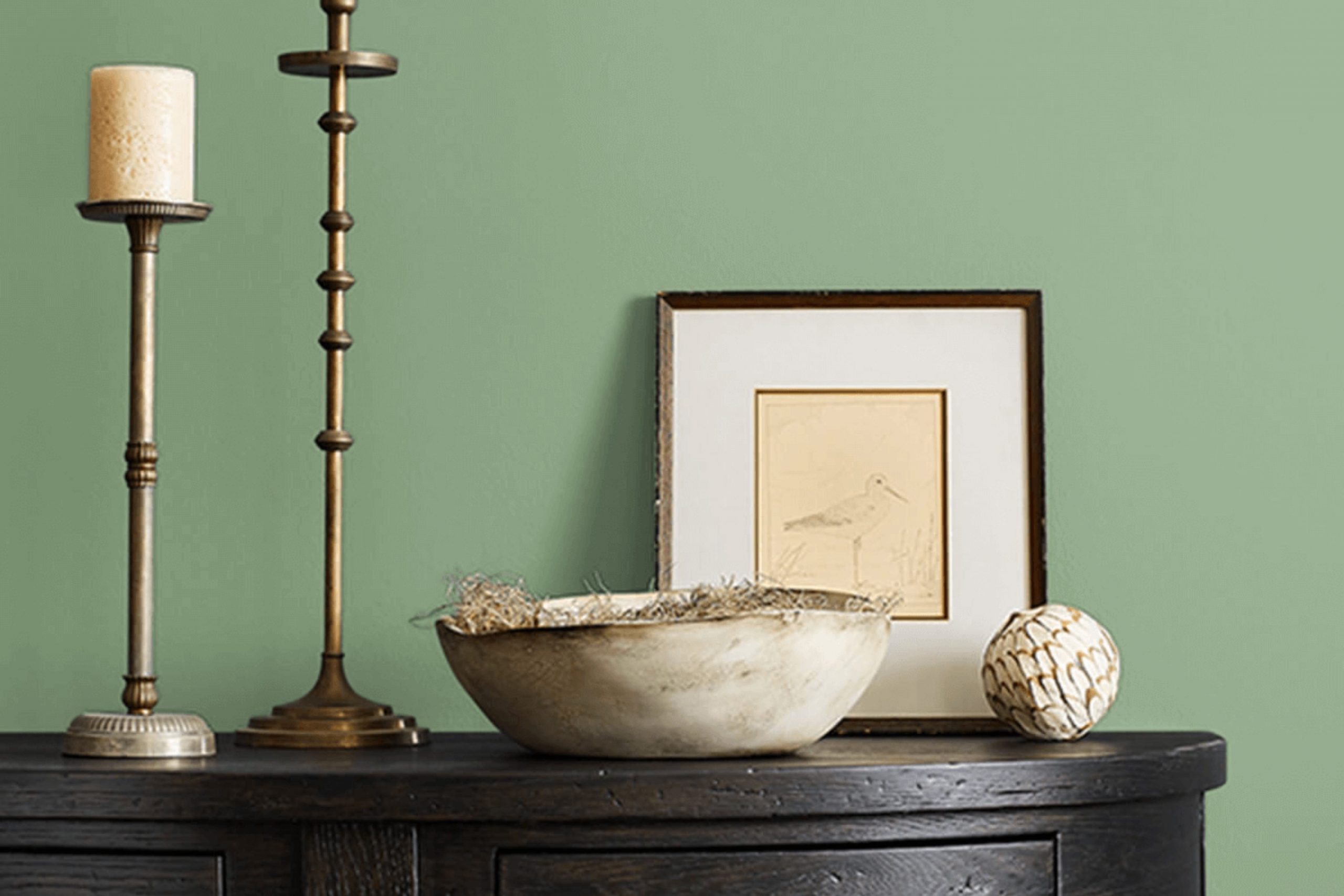
As I look at Agate Green SW 7742 by Sherwin Williams, I’m struck by its soft, muted tone that feels like a blend of green with hints of gray. It’s a color that brings a subtle hint of nature indoors, creating a calming atmosphere in any room.
I find it to be incredibly adaptable, easily fitting into various interior styles. Specifically, it works wonderfully in minimalist, Scandinavian, and modern farmhouse designs. These styles often feature clean lines and a soft color palette, making Agate Green a perfect match.
I’ve noticed that this color pairs beautifully with natural materials such as light wood, linen, and cotton. These elements help to maintain a light, airy feel in the room, complementing the understated elegance of the green. It also looks stunning with stone textures, like marble or granite, providing a nice contrast without overpowering the gentle green shade.
In terms of usage, I love using this color in rooms that need a touch of calmness, such as bedrooms or home offices. It surrounds these areas with a soothing vibe, making them ideal for relaxation and focus. Overall, Agate Green has a unique charm that works effortlessly in creating inviting and comfortable interiors.
decorcreek.com
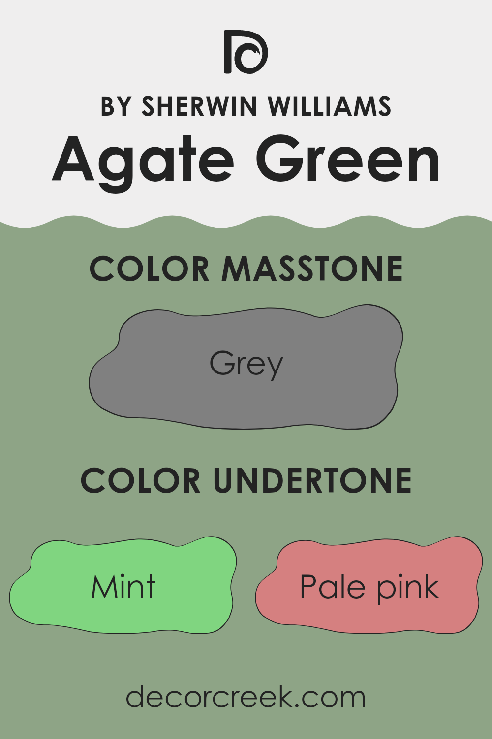
What are the right undertones of Agate Green SW 7742 ?
Agate Green SW 7742 is an adaptable paint color that showcases a complex blend of undertones, which can significantly affect its appearance on interior walls. Understanding undertones is crucial because they subtly influence the primary color, often in ways that can change under different lighting conditions or when combined with other colors in a room.
This specific shade features undertones ranging from mint and pale yellow to darker hues like olive and dark green. For example, mint and light blue undertones can give Agate Green a cooler, fresher look, making it ideal for creating a calm and relaxed atmosphere in areas like bathrooms or bedrooms. On the other hand, olive and dark green can provide a more grounded, earthy feel, suitable for living rooms or offices where a touch of nature is desired.
When applied to interior walls, the variety of undertones in Agate Green means it can interact playfully with both natural and artificial light. In a brightly lit room, lighter undertones such as pale yellow might become more pronounced, giving the room a vibrant glow. In contrast, in dimmer settings, darker undertones like dark green could dominate, lending the room a more cozy and intimate vibe.
Thus, when choosing this color for a room, considering the room’s lighting and the desired emotional impact is important. Agate Green’s flexibility can help achieve various aesthetics, from lively and refreshing to subtle and grounding, depending on its surrounding elements.
decorcreek.com
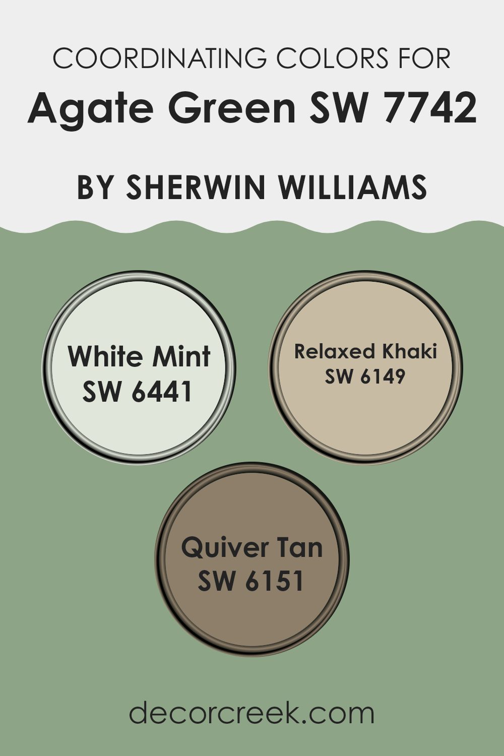
Best Coordinating Colors to use with Agate Green SW 7742 by Sherwin Williams this year.
Coordinating colors are selected to complement a primary paint choice, creating a harmonious color scheme in your room. For example, when working with a shade like Agate Green by Sherwin Williams, you might opt to combine it with colors that enhance its calming, earthy qualities without feeling too intense in the room.
White Mint by Sherwin Williams is a subtle green with a hint of freshness that can lighten up a room while harmonizing nicely with a deeper tone like Agate Green. It’s perfect for creating a gentle contrast and enhancing the sense of light in smaller or dimly lit areas.
On the other hand, Relaxed Khaki offers a neutral backdrop that pairs effortlessly with more saturated colors, providing a warm, understated elegance. It’s great for areas where you want the color to blend smoothly without making too strong a statement. Lastly, Quiver Tan is a richer, deeper tan that can ground a room’s palette, offering a solid foundation that supports bolder colors. This color works well in balancing out the vibrancy of Agate Green, providing a calming and inviting atmosphere.
You can see recommended paint colors below:
Trendy Trim Colors of Agate Green SW 7742 by Sherwin Williams to use this year.
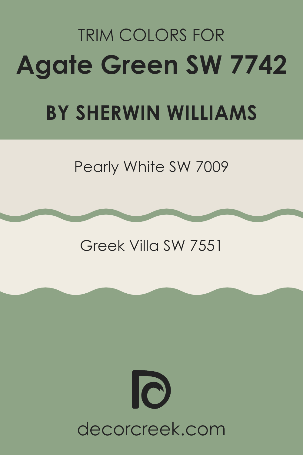
Trim colors play an essential role in highlighting and complementing the primary paint color on the walls. For a color like Agate Green, choosing the right trim color helps to frame the room beautifully and can softly contrast or harmonize with the main color, enhancing the overall aesthetic.
Appropriate trim colors, like Pearly White or Greek Villa, are crucial because they can either subtly accentuate the boldness of Agate Green or create a smooth transition between the wall and other elements of the room, such as the doors, windows, and ceilings.
Pearly White is a gentle and soft hue that pairs nicely with the quieter tones of Agate Green, providing a subtle lift that keeps the room fresh and clean-looking. On the other hand, Greek Villa offers a slightly warmer tone, which adds a cozy and inviting feel to the environment when used as a trim color with Agate Green. This warmer trim option works particularly well in rooms where a more welcoming atmosphere is desired, blending seamlessly with the natural, understated elegance of the green.
You can see recommended paint colors below:
- SW 7009 Pearly White
- SW 7551 Greek Villa
Evergreen Colors Similar to Agate Green SW 7742 by Sherwin Williams
Choosing similar colors is essential in paint and decor because it creates a cohesive and harmonious look. When you select shades like those related to Agate Green by Sherwin Williams, you can craft rooms that feel naturally balanced. Similar colors work together to enhance each other without creating too much contrast, which can be ideal for creating a calming atmosphere in a home.
For instance, Rookwood Jade is a rich, deep green that evokes the lushness of a dense forest, adding depth and warmth to an environment. Nearby in the spectrum, Burma Jade carries a slightly lighter, more vibrant touch, reminiscent of spring growth, injecting life into rooms.
Nurture Green, as suggested by its name, has a comforting, soft vibe, similar to young, tender leaves. Lounge Green is a bit moodier, suggesting the shade of green you might find in a shaded woodland retreat, perfect for creating a thoughtful nook. Broccoflower has a quirky, fresh appeal, just like the vegetable it’s named after, bringing an unexpected pop to decor.
Restful, on the other hand, is gentle and subdued, ideal for bedrooms or other restful rooms. Parisian Patina has a hint of green with a worn, classic feel, lending a sense of history to its surroundings. Leaflet offers a crisp, clear green, like fresh spring foliage, brightening rooms effortlessly.
Verdigreen features a muted, understated green that hints at aged copper patinas, providing an elegant yet understated backdrop. Lastly, Haven is a calming, softer shade that provides a sense of sanctuary and peaceful retreat in any room. These colors, all similar yet distinctly individual, allow for flexible design choices that feel cohesive and natural when used together.
You can see recommended paint colors below:
- SW 2812 Rookwood Jade
- SW 2862 Burma Jade
- SW 6451 Nurture Green
- SW 6444 Lounge Green
- SW 9039 Broccoflower
- SW 6458 Restful
- SW 9041 Parisian Patina
- SW 9674 Leaflet
- SW 9042 Verdigreen
- SW 6437 Haven
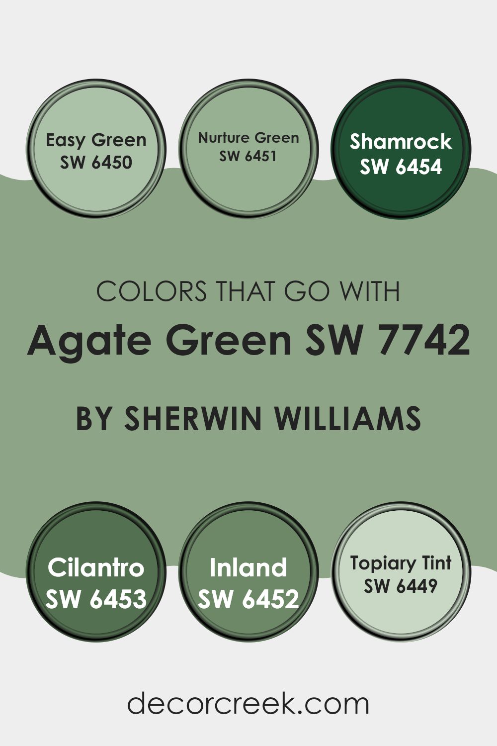
Colors that Go With Agate Green SW 7742 by Sherwin Williams
Choosing the right colors to pair with Agate Green (SW 7742) by Sherwin Williams can greatly enhance the visual appeal and cohesion of a room. Agate Green is an adaptable shade that pairs beautifully with a wide range of other hues. When combined with colors like Easy Green and Nurture Green, Agate Green helps create a natural, calming atmosphere.
These greens provide a soft backdrop, making them ideal for areas where relaxation is key. Shamrock and Cilantro add a more vibrant touch, injecting energy and freshness into the environment. These richer greens are perfect for accentuating areas or for use in rooms that benefit from a lively ambiance.
Moreover, colors like Inland and Topiary Tint offer subtle variations that complement Agate Green without feeling too intense. Inland, a deeper green, provides a sturdy grounding effect, making it excellent for areas that require a touch of gravity. Topiary Tint, on the other hand, offers a lighter, more airy feel, excellent for brightening up a room while maintaining a harmonious look with Agate Green. Together, these colors allow for flexibility in design, making it possible to achieve a range of atmospheres from relaxing to invigorating, all while maintaining a stylish and cohesive palette.
You can see recommended paint colors below:
- SW 6450 Easy Green
- SW 6451 Nurture Green
- SW 6454 Shamrock
- SW 6453 Cilantro
- SW 6452 Inland
- SW 6449 Topiary Tint
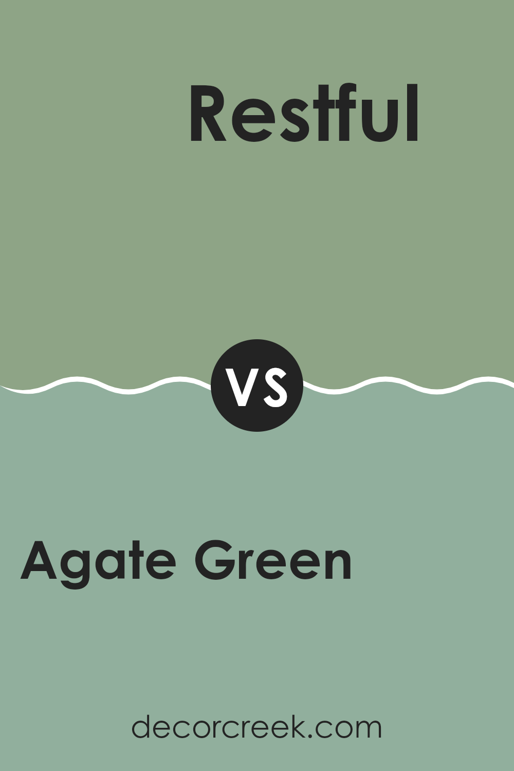
Agate Green SW 7742 by Sherwin Williams vs Restful SW 6458 by Sherwin Williams
Agate Green and Restful are two distinct shades from Sherwin Williams. Agate Green is a deeper, muted green with hints of gray, creating a calming and grounded feel, perfect for rooms where you want a touch of nature without excessive brightness.
It pairs well with natural materials like wood and stone. On the other hand, Restful is a lighter, more vibrant green, providing a refreshing and lively atmosphere. It’s ideal for adding a spark of energy to a room without being too bold.
This shade works great in areas like bathrooms or kitchens where a clean, fresh look is desired. Both colors bring their own unique vibe to a room, with Agate Green leaning more towards a subtle, cozy feeling and Restful offering a brighter and more energizing touch.
You can see recommended paint color below:
- SW 6458 Restful
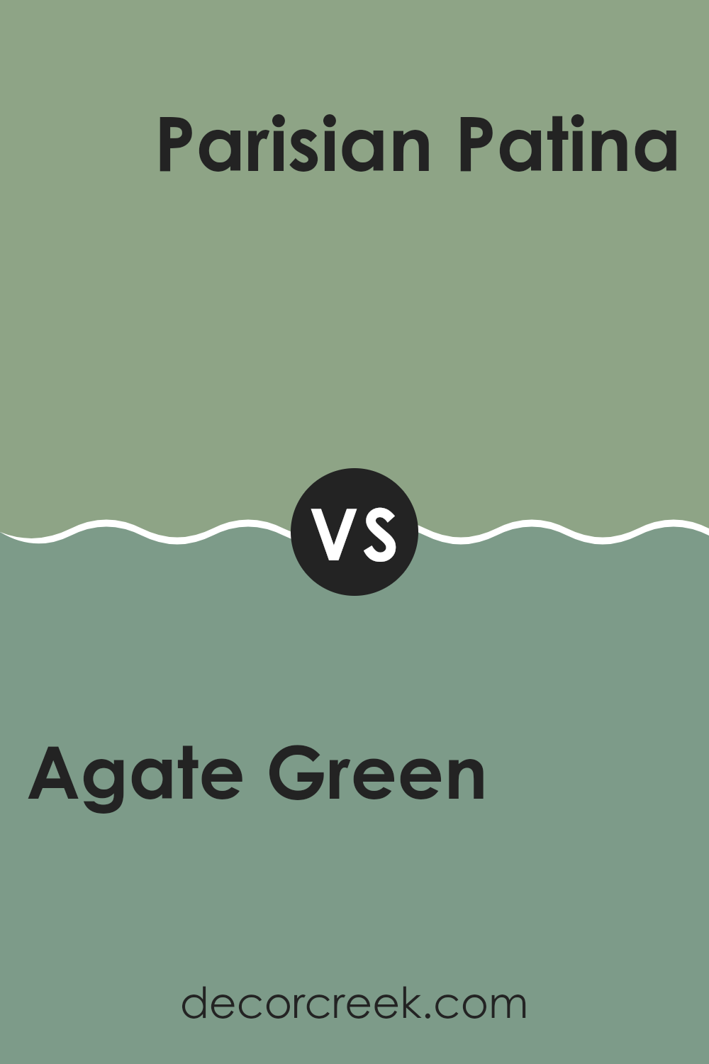
Agate Green SW 7742 by Sherwin Williams vs Parisian Patina SW 9041 by Sherwin Williams
Agate Green and Parisian Patina by Sherwin Williams are both unique shades of green that offer different vibes for any room. Agate Green has a softer, muted tone that gently adds a touch of nature-inspired calmness to walls. It’s lighter and less intense, making it perfect for creating a relaxed and welcoming atmosphere in rooms like the living area or bedroom.
In contrast, Parisian Patina is a deeper, richer green that bears a more pronounced presence. This shade pulls in elements of a classic green but with a hint of gray that gives it a more grounded feeling.
It’s ideal for those looking to make a bolder statement in areas such as an office or a dining room, where its depth can create a sense of interest and character. Both colors are adaptable and can harmonize with various decor styles, but their different tones will set a distinct mood in any room they are used.
You can see recommended paint color below:
- SW 9041 Parisian Patina
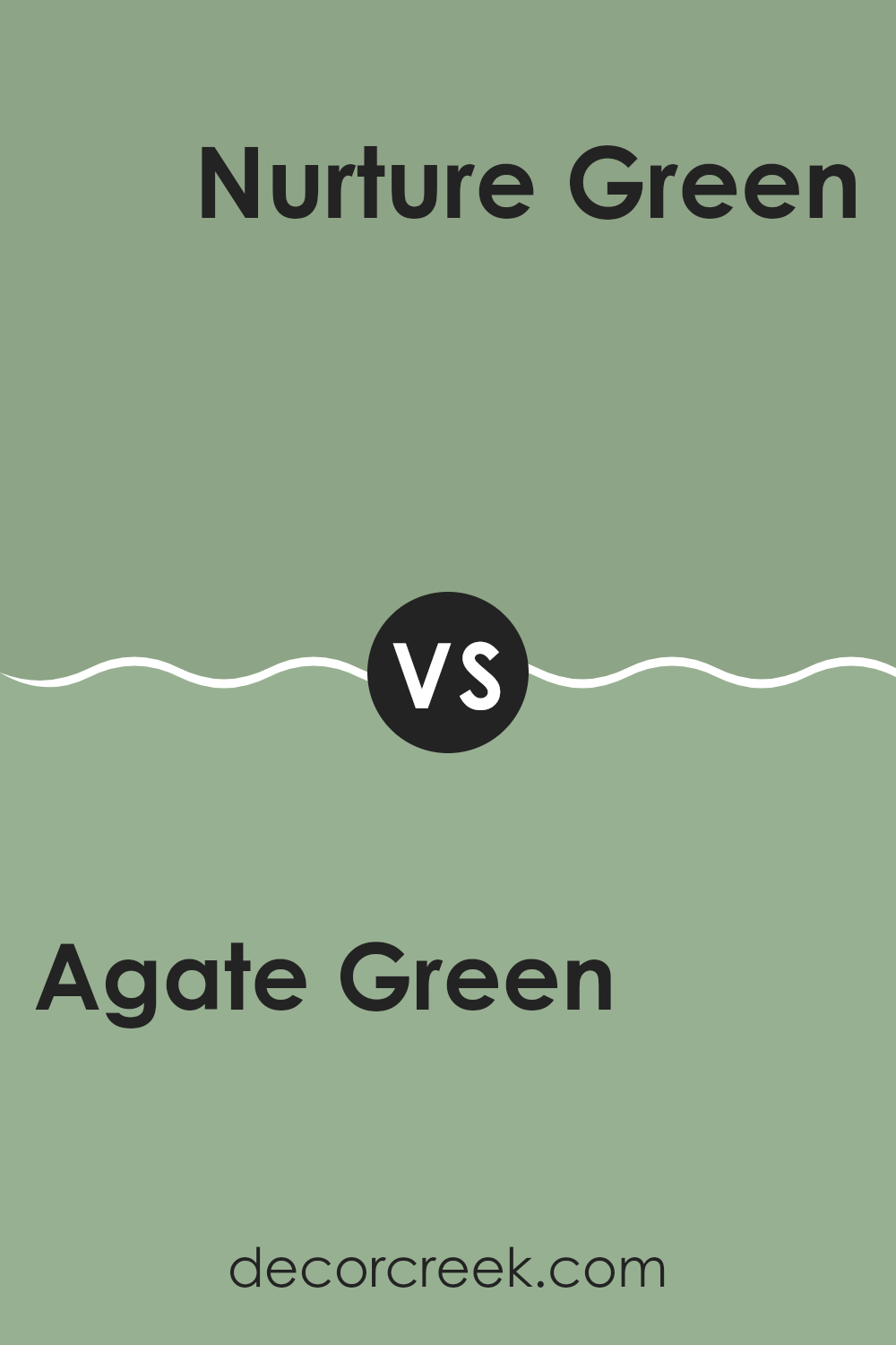
Agate Green SW 7742 by Sherwin Williams vs Nurture Green SW 6451 by Sherwin Williams
Agate Green and Nurture Green by Sherwin Williams are two distinct shades that can change the mood of a room. Agate Green is a soft, subdued green with a grey tint, making it perfect for creating a calm and soothing atmosphere.
It works well in rooms where you want to relax, such as bedrooms or living rooms. On the other hand, Nurture Green is a brighter, more vibrant green. This color brings more energy to a room and is great for areas where you want to feel refreshed and invigorated, like kitchens or playrooms.
While Agate Green blends into the background with its muted tones, Nurture Green stands out and can become a focal point in a room. Both colors offer unique vibes, with Agate Green leaning towards a more muted, calm look and Nurture Green offering a lively and fresh feel.
You can see recommended paint color below:
- SW 6451 Nurture Green
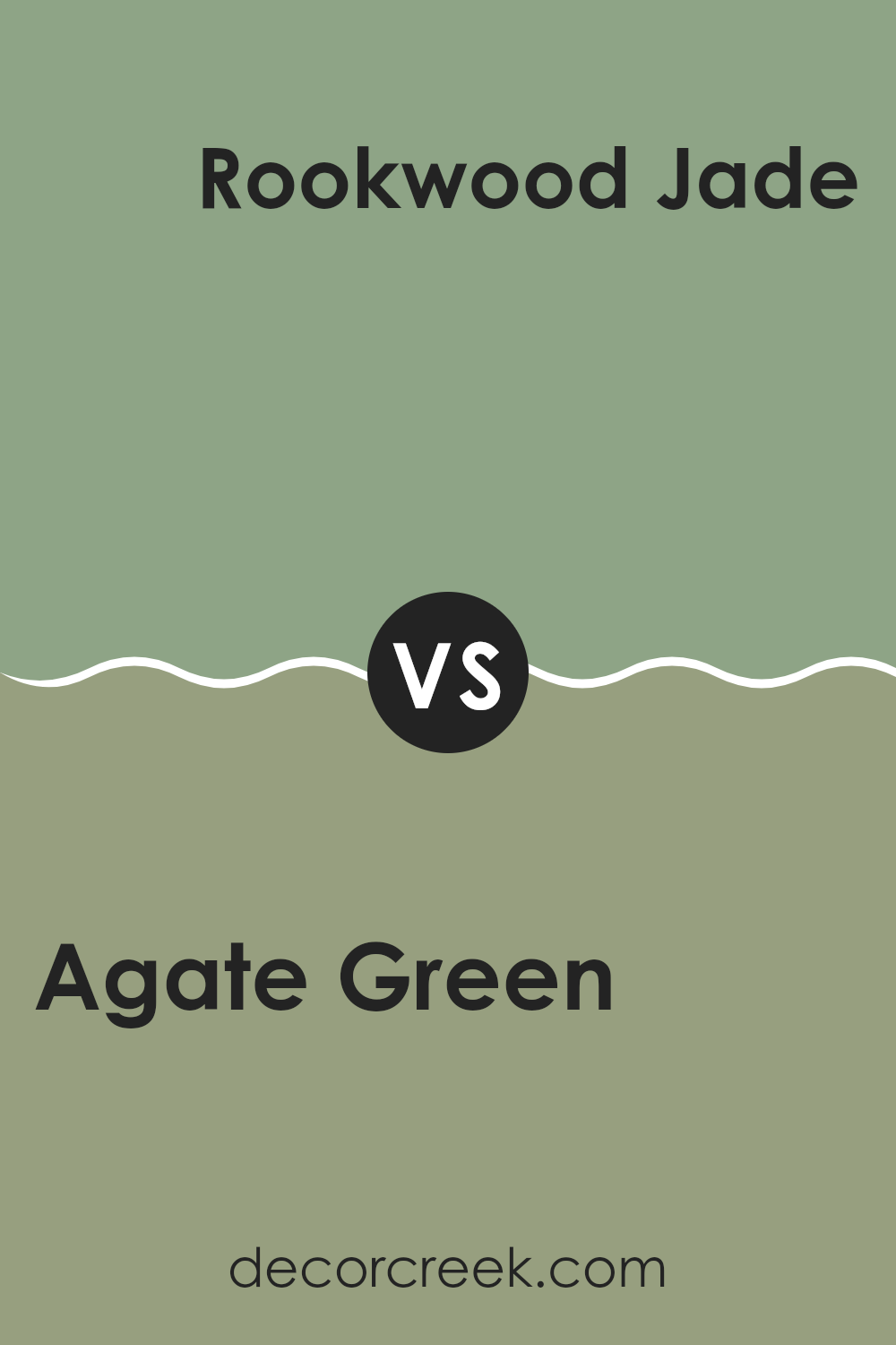
Agate Green SW 7742 by Sherwin Williams vs Rookwood Jade SW 2812 by Sherwin Williams
Agate Green and Rookwood Jade are two unique paint colors from Sherwin Williams that offer distinct vibes to any room. Agate Green is a soft, muted green with a touch of gray that gives it a soothing and gentle feel, making it very adaptable for various rooms. It’s light enough to keep rooms feeling airy but has enough depth to add character.
On the other hand, Rookwood Jade is a deeper, more intense color inspired by natural jade stone. It presents a richer, earthier tone that can make a bold statement in a room. This color works well if you want to add a touch of nature-inspired lushness to your room.
Both colors work nicely together, with Rookwood Jade serving as an excellent choice for an accent wall or trim, complementing the lighter Agate Green. Whether used together or separately, both bring a fresh, natural feel to the decor.
You can see recommended paint color below:
- SW 2812 Rookwood Jade
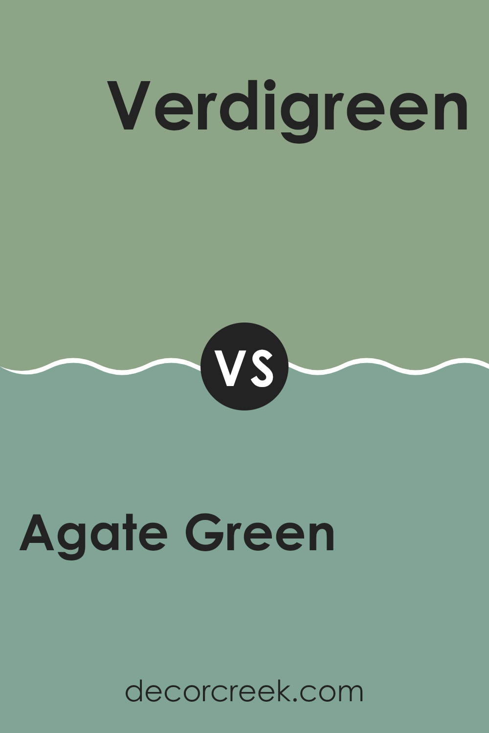
Agate Green SW 7742 by Sherwin Williams vs Verdigreen SW 9042 by Sherwin Williams
Agate Green and Verdigreen by Sherwin Williams are both shades of green, but they have different tones and feelings. Agate Green is a soft, muted green with a touch of gray. This color is gentle and can make a room feel cozy and calm. It’s great for rooms where you want to relax, like bedrooms or living rooms.
On the other hand, Verdigreen is a brighter and more vibrant green. It has more blue in it, which gives it a fresher look. This color is lively and can add a splash of energy to a room. It’s perfect for areas where you want a more dynamic and cheerful atmosphere, like kitchens or playrooms.
Both colors can work well in homes, depending on what kind of mood you want to create. Agate Green is better if you like softer, more neutral colors, while Verdigreen is a good choice if you prefer something that stands out more.
You can see recommended paint color below:
- SW 9042 Verdigreen
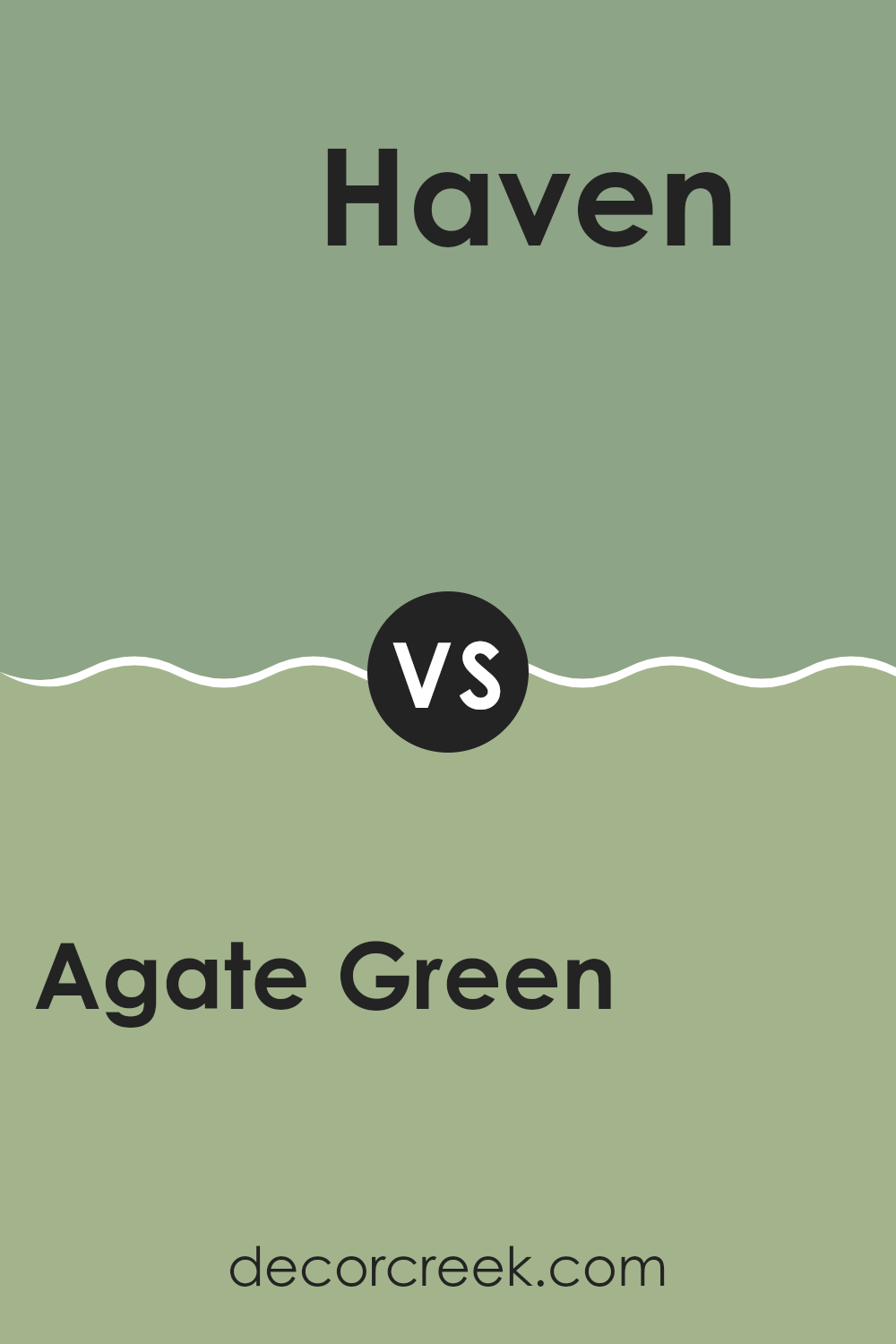
Agate Green SW 7742 by Sherwin Williams vs Haven SW 6437 by Sherwin Williams
Agate Green and Haven from Sherwin Williams offer unique shades that freshen up any room. Agate Green is a soft, muted green with a hint of gray. This color has a calming and understated vibe, making it perfect for creating a calm, cozy atmosphere in rooms like bedrooms or offices. It pairs well with natural elements and light woods to enhance its earthy qualities.
On the other hand, Haven is a deeper, richer green with a more pronounced presence. It’s a vibrant color that stands out more in a room, ideal for making a statement or as an accent wall. This shade works well with both modern and traditional decor, adding a fresh burst of energy to a room.
When comparing the two, Agate Green is lighter and more reserved, offering subtle elegance, while Haven brings a bold and lively feel. Depending on what mood you want to set, each color has its charm and can significantly affect the style and feel of a room.
You can see recommended paint color below:
- SW 6437 Haven
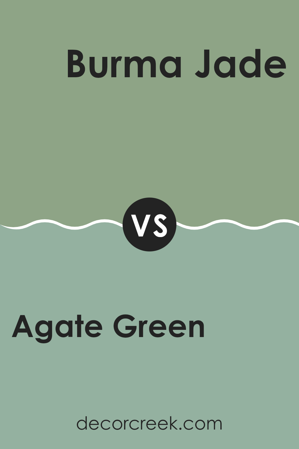
Agate Green SW 7742 by Sherwin Williams vs Burma Jade SW 2862 by Sherwin Williams
Agate Green and Burma Jade are two distinct colors from Sherwin Williams. Agate Green is a soft, muted green with a touch of gray, giving it a calming look that’s perfect for creating a peaceful ambiance in rooms like bedrooms or living rooms. It leans slightly towards being neutral, which makes it adaptable for pairing with various decor elements.
On the other hand, Burma Jade is a deeper, more vibrant green with a noticeable richness that can add a strong visual impact to a room. This color is bolder and can inject energy into a room, making it great for areas where a lively atmosphere is desired, such as playrooms or creative rooms.
Together, these colors offer a range of options: Agate Green works well for a subtle, laid-back vibe, while Burma Jade is fitting for rooms that benefit from a splash of brightness and fun.
You can see recommended paint color below:
- SW 2862 Burma Jade
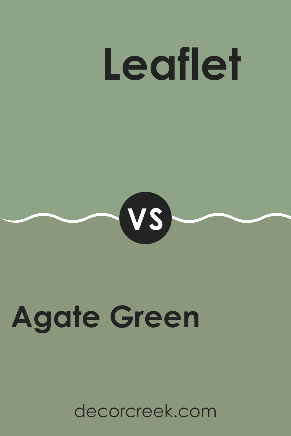
Agate Green SW 7742 by Sherwin Williams vs Leaflet SW 9674 by Sherwin Williams
Agate Green and Leaflet are two distinct colors from Sherwin Williams. Agate Green is a soft, muted green with a hint of gray, giving it a subtle and soothing appearance. It’s an adaptable color that works well in a variety of rooms, adding a calm and gentle ambiance without being too bold.
Leaflet, on the other hand, is a livelier green that leans towards a fresh, spring-like tone. It’s brighter and more vibrant, making it a great choice for areas where you want to inject some energy and cheerfulness. This color could be perfect for accent walls or rooms that benefit from a pop of color.
Together, these two greens offer a nice contrast: Agate Green provides a quieter background, while Leaflet adds a splash of brightness. Whether used together or individually, each color brings its unique vibe to a room.
You can see recommended paint color below:
- SW 9674 Leaflet
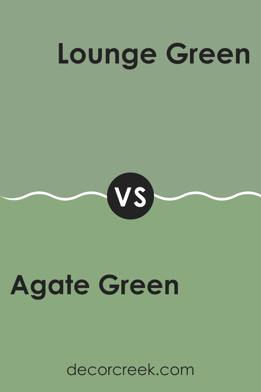
Agate Green SW 7742 by Sherwin Williams vs Lounge Green SW 6444 by Sherwin Williams
Agate Green and Lounge Green are two distinct shades by Sherwin Williams that offer their unique appeal in interior design. Agate Green is a soft, muted green with a grayish tone that makes it adaptable and calming. It’s ideal for creating a light and airy room, and works well in areas like living rooms or bedrooms where a gentle touch of color is desired.
On the other hand, Lounge Green presents a much deeper and vibrant green, imbuing rooms with richness and energy. This shade can make a bold statement and is perfect for accent walls or areas where you want to add a pop of color without feeling too intense.
While Agate Green provides a subtle backdrop conducive to relaxation, Lounge Green stands out and demands attention, making it suitable for more dynamic, lively settings. Both colors demonstrate Sherwin Williams’ ability to offer a wide range of greens catering to different tastes and interior design needs.
You can see recommended paint color below:
- SW 6444 Lounge Green
Agate Green SW 7742 by Sherwin Williams vs Broccoflower SW 9039 by Sherwin Williams
Agate Green is a muted, soft green with a hint of gray, giving it a calming and gentle feel. This color is subtle and works well in rooms that aim for a peaceful and understated look. On the other hand, Broccoflower is a brighter, more vibrant green.
This shade is fresher and has a youthful vibe, making it perfect for adding a lively touch to any room. The key difference lies in their intensity and mood: Agate Green leans more towards a quiet, neutral backdrop, while Broccoflower stands out more and can really make a room feel lively and fresh.
Both colors offer unique qualities, but their impact and where they fit best in a home vary significantly. Agate Green suits areas where you want a touch of color without feeling too intense, whereas Broccoflower is great for those looking to make a more dynamic statement.
You can see recommended paint color below:
- SW 9039 Broccoflower
After looking at SW 7742 Agate Green by Sherwin Williams, I’ve learned a lot about this color. It’s a unique shade of green that feels calming and fresh. When you paint a room with Agate Green, it can make the room seem very cozy and welcoming. I can tell this color would be great in rooms like the living room or even a bedroom, where you want to feel relaxed.
I really appreciate how Agate Green is not too bright or too dark; it’s just right. It would also go well with many different styles and decorations, making it easy to use if you want to update your room’s look without doing too much work. Plus, it seems like it could hide everyday marks and scuffs pretty well, keeping your walls looking nice over time.
Overall, I like SW 7742 Agate Green for its calming feel and how it can make a room look beautiful without trying too hard. It’s a color that can make anyone’s home look nice and welcoming.
decorcreek.com
Ever wished paint sampling was as easy as sticking a sticker? Guess what? Now it is! Discover Samplize's unique Peel & Stick samples.
Get paint samples

