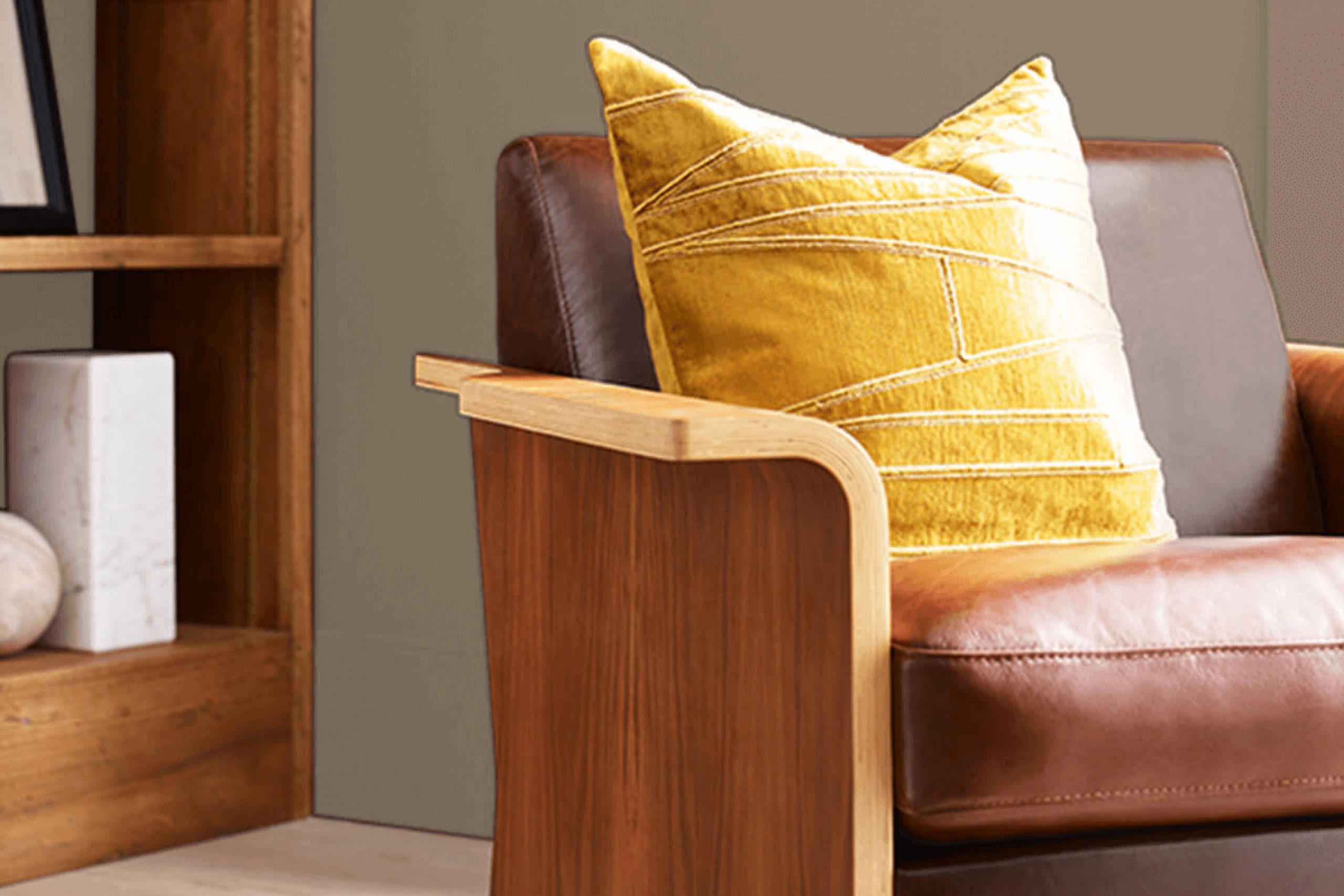
When choosing the perfect paint color for your home, it’s vital to consider how each shade will influence the atmosphere and mood of your room. Today, let’s talk about a unique shade from Sherwin Williams: SW 6151 Quiver Tan. This subtle, warm tan offers a flexible backdrop for both vibrant and subdued design schemes.
As someone who has used it in various decorating projects, I appreciate its understated elegance. Quiver Tan stands out for its ability to blend seamlessly with different styles and textures, making it an ideal choice for living rooms, bedrooms, or even kitchens. It has a cozy warmth that makes any room feel more inviting.
You’ll find that it pairs wonderfully with rich woods, soft textiles, and a broad palette of accent colors. From a practical standpoint, this color is great at hiding minor imperfections on walls, ensuring your home looks polished and well-maintained. In my experience, Quiver Tan adapts beautifully to natural light, subtly shifting tones from sunrise to sunset, which enhances its charm.
It’s a resilient color choice that supports various decor changes over the years. Whether you’re looking for a fresh look for your home or a soothing neutral for a busy office, Quiver Tan could be the snug, flexible option you need. Let’s see how you can include it into your rooms to create a style that feels both refreshed and enduring.
What Color Is Quiver Tan SW 6151 by Sherwin Williams?
Quiver Tan from Sherwin Williams is a warm, muted beige that offers a cozy and inviting feeling to any room. This color has a natural, earthy hue that makes rooms feel more grounded and comfortable. Its understated nature allows it to serve as a flexible backdrop for various decor styles and color schemes.
Quiver Tan works especially well in interior styles that value comfort and simplicity, such as rustic, farmhouse, and traditional decor. It provides a soft base that complements natural materials like wood, linen, and leather, enhancing their texture and depth.
For instance, pairing Quiver Tan walls with dark wood furniture creates a rich contrast, while coupling it with lighter woods or wicker elements can keep a room feeling airy and light. This shade also pairs beautifully with matte finishes and soft textiles, such as cotton throws or wool rugs, contributing to a tactile experience that invites relaxation.
Its neutrality supports a wide range of accent colors, from soft pastels like sage green and dusty rose to bolder choices like navy or terracotta, providing flexibility in accessorizing and styling. Overall, Quiver Tan is a practical choice that can help create a warm, welcoming feeling in your home while also offering ample creative freedom in your decorating approach.
Is Quiver Tan SW 6151 by Sherwin Williams Warm or Cool color?
Quiver Tan SW 6151 by Sherwin Williams is a warm, inviting neutral tone that brings a cozy and comfortable feel to any room in your home. This shade of beige has a subtle richness that works well with a variety of decorating styles, from modern to rustic.
It’s ideal for living rooms or bedrooms where a calm and welcoming feeling is desired. Quiver Tan also pairs beautifully with white trim for a clean, crisp look, or with darker furniture for a more grounded feel. The color is flexible enough to be used on walls, trim, or even as an accent color.
It’s especially effective in rooms with natural light, as the sunlight enhances its warm undertones, creating a soft, natural mood. By choosing Quiver Tan for your home, you create an enduring look that remains stylish and appealing.
Undertones of Quiver Tan SW 6151 by Sherwin Williams
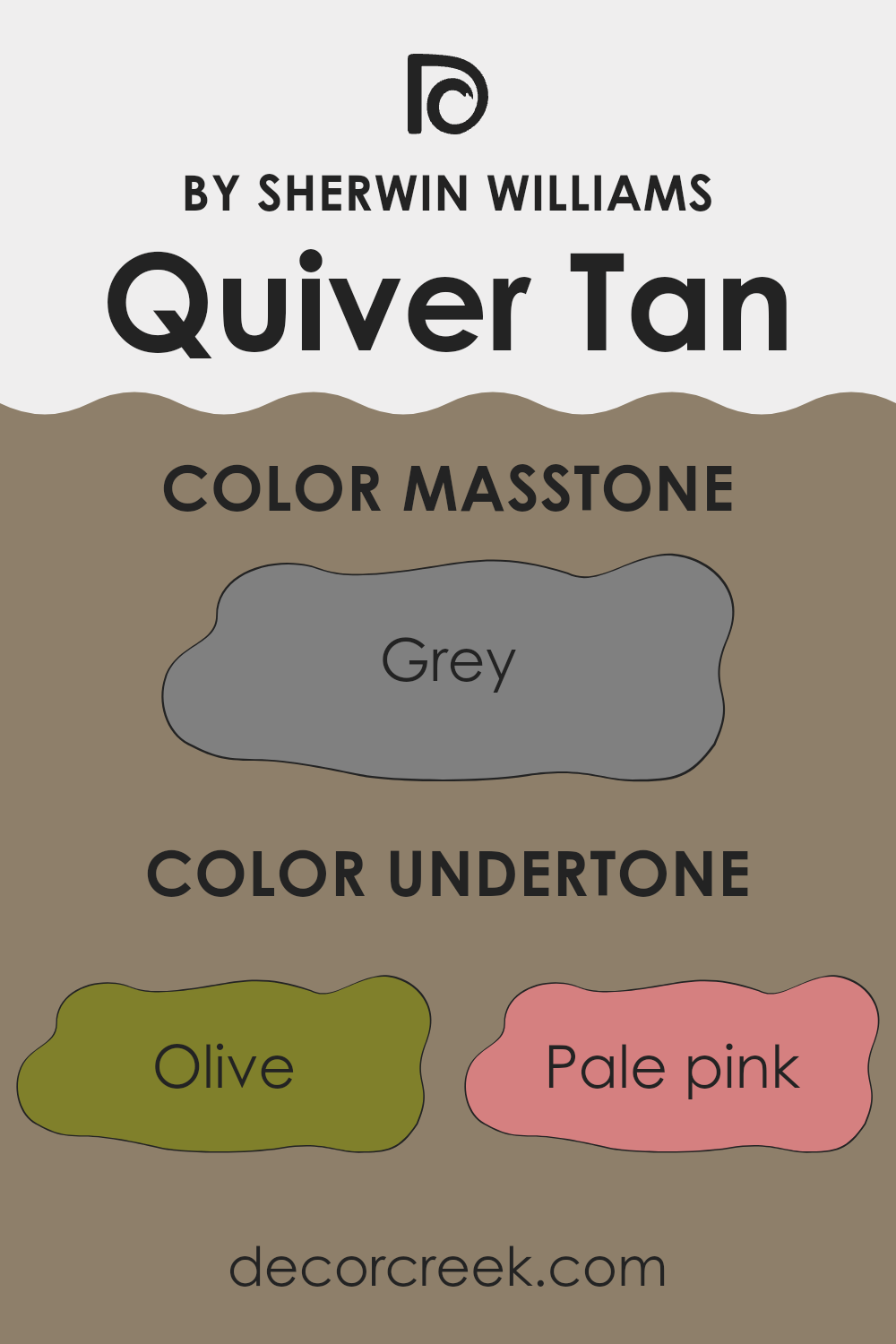
Quiver Tan is a unique paint color with a complexity that comes from its diverse range of undertones. These undertones greatly affect how we see the color under different lighting conditions and surroundings. At first glance, Quiver Tan may appear as a simple neutral tan, but it carries a spectrum of subtle shades that can shape its overall look.
Undertones like olive, pale pink, and brown add a warm depth, making the color feel cozy and welcoming in a room. These warmer undertones can make a room feel more enclosed and intimate, ideal for living rooms or bedrooms where a comforting mood is desired.
On the other hand, undertones like light blue, dark turquoise, and mint bring a cooler side to the paint. These can give a fresh and airy feel to the color, which can help to visually widen a room, making it seem larger and more open. This feature is especially helpful in smaller rooms or areas with limited natural light.
Also, shades like pale yellow and light green add a touch of brightness, subtly enhancing the light in a room. This can be especially useful in north-facing rooms that might otherwise feel too cool or dim.
In decorating, understanding these undertones helps when picking furnishings and accents. For example, matching fabric colors and decorative pieces with the cooler undertones can create a balanced look, while contrasting with warmer undertones can add an energetic touch to the décor.
Overall, the intricate mix of undertones in Quiver Tan can deeply influence the feeling of interior walls, offering flexibility to build different moods and styles suited to personal taste and practical needs.
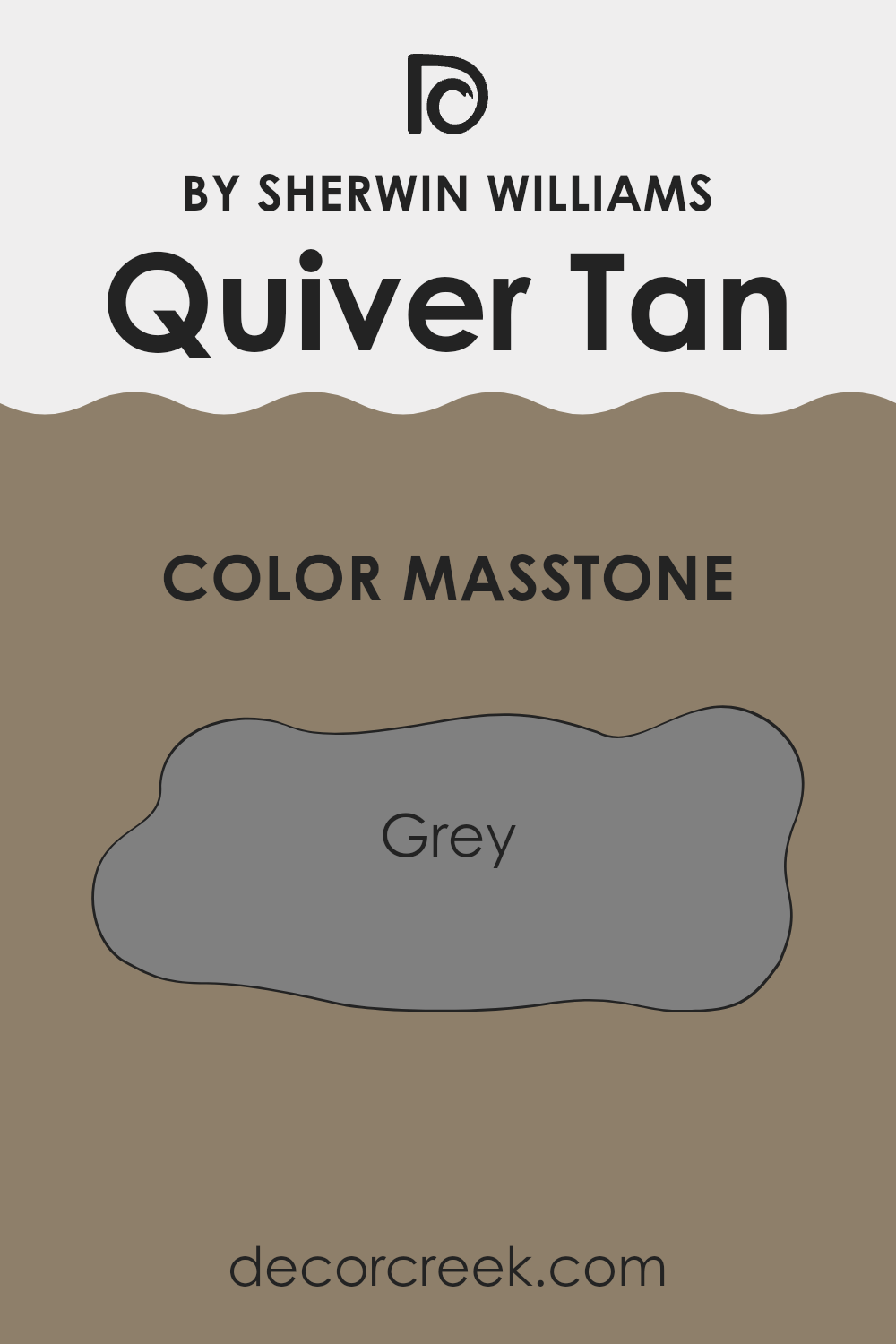
What is the Masstone of the Quiver Tan SW 6151 by Sherwin Williams?
Quiver Tan SW 6151 by Sherwin Williams masstone is a unique shade of grey. This color is perfect for creating a cozy and inviting feeling in homes because it has a warm undertone that makes rooms feel welcoming. Grey is a flexible color that works well in many different settings, making it a popular choice for homeowners.
The neutral grey tone of Quiver Tan can easily pair with a wide range of accent colors, from bold and bright to soft and subtle, allowing for adaptability in décor choices and styles. Whether used in living rooms, bedrooms, or kitchens, this color adds a touch of warmth and modernity without making the room feel too heavy.
Its ability to blend with other colors and materials also means it can suit various themes and tastes, making it an excellent choice for anyone looking to update their home without major changes. Grey also has the advantage of making rooms appear larger and more open, which is particularly helpful for smaller rooms.
How Does Lighting Affect Quiver Tan SW 6151 by Sherwin Williams?
Lighting has a significant effect on how we see colors. The type of light and its source can make a paint color look completely different in one setting compared to another. For example, Quiver Tan is a flexible shade that can appear differently under various lighting conditions.
In natural light, Quiver Tan tends to show its true color. Natural light provides a balanced spectrum of colors, making this tan shade look lively and fairly consistent throughout the day. However, the direction of your room can affect this look.
In north-facing rooms, which get less direct sunlight, Quiver Tan might look slightly cooler and more muted, giving it a softer feel. South-facing rooms, with more direct sunlight, can make this color look warmer and brighter, enhancing its cozy feeling.
In east-facing rooms, Quiver Tan will be affected by the morning light, which is generally cooler and bluer. This can make the color appear lighter and more airy in the morning, then return to its true warmer tone in the afternoon and evening. West-facing rooms, however, receive evening light, which is warmer and can make the color look richer and more deep toward the end of the day.
Artificial lighting changes the look once again. Under incandescent lighting, Quiver Tan will appear warmer because these lights bring out yellows and reds. Fluorescent lighting, on the other hand, casts a cooler, bluish tone on walls, which can make Quiver Tan look less warm and more neutral or soft.
Overall, Quiver Tan’s ability to adjust to different lighting conditions makes it a flexible choice for many rooms. Keep in mind how your room’s direction and the type of light it gets might affect the final look of this color on your walls. Choosing the right lighting is just as important as picking the color itself to ensure you achieve the desired effect in your room.
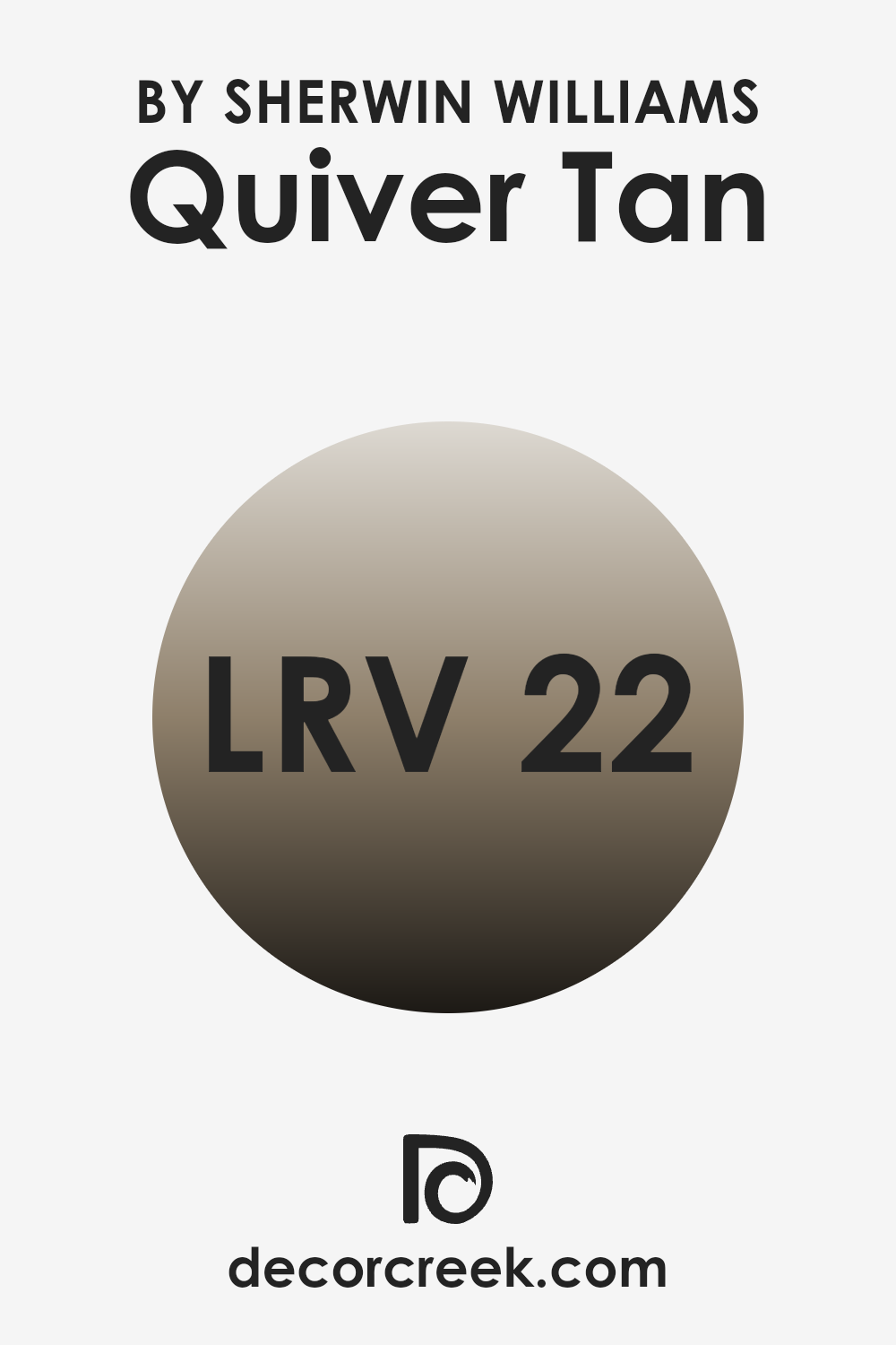
What is the LRV of Quiver Tan SW 6151 by Sherwin Williams?
LRV stands for Light Reflectance Value, which measures how much visible and usable light reflects from a surface when light shines on it. This value is usually shown as a percentage, with lower numbers meaning the surface reflects less light, while higher values mean more light is reflected.
A wall color with an LRV around 50 is considered medium, as it neither absorbs nor reflects light too much. When choosing paint colors, LRV is an important factor because it helps show how light or dark a color will look in a certain setting. Lighter walls make a room feel more open and airy, while darker walls can make a room feel smaller and more enclosed.
Looking at the LRV of Quiver Tan SW 6151 by Sherwin Williams, which is 21.847, it is a darker shade, meaning it absorbs more light than it reflects. In small or dimly lit rooms, using this color might make the room appear even smaller and darker. However, in a well-lit or larger room, this depth of color can add warmth and character.
The low LRV also means this color works well for creating a cozy and welcoming feeling, as it won’t make the room much brighter but will instead enrich it with depth and warmth. Because of this, it’s important to consider the room’s size and lighting before using this shade to get the effect you want.
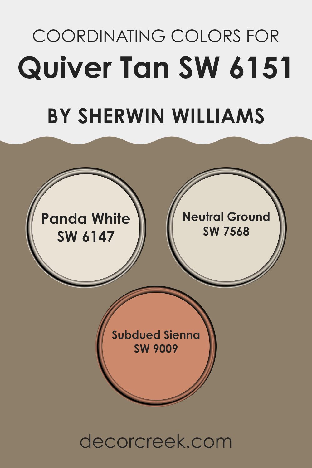
Coordinating Colors of Quiver Tan SW 6151 by Sherwin Williams
Coordinating colors are complementary shades that pair well together to create a visually appealing and unified look in décor. They can be used to accent a main color, helping to enhance the overall style of a room without making it feel too strong or heavy. For example, when decorating with a base color like Quiver Tan, it’s helpful to choose coordinating colors that bring balance and harmony to the room.
Panda White SW 6147 is a clean and gentle off-white that offers a soft contrast to richer, darker tones like Quiver Tan. It’s ideal for use on trim or ceilings to give a fresh and open feeling to the room. Neutral Ground SW 7568, another coordinating color, is a soft beige that complements warmer hues, creating a smooth link between color applications in a room.
It works well for larger areas, such as walls, to form a calming base. Finally, Subdued Sienna SW 9009 adds a touch of deeper, earthy red tones that can bring warmth and a bit of character when used as an accent. This color is great for adding depth to a color plan and pairs beautifully with accessories or as a feature wall. Together, these colors strengthen and enhance the base tone, giving design flexibility while keeping a balanced and connected look.
You can see recommended paint colors below:
- SW 6147 Panda White
- SW 7568 Neutral Ground
- SW 9009 Subdued Sienna
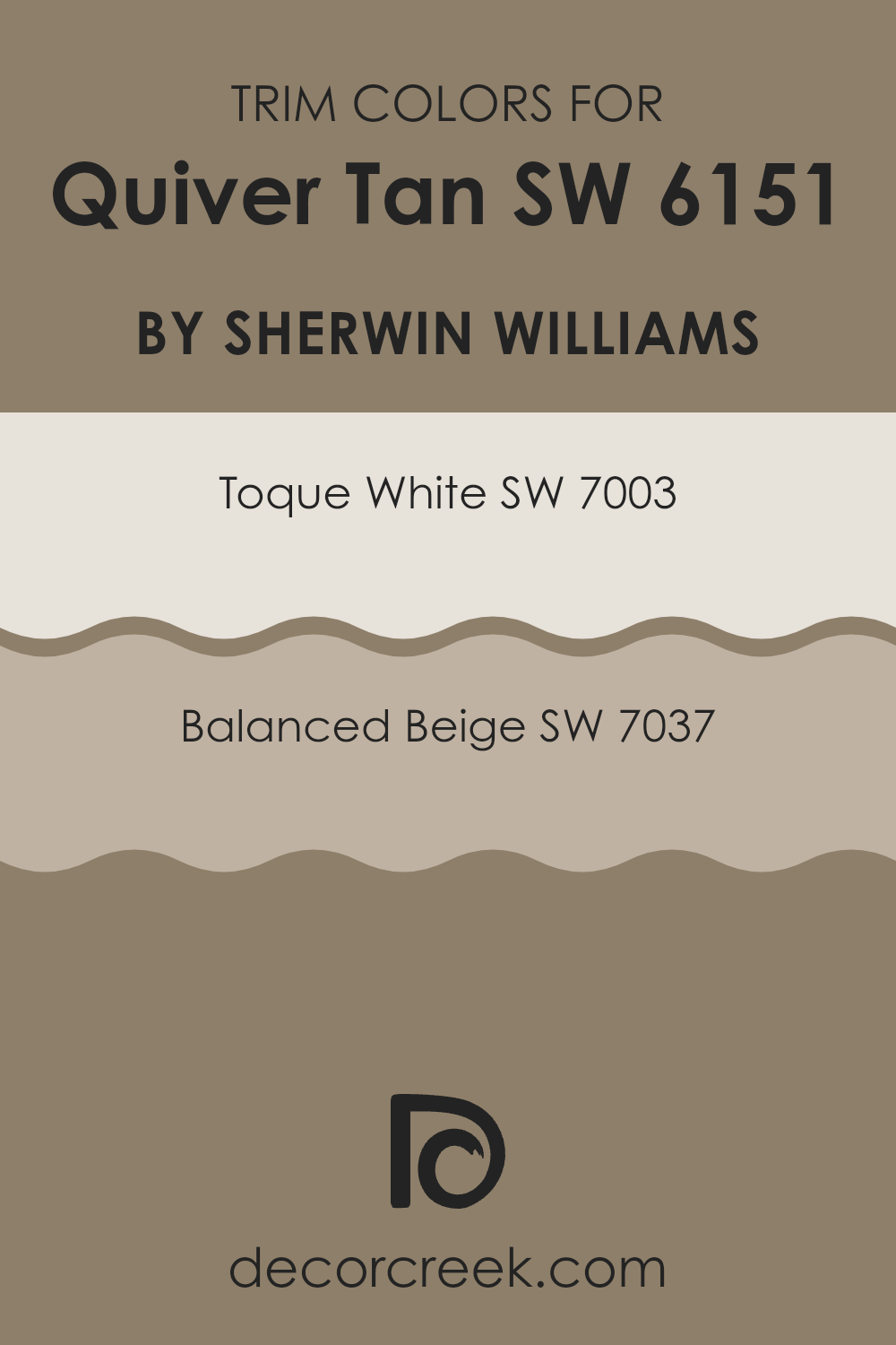
What are the Trim colors of Quiver Tan SW 6151 by Sherwin Williams?
Trim colors are specific shades used to highlight and define the architectural details and edges of a room, such as door frames, window sills, and baseboards. When painting a room in Quiver Tan (SW 6151), choosing the right trim colors can greatly improve the overall look and clearly outline the room’s features.
Toque White (SW 7003) and Balanced Beige (SW 7037) are great choices for trim because they provide contrast that stands out without feeling too bold, keeping the walls as the main focus. Toque White (SW 7003) is a soft, clean shade that brings a fresh, crisp outline to a room, making it a lovely match for the warmer tones of Quiver Tan.
It can make any room feel more open and light, which is especially helpful for smaller or darker rooms. Balanced Beige (SW 7037), on the other hand, adds gentle depth as a trim color, creating a smooth transition that blends beautifully with the rich, warm tone of Quiver Tan. This shade is perfect for adding a touch of warmth to the trim, enhancing the comfort of the room without making it feel closed or heavy.
You can see recommended paint colors below:
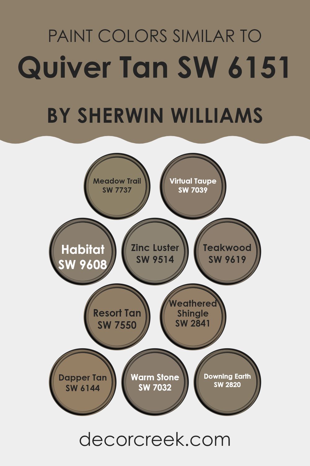
Colors Similar to Quiver Tan SW 6151 by Sherwin Williams
Choosing similar colors for a design plan is important because they create a balanced and seamless look. When shades close in hue or saturation are used together, they make rooms feel more connected and smooth. For example, when decorating a room, using tones that naturally complement each other enhances the overall mood. It avoids strong contrasts and makes the room feel more comfortable and inviting. This method is especially useful for building a calm and unified visual flow.
One way to use a cohesive palette is by including a warm neutral like Meadow Trail. This color offers gentle earthiness that pairs beautifully with other natural tones. Virtual Taupe is another great choice for those who want a slightly deeper shade that still holds warmth, making it perfect for creating a gentle, welcoming feeling.
Habitat, with its richer earthy tone, adds depth and works wonderfully as an accent or grounding color in a room. Another shade, Zinc Luster, brings a soft metallic-like sheen that can quietly add elegance without making the room feel heavy. Teakwood, with its strong warmth, pairs perfectly with other browns to boost the inviting charm of any room.
Resort Tan adds a sun-warmed, gentle layer that feels soothing, while Weathered Shingle gives an aged, graceful look that pairs well with both light and dark shades. Dapper Tan has a soft, dusty character, ideal for creating a cozy, lived-in feeling.
Warm Stone appears slightly cooler yet stays within the earthy range, blending beautifully with more grounded colors. Lastly, Downing Earth shows a deep, muted brown that adds weight and richness, anchoring lighter shades nicely. Using such tones ensures a well-rounded and pleasing design that feels both unified and thoughtfully balanced.
You can see recommended paint colors below:
- SW 7737 Meadow Trail
- SW 7039 Virtual Taupe
- SW 9608 Habitat
- SW 9514 Zinc Luster
- SW 9619 Teakwood
- SW 7550 Resort Tan
- SW 2841 Weathered Shingle
- SW 6144 Dapper Tan
- SW 7032 Warm Stone
- SW 2820 Downing Earth
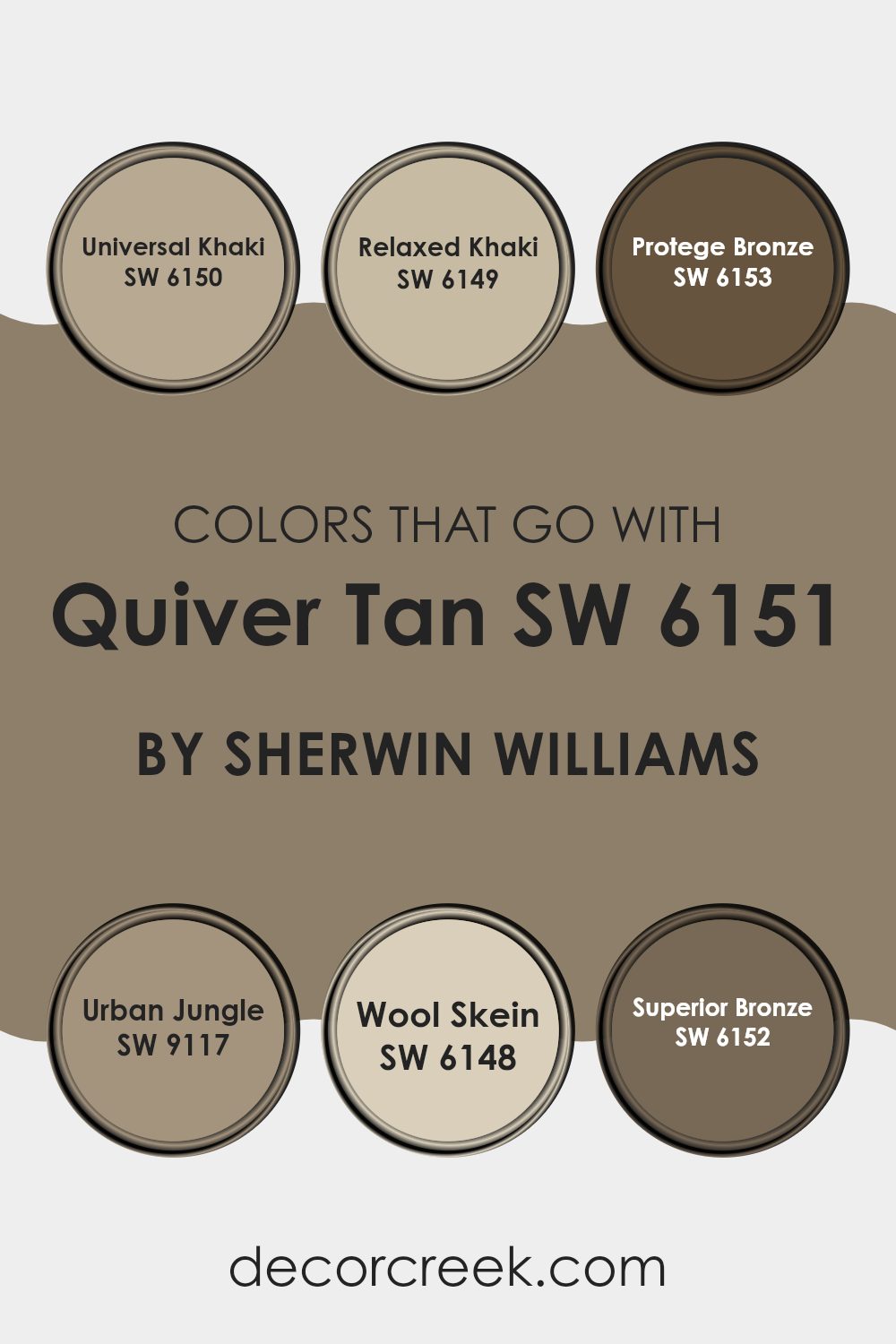
Colors that Go With Quiver Tan SW 6151 by Sherwin Williams
Choosing the right colors to pair with Quiver Tan SW 6151 by Sherwin Williams can deeply influence the mood and character of any room. These matching shades are thoughtfully chosen to create a balanced look that highlights the main color’s natural charm.
For example, when paired with Universal Khaki SW 6150, which carries a slightly greener tint, it makes the room feel grounded and well-balanced. Relaxed Khaki SW 6149, a lighter and softer shade, draws out the warmth in Quiver Tan, giving rooms a cozy and inviting feeling.
Protege Bronze SW 6153 is a deeper, richer hue that adds a touch of elegance when paired with Quiver Tan. It helps define the room with a more noticeable contrast, making it perfect for accent walls or furniture.
Urban Jungle SW 9117, on the other hand, is a fresh and modern green that adds liveliness and energy, making it ideal for room meant to feel bright and uplifting. Wool Skein SW 6148, with its gentle yellow undertone, pairs beautifully with Quiver Tan by adding a soft, glowing warmth that enhances natural light in the room.
Lastly, Superior Bronze SW 6152, with its bold and dramatic tone, creates a striking mix that’s great for highlighting architectural details or creating focal points. Using these companion shades ensures a tasteful and unified palette that suits a wide range of interiors and styles.
You can see recommended paint colors below:
- SW 6150 Universal Khaki
- SW 6149 Relaxed Khaki
- SW 6153 Protege Bronze
- SW 9117 Urban Jungle
- SW 6148 Wool Skein
- SW 6152 Superior Bronze
How to Use Quiver Tan SW 6151 by Sherwin Williams In Your Home?
Quiver Tan SW 6151 by Sherwin Williams is a warm, inviting beige paint color that works beautifully to create a cozy and comfortable feeling in your home. Its soft tan tone pairs well with many other colors, making it a flexible choice for any room.
You can use it in your living room to create a neutral background for both bright and calm furniture and décor. In the bedroom, Quiver Tan brings a gentle calmness, perfect for a restful setting. It’s also a wonderful choice for kitchens or dining rooms, as it complements wood finishes and strengthens the welcoming mood of the heart of the home.
For those wanting to refresh their walls without choosing a bold shade, Quiver Tan is ideal. It offers just the right amount of warmth to make rooms feel more inviting, without taking attention away from other details. Overall, it’s a great option for anyone hoping to give their home a renewed and comforting touch.
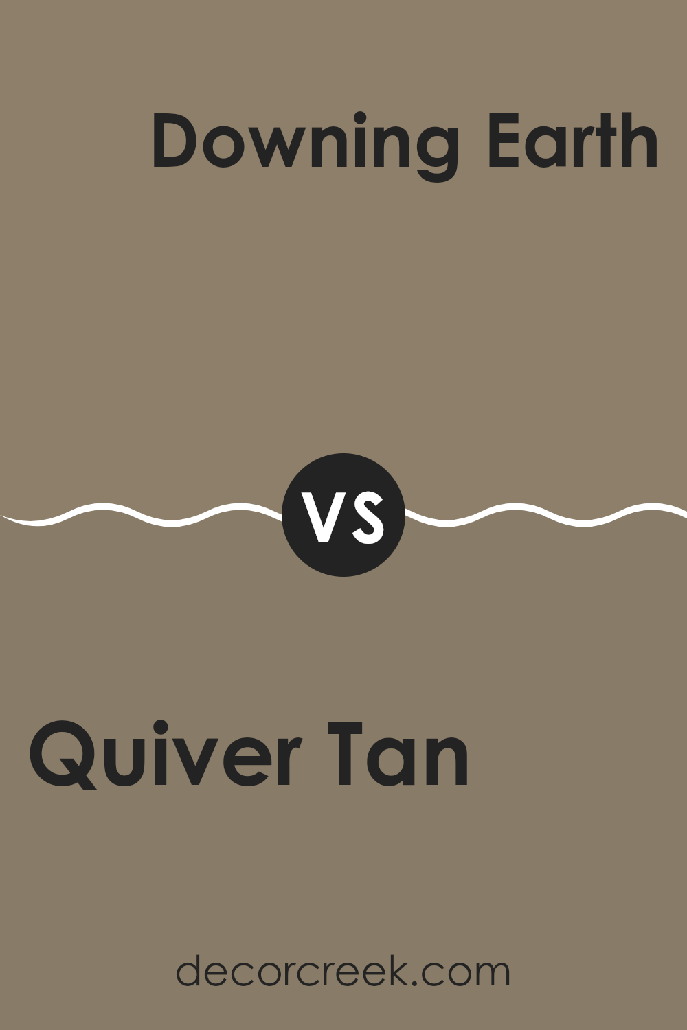
Quiver Tan SW 6151 by Sherwin Williams vs Downing Earth SW 2820 by Sherwin Williams
Quiver Tan and Downing Earth are two distinct shades from Sherwin Williams. Quiver Tan is a light, sandy beige with a warm undertone that gives a cozy and welcoming feeling. It’s perfect for rooms where you want to create a gentle, neutral background that pairs easily with different colors and textures.
Downing Earth, by contrast, is a much deeper shade — a rich brown with warm undertones that bring depth and strength. This color adds a bold, grounding touch to any room, making it feel more enclosed and comforting.
While Quiver Tan reflects more light, helping a room feel open and airy, Downing Earth absorbs light, making large rooms feel warmer and more snug. Each color plays a different role depending on the mood and size of the room you’re designing.
You can see recommended paint color below:
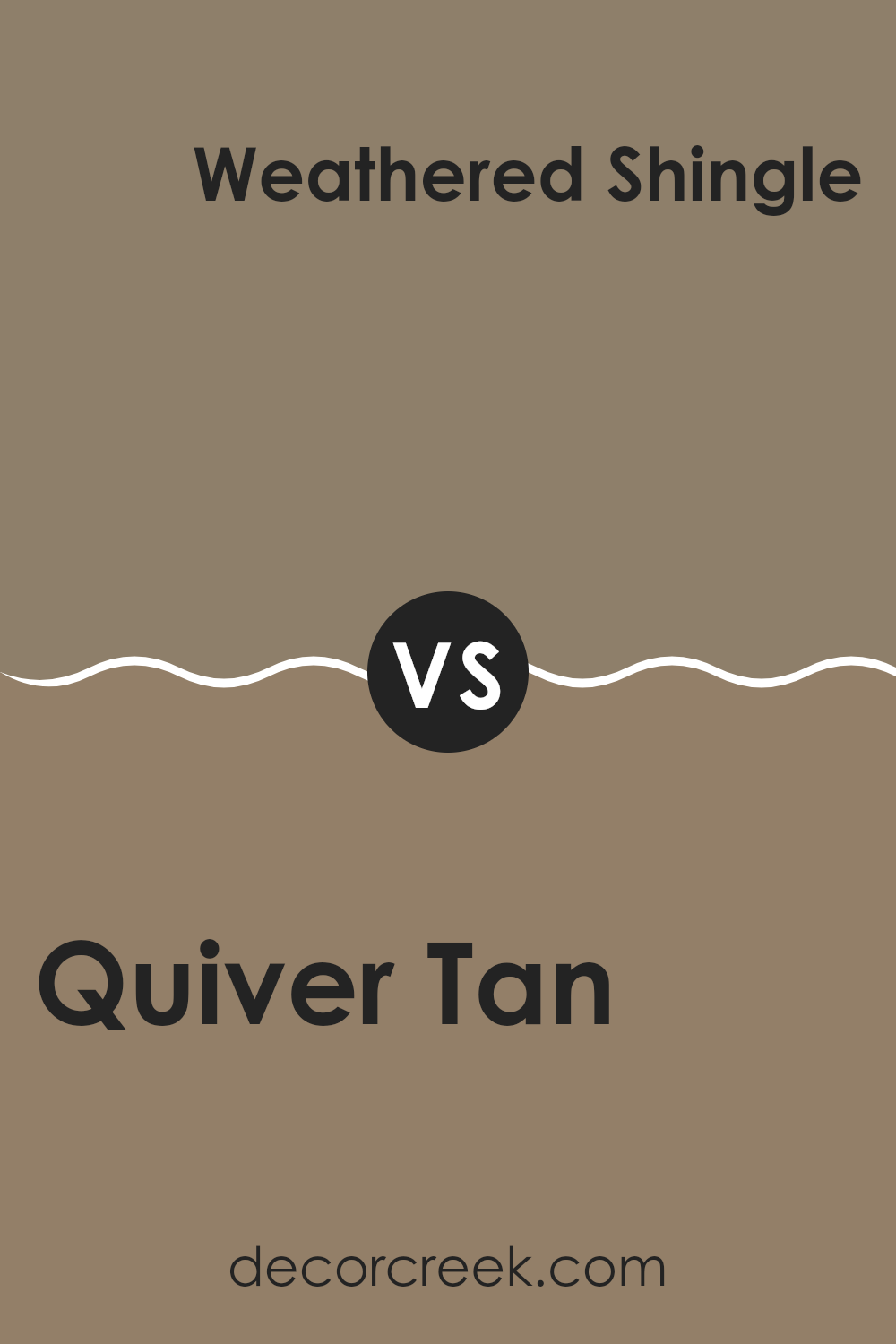
Quiver Tan SW 6151 by Sherwin Williams vs Weathered Shingle SW 2841 by Sherwin Williams
Quiver Tan and Weathered Shingle are two distinct shades from Sherwin Williams. Quiver Tan is lighter, offering a warm and welcoming beige that helps rooms feel cozy and bright. It’s perfect for building a gentle backdrop that pairs well with both bold and soft color schemes.
Weathered Shingle, on the other hand, is a deeper gray-brown shade that captures the rustic and enduring look of aged wood shingles. This color adds depth and character to a room, making it ideal for accent walls or rooms where a moodier, grounding feel is desired.
When it comes to use, Quiver Tan works beautifully in almost any room, adding warmth without taking over the look, while Weathered Shingle fits best in areas that can handle a darker tone without feeling too closed in. Using both together can create a lovely contrast that highlights each color’s unique character and balance.
You can see recommended paint color below:
Quiver Tan SW 6151 by Sherwin Williams vs Habitat SW 9608 by Sherwin Williams
Quiver Tan and Habitat are two distinct shades from Sherwin Williams. Quiver Tan is a soft, warm beige with a touch of yellow that gives it a cozy and welcoming feeling. It’s perfect for creating a gentle, relaxed mood in a room.
Habitat, on the other hand, is a deeper brown with green undertones that bring a natural, earthy character to areas. This color adds depth and warmth, making a room feel more grounded and snug.
Together, these two shades can create a lovely balance of light and richness. Quiver Tan works beautifully on main walls to keep the room bright and open, while Habitat can be used as an accent on a feature wall or trim to add grounding contrast and visual interest to the overall design.
You can see recommended paint color below:
Quiver Tan SW 6151 by Sherwin Williams vs Dapper Tan SW 6144 by Sherwin Williams
Quiver Tan and Dapper Tan are two warm, welcoming shades from Sherwin Williams, each with its own personality. Quiver Tan is lighter and softer, making it ideal for brightening smaller rooms or room with limited natural light. Its gentle beige tone creates a clean background that suits both bold and subtle décor, offering flexibility across different styles.
Dapper Tan, by contrast, is deeper and richer, bringing more presence and depth to a room. It’s excellent for creating a cozy and inviting feeling, especially in larger areas or areas where a darker, comforting tone is desired without losing warmth.
These two shades also work beautifully together, allowing for a layered, balanced look that adds dimension and harmony to your design. Whether paired or used individually, each color offers a unique way to shape a warm and stylish living environment.
You can see recommended paint color below:
- SW 6144 Dapper Tan
Quiver Tan SW 6151 by Sherwin Williams vs Teakwood SW 9619 by Sherwin Williams
Quiver Tan and Teakwood are two distinct shades from Sherwin Williams that bring different moods to interior design. Quiver Tan is a light, warm beige with soft yellow undertones, perfect for creating a cozy and welcoming feeling. It pairs beautifully with crisp whites or gentle earth tones, adding a calm and balanced vibe without making the room feel too enclosed.
Teakwood, in contrast, is a deep, rich brown that carries a sense of elegance and classic charm. It adds depth and character to any room, making it ideal for accent walls, cabinetry, or furniture pieces. When paired with lighter tones, it creates a striking yet harmonious contrast that keeps the room grounded and refined.
Together, these colors offer a wonderful balance of warmth and depth — Quiver Tan brightens and softens, while Teakwood enriches and grounds. The choice between them depends on whether you want a light, airy mood or a bold, refined atmosphere.
You can see recommended paint color below:
Quiver Tan SW 6151 by Sherwin Williams vs Virtual Taupe SW 7039 by Sherwin Williams
Quiver Tan and Virtual Taupe by Sherwin Williams are two distinct shades that suit a variety of interior styles. Quiver Tan, the lighter hue, brings gentle warmth that helps create a cozy and welcoming feeling, making it perfect for living rooms or bedrooms.
Its lighter tone reflects more light, giving rooms an open and airy quality. Virtual Taupe, in contrast, is a deeper, richer shade with a strong and steady character, ideal for accent walls or larger areas where it adds depth without feeling too heavy.
Because of its darker tone, Virtual Taupe also helps conceal wall imperfections and gives rooms a more grounded and defined appearance. In design pairings, Quiver Tan complements soft, light tones beautifully, while Virtual Taupe works equally well with both bold and subtle accents, offering great flexibility for balanced and stylish interiors.
You can see recommended paint color below:
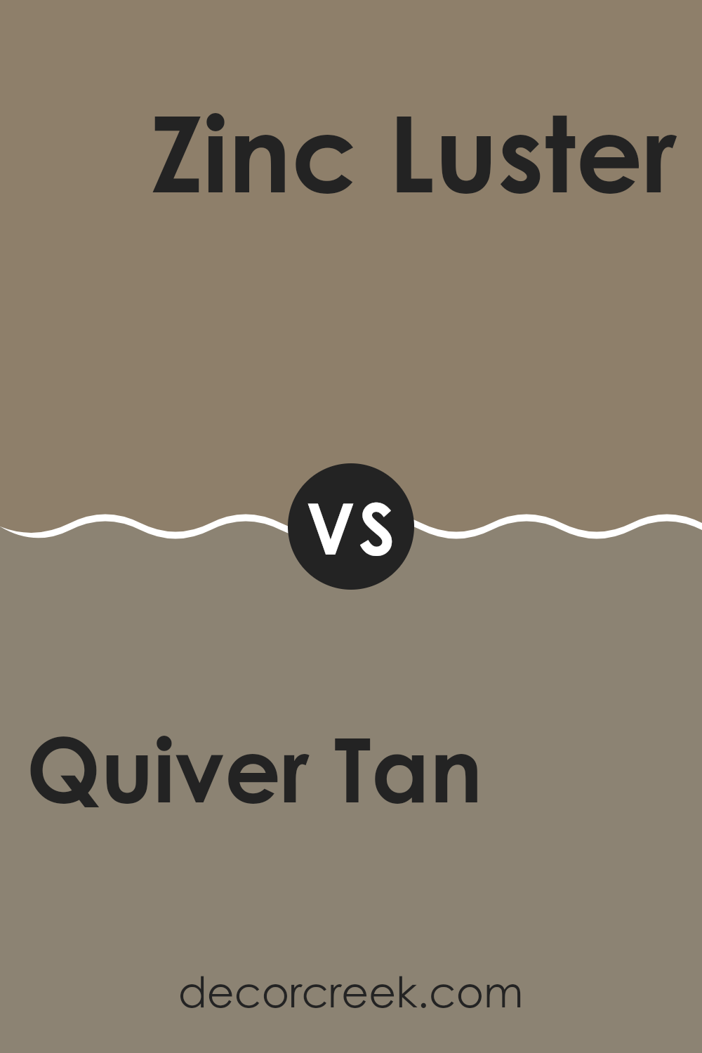
Quiver Tan SW 6151 by Sherwin Williams vs Zinc Luster SW 9514 by Sherwin Williams
The main color, Quiver Tan, is a warm, inviting beige that has subtle yellow undertones, giving it a cozy and soft appearance. It works well in rooms that aim for a relaxed and welcoming feel, such as living rooms or bedrooms.
On the other hand, Zinc Luster is a darker gray shade with hints of blue, creating a moodier and more pronounced effect. It’s perfect for adding a touch of drama and modernity to a room, making it ideal for accent walls or contemporary settings.
Overall, Quiver Tan provides a comfortable, gentle backdrop, while Zinc Luster offers a stronger, more dynamic aesthetic. These colors could complement each other in a room that balances neutral warmth with chic boldness.
You can see recommended paint color below:
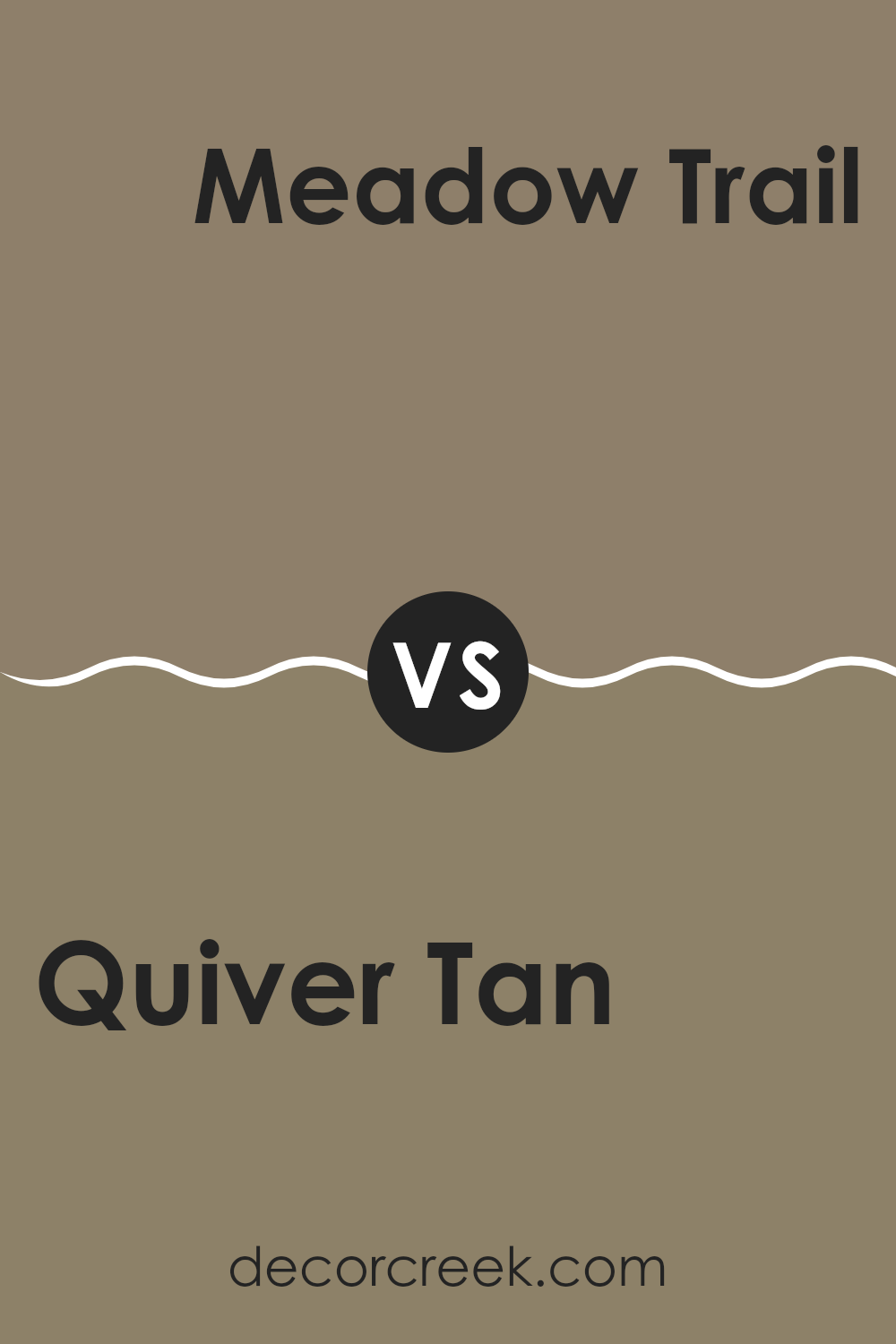
Quiver Tan SW 6151 by Sherwin Williams vs Meadow Trail SW 7737 by Sherwin Williams
Quiver Tan and Meadow Trail are two distinct paint colors by Sherwin Williams, each offering its unique charm. Quiver Tan is a soft, beige color that has a warm, inviting feel. It’s perfect for creating a cozy atmosphere in any room, often used in living areas or bedrooms where comfort is key. It pairs well with various furnishings, making it a flexible choice for many homes.
On the other hand, Meadow Trail is a deeper, olive green shade that brings a touch of nature indoors. This color is great for those who prefer something a little bolder and more earthy. It works well in rooms that aim to have a more grounded, natural look, like studies or dining rooms.
Both colors provide their respective moods and can significantly influence the aesthetic of a room. While Quiver Tan offers a classic, understated elegance, Meadow Trail steps a bit bolder with a lively reflection of the outdoors.
You can see recommended paint color below:
- SW 7737 Meadow Trail
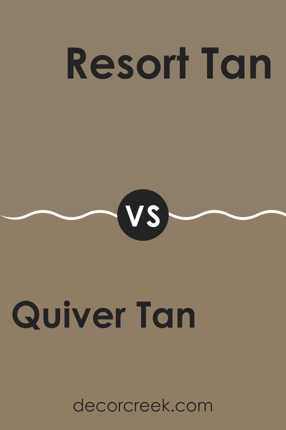
Quiver Tan SW 6151 by Sherwin Williams vs Resort Tan SW 7550 by Sherwin Williams
Both Quiver Tan and Resort Tan by Sherwin Williams are warm neutrals, but they bring different moods to a room due to their underlying tones and depth. Quiver Tan is a lighter, softer beige that offers a subtle, airy feel to rooms. It’s excellent for creating a relaxed, comfortable atmosphere without making a room feel too small, making it an ideal choice for smaller rooms or areas with limited natural light.
On the other hand, Resort Tan is a deeper, richer tan shade. This color provides a cozy warmth, perfect for rooms where a more inviting, enveloping feel is desired. It works well in larger areas or rooms that can handle a darker shade without feeling closed in.
Their differing depths mean that while Quiver Tan might be better for a casual, light setting such as a sunroom or a breezy living area, Resort Tan could be the better pick for formal rooms or a den where you might want a bit more of a grounded, secure feeling. Both colors coordinate well with various decor styles and add a touch of natural warmth to any room.
You can see recommended paint color below:
- SW 7550 Resort Tan
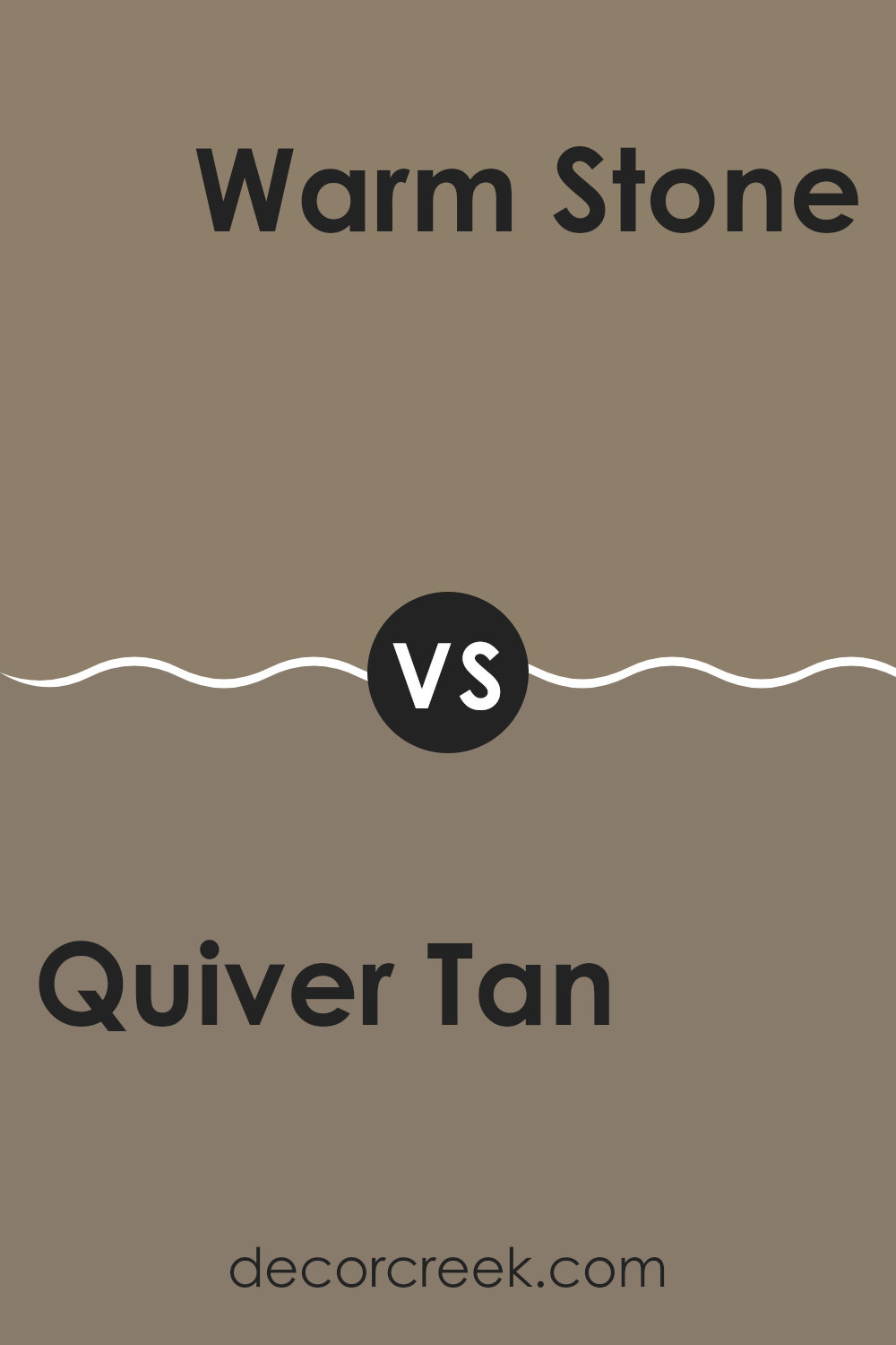
Quiver Tan SW 6151 by Sherwin Williams vs Warm Stone SW 7032 by Sherwin Williams
Quiver Tan and Warm Stone are both neutral shades by Sherwin Williams, but they bring different moods to a room. Quiver Tan is a soft, gentle beige that creates a cozy and welcoming feeling. It’s light enough to make smaller rooms seem more open and pairs beautifully with many décor styles, making it a flexible choice.
Warm Stone, in contrast, is a deeper and richer taupe-leaning tone. This color gives a room a more grounded and warm character, perfect for creating a snug and comfortable setting. It works best in larger rooms or rooms with plenty of natural light, as it can make smaller rooms feel tighter if not balanced properly.
Both shades are perfect for those who love subtle, earthy tones in their homes. Whether you choose Quiver Tan for its lightness and flexibility or Warm Stone for its depth and warmth, each provides a balanced and harmonious backdrop that complements any interior style.
You can see recommended paint color below:
In summing up my thoughts on SW 6151 Quiver Tan by Sherwin Williams, I’m really pleased with how warm and welcoming this color makes any room feel. It’s like a gentle hug, wrapping around the walls of a room, making everything look cozy and friendly. Whether it’s in a living room, bedroom, or even a kitchen, Quiver Tan has a special way of making rooms feel more like home.
It’s easy to match with different colors of furniture and decorations because it has such a friendly, neutral shade. This means if you have a blue sofa or a red table, this paint will still look good around them! I noticed that it also looks beautiful at different times of the day; it’s just as lovely in the morning light as it is under a lamp’s glow at night.
Another great thing is that it doesn’t show dirt too quickly. This is especially helpful if there are kids around—they can play freely without worrying much about marks on the walls.
Overall, I find that SW 6151 Quiver Tan is an excellent choice if you want to make your home feel more comfortable and inviting without too much effort. It’s a paint color that works beautifully, making it easy for everyone to enjoy their surroundings.
Ever wished paint sampling was as easy as sticking a sticker? Guess what? Now it is! Discover Samplize's unique Peel & Stick samples.
Get paint samples

