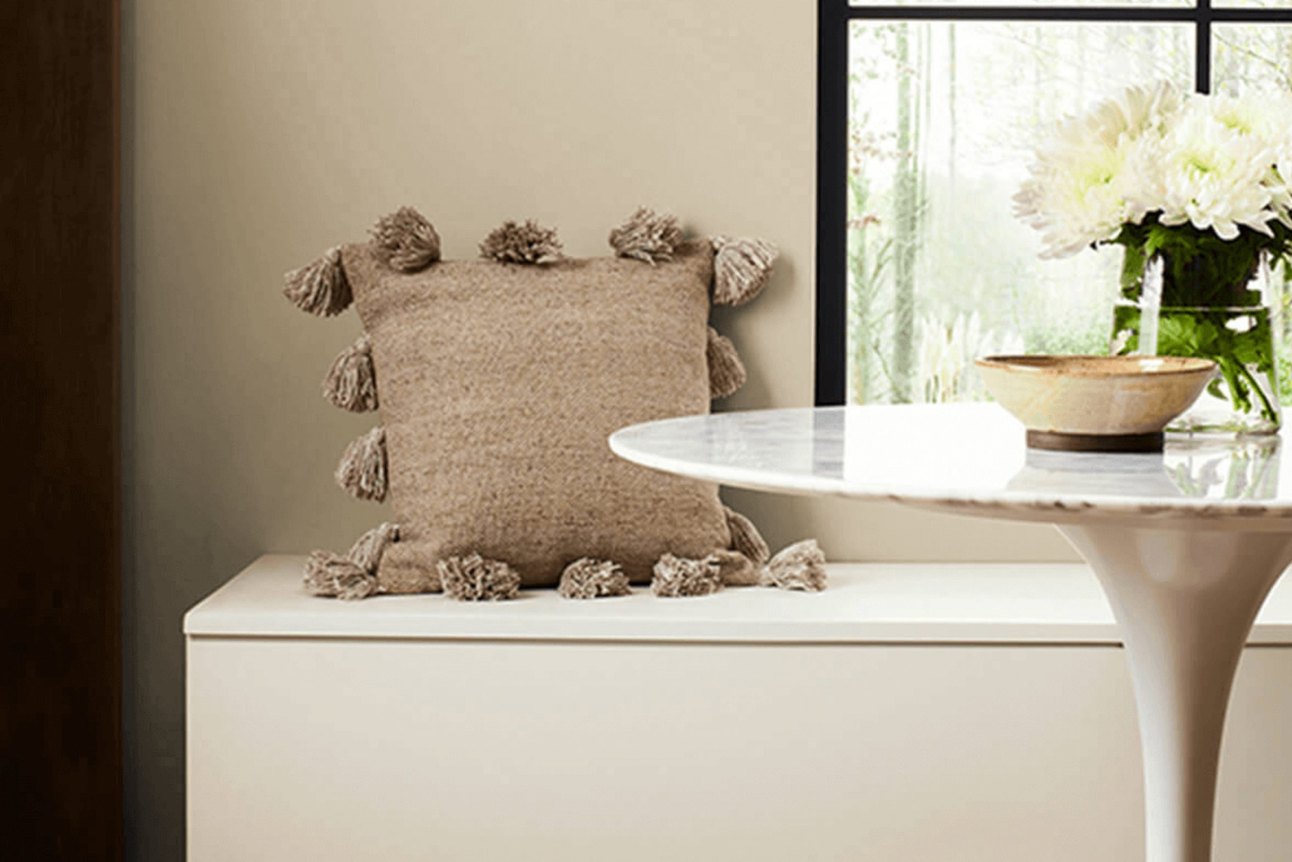
If you’re considering a fresh look for your home, you might find SW 6149 Relaxed Khaki by Sherwin Williams to be a charming option. I recently tried this color myself and was pleased with its soothing, understated elegance.
Relaxed Khaki is a flexible, warm neutral that pairs splendidly with a wide range of decor styles, from rustic to modern. Its ability to act as a backdrop or stand alone as a primary color adds to its appeal. Whether you’re looking to paint an entire room or just accentuate certain features, Relaxed Khaki provides a soft yet refined vibe.
The shade works brilliantly in areas where you want to enhance natural light while maintaining a cozy ambiance. It’s also forgiving, which means it does well in high-traffic areas or rooms where you spend a lot of time.
Join me in considering how this subtle hue could contribute to the calming atmosphere we all seek in our living areas.
What Color Is Relaxed Khaki SW 6149 by Sherwin Williams?
Relaxed Khaki by Sherwin Williams is a warm, inviting beige tone that infuses a cozy and welcoming vibe into any room. This adaptable neutral is perfect for creating a calm and comfortable atmosphere while maintaining a chic and enduring aesthetic. It has a subtle earthiness that makes it an excellent choice for those looking to add a hint of warmth to their interiors without feeling too intense.
This color works exceptionally well in a variety of interior styles, including traditional, rustic, and contemporary. In traditional settings, Relaxed Khaki pairs beautifully with rich woods and classic furniture pieces, enhancing the natural materials without competing for attention.
For a rustic look, it harmonizes with textured elements like stone, distressed wood, and woven materials, contributing to a laid-back, country-inspired feel. In modern and contemporary interiors, it serves as a soft backdrop, allowing bold lines and minimalist decor to stand out.
Relaxed Khaki is particularly effective when paired with soft textures like plush textiles in creams and browns. It also looks stunning when combined with metallic finishes such as brushed nickel or antique brass, providing a subtle contrast that enhances its warmth. Overall, this color is a smart choice for anyone looking to create a soothing and stylish room that feels both fresh and grounded.
Is Relaxed Khaki SW 6149 by Sherwin Williams Warm or Cool color?
Relaxed Khaki by Sherwin Williams is a warm and inviting paint color that many homeowners choose for its calming effect. This shade of khaki has a cozy feel to it, which makes it an excellent choice for rooms where you spend a lot of time relaxing, such as living rooms or bedrooms.
It pairs well with both natural wood tones and various accent colors, allowing for adaptable decorating options. Because of its neutral yet warm base, it can also be used in areas that need a subtle touch of color without feeling too intense.
Whether in a large open area or a small, intimate room, Relaxed Khaki brings a comforting and gentle ambiance. It’s easy to apply and works particularly well in homes aiming for an enduring look. Overall, its ability to blend with different decor styles and settings makes it a favorite among those updating their homes.
Undertones of Relaxed Khaki SW 6149 by Sherwin Williams
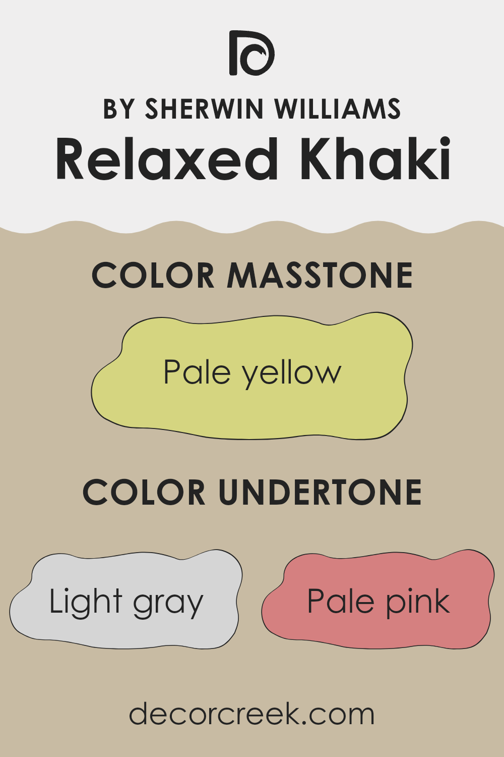
Relaxed Khaki is an adaptable paint color that brings a sense of calmness and warmth to any room. What makes this color special are its undertones—the subtle hints of other colors that can either enhance or slightly shift the main hue depending on the lighting conditions and surrounding environment.
The undertones in Relaxed Khaki are quite diverse, including light gray, pale pink, light purple, mint, light blue, grey, lilac, yellow, orange, light green, and olive. These undertones play a key role in how the color appears in different settings.
For instance, light gray and grey undertones can make the color appear cooler and more neutral, suitable for modern and minimalist rooms. On the other hand, warmer undertones like pale pink, orange, and light purple can add a cozy and inviting touch, making the room feel more comfortable.
When used on interior walls, Relaxed Khaki adjusts beautifully to various lighting conditions. In rooms with lots of natural light, the lighter and cooler undertones, such as light blue and mint, might become more noticeable, giving the room a fresher feel. In rooms with warmer artificial lighting, the yellow, orange, and pale pink undertones can make the walls seem richer and more welcoming.
Understanding these undertones can help you better decide on décor and furniture colors that complement or contrast effectively, improving the overall aesthetic of your room. Whether you aim for a soothing retreat or a lively gathering spot, keeping these undertones in mind can help you achieve the desired mood and style.
What is the Masstone of the Relaxed Khaki SW 6149 by Sherwin Williams?
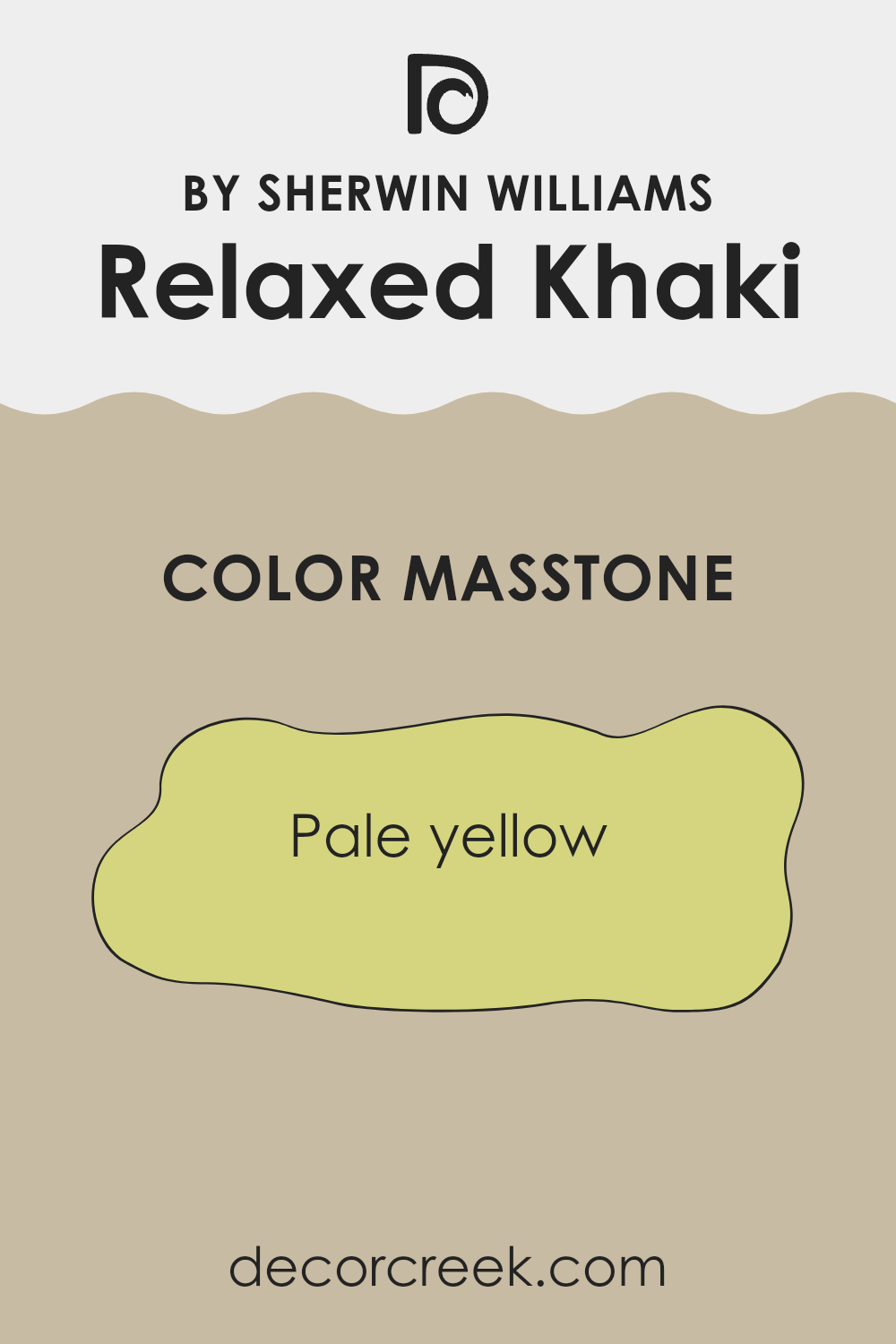
Relaxed Khaki SW 6149 by Sherwin Williams has a masstone of pale yellow, evident in its light, soft hue resembling #D5D580. This color choice reflects a laid-back and welcoming vibe, making it ideal for various rooms in a home. Its gentle yellow undertone ensures it pairs well with a wide range of decor styles, from modern to rustic, adding a subtle warmth without feeling too intense.
This shade’s adaptability also comes into play in the way it interacts with both natural and artificial light, gently enhancing smaller rooms or areas without much light to make them appear brighter and more open.
It works great in living rooms, bedrooms, or even kitchens, where its neutral yet warm tone provides a clean, fresh backdrop that supports a variety of furnishings and accessories. Overall, its effect is to make home areas feel calm and gently inviting.
How Does Lighting Affect Relaxed Khaki SW 6149 by Sherwin Williams?
Lighting has a significant impact on how we perceive colors. The same paint can look different in various lighting conditions. For example, the color Relaxed Khaki, a warm, soft beige, reacts distinctly under different light sources.
In artificial light, such as from LED or incandescent bulbs, this shade tends to appear warmer, enhancing its beige tones. This makes the room feel cozy and inviting, especially under softer, yellow-toned lighting. In stark fluorescent lighting, however, some of the warmth might be reduced, making the color appear slightly duller.
Natural light reveals the truest form of Relaxed Khaki, with its effects varying throughout the day and depending on the room’s orientation. In rooms facing north, light is cooler and more consistent throughout the day. Here, Relaxed Khaki might look a bit more muted and cooler, potentially seeming more neutral rather than warm.
South-facing rooms benefit from intense, warm light for most of the day. Here, Relaxed Khaki shines, looking warmer and more vibrant. It can enhance the coziness of the room and is ideal for living areas where a welcoming atmosphere is desired.
In east-facing rooms, the color will look brightest and warmest in the morning as the sun rises, casting a soft, warm glow. As the day progresses and the natural light fades, the color will lose some of its warmth and shift toward a more neutral, calm beige.
Lastly, in west-facing rooms, Relaxed Khaki will display a neutral tone during most of the day but will warm up in the evening as the sun sets, bringing out rich, warm hues. This shift can add a pleasant dynamic to the room, making it more lively in the evening.
Overall, Relaxed Khaki’s look is quite adaptable, harmonizing well with both artificial and natural light, though the tone and mood it creates can vary notably depending on the lighting in the room.
What is the LRV of Relaxed Khaki SW 6149 by Sherwin Williams?
LRV stands for Light Reflectance Value, a measure used to describe the percentage of light a paint color reflects when it’s applied to a surface. This measurement helps in understanding how light or dark a color will appear once it’s on your walls.
A higher LRV means the color reflects more light, making it appear lighter and helping the room feel more open. Conversely, a lower LRV means the color absorbs more light, which can make a room feel cozier but smaller. LRV is particularly useful when choosing paint colors because it can greatly influence the atmosphere and mood of a room.
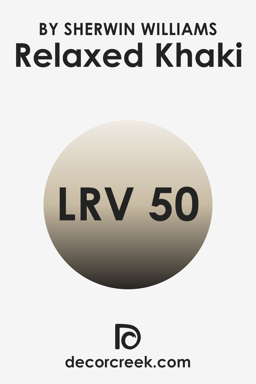
The LRV of Relaxed Khaki is 50.481, which places it in the middle of the LRV scale. This means it neither reflects light excessively nor absorbs too much. It strikes a nice balance, making it a flexible choice that can work well in various lighting conditions and room sizes.
In rooms with less natural light, this color will bring a warm and welcoming feel without making the area seem too enclosed. In well-lit rooms, it will have a soft, balanced appearance, neither dominating the room with brightness nor receding into darkness. This makes Relaxed Khaki a dependable choice for those seeking a balanced look in their decorating plans.
Coordinating Colors of Relaxed Khaki SW 6149 by Sherwin Williams
Coordinating colors are those that work harmoniously alongside each other to create a pleasing and balanced aesthetic. These colors can either complement each other or provide a gentle contrast, both aiming to enhance the overall look of a room. For example, if a primary color is used on the walls, coordinating colors can be used for furnishings, trims, or accent areas. Such combinations can bring a room together, making it feel more unified and visually appealing.
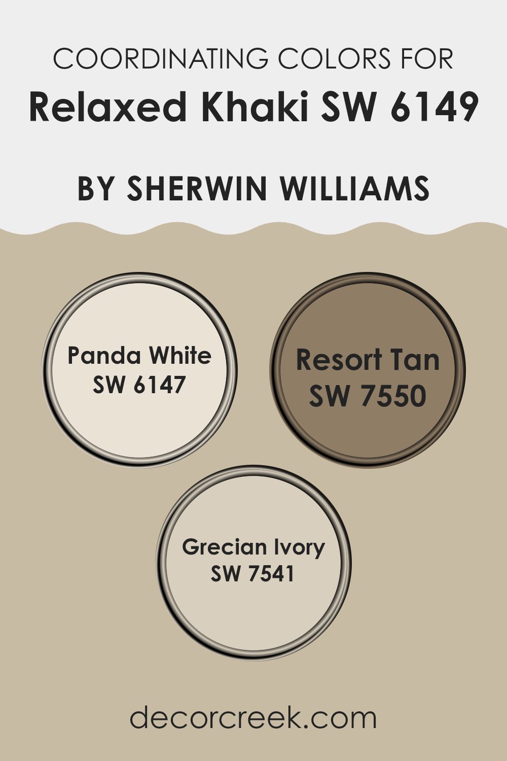
For the color Relaxed Khaki by Sherwin Williams, there are specific coordinating colors that pair beautifully with it. Panda White (SW 6147) is a soft, clean white that can brighten rooms effectively when used with Relaxed Khaki, providing a fresh and airy feel to any area.
Resort Tan (SW 7550) is a deeper, warm beige that adds depth and comfort when used alongside Relaxed Khaki, perfect for creating a cozy and inviting mood. Lastly, Grecian Ivory (SW 7541) is a gentle, creamy hue that blends beautifully with the understated tone of Relaxed Khaki, perfect for achieving a subtle yet refined look. Together, these coordinating colors offer a range of options to enhance the beauty of Relaxed Khaki in different settings and styles.
You can see recommended paint colors below:
- SW 6147 Panda White
- SW 7550 Resort Tan
- SW 7541 Grecian Ivory
What are the Trim colors of Relaxed Khaki SW 6149 by Sherwin Williams?
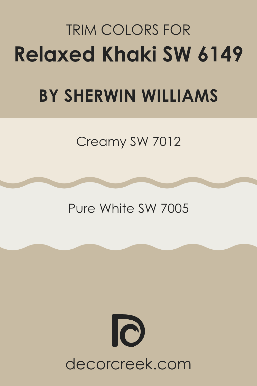
Trim colors are essential accents that define and complement the main color used on walls and larger surfaces. By carefully selecting trim colors, you can highlight the architectural details of a room, creating a polished and complete look. For a color like Relaxed Khaki by Sherwin Williams, using the right trim color is key to achieving a balanced and cohesive result. The trim acts as a frame, helping separate different colors and materials used in a room, making design elements more defined and visually engaging.
Creamy (SW 7012) is a soft and warm white that provides a gentle contrast when paired with Relaxed Khaki, adding a touch of warmth to the overall atmosphere without overpowering the calm character of the khaki. Pure White (SW 7005), in contrast, offers a sharp, clean boundary against the more subdued khaki, giving a fresh and bright appearance to any area.
The brightness of Pure White makes it an excellent choice for enhancing light within a room, helping it feel larger and more open. Deciding between these trim colors depends on the desired effect and the amount of natural light in the room, with each bringing its own distinct harmony to Relaxed Khaki.
You can see recommended paint colors below:
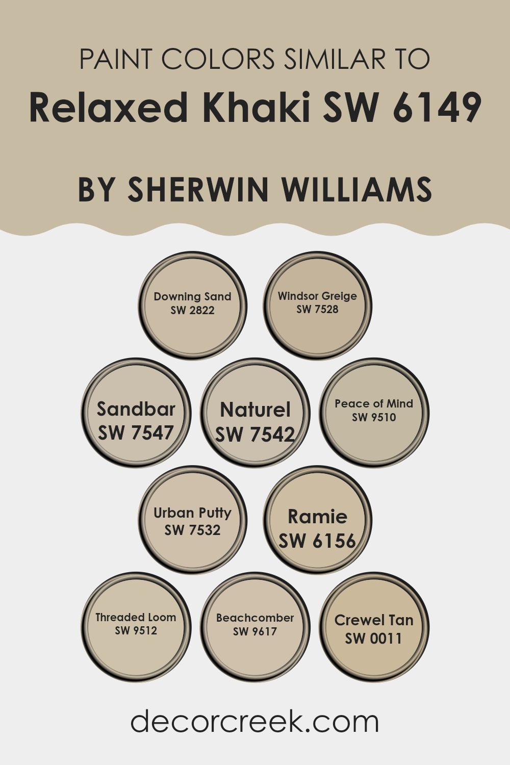
Colors Similar to Relaxed Khaki SW 6149 by Sherwin Williams
Choosing related colors in home decor is essential for creating a visually appealing and harmonious atmosphere. Colors close in hue work beautifully together because they share a common base tone, allowing the transition from one color to the next in a room to feel smooth and cohesive.
When considering colors similar to Relaxed Khaki by Sherwin Williams, shades like Downing Sand, Windsor Greige, or Sandbar are excellent companions. These tones carry a gentle warmth and subtle neutrality that complement without dominating, perfect for giving rooms a consistent and seamless appearance.
Downing Sand offers a sandy touch that’s bright yet understated, ideal for rooms needing a soft lift. Likewise, Windsor Greige blends gray and beige into a balanced backdrop that fits well with any decor style. Sandbar is another soft neutral, slightly deeper, adding a quiet depth to interiors.
Naturel and Peace of Mind are somewhat richer hues that bring a hint of complexity to a color palette while keeping the mood calm. Urban Putty leans darker, offering more definition and shadow for areas that benefit from contrast.
Ramie has an earthy character, while Threaded Loom introduces a dustier tone that feels grounding. Beachcomber and Crewel Tan, in contrast, lend a more traditional touch—the first evoking coastal ease and the second offering a lasting, classic warmth. Using these closely related colors together creates a gentle flow throughout a room, making it feel thoughtfully coordinated and comfortably refined.
You can see recommended paint colors below:
- SW 2822 Downing Sand
- SW 7528 Windsor Greige
- SW 7547 Sandbar
- SW 7542 Naturel
- SW 9510 Peace of Mind
- SW 7532 Urban Putty
- SW 6156 Ramie
- SW 9512 Threaded Loom
- SW 9617 Beachcomber
- SW 0011 Crewel Tan
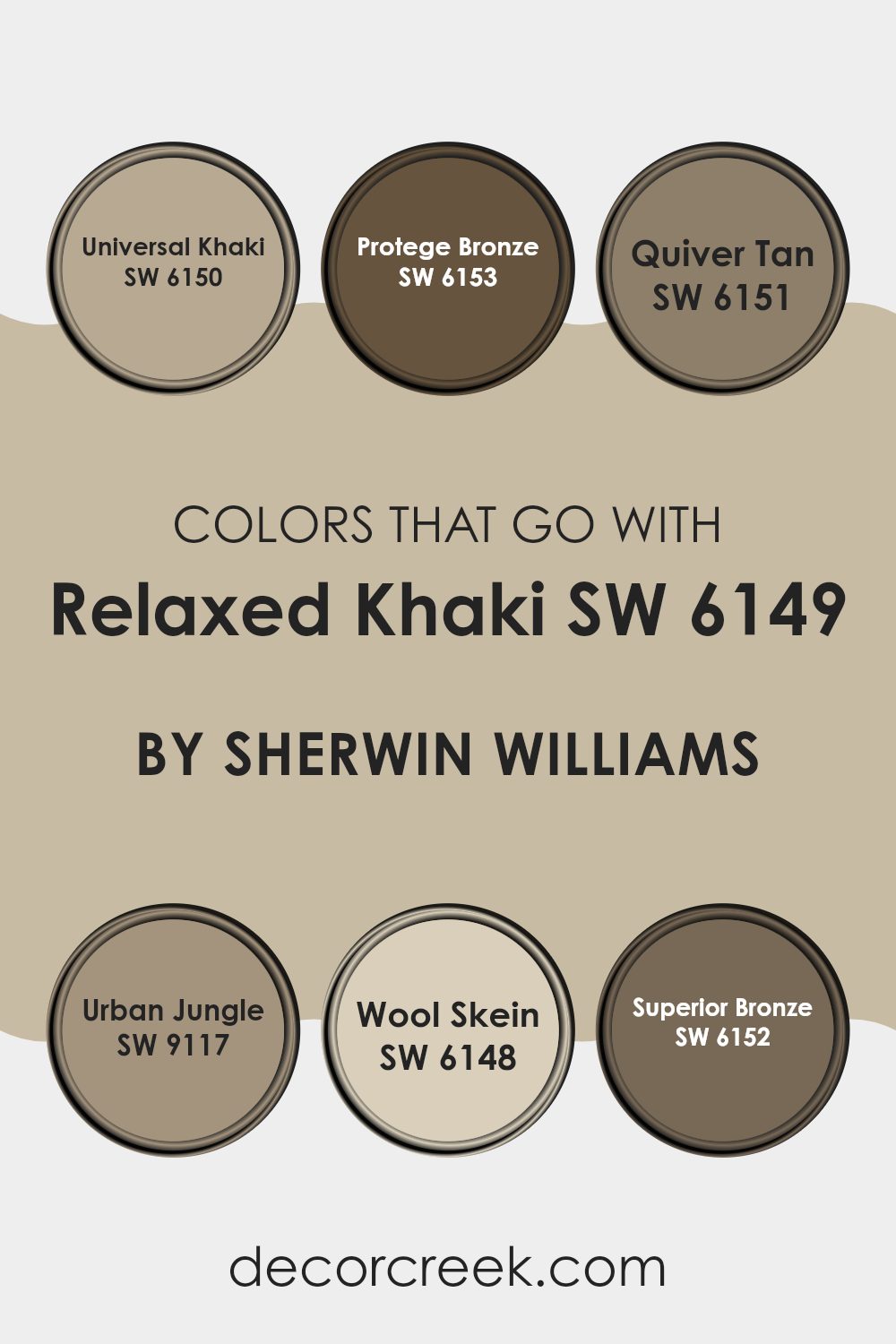
Colors that Go With Relaxed Khaki SW 6149 by Sherwin Williams
Choosing the right colors to pair with Relaxed Khaki SW 6149 by Sherwin Williams is essential because it helps create a balanced and appealing look in any room. Complementary colors like Universal Khaki SW 6150 and Quiver Tan SW 6151 add subtle variation to the environment without feeling too intense.
These shades are close enough to provide a soft contrast yet similar enough to maintain a unified appearance. Likewise, Wool Skein SW 6148 offers a lighter tone that can brighten a room while still aligning with the earthy warmth of Relaxed Khaki.
In contrast, colors like Protege Bronze SW 6153 and Superior Bronze SW 6152 introduce a deeper dimension, adding warmth and richness to the palette. These stronger hues work beautifully for accent walls or furniture, providing a grounded base that pairs naturally with the lighter khaki.
Meanwhile, Urban Jungle SW 9117 brings in a gentle greenish undertone that feels natural and refreshing, perfect for those wanting to weave a hint of nature into their room. Together, these colors form a cohesive and welcoming atmosphere, suitable for decorating styles ranging from minimalist to more classic interiors.
You can see recommended paint colors below:
- SW 6150 Universal Khaki
- SW 6153 Protege Bronze
- SW 6151 Quiver Tan
- SW 9117 Urban Jungle
- SW 6148 Wool Skein
- SW 6152 Superior Bronze
How to Use Relaxed Khaki SW 6149 by Sherwin Williams In Your Home?
Relaxed Khaki by Sherwin Williams is a warm, neutral paint color that brings a cozy and inviting feel to any room. Its earthy tones make it a perfect choice for creating a calm and comfortable atmosphere. This color works well in living rooms and bedrooms where you want to build a soothing and restful mood.
It’s also great for a home office as it provides a subtle backdrop that doesn’t distract. You can pair Relaxed Khaki with white trim to keep things light and open, or with dark woods for a more grounded appearance. It’s adaptable enough to fit many different decor styles, from rustic to modern.
If you’re considering refreshing your walls, think about using this shade as a base color. It will coat your walls in a beautiful, natural tone that’s gentle on the eyes and pairs nicely with a range of furnishings and accent shades.
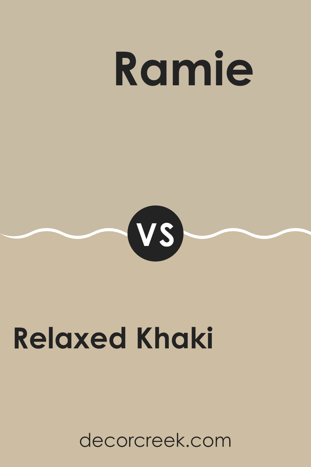
Relaxed Khaki SW 6149 by Sherwin Williams vs Ramie SW 6156 by Sherwin Williams
Relaxed Khaki and Ramie by Sherwin Williams are two neutral paint colors that create subtly different moods for room decor. Relaxed Khaki is a soft, warm beige with a cozy feel, perfect for shaping a welcoming atmosphere in any room. It pairs beautifully with both bold and muted accents, making it adaptable for various styling choices.
Ramie, in contrast, is a slightly lighter shade that leans toward a neutral, muted green. It brings a fresh and clean appearance, helping rooms feel more open and airy. This color performs especially well in areas with abundant natural light or in areas where you want to create a sense of openness.
Both colors are understated and blend beautifully with a range of styles, from modern to rustic. Whether you prefer the warmer tones of Relaxed Khaki or the softer, breezier character of Ramie, each delivers a distinct mood without feeling too intense.
You can see recommended paint color below:
- SW 6156 Ramie
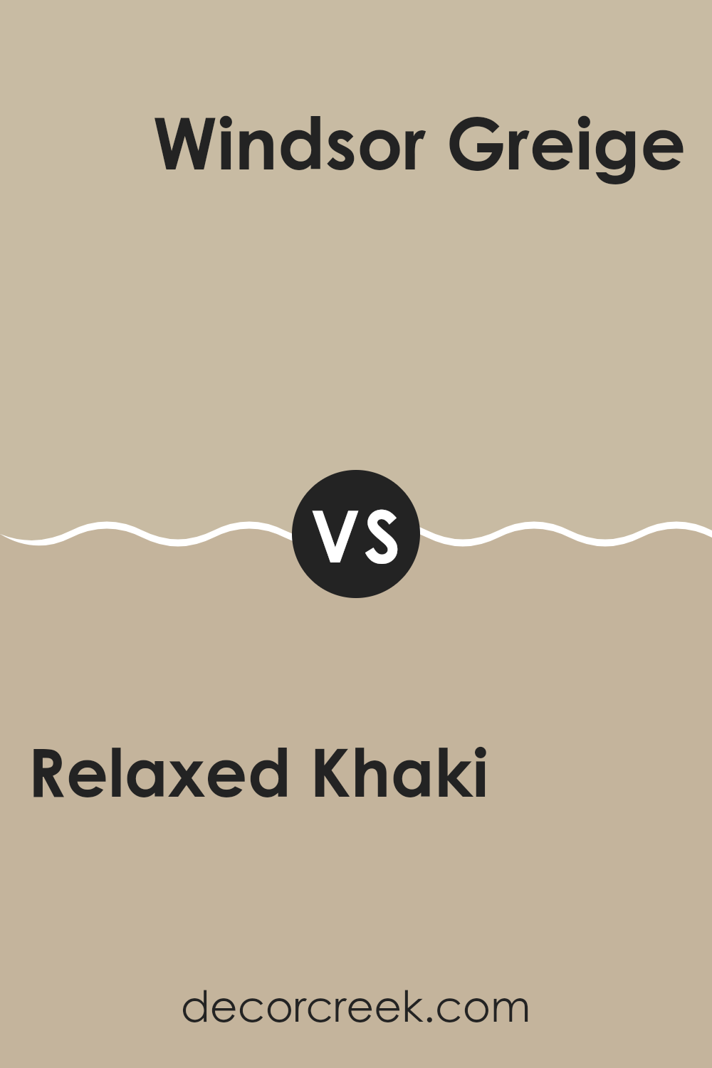
Relaxed Khaki SW 6149 by Sherwin Williams vs Windsor Greige SW 7528 by Sherwin Williams
Relaxed Khaki and Windsor Greige are two well-loved shades from Sherwin Williams. Relaxed Khaki is a soft, warm beige that brings a cozy and welcoming feel to any room. It has a calming quality, perfect for areas where you want to unwind and feel at ease. The lightness of the color makes it adaptable and simple to pair with different decor styles and accent tones.
Windsor Greige, in contrast, leans more toward a gray tone with a touch of beige. This color is slightly darker than Relaxed Khaki and offers a more grounded, steady look. It’s ideal for those who prefer a neutral backdrop that still adds depth to a room without feeling too strong. This shade performs well in high-traffic areas, such as hallways and living rooms, since it hides scuffs and marks effectively.
Overall, while Relaxed Khaki brings warmth and brightness to a room, Windsor Greige provides a cooler, understated neutrality—making both colors excellent yet distinct choices for home interiors.
You can see recommended paint color below:
Relaxed Khaki SW 6149 by Sherwin Williams vs Beachcomber SW 9617 by Sherwin Williams
The two colors, Relaxed Khaki and Beachcomber by Sherwin Williams, bring distinct moods and styles to any room. Relaxed Khaki is a soft, neutral beige with a warm, welcoming feel. It’s adaptable enough to be used in many rooms, offering a subtle, cozy backdrop that pairs easily with different decor styles and tones.
Beachcomber, in contrast, is a brighter and lighter off-white shade. It introduces a fresher, more open feel to rooms, making it perfect for areas you want to appear airy and luminous. While Relaxed Khaki leans toward a classic, lasting look, Beachcomber delivers a cleaner, more modern touch.
When combined, these two shades create a balanced and cohesive palette, with Relaxed Khaki grounding the room and Beachcomber adding gentle highlights for a soft and inviting contrast.
You can see recommended paint color below:
Relaxed Khaki SW 6149 by Sherwin Williams vs Urban Putty SW 7532 by Sherwin Williams
Relaxed Khaki and Urban Putty are two colors from Sherwin Williams that complement a wide range of design styles. Relaxed Khaki is a light, warm beige with a soft and inviting character. This color is gentle and works beautifully as a neutral backdrop in any room, allowing other tones and textures to shine without dominating the room.
Urban Putty, in contrast, is slightly darker and leans toward a grayish-tan shade. It carries a richer presence, adding depth and warmth to interiors without feeling too strong. Thanks to its depth, Urban Putty also does a great job of hiding minor marks and scuffs in high-traffic areas.
Both shades are adaptable options for interior walls, but their tones create different moods. Relaxed Khaki reflects more light and can help smaller rooms feel larger, while Urban Putty delivers a more intimate and grounded atmosphere. The choice between them depends on lighting, room size, and your personal preference for shaping the right mood in your home.
You can see recommended paint color below:
- SW 7532 Urban Putty
Relaxed Khaki SW 6149 by Sherwin Williams vs Naturel SW 7542 by Sherwin Williams
Relaxed Khaki and Naturel, both by Sherwin Williams, complement each other beautifully while offering subtle differences that give each its own charm. Relaxed Khaki is a warm, soft beige that brings a cozy and welcoming touch to any room. It blends easily with different decor styles, making it an adaptable option for various areas of the home.
Naturel, in contrast, leans slightly darker with a gentle gray undertone compared to Relaxed Khaki. This shade adds a grounded, earthy quality that brings depth and character to rooms needing a more defined presence without feeling too strong.
Naturel works wonderfully in areas where you want a bit more visual weight while still maintaining a calm, neutral palette. Both colors can flow seamlessly within the same home—Relaxed Khaki brightening rooms and Naturel adding a layer of grounded refinement for a cohesive, elegant look.
You can see recommended paint color below:
- SW 7542 Naturel
Relaxed Khaki SW 6149 by Sherwin Williams vs Crewel Tan SW 0011 by Sherwin Williams
Relaxed Khaki by Sherwin Williams is a soft, warm beige with a cozy character, making it perfect for adding a calming and welcoming touch to any room. This adaptable shade pairs beautifully with a range of decor styles, from rustic to modern, making it a reliable choice for those wanting to create a homely atmosphere without feeling too strong.
Crewel Tan, in contrast, is noticeably lighter and carries a softer yellow undertone compared to Relaxed Khaki. It brings a gentle brightness that helps smaller rooms feel larger and more open. This color is ideal for areas where you want to introduce subtle warmth without the tone becoming too dominant.
In essence, while both colors share a warm and neutral foundation, Relaxed Khaki provides more depth and richness, whereas Crewel Tan delivers a lighter, airier feel—perfect for enhancing openness and natural light in any room.
You can see recommended paint color below:
- SW 0011 Crewel Tan
Relaxed Khaki SW 6149 by Sherwin Williams vs Downing Sand SW 2822 by Sherwin Williams
Relaxed Khaki and Downing Sand, both from Sherwin Williams, have distinct tones that cater to different tastes in home decor. Relaxed Khaki is a neutral, warm beige with soft earthy undertones, making it an adaptable option for any room. It brings a cozy and welcoming feel, perfect for creating a relaxed atmosphere.
Downing Sand, however, has a slightly yellower tone, contributing to a brighter and more inviting area. Though both colors fall in the beige family, Downing Sand is warmer, with a sunnier vibe that can make smaller rooms appear more open and airy.
Both shades pair nicely with a range of decor styles and other colors, but the choice between them depends on the desired mood and lighting of the room. Relaxed Khaki might be better suited to rooms where a subdued, calm feel is preferred, while Downing Sand fits beautifully in areas where a cheerful and refreshing look is desired.
You can see recommended paint color below:
Relaxed Khaki SW 6149 by Sherwin Williams vs Threaded Loom SW 9512 by Sherwin Williams
Relaxed Khaki and Threaded Loom are two shades from Sherwin Williams that offer a subtle yet appealing difference in ambiance for any room. Relaxed Khaki is a warm and inviting beige with a hint of gray. It creates a cozy and welcoming environment, perfect for rooms where comfort is key. This color pairs well with a range of decor styles and brings a soft, neutral backdrop to a room.
Threaded Loom, in contrast, is a cooler tone, leaning toward a light gray with a touch of blue undertone. This gives it a fresher, more modern feel compared to the warmer Relaxed Khaki. Threaded Loom is ideal for rooms that aim for a clean and contemporary look, offering a calm and understated aesthetic.
Both shades are adaptable, but the choice between them depends on the mood you want to create in your room. Relaxed Khaki suits a traditional, warm feel, while Threaded Loom works best for a sleek, modern atmosphere.
You can see recommended paint color below:
Relaxed Khaki SW 6149 by Sherwin Williams vs Peace of Mind SW 9510 by Sherwin Williams
Relaxed Khaki and Peace of Mind are two distinct Sherwin Williams paint colors that can shift the mood and style of any room. Relaxed Khaki is a warm, neutral beige. It has a calming effect, and its welcoming nature makes it perfect for rooms where relaxation is essential, like living areas or bedrooms. It carries an understated refinement without being too bold, blending smoothly with other colors and decor styles.
Peace of Mind, in contrast, is a softer, paler gray with gentle hints of blue. This shade feels fresh and clean, bringing a more airy and open vibe to rooms. It can brighten an area while still offering a gentle, soothing character. Peace of Mind works beautifully in bathrooms, kitchens, or any room you want to feel more spacious and light.
Both shades provide a strong foundation for many decorating approaches, but Relaxed Khaki leans toward a warm, cozy mood, while Peace of Mind delivers a cooler, refreshing energy. Used together, they can balance warmth and coolness perfectly within a home’s palette. Whether paired or on their own, each color brings its own distinctive charm.
You can see recommended paint color below:
Relaxed Khaki SW 6149 by Sherwin Williams vs Sandbar SW 7547 by Sherwin Williams
Relaxed Khaki and Sandbar are both warm neutrals from Sherwin Williams, but they each bring a distinct mood to a room. Relaxed Khaki is a soft, muted beige with a cozy, welcoming tone. It carries a slight green undertone that adds a touch of earthiness, making it an adaptable choice for living areas and bedrooms where you want a calm and soothing feel.
Sandbar, in contrast, is lighter and comes across as a classic, creamy beige. It holds a hint of gray, giving it a slightly cooler impression compared to Relaxed Khaki. This shade is perfect for rooms that need to feel more open and airy, such as smaller areas or areas with limited natural light.
Both hues work wonderfully as neutral foundations that allow other design features in a room to stand out. Relaxed Khaki suits those who prefer a deeper, more grounded mood, while Sandbar fits perfectly for achieving a lighter, fresher appearance.
You can see recommended paint color below:
After reading about SW 6149 Relaxed Khaki by Sherwin Williams, I’ve learned a lot about this paint color. It’s a soft and cozy tan that can make any room in your home feel warm and welcoming. What’s great about Relaxed Khaki is that it blends well with so many other colors. Whether you pair it with bright tones like blue or red, or keep it calm with whites and other soft shades, it always looks beautiful.
This color is perfect if you want your room to feel comfortable and inviting. It works especially well in areas where you spend plenty of time, like your living room or bedroom. Relaxed Khaki isn’t too dark or too light, so it fits nicely in most rooms. People who use this color often say it helps their homes feel balanced—neither too bold nor too plain.
If you’re thinking about giving your room a fresh update, Relaxed Khaki could be a wonderful option. It’s easy to work with and instantly makes everything feel a bit cozier. Whether you’re painting for the first time or have done it before, this color applies smoothly and looks great almost anywhere. So, if you want a shade that brings warmth and comfort to your home, Relaxed Khaki by Sherwin Williams might be exactly what you’re looking for!
Ever wished paint sampling was as easy as sticking a sticker? Guess what? Now it is! Discover Samplize's unique Peel & Stick samples.
Get paint samples

