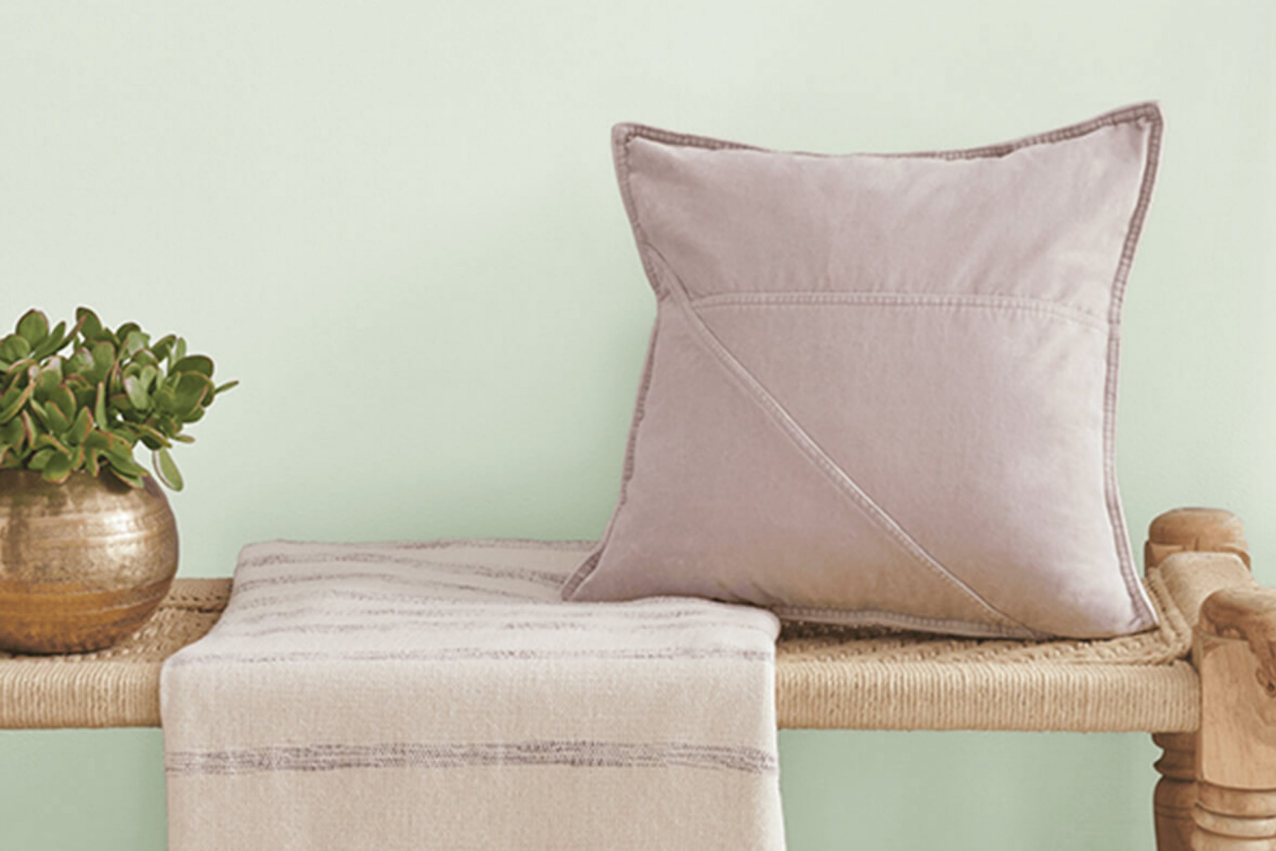
As you consider refreshing your room, you might want to take a look at a charming paint color I’ve come across: SW 6441 White Mint by Sherwin Williams. This color is a gentle blend of minty freshness and soft white, creating an atmosphere that feels both airy and cozy. As a designer, what intrigued me about White Mint is its subtle power to brighten up a room while bringing in a touch of nature’s quiet energy.
It’s an adaptable shade that’s particularly well-suited for areas where you seek peace and a breezy feel, like bathrooms or light-filled reading nooks. I’ve found it pairs beautifully with soft neutrals and wood tones, enhancing the room without overpowering it. It’s not just another paint color; it’s a backdrop that shifts with the changing sunlight, lending a dynamic quality to static rooms.
Whether you’re looking to spruce up a single room or planning a more extensive renovation, White Mint offers a refreshing palette that works harmoniously with both modern and traditional decor.
So, if you’re aiming for a calm vibe in your next home project, consider the subtle charm of SW 6441 White Mint.
What Color Is White Mint SW 6441 by Sherwin Williams?
White Mint is a gentle, refreshing green shade from Sherwin Williams that offers a light and airy feeling to any room. It has a crisp, clean vibe that easily brightens rooms and provides a calming atmosphere. The subtlety of this color makes it adaptable for various uses around the home or office.
Perfect for modern and minimalist interiors, White Mint works exceptionally well in styles that emphasize clean lines and uncluttered rooms. It can also seamlessly blend into coastal and Scandinavian decor, where the focus is on light hues, natural lighting, and elements of nature.
When it comes to pairing materials, White Mint goes beautifully with natural wood finishes, from light pine to rich, dark walnut. These wood tones help to warm up the coolness of the green, creating a balanced aesthetic. Additionally, this shade pairs well with metallic finishes like brushed nickel or matte silver, which add a modern touch to the environment.
Texturally, White Mint complements soft, plush fabrics like cotton and linen in neutrals or muted tones, which help create a cozy, inviting room. It also works well with sleek materials such as glass and polished stone, adding to the clean, fresh vibe of the color. This is ideal for creating a room that feels both open and peaceful.
Is White Mint SW 6441 by Sherwin Williams Warm or Cool color?
White Mint is a color offered by Sherwin Williams that has a subtle, fresh quality, making it a popular choice for creating a light and clean atmosphere in homes. This shade is a soft, almost pastel green, that has a brightness to it which can help make a room feel more open and airy.
Because it’s not too strong or bold, White Mint is adaptable and can be used in various rooms such as bathrooms, kitchens, or bedrooms, blending well with both modern and traditional décor. It pairs nicely with whites, grays, and even darker furniture, helping to balance the room.
Homeowners often use this color to refresh their walls, as it brings a gentle splash of color without overpowering the senses. Additionally, the lightness of White Mint can help enhance natural light in a room, making the room feel vibrant yet relaxed. Overall, it’s a practical choice for anyone looking to brighten up their home.
Undertones of White Mint SW 6441 by Sherwin Williams
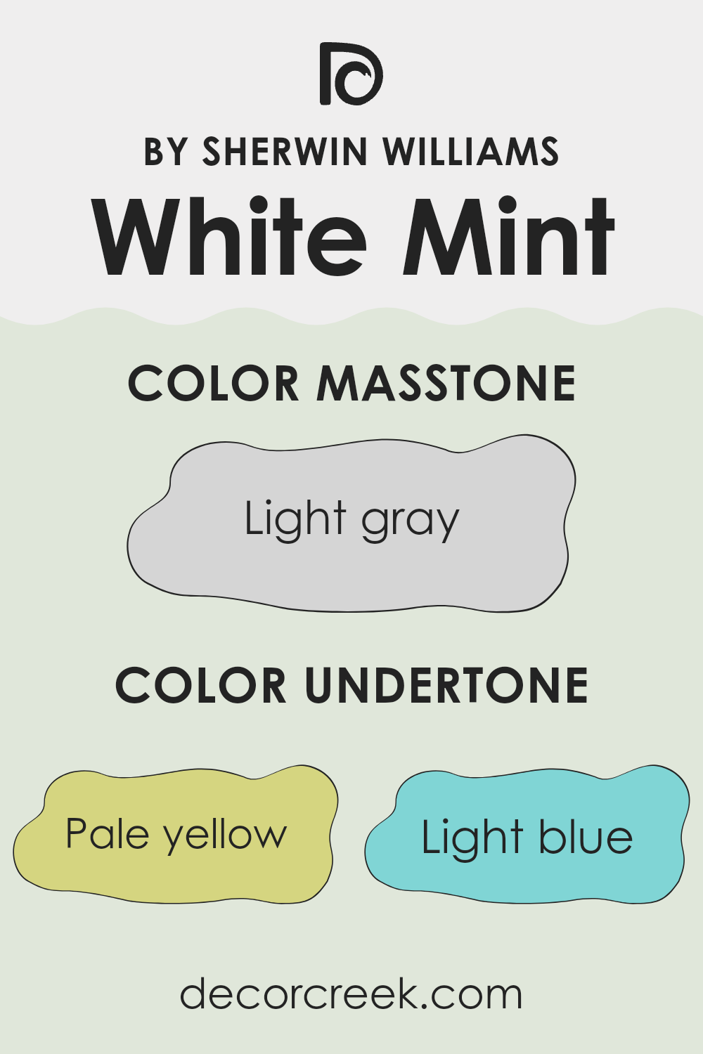
White Mint is a unique paint color that subtly plays with light and changes the feel of a room with its mixture of undertones. Understanding the undertones in White Mint is key to working successfully with it in any interior. Undertones are the colors that linger beneath the dominant color seen from a distance and can influence a paint color to look different under various lighting conditions.
For example, White Mint has undertones of pale yellow, light blue, light purple, mint, pale pink, lilac, and grey. The presence of these undertones can affect the main hue’s perception on your walls, making the room feel warmer or cooler depending on the lighting and surrounding colors.
When you apply White Mint to walls, its pale yellow undertone can add a subtle warmth, making the room feel cozy. Meanwhile, its light blue and mint undertones bring a fresh and airy feel, good for rooms you want to feel bright and open. The grey undertone helps to moderate the brightness, ensuring that the color remains soft and not overpowering.
The various undertones also mean that White Mint can react differently to natural and artificial lighting, sometimes appearing more greenish or bluish depending on the time of day and the type of light. This chameleon aspect makes it adaptable and exciting to use, as the color can appear to change and adjust seamlessly from dawn to dusk, fitting many styles and rooms.
What is the Masstone of the White Mint SW 6441 by Sherwin Williams?
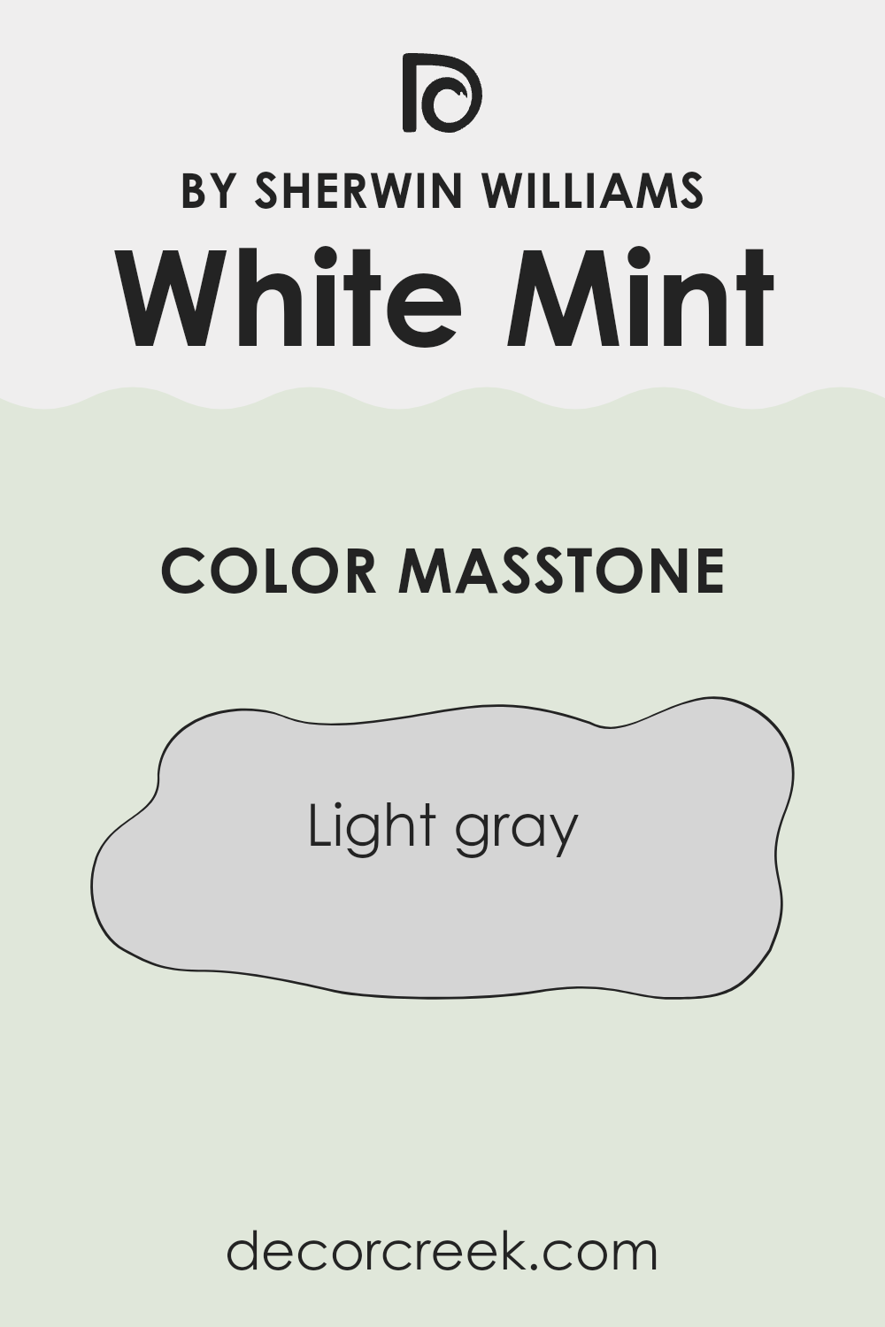
White Mint, with its masstone of light gray, tagged as #D5D5D5, is an adaptable and fresh color ideal for homes looking for a soft yet distinct feel. When applied to walls, this shade acts as a subtle background that can make rooms appear more spacious and clean.
The neutrality of the light gray allows it to blend seamlessly with various decor styles and colors. Whether paired with bright accents in a modern living room or soft pastels in a cozy bedroom, White Mint supports various design choices without overpowering.
It’s especially useful in rooms that don’t get a lot of natural sunlight, as its brightness can help lighten up dim areas. Additionally, this color is gentle on the eyes, making it a good choice for large areas or rooms where you spend a lot of time. Overall, White Mint offers a fresh and flexible backdrop for everyday living.
How Does Lighting Affect White Mint SW 6441 by Sherwin Williams?
Lighting plays a crucial role in how we perceive colors. The type of light and its intensity can make a significant difference in how a color looks in a room. For example, the color White Mint by Sherwin Williams can appear differently under natural and artificial lighting.
In natural light, White Mint tends to look fresher and brighter, especially in rooms that receive a lot of sunlight. This makes it an excellent choice for areas where you want a lively, vibrant feel. However, the direction of the room also affects the color’s appearance:
1. North-facing rooms – These rooms receive less direct sunlight, causing White Mint to appear slightly cooler and more subdued. It’s a gentle, soft look that can make small rooms feel bigger.
2. South-facing rooms – These get more sunlight, which can make White Mint look very bright and vibrant. It’s ideal for energizing a room and works well in living areas and kitchens where you want a cheerful atmosphere.
3. East-faced rooms – These rooms get strong sunlight in the morning. White Mint will look very bright in the morning but will fade to a cooler tone as the day progresses. This dynamic change can be great for bedrooms and breakfast nooks.
4. West-faced rooms – Here, the color receives intense light in the afternoon and evening. White Mint will look softer during the morning and then become vivid and dynamic as the day ends.
When it comes to artificial lighting, the bulb’s temperature affects White Mint’s appearance. Warm bulbs will enhance the green tones, making the room cozier and inviting. In contrast, cool bulbs highlight the mint aspect, giving a crisper, more refreshing look. This adaptability makes White Mint a reliable choice for different lighting setups and room directions. Choosing the right lighting is key to achieving the desired mood and impact with this color.
What is the LRV of White Mint SW 6441 by Sherwin Williams?
LRV stands for Light Reflectance Value, which is a measurement used to describe how much light a paint color reflects when it’s on your walls. Think of it as a scale where lower numbers mean a color will look darker because it absorbs more light, and higher numbers mean a color will look lighter because it reflects more light.
This is especially important in home decorating because it helps you understand how bright or dark a color will usually appear under normal lighting conditions. For example, colors with higher LRV make rooms feel more open and airy because they reflect more light around the room.
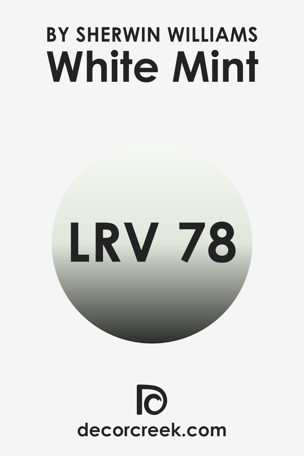
The LRV of White Mint is 78.391, which is relatively high. This means it is on the lighter side and will reflect a good amount of light back into the room, making the area feel brighter and more open. Since it reflects a lot of light, it’s a good choice for smaller rooms or rooms that don’t get much natural sunlight, as it can help make the room feel larger and more welcoming. When used on walls, it has the potential to provide a light, refreshing feel without overpowering the room, and it can work well in a variety of lighting situations, maintaining its light and airy appearance.
Coordinating Colors of White Mint SW 6441 by Sherwin Williams
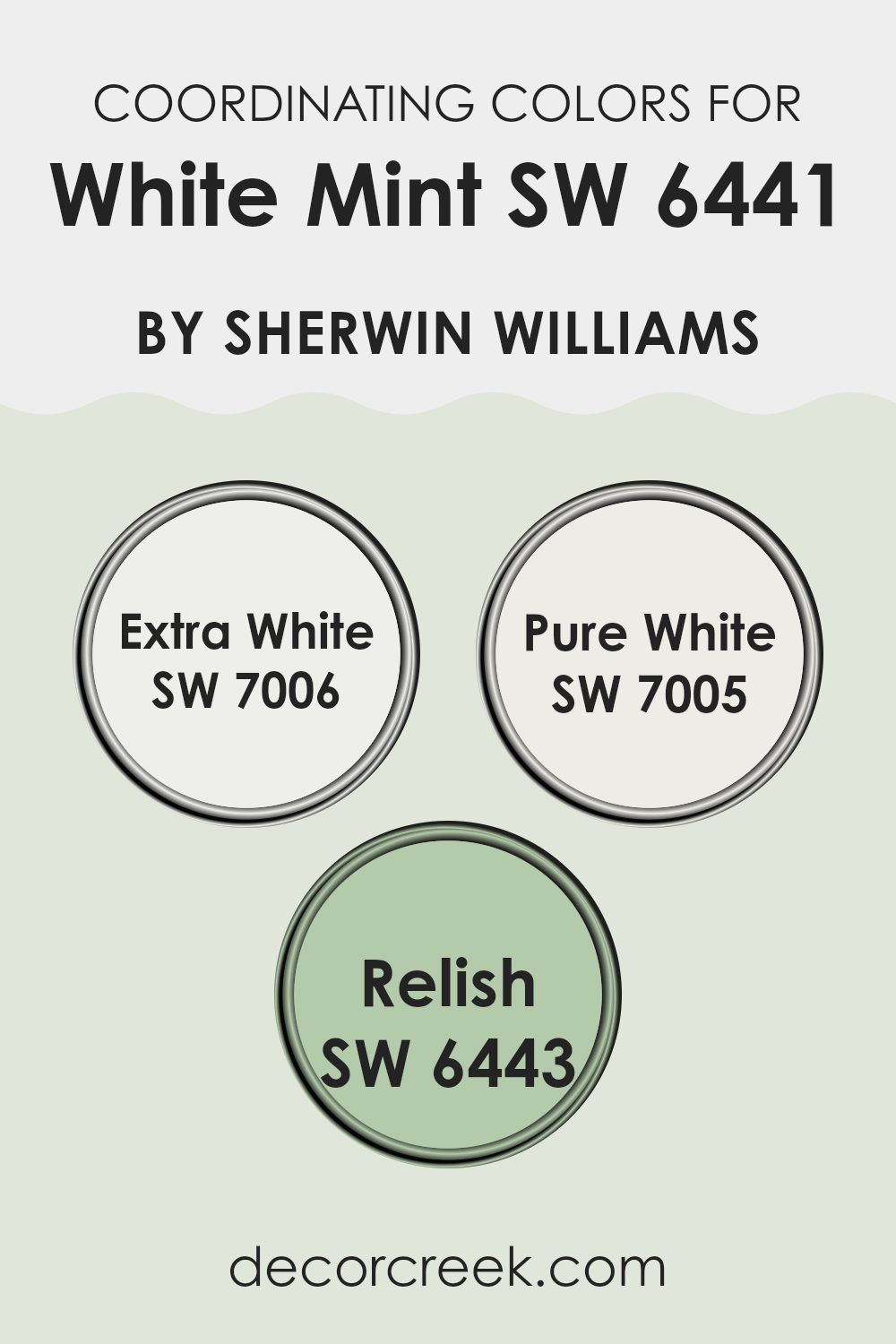
Coordinating colors are shades that complement each other and can be used together to enhance the aesthetic appeal of a room. When choosing coordinating colors, the aim is to create a cohesive look that balances visual interest and harmony. For example, White Mint by Sherwin Williams pairs well with colors like Extra White, Pure White, and Relish because they share undertones or contrast in a way that is visually pleasant.
Extra White is a clean and crisp white that serves as an excellent backdrop, making any room look fresh and inviting. It effectively highlights bolder colors like Relish without overshadowing the softer tones of White Mint.
Pure White, another coordinating color, is slightly warmer than Extra White, offering a subtle creaminess that softens rooms and provides a smooth transition between contrasting colors. Relish, with its deep and rich green tone, adds a bold pop of color that complements the light and airy vibe of White Mint. This combination offers a balanced palette that can make any decorating style look cohesive and thoughtfully designed.
You can see recommended paint colors below:
What are the Trim colors of White Mint SW 6441 by Sherwin Williams?
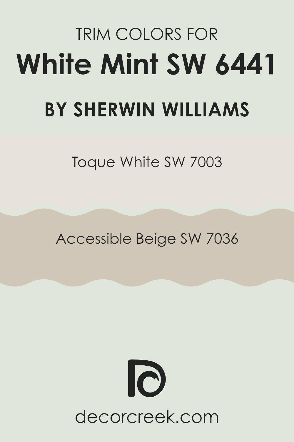
Trim colors are the shades used for the architectural details and accents of a room or a house, such as baseboards, moldings, door frames, and window casings. Selecting the right trim color can accentuate the main wall colors and make the architectural features stand out, giving a finished look to the room. For a fresh and clean color like White Mint by Sherwin Williams, trim colors such as Toque White and Accessible Beige can enhance the overall aesthetic without overpowering it.
Toque White is a soft, neutral shade that provides just enough contrast against White Mint to define the room without creating a stark difference. It’s an adaptable color that blends well, adding subtle detail and continuity in rooms.
On the other hand, Accessible Beige is a warm tone that offers a slightly bolder frame, enriching White Mint’s lighter hues. This color brings a welcoming warmth to balance the coolness of White Mint, perfect for creating a gentle, inviting environment. Together, these trims support the main color and contribute to a cohesive and visually pleasant atmosphere.
You can see recommended paint colors below:
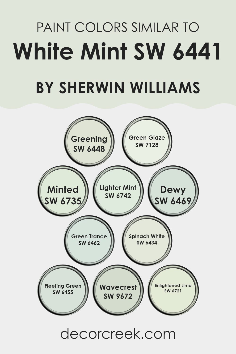
Colors Similar to White Mint SW 6441 by Sherwin Williams
Similar colors are crucial in design because they create a sense of harmony and balance. Using shades that are closely related, like variations of White Mint, offers a cohesive look that can make rooms feel naturally put together.
For instance, colors like Greening and Green Glaze are great alternatives that provide subtle differences without straying too far from a central theme, keeping the atmosphere consistent yet lively.
Minted and Lighter Mint play within the same color family but vary in saturation and brightness, offering flexibility while maintaining a unified visual flow.
Additionally, colors like Dewy and Green Trance bring slightly differing hues into the mix, lending variety while still aligning with the overall aesthetic. Spinach White and Fleeting Green lean towards a softer palette, enriching environments with a gentle and refreshing touch.
Wavecrest introduces a hint of depth, perfect for accentuating areas without overpowering the base color of White Mint. Lastly, Enlightened Lime adds a zest that can brighten up a room with a lively yet subtle twist. Using these related colors allows designers and homeowners to achieve an appealing and coherent look with enough variation to keep each view interesting.
You can see recommended paint colors below:
- SW 6448 Greening
- SW 7128 Green Glaze
- SW 6735 Minted
- SW 6742 Lighter Mint
- SW 6469 Dewy
- SW 6462 Green Trance
- SW 6434 Spinach White
- SW 6455 Fleeting Green
- SW 9672 Wavecrest
- SW 6721 Enlightened Lime
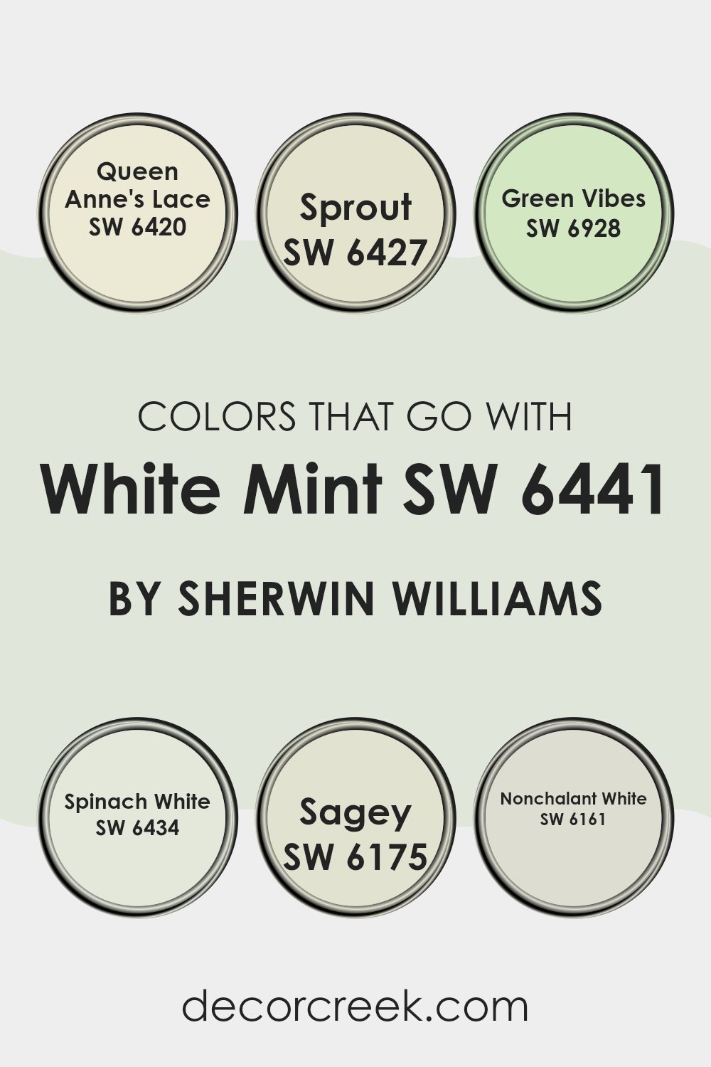
Colors that Go With White Mint SW 6441 by Sherwin Williams
Choosing the right colors to complement White Mint SW 6441 by Sherwin Williams is crucial for creating a harmonious and appealing room. These colors help to balance the soft, fresh vibe of White Mint SW 6441, enhancing the overall aesthetic without overpowering it.
For instance, Queen Anne’s Lace SW 6420 is a delicate, creamy yellow that pairs beautifully with White Mint, providing a gentle contrast that brightens rooms. Sprout SW 6427, a light and lively green, mirrors the subtle vibrancy of White Mint, creating a cohesive and refreshing palette that’s easy on the eyes.
Green Vibes SW 6928 offers a dynamic and vivid green that injects energy into any room paired with White Mint, making it ideal for areas needing a pop of color. Spinach White SW 6434, with its mild and earthy tone, grounds the airy feel of White Mint, perfect for bringing a natural, calming effect to a room. Additionally, Sagey SW 6175 adds depth with its deeper green hue, suggesting a mature and nestled feeling when used alongside White Mint.
Finally, Nonchalant White SW 6161 is a neutral, soft grey that acts as a subtle backdrop, ensuring that the refreshing nature of White Mint stands out. By carefully selecting these complementary colors, you can achieve a balanced and pleasing environment that feels both inviting and stylish.
You can see recommended paint colors below:
- SW 6420 Queen Anne’s Lace
- SW 6427 Sprout
- SW 6928 Green Vibes
- SW 6434 Spinach White
- SW 6175 Sagey
- SW 6161 Nonchalant White
How to Use White Mint SW 6441 by Sherwin Williams In Your Home?
White Mint SW 6441 by Sherwin Williams is a fresh and airy paint color that can brighten up any room in your home. This shade is particularly good if you want to create a calm and relaxed atmosphere without it feeling too cold or stark. It’s a soft mint green that pairs well with a variety of decor styles, from modern to rustic.
You can use White Mint in smaller rooms like bathrooms or laundry rooms to make them feel larger and more open. It also works beautifully in bedrooms, adding a gentle touch of color that’s calming and comfortable. If you have a home office, painting the walls with White Mint can help keep the room feeling light and energizing, perfect for staying focused and productive.
For a coherent look, combine White Mint with light wood furniture, white trim, and accents in pale blues or gentle grays. This color is adaptable enough to act as either a subtle background or a striking feature wall, depending on your preference. By adding in personal touches like colorful artwork or vibrant plants, you can make any room painted with White Mint uniquely your own.
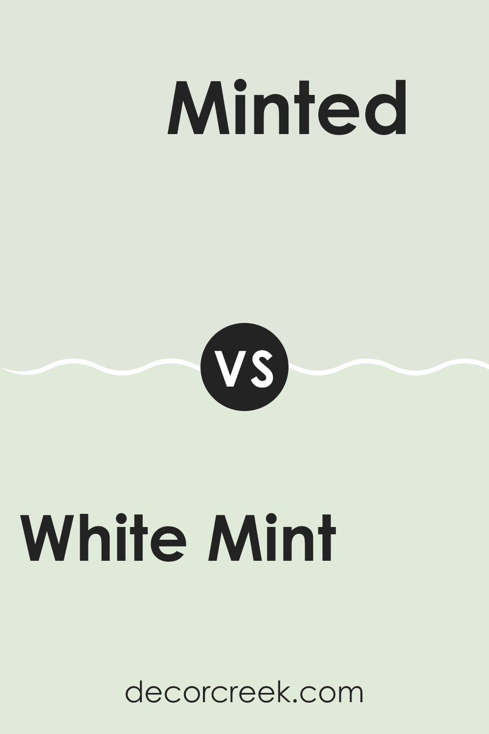
White Mint SW 6441 by Sherwin Williams vs Minted SW 6735 by Sherwin Williams
White Mint is a gentle and soft color, offering a hint of green that brings a fresh, clean feel to any room. It’s subtle and perfect for environments where you want a calm, peaceful vibe without using a pure white. It’s light enough to make small rooms appear larger and has an open, breathable quality.
In contrast, Minted is a more vibrant and energetic shade. This color has a bolder presence, bringing a lively and cheerful energy to a room. Its brightness stands out more significantly than White Mint and is a great choice for adding a punch of color without overpowering the room. Minted works well in rooms that benefit from a splash of color, like bathrooms or kids’ rooms.
Both colors share a green base, but where White Mint leans towards softness and neutrality, Minted heads towards a zestier and more noticeable impact. They could even work well together in different parts of a home to maintain a harmonic color flow with varied intensity across rooms.
You can see recommended paint color below:
- SW 6735 Minted
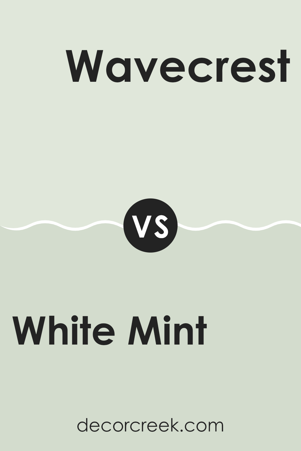
White Mint SW 6441 by Sherwin Williams vs Wavecrest SW 9672 by Sherwin Williams
White Mint and Wavecrest, both by Sherwin Williams, are distinct yet harmonious colors. White Mint is a fresh, light green with a subtle hint of mint, making it feel cool and refreshing. It’s light enough to use extensively in a room without overpowering it, working well in areas that aim for a clean and airy look.
On the other hand, Wavecrest leans more towards a soothing blue with a gentle gray undertone. This color is slightly darker and richer compared to White Mint, offering a calm and stable ambiance that’s ideal for creating a peaceful retreat in your home.
Both colors can work beautifully in rooms aiming for a relaxed feel, but the choice depends on whether you prefer a cooler hint with White Mint or a softer, deeper tone with Wavecrest. Together, they can also complement each other well in a color scheme for those looking to mix light greens and blues in their decor.
You can see recommended paint color below:
- SW 9672 Wavecrest
White Mint SW 6441 by Sherwin Williams vs Lighter Mint SW 6742 by Sherwin Williams
White Mint and Lighter Mint are two colors by Sherwin Williams that vary subtly in their shades of mint green. White Mint is a soft, creamy mint that brings a calm and gentle aura to any room. It’s a bit richer and can add a touch of warmth, making the room feel cozy yet fresh.
On the other hand, Lighter Mint is even more muted and closer to a pastel, providing a lighter, almost ethereal quality. This color is great for those looking to brighten a room while maintaining a soft, understated vibe.
Both colors are excellent choices for creating a refreshing and open atmosphere in places like kitchens and bathrooms. The main difference lies in their intensity and the mood they set; White Mint offers a tad more warmth, while Lighter Mint feels airier and even more subdued.
You can see recommended paint color below:
- SW 6742 Lighter Mint
White Mint SW 6441 by Sherwin Williams vs Greening SW 6448 by Sherwin Williams
White Mint and Greening are two distinct colors by Sherwin Williams, each offering its own unique vibe. White Mint is a soft, light green that almost leans toward a pastel tone. It’s a subtle choice, perfect for creating a calm and gentle atmosphere in a room. This color works well in small rooms or areas where you want a hint of color without overpowering the surroundings.
On the other hand, Greening is a deeper, more vibrant green. It stands out more and brings a fresh and lively feel to a room. Greening is ideal for those looking to add a dash of nature-inspired freshness to their surroundings, and it pairs well with neutral tones to maintain balance.
Both colors are great choices depending on your goal for the room’s feel. White Mint is better for a softer, lighter touch, while Greening suits a bolder, more dynamic look.
You can see recommended paint color below:
- SW 6448 Greening
White Mint SW 6441 by Sherwin Williams vs Fleeting Green SW 6455 by Sherwin Williams
White Mint and Fleeting Green are both colors by Sherwin Williams, but they have distinct tones and vibes. White Mint is a light, airy color that has a subtle hint of green. It’s fresh and clean, making it perfect for creating a bright and welcoming room. This color works well in small rooms or areas with limited natural light, as it can help make the room feel larger and more open.
On the other hand, Fleeting Green is a deeper, more muted green that carries a hint of gray. This color is more grounded and earthy, making it a great choice for creating a cozy and comfortable atmosphere. It’s ideal for rooms where you want to promote relaxation and calm, such as bedrooms or reading nooks.
In summary, while both colors belong to the green family, White Mint is lighter and more vibrant, and Fleeting Green is deeper and more subdued. Each color offers a unique mood, suiting different tastes and styles for various rooms.
You can see recommended paint color below:
- SW 6455 Fleeting Green
White Mint SW 6441 by Sherwin Williams vs Enlightened Lime SW 6721 by Sherwin Williams
White Mint and Enlightened Lime are two distinct colors from Sherwin Williams that offer unique vibes for decorating rooms. White Mint is a soft, muted green with a hint of white that gives it a very light and airy feel. This color is great for creating a calm and gentle atmosphere in a room, making it ideal for areas where you want to relax.
On the other hand, Enlightened Lime is a much brighter, more vibrant shade of green. This color is full of energy and life, perfect for adding a punch of brightness to any room. It’s particularly effective in areas that aim to inspire creativity and enthusiasm, like a kitchen or a children’s playroom.
In summary, while White Mint provides a subtle and quiet backdrop, Enlightened Lime offers a lively and cheerful burst of color. Whether you want a soothing retreat or a dynamic room, these colors have different strengths to fit your decorating needs.
You can see recommended paint color below:
- SW 6721 Enlightened Lime
White Mint SW 6441 by Sherwin Williams vs Green Trance SW 6462 by Sherwin Williams
White Mint and Green Trance, both by Sherwin Williams, represent different moods and aesthetics within a palette. White Mint is a light, airy color, leaning more toward a subtle, refreshing hue that can make small rooms appear larger and brighter. It’s soft enough to serve as a neutral backdrop, yet possesses a hint of minty freshness that brings a clean and calming atmosphere to any room.
On the other hand, Green Trance is a deeper, more vivid shade of green. It provides a bolder statement and can anchor a room with its richness. Ideal for creating a focal point, it pairs well with natural woods and metallic accents, giving the room a more grounded and lively appeal.
While both colors share a green base, White Mint offers a gentle whisper of color, and Green Trance speaks more confidently. The choice between them depends on how much punch or subtlety one wants to introduce into a room.
You can see recommended paint color below:
White Mint SW 6441 by Sherwin Williams vs Green Glaze SW 7128 by Sherwin Williams
White Mint and Green Glaze, both by Sherwin Williams, are distinct in their vibes and visual impact. White Mint is a soft, pale green that feels light and airy. It has a subtle hint of green that adds a touch of freshness to any room without being overpowering. It’s perfect for creating a calm, soothing environment in places like bedrooms or bathrooms.
On the other hand, Green Glaze is a much deeper and bolder green. It packs a stronger punch with its richer, more vibrant hue. This color stands out more and would work well in rooms that you want to infuse with energy and vitality. It could be a great choice for an accent wall or a room where lots of activities take place.
When choosing between these two, your decision might depend on the mood you’re aiming to achieve; calm and gentle with White Mint, or lively and spirited with Green Glaze.
You can see recommended paint color below:
- SW 7128 Green Glaze
White Mint SW 6441 by Sherwin Williams vs Spinach White SW 6434 by Sherwin Williams
White Mint and Spinach White are two interesting shades by Sherwin Williams. White Mint has a fresh and cool tone, much like the hint you get from a mint leaf, giving rooms a clean and lively look. It’s great for making small rooms appear brighter and bigger since it reflects light well.
On the other hand, Spinach White leans toward a more natural and earthy tone. This color resembles the pale green you might see in spinach leaves, offering a soft and subtle backdrop that feels calming and grounding. It works well in rooms where you want a touch of color without overpowering the surroundings.
While both colors are variations of green, White Mint comes off as crisper and more vibrant, making it suitable for a modern look. Spinach White, being milder and more muted, suits rooms where a relaxed, understated aesthetic is desired. Both colors offer their unique charm and can beautifully enhance different areas depending on your style and need.
You can see recommended paint color below:
- SW 6434 Spinach White
White Mint SW 6441 by Sherwin Williams vs Dewy SW 6469 by Sherwin Williams
“White Mint” and “Dewy” by Sherwin Williams are two light hues that are perfect for creating a refreshing atmosphere, though they offer subtle differences in their vibes. “White Mint” has a crisp hint of green, giving it a revitalizing and clean effect that’s ideal for rooms meant to feel fresh and airy. It’s like a breath of fresh air when you walk in—uplifting and light.
On the other hand, “Dewy” leans more toward a soft, gentle green, reminiscent of a light morning mist in a peaceful meadow. It brings a soothing feel to any room, making it well-suited for places where you want to relax and wind down. This color can soften the edges of a room, making it feel more welcoming and cozy.
Both shades work well for boosting the appeal of a room with their light, uplifting qualities. However, “White Mint” is the go-to for a more invigorating, open effect, while “Dewy” is better for creating a gentle, soothing environment.
You can see recommended paint color below:
- SW 6469 Dewy
After reading all about SW 6441 White Mint by Sherwin Williams, I’ve learned a lot about this pretty paint color. It has a soft green tone that makes rooms feel fresh and light. It’s perfect for places like your bedroom or living room where you want to relax and feel comfortable. The color is not too bright and not too dark, like the gorgeous color of the first leaves in spring.
When choosing this color, it’s a great idea if you want to freshen up your room without making it too bold or flashy. It goes well with a lot of other colors, so it’s easy to match with furniture and decorations you might already have. Plus, it’s a paint that hides small marks or dirt pretty well, which can be very handy.
To sum it up, SW 6441 White Mint by Sherwin Williams is a wonderful choice if you’re thinking about adding a splash of light green to your home. It’s calming, pleasing to the eyes, and will help make any room feel cozy and welcoming. Whether you’re painting a whole room or just one wall for a fun accent, it’s a great pick!
Ever wished paint sampling was as easy as sticking a sticker? Guess what? Now it is! Discover Samplize's unique Peel & Stick samples.
Get paint samples

