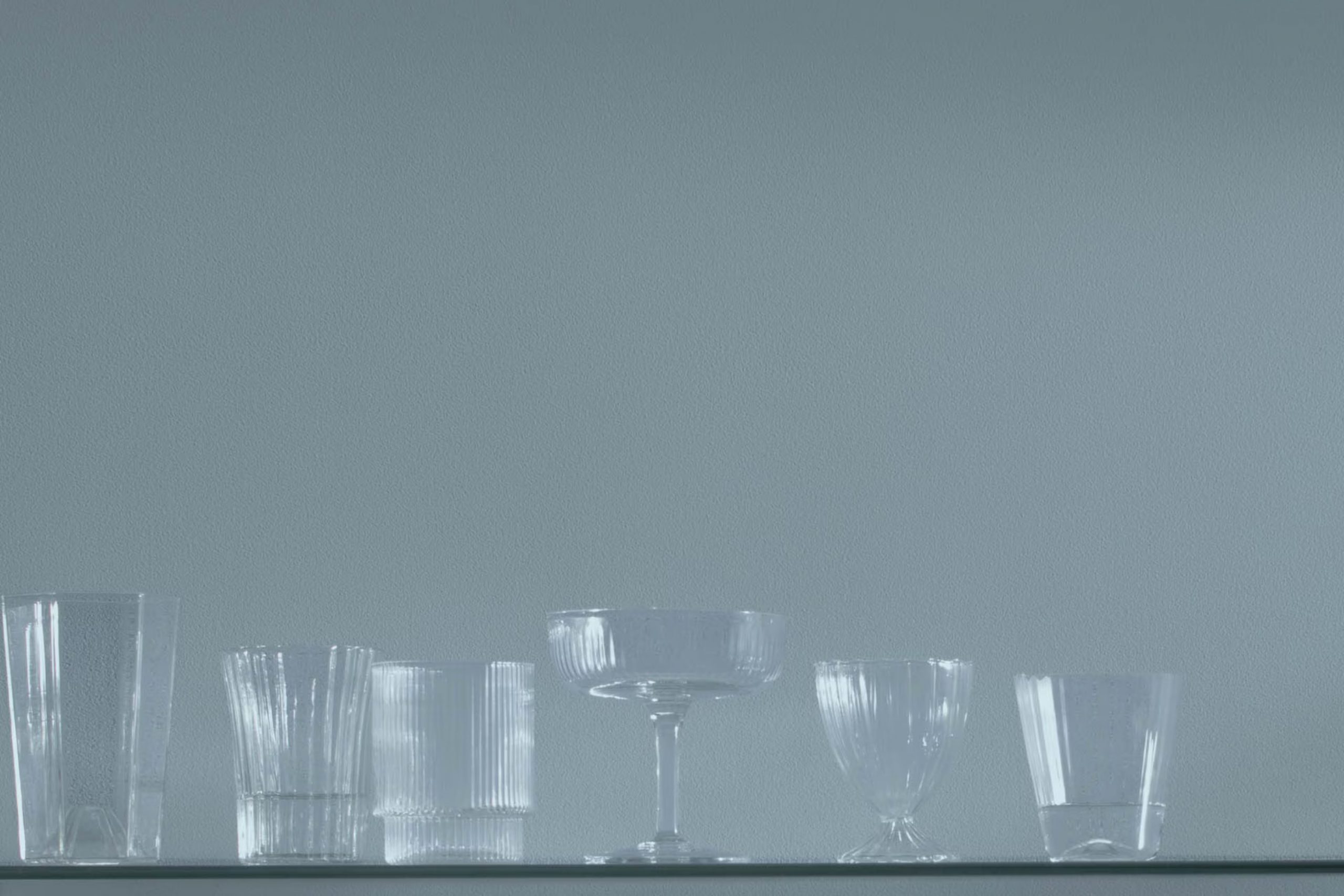
When you first look at AF-550 Amsterdam from Benjamin Moore, it may seem like just another gray. However, as you spend more time with it, you realize there’s a subtle richness to this shade. It’s a color with a robust character that can turn any room into something refined. As you plan your next project, consider how using Amsterdam could bring a sense of warmth and depth to your walls.
Despite its depth, AF-550 Amsterdam maintains a level of softness. This makes it incredibly adaptable, suitable for living rooms, bedrooms, or even studies where comfort and focus are key. What’s more, it pairs beautifully with a wide range of décor, enhancing furniture and artwork without overpowering the room’s elements.
As you think about updating your home’s color scheme, consider how Amsterdam might interact with your current themes. Will it refresh your area or offer the subtle change you’ve been looking for?
Its ability to blend effortlessly with various styles and settings makes it a go-to choice for anyone looking to enhance their environment without making drastic changes.
What Color Is Amsterdam AF-550 by Benjamin Moore?
Amsterdam AF-550 by Benjamin Moore is a deep, rich blue-gray shade that adds a sense of calm and elegance to any room. This color, with its balanced blend of blue and gray, provides a subtle yet impactful backdrop that is adaptable enough to work in a variety of interior styles. It is particularly effective in modern and contemporary interiors, where its solidity can create a dramatic statement. However, it also fits well in industrial and minimalist rooms due to its clean, crisp nature.
Amsterdam AF-550 pairs beautifully with a range of materials and textures. For a modern and clean look, consider combining it with polished concrete floors, glass, and metal accents. In more rustic or industrial settings, this color works well with natural wood, leather details, and textured fabrics like linen or chunky knits, which can soften the overall appearance.
In terms of accents and furnishings, this color complements warm wood tones, natural stone, and muted metals such as brushed nickel or aged brass. For those looking to create an inviting atmosphere in their home, Amsterdam AF-550 serves as a perfect base color that supports a variety of design elements and personal styles, making it a practical choice for living rooms, bedrooms, and even kitchens.
Is Amsterdam AF-550 by Benjamin Moore Warm or Cool color?
Amsterdam AF-550 by Benjamin Moore is an adaptable paint color that adds a distinct and attractive appeal to any room. The color is a deep, rich blue with gray undertones, making it perfect for creating a cozy yet stylish atmosphere.
In homes, this shade works well in various areas, from living rooms to bedrooms, providing a calming backdrop that pairs well with numerous décor styles, from modern to traditional. Its muted tone helps in making small rooms appear larger and more open, while in larger areas, it offers a grounded and comforting feel.
Additionally, the color is highly flexible, looking equally striking with light and dark furnishings, which gives homeowners the freedom to mix and match their interior items without clashing with the walls. Overall, Amsterdam AF-550 is a reliable yet visually striking choice that enhances the aesthetic value of interiors through its deep, welcoming hue.
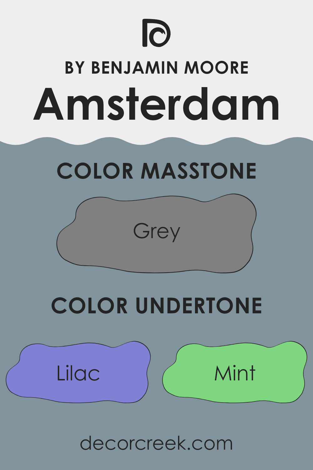
Undertones of Amsterdam AF-550 by Benjamin Moore
Amsterdam AF-550 by Benjamin Moore is an adaptable paint color with a complex mix of undertones, making it suitable for various interior settings. Undertones are subtle colors that influence the main hue and can significantly affect how a color appears in different lighting and alongside other shades. For instance, a lilac undertone might make the paint look slightly cooler, while an orange undertone could warm it up.
The diverse undertones in Amsterdam AF-550—ranging from lilac, mint, and light blue to darker shades like navy and dark green—allow this color to shift perception under different lighting conditions. In natural light, the lighter undertones such as pale yellow and light turquoise could make the walls appear brighter and more open. Meanwhile, in rooms with less natural light, darker undertones like dark green and navy might become more dominant, giving the room a more grounded feel.
When applied to interior walls, the full spectrum of undertones in Amsterdam AF-550 interacts with furnishings and decor in unique ways. For example, the presence of light purple and pink undertones can soften a room’s look and feel soothing, making it ideal for bedrooms or bathrooms. Conversely, stronger undertones like dark blue or brown can provide a dramatic backdrop, enhancing areas like dining rooms or entryways.
In conclusion, the rich array of undertones in Amsterdam AF-550 means it can adjust to many different styles and moods, making it a practical choice for those looking to refresh their walls. Its ability to look different depending on the lighting and surrounding colors adds an interesting dynamic to any interior design project.
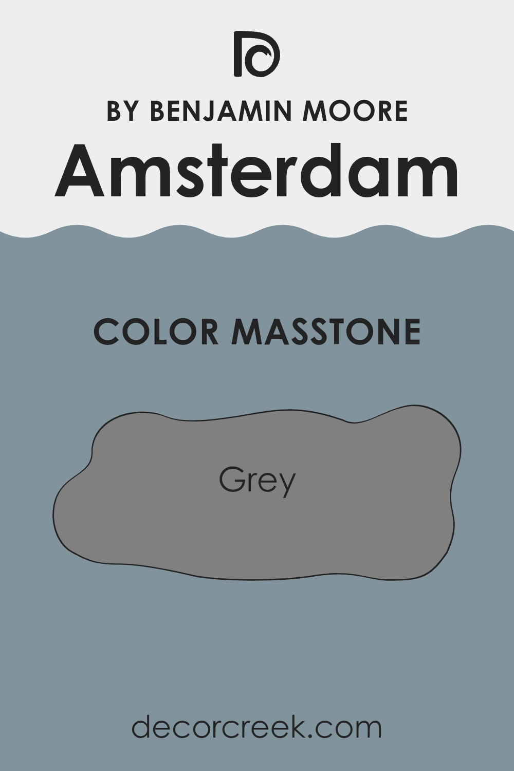
What is the Masstone of the Amsterdam AF-550 by Benjamin Moore?
Amsterdam AF-550 by Benjamin Moore has a masstone which is a shade of grey, similar to Grey(#808080). This color offers a neutral backdrop that works well in various home settings, making it adaptable for both modern and traditional interior designs.
The grey shade helps other colors in the room stand out, whether it’s furniture, artworks, or fabric. It’s an ideal choice for walls because it doesn’t overpower the room but rather complements other elements within it. Its neutral tone is effective in making small rooms appear larger and gives bigger areas a cohesive look.
Since the color doesn’t clash with others, homeowners find it easy to match with different decor styles and color schemes. This makes it a practical choice for common areas like living rooms and kitchens, where differing colors and textures often meet. The gray hue helps maintain a calm atmosphere, making it a good option for bedrooms as well.
Overall, its flexibility and understated quality make it a reliable choice for creating a pleasant home environment.
How Does Lighting Affect Amsterdam AF-550 by Benjamin Moore?
Lighting plays a significant role in how we perceive colors in our surroundings. The color of a light source can drastically alter the appearance of wall colors in any room. Under different lighting conditions, the same paint shade can look completely different. This is because light sources vary in color temperatures; natural daylight being cooler and generally bluer in tone, while most artificial lights have warmer, yellowish hues.
For instance, consider a specific color like Benjamin Moore’s Amsterdam AF-550. This color can show multiple sides of its character depending on the lighting. In artificial light, which typically has a yellower tone, Amsterdam AF-550 might appear warmer and slightly more muted than it does in daylight. Under the bright, often blue-spectrum lighting found in many LED or fluorescent bulbs, its deep blue tones can become more defined, enhancing its richness.
In rooms that face different directions, Amsterdam AF-550 will also look different at various times of the day due to changes in natural light exposure. In north-facing rooms, which get limited direct sunlight and have a cooler light quality, the color could appear more subdued and slightly darker, enriching its deeper tones. In south-facing rooms, which are bathed in warm, bright sunlight for most of the day, this color can look lighter and more vivid because the bright light highlights its undertones.
East-facing rooms see the morning light, which is generally softer and warmer; here, Amsterdam AF-550 might have a very balanced, true appearance in the morning, becoming cooler as the day goes on. In contrast, west-facing rooms get intense evening light, which could make this color appear warmer and more vibrant towards the end of the day.
Understanding how lighting affects color can help in effectively using Amsterdam AF-550, ensuring that the hue complements the room’s lighting conditions, purpose, and overall aesthetic.
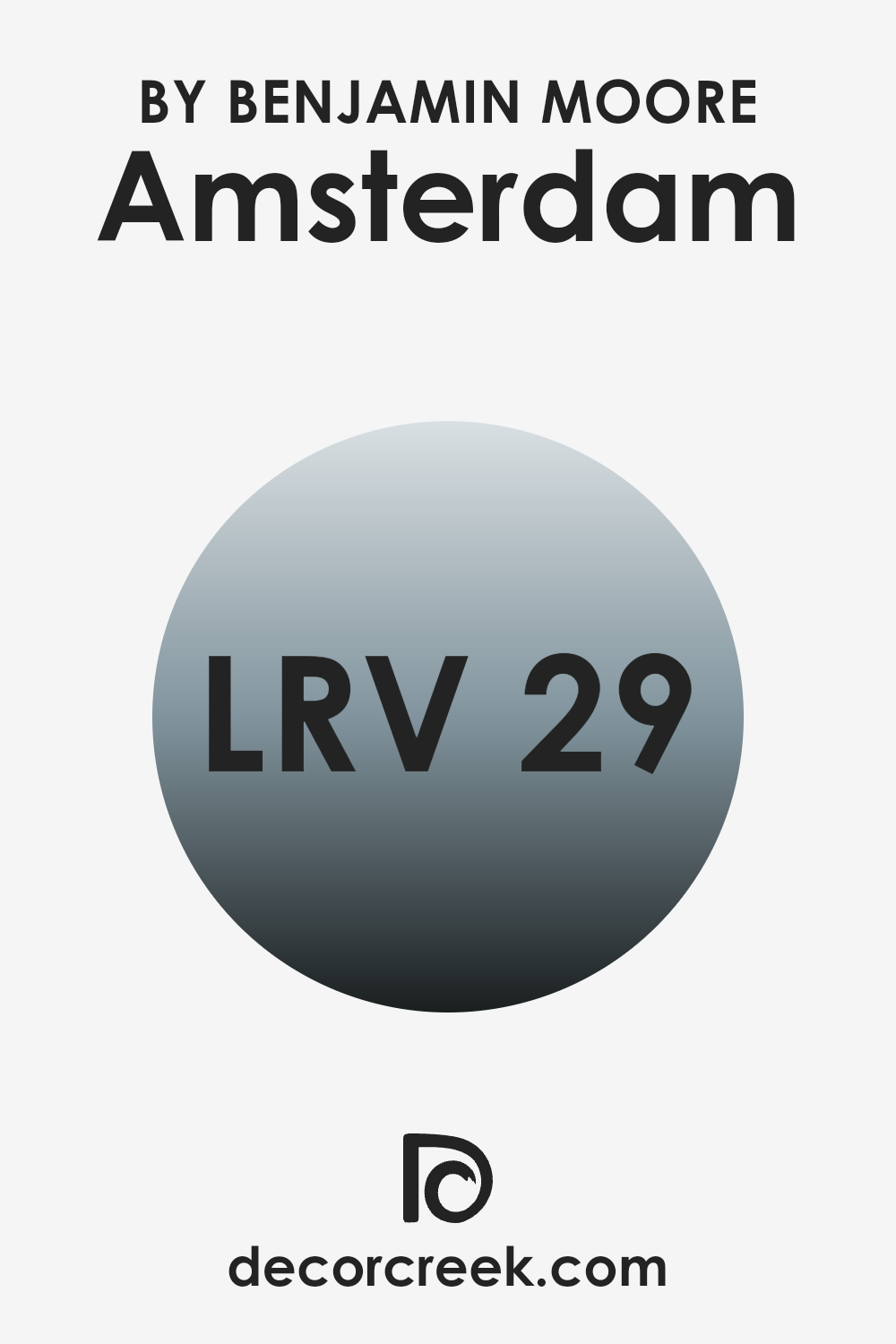
What is the LRV of Amsterdam AF-550 by Benjamin Moore?
Light Reflectance Value (LRV) measures the percentage of light a paint color reflects from or absorbs into a painted surface. It’s a useful metric used primarily in the selection of paint colors for interiors and exteriors, ranging from 0 (reflects no light, absolute black) to 100 (reflects all light, pure white).
A higher LRV means the color reflects more light, making a room appear brighter and larger, while a low LRV means the color absorbs more light, which can make an area feel cozier but smaller. For the color with an LRV of 29.21, this means it reflects less than one-third of the light that hits it.
As a result, when used on walls, it can create an intimate and contained atmosphere due to its ability to absorb more light than it reflects. This particular level of reflectivity can make the color ideal for larger rooms or areas with a lot of natural light, as it helps balance the brightness and can prevent the room from feeling too expansive or stark. Conversely, in a small or dimly lit area, using a color with such an LRV might make the room feel smaller and darker.
decorcreek.com
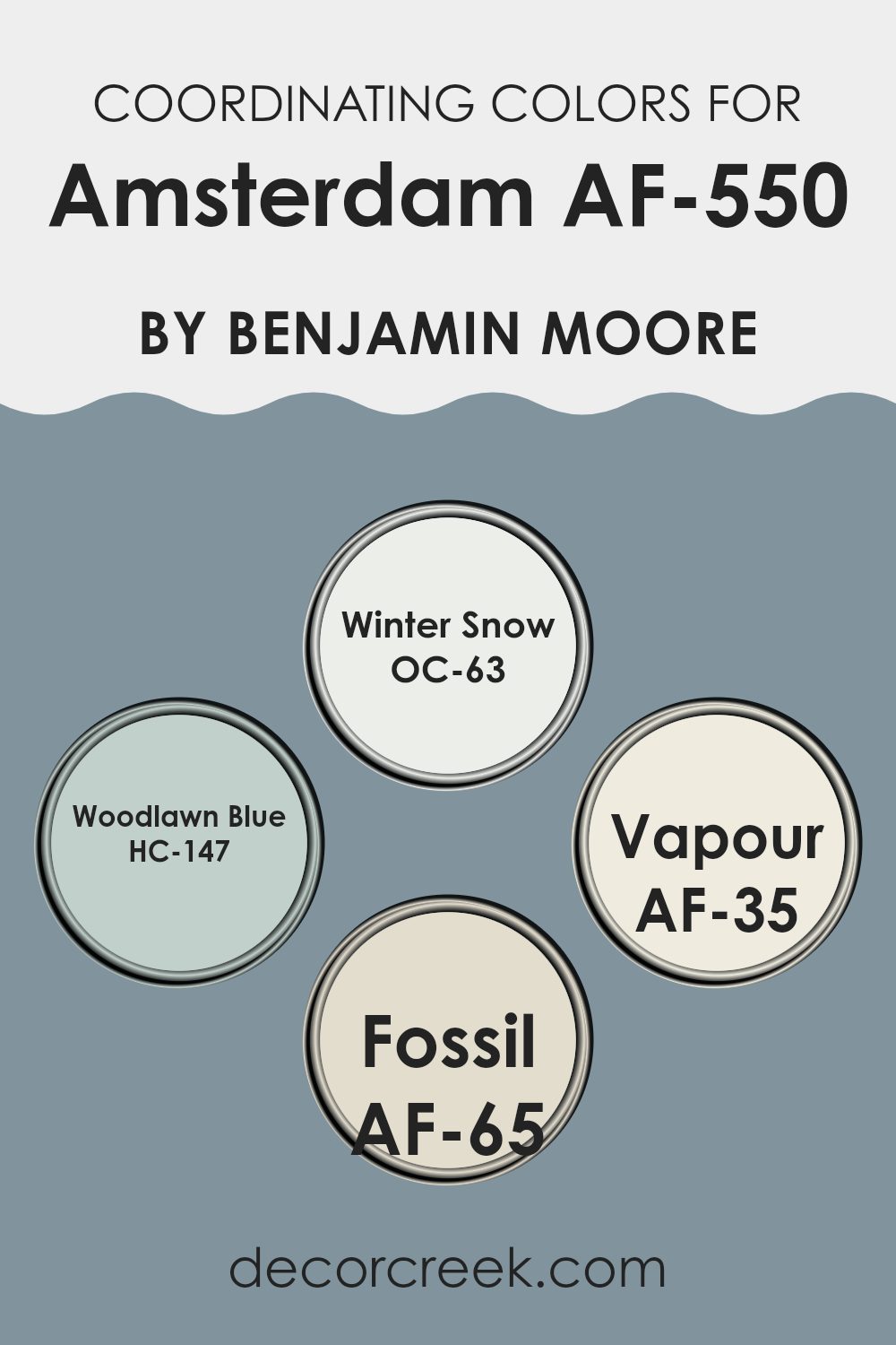
Coordinating Colors of Amsterdam AF-550 by Benjamin Moore
Coordinating colors are hues that complement or enhance each other, creating a visually appealing and harmonious look in any room. These colors are often selected from the same paint company to guarantee they match perfectly in tone and intensity. For instance, OC-63 – Winter Snow is a crisp, clean white that offers a fresh backdrop, making it a perfect partner for more vibrant or deeper shades.
It acts as a subtle enhancer and doesn’t overpower the other tones. HC-147 – Woodlawn Blue, on the other hand, is a gentle blue with a calming presence, ideal for creating a light and airy feel in rooms like bedrooms or bathrooms. Another great coordinating color is AF-35 – Vapour, a soft neutral that can blend seamlessly with other hues or stand alone for a sleek, minimal look.
Its adaptability makes it a fantastic choice for many different settings and decor styles. AF-65 – Fossil is a darker shade that provides excellent contrast against lighter tones like Winter Snow, adding depth and interest to the color scheme. These coordinating colors work together to create a balanced and inviting atmosphere, enhancing the overall aesthetic of a room while allowing individual elements to stand out beautifully.
You can see recommended paint colors below:
- OC-63 Winter Snow
- HC-147 Woodlawn Blue
- AF-35 Vapour
- AF-65 Fossil
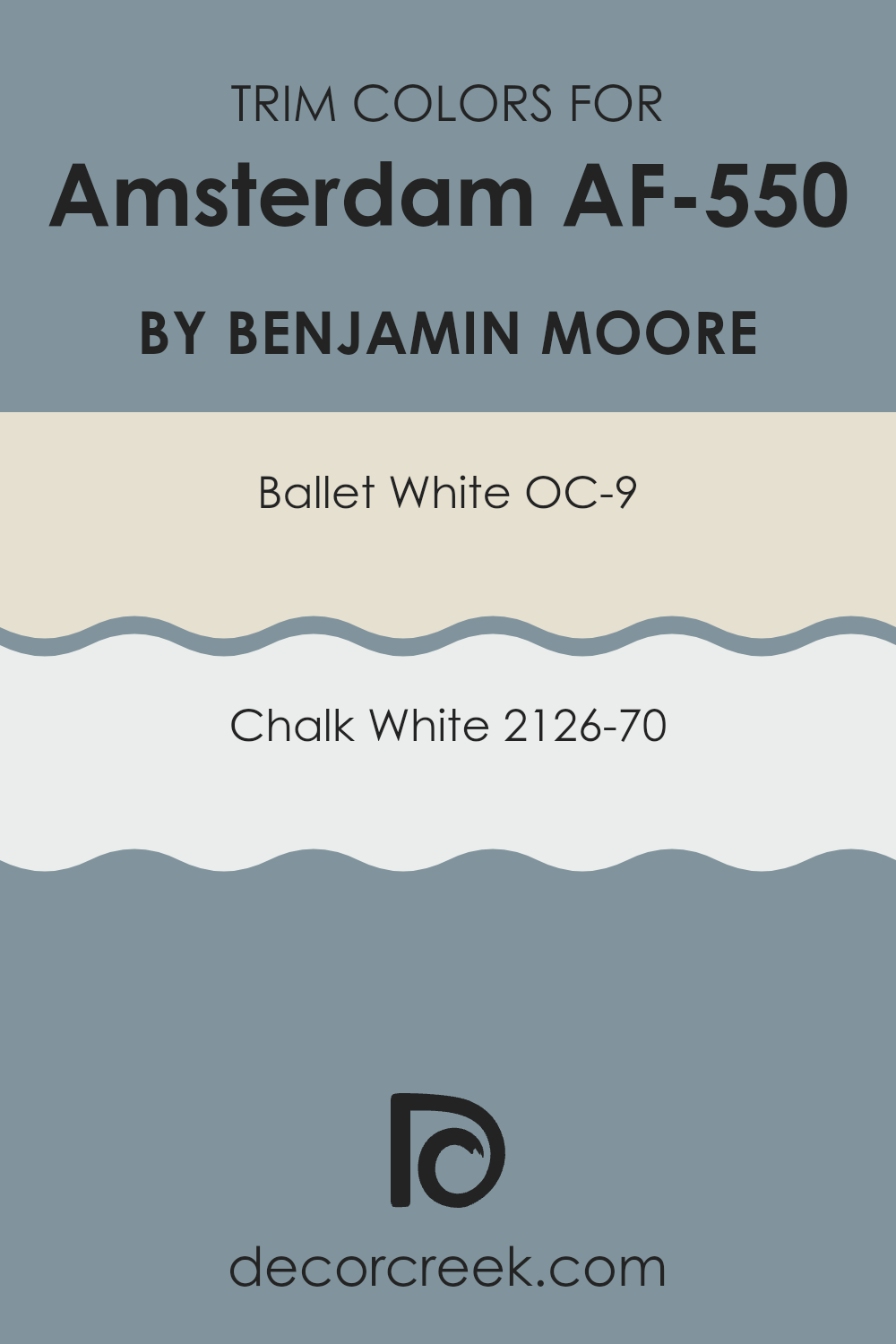
What are the Trim colors of Amsterdam AF-550 by Benjamin Moore?
Trim colors are the hues used on architectural elements like door casings, moldings, and baseboards to define and accentuate the lines and features of a room. With the right trim color, the overall aesthetic of a room can be significantly enhanced, making architectural details stand out and giving the area a refined look.
Selecting trim colors in shades such as OC-9 Ballet White or 2126-70 Chalk White can serve to subtly complement deeper, richer wall colors like Amsterdam AF-550 by Benjamin Moore, ensuring that the room feels cohesive and well-balanced. OC-9 – Ballet White is a warm, off-white color that brings a gentle brightness to a room without feeling too stark, making it a lovely choice for trims that softly highlight the surrounding colors.
On the other hand, 2126-70 – Chalk White offers a cleaner, more neutral tone, providing a crisp border that can help stronger colors such as Amsterdam AF-550 stand out, enhancing the overall effect of the room’s design. Using these colors for trim works effectively to create a visually appealing contrast that draws the eye and complements the main color palette.
You can see recommended paint colors below:
- OC-9 Ballet White
- 2126-70 Chalk White
Colors Similar to Amsterdam AF-550 by Benjamin Moore
Choosing similar colors in decoration helps create a harmonious and cohesive look in your room. For example, pairing colors similar to Amsterdam AF-550 by Benjamin Moore ensures a smooth visual transition between rooms or on different walls within the same area. These colors blend well together because they share common undertones, promoting a sense of continuity and flow that is visually pleasing and comforting to the eye.
Colors like Polaris Blue and Water’s Edge bring to mind the soothing hues of the ocean under different lighting conditions. Polaris Blue is a gentle midpoint between sky blue and the deeper tones encountered at dusk. Water’s Edge, on the other hand, suggests the color found deeper in the ocean, reminiscent of the shade seen where the water reflects the overcast sky.
Both these hues support a fluid aesthetic when used alongside each other. Another pair, Province Blue and Mineral Alloy, resemble twilight shades with a grayish undertone. Province Blue recalls an evening horizon, somewhat muted yet still lively, while Mineral Alloy offers a stronger, more defined tone that mirrors the natural mineral hues found in rocks and soils. These colors work well together or with others to maintain continuity without losing visual interest.
You can see recommended paint colors below:
- 1649 Polaris Blue
- 1635 Water’s Edge
- 2135-40 Province Blue
- 1622 Mineral Alloy

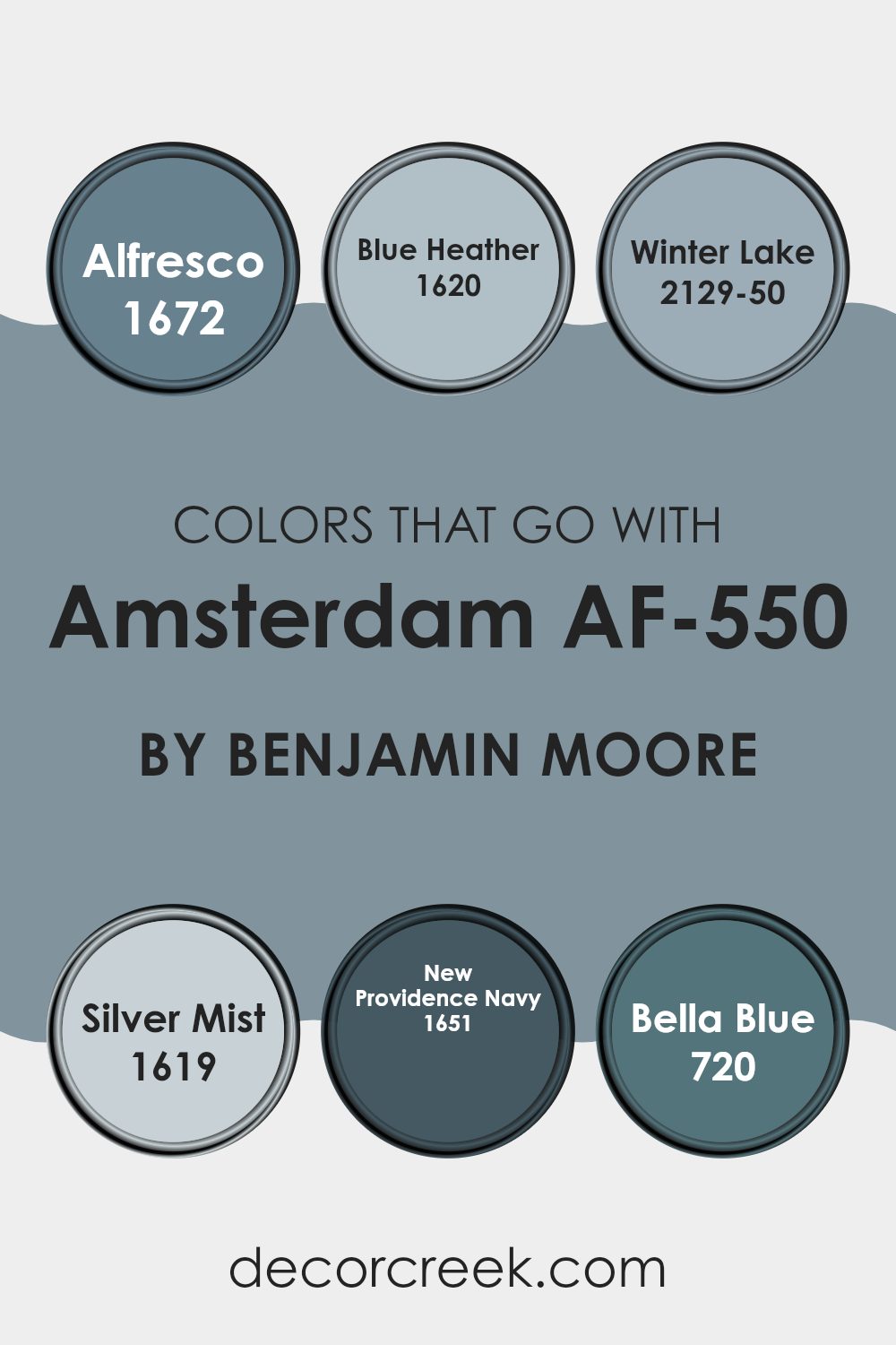
Colors that Go With Amsterdam AF-550 by Benjamin Moore
Choosing the right colors that complement Amsterdam AF-550 by Benjamin Moore is crucial for creating a harmonious and appealing interior. When paired thoughtfully, these colors enhance the deep, rich tone of Amsterdam AF-550, a cozy yet strong gray, ensuring balance and unity in your décor. Each supporting color serves to highlight its unique attributes, making the area more inviting and visually interesting.
For example, using lighter or contrasting shades can add depth and dimension to the room, making it feel more open and well-rounded.
Among the colors that pair well with Amsterdam AF-550, Alfresco 1672 introduces a gentle, fresh blue, bringing a light and airy feel that softens the bolder gray. Blue Heather 1620, another soft hue, has a subtle lilac undertone that offers a delicate contrast, adding a touch of grace. Winter Lake 2129-50 provides a cooler, bolder blue that injects vibrancy while maintaining a calming atmosphere.
Silver Mist 1619 is a light gray that blends smoothly with Amsterdam AF-550, ensuring a seamless visual transition throughout the area. For a more dramatic effect, New Providence Navy 1651 adds a deep, classic navy blue, which enriches the palette with its elegance. Lastly, Bella Blue 720 with its cheerful yet muted tone complements the sturdier gray, uplifting the overall aesthetic without feeling too strong.
Together, these colors create a cohesive look that enhances the appeal and warmth of any room they adorn.
You can see recommended paint colors below:
- 1672 Alfresco
- 1620 Blue Heather
- 2129-50 Winter Lake
- 1619 Silver Mist
- 1651 New Providence Navy
- 720 Bella Blue
How to Use Amsterdam AF-550 by Benjamin Moore In Your Home?
Amsterdam AF-550 by Benjamin Moore is an adaptable paint color that adds a sense of depth and warmth to any room in your home. This rich, gray-blue shade works well in a variety of settings, making it a great choice for those looking to refresh their living area. You can use Amsterdam AF-550 in your living room or bedroom to create a cozy, welcoming atmosphere.
It pairs beautifully with white trim and hardwood floors, highlighting the architectural features of your home. In the kitchen or dining area, Amsterdam AF-550 can be paired with lighter cabinets or countertops to create a balanced look. It’s also an excellent choice for the bathroom, where it can give the room a clean and fresh feel.
If you’re thinking about adding some color to your exterior, Amsterdam AF-550 can be used on front doors or shutters, providing a stylish contrast to more neutral siding colors. Its flexibility makes it a smart choice for anyone looking to refresh their home with a new paint color.
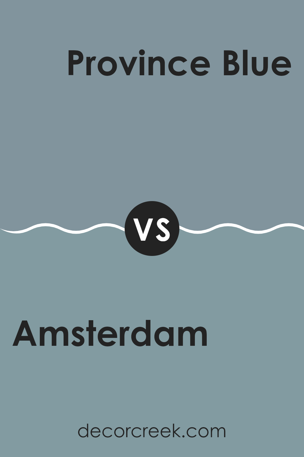
Amsterdam AF-550 by Benjamin Moore vs Province Blue 2135-40 by Benjamin Moore
Amsterdam and Province Blue by Benjamin Moore are two distinct shades that add their own unique character to any room. Amsterdam is a deep, rich gray with a subtle blue undertone.
It often gives a feeling of solidity and grounding to a room, making it a popular choice for creating a strong, yet cozy atmosphere. In contrast, Province Blue is a softer, lighter blue with hints of gray. This color is perfect for bringing a fresh and airy feel to an area, making it feel more open and inviting.
While Amsterdam tends to draw in the walls and make a room feel more intimate, Province Blue can make an area feel larger and more relaxed. These colors are adaptable and can fit various decor styles depending on how they are used in a room.
You can see recommended paint color below:
- 2135-40 Province Blue
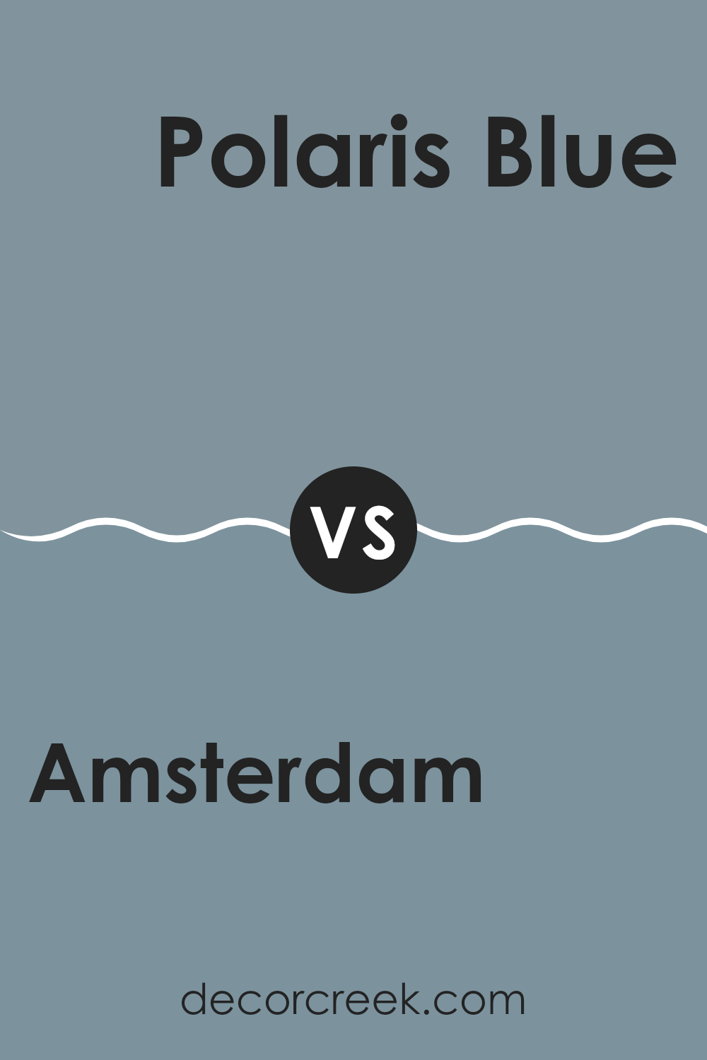
Amsterdam AF-550 by Benjamin Moore vs Polaris Blue 1649 by Benjamin Moore
Amsterdam AF-550 by Benjamin Moore is a deep, gray-blue hue that brings a strong presence to any room. It has an understated elegance that makes it perfect for creating a cozy, welcoming atmosphere. Its richness is adaptable enough to be used in various settings, from living rooms to bedrooms, without overpowering the area.
On the other hand, Polaris Blue 1649 is a lighter, softer blue with a more vibrant feel. It offers freshness and a breezy sort of charm, making it ideal for adding a bright and airy quality to a room. This color works well in areas like bathrooms and kitchens, where a clean, refreshing look is often desired.
Both colors, while distinctly blue, offer different moods and effects. Amsterdam’s depth can make a room feel more enclosed and snug, while Polaris Blue tends to open up an area with its lighter, more dynamic tone. Choosing between them depends on the desired impact and the specific function of the room you’re planning to paint.
You can see recommended paint color below:
- 1649 Polaris Blue
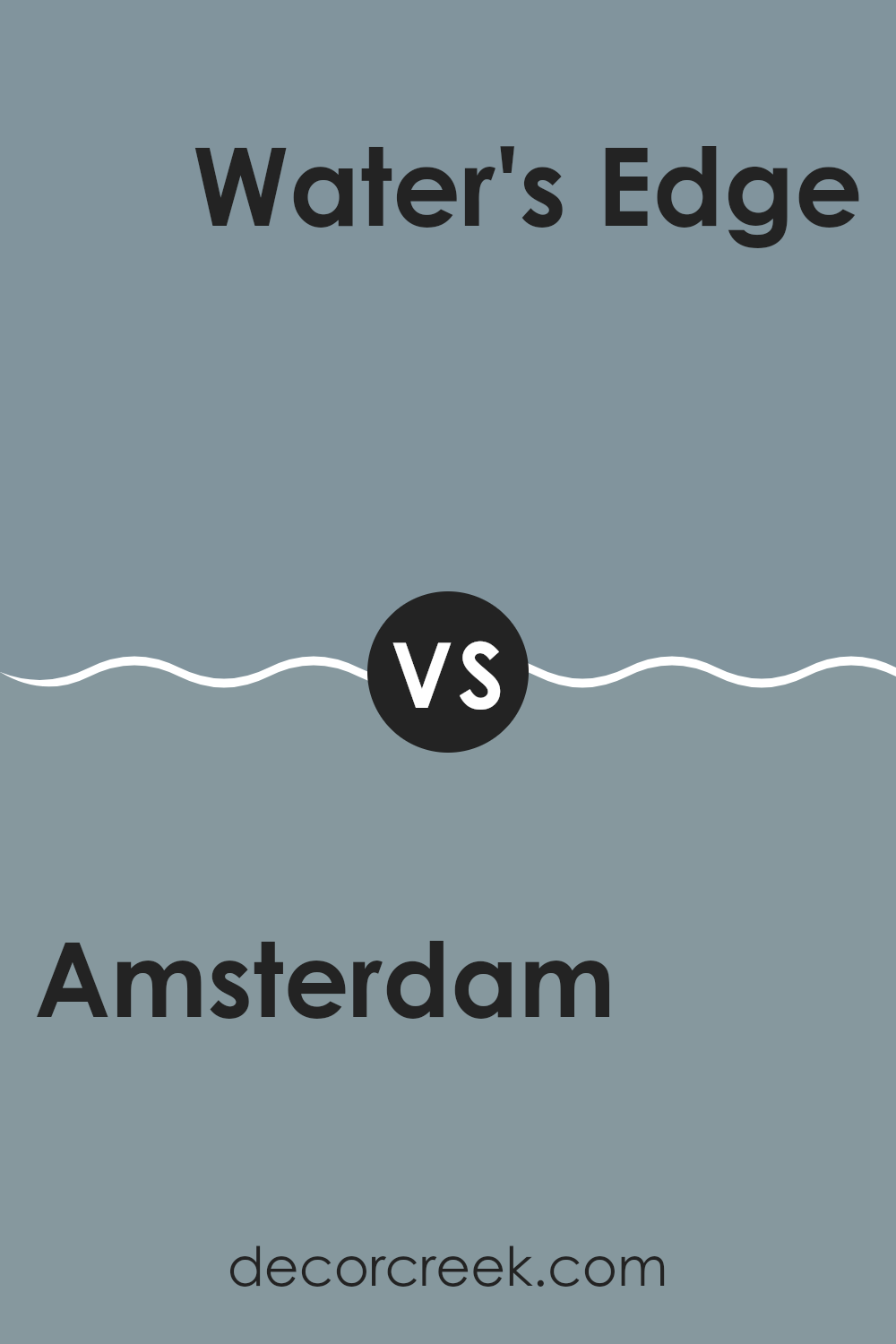
Amsterdam AF-550 by Benjamin Moore vs Water’s Edge 1635 by Benjamin Moore
Amsterdam AF-550 and Water’s Edge 1635, both by Benjamin Moore, present distinct moods for any room. Amsterdam is a deep, greyish-blue hue that brings a strong, almost stately quality to interiors.
It’s perfect if you’re aiming for a grounded, mature look. On the other hand, Water’s Edge leans towards a lighter, fresher blue with a welcoming brightness that can make small areas appear larger and more open.
Amsterdam might be better suited for formal rooms or bedrooms due to its darker tone, while Water’s Edge works wonderfully in bathrooms or kitchens for a splash of cheerful color. Both colors pair beautifully with white trim or wooden furniture, highlighting different elements depending on the atmosphere you want to create. Choose Amsterdam for a more refined elegance or Water’s Edge for a lively, open vibe.
You can see recommended paint color below:
Amsterdam AF-550 by Benjamin Moore vs Mineral Alloy 1622 by Benjamin Moore
The main color, Amsterdam, is a deep, grayish-blue that adds a cozy and strong feeling to any room. It’s the kind of color that makes you think of a sturdy, classic denim jean or the stormy sea. On the other hand, Mineral Alloy is lighter and leans more towards a soft gray with a hint of blue, giving a more relaxed and open vibe, similar to a light morning sky or a gentle mist.
Both colors come from the same family but serve different moods and atmospheres in a room. Amsterdam, being darker, is a great choice for making a bold statement and works well in places where you want to add depth, like in a study or a living area. Meanwhile, Mineral Alloy is perfect for rooms that you want to keep bright and airy, such as bathrooms or small kitchens, where its lighter shade helps to make the area look bigger and more welcoming.
In summary, Amsterdam provides a strong, comforting presence, while Mineral Alloy offers a gentler, roomy feel. Both are adaptable, but your choice depends on the type of mood you want to set.
You can see recommended paint color below:
- 1622 Mineral Alloy
It was helpful for me to write about AF-550 Amsterdam by Benjamin Moore because I got to share how this beautiful paint color can change a room. This color, a deep, blueish gray, reminds me of a stormy sky but still feels cozy and warm somehow. It’s just right for making a room feel both snug and lovely at the same time.
What’s really great about Amsterdam is how nicely it pairs with other colors. Whether you’re placing it next to soft whites or bright shades, it looks amazing. This makes it a reliable choice for anyone wanting to make their bedroom, living room, or even the kitchen feel a bit more special.
From my time looking at and talking about Amsterdam, I’ve noticed that it doesn’t just look good; it also helps make other things in the room stand out. The color has a way of making furniture and decorations pop, which I think is pretty cool, especially if you like mixing old and new pieces around your home.
In conclusion, writing about Amsterdam was fun and it made me think about how a simple can of paint can really make a big difference in our homes. It’s more than just a color; it’s an easy way to make any room feel brighter and more welcoming without having to do a lot of work or spend a lot of money.
Ever wished paint sampling was as easy as sticking a sticker? Guess what? Now it is! Discover Samplize's unique Peel & Stick samples.
Get paint samples

