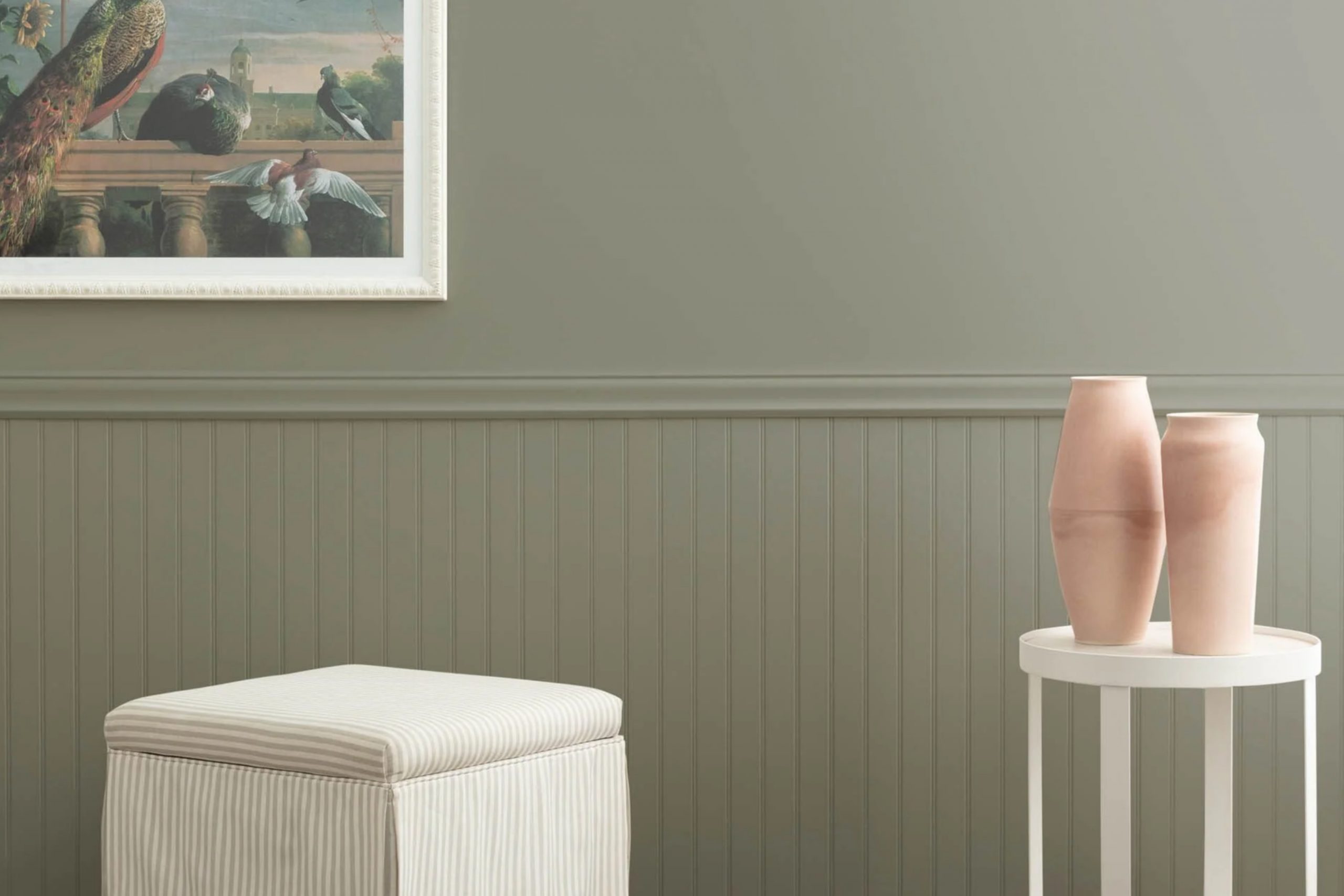
Choosing the perfect paint color for your space can sometimes be a challenge, but if you’re eyeing a timeless hue that adds a sophisticated touch, you might want to consider 1560 Antique Pewter by Benjamin Moore. This unique gray offers a balance of warmth and elegance, making it a versatile choice for any room in your home. Whether it’s for a cozy living area, a serene bedroom, or an inviting kitchen, 1560 Antique Pewter has the ability to elevate the look of your interiors with its understated beauty.
With its rich, neutral base, this color pairs well with a wide range of decor styles. From modern and minimalist to rustic and traditional, it brings a sense of calm and sophistication without overwhelming the senses. If you’re planning a makeover or refreshing your space, 1560 Antique Pewter could be the color that ties everything together.
Its adaptability means it can seamlessly blend with your existing furnishings and accessories, or serve as a foundation for a new design theme.
In this discussion, we’ll delve into why 1560 Antique Pewter by Benjamin Moore stands out as a top choice for homeowners and designers alike.
Whether it’s the color’s ability to create a warm, inviting atmosphere or its compatibility with various design aesthetics, we’ll cover all you need to know to make an informed decision for your next project.
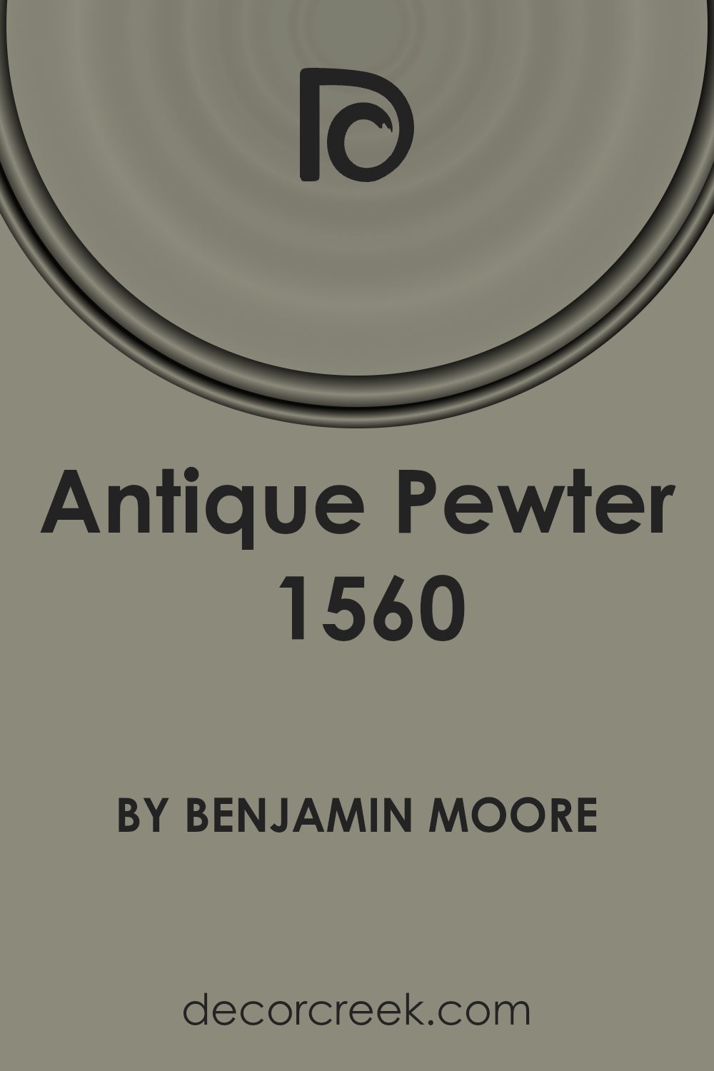
What Color Is Antique Pewter 1560 by Benjamin Moore?
Antique Pewter by Benjamin Moore is a unique and versatile paint color that can add depth and character to any room. This shade is a sophisticated blend of gray with a touch of green, creating a soft, muted hue that works beautifully in various settings. Its earthy tones make it a perfect choice for those seeking a neutral color with a bit of warmth.
This color is especially suited for interior styles that aim for a cozy, welcoming atmosphere. Think modern farmhouse, rustic, or even Scandinavian designs where its calming effect can complement the minimalistic and organic aesthetic. Antique Pewter pairs wonderfully with natural materials such as wood, stone, and leather, enhancing their texture and bringing a sense of harmony to the space.
For textiles, it works well with fabrics that have a bit of texture to them, like linen or wool, adding to the overall soft and layered look of a room. The color is also an excellent backdrop for metallic accents like brass or copper, offering a subtle contrast that can make these materials pop.
In spaces like living rooms, bedrooms, or even kitchens, Antique Pewter can create a serene and grounded environment. Its versatility makes it a fantastic choice for anyone looking to add a touch of sophistication and warmth to their home.
Is Antique Pewter 1560 by Benjamin Moore Warm or Cool color?
Antique Pewter 1560 by Benjamin Moore is a unique color that brings a sophisticated and subtle elegance to any room in your home. This shade is a soft, warm gray that falls somewhere between a light gray and a muted silver, making it highly versatile and easy to pair with various decor styles.
In home interiors, Antique Pewter 1560 has a calming effect, creating a cozy and inviting atmosphere. It’s perfect for living rooms, bedrooms, or even kitchens and bathrooms, adding depth and dimension without overpowering the space. This color works well with both natural light and artificial lighting, subtly shifting in hue to match the room’s mood, from a bright and airy feel during the day to a more intimate and comfortable vibe in the evening.
Moreover, it serves as an excellent backdrop for artwork, furniture, and accent pieces, allowing other colors to pop without causing a clash. Whether your home is furnished in modern, traditional, or eclectic styles, Antique Pewter 1560 can seamlessly integrate, adding a touch of sophistication and timeless appeal.
Undertones of Antique Pewter 1560 by Benjamin Moore
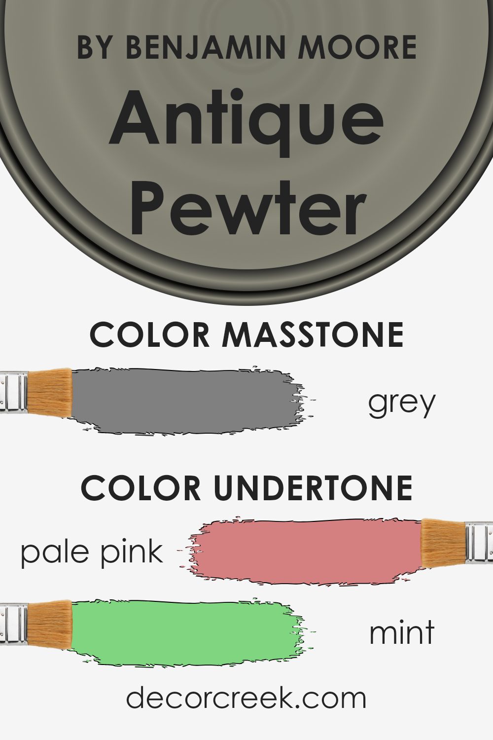
Antique Pewter 1560 by Benjamin Moore is a complex color that can look different based on the lighting and surrounding colors. The undertones play a huge role in how we perceive it. For instance, if you’re in a room with lots of natural light, the pale pink or light blue undertones might make the color appear softer and more welcoming. On a cloudy day, darker undertones like dark green or navy could make the room feel cozier.
In interior walls, these undertones add depth and character to the space. Imagine painting your living room with this color. Depending on the furniture and accessories, you might see more of the mint or light green undertones, which can create a fresh and inviting atmosphere. Or you could complement it with darker wood finishes and bring out the brown or olive undertones, offering a grounding and sophisticated feel.
The variety of undertones also means the color can match well with many different accent colors. Light turquoise or pale yellow accents can brighten up the space, while dark grey or navy can make it feel more formal and serious. Because of this versatility, Antique Pewter 1560 is not just a simple gray. It’s a backdrop that allows for personalization, making any room feel uniquely yours.
Understanding the undertones of Antique Pewter 1560 and how they affect the overall look of the color can help you create the perfect space in your home. Whether you’re going for a cozy, intimate feel or a bright and airy atmosphere, paying attention to these subtle hints of color can make all the difference.
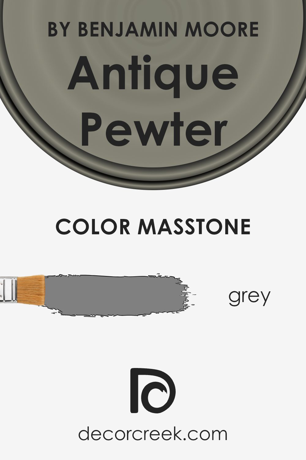
What is the Masstone of the Antique Pewter 1560 by Benjamin Moore?
Antique Pewter 1560 by Benjamin Moore has a masstone of grey, having the specific code #808080. This unique shade has a balanced and neutral feature that makes it incredibly versatile for use in homes. Its grey tone can serve as a subtle backdrop in various spaces, allowing other colors in the decor to stand out or blend harmoniously. Since it’s neither too dark nor too light, this pewter color can help create a cozy and inviting atmosphere without overpowering a room.
Using this grey in your home can enhance the sense of calm and elegance. It works well in areas where you want to promote relaxation, like bedrooms or living rooms. Furthermore, its neutrality means it can also fit seamlessly into kitchens and bathrooms, pairing well with both warm and cool accents.
This flexibility allows homeowners to refresh their spaces without worrying about major clashes with existing furniture or accessories. This specific shade by Benjamin Moore helps in achieving a timeless look that can easily adapt to changing styles and preferences.
How Does Lighting Affect Antique Pewter 1560 by Benjamin Moore?
Lighting plays a crucial role in how we see colors in our surroundings. It can make the same color look different based on whether it’s under artificial light or natural sunlight. A color like Antique Pewter by Benjamin Moore is a great example to discuss this effect.
In artificial light, such as LED or incandescent bulbs, the color Antique Pewter might appear warmer or take on a slightly different hue. This is because artificial lights can have yellow or blue undertones that mix with the color on walls or objects, altering how we perceive it. For instance, under warm, yellow-toned lights, Antique Pewter may look more inviting and cozy, bringing out its subtler brown and gray undertones.
Under natural light, this color can look vastly different depending on the time of day and the weather. Natural sunlight tends to bring out the truest version of the color. On a sunny day, Antique Pewter might have a crisp, cool appearance, showcasing its gray qualities, while on an overcast day, it might appear softer, more muted.
The direction of the room also has a significant impact on how Antique Pewter looks:
- North-faced rooms: These rooms get less direct sunlight, making them cooler and slightly dim. In such rooms, Antique Pewter can seem more somber and darker, emphasizing its gray attributes.
- South-faced rooms: These rooms are bathed in more natural light throughout the day. Here, Antique Pewter will appear lighter and more lively, allowing its subtle warm undertones to shine, making the room feel more spacious and
- East-faced rooms: Morning light is cooler, so Antique Pewter may look more refreshing and calm in the morning, transitioning to warmer and cozier as the day progresses
- West-faced rooms: In the evening, as the sun sets, the color can look very warm and rich due to the reddish-golden hues of the sunset, turning the Antique Pewter into a more welcoming backdrop.
Understanding how lighting affects color can help in making more informed choices about paint in your home or any space.
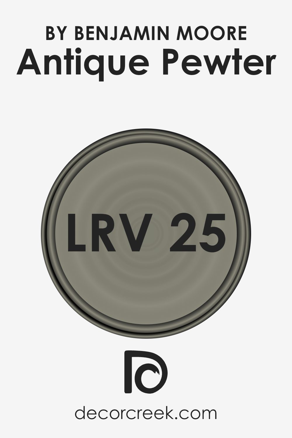
What is the LRV of Antique Pewter 1560 by Benjamin Moore?
LRV stands for Light Reflectance Value, and it’s a measure of how much light a color reflects back into the room, scored on a scale from 0 to 100. The lower the number, the less light it reflects, and conversely, the higher the number, the more light it reflects. This is important because it can significantly affect how a color looks in your space. A higher LRV value means the color will seem lighter and can make a room feel more expansive and brighter. On the other hand, colors with a lower LRV can make a room feel cozier but smaller, as they absorb more light.
For the color Antique Pewter with an LRV of 25.4, this means it’s on the darker side of the scale, reflecting relatively little light. In practical terms, when used on walls, Antique Pewter will create a more intimate and snug ambiance because of its lower LRV.
It won’t brighten up a space as much as a color with a higher LRV would, so it’s perfect for creating a moody or cozy feel. Lighting plays a crucial role when working with colors like this; both natural and artificial light will interact with the hue, affecting how it’s perceived at different times of the day.
Therefore, Antique Pewter might look different in a room with plenty of sunlight compared to a room with fewer windows.
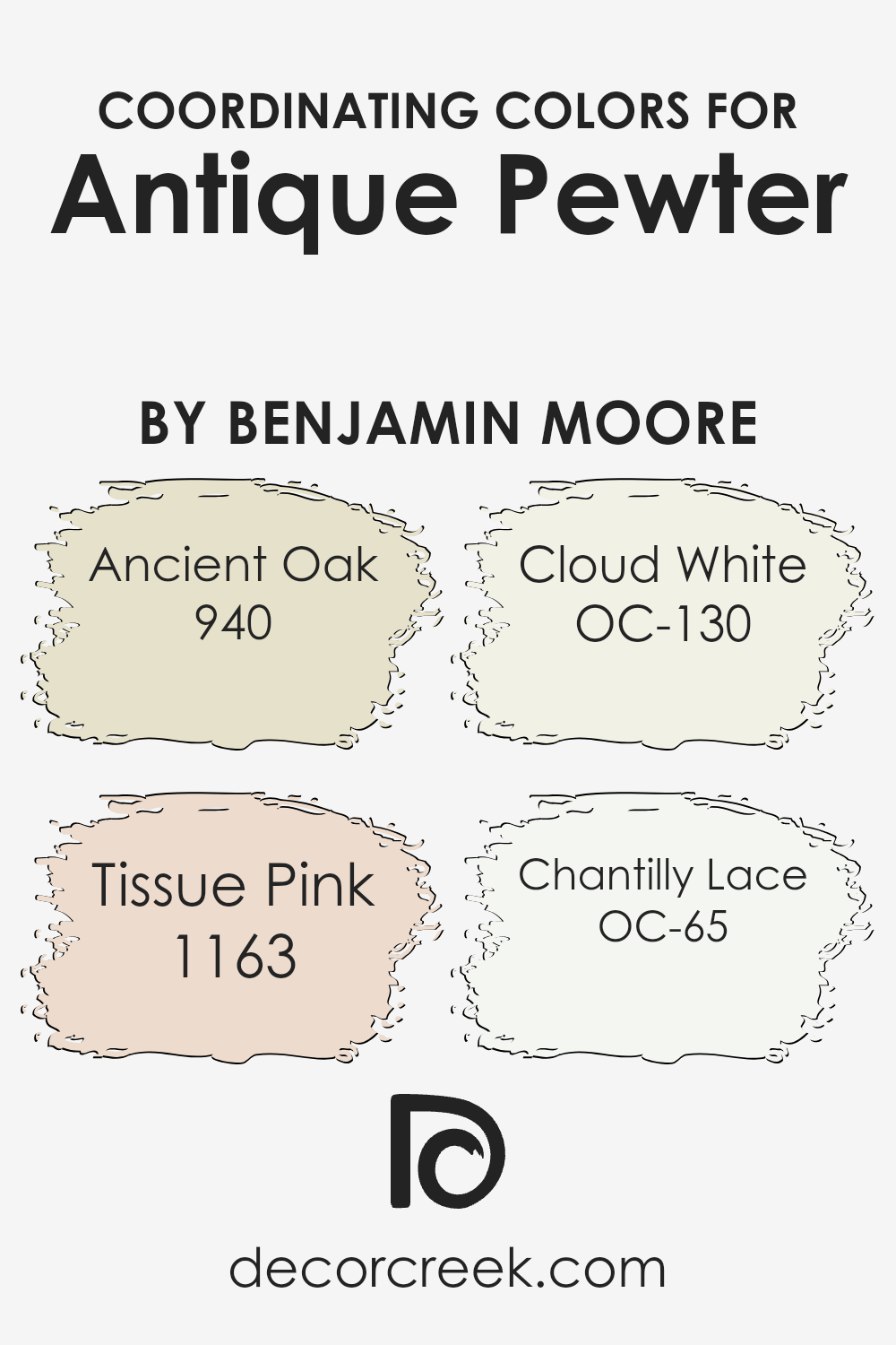
Coordinating Colors of Antique Pewter 1560 by Benjamin Moore
Coordinating colors are shades that complement a primary paint color, enhancing the overall look and feel of a room without overwhelming it. They work by balancing visual appeal, adding depth and character to spaces, and making design choices more cohesive. For example, when decorating a room with a base color like a sophisticated gray, finding the right accompanying shades can transform the space into a harmonious haven.
Ancient Oak 940 is a warm, muted brown that exudes a sense of sturdy reliability, perfect for creating a grounded and comforting atmosphere. Tissue Pink 1163 offers a soft, gentle hue, introducing a whisper of color that’s light and airy, ideal for adding a touch of sweetness without overpowering.
Cloud White OC-130 acts as a breath of fresh air, providing a clean, crisp backdrop that amplifies the light in any room, making spaces appear larger and more inviting. Lastly, Chantilly Lace OC-65 brings a pure, radiant white to the mix, offering a slightly cooler tone that sparkles with clarity, lending a fresh and seamless finish to the ensemble.
Each of these coordinating colors works together to enhance the beauty and sophistication of the primary shade, ensuring a beautifully balanced and inviting space.
You can see recommended paint colors below:
- 940 Ancient Oak
- 1163 Tissue Pink
- OC-130 Cloud White
- OC-65 Chantilly Lace
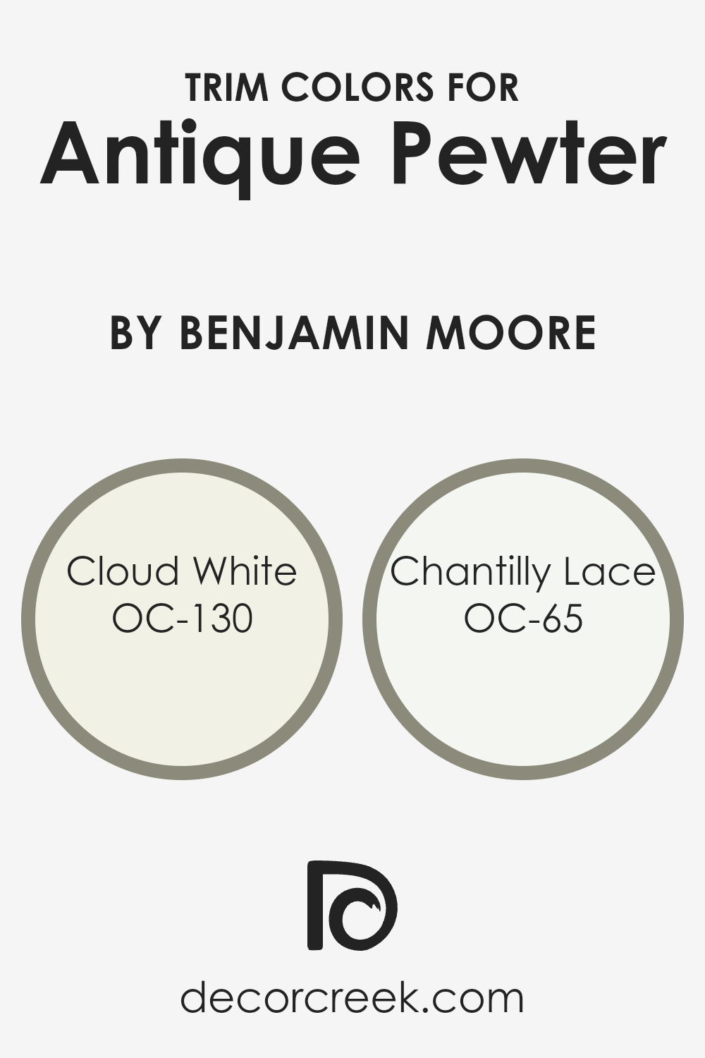
What are the Trim colors of Antique Pewter 1560 by Benjamin Moore?
Trim colors are essentially the accent colors that are used on moldings, door frames, window casings, and baseboards in a room. These colors are designed to complement or contrast the primary wall color to enhance the overall appearance of a space. For a sophisticated color like Antique Pewter by Benjamin Moore, choosing the right trim color is crucial. It helps in defining architectural details, creating depth, and contributing to the room’s cohesive look. The trim color can be a subtle nod to elegance or a bold statement, depending on the chosen hue. Particularly with a nuanced color like Antique Pewter, the trim can either soften the transition between wall and ceiling or frame the wall color for a more dramatic effect.
OC-130, known as Cloud White, is a soft, creamy white with a hint of warmth that can make spaces feel more inviting. This color pairs well with the muted, sophisticated tones of Antique Pewter, offering a seamless transition that enhances natural light and adds a gentle brightness to the room.
On the other hand, OC-65, or Chantilly Lace, presents a crisp, clean white with a bit more neutrality compared to Cloud White. Its lack of underlying tones makes it a universal choice for pairing with Antique Pewter, providing a sharp contrast that highlights architectural features with a fresh, modern appeal.
Both options offer their unique touch to the space, allowing for personalization while maintaining a harmonious look with Antique Pewter as the backdrop.
You can see recommended paint colors below:
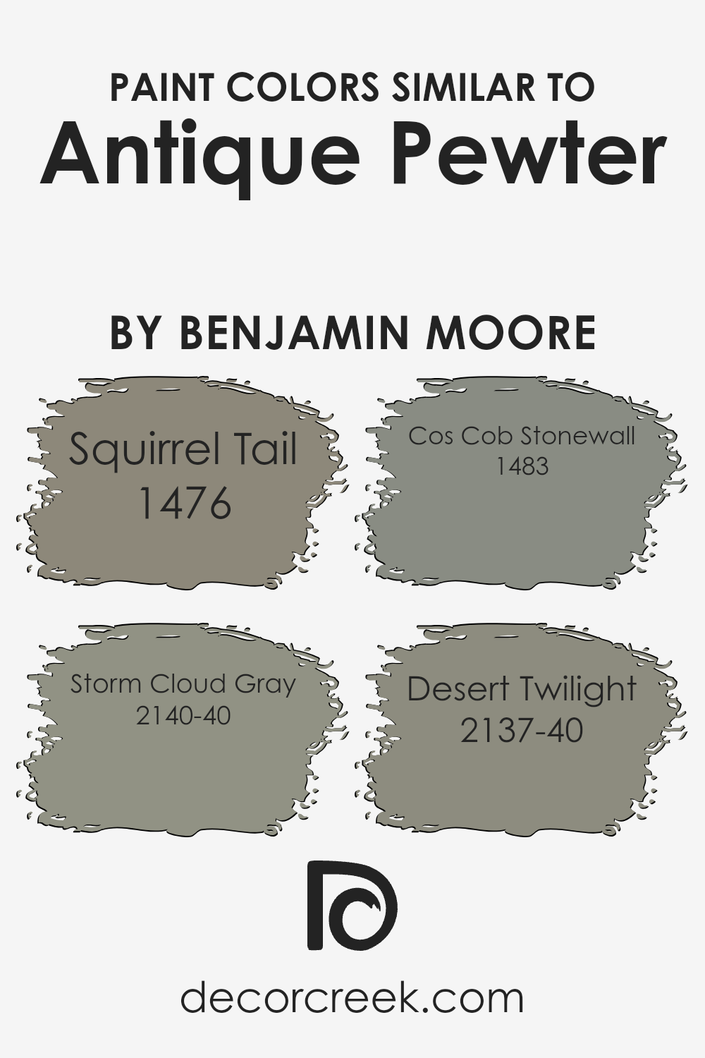
Colors Similar to Antique Pewter 1560 by Benjamin Moore
Using similar colors in design can greatly enhance the aesthetic appeal of a space, creating a harmonious and balanced look. When colors share a common hue or intensity, they naturally complement each other, resulting in a cohesive and pleasing atmosphere. This principle is especially true for shades similar to Antique Pewter by Benjamin Moore, a sophisticated gray that exudes a timeless charm. Such colors, while distinct, share a certain depth and neutrality, making them versatile for various applications, from accent walls to entire room schemes. They work together by subtly varying in warmth or coolness, providing visual interest without overwhelming the senses with stark contrasts.
For instance, Squirrel Tail offers a slightly warmer tone, bringing a cozy and inviting feel to spaces that need a touch of comfort. Storm Cloud Gray, on the other hand, presents a moodier, more dramatic depth, making it ideal for creating focal points or grounding lighter palettes.
Cos Cob Stonewall has an earthy, natural quality that echoes the sturdiness and reliability of stone, perfect for adding a sense of stability. Lastly, Desert Twilight stands out with its unique blend of gray and subtle violet undertones, offering a tranquil and serene backdrop for relaxation. Each of these colors, while sharing a kinship with Antique Pewter, brings its own character to the table, allowing for rich and layered interior designs.
You can see recommended paint colors below:
- 1476 Squirrel Tail
- 2140-40 Storm Cloud Gray
- 1483 Cos Cob Stonewall
- 2137-40 Desert Twilight
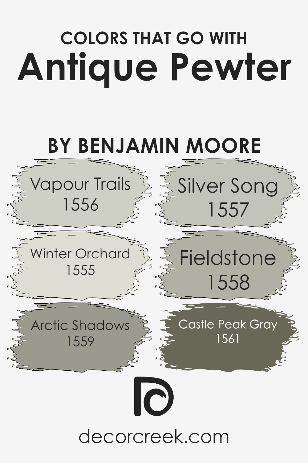
Colors that Go With Antique Pewter 1560 by Benjamin Moore
Selecting colors that complement Antique Pewter 1560 by Benjamin Moore is essential because it ensures that the overall look is coherent and aesthetically pleasing. These complementary colors enhance the muted elegance of Antique Pewter, creating a sophisticated palette that can elevate any space.
By carefully choosing colors like Vapour Trails, Winter Orchard, Arctic Shadows, Silver Song, Fieldstone, and Castle Peak Gray, you can design a room that feels balanced and thoughtfully curated. The harmonious combination of these colors works together to bring out the best in Antique Pewter, making it stand out as a versatile and stylish choice for walls.
Vapour Trails is a soft, airy gray with a hint of warmth, making it perfect for creating a serene and inviting space. Winter Orchard is slightly warmer, offering a gentle embrace of light greige that reflects natural light beautifully, enhancing the depth of Antique Pewter. Arctic Shadows stands out as a deeper shade, providing a striking contrast that adds dimension and interest to the room.
Silver Song, with its silvery-blue undertones, offers a refreshing coolness that pairs splendidly with the neutrality of Antique Pewter. Fieldstone introduces a touch of earthiness, grounding the color scheme with its solid, mid-tone gray, while Castle Peak Gray brings a robust depth to the palette, its darker tone working well to anchor the lighter shades.
Together, these colors create a cohesive and inviting environment that showcases the timeless appeal of Antique Pewter.
You can see recommended paint colors below:
- 1556 Vapour Trails
- 1555 Winter Orchard
- 1559 Arctic Shadows
- 1557 Silver Song
- 1558 Fieldstone
- 1561 Castle Peak Gray
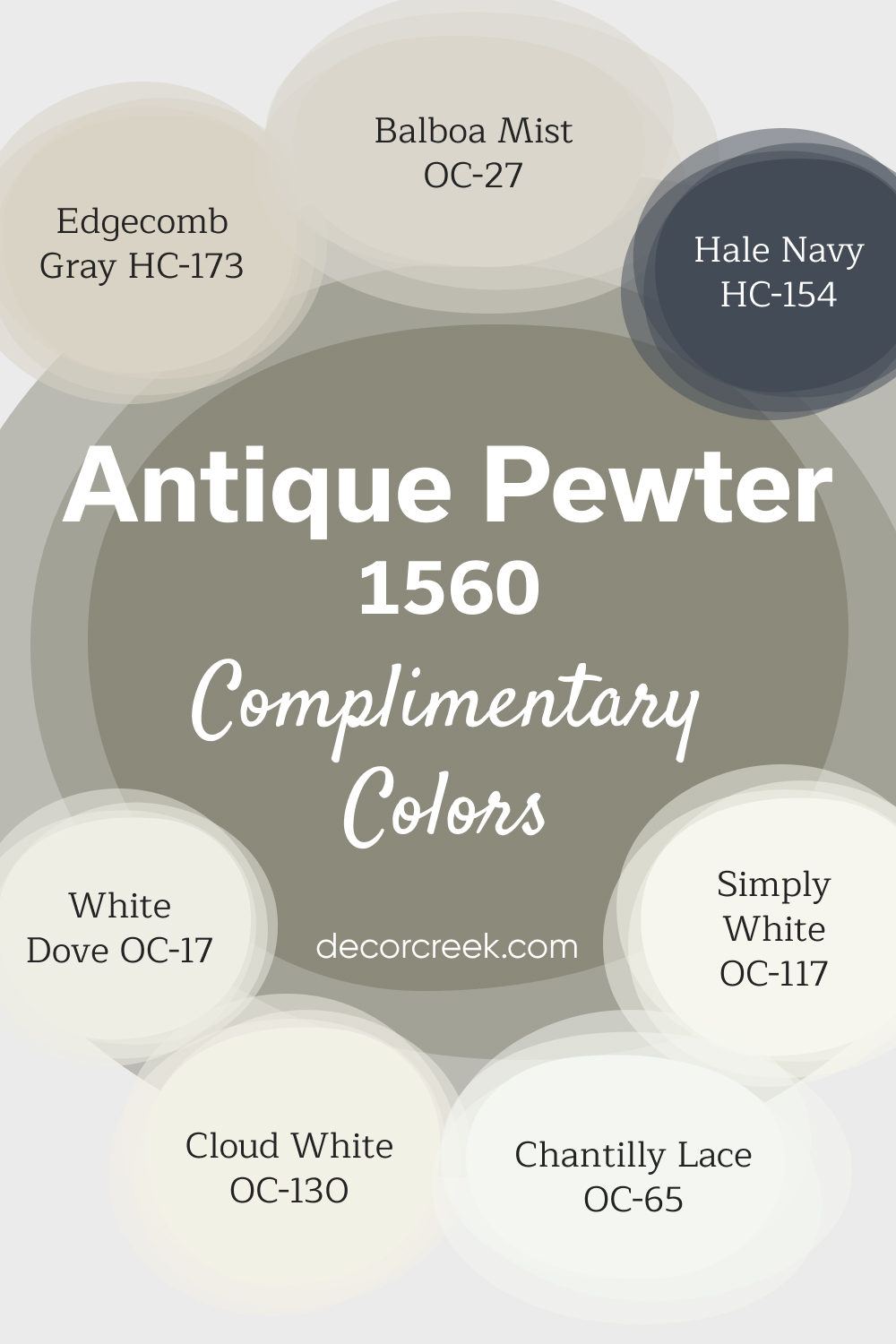
Complimentary Colors for Antique Pewter 1560 Paint Color by Benjamin Moore
Antique Pewter by Benjamin Moore is a versatile gray with warm undertones, offering a balanced, timeless look for any room. Its earthy tones make it perfect for creating a cozy and inviting atmosphere, whether used on walls or as an accent. Antique Pewter blends seamlessly with a variety of shades, making it a popular choice for both modern and traditional designs.
Pair Antique Pewter with Chantilly Lace or White Dove for a crisp, clean contrast, or Edgecomb Gray and Balboa Mist for a softer, more seamless palette.
For a bolder statement, Hale Navy works beautifully as an accent color, adding depth and drama.
Cloud White and Simply White are ideal for trim and ceilings, enhancing the overall brightness of the space.
How to Use Antique Pewter 1560 by Benjamin Moore In Your Home?
Antique Pewter 1560 by Benjamin Moore is a unique paint color that brings a sophisticated, soft grey tone into your home. Its neutral shade makes it easy to combine with a wide range of decor styles, from modern to traditional. This versatility means you can use Antique Pewter 1560 in almost any room of your house, whether you’re looking to create a calming atmosphere in your bedroom or a sleek look in your living room.
One great way to use this color is by painting your walls with it to serve as a subtle backdrop that complements brighter colors or plays up the elegance of white trim and furniture. It works well in spaces where you want to add depth without overwhelming the room with a dark color. Kitchens, bathrooms, and home offices also benefit from this shade, providing a serene environment that’s both stylish and timeless.
Besides walls, consider using Antique Pewter 1560 on cabinets, doors, or even as an accent color in shelving units. It pairs nicely with metallic finishes, wood textures, and vibrant textiles, offering endless possibilities for creating a space that feels both cozy and refined.
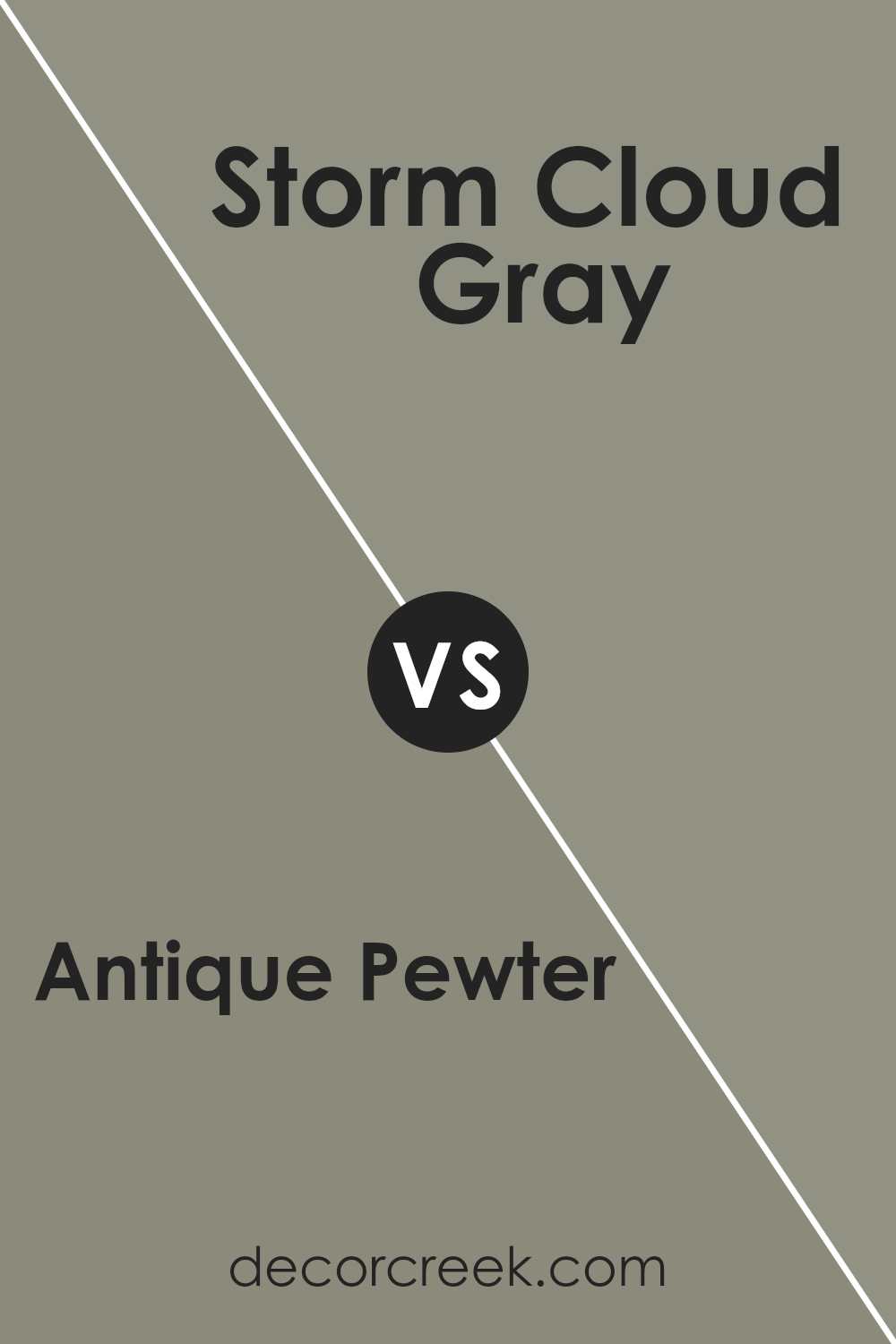
Antique Pewter 1560 by Benjamin Moore vs Storm Cloud Gray 2140-40 by Benjamin Moore
Antique Pewter and Storm Cloud Gray are two colors by Benjamin Moore that share a few similarities, but also have their distinct differences. Antique Pewter is a soft, muted gray with a hint of green undertone, making it a natural and soothing choice for rooms. It brings a warm elegance to spaces, offering a sense of calmness.
On the other hand, Storm Cloud Gray is a stronger, more pronounced gray with a deeper tone. It’s bolder than Antique Pewter, providing a striking presence that can make a statement in a room. While Antique Pewter is like a gentle whisper, calming and subtle, Storm Cloud Gray is more like a confident voice, standing out with a bit more intensity.
Both colors are versatile and can complement a wide range of décor styles, but your choice between them would depend on the ambiance you want to create—cozy and serene with Antique Pewter, or bold and dramatic with Storm Cloud Gray.
You can see recommended paint color below:
- 2140-40 Storm Cloud Gray
Antique Pewter 1560 by Benjamin Moore vs Squirrel Tail 1476 by Benjamin Moore
Antique Pewter and Squirrel Tail, both from Benjamin Moore, are two shades that can beautify any space, each carrying its unique vibe. Antique Pewter is a soft, muted grey with a hint of green, giving off a peaceful and tranquil feel. It’s perfect for creating a serene and inviting atmosphere in rooms where you want to unwind.
On the other hand, Squirrel Tail steps in with a warmer tone, blending grey with subtle brown undertones. This color adds a cozy, welcoming touch, great for spaces where you gather and spend time with loved ones.
Comparatively, Antique Pewter leans more towards a cooler palette, offering a sense of calmness, while Squirrel Tail brings warmth, making a room feel more intimate. Both colors are versatile and can beautifully complement various decor styles, but your choice between them would hinge on the ambiance you wish to create—cool and calming with Antique Pewter or warm and inviting with Squirrel Tail.
You can see recommended paint color below:
- 1476 Squirrel Tail
Antique Pewter 1560 by Benjamin Moore vs Desert Twilight 2137-40 by Benjamin Moore
Antique Pewter and Desert Twilight, both by Benjamin Moore, exhibit subtle yet distinguishable differences that make them unique. Antique Pewter is a complex gray with warm undertones, providing a soothing and welcoming feel to spaces. Its versatility allows it to adapt well to various lighting conditions, changing subtly in appearance from a cozy soft gray in natural light to a more profound, richer tone under artificial lighting.
On the other hand, Desert Twilight has a deeper, earthier feel, with a blend that hints at a greenish-gray undertone. This color brings a serene, grounding effect to rooms, evoking the calmness of twilight in a desert landscape. It pairs beautifully with natural materials and can add depth and sophistication to any space.
While both colors share a gray base, Antique Pewter leans towards a lighter, warmer gray, making spaces feel open and airy. Desert Twilight, with its slightly greener and darker tone, offers a more intimate and enclosed atmosphere. Choosing between them would depend on the desired ambiance and the room’s purpose.
You can see recommended paint color below:
- 2137-40 Desert Twilight
Antique Pewter 1560 by Benjamin Moore vs Cos Cob Stonewall 1483 by Benjamin Moore
Antique Pewter and Cos Cob Stonewall are both unique colors from Benjamin Moore, but they bring different vibes to a space. Antique Pewter has a subtle gray tone that feels soft and sophisticated. It’s like a cozy, muted gray with hints of warmth, making it perfect for creating a serene and inviting atmosphere in any room. On the other hand, Cos Cob Stonewall leans towards a greenish-gray, inspired by natural stone. This color has a bit more earthiness to it, offering a connection to the outdoors and adding a refreshing, natural feel to interiors.
While both colors share a certain softness and can complement a range of decor styles, Antique Pewter is more about creating a neutral, understated elegance. Cos Cob Stonewall, with its touch of green, brings in a bit more character and can help to brighten spaces while still keeping things grounded. Whether you’re going for a classic look with Antique Pewter or a slightly more vibrant, nature-inspired vibe with Cos Cob Stonewall, both colors offer a beautiful palette for your home.
You can see recommended paint color below:
- 1483 Cos Cob Stonewall
Conclusion
In conclusion, the shade Antique Pewter by Benjamin Moore is a versatile and elegant color that offers a unique blend of gray with subtle blue undertones. This color is perfect for those looking to create a serene and sophisticated atmosphere in any space. Its adaptability allows it to be used in various settings, from modern kitchens to cozy living rooms, providing a soothing backdrop that complements a wide range of decor styles.
Moreover, Antique Pewter’s timeless appeal ensures it remains a popular choice among homeowners and design enthusiasts. Whether used as a main color scheme or an accent, it brings a sense of calm and elegance to interiors.
Its ability to pair well with both warm and cool colors adds to its versatility, making it a go-to choice for anyone looking to refresh their space with a hue that balances contemporary charm with classic elegance.
Ever wished paint sampling was as easy as sticking a sticker? Guess what? Now it is! Discover Samplize's unique Peel & Stick samples.
Get paint samples

