HC-154 Hale Navy by Benjamin Moore stands out as a classic, deeply saturated shade of navy blue that brings a rich sense of sophistication and style to any space. Known for its versatility, Hale Navy has the unique ability to adapt to various decor styles, whether you’re aiming for a crisp, modern look or a cozy, traditional atmosphere.
This color is not just another shade of blue; it carries a timeless elegance that can make a bold statement on exterior facades or add a touch of drama to interior walls, cabinetry, and furniture. With Hale Navy, homeowners and designers alike celebrate its striking balance between being bold enough to make a statement and subdued enough to act as a neutral, pairing beautifully with a wide range of colors.
From bright whites to soft grays and even rich wood tones, Hale Navy complements and enhances its surroundings. Its enduring popularity is not just about the color itself but the mood it creates; a backdrop that promotes both tranquility and confidence in any room.
As we explore the possibilities of incorporating HC-154 Hale Navy into your home, we’ll look at its impact on spaces of all sizes and styles, the best complementing colors and materials, and tips for achieving the look you desire.
Whether you’re refreshing a single room or transforming your entire home, Hale Navy offers a blend of classic and contemporary that can transform your space into a stunning exhibit of timeless design.
What Color Is Hale Navy HC-154 by Benjamin Moore?
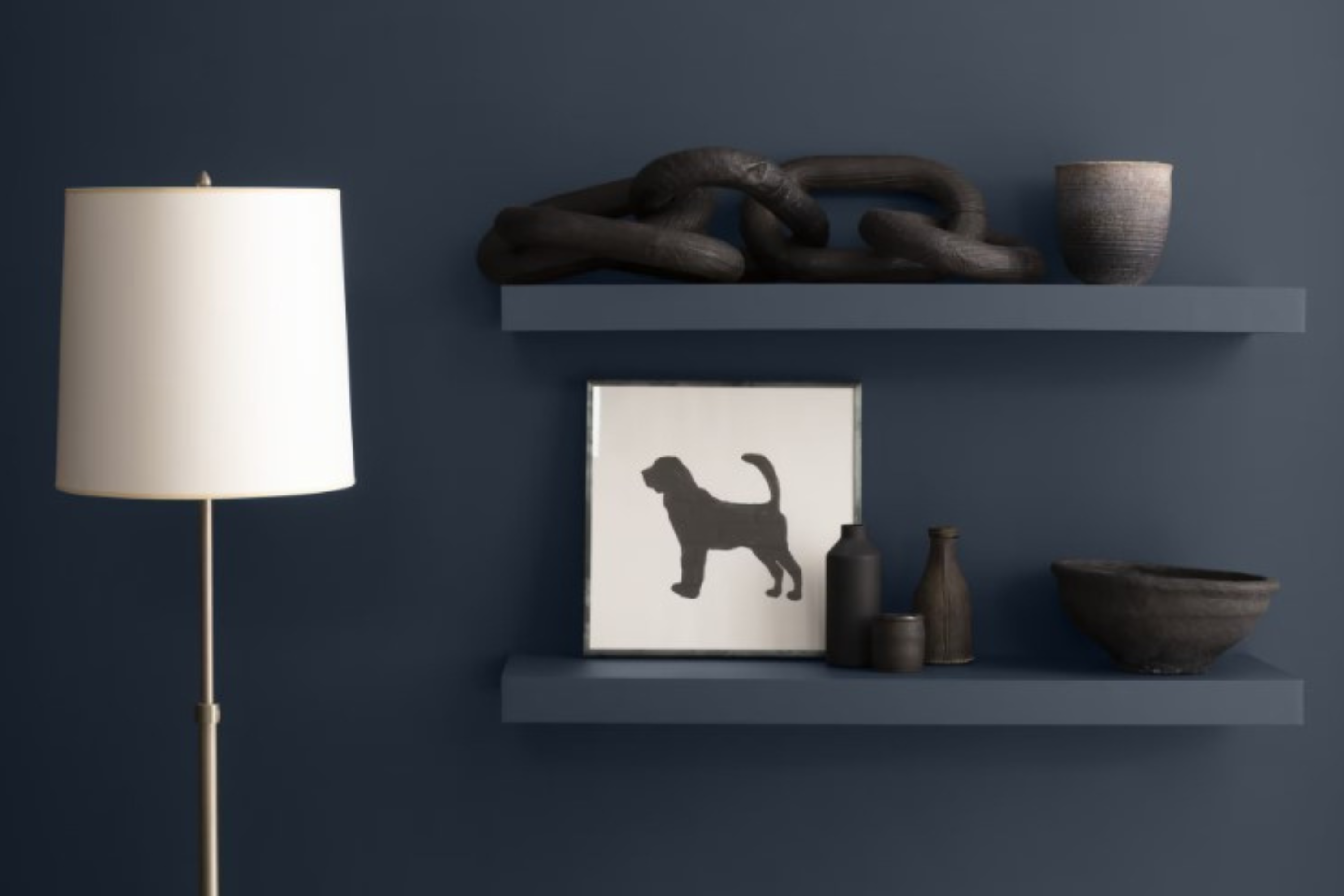
Hale Navy is a timeless color by Benjamin Moore that offers a perfect blend of richness and sophistication. This bold shade stands out for its ability to add depth and character to any room. Its versatility makes it a fantastic choice for various interior styles, from classic to contemporary, coastal to urban chic. The beauty of Hale Navy lies in its unique balance between a strong, dark tone and a welcoming warmth, making spaces feel cozy yet spacious.
This deep blue color works exceptionally well in living rooms, bedrooms, and even kitchens, bringing in a sense of tranquility and elegance. When it comes to pairing with materials and textures, Hale Navy is incredibly accommodating. It looks stunning when combined with natural wood, adding a rustic charm to the ambiance.
Metallic finishes like brass or gold create a luxurious contrast, offering a touch of glamour to the decor. For a softer approach, pairing it with linen or cotton fabrics in light colors such as white or cream can lighten the mood, ensuring the space feels airy and bright.
In terms of interior styles, Hale Navy shines in settings that aim for a classic, nautical vibe but is equally at home in modern and minimalist designs, providing a strong, dynamic backdrop for art and decorative pieces. Its flexibility and timeless appeal make it a popular choice for those looking to add a dash of sophistication to their home.
Ever wished paint sampling was as easy as sticking a sticker? Guess what? Now it is! Discover Samplize's unique Peel & Stick samples.
Get paint samples

Is Hale Navy HC-154 by Benjamin Moore Warm or Cool color?
Hale Navy HC-154 by Benjamin Moore is a stunning choice for anyone looking to add a touch of sophistication and depth to their home. This rich, deep blue has a timeless quality that works beautifully in a variety of settings, whether you’re updating a cozy den or giving a bedroom a dramatic makeover. Its versatility extends to both traditional and modern decor, allowing it to seamlessly integrate with a wide range of styles.
The beauty of Hale Navy lies in its ability to create a sense of calm and stability. It’s not just a color; it’s an atmosphere. In well-lit rooms, it exudes a vibrant energy, while in spaces with less natural light, it takes on a more subtle, nuanced character.
Furthermore, Hale Navy acts as a perfect backdrop for artwork, furniture, and accessories, highlighting them without overwhelming the senses.
Incorporating Hale Navy into your home can transform any space. It’s especially effective in providing a striking contrast when paired with crisp whites or soft neutrals, which helps to brighten the space and give it a fresh, inviting feel. Whether you’re painting an accent wall or enveloping the entire room, Hale Navy brings a level of sophistication that is both impressive and welcoming.
Undertones of Hale Navy HC-154 by Benjamin Moore
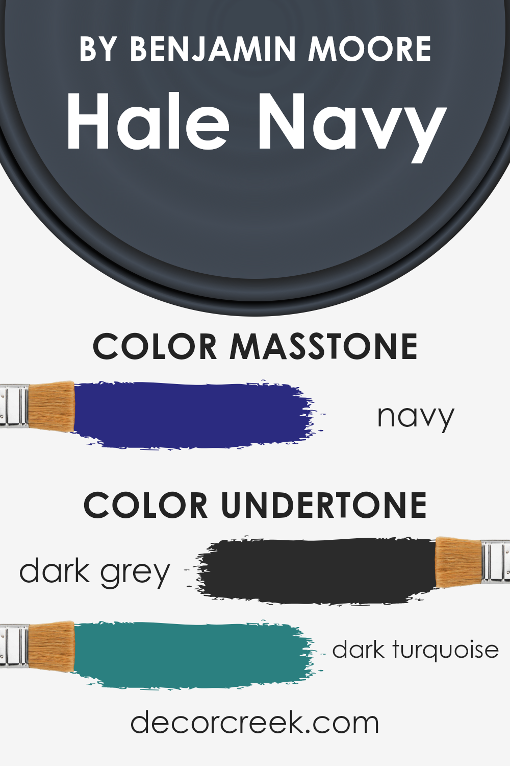
Hale Navy by Benjamin Moore is a rich, deep blue color that has a lot of character thanks to its undertones. Understanding undertones, which are the subtle colors lying beneath the main color, is crucial because they can greatly influence how we perceive the primary color. For Hale Navy, the undertones are dark grey and dark turquoise. These undertones play a significant role in the way this paint color behaves in different lighting conditions and settings.
Dark grey undertones add a solid, grounding feel to Hale Navy, making it appear more sophisticated and less bright than a pure blue. This is a fantastic quality for creating a sense of stability and calm in a room.
The dark turquoise undertones give the color a touch of vibrancy. This undercurrent of energy ensures the blue isn’t too heavy or somber, adding a layer of complexity and a hint of liveliness that prevents the color from feeling flat.
When applied to interior walls, these undertones influence Hale Navy’s appearance throughout the day. In natural light, the dark turquoise undertones might become more pronounced, infusing the space with a bit of sparkle and depth. In artificial light, the dark grey undertones could take over, lending the room a more muted, cozy, and serene atmosphere.
Overall, the undertones in Hale Navy make it a versatile and dynamic choice for walls. They ensure the color adapts subtly to changing light, imbuing spaces with varying moods and character—an ideal choice for anyone looking to add sophistication and depth to their interiors without overwhelming the senses.
What is the Masstone of the Hale Navy HC-154 by Benjamin Moore?
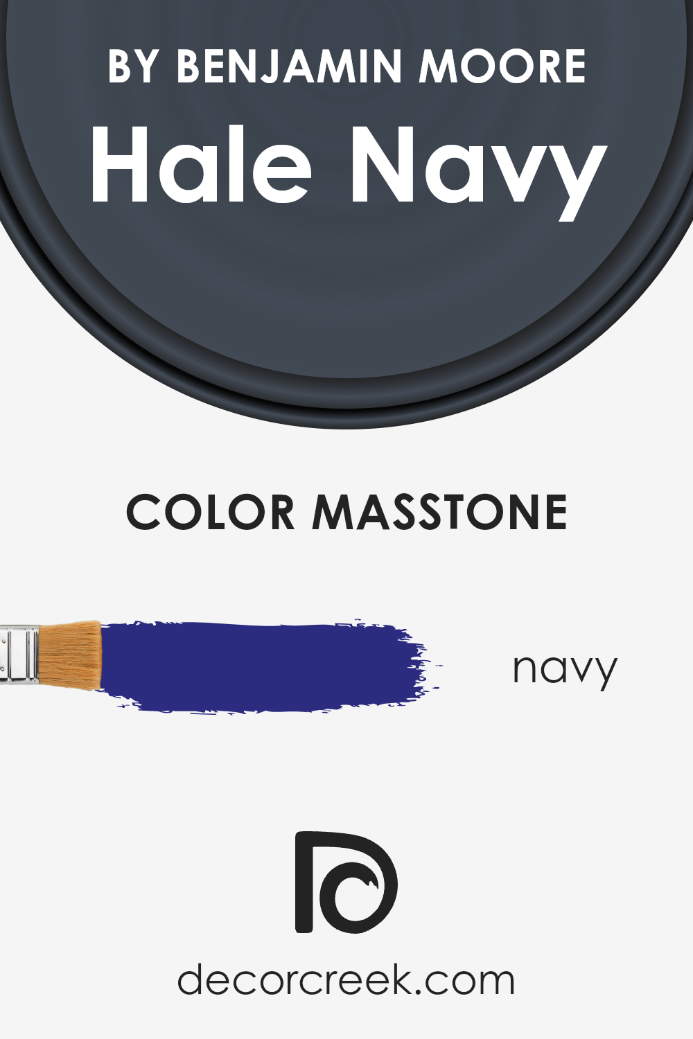
Hale Navy HC-154 by Benjamin Moore has a masstone close to Navy (#2B2B80), giving it a strong, deep blue hue that’s both elegant and timeless. This rich color brings a sense of sophistication and tranquility to any space, making it versatile for various home settings.
Because of its saturated navy base, it works beautifully in rooms with ample natural light or in spaces where a bold statement wall is desired. It pairs well with a range of colors, from crisp whites for a classic nautical look to warm neutrals for a more understated elegance.
In smaller rooms, using Hale Navy can create a cozy, enveloping effect, while in larger spaces, it adds depth and interest without overwhelming the senses. Its ability to adapt to both modern and traditional decor makes it a go-to choice for homeowners looking to add a touch of timeless flair to their interiors.
How Does Lighting Affect Hale Navy HC-154 by Benjamin Moore?
Lighting plays a crucial role in how we perceive colors. When it comes to painting walls, the color you choose can look vastly different under various lighting conditions due to the light’s intensity and the color it emits.
Considering how a specific color like Hale Navy, a popular deep blue-gray color by Benjamin Moore, will look in your room depending on the light source is essential in achieving the desired mood and effect.
- In artificial light, the appearance of Hale Navy can vary significantly depending on the type of bulb used. Warmer lights, such as incandescent bulbs, can bring out the warmer undertones in the paint, making the color appear more vibrant and dynamic. On the other hand, cooler lights, like fluorescent bulbs, can highlight the blue tones, giving the room a cooler feel. LED lights, which are available in both warm and cool tones, offer flexibility in adjusting how Hale Navy looks in a room, ensuring you can tweak the ambiance according to your preferences.
- Natural light affects Hale Navy differently throughout the day and depending on the room’s orientation. North-facing rooms receive less direct sunlight, which can make Hale Navy appear deeper and more pronounced, emphasizing its cooler tones. In contrast, south-facing rooms are bathed in warm sunlight for most of the day, which can lighten the appearance of Hale Navy, bringing out subtle warmth in its gray undertones.
- East-facing rooms enjoy bright morning light, making Hale Navy look bright and vibrant in the morning, then gradually softer as the day progresses. Meanwhile, west-facing rooms might see this color in a softer light during the morning and become dramatically vibrant and rich in the afternoon to evening as it catches the warmer, golden hues of the setting sun.
In summary, the lighting direction in a room – whether from natural light sources or artificial ones – can significantly influence how Hale Navy looks, affecting its overall vibe and feel in the space.
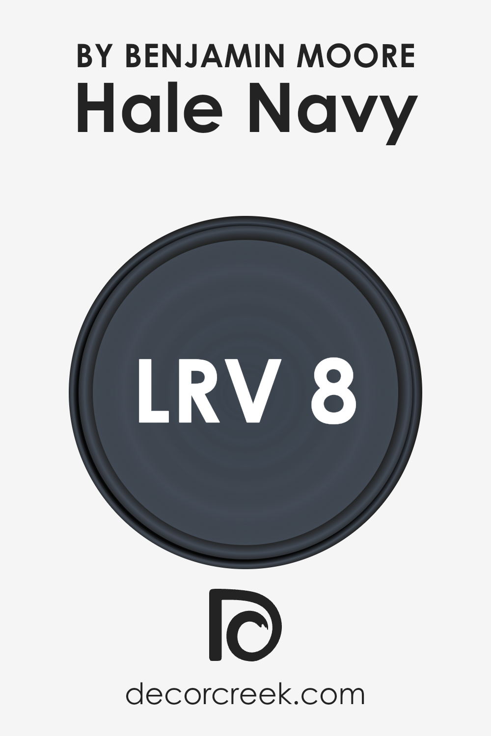
What is the LRV of Hale Navy HC-154 by Benjamin Moore?
LRV stands for Light Reflectance Value, which measures the percentage of light a paint color reflects from or absorbs into a surface. This value ranges from 0, which is completely black and absorbs all light, to 100, which is pure white and reflects all light.
This means that the higher the LRV, the lighter the color appears, and the more it can brighten up a room by reflecting light around it. On the other hand, colors with a lower LRV absorb more light, making them look darker and can make a room feel smaller or more intimate because they reflect less light into the space.
In the case of Hale Navy HC-154 by Benjamin Moore, with an LRV of 8.36, it’s on the darker end of the scale. This low LRV means it absorbs a lot of light rather than reflecting it, making the color appear very deep and rich. When used on walls, this dark navy hue can add depth and drama to a space, making it feel cozy and grounded.
However, because it reflects so little light, it’s best used in rooms with plenty of natural or artificial lighting to prevent the space from feeling too dark. The specific LRV of 8.36 tells us that Hale Navy is quite a dark color, creating a significant impact in how it feels and looks in a room, affecting the overall mood and perception of the space.
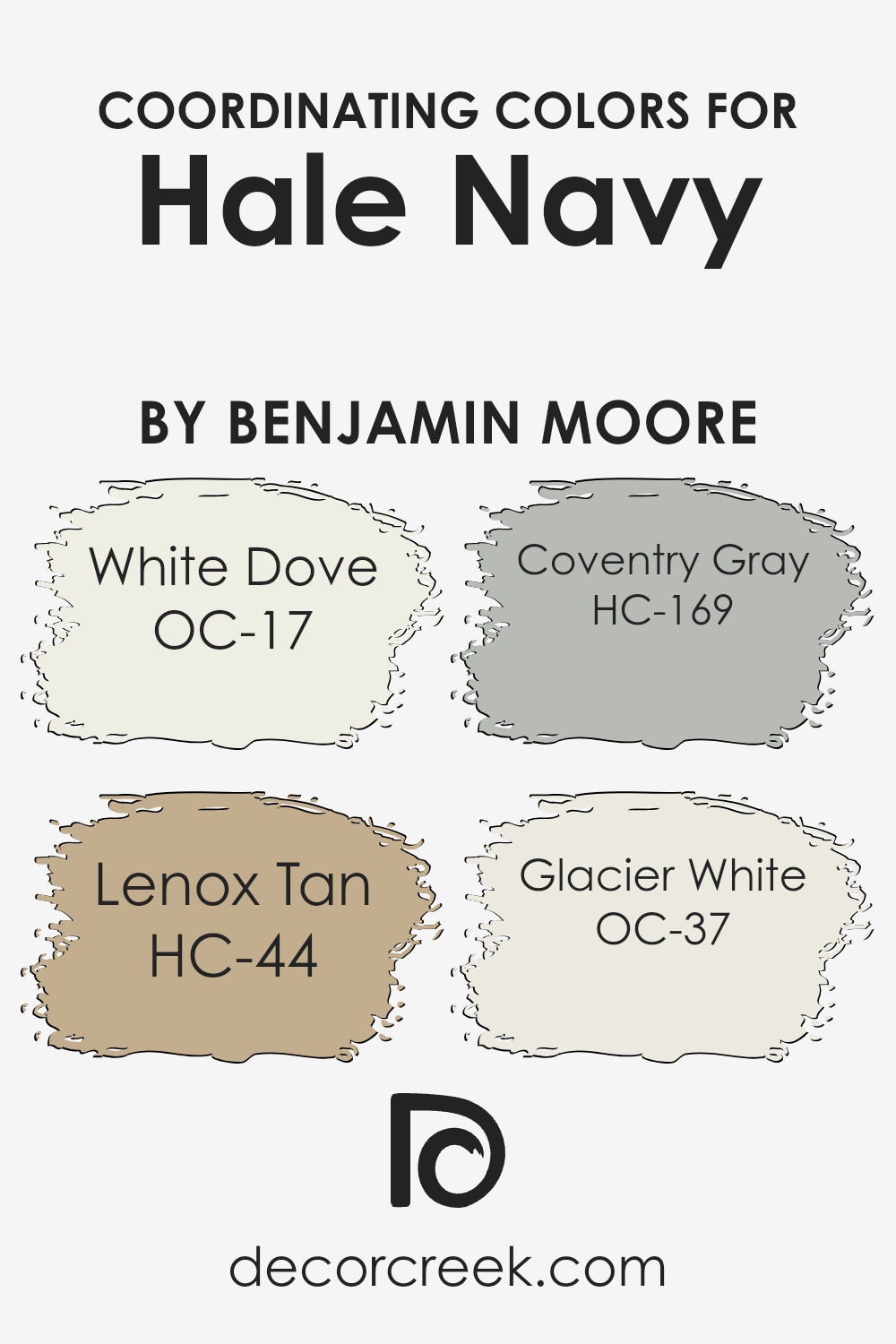
Coordinating Colors of Hale Navy HC-154 by Benjamin Moore
Coordinating colors are hues that complement each other when used together in a space, creating a balanced and harmonious look. They can either be contrasting colors that sit opposite each other on the color wheel or similar shades that share a base hue, offering a variety of design possibilities.
These colors work by either enhancing the vibrancy of each other or by providing a soft backdrop that allows a particular color to stand out. When chosen thoughtfully, coordinating colors can add depth and character to a room, making the design feel intentional and well-curated.
For instance, OC-17 White Dove is a soft, warm white with a hint of creaminess, making it a versatile choice that pairs beautifully with deeper or vibrant hues, giving a calming effect.
HC-44 Lenox Tan, is a mid-tone beige, evoking a sense of warmth and earthiness that works well with richer colors, lending a grounded feel to spaces. HC-169 Coventry Gray is a sophisticated, light gray with blue undertones, providing a crisp contrast to more saturated colors, which can amplify the elegance of a space. Finally, OC-37 Glacier White, is a clean, bright white with a slightly cool undertone, perfect for creating a fresh and airy feel that highlights bolder colors without competing for attention.
Together, these coordinating colors complement and enhance one another, allowing for a holistic and appealing design aesthetic.
You can see recommended paint colors below:
- OC-17 White Dove
- HC-44 Lenox Tan
- HC-169 Coventry Gray
- OC-37 Glacier White
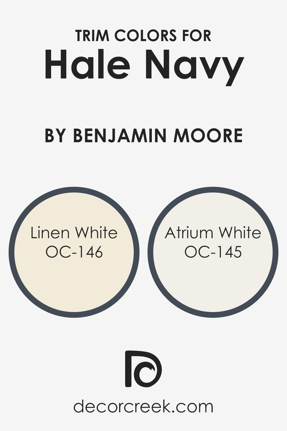
What are the Trim colors of Hale Navy HC-154 by Benjamin Moore?
Trim colors are the accents used on the edges, corners, and frames of walls, doors, and windows to outline and define the space. When paired with a rich and classic navy like Hale Navy HC-154 by Benjamin Moore, selecting the right trim color becomes crucial.
The appropriate trim colors, such as OC-146 – Linen White and OC-145 – Atrium White by Benjamin Moore, can complement the deep blue to enhance its character, provide a crisp contrast, and highlight the architectural features of a room. This contrast not only emphasizes the elegant navy but also brightens the space, making it feel more open and elegant.
Linen White OC-146 is a soft, warm white with a subtle hint of cream. It brings a cozy and inviting warmth to the space, making it an ideal companion for the sophisticated Hale Navy, ensuring the navy doesn’t overpower the room’s atmosphere. On the other hand, Atrium White OC-145 is a pure, bright white with a slight touch of pink.
This color adds a fresh and clean look to the navy walls, creating a striking but harmonious balance that enhances the overall aesthetic of the space. Together, these trim colors provide options to either warm up the room with Linen White or give it a crisp, fresh feel with Atrium White, both of which beautifully frame and complement Hale Navy walls.
You can see recommended paint colors below:
- OC-146 Linen White
- OC-145 Atrium White
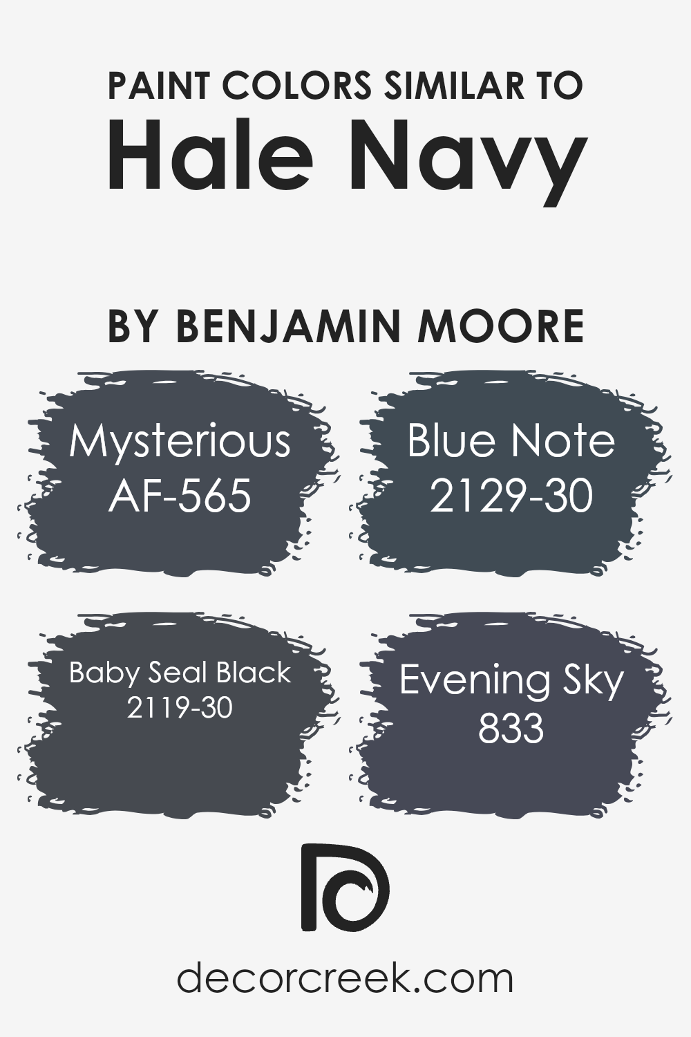
Colors Similar to Hale Navy HC-154 by Benjamin Moore
Choosing similar colors is crucial when you aim to create a harmonious and visually appealing space. Colors close to each other on the color spectrum, such as the ones similar to Hale Navy by Benjamin Moore, provide a seamless look that is both sophisticated and calming. Pairing such shades together allows for a cohesive design that subtly shifts from one hue to another, adding depth and interest without overwhelming the senses.
When used in decor, similar colors create a unified atmosphere, making a room feel well put together and intentional.
By carefully selecting hues that complement each other, designers can craft spaces that are pleasing to the eye and evoke a sense of tranquility.
- Among the similar colors to Hale Navy, AF-565 Mysterious stands out as a deep, enigmatic gray that brings an air of mystery and elegance to any space. It’s a versatile shade that pairs well with a variety of decor styles, adding a sophisticated touch.
- Baby Seal Black 2119-30, another close cousin, offers a rich, intense darkness reminiscent of a serene night sky, perfect for creating dramatic accents.
- Blue Note 2129-30 takes a slightly lighter tone, infusing spaces with a moody yet inviting vibe, ideal for those seeking a bold but not overpowering atmosphere.
- Lastly, 833 Evening Sky is a soft, twilight-hued blue that promises serenity, mimicking the tranquil moments just after sunset.
Together, these colors work harmoniously to enhance the aesthetic appeal and emotional warmth of spaces inspired by Hale Navy.
You can see recommended paint colors below:
- AF-565 Mysterious
- 2119-30 Baby Seal Black
- 2129-30 Blue Note
- 833 Evening Sky
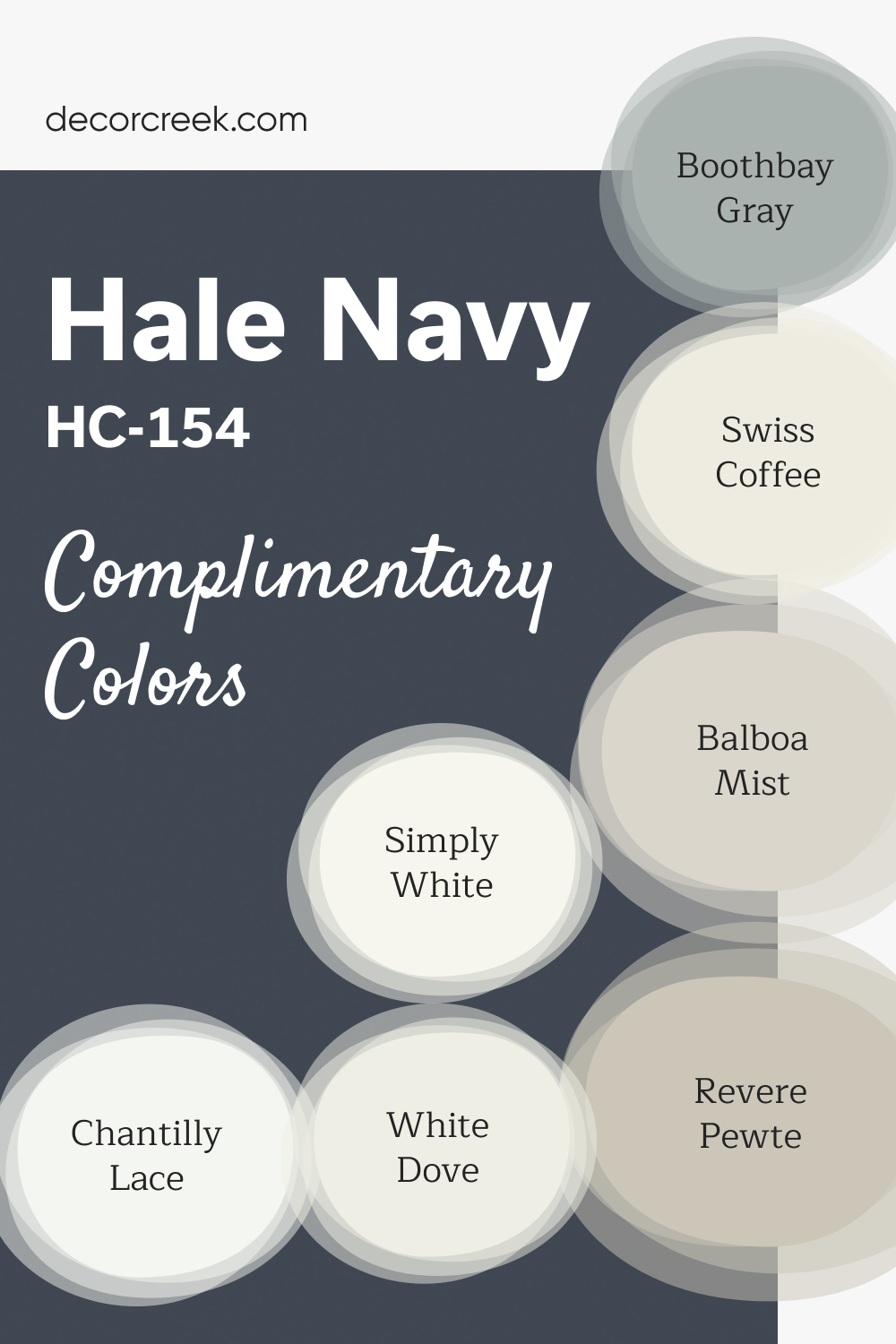
Complimentary Colors for Hale Navy HC-154 Paint Color by Benjamin Moore
Hale Navy by Benjamin Moore is a rich, deep navy that adds a timeless elegance to any space. It works beautifully with light, crisp shades like White Dove and Simply White, perfect for creating contrast on trim or cabinetry.
For a softer, neutral balance, Revere Pewter and Balboa Mist offer warm, grounded tones that complement the boldness of Hale Navy without overpowering it.
Chantilly Lace and Swiss Coffee are excellent choices for brightening up a room with their clean, fresh feel, while Boothbay Gray adds a subtle, cool contrast to the overall palette. Together, these colors create a versatile, sophisticated look that can suit both modern and traditional interiors, bringing depth and style to any space.
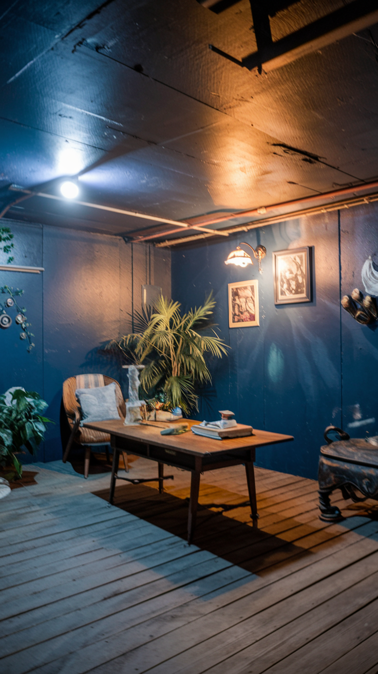
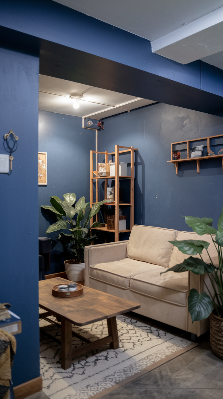
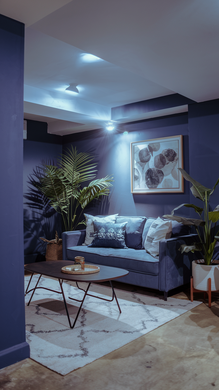
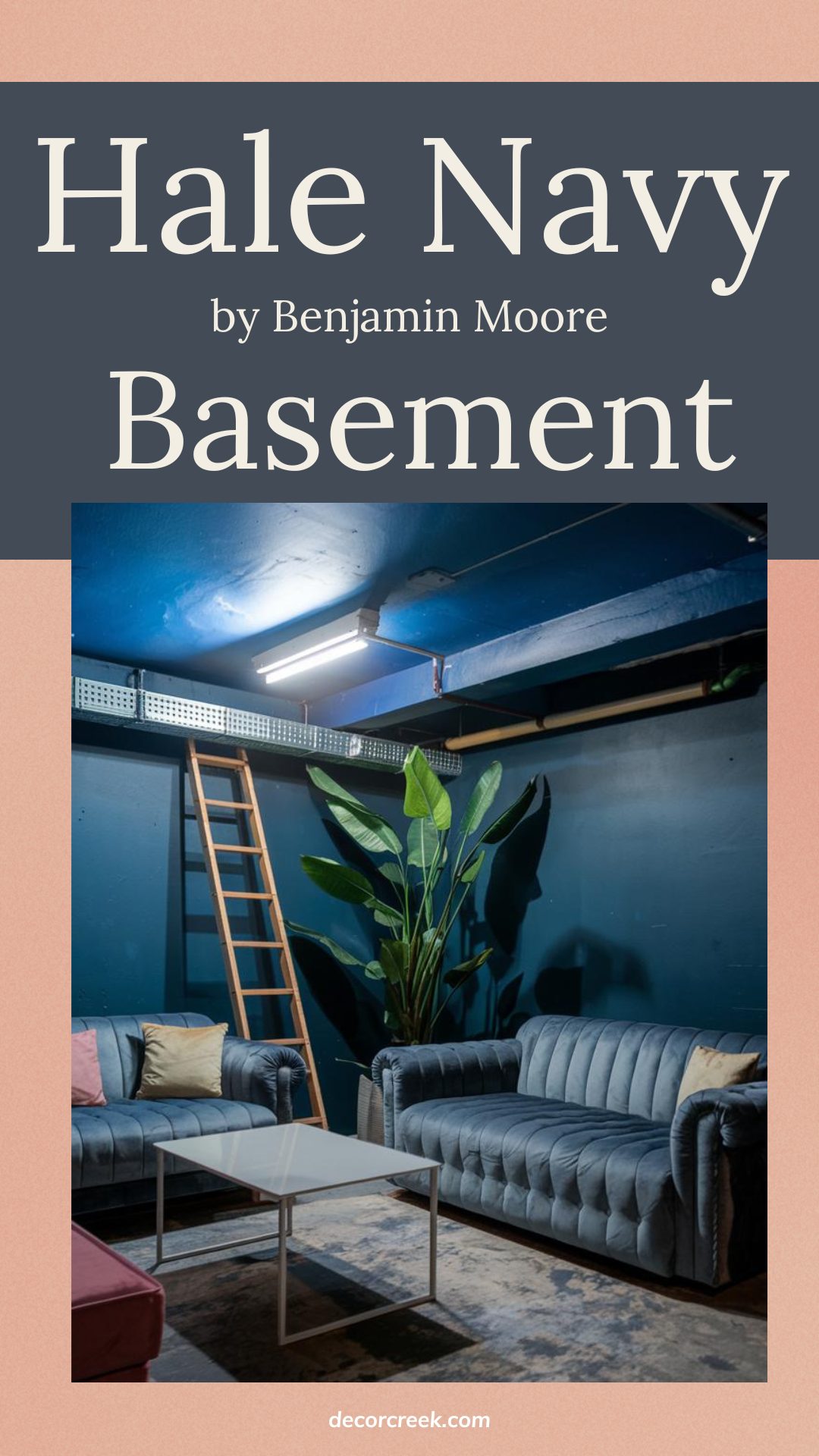
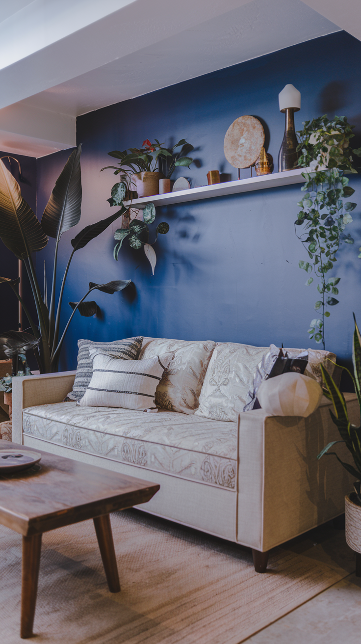
Hale Navy for a Cozy Basement Refresh
Hale Navy by Benjamin Moore is such a perfect color if you’re looking to add depth and coziness to your basement. It’s a rich, bold navy that feels both timeless and welcoming, making it an awesome choice for a space that might otherwise feel a bit plain. Pair it with lighter neutrals or warm wood tones, and you’ll instantly make the room feel more inviting without it feeling too dark.
If your basement has enough lighting, Hale Navy can really shine! It adds a touch of drama while still being cozy. Plus, this color works great with industrial-style lighting or even soft, cozy lamps for a more relaxed vibe. You’ll love how versatile it is with different textures, too—think wood, metal, or soft fabrics.
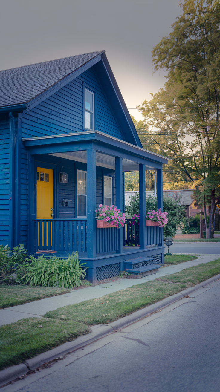
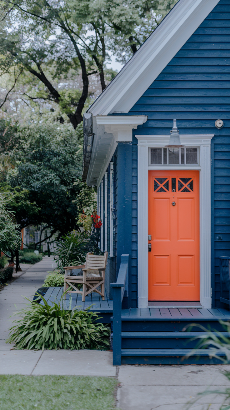
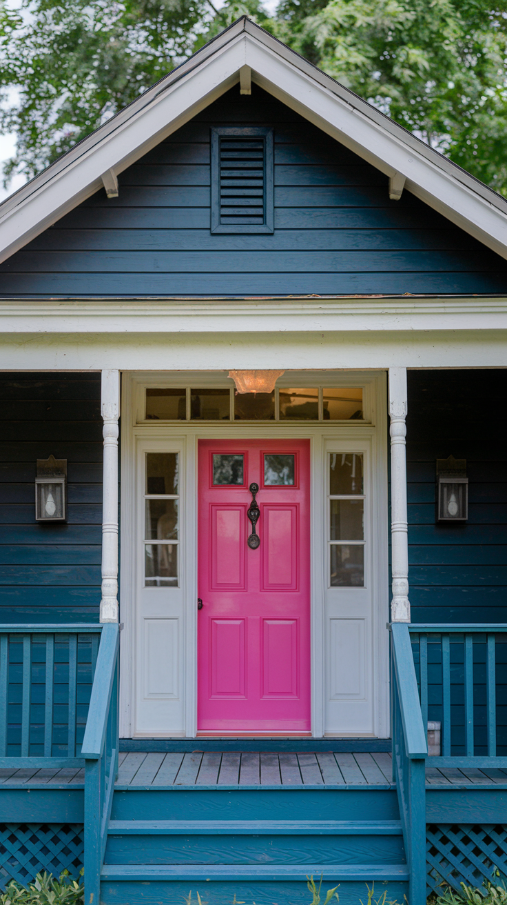
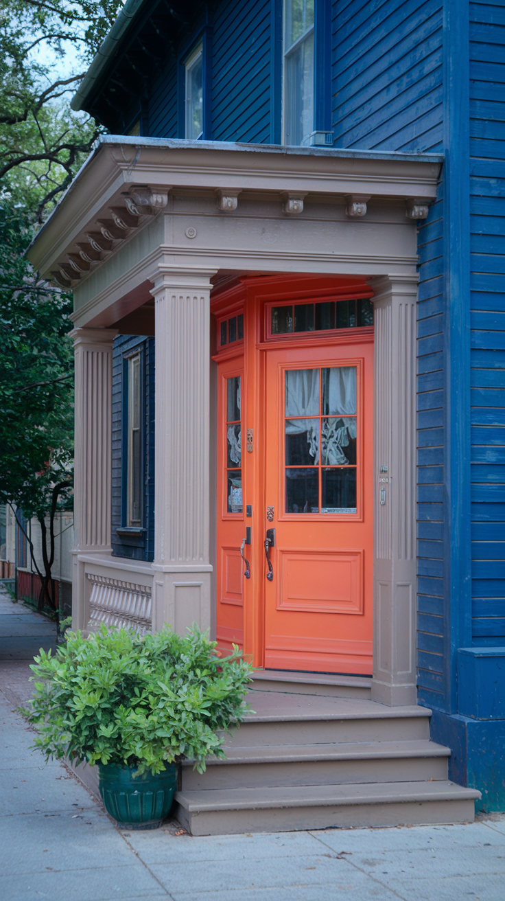
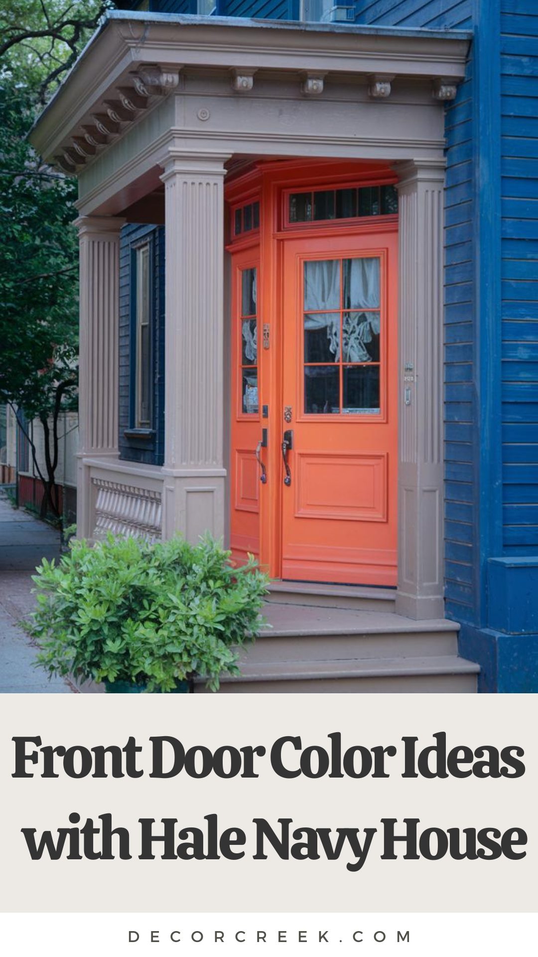
Perfect Front Door Colors for a Hale Navy House
If your house is painted in Hale Navy, a front door color that stands out can really elevate the whole look! A crisp white front door gives a fresh, clean contrast, adding a timeless and classic touch. It’s simple yet stylish and makes the navy stand out even more.For something a bit more fun, you could go with a pop of color like a bright red or cheerful yellow.
Red gives off that traditional vibe with a modern twist, while yellow brings a warm, sunny feel to the entrance. Both options will add personality without clashing with Hale Navy’s deep, bold shade.
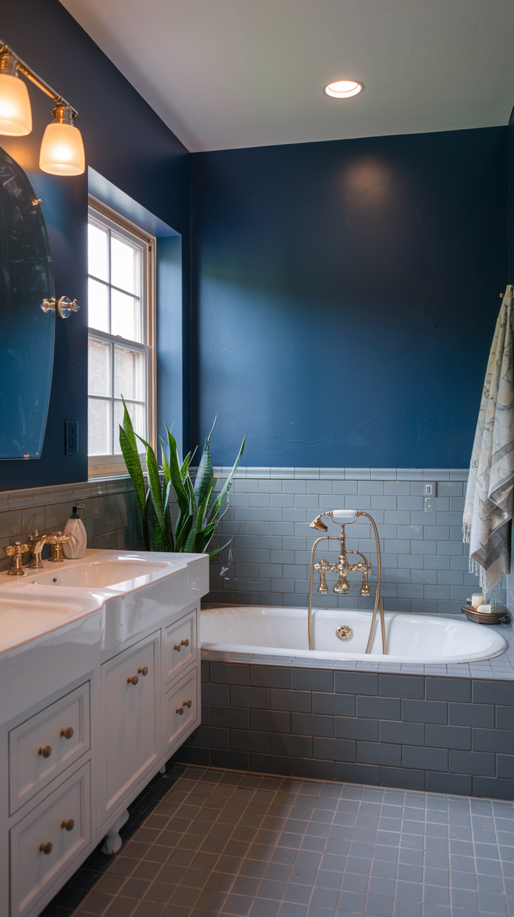
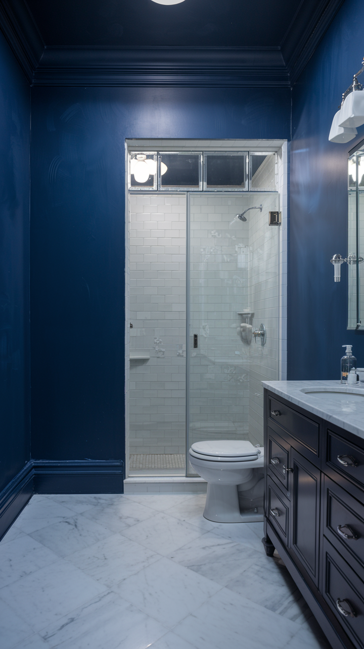
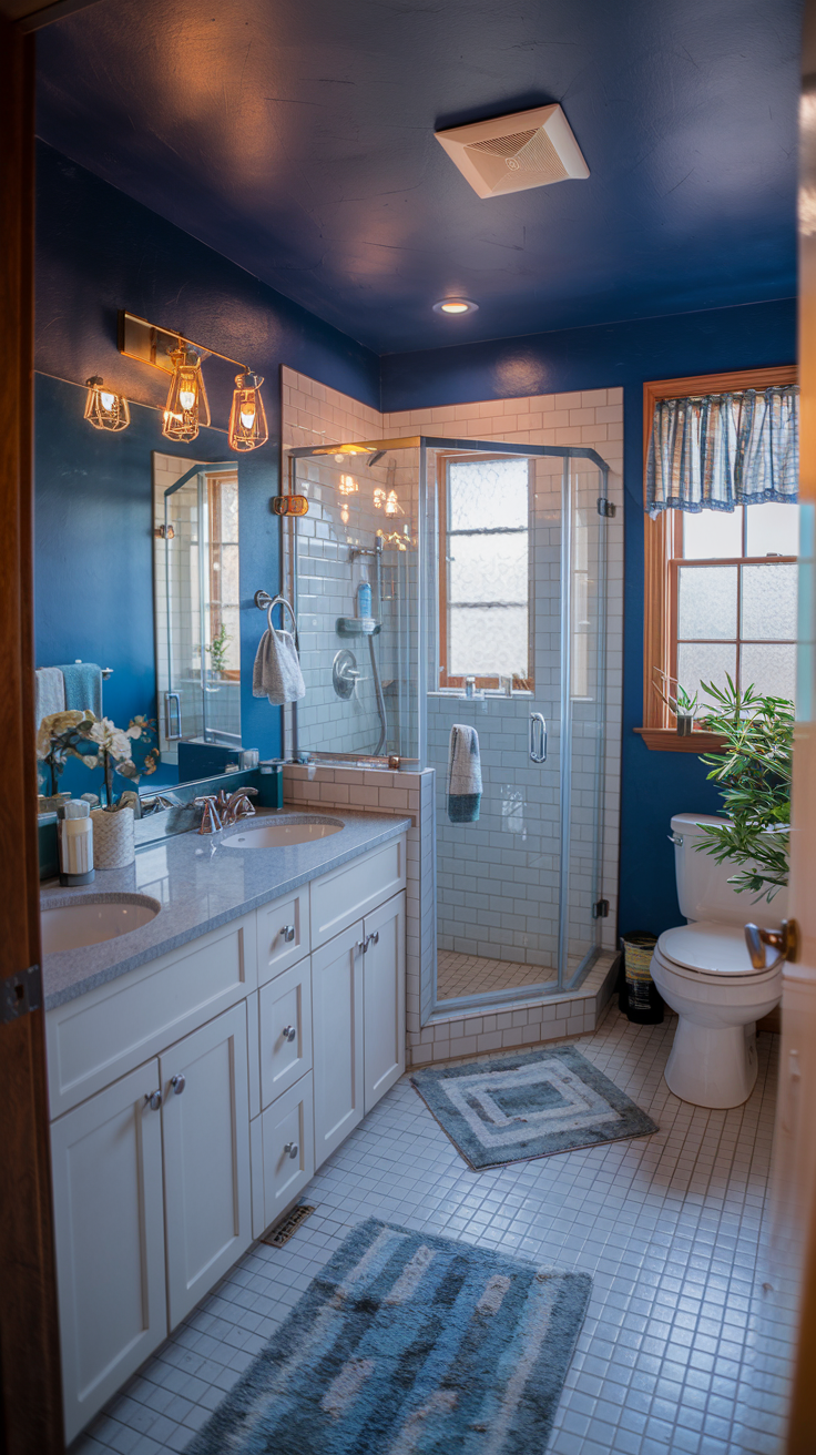
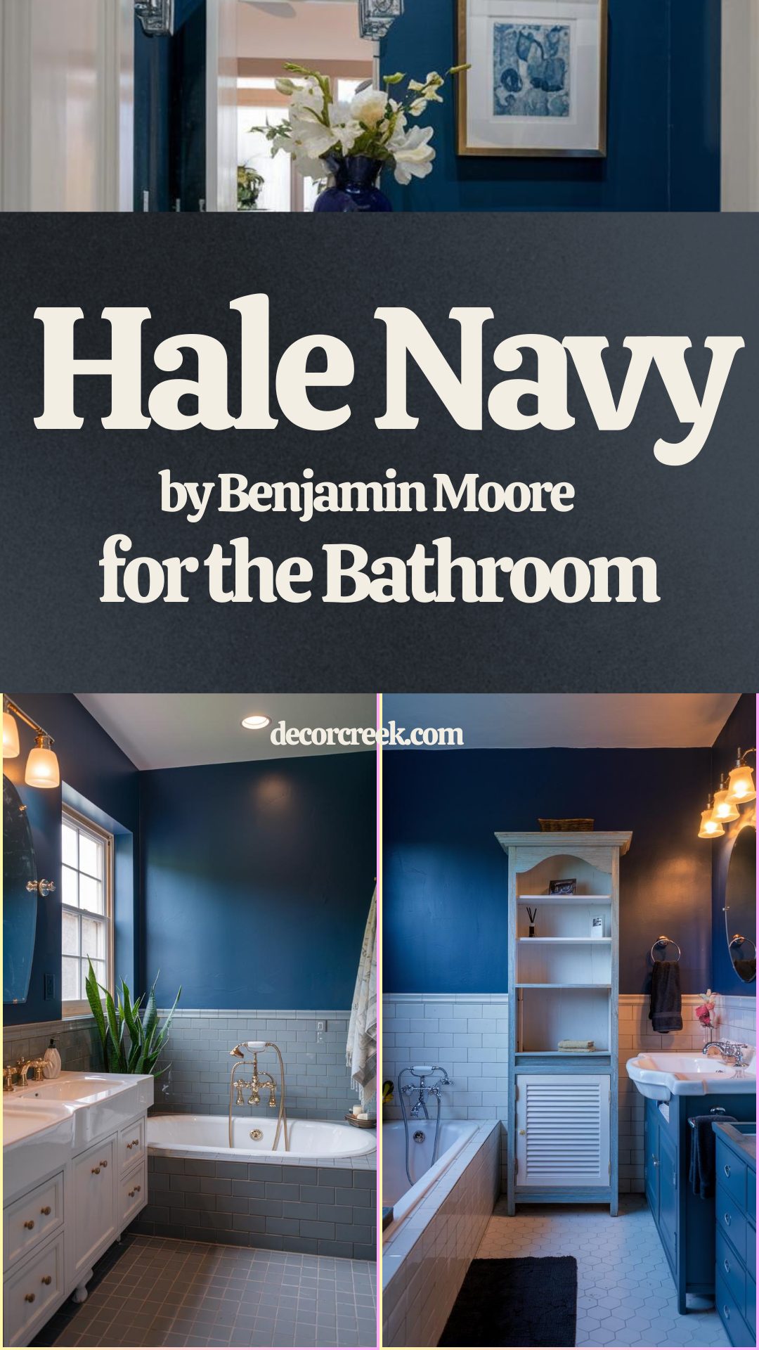
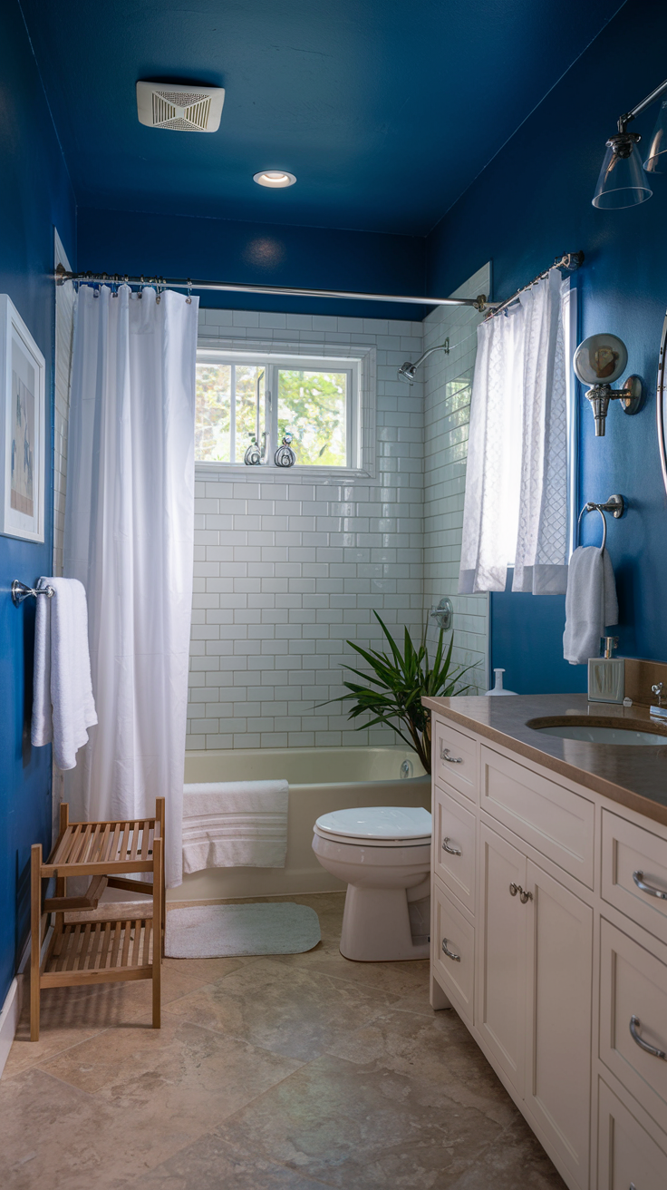
Hale Navy for a Bold, Stylish Bathroom
Using Hale Navy in a bathroom instantly adds a bold, modern touch. This rich navy hue creates a dramatic yet calming atmosphere, perfect for turning your bathroom into a little retreat. Pair it with white tiles or marble countertops to keep things light and balanced. The contrast between the deep navy and crisp white looks super clean and chic.
For accents, go for warm brass or gold fixtures to add a touch of elegance (without going overboard ). If you’re working with a small bathroom, you can balance the dark walls by keeping the vanity or flooring in lighter tones like light wood or neutral tiles.
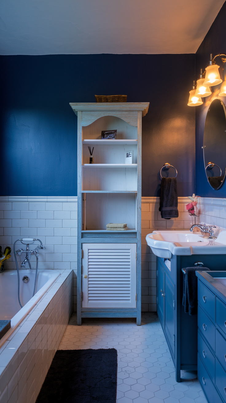
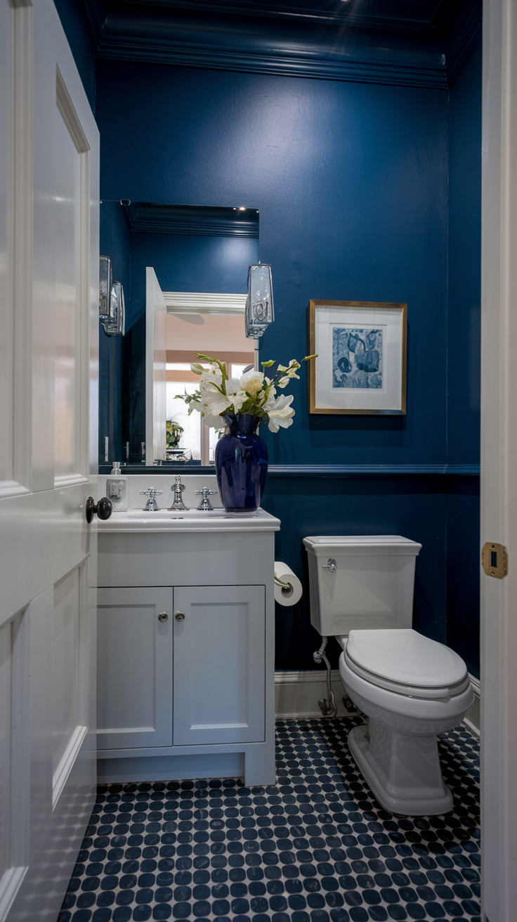
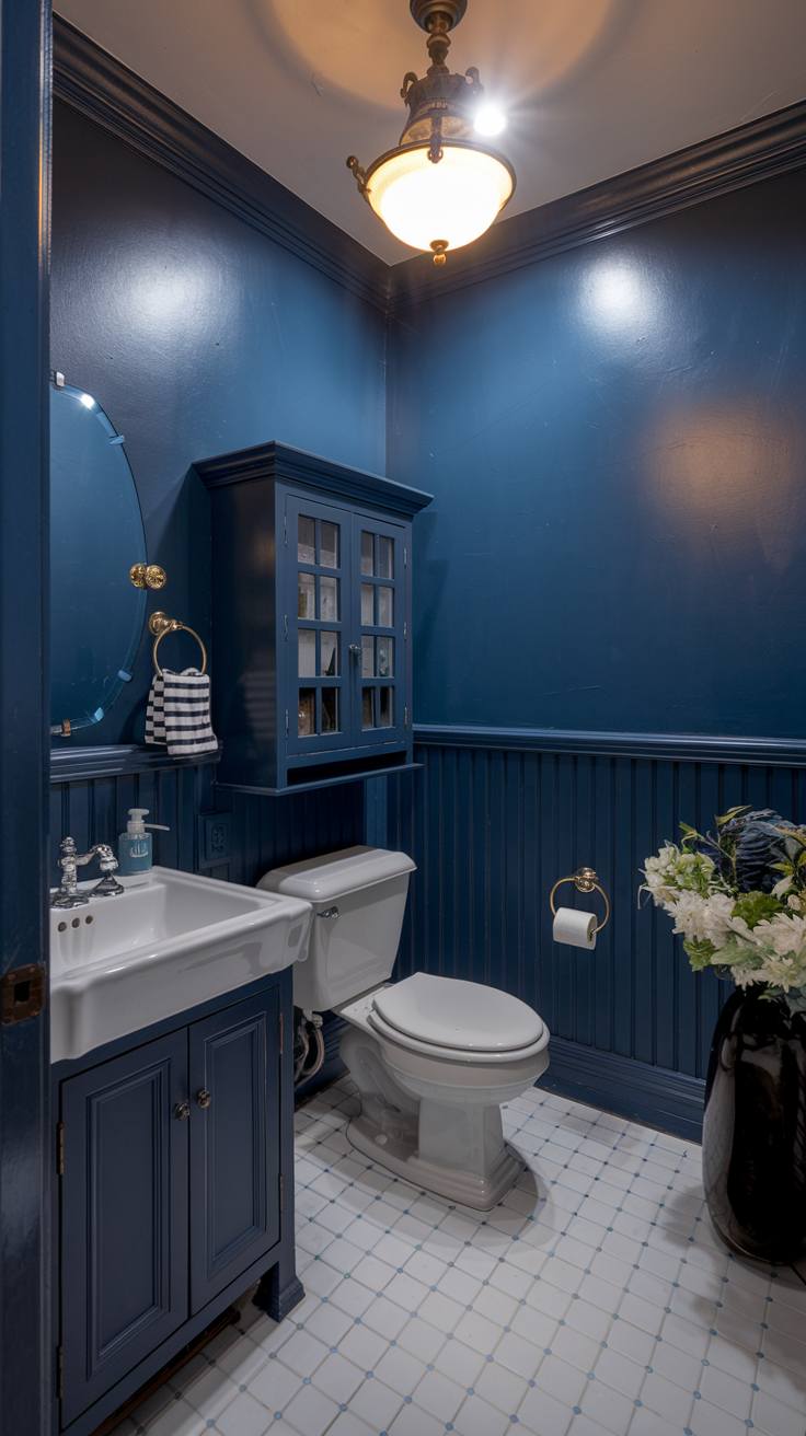
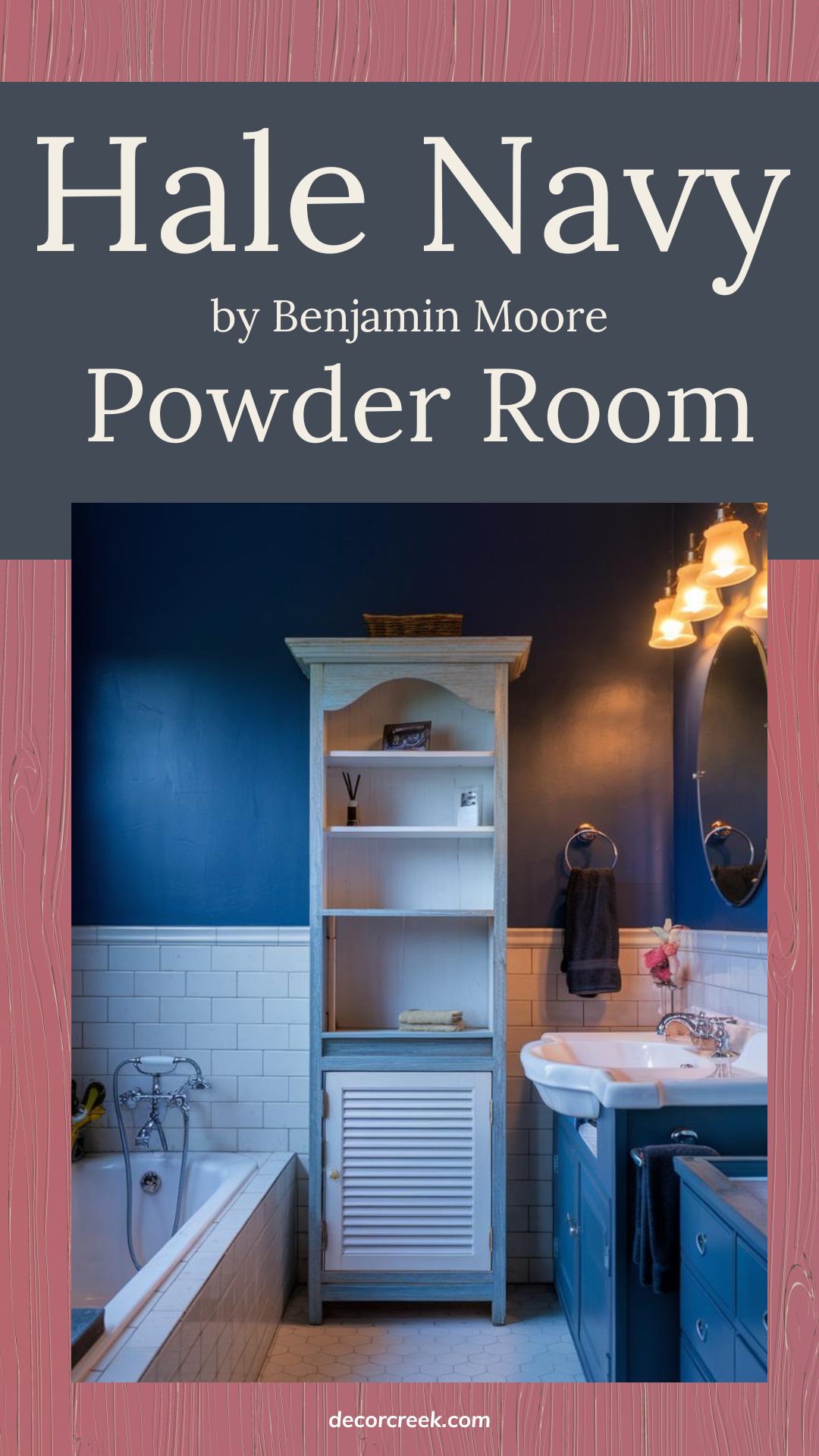
Hale Navy for a Stunning Powder Room
Hale Navy is a fantastic choice for a powder room if you want to make a statement in a small space. The deep, rich navy adds a bold, elegant touch that feels both cozy and stylish. Pair it with crisp white accents like a pedestal sink or white trim to keep the room feeling fresh and balanced.
Since powder rooms are often smaller, you can have fun with contrasting textures, like adding gold or brass fixtures for a pop of warmth, or even a patterned floor tile for a bit of extra flair. Hale Navy brings a sense of depth, making your powder room feel like a hidden gem in your home!
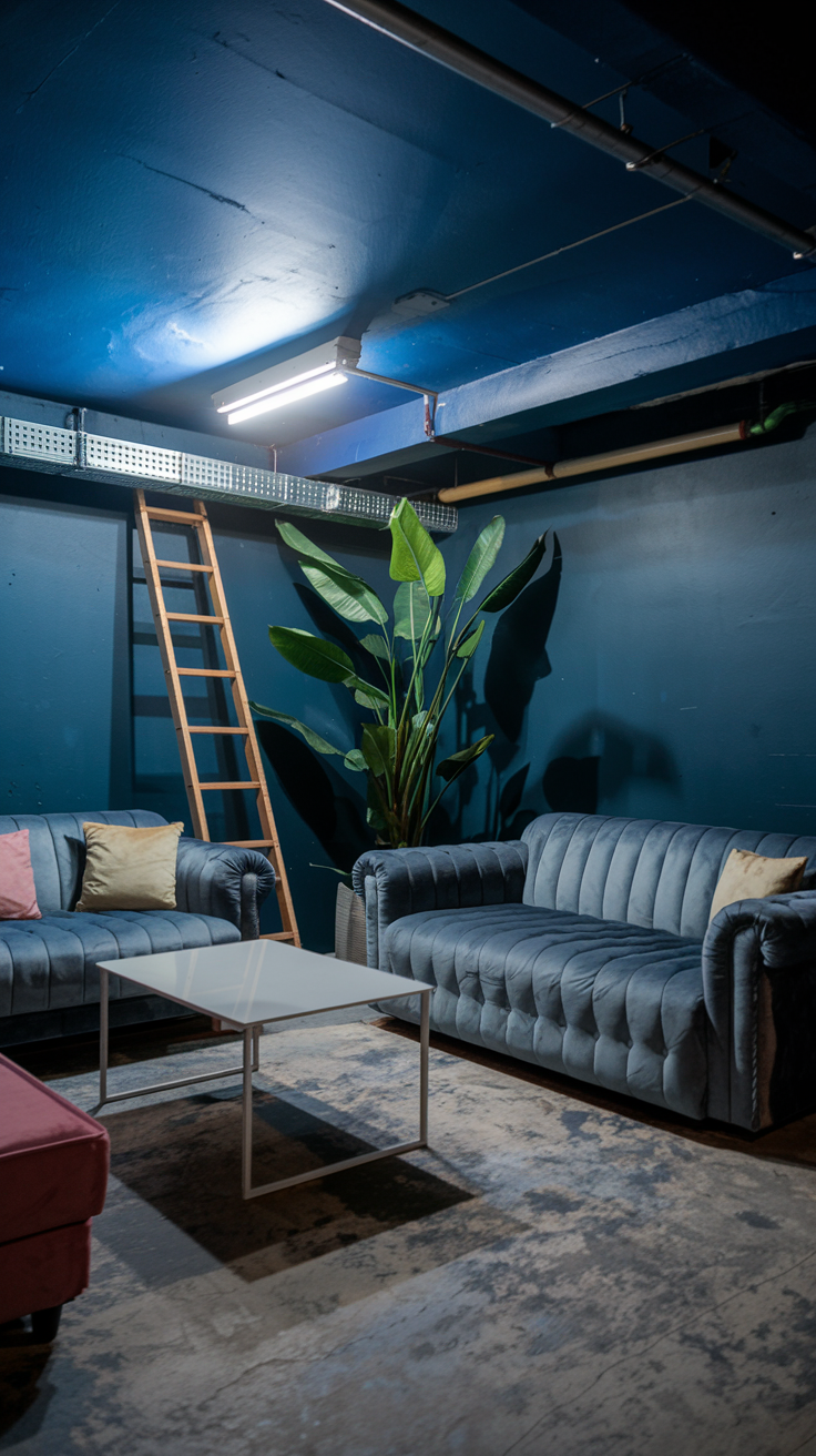
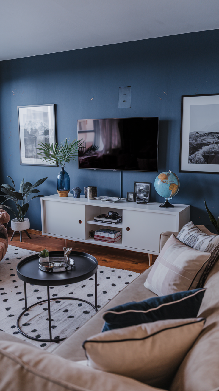
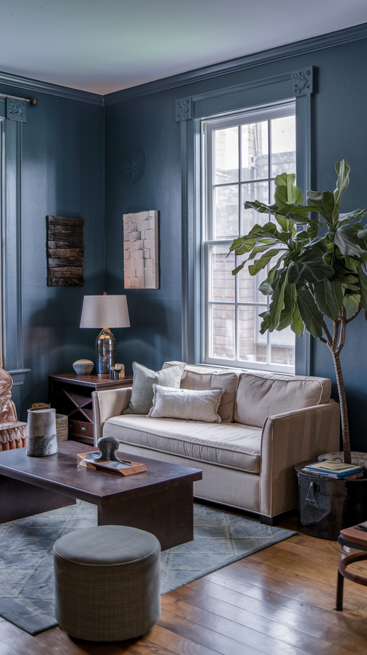
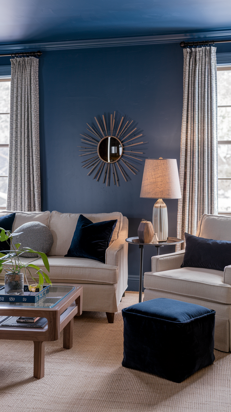
Hale Navy for a Cozy and Stylish Living Room
Hale Navy on the walls of your living room brings a cozy, stylish vibe that feels both bold and welcoming. Its deep blue tone creates the perfect backdrop for a relaxing space, especially when paired with light-colored furniture and natural textures like wood or linen. The navy adds a sense of warmth without feeling too dark, making it ideal for a comfy gathering space.
To keep the room feeling open, you can mix in lighter accents like white or soft beige pillows and throws. If you want to add a bit of contrast, metallic accents like brass or gold work beautifully with Hale Navy, bringing a little touch of modern flair without overwhelming the room.
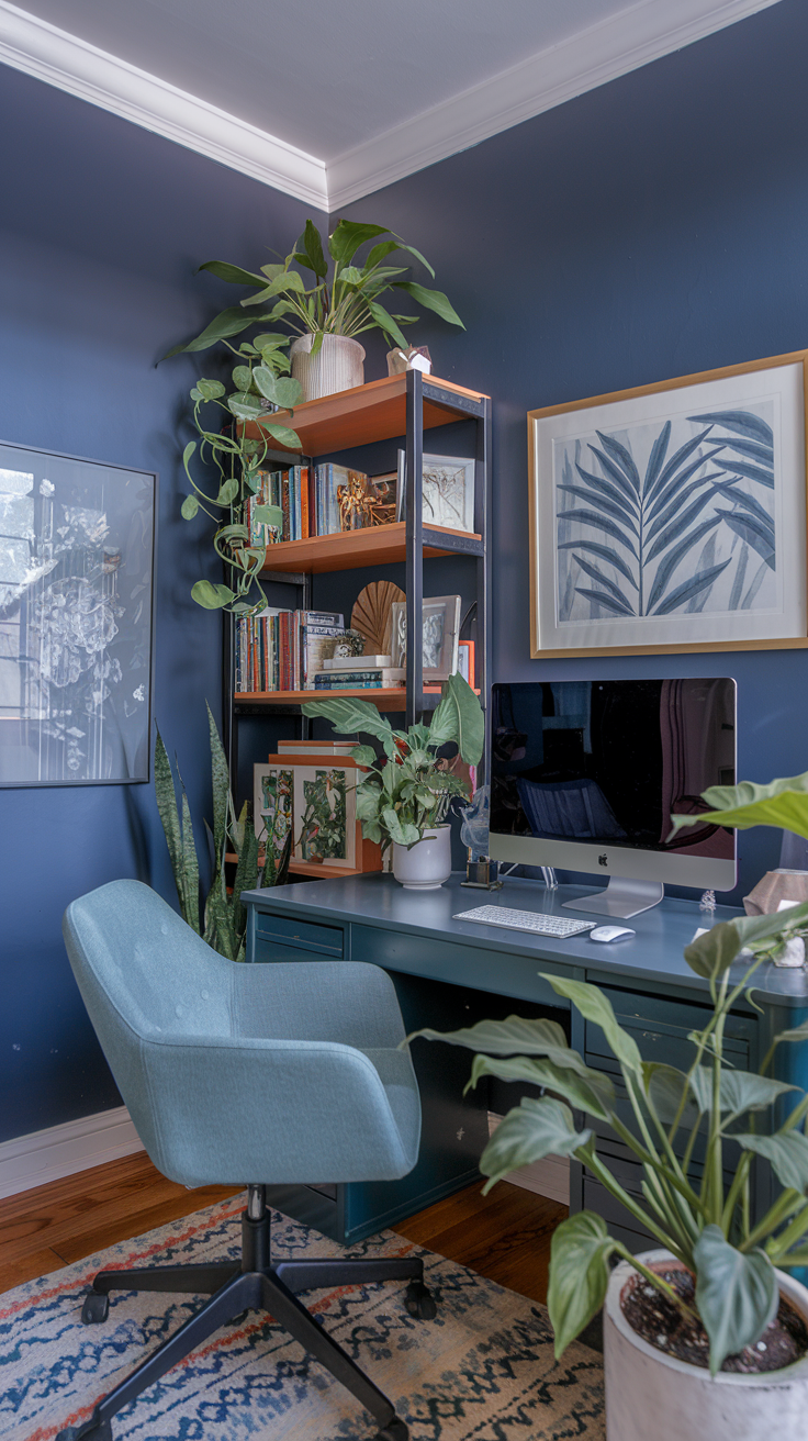
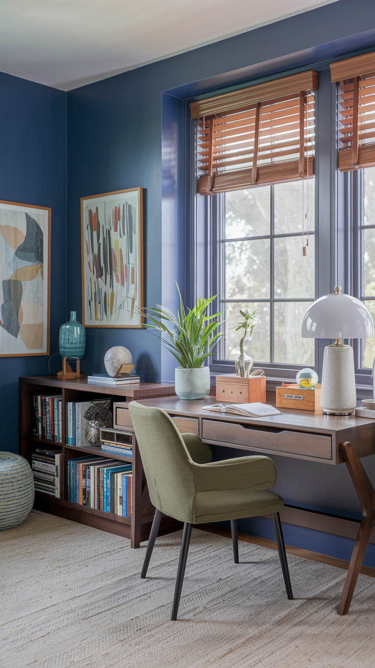
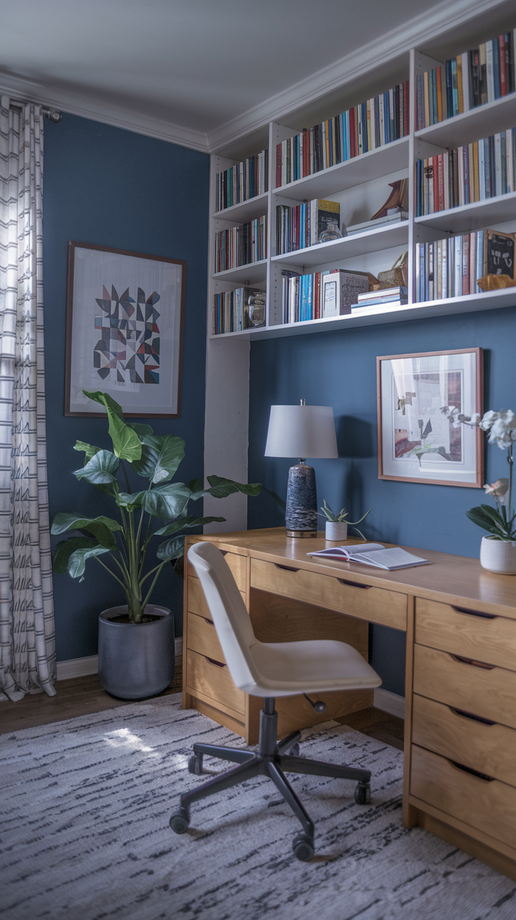
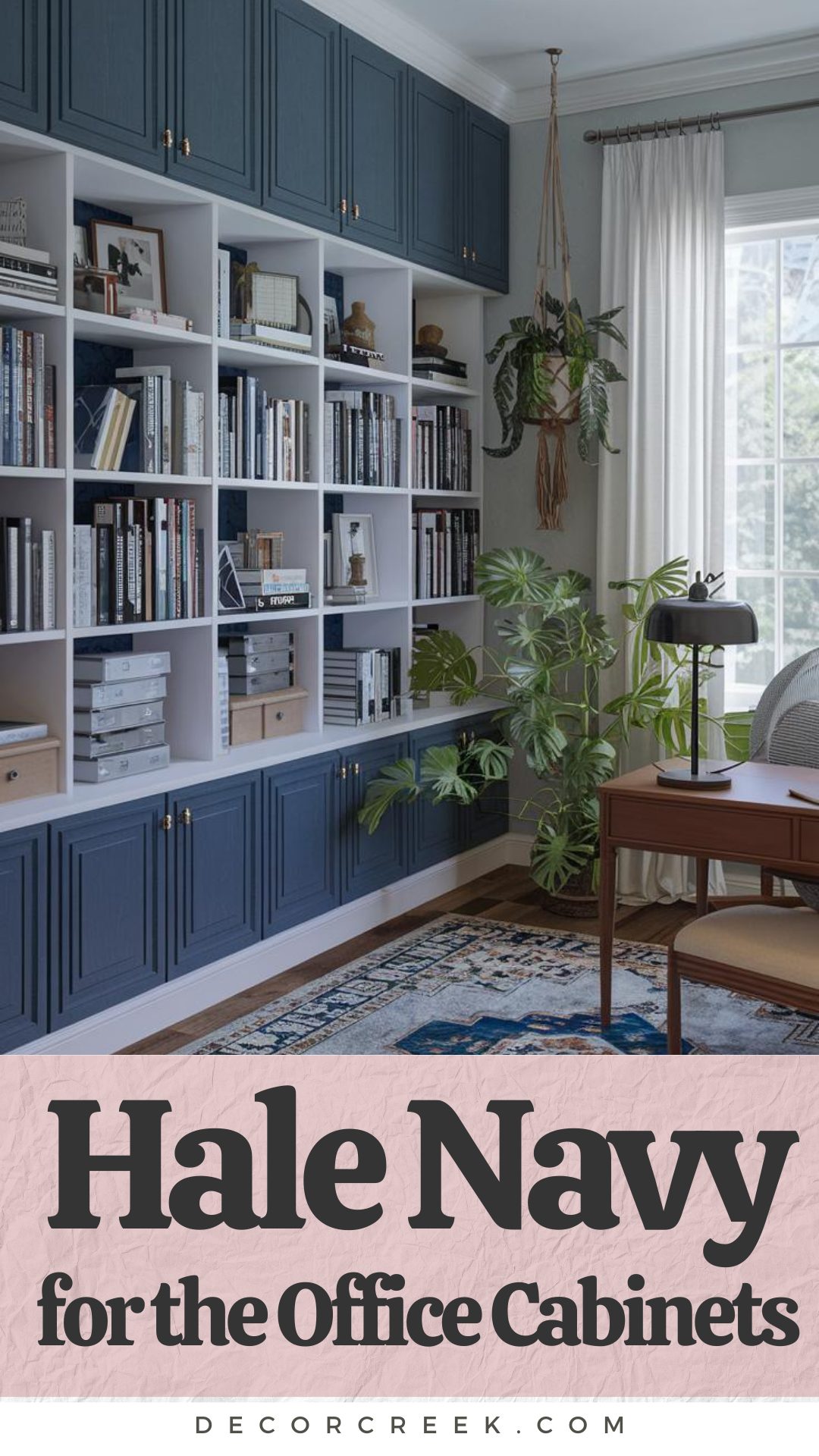
Hale Navy for Office Cabinets Your Bold and Productive Style
Hale Navy on office cabinets is a great choice if you want to create a space that feels productive but also stylish. The deep, rich navy adds a touch of sophistication, making your office feel put together and professional. Plus, it pairs really well with a neutral wall color, like white or light gray, giving a balanced and clean look to the whole space.
For a modern touch, you can add hardware in brass or matte black, which really pops against the navy. It’s a subtle way to add personality without going overboard. Hale Navy cabinets also look fantastic with wood accents or a butcher block desk, creating a warm yet sleek office vibe.
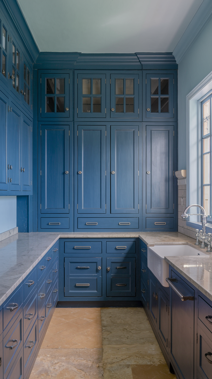
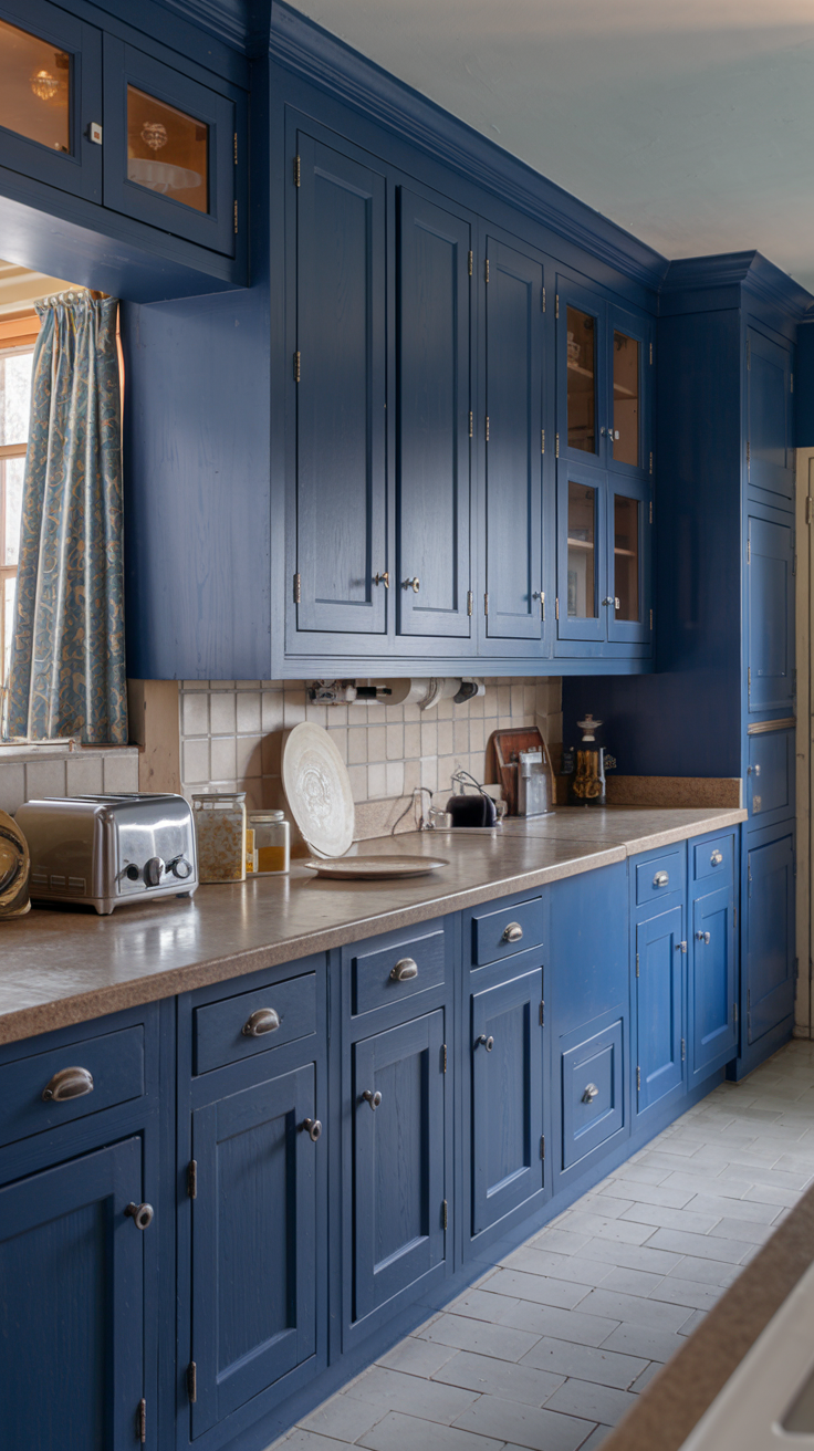
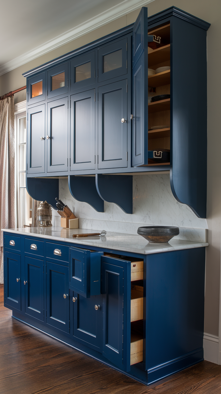
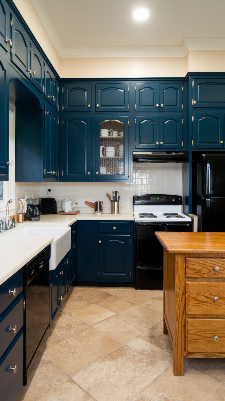
Hale Navy Cabinets for a Stunning Kitchen Look
Hale Navy kitchen cabinets can instantly elevate your space, giving it a rich and sophisticated feel. The deep navy color adds a beautiful contrast to lighter countertops, like white quartz or marble, making the whole kitchen feel fresh and modern. Plus, it’s a timeless color that won’t go out of style anytime soon!
Pair Hale Navy cabinets with brass or gold hardware for a touch of warmth, or go with sleek matte black for a more contemporary vibe. If you want to keep things light, balance the navy with light wood flooring or a white backsplash to make sure the space still feels open and inviting. It’s a bold choice, but one that will make your kitchen look both chic and cozy.
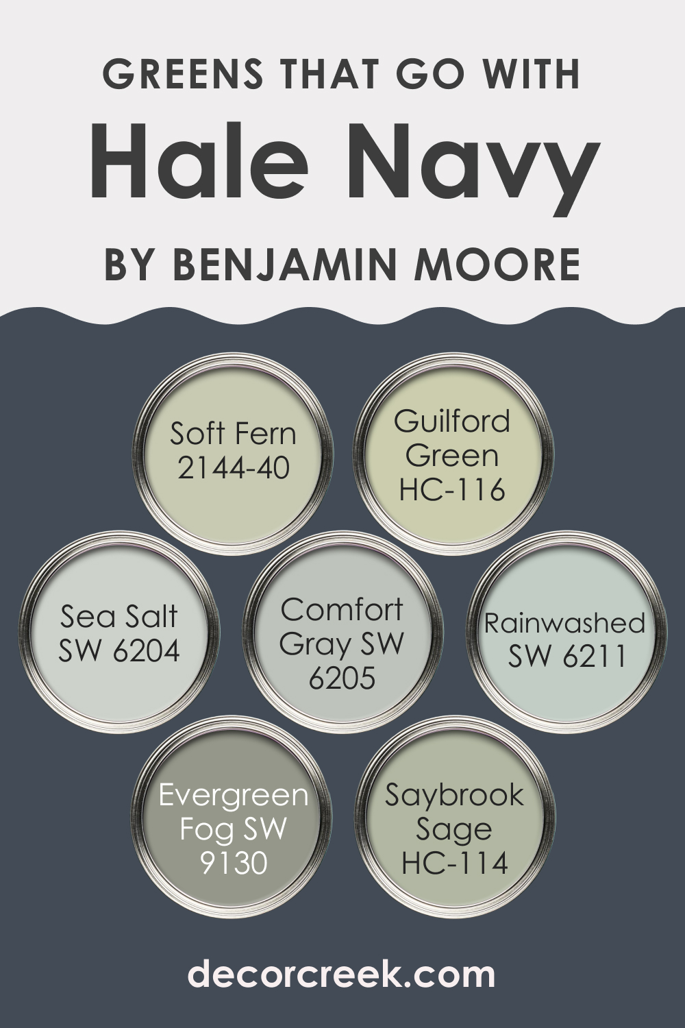
Perfect Green Shades to Pair with Hale Navy
The greens that pair beautifully with Hale Navy by Benjamin Moore, as shown in the image, include:
- Soft Fern 2144-40: A gentle, muted green that complements Hale Navy’s boldness by bringing a soft, calming touch to any space.
- Guilford Green HC-116: This sage-like hue adds a fresh, natural element that balances out the richness of the navy, making it great for accent walls or decor.
- Sea Salt SW 6204: A light, airy green that gives a soothing vibe, perfect for creating a relaxed atmosphere when paired with the depth of Hale Navy.
- Comfort Gray SW 6205: More of a gray-green, this subtle tone brings a modern, calming feel when used alongside Hale Navy, ideal for minimalist spaces.
- Rainwashed SW 6211: A soft, slightly blue-green that plays well with the navy, adding a serene, coastal-inspired vibe to the space.
- Evergreen Fog SW 9130: This deeper, earthy green works wonderfully to add contrast and a nature-inspired element to a Hale Navy palette.
- Saybrook Sage HC-114: A classic, muted green that feels timeless and grounding, perfect for adding warmth and coziness when paired with Hale Navy.
These greens offer a versatile range of options to enhance the boldness of Hale Navy while adding soothing, nature-inspired elements to any room.
How to Use Hale Navy HC-154 by Benjamin Moore In Your Home?
Hale Navy HC-154 by Benjamin Moore is a timeless, deep blue paint color that can bring a touch of sophistication and depth to any home. This versatile shade works well in a variety of settings, from a statement wall in a living room to cabinets in a kitchen, adding a classic elegance wherever it’s used. Its rich hue pairs well with a range of colors, from crisp whites to warm woods, making it easy to integrate into your existing decor.
For those looking to refresh their space, Hale Navy offers a bold but balanced option. It can make small spaces feel more intimate and large rooms appear cozier. In a bedroom, it can create a serene, restful environment, while in a bathroom, it adds a luxurious feel.
Even as an accent, like on a bookshelf or in a nook, it brings a pop of color that draws the eye without overwhelming.
In essence, Hale Navy from Benjamin Moore can help add a stylish flair to your home, whether through big changes or small updates, making it a great choice for anyone looking to enhance their living spaces.
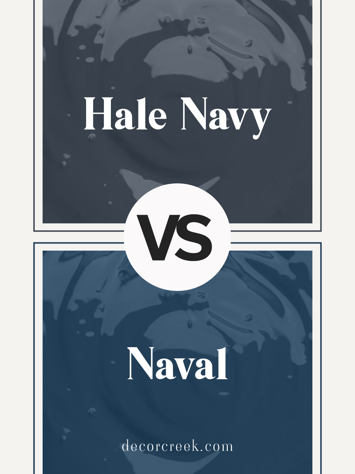
Hale Navy HC-154 vs Naval SW 6244 by Sherwin Williams
Hale Navy HC-154 by Benjamin Moore and Naval SW 6244 by Sherwin Williams are both timeless, rich navy blues. Hale Navy is a slightly warmer navy with a hint of gray, offering depth and versatility in both traditional and modern settings. Naval is a true, bold navy that feels crisp and classic, perfect for adding sophistication to any space.
Hale Navy works beautifully in living rooms or bedrooms where a cozy, inviting feel is desired, while Naval is ideal for accent walls or cabinetry, creating a strong, elegant focal point. Both shades pair wonderfully with white trim and metallic accents for a refined, polished look.
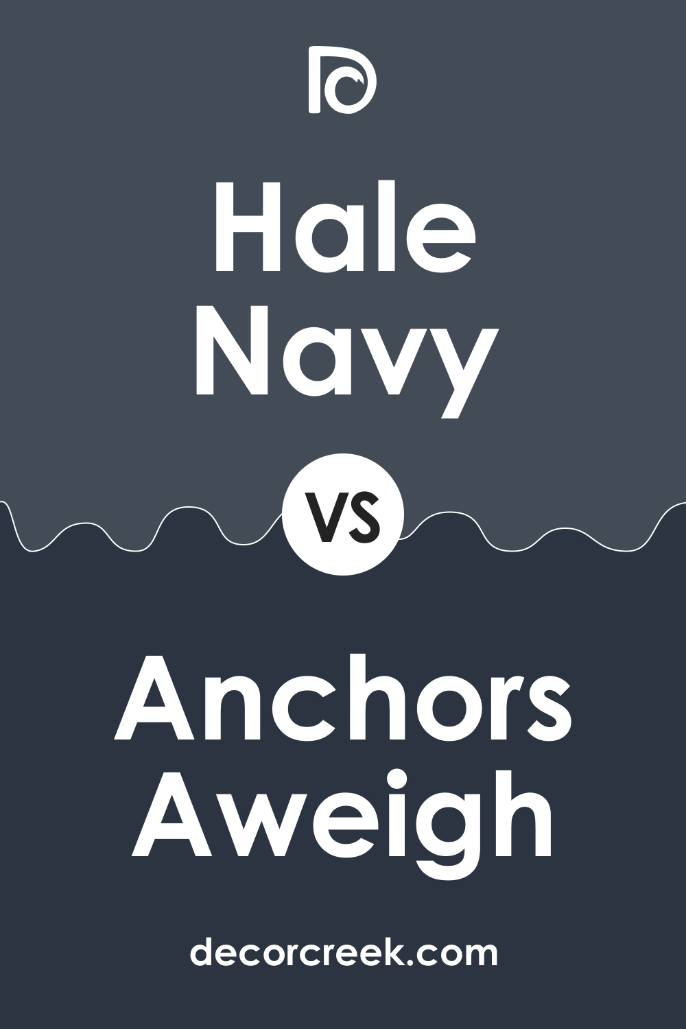
Hale Navy HC-154 vs Anchors Aweigh SW 9179 by Sherwin Williams
Hale Navy HC-154 and Anchors Aweigh SW 9179 by Sherwin Williams are two deep, striking blues with different undertones. Hale Navy has a touch of gray, giving it a versatile, warm undertone that adds richness to rooms. Anchors Aweigh is a slightly darker, cooler navy, providing a bold, dramatic effect.
Hale Navy suits traditional or transitional spaces, adding warmth and depth. Anchors Aweigh works well on accent walls or cabinetry, where its cool tone can create a sophisticated statement. Both colors look stunning with white trim and warm wood accents, adding elegance and depth to any decor style.
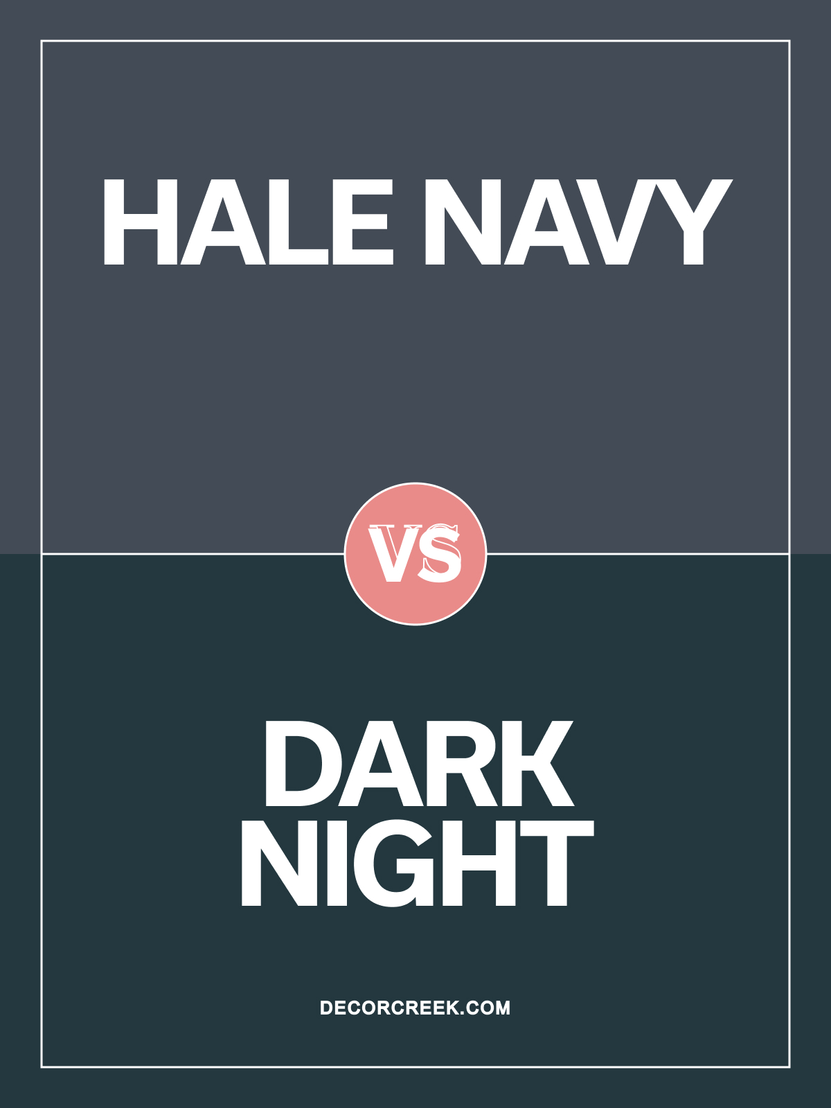
Hale Navy HC-154 vs Dark Night SW 6237 by Sherwin Williams
Hale Navy HC-154 and Dark Night SW 6237 by Sherwin Williams are both rich, dramatic colors with unique personalities. Hale Navy is a classic navy with a touch of warmth, offering a timeless and adaptable look. Dark Night leans towards teal, with green undertones that give it a unique, bold character.
Hale Navy is perfect for creating a cozy, sophisticated feel in living rooms or dining areas, while Dark Night works well as a statement color in modern or eclectic spaces. Both shades pair beautifully with crisp whites and metallics, adding a touch of drama and elegance to any room.
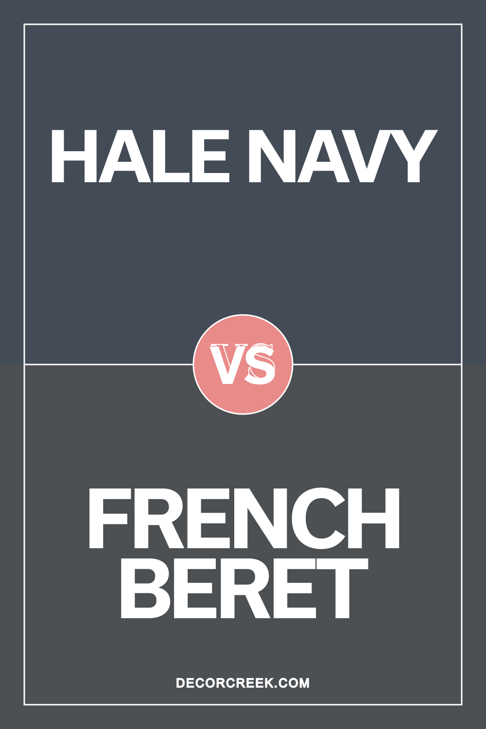
Hale Navy HC-154 vs French Beret 1610 by Benjamin Moore
Hale Navy HC-154 and French Beret 1610 by Benjamin Moore are two dark, refined colors with unique tones. Hale Navy is a rich navy blue with a hint of warmth, making it perfect for cozy, timeless spaces. French Beret is a dark gray with a subtle blue undertone, giving it a slightly cooler, more modern feel.
Hale Navy works well in traditional or transitional rooms, adding a bold yet classic look. French Beret is ideal for modern spaces or accent walls, providing depth and sophistication. Both colors pair beautifully with white trim and metallic accents, creating a polished, elegant look.
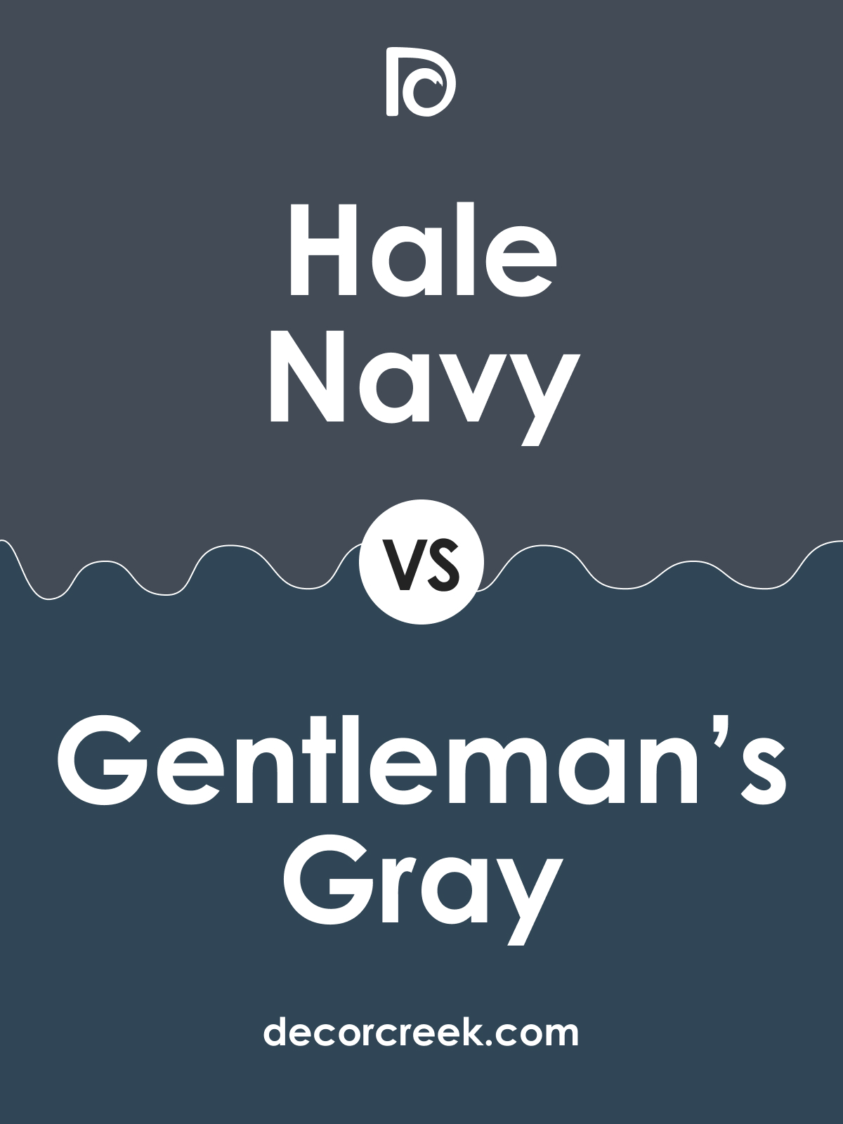
Hale Navy HC-154 vs Gentleman’s Gray 2062-20 by Benjamin Moore
Hale Navy HC-154 and Gentleman’s Gray 2062-20 by Benjamin Moore are two rich, deep blues with unique personalities. Hale Navy is a classic, slightly warm navy that brings a timeless, versatile look to spaces. Gentleman’s Gray is a darker blue with a hint of teal, giving it a bolder, more vibrant character.
Hale Navy is ideal for creating a cozy, traditional feel in bedrooms or libraries. Gentleman’s Gray works well on accent walls or cabinetry, where its vibrant tone can make a striking statement. Both colors look stunning with crisp whites and natural wood accents, adding a luxurious, polished feel.
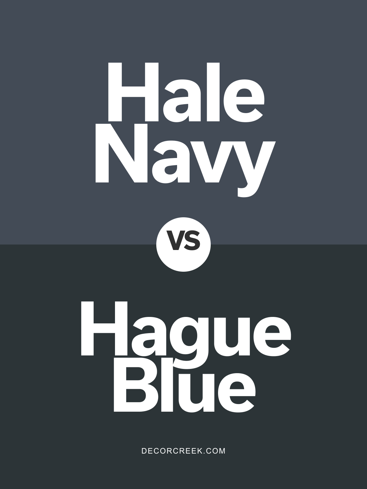
Hale Navy HC-154 vs Hague Blue No. 30 by Farrow & Ball
Hale Navy HC-154 by Benjamin Moore and Hague Blue No. 30 by Farrow & Ball are both rich, sophisticated navies. Hale Navy is a warm navy with a hint of gray, providing versatility in both classic and contemporary spaces. Hague Blue has a touch of green in its undertone, giving it a unique, deep blue-green look that’s both bold and elegant.
Hale Navy works beautifully in traditional settings, adding depth without overwhelming. Hague Blue is ideal for creating a dramatic statement in modern or eclectic spaces. Both shades pair excellently with white trim and brass accents, creating a luxurious and timeless atmosphere.
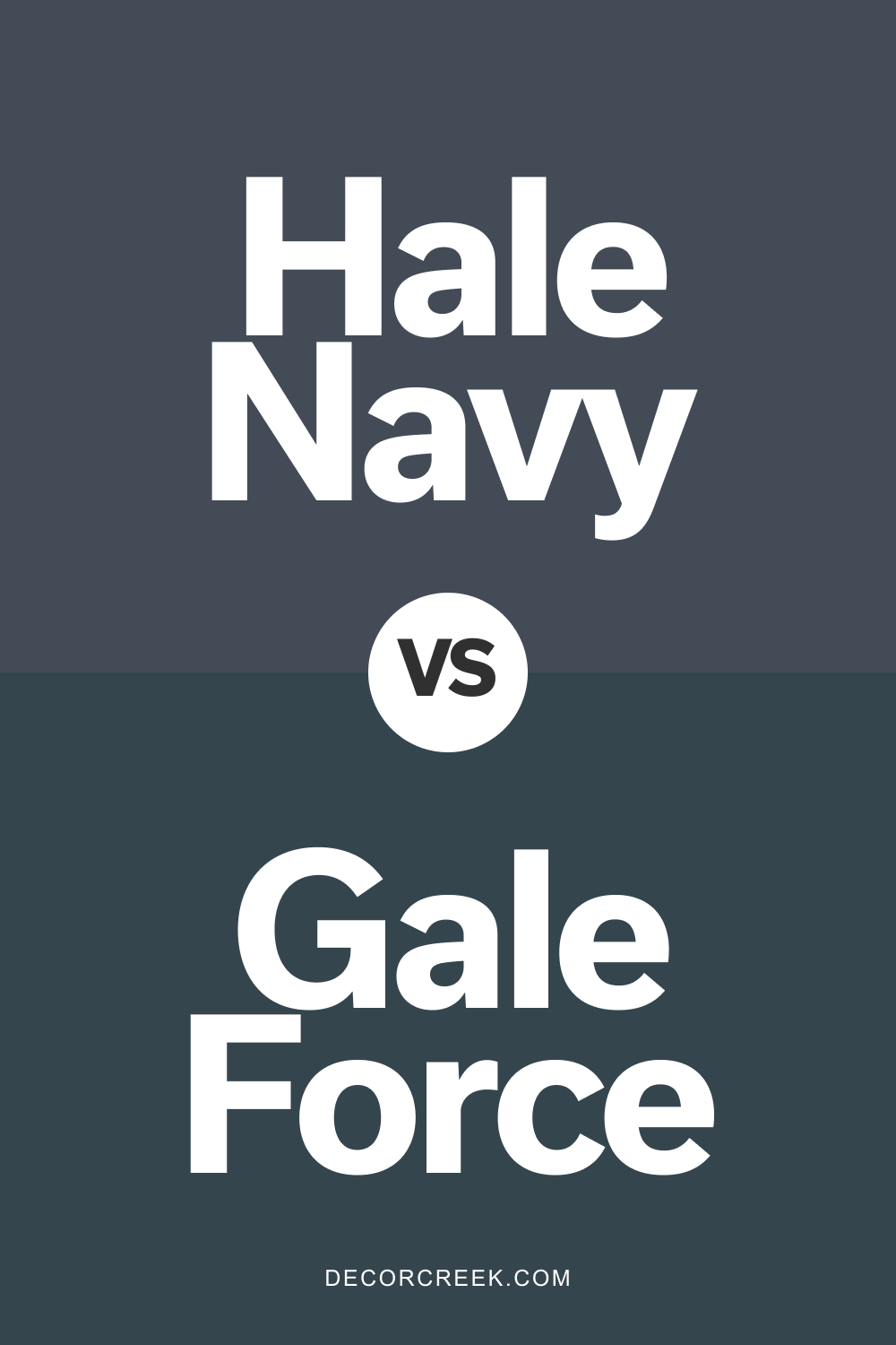
Hale Navy HC-154 vs Gale Force SW 7605 by Sherwin Williams
Hale Navy HC-154 and Gale Force SW 7605 by Sherwin Williams are deep, bold colors with unique tones. Hale Navy is a classic navy blue with a warm undertone, perfect for creating cozy and timeless interiors. Gale Force has a touch of green in its blue, giving it a rich teal undertone that adds depth and a modern twist.
Hale Navy is ideal for traditional spaces or accent walls, where a true navy can add elegance. Gale Force is perfect for adding a bit of personality to spaces like entryways or bathrooms, where a touch of teal can enhance the mood.
Both colors work beautifully with whites and light wood tones, providing a balanced, sophisticated look.
Hale Navy HC-154 by Benjamin Moore vs Evening Sky 833 by Benjamin Moore
Hale Navy and Evening Sky are two beautiful paints by Benjamin Moore. Hale Navy is a deep, rich color, like the sea at its most intense. It’s like looking into the depths of the ocean, strong and bold.
This color can make a statement in any room, adding a touch of elegance and drama. On the other hand, Evening Sky is lighter, reminding you of the sky just after sunset. It has a serene, calming effect, perfect for creating a peaceful space. It’s softer, offering a contrast to Hale Navy’s strength. While Hale Navy brings a sense of sophistication and depth, Evening Sky adds a breath of freshness and tranquility.
Both colors work beautifully in their own right, whether you’re looking for the boldness and elegance of Hale Navy or the calm and serenity of Evening Sky.
You can see recommended paint color below:
- 833 Evening Sky
Hale Navy HC-154 by Benjamin Moore vs Mysterious AF-565 by Benjamin Moore
Hale Navy and Mysterious are both rich, dark colors by Benjamin Moore. Hale Navy, as its name suggests, is a deep, strong navy blue. It gives off a classic and timeless feel, making spaces cozy yet bold.
On the other hand, Mysterious leans towards a darker, more enigmatic shade. It’s not just a simple black; it brings in hints of navy blue, adding a subtle complexity. While both shades are perfect for creating sophisticated and stylish spaces, Hale Navy has a more traditional blue tone, offering a sense of stability and strength. Mysterious, however, adds a layer of mystery and depth, making it ideal for a dramatic and contemporary look.
In choosing between the two, consider the mood you want to set. Hale Navy is great for a classic, dependable feel, whereas Mysterious is perfect for adding a touch of drama and modern flair.
You can see recommended paint color below:
- AF-565 Mysterious
Hale Navy HC-154 by Benjamin Moore vs Baby Seal Black 2119-30 by Benjamin Moore
Hale Navy and Baby Seal Black are two beautiful shades offered by Benjamin Moore. Hale Navy is a deep, rich blue that has a balance of warmth and sophistication. It’s not as stark as a true navy, offering a bit of softness, making it versatile for many spaces.
On the other hand, Baby Seal Black is a dark, intense color that leans more towards a true black with subtle hints of softness. This shade is perfect for creating striking contrasts, especially in spaces that benefit from a bold statement.
While Hale Navy carries a hint of color, providing depth and character to walls without overwhelming a room, Baby Seal Black delivers a powerful punch of elegance and drama, making it ideal for accent walls or detailed trim work.
Both colors bring their own unique vibe, with Hale Navy offering a cooler, serene backdrop, and Baby Seal Black presenting a definitive, sophisticated edge, making them excellent choices for those looking to add personality to their spaces.
You can see recommended paint color below:
- 2119-30 Baby Seal Black
Hale Navy HC-154 by Benjamin Moore vs Blue Note 2129-30 by Benjamin Moore
Hale Navy and Blue Note by Benjamin Moore are both beautiful shades of blue, but they have their unique characteristics. Hale Navy has a timeless, classic feel to it. It’s a deep, saturated navy that can add a sense of sophistication and strength to any space. It’s versatile enough to be used in a variety of settings, from elegant living rooms to cool, serene bedrooms.
On the other hand, Blue Note is a tad darker, leaning towards a more dramatic and intense ambiance. It carries a certain depth that can make walls seem to recede, perfect for creating a bold statement in a room. This color works well in spaces where you want to add drama or a focal point without overwhelming the space with too much brightness.
Both colors are great for creating moody atmospheres and can be paired with a range of complementary colors, from bright whites to soft neutrals. Whether you choose Hale Navy for its classic charm or Blue Note for its deep intensity, both colors offer a way to bring elegance and a touch of drama into your home.
You can see recommended paint color below:
Conclusion
In conclusion, Hale Navy, a color by Benjamin Moore, stands out as a versatile and stylish choice for anyone looking to add a sophisticated touch to their space. Its deep, rich hue offers a perfect balance between traditional and modern aesthetics, making it an ideal option for various applications, from accent walls to cabinetry. Its ability to pair well with a wide range of colors, from neutrals to vibrant tones, ensures it can seamlessly integrate into any design scheme, enhancing the overall look and feel of a room.
Furthermore, the durability and premium quality associated with Benjamin Moore products mean that choosing Hale Navy for your decorating projects is not only a decision for style but also for longevity.
Whether you’re updating a single room or undergoing a complete home renovation, this color provides a solid foundation that can elevate the atmosphere of your space, making it feel more inviting and polished. Its popularity among interior designers and homeowners alike underscores its effectiveness in achieving a refined and cohesive aesthetic.

Ever wished paint sampling was as easy as sticking a sticker? Guess what? Now it is! Discover Samplize's unique Peel & Stick samples.
Get paint samples
