In a world of color, there’s a neutral shade that has won hearts with its warm embrace and versatile nature: Accessible Beige SW 7036. In the vast realm of interior design and decor, where color schemes make or break the mood, Accessible Beige stands as an undisputed champion.
Its inherent ability to complement a wide range of design styles, from modern minimalism to rustic chic, has led to its tremendous popularity among designers and homeowners alike.
Whether you’re looking to create a serene living room or an elegant study, Accessible Beige SW 7036 might just be the shade you’re searching for.

What Color Is Accessible Beige SW 7036?
Accessible Beige SW 7036 is a truly versatile neutral hue. It is a light to medium beige color that beautifully combines the warmth of traditional beige with a modern, fresh feel. The color embodies a soothing earthy vibe, taking inspiration from natural elements like sand, wheat, and raw linen. Its subtle, muted tone makes it an excellent backdrop, helping other colors and elements within the room stand out.
When applied to walls, Accessible Beige SW 7036 exudes an inviting warmth that isn’t overly intense or stark. It can instantly brighten up a space, lending an aura of quiet sophistication.
This color’s understated elegance allows it to seamlessly blend into any space, making it feel like an inherent part of the room rather than a disruptive element.

Ever wished paint sampling was as easy as sticking a sticker? Guess what? Now it is! Discover Samplize's unique Peel & Stick samples.
Get paint samples

Is It a Warm Or Cool Color?
While Accessible Beige SW 7036 is categorized as neutral, it leans more towards being a warm color. The defining characteristic of warm colors is their ability to evoke a cozy, welcoming feel, and Accessible Beige does just that. It provides a soothing warmth without veering into the territory of yellows or oranges.
Undertones of Accessible Beige SW 7036
A color’s undertones are the subtle colors that lie beneath the surface. They are not always instantly visible but have a significant impact on how the color appears in different settings and lighting conditions. For Accessible Beige SW 7036, its balanced undertones of taupe and gray offer a unique charm that distinguishes it from other beige colors.
The gray undertone in Accessible Beige gives it a coolness that balances the warm beige, preventing it from looking too yellow. This gray influence also makes Accessible Beige a favorite among those who love the neutrality of gray but prefer a bit of warmth. Conversely, the taupe undertone adds a slightly earthy hue, grounding the color and adding depth and richness.
In essence, the interplay between these two undertones results in a color that can adapt to a wide range of color palettes and design aesthetics. They allow Accessible Beige to work harmoniously with both cool and warm colors, making it a versatile choice for any interior.

Coordinating Colors of Accessible Beige SW 7036
Coordinating colors are the hues that work well with a given color, creating a visually pleasing and harmonious color scheme. When it comes to Accessible Beige SW 7036, there are several color choices that work exceptionally well:
- SW 9174 Moth Wing: A rich, warm brown that brings out the warmth in Accessible Beige, creating a cozy, comfortable ambiance.
- SW 9141 Waterloo: A deep, cool blue that provides a beautiful contrast to Accessible Beige, bringing a vibrant energy to the room.
- SW 7004 Snowbound: A crisp, bright white that offers a fresh, clean contrast, allowing Accessible Beige to stand out without overwhelming the space.
In addition to these, here are three more colors that beautifully coordinate with Accessible Beige:
- SW 7037 Balanced Beige: A deeper beige that complements the lighter Accessible Beige, adding depth and dimension to the room.
- SW 7057 Silver Strand: A light, silvery gray that enhances the cool undertones of Accessible Beige, creating a tranquil and elegant ambiance.
- SW 7605 Gale Force: A bold, navy blue that contrasts with Accessible Beige, making it an excellent choice for accent pieces or feature walls.

How Does Lighting Affect Accessible Beige SW 7036?
Lighting significantly impacts how we perceive color. In the case of Accessible Beige SW 7036, it can appear differently based on the quality of light in a room.
In spaces filled with abundant natural light, Accessible Beige can appear lighter and slightly warmer, thanks to the sunlight’s yellow tints. It also tends to highlight the beige’s warm attributes, enhancing the color’s inviting feel.
In contrast, under artificial light, especially cooler LED or fluorescent lighting, Accessible Beige can show off more of its gray undertones, giving it a cooler and slightly muted appearance. This unique characteristic is part of what makes Accessible Beige such a versatile color, capable of adapting to varying lighting conditions while still maintaining its charm.

LRV of Accessible Beige SW 7036
Light Reflectance Value (LRV) is a measurement used to determine how much light a color reflects and how dark or light that color appears under certain lighting conditions. The LRV scale ranges from 0, representing absolute black, to 100, symbolizing pure white.
Accessible Beige SW 7036 has an LRV of 58, meaning it falls in the middle-to-upper range of the LRV scale. This gives it a fairly balanced combination of depth and brightness. A color with an LRV of 58 is light enough to make a room appear larger, brighter, and more inviting. Yet, it still possesses enough depth to add character and interest to the room.
The LRV of 58 also indicates that Accessible Beige SW 7036 has the ability to reflect a decent amount of light. This makes it an excellent choice for spaces with limited natural light, as it can help to brighten up the room. Conversely, in well-lit spaces, Accessible Beige can highlight architectural details and accentuate the depth of the space. This balanced LRV, combined with its balanced undertones, makes Accessible Beige a highly adaptable color, capable of performing well in a wide range of spaces and lighting conditions.

LRV – what does it mean? Read This Before Finding Your Perfect Paint Color
Trim Colors of Accessible Beige SW 7036
In the realm of interior design, trim colors are the hues chosen for the architectural detailing in a room, such as baseboards, window and door frames, crown molding, and wainscoting. Selecting the right trim color can enhance the primary wall color, create depth and contrast, and add elegance and sophistication to the room.
When it comes to Accessible Beige SW 7036, trim colors in various shades of white can beautifully highlight the color’s versatility and warmth.
- SW 7006 Extra White: is a clean, brilliant white. When used as a trim with Accessible Beige, it adds a crisp, modern edge, offering a beautiful contrast that helps the beige stand out more prominently.
- SW 7757 High Reflective White: High Reflective White is one of the purest whites available from Sherwin Williams. As a trim color with Accessible Beige, it can create a smooth transition, seamlessly blending with the beige while still providing a light, fresh boundary that illuminates the room.
- SW 7566 Westhighland White: Westhighland White is a softer, creamy white. Its subtle warmth makes it a perfect pairing for Accessible Beige, contributing to a cozy, welcoming atmosphere in the room.
The selection of an appropriate trim color is critical as it helps to create a cohesive look and feel, draw attention to the architectural details, and provide a professional finish to the room. The relationship between the wall color and trim color can significantly impact the overall aesthetic and mood of a space.

Colors Similar to Accessible Beige SW 7036
Knowing colors similar to your primary color choice allows you to explore different shades that might better suit your specific needs or preferences. These comparable colors can offer subtle variations in undertones, depth, or warmth while maintaining a similar aesthetic to the original color.
- SW 9085 Touch of Sand: Touch of Sand is a soft, warm neutral with similar gray and taupe undertones as Accessible Beige. However, it leans a bit more toward a sandy tan, giving it a slightly earthier feel. It’s a wonderful alternative if you’re looking for a shade a touch warmer than Accessible Beige.
- SW 6078 Realist Beige: Realist Beige is a medium-light beige that shares the neutral, adaptable character of Accessible Beige. It brings a bit more depth and warmth to the table, making it a great choice for those seeking a slightly richer version of Accessible Beige.
- SW 7541 Grecian Ivory: Grecian Ivory is a light, muted beige ivory with a touch of green undertone. While similar to Accessible Beige, this undertone gives Grecian Ivory a slightly cooler, more natural vibe. This color might be a fantastic alternative if you want a color close to Accessible Beige but with a fresher, slightly cooler feel.
Understanding similar colors to your primary choice broadens your design options. It can help you find a color that fits more precisely within your desired color scheme, caters to your specific design aesthetic, or better matches existing furniture and decor.
In essence, this knowledge provides you with more control and flexibility over your design choices.

Colors That Go With SW Accessible Beige
Sherwin-Williams boasts a wide range of colors that can seamlessly complement SW Accessible Beige. Whether you’re looking for a color to create a striking contrast or something that aligns closely with Accessible Beige’s soothing tones, Sherwin-Williams offers a plethora of options to choose from.
One such color is SW 9174 Moth Wing. This muted brown shade shares the same warmth as Accessible Beige, but its deeper tone can provide a beautiful contrast and depth when used alongside. It’s perfect for accent walls, furniture, or even cabinetry.
On the other end of the spectrum, we have SW 7004 Snowbound. This crisp, bright white color is lighter and cooler, making it an excellent choice for trim or ceiling paint to provide a clean, refreshing contrast against Accessible Beige’s warm undertones.
Finally, SW 9141 Waterloo is a rich, medium-dark blue that can create a stunning visual contrast with Accessible Beige, perfect for adding a pop of color in a neutral room.

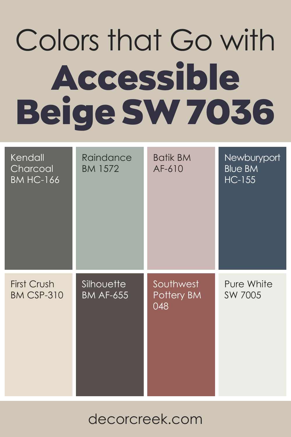
Accessible Beige SW 7036 is one of those warm neutrals that instantly makes a room feel gentle and welcoming. It has a soft warmth without feeling heavy, which is why I often choose it for living rooms, bedrooms, and open floor plans.
When paired with deeper shades like Kendall Charcoal, Silhouette, and Southwest Pottery, Accessible Beige gains richer dimension and becomes more grounded. These colors help the palette feel mature and steady.
For a softer, calmer look, I love using Raindance, Batik, and First Crush—they bring a light, fresh touch. Adding a cool accent like Newburyport Blue creates a beautiful mix of warm and cool tones that works well in many homes. Pure White also sits perfectly beside Accessible Beige, giving the room a clean finish without taking away its warmth.
This color blends beautifully with natural textures, warm woods, and soft fabrics. With the right partners, Accessible Beige brings comfort and quiet elegance to everyday living.
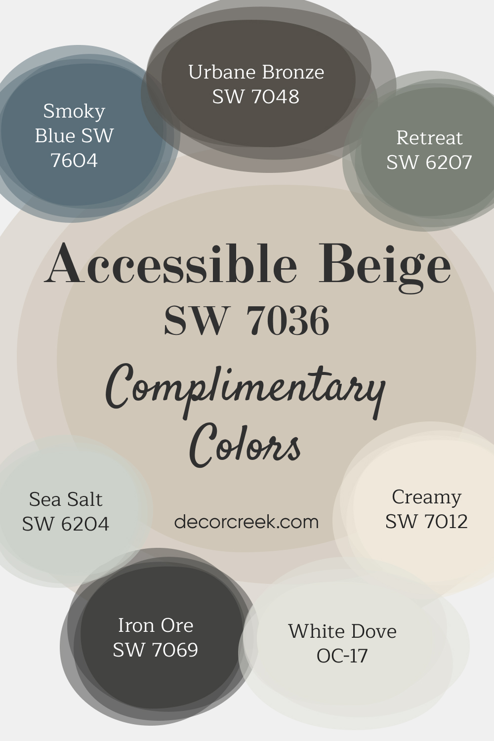
Complimentary Colors for Accessible Beige SW 7036 Paint Color by Sherwin-Williams
This curated selection of paint colors brings a mix of warmth, depth, and calm to any room. Accessible Beige provides a soft, neutral foundation that pairs beautifully with deeper shades like Iron Ore and Urbane Bronze for a more dramatic effect.
If you’re looking for a soothing, natural feel, Retreat and Sea Salt offer gentle green tones that bring peace and relaxation to your space. For a pop of color, Smoky Blue introduces a cool, calming vibe that’s perfect for accent walls or smaller rooms.
Finish the look with White Dove or Creamy, both of which brighten up your walls, trim, or ceilings with a clean, crisp feel. Whether you’re updating a room or refreshing your entire home, these colors provide endless options to suit your style.
How to Use Accessible Beige SW 7036 In Your Home?
The sheer adaptability of Accessible Beige SW 7036 makes it suitable for use in nearly any room of your home. Its subtle, warm undertones and balanced light reflectance value enable it to complement a wide range of interior design styles. Whether you favor traditional, rustic, contemporary, coastal, or transitional design, Accessible Beige can seamlessly blend with these aesthetics, creating a harmonious and welcoming ambiance.
Its neutral tone can serve as an ideal backdrop for highlighting furniture, art pieces, or accent colors. Furthermore, its versatility makes it suitable for rooms of various functions, from bedrooms and bathrooms to kitchens and living rooms. It’s even an attractive option for exteriors. Let’s explore how to use Accessible Beige in different parts of your home.
How to Use Accessible Beige SW 7036 in the Bedroom?
In the realm of bedrooms, where relaxation and tranquility are paramount, Accessible Beige SW 7036 can create an ambiance of serene sophistication. Its balanced undertones can infuse the room with a sense of calm, serving as an ideal backdrop for a variety of design elements. Complementing it with whites or creams for the ceiling and trim can elevate this tranquil aesthetic.
Paired with dark wooden furniture, Accessible Beige can create a traditional and timeless look, while matching it with lighter, contemporary furniture can evoke a chic, modern vibe. It’s also versatile enough to accommodate a variety of bedding and accent colors, enabling you to refresh your bedroom look with ease as your preferences evolve.

How to Use Accessible Beige SW 7036 in the Bathroom?
In bathrooms, Accessible Beige SW 7036 can serve as a canvas against which other elements can shine. It can effortlessly highlight features such as a vintage claw-foot tub, a sleek modern vanity, or metallic fixtures. Furthermore, its light-reflecting properties can help make a small bathroom appear larger and more spacious.
Paired with white or light-colored tiles, Accessible Beige can create a clean, fresh aesthetic. Alternatively, juxtaposing it against darker tiles or countertops can generate visual interest and depth. This color’s versatility ensures it can accommodate various bathroom styles, from minimalist to luxurious.

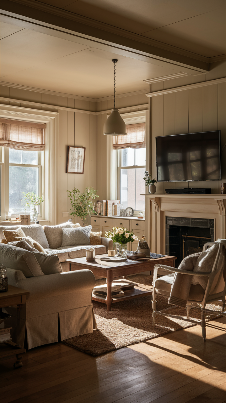
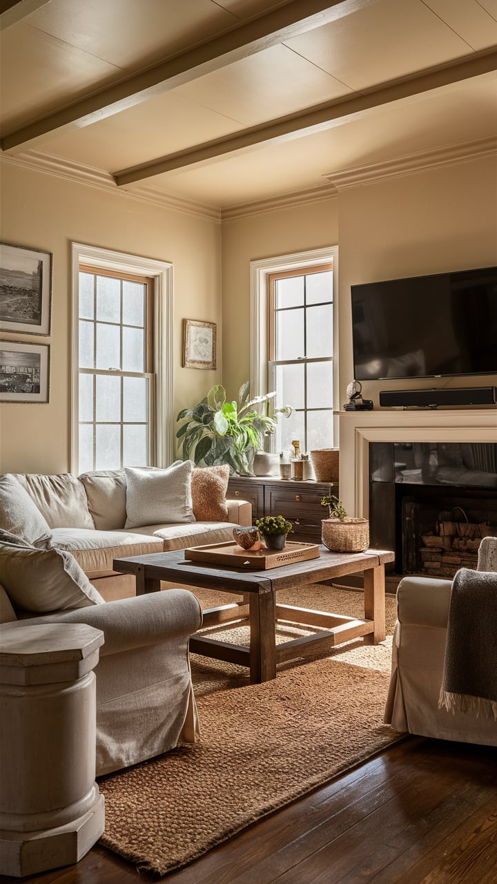
How to Use Accessible Beige SW 7036 in the Living Room?
In the living room, a space often designed for comfort and conviviality, Accessible Beige SW 7036 can provide a soothing and inviting ambiance. The color’s warm undertones can harmonize with a range of textures and colors, from the richness of leather to the softness of linen or from the vibrancy of jewel tones to the tranquility of pastels.
In well-lit living rooms, Accessible Beige’s grelaxation ray undertone can subtly come forward, lending a cool, modern edge to the space. In the evening, under softer lighting, the beige and taupe undertones can impart a cozy, warm feel, making it an ideal setting for or social gatherings.

Visualisations:
How to Use Accessible Beige SW 7036 for an Exterior?
Accessible Beige SW 7036 is not only limited to interiors; it can also work wonderfully as an exterior color. Its neutrality can complement various architectural styles and blend harmoniously with the surrounding landscape. The color’s light reflectance can help the house look vibrant, even under the sun’s intense rays.
Pairing Accessible Beige with white or off-white trim can create a classic and timeless appeal. On the other hand, contrasting it with darker trim colors, such as a rich brown or deep blue, can highlight architectural details and add a contemporary twist. This flexibility makes Accessible Beige a popular choice for home exteriors.

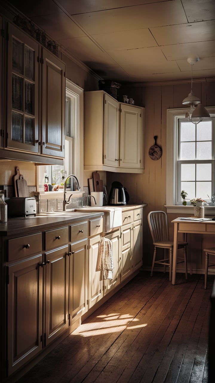
How to Use Accessible Beige SW 7036 in the Kitchen?
In kitchens where functionality meets aesthetics, Accessible Beige SW 7036 can set a warm, inviting tone. Whether your kitchen features sleek, modern fixtures or rustic, farmhouse elements, Accessible Beige can harmonize with these styles, offering a soothing backdrop against which the kitchen components can stand out.
Coupling Accessible Beige with white or cream countertops can create a bright, clean aesthetic while pairing it with dark wood or black countertops can evoke a sense of richness and depth. Against this versatile backdrop, pops of color, such as a vibrant backsplash or colorful kitchen accessories, can shine.

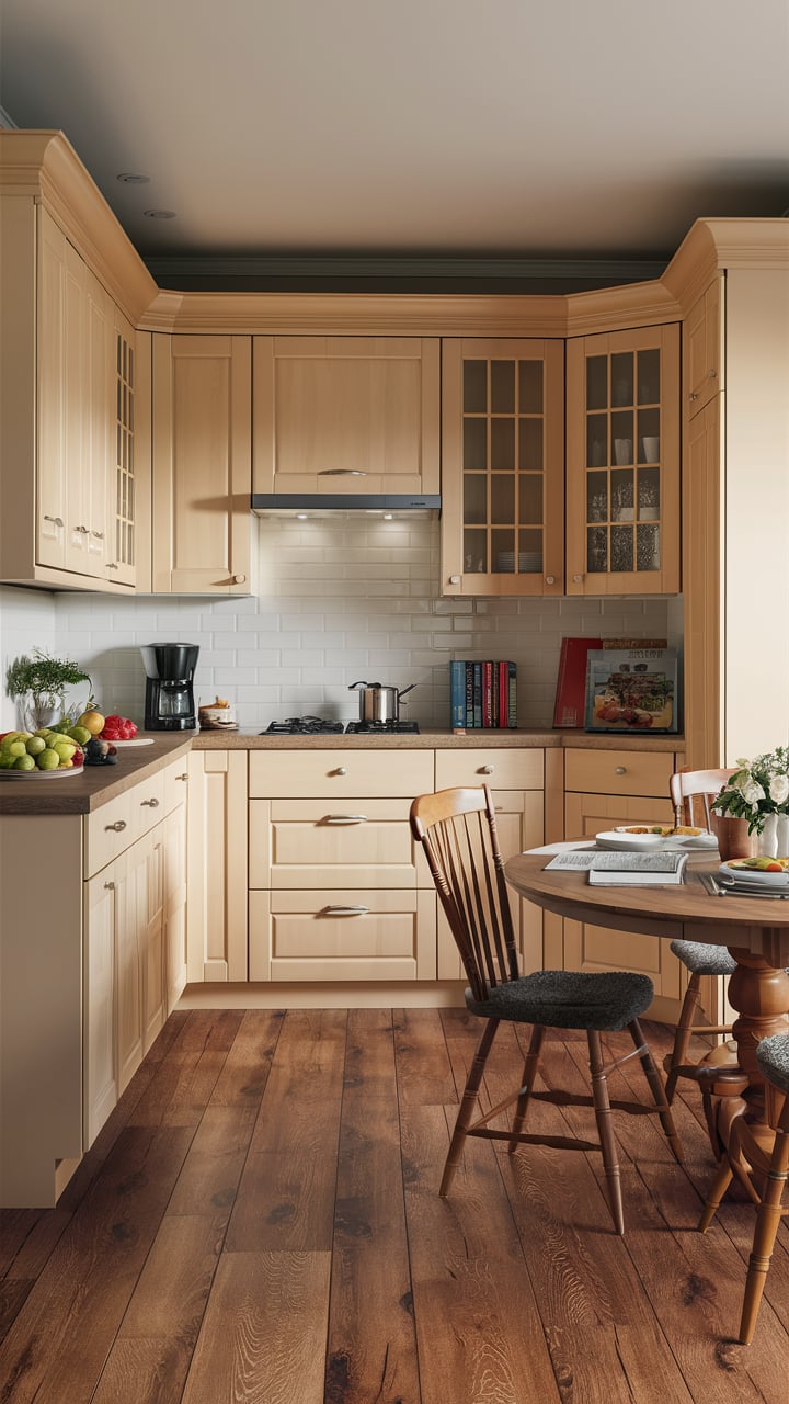
How to Use Accessible Beige SW 7036 for the Kitchen Cabinets?
Kitchen cabinets painted in Accessible Beige SW 7036 can impart a sense of warmth and sophistication. This versatile color can adapt to a variety of kitchen styles, from classic to contemporary, and its light reflectance can help keep the kitchen looking bright and open.
In a kitchen with Accessible Beige cabinets, you could opt for a darker countertop to create contrast and add depth. Alternatively, you could choose a lighter countertop for a seamless, monochromatic look. Regardless of your design preferences, Accessible Beige kitchen cabinets can provide a beautiful and flexible foundation for your culinary space.

Accessible Beige SW 7036 in the Hallway
Accessible Beige SW-7036 is an excellent choice for creating a warm and welcoming ambiance in your hallway. This neutral, versatile shade brings a sense of brightness and spaciousness, making it ideal for hallways, which often lack natural light. Its subtle warm undertones ensure a cozy feel, inviting you and your guests into the home.
Accessible Beige complements various decor styles and works well with both light and dark furnishings. It also serves as a perfect backdrop for displaying artwork or family photos. By using this color in your hallway, you’ll achieve a timeless look that is both elegant and inviting

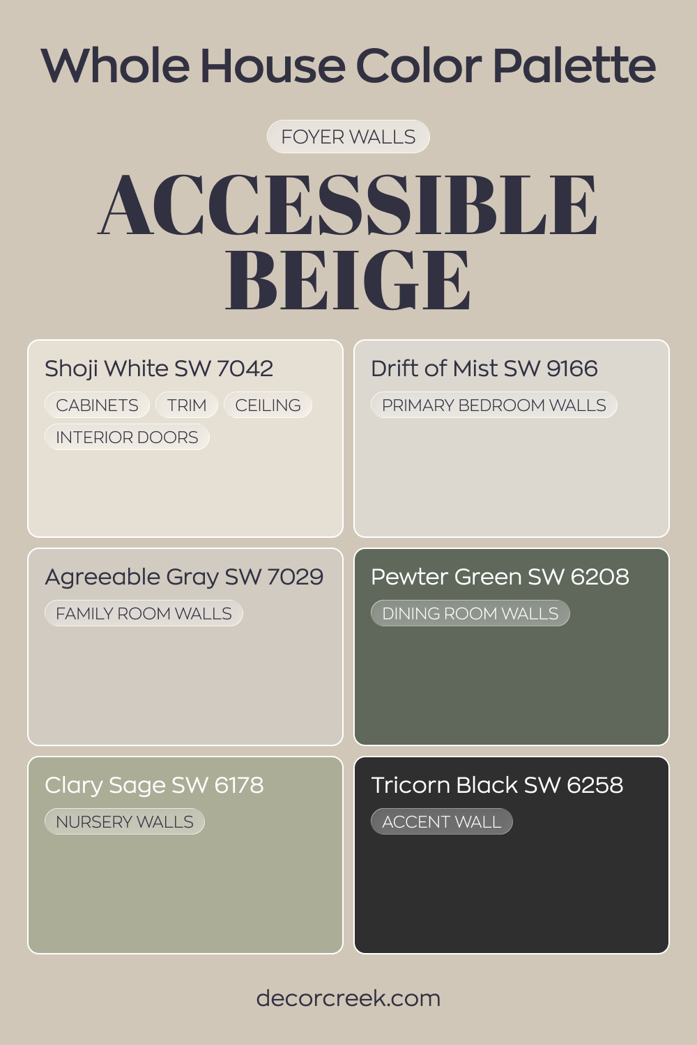
Whole house paint color palette centered on Accessible Beige SW 7036
Accessible Beige SW 7036 welcomes you in the foyer with warm, inviting depth. Shoji White on cabinets, trim, ceilings, and interior doors brightens the edges and keeps the look polished. The combination feels cozy yet refined.
Drift of Mist in the primary bedroom and Agreeable Gray in the family room continue the neutral story with soft gray balance.
Pewter Green in the dining room adds earthy character, while Clary Sage in the nursery brings a gentle green touch. These shades layer warmth and nature-inspired tones.
Tricorn Black on an accent wall introduces bold contrast. The dark focal point sharpens the lighter neutrals and gives the whole house a confident finish.
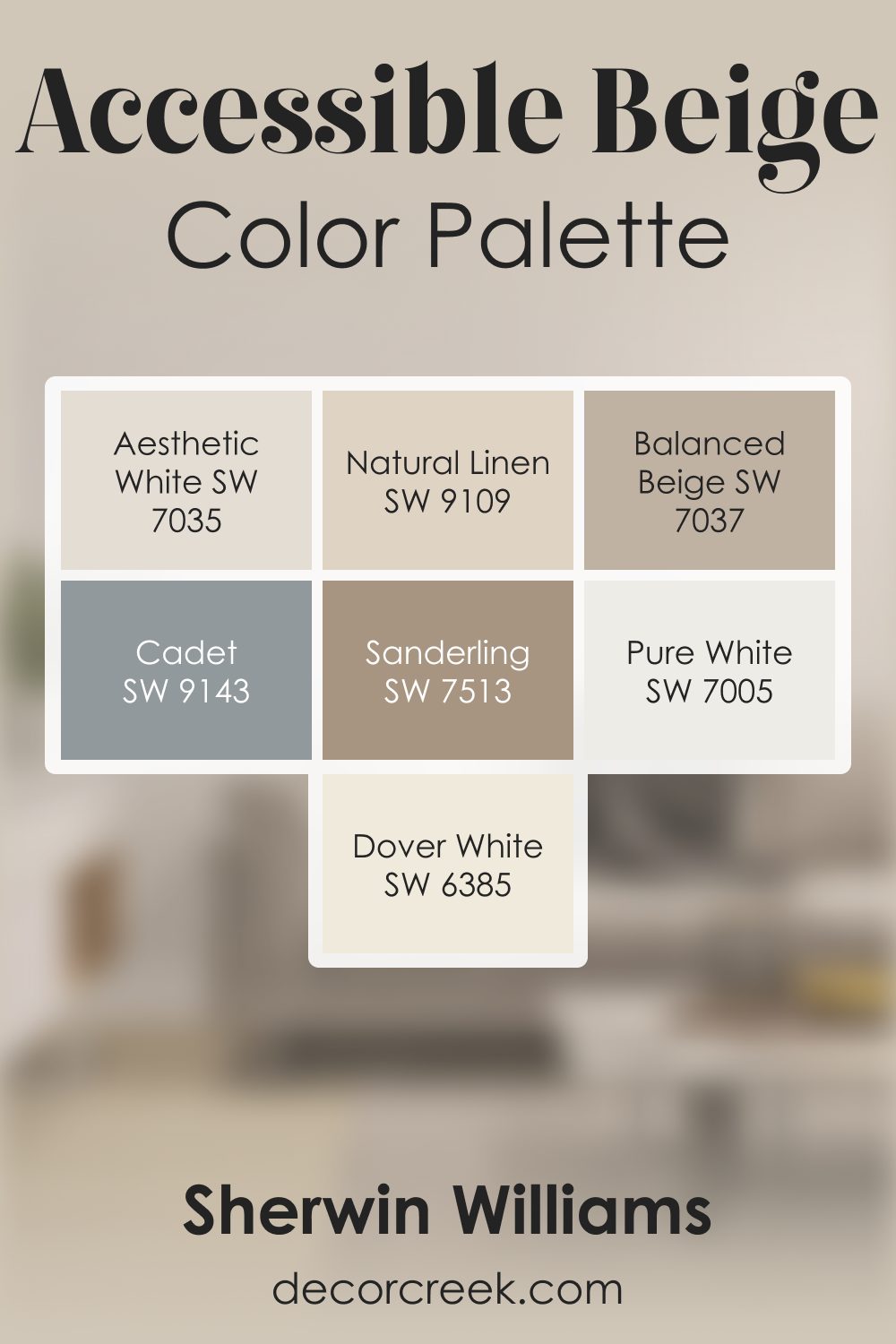
Accessible Beige SW 7036 by Sherwin Williams Color Palette
Every time I use Accessible Beige, I feel this warm, friendly calm spread across the room. It has a natural softness that makes everything feel comfortable and lived-in in the best way. I love how beautifully it pairs with Aesthetic White and Natural Linen—together they create a warm, quiet glow that feels effortless. Balanced Beige and Sanderling deepen the palette just enough to give it a gentle richness.
When I want brightness, Dover White and Pure White add a clean lift that feels smooth rather than sharp. And Cadet is the touch I use when I want a cooler accent to balance the warmth without breaking the mood.
What I love most about this palette is how steady and peaceful it feels. Accessible Beige sits at the heart of it, giving the whole combination a warm, welcoming presence that feels easy to love every day.
Comparing Accessible Beige SW 7036 With Other Colors
Comparing colors is an essential part of the color selection process. Each color, even within the same family or range, has its unique undertones and depth. The comparison allows you to understand these subtle variations and nuances better, helping you choose a color that precisely meets your design goals, complements your home’s lighting conditions, and harmonizes with your existing furniture and decor.
Accessible Beige SW 7036 vs. SW 7038 Tony Taupe
SW Tony Taupe is a much deeper, darker color than Accessible Beige. Its rich taupe undertones lend it a stronger presence, making it a suitable choice for rooms where a more dramatic, intense look is desired. On the other hand, Accessible Beige, with its balanced undertones of taupe and gray, is more subdued and softer, imparting a serene, relaxing feel.
Despite the difference in intensity, both colors share a versatile neutrality. This similarity allows them to adapt to a variety of design aesthetics and color palettes. However, the choice between them would depend on the mood you wish to create — tranquil and soothing with Accessible Beige or bold and dramatic with Tony Taupe.

Accessible Beige SW 7036 vs. SW 7039 Virtual Taupe
SW Virtual Taupe is a medium-dark taupe with a strong gray undertone. It is significantly darker than Accessible Beige and leans more towards gray, making it a more grounding color. The depth of Virtual Taupe can add a sense of richness and sophistication to a room, whereas Accessible Beige can create a light, airy atmosphere with its higher LRV.
While both colors can fit into various design schemes, their impact and the atmosphere they create differ. Accessible Beige can brighten up spaces and give them a relaxed vibe, whereas Virtual Taupe can bring a robust, luxurious character to a room.

Accessible Beige SW 7036 vs. SW 7037 Balanced Beige
SW Balanced Beige is a medium-tone beige that, true to its name, balances warm and cool undertones. It’s darker than Accessible Beige and adds more warmth to the room, making spaces feel cozy and inviting. Conversely, Accessible Beige, being lighter, offers a cooler and more relaxed atmosphere.
Both colors are wonderfully versatile and can adapt to a range of interiors. However, your choice would depend on the level of warmth you desire in your room — Balanced Beige for a cozier feel or Accessible Beige for a more neutral and calm ambiance.

Accessible Beige SW 7036 vs. SW 7022 Alpaca
SW Alpaca is a light to medium gray color with a slight beige undertone. It leans more toward the gray spectrum compared to Accessible Beige, which has a balanced mix of beige, taupe, and gray. Alpaca might give off a cooler vibe, making it an excellent choice for modern, minimalist designs.
Both Accessible Beige and Alpaca share a soothing quality and can serve as neutral backdrops in various settings. Yet, their fundamental difference lies in their temperature — Accessible Beige is warmer, offering a gentle, comforting ambiance, while Alpaca, with its gray leanings, brings a chic, contemporary feel to the room.

Accessible Beige SW 7036 vs. SW 7511 Bungalow Beige
SW Bungalow Beige is a medium-light beige that leans slightly towards pink or peach, making it warmer than Accessible Beige. This warmth can make spaces feel intimate, cozy, and cheerful. Accessible Beige, with its balanced undertones, retains a more neutral character, making it suitable for those seeking a calm, serene environment.
While both colors can create beautiful, inviting spaces, Bungalow Beige leans towards a warmer, earthier aesthetic. In contrast, Accessible Beige offers a more neutral, balanced look that can accommodate a broader range of design elements and styles.

Accessible Beige SW 7036 vs. SW 7530 Barcelona Beige
SW Barcelona Beige is a medium beige with a warm, golden undertone. It’s more intense and warmer than Accessible Beige, offering an inviting, sunny vibe to a room. Accessible Beige, on the other hand, remains more subdued and neutral, lending itself to a wider variety of decor styles and colors.
Despite their shared beige category, Barcelona Beige and Accessible Beige impart different atmospheres due to their undertones. If you are seeking a vibrant, sunny space, Barcelona Beige would be your pick, while Accessible Beige would suit those aiming for a serene, neutral environment.

Conclusion
The multifaceted nature of Accessible Beige SW 7036 makes it a versatile and adaptable color choice for various spaces and design styles. Whether used in a bedroom for a soothing ambiance, as a neutral backdrop in a living room or to add warmth to a kitchen, this color’s potential is extensive. Its balanced undertones, complementing trim and coordinating colors, and responsiveness to lighting changes add to its appeal.
Comparisons with other similar hues further illuminate its unique characteristics, helping homeowners make an informed choice that matches their personal aesthetic and the specific demands of their space. Accessible Beige’s chameleon-like ability to adjust and enhance the beauty of its surroundings truly sets it apart as an exemplary neutral paint color.

Ever wished paint sampling was as easy as sticking a sticker? Guess what? Now it is! Discover Samplize's unique Peel & Stick samples.
Get paint samples
Frequently Asked Questions
⭐What undertones does Accessible Beige SW 7036 have?
Accessible Beige is a neutral paint color with subtle gray and taupe undertones. It's not a pure beige but instead has a balanced mix of warm and cool tones, which gives it a versatile, neutral look.
⭐In what type of rooms or settings does Accessible Beige SW 7036 work best?
Due to its neutrality, Accessible Beige is very versatile. It works beautifully in a variety of settings, such as living rooms, bedrooms, kitchens, or offices. It's particularly effective in spaces with a lot of natural light but also works well in areas with less natural light.
⭐What colors complement Accessible Beige SW 7036?
Accessible Beige is a neutral paint color, which means it pairs well with many other colors. For a harmonious palette, consider pairing it with other neutrals like grays, whites, or deeper browns. It also works well with cool blues, soft greens, and even some pastel shades.
⭐How does the color Accessible Beige SW 7036 change under different lighting conditions?
Like any paint color, Accessible Beige can appear different depending on the lighting. In a room with lots of natural light, it may look lighter and lean towards a more off-white or light gray. In spaces with less natural light or in artificial light, it can appear slightly darker, bringing out the taupe undertones.
⭐Does Accessible Beige SW 7036 work well for exteriors?
Yes, Accessible Beige is a great choice for home exteriors due to its neutral and versatile nature. It pairs well with a variety of exterior elements like brick, stone, and siding and complements a wide range of accent colors. It also works well for both traditional and contemporary architectural styles.


