As you consider refreshing your living space, you might stumble upon a unique shade called SW 6549 Ash Violet by Sherwin Williams. This particular color offers a subtle blend of grey with hints of soft violet, setting a serene yet sophisticated tone in any room. If you’re someone who enjoys a touch of modernity alongside classic elegance, Ash Violet could be the ideal choice for your next painting project.
This shade is versatile enough to work beautifully in a variety of settings, whether you’re aiming to create a soothing atmosphere in a bedroom or looking to add a chic backdrop to your living area. Its understated color pairs well with many decor styles and complements a wide range of furniture finishes and textiles, making it a practical and appealing option.
If you’re apprehensive about making dramatic changes, consider how a coat of Ash Violet might enhance less visible areas like a powder room or an accent wall. The muted yet rich hue can make small spaces feel larger and more inviting without overwhelming the senses.
Let me share more about why Ash Violet could be the fresh new color you’ve been looking to introduce into your home.

What Color Is Ash Violet SW 6549 by Sherwin Williams?
Ash Violet by Sherwin Williams is a unique color that balances the muted coolness of gray with hints of gentle violet. This subtle yet charming shade is versatile, making it a fine choice for those looking to add a touch of understated elegance to their interiors. With its soothing vibe, it complements spaces designed for relaxation and calm.
The color works exceptionally well in modern and minimalist interior styles, where its understated quality can blend seamlessly with clean lines and simple forms. Ash Violet is also a great match for Scandinavian decor, where neutral colors and natural light play a key role in creating airy, inviting spaces. When paired with contemporary furnishings, this color provides a soft backdrop that allows bolder elements to stand out.
When it comes to pairing with materials, Ash Violet goes beautifully with natural wood, which adds warmth to its cool undertones. Textures like linen and cotton in light colors also work well, maintaining the light and fresh feel of the space. For those who prefer a bit of contrast, incorporating metals like brushed nickel or matte black can create a pleasing mix of soft and sleek elements.
This color’s versatility also makes it suitable for use with plush fabrics, adding a touch of luxury to upholstery or curtains in more plush settings.
Is Ash Violet SW 6549 by Sherwin Williams Warm or Cool color?
Ash Violet by Sherwin Williams is a unique paint color that offers a subtle and soft touch to any room in a home. This color has a blend of gray and light purple tones, making it versatile and suitable for various decorating styles.
Because Ash Violet is not overwhelmingly bold, it is ideal for creating a calm and inviting atmosphere in spaces like bedrooms, bathrooms, or living areas. Its muted nature means it pairs well with many colors, from neutrals like white and beige to more vibrant shades that might be used in accessories or furniture.
Ash Violet works especially well in spaces that get a lot of natural light, as the light brings out the complexity of the color, showcasing its gentle purple hue without overpowering the room. This makes it a great choice for anyone looking to add a touch of color to their home without making too drastic a change.
Undertones of Ash Violet SW 6549 by Sherwin Williams
Ash Violet is a unique paint color that carries various undertones, making it versatile and appealing for different spaces. Understanding undertones is important because they can subtly influence the feel and appearance of a color when applied to walls. For Ash Violet, these undertones include shades of gray, light purple, pale pink, and more.
An undertone is essentially a hint of another color that is present beneath the main color. It affects how colors look under different lighting conditions and when paired with other colors in a room. For instance, Ash Violet has a grey undertone, which can make it appear cooler and more neutral, making it a good choice for a modern look. The light purple and pale pink undertones add a soft, welcoming touch to the hue, which can be ideal for bedrooms or sitting areas, providing a gentle, restful ambiance.
Furthermore, undertones like light blue and mint introduce a fresh, clean aspect to Ash Violet, enhancing the feeling of space in a room. These cooler undertones might make the color a good match for bathrooms or small spaces, as they can make the area seem larger.
When used on interior walls, the variety of undertones in Ash Violet means it can adapt well to different styles and lighting conditions. In a room with plenty of natural light, the lighter undertones might become more pronounced, giving the room a vibrant, airy feel. In artificial light, deeper undertones like navy or dark blue might stand out, providing a more grounded, secure feeling.
Overall, the multifaceted nature of Ash Violet due to its undertones means it can work beautifully in many different interior settings, adapting subtly to enhance the mood and style of any room.
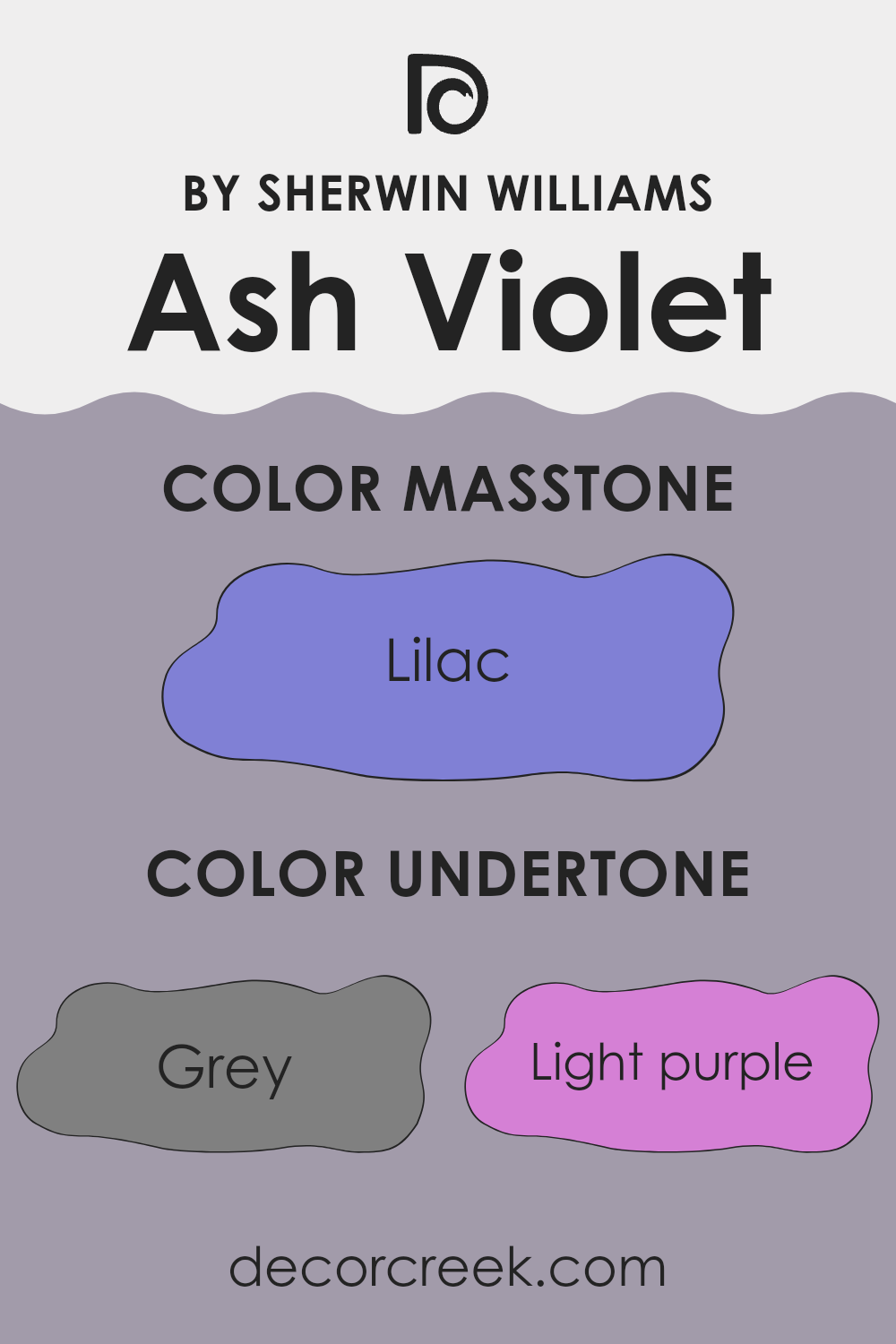
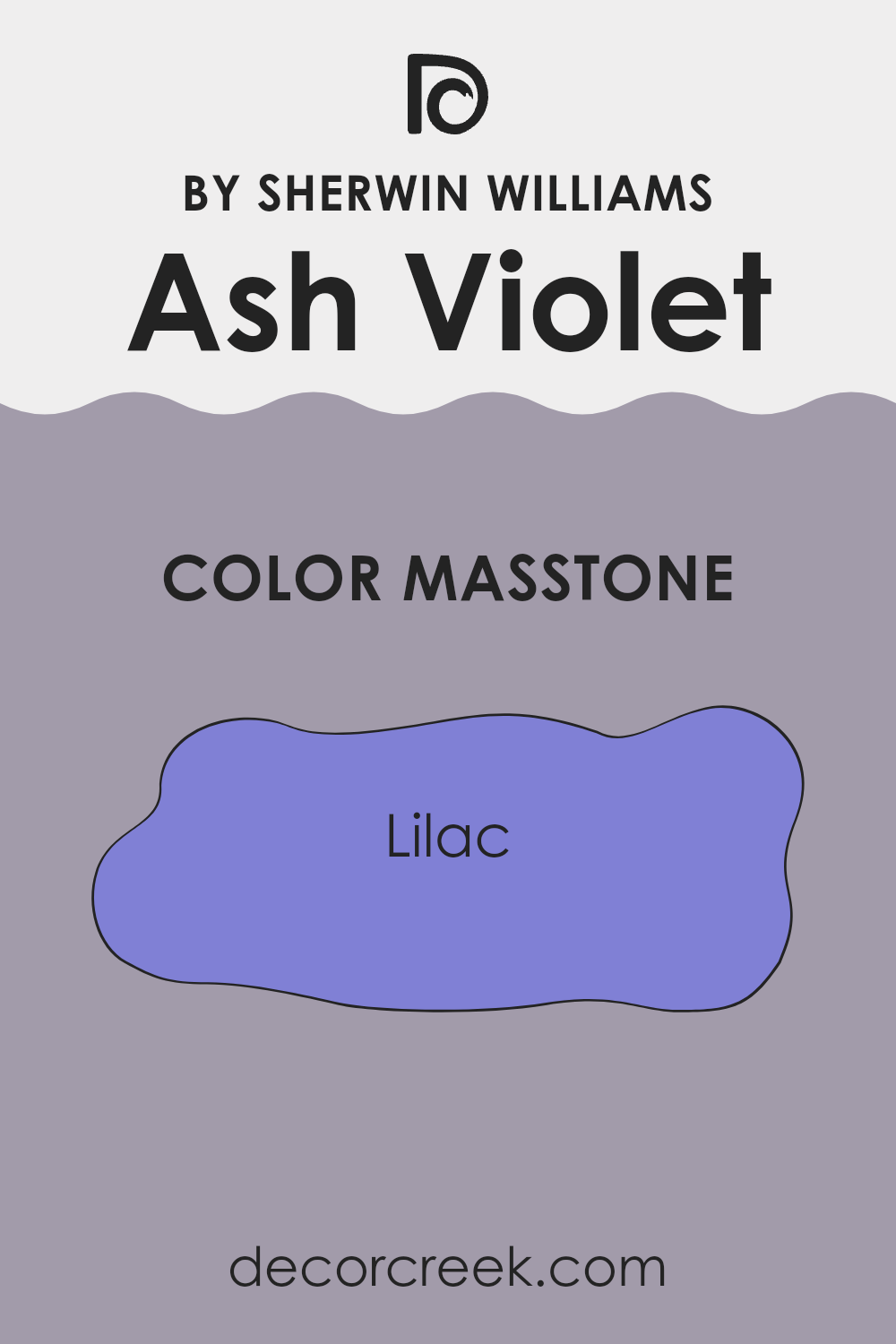
What is the Masstone of the Ash Violet SW 6549 by Sherwin Williams?
Ash Violet SW 6549 by Sherwin Williams has a masstone similar to the color Lilac (#8080D5), which gives it a gentle and pleasant appearance. This soft purple shade can create a cozy and inviting atmosphere in homes.
It’s particularly effective in bedrooms and living areas where you want to promote a relaxed vibe. The cool tone of this color works well with natural light, helping spaces appear more light and airy. When used in smaller rooms, it can make them seem larger and more open.
Additionally, Ash Violet pairs beautifully with light neutrals like whites or soft grays, which can enhance its gentle nature without overpowering the space. This makes it a versatile choice for many different home styles and decorating tastes, adding a touch of light-hearted charm without being too bold or overwhelming.
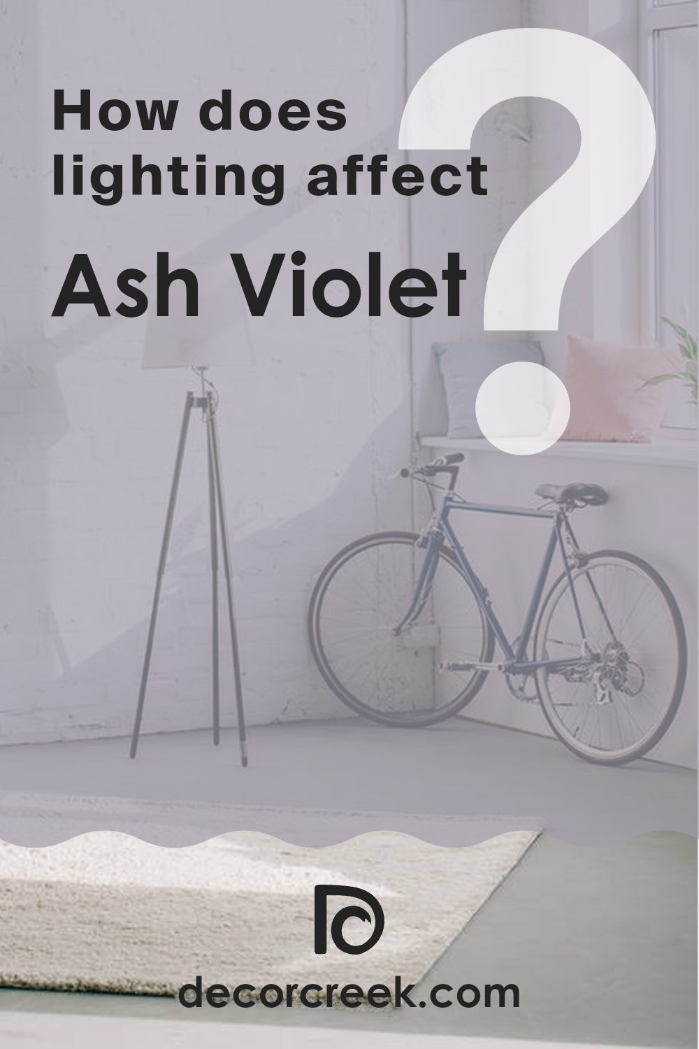
How Does Lighting Affect Ash Violet SW 6549 by Sherwin Williams?
Lighting plays a crucial role in how we perceive colors. Different light sources can significantly alter the appearance of a color on your walls, furniture, or decor. Natural light from the sun and artificial light from bulbs are the most common sources, each affecting colors differently.
Taking the color Ash Violet as an example, let’s look at how lighting conditions impact its appearance. This shade is a subtle blend of gray and violet, offering a unique visual experience under various lighting conditions.
- Natural Light: Under natural sunlight, Ash Violet reveals more of its violet hues. The color appears slightly brighter and more vibrant during the day, especially when sunlight is direct.
- Artificial Light: In artificial light, such as that from LED or incandescent bulbs, Ash Violet tends to look more subdued.
Incandescent lighting can bring out warmer tones in the color, making it look more greyish, whereas LED lighting might keep it closer to its true shade but slightly dimmer.
Room Orientation and Light:
1. North-facing rooms: These rooms tend to get less direct sunlight, which can make Ash Violet appear more muted and shadowy. In these spaces, the color might lean more towards its grey undertones, giving a cooler feel.
2. South-facing rooms: South-facing rooms receive a significant amount of natural light throughout the day. Here, Ash Violet will look lighter and more true to its actual violet tint. The ample sunlight can make the color feel airy and more pronounced.
3. East-facing rooms: Sunrise light is warm and welcoming in east-facing rooms. Ash Violet will look warmer and lighter in the morning and will transition to being cooler and more subdued as the day progresses and natural light diminishes.
4. West-facing rooms: Similar to east-facing rooms but in reverse, west-facing rooms glow with the sunset. Ash Violet will display warmer, more intense tones in the evening and paler, cooler tones during the day.
In summary, Ash Violet’s perception varies greatly depending on the quality and direction of light. Whether in natural or artificial light, and depending on the room’s orientation, this color can shift from looking more grey to vivid violet.
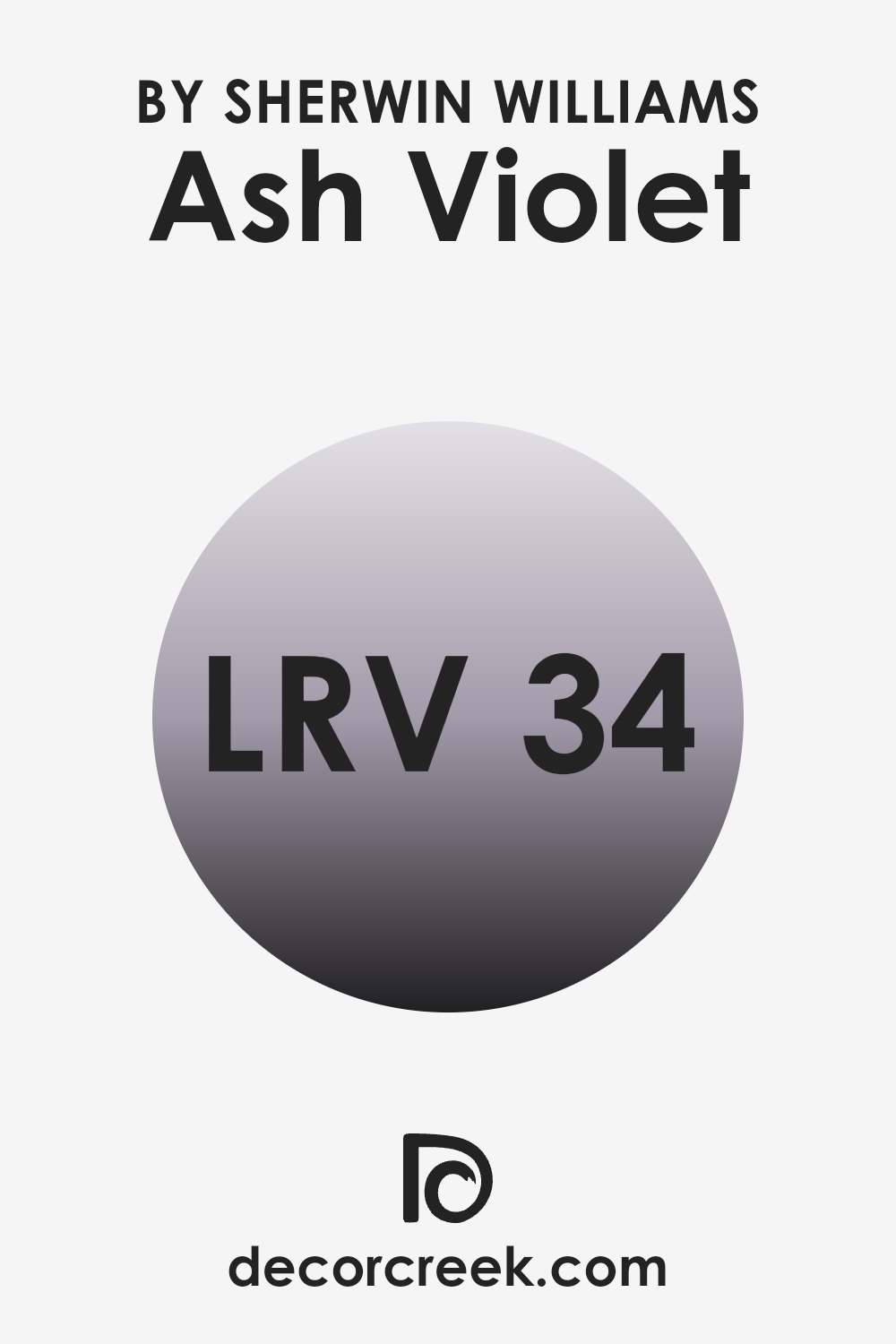
What is the LRV of Ash Violet SW 6549 by Sherwin Williams?
Light Reflectance Value (LRV) is a measure of how much light a paint color reflects back into a room as compared to the light that falls on it. The LRV scale goes from a very dark 0 which reflects almost no light, to a very bright 100 which reflects most of the light.
A higher LRV means the color will appear lighter and can make a small room feel more spacious and airy. Conversely, a lower LRV can make a color look richer and more vivid, but it might make a small room feel smaller and darker.
The LRV of Ash Violet, which is 34.14, positions it in the middle range. This means it doesn’t reflect a lot of light nor does it absorb too much. Colors like this are versatile because they have a balance of brightness and depth that can work well in many spaces without overpowering the surroundings.
In a well-lit room, Ash Violet will look lighter and more vibrant, while in a room with less natural light, it will appear more subdued and cozy. Because of its moderate LRV, it’s a color that provides flexibility when decorating, allowing different lighting conditions to subtly alter its appearance.
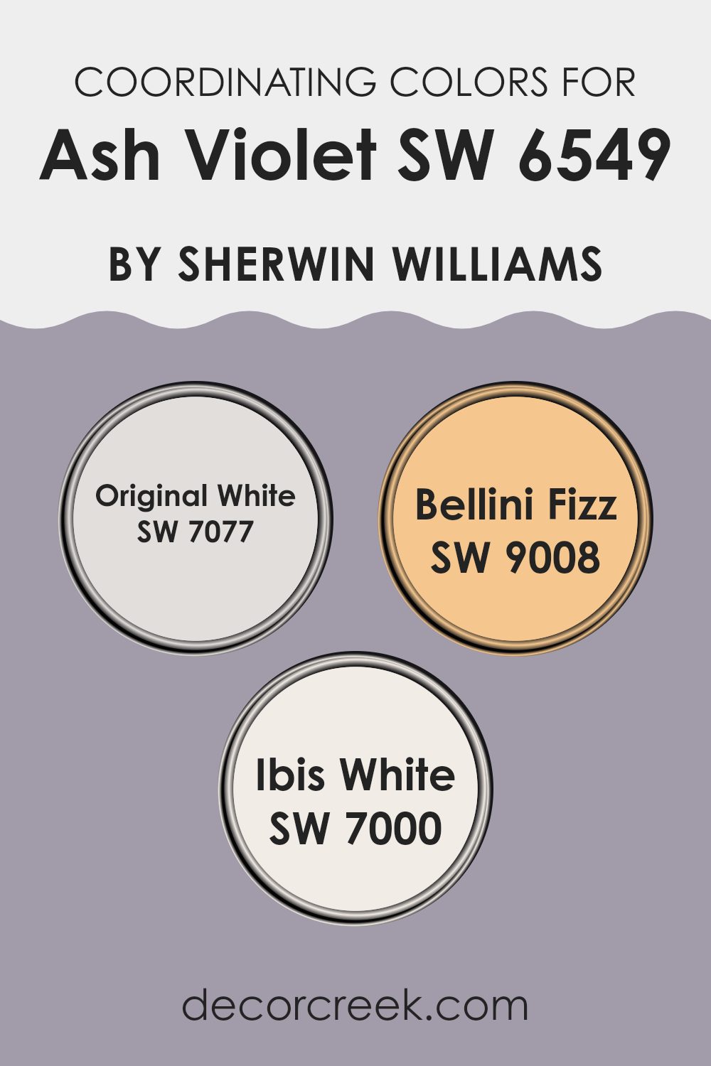
Coordinating Colors of Ash Violet SW 6549 by Sherwin Williams
Coordinating colors are shades that complement each other aesthetically, creating a harmonious look when used together in decor. They have a balanced relationship on the color wheel, either by being close to each other or by offering a pleasing contrast. When you select a main color like Ash Violet, finding the right coordinating colors can enhance the ambiance of a space without overwhelming it. Typically, these are chosen to create a fluid visual flow in a room, balancing the environment and adding depth to the overall design.
Original White by Sherwin Williams is a clean and bright shade that can help to subtly lift and illuminate darker colors like Ash Violet. It is perfect for trim, ceilings, or accent areas where you want to add lightness without stark contrast.
Bellini Fizz is a gentle, peachy hue that adds warmth and a soft, inviting touch to a color scheme, pairing beautifully with the cool tones of Ash Violet for a soothing yet warm atmosphere. Ibis White offers a slightly warmer tone compared to Original White, making it ideal for creating a cozy but bright feel, complementing both muted and vibrant colors effectively to ensure a cohesive look throughout your space.
You can see recommended paint colors below:
- SW 7077 Original White
- SW 9008 Bellini Fizz
- SW 7000 Ibis White
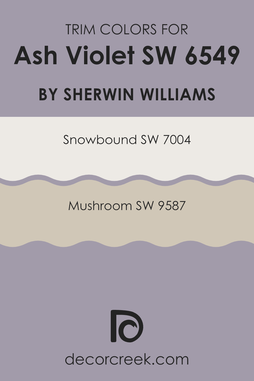
What are the Trim colors of Ash Violet SW 6549 by Sherwin Williams?
Trim colors are chosen to complement or contrast with the main wall color, effectively framing the room and defining its architectural elements such as doors, windows, and baseboards. When paired with Ash Violet, a profound and warm hue, selecting the right trim color can add balance and definition to the space. Snowbound and Mushroom from Sherwin Williams are excellent choices for this purpose, each offering a unique attribute that enhances this specific shade of purple.
Snowbound is a clean and neutral white with subtle undertones that prevent it from appearing too stark or cold, making it an ideal counterpart to the richness of Ash Violet. It provides a fresh and clear boundary that can help make the wall color pop, ensuring that the room feels well-put-together and polished.
Mushroom, on the other hand, is a soft beige with a warm base, offering a more subtle and harmonious transition between the wall color and trim. This color can soften the intensity of Ash Violet, lending an organic and cohesive look to the décor while maintaining a distinct delineation between different surfaces.
You can see recommended paint colors below:
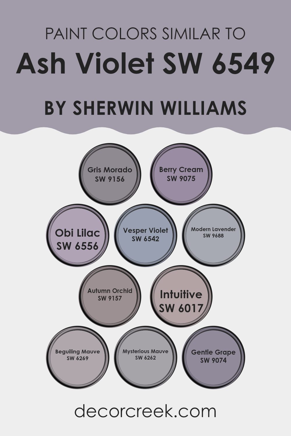
Colors Similar to Ash Violet SW 6549 by Sherwin Williams
When decorating a space, using similar colors can create a harmonious and balanced environment. Colors close to Ash Violet, like Gris Morado or Berry Cream, work well together because they share a base tone, helping in achieving a coherent look without stark contrasts.
Pick hues like Obi Lilac or Vesper Violet, which add subtle varieties in saturation or lightness, offering depth and complexity to an interior without overwhelming the senses. This technique allows for a fluid and inviting atmosphere.
If looking to enhance the space further, integrating shades like Modern Lavender, Autumn Orchid, or Intuitive into the mix can introduce a gentle play of undertones. These colors, alongside others like Beguiling Mauve and Mysterious Mauve, provide a spectrum of options from slightly more vivid to deeper and more muted expressions.
Gentle Grape rounds out the selection by offering an understated yet rich option, ensuring that there is a color that can quietly support or gently contrast with the main hue for visual interest and style cohesion. This use of similar colors makes the space feel connected and pleasing to the eye.
You can see recommended paint colors below:
- SW 9156 Gris Morado
- SW 9075 Berry Cream
- SW 6556 Obi Lilac
- SW 6542 Vesper Violet
- SW 9688 Modern Lavender
- SW 9157 Autumn Orchid
- SW 6017 Intuitive
- SW 6269 Beguiling Mauve
- SW 6262 Mysterious Mauve
- SW 9074 Gentle Grape
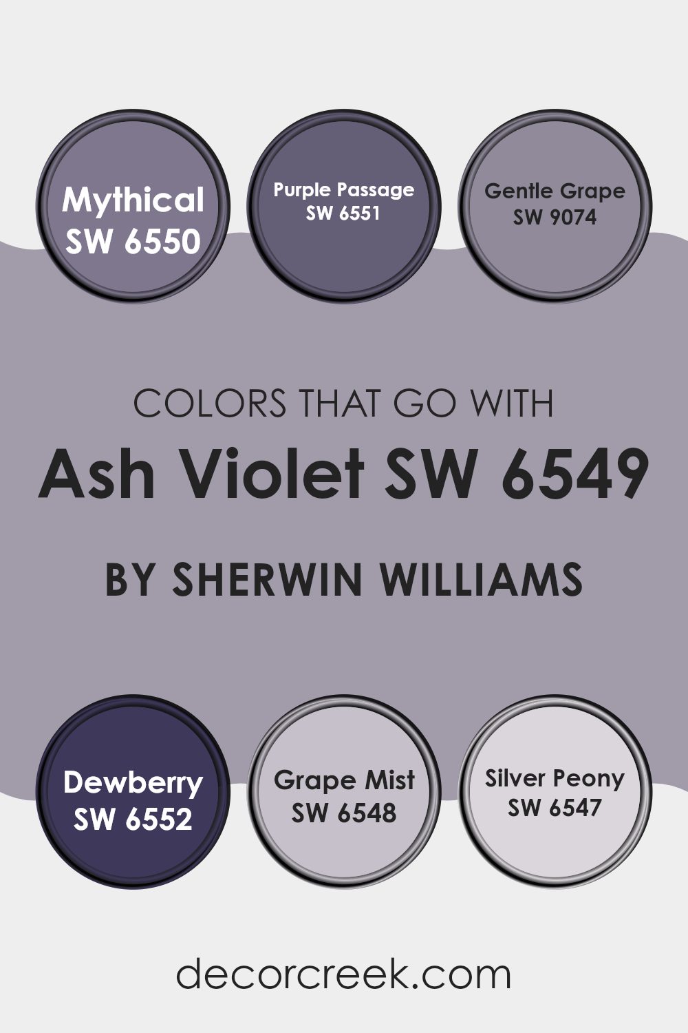
Colors that Go With Ash Violet SW 6549 by Sherwin Williams
Choosing the right colors to accompany Ash Violet SW 6549 by Sherwin Williams is essential for creating a harmonious and pleasing environment. When paired correctly, these colors enhance the overall aesthetic and can set a particular mood in any space. For instance, Mythical SW 6550 offers a deeper shade that complements the lighter tones of Ash Violet, adding depth and interest to the room. Purple Passage SW 6551 slightly tilts towards a richer hue, which works well to add a subtle contrast that is both delightful and calming.
Gentle Grape SW 9074 is a muted purple that pairs softly with Ash Violet, creating a soothing palette perfect for spaces where you want a relaxed vibe. Dewberry SW 6552, with its richer berry tone, provides a vibrant burst that can liven up any area. Grape Mist SW 6548 leans towards a cooler, more subdued lavender that blends seamlessly with Ash Violet, ensuring a smooth visual flow.
Finally, Silver Peony SW 6547, with its light, almost ethereal pink, offers a soft counterpart that highlights the more subtle notes in Ash Violet. Together, these colors work in harmony to enhance each other, making your space visually appealing and thoughtfully designed.
You can see recommended paint colors below:
- SW 6550 Mythical
- SW 6551 Purple Passage
- SW 9074 Gentle Grape
- SW 6552 Dewberry
- SW 6548 Grape Mist
- SW 6547 Silver Peony
How to Use Ash Violet SW 6549 by Sherwin Williams In Your Home?
Ash Violet SW 6549 is a unique paint color option by Sherwin Williams. It’s a gentle shade of violet with gray undertones that can add a modern touch to any room. Ideal for bedrooms or living areas, this color can create a peaceful, cozy feeling.
You can use it on all walls for a soft, uniform look, or just paint one wall to make it a focal point. This is especially effective in small spaces like a powder room or a reading nook. This color pairs well with light woods, white furniture, and metallic accents, helping to keep the space bright and welcoming. For a harmonious look, think about matching it with light gray, cream, or soft blue.
Experiment by incorporating textures like velvet cushions or a fluffy area rug in neutral colors to enrich the room naturally. Whether you’re painting a whole room or just an accent wall, Ash Violet has the versatility to refresh any space in your home nicely.
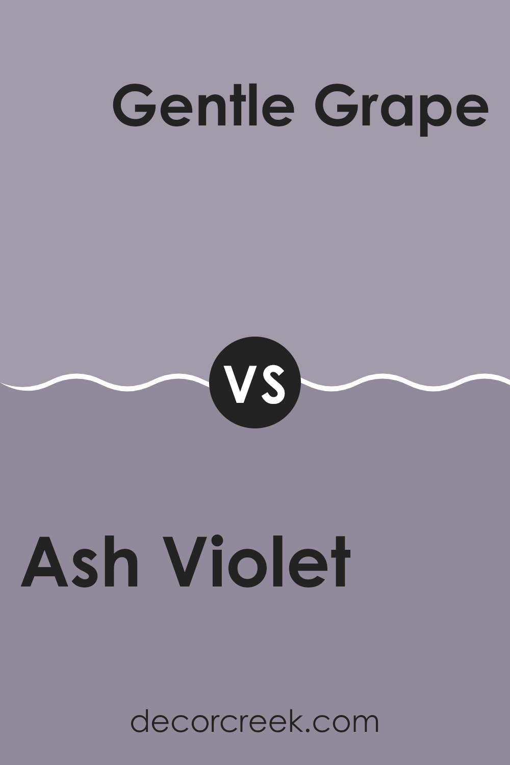
Ash Violet SW 6549 by Sherwin Williams vs Gentle Grape SW 9074 by Sherwin Williams
Ash Violet and Gentle Grape, both by Sherwin Williams, are unique shades of violet. Ash Violet leans toward a muted, soft grayish-violet tone that provides a subtle and calming feeling to any space. It’s versatile, fitting well in bedrooms or living areas where a gentle backdrop is desired.
Gentle Grape, on the other hand, has a deeper and richer violet hue, making it slightly more bold and prominent when applied to walls. This color can add a touch of drama and warmth, suitable for spaces that could benefit from a strong, yet welcoming color.
While Ash Violet is understated, Gentle Grape stands out more, making it a fitting choice for someone looking to make a statement with their color scheme. Both colors offer different vibes but are equally appealing in their own right.
You can see recommended paint color below:
- SW 9074 Gentle Grape
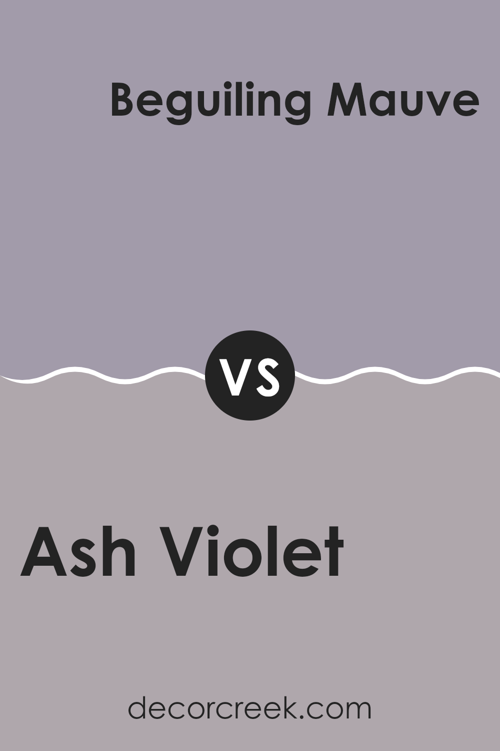
Ash Violet SW 6549 by Sherwin Williams vs Beguiling Mauve SW 6269 by Sherwin Williams
Ash Violet is a subtle shade that has a soft, muted quality, blending gray with hints of violet. It’s a versatile color that works well in spaces where you want a touch of uniqueness without overwhelming the room. Meanwhile, Beguiling Mauve brings in a warmer, more noticeable hue.
This color captures the essence of mauve with its gentle blend of rosy and purple tones, making it slightly more vibrant than Ash Violet. Both colors offer a soothing feel but in different ways; Ash Violet leans towards a cooler, more understated presence, while Beguiling Mauve provides a warmer ambiance.
These colors could complement each other in a space, with Ash Violet serving as a calming backdrop and Beguiling Mauve adding a soft, warm touch. Together, they create a balanced and appealing palette.
You can see recommended paint color below:
- SW 6269 Beguiling Mauve
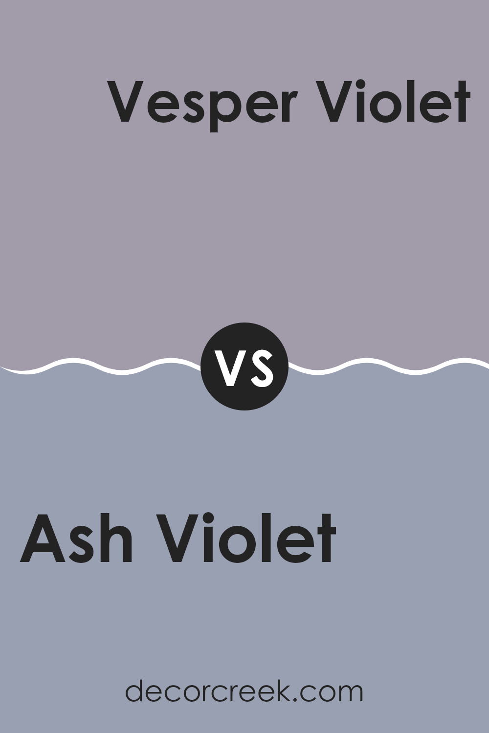
Ash Violet SW 6549 by Sherwin Williams vs Vesper Violet SW 6542 by Sherwin Williams
Ash Violet and Vesper Violet, both from Sherwin Williams, present unique tones that can add character to any space. Ash Violet has a muted, subtle quality that leans towards a soft, grayish-lilac hue. This makes it an excellent choice for creating a calming, understated atmosphere, ideal for living rooms or bedrooms that aim for a gentle aesthetic.
On the other hand, Vesper Violet is notably darker and richer, displaying more depth and presence in its color. The boldness of Vesper Violet offers a dramatic flair, making it suitable for accent walls or spaces that benefit from a more pronounced color statement, such as a dining area or an entryway.
While both colors share a violet base, Ash Violet provides a lighter, airier feel, whereas Vesper Violet delivers a more striking and immersive visual experience. Depending on the mood you want to set in a room, each color has its own strengths for enhancing your home’s decor.
You can see recommended paint color below:
- SW 6542 Vesper Violet
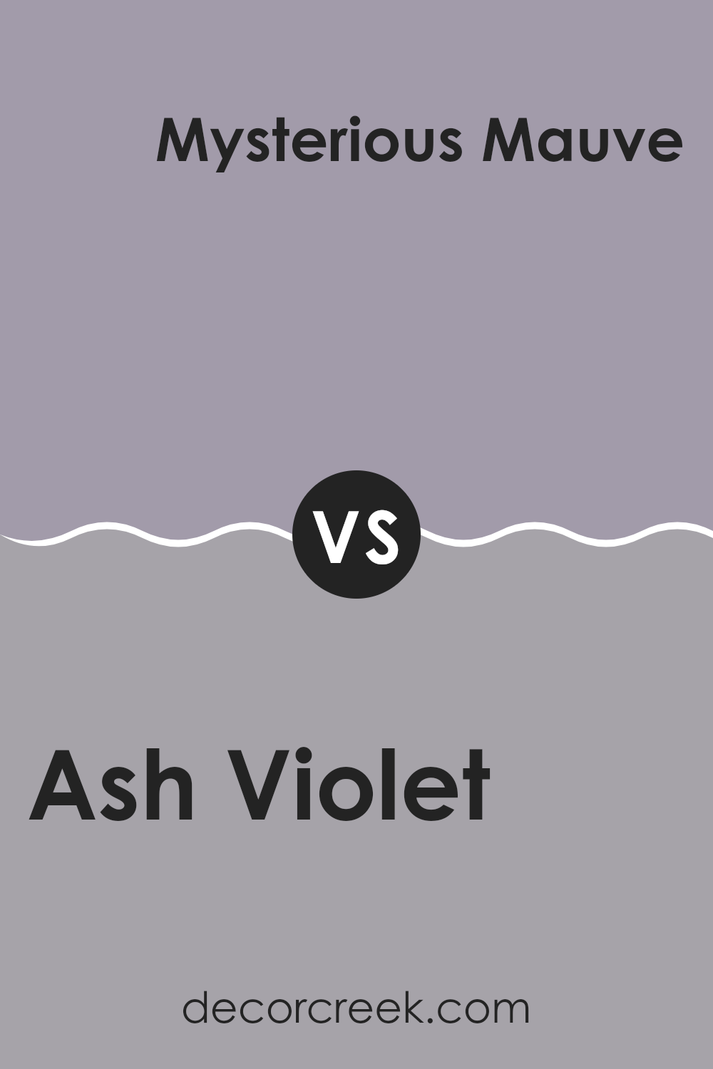
Ash Violet SW 6549 by Sherwin Williams vs Mysterious Mauve SW 6262 by Sherwin Williams
Ash Violet and Mysterious Mauve are both unique colors with their own charm. Ash Violet has a subtle grayish tone, creating a calm and gentle mood that works well in almost any space. It’s particularly good for achieving a soft, understated atmosphere.
On the other hand, Mysterious Mauve leans towards a warmer, richer hue with a hint of depth that can give a cozy and welcoming feel to a room. This color tends to make spaces feel more enclosed and intimate, ideal for places where you want to relax or have personal conversations.
Both colors are versatile and can be used in various styles of decor, from modern to traditional. Ash Violet might be better in a more open, airy room to enhance its light and neutral qualities, while Mysterious Mauve would suit spaces that benefit from a snug and warm appearance such as bedrooms or reading areas. You can use both to create a stylish and pleasant environment in your home.
You can see recommended paint color below:
- SW 6262 Mysterious Mauve
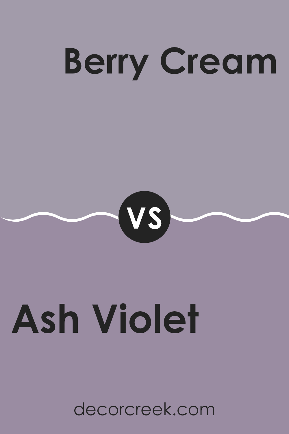
Ash Violet SW 6549 by Sherwin Williams vs Berry Cream SW 9075 by Sherwin Williams
Ash Violet is a subtle shade that leans towards a soft, muted purple. It’s light enough to make spaces feel larger but still adds a touch of color that is simple and not too bold. On the other hand, Berry Cream is a warmer and more inviting hue with its creamy, light pink tone.
While Ash Violet brings a cooler, understated elegance to a room, Berry Cream provides a warm, welcoming atmosphere. Ash Violet works well in spaces that seek a modern, minimalist feel, whereas Berry Cream suits areas where a cozy, comforting vibe is desired.
Both colors are versatile but serve different aesthetic purposes in interior design. Ash Violet is more likely to be used in a sleek, contemporary setting, while Berry Cream fits beautifully in a soft, romantic decor style. Their unique tones allow them to be used in various ways depending on the mood and style you want to achieve in your space.
You can see recommended paint color below:
- SW 9075 Berry Cream
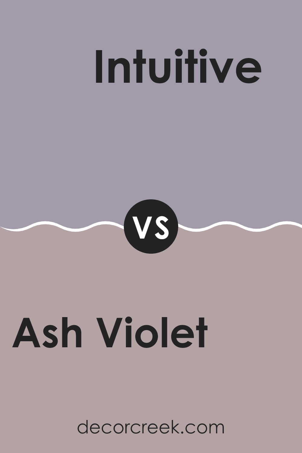
Ash Violet SW 6549 by Sherwin Williams vs Intuitive SW 6017 by Sherwin Williams
Ash Violet and Intuitive are two unique paint colors from Sherwin Williams. Ash Violet has a dusky, muted purple tone that can add a subtle, gentle flair to any space, blending well in areas meant for relaxation or creativity. This color leans towards a cooler palette, making it great for bringing a calm, fresh feel to rooms that receive plenty of natural light.
On the other hand, Intuitive is a light, soft gray-green shade that offers a refreshingly calm ambiance to interiors. It’s particularly effective in spaces where a touch of nature’s influence is desired without overpowering the room. Intuitive can work beautifully in both modern and traditional settings, providing a neutral backdrop that enhances other colors and decor elements.
Both Ash Violet and Intuitive are versatile in their own ways, suitable for different tastes and styles. While Ash Violet stands out more as a statement hue due to its richer color, Intuitive acts more as a subtle, balancing element within a color scheme.
You can see recommended paint color below:
- SW 6017 Intuitive
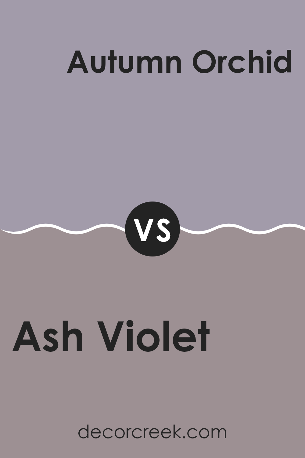
Ash Violet SW 6549 by Sherwin Williams vs Autumn Orchid SW 9157 by Sherwin Williams
Ash Violet and Autumn Orchid are two unique paint colors from Sherwin Williams that each bring their own flair to a space. Ash Violet is a subtle shade that leans towards a soft, muted purple with a hint of gray. This gives it a calm, understated quality that works well in areas where you want a touch of color without overwhelming the space. It pairs nicely with light woods and neutral accents.
In contrast, Autumn Orchid has a warmer tone, resembling a gentle pink with a splash of peach. This color has a welcoming and cozy feel, making it great for living rooms or bedrooms where you want to create a comforting environment. Autumn Orchid looks lovely with rich, dark furniture or creamy whites, enhancing its warmth.
Both colors have their distinct charms and can set different moods in a room depending on what you’re looking for – Ash Violet for a cooler, more muted atmosphere, and Autumn Orchid for a warm, inviting space. They show how varying shades can impact the feel and look of your interiors.
You can see recommended paint color below:
- SW 9157 Autumn Orchid
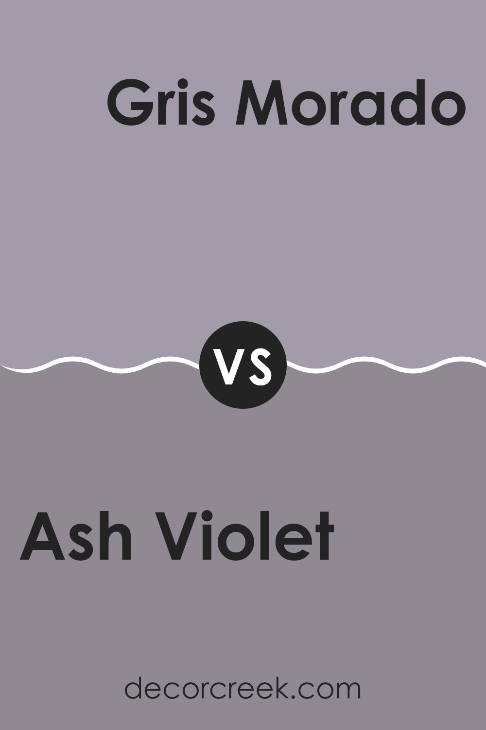
Ash Violet SW 6549 by Sherwin Williams vs Gris Morado SW 9156 by Sherwin Williams
Ash Violet and Gris Morado are two distinct shades by Sherwin Williams, each offering its unique appeal. Ash Violet is a gentle hue resembling a soft, muted purple with gray undertones. It gives a calming, subtle ambiance to spaces, making it perfect for rooms where you want a touch of softness without overpowering color intensity.
On the other hand, Gris Morado leans more towards a deeper, grayish-purple tone. It’s richer and slightly bolder than Ash Violet, providing a stronger visual impact. This color works well in areas where a more pronounced expression of color is desired, adding depth and interest without becoming too intense.
When choosing between the two, consider the mood and size of your space. Ash Violet works beautifully in smaller, more intimate areas, while Gris Morado suits larger spaces or accent walls where you can appreciate its depth fully. Both colors offer a modern touch with their subtle bluish-purple shades, ideal for contemporary homes looking to add a hint of color without going too bright or overwhelming.
You can see recommended paint color below:
- SW 9156 Gris Morado
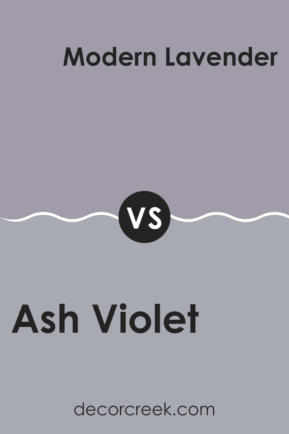
Ash Violet SW 6549 by Sherwin Williams vs Modern Lavender SW 9688 by Sherwin Williams
Ash Violet and Modern Lavender are both colors that give a peaceful vibe but have unique shades. Ash Violet is a deeper, muted color with hints of blue and gray. It’s a cool tone that can make any space feel a bit cozier. This color works well in bedrooms or living rooms where you want a calm and soothing atmosphere.
On the other hand, Modern Lavender is a lighter and brighter shade. It has a fresher look with its subtle pink undertones, making it perfect for spaces that you want to feel more open and airy. This color is excellent for bathrooms or small spaces as it can help them look bigger.
Both colors are versatile, but their effect depends a lot on the room’s size and the natural light it gets. Using either color can make a room look more pleasant, yet choosing between them depends on whether you prefer a snug (Ash Violet) or a more open feel (Modern Lavender).
You can see recommended paint color below:
- SW 9688 Modern Lavender
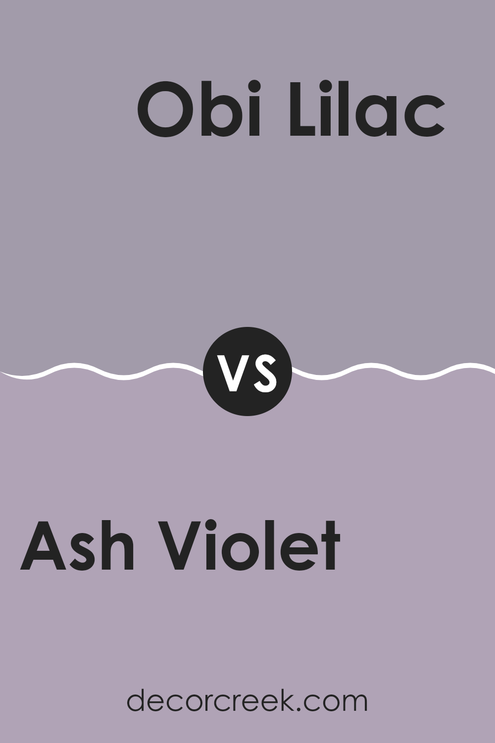
Ash Violet SW 6549 by Sherwin Williams vs Obi Lilac SW 6556 by Sherwin Williams
Ash Violet and Obi Lilac, both by Sherwin Williams, offer unique shades that can change the feel of any space. Ash Violet is a muted purple with a grayish tone, giving it a subtle and understated look. This color is great for adding a touch of elegance without overpowering a room. It works well in spaces where you want a calm, cozy vibe.
In contrast, Obi Lilac is a lighter and softer purple. It has a more distinct lilac hue, which adds a fresh and airy feel to interiors. This color is ideal for brightening up small spaces or adding a gentle splash of color in rooms that need a bit of cheer.
Both colors pair well with neutral shades, but while Ash Violet leans towards a more reserved and muted atmosphere, Obi Lilac offers a lighter and more refreshing touch. Depending on the mood you’re aiming for in your space, either color could be the perfect choice.
You can see recommended paint color below:
- SW 6556 Obi Lilac
Conclusion
SW 6549 Ash Violet by Sherwin Williams is like a magic paint color. It’s not just purple; it has a bit of gray too, making it calm and gentle, just like the sky when the sun starts to set. This color can make rooms feel special without being too bright or bold, and it’s perfect for places where you want to relax, like your bedroom or living room.
I tried using Ash Violet in different parts of the house, and it worked well everywhere. In the living room, it made the space feel cozy and welcoming. In the bedroom, it added a gentle touch that made it easy to wind down after a busy day. It’s also a color that goes well with many decorations, from light colored pillows to darker curtains.
Ash Violet can work for many people in many types of homes because it’s not too loud but still adds a lot of character. If you’re thinking about giving your room a new look, SW 6549 Ash Violet is a great choice to consider because it can make your place feel fresh and modern without looking too different.
Remember, the right color can make a big difference in how a room feels, and Ash Violet is definitely a color that can do that!
Ever wished paint sampling was as easy as sticking a sticker? Guess what? Now it is! Discover Samplize's unique Peel & Stick samples.
Get paint samples

