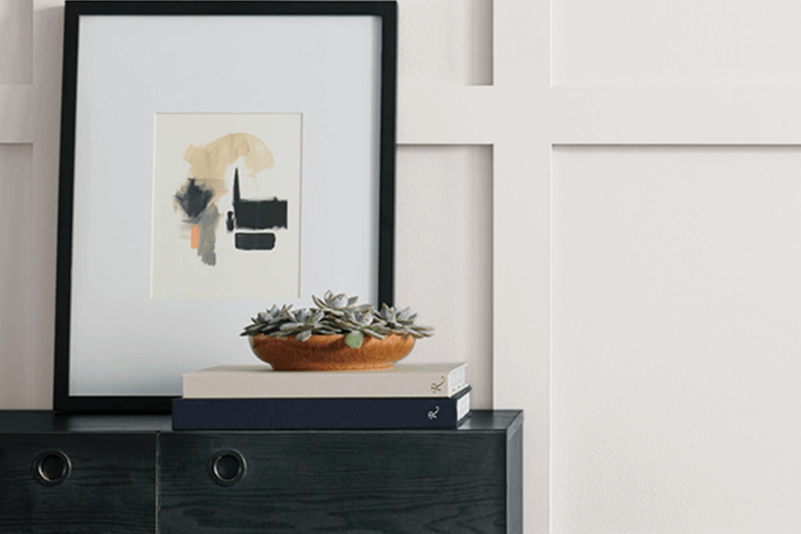
When you’re searching for a perfect shade of white paint, SW 7077 Original White by Sherwin Williams might just catch your eye. This shade stands out because of its clean and clear tone that can brighten up your space without overwhelming it with starkness.
Choosing the right white paint can seem tricky, as each shade has subtle undertones that affect how it looks in different lights and settings. Original White offers a balanced approach, neither too warm nor too cool, making it a versatile choice for any room in your home.
Whether you want to freshen up your living room, bedroom, or kitchen, this paint provides a fresh canvas, allowing other elements in your room to pop. It’s especially great if you’re looking to create a serene and inviting atmosphere. Plus, its adaptability means it pairs beautifully with various decors, from modern minimalism to cozy rustic.
So, if you’re planning to give your home a makeover or just a touch-up, Original White could provide the simple elegance you need.
What Color Is Original White SW 7077 by Sherwin Williams?
Original White SW 7077 by Sherwin Williams is a clean, neutral white, perfect for adding a fresh and airy feel to any room. This shade of white doesn’t lean too cool or too warm, making it a versatile choice for various decorating styles. It’s particularly effective in interiors aiming for a minimalist, modern, or contemporary vibe, but it’s also subtle enough to fit in with farmhouse or traditional themes.
Original White works wonders in small spaces, making them appear larger and more open. It’s an ideal background for artwork and bold accents, allowing colors and textures to really pop. For materials, this white pairs well with natural wood tones, from light beech to dark walnut, enhancing the warmth of the wood.
Likewise, it complements metallic accents like brass, copper, and chrome, adding a touch of elegance without overwhelming the senses.
Texturally, Original White pairs beautifully with soft fabrics like linen and wool for a cozy atmosphere, or it can provide a sharp contrast to sleek glass and polished stone for a more refined look. Its neutrality allows for flexibility with floor coverings as well, from bright, patterned rugs to more subdued, solid-colored carpets.
In short, Original White offers a clean, straightforward backdrop that supports a wide range of design options.
Is Original White SW 7077 by Sherwin Williams Warm or Cool color?
Original White SW 7077 by Sherwin Williams is a classic paint color that shines mostly in its versatility and subtle warmth, making it well-suited for various spaces within a home. Its off-white shade avoids stark contrasts, blending smoothly with different décor styles and other colors.
This shade is particularly useful for creating a clean, airy feel, which can make smaller rooms appear more spacious. Because of its neutrality, Original White is excellent for walls, providing a fresh and calm baseline that complements vibrant art pieces, bold furniture, or rich textiles.
Its light-reflective quality can also brighten areas that receive less natural light, making rooms feel more welcoming and cheerful.
Additionally, its understated nature means it pairs well with both cool and warm tones, offering flexibility in designing or updating the look of a home. Whether it’s a busy family kitchen or a quiet study room, Original White provides a simple yet effective backdrop.
Undertones of Original White SW 7077 by Sherwin Williams
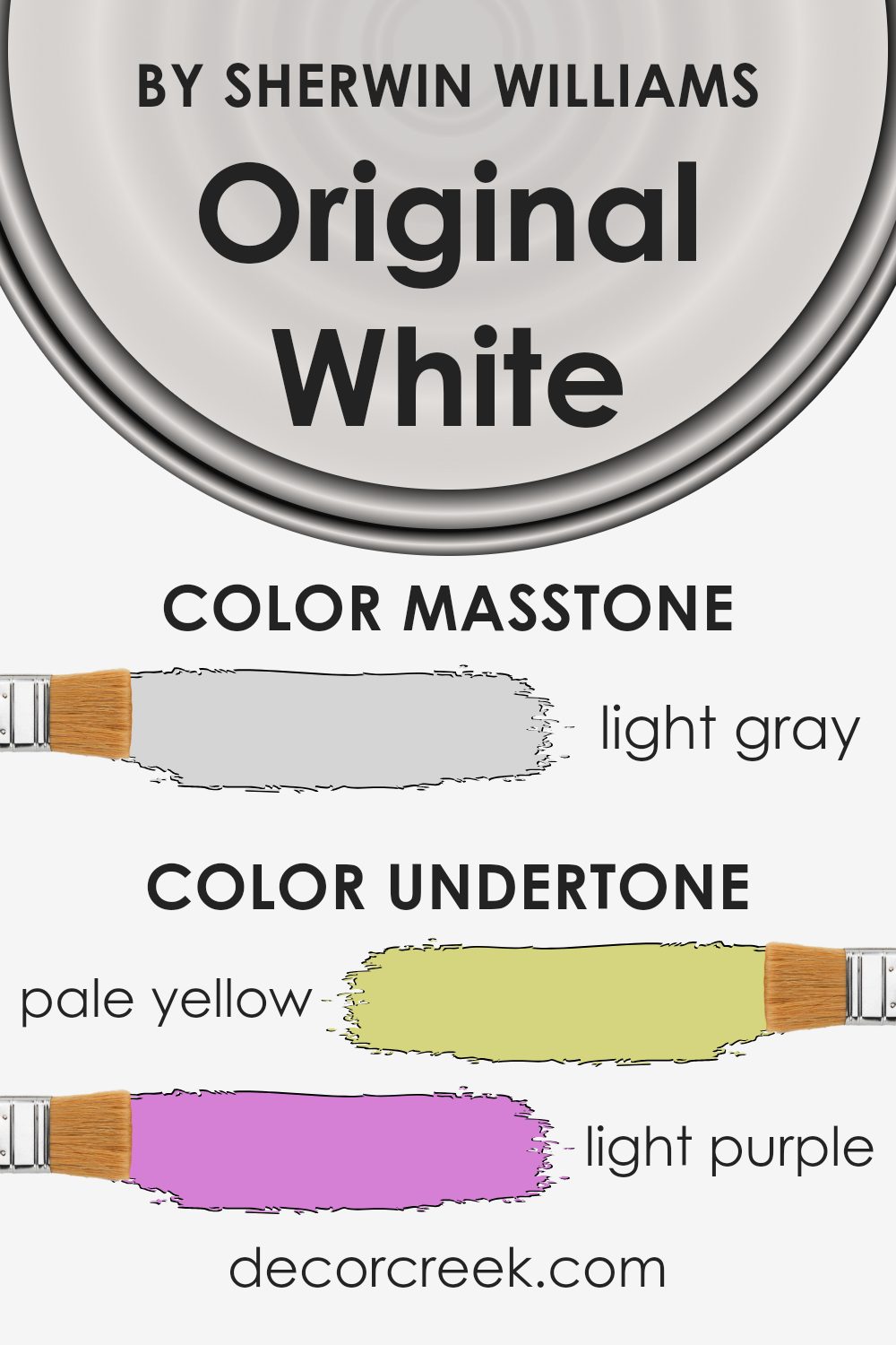
Original White is a versatile paint color often used to create a clean and crisp look in various spaces. An understanding of its undertones can greatly enhance how we perceive and utilize this shade. Generally, undertones are subtle hues that influence the overall appearance of a color under different lighting conditions.
For Original White, these undertones include pale yellow, light purple, light blue, pale pink, mint, lilac, and gray.
Different undertones can make a significant impact on how a color appears on interior walls. For instance, when Original White is applied in a room, these mixed undertones contribute to its unique appeal. The hint of pale yellow can add a slight warmth, making the space feel more welcoming, while light blue might give a cooler, more refreshing vibe.
Light purple or lilac could bring a gentle, almost imperceptible depth that enriches the space subtly.
Moreover, the presence of gray can help in toning down the brightness, ensuring that the white isn’t too stark but has a soft, approachable feel. This makes Original White an excellent choice for anyone hoping to achieve a balance between warmth and neutrality.
Regardless of the size or lighting in a room, understanding these undertones will help in achieving the desired effect, ensuring that the walls complement the furnishings and overall decor.
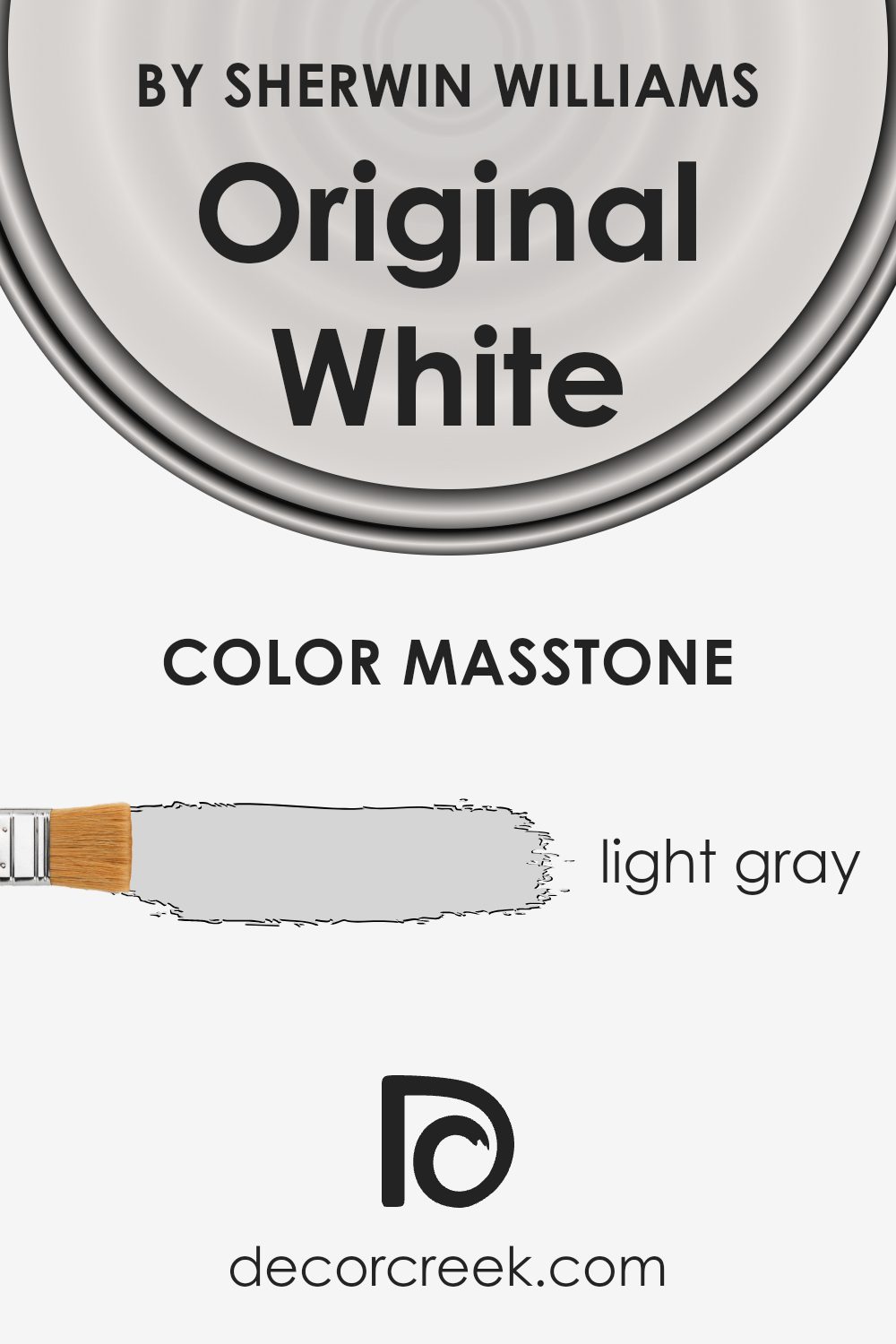
What is the Masstone of the Original White SW 7077 by Sherwin Williams?
Original White SW 7077 by Sherwin Williams has a masstone of light gray with the hex code #D5D5D5. This subtle shade affects how it functions in home settings by providing a versatile backdrop that blends well with other colors. Its light gray tone makes small spaces appear larger and more open, as it reflects natural light effectively.
This can be especially useful in dark or small rooms. Moreover, its neutral quality means it doesn’t clash with other colors, which allows homeowners to mix a variety of furnishings and decor without worrying about color conflicts.
The gentle nature of the color induces a relaxed atmosphere, making it an excellent choice for bedrooms and living spaces where calmness is appreciated. Additionally, being a light gray, it is less prone to show small marks and scuffs compared to warmer and darker colors, which is advantageous for high-traffic areas in homes.
How Does Lighting Affect Original White SW 7077 by Sherwin Williams?
Lighting plays a critical role in how we perceive colors, and the color “Original White” by Sherwin Williams is no exception. How it looks will change depending on whether it is under artificial light or natural sunlight, as well as the direction of the room it’s used in.
Under artificial light, which often includes bulbs with yellow undertones, “Original White” tends to show a warmer tone. This makes the space cozy and welcoming, suitable for evening relaxation. In contrast, when exposed to natural light—particularly bright daylight—the color can appear crisper and brighter.
This gives rooms a fresh and open feel, enhancing the sense of space.
The impact of natural light on “Original White” also varies with the orientation of the room:
1. North-Faced Rooms: These rooms get less direct sunlight, which can make colors appear a bit duller. “Original White” in a north-facing room might look more muted and less vibrant, potentially feeling slightly cooler in tone.
2.South-Faced Rooms: These rooms enjoy abundant sunlight for most of the day, which can dramatically brighten “Original White,” making it appear very bright and pure. This is ideal for creating a light, airy atmosphere.
3.East-Faced Rooms: Morning light is typically cooler and bluer. “Original White” in an east-facing room can look especially fresh and lively in the mornings when the light is brightest, transitioning to a more subdued tone as the day progresses.
4.West-Faced Rooms: In contrast to east-facing rooms, west-facing rooms receive sunlight in the later part of the day. This means “Original White” may appear more neutral or even dull in the morning, but as the sun sets, it will warm up significantly, giving the room a softer and more comfortable feel toward the evening.
Overall, no matter where you use “Original White,” the quality and direction of light significantly influence how this color is perceived in any given space.
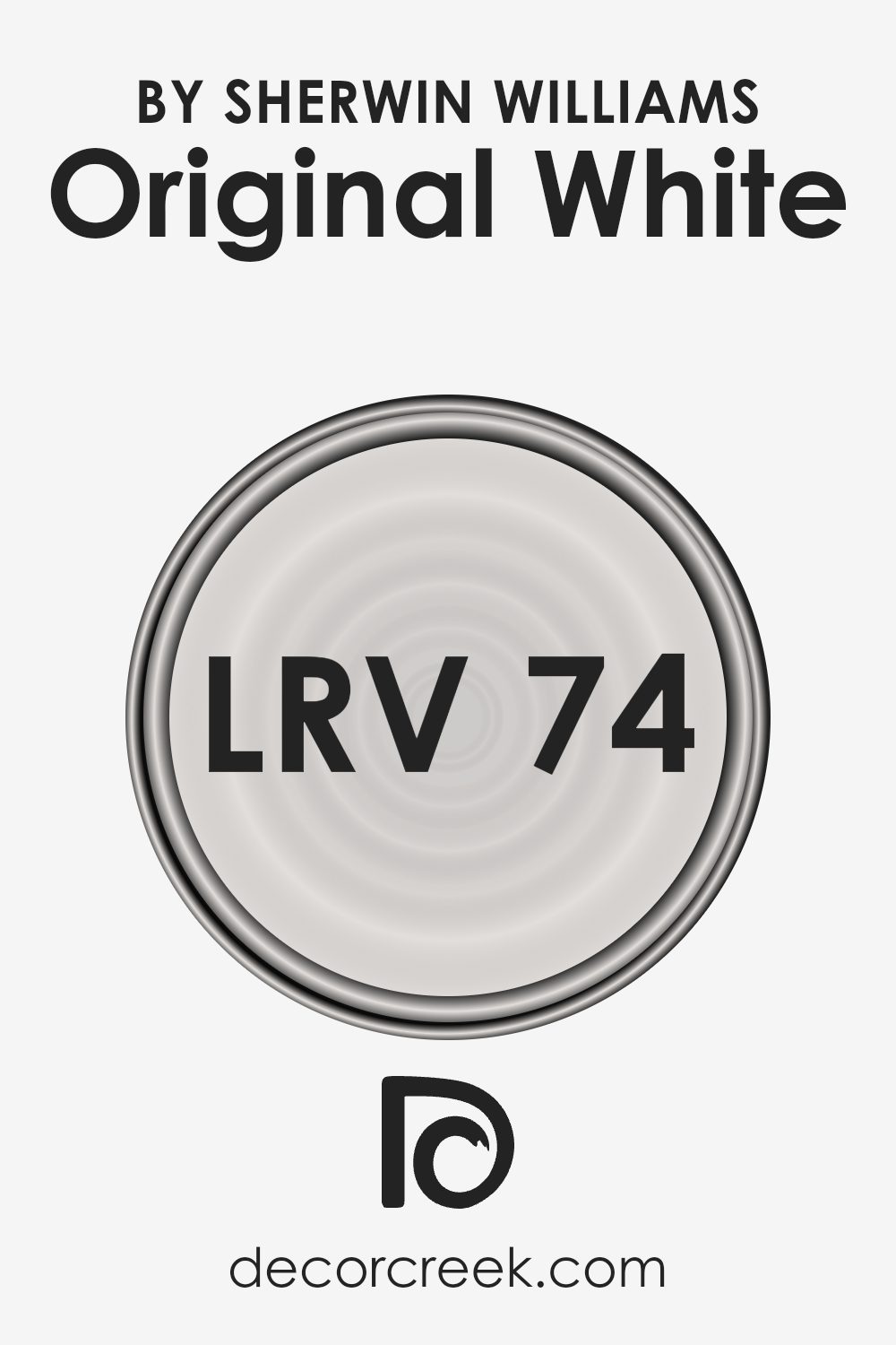
What is the LRV of Original White SW 7077 by Sherwin Williams?
LRV stands for Light Reflectance Value, which is a measure of the amount of visible and usable light that a color reflects when illuminated by a light source. It is essentially a scale to gauge how light or dark a paint color will look on a wall.
High LRV values indicate that the color reflects more light, making spaces appear lighter and potentially making rooms feel larger and more open. Conversely, colors with lower values will absorb more light, creating a darker, cozier appearance.
Considering the LRV of 73.551 for the mentioned color, it falls on the higher end of the scale, meaning it is a lighter shade. This high value signifies that the color will reflect a good amount of light, brightening up spaces where it is used. It is especially effective in rooms that may not receive ample natural sunlight, as it can help enhance the available light.
This makes it an excellent choice for smaller rooms or areas where you want to create a sense of openness and airiness.
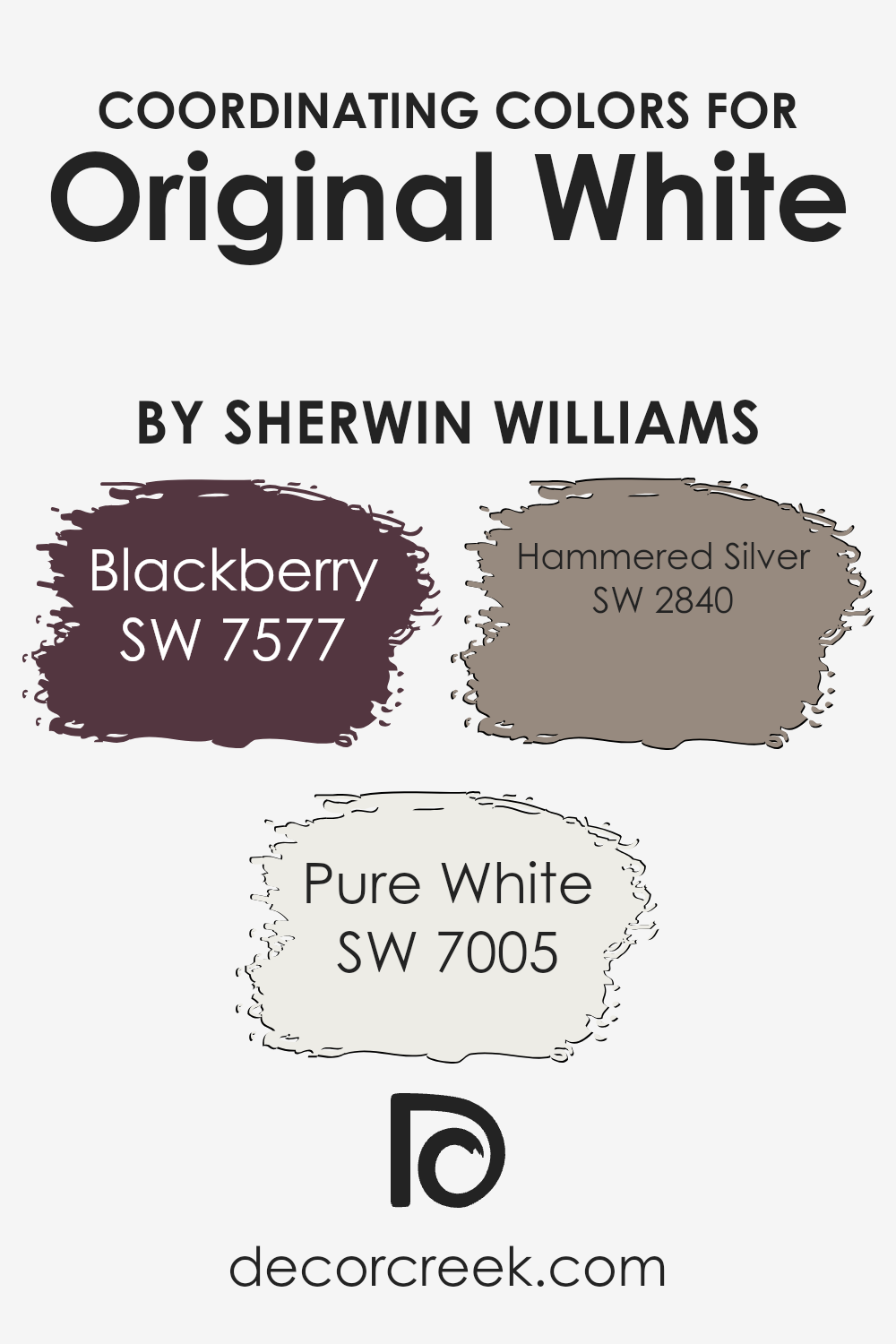
Coordinating Colors of Original White SW 7077 by Sherwin Williams
Coordinating colors are those that complement and enhance the look of a primary color, in this case, Original White. These colors work together to create a harmonious palette that can be used across various elements of a design, from walls to accents and furnishings.
When chosen correctly, coordinating colors help balance the visual tone, adding depth and cohesion to the space.
Specifically for Original White, colors such as SW 7577 – Blackberry, SW 7005 – Pure White, and SW 2840 – Hammered Silver serve as excellent companions. SW 7577 – Blackberry offers a rich, deep hue that contrasts sharply with the crispness of Original White, making it ideal for creating dramatic focal points or accent areas.
On the other hand, SW 7005 – Pure White is a clean and bright shade that matches the freshness of Original White, ensuring a seamless look that can make spaces appear larger and more open.
Lastly, SW 2840 – Hammered Silver provides a metallic gray tone, lending a modern and industrial feel which complements the neutral backdrop of Original White in a very stylish and functional way. Together, these colors offer a balanced and attractive scheme appropriate for various styling themes.
You can see recommended paint colors below:
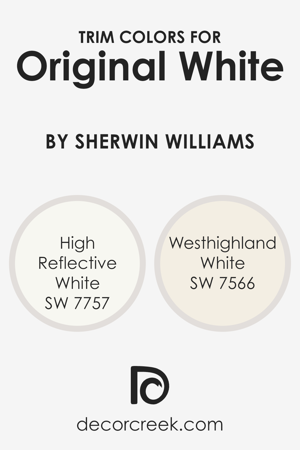
What are the Trim colors of Original White SW 7077 by Sherwin Williams?
Trim colors are specially selected shades used to highlight or complement the main colors of a room, particularly around windows, doors, baseboards, and crown moldings. When paired with a neutral tone such as Original White by Sherwin Williams, trim colors like SW 7757 – High Reflective White and SW 7566 – Westhighland White can enhance the overall aesthetic and make architectural details pop.
Choosing the right trim color can make a subtle yet significant difference in how the walls and the room feel altogether, highlighting strengths in the interior design by accenting the home’s features.
High Reflective White, as the name suggests, is a very bright white that can lend a crisp, clean look to any space. It works wonderfully as a trim color with Original White because it provides a slight contrast, enough to outline and define spaces without overwhelming the softer tone of the main color.
Westhighland White, on the other hand, offers a warmer, creamier option, which can add a soft, gentle contrast to the walls and create a cozier, more inviting environment.
Both of these trim colors can bring balance and harmony to a room, enhancing the Original White base in ways that other colors might not achieve as subtly.
You can see recommended paint colors below:
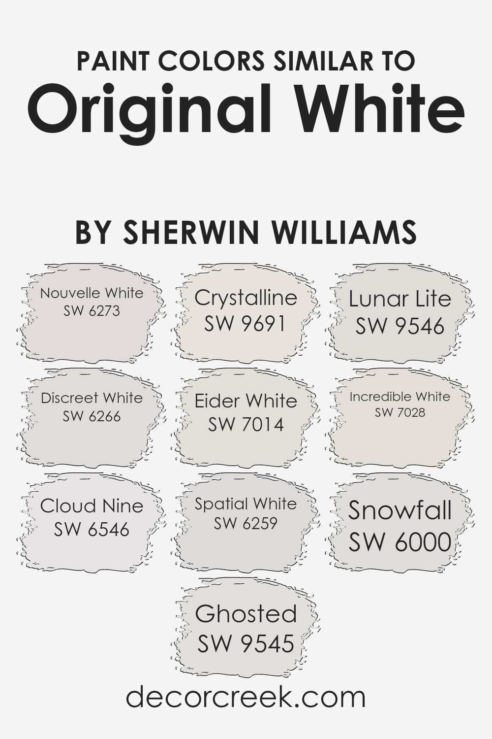
Colors Similar to Original White SW 7077 by Sherwin Williams
When it comes to interior design, choosing the right color palette is essential, and using similar colors can create a cohesive and harmonious space. Similar colors, like variations of Original White by Sherwin Williams, work well together because they share common undertones but differ slightly in brightness or saturation, providing subtle contrast and depth to a room without overwhelming the senses.
These variations can help in creating a fluid visual experience while maintaining a unified look.
For instance, Nouvelle White has a soft hint of gray that can cool down a room subtly while still keeping the fresh appeal of white. Discreet White, on the other hand, offers a touch more saturation, providing a slightly stronger presence of gray which works well in spaces that need a bit more definition without straying too far from white.
Cloud Nine is lighter and airier, contributing to a more open and airy feel, which can make smaller spaces appear larger. Ghosted features an almost ethereal pale gray, blending seamlessly with other neutrals to create a soothing backdrop. Crystalline provides a crisp and clean look, making it ideal for modern spaces that capitalize on natural light.
Eider White introduces a drop of pink, warming up rooms that might otherwise feel too stark. Spatial White has a minimalistic charm with its very light gray tones, suitable for contemporary spaces. Lunar Lite offers a very slight lavender tint, perfect for adding a unique yet understated twist to a room
. Incredible White leans towards a beige-gray, providing warmth and versatility, making it perfect for both traditional and modern settings. Finally, Snowfall is a brilliant white that reflects light beautifully, ideal for creating a sense of expansiveness and cleanliness.
You can see recommended paint colors below:
- SW 6273 Nouvelle White
- SW 6266 Discreet White
- SW 6546 Cloud Nine
- SW 9545 Ghosted
- SW 9691 Crystalline
- SW 7014 Eider White
- SW 6259 Spatial White
- SW 9546 Lunar Lite
- SW 7028 Incredible White
- SW 6000 Snowfall
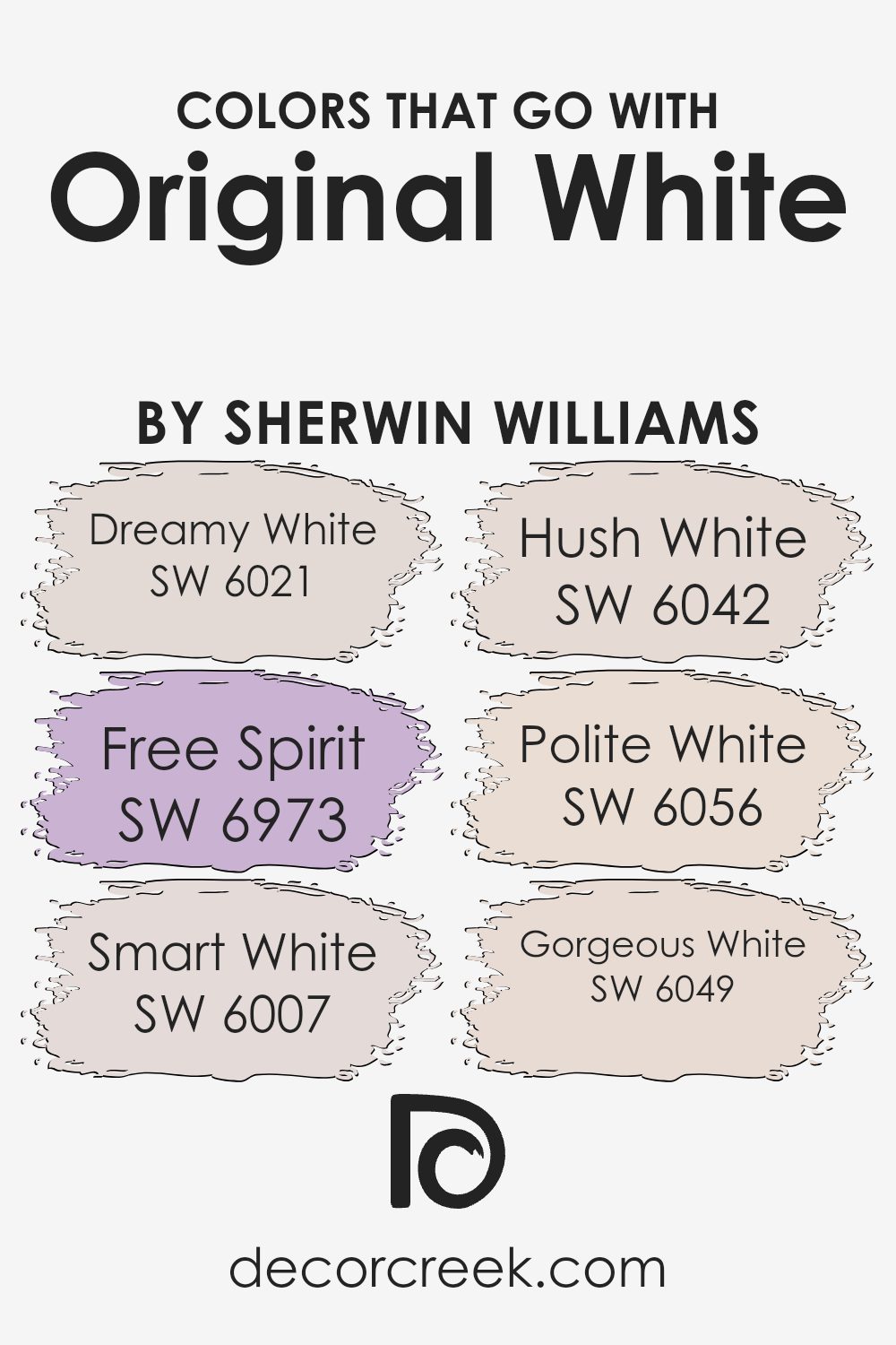
Colors that Go With Original White SW 7077 by Sherwin Williams
Colors that complement Original White SW 7077 by Sherwin Williams like Dreamy White, Free Spirit, Smart White, Hush White, Polite White, and Gorgeous White, play a crucial role in design aesthetics, creating cohesion and balance in any space.
These colors work together to enhance the surroundings without overpowering the senses. For instance, Dreamy White is a soft, muted shade that adds a gentle touch, perfect for creating a calm backdrop. Similarly, Free Spirit is a lively, subtle lavender that offers a hint of playfulness to an otherwise neutral palette.
Smart White offers a slightly deeper tone, providing contrast and depth when used alongside lighter shades. Hush White, meanwhile, is a warm grey that bridges the gap between modern and traditional styles, making it versatile for various decorating themes.
Polite White has a beige undertone that warms up the surroundings, ideal for spaces that need a cozy, inviting feel.
Lastly, Gorgeous White stands out with its fresh, almost pristine quality that brings vibrancy to any room. These carefully selected shades harmonize with Original White to create flow and continuity, ensuring that the colors in the room are pleasing to the eye and enhance the overall mood of the space.
You can see recommended paint colors below:
- SW 6021 Dreamy White
- SW 6973 Free Spirit
- SW 6007 Smart White
- SW 6042 Hush White
- SW 6056 Polite White
- SW 6049 Gorgeous White
How to Use Original White SW 7077 by Sherwin Williams In Your Home?
Original White SW 7077 by Sherwin Williams is a versatile paint color perfect for any room in your house. If you’re thinking about giving your walls a fresh coat, this shade offers a clean, crisp feel that brightens spaces without overwhelming them.
It works great in small rooms like bathrooms or hallways, where it can make the area appear larger and more open. In larger living spaces or bedrooms, it serves as a calm background, allowing your furniture and decor to stand out.
Plus, Original White is an excellent choice for ceilings and trim, helping to create a neat, polished look throughout your home. It pairs well with nearly any other color, from bold and bright tones to softer, muted shades, making it incredibly easy to incorporate into your existing style or color scheme. Whether you’re updating a single room or repainting the whole house, Original White is a reliable and easy-to-use option.
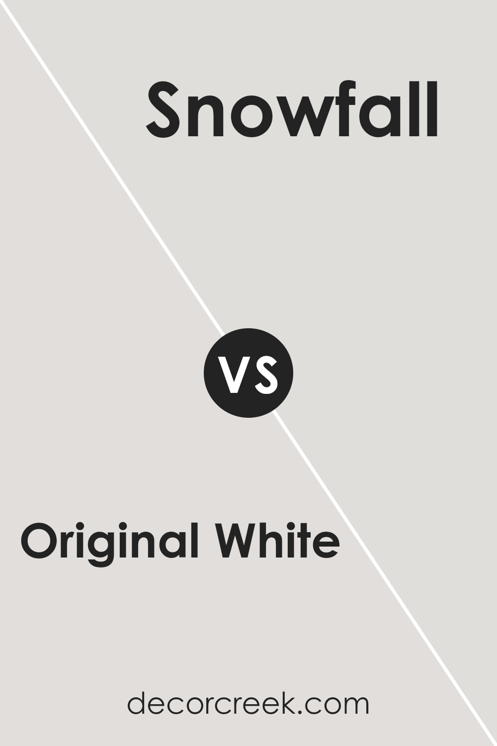
Original White SW 7077 by Sherwin Williams vs Snowfall SW 6000 by Sherwin Williams
Original White and Snowfall are two shades of white by Sherwin Williams, and they offer subtle differences for room aesthetics. Original White has a slightly warm tone, providing a cozy feel to spaces. It pairs well with vibrant colors or can stand alone for a clean look.
On the other hand, Snowfall has a cooler tone, which might make a room feel more spacious and crisp. It’s great for modern spaces or acting as a backdrop to bolder decor elements. When choosing between these whites, consider the lighting and size of your room.
Original White works well in rooms with natural light and can make them feel inviting, while Snowfall is ideal for brightening dim spaces and adding a fresh touch. Both colors are versatile, but the choice depends on the atmosphere you want to create.
You can see recommended paint color below:
- SW 6000 Snowfall
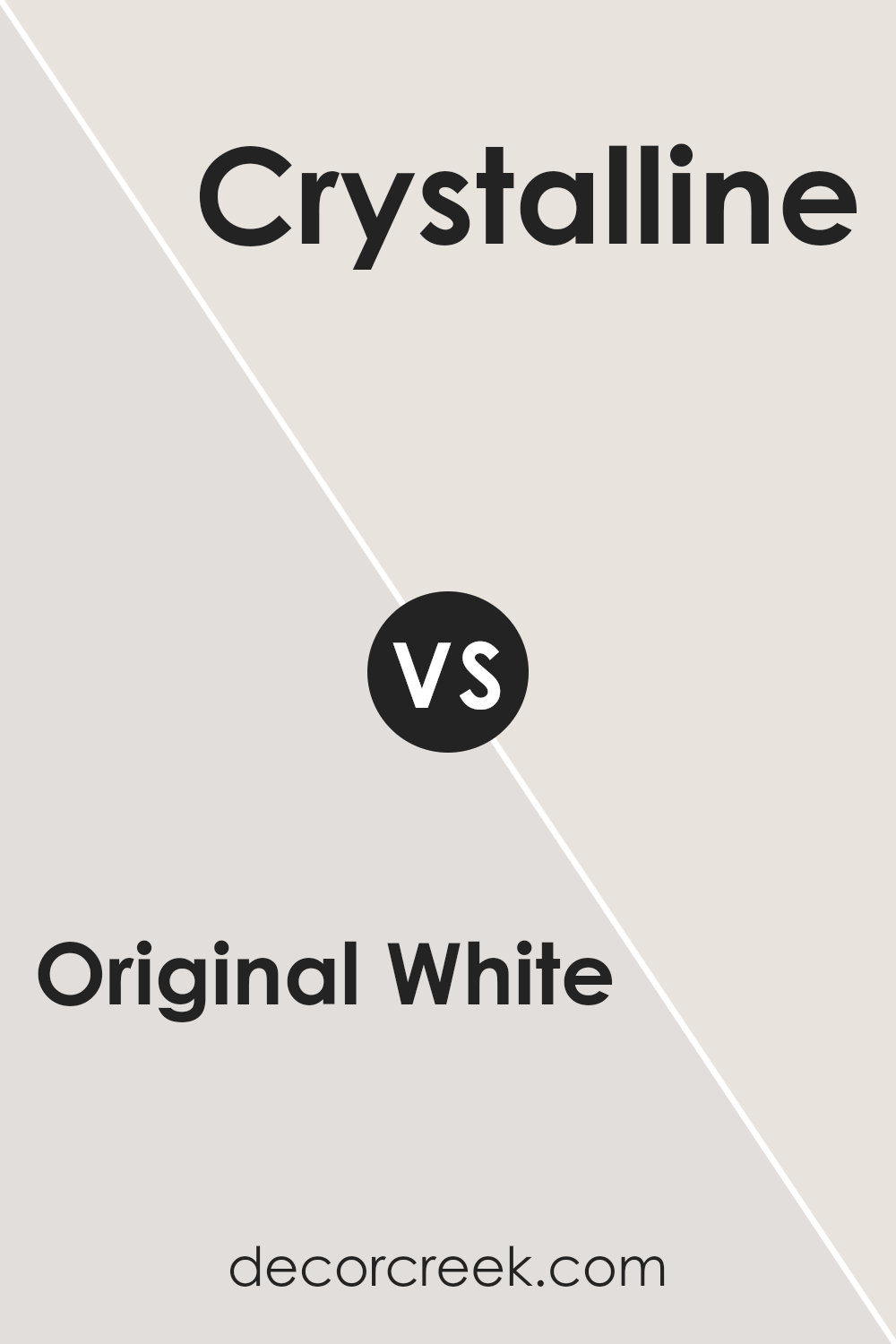
Original White SW 7077 by Sherwin Williams vs Crystalline SW 9691 by Sherwin Williams
Original White and Crystalline, both by Sherwin Williams, are distinct yet subtly charming colors. Original White is a true, clean white, offering a crisp and fresh look. This color is perfect for anyone wanting to create a bright and open feel in a space, making small rooms appear larger and more inviting.
On the other hand, Crystalline is a gentle and light aqua hue with a hint of green. This color gives a room a refreshing and calm atmosphere. It’s particularly good for bathrooms or bedrooms where a light, uplifting touch is desirable.
While Original White pairs well with almost any color, adding flexibility in decor choices, Crystalline offers a unique, soft splash of color that works best with other light tints for a harmonious look.
You can see recommended paint color below:
- SW 9691 Crystalline
Original White SW 7077 by Sherwin Williams vs Spatial White SW 6259 by Sherwin Williams
The main color, Original White, and the second color, Spatial White, both by Sherwin Williams, offer subtle yet distinct tones. Original White has a clean and straightforward appeal, making it a go-to choice for creating a fresh and open feel in any room.
It does not lean too much towards any particular undertone, which makes it flexible for various decor styles. On the other hand, Spatial White leans slightly cooler, thanks to a hint of gray that softens its overall expression. This makes it ideal for spaces where a calm, understated elegance is desired.
In contrast to Original White, the gray undertone in Spatial White provides a minimalist vibe that pairs well with modern furnishings and can help hide imperfections. Both colors offer a neutral palette, but the choice between them depends on the desired warmth or coolness in the space.
You can see recommended paint color below:
- SW 6259 Spatial White
Original White SW 7077 by Sherwin Williams vs Lunar Lite SW 9546 by Sherwin Williams
Original White is a clean and bright shade that leans towards a true white without coming off as too stark or cold. It’s a versatile choice that can easily freshen up any space, making it appear more open and airy. This color works well in various settings, from modern kitchens to cozy bedrooms, bringing a sense of cleanliness and simplicity.
On the other hand, Lunar Lite is a much softer white with a hint of gray. This subtle addition of gray gives it a slightly warmer tone compared to Original White. Lunar Lite is ideal for those looking to maintain a light and airy vibe but prefer a gentler touch of warmth to the space. This color is excellent for areas where you want a soothing feel without the brightness of a purer white.
Both colors offer their unique take on white paint, with Original White providing a crisp backdrop and Lunar Lite offering a cozier ambiance. Each could work well depending on the mood you’re trying to achieve in your room.
You can see recommended paint color below:
- SW 9546 Lunar Lite
Original White SW 7077 by Sherwin Williams vs Nouvelle White SW 6273 by Sherwin Williams
Original White is a clean and crisp white color that works perfectly as a neutral backdrop. It’s pure and simple, making it great for spaces where you want a fresh and bright feel. On the other hand, Nouvelle White has a slightly warmer tone.
This means it’s not as stark as Original White, and it gives rooms a softer, cozier vibe. The warmer undertones of Nouvelle White are great for areas where you want a friendly and welcoming atmosphere, such as living rooms or bedrooms.
Although both colors are shades of white, Original White gives a sharper, more straightforward white, while Nouvelle White, with its subtle warmth, offers a gentle and inviting ambiance. Either choice depends on the mood and comfort level you wish to achieve in your space.
You can see recommended paint color below:
- SW 6273 Nouvelle White
Original White SW 7077 by Sherwin Williams vs Ghosted SW 9545 by Sherwin Williams
Original White by Sherwin Williams is a clean and bright white color that provides a fresh and open feel to any space. It reflects light well, making rooms look larger and more welcoming. This shade is versatile and can act as a base for contrasting colors or can simply be used on its own for a crisp look.
On the other hand, Ghosted by Sherwin Williams is a softer, more muted white. It has subtle gray undertones that give it a warm appearance. This color is ideal for creating a cozy and inviting atmosphere without the starkness that sometimes comes with purer whites.
When comparing these two, Original White is better for achieving a more vivid and striking effect in a room, making it perfect for art-filled spaces or areas that benefit from a lot of natural light. Ghosted, with its gentler tone, is excellent for more relaxed settings where comfort is a priority, such as bedrooms or living rooms. Each color offers its own unique aesthetic and appeal depending on the vibe you want to achieve.
You can see recommended paint color below:
Original White SW 7077 by Sherwin Williams vs Eider White SW 7014 by Sherwin Williams
Original White by Sherwin Williams is a versatile shade of white that is pure and bright. Ideal for spaces where you want a clean and clear look, it works well in both modern and traditional settings. This color reflects lots of light, making it great for smaller or dimmer rooms.
On the other hand, Eider White is a softer white with a slight undertone of gray. This subtle hint of color softens its overall appearance, making it less stark compared to Original White. Eider White is especially suited for creating a cozy, welcoming environment. It’s a great choice for those looking to add warmth to their space while keeping the base tone light.
Both colors lend themselves to a variety of décor styles and are flexible enough to be used in many different parts of a home. However, the choice between them often comes down to the desired feel—a brighter punch of clarity with Original White or a softer, gentle ambiance with Eider White.
You can see recommended paint color below:
Original White SW 7077 by Sherwin Williams vs Cloud Nine SW 6546 by Sherwin Williams
Original White and Cloud Nine, both by Sherwin Williams, are popular choices for those looking for a clean and airy look for their spaces. Original White is a pure white that provides a crisp backdrop. It is perfect for creating brightness in a room because it reflects light well, making spaces appear larger.
On the other hand, Cloud Nine is a soft, very light gray that still maintains a lot of the brightness of a white but offers a hint of warmth. This subtle difference can make a room feel more inviting without losing the feeling of openness that a white offers.
While both colors are light, the key difference lies in the undertones. Original White is cooler, bringing a sharp and neat finish. In contrast, Cloud Nine, with its slight gray tint, can add depth to a space while staying close to a white palette. If you’re deciding between the two, consider the atmosphere you want to achieve: do you prefer the stark, pure look of Original White or the warmer, gentler feel of Cloud Nine?
You can see recommended paint color below:
- SW 6546 Cloud Nine
Original White SW 7077 by Sherwin Williams vs Incredible White SW 7028 by Sherwin Williams
Original White and Incredible White by Sherwin Williams are both white paints, but they have subtle differences. Original White is a pure and clear white that doesn’t lean towards any other colors. It’s bright and can make a room feel open and airy.
On the other hand, Incredible White has a slightly warmer tone. This warmth comes from a hint of gray that makes it less stark compared to Original White. This makes Incredible White a good choice for spaces where you want a cozy feel but still keep things light and neutral.
Both colors reflect light well, though Original White might appear somewhat brighter in well-lit rooms. Whether you choose Original White for its crispness or Incredible White for its warmth can depend on the mood you want to create in your space and how the natural light interacts with your rooms.
You can see recommended paint color below:
Original White SW 7077 by Sherwin Williams vs Discreet White SW 6266 by Sherwin Williams
Original White and Discreet White by Sherwin Williams are subtly different shades of white, each having its own unique appeal. Original White has a clean and straightforward vibe; it’s very close to a pure white, making it a great choice for those who want a bright and airy feel in their space. It reflects more light, which can make small rooms appear larger and more open.
On the other hand, Discreet White has a slightly softer tone because it contains a hint of gray. This makes it less stark compared to Original White and ideal for creating a cozy and subdued atmosphere. It’s perfect for spaces where you want just a slight deviation from stark white but still prefer a light and neutral background.
Both colors work well in various types of settings, whether you’re looking to paint an office space, a bedroom, or a living area. Your choice between them would depend on how bright or muted you want the room to feel. Original White adds more vibrancy, while Discreet White offers a gentler touch.
You can see recommended paint color below:
- SW 6266 Discreet White
It’s perfect for anyone who wants to create the perfect background for their room without making things complicated or cluttered. Whether you’re painting a cozy corner or a big living room, Original White acts like a big breath of fresh air.
What strikes me most about this color is its ability to blend in yet stand out. It supports all sorts of decor, which means it works well whether you like a lot of colors around or prefer a more simple style.
For anyone unsure about picking the right white, I think Original White is a safe bet. It’s like a friendly hello; it makes everyone feel at ease.
As I sum up my findings, I recommend SW 7077 Original White for anyone looking to refresh their home with a color that’s easy on the eyes and easy to match with other colors and decorations. It’s a clean slate, a fresh start, and a way to make your home shine.
So, if you’re thinking about a new look for your room, you might really like this welcoming, cheerful white.
Ever wished paint sampling was as easy as sticking a sticker? Guess what? Now it is! Discover Samplize's unique Peel & Stick samples.
Get paint samples

