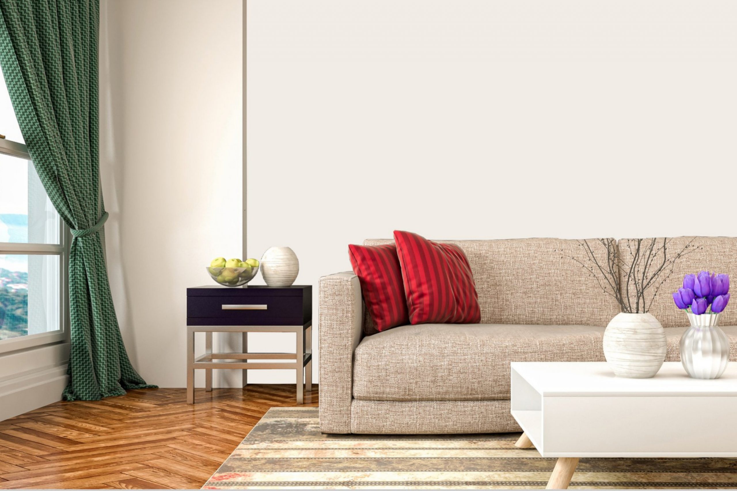
When you come across the paint color SW 7000 Ibis White by Sherwin Williams, you’re welcomed by a shade that’s both simple and elegant. Its clean, fresh hue brings a sense of calm and openness to any space.
Ibis White is a versatile choice that works well in various rooms, whether you’re aiming to brighten a small area or seeking a neutral backdrop for a larger space.
This shade provides a blank canvas that allows furniture and decor to stand out, highlighting the unique personality of your living space without overwhelming it. It’s a color that speaks with subtlety, making it easy to pair with both bold and muted accents.
What I appreciate about Ibis White is its ability to adapt.
It’s not just a sterile shade but rather a warm and inviting tone that can transform a room into a cozy retreat or a sleek, modern oasis.
It reflects light beautifully, adding a sense of airiness and enhancing the natural brightness of any room. There’s a timeless quality to it, making it a reliable choice for those who value both tradition and modernity.
In every way, Ibis White serves as a graceful and inviting foundation for your home.
What Color Is Ibis White SW 7000 by Sherwin Williams?
Ibis White by Sherwin Williams is a soft, clean white with a hint of warmth, making it a versatile choice for many interiors. This shade doesn’t feel stark or cold, which is often the case with many white paints. Instead, it brings a subtle, welcoming brightness to a room.
It’s an ideal color for those looking to create a simple and fresh atmosphere in their home.
Ibis White works beautifully in minimalist and modern styles, where clean lines and simplicity are key. It can also complement traditional interiors by highlighting architectural details without overpowering them.
Coastal or farmhouse-themed homes can benefit from its warm undertones, adding a touch of coziness.
This white pairs well with a variety of materials and textures. It provides a lovely backdrop for natural wood, enhancing the wood’s rich tones. In a room with metal accents like brushed silver or brass, Ibis White allows these elements to shine without clashing.
Soft textiles, such as cotton or linen, can enhance the white’s soothing quality, while incorporating stone or ceramic elements creates harmonious contrast.
For those who enjoy a pop of color, Ibis White can help bold accents stand out beautifully, making it a flexible choice for any room in the house.
Is Ibis White SW 7000 by Sherwin Williams Warm or Cool color?
Ibis White by Sherwin Williams is a versatile paint color that adds a fresh and clean feel to any room.
Its soft white tone works well in different areas of a home, whether in bedrooms, living rooms, or kitchens.
One of the best features of Ibis White is its ability to make spaces feel larger and more open. This makes it an excellent choice for smaller rooms or areas with limited natural light.
It reflects light effectively, creating a brighter and more inviting atmosphere. Additionally, Ibis White pairs nicely with both warm and cool colors, making it easy to match with various styles and furnishings.
Whether you have modern or classic décor, this color can complement your existing design. Its neutral nature also provides a great backdrop for colorful accents, such as artwork or decorative items. Overall, Ibis White is a practical and stylish option for updating your home’s interior.
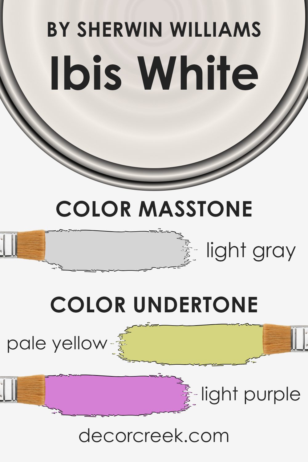
Undertones of Ibis White SW 7000 by Sherwin Williams
Ibis White by Sherwin Williams is more than just a simple shade of white. The undertones in this paint color bring unique qualities to how it appears in your home.
Undertones are subtle hints of color that can change the way a paint looks under different lighting conditions. For Ibis White, these undertones include pale yellow, light purple, light blue, pale pink, mint, lilac, and grey.
These undertones can make Ibis White appear different depending on the room and the light. With pale yellow and mint influences, the color can feel warm and inviting, which is great for creating a cozy atmosphere.
The light blue and lilac undertones might bring a cool and peaceful vibe, making a room feel airy and spacious. Meanwhile, the hint of grey adds neutrality, ensuring the color is versatile and easy to pair with other decorations in your home.
In practice, Ibis White can shift from warm to cool depending on whether the room gets a lot of natural sunlight or if it’s lit by lamps.
It also works well with various color schemes due to its balanced undertone mix. Overall, these undertones help change the mood of a room without being overwhelming.
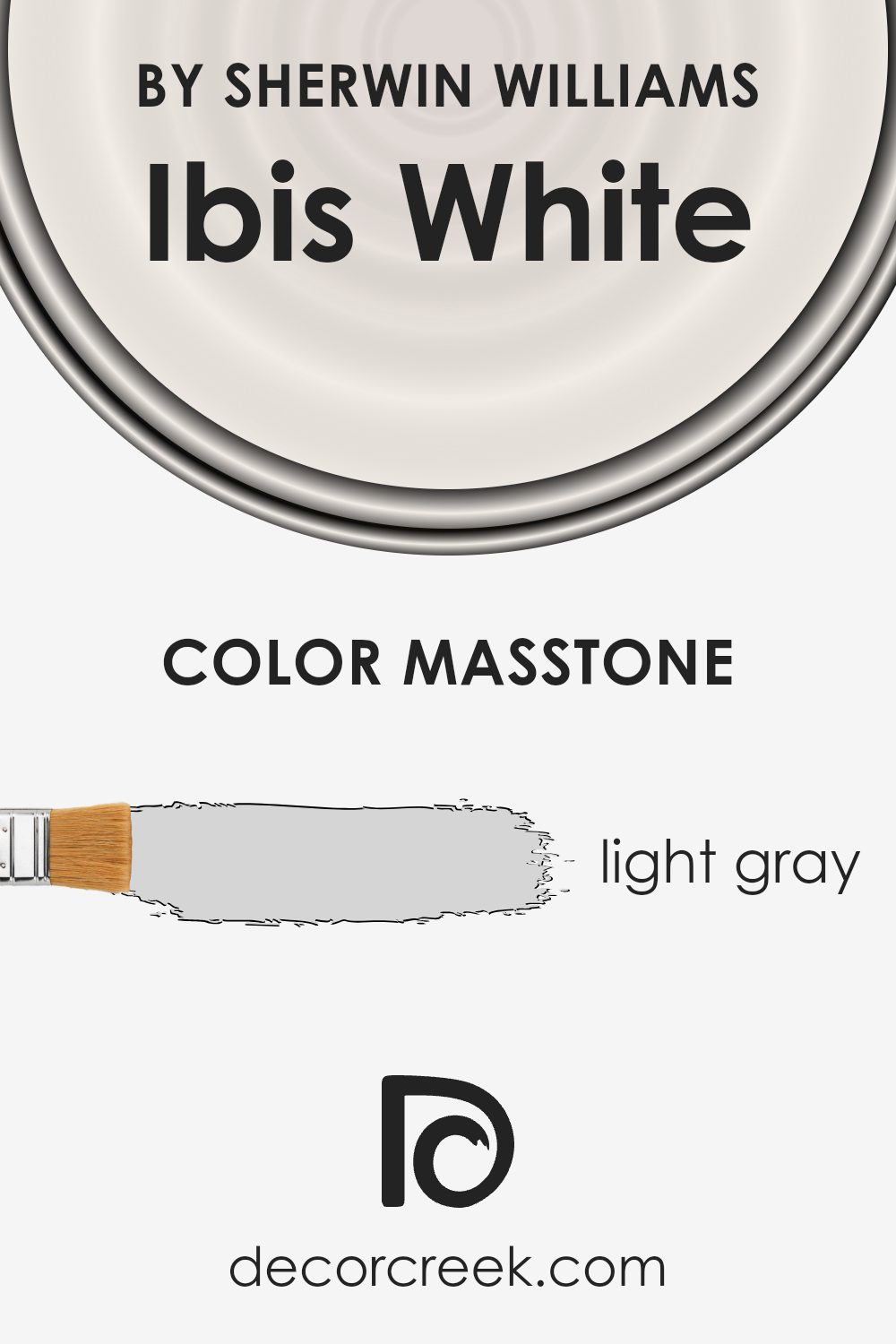
What is the Masstone of the Ibis White SW 7000 by Sherwin Williams?
Ibis White by Sherwin Williams is a soft white hue with a hint of light gray.
This subtle masstone gives it a gentle and neutral feel, making it versatile for home interiors. The light gray undertone helps it adapt to different lighting conditions.
In bright, natural light, Ibis White maintains a cool, clean look. In dimmer, artificial lighting, the slight gray tone can appear warmer and more inviting.
This color works well in most rooms, giving them a fresh and bright appearance without feeling too stark or cold.
It’s excellent for walls, ceilings, and trim, providing a seamless backdrop for various styles and decor. Because of its neutral quality, Ibis White allows other design elements and colors to stand out, making it a popular choice for those wanting a classic, timeless look in their homes.
It’s a reliable choice for creating a calm and open atmosphere.
How Does Lighting Affect Ibis White SW 7000 by Sherwin Williams?
Lighting plays a big role in how we see colors. Different types of light can change the way a color looks in a room. Ibis White by Sherwin Williams is a soft white with warm undertones. Its appearance can change depending on the type of light in a space.
In natural light, Ibis White tends to show its true color more clearly. In a north-facing room, which generally gets cooler and softer light, Ibis White might look a bit muted and take on a slightly cooler tone.
This is because the cooler light can enhance any subtle blue tones in the color, making it look a bit less warm.
In south-facing rooms, which get more direct sunlight, Ibis White can appear brighter and warmer. The warm sunlight enhances its warm undertones, making the room feel cozy and inviting. This lighting can bring out the creaminess in Ibis White, showcasing its warm side.
East-facing rooms get warm, yellow light in the morning and cooler light in the afternoon. In these rooms, Ibis White might start off feeling warm and inviting in the morning, then transition to a more neutral tone in the afternoon when the light becomes cooler.
West-facing rooms, on the other hand, get cooler light in the morning and warmer, more golden light in the late afternoon and evening.
In these spaces, Ibis White might appear more neutral during the early part of the day and then take on a warm, soft glow in the afternoon and evening as the sun lowers.
Under artificial lighting, the appearance of Ibis White can also depend on the type of bulbs used.
Warm LED or incandescent lights will enhance its warm tones, while cooler fluorescent or daylight LEDs might make the color seem more neutral or even a bit cooler. So, choosing the right lighting for your space is key to maintaining the desired look of Ibis White.
What is the LRV of Ibis White SW 7000 by Sherwin Williams?
LRV, or Light Reflectance Value, is an important measure when choosing paint colors. It helps you understand how much light a color will reflect.
The scale goes from 0 to 100, with 0 being pure black that absorbs all light, and 100 being pure white that reflects all light.
A higher LRV means more light will bounce off the walls, which can make a room feel brighter and more spacious. This is particularly helpful in smaller or dimly lit rooms. On the other hand, colors with lower LRV values absorb more light, which can make a space feel more intimate and cozy.
For a color with an LRV of 84.425, like Ibis White, this means it’s a fairly bright color.
It will reflect a lot of light, helping to make your space feel open and airy. This makes it a great choice for spaces where you want to enhance natural light, like living rooms or kitchens.
Additionally, high LRV colors can highlight architectural details and provide a clean backdrop for other elements in the room, such as furniture and artwork. If you’re using Ibis White, expect a bright, reflective finish that can make your room shine with a fresh look.

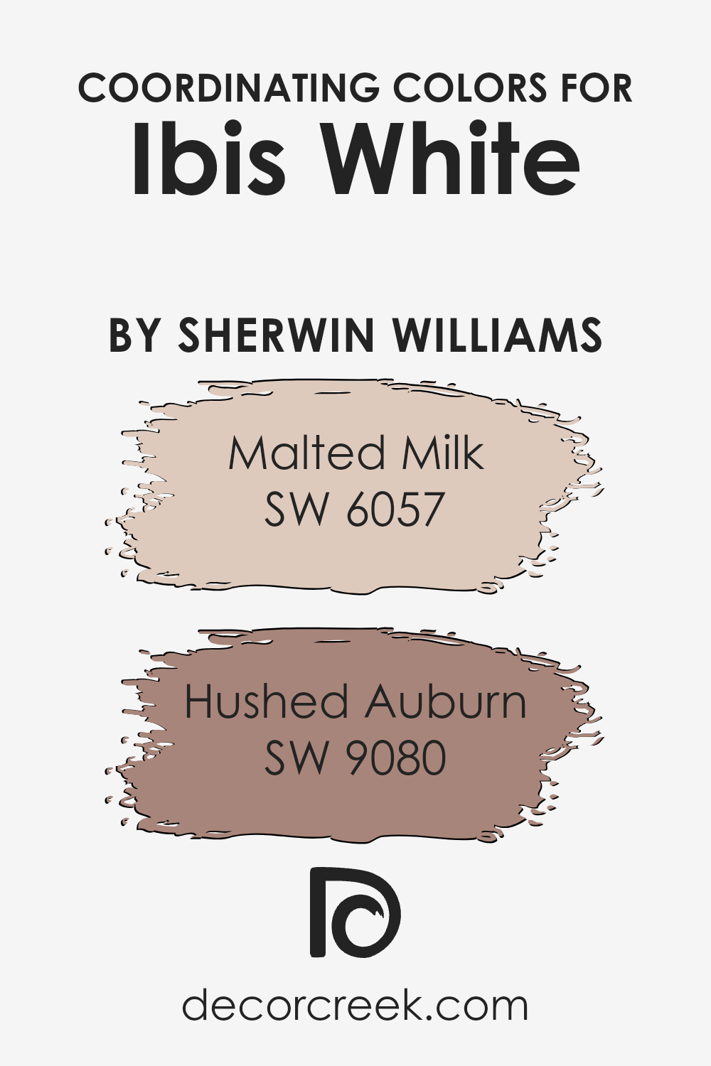
Coordinating Colors of Ibis White SW 7000 by Sherwin Williams
Coordinating colors are hues that are selected to complement each other in a color scheme, creating a harmonious look.
They enhance each other’s appeal rather than clashing, making spaces feel more balanced and pleasing to the eye. The concept relies on choosing colors with similar undertones or contrasts that go well together.
When working with Ibis White by Sherwin Williams, one might consider using colors like Malted Milk and Hushed Auburn to enhance its crisp neutral tones. Ibis White, being a versatile and soft white, acts as a wonderful backdrop, allowing other colors to naturally stand out.
Malted Milk is a warm beige with a cozy, inviting feel. It adds a touch of warmth and pairs beautifully with whites, offering a subtle, comforting contrast.
On the other hand, Hushed Auburn is a deep, muted red that introduces a rich earthiness to the palette. It brings depth and a sophisticated touch without overwhelming the space. Together, these colors create a balanced environment where each shade complements the others, making the overall color scheme pleasing and cohesive. Using these coordinating colors can enhance not only the visual appeal but also the overall ambiance of a room.
You can see recommended paint colors below:
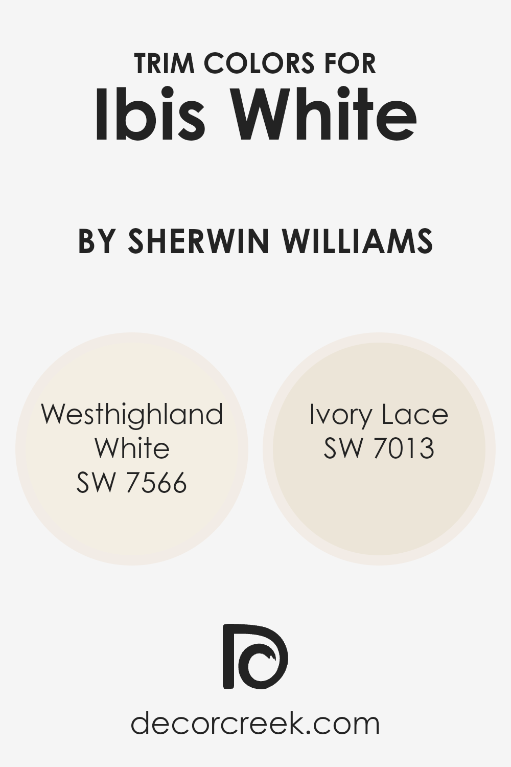
What are the Trim colors of Ibis White SW 7000 by Sherwin Williams?
Trim colors are the shades used to accentuate and define the edges of walls, doors, windows, and other structural elements in a space.
For a room painted in Ibis White by Sherwin Williams, selecting the right trim color is important because it creates contrast and highlights the architectural features, adding depth and character to the room.
Trim colors can also affect the mood and perception of the space. They have the power to make a room feel more complete and polished.
When paired with Ibis White, trim colors that are slightly off-white or have warm undertones can create a lovely, cohesive look that feels welcoming and elegant.
Two excellent options for trim colors paired with Ibis White are Westhighland White and Ivory Lace, both by Sherwin Williams. Westhighland White is a warm, creamy white that adds a subtle contrast to Ibis White without overpowering it.
Its understated warmth makes spaces feel soft and inviting, which is perfect for cozy rooms or common areas that encourage relaxation. Ivory Lace, on the other hand, has a slightly brighter appearance with a hint of yellow undertones.
This gives a crisp and clean look to the trim that can brighten up a room while still maintaining a harmonious feel when combined with the cool base of Ibis White. Both colors complement the soft brightness of Ibis White, ensuring a seamless, elegant aesthetic throughout your space.
You can see recommended paint colors below:
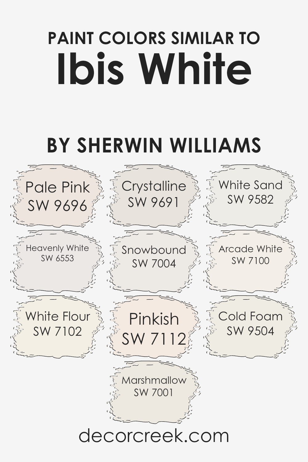
Colors Similar to Ibis White SW 7000 by Sherwin Williams
Similar colors to Ibis White, like Pale Pink, Heavenly White, and White Flour, play a crucial role in creating a harmonious and balanced space. These colors are gentle on the eyes and blend effortlessly with a variety of surroundings. Pale Pink introduces a soft, rosy hue that adds warmth and subtlety, while Heavenly White offers a gentle, clean shade that brings a fresh, airy feel to a room.
White Flour has a slightly creamy undertone, which brings coziness to any setting.
Continuing with this palette, Marshmallow provides a faintly sweet shade reminiscent of its namesake, bringing a light and fluffy feel to walls.
Crystalline is a cool, soothing tone that hints at tranquility with its gentle blue undertones. Snowbound offers a crisp, refreshing white, ideal for creating contrasts with deeper colors. Pinkish brings a touch of subtle color, adding whisper-soft warmth to spaces.
White Sand adds a hint of beige, giving off a warm, grounded feel. Then there’s Arcade White, which has a modern touch with its cool, clean simplicity. Cold Foam tops off this collection with a soft, understated white that resembles a perfect latte froth.
Together, these colors bring cohesion, creating rooms that feel welcoming and balanced.
You can see recommended paint colors below:
- SW 9696 Pale Pink
- SW 6553 Heavenly White
- SW 7102 White Flour
- SW 7001 Marshmallow
- SW 9691 Crystalline
- SW 7004 Snowbound
- SW 7112 Pinkish
- SW 9582 White Sand
- SW 7100 Arcade White
- SW 9504 Cold Foam
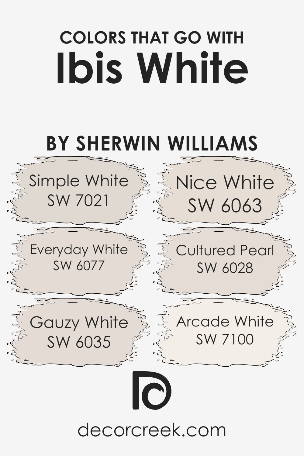
Colors that Go With Ibis White SW 7000 by Sherwin Williams
Choosing colors that complement Ibis White SW 7000 by Sherwin Williams can make a room feel harmonious and inviting.
Textures and hues can play a huge role in achieving the desired mood for your space, and the right combination creates a sense of balance. One color that pairs well is SW 7021 – Simple White, which is a clean, neutral shade that can make a room feel bright and open.
SW 6077 – Everyday White provides warmth and comfort with its soft undertones, perfect for creating a welcoming atmosphere.
If you want a touch of softness, SW 6035 – Gauzy White adds a subtle, airy feel, almost like a gentle breeze moving through the room.
SW 6063 – Nice White, on the other hand, offers a creamy touch that feels cozy yet elegant. It’s ideal for spaces where warmth is essential, like living rooms or bedrooms.
SW 6028 – Cultured Pearl provides a hint of sophistication with its slightly cooler undertone, which can give your room a more classic feel.
Lastly, SW 7100 – Arcade White has a fresh, crisp quality that can make any space feel more modern and clean-cut.
Together, these colors can beautifully accentuate Ibis White, each adding their unique charm and helping create a cohesive look for any room.
You can see recommended paint colors below:
- SW 7021 Simple White
- SW 6077 Everyday White
- SW 6035 Gauzy White
- SW 6063 Nice White
- SW 6028 Cultured Pearl
- SW 7100 Arcade White
How to Use Ibis White SW 7000 by Sherwin Williams In Your Home?
Ibis White SW 7000 by Sherwin Williams is a versatile paint color that many people love using in their homes.
It’s a soft white with a hint of warmth, making it ideal for creating a cozy and inviting atmosphere. You can use Ibis White on your walls for a fresh and clean look that brightens up any room.
It pairs well with various other colors, so you can easily add accents with cushions, artwork, or rugs.
In the living room, this shade can help make the space feel open and airy. In the kitchen, it provides a clean backdrop that makes any cabinetry style pop.
If used in the bedroom, it can make the space feel calm and restful, perfect for winding down after a long day. Ibis White also works well in bathrooms, giving a crisp and refreshing feel.
This color is a great choice for those seeking a simple yet impactful update to their home decor.
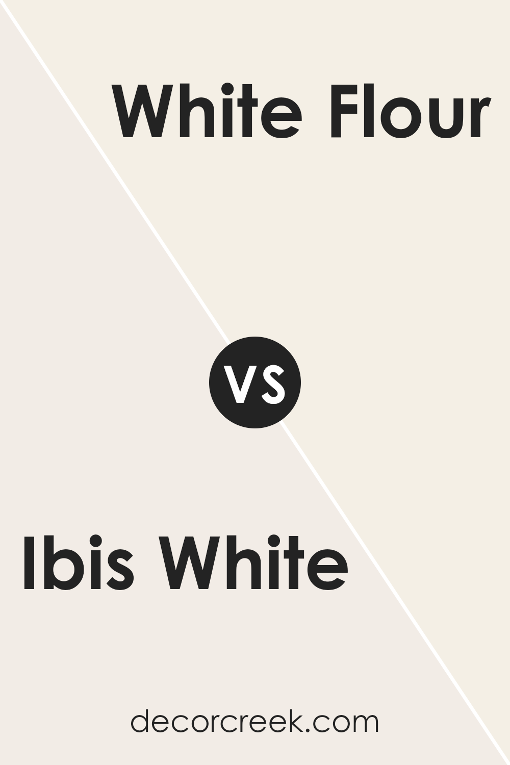
Ibis White SW 7000 by Sherwin Williams vs White Flour SW 7102 by Sherwin Williams
Ibis White and White Flour are both popular paint colors by Sherwin Williams, but they have distinct characteristics.
Ibis White is a clean, bright white with subtle warm undertones, making it versatile and suitable for various settings. It’s crisp and fresh, enhancing light in a room without feeling too stark.
White Flour, on the other hand, is a softer, warmer white.
It has an almost creamy quality that adds a cozy feel to a space. This warmth makes it ideal for creating inviting, relaxed atmospheres, particularly in bedrooms and living rooms.
While both colors are neutral and flexible, Ibis White leans towards a more modern and minimalist look, often favored in contemporary spaces.
White Flour is better suited when you want a touch of warmth and comfort. Choosing between them depends on the mood and style you want to achieve in your space.
You can see recommended paint color below:
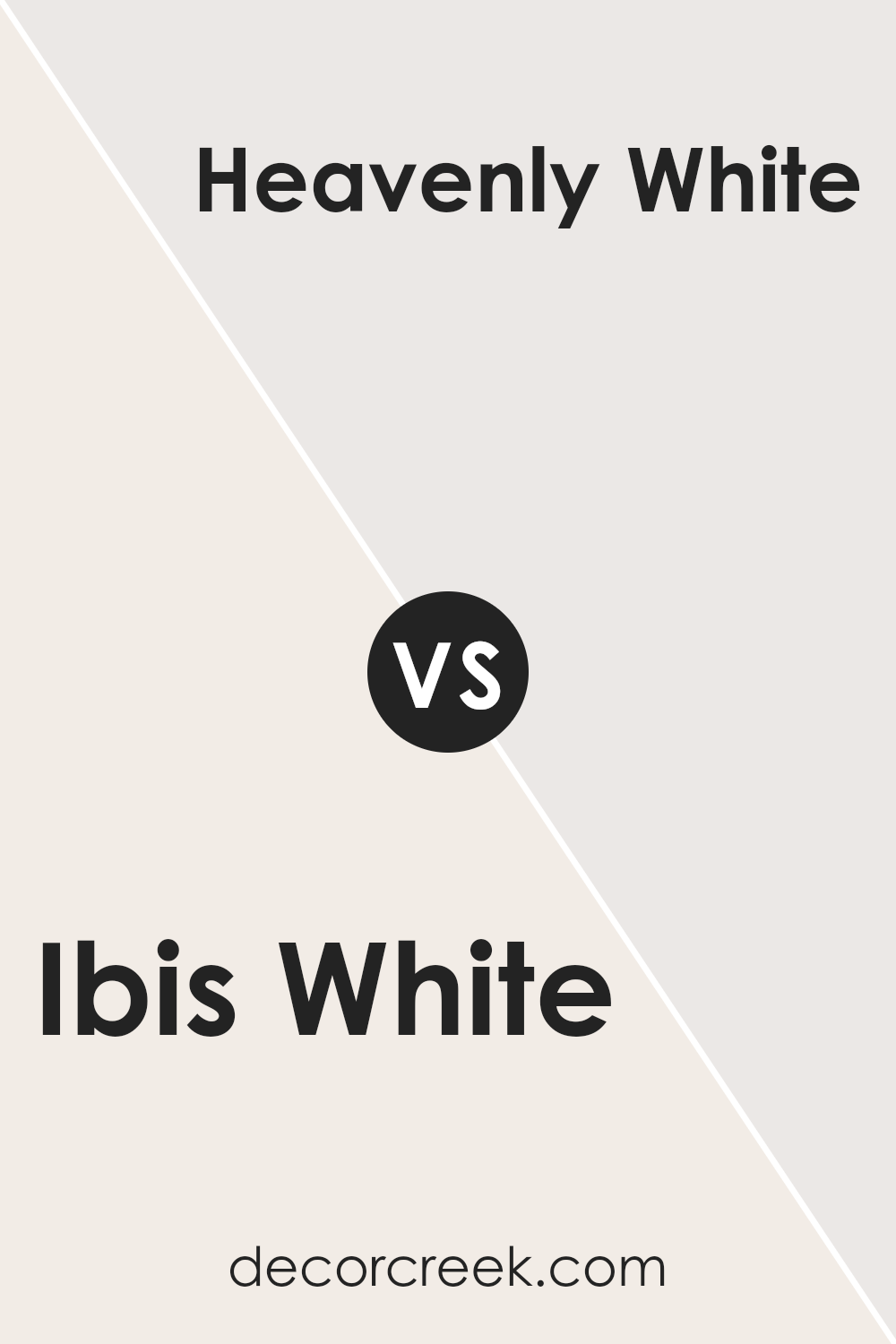
Ibis White SW 7000 by Sherwin Williams vs Heavenly White SW 6553 by Sherwin Williams
Ibis White SW 7000 and Heavenly White SW 6553 by Sherwin Williams are both warm whites, but they serve different purposes.
Ibis White is a soft, versatile shade that complements various styles and home decors. It has a subtle warmth, making it welcoming without being too stark.
This color is perfect for a modern look, combining well with other neutrals or bold accents.
On the other hand, Heavenly White SW 6553 leans on the creamier side, offering a gentle, comforting feel. It works well in spaces that aim for a cozy ambiance.
While it can also match different styles, it’s particularly suited for traditional or classic settings.
Overall, Ibis White is adaptable and sleek, providing a clean backdrop, while Heavenly White brings in warmth with a touch of elegance.
Choosing between them depends on whether you want a clean and fresh atmosphere or a warm and inviting one.
You can see recommended paint color below:
- SW 6553 Heavenly White
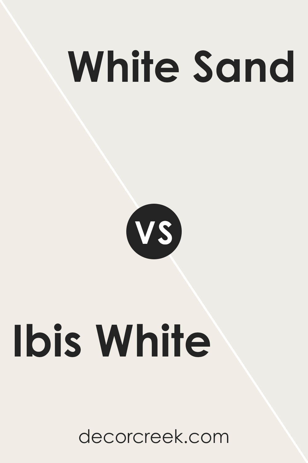
Ibis White SW 7000 by Sherwin Williams vs White Sand SW 9582 by Sherwin Williams
Ibis White and White Sand are both popular paint colors from Sherwin Williams, but they offer different vibes.
Ibis White is a clean, crisp white. It’s perfect for creating a bright, fresh look in any space. Its simplicity makes it versatile for various rooms and styles.
On the other hand, White Sand is a warm, soft white with subtle beige undertones.
This gentle tone brings a comforting and cozy feel to a space, making it an excellent choice for areas where you want a touch of warmth without strong color.
While Ibis White works well in modern and minimalist settings due to its pure white appearance, White Sand adds a bit of depth and richness, which suits traditional or transitional styles.
Choosing between the two depends on the mood you want to set: bright and airy with Ibis White or warm and inviting with White Sand.
You can see recommended paint color below:
Ibis White SW 7000 by Sherwin Williams vs Marshmallow SW 7001 by Sherwin Williams
Ibis White (SW 7000) and Marshmallow (SW 7001) are both soft, neutral colors offered by Sherwin Williams, perfect for creating a clean and inviting look. Ibis White is a very light, off-white shade with subtle warm undertones. It’s an excellent choice for those who want a fresh and gentle background that complements most other colors in furniture and decor.
On the other hand, Marshmallow is also a warm white but it carries a slightly creamier hue. This makes Marshmallow feel a bit cozier while still keeping a light and open atmosphere.
When comparing the two, Marshmallow may add a touch more warmth and comfort to a space, whereas Ibis White tends to keep things crisp and bright.
Both colors are versatile and work well throughout the home, but your choice may depend on whether you prefer a slightly warmer or brighter environment.
You can see recommended paint color below:
Ibis White SW 7000 by Sherwin Williams vs Arcade White SW 7100 by Sherwin Williams
Ibis White SW 7000 and Arcade White SW 7100 are two popular paint colors by Sherwin Williams, but they have their own unique qualities.
Ibis White is a warm, soft white with subtle beige undertones. It creates a cozy and inviting atmosphere, making it ideal for living spaces and bedrooms where you want a gentle, welcoming feel.
On the other hand, Arcade White is a slightly cooler white with gray undertones. This makes it feel more modern and clean, which works well in kitchens, bathrooms, or contemporary settings.
While Ibis White offers warmth and comfort, Arcade White provides a crisp and sleek look. When deciding between the two, consider the mood you want to create in your space.
Ibis White is comforting and cozy, while Arcade White is fresh and cool. Both are versatile, but the choice depends on the ambiance you prefer.
You can see recommended paint color below:
Ibis White SW 7000 by Sherwin Williams vs Pale Pink SW 9696 by Sherwin Williams
Ibis White and Pale Pink by Sherwin Williams are both soft, light colors, but they serve different purposes in design.
Ibis White is a crisp, clean white that offers a neutral backdrop, making it versatile for various styles and color schemes.
It’s ideal for creating a fresh and modern look, giving spaces a sense of space and cleanliness. Pale Pink, on the other hand, brings a gentle warmth and subtle color to a room. It’s a soft pink with a hint of sweetness and can add a touch of warmth and charm to spaces.
This color works well in bedrooms or nurseries where a calming, welcoming ambiance is desired.
When used together, Ibis White can balance out the playfulness of Pale Pink, making the combination suitable for stylish yet comforting rooms.
Each color uniquely impacts the mood and feel of a space, with Ibis White offering neutrality and Pale Pink providing a soft, warm accent.
You can see recommended paint color below:
- SW 9696 Pale Pink
Ibis White SW 7000 by Sherwin Williams vs Cold Foam SW 9504 by Sherwin Williams
Ibis White and Cold Foam are two popular paint colors by Sherwin Williams. Ibis White is a soft, warm white that adds a gentle and cozy feel to any room.
It reflects light well, making spaces feel brighter and more open, without being stark or clinical. It’s a versatile base color that can easily pair with various accent shades.
Cold Foam, on the other hand, is a very light gray with a cool undertone. It’s perfect for those who want a whisper of color that’s not as warm as pure white.
Cold Foam adds a subtle difference to your walls, giving them a clean and modern look without feeling too cold.
Both colors work well in different settings. Ibis White can make spaces feel inviting and warm, while Cold Foam offers a fresh, crisp look. Choosing between them depends on whether you prefer a warmer or cooler atmosphere in your home.
You can see recommended paint color below:
Ibis White SW 7000 by Sherwin Williams vs Crystalline SW 9691 by Sherwin Williams
Ibis White SW 7000 by Sherwin Williams is a warm white with a soft, inviting feel.
It has subtle undertones of yellow or beige, which make it a great choice for creating a cozy atmosphere.
This color works well in a variety of settings, from living rooms to bedrooms, providing a clean, classic look that is both welcoming and timeless.
In contrast, Crystalline SW 9691 is a pale green with a refreshing and airy quality. It introduces a hint of color without overwhelming a space, making it perfect for areas where you want a touch of nature.
The green undertones in Crystalline can have a calming effect, providing a sense of peace and balance. While Ibis White offers warmth and versatility, Crystalline brings a subtle splash of nature-inspired color.
Both colors are flexible and can be used to complement different styles, making them excellent choices for a variety of design projects.
You can see recommended paint color below:
- SW 9691 Crystalline
Ibis White SW 7000 by Sherwin Williams vs Pinkish SW 7112 by Sherwin Williams
Ibis White SW 7000 and Pinkish SW 7112 from Sherwin Williams are two unique colors that give off different vibes. Ibis White is a clean, crisp white that feels fresh and pure. It’s perfect for creating a bright, airy space and works well as a neutral backdrop. This color pairs nicely with almost any other shade, from bold hues to soft pastels.
Pinkish SW 7112, on the other hand, has a warm, gentle pink tone that offers a touch of warmth and playfulness.
It adds a cozy and inviting feel to a space without being overpowering. While Ibis White is more about neutrality and brightness, Pinkish brings in a subtle hint of color, creating a soft, romantic atmosphere.
Together, they can balance each other out, with Ibis White providing a clean canvas and Pinkish adding a little warmth and charm to the room.
You can see recommended paint color below:
- SW 7112 Pinkish
Ibis White SW 7000 by Sherwin Williams vs Snowbound SW 7004 by Sherwin Williams
Ibis White (SW 7000) and Snowbound (SW 7004) are both popular white paint colors by Sherwin Williams, but they have some distinct differences.
Ibis White has a warmer tone, with subtle beige undertones that give it a soft, inviting feel. It works well in spaces that aim for a cozy and welcoming atmosphere.
On the other hand, Snowbound is a cooler white with gray undertones. This gives it a slightly crisper and more modern appearance, making it suitable for spaces that aim for a clean and fresh look.
While both colors are versatile and can suit various styles, Ibis White might pair better with earthy tones and warm woods, whereas Snowbound complements cooler shades like blues and grays.
Choosing between them will depend on the feel you want for your room and the colors you plan to pair them with.
You can see recommended paint color below:
Ibis White is a beautiful, bright white paint that can make any room feel fresh and clean. It’s like bringing a bit of sunshine into your home.
This color is great if you want to make a room look lighter and brighter, even on cloudy days. What’s really cool about Ibis White is how it matches with lots of other colors. Whether you have colorful furniture or prefer simpler styles, this paint can help bring everything together nicely.
It’s like finding the perfect LEGO piece that clicks just right with all the others to complete your model.
Think of Ibis White as a friendly color choice for any room. It’s perfect for bedrooms, living rooms, or even the kitchen because it helps everything look neat and tidy. Plus, it’s easy on the eyes, which makes spending time in a room painted with this color feel comfortable and pleasant.
Overall, Ibis White is a wonderful choice if you want to freshen up your walls. It’s simple, cheerful, and works well in all sorts of places.
There’s something special about how it improves any room. So, if you’re thinking about painting, Ibis White might just be the perfect choice for you.
Ever wished paint sampling was as easy as sticking a sticker? Guess what? Now it is! Discover Samplize's unique Peel & Stick samples.
Get paint samples

