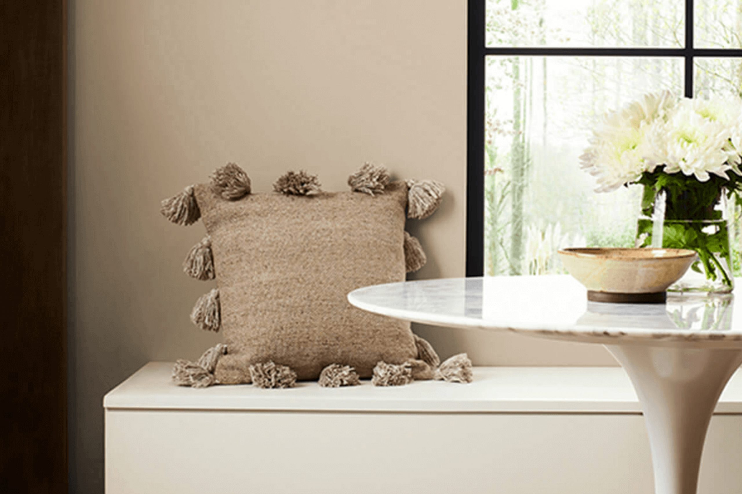
If you’re thinking about giving your living space a new look, then considering this warm, versatile shade might be a great choice for you. Barcelona Beige is a soft, neutral color that brings a cozy feeling to any room, making it perfect for living rooms, bedrooms, or even kitchens.
Its subtle elegance allows it to blend well with different styles and decorations, whether your taste leans towards modern minimalism or a more classic aesthetic. This shade can help create a welcoming space that feels both comforting and stylish.
Moreover, because it’s not too dark or too light, it works beautifully throughout the year, reflecting the changing lights and seasons, adding richness to your interiors. Whether you’re just touching up or planning a complete makeover, Barcelona Beige offers a fantastic canvas to build upon.
So, if you’re ready to refresh your space with something new yet timeless, Barcelona Beige by Sherwin Williams could be the color that you’re looking for. Stay tuned as I guide you through how to best utilize this shade in your home to achieve a beautiful, serene environment.
What Color Is Barcelona Beige SW 7530 by Sherwin Williams?
Barcelona Beige is a warm, subtle color that brings a cozy and welcoming feel to any space. With its soft beige tone, it provides a versatile backdrop, making it easy to decorate around. The hue has a balanced mix of brown and gray, giving it a solid, earthy base that isn’t too heavy or stark.
This color is ideal for interior styles that emphasize comfort and simplicity, such as modern farmhouse, rustic, and traditional decors. It’s particularly effective in living rooms and bedrooms where a calm, inviting atmosphere is desired.
Additionally, Barcelona Beige can enhance the airiness of a space when used in smaller rooms or apartments.
When it comes to pairing with materials and textures, Barcelona Beige works beautifully with natural wood, from light oak to rich walnut, adding depth and warmth. It also complements textured fabrics like linen or wool, which can be introduced through upholstery or soft furnishings. For a bit of contrast, pairing this beige with crisp white trims or metallic accents in bronze or gold can create a subtle, yet striking, effect.
Overall, Barcelona Beige is a great choice for those looking to create a cozy, grounding environment in their home without overwhelming it with color.
Is Barcelona Beige SW 7530 by Sherwin Williams Warm or Cool color?
Barcelona Beige is a warm and neutral paint color from Sherwin Williams. It’s a versatile shade that works well in various parts of the home, creating a cozy and inviting atmosphere without being overpowering. This beige has subtle, earthy tones that make it easy to pair with a wide range of decor styles and colors, from modern and minimalistic to rustic and traditional.
One of the best qualities of Barcelona Beige is its ability to blend seamlessly into existing interiors while providing a fresh, updated look. It enhances natural light in a room, making the space feel more open and airy.
When used on walls, it’s soothing and provides a neutral backdrop that makes room features and furnishings stand out.
In terms of practicality, it’s great for high-traffic areas like living rooms and hallways because it doesn’t show minor marks or scuffs as easily as darker colors might. Overall, it’s a reliable choice for those looking to refresh their home with a gentle and appealing color.
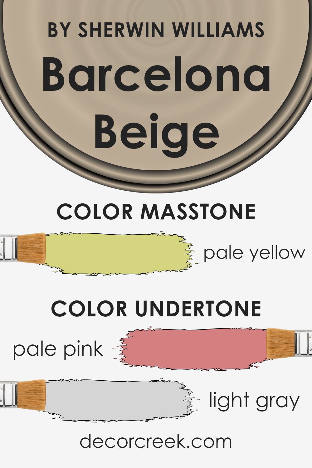
Undertones of Barcelona Beige SW 7530 by Sherwin Williams
Barcelona Beige is a warm and versatile paint color that can subtly change its appearance based on the lighting and surrounding colors due to its complex undertones. Undertones are the underlying hues that can enhance or influence the main color, often noticeable in different lighting conditions or when paired with contrasting colors.
This particular beige shade has a mix of subtle undertones including pale pink, light gray, light purple, mint, grey, light blue, lilac, yellow, orange, light green, and olive. These undertones can help the color blend with a variety of decor styles and color schemes, making it a flexible choice for interior walls.
When used in interior design, the right lighting can bring out Barcelona Beige’s undertones in charming ways. For instance, in a room with ample natural light, the light blue and mint undertones might give the walls a fresher, more airy feel. In artificial light, the warmer undertones like pale pink and orange can make a room feel cozier.
Choosing this color for walls allows the subtle undertones to interact, sometimes making the walls seem to change color at different times of day. This can make the room feel dynamic and adaptable without overwhelming with strong colors. It pairs well with a wide range of complementary colors from soft pastels to rich, earthy tones.
Thus, using Barcelona Beige can be a simple yet effective way to create a warm, inviting atmosphere in a home.
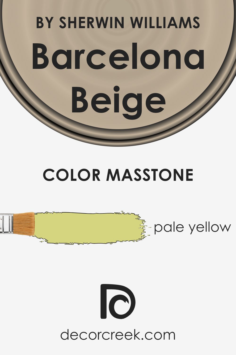
What is the Masstone of the Barcelona Beige SW 7530 by Sherwin Williams?
Barcelona Beige has a masstone of pale yellow, a gentle and welcoming shade that makes it a fantastic choice for home interiors. This color brings a soft warmth to rooms, creating a cozy and inviting atmosphere. Its light yellow hue helps to brighten spaces while maintaining a subtle, natural look.
This is particularly effective in areas with limited natural light, as the brightness of the color can help to make rooms appear larger and more open. The neutrality of Barcelona Beige allows it to blend well with various decor styles and color palettes, making it versatile for use in living rooms, bedrooms, and kitchens.
It pairs beautifully with white trims, giving a fresh and clean look, while also looking great with darker woods or bold accent colors. Overall, its softness and warmth make it a delightful choice for creating a pleasant and comfortable home environment.
How Does Lighting Affect Barcelona Beige SW 7530 by Sherwin Williams?
Lighting plays a crucial role in how colors are perceived in any space. Whether it’s man-made or natural light, the intensity and type of light can make a color look different at various times of the day or in different settings.
Barcelona Beige is a warm, versatile paint color that adapts uniquely to different lighting conditions. In rooms with artificial light, such as LEDs or fluorescent bulbs, the color may appear slightly more muted than in natural sunlight.
Artificial lighting typically does not replicate the full spectrum of sunlight and can influence the way colors are viewed.
For example, under warm, yellow-toned lighting, Barcelona Beige may seem cozier and richer, while cooler, bluish lights could make it look more subdued.
In natural light, Barcelona Beige has the opportunity to show its true colors. How it appears can greatly depend on the direction the room faces:
- 1. North-faced rooms often receive less direct sunlight, which can give the color a cooler, slightly grayer appearance. This doesn’t diminish its beauty but rather gives it a soft, subtle presence.
- 2. South-faced rooms get more direct sunlight, making Barcelona Beige appear warmer and more vibrant. The natural light enhances its warm undertones, making the space feel welcoming and bright.
- 3. East-faced rooms experience bright light in the morning, which can make the color look very lively and warm early in the day. However, as the day progresses and natural light diminishes, the color might look softer and more neutral.
- 4. West-faced rooms are the opposite, as they get a stronger light in the afternoon and evening. Here, Barcelona Beige can look quite dynamic and rich in the later parts of the day, illuminated by the warmth of the setting sun.
In summary, the appearance of Barcelona Beige by Sherwin Williams changes based on its lighting context, offering a range of atmospheres from soft and subtle under cool light to warm and inviting under bright, warm light.
When choosing this color, consider the room’s orientation and the type of light it receives to fully utilize its potential in your decorating.
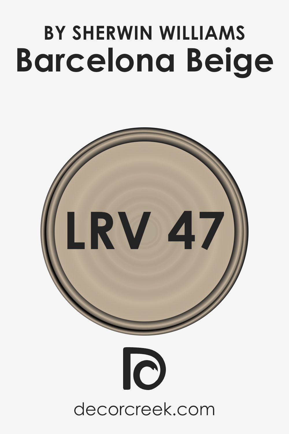
What is the LRV of Barcelona Beige SW 7530 by Sherwin Williams?
LRV, or Light Reflectance Value, is a measure used to indicate how much light a paint color reflects or absorbs when applied to a wall. This scale runs from black, which absorbs all light and has an LRV of 0, to white, which reflects all light and has an LRV of 100.
A higher LRV means the color reflects more light, making a room appear brighter and more open. Conversely, a lower LRV means the color absorbs more light, which can make a space look more closed in and darker.
Considering Barcelona Beige has an LRV of around 46, it occupies a middle ground in terms of light reflectivity. This means it won’t make a space feel overly bright or excessively dark. It reflects a moderate amount of light, contributing to a balanced look that doesn’t drastically alter the perception of space.
For rooms with limited natural light or smaller spaces, this mid-range LRV can help keep the environment feeling neither too cramped nor too stark, maintaining a comfortable and welcoming atmosphere.
Coordinating Colors of Barcelona Beige SW 7530 by Sherwin Williams
Coordinating colors are selected to complement and enhance the main color in a palette, creating a harmonious look. When used thoughtfully, these colors can accentuate or subtly balance the primary color. For instance, you might consider Barcelona Beige by Sherwin Williams, a warm, neutral beige that serves as a versatile backdrop for various interior styles. Coordinating colors for this shade include Sunrise, Panda White, and Dapper Tan, each offering its unique contribution to the overall atmosphere of a space.
Sunrise is a bright, cheerful yellow that brings a touch of sunlight into any room, perfect for adding a lively contrast to the calmness of Barcelona Beige. It works well in areas that benefit from a pop of color to make the space more inviting and energetic.
Panda White, on the other hand, is a soft, clean white that offers a subtle lift to the surrounding colors. It’s ideal for creating a light and airy feel, helping to open up a space while providing a gentle contrast. Lastly, Dapper Tan is a deeper, richer shade that complements Barcelona Beige by adding depth and warmth. This color is suitable for those looking to create a cozy, cohesive environment without overpowering the primary color theme.
You can see recommended paint colors below:
- SW 6668 Sunrise
- SW 6147 Panda White
- SW 6144 Dapper Tan

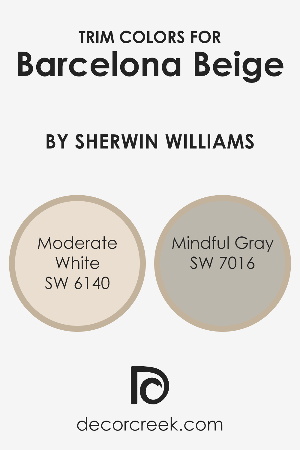
What are the Trim colors of Barcelona Beige SW 7530 by Sherwin Williams?
Trim colors are specific hues selected for painting the trimmings around doors, windows, and baseboards, providing a visual frame that complements or contrasts with the wall color. Choosing the right trim color can significantly enhance the overall appearance of a room.
For a warm, neutral shade like Barcelona Beige by Sherwin Williams, trim colors play a crucial role in defining the spatial dynamics and adding depth and definition to the space.
Using a lighter trim shade like Moderate White or a slightly darker and contrasting tone like Mindful Gray can adjust the mood and perception of the area painted with the beige tone.
Moderate White is a soft and warm off-white hue that provides a subtle contrast when used as a trim color with Barcelona Beige. This combination fosters a gentle, welcoming ambiance in the room, making it feel more open and inviting. On the other hand, Mindful Gray offers a more pronounced contrast, being a shade that leans towards taupe.
Using Mindful Gray as a trim color introduces a more grounded, defined edge to the areas, nicely framing the softer Barcelona Beige and resulting in a look that’s balanced and harmoniously sectioned.
You can see recommended paint colors below:
- SW 6140 Moderate White
- SW 7016 Mindful Gray
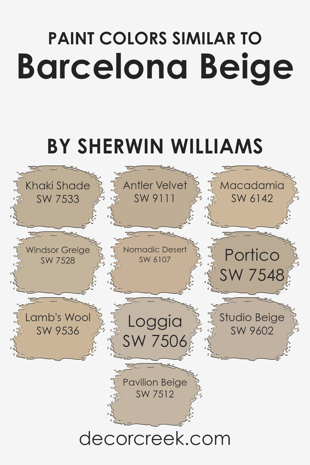
Colors Similar to Barcelona Beige SW 7530 by Sherwin Williams
Similar colors are essential in interior design because they create a seamless and harmonious atmosphere in a space. By using shades like Khaki Shade, Windsor Greige, or Lamb’s Wool, which are in close range to Barcelona Beige, one can achieve a gentle flow from room to room, enhancing the overall aesthetic while keeping the vibe consistent.
These colors work together because they share common undertones that complement each other, making the space feel thoughtfully connected without abrupt shifts in mood or style.
For example, Khaki Shade offers a slightly deeper, earthy quality that grounds the surrounding lighter tones. Windsor Greige brings a subtle elegance with its blend of gray and beige, perfect for spaces that require a touch of formality without overwhelming the senses. Lamb’s Wool adds a soft, warm touch, reminiscent of cozy, quiet corners.
Pavilion Beige is just a touch lighter, providing a bright and airy feel that enlarges smaller spaces. Antler Velvet has a unique richness, ideal for creating focal points without dominating. Nomadic Desert hints at sandy expanses, offering warmth and casual comfort. Loggia casts a muted shadow, perfect for adding depth.
Macadamia blends a nutty tone that infuses warmth. Portico, a shade that hints at classic architecture, offers mild sophistication. Lastly, Studio Beige works wonderfully in creative spaces, inspiring without distracting. Together, these colors fabricate a cohesive palette that enhances the beauty and functionality of any home.
You can see recommended paint colors below:
- SW 7533 Khaki Shade
- SW 7528 Windsor Greige
- SW 9536 Lamb’s Wool
- SW 7512 Pavilion Beige
- SW 9111 Antler Velvet
- SW 6107 Nomadic Desert
- SW 7506 Loggia
- SW 6142 Macadamia
- SW 7548 Portico
- SW 9602 Studio Beige
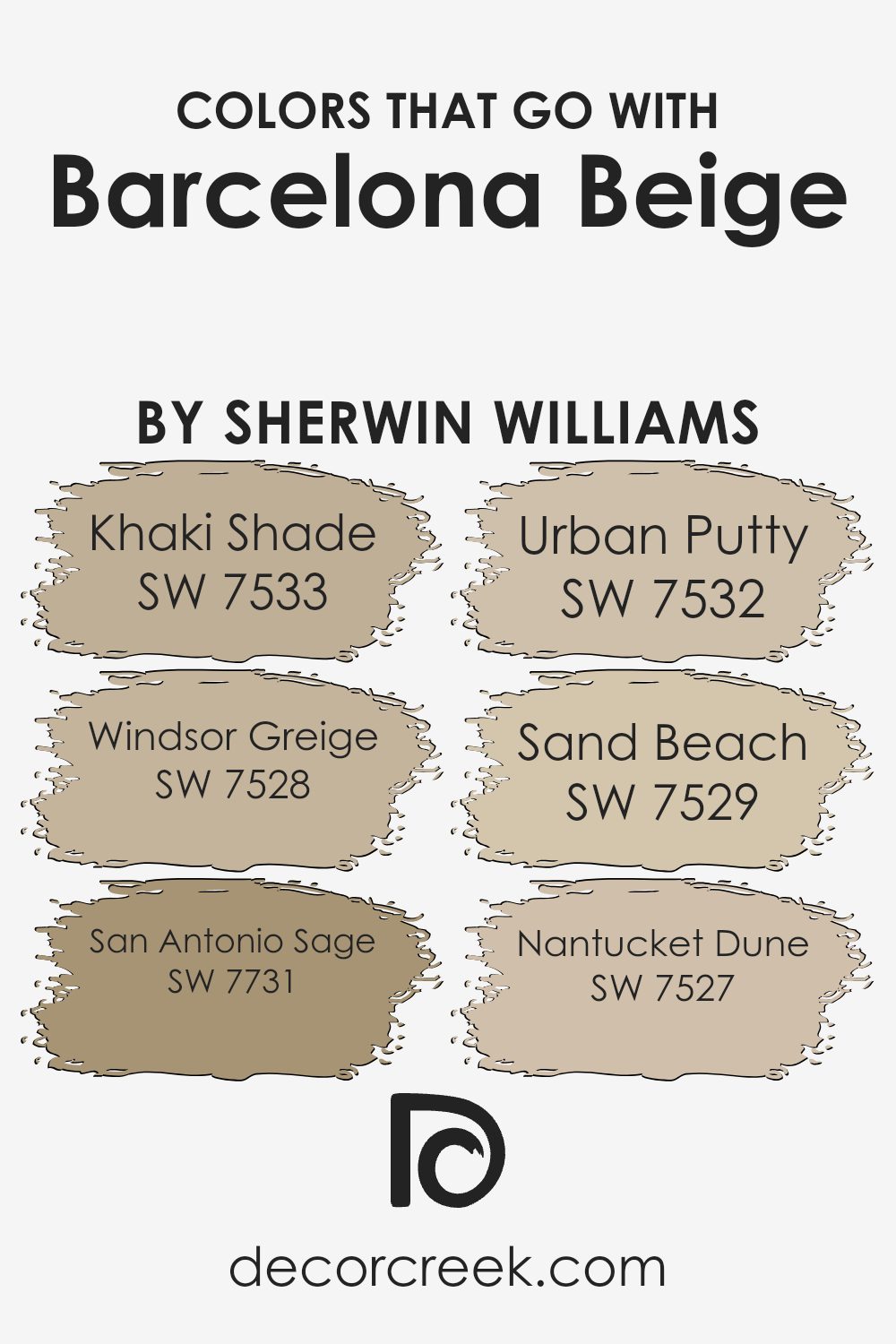
Colors that Go With Barcelona Beige SW 7530 by Sherwin Williams
Choosing complementary colors for Barcelona Beige SW 7530 by Sherwin Williams is crucial as it helps in creating a cohesive and appealing color scheme in any space. The right colors can enhance the ambiance, making the room feel warmer, cozier, or more welcoming depending on the chosen palette.
For instance, SW 7533 – Khaki Shade, a muted green, works well with Barcelona Beige as it brings a subtle touch of nature into the interior, blending smoothly without overwhelming the senses.
SW 7528 – Windsor Greige, a deeper greyish-beige, offers a slightly contrasting hue that can add depth and dimension to rooms when paired with Barcelona Beige.
SW 7731 – San Antonio Sage, an earthy, gray-green, complements Barcelona Beige by adding a dash of color that is neither too loud nor too subdued, perfect for creating a harmonious space. Another great pairing is SW 7532 – Urban Putty, a soft taupe that echoes the warmth of Barcelona Beige, enhancing the cozy feel of any room.
SW 7529 – Sand Beach provides a lighter, creamier contrast to Barcelona Beige, giving a lift to the overall palette and brightening spaces that may lack natural light. Lastly, SW 7527 – Nantucket Dune, a gentle sandy color, matches well with Barcelona Beige to generate a beachy, relaxed vibe that is both simple and inviting.
These combinations can effectively establish a balanced visual flow in your décor, rounding out the aesthetic of your living space.
You can see recommended paint colors below:
- SW 7533 Khaki Shade
- SW 7528 Windsor Greige
- SW 7731 San Antonio Sage
- SW 7532 Urban Putty
- SW 7529 Sand Beach
- SW 7527 Nantucket Dune
How to Use Barcelona Beige SW 7530 by Sherwin Williams In Your Home?
Barcelona Beige by Sherwin Williams is a warm, neutral color that can be a great choice for various spaces in your home. It has a cozy, inviting vibe making it perfect for living rooms and bedrooms where you want a comforting atmosphere. Its subtle earthy tones pair well with a wide range of colors, from bright and vivid shades to more muted hues, giving you flexibility in your decorating choices.
You can use Barcelona Beige on walls to create a calm backdrop that allows your furniture and artwork to stand out. It’s also an excellent color for hallways and entryways, where it can make the space appear brighter and more welcoming.
For a cohesive look, consider using Barcelona Beige for larger areas and accentuating with darker or more vibrant colors through accessories like cushions, rugs, and drapes.
Additionally, this color works well in homes with natural light as well as in those with less sunlight, maintaining its warmth and appeal under various lighting conditions. Whether you’re redoing a room or just updating your color scheme, Barcelona Beige offers a versatile and appealing option.
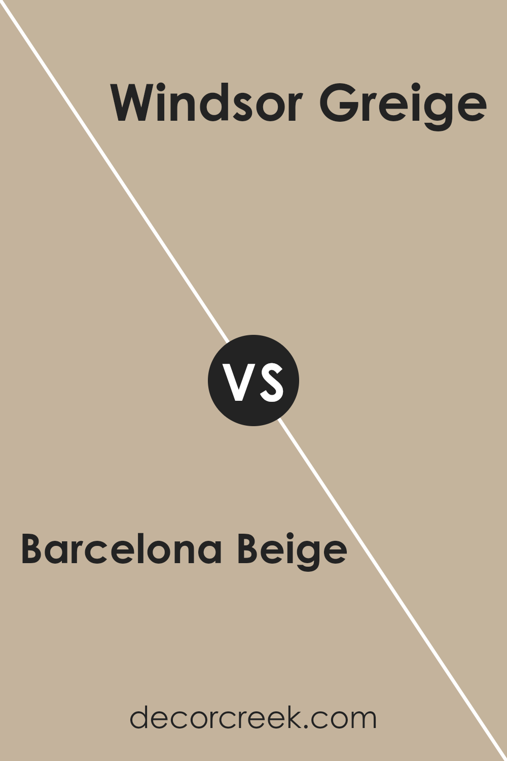
Barcelona Beige SW 7530 by Sherwin Williams vs Windsor Greige SW 7528 by Sherwin Williams
Barcelona Beige and Windsor Greige are two popular paint colors by Sherwin Williams that are often chosen for their warm, neutral tones. Barcelona Beige is a lighter shade with subtle yellow undertones, giving a soft and cozy feel to any room. It brings brightness to spaces and works well in areas with less natural light.
On the other hand, Windsor Greige is a bit darker and has a mix of beige and gray. This color has a more grounded feel and can add a sense of warmth and depth to spaces, making it ideal for creating a cozy and inviting atmosphere.
While both colors provide a neutral palette that complements various decor styles, Barcelona Beige is typically better for creating a lighter, airier feel, and Windsor Greige is excellent for adding richness and warmth.
You can see recommended paint color below:
- SW 7528 Windsor Greige
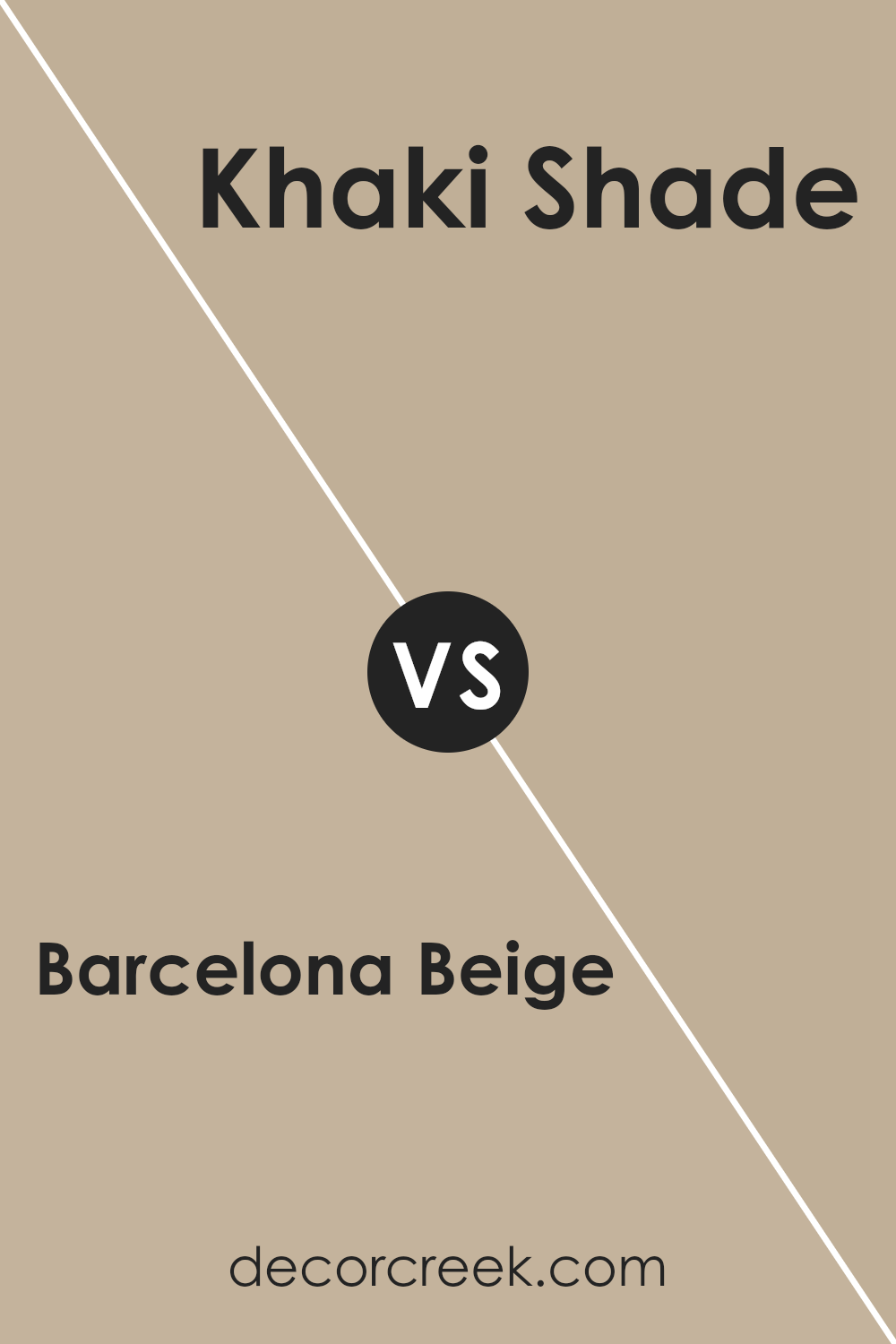
Barcelona Beige SW 7530 by Sherwin Williams vs Khaki Shade SW 7533 by Sherwin Williams
Barcelona Beige and Khaki Shade, both by Sherwin Williams, are neutral colors that offer distinct atmospheres for rooms. Barcelona Beige is a lighter, warm beige that reflects light well, making spaces feel more open and airy. It’s perfect for living rooms or bedrooms where you want a calm, welcoming feel.
On the other hand, Khaki Shade is a deeper, earthier color that provides a sense of grounding and stability. It’s darker than Barcelona Beige and works great in areas where a cozy, enclosed feel is desired, like in dens or reading nooks.
Despite their similarities as neutrals, these two colors can influence the mood and perceived size of a space quite differently. Barcelona Beige tends to make a room look larger, while Khaki Shade adds warmth and depth, making it more enclosed.
You can see recommended paint color below:
- SW 7533 Khaki Shade
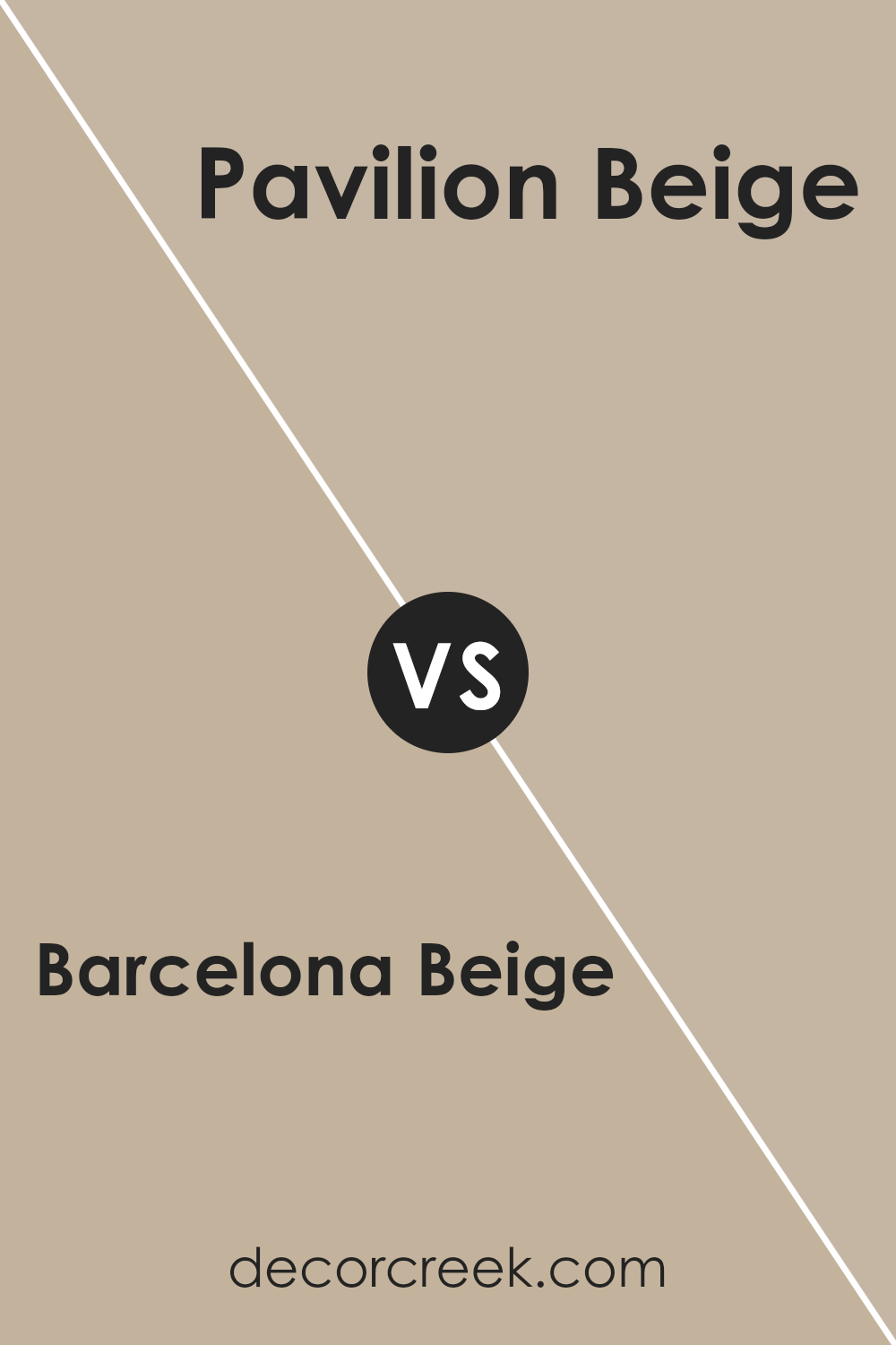
Barcelona Beige SW 7530 by Sherwin Williams vs Pavilion Beige SW 7512 by Sherwin Williams
Barcelona Beige and Pavilion Beige by Sherwin Williams are both neutral shades that offer a warm feel, yet they carry distinct tones making them suitable for different spaces and moods. Barcelona Beige has a soft, sandy quality, which makes it very versatile for rooms where a subtle, inviting atmosphere is desired. This color works well in areas with natural light, enhancing a space without overpowering it.
On the other hand, Pavilion Beige leans towards a slightly grayer tone, giving it a steadier, more grounded feel. This color is excellent for spaces that require a hint of formality but still benefit from the warmth of a beige. It’s particularly effective in office spaces or dens, where the cooler undertone can create a calm, focused environment.
Both colors are quite adaptable and pair well with various decor styles, but the choice between them would depend on the desired warmth and mood of the room.
You can see recommended paint color below:
Barcelona Beige SW 7530 by Sherwin Williams vs Antler Velvet SW 9111 by Sherwin Williams
Barcelona Beige and Antler Velvet, both from Sherwin Williams, offer distinct tones that cater to different aesthetic tastes. Barcelona Beige is a warm, soft beige with a neutral, comforting presence, making it perfect for creating a cozy and welcoming atmosphere in any room. It pairs well with a wide range of colors, adding a soothing backdrop to spaces intended for relaxation.
On the other hand, Antler Velvet, has a significantly darker and richer hue. This color leans towards a deep, muted brown, providing a bold and grounding effect. It’s ideal for adding depth and emphasis in a space, and works particularly well in areas dedicated to focused activities or evening gatherings.
Both colors carry an understated elegance that can fit into various design styles, from modern to traditional. However, their impact and the mood they set can be quite different, with Barcelona Beige brightening spaces and Antler Velvet adding a sense of solid sophistication. Choosing between them depends on the desired ambience and functionality of the room.
You can see recommended paint color below:
- SW 9111 Antler Velvet

Barcelona Beige SW 7530 by Sherwin Williams vs Nomadic Desert SW 6107 by Sherwin Williams
Barcelona Beige and Nomadic Desert are two warm neutral paint colors from Sherwin Williams that can create cozy and welcoming spaces in your home. Barcelona Beige is a lighter shade, providing a soft and subtle backdrop that works well in almost any room. It reflects more light, making it an excellent choice for smaller spaces or areas with limited natural light.
On the other hand, Nomadic Desert is a deeper beige that brings a stronger presence of color. It’s richer and can add more warmth to a room, making it ideal for larger spaces or rooms that need a bit more depth and warmth.
This color pairs well with a variety of decor styles, especially if you are looking to make a more noticeable color statement.
Both colors are great options for a neutral palette, but your choice will depend on the specific feel and size of the space you are decorating. Nomadic Desert stands out more, while Barcelona Beige blends more smoothly into its surroundings.
You can see recommended paint color below:
- SW 6107 Nomadic Desert
Barcelona Beige SW 7530 by Sherwin Williams vs Loggia SW 7506 by Sherwin Williams
Barcelona Beige and Loggia are both neutral paint colors from Sherwin Williams, but they each bring their own unique feel when applied. Barcelona Beige has a lighter, warmer tone that can make spaces feel more open and airy. It’s a superb choice for anyone wanting to create a cozy and inviting environment without it feeling too cramped
. On the other hand, Loggia is slightly darker with a hint of gray undertones, which gives it a richer, more grounding presence in a room. This color can be great for adding a touch of elegance and warmth, especially in well-lit spaces.
Although both colors are versatile, Barcelona Beige works best in spaces where you want to enhance natural light, while Loggia is ideal when aiming to add depth and warmth.
Together, they can create a balanced and harmonious look, depending on how they are used throughout your space.
You can see recommended paint color below:
- SW 7506 Loggia
Barcelona Beige SW 7530 by Sherwin Williams vs Lamb’s Wool SW 9536 by Sherwin Williams
Barcelona Beige and Lamb’s Wool are two appealing colors by Sherwin Williams that offer warm, neutral tones suitable for various settings. Barcelona Beige is a subtle, sandy beige, providing a cozy and welcoming atmosphere to any room. It’s versatile and pairs well with other colors, making it an excellent choice for living areas and bedrooms where a calm and orderly feel is desired.
On the other hand, Lamb’s Wool is a slightly lighter and creamier shade than Barcelona Beige. It leans towards a soft, gentle cream with just a hint of warmth, reminiscent of a light, cozy woolen blanket.
This color is perfect for creating a bright and airy feel, especially in smaller or less lit spaces, as it reflects light beautifully, making spaces appear larger and more open.
Both colors work well in a variety of decor styles and offer a refined yet understated backdrop to build upon with other decorative elements. The choice between them would largely depend on the desired mood and the available natural light in the space.
You can see recommended paint color below:
Barcelona Beige SW 7530 by Sherwin Williams vs Macadamia SW 6142 by Sherwin Williams
Barcelona Beige and Macadamia are two warm, inviting shades from Sherwin Williams, though they have slightly different tones. Barcelona Beige is a neutral beige that creates a calm and soft environment, making it versatile for various spaces in your home. It leans more towards a gray-taupe, providing a subdued backdrop that pairs well with both vibrant and muted accents.
On the other hand, Macadamia is a softer, creamier color with a hint of warm peach undertones. It’s a bit richer and can make a room feel cozy and welcoming. This color works beautifully in areas that benefit from a gentle, sunlit appearance, such as living rooms or bedrooms.
Both colors are great for creating a relaxed and comfortable atmosphere, but the choice between them depends on the specific warmth and depth you want to bring to your space. Macadamia will offer a slightly warmer touch, while Barcelona Beige keeps things a bit cooler with its gray hints.
You can see recommended paint color below:
- SW 6142 Macadamia
Barcelona Beige SW 7530 by Sherwin Williams vs Portico SW 7548 by Sherwin Williams
Barcelona Beige and Portico are two shades from Sherwin Williams that look quite nice together but have distinct tones. Barcelona Beige is a warm neutral color with a cozy and welcoming vibe. It works well in almost any space, giving a soothing backdrop that complements furniture and décor of many styles
. On the other hand, Portico is a shade darker with a slight gray undertone, offering a bit more depth. It’s perfect for those looking to add a subtle contrast while maintaining a harmonious feel in their room. Both colors coordinate well and are ideal for those wanting a laid-back yet stylish environment.
Whether used together or separately, they provide a solid foundation for a variety of decorating themes.
You can see recommended paint color below:
- SW 7548 Portico
Barcelona Beige SW 7530 by Sherwin Williams vs Studio Beige SW 9602 by Sherwin Williams
Barcelona Beige and Studio Beige by Sherwin Williams are both neutral shades, but they have distinct tones that set them apart. Barcelona Beige leans more towards a soft, warm beige with a comforting appeal, making it great for spaces where you want a cozy and inviting atmosphere. It pairs well with a variety of decor, adding a gentle richness to the room without overpowering other elements.
On the other hand, Studio Beige has a slightly cooler undertone, which presents a more muted and subtle look. This color is excellent for contemporary spaces, as it provides a clean and crisp background that complements modern furnishings and finishes.
It’s particularly effective in areas with lots of natural light, as the light reveals the complexity of this cooler beige.
Both colors offer versatility and can be used in various settings, whether you’re looking to warm up a room or give it a more refined feel. Choosing between them depends on the mood you’re trying to achieve and the existing colors in your space.
You can see recommended paint color below:
- SW 9602 Studio Beige
Conclusion
It‘s a warm beige that can make any room feel cozy and welcoming. Whether you’re painting a living room or just a small corner of your home, Barcelona Beige has a gentle way of making spaces feel just right.
What’s great about this color is how well it works with other colors. You can pair it with bright colors or keep things calm by using other soft tones. It’s not just a pretty color; it’s also practical because it hides little marks or scuffs, which is pretty handy.
In conclusion, if someone is looking for a paint color that is friendly and warm, and can make any room in your home feel more comfortable, I’d say you can’t go wrong with Barcelona Beige.
It’s like the comfy, soft sweater of paint colors—always there to make things look and feel just a bit nicer.
Ever wished paint sampling was as easy as sticking a sticker? Guess what? Now it is! Discover Samplize's unique Peel & Stick samples.
Get paint samples

