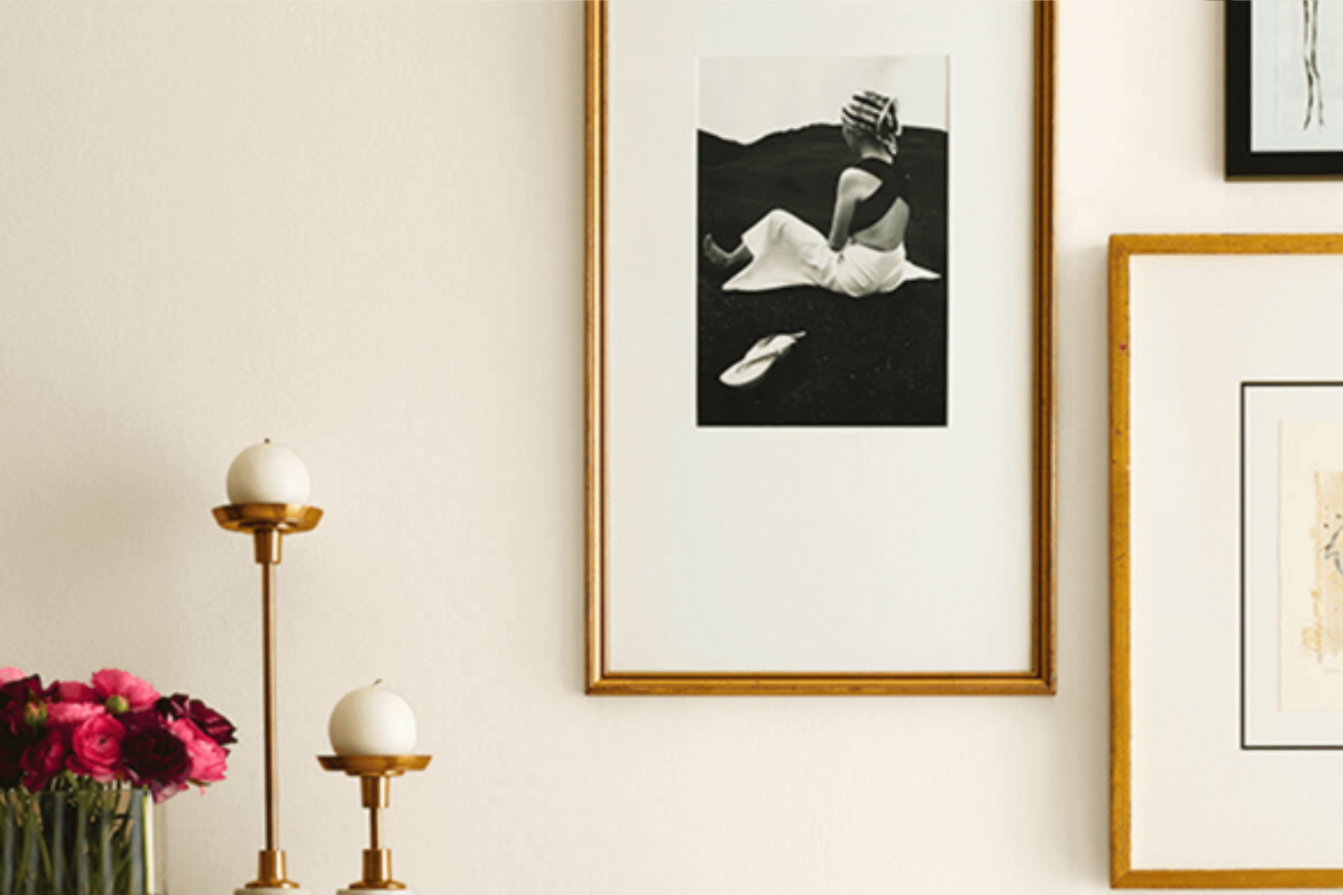
Sherwin Williams’ Panda White (SW 6147) is a paint color that strikes a perfect balance between warm and cool tones, making it an incredibly versatile option for any space in your home. This shade is not a stark white; rather, it effortlessly blends a soft, subtle hint of creaminess with a touch of gray, giving it a unique character that can enhance the look and feel of your rooms.
Whether you’re looking to create a cozy and inviting living room, a serene and relaxing bedroom, or even a bright and airy kitchen, Panda White has the ability to transform your space with its gentle elegance.
Its adaptability means it pairs beautifully with a wide range of decor styles, from modern and minimalist to rustic and traditional. The beauty of Panda White lies in its understated simplicity, which allows other elements in the room, like furniture, artwork, or accent colors, to take center stage while still providing a warm and cohesive backdrop.
For those updating their home or taking on a new painting project, considering Panda White (SW 6147) from Sherwin Williams is a smart choice for creating spaces that feel both sophisticated and welcoming.
What Color Is Panda White SW 6147 by Sherwin Williams?
Panda White is a unique and versatile shade from Sherwin Williams that stands out for its subtle blend of warm undertones. This color is neither stark white nor too creamy, striking a perfect balance that makes it great for creating a cozy yet bright atmosphere in any room. The beauty of Panda White lies in its ability to adapt to different lighting conditions, providing a soft glow in spaces filled with natural light while maintaining a welcoming warmth in areas with artificial lighting.
This shade works exceptionally well in various interior styles, particularly in minimalist, Scandinavian, and modern farmhouse designs. Its understated elegance allows it to serve as a neutral backdrop, complementing vibrant accents without overwhelming the senses.
Panda White is especially suited for living rooms, bedrooms, and kitchens where its soothing presence can enhance the sense of comfort and cleanliness.
When it comes to pairing with materials and textures, Panda White is remarkably flexible. It looks stunning alongside natural wood, whether it’s a light oak or a darker walnut, highlighting the beauty of the grain while contributing to a sense of earthiness. For a more contemporary feel, pairing it with matte black or brushed nickel finishes can create a striking contrast that’s both sophisticated and bold. Textiles in rich textures or soft pastels also work beautifully with this color, allowing for a layered, inviting space that feels cohesive and thoughtfully designed.
In summary, Panda White is a go-to choice for those looking to create a serene and inviting space with a touch of warmth, blending seamlessly with a variety of decors and materials.
Ever wished paint sampling was as easy as sticking a sticker? Guess what? Now it is! Discover Samplize's unique Peel & Stick samples.
Get paint samples

Is Panda White SW 6147 by Sherwin Williams Warm or Cool color?
Panda White SW 6147 by Sherwin Williams is a unique shade that brings a soft, warm touch to any space. Imagine cozying up in a room that wraps you in a gentle hug; that’s the vibe Panda White delivers. It’s not a stark white but has a soothing off-white tone with subtle hints of beige, making it incredibly versatile for various settings in homes. This color has a way of creating an inviting atmosphere, which is perfect for rooms where comfort is key, like living rooms or bedrooms.
Applying Panda White on walls can make your space feel more open and airy while maintaining a warm, welcoming ambiance. It’s a great base color because it pairs beautifully with different colors and textures, transforming your home into a harmonious haven. Whether you have a modern, minimalist, or cozy country theme in your home, Panda White easily adapts, proving its flexibility in design schemes.
Moreover, lighting plays a significant role in how Panda White transforms a room. Under natural light, it can appear brighter, enhancing the space with a fresh, vibrant feel, while in the evening, under artificial lighting, it can create a soft, serene retreat. This dynamic ability ensures that your home is not only stylish but also adaptable to the changing moods and moments of your day-to-day life.
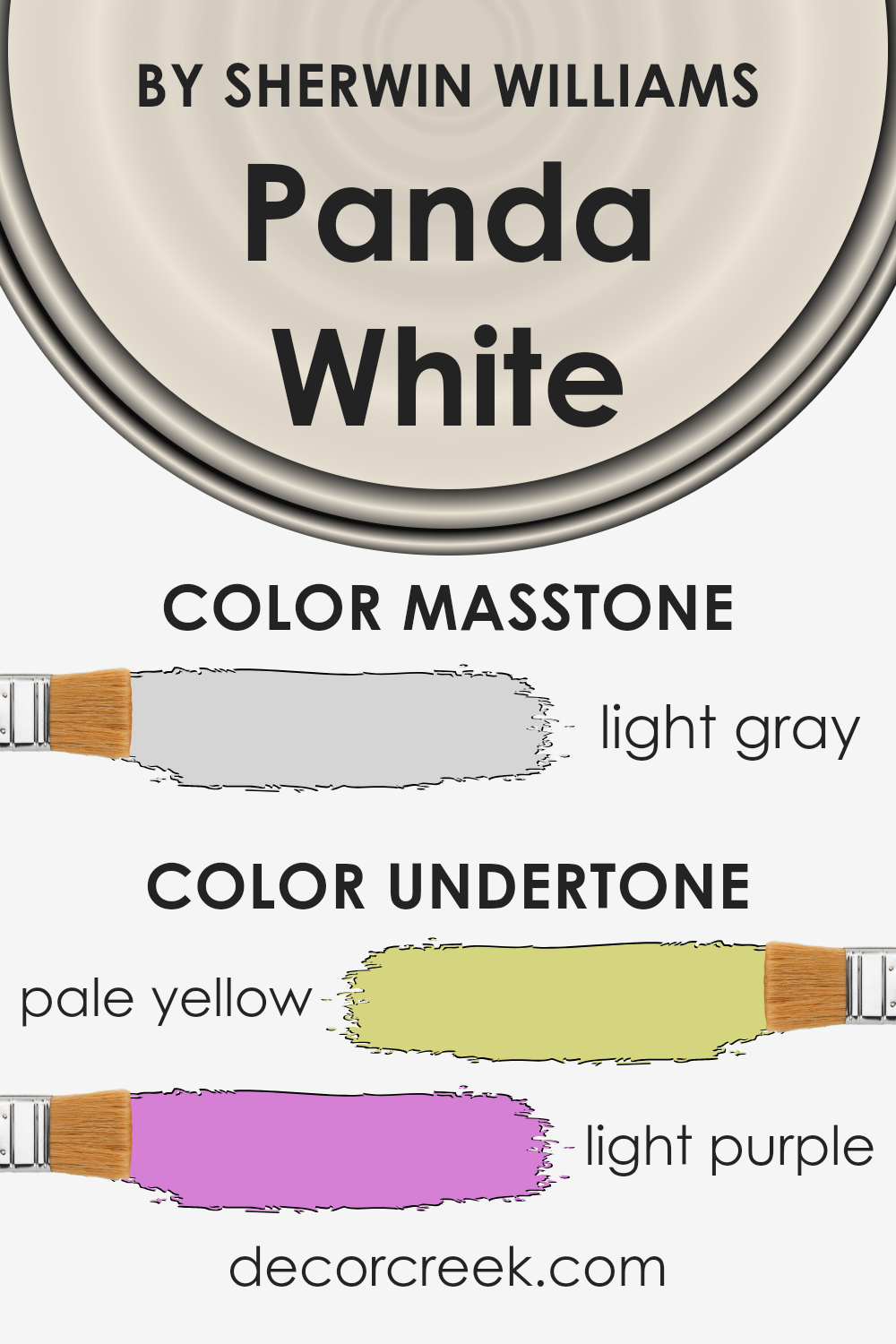
Undertones of Panda White SW 6147 by Sherwin Williams
Panda White by Sherwin Williams is a unique color because of its understated elegance and versatility. What makes this color so special are its understones: pale yellow and light purple. Understanding undertones is crucial because they subtly influence how a color looks in different lighting conditions, affecting the overall mood and ambiance of a room.
Pale yellow undertones add warmth to the paint, making spaces feel cozy and inviting. This warmth can make a room bathed in natural light feel airy and bright, enhancing the sense of spaciousness. Conversely, the light purple undertones introduce a hint of coolness, which can make the color appear slightly more sophisticated and nuanced under certain lighting conditions.
When applied to interior walls, Panda White undergoes a fascinating transformation based on the room’s natural and artificial lighting. During the day, in rooms with plenty of sunlight, the pale yellow undertones might become more pronounced, creating a soft, welcoming glow. In the evenings or in spaces with cooler light sources, the light purple undertones can emerge, giving the walls a subtle depth and complexity.
This interplay between warmth and coolness allows Panda White to adapt to various decor styles and color schemes, making it an incredibly versatile choice for homeowners. Whether you’re aiming for a bright and airy feel or a more grounded, sophisticated look, the underlying hues of pale yellow and light purple can help achieve the desired effect, making the space feel perfectly balanced.
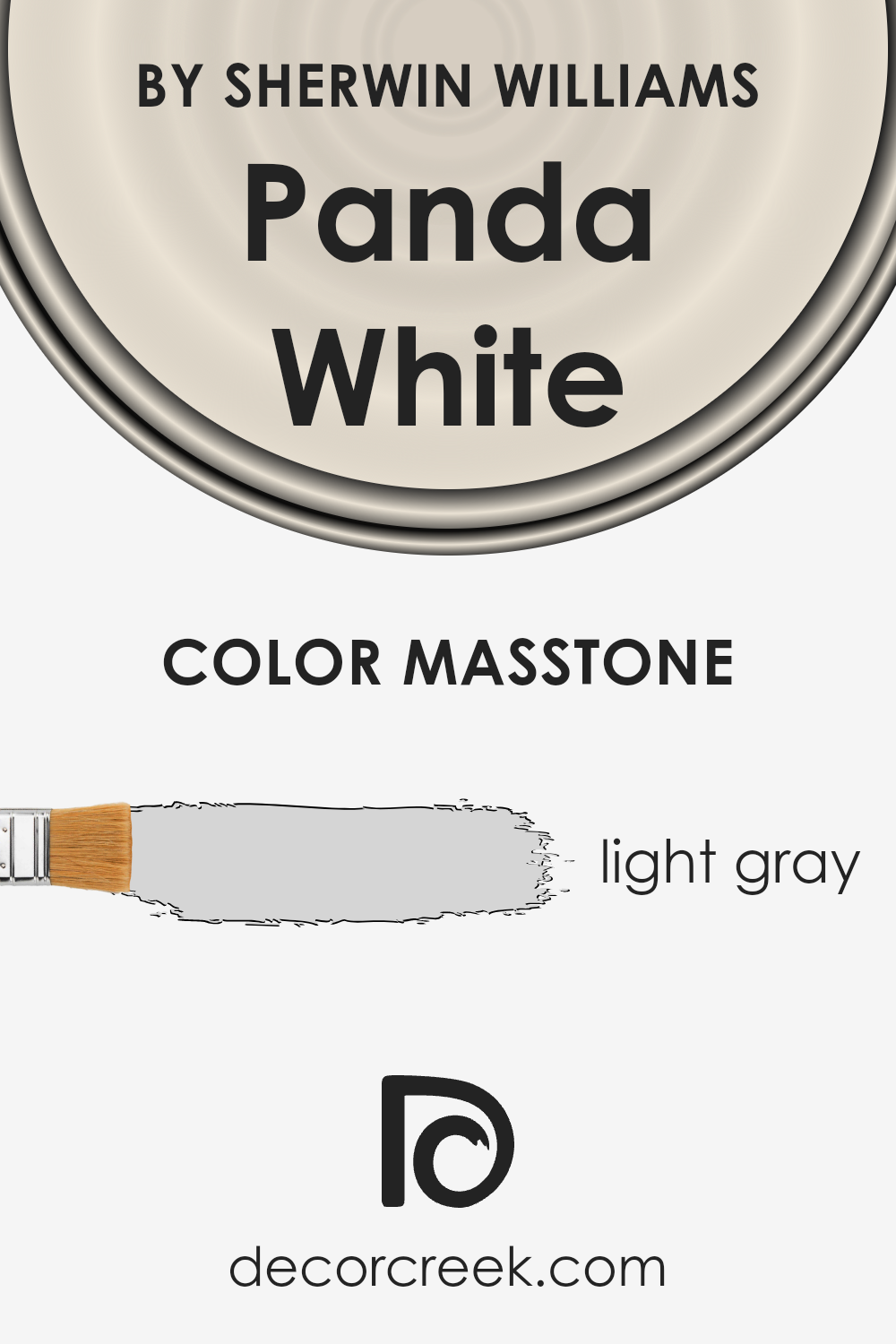
What is the Masstone of the Panda White SW 6147 by Sherwin Williams?
Panda White by Sherwin Williams is a light gray color with the masstone #D5D5D5. This subtle shade has a unique way of bringing a sense of calm and simplicity into homes. Its light gray tone works like magic in spaces, making rooms feel more open and airy. This color is perfect for anyone looking to create a peaceful and serene environment without making the space feel cold or impersonal.
One of the best things about Panda White is how versatile it is. It pairs beautifully with a wide range of colors, from bright and bold hues to more muted tones. This means you can use it in almost any room, whether you want a cozy bedroom or a refreshing living space. It acts as a neutral backdrop that allows other colors to shine, while also adding a touch of sophistication on its own.
Because of its lightness, it can also help in rooms that don’t get a lot of natural light, making them appear brighter and more welcoming. Whether you’re looking to refresh your home’s look or starting from scratch, Panda White offers a fresh, modern feel that’s easy to love.
How Does Lighting Affect Panda White SW 6147 by Sherwin Williams?
Lighting can greatly influence how colors are perceived in a room, including how a specific shade, such as Panda White by Sherwin Williams, presents itself under different lighting conditions. Light sources, whether natural or artificial, can enhance or mute the colors we see, sometimes altering them in fascinating ways.
- Under artificial light, Panda White may shift away from its true color. Depending on the type of bulb used—LED, fluorescent, or incandescent—the perceived color can vary. LED lights, which often have a cooler tone, can make Panda White appear crisper or slightly bluish. In contrast, incandescent bulbs, with their warmer glow, tend to soften this color, giving it a cozier feel. The choice of lighting can thus affect how Panda White contributes to the atmosphere of a room.
- Natural light brings its own set of dynamics. In rooms facing north, which receive less direct sunlight, Panda White might lean towards a cooler, more shadowed appearance, emphasizing its subtle undertones. South-facing rooms bask in abundant daylight, making Panda White look warmer and brighter, enhancing the natural vibrancy of the space.
- East-facing rooms are lit with the soft, warm light of the morning sun, which can make Panda White appear soft and warmly inviting in the morning, transitioning to a cooler tone as the day progresses. Conversely, west-facing rooms capture the evening light, which can imbue the color with a warm, glowing quality towards the end of the day, contrasting with a neutral to cool appearance during the morning and early afternoon.
Understanding these nuances can help in choosing the right color for a room, considering the quality and direction of light it receives. Panda White, with its subtle warmth and versatility, can work beautifully in many spaces, with its perceived color and mood shifting gently with the changing light.
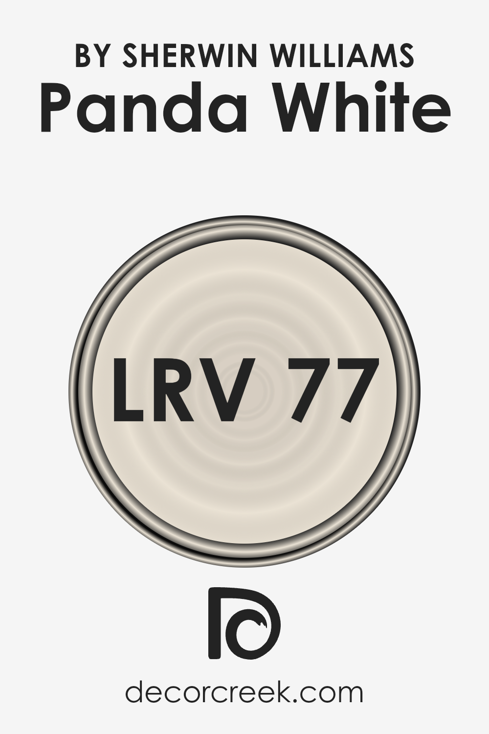
What is the LRV of Panda White SW 6147 by Sherwin Williams?
LRV stands for Light Reflectance Value, and it’s a measure used to indicate how much light a paint color will reflect when it’s applied to a wall. The LRV scale goes from 0 to 100, with 0 being completely black, absorbing all light, and 100 being pure white, reflecting all light back.
This measure is crucial because it helps you understand how light or dark a color will look in your space once it’s on your walls. Paints with higher LRVs reflect more light, making rooms feel brighter and more open, while colors with lower LRVs absorb more light, which can make a space feel cozier but also smaller or darker.
Panda White, with an LRV of 76.505, is on the lighter side of the scale, meaning it will reflect a lot of light. This makes it a great option for spaces you want to feel airy and spacious. In rooms with a lot of natural light, this color will appear even lighter and can help enhance the room’s brightness.
In spaces with less natural light, it can help make the area feel more luminous and less cramped. Since LRV greatly influences the perception of space and light, choosing a color like this with a high LRV can be a strategy to make your room look and feel more inviting and bigger.
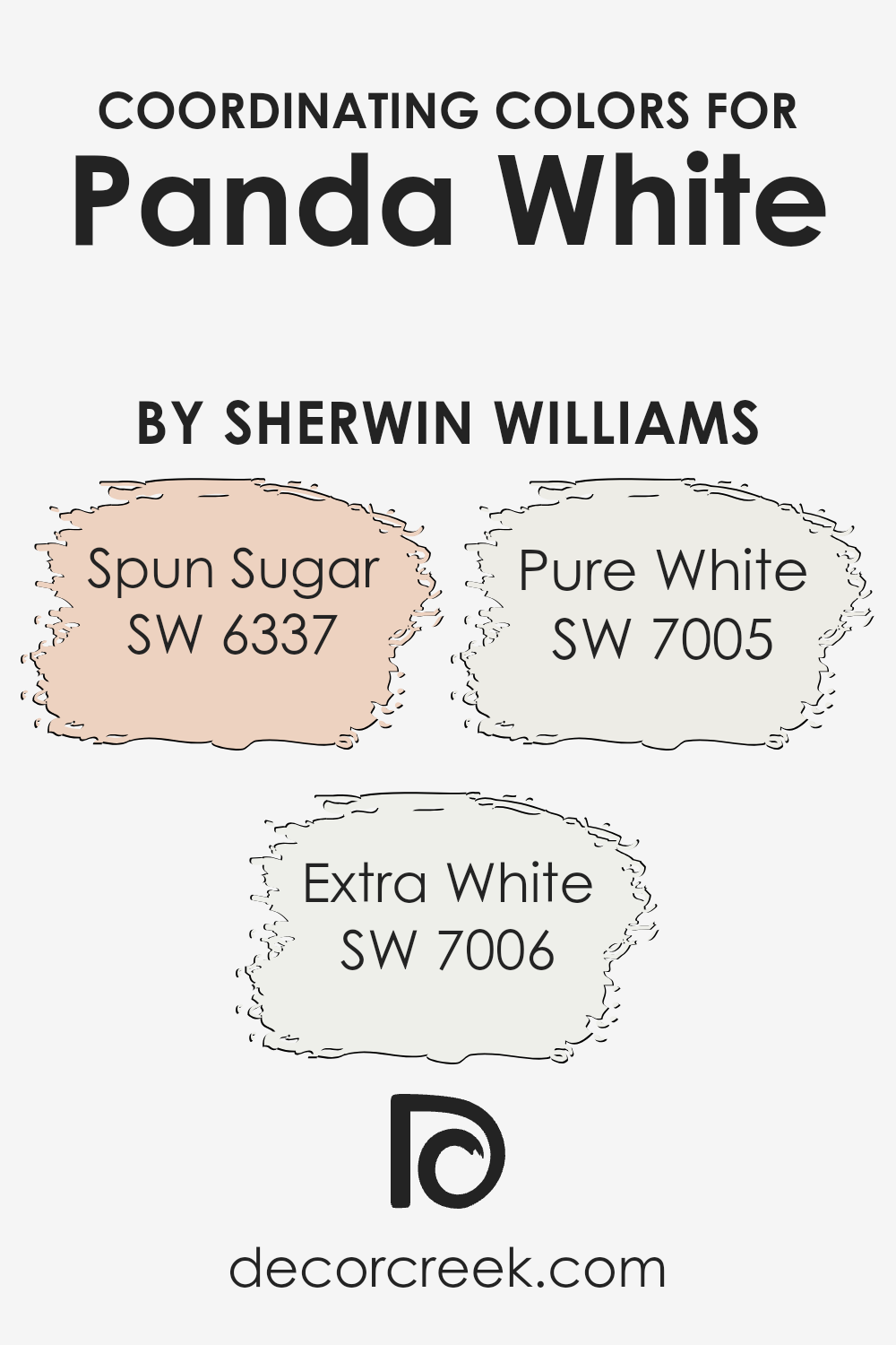
Coordinating Colors of Panda White SW 6147 by Sherwin Williams
Coordinating colors work by complementing one another to create a harmonious color scheme in your space. When used together, these colors enhance the beauty and mood of a room without competing for attention. For instance, when you select a nuanced, warm white like Panda White by Sherwin Williams as your base color, it sets a soft and inviting tone. To harmonize with this, choosing shades that balance well ensures a cohesive look throughout the space.
Spun Sugar is a delicate, blush pink that offers a whisper of color, adding a gentle warmth that’s neither too bold nor overpowering, perfect for creating a serene environment. Its softness pairs beautifully with the subtlety of Panda White, introducing a hint of lighthearted cheerfulness. On the stark end, Extra White presents a clean and crisp appeal, injecting a fresh burst of brightness that can make any room feel more open and airy.
It’s great for trim and ceilings to define spaces crisply against the softer backdrop of Panda White. Lastly, Pure White strikes a balance between warm and cool tones, making it an incredibly versatile partner. It offers a slightly more pronounced contrast to Panda White, ideal for creating depth and interest in spaces that crave a bit of dynamism without straying too far from a neutral palette. These coordinating colors work in tandem to fashion spaces that feel thoughtfully composed and visually appealing.
You can see recommended paint colors below:
- SW 6337 Spun Sugar
- SW 7006 Extra White
- SW 7005 Pure White
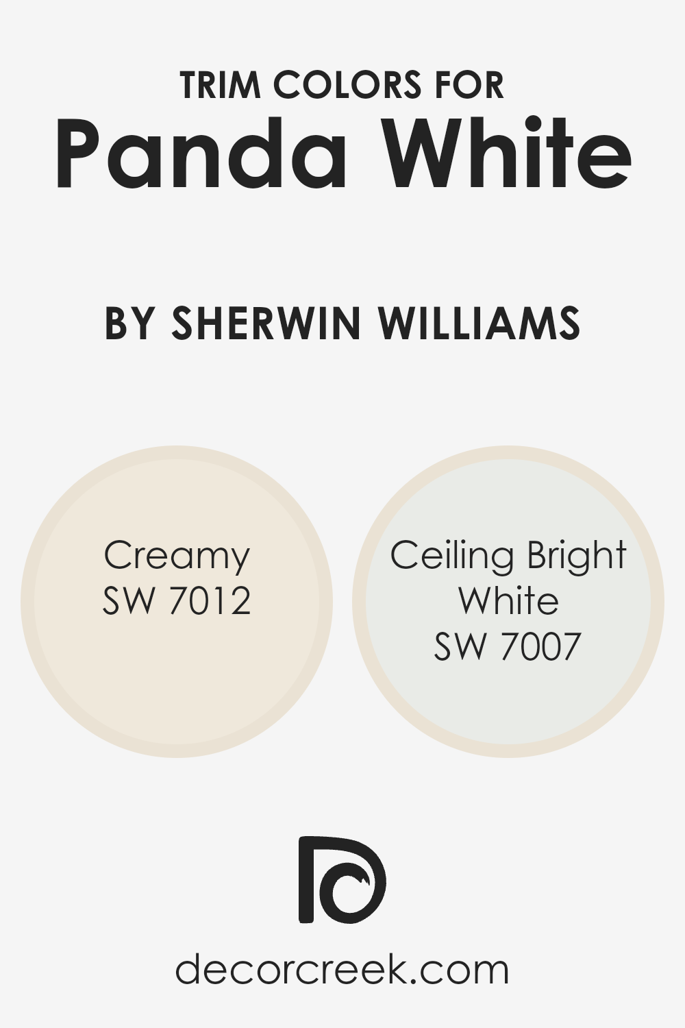
What are the Trim colors of Panda White SW 6147 by Sherwin Williams?
Trim colors play a vital role in the world of interior design, especially when considering a versatile neutral like Panda White by Sherwin Williams. These colors, which are used on moldings, door frames, and other architectural features, add contrast and depth, effectively framing the walls and accentuating the room’s features.
The choice of trim color can either subtly complement the wall color, creating a soft, seamless look, or it can add a striking contrast that highlights the architectural beauty of a room. When paired with a neutral hue like Panda White, selecting the right trim color is crucial for achieving the desired effect, whether it’s to enhance the room’s brightness or to bring a cozy warmth into the space.
Creamy (SW 7012) is a soft, warm hue that blends well with Panda White, offering a harmonious and inviting look. It’s perfect for spaces where a gentle transition between the wall and the trim is desired, creating a cozy and cohesive atmosphere. Ceiling Bright White (SW 7007), on the other hand, is a crisp, clean color that contrasts sharply with Panda White, making it ideal for adding a fresh, vibrant edge to a room.
This color can help to make the ceiling appear higher and the space more expansive, making it a great choice for smaller rooms or spaces with lower ceilings. Both of these trim colors offer unique ways to enhance the beauty and character of Panda White walls, thereby transforming the overall feel of a room.
You can see recommended paint colors below:
- SW 7012 Creamy
- SW 7007 Ceiling Bright White
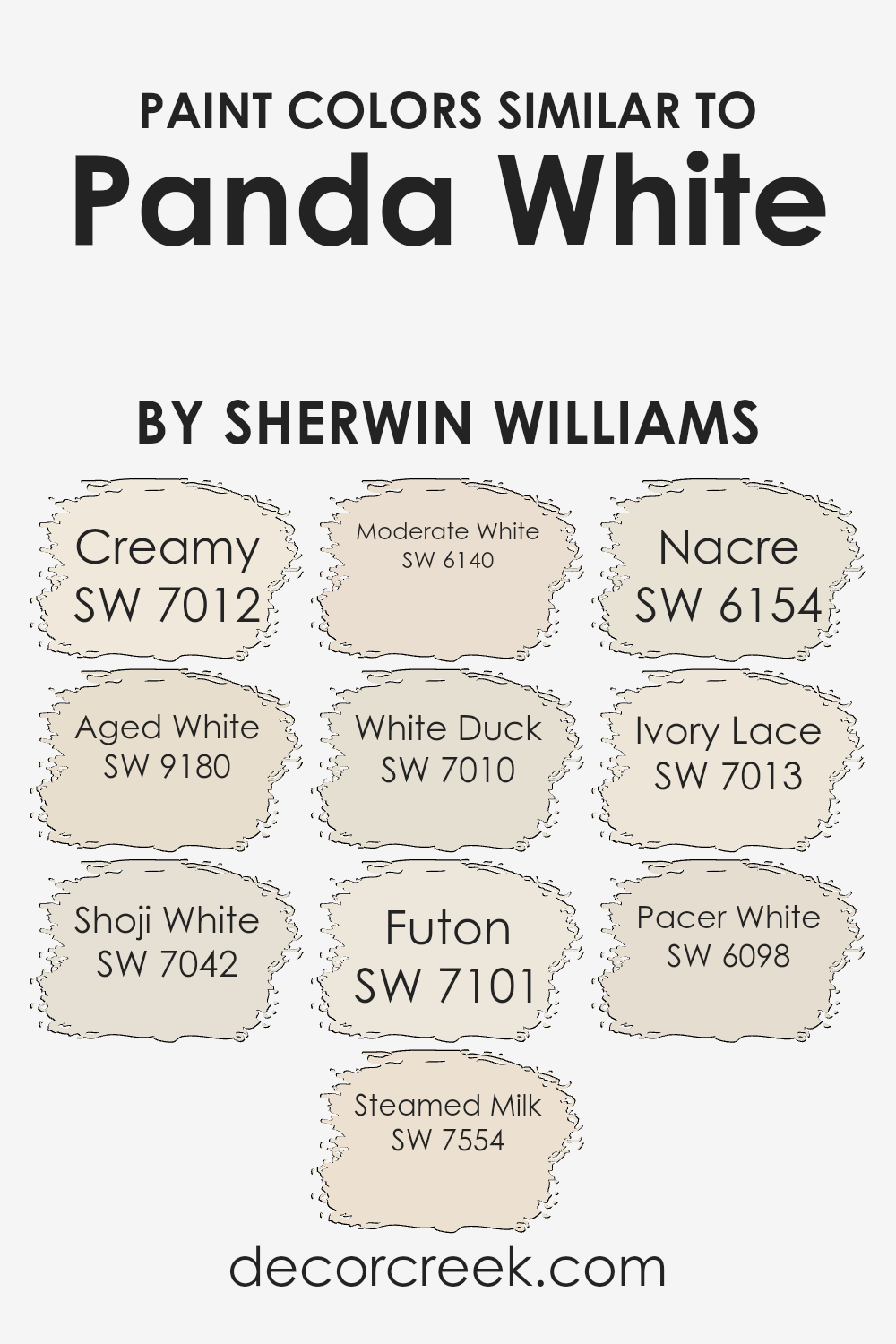
Colors Similar to Panda White SW 6147 by Sherwin Williams
Selecting similar colors is important because they create a harmonious and visually pleasing space. Colors that share a certain similarity, such as those akin to Panda White by Sherwin Williams, work together by providing subtle differences that add depth and complexity without overwhelming the senses. This palette can effectively balance light and warmth, making a room feel inviting and comfortable.
- Starting with Creamy (SW 7012), this shade offers a rich, buttery tone that brings a soft glow to any room, making spaces feel cozy and well-lit.
- Aged White (SW 9180) leans more into a vintage charm with a slightly weathered look that brings a sense of warmth and history.
- Shoji White (SW 7042) is a muted, off-white with a hint of gray, offering a serene backdrop that pairs well with modern and minimalist decors.
- Steamed Milk (SW 7554) has a creamy undertone that creates a soothing and welcoming atmosphere, perfect for living areas.
- Moderate White (SW 6140) subtly blends beige and white, striking a balance that enhances natural light.
- White Duck (SW 7010) softens spaces with its subtle, warm undertones, making rooms feel airy yet grounded.
- Futon (SW 7101) is a light, neutral hue with the ability to make small spaces appear larger while still maintaining a cozy vibe.
- Nacre (SW 6154) has a pearlescent quality that adds a touch of elegance and sophistication. Ivory Lace (SW 7013) is a soft, delicate shade with a slightly romantic appeal, ideal for creating a tranquil retreat.
- Lastly, Pacer White (SW 6098) rounds out the selection with its neutral, versatile appeal that works well in any setting, providing a crisp, clean look.
Together, these colors interplay beautifully to create rooms that are both functional and aesthetically pleasing, making them perfect choices for anyone looking to add a sophisticated touch of warmth and light to their home.
You can see recommended paint colors below:
- SW 7012 Creamy
- SW 9180 Aged White
- SW 7042 Shoji White
- SW 7554 Steamed Milk
- SW 6140 Moderate White
- SW 7010 White Duck
- SW 7101 Futon
- SW 6154 Nacre
- SW 7013 Ivory Lace
- SW 6098 Pacer White
How to Use Panda White SW 6147 by Sherwin Williams In Your Home?
Panda White SW 6147 by Sherwin Williams is a versatile color that anyone can use to freshen up their home. This shade is not just plain white; it has a soft warmth to it that makes spaces feel cozy and inviting. Imagine painting your living room walls with Panda White; it can serve as a perfect backdrop that allows your furniture and decor to really stand out. In the bedroom, this color can help create a peaceful and calm environment, perfect for relaxing after a long day.
Interestingly, Panda White adapts well to different lighting conditions, looking slightly different from morning to evening. This means it can blend well in any room, whether it has lots of natural light or relies more on artificial lighting. You can also use it for trim or cabinets for a subtle contrast against bolder colors. It’s a great way to refresh your space without making a dramatic change. So, if you’re looking to update your home with a color that is both beautiful and easy to work with, Panda White might be the perfect choice for you.
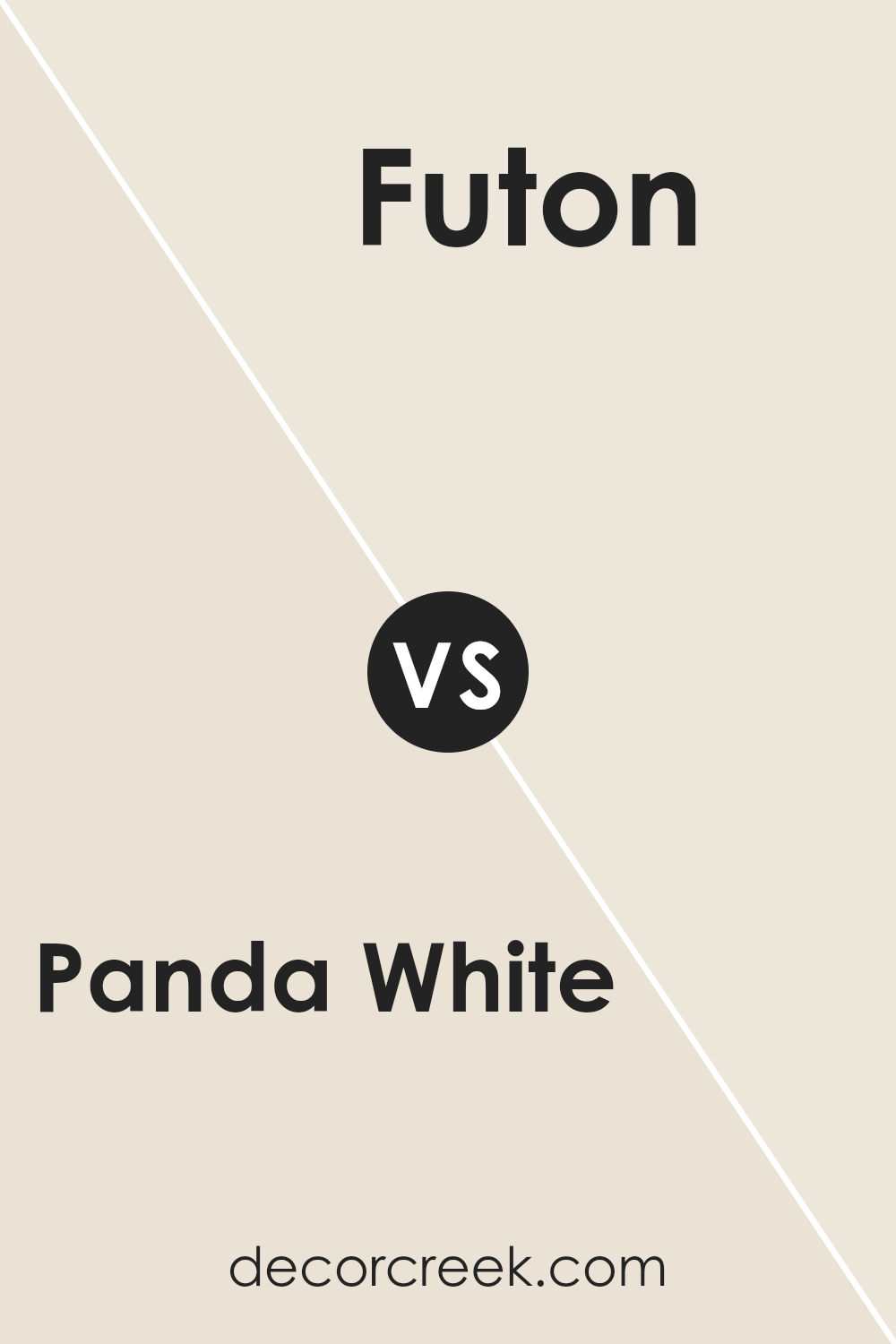
Panda White SW 6147 by Sherwin Williams vs Futon SW 7101 by Sherwin Williams
Panda White and Futon are two paint colors by Sherwin Williams, each offering a unique feel for rooms. Panda White is a soft, warm white with a hint of beige, making it cozy and inviting. It’s great for a space where you want a bright, airy feel without the starkness sometimes associated with pure white. On the other hand, Futon is a bit deeper, sitting comfortably between gray and beige.
This color, often referred to as “greige,” brings a modern and sophisticated vibe to any space. It’s incredibly versatile, working well in both bright and dimly lit rooms, adapting to the surrounding decor to enhance warmth or add a chic, contemporary touch. Together, these colors can create a harmonious balance, with Panda White highlighting brightness and spaciousness, while Futon adds depth and character, grounding the space in warmth and style.
You can see recommended paint color below:
- SW 7101 Futon
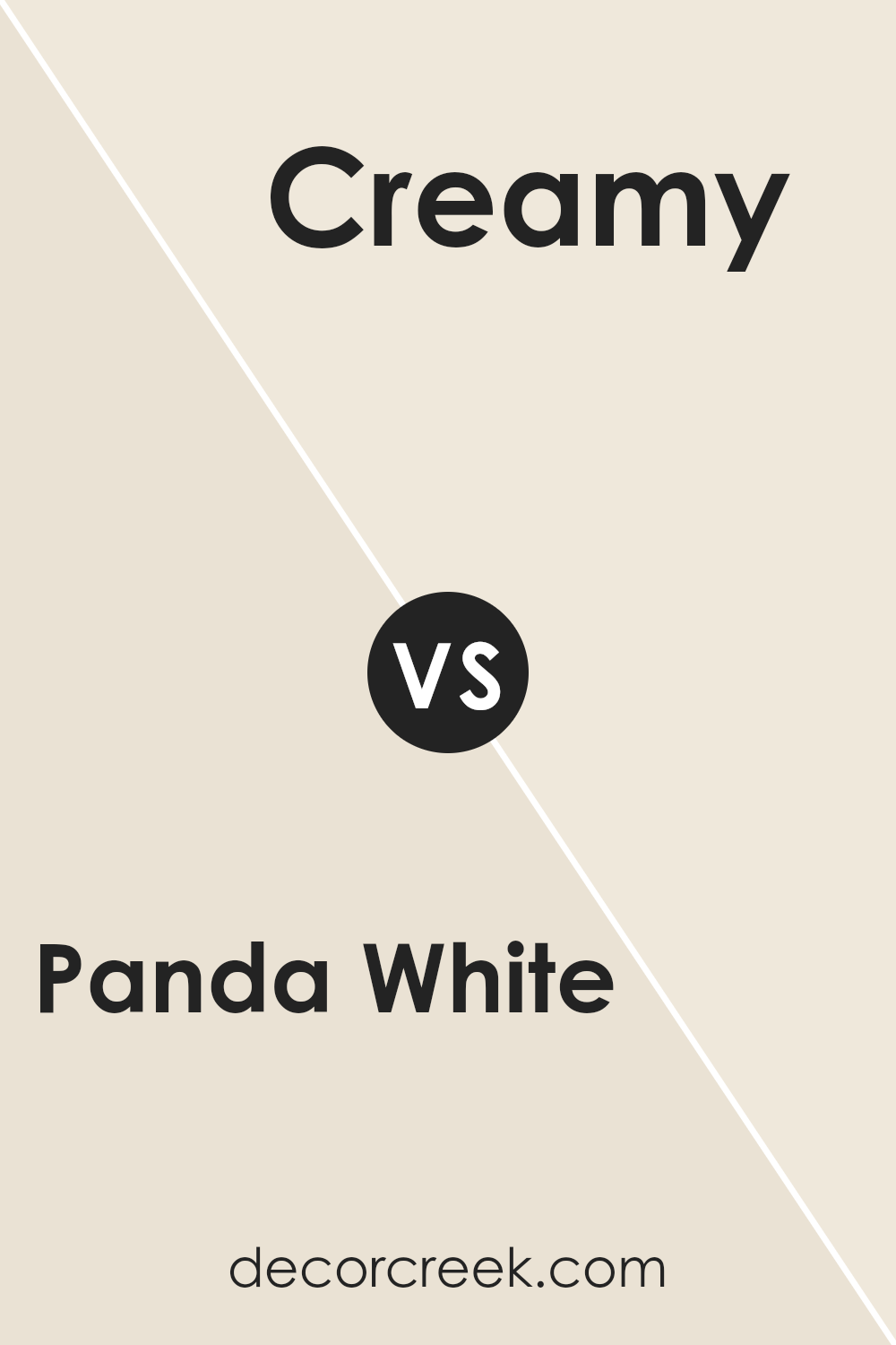
Panda White SW 6147 by Sherwin Williams vs Creamy SW 7012 by Sherwin Williams
Panda White and Creamy by Sherwin Williams are two popular shades that bring their own unique vibe to spaces. Panda White, unlike its name, is not a stark white. It’s a soft, warm hue that gives a cozy and inviting atmosphere to rooms. It leans slightly towards a light beige, making it perfect for those who want the cleanliness of white without the clinical feel.
Creamy, on the other hand, lives up to its name by offering a richer, more buttery tone. This color provides a deeper sense of warmth and comfort, making it ideal for creating snug and welcoming areas. It has a more pronounced yellow undertone compared to Panda White, which adds to its creamy texture, hence the name.
Both colors are fantastic for adding light and coziness to your space, but the choice between them comes down to the level of warmth and the specific undertones you’re looking for. Panda White is more subdued and neutral, great for those seeking a light, airy feel. Creamy is better for those wanting a bit more color and warmth, generating a more enveloping and comforting aura.
You can see recommended paint color below:
- SW 7012 Creamy
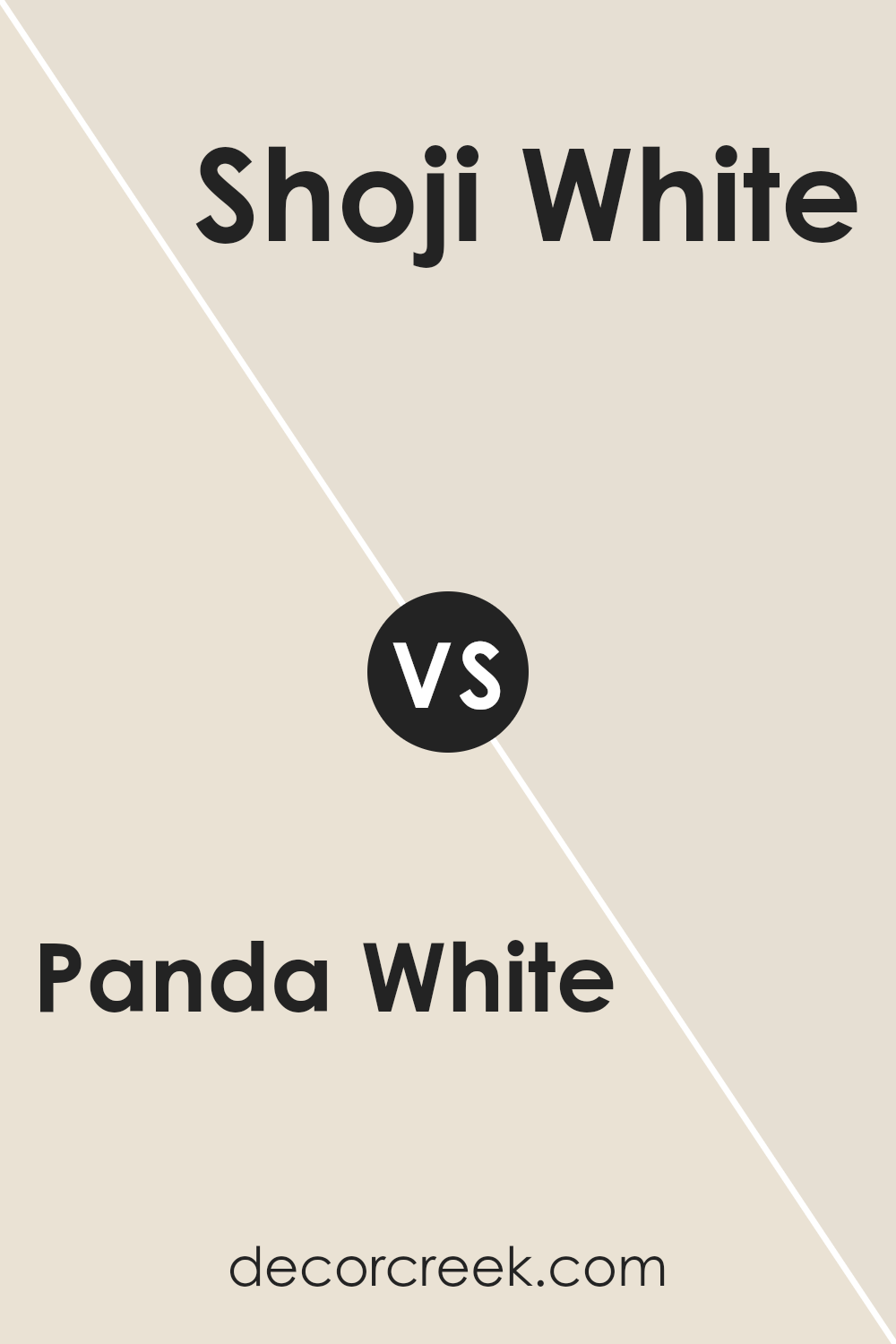
Panda White SW 6147 by Sherwin Williams vs Shoji White SW 7042 by Sherwin Williams
Panda White and Shoji White, both from Sherwin Williams, are unique shades of white that offer subtle differences for your walls. Panda White has a warm undertone that feels cozy and inviting. It’s like a soft blanket wrapped around a room, adding a touch of comfort without overwhelming the space. Think of it as a gentle hug from your home.
On the other hand, Shoji White leans a bit cooler than Panda White, offering a crisp and clean look. It’s like the first cool breeze of fall that refreshes without being too cold. Shoji White brings a sense of calm and simplicity to any space, making it perfect for creating a serene and peaceful environment.
Both colors are versatile and can brighten up a room while still adding character. Whether you choose the cozy warmth of Panda White or the calm clarity of Shoji White, you’re sure to create a welcoming atmosphere in your home. These paints are more than just white; they carry subtle tones that can significantly affect the mood and look of your interiors.
You can see recommended paint color below:
Panda White SW 6147 by Sherwin Williams vs Steamed Milk SW 7554 by Sherwin Williams
Panda White and Steamed Milk, both by Sherwin Williams, share a creamy backbone but differ in mood and tone. Panda White has a soft, airy feel, leaning slightly cooler compared to Steamed Milk. It’s like comparing the lightness of a cloud to the warm, comforting embrace of a warm beverage. On the other hand, Steamed Milk offers a warmer, cozier vibe, reminiscent of its namesake.
Its tone suggests a richness that can make spaces feel more inviting and snug. While both colors can brighten a room, Panda White might be better suited for those seeking a crisper, cleaner look, whereas Steamed Milk could be the go-to for someone wanting to create a warmer, more enveloping atmosphere. Either way, both hues serve as versatile backdrops, capable of complementing a wide range of decor styles while adding their unique touch to the room.
You can see recommended paint color below:
- SW 7554 Steamed Milk
Panda White SW 6147 by Sherwin Williams vs Moderate White SW 6140 by Sherwin Williams
Panda White by Sherwin Williams is a serene and soft hue that brings a subtle vibrancy to spaces. It’s like a gently lit morning, providing a calm and peaceful foundation. This color has a hint of warmth, making it very inviting without overwhelming a room. It’s perfect for creating a soothing atmosphere that still feels connected and lively.
In contrast, Moderate White by Sherin Williams takes a step back into a more reserved territory. It leans towards a neutral palette, offering a quiet background that blends seamlessly into various decor styles. This color is like a soft whisper in a room, where its presence is felt more in its subtlety than in a pronounced statement. It’s ideal for those looking to achieve an understated elegance, where the color supports rather than dominates the space.
Both Panda White and Moderate White share a common ground in their ability to create warm and inviting spaces. However, Panda White holds a slightly brighter character, while Moderate White offers a more muted backdrop.
You can see recommended paint color below:
- SW 6140 Moderate White
Panda White SW 6147 by Sherwin Williams vs Nacre SW 6154 by Sherwin Williams
Panda White and Nacre are two shades from Sherwin Williams, each with their own unique vibe. Panda White is a soft, warm white that’s versatile and can easily fit into any space without overwhelming it. It’s like a cozy blanket of snow, offering a subtle backdrop that complements other colors beautifully.
On the other hand, Nacre takes it up a notch by adding a touch of creaminess, making spaces feel more inviting and rich. It’s not just a plain white; it’s like a warm hug, adding depth to rooms in a more pronounced way than Panda White. While both colors share a base of white, Nacre’s creamy undertones set it apart, giving interiors a more layered and cozy atmosphere.
In essence, if you’re after a clean, straightforward look, Panda White is your go-to. But if you want that extra warmth and a hint of elegance, Nacre will do the trick. Both shades offer a fantastic base, but their slight differences can impact the mood and style of a room significantly.
You can see recommended paint color below:
- SW 6154 Nacre
Panda White SW 6147 by Sherwin Williams vs Aged White SW 9180 by Sherwin Williams
Panda White and Aged White are both colors by Sherwin Williams, offering subtle yet distinct vibes for any space. Imagine Panda White as a soft, gentle white with a hint of warmth, making rooms feel fresh and inviting without being stark. It’s like a bright, sunny day, illuminating walls with a soft glow. On the other hand, Aged White steps in with a bit more depth, bringing a cozy, vintage feel.
This color is like an old, cherished book – warm, comfortable, and full of stories. It has a touch of beige or cream, adding character and warmth, perfect for creating a snug and welcoming atmosphere. When comparing the two, Panda White leans more towards a clean, pure backdrop, while Aged White offers a hint of nostalgia, making spaces more intimate and lived-in. Both colors are versatile, but the choice between them depends on the mood you want to set: bright and airy with Panda White or warm and cozy with Aged White.
You can see recommended paint color below:
- SW 9180 Aged White
Panda White SW 6147 by Sherwin Williams vs Pacer White SW 6098 by Sherwin Williams
Panda White and Pacer White are both paint colors from Sherwin Williams, but they have their distinct characteristics. Panda White is a soft, warm white that has a slight hint of beige. It’s the kind of white that brings a cozy and welcoming feel to a room without making it feel stark or cold. It’s versatile and can fit beautifully in most spaces, whether you’re aiming for a modern or more traditional look.
On the other hand, Pacer White leans more towards a true, neutral white. It doesn’t carry as much warmth as Panda White, making it a good choice for those who prefer a cleaner, brighter look. Pacer White is excellent for spaces where you want to maximize the feeling of light and openness, making rooms appear larger and more airy.
Both colors are great options, but your choice depends on the mood you want to create. Panda White is perfect for a cozy, inviting atmosphere, while Pacer White is ideal for a crisp, open, and bright space.
You can see recommended paint color below:
- SW 6098 Pacer White
Panda White SW 6147 by Sherwin Williams vs Ivory Lace SW 7013 by Sherwin Williams
Panda White and Ivory Lace, both from Sherwin Williams, are elegant colors, yet they have their distinct features. Panda White, despite what its name might suggest, isn’t a stark white. It’s a soft, warm shade that leans slightly towards a very light gray or off-white. This makes it versatile and comforting, particularly good for creating a cozy atmosphere without the sharp brightness of pure white.
On the other hand, Ivory Lace is a bit closer to what you might traditionally think of when you hear “ivory” – a smooth, creamy color. It’s warmer than Panda White, with a hint of yellow undertones that gives it a welcoming feel. This warmth makes Ivory Lace perfect for spaces where you want a touch of coziness and inviting light, without going too bright.
In comparison, Panda White offers a more neutral backdrop, making it easier to pair with various colors and decor styles. Ivory Lace, with its warmer, creamier appearance, is ideal for creating a snug, intimate environment. Both are beautiful in their own right, but your choice between them would depend on the specific atmosphere you’re aiming to achieve.
You can see recommended paint color below:
Panda White SW 6147 by Sherwin Williams vs White Duck SW 7010 by Sherwin Williams
Panda White and White Duck, both from Sherwin Williams, are two subtle colors that at first glance might seem similar, but they have distinct differences. Panda White leans towards a soft, warm hue that brings a cozy and welcoming feel to any space. It’s not a pure white; instead, it has a slight creamy nature which makes it perfect for creating a gentle ambiance.
On the other hand, White Duck is a bit cooler compared to Panda White. It still falls into the category of warm whites but carries a hint of gray that gives it a more neutral appearance. This makes White Duck an excellent choice for those looking for a white that straddles the line between warm and cool, offering flexibility in pairing with various decor styles.
Choosing between Panda White and White Duck depends on the room and the mood one wishes to create. Panda White works well in spaces where a touch of warmth is desired, while White Duck is ideal for those who prefer a cleaner, more understated look. Both colors offer their unique charm, making any space inviting and stylish.
You can see recommended paint color below:
- SW 7010 White Duck
Conclusion
Panda White by Sherwin Williams is a versatile color that strikes a perfect balance between warm and cool tones, making it an excellent choice for those looking to add a touch of sophistication and calmness to their space.
Its neutral nature allows it to blend seamlessly with a variety of decor styles and colors, making it an ideal backdrop for both contemporary and traditional settings. This color can effortlessly create a cozy atmosphere in a room while also serving as a subtle canvas for accentuating other elements within the space.
Homeowners and designers appreciate Panda White for its ability to enhance natural light in a room, giving spaces a bright and airy feel without the starkness that comes with pure white. Its understated elegance offers a sense of serenity and spaciousness, making it a go-to choice for bedrooms, living rooms, and even kitchens. Whether used as a main wall color or as a complement to bolder hues, Panda White brings a refined and inviting ambiance to any room, proving its worth as a timeless option in the world of interior design.
Ever wished paint sampling was as easy as sticking a sticker? Guess what? Now it is! Discover Samplize's unique Peel & Stick samples.
Get paint samples
