Introducing SW 7512 Pavilion Beige by Sherwin Williams, a paint color that has gained popularity for its unique and versatile shade. This particular beige isn’t just any beige; it’s a blend that brings a sense of warmth and sophistication to any room. Perfect for those looking to add a touch of elegance without overwhelming a space, Pavilion Beige stands out for its adaptability. Whether you’re aiming to create a cozy living room, a serene bedroom, or even a welcoming kitchen, this color has the ability to transform your space in a subtle yet significant way.
What sets Pavilion Beige apart is its ability to complement a wide range of décor styles and preferences. From modern to rustic, minimalist to eclectic, this shade works harmoniously with various textures and colors. If you’re planning a home makeover or selecting a palette for a new house, considering SW 7512 Pavilion Beige can be a smart move. It acts as a neutral backdrop that allows your furniture and décor to take center stage, while still adding character and warmth to the room. Let’s explore how this Sherwin Williams color can make a difference in your home, offering a fresh and inviting atmosphere.

What Color Is Pavilion Beige SW 7512 by Sherwin Williams?
Pavilion Beige by Sherwin Williams is a warm, inviting neutral that offers a perfect balance between a light beige and a soft gray. This versatile shade brings a sense of calm and understated elegance to any room, making it a go-to choice for those looking to create a cozy yet sophisticated space. Its subtle warmth makes it incredibly adaptable to a variety of interior styles, from modern farmhouse and Scandinavian minimalist to traditional and contemporary designs.
What sets Pavilion Beige apart is its ability to act as a neutral backdrop that enhances natural light, making spaces feel more open and airy. It complements a wide range of materials and textures, pairing beautifully with natural wood finishes, from light oaks to rich walnuts, adding depth and interest to the interiors. It also works harmoniously with metal accents like brass or copper, bringing a touch of glam to the overall aesthetic. Textiles in soft linen, chunky wool, or even luxurious velvet look particularly stunning against this neutral hue, allowing for a layered look that feels cozy and inviting.
In terms of interior styles, Pavilion Beige seamlessly blends with minimalist designs, where its simplicity can be the foundation for a clean and peaceful space. It’s equally at home in more dynamic settings, where it can balance bolder patterns and colors, making it an ideal choice for anyone looking to create a versatile and welcoming home.
Is Pavilion Beige SW 7512 by Sherwin Williams Warm or Cool color?
Pavilion Beige by Sherwin Williams is a warm, inviting neutral that adds a cozy vibe to any room. It’s a versatile shade that pairs well with a wide range of colors, from bold and bright to soft and subtle. The beauty of Pavilion Beige lies in its ability to create a serene and welcoming atmosphere, making it perfect for living rooms, bedrooms, or any space where comfort is key.
This color has a fantastic way of making spaces feel more open and airy, yet retains a sense of warmth. It’s ideal for those looking to inject a subtle hint of color into their homes without overwhelming the space. The warmth of Pavilion Beige also means it works wonders in rooms with natural light, enhancing the feeling of brightness and space, and in artificial light, it keeps the room feeling cozy.
Pavilion Beige has the power to transform a room into a haven of calm and relaxation. Whether you’re aiming for a classic look or something more modern, this color provides a solid foundation that can be built upon with various textures and accent colors. It’s particularly effective in achieving a chic, understated look that stands the test of time.
Undertones of Pavilion Beige SW 7512 by Sherwin Williams
Pavilion Beige is a subtle and warm beige paint color that offers more than meets the eye at first glance. This color is not just a simple beige; it’s a complex hue with a blend of various undertones that can significantly affect how it looks in different settings and lighting.
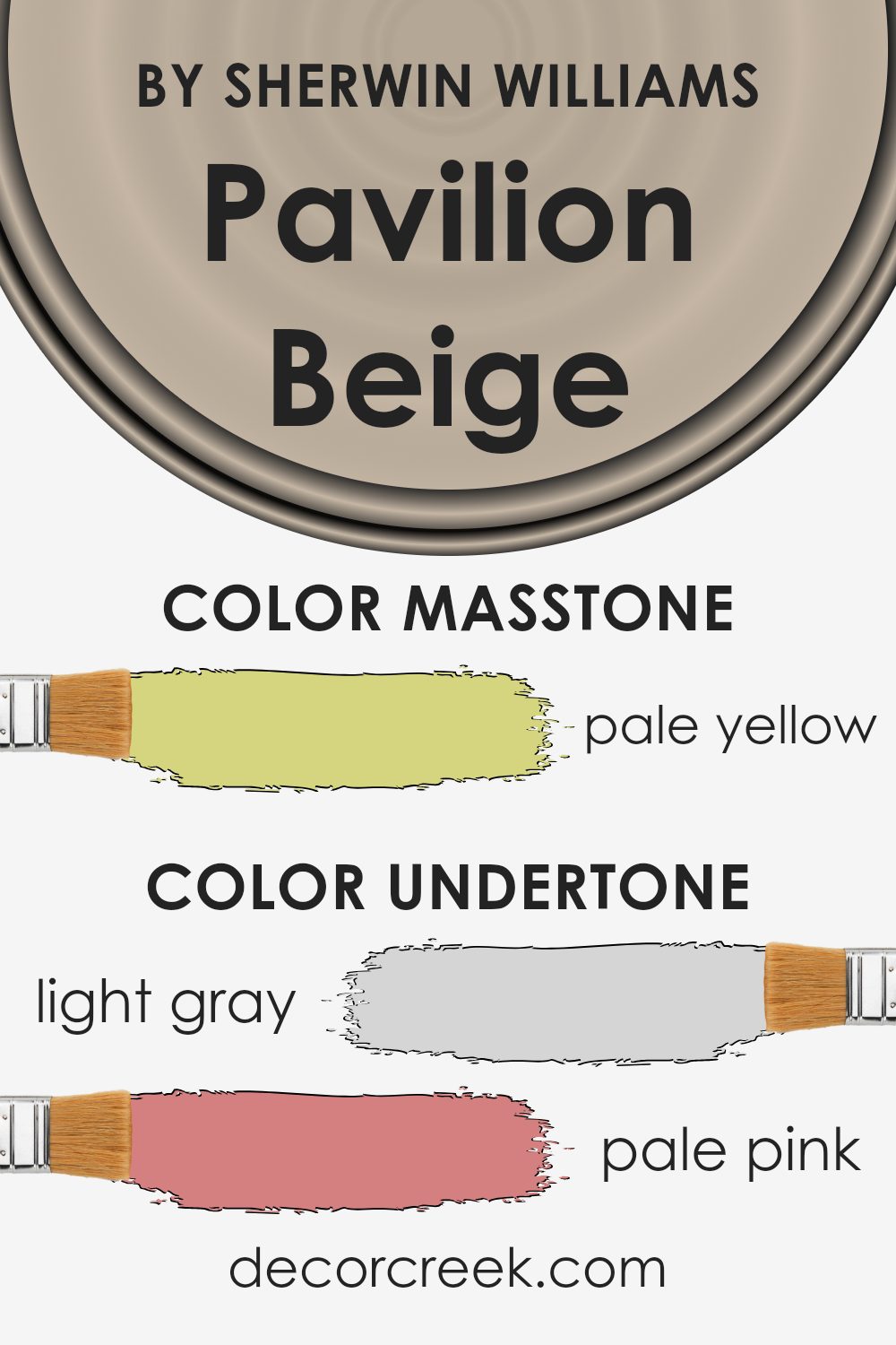
Undertones are essentially the colors lurking beneath the surface of the main color. They can skew a neutral color warmer or cooler, depending on their hue. For Pavilion Beige, these undertones include light gray, pale pink, light purple, mint, light blue, grey, lilac, yellow, orange, light green, and olive. Each of these undertones contributes to Pavilion Beige’s versatility and complexity, impacting the overall mood and feel of a space.
When painting interior walls with Pavilion Beige, these undertones come into play, subtly influencing the color’s appearance under different lighting conditions. During the day, natural light can highlight Pavilion Beige’s warmer tones, making a room feel cozy and welcoming. Artificial lighting, depending on its color temperature, can either enhance the beige’s softness with a creamy glow or bring out its cooler aspects, making the walls seem crisper.
Understanding Pavilion Beige’s undertones helps in choosing decor and accents that harmonize with the wall color. For instance, pairing it with warmer hues can amplify the cozy ambiance, while cool-toned furnishings might bring out the sophistication of its gray or blue undertones. Essentially, these undertones allow Pavilion Beige to adapt and complement a wide range of interior styles and color schemes, making it a versatile choice for any room.
What is the Masstone of the Pavilion Beige SW 7512 by Sherwin Williams?
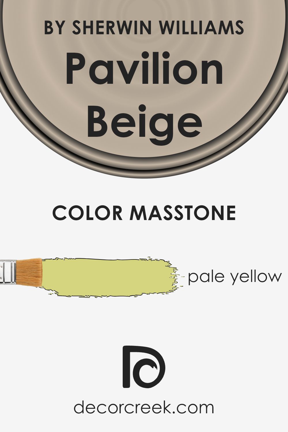
Pavilion Beige by Sherwin Williams is a unique shade that truly stands out for its versatility and warmth. The masstone of this color, a pale yellow, gives it a soft, inviting appearance that can light up any space. When you apply it to a room, it brings a sunny, cheerful vibe without being overwhelming. This light yellow hue blends seamlessly with a variety of decor styles and colors, making it a perfect choice for anyone looking to refresh their home.
In homes, the impact of this pale yellow tone is both subtle and significant. It has the power to make small rooms appear more spacious and dark spaces feel brighter. Furthermore, it creates a calm and cozy atmosphere, ideal for living rooms and bedrooms where comfort is a priority. Its understated elegance also makes it a great backdrop for artwork and furniture, allowing them to shine without competing with the wall color. Overall, Pavilion Beige offers a balance of warmth and light, enhancing the beauty of your home in a natural and effortless way.
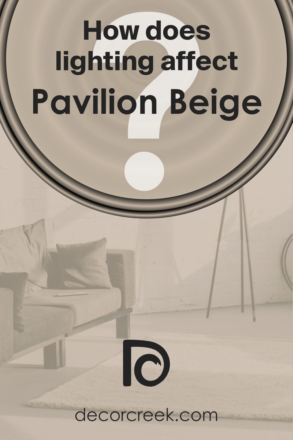
How Does Lighting Affect Pavilion Beige SW 7512 by Sherwin Williams?
Lighting plays a crucial role in how we perceive colors around us. Essentially, the type and quality of light can dramatically change the appearance of a color. This concept is key when considering wall colors for your space, such as Pavilion Beige by Sherwin Williams.
- In artificial light, the impact on Pavilion Beige can vary significantly based on the light bulb’s color temperature. Warmer lights tend to enhance the beige, giving it a cozier, more inviting feel. It becomes richer and more vibrant, perfect for living spaces or bedrooms where you want a warm ambiance. In contrast, cooler lights may make this beige appear more neutral or slightly cooler, which might suit modern, minimalistic spaces well.
- Natural light brings out the truest version of Pavilion Beige, but the amount and direction of the light can alter its perception. North-faced rooms receive less direct sunlight, making colors appear slightly cooler and more muted. Here, Pavilion Beige would look more subdued, maintaining a calm and serene vibe, ideal for creating a peaceful retreat.
- South-faced rooms, basked in abundant sunlight, can make Pavilion Beige feel warmer and brighter, enhancing its welcoming nature. This could make the space feel airy and vibrant, ideal for social areas like the living room.
- In east-faced rooms, the color will change throughout the day. Morning light can make Pavilion Beige look soft and warm, perfect for starting the day on a positive note. As the day progresses and the direct sunlight moves away, the color may become cooler, retaining a gentle, soothing atmosphere.
- West-faced rooms will have the opposite effect. During afternoons and evenings, as the sun sets, the warm light intensifies the warmth of Pavilion Beige, making spaces feel cozy and snug. This is great for dining rooms or any space where you want to relax in the evening.
Overall, lighting—whether artificial or natural—significantly influences how Pavilion Beige and indeed any color, is perceived, making it a vital consideration in decorating and design.
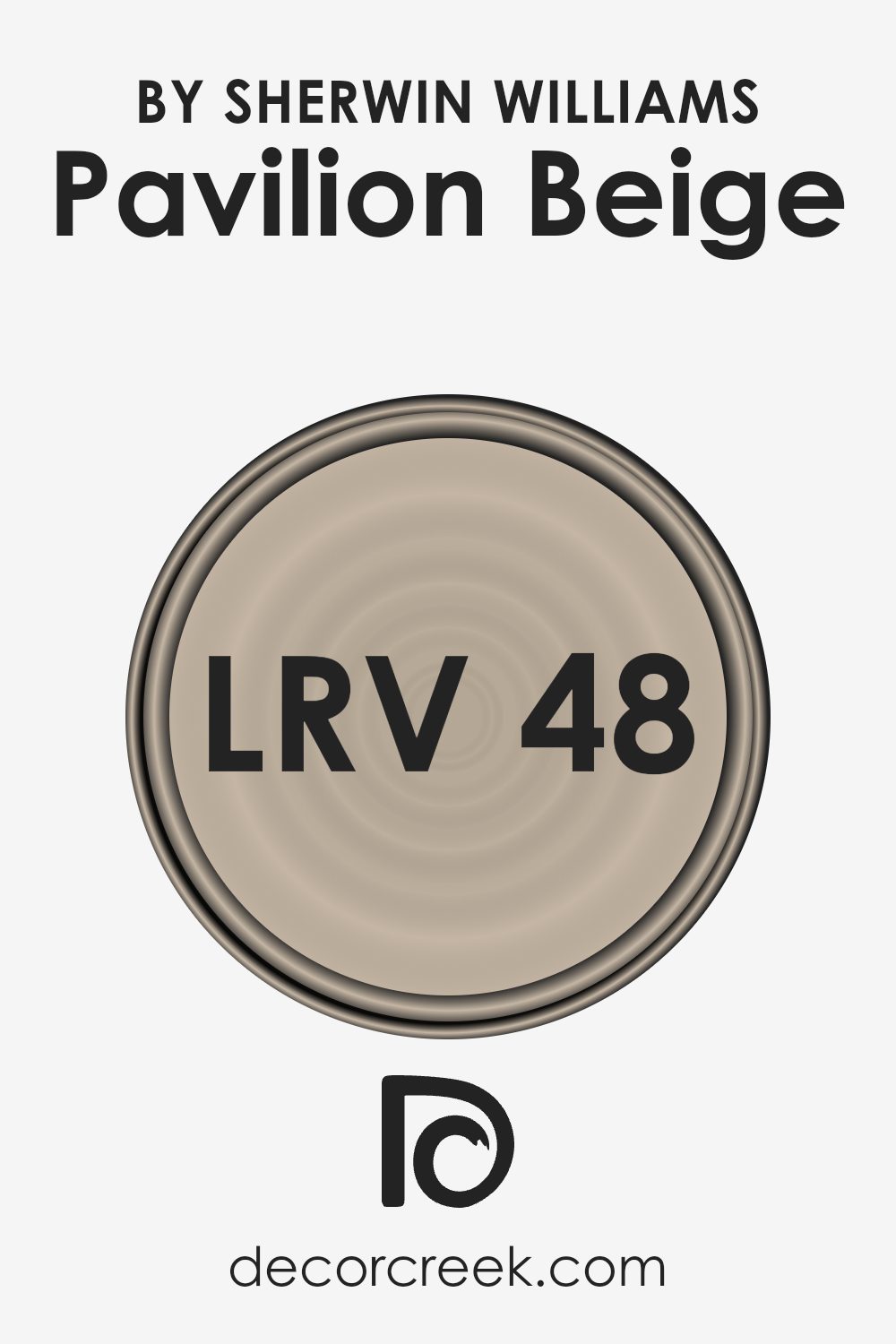
What is the LRV of Pavilion Beige SW 7512 by Sherwin Williams?
LRV stands for Light Reflectance Value, and it measures the percentage of light a paint color reflects from or absorbs into a painted surface. This scale goes from 0, which is pure black, absorbing all light, to 100, which is pure white, reflecting all light. LRV is an important factor to consider when choosing paint because it can significantly affect the appearance and ambiance of a room. Colors with higher LRV make spaces appear brighter and bigger because they reflect more light. Conversely, colors with lower LRV can make a space feel cozier and smaller as they absorb more light.
For the color Pavilion Beige with an LRV of 47.972, it stands near the middle of the LRV scale. This means it neither reflects nor absorbs light excessively, making it a versatile choice for many spaces. In a room with plenty of natural light, Pavilion Beige will appear lighter and more open, enhancing the feeling of space without being too stark. In rooms with less natural light, it will contribute to a warm and inviting atmosphere, without making the space feel cramped or too dark. This balanced LRV makes Pavilion Beige a flexible color that can adapt well to various lighting conditions and design styles.
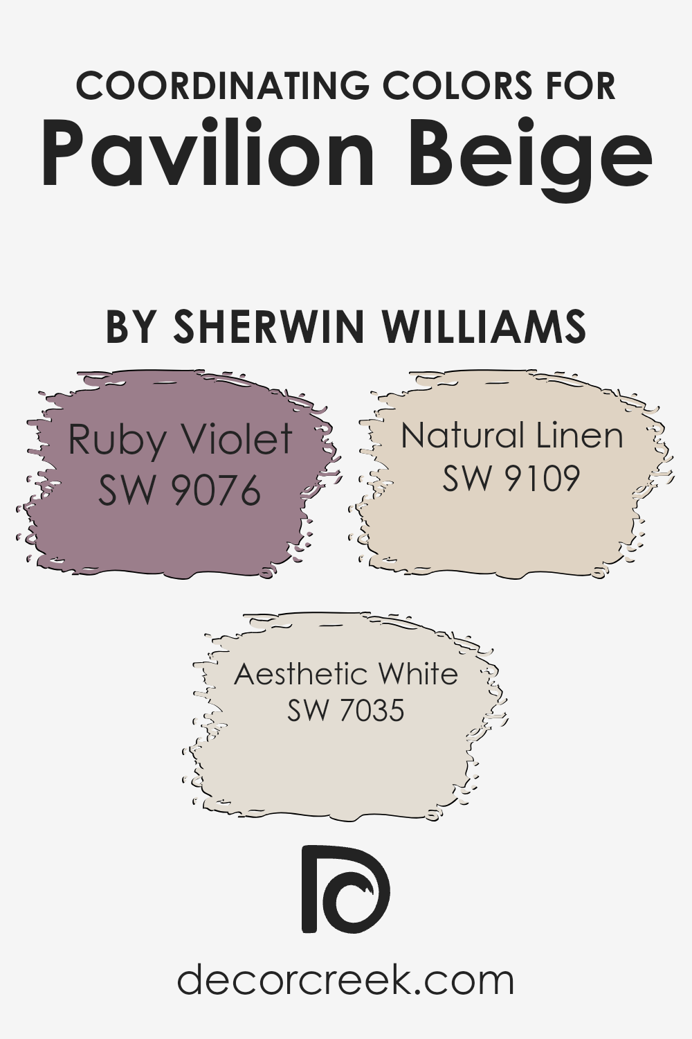
Coordinating Colors of Pavilion Beige SW 7512 by Sherwin Williams
Coordinating colors are complementary shades that work well together to enhance the overall aesthetic of a space. They are chosen to create a pleasing color scheme that brings balance and harmony. The idea is to select colors that complement each other and the primary color, in this case, Pavilion Beige by Sherwin Williams, without clashing or overwhelming the space. These colors are strategically picked to accentuate key design elements, add depth, and inject personality into a room. When used thoughtfully, coordinating colors can transform an ordinary space into a cohesive and inviting one.
Among the coordinating colors for Pavilion Beige, Ruby Violet offers a rich and deep accent that adds a touch of sophistication and warmth to spaces. This vibrant hue can make a bold statement or provide an elegant backdrop when used sparingly.
Aesthetic White, on the other hand, is a versatile and soft neutral that brightens and expands a space, creating a serene and calming atmosphere. It works seamlessly with Pavilion Beige to offer a subtle contrast that enhances natural light. Lastly, Natural Linen brings a comfortable and cozy feel, its earthy tone serving as the perfect middle ground between the warmth of Ruby Violet and the crispness of Aesthetic White. This combination of colors ensures a well-rounded and appealing palette that complements Pavilion Beige beautifully.
You can see recommended paint colors below:
- SW 9076 Ruby Violet
- SW 7035 Aesthetic White
- SW 9109 Natural Linen
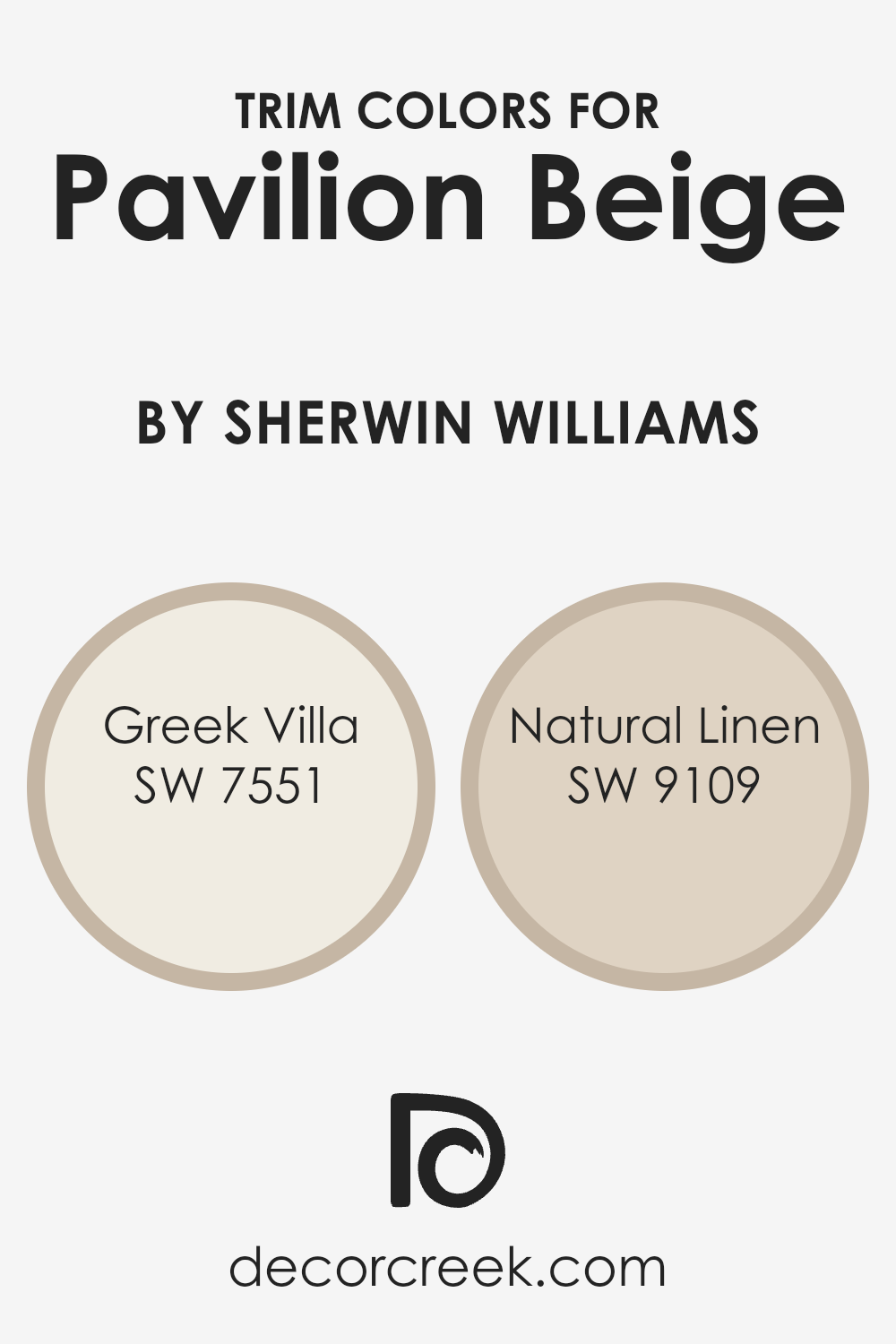
What are the Trim colors of Pavilion Beige SW 7512 by Sherwin Williams?
Trim colors are essentially the accents used in painting to highlight or complement the main color of a wall or structure, which in this case is Pavilion Beige by Sherwin Williams. Choosing the right trim color is crucial because it helps to define and enhance the architectural features of a room or exterior, giving depth and dimension to the space. Trim colors can make a significant difference in the overall appearance, creating contrast or harmony depending on the chosen hues. For Pavilion Beige, a color known for its understated elegance and warm neutrality, selecting the appropriate trim colors is essential to bring out its best qualities without overwhelming it.
Greek Villa (SW 7551) and Natural Linen (SW 9109) are two trim colors that work beautifully with Pavilion Beige. Greek Villa is a soft, creamy white with a hint of warmth, making it a perfect complement to Pavilion Beige by brightening the space without creating a stark contrast. It’s like a gentle whisper along the edges of a room, subtly framing the beige with a soft glow. On the other hand, Natural Linen offers a deeper, cozier warmth, akin to the comfort of a well-loved linen garment. It’s slightly richer than Pavilion Beige but still in harmony, providing a soothing transition from the walls to trim that enriches the whole space. Both colors offer a way to subtly enhance the calming and welcoming feel of Pavilion Beige, making them ideal choices for a refined and inviting atmosphere.
You can see recommended paint colors below:
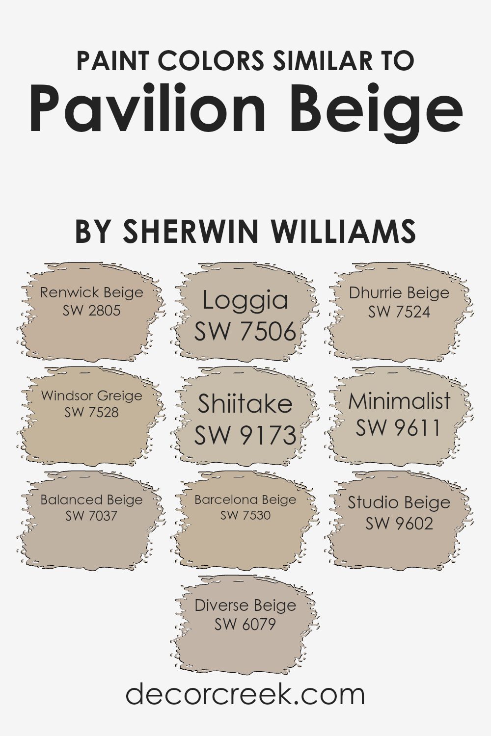
Colors Similar to Pavilion Beige SW 7512 by Sherwin Williams
Choosing similar colors can significantly enhance the visual appeal and cohesion of a space. Specifically, colors akin to Pavilion Beige by Sherwin Williams, such as Renwick Beige and Windsor Greige, contribute to a warm and inviting atmosphere. These tones offer a subtle variation, enabling a seamless blend from one room to another, thus creating a unified look throughout your home. Balanced Beige and Diverse Beige further extend this palette, adding depth and versatility. These shades work particularly well in areas where natural light varies, adapting to the changes and maintaining the room’s cozy vibe throughout the day.
Continuing with the theme of similar colors, Loggia and Shiitake introduce a slightly earthier feel, grounding the aesthetic with their richer undertones. This transition allows for more dynamic and layered interior designs. Barcelona Beige, Dhurrie Beige, Minimalist, and Studio Beige also play into this narrative, offering a range of hues that balance warmth with neutrality. These colors ensure that spaces feel open and airy yet exude warmth and comfort. Including these tones in your decor strategy can make for an effortlessly sophisticated space, proving the importance and effectiveness of selecting similar colors.
You can see recommended paint colors below:
- SW 2805 Renwick Beige
- SW 7528 Windsor Greige
- SW 7037 Balanced Beige
- SW 6079 Diverse Beige
- SW 7506 Loggia
- SW 9173 Shiitake
- SW 7530 Barcelona Beige
- SW 7524 Dhurrie Beige
- SW 9611 Minimalist
- SW 9602 Studio Beige
Colors that Go With Pavilion Beige SW 7512 by Sherwin Williams
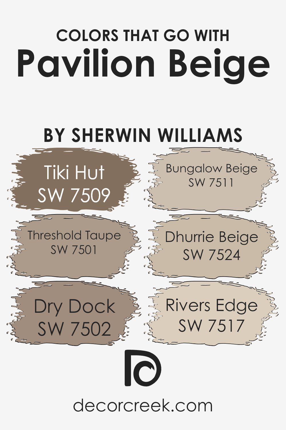
Colors that complement Pavilion Beige SW 7512 by Sherwin Williams play a crucial role in interior design, enhancing the aesthetic appeal and creating a visually harmonious space. These coordinating colors, like Tiki Hut, Threshold Taupe, Dry Dock, Bungalow Beige, Dhurrie Beige, and River’s Edge, work together to evoke a feeling of warmth and continuity in your home. When chosen thoughtfully, these colors can accentuate the understated elegance of Pavilion Beige, making it an ideal backdrop for a variety of décor styles.
- Tiki Hut adds a dash of earthiness, grounding spaces with its rich, natural tone, while Threshold Taupe brings a slightly cooler, sophisticated edge, perfect for creating a serene environment.
- Dry Dock, with its versatile greyish hue, offers a contemporary twist, ensuring rooms feel both spacious and cozy.
- Bungalow Beige has a welcoming, light-infused warmth, making it great for creating inviting spaces.
- Dhurrie Beige stands out with its subtle neutrality, providing a canvas that allows other elements in the room to shine.
- Finally, River’s Edge introduces a touch of softness and tranquility, reminiscent of flowing water, rounding out the selection to ensure there’s a perfect shade to complement various tastes and design needs.
Together, these colors work alongside Pavilion Beige to create stunning, cohesive spaces that feel thoughtfully curated and effortlessly stylish.
You can see recommended paint colors below:
- SW 7509 Tiki Hut
- SW 7501 Threshold Taupe
- SW 7502 Dry Dock
- SW 7511 Bungalow Beige
- SW 7524 Dhurrie Beige
- SW 7517 Rivers Edge
How to Use Pavilion Beige SW 7512 by Sherwin Williams In Your Home?
Pavilion Beige SW 7512 by Sherwin Williams is a versatile color that offers warmth and coziness to any space in your home. Its neutral tone makes it an excellent choice for those who want to add a subtle elegance without overwhelming the room. You can use Pavilion Beige in various ways, from painting whole rooms for a serene and calming atmosphere to accent walls that add depth and character. If you’re looking for a color that complements a wide range of décor, Pavilion Beige is perfect. It pairs beautifully with both bright colors, adding contrast, and with other neutrals for a more understated look.
For a cozy feel, consider using it in your living room or bedroom. It also works well in a home office, where it can help create a focused yet relaxed environment. In addition to walls, Pavilion Beige can refresh cabinets, doors, and trim, bringing a fresh and cohesive look throughout your home. Its flexibility and timeless appeal make it a go-to color for any decorating style.
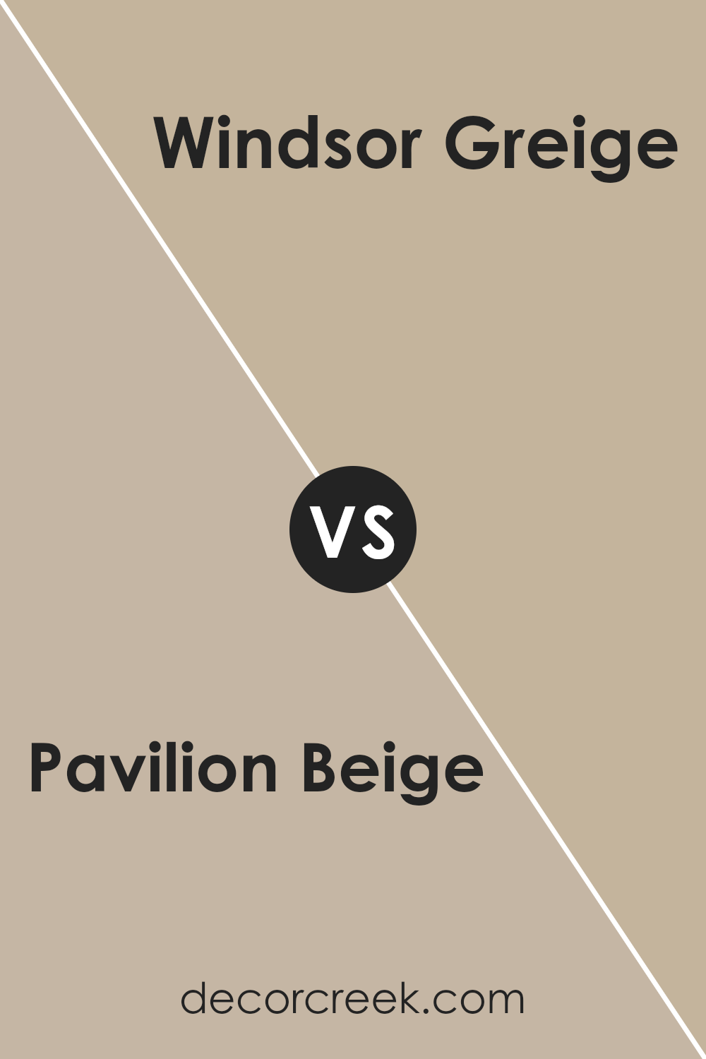
Pavilion Beige SW 7512 by Sherwin Williams vs Windsor Greige SW 7528 by Sherwin Williams
Pavilion Beige and Windsor Greige are both paint colors offered by Sherwin Williams, but they bring different vibes to a room. Pavilion Beige is a soft, warm beige that gives off a cozy and inviting feel. It’s like the color of a sandy beach under the morning sun, subtle yet warm. It’s perfect for creating a light and airy space that feels welcoming.
Windsor Greige, on the other hand, leans more towards a grayish tone, offering a more modern and sophisticated look. Think of it as the color of driftwood – a blend of gray and brown that’s not too dark but adds a touch of elegance to any space. It’s versatile, working well in rooms that aim for a bit of formality without losing the comfort.
Both colors are great for those looking to add a neutral backdrop to their rooms, but the choice between Pavilion Beige’s warmth and Windsor Greige’s cool sophistication depends on the atmosphere one wants to achieve.
You can see recommended paint color below:
- SW 7528 Windsor Greige
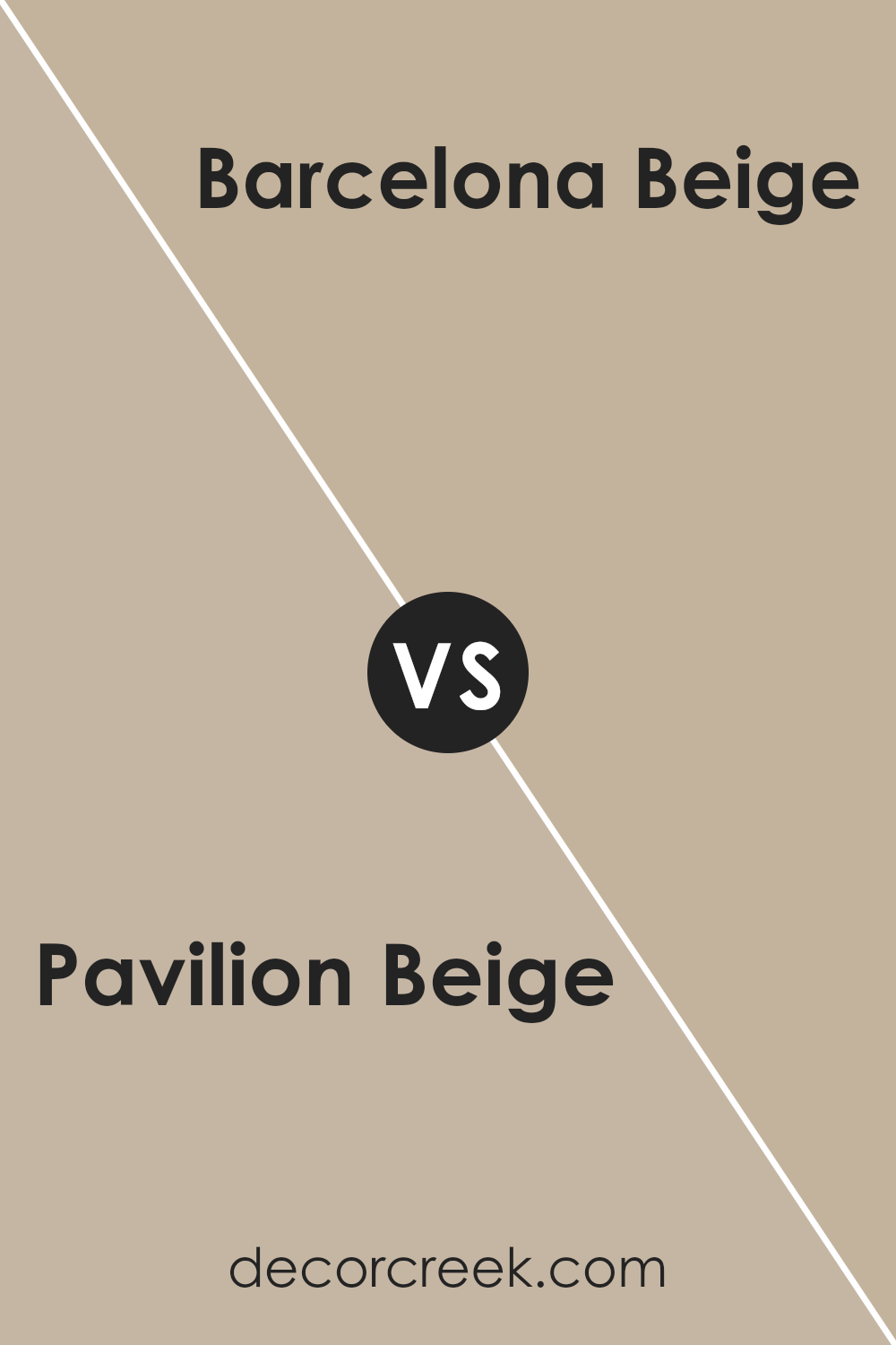
Pavilion Beige SW 7512 by Sherwin Williams vs Barcelona Beige SW 7530 by Sherwin Williams
Pavilion Beige and Barcelona Beige, both by Sherwin Williams, offer unique takes on neutral beige tones. Pavilion Beige leans towards a light, warm beige that softly lightens up a space, providing a cozy and inviting atmosphere. This color is perfect for those looking for a subtle backdrop that’s easy to match with a variety of decor styles and colors.
On the other hand, Barcelona Beige steps in with a slightly darker and richer tone, adding a bit more depth to rooms. It strikes a balance between warmth and sophistication, making it a great choice for spaces where you want a bit more character without overwhelming the senses. This shade is well-suited for areas that could benefit from a warmer touch, yet it still maintains an air of neutrality.
Both colors offer versatility and a timeless appeal, but the choice between them depends on the level of warmth and the specific atmosphere you’re looking to create in your space. Pavilion Beige is lighter, lending an airy feel, while Barcelona Beige brings a deeper, cozy warmth to interiors.
You can see recommended paint color below:
- SW 7530 Barcelona Beige
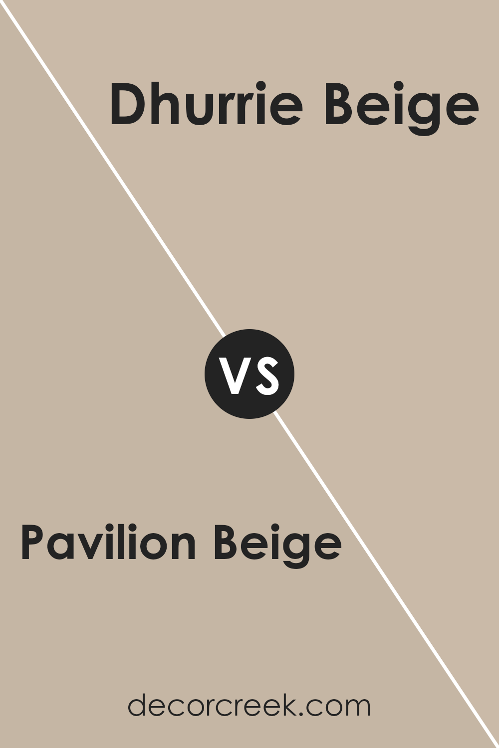
Pavilion Beige SW 7512 by Sherwin Williams vs Dhurrie Beige SW 7524 by Sherwin Williams
Pavilion Beige and Dhurrie Beige are two beautiful shades offered by Sherwin Williams, and each has its own unique character. Pavilion Beige is a soft, warm beige color that gives off a cozy and welcoming vibe. It’s a versatile color that can easily fit into any space, making rooms feel light and airy yet grounded.
On the other hand, Dhurrie Beige is slightly darker and carries a more pronounced beige tone. It leans towards a classic, timeless look, providing a hint of earthiness to spaces without overwhelming them. This color can add depth and warmth to a room, making it ideal for those looking to create a comforting and inviting atmosphere.
When comparing these two, the main difference lies in their intensity and warmth. Pavilion Beige is lighter, perfect for creating a subtle backdrop, whereas Dhurrie Beige, being a bit darker, serves well in spaces that seek a stronger presence of beige. Both colors are flexible and can be used in various settings, from casual to elegant spaces, depending on the desired mood and accompanying decor.
You can see recommended paint color below:
- SW 7524 Dhurrie Beige
Pavilion Beige SW 7512 by Sherwin Williams vs Balanced Beige SW 7037 by Sherwin Williams
Pavilion Beige and Balanced Beige, both by Sherwin Williams, are like close cousins in the world of colors. Pavilion Beige is a soft, warm beige with a cozy, welcoming feel. It’s like the color of sand on a sunny beach, offering a gentle backdrop that can make a room feel open and airy. On the other hand, Balanced Beige leans a bit cooler, though it’s still very much a neutral shade. Think of it as the shadow to Pavilion Beige’s sunlight, offering depth and a slightly more sophisticated vibe without becoming too dark or moody.
While both colors share a beige base, Pavilion Beige brings in a touch of warmth that makes spaces feel more intimate, whereas Balanced Beige offers a subtle hint of coolness that can make a room feel more modern and grounded. Choosing between them depends on the mood you want to set: cozy and warm with Pavilion Beige or cool and refined with Balanced Beige.
You can see recommended paint color below:
Pavilion Beige SW 7512 by Sherwin Williams vs Diverse Beige SW 6079 by Sherwin Williams
Pavilion Beige by Sherwin Williams is a light, warm beige that gives a soft, cozy feel to any room. It’s perfect if you want to create a bright and welcoming space. It has a sandy tone that makes it versatile, blending well with many decor styles and colors.
On the other hand, Diverse Beige, also by Sherwin Williams, is a slightly darker shade. It leans towards a medium beige, offering a richer and more grounded look. This color is great for adding a bit of warmth and depth to a space without overpowering it. It works well in areas where you want a bit more coziness and sophistication.
Both colors are beautiful, but they serve different purposes depending on the mood you want to set. Pavilion Beige is lighter, making spaces feel more open and airy, while Diverse Beige brings a stronger sense of warmth and character, ideal for creating inviting spaces.
You can see recommended paint color below:
- SW 6079 Diverse Beige
Pavilion Beige SW 7512 by Sherwin Williams vs Studio Beige SW 9602 by Sherwin Williams
Pavilion Beige and Studio Beige, both by Sherwin Williams, are two distinct shades that share a common neutral territory but with different vibes. Pavilion Beige leans more towards a light, airy feel, giving spaces a subtle warmth without overpowering them. It’s a versatile color that works well in various settings, providing a serene and welcoming atmosphere.
On the other hand, Studio Beige has a slightly deeper tone, offering a bit of richness and coziness to rooms. This color is great for creating a snug, inviting environment, making it ideal for places where you want to relax and feel at home.
While both colors can serve as excellent backdrops for different decor styles, Pavilion Beige is your go-to for a lighter, more open space feel. Studio Beige, however, is perfect if you’re aiming for a warmer, more intimate setting. Each brings its unique flair to the table, making them fantastic choices for someone looking to update their space with a touch of elegance and comfort.
You can see recommended paint color below:
- SW 9602 Studio Beige
Pavilion Beige SW 7512 by Sherwin Williams vs Renwick Beige SW 2805 by Sherwin Williams
Pavilion Beige and Renwick Beige are both cozy, warm colors from Sherwin Williams, but they have their own unique vibes. Pavilion Beige is a soft, light beige, giving off a gentle and inviting feel to any room. It’s perfect for creating a serene and comfortable atmosphere, making spaces feel open and airy.
On the other hand, Renwick Beige goes a bit darker. It brings a richer, more pronounced beige tone to the table. This color adds warmth and depth, making it ideal for adding character to a space. Because of its slightly deeper hue, Renwick Beige works well in areas where you want to establish a cozy yet sophisticated look.
When you compare them, Pavilion Beige is your go-to for making rooms feel larger and more tranquil, while Renwick Beige is the choice for a bolder, more grounded aesthetic. Both are versatile, but your preference might depend on the mood you’re aiming to create and the size of your space.
You can see recommended paint color below:
- SW 2805 Renwick Beige
Pavilion Beige SW 7512 by Sherwin Williams vs Loggia SW 7506 by Sherwin Williams
Pavilion Beige and Loggia, both by Sherwin Williams, have their unique spots in the color palette. Pavilion Beige is like a light, warm hug on a sunny afternoon. It’s subtle yet inviting, making any space feel cozy and welcoming without being overwhelming. Think of Pavilion Beige as a gentle backdrop that lets your furniture and decor stand out.
On the other hand, Loggia steps a bit into the shadows, offering a deeper, richer hue. It’s not dark, but it carries more depth than Pavilion Beige, giving rooms a grounded feeling. Imagine a color that can make spaces feel sophisticated and warm at the same time – that’s Loggia for you.
Both colors share a warmth that can complement a variety of decorating styles, but Pavilion Beige keeps things brighter and airier, while Loggia adds a touch of elegance and definition. Whether you’re aiming for a light and breezy vibe or a more anchored, earthy atmosphere, these colors offer lovely options.
You can see recommended paint color below:
- SW 7506 Loggia
Pavilion Beige SW 7512 by Sherwin Williams vs Minimalist SW 9611 by Sherwin Williams
Pavilion Beige and Minimalist are both colors by Sherwin Williams. Pavilion Beige is like a warm, inviting hug for your walls. It’s not too dark, not too light, but right in that cozy middle. Its warm undertones can make a room feel welcoming and homey, perfect for living spaces or bedrooms where comfort is key.
Minimalist is the cooler, calmer cousin. It’s lighter, leaning more towards a pure, clean look. This color can make small spaces appear bigger and brighter, offering a refreshing, airy feel. It’s great for modern spaces or areas where you want a crisp, minimal feel without going too stark or cold.
Even though they share a neutral base, Pavilion Beige brings warmth and a subtle depth to the table, creating a snug, enveloping feel. Minimalist, on the other hand, goes for simplicity and clarity, providing a backdrop that’s both light and uplifting. Choosing between them depends on whether you want your space to wrap you in warmth or offer a breath of fresh air.
You can see recommended paint color below:
- SW 9611 Minimalist
Pavilion Beige SW 7512 by Sherwin Williams vs Shiitake SW 9173 by Sherwin Williams
Pavilion Beige and Shiitake by Sherwin Williams are two distinct hues that can create a warm and inviting space. Pavilion Beige is a lighter, softer color that brings a sense of calm and simplicity to a room. It’s like the gentle touch of sunlight in the early morning, subtle yet refreshing. It works well in spaces where you want to promote relaxation and peace, such as living rooms and bedrooms.
On the other hand, Shiitake has a deeper, richer tone that adds a bit more depth and personality to spaces. It’s akin to the warm, earthy feel of autumn, providing a cozy backdrop that makes a room feel more grounded and intimate. Shiitake is great for areas where you want a bit of sophistication without going too dark, perfect for dining rooms or home offices.
Both colors offer versatility and can blend nicely with various décor styles. However, Pavilion Beige leans towards creating a brighter, airier feel, while Shiitake offers warmth and richness, making spaces feel more enveloped and snug. Whether you’re looking for a light refresh or a deeper, cozier vibe, these colors have you covered.
You can see recommended paint color below:
- SW 9173 Shiitake
Conclusion
Pavilion Beige by Sherwin Williams stands out as a versatile and appealing choice for those looking to add a touch of warmth and elegance to their spaces. As a color that balances between being neutrally warm but not too overpowering, it offers a perfect backdrop for various decor styles and preferences. Its subtly rich tone allows it to be easily paired with different textures and colors, making it an ideal choice for anyone looking to refresh their home or office with a contemporary yet timeless look.
Moreover, the adaptability of Pavilion Beige ensures it fits well in numerous settings, from living rooms and bedrooms to professional spaces. Its ability to enhance natural light while providing a cozy atmosphere underscores its popularity among interior designers and homeowners alike. Whether you’re aiming for a minimalist aesthetic or a more layered and eclectic decor, Pavilion Beige proves to be more than just a paint color; it’s a strategic choice for creating inviting and stylish environments.
Ever wished paint sampling was as easy as sticking a sticker? Guess what? Now it is! Discover Samplize's unique Peel & Stick samples.
Get paint samples

