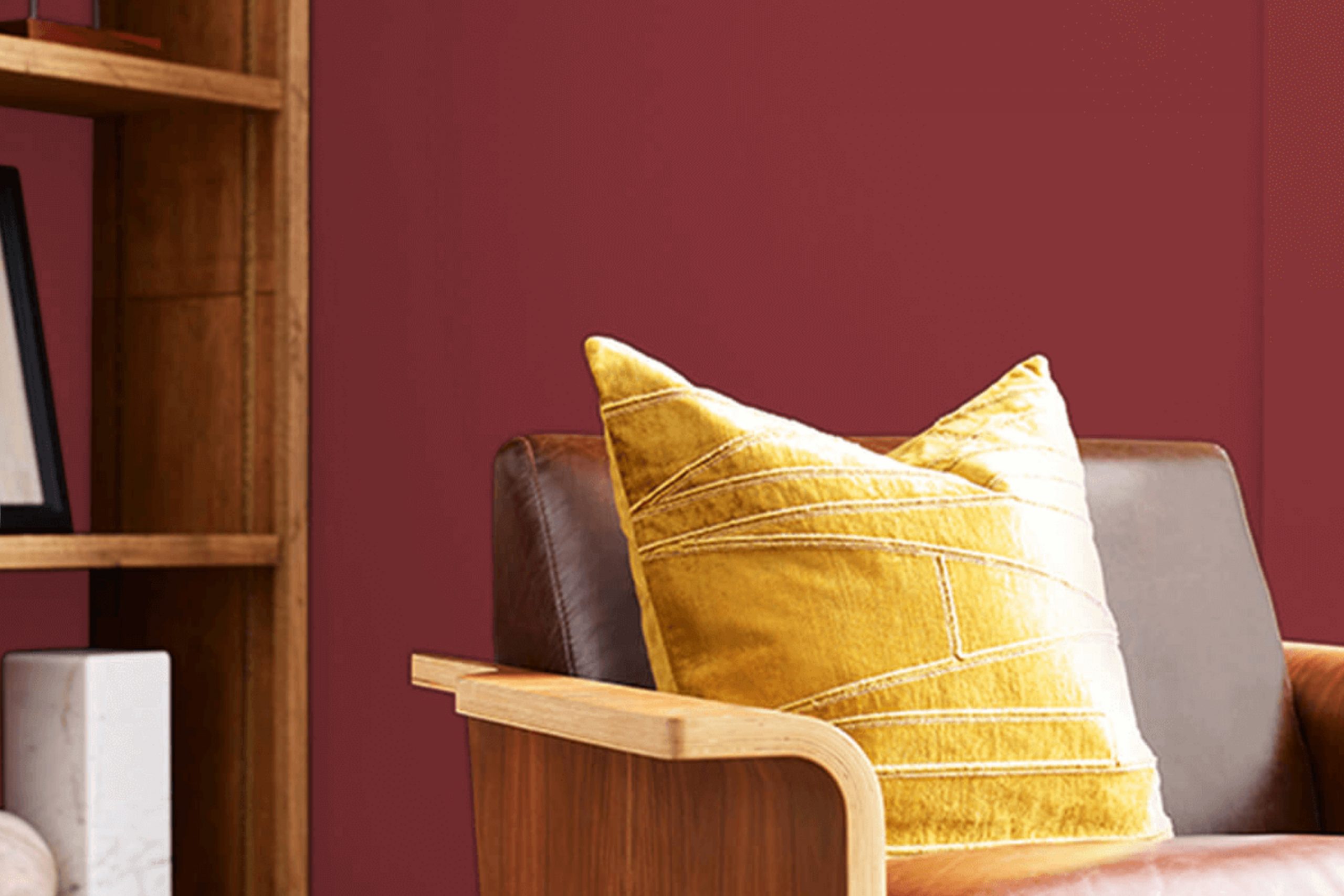
When you think of a color that’s both bold and inviting, SW 9695 Beetroot by Sherwin Williams might come to mind. Rich and vibrant, this deep red hue brings warmth to any room. It’s the kind of color that makes a statement while also creating a cozy atmosphere.
Imagine walking into a room painted with Beetroot—it feels like a warm hug. The depth of the color catches your attention immediately, yet it’s not overpowering. It works well with both modern and traditional decor styles, adding a touch of elegance.
Pair it with neutral tones like beige or cream to let the color stand out, or combine it with other rich tones like navy or dark green for a more dramatic effect. Beetroot is flexible, proving to be both refined and inviting. Whether it’s on an accent wall, in a cozy reading nook, or throughout an entire room, Beetroot turns ordinary areas into memorable ones.
It’s perfect for those who want to add character and warmth to their homes.
What Color Is Beetroot SW 9695 by Sherwin Williams?
Beetroot SW 9695 by Sherwin Williams is a bold and rich color, reminiscent of the deep purples and reds found in its namesake vegetable. This hue adds a vibrant pop of color to any room, bringing a touch of drama and warmth. It’s a perfect choice for those who love bold colors without venturing into extreme brightness.
This color works exceptionally well in modern and contemporary interiors where it can serve as a striking accent against neutral greys, whites, and blacks. In an eclectic or bohemian style, it pairs beautifully with a mix of other deep jewel tones like emerald green and sapphire blue.
Materials and textures that complement this color include rich, dark woods, metallics such as brass and gold, and natural fabrics like linen or cotton. Velvet furniture pieces or cushions in Beetroot can create a luxurious feel and add a cozy element. Glass and mirrored surfaces can also help reflect and balance the richness of this color, keeping it from feeling too strong in a room.
Whether you’re painting an entire wall or using it for accent furnishings, Beetroot SW 9695 is sure to add energy and interest to your home.
Is Beetroot SW 9695 by Sherwin Williams Warm or Cool color?
Beetroot SW 9695 by Sherwin Williams is a deep, rich color that adds warmth and vibrancy to any room. This bold hue works well as an accent wall or in decorative pieces like cushions or curtains. When used on walls, it creates a cozy and inviting atmosphere, perfect for living rooms or dining areas.
It pairs well with neutral colors like whites, grays, and beiges, which help balance its intensity. Beetroot can also complement natural materials like wood and stone, enhancing their textures. In kitchens, it can add a pop of color to cabinets or backsplashes, bringing energy into the room.
In bedrooms, it provides a snug environment conducive to relaxation. The pigment of Beetroot offers flexibility in both traditional and modern interiors. Homeowners can use it to introduce character without making a room feel too strong, making it a flexible choice for various design styles.
Undertones of Beetroot SW 9695 by Sherwin Williams
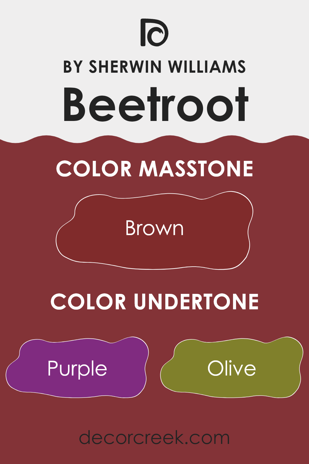
Beetroot by Sherwin Williams is a vibrant and dynamic color with a mix of undertones that influence how we perceive it. The undertones of a color can change its appearance based on lighting and surrounding colors. For Beetroot, these undertones include shades like purple, olive, red, dark grey, and others. Each of these brings a unique quality to the color.
The purple undertone gives Beetroot a slightly cooler and more regal feel, while the olive undertone adds a hint of earthiness. Red enhances its warmth and boldness, making it eye-catching and lively. The presence of dark grey and navy undertones can lend a sense of depth and grounding to the color, while the grey undertone ensures it remains balanced and not overly bright.
In an interior setting, Beetroot can create a warm and inviting atmosphere. The color’s reddish and pink undertones make it a friendly and passionate choice for living areas. However, darker tones like navy and dark green provide an element of refinement. Bright orange and pale pink undertones keep the room feeling lively. Depending on the room’s lighting and decor, Beetroot can shift between feeling cozy and energetic, making it a flexible choice for walls.
What is the Masstone of the Beetroot SW 9695 by Sherwin Williams?
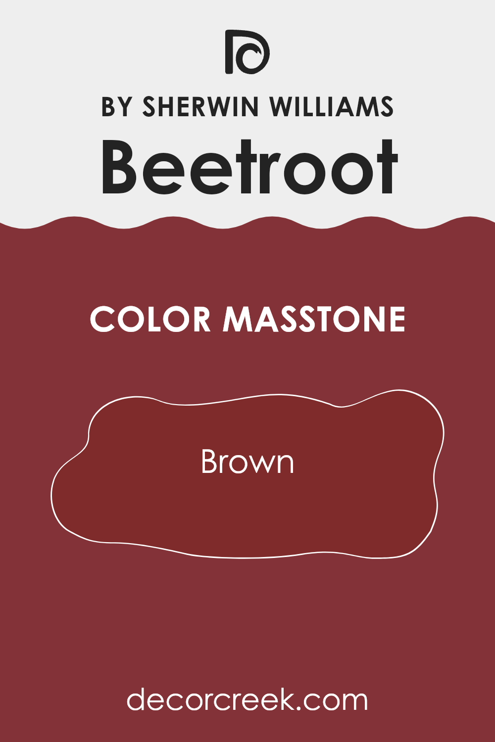
Beetroot SW 9695 by Sherwin Williams is a deep color with a warm brown masstone. This rich hue brings a cozy and inviting feel to any room. In homes, it can be used in living rooms or dining areas to create a warm and intimate atmosphere.
The brown undertone helps the color blend well with wooden furniture and natural elements, adding to the warmth. It pairs nicely with neutral tones like beige or cream, offering a balanced look that is both stylish and comfortable.
In bedrooms, Beetroot can add a sense of depth and make the area feel snug and restful. Because it is a bold color, it works well as an accent wall, highlighting specific areas without making the room feel too strong. Overall, Beetroot’s brown base makes it a flexible choice for various decorating styles, from traditional to modern.
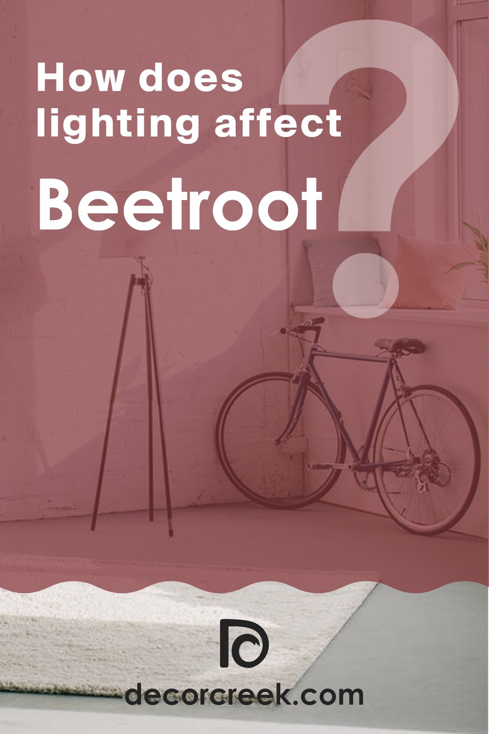
How Does Lighting Affect Beetroot SW 9695 by Sherwin Williams?
Lighting plays a crucial role in how we perceive colors. Different types of light can change how a color looks, affecting its brightness, tone, and overall appearance. The color Beetroot, SW 9695 by Sherwin Williams, is a rich, deep hue that can look very different depending on the lighting conditions in a room.
In natural light, Beetroot can appear more vibrant and lively. The color shows its true depth and richness under sunlight, making it a bold choice for a room with ample daylight. However, artificial lighting, such as incandescent or LED lights, can alter its appearance.
Incandescent bulbs usually give off a warm glow, which can make Beetroot appear slightly darker or warmer. On the other hand, cooler LED lights might enhance the purplish undertones of the color, giving it a different look.
The orientation of a room also affects how Beetroot appears. In north-facing rooms, natural light is generally cooler and less intense, which can make Beetroot look a bit dimmer and bring out its cooler tones. This might give the color a more muted, relaxed feel.
In contrast, south-facing rooms receive more direct sunlight throughout the day, making colors appear brighter and more vibrant. Beetroot in a south-facing room may seem rich and full-bodied, showing off its depth beautifully. This could make the room feel warm and inviting.
East-facing rooms get plenty of morning light, which is warm and soft. In these rooms, Beetroot might look particularly soothing and pleasant as the day begins. However, as the day progresses, the light fades, possibly making the room feel a bit darker.
West-facing rooms receive intense light in the afternoon and evening, potentially bringing out the depth and warmth in Beetroot. During this time, the color can feel intense and warm, while in the morning it might seem cooler.
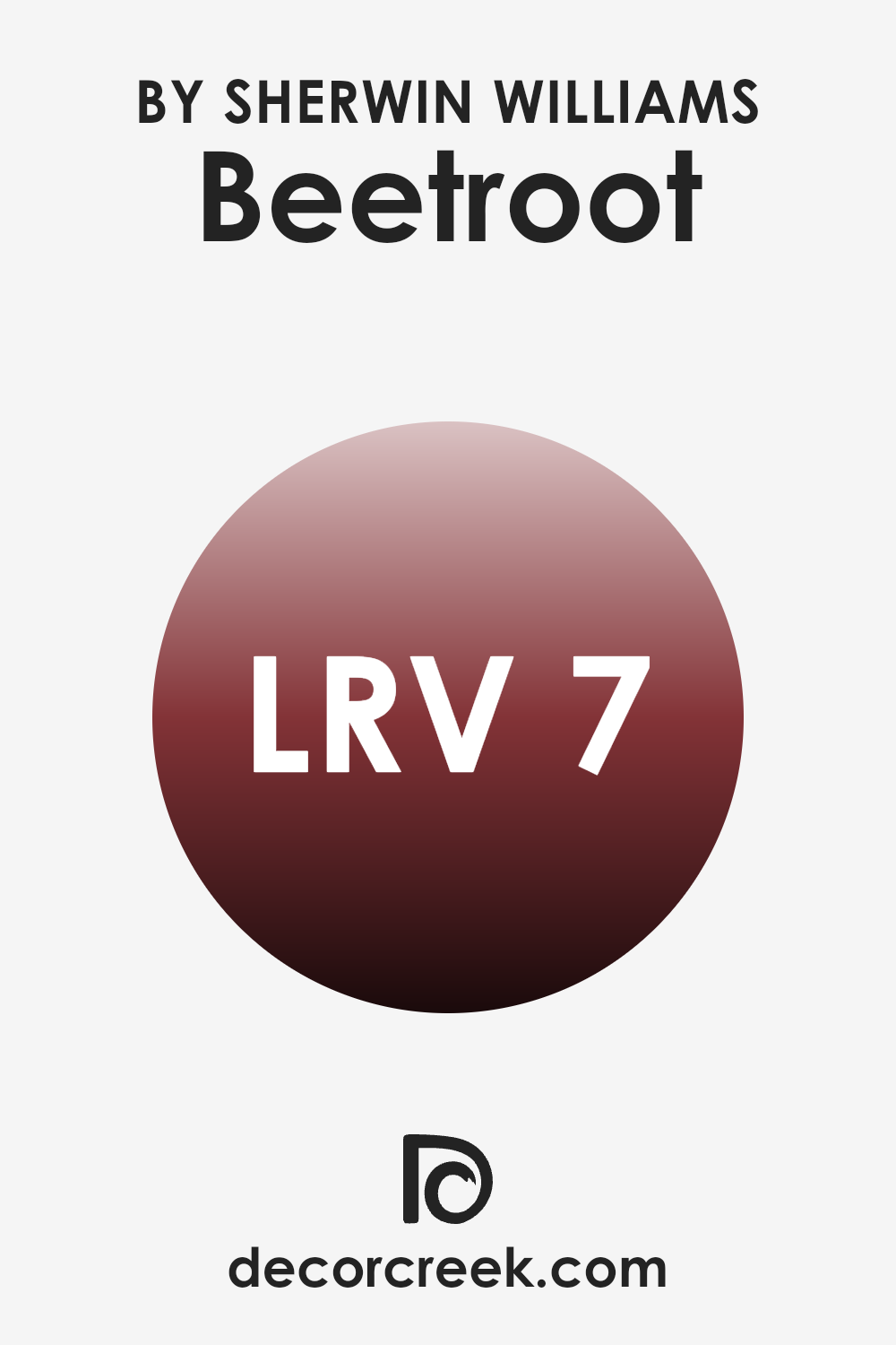
What is the LRV of Beetroot SW 9695 by Sherwin Williams?
LRV, or Light Reflectance Value, is an important concept when it comes to choosing paint colors for your home. It measures the percentage of light a paint color reflects and is rated on a scale from 0 to 100. A color with an LRV of 0 reflects no light, making it completely black, while a color with an LRV of 100 reflects all light, making it pure white.
When you’re selecting a paint color, the LRV can help you understand how dark or light a color will appear on your walls. Colors with low LRVs absorb more light, making rooms feel cozier or smaller, while colors with high LRVs reflect more light, making areas feel larger and brighter.
Beetroot by Sherwin Williams has an LRV of 7.458, which places it on the much darker end of the scale. With this low LRV, Beetroot will absorb a lot of light and make a room feel much more intimate and enclosed. It’s a deep, rich color, which means it can add warmth and a sense of depth to a room. This makes it a good choice for areas where you want to create a snug or dramatic atmosphere, like a library or a cozy dining room.
However, it might be too overpowering for small rooms without sufficient lighting, as it could make them feel cramped. When using a color with such a low LRV, consider pairing it with lighter accents or balanced lighting to keep the room from feeling too dark.
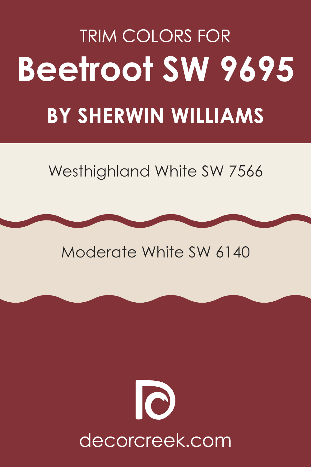
What are the Trim colors of Beetroot SW 9695 by Sherwin Williams?
Trim colors are the shades used on the edges or borders of walls, doors, and windows to create contrast or complement the main wall color. They can significantly influence the look and feel of a room by highlighting architectural features or creating a clean, polished appearance. When paired with Sherwin Williams’ Beetroot color, a deep and rich hue, trim colors like Westhighland White and Moderate White help to soften the intensity and enhance the overall design by providing a crisp, clean contrast that makes the main color pop.
Choosing the right trim color can be crucial as it can accentuate or mute the main tone, adding depth or unity to the room’s aesthetic. These combinations add balance and can make areas feel more inviting and well put together.
Westhighland White, SW 7566, is a warm white that provides a soft and warm backdrop, brightening the room without overpowering it. This shade offers a gentle charm, making it adaptable to different styles. Meanwhile, Moderate White, SW 6140, has a subtle beige undertone that gives walls a warm and cozy feel, which is perfect for creating a more relaxed and comfortable atmosphere.
Both these colors allow the rich tones of Beetroot to stand out while providing a harmonious and elegant frame to the colorful walls. These choices for trim colors ensure that the vibrant Beetroot remains the star of the show while giving the entire room a pleasing, cohesive look.
You can see recommended paint colors below:
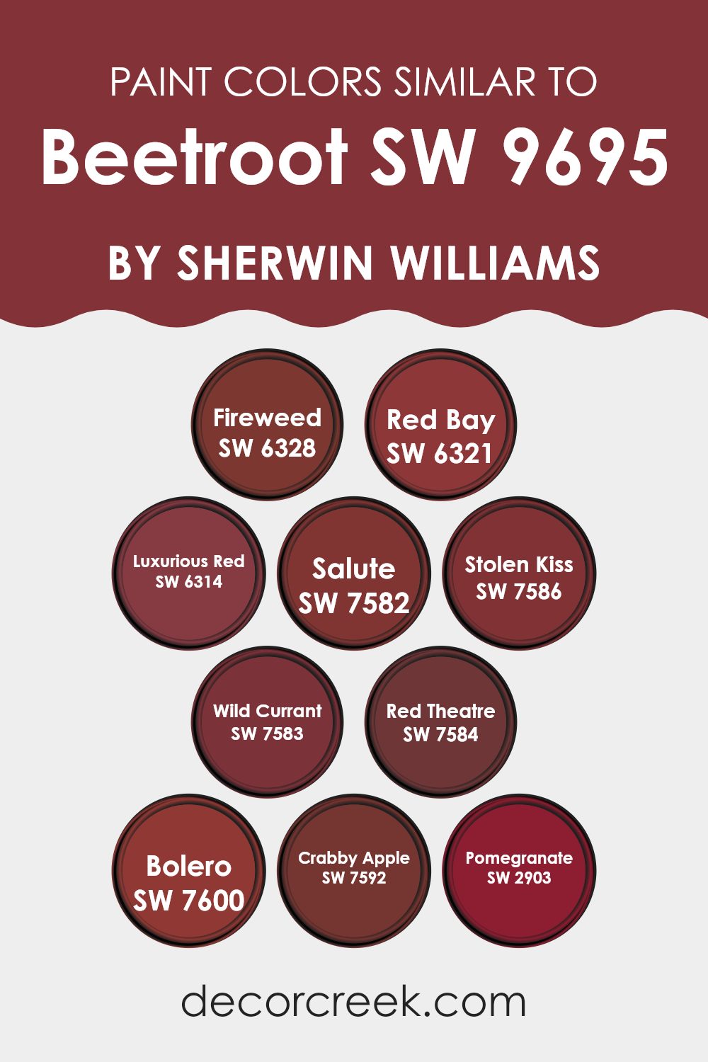
Colors Similar to Beetroot SW 9695 by Sherwin Williams
Similar colors play a crucial role in creating harmonious and visually appealing rooms. They allow for a seamless transition between different elements of a room, adding depth and richness to the overall design. For example, Beetroot by Sherwin Williams can be beautifully complemented by similar shades, enhancing its essence without clashing or feeling too strong.
Colors like Fireweed and Red Bay offer a warm, earthy undertone, bringing a grounded and cozy feel. Luxurious Red and Salute provide a rich, deep variation of red, adding a touch of elegance and drama to any scene.
Stolen Kiss and Wild Currant convey a playful yet intense red, perfect for accents or focal points, while Red Theatre and Bolero present a bold, theatrical flair, sure to draw attention. Crabby Apple and Pomegranate introduce a softer, more muted side of red, offering a balance that can calm the stronger tones. These similar colors work together, creating a balanced palette that enhances the beauty and character of Beetroot.
By using these hues, you can achieve a well-rounded and united aesthetic that is visually pleasing and engaging, making them an essential tool in any design repertoire.
You can see recommended paint colors below:
- SW 6328 Fireweed
- SW 6321 Red Bay
- SW 6314 Luxurious Red
- SW 7582 Salute
- SW 7586 Stolen Kiss
- SW 7583 Wild Currant
- SW 7584 Red Theatre
- SW 7600 Bolero
- SW 7592 Crabby Apple
- SW 2903 Pomegranate
How to Use Beetroot SW 9695 by Sherwin Williams In Your Home?
Beetroot SW 9695 by Sherwin Williams is a rich, bold shade of deep red with a subtle hint of purple. This color can make a strong statement in any room, creating a cozy and inviting atmosphere. In a living room, Beetroot can be used on an accent wall to add warmth and depth, complementing neutral furniture.
It also works well in dining rooms, where it can stimulate conversation and appetite. Paired with gold or brass accents, Beetroot can give a room a touch of elegance. In bedrooms, this color helps create a cozy, intimate room.
Pair it with soft, light-colored linens and simple decor to balance its intensity. For those who love contemporary design, Beetroot can be used in a kitchen with black cabinetry and stainless steel appliances for a bold look. Adding touches of wood and white can soften its impact. Suitable for various styles, Beetroot is a flexible choice for home decor.
Beetroot SW 9695 by Sherwin Williams vs Bolero SW 7600 by Sherwin Williams
Beetroot SW 9695 and Bolero SW 7600 are two rich, red shades from Sherwin Williams. Beetroot is a deep, earthy red with brown undertones, which gives it a warm and cozy feeling. It’s perfect for rooms where you want a touch of elegance and comfort.
Bolero, on the other hand, is a vibrant and bold red, leaning more towards a true red with some blue undertones. This color is energizing and makes a striking statement in any room. While Beetroot offers a more muted and subdued look, Bolero stands out with its lively and striking presence.
Beetroot can create a calming atmosphere, whereas Bolero is ideal for making a bold statement and adding energy. Both colors can complement neutral shades, but Bolero pairs well with crisp whites and cool grays, while Beetroot works beautifully with warm tones and naturals. Both colors add warmth, but their different shades offer distinct styles.
You can see recommended paint color below:
- SW 7600 Bolero
Beetroot SW 9695 by Sherwin Williams vs Red Bay SW 6321 by Sherwin Williams
Beetroot (SW 9695) and Red Bay (SW 6321) are two vibrant colors by Sherwin Williams, each offering a different feel. Beetroot is a rich, purplish-red with a deep, earthy tone that brings warmth and coziness to a room.
It’s a bold yet comforting color, ideal for areas where you want a touch of drama without too much brightness. By contrast, Red Bay is a more classic and straightforward red. It has a brighter, more energetic appearance compared to the more muted Beetroot.
Red Bay can add a lively and welcoming vibe to a room, making it great for social areas like living rooms or kitchens. While Beetroot provides a more relaxed, refined atmosphere, Red Bay offers energy and warmth. Both colors are striking, but they work best in different settings due to their unique undertones and intensities, allowing for varied design choices based on your desired mood.
You can see recommended paint color below:
Beetroot SW 9695 by Sherwin Williams vs Stolen Kiss SW 7586 by Sherwin Williams
Beetroot SW 9695 by Sherwin Williams is a deep, rich shade of red-purple. It carries a bold and dramatic vibe, perfect for making a statement in any room. It’s a color that can add warmth and intensity, ideal for areas where you want a touch of luxury and coziness.
In contrast, Stolen Kiss SW 7586 is also in the red family but is a lighter, more muted hue. It’s softer and leans towards a warm pink, giving it a romantic and gentle feel. Stolen Kiss offers a more approachable and subtle look, making it suitable for areas where you want to create a welcoming and soothing atmosphere.
Together, these colors can complement each other beautifully. Beetroot’s intensity can serve as an accent against the softer backdrop of Stolen Kiss, allowing for a dynamic and balanced design. Whether used separately or together, both colors can add distinct character to your room.
You can see recommended paint color below:
- SW 7586 Stolen Kiss
Beetroot SW 9695 by Sherwin Williams vs Red Theatre SW 7584 by Sherwin Williams
Beetroot (SW 9695) and Red Theatre (SW 7584) are two distinct shades of red offered by Sherwin Williams. Beetroot is a deep, rich hue with hints of purple, giving it a slightly cooler and more contemporary feel. It brings a sense of warmth and coziness to a room, making it ideal for areas where comfort and relaxation are desired.
On the other hand, Red Theatre is a classic, bold red with a brighter, more vibrant tone. It has a lively and energetic personality, perfect for creating a dramatic effect. This color works well in areas where you want to make a statement or add a touch of excitement.
When used together, Beetroot could be the anchor with its subtle sophistication, while Red Theatre can add bold accents. Choosing between these colors depends on the atmosphere you want to achieve: calm and inviting with Beetroot or lively and theatrical with Red Theatre.
You can see recommended paint color below:
- SW 7584 Red Theatre
Beetroot SW 9695 by Sherwin Williams vs Luxurious Red SW 6314 by Sherwin Williams
Beetroot (SW 9695) and Luxurious Red (SW 6314), both by Sherwin Williams, are strikingly different shades of red that can add distinct personalities to a room. Beetroot SW 9695 is a rich, deep, purplish-red, reminiscent of the hearty vegetable it’s named after.
It exudes warmth and depth, making it a great choice for creating a cozy and inviting atmosphere. It’s more subdued, offering a sense of calmness and comfort. On the other hand, Luxurious Red SW 6314 is a brighter, more vibrant red.
It is bold and energetic, making it perfect for areas where you want to make a statement or create a lively atmosphere. While both colors can enhance a room, Beetroot is ideal for those seeking a more muted and calming vibe, whereas Luxurious Red suits those looking to add a touch of excitement and drama to their surroundings.
You can see recommended paint color below:
- SW 6314 Luxurious Red
Beetroot SW 9695 by Sherwin Williams vs Pomegranate SW 2903 by Sherwin Williams
Beetroot SW 9695 and Pomegranate SW 2903 by Sherwin Williams are two distinct shades of red that evoke different feelings and can dramatically affect a room. Beetroot is a deep, rich burgundy with a hint of purple, which gives it a warm and inviting appearance.
It can add a cozy and intimate atmosphere to a room. In contrast, Pomegranate is a brighter and more vibrant red with a touch of orange. This makes it feel lively and energizing, perfect for areas where you want to encourage conversation and activity.
When these colors are used in home design, Beetroot might work well in a living room or bedroom to create a sense of relaxation and comfort. Pomegranate, on the other hand, could be ideal for kitchens or dining areas where a lively, spirited touch is desired. Both colors have their unique charm and can be used to create distinct moods in your home.
You can see recommended paint color below:
- SW 2903 Pomegranate
Beetroot SW 9695 by Sherwin Williams vs Fireweed SW 6328 by Sherwin Williams
Beetroot and Fireweed are two distinctive colors offered by Sherwin Williams. Beetroot is a deep, rich burgundy with hints of purple, creating a warm and cozy feel. It can add a sense of depth and luxury to a room, making it an excellent choice for accent walls or rooms where you want a bit of drama.
On the other hand, Fireweed is a warm, earthy red that leans toward a rusty hue. It has a somewhat spicy and inviting vibe, perfect for creating a welcoming atmosphere. While both colors deliver warmth, Beetroot’s darker tone is ideal for more intimate settings, while Fireweed offers a more vibrant and energetic look.
When deciding between them, consider the mood you want to create: Beetroot for a refined touch or Fireweed for a lively, welcoming room. Both can complement various design styles, depending on your personal taste.
You can see recommended paint color below:
Beetroot SW 9695 by Sherwin Williams vs Crabby Apple SW 7592 by Sherwin Williams
Beetroot (SW 9695) and Crabby Apple (SW 7592) by Sherwin Williams are two rich and warm colors that add character to any room. Beetroot is a deep, dusty purple with hints of brown, making it a bold yet grounded choice.
It’s perfect for creating a cozy and intimate atmosphere, ideal for living rooms or bedrooms. On the other hand, Crabby Apple is a warm, muted red with slight brown undertones. This color feels inviting and can energize a room without feeling too strong, making it suitable for dining rooms or accent walls.
While both colors have a grounded feel, Beetroot leans towards a more dramatic and moody vibe, whereas Crabby Apple offers warmth and a bit more vibrance. When paired together, they can create a harmonious and stylish environment. Each color brings its own unique warmth and intensity, allowing for various creative uses in home decor.
You can see recommended paint color below:
- SW 7592 Crabby Apple
Beetroot SW 9695 by Sherwin Williams vs Salute SW 7582 by Sherwin Williams
Beetroot SW 9695 by Sherwin Williams is a rich, vibrant color that brings a lot of warmth and energy to a room. It has a deep reddish-purple tone, reminiscent of the inside of a fresh beet. This color can make a room feel cozy and inviting when used on walls or as a bold accent.
On the other hand, Salute SW 7582 is a dark, almost navy-blue color, which gives off a more formal and classic feel. It can create a striking contrast when paired with lighter colors and often feels more restrained compared to the lively vibe of Beetroot. Salute adds depth to a room without making it feel too strong.
Both colors can make a strong statement, but in different ways: Beetroot is playful and warm, while Salute is calming and composed. They each provide unique moods, allowing for creative choices in color schemes and designs.
You can see recommended paint color below:
- SW 7582 Salute
Beetroot SW 9695 by Sherwin Williams vs Wild Currant SW 7583 by Sherwin Williams
Beetroot by Sherwin Williams is a rich, deep red color that brings warmth and drama to any room. It’s bold and has a slight purple undertone, making it perfect for areas where you want to create a cozy and inviting atmosphere.
On the other hand, Wild Currant is a brighter red with more vibrancy. It leans toward a true red without the purple hue. This makes Wild Currant feel more energetic and lively compared to the more muted and refined Beetroot.
Beetroot’s darker tone is great for accent walls or furniture, providing a sense of depth and elegance. In contrast, Wild Currant is excellent for adding a splash of color to a room, whether through smaller décor items or as a full wall color in areas that need a bit of energy. Both colors are beautiful, but their different tones suit different design intentions.
You can see recommended paint color below:
- SW 7583 Wild Currant
When I think about SW 9695 Beetroot by Sherwin-Williams, I imagine a color that feels rich and warm, like a cozy blanket or a sweet treat. It’s a deep red shade that makes any room feel welcoming and full of life.
If you put Beetroot on your walls, it feels like bringing a bit of excitement into your home. This color doesn’t just sit quietly; it stands out and gives energy. It’s perfect when you want a room to feel a little more special. Whether it’s your living room or a cozy reading nook, this color helps everything feel just right.
Using Beetroot in different places gets everyone to notice and feel happy. It’s amazing how a simple paint can change how we feel, making our rooms come alive. It can make an ordinary day feel like a holiday.
In my view, SW 9695 Beetroot isn’t just a color; it’s an experience. It shows how something simple, like choosing the right paint, can make a big difference. Beetroot by Sherwin-Williams makes home a truly delightful place where good times happen and happy memories are made.

Ever wished paint sampling was as easy as sticking a sticker? Guess what? Now it is! Discover Samplize's unique Peel & Stick samples.
Get paint samples

