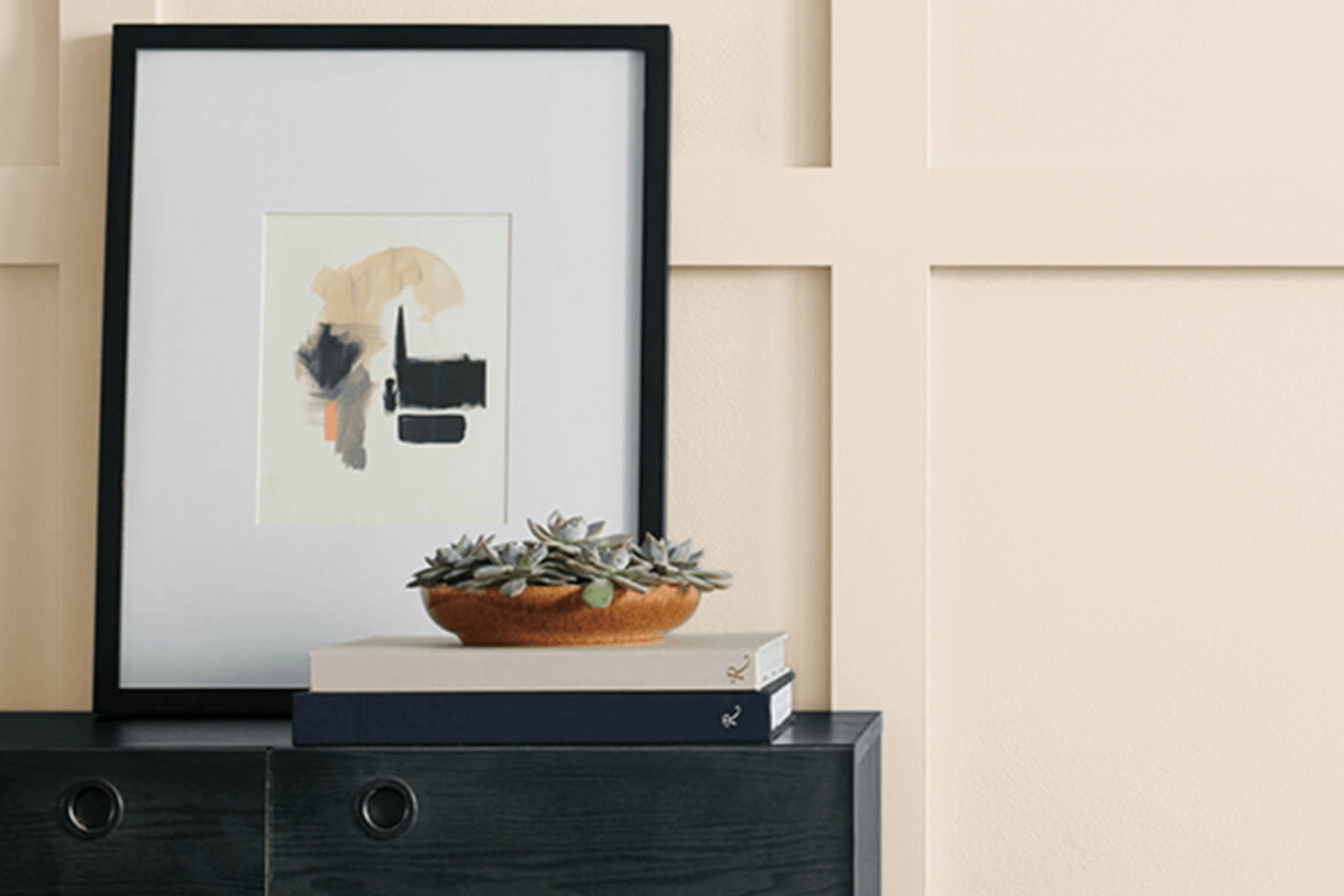
I recently painted my living room with SW 6140 Moderate White by Sherwin Williams, and it’s been a game-changer for the space. This color has a unique charm that subtly enhances the room’s atmosphere without overwhelming it.
It’s a warm, creamy white that balances beautifully between being too stark and too yellow. As the light changes throughout the day, I’ve noticed how it gently shifts in tone, adding depth and warmth to the room.
The most remarkable thing about Moderate White is its adaptability. It works harmoniously with different styles and accents, providing a perfect backdrop for various décor elements. I’ve paired it with both bright and muted colors, and it complements them effortlessly. Whether it’s morning light streaming through the windows or the gentle glow of evening lamps, this color blends seamlessly with any type of lighting.
What I love most about Moderate White is how inviting it feels. Friends and family have remarked on the welcoming vibe as soon as they walk in. It’s a color that makes a space feel cozy and lived-in while still maintaining a clean, fresh look. If you’re looking for a versatile and warm shade, SW 6140 Moderate White might just be the perfect choice.
What Color Is Moderate White SW 6140 by Sherwin Williams?
Moderate White (SW 6140) by Sherwin Williams is a warm, soft white with subtle beige undertones. This color creates a cozy and inviting atmosphere, making it an excellent choice for interiors that aim for warmth and comfort. The gentle hue of Moderate White provides a neutral backdrop that works well in a variety of interior styles, from traditional and transitional to modern farmhouse and Scandinavian.
In traditional settings, Moderate White complements rich wood tones and classic furnishings, providing a balanced and understated elegance.
For modern farmhouse interiors, it pairs beautifully with natural materials such as reclaimed wood, linen, and jute, adding to the rustic charm without overpowering the space. In Scandinavian designs, the warmth of this color contrasts pleasantly with clean lines and minimalist decor, ensuring the space remains airy yet warm.
Moderate White also pairs well with other warm, earthy tones and colors, such as soft grays, muted greens, and terracotta, bringing unity and cohesion to a room’s palette. Texturally, it complements materials like leather, wool, and natural woven fabrics, enhancing the tactile experience of the space.
Whether used on walls, trim, or cabinetry, Moderate White serves as a versatile and inviting option that can adapt to various styles while providing a cozy and welcoming ambiance.
Is Moderate White SW 6140 by Sherwin Williams Warm or Cool color?
Moderate White SW 6140 by Sherwin Williams is a versatile paint color that suits many home styles. It’s a warm, soft shade that has a gentle presence in any room. Because of its warm undertones, it provides a comforting and inviting atmosphere, making it ideal for living rooms, bedrooms, or any space where you want to relax.
This color works well with various other colors, allowing homeowners to mix and match different decor styles. It complements dark woods, creating a cozy and balanced look, and pairs beautifully with brighter accents, letting those colors stand out without clashing.
In spaces with natural light, Moderate White reflects light softly, adding a touch of brightness without being overwhelming. Despite being a neutral, it has enough depth to add interest to your walls. It’s a practical choice for anyone looking to create a harmonious and homely environment.
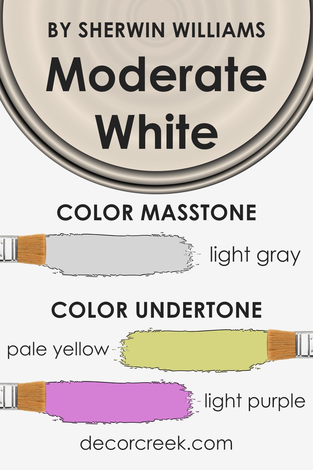
Undertones of Moderate White SW 6140 by Sherwin Williams
Moderate White by Sherwin Williams is a soft and versatile off-white paint. This color has a variety of undertones, which can subtly affect how it looks in different lighting conditions and settings. Undertones are the colors underneath the main color that can influence how the color appears to us. Even though the dominant impression of Moderate White is neutral, it has undertones of pale yellow, light purple, light blue, pale pink, mint, lilac, and grey.
When you use this paint on interior walls, the undertones will play a role in how the walls look. For example, in a room with a lot of natural light, the pale yellow undertone may become more noticeable, giving the room a warmer and sunnier feel.
In contrast, under artificial light, the cooler undertones like light blue or lilac might stand out, creating a cooler and more relaxed atmosphere.
The grey undertone helps balance the color, preventing it from looking too warm or too cool. These variations make Moderate White a flexible choice that can work in different settings, allowing it to adapt to a variety of decor styles and lighting situations.
The overall effect is subtle but can significantly influence the mood of a room.
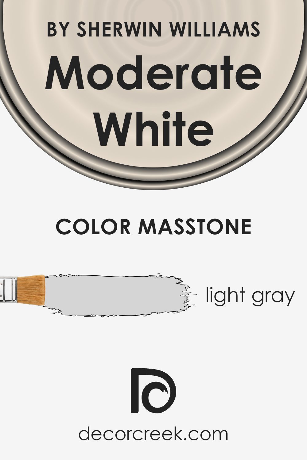
What is the Masstone of the Moderate White SW 6140 by Sherwin Williams?
Moderate White (SW 6140) by Sherwin Williams is a popular choice for home interiors. Its masstone, a light gray (#D5D5D5), serves as a soft, neutral base that adapts well to various environments. This light gray tinge allows Moderate White to reflect natural light effectively, creating an open and airy feel in living spaces.
As a versatile color, it coordinates well with many accent colors, from bold, vibrant hues to more muted tones, allowing homeowners to switch up decorations without changing the wall color.
In spaces like living rooms and bedrooms, it provides a cozy and inviting backdrop that is easy to live with. In kitchens and bathrooms, its light gray undertone can add a touch of modern elegance while maintaining warmth. Overall, the light gray masstone in Moderate White makes it a practical and timeless choice for any home, offering balanced brightness and subtle sophistication.
How Does Lighting Affect Moderate White SW 6140 by Sherwin Williams?
Lighting plays a crucial role in how we perceive colors. Different types of light can make a color look different in various settings. One example is the color Moderate White (SW 6140) by Sherwin Williams. This is a neutral color, but it can change its appearance depending on the lighting conditions and room orientation.
In artificial lighting, colors can appear warmer or cooler based on the bulb. For instance, incandescent bulbs tend to give off a warm, yellowish glow which can make Moderate White appear creamier than it might in natural daylight. LED lights can have different effects depending on their temperature—cooler LEDs can make Moderate White look more neutral or even slightly gray.
In natural light, the orientation of the room matters greatly. In north-facing rooms, which typically receive cooler, more consistent light, Moderate White may show cooler undertones, possibly appearing more muted or even a bit grayish. North-facing rooms usually don’t have much direct sunlight, so colors often look more subdued.
In south-facing rooms, the light is warm and bright for the longest periods of the day. This kind of light can enhance the warmth in Moderate White, making it look more welcoming and creamy. The sunlight makes colors pop more, so expect a warmer and more vibrant appearance.
East-facing rooms get bright, warm light in the morning. Moderate White might appear brighter and warmer in the mornings, but as the day progresses, the color can look more neutral as the intensity of the light decreases.
West-facing rooms get good natural light in the afternoon and early evening. The warm afternoon light can make Moderate White appear richer and warmer. In the morning, the color might appear cooler until the afternoon light changes the dynamic.
Understanding how different lights affect colors can help in selecting the right shade for each room based on its natural and artificial lighting conditions.
What is the LRV of Moderate White SW 6140 by Sherwin Williams?
The Light Reflectance Value (LRV) of a paint color is a measure of how much light the color will reflect. It’s a scale from 0 to 100, where 0 represents black, which absorbs all light, and 100 represents pure white, which reflects all light. The LRV of a color can significantly affect how it appears in a room because it influences how much light bounces off the walls.
A higher LRV means the color will reflect more light, making a room feel brighter and more open, while a lower LRV means the color will absorb more light, potentially making a room feel cozier or smaller.
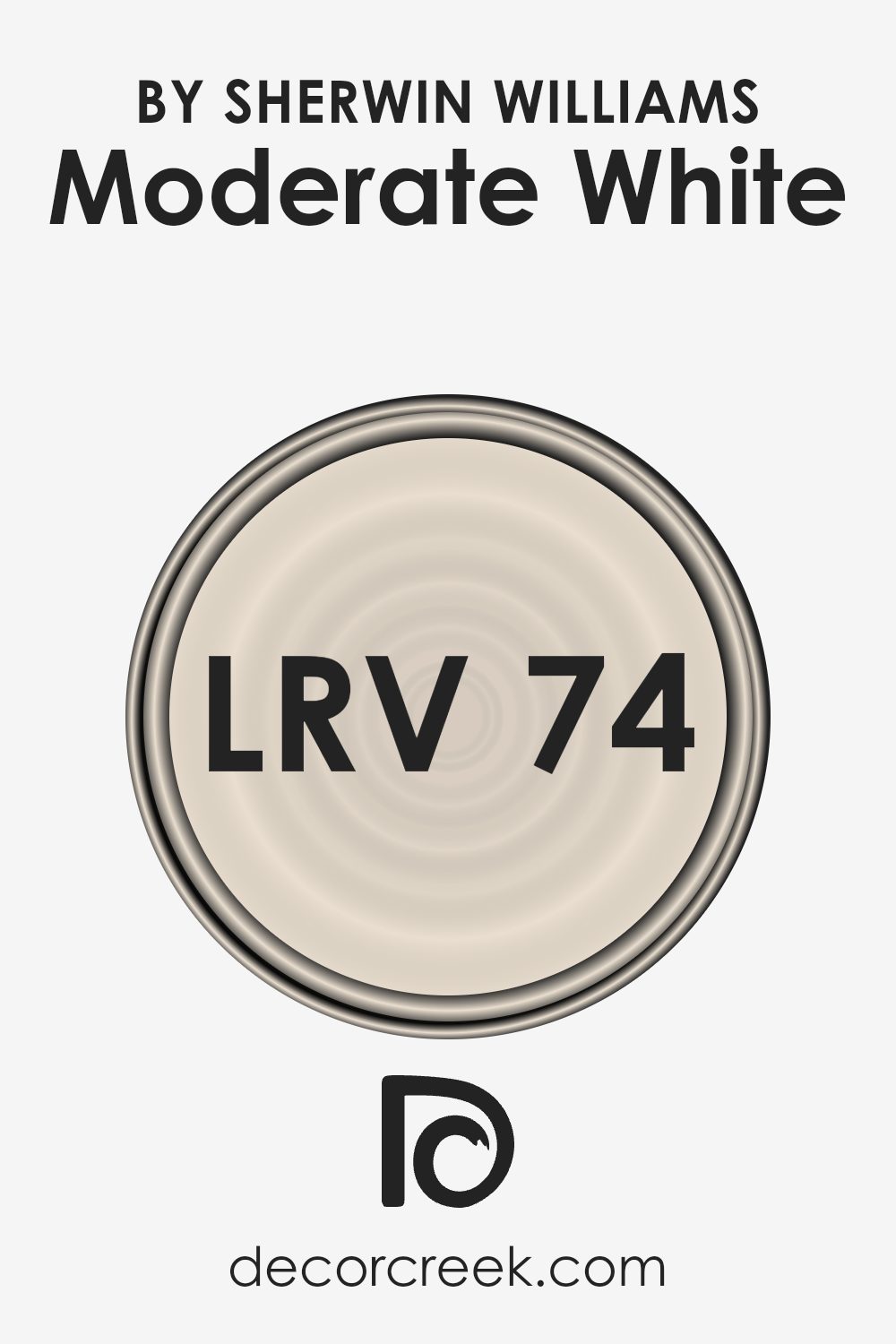
With an LRV of 73.87, Moderate White by Sherwin Williams is a light, reflective color. This high LRV means it will reflect a lot of light, making spaces feel airy and bright. This makes it a great choice for rooms that might not receive a lot of natural light since it can help make them feel lighter and more welcoming.
The color can enhance the perception of space and prevent rooms from feeling closed in. Additionally, the lightness of Moderate White allows it to serve as a versatile backdrop, easily coordinating with a wide variety of furnishings and accent colors.
Coordinating Colors of Moderate White SW 6140 by Sherwin Williams
Coordinating colors are hues that complement each other, creating a pleasing and harmonious look when used together in a space. They work by balancing each other out, either through contrast or similarity, enhancing the overall aesthetic of a room. For example, if you use Moderate White by Sherwin Williams as your primary color, you can choose coordinating colors that match well with it to create a seamless and inviting environment.
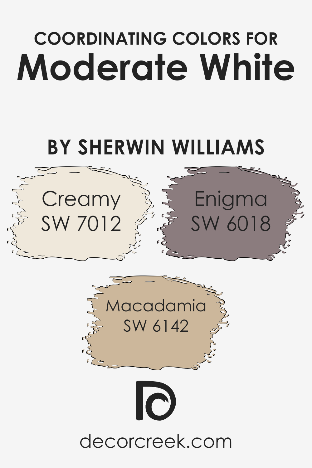
A perfect pair for Moderate White is SW 7012 – Creamy, which is a soft, warm off-white that adds a touch of cozy brightness to a room without overwhelming it. Another great option is SW 6142 – Macadamia, a warm, muted brown that brings a sense of earthiness and comfort to the palette.
For a bolder accent, SW 6018 – Enigma offers a deep, rich plum hue that introduces an element of surprise and adds depth to the color scheme. When used together, these colors work to create a cohesive look that’s both balanced and inviting, making any space feel welcoming and well-coordinated.
You can see recommended paint colors below:
- SW 7012 Creamy
- SW 6142 Macadamia
- SW 6018 Enigma
What are the Trim colors of Moderate White SW 6140 by Sherwin Williams?
Trim colors are the shades used for painting the edges and details around doors, windows, and baseboards. They contrast with or complement the main wall color to highlight these features and can make a significant impact on the overall appearance of a room. For a warm off-white like Moderate White, using the right trim color brings out its warmth while ensuring the room feels coordinated.
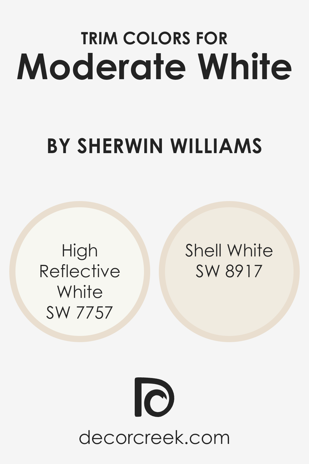
High Reflective White, for instance, is a bright and crisp white, ideal for trims because it provides a clean and sharp look that contrasts beautifully with Moderate White. This combination creates a bright and airy atmosphere by enhancing the clean edges of the room.
On the other hand, Shell White is a creamier, softer white that adds a touch of warmth, which pairs well with the subtle beige undertones in Moderate White. Using Shell White as a trim can give the space a softer, more cohesive feel, blending gently with the wall color. Trim colors like these play a crucial role in defining the room’s aesthetic, highlighting architectural details, and ensuring a polished finish.
You can see recommended paint colors below:
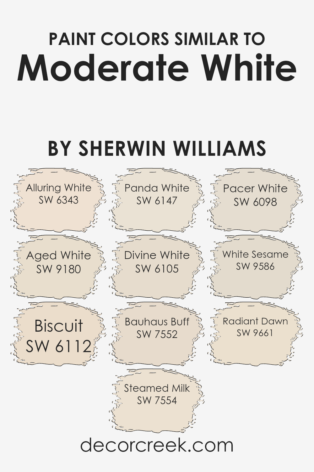
Colors Similar to Moderate White SW 6140 by Sherwin Williams
Similar colors are important because they provide subtle variations in tone that can enrich a color scheme and create a cohesive look in any space. When working with colors close to Moderate White, such as those from Sherwin Williams, they complement each other and offer versatility in design. For instance, Alluring White adds a hint of pink undertones, giving warmth to its neutral base, while Aged White leans slightly more beige, adding depth and coziness.
Biscuit has a soft buttery feel, perfect for creating an inviting atmosphere, with Steamed Milk providing a creamy backdrop that feels fresh and light. Panda White gives an earthy touch, fitting beautifully in rooms looking for an organic touch.
Divine White is a soft, off-white, with a hint of beige that seamlessly blends with natural tones, while Bauhaus Buff carries a slightly darker and warmer shade, enhancing a rustic charm. With its slightly peachy undertone, Pacer White can brighten a room without overwhelming, whereas White Sesame introduces a nearly imperceptible gray tint, adding a modern edge.
Radiant Dawn, with its gentle mix of pale pink and ivory, lends an almost ethereal quality to spaces, making each of these colors wonderful for creating a soft, harmonious environment. Together, they work to maintain a neutral palette while offering distinct nuances that enhance overall design.
You can see recommended paint colors below:
- SW 6343 Alluring White
- SW 9180 Aged White
- SW 6112 Biscuit
- SW 7554 Steamed Milk
- SW 6147 Panda White
- SW 6105 Divine White
- SW 7552 Bauhaus Buff
- SW 6098 Pacer White
- SW 9586 White Sesame
- SW 9661 Radiant Dawn
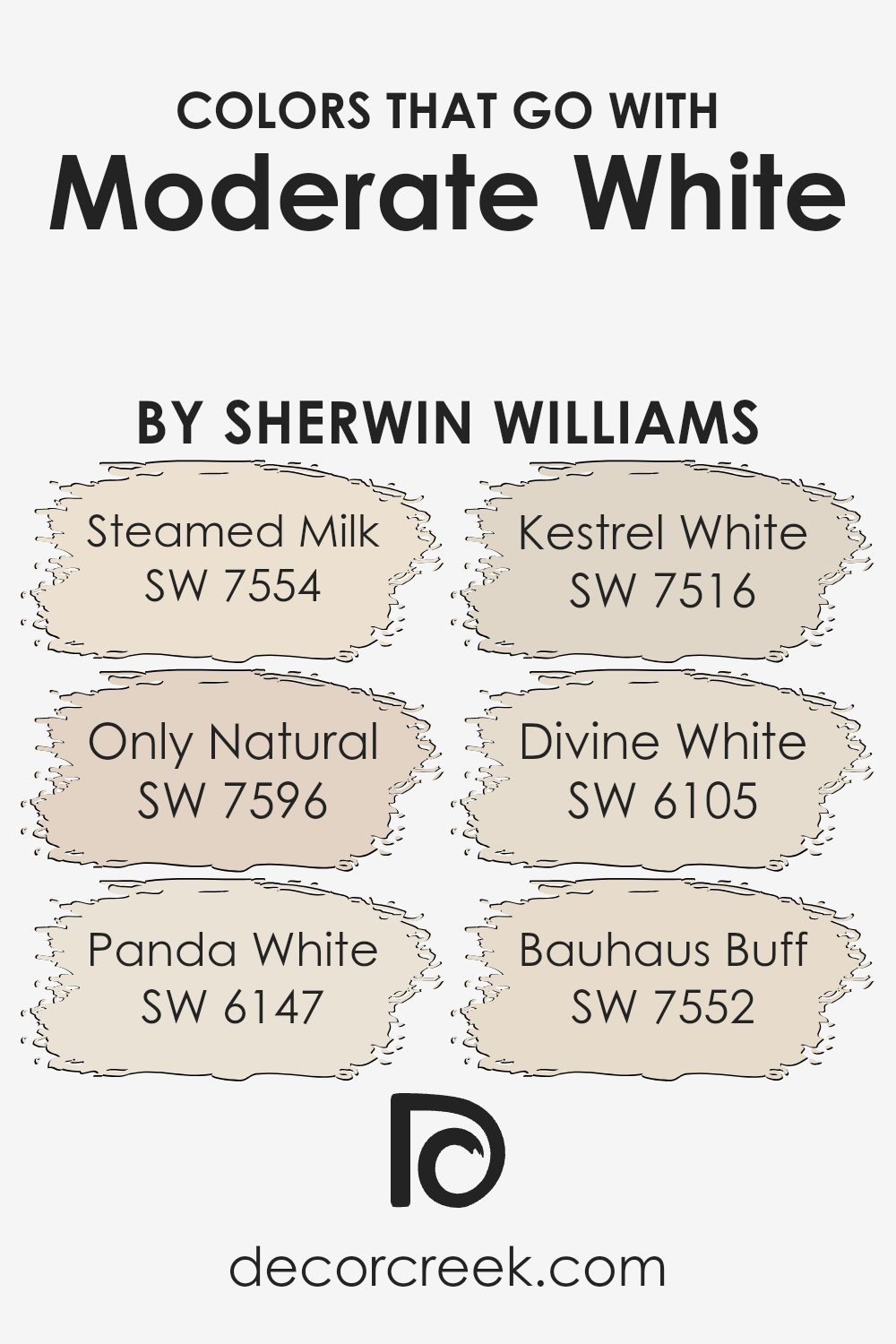
Colors that Go With Moderate White SW 6140 by Sherwin Williams
Choosing colors that go with Sherwin Williams’ Moderate White SW 6140 is essential because they create a harmonious look in your space. These colors complement each other, enhancing the overall feel of any room in your home. They ensure a balanced aesthetic and allow each element in the room to contribute to a welcoming ambiance.
SW 7554, Steamed Milk, offers a soft, creamy hue that brings warmth to your decor. It pairs beautifully with Moderate White, creating a cozy yet sophisticated vibe. SW 7596, Only Natural, adds a touch of subtle earthy tones, providing a natural look that works well in any living space.
Additionally, SW 6147, Panda White, is a versatile off-white shade that provides a clean and crisp feel to the room. It complements Moderate White effortlessly, making spaces feel open and airy. SW 7516, Kestrel White, gives a gentle nod to traditional whites with its slight warmth, enhancing the welcoming ambiance of any room.
For those wanting a slightly darker nuance without losing the brightness, SW 6105, Divine White, offers a rich yet simple tone that matches well with accessories. SW 7552, Bauhaus Buff, with its muted buff color, ties everything together with a hint of vintage, completing an understated yet charming palette.You can see recommended paint colors below:
- SW 7554 Steamed Milk
- SW 7596 Only Natural
- SW 6147 Panda White
- SW 7516 Kestrel White
- SW 6105 Divine White
- SW 7552 Bauhaus Buff
How to Use Moderate White SW 6140 by Sherwin Williams In Your Home?
Moderate White SW 6140 by Sherwin Williams is a versatile and warm neutral paint color. It’s a great choice for creating a comfortable and inviting atmosphere in your home. With its soft beige undertones, Moderate White works well in various rooms, from living areas to bedrooms, offering a subtle background that complements different styles and décor.
In the living room, you can use this shade on the walls to provide a cozy and welcoming feel. It pairs beautifully with both light and dark furnishings, allowing flexibility in decorating. In the kitchen, it can be used to maintain a clean and timeless look, working nicely with wooden or white cabinets.
In bedrooms, Moderate White creates a restful environment, perfect for relaxation. You can add colorful or neutral bedding and accessories to make the room feel personalized. Overall, Moderate White is a reliable choice for anyone looking to add warmth and comfort to their home spaces.
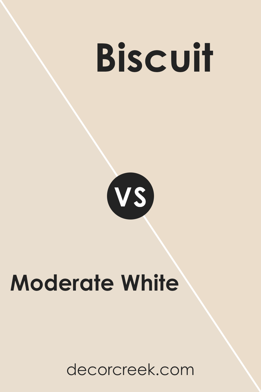
Moderate White SW 6140 by Sherwin Williams vs Biscuit SW 6112 by Sherwin Williams
Moderate White (SW 6140) and Biscuit (SW 6112) by Sherwin Williams are both warm and inviting colors with distinct characteristics. Moderate White is a soft, neutral off-white with subtle beige undertones. It provides a calm and spacious feel, making it versatile for various spaces in a home, like living rooms or bedrooms. It pairs well with a range of colors without overwhelming a space.
Biscuit, on the other hand, carries a stronger beige tone with a hint of yellow, giving it a warmer appearance than Moderate White. It brings a cozy and comforting vibe, ideal for kitchens or dining areas. Biscuit can add more depth to a room due to its richer tones.
Both colors blend well with earthy hues and work nicely as backdrops for art and furniture, but the choice between them depends on how warm or neutral you want the space to feel.
You can see recommended paint color below:
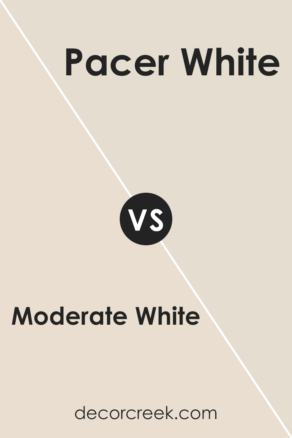
Moderate White SW 6140 by Sherwin Williams vs Pacer White SW 6098 by Sherwin Williams
Moderate White SW 6140 by Sherwin Williams is a soft, warm white with subtle beige undertones, making it versatile for various spaces. It’s a neutral shade that’s not too bright, providing a cozy feel without being overwhelming. This color can adapt well to different lighting, shifting from a gentle beige in natural light to a warmer tone under artificial lighting.
On the other hand, Pacer White SW 6098 is also a warm white but leans slightly more towards a creamy tone. It has a bit more depth compared to Moderate White, which can give it a richer appearance on walls. This makes Pacer White suitable for traditional or elegant settings where a touch of warmth is desired.
Both colors are warm and inviting, but while Moderate White offers more of a balanced, subtle presence, Pacer White brings a slightly more pronounced warmth, adding a touch of coziness to any room.
You can see recommended paint color below:
- SW 6098 Pacer White
Moderate White SW 6140 by Sherwin Williams vs Bauhaus Buff SW 7552 by Sherwin Williams
Moderate White SW 6140 and Bauhaus Buff SW 7552, both by Sherwin Williams, offer unique aesthetic qualities. Moderate White is a soft, warm white with subtle beige undertones. It’s a versatile and neutral color, suitable for creating a calm and cozy environment. It works well in spaces where a light and airy feel is desired, seamlessly complementing various decors.
On the other hand, Bauhaus Buff is a warm, creamy beige that adds a touch of warmth and personality to a room without being overpowering. Its slightly deeper tone compared to Moderate White makes it an excellent choice for adding a bit more depth and character.
While both colors can complement a wide range of styles, Moderate White is typically used when a brighter atmosphere is needed, whereas Bauhaus Buff is often chosen to enhance spaces with a richer, more inviting touch. Both colors offer a welcoming backdrop for both contemporary and traditional designs.
You can see recommended paint color below:
Moderate White SW 6140 by Sherwin Williams vs Panda White SW 6147 by Sherwin Williams
Moderate White SW 6140 and Panda White SW 6147 are two soft, warm off-white colors by Sherwin Williams that are often used in interior spaces. Moderate White is a light beige with subtle warmth, making it a versatile choice for most rooms. It has enough depth to add interest without being too bold. Panda White, on the other hand, is also a warm off-white but tends to have a slightly lighter and creamier appearance compared to Moderate White.
When comparing them, Moderate White can appear a bit more beige or taupe, while Panda White leans more towards a soft cream. Both colors create cozy atmospheres, but Moderate White offers a touch more color, while Panda White is closer to a true off-white.
These differences make Moderate White feel a bit more grounded, while Panda White might be perceived as slightly brighter and lighter, ideal for creating airy spaces.
You can see recommended paint color below:
Moderate White SW 6140 by Sherwin Williams vs Radiant Dawn SW 9661 by Sherwin Williams
Moderate White SW 6140 and Radiant Dawn SW 9661 are two paint colors from Sherwin Williams that offer different vibes. Moderate White is a warm, neutral shade that can fit well in many settings. It’s not too bright, which makes it cozy and versatile for living rooms, bedrooms, or common spaces. The color provides a soft backdrop that complements various decor styles and color schemes.
On the other hand, Radiant Dawn is a soft, light color with a hint of peach or apricot. It’s bright and cheerful, making it a great choice for spaces where you want more energy and light. This color works well in areas like kitchens, bathrooms, or playrooms to provide a fresh and lively ambiance.
While both colors are warm-toned, Moderate White leans towards being more neutral, whereas Radiant Dawn has a noticeable hint of color that adds a bit of playful warmth.
You can see recommended paint color below:
- SW 9661 Radiant Dawn
Moderate White SW 6140 by Sherwin Williams vs White Sesame SW 9586 by Sherwin Williams
Moderate White (SW 6140) by Sherwin Williams is a warm neutral color that has a cozy, inviting feel. It’s a blend of soft beige with a hint of gray, making it versatile for various settings. This color works nicely in living rooms or bedrooms, adding warmth without overwhelming the space.
On the other hand, White Sesame (SW 9586) is a lighter, more neutral shade. It’s closer to a true white but with a soft undertone that prevents it from feeling too stark or cold. This makes White Sesame great for creating a clean, airy environment, perfect for kitchens, bathrooms, or modern interiors.
When comparing the two, Moderate White adds a touch more warmth and depth, making it suitable for traditional or cozy interiors. White Sesame offers a crisper and brighter look, ideal for more contemporary spaces. Both colors are flexible, but they serve different moods and energy levels in a room.
You can see recommended paint color below:
Moderate White SW 6140 by Sherwin Williams vs Steamed Milk SW 7554 by Sherwin Williams
Moderate White SW 6140 by Sherwin Williams is a warm, neutral paint color known for its versatility. It offers a soft, yet welcoming atmosphere. This color leans towards beige with a hint of gray, making it a perfect backdrop for many styles of interior design. It can create a cozy environment without feeling too constricting, functioning well in living rooms or bedrooms.
On the other hand, Steamed Milk SW 7554 by Sherwin Williams has a creamy hue with a subtle touch of warmth. It is slightly lighter than Moderate White, providing an airy and open feel. Steamed Milk works great in spaces where you want to enhance natural light and maintain a light and cheerful ambiance.
Both colors can serve as neutrals but differ in depth and brightness. While Moderate White is richer and a bit moodier, Steamed Milk is brighter and brings a sense of freshness to a room.
You can see recommended paint color below:
Moderate White SW 6140 by Sherwin Williams vs Aged White SW 9180 by Sherwin Williams
Moderate White SW 6140 and Aged White SW 9180, both from Sherwin Williams, are neutral shades that offer different vibes. Moderate White is a warm, versatile white with a hint of beige, making it a cozy choice for various spaces.
It works well in both modern and traditional settings, providing a welcoming feel. On the other hand, Aged White has a slightly richer, creamier tone, giving it a more antique or rustic appearance. This makes it ideal for spaces that aim for a vintage or classical look.
While Moderate White is closer to a soft, muted white, Aged White leans towards a buttery off-white. This subtle difference can significantly impact the mood of a room. If you’re looking for a clean, subtle backdrop, Moderate White is a great choice. For a warmer, more nostalgic ambiance, Aged White might be the preferred option. Both colors are excellent foundations for adding other decorative elements.
You can see recommended paint color below:
Moderate White SW 6140 by Sherwin Williams vs Divine White SW 6105 by Sherwin Williams
Moderate White SW 6140 and Divine White SW 6105, both by Sherwin Williams, offer subtle differences suited for various settings. Moderate White SW 6140 is a warm, neutral shade with a hint of beige that makes it adaptable to different environments.
It’s perfect for adding a cozy, inviting feel to a space without overpowering it. Divine White SW 6105, on the other hand, leans slightly lighter and has a touch more warmth, giving it a soft, delicate appearance. This makes it ideal for rooms that need a little more lightness and brightness.
While both colors are versatile and can complement a range of design styles, Moderate White might be a better choice in spaces where you want a hint of depth, while Divine White is excellent for a clean, bright look. Both colors can help create a harmonious and welcoming atmosphere in any home.
You can see recommended paint color below:
Moderate White SW 6140 by Sherwin Williams vs Alluring White SW 6343 by Sherwin Williams
Moderate White SW 6140 by Sherwin Williams is a soft, warm off-white color with subtle beige undertones. It creates a cozy and inviting atmosphere in any room. It works well as a neutral backdrop and pairs nicely with both warm and cool accents. The color is versatile, making it suitable for living rooms, bedrooms, or any space that needs a touch of warmth without being overpowering.
On the other hand, Alluring White SW 6343 by Sherwin Williams is also an off-white, but it leans more towards the creamy side with slight peachy undertones. This gives it a brighter, more cheerful quality compared to Moderate White. Alluring White can add a hint of warmth and brightness to a room, making it feel open and airy.
In comparison, Moderate White is warmer and more muted, while Alluring White is light and slightly more vibrant. Both are excellent choices for creating a welcoming environment, with their unique subtle differences setting them apart.
You can see recommended paint color below:
- SW 6343 Alluring White
After thinking about SW 6140 Moderate White by Sherwin Williams, I believe it’s a fantastic color choice for just about any room in your home. This shade is a warm, creamy white that can make your room feel cozy and inviting. It’s not too bright, so it won’t hurt your eyes, but it’s light enough to keep your room feeling fresh and open.
One of the best things about this white is that it pairs well with so many other colors. Whether you have bold furniture or soft, pastel accents, this shade of white can be a perfect backdrop. Imagine painting your walls with it and seeing how nicely it goes with your colorful rugs or bright pillows. It can help everything in your room come together without being too plain or boring.
Also, SW 6140 Moderate White can work great in different kinds of rooms—like the living room, kitchen, or even a hallway. It’s like a friendly color that feels comforting no matter where you use it. Plus, it won’t go out of style anytime soon, so you won’t have to worry about repainting for a long time.
In short, if you’re thinking about changing up the colors in your home, consider SW 6140 Moderate White. It might be just what you need to make your room special and welcoming.
Ever wished paint sampling was as easy as sticking a sticker? Guess what? Now it is! Discover Samplize's unique Peel & Stick samples.
Get paint samples

