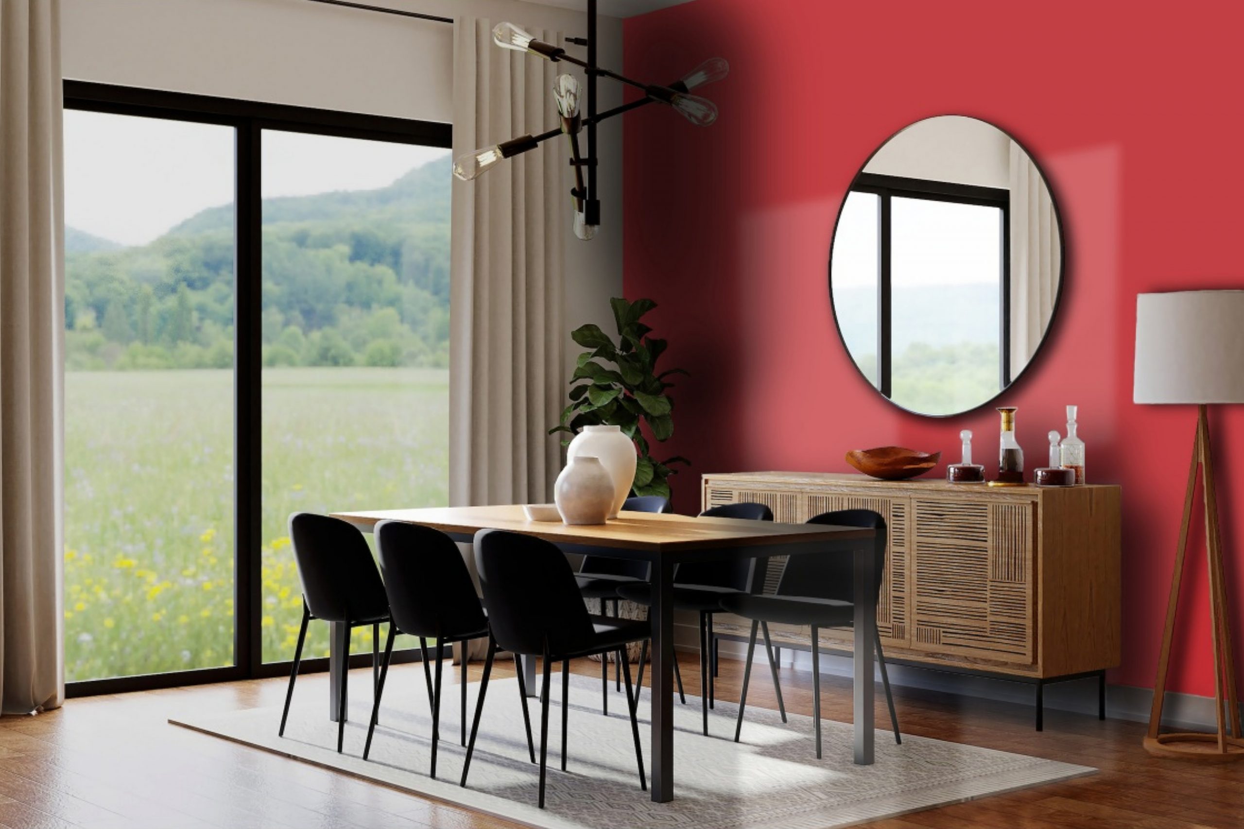
SW 6321 Red Bay by Sherwin Williams is a stunning paint color that can instantly warm up any space in your home. This rich hue belongs to a palette that draws inspiration from nature, offering a cozy, inviting vibe to both living areas and personal spaces. Perfect for those looking to add a touch of sophistication and warmth to their interior design, Red Bay has a unique charm that works beautifully in various settings, from kitchens and dining rooms to bedrooms and living areas.
Choosing the right paint color is crucial in achieving the desired atmosphere in a room, and Red Bay does not disappoint. Whether you’re aiming to create a focal point with an accent wall or plan to transform the entire room, this shade provides a balanced blend of depth and brightness, making it versatile for different lighting conditions and styles.
Its earthy undertones ensure it pairs well with a wide range of décor elements, from wood and metals to textiles of numerous patterns and colors.
If you’re considering a makeover for your home or simply want to update a room with a fresh coat of paint, Red Bay by Sherwin Williams offers a delightful solution. It’s a color that stands the test of time, effortlessly blending with changing trends and personal tastes. So, for anyone looking to add warmth and character to their space, Red Bay is an excellent choice to consider.”
What Color Is Red Bay SW 6321 by Sherwin Williams?
Red Bay by Sherwin Williams is a warm, rich color that adds a cozy and inviting touch to any room. This particular shade is a deep, reddish-brown, reminiscent of autumn leaves or a fine mahogany. Its warmth makes it an excellent choice for creating a snug and welcoming atmosphere in your home.
This versatile color works wonderfully in a variety of interior styles. It’s particularly striking in traditional settings, where its depth can add a layer of sophistication and timeless elegance. Farmhouse interiors also benefit from Red Bay, as it complements natural wood textures and rustic elements, enhancing the homey feel of the space.
When it comes to pairing materials and textures with Red Bay, consider natural elements for a harmonious look. Leather furniture, for example, can look stunning against a Red Bay backdrop, bringing out the richness of both the leather and the wall color. Wooden accents, whether in flooring, furniture, or decorative items, also pair beautifully, creating a seamless blend of warmth and organic texture. For a bit of contrast, incorporate metals like gold or brass in light fixtures or decor items, adding a touch of luxury without overwhelming the room’s cozy vibe.
In summary, Red Bay is a versatile, warm shade perfect for adding depth and coziness to a variety of interior styles, and it beautifully complements natural materials and rich textures.

Is Red Bay SW 6321 by Sherwin Williams Warm or Cool color?
Red Bay SW 6321 by Sherwin Williams is a warm, rich paint color that adds a cozy and elegant atmosphere to any room in a home. With its deep red tones that lean towards a sophisticated burgundy, it works exceptionally well in spaces that aim for a luxurious or welcoming vibe. Whether you’re looking to create a statement wall in your living room or add depth to your dining area, Red Bay offers versatility, making it suitable for both modern and traditional interiors.
This color shines when used in well-lit areas, as natural light brings out its vibrant undertones, giving a room a more dynamic and inviting feel. However, in spaces with less light, it can produce a more intimate and snug ambiance, perfect for areas like bedrooms or reading nooks.
Pairing Red Bay with neutral colors such as whites, creams, or light grays can balance its intensity, ensuring that the space doesn’t feel overwhelming but instead, comfortably grounded. Moreover, incorporating materials like wood, leather, or metal can enhance the color’s richness, adding to the overall aesthetic of warmth and sophistication.
Using Red Bay in your home is more than just choosing a paint color; it’s about creating a mood that reflects comfort, elegance, and warmth, making your space feel truly inviting.
Undertones of Red Bay SW 6321 by Sherwin Williams
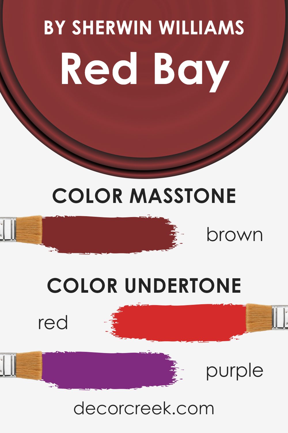
Red Bay, a paint color by Sherwin Williams, is a deep, vibrant shade with a complex personality. The undertones of a color are like the secret ingredients; they can subtly influence how we perceive the main hue. For Red Bay, these undertones are varied, ranging from red to purple, olive, dark grey, pink, orange, grey, navy, dark green, pale pink, and dark turquoise. Although the primary look of Red Bay is a rich red, these undertones play a significant role in how it adapts to different settings and lighting conditions.
In simple terms, undertones are the colors hiding beneath the surface color. They can make a paint color appear cooler or warmer, depending on the mix. For instance, in Red Bay, the presence of orange and pink undertones adds warmth, making a room feel cozy and welcoming. On the other hand, the dark grey, navy, and dark green undertones can give it a more grounded, sophisticated look.
When applied to interior walls, Red Bay’s complexity comes to life. The natural light and surrounding colors in a room will interact with it in unique ways. In a brightly lit room, for instance, the red and orange undertones might become more prominent, giving the walls a vibrant glow. In contrast, in a room with less light or during the evening, the darker undertones like dark green or dark grey might stand out more, imparting a luxurious, intimate feel.
This versatility makes Red Bay an intriguing choice for spaces. It’s not just a simple red paint; it’s a hue with depth and dimension, capable of transforming a room based on its innate color blend and the environment around it.
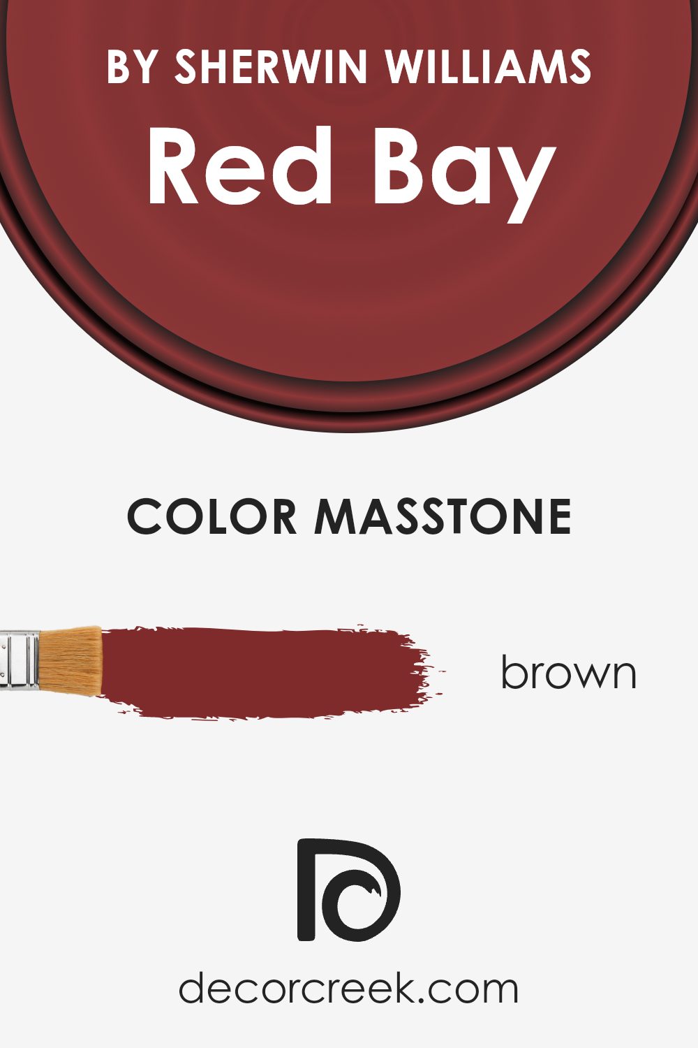
What is the Masstone of the Red Bay SW 6321 by Sherwin Williams?
Red Bay SW 6321 by Sherwin Williams has a masstone, or primary underlying hue, that is a rich brown color, specifically #802B2B. This deep, warm shade of brown brings a cozy and inviting atmosphere to any room in a home. Due to its earthy and neutral base, it pairs well with a variety of decor styles, from rustic to modern.
It works particularly well in spaces where a sense of warmth and comfort is desired, such as in living rooms or bedrooms. The color can also create a striking contrast when used alongside lighter colors, making it versatile for accent walls or furniture pieces. In addition, because it’s grounded in brown, it has a timeless quality that doesn’t quickly go out of style.
This means incorporating Red Bay into your home can add lasting warmth and character, making spaces feel more welcoming and lived-in.
How Does Lighting Affect Red Bay SW 6321 by Sherwin Williams?
Lighting can significantly affect how we perceive colors. Different types of light can change the way a color looks in terms of its brightness, hue, and contrast. Specifically, the color Red Bay by Sherwin Williams is a vibrant and warm shade that can look different depending on the kind of light it’s under. When it comes to artificial light, this color can vary based on the temperature of the light bulb used. In a room with warm lighting, Red Bay might appear more cozy and rich, while in cooler artificial light, it may seem a bit more subdued, losing a bit of its warmth.
Natural light, on the other hand, changes throughout the day and can thus affect how Red Bay looks in a space. In north-faced rooms, which tend to get less direct sunlight, this color might appear slightly darker and more muted. The lack of intense natural light can make it look sophisticated but without the vibrant glow it might have in a brighter, sunlit space.
South-faced rooms enjoy abundant sunlight for the better part of the day. Here, Red Bay can truly shine, appearing lively, warm, and inviting. The natural light highlights its rich depth, making the space feel welcoming and energetic.
In east-faced rooms, the morning light can make Red Bay look very bright and vivid. The early sun casts a golden glow, enhancing the color’s warmth and making it pop. As the day progresses and the natural light fades, the color can take on a more subdued, yet still warm, quality.
West-faced rooms experience the opposite effect: the color may start the day looking more muted but becomes dramatically vibrant in the afternoon and evening as the setting sun fills the room with intense, warm light. This can make Red Bay appear exceptionally dynamic and rich during these times.
In summary, the appearance of Red Bay by Sherwin Williams can vary considerably under different lighting conditions, from appearing cozy and subdued in artificial or less direct natural light to becoming intensely warm and vibrant in rooms filled with plenty of natural sunlight.

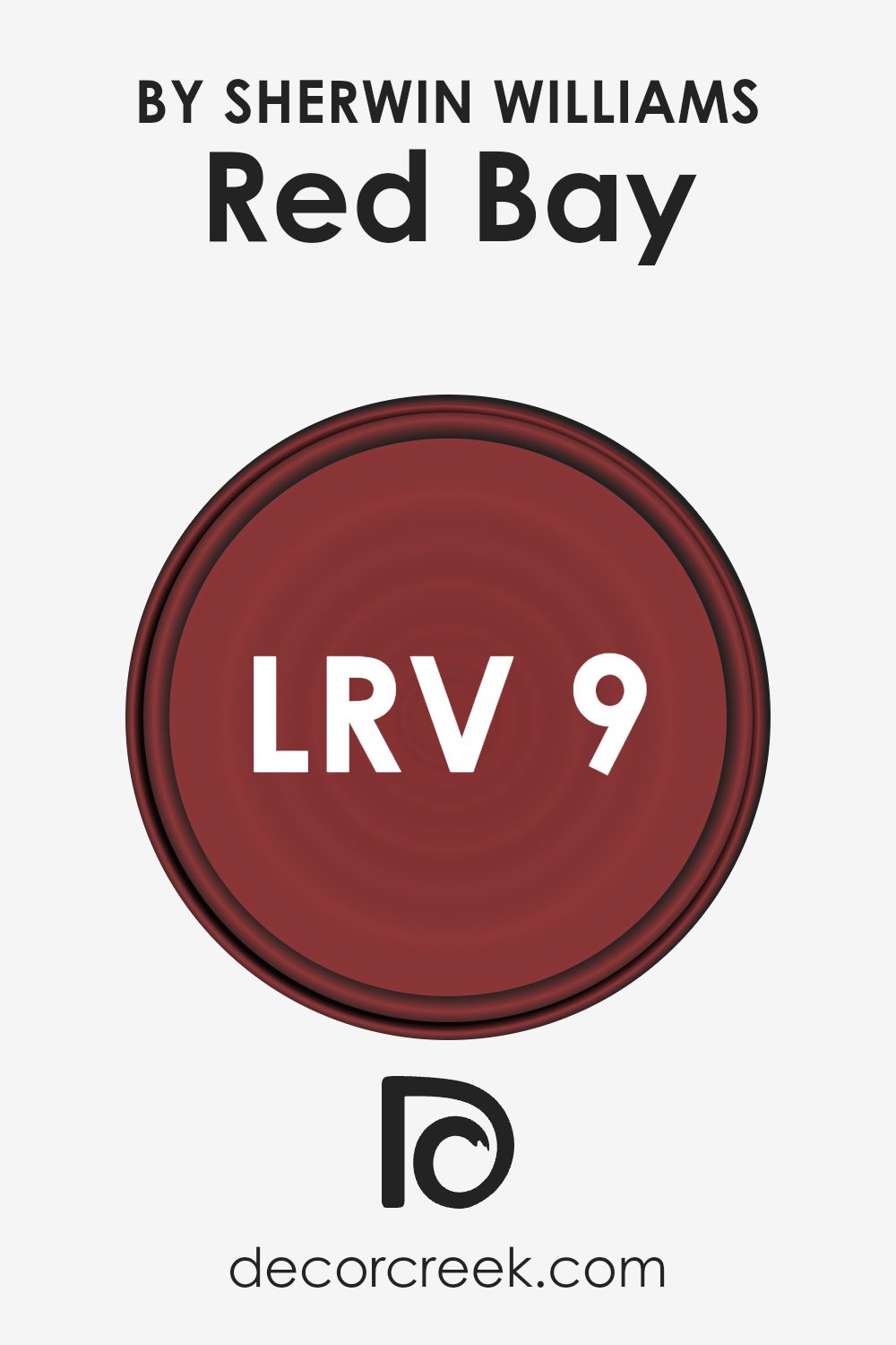
What is the LRV of Red Bay SW 6321 by Sherwin Williams?
With an LRV of 8.715, the specified color is on the darker side of the spectrum, meaning it absorbs more light than it reflects. This low LRV suggests that when used on walls, it will render the space more subdued and intimate, potentially making small rooms feel even smaller or cozier.
The low LRV also means this color will significantly change its appearance under different lighting conditions; it might appear richer and more vibrant in a well-lit room or during daylight hours, but could look much darker in poorly lit areas. When choosing where to apply this color, consider the room’s natural and artificial lighting to ensure it complements the space as intended.
Coordinating Colors of Red Bay SW 6321 by Sherwin Williams
Coordinating colors are chosen to complement a main color, enhancing the overall aesthetic of a space. They work by balancing hue, saturation, and brightness, creating a visually cohesive environment. For a rich color like Red Bay by Sherwin Williams, selecting the right coordinating colors ensures that the spaces feel harmonious and thoughtfully designed. These colors, when used together, can either create a vibrant contrast or a subtle transition, depending on how they’re applied in a room’s decor.
Intimate White, a soft and serene shade, offers a gentle contrast to the robustness of Red Bay, providing a soothing backdrop that allows the depth of Red Bay to truly pop. This color is perfect for trim or ceilings, acting as a calming balance to more saturated colors. Alpaca, on the other hand, is a warm, neutral gray that pairs beautifully with Red Bay, lending a sophisticated and understated elegance to any room.
Its versatility bridges the gap between warm and cool elements in a space. Lastly, Indigo Batik is a deep, rich blue that adds a dramatic flair when combined with Red Bay. This bold choice can bring depth and intensity to a design scheme, making it an excellent choice for accent walls or furniture pieces. Together, these coordinating colors offer a palette that is both versatile and cohesive, allowing for endless creative possibilities.
You can see recommended paint colors below:
- SW 6322 Intimate White
- SW 7022 Alpaca
- SW 7602 Indigo Batik

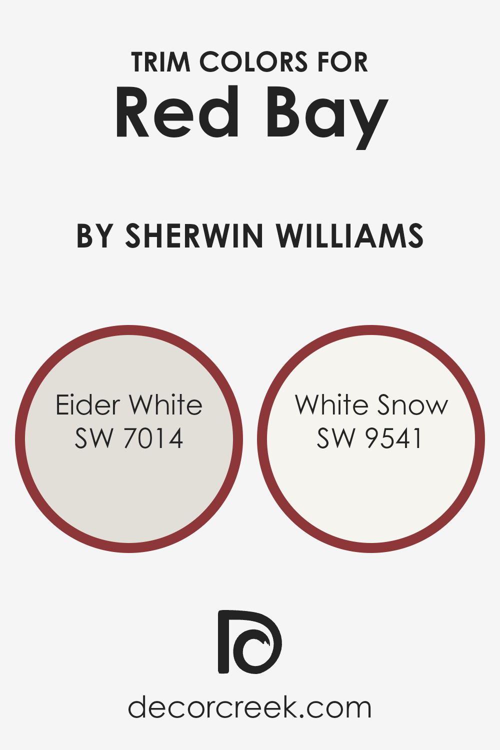
What are the Trim colors of Red Bay SW 6321 by Sherwin Williams?
Trim colors are chosen to complement or contrast the main color of a wall or space, serving as frames or accents around windows, doors, and baseboards. In the case of Red Bay by Sherwin Williams, a deep, rich hue, selecting the right trim color is crucial because it highlights the architectural features of a room and adds a layer of sophistication.
Trim colors can either blend seamlessly with the main color for a subtle effect or stand out for a more dramatic look, influencing the overall feel and cohesion of the space.
Eider White SW 7014 is a soft, warm white with subtle gray undertones, offering a gentle contrast to the boldness of Red Bay. It provides a soothing transition that isn’t too stark, making it ideal for a cozy and inviting atmosphere. On the other hand, White Snow SW 9541 is a brighter, crisper white that brings a more pronounced contrast to Red Bay, sharpening architectural details and bringing a fresh, lively flair to the space. Both these colors offer a versatile palette that enhances the depth and richness of Red Bay, allowing it to truly shine in any setting.
You can see recommended paint colors below:
- SW 7014 Eider White
- SW 9541 White Snow
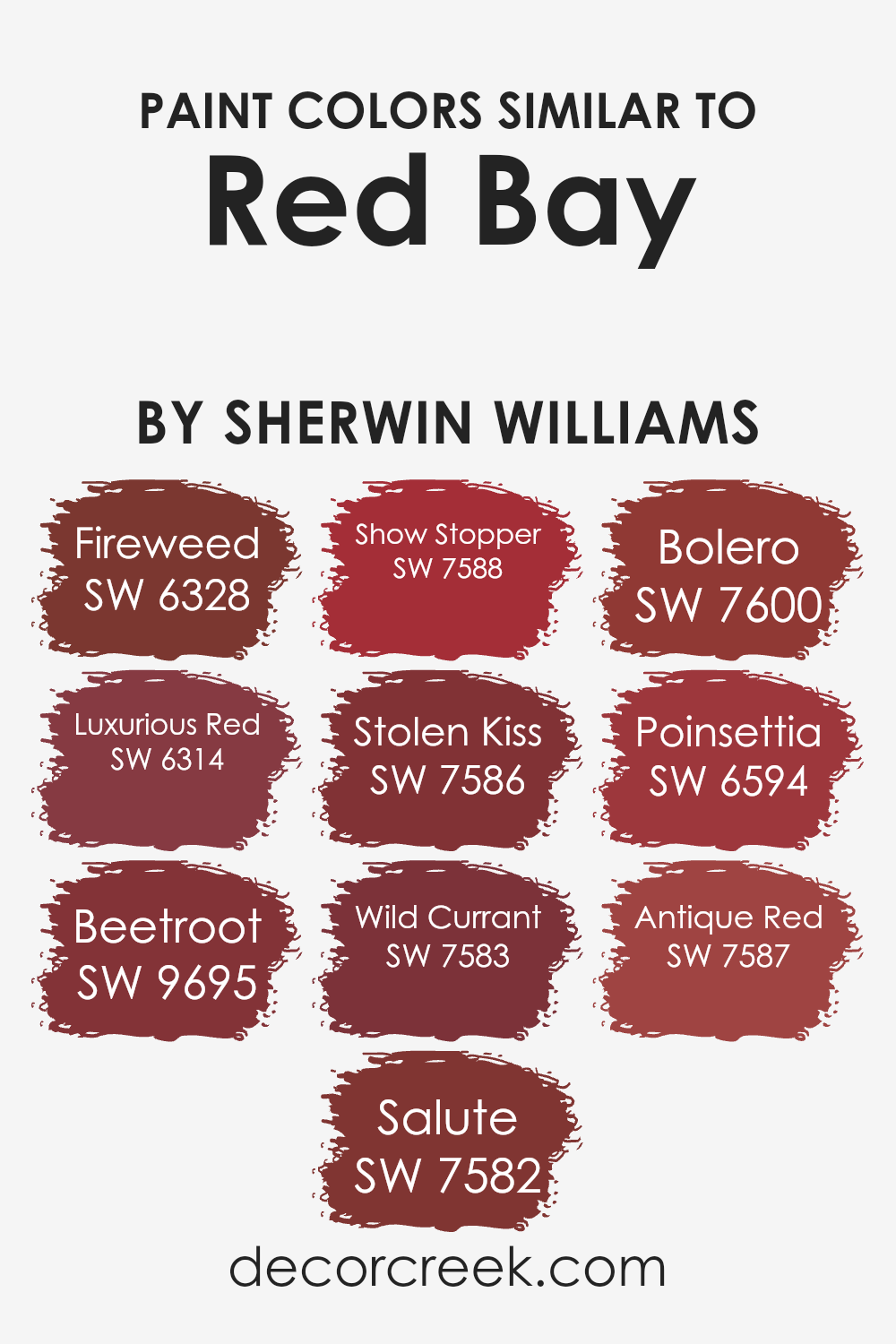
Colors Similar to Red Bay SW 6321 by Sherwin Williams
Similar colors are significant in design and decoration due to their ability to create a cohesive and harmonious look. Colors that share a common hue, like variants of red from Sherwin Williams, work well together because they share a base color, which makes them naturally complementary.
Such colors can add depth and texture to a space without overwhelming it with too much contrast. They allow for subtle transitions between different surfaces and elements in a room, enabling a designer or homeowner to create spaces that feel intentionally designed and put together.
Whether aiming for a bold statement wall or a nuanced color scheme throughout a home, picking colors that are closely aligned on the color wheel ensures a smooth visual flow, giving spaces a refined and carefully curated appearance.
For instance, Fireweed offers a vibrant and lively tone, perfect for energizing a space, while Luxurious Red brings a deeper, more sophisticated vibe, ideal for creating an ambiance of elegance and warmth. Beetroot adds a muted, earthy quality, suitable for grounding a room with a touch of nature-inspired color.
Salute stands out with its subdued, almost neutral red, providing a versatile backdrop for both modern and traditional settings. Show Stopper is aptly named for its ability to make a bold, dramatic statement, commanding attention in any space.
Stolen Kiss whispers romance with its soft, subtle hue, perfect for creating a serene, cozy nook. Wild Currant offers a slightly adventurous flair with its rich, deep tone, inviting depth and intrigue. Bolero stirs the senses with its dynamic, yet warm presence, ensuring a welcoming atmosphere. Poinsettia sparkles with a festive cheer, adding a pop of bright, joyful color ideal for lively spaces.
Lastly, Antique Red exudes a timeless charm, making it a go-to for spaces that aim for a classical and enduring appeal. Together, these colors weave a rich tapestry of hues, affording endless possibilities for personalized and cohesive palettes.
You can see recommended paint colors below:
- SW 6328 Fireweed
- SW 6314 Luxurious Red
- SW 9695 Beetroot
- SW 7582 Salute
- SW 7588 Show Stopper
- SW 7586 Stolen Kiss
- SW 7583 Wild Currant
- SW 7600 Bolero
- SW 6594 Poinsettia
- SW 7587 Antique Red
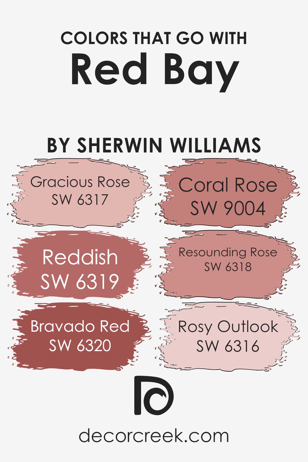
Colors that Go With Red Bay SW 6321 by Sherwin Williams
Choosing the right colors to complement Red Bay SW 6321 by Sherwin Williams is crucial because it ensures a harmonious and visually appealing palette in your space. When colors like SW 6317 – Gracious Rose, SW 6319 – Reddish, SW 6320 – Bravado Red, SW 9004 – Coral Rose, SW 6318 – Resounding Rose, and SW 6316 – Rosy Outlook are thoughtfully selected, they enhance the depth and warmth of Red Bay, creating an inviting and cohesive look.
This selection of colors works together by balancing warmth and providing a richness that can elevate any room’s aesthetic. The use of complementary colors like these forms a sophisticated environment, where each hue supports and highlights the features of the others.
Gracious Rose offers a soft, muted contrast to the boldness of Red Bay, providing a delicate balance in decor. Reddish adds depth and intensity by bringing a slightly darker shade into the mix, enriching the overall color scheme. Bravado Red intensifies the warm tones of Red Bay, making spaces feel more dynamic and full of energy. Coral Rose injects a vibrant, spirited cheer into the palette with its bright, lively tones.
Resounding Rose deepens the mood, offering a sophisticated, rich complement to the primary color. Lastly, Rosy Outlook presents a lighter, more optimistic touch that brightens the space and brings a sense of airiness against the strong character of Red Bay. Together, these colors ensure that any design project will have a well-rounded, appealing, and dynamic color scheme that feels both welcoming and elegantly coordinated.
You can see recommended paint colors below:
- SW 6317 Gracious Rose
- SW 6319 Reddish
- SW 6320 Bravado Red
- SW 9004 Coral Rose
- SW 6318 Resounding Rose
- SW 6316 Rosy Outlook
How to Use Red Bay SW 6321 by Sherwin Williams In Your Home?
Red Bay SW 6321 by Sherwin Williams is a warm, rich paint color that can add a cozy and inviting feel to any room in your home. This deep, reddish-brown shade is perfect for creating a statement wall in your living room, dining area, or even your bedroom. Its deep tone works well with natural light, bringing out a vibrant yet soothing warmth that makes spaces feel more welcoming.
Using Red Bay in your home can really transform the mood. It pairs beautifully with soft neutrals like creams and grays, allowing it to stand out without overpowering the room. It’s also a great choice for accenting features such as fireplace mantels or built-in bookshelves, adding depth and interest to your spaces.
For those looking to add some character to their kitchen or bathroom, Red Bay can be used on cabinets for a chic, sophisticated look. It contrasts nicely with lighter countertops and backsplashes. Plus, in rooms with ample lighting, this color can truly shine, showcasing its rich hue without making the space feel too dark.
In short, Red Bay by Sherwin Williams is a versatile color that can help you refresh your home’s look, whether you’re painting an entire room or just looking for a splash of color to update a space.
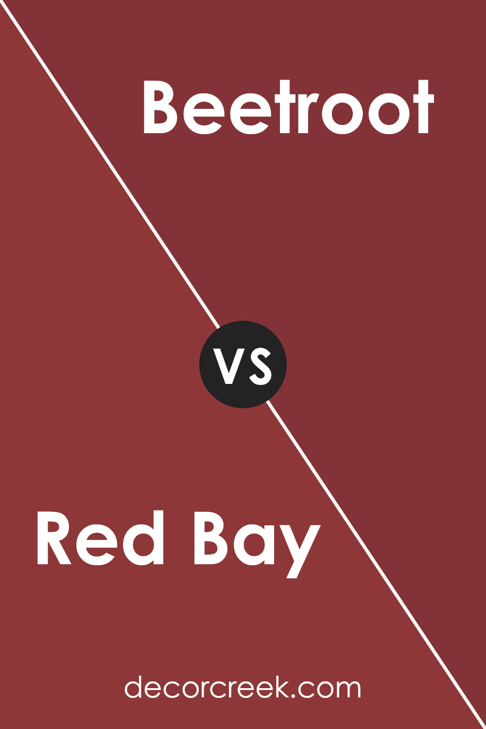
Red Bay SW 6321 by Sherwin Williams vs Beetroot SW 9695 by Sherwin Williams
Red Bay is a rich, deep color that feels like it has a hint of brown mixed with red. It’s the kind of color that makes a space feel warm and cozy, like wrapping yourself in a comfortable blanket on a chilly evening. On the other hand, Beetroot is a bold, vibrant shade that leans more towards purple with red undertones.
It’s a lively color that can add a pop of energy to any room. While both colors bring warmth to a space, Red Bay does it in a more subdued, comforting way, and Beetroot does it with a bit of a punch, making things exciting.
If you’re trying to choose between the two for a room, think about what kind of vibe you’re going for: calming and grounded with Red Bay, or energetic and bold with Beetroot. Both are beautiful, but they serve different moods and atmospheres.
You can see recommended paint color below:
- SW 9695 Beetroot
Red Bay SW 6321 by Sherwin Williams vs Show Stopper SW 7588 by Sherwin Williams
Main color, Red Bay, and the second color, Show Stopper, both from Sherwin Williams, present unique shades of red but have distinct vibes. Red Bay leans towards a rich, deep red with a hint of maroon, giving spaces a warm and cozy feel. It’s like the comforting warmth of a soft blanket on a chilly evening. On the other hand, Show Stopper stands out with its vibrant, bold red tone that seems to pull all attention towards it, similar to a spotlight on a dark stage.
This color is perfect for someone looking to make a strong statement in a room. While Red Bay offers a more subdued and traditional elegance, Show Stopper radiates energy and excitement, ideal for lively spaces. Choosing between them depends on the mood you wish to create: Red Bay for a soothing and refined atmosphere, and Show Stopper for a lively and dramatic effect.
You can see recommended paint color below:
- SW 7588 Show Stopper

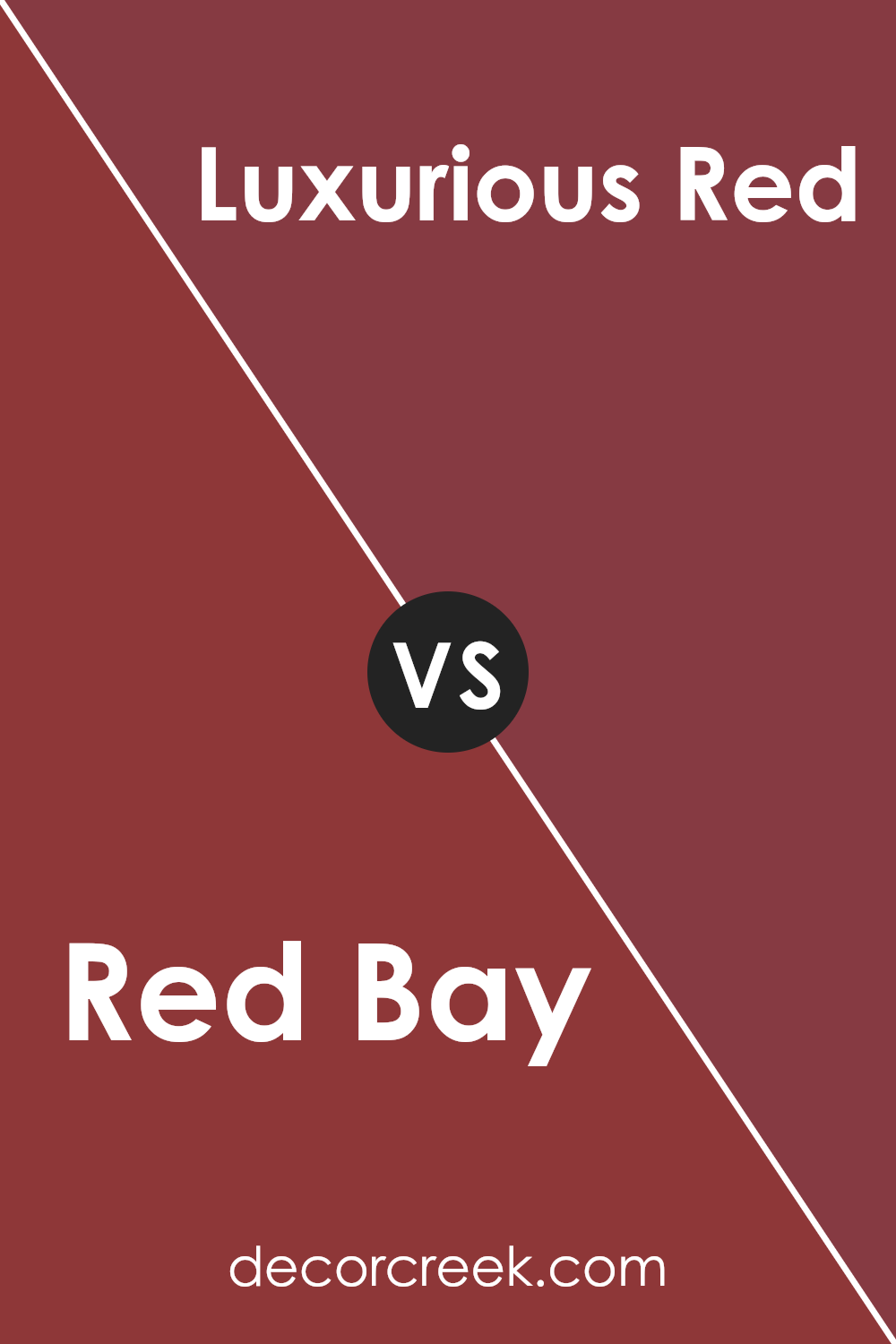
Red Bay SW 6321 by Sherwin Williams vs Luxurious Red SW 6314 by Sherwin Williams
Red Bay and Luxurious Red, both by Sherwin Williams, have their unique charm. Red Bay leans towards a deeper, almost earthy red tone. It’s rich and warm, making it perfect for cozy spaces or to add a touch of sophistication. On the other hand, Luxurious Red is just as its name suggests – luxurious. It’s a brighter, more vibrant red.
This color is great for creating bold, statement spaces that want to grab attention. Both colors could beautifully transform a room, depending on what mood you’re aiming for. If you want a more muted, subtle elegance, Red Bay is your go-to. But, for a livelier, more striking ambiance, Luxurious Red will do the trick. Each has its place depending on the impact you’re looking to achieve in your space.
You can see recommended paint color below:
- SW 6314 Luxurious Red
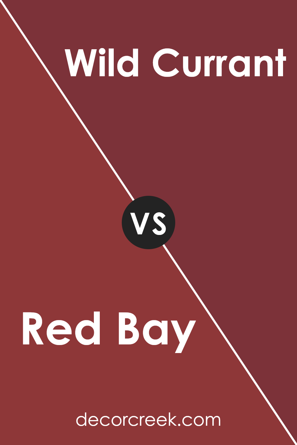
Red Bay SW 6321 by Sherwin Williams vs Wild Currant SW 7583 by Sherwin Williams
Red Bay and Wild Currant, both by Sherwin Williams, are two intriguing colors that stand out in their own unique ways. Red Bay is a deep, rich shade that leans toward a rustic and warm feel. It’s the kind of color that feels both cozy and sophisticated, perfect for creating a statement space or adding depth to a room.
On the other hand, Wild Currant has a more vibrant and bold personality. It’s brighter and has a bit more punch, making it ideal for spaces that want to draw attention or evoke a sense of energy and passion. While Red Bay might remind you of the warmth of autumn or the richness of well-worn leather, Wild Currant is more about the vibrancy of summer berries and the excitement they bring.
Together, these two colors offer a range of possibilities for transforming spaces, whether you’re looking for something grounded and calming or lively and dynamic.
You can see recommended paint color below:
- SW 7583 Wild Currant
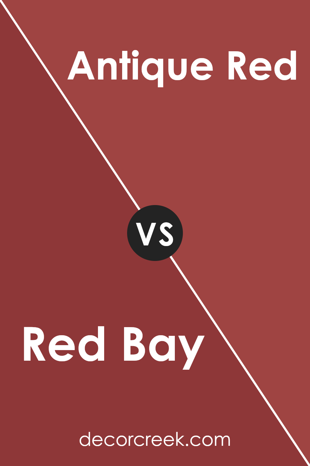
Red Bay SW 6321 by Sherwin Williams vs Antique Red SW 7587 by Sherwin Williams
Red Bay and Antique Red are two striking colors by Sherwin Williams, each with its unique personality. Red Bay leans towards a rich, deep tone, almost like the shade you’d find on luxurious wooden furniture or a sophisticated leather chair. It has a warmth that’s both inviting and powerful, making spaces feel cozy yet elegant.
On the other hand, Antique Red sports a slightly more vibrant vibe. It’s the kind of color you might see on a classic car or a vintage piece of decor. This hue carries a brightness that can light up a room, adding a touch of energy and flair without overwhelming the space.
While both colors share a base in red, Red Bay brings depth and seriousness, perfect for creating a statement space or adding gravity to a room’s ambiance. Antique Red, conversely, offers a lively pop of color, ideal for accent walls or decor items where you want a more playful, standout look. Choosing between them depends on the mood you’re aiming for: the sophistication and depth of Red Bay or the cheerful brightness of Antique Red.
You can see recommended paint color below:
- SW 7587 Antique Red
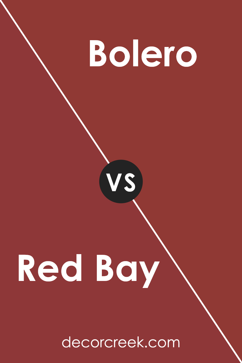
Red Bay SW 6321 by Sherwin Williams vs Bolero SW 7600 by Sherwin Williams
Red Bay and Bolero are two colors from Sherwin Williams that stand out for their distinct qualities. Red Bay is a deep, rich hue that leans towards a darker, warm red. It carries a sense of elegance and traditional charm, making it a go-to for spaces that aim for a sophisticated and cozy ambiance. On the other hand, Bolero steps into the scene with a slightly lighter and softer approach.
It’s a mix that brings together warmth with a hint of peachy undertone, creating a welcoming and soothing effect. This color is perfect for those looking to add a gentle, uplifting vibe to their room without overwhelming it with intensity. While Red Bay draws attention with its boldness and depth, Bolero offers a calming presence, ideal for serene settings.
Together, they cater to different moods and styles, from the dramatic and profound to the tranquil and gentle.
You can see recommended paint color below:
- SW 7600 Bolero
Red Bay SW 6321 by Sherwin Williams vs Fireweed SW 6328 by Sherwin Williams
Red Bay and Fireweed by Sherwin Williams are both beautiful colors, but they have their unique shades and vibes. Imagine Red Bay as a rich, deep maroon with a cozy warmth to it, kind of like the feeling you get when sitting by a fireplace on a cold night. It’s a sophisticated color that adds a luxurious touch to any room.
On the other hand, Fireweed is a brighter, more vibrant shade. Think of the lively color of a blooming flower in the middle of summer – it’s full of energy and can really make a space pop with personality. While Red Bay brings in a classic and somewhat serious tone, Fireweed adds a punch of cheerfulness and bright warmth.
Whether you prefer the deep, comforting maroon of Red Bay or the lively, bright charm of Fireweed, both colors have their own way of making a space inviting and interesting.
You can see recommended paint color below:
- SW 6328 Fireweed
Red Bay SW 6321 by Sherwin Williams vs Poinsettia SW 6594 by Sherwin Williams
Red Bay and Poinsettia are both popular paint colors from Sherwin Williams, but they have their unique charm. Red Bay is a deep, rich maroon with a hint of brown, making it feel warm and cozy. It’s perfect for creating an inviting space that feels sophisticated yet comfortable. On the other hand, Poinsettia is a bold and bright red.
It’s more vibrant and has a slightly orange undertone, giving it a lively and energetic feel. This color can make a strong statement in a room, adding a pop of brightness and enthusiasm.
Although both colors share a base in the red family, they serve different purposes in decor. Red Bay’s deeper, muted tone is ideal for someone looking to add depth and warmth to their space, whereas Poinsettia’s brightness is great for those wanting to inject energy and cheerfulness. Depending on what atmosphere you’re aiming to achieve, either of these colors could be the perfect choice for your project.
You can see recommended paint color below:
- SW 6594 Poinsettia
Red Bay SW 6321 by Sherwin Williams vs Salute SW 7582 by Sherwin Williams
Red Bay by Sherwin Williams is a rich, deep red color that has a warm and inviting tone. It’s like the shade you find on elegant cherry wood or a cozy brick fireplace. This color adds a bold and sophisticated touch to any room, making spaces feel more welcoming and lively. It works great in living rooms or dining areas where you’re looking to create a statement or add a bit of drama.
On the other hand, Salute by Sherwin Williams is quite different. It steps away from the warmth of Red Bay into a cooler, darker territory. Salute is a deep, almost charcoal gray that leans towards a navy blue in some lighting. It’s a strong and solid color that brings a sense of calm and serenity to spaces. Perfect for creating a modern, sleek look, Salute can be used in bedrooms or offices where a more subdued and focused atmosphere is desired.
While both colors are bold and can define a room’s character, Red Bay brings warmth and vibrancy, whereas Salute offers a cooler, more grounded feel.
You can see recommended paint color below:
- SW 7582 Salute
Red Bay SW 6321 by Sherwin Williams vs Stolen Kiss SW 7586 by Sherwin Williams
Red Bay and Stolen Kiss are two distinct shades from Sherwin Williams. Red Bay is a deep, rich color with a hint of maroon, giving off a strong and cozy vibe. It’s perfect for creating a statement in a space, adding depth and warmth to rooms like living rooms or dining areas. On the other hand, Stolen Kiss leans toward a softer, more romantic red.
It has a lighter, more playful feel, making it ideal for spaces where you want a touch of warmth without the intensity of a darker red. While Red Bay might be preferred for more traditional or sophisticated settings, Stolen Kiss fits beautifully in casual, cheerful spaces. Choosing between them depends on the mood you’re aiming for – the powerful, enveloping atmosphere with Red Bay, or the inviting, gentle caress of color with Stolen Kiss.
You can see recommended paint color below:
- SW 7586 Stolen Kiss
Conclusion
In summary, Red Bay SW 6321 by Sherwin Williams stands out as a rich and warm paint color that adds a cozy yet sophisticated feel to any room. Its deep tones can create an inviting atmosphere, making it an ideal choice for living spaces, dining areas, or even bedrooms. This particular shade is versatile and can be beautifully paired with a wide range of decor styles, from classic to modern.
Furthermore, the ease of integrating Red Bay SW 6321 into various interior designs makes it a popular choice among homeowners and professionals alike. Its ability to complement different materials and textures adds depth and character to spaces without overwhelming them.
Whether you’re looking to create a focal point or a backdrop for your furnishings, Red Bay by Sherwin Williams provides a timeless elegance that enriches the overall aesthetic of any home.

Ever wished paint sampling was as easy as sticking a sticker? Guess what? Now it is! Discover Samplize's unique Peel & Stick samples.
Get paint samples

