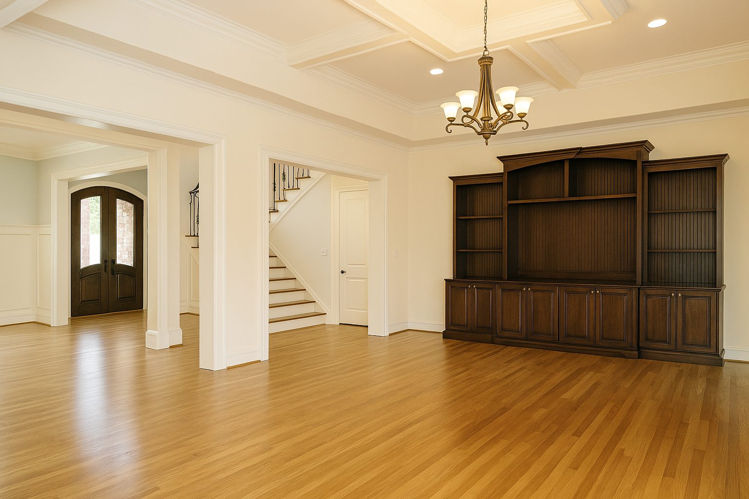
When I think of a color that blends warmth with subtle elegance, SW 6112 Biscuit by Sherwin-Williams instantly comes to mind. It’s a tone that feels like a gentle hug, making any space feel inviting and comfortable.
The beauty of Biscuit is in its simplicity; it possesses a creamy warmth that’s neither overwhelming nor too dull, making it a versatile choice for various spaces in your home.
Imagine a room painted in this shade—it immediately feels cozy yet refined, uplifting the surroundings without stealing the spotlight. Its soft, neutral vibe harmonizes beautifully with both traditional and modern decor, offering countless opportunities for decorating.
I find this color works particularly well in living areas, kitchens, or even bedrooms where a welcoming atmosphere is desired.
Paired with whites or woods, it enhances the room’s aesthetic, creating an effortlessly stylish look. If you’re considering a refresh for your home and want a color that navigates the balance between being neutral and slightly warm, SW 6112 Biscuit could be a fitting choice.
You’ll appreciate how it subtly adds character while allowing other design elements to shine. With Biscuit, comfort meets chic in a hue that’s bound to add a touch of serenity to your space.
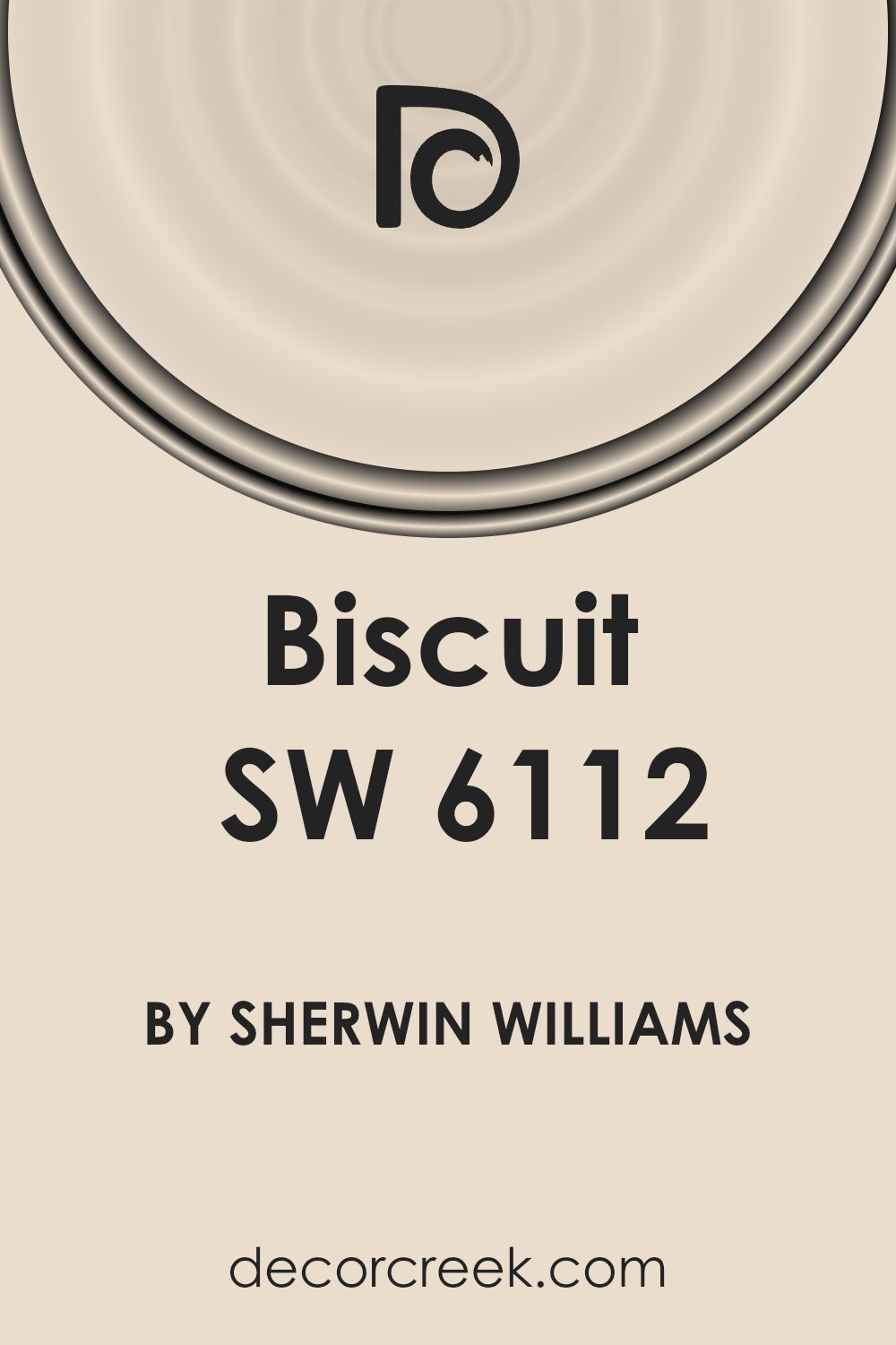
What Color Is Biscuit SW 6112 by Sherwin Williams?
Biscuit SW 6112 by Sherwin Williams is a warm, inviting color that brings a sense of calm to any space. It’s a beige shade with subtle yellow undertones, making it perfect for creating a cozy and welcoming atmosphere. This color works well in various interior styles, such as traditional, country, and even modern, due to its versatility and neutrality.
In a traditional setting, Biscuit can enhance classic furniture pieces, blending effortlessly with upholstered sofas, wooden coffee tables, and elegant lighting fixtures.
In a country-style home, it complements rustic wood finishes, natural textiles, and vintage accessories, adding to the room’s charm. In modern spaces, Biscuit serves as a soft background that balances sleek furniture lines and bold accents.
To make the most of Biscuit, pair it with natural materials like wood, linen, and cotton.
Wooden floors or furniture in darker shades can highlight Biscuit’s warmth, while lighter woods offer a more subtle contrast.
Textured fabrics such as woven rugs, knitted throws, and plush cushions can add depth to the room without overwhelming it.
Metallic elements in finishes like bronze or brass can also create a sophisticated touch, providing gentle contrast with Biscuit’s warmth. Overall, this color offers endless possibilities for creating beautiful, comfortable spaces.
Is Biscuit SW 6112 by Sherwin Williams Warm or Cool color?
Biscuit SW 6112 by Sherwin Williams is a warm, neutral color that can create a cozy and inviting atmosphere in homes. It’s a soft beige tone that blends well with various design styles, making it versatile for any room.
This color can serve as a perfect backdrop, allowing other colors and textures in the room to stand out without overpowering them. Biscuit works well in living rooms, giving them a comfortable, homey feel where people want to relax and spend time.
In kitchens, it can bring a sense of warmth, complementing wooden cabinets and stone countertops nicely. Its neutrality makes it easy to pair with various accent colors, whether you prefer bold hues or pastel shades. In bedrooms, Biscuit fosters a sense of comfort and restfulness, helping create a cozy retreat.
This shade offers a classic, timeless look, making it a popular choice for homeowners who appreciate subtle, understated elegance in their decor.
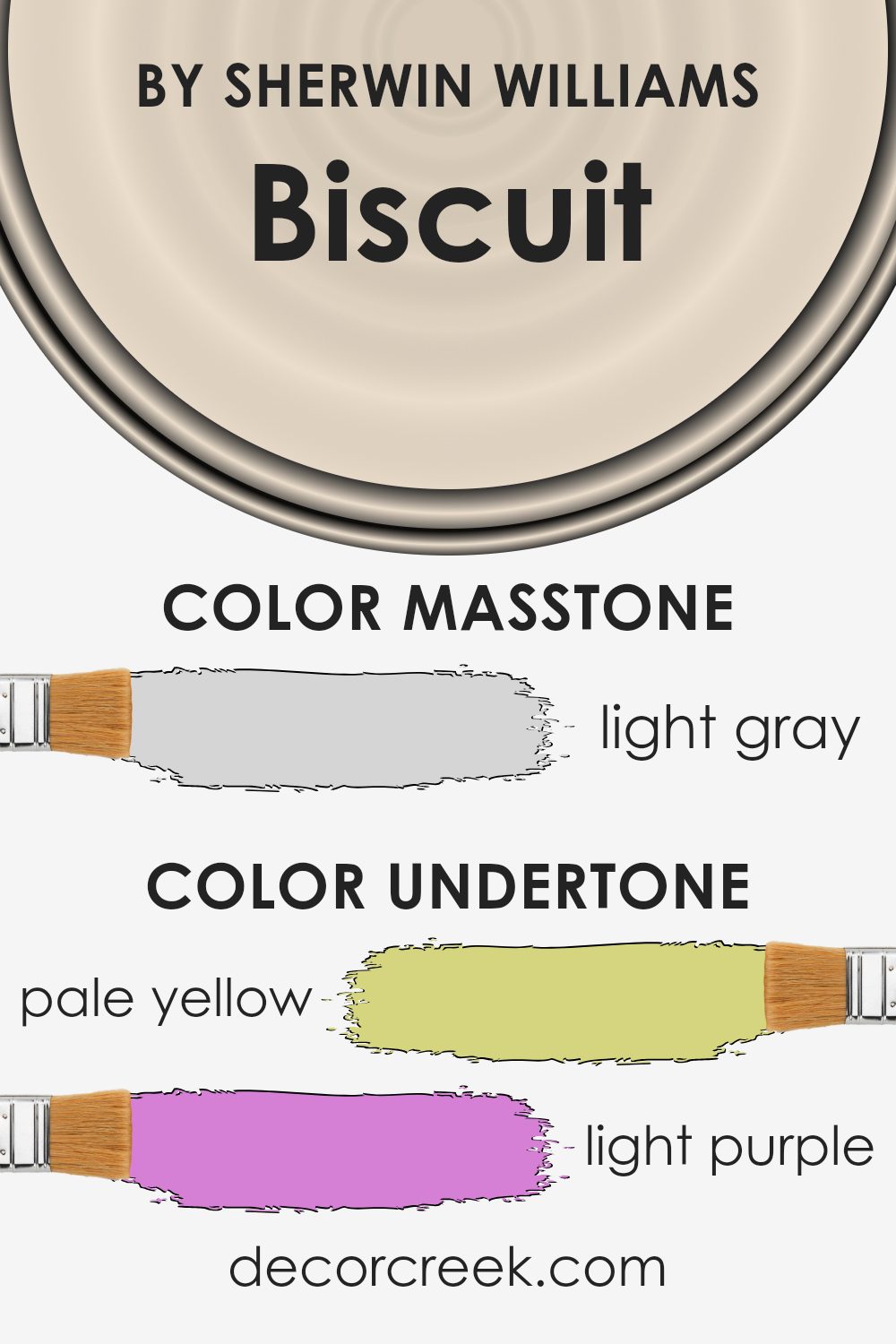
Undertones of Biscuit SW 6112 by Sherwin Williams
Biscuit SW 6112 by Sherwin Williams is a warm beige color that carries a subtle mix of undertones. Undertones are the colors that appear underneath the main color, influencing how we perceive it. In the case of Biscuit, these undertones include pale yellow, light purple, light blue, pale pink, mint, lilac, and grey. They can subtly shift how the color looks depending on the lighting and surroundings.
The pale yellow undertone in Biscuit adds warmth, making it feel welcoming and cozy. This can be particularly inviting in living rooms or bedrooms.
The light purple and lilac undertones introduce a soft touch that adds depth and complexity, giving the color a slightly cooler, more balanced feel. Light blue and mint bring a fresh, airy quality to the color, which can make a room feel open and spacious.
Meanwhile, the grey undertone neutralizes the color, preventing it from feeling too warm or overpowering.
On interior walls, Biscuit can create a versatile backdrop that adapts to different settings. In a well-lit room, the color may appear lighter and more vibrant due to the reflections from pale yellow and mint.
In dimmer spaces, the grey and lilac undertones can make it feel more subdued and calming. This makes Biscuit a great choice for various rooms in the home.
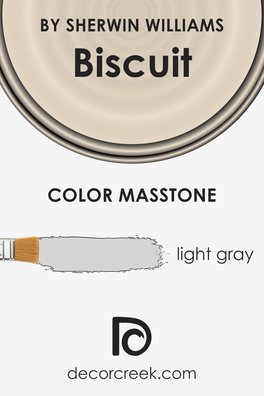
What is the Masstone of the Biscuit SW 6112 by Sherwin Williams?
Biscuit SW 6112 by Sherwin Williams, with its light gray masstone (#D5D5D5), offers a gentle and neutral backdrop for any home interior. This soft, subtle shade can make rooms feel more open and spacious by reflecting light, helping to brighten darker areas.
Its neutral tone allows it to blend seamlessly with various colors and styles, making it a versatile choice for walls, ceilings, or trim.
In living rooms, Biscuit can create a warm and inviting atmosphere without overpowering other design elements. In bedrooms, its calming presence contributes to a peaceful and restful environment. Kitchens painted in this shade gain a clean and fresh look, pairing well with different cabinetry and countertop colors.
Also, the light gray base provides an excellent contrast for colorful artwork or furnishings, allowing them to stand out. Overall, Biscuit SW 6112’s light gray tone works in any space, offering a balanced and cohesive look.
How Does Lighting Affect Biscuit SW 6112 by Sherwin Williams?
The way a color appears is greatly influenced by the type of lighting in a space. Light can change the look of colors, making them seem different depending on the time of day and the direction a room faces. The paint color Biscuit SW 6112 by Sherwin Williams is a warm, neutral shade that looks different under various lighting conditions.
In artificial light, such as LED or incandescent bulbs, Biscuit might appear warmer or slightly more yellow. This is because most bulbs have a warm tone that can enhance its color. If the light is cool, like some fluorescent lights, the Biscuit shade might look more muted or less vibrant in comparison.
Natural light can dramatically influence how Biscuit looks. In north-facing rooms, which tend to have less direct sunlight and cooler light, Biscuit SW 6112 may appear more subdued or cooler. The absence of strong sunlight makes colors less vibrant, bringing out any cooler undertones in the paint.
In south-facing rooms, where there is abundant direct sunlight throughout the day, Biscuit may appear warmer and brighter. The light from these rooms enhances the depth and richness of warm colors, making Biscuit look more vibrant.
East-facing rooms get substantial sunlight in the mornings, which can make the Biscuit shade look warm and inviting early in the day. However, as the day progresses and the light moves away, the color might seem less bright or even a bit muted.
West-facing rooms receive sunlight in the late afternoon and evening, which gives Biscuit a warm glow during those times. The warm evening light can make this shade appear richer, bringing out its warm tones.
Each room’s natural and artificial lighting plays a crucial role in how the color Biscuit SW 6112 is perceived, so it’s often best to test the color in different lighting conditions to see how it will look in your space.

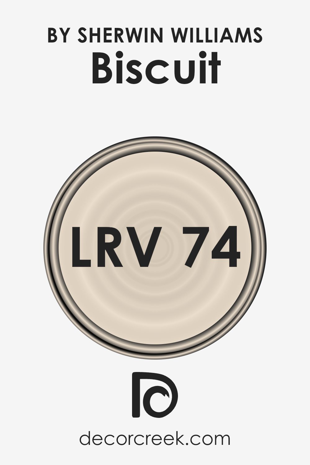
What is the LRV of Biscuit SW 6112 by Sherwin Williams?
Light Reflectance Value, or LRV, measures how much light a color reflects. It operates on a scale from 0 to 100, where 0 means the color absorbs all light and reflects none, making it very dark, and 100 means the color reflects all light, making it very bright.
When it comes to choosing paint colors, understanding LRV is important because it affects how colors look on your walls depending on the amount of natural and artificial light in a room.
A higher LRV means a color will reflect more light, making a space feel brighter and sometimes larger, while a lower LRV can make a room feel more intimate and cozier.
With an LRV of 73.67, Biscuit by Sherwin Williams reflects a significant amount of light.
This makes it a great choice for rooms where you want to create an open, airy feeling. Because it is quite reflective, it can help smaller spaces appear larger and can contribute to a brighter atmosphere in rooms that don’t get a lot of natural light. On walls, this color can appear soft and inviting, maintaining a light presence without being too stark or overpowering.
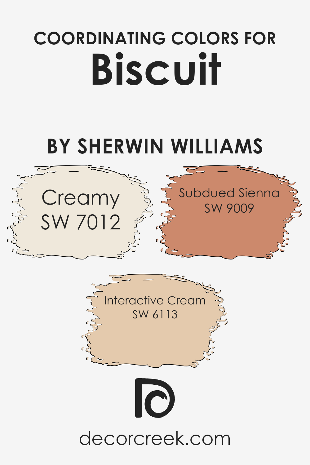
Coordinating Colors of Biscuit SW 6112 by Sherwin Williams
Coordinating colors are hues chosen to complement and enhance a primary color, creating a harmonious and visually pleasing palette. When designing a space around Biscuit by Sherwin Williams, consider using shades like Creamy, Interactive Cream, and Subdued Sienna.
These colors work together to create a balanced and inviting atmosphere by playing off each other’s undertones and adding depth to the space.
Creamy (SW 7012) is a soft, warm white that offers a classic and timeless backdrop, perfect for balancing richer colors and ensuring that everything feels light and airy. It adds warmth without overpowering the room, maintaining an inviting ambiance.
On the other hand, Interactive Cream (SW 6113) provides a bit more intensity with its golden undertones, adding richness and a lively touch to the overall scheme.
It pairs well with Biscuit, offering a seamless transition that ties everything together. Subdued Sienna (SW 9009) introduces a rustic, earthy tone that grounds the color palette. Its muted red and brown notes add depth and interest, helping to create a cozy and comfortable space. By integrating these coordinating colors with Biscuit, you achieve a well-balanced and inviting environment that feels cohesive yet dynamic.
You can see recommended paint colors below:
- SW 7012 Creamy
- SW 6113 Interactive Cream
- SW 9009 Subdued Sienna
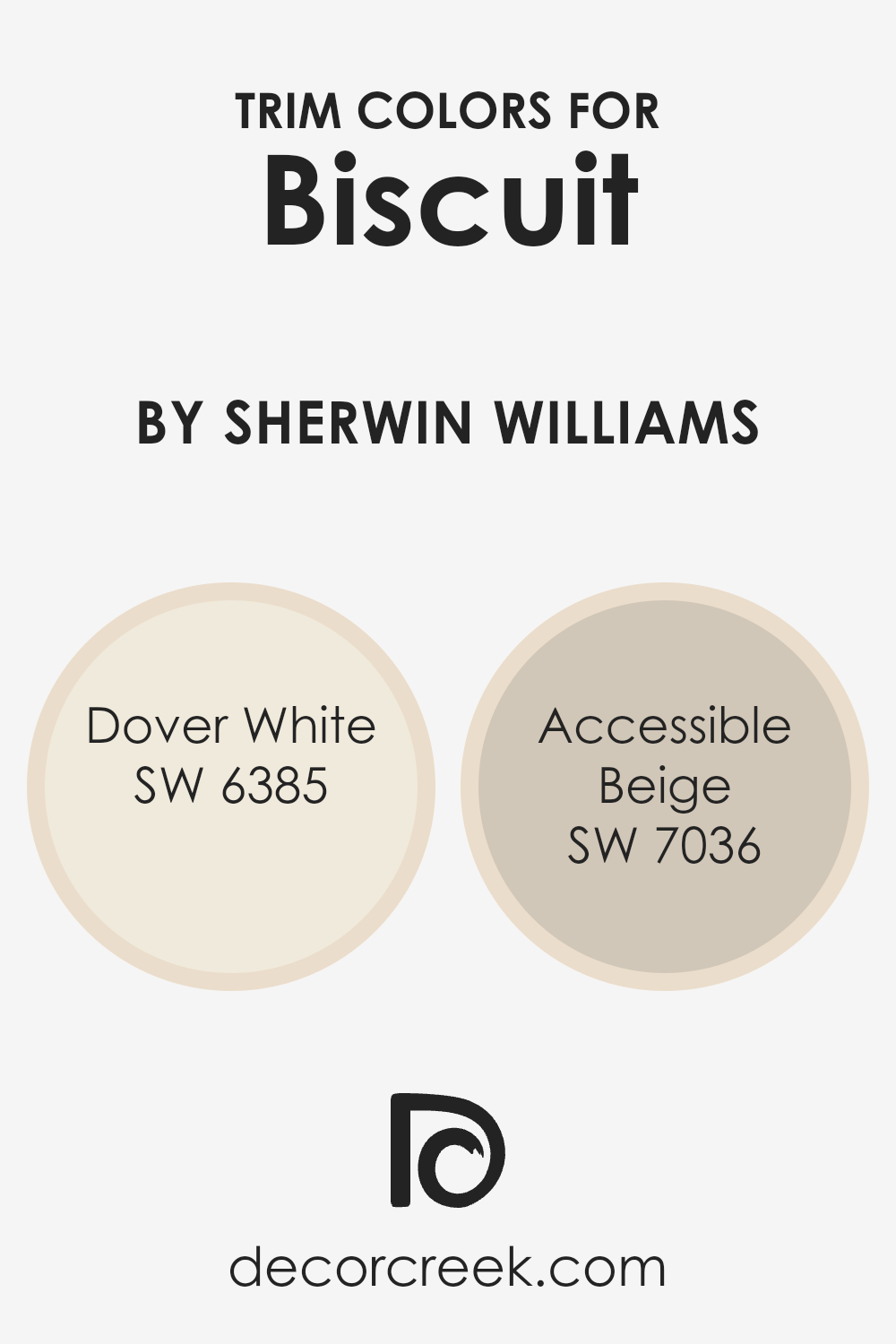
What are the Trim colors of Biscuit SW 6112 by Sherwin Williams?
Trim colors play a crucial role in defining and highlighting architectural details within a space. When paired with Biscuit SW 6112 by Sherwin Williams, trim colors such as Dover White and Accessible Beige can enhance the overall appearance and feel of a room.
Trim colors help to create contrast and can either make a bold statement or blend seamlessly with the primary wall color to create a cohesive look. They are the finishing touches that bring warmth and depth to Biscuit’s neutral tone, making it feel more structured and complete.
Dover White (SW 6385) is a soft, warm white that provides a gentle contrast against Biscuit SW 6112. Its creamy undertones make it an inviting choice for highlighting trim, molding, and even ceilings, adding to the room’s brightness without feeling stark.
On the other hand, Accessible Beige (SW 7036) is a versatile, muted beige that brings a touch of subtle elegance to any space.
It offers a slightly darker option for trim, creating a beautiful, soft contrast that complements the warmth of Biscuit while maintaining a classic and timeless look. Together, these trim colors can enhance the warmth and inviting nature of a room painted in Biscuit.
You can see recommended paint colors below:
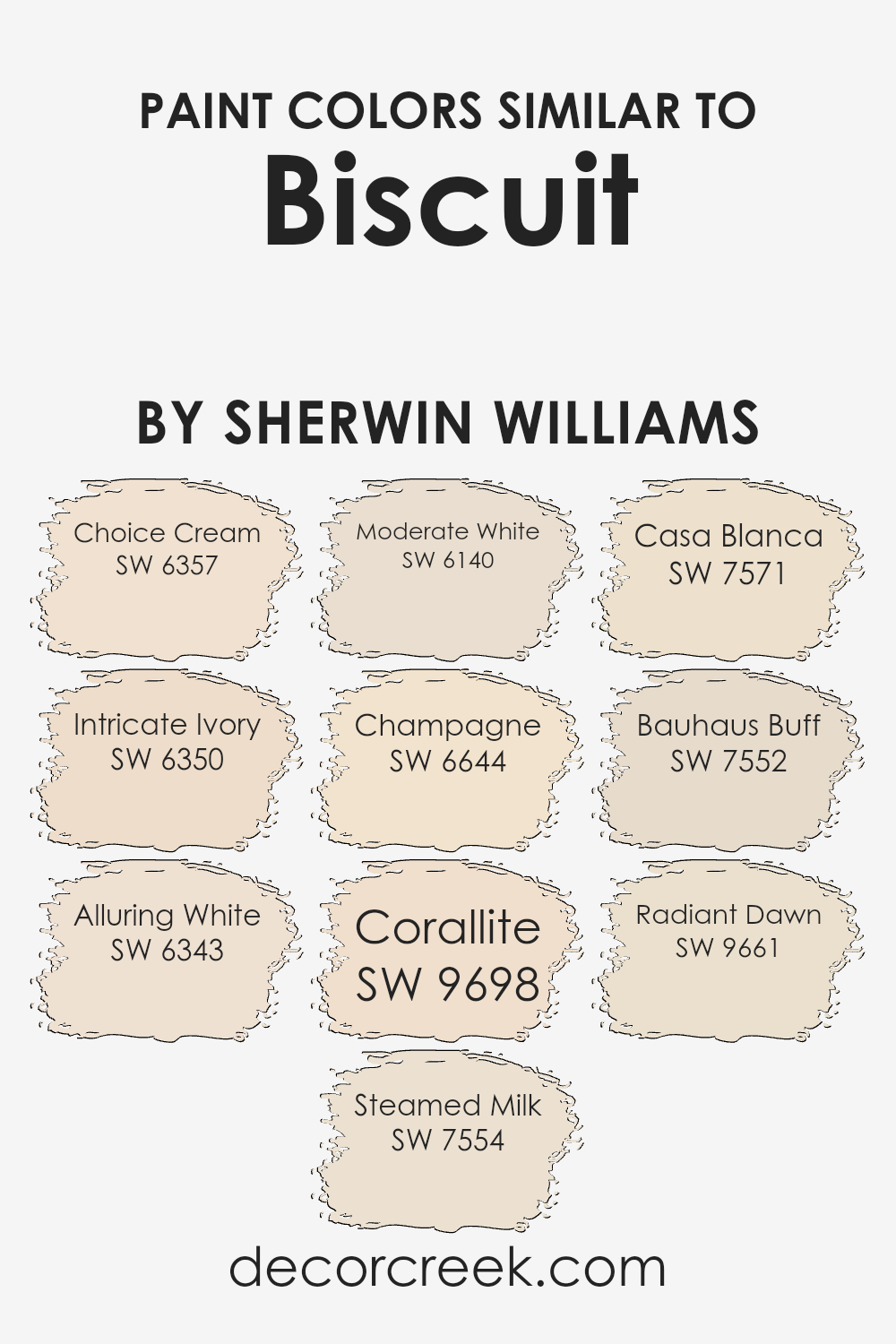
Colors Similar to Biscuit SW 6112 by Sherwin Williams
Using colors that are similar to Biscuit by Sherwin Williams can create a harmonious and calming space. These colors work well together because they share similar undertones and intensities, making them blend seamlessly.
When you’re decorating a room, using colors like Choice Cream or Intricate Ivory can provide a warm, welcoming feel. Choice Cream is a soft, buttery tone that can brighten a space without feeling overwhelming. Intricate Ivory offers a hint of warmth with its subtle golden undertones, making any room feel cozy.
Alluring White and Steamed Milk are softer and lighter shades. Alluring White offers a clean, fresh look with a touch of warmth, while Steamed Milk enhances spaces with its creamy, subtle hue. Moderate White is an excellent choice for those seeking a warm neutral, providing versatility and a touch of neutrality.
For a hint of cheerfulness, Champagne delivers a soft, blush hue, while Corallite adds a bit of warmth with its coral tones.
Casa Blanca is perfect for adding depth with its rich, creamy hue, while Bauhaus Buff is a muted, earthy beige that complements any color scheme. Finally, Radiant Dawn serves as a soft, peachy highlight that can add a gentle glow to any space. These colors all work together to create an inviting and relaxing environment.
You can see recommended paint colors below:
- SW 6357 Choice Cream
- SW 6350 Intricate Ivory
- SW 6343 Alluring White
- SW 7554 Steamed Milk
- SW 6140 Moderate White
- SW 6644 Champagne
- SW 9698 Corallite
- SW 7571 Casa Blanca
- SW 7552 Bauhaus Buff
- SW 9661 Radiant Dawn
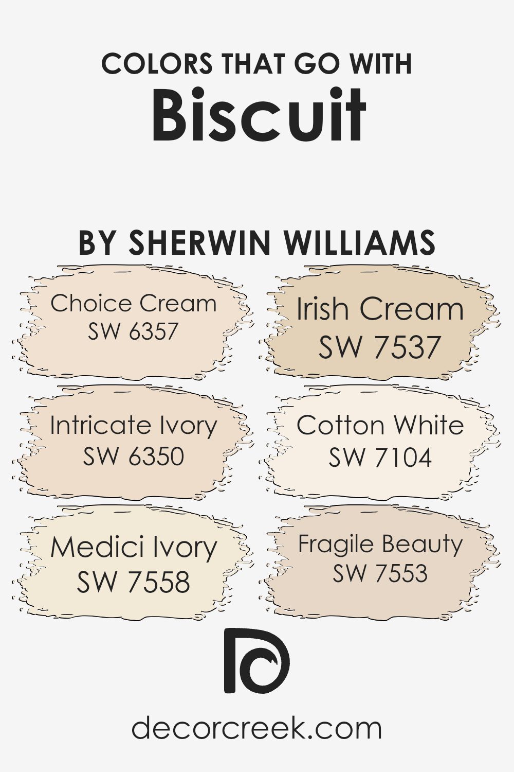
Colors that Go With Biscuit SW 6112 by Sherwin Williams
Choosing colors that go well with Biscuit SW 6112 by Sherwin Williams can make a space look warm and welcoming. These complementary colors work together to create a pleasing and harmonious environment. SW 6357 Choice Cream, for instance, adds a touch of warmth with its soft yellow undertones, creating a cozy and sunny feel.
SW 6350 Intricate Ivory is a gentle off-white that provides a neutral backdrop without being stark, making it versatile. SW 7558 Medici Ivory has a slight beige tint that brings a gentle warmth, adding depth and interest to the color palette.
SW 7537 Irish Cream is an earthy tone that blends well with Biscuit SW 6112, grounding the color scheme. SW 7104 Cotton White is a crisp, clean white that introduces brightness without overwhelming the subtlety of the other colors.
Lastly, SW 7553 Fragile Beauty, a delicate pinkish beige, brings a light and airy feel, suggesting a soft elegance.
Together, these colors work harmoniously, each adding its own touch to enhance the overall look of a room, making sure the space feels balanced and inviting.
You can see recommended paint colors below:
- SW 6357 Choice Cream
- SW 6350 Intricate Ivory
- SW 7558 Medici Ivory
- SW 7537 Irish Cream
- SW 7104 Cotton White
- SW 7553 Fragile Beauty
How to Use Biscuit SW 6112 by Sherwin Williams In Your Home?
Biscuit SW 6112 by Sherwin Williams is a warm, inviting color that can bring a cozy feel to your home. It’s a versatile shade that blends well with many styles and spaces. You could use this soft beige tone in the living room to create a welcoming environment where family and friends feel relaxed.
It’s also a great choice for the kitchen, giving it a warm, homey vibe that makes cooking and dining more enjoyable. In the bedroom, Biscuit can provide a calming backdrop that makes resting even more peaceful.
Pair Biscuit with white trim for a classic look or with darker accents for a bit of contrast. It also complements natural wood tones beautifully, adding to its versatility. Whether you’re repainting a single room or refreshing your entire home, Biscuit SW 6112 offers a neutral yet warm choice that makes any space feel more comfortable and friendly.
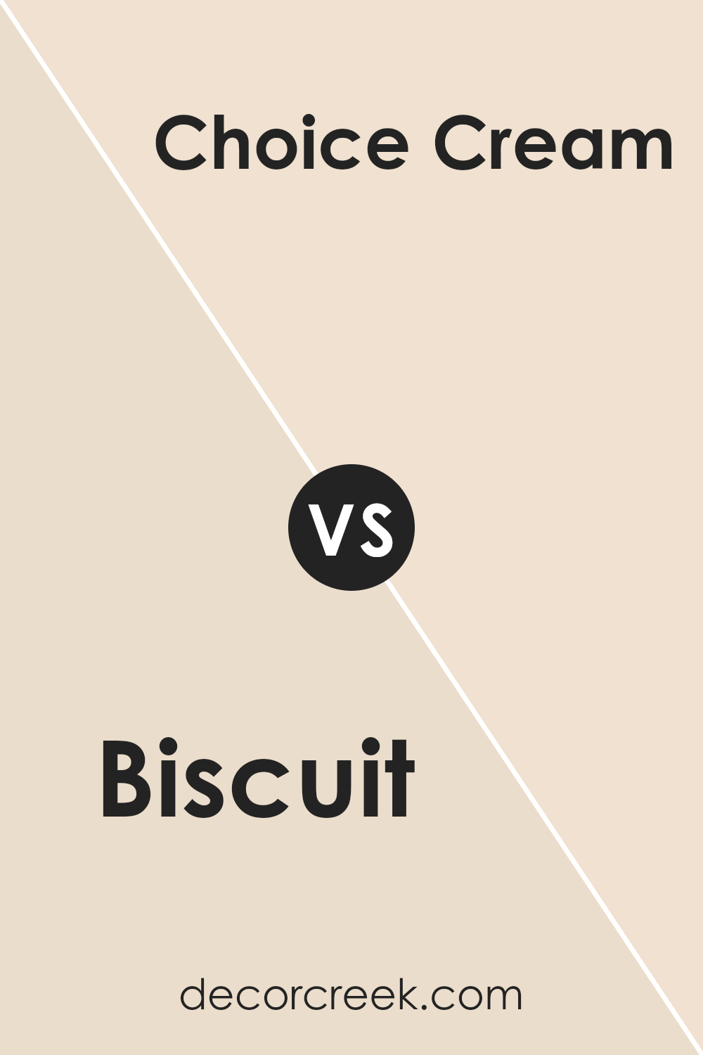
Biscuit SW 6112 by Sherwin Williams vs Choice Cream SW 6357 by Sherwin Williams
Biscuit SW 6112 and Choice Cream SW 6357 are both warm, neutral shades from Sherwin Williams, but each has its own unique feel. Biscuit is a soft beige with a touch of warmth, making it cozy and inviting. It’s a versatile color that works well in almost any room, providing a calm backdrop without being too overwhelming.
On the other hand, Choice Cream is a bit lighter and brighter with subtle yellow undertones. This gives it a sunnier, more cheerful vibe compared to Biscuit. Choice Cream can brighten up a space and make it feel more open and airy.
When choosing between the two, consider the mood you want to create. Biscuit is great for creating a warm, cozy atmosphere, while Choice Cream is perfect for a fresh and lively look. Both colors pair easily with other neutrals and can complement a variety of styles and décors.
You can see recommended paint color below:
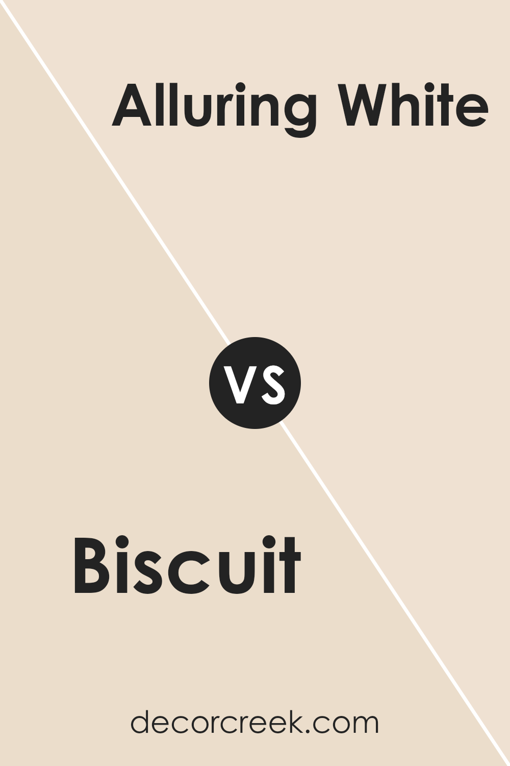
Biscuit SW 6112 by Sherwin Williams vs Alluring White SW 6343 by Sherwin Williams
Biscuit and Alluring White by Sherwin Williams are two distinct and versatile colors that complement each other. Biscuit is a warm, light beige color that offers a cozy, welcoming feel, making it great for creating a relaxed environment. It pairs well with a variety of colors, adding warmth without overwhelming the space.
In contrast, Alluring White is a soft, creamy white with subtle hints of warmth. It is brighter and more neutral, which can open up a space and make it feel more expansive.
When used together, Biscuit can add depth and coziness to a room, while Alluring White provides a clean, fresh balance. These two colors can work well in various settings, from living rooms to bedrooms, where a combination of warmth and brightness is desired. They offer a harmonious blend, perfect for any room that aims for a comfortable yet elegant look.
You can see recommended paint color below:
- SW 6343 Alluring White
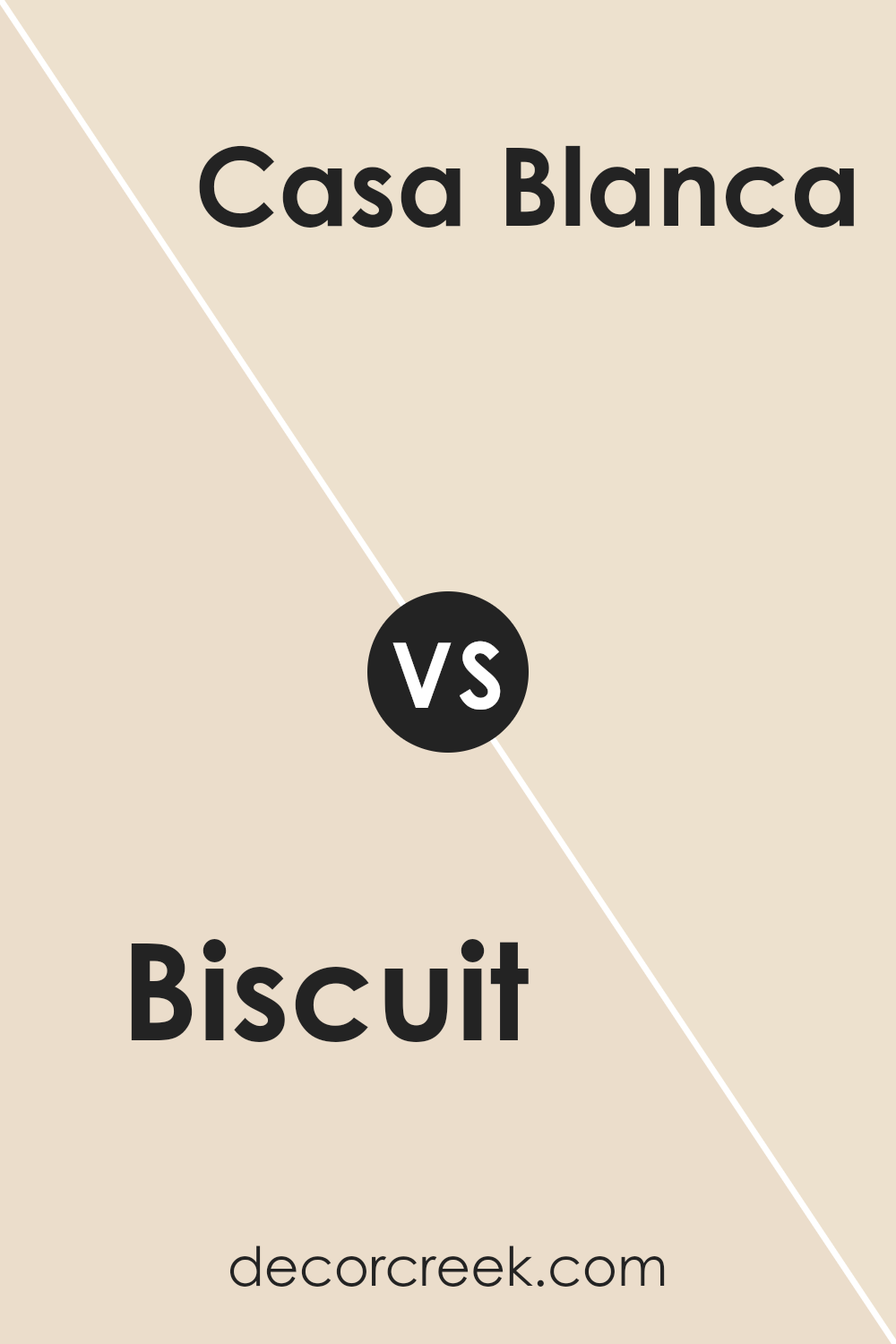
Biscuit SW 6112 by Sherwin Williams vs Casa Blanca SW 7571 by Sherwin Williams
Biscuit SW 6112 and Casa Blanca SW 7571 are two paint colors offered by Sherwin Williams. Biscuit is a warm, creamy beige that can make spaces feel cozy and inviting. It has a subtle hint of yellow, which adds a soft and welcoming touch to rooms without being overpowering.
Casa Blanca, on the other hand, is a light, neutral off-white with a slight warmth. It’s brighter and can give spaces an airy feel, making them seem larger and more open. This makes Casa Blanca a versatile choice that can easily blend with different decor styles.
When compared, Biscuit is distinctly warmer and richer, adding a more intimate vibe, whereas Casa Blanca provides a lighter, more refreshing appearance. Both colors work well in a variety of settings, but Biscuit might be better suited for spaces where you want added warmth, while Casa Blanca is ideal for creating a bright, spacious atmosphere.
You can see recommended paint color below:
Biscuit SW 6112 by Sherwin Williams vs Corallite SW 9698 by Sherwin Williams
Biscuit and Corallite are two distinct colors offered by Sherwin Williams. Biscuit is a warm, neutral shade with a light beige tone, offering a sense of coziness and comfort. It’s versatile, fitting well in spaces requiring a soft and inviting backdrop, perfectly complementing various decors and furnishings.
In contrast, Corallite is a vibrant, energetic hue reminiscent of coral reefs. It brings a lively and refreshing feel to spaces, making it suitable for accent walls or areas needing a splash of color. While Biscuit creates a calming, understated environment, Corallite adds boldness and enthusiasm.
Together, they can work to balance each other: Biscuit provides the soothing base, while Corallite introduces striking highlights. Choosing between these colors depends on the desired mood and style of the space, with Biscuit for subtle warmth and Corallite for energetic, lively accents.
You can see recommended paint color below:
- SW 9698 Corallite
Biscuit SW 6112 by Sherwin Williams vs Bauhaus Buff SW 7552 by Sherwin Williams
Biscuit (SW 6112) and Bauhaus Buff (SW 7552) by Sherwin Williams are both warm, neutral colors, yet they have noticeable differences. Biscuit is a soft, creamy beige with yellow undertones, giving it a cozy and inviting feel. It’s a versatile shade that can brighten a room without being too overpowering.
On the other hand, Bauhaus Buff is slightly darker, featuring more brownish undertones. This gives it a richer, earthier appearance, making it a great choice for creating a more grounded, warm ambiance.
Biscuit is perfect for spaces where you want to maintain a light and airy atmosphere, while Bauhaus Buff works well in areas where you prefer a more substantial and comforting environment. Both colors are excellent for creating a neutral backdrop, but Biscuit leans towards a more delicate and fresh look, whereas Bauhaus Buff offers a deeper, more rustic vibe.
You can see recommended paint color below:
Biscuit SW 6112 by Sherwin Williams vs Champagne SW 6644 by Sherwin Williams
Biscuit and Champagne by Sherwin Williams are two distinct colors, each carrying its own charm. Biscuit is a warm, neutral shade that resembles the soft, creamy tone of a freshly baked biscuit. It provides a cozy and inviting atmosphere, making it a versatile choice for spaces that aim for comfort and warmth. This color is well-suited for living rooms, bedrooms, or any area where a calming environment is desired.
On the other hand, Champagne is more vibrant and lively. With its light yellow undertone, it adds a touch of brightness and cheerfulness to any room.
It’s a great option for spaces that need a bit of energy and pop, such as kitchens or dining areas. Champagne can make a room feel sunny and welcoming, offering a more playful vibe compared to the more understated Biscuit. Together, these two colors can complement each other by balancing warmth with vibrancy in a home.
You can see recommended paint color below:
- SW 6644 Champagne
Biscuit SW 6112 by Sherwin Williams vs Steamed Milk SW 7554 by Sherwin Williams
Biscuit and Steamed Milk are two warm, neutral colors by Sherwin Williams. Biscuit is a medium beige with a hint of warmth, making it cozy and inviting. It adds a touch of depth to a room without being too dark, making it versatile for many spaces. Steamed Milk, on the other hand, is a lighter, creamy off-white. It brings a sense of brightness and openness, making a room look airy and fresh.
When you put them side by side, Biscuit can add contrast and a bit of warmth, while Steamed Milk provides a soft backdrop.
They can be used together in a harmonious blend where Biscuit acts as an accent for trim or furniture, and Steamed Milk covers the walls. This combination works well in spaces where you want a gentle, welcoming atmosphere without overwhelming the senses. Both colors are excellent choices for a calm and cohesive look.
You can see recommended paint color below:
Biscuit SW 6112 by Sherwin Williams vs Intricate Ivory SW 6350 by Sherwin Williams
Biscuit is a warm, soft beige with a hint of yellow. It’s cozy and welcoming, making it a great choice for living spaces where comfort is key. Intricate Ivory, on the other hand, is a lighter, creamier tone. It has a touch of warmth but is closer to an off-white, which can brighten a room while still feeling soft and gentle.
When placed side by side, Biscuit feels earthier and slightly richer, while Intricate Ivory offers a more neutral backdrop. Biscuit can bring a comforting feeling to a space, making it feel grounded and homely. In contrast, Intricate Ivory brings a light, airy feel, perfect for creating a space that feels open and clean.
Both colors complement each other well, with Biscuit providing warmth and depth, and Intricate Ivory adding lightness and brightness. They work well together or separately, depending on the desired mood of the room.
You can see recommended paint color below:
- SW 6350 Intricate Ivory
Biscuit SW 6112 by Sherwin Williams vs Radiant Dawn SW 9661 by Sherwin Williams
Biscuit and Radiant Dawn are two warm, inviting colors by Sherwin Williams. Biscuit is a soft beige with a hint of cream, giving it a cozy, neutral feel. It works well in living spaces, creating a calm and inviting atmosphere. This color pairs nicely with earthy tones and can be a versatile backdrop for other colors and decor.
Radiant Dawn, on the other hand, is a light, warm yellow that brings a cheerful and sunny feel to a room. It’s brighter than Biscuit, making it ideal for spaces where you want to add a bit of light and energy. This color can brighten up smaller rooms or areas with less natural light, making them feel more spacious and welcoming.
Together, these two colors can complement each other, with Biscuit providing a neutral balance to the cheerful and lively Radiant Dawn. They are both excellent choices for creating warm and comfortable spaces in your home.
You can see recommended paint color below:
- SW 9661 Radiant Dawn
Biscuit SW 6112 by Sherwin Williams vs Moderate White SW 6140 by Sherwin Williams
Biscuit SW 6112 and Moderate White SW 6140 both offer warm, neutral tones, but they serve slightly different purposes. Biscuit is a cozy, light beige with a hint of yellow, bringing warmth and softness to spaces. It’s great for creating a welcoming and homey atmosphere, perfect for living rooms or kitchens.
In contrast, Moderate White is a softer, creamier white with a subtle beige undertone. It provides a clean, fresh backdrop while maintaining warmth but feels a bit airier and lighter than Biscuit.
This makes Moderate White suitable for open spaces or areas where you want to enhance natural light, such as bedrooms or bathrooms.
While Biscuit can add a touch of coziness, Moderate White offers understated elegance, making it a versatile choice that pairs well with various color palettes and styles. Both colors can enhance a home’s atmosphere depending on the desired effect.
You can see recommended paint color below:
- SW 6140 Moderate White
Conclusion
It is a warm, creamy color that can make any room feel welcoming and cozy. Imagine the color of a freshly baked biscuit—that’s SW 6112! It’s soothing and gentle, making it perfect for spaces where you want to relax.
When you paint a wall with Biscuit, it can make the room feel larger and more open. This color works well with many other colors. You can add cushions, rugs, or curtains in different shades to brighten up the room.
I find that Biscuit is a good choice because it doesn’t stand out too much. This means you can easily change the style of a room without needing to repaint every time. For example, during the winter, you can add warm-colored accessories, and in the summer, you can switch to cool-toned items.
Choosing Biscuit is like picking a color that sits on the fence. It is neither too dark nor too light, and that’s why many people like it.
It makes everything feel balanced and calm. Whenever I think about a color to use in any room, I’ll keep SW 6112 Biscuit in mind because it blends well and makes everything look nice and inviting.
Ever wished paint sampling was as easy as sticking a sticker? Guess what? Now it is! Discover Samplize's unique Peel & Stick samples.
Get paint samples

