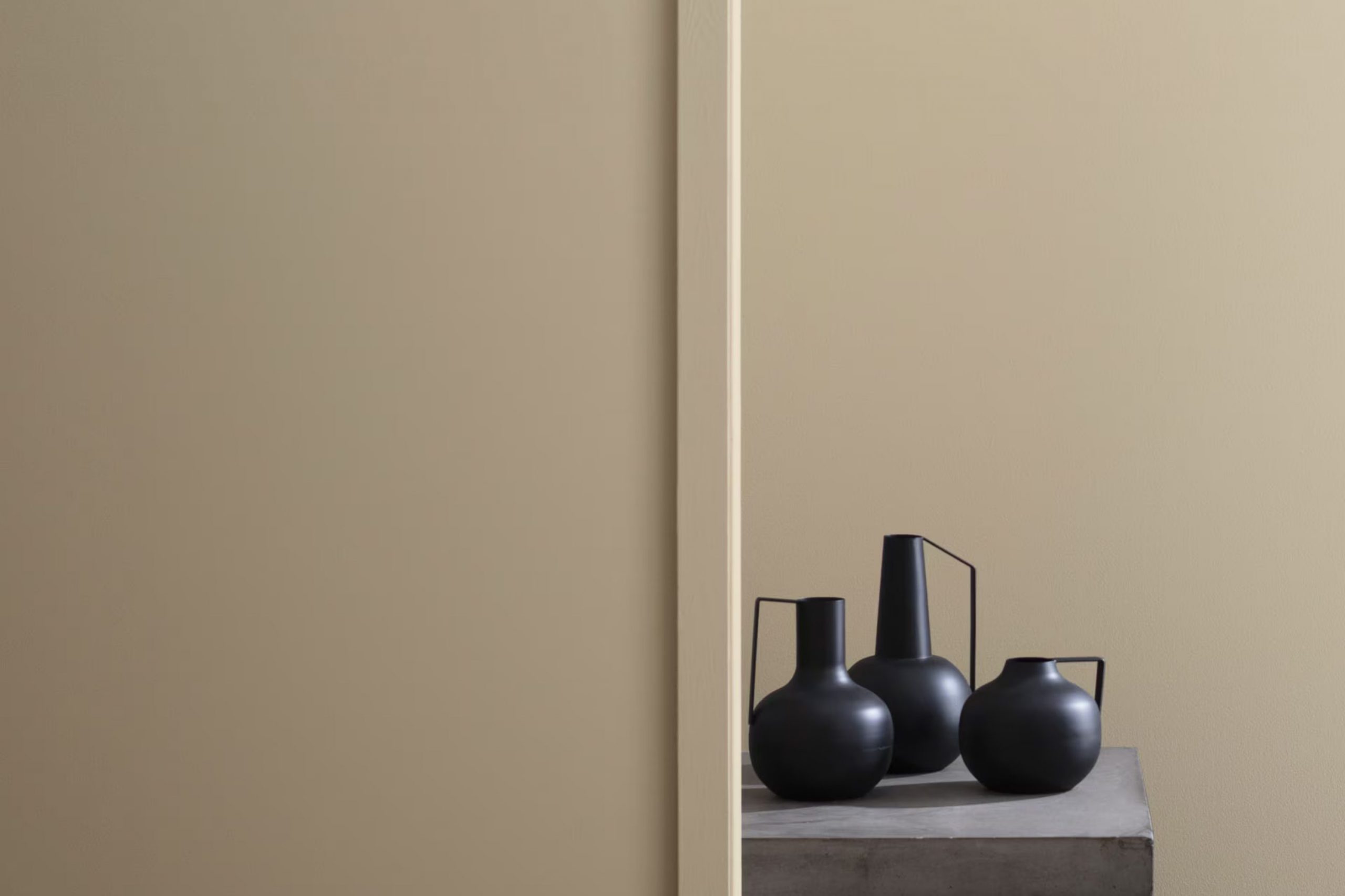
I recently stumbled upon a paint color called HC-80 Bleeker Beige by Benjamin Moore, and it struck a chord with me. If you’re searching for a shade that balances warmth with flexibility, this might be just what you need. Bleeker Beige offers a unique blend of understated elegance that works well in almost any area.
Whether you’re freshening up a cozy living room or giving a bedroom a soft, welcoming vibe, this color has the ability to subtly enhance the aesthetics of your surroundings without overpowering them.
What I appreciate most is its adaptability. Despite its name, Bleeker Beige isn’t just a simple beige. It has hints of gray that shift beautifully depending on the lighting, making it a reliable choice for those long-term decorating projects. It pairs effortlessly with a wide range of decor, from modern minimalist to rustic farmhouse, demonstrating its impressive flexibility.
If you’re planning to give your home a makeover and looking for a color that can pull different elements together harmoniously, consider giving HC-80 Bleeker Beige a try.
What Color Is Bleeker Beige HC-80 by Benjamin Moore?
Bleeker Beige by Benjamin Moore is a warm, inviting neutral color with a flexible appeal that brings a cozy feel to any room. This shade of beige has a slight gray undertone, making it easy to pair with a variety of decor styles and colors. Its softness allows it to blend seamlessly into settings that prioritize comfort and simplicity, such as casual country, rustic, or classic traditional interiors.
This color works beautifully in areas where natural light is abundant, as it tends to highlight the subtle gray undertones, adding depth and warmth to the room. In dimmer areas, it exudes a richer warmth, creating an inviting and cozy atmosphere.
Bleeker Beige pairs well with natural materials such as wood, leather, and linen, enhancing their texture and adding to the overall earthy feel of an interior area. It also goes beautifully with soft textiles like cotton throws or wool rugs, which help create a layered, lived-in look.
When it comes to metals, this color coordinates well with both warm tones like bronze and copper, as well as cooler metals like brushed silver or chrome, making it exceptionally flexible for different design schemes. Overall, Bleeker Beige is a fantastic choice for creating a warm, welcoming home environment without overpowering the senses.
Is Bleeker Beige HC-80 by Benjamin Moore Warm or Cool color?
Bleeker Beige by Benjamin Moore is a flexible and warm neutral color that fits well in many home settings. Its beauty lies in its understated elegance, making it an excellent choice for those looking to create a cozy and inviting atmosphere. This shade of beige helps to soften rooms and can make small areas appear larger and more open.
It pairs well with a wide range of other colors. Bright and bold colors pop against it, while soft whites or other neutrals blend smoothly for a more muted palette. In living rooms, bedrooms, or any room where relaxation is key, this color sets a relaxed mood.
It’s also practical. Light enough to keep rooms feeling bright yet sufficiently rich to hide everyday wear and tear, making it a good choice for high-traffic areas. When used on walls, it provides a warm backdrop for furniture and art, allowing pieces to stand out. Bleeker Beige is truly a go-to paint color for anyone looking to add warmth to their home without overpowering it with color.
Undertones of Bleeker Beige HC-80 by Benjamin Moore
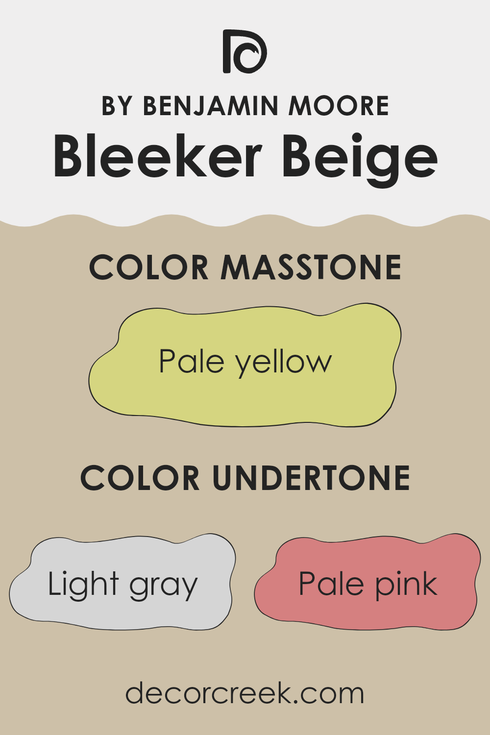
Bleeker Beige is a warm paint color known for its flexibility and subtle complexity due to its array of undertones. Undertones are subtle colors that influence the main hue and can either enhance or alter how a color looks depending on the lighting and surrounding elements.
For example, light gray undertones help Bleeker Beige maintain a neutral appearance, perfect for matching with various decor elements without overpowering the area. Pale pink and light purple undertones add a soft, inviting feel, making a room feel cozy. Mint and light green underttones bring a touch of freshness, suitable for rooms intended to feel airy and light.
Light blue and lilac undertones in Bleeker Beige contribute to a calm atmosphere, ideal for bedrooms or bathrooms where you seek a soothing ambiance. Grey, olive, and yellow undertones provide an earthy quality, making it a great choice for living areas where a grounded, natural feel is desired. Orange undertones add a hint of warmth, creating a welcoming vibe.
The combination of these undertones means that Bleeker Beige can look slightly different in each setting. It adapts based on natural and artificial lighting, so it might appear more greenish in a sunlit room or more gray on cloudy days. This adaptability makes it a favorite for interior walls, where conditions change throughout the day, ensuring rooms remain dynamic and aesthetically pleasing.
decorcreek.com
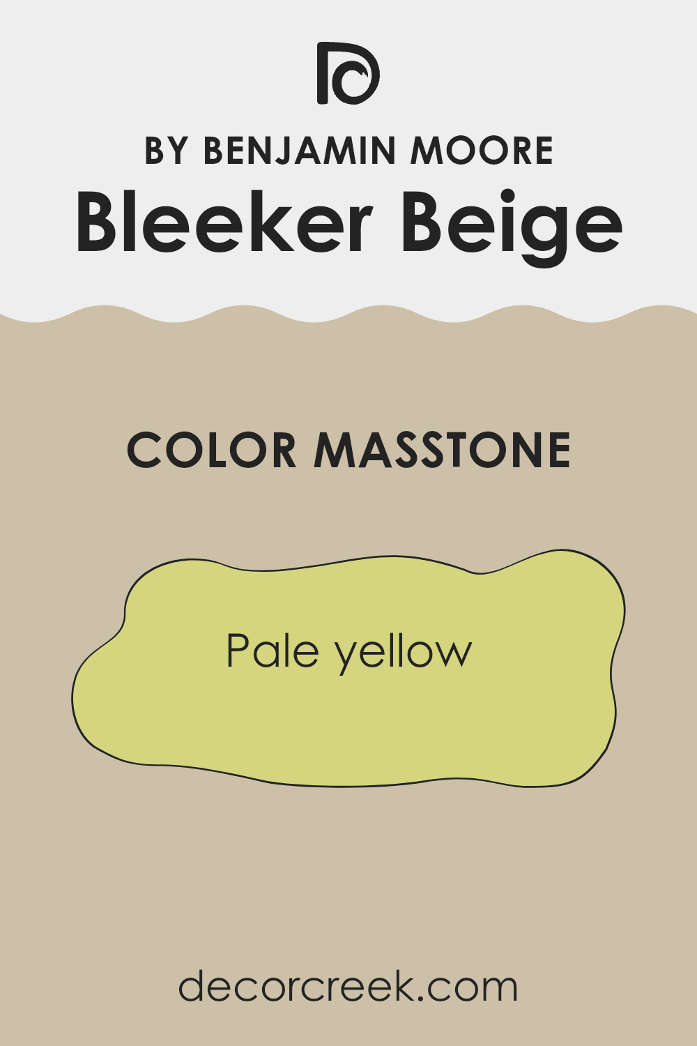
What is the Masstone of the Bleeker Beige HC-80 by Benjamin Moore?
Bleeker Beige HC-80 by Benjamin Moore has a masstone of pale yellow, with a hex code of #D5D580. This subtly warm hue makes it a great choice for creating cozy and welcoming areas in homes.
Pale yellows like this one reflect light beautifully, which can make small rooms appear larger and more open. Because of its gentle and soft characteristics, this color fits well in almost any room, adding a touch of warmth without overpowering the area.
This flexibility also means that it pairs effortlessly with a wide range of decor styles and colors, from rustic wooden finishes to modern blacks and whites. It brings a natural, earthy feel to living areas, bedrooms, and even kitchens, enhancing other colors and materials in the room. The gentle warmth of this pale yellow makes it ideal for rooms where you want to relax and feel at home.
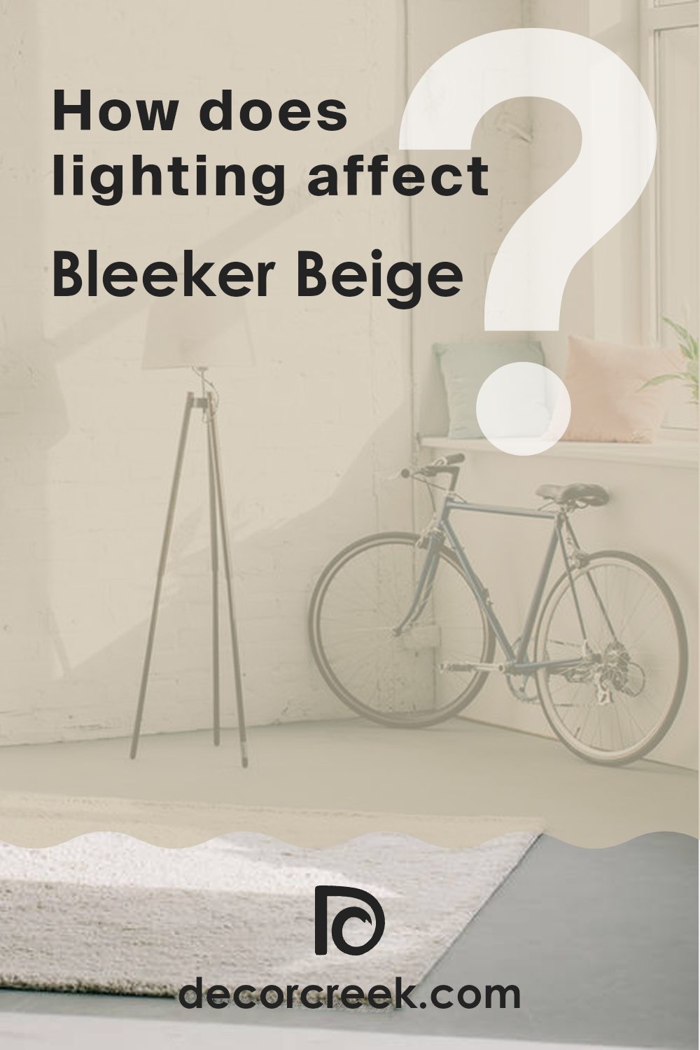
How Does Lighting Affect Bleeker Beige HC-80 by Benjamin Moore?
Lighting plays a crucial role in how we perceive colors in an area. Depending on the type of light—natural or artificial—the appearance of colors can change dramatically. The paint color Bleeker Beige by Benjamin Moore is a flexible shade that can look quite different under various lighting conditions.
Under artificial light, such as LED or fluorescent lights, Bleeker Beige tends to appear warmer, highlighting its cozy and inviting qualities. This can make a room feel more comfortable and welcoming, especially in the evening or in areas without much natural light.
In natural light, this color can shift in appearance depending on the intensity and angle of the sunlight. Natural light brings out the truest hue of Bleeker Beige, displaying its complex mix of warm undertones.
Considering different room orientations:
- North-facing rooms: These rooms receive less direct sunlight, which can cause colors to appear cooler. In north-facing rooms, Bleeker Beige might look slightly more muted and grayish, particularly during the day.
- South-facing rooms: These rooms enjoy abundant light for most of the day, which can amplify the warmth of Bleeker Beige, making it look richer and more vibrant. It’s ideal for bringing a cozy yet bright feel to south-facing areas.
- East-facing rooms: Morning light is cooler and can make Bleeker Beige look soft and subdued in the morning, transitioning to a true, warmer hue as the day progresses and more indirect light fills the room.
- West-facing rooms: In the evening, as the sun sets, the light is warmer and can enhance the beige tones, making the room feel warm and inviting.
Overall, Bleeker Beige is a flexible color that reacts subtly to lighting changes, making it suitable for many different areas and lighting environments. Its ability to adapt makes it a popular choice for creating a friendly and adaptable backdrop in a home.
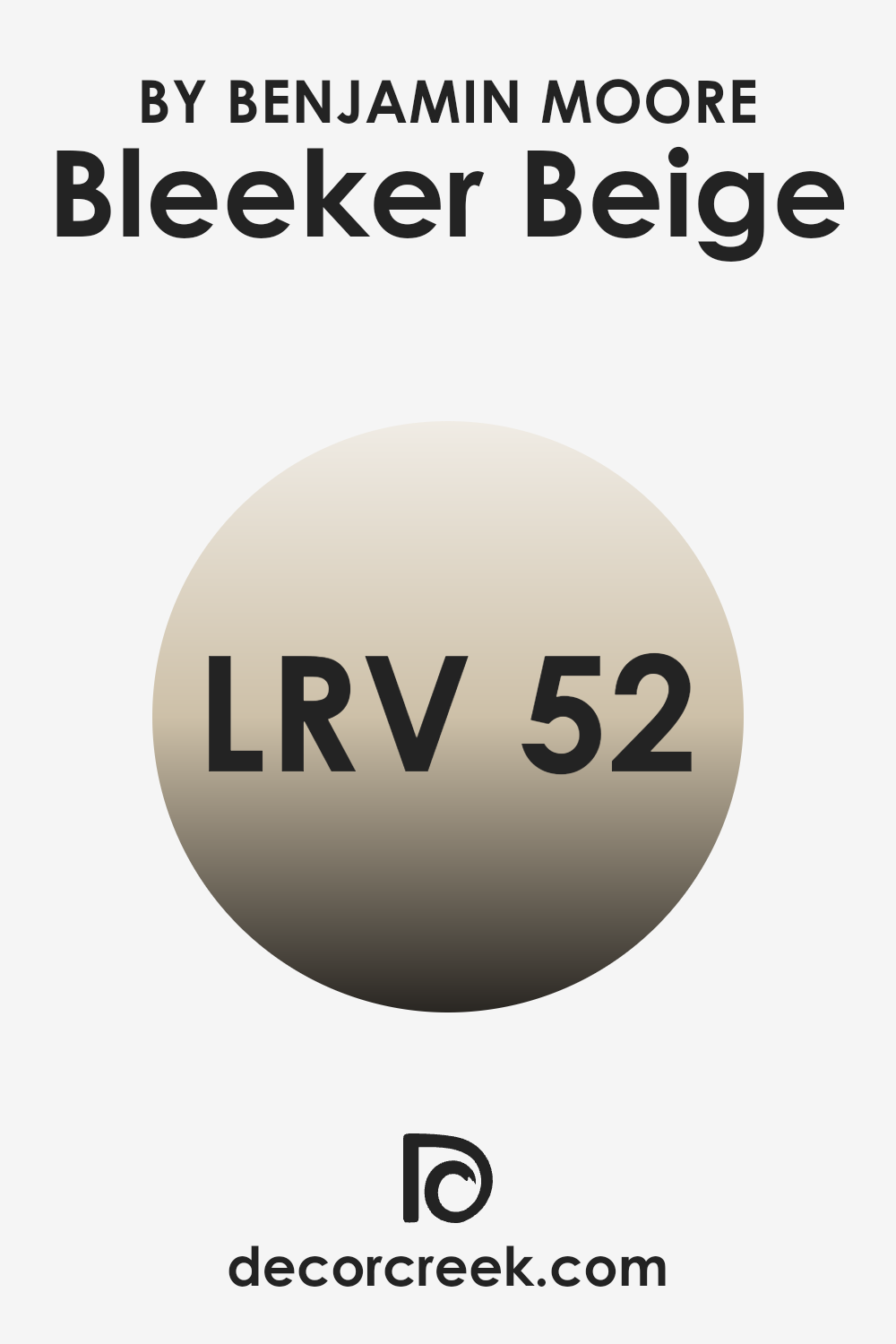
What is the LRV of Bleeker Beige HC-80 by Benjamin Moore?
LRV stands for Light Reflectance Value, which is a measure of the amount of light a paint color reflects back into a room as opposed to absorbing it. This measurement is given on a scale from 0%, meaning it reflects no light and absorbs all the light, to 100%, meaning it reflects all light and absorbs none.
LRV is a useful guideline when choosing paint colors because it helps you understand how light or dark a color will look once applied to your walls. A higher LRV can make a room feel more open and airy because more light is being reflected around the area.
The LRV of Bleeker Beige, which is 51.66, positions it in the middle of the scale. This means it is neither too dark nor too light, making it a flexible choice for various areas. In a room with ample natural light, this color will appear lighter and can help enhance the bright, welcoming feel of the area. In dimmer, less naturally lit areas, the same color might appear somewhat darker and can create a cozier atmosphere. This balance makes Bleeker Beige a good option for areas that serve multiple purposes throughout the day, adjusting subtly with the changing light conditions.
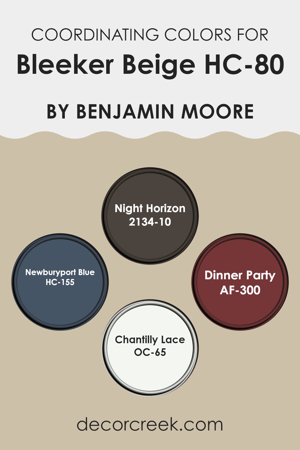
Coordinating Colors of Bleeker Beige HC-80 by Benjamin Moore
Coordinating colors are shades that harmonize well with a main color, enhancing its visual appeal without overpowering it. In the context of Benjamin Moore’s Bleeker Beige, coordinating colors are chosen to complement and accentuate this neutral hue, creating a cohesive and visually pleasing palette. These complementary shades are carefully selected to ensure they balance well with the primary color, allowing for a variety of design applications, from creating contrast to building a monochromatic look.
Night Horizon is a deep, bold gray that provides a striking contrast to the softer tone of Bleeker Beige, making it ideal for accent walls or furniture. Newburyport Blue, on the other hand, offers a rich, maritime blue that pairs beautifully with Bleeker Beige for a classic, enduring look. Dinner Party is a vibrant, deep red that adds a touch of warmth and drama, perfect for creating a focal point in any room.
Lastly, Chantilly Lace is a crisp, clean white that brightens areas and complements the warm undertones of Bleeker Beige, ideal for trim work or ceilings to create a fresh and airy feel. Together, these colors work in harmony to enhance the beauty of an area, offering various decorating options to suit different tastes and styles.
You can see recommended paint colors below:
- 2134-10 Night Horizon
- HC-155 Newburyport Blue
- AF-300 Dinner Party
- OC-65 Chantilly Lace
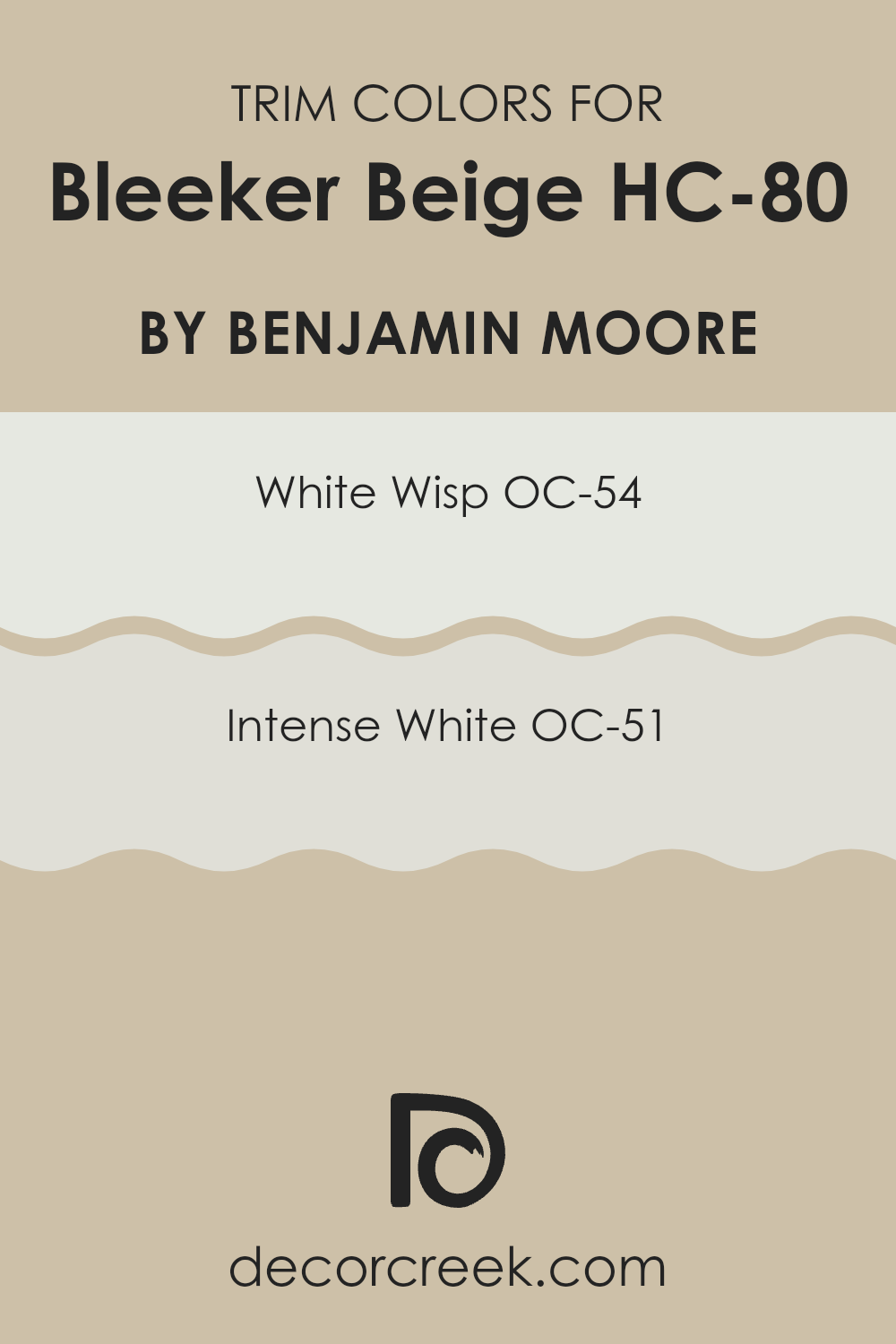
What are the Trim colors of Bleeker Beige HC-80 by Benjamin Moore?
Trim colors are the shades used on the details of a room such as baseboards, moldings, doors, and window frames. Choosing the right trim color can gently emphasize these architectural features, enhancing the visual aesthetic of the area. For Bleecker Beige HC-80 by Benjamin Moore, which is a warm, inviting neutral tone, selecting an appropriate trim color is essential to create a balanced, harmonious look.
Shades like White Wisp OC-54 and Intense White OC-51, both by Benjamin Moore, are excellent choices because they offer a clean, crisp border that complements the richness of Bleecker Beige without overpowering the area.
White Wisp OC-54 is a soft, airy white with a hint of gray undertone which adds a subtle contrast to Bleecker Beige. This pale shade prevents the area from looking too stark while still providing a fresh and light lift. On the other hand, Intense White OC-51, which leans slightly warmer than White Wisp, offers a seamless flow when paired with Bleecker Beige. This color has a softness that works well in creating a cozy yet defined environment, making it a great choice for anyone looking to highlight the craftsmanship of their home’s trim in a subtle yet effective way.
You can see recommended paint colors below:
- OC-54 White Wisp
- OC-51 Intense White
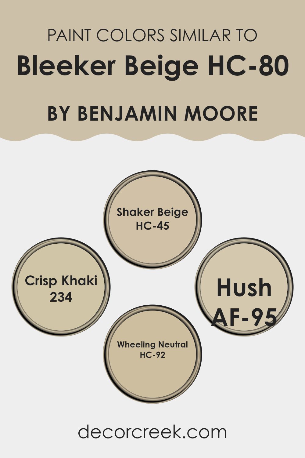
Colors Similar to Bleeker Beige HC-80 by Benjamin Moore
Similar colors are crucial in interior design because they create a harmonious and coherent aesthetic within an area. By using shades like HC-45 Shaker Beige, 234 Crisp Khaki, AF-95 Hush, and HC-92 Wheeling Neutral, which share a close kinship with Bleeker Beige, one can achieve a subtle yet impactful visual flow.
These colors blend effortlessly with each other, allowing for a smooth visual transition from room to room without clashing or causing abrupt visual breaks. This kind of color coordination also helps to augment the perceived size and luminosity of an area, making rooms appear larger and brighter.
HC-45 Shaker Beige is a warm, inviting beige that pairs beautifully with a variety of decor, offering a cozy feel. 234 Crisp Khaki is slightly deeper, adding a touch of earthiness that enriches the environment it inhabits. AF-95 Hush is a soft neutral, its quiet presence provides a peaceful backdrop for daily life.
Lastly, HC-92 Wheeling Neutral is a balanced beige that sits comfortably between warm and cool tones, providing flexibility in styling and decoration. Altogether, these colors form a flexible palette that can support a wide range of design preferences, making them very useful for creating a cohesive look in any home.
You can see recommended paint colors below:
- HC-45 Shaker Beige
- 234 Crisp Khaki
- AF-95 Hush
- HC-92 Wheeling Neutral
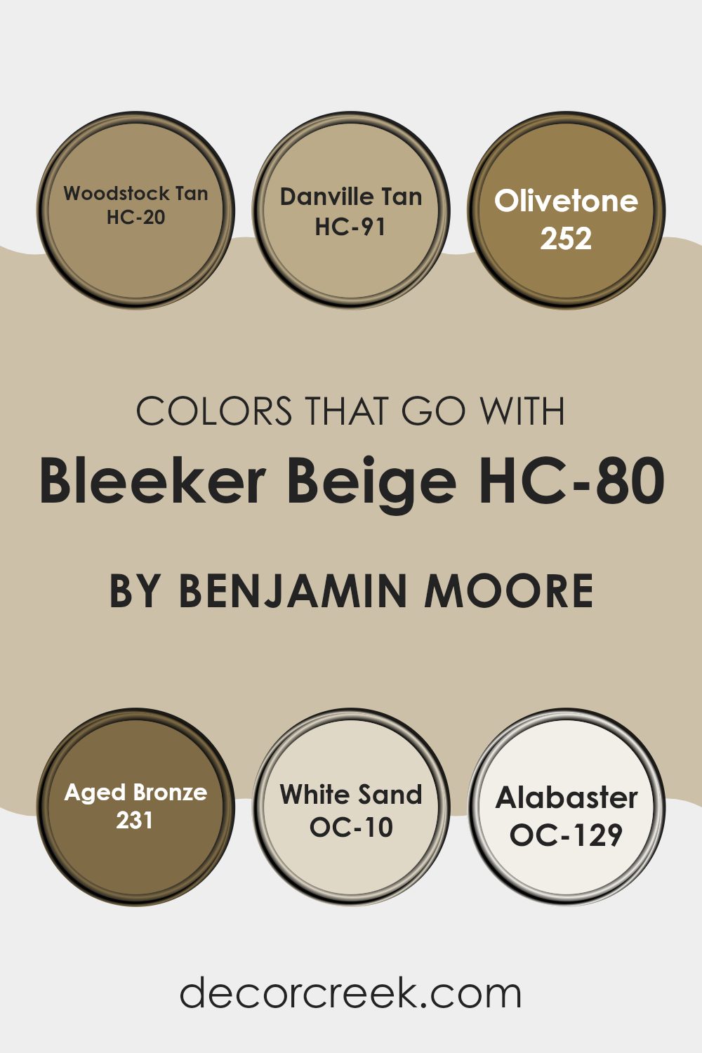
Colors that Go With Bleeker Beige HC-80 by Benjamin Moore
Choosing colors that complement Bleeker Beige HC-80 by Benjamin Moore can greatly enhance the overall look of an area. These colors support a harmonious palette and aid in creating a cohesive design aesthetic. When paired wisely, they can accentuate Bleeker Beige’s warm undertones, providing a cozy and welcoming atmosphere. The significance of selecting the right complementary colors lies in their ability to add depth and character to the room. This approach ensures that the colors do not clash, but instead, work together to produce a pleasant and balanced visual experience.
For example, HC-20 – Woodstock Tan is a deeper hue that works well to ground the airiness of Bleeker Beige, offering a sturdy contrast. HC-91 – Danville Tan shares a similar earthiness with a slightly more golden tone, perfect for enhancing warmth in the décor. Moving to the greens, 252 – Olivetone presents a subtle, muted green that can introduce a gentle splash of nature-inspired color.
Then there’s 231 – Aged Bronze, a rich, deep color that resembles the patina of aged metal, excellent for adding a touch of elegance. On the lighter side, OC-10 – White Sand is a soft, clean white that refreshes the area and brings out the vibrancy of Beige. Lastly, OC-129 – Alabaster offers a hint of creaminess, providing a soft contrast, making it an ideal choice for trims and accents. Together, these colors create a palette that enhances the flexibility and beauty of Bleeker Beige.
You can see recommended paint colors below:
- HC-20 Woodstock Tan
- HC-91 Danville Tan
- 252 Olivetone
- 231 Aged Bronze
- OC-10 White Sand
- OC-129 Alabaster
How to Use Bleeker Beige HC-80 by Benjamin Moore In Your Home?
Bleeker Beige HC-80 by Benjamin Moore is a warm, flexible beige paint color that works great in many parts of a home. It’s a cozy shade that adds a welcoming feel to any room without being too bold or overpowering. If you’re thinking about using this color, one great place is your living room or family room. It pairs beautifully with a wide range of furniture colors and styles, from dark woods to lighter fabrics, helping to create a balanced look.
Additionally, Bleeker Beige is an excellent choice for bedrooms. It provides a calm, neutral backdrop that can help make your area feel relaxing and comfortable, ideal for a good night’s sleep.
You can also consider it for hallways or entryways, where it can make the area feel inviting and connected to the rest of your home. Just add some colorful art or a decorative rug to give these areas a personal touch. This shade also works well in a kitchen, providing a soft contrast to cabinets and appliances.
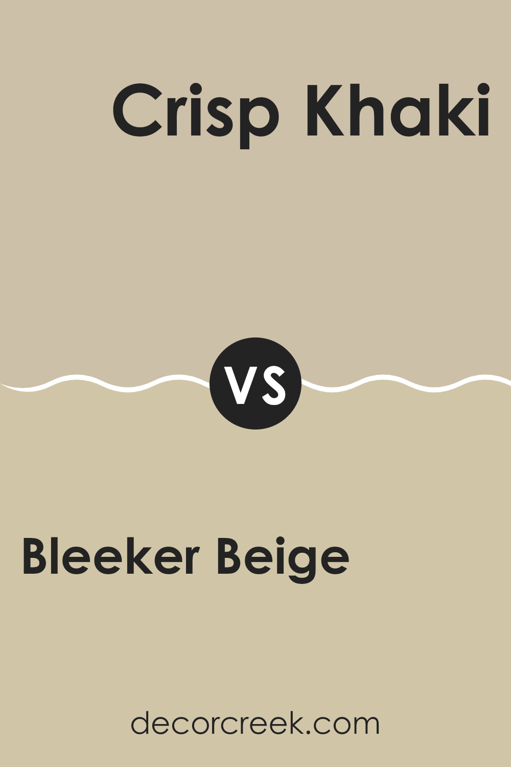
Bleeker Beige HC-80 by Benjamin Moore vs Crisp Khaki 234 by Benjamin Moore
Bleeker Beige and Crisp Khaki are two paint colors by Benjamin Moore that have distinct yet subtle differences. Bleeker Beige has a warm, soft vibe, mainly because of its beige base with a hint of gray.
This makes it flexible for any room, providing a cozy backdrop that feels welcoming. On the other hand, Crisp Khaki has a slightly richer and deeper tone, leaning more towards a true khaki color.
It tends to bring a bit more warmth to the area compared to Bleeker Beige, due to its slightly darker and more saturated hue. Both colors work well in areas that need a neutral color that isn’t too stark or bright. They can be used in living rooms, dining areas, or bedrooms, with Crisp Khaki offering a tad more depth and warmth, which can make larger areas feel more intimate.
You can see recommended paint color below:
- 234 Crisp Khaki
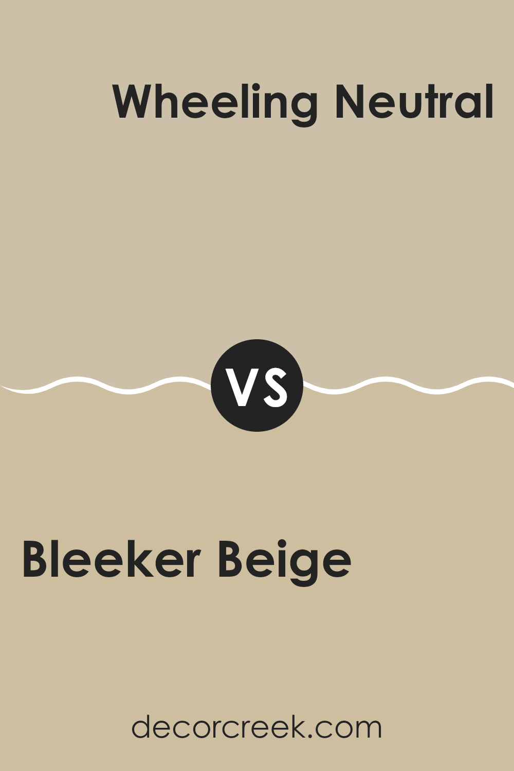
Bleeker Beige HC-80 by Benjamin Moore vs Wheeling Neutral HC-92 by Benjamin Moore
Bleeker Beige and Wheeling Neutral, both by Benjamin Moore, are subtle and warm hues that create a cozy vibe in any area. Bleeker Beige is a soft, sandy color that brings a light and airy feel to rooms.
It’s quite flexible and pairs well with various decor styles, making it a perfect choice for living areas and bedrooms. On the other hand, Wheeling Neutral has a slightly more gray tone, providing a bit of a cooler feel compared to Bleeker Beige.
It’s great for those looking for a neutral that leans towards a classic, enduring look without being too bold. Wheeling Neutral might also hide marks and scuffs better because of its deeper color. Both colors are neutral enough to act as a backdrop for furniture and artwork, but the choice between the two would depend on whether you prefer a warmer beige or a cooler, gray-inflected neutral.
You can see recommended paint color below:
- HC-92 Wheeling Neutral
Bleeker Beige HC-80 by Benjamin Moore vs Shaker Beige HC-45 by Benjamin Moore
Bleeker Beige and Shaker Beige by Benjamin Moore are two popular neutral paint colors, each giving a warm, inviting vibe to any area. Bleeker Beige is a bit lighter, providing a soft, subtle backdrop that is flexible for various rooms, from living areas to bedrooms. It tends to brighten up areas while maintaining a cozy feel.
On the other hand, Shaker Beige has a deeper, richer tone that makes it slightly more pronounced when applied on walls. It’s still neutral but carries more warmth, making it ideal for areas where you want a welcoming yet slightly more defined color presence.
Both colors go well with a variety of décor styles and pair nicely with a wide range of furniture colors and materials. Whether you choose Bleeker Beige for its lighter touch or Shaker Beige for its warmer depth, both shades offer an enduring backdrop for any room.
You can see recommended paint color below:

Bleeker Beige HC-80 by Benjamin Moore vs Hush AF-95 by Benjamin Moore
Bleeker Beige and Hush are both paint colors offered by Benjamin Moore, but they have different tones that set them apart. Bleeker Beige is a warm beige that has a cozy and inviting feel.
It works well in living rooms or bedrooms because it has a comforting presence that makes areas feel more welcoming. On the other hand, Hush is lighter and has a softer appearance.
It leans slightly towards a gray tone, making it a great choice for modern areas that want a neutral backdrop without feeling too warm. This color is excellent for creating a calm mood in places like home offices or bathrooms. Both colors are flexible, but Bleeker Beige offers warmth, whereas Hush provides a subtle, neutral canvas.
You can see recommended paint color below:
- AF-95 Hush

After learning so much about HC-80 Bleeker Beige by Benjamin Moore, I feel confident in saying that it’s an excellent choice for anyone looking to give their room a warm and welcoming atmosphere. This paint color’s soft, warm beige tone works like a cozy blanket, covering the walls with a soothing vibe that makes every room feel just right. Whether it’s used in a busy kitchen, a quiet study, or a child’s playroom, Bleeker Beige offers a perfect background that complements various furniture styles and colors.
Plus, it’s easy to apply and has great coverage, which means you don’t need to worry about spending lots of time or effort painting your walls. The painted walls are easy to maintain and keep clean, which is a bonus if you have little ones or pets.
Joining it with other colors and decor styles, you’ll see that Bleeker Beige is like a reliable friend making everything else look good. This color is a smart, practical choice if you’re thinking of refreshing your home or just one room.
Looking at my walls now, I’m happy with the choice and glad I picked HC-80 Bleeker Beige from Benjamin Moore.
Ever wished paint sampling was as easy as sticking a sticker? Guess what? Now it is! Discover Samplize's unique Peel & Stick samples.
Get paint samples

