Black
Black Blue
Blue Brown
Brown Gray
Gray Green
Green Neutral
 Orange
 White
White Yellow
As I started refreshing my living room, I came across a beautiful color called 771 Blue Allure by Benjamin Moore. The name itself felt so welcoming that I simply had to see it in person. Once I did, it became obvious why this shade feels so special.
It’s a calming blue that carries a gentle vibrancy, making it perfect for a room where I want to unwind and feel comfortable. Not too bold and not too soft, Blue Allure creates just the right balance, bringing a fresh and airy feeling to the room.
It pairs wonderfully with light-colored furnishings and natural wood accents, improving the overall calming atmosphere. The color also has this way of reflecting natural light that brightens up the entire area, making it feel larger and more open.
Choosing 771 Blue Allure has been such a lovely experience, and it has completely refreshed the way my living room feels.
What Color Is Blue Allure 771 by Benjamin Moore?
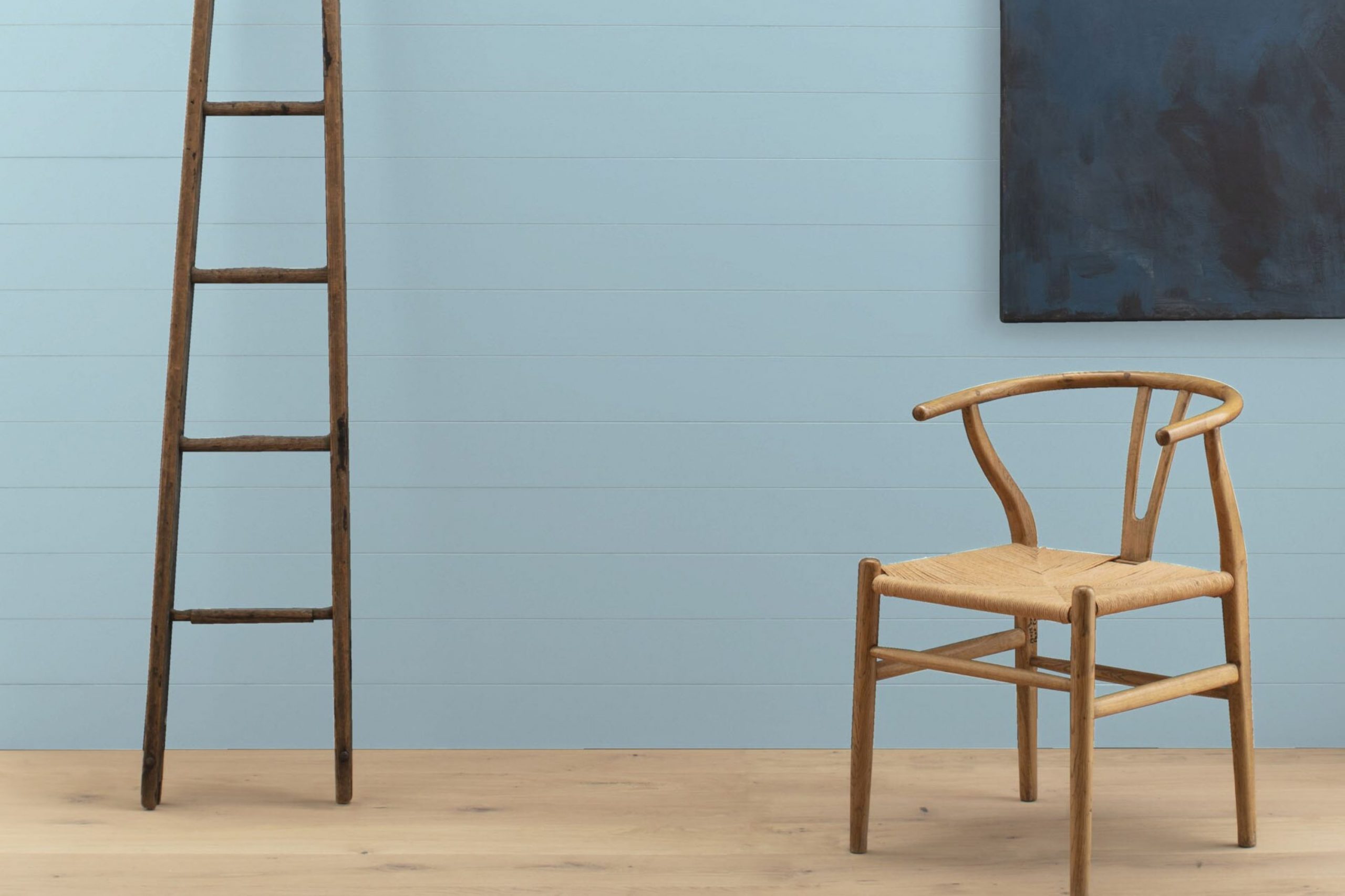
Blue Allure 771 by Benjamin Moore is a vibrant and fresh shade of blue that brings to mind a clear sky on a sunny day. Its brightness adds a lively pop of color to any room, making it an exciting choice for those wanting to add some cheerfulness to their interior.
This blue works particularly well in coastal, modern, and contemporary interior styles. In coastal decor, it pairs wonderfully with white and sandy beige tones, bringing to mind the seaside’s airy vibe. For modern or contemporary interiors, it can create a striking contrast against minimalist, clean lines and sleek furniture.
Blue Allure 771 also pairs beautifully with natural materials and textures. Wood looks fantastic against this blue, whether it’s light oak or rich walnut. The warmth of the wood balances the coolness of the blue, creating a balanced, welcoming room. Metals like brushed nickel or polished chrome also complement this shade, adding a crisp, modern touch to the decor.
Moreover, soft fabrics like cotton or linen in white or neutral tones make great companions for Blue Allure 771, as they help soften the intensity of the blue while keeping the look fresh and light. This shade can really make a room feel more lively and cheerful, perfect for areas like living rooms or kitchens where you spend a lot of time.
decorcreek.com
Is Blue Allure 771 by Benjamin Moore Warm or Cool color?
Blue Allure 771 by Benjamin Moore is a vibrant and refreshing shade of blue that brings a lively pop of color to any room. This particular blue has an energetic quality that can make a room feel more welcoming and cozy. It works really well in areas like living rooms or bedrooms where you want a bit of personality without feeling too intense.
What’s great about Blue Allure is its adaptability. It pairs nicely with neutral tones like whites and grays, allowing furniture and artwork to stand out. It also complements wooden features, highlighting their natural beauty. In smaller rooms, such as bathrooms or reading nooks, it adds depth and interest, making them feel more attractive.
Using this shade can also help brighten darker rooms since it naturally reflects light. This is especially helpful in homes that might not get a lot of natural sunlight. By choosing Blue Allure for walls or even just an accent wall, homeowners can create a fresh, modern look that remains stylish for years.
Undertones of Blue Allure 771 by Benjamin Moore
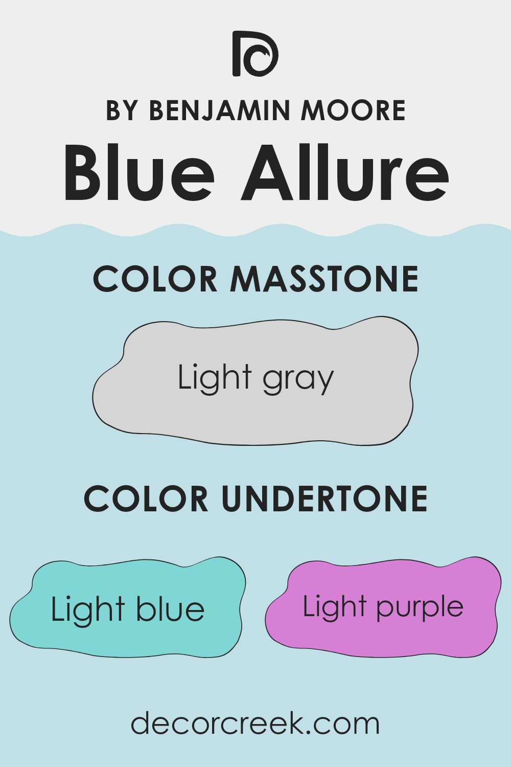
Blue Allure by Benjamin Moore is an adaptable color that showcases a beautiful blend of undertones, making it unique and suitable for different settings and styles. The undertones in any paint color play an important role in how it is perceived and how it influences the atmosphere of a room. For Blue Allure, these subtle hints include light blue, light purple, pale yellow, lilac, mint, pale pink, and grey.
These underlying hints have a strong impact on the overall appearance of the wall paint. For example, the light blue and mint undertones can give a fresh and lively feel to a room, creating a sense of calmness and freshness. This is particularly suitable for places like the bathroom or kitchen where a clean, refreshing look is often preferred.
Meanwhile, the light purple and lilac undertones add a touch of softness and gentleness, making the color a good choice for bedrooms where a restful environment is important. Additionally, the pale yellow undertone can subtly fill a room with cheerfulness and warmth, perfect for living areas that benefit from a cozy and welcoming atmosphere.
The grey undertone keeps the color grounded, ensuring it doesn’t feel too bright and remains calming, suitable for different decor styles and preferences. Pale pink softens the overall look, contributing to a gentle and welcoming vibe.
Ultimately, the mix of these undertones means that Blue Allure can easily adjust to different lighting and furniture styles, making it an adaptable option for anyone looking to redecorate. The way these undertones interact creates a dynamic yet balanced look that improves interior walls beautifully.
decorcreek.com
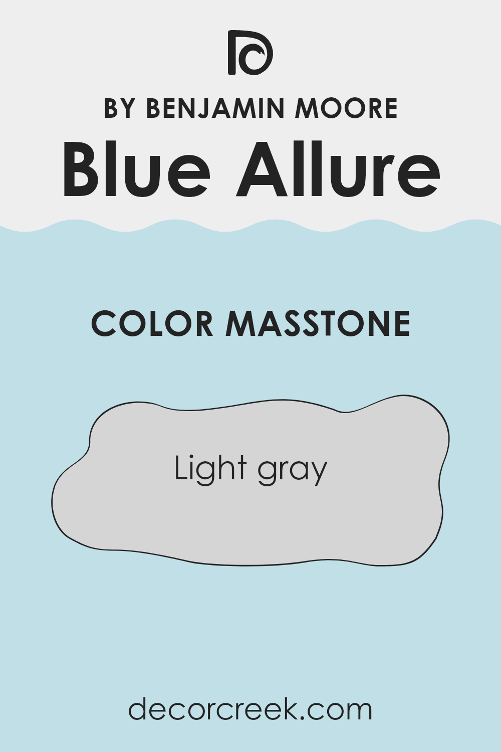
What is the Masstone of the Blue Allure 771 by Benjamin Moore?
Blue Allure 771 by Benjamin Moore, despite its name, surprisingly presents a masstone of light gray, noted as #D5D5D5. This soft and gentle gray shade is extremely adaptable when it comes to interior decorating.
It acts as a subtle backdrop that can easily blend with different color schemes and furnishings, making it a go-to choice for those looking to create a balanced and welcoming room without making it feel too intense with color.
The light gray tone of Blue Allure 771 works well in rooms that receive a lot of natural light, reflecting and amplifying the brightness to make rooms feel more open and airy. On the other hand, in darker rooms, this color helps keep the atmosphere light and fresh instead of feeling too closed in or cramped. This paint color is also practical as it tends to hide small imperfections on walls better than darker shades, making maintenance easier. Overall, it’s an excellent choice for anyone wanting a neutral color palette that offers adaptability and a clean, fresh look.
decorcreek.com
How Does Lighting Affect Blue Allure 771 by Benjamin Moore?
Lighting can strongly affect the way colors appear in a room, influencing both the mood and the overall look. Color perception changes depending on the type of light, whether artificial or natural. Blue Allure by Benjamin Moore is an interesting example to observe under different lighting conditions.
In artificial light, such as that from incandescent bulbs, Blue Allure tends to appear warmer and softer. This is because incandescent lighting casts a yellowish tint, reducing the boldness of the blue. Fluorescent lights, on the other hand, might make it look slightly brighter because of their cooler, bluish tone.
Natural light brings out the truest version of Blue Allure, but this also depends on the direction of the room’s windows. North-facing rooms often receive less direct sunlight, which can make colors appear slightly darker and cooler. Here, Blue Allure might seem more muted and shadowed, giving the room a calm and relaxed feeling.
South-facing rooms are filled with stronger light throughout the day, which can make colors look brighter and more vivid. In these rooms, Blue Allure might appear lively and eye-catching, reflecting more of its true blue quality.
East-facing rooms enjoy bright morning light, which can make Blue Allure look soft and cheerful in the morning hours but possibly cooler and quieter as the day continues and the natural light fades.
Rooms facing west absorb the warmer, reddish tones of the evening sun which can make Blue Allure appear richer and slightly warmer in the late afternoon and evening than during the morning.
Overall, Blue Allure’s appearance can range from a soft, calming blue in shaded or dimmer light to a vivid, cheerful shade in bright, direct light, showing how lighting conditions play an important role in the visual perception of color.
decorcreek.com
What is the LRV of Blue Allure 771 by Benjamin Moore?
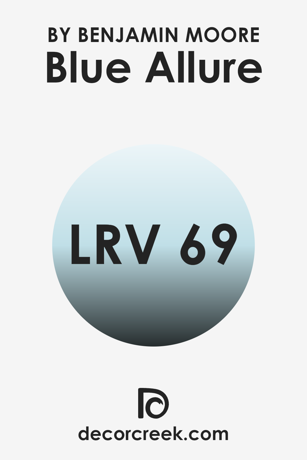
Light Reflectance Value (LRV) is a measure used to indicate how much light a paint color reflects or absorbs when applied to a surface. It’s an important property to consider when choosing paint colors because it can strongly affect the atmosphere and brightness of a room.
Measured on a scale where higher numbers mean more light is reflected, a higher LRV can make a room feel more open and airy, while a lower LRV can make a room feel more cozy and enclosed.
For the specific color Blue Allure, with an LRV of 69.32, it falls into the category of colors that reflect a good amount of light. This means that when applied to walls, it tends to make a room feel more lively and bright, as it does not absorb much light. It is an effective choice for making smaller or darker rooms appear more open and well-lit. Given its strong ability to reflect light, it also offers a lot of adaptability in terms of decor and pairing with other colors, improving flexibility in interior design options.
decorcreek.com
Coordinating Colors of Blue Allure 771 by Benjamin Moore
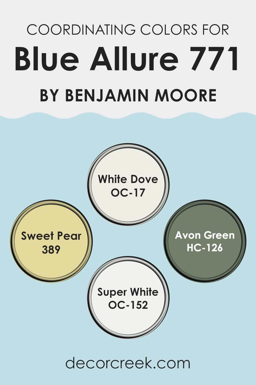
Coordinating colors are hues that complement or improve the main color in a palette, in this case, Blue Allure by Benjamin Moore. These coordinating colors work together to create a balanced look, ensuring that no single color overpowers the other.
For example, neutral tones like OC-17 – White Dove and OC-152 – Super White provide a clean, fresh backdrop that allows a bold color to stand out without feeling too intense in the room. Meanwhile, more vibrant colors like 389 – Sweet Pear and HC-126 – Avon Green add depth and interest, bringing energy and a natural feeling to the setting.
White Dove is a soft white that acts as an adaptable backdrop, making it ideal for creating a calming atmosphere that complements the vibrant tones of Blue Allure. Sweet Pear, a gentle green with a hint of yellow, adds a lively yet subtle touch inspired by nature, perfect for brightening up rooms.
Avon Green offers a deeper, richer tone that pairs well with Blue Allure, grounding the brighter blues and creating a more unified look. Lastly, Super White is a crisp, clean white that offers a striking contrast, particularly useful for trim or accent elements to make the colors stand out. Together, these coordinating colors create a balanced and pleasing palette.
You can see recommended paint colors below:
- OC-17 White Dove
- 389 Sweet Pear
- HC-126 Avon Green
- OC-152 Super White
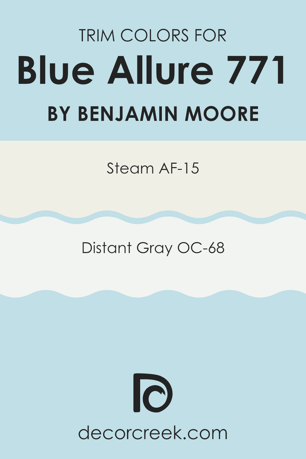
What are the Trim colors of Blue Allure 771 by Benjamin Moore?
Trim colors are specific shades used to highlight or outline the architectural details and edges of a room such as door frames, baseboards, crown moldings, and window sills. Choosing the right trim color can highlight these features and create a beautiful contrast that defines the areas within a room.
For example, using contrasting trim colors alongside main wall colors can draw attention to the fine craftsmanship of your home’s details or add a touch of crisp freshness when paired with more vibrant wall colors like “Blue Allure” by Benjamin Moore.
AF-15, known as “Steam,” is a clean, crisp white that can brighten up trim and make the wall colors stand out by providing a sharp, refreshing contrast. This shade is especially effective in bringing out the depth and vibrancy of richer, more colorful walls.
On the other hand, OC-68, or “Distant Gray,” offers a softer contrast with a gentle, light gray tone that softens edges without sharp shifts, blending more naturally with lighter wall colors. Using either of these trim colors with a vibrant shade such as “Blue Allure” can improve the overall visual appeal of a room, defining areas neatly and providing an attractive frame to colored walls.
You can see recommended paint colors below:
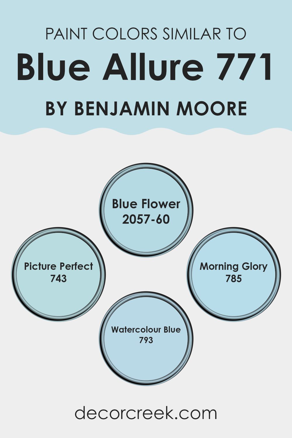
Colors Similar to Blue Allure 771 by Benjamin Moore
Choosing similar colors is important when aiming for a balanced and visually appealing color scheme in your design or decor project. When colors like Blue Allure and its similar shades such as Blue Flower, Picture Perfect, Morning Glory, and Watercolour Blue are used together, they create a unified blend.
These colors, which vary subtly in brightness and depth, allow for a smooth transition across a room, adding depth without the sharp contrast that comes from more dramatically different colors. This technique is especially useful in creating a calming atmosphere, as the continuity of similar hues tends to feel comfortable to the eyes and can make rooms appear larger and more open.
Blue Flower is a slightly brighter version of Blue Allure, bringing a fresh and lively feeling to the setting. Picture Perfect has the softness of an early morning sky, gentle and light, ideal for creating a calm and welcoming room.
Morning Glory offers a touch more intensity and depth, making it great for adding character without overpowering the lighter tones. Finally, Watercolour Blue has a muted, subtle quality that works beautifully with natural light, improving rooms with a soft yet rich blue tone. When used together, these shades of blue create a flowing visual story, making them perfect for anyone looking to design a room that feels connected and beautifully balanced.
You can see recommended paint colors below:
- 2057-60 Blue Flower
- 743 Picture Perfect
- 785 Morning Glory
- 793 Watercolour Blue
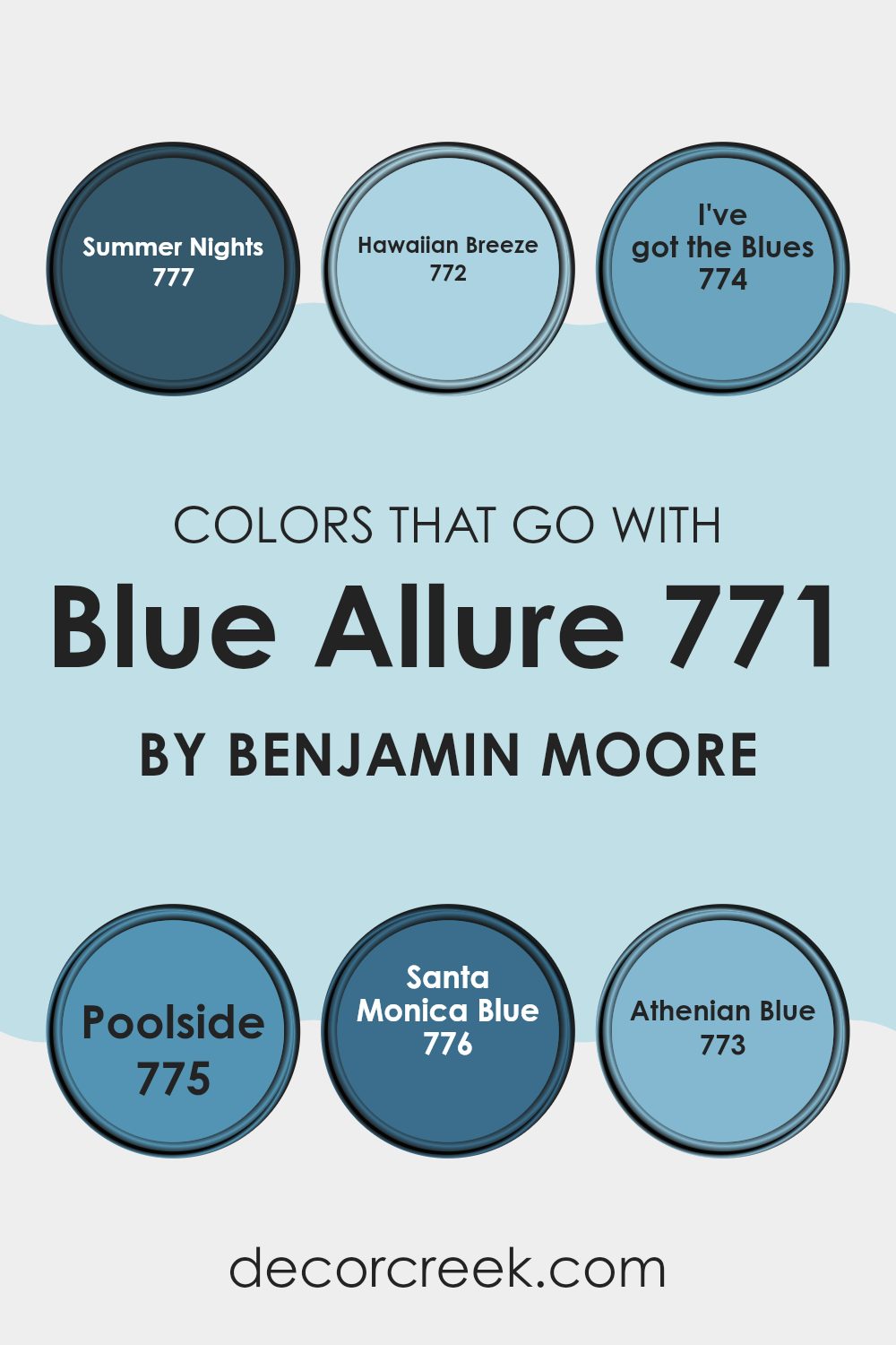
Colors that Go With Blue Allure 771 by Benjamin Moore
The colors that complement Blue Allure 771 by Benjamin Moore are important for creating a balanced and appealing color scheme in any room. These colors are carefully selected to work beautifully with the unique shade of Blue Allure, ensuring that the entire palette feels connected. When colors are chosen thoughtfully, they can improve the atmosphere of a room, make smaller rooms appear larger, or simply add a touch of beauty.
Summer Nights 777 provides a deep, calming blue that can anchor a room by adding depth and richness. It’s a great contrast to the brighter Blue Allure, creating a dynamic yet balanced setting. Hawaiian Breeze 772 offers a lighter, airier blue, reminiscent of the sky on a clear day, which can brighten a room’s mood and complement the richer tones of Blue Allure.
I’ve Got the Blues 774 is a soft and muted blue, perfect for creating a calming backdrop that allows brighter elements to stand out. Poolside 775 brings a playful, cheerful blue to the mix, adding a splash of freshness that can energize any room.
Santa Monica Blue 776 leans toward a touch of green, giving it a unique character that pairs beautifully with more classic blues. Lastly, Athenian Blue 773 has a hint of purple, offering a soft, gentle contrast and improving the overall variety of the palette. Each color has its own personality but all work together to support the main focus, Blue Allure 771.
You can see recommended paint colors below:
- 777 Summer Nights
- 772 Hawaiian Breeze
- 774 I’ve got the Blues
- 775 Poolside
- 776 Santa Monica Blue
- 773 Athenian Blue
How to Use Blue Allure 771 by Benjamin Moore In Your Home?
Blue Allure 771 by Benjamin Moore is a vibrant and fresh shade of blue that can brighten up any room in your home. This particular blue brings a cheerful and clean feeling, making it perfect for areas like the kitchen or bathroom where you can enjoy a splash of color.
It works wonderfully in small rooms too. A small room like a powder room or a study can feel more open with this shade on the walls.
You can also use it in a bedroom to create a cheerful atmosphere. Pair it with white trim and furniture to keep the room light and airy. For those who like a bit of contrast, adding accessories in orange or yellow can make the blue stand out even more. Whether you decide to paint all the walls or just use it for an accent wall, Blue Allure 771 can bring your decorating ideas to life with its bright, fresh look.
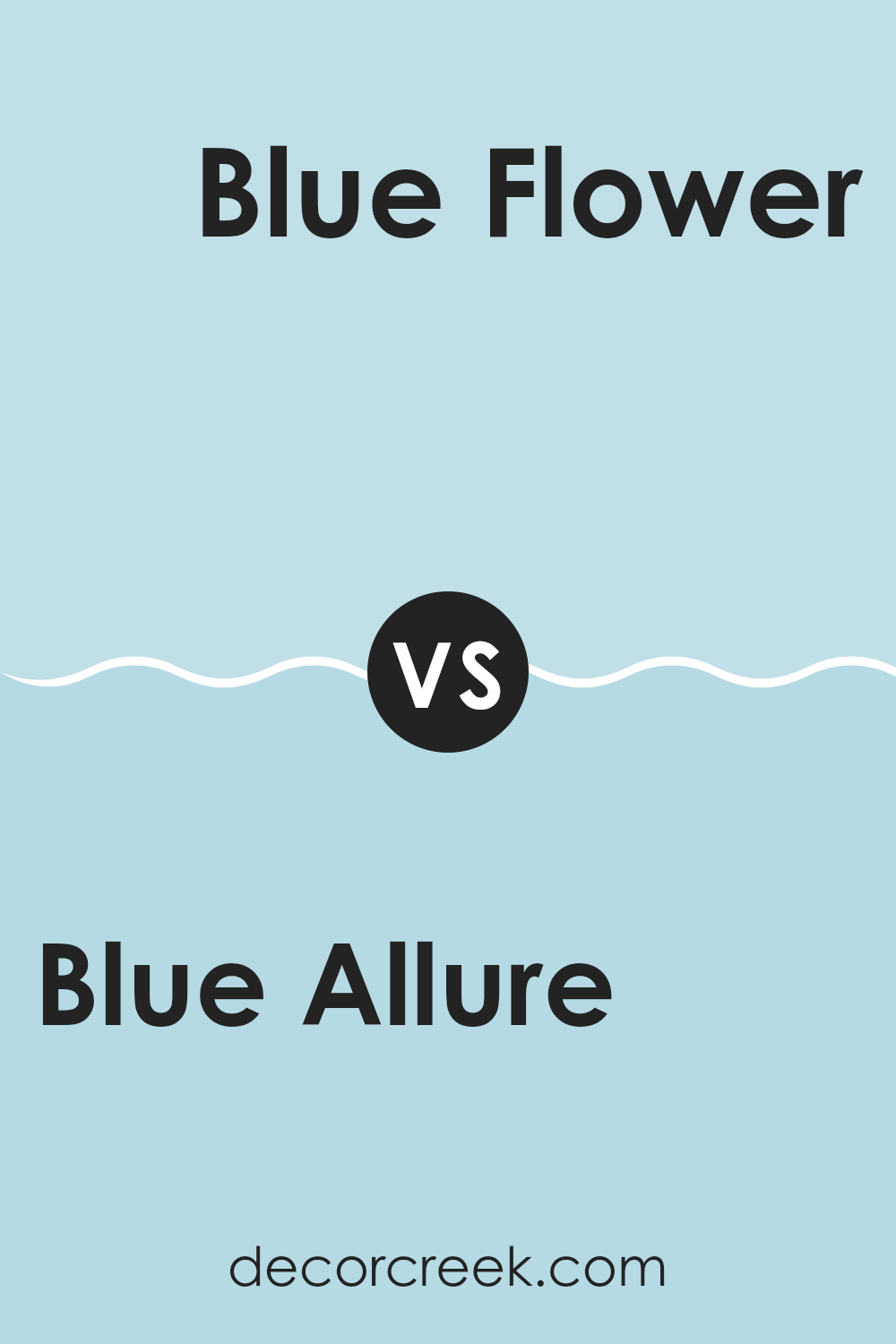
Blue Allure 771 by Benjamin Moore vs Blue Flower 2057-60 by Benjamin Moore
Blue Allure and Blue Flower by Benjamin Moore are both beautiful shades, but they each create a different feeling. Blue Allure is a deep, rich color that feels warm and welcoming.
It’s perfect for creating a cozy room where you want to relax. On the other hand, Blue Flower is much lighter and brighter. This shade feels airy and fresh, which can make a room appear more open and filled with light.
If you’re looking to add a touch of calm brightness to your room, Blue Flower is a wonderful choice. Both colors offer their own charm, whether you prefer the depth and richness of Blue Allure or the light, fresh feeling of Blue Flower.
You can see recommended paint color below:
- 2057-60 Blue Flower
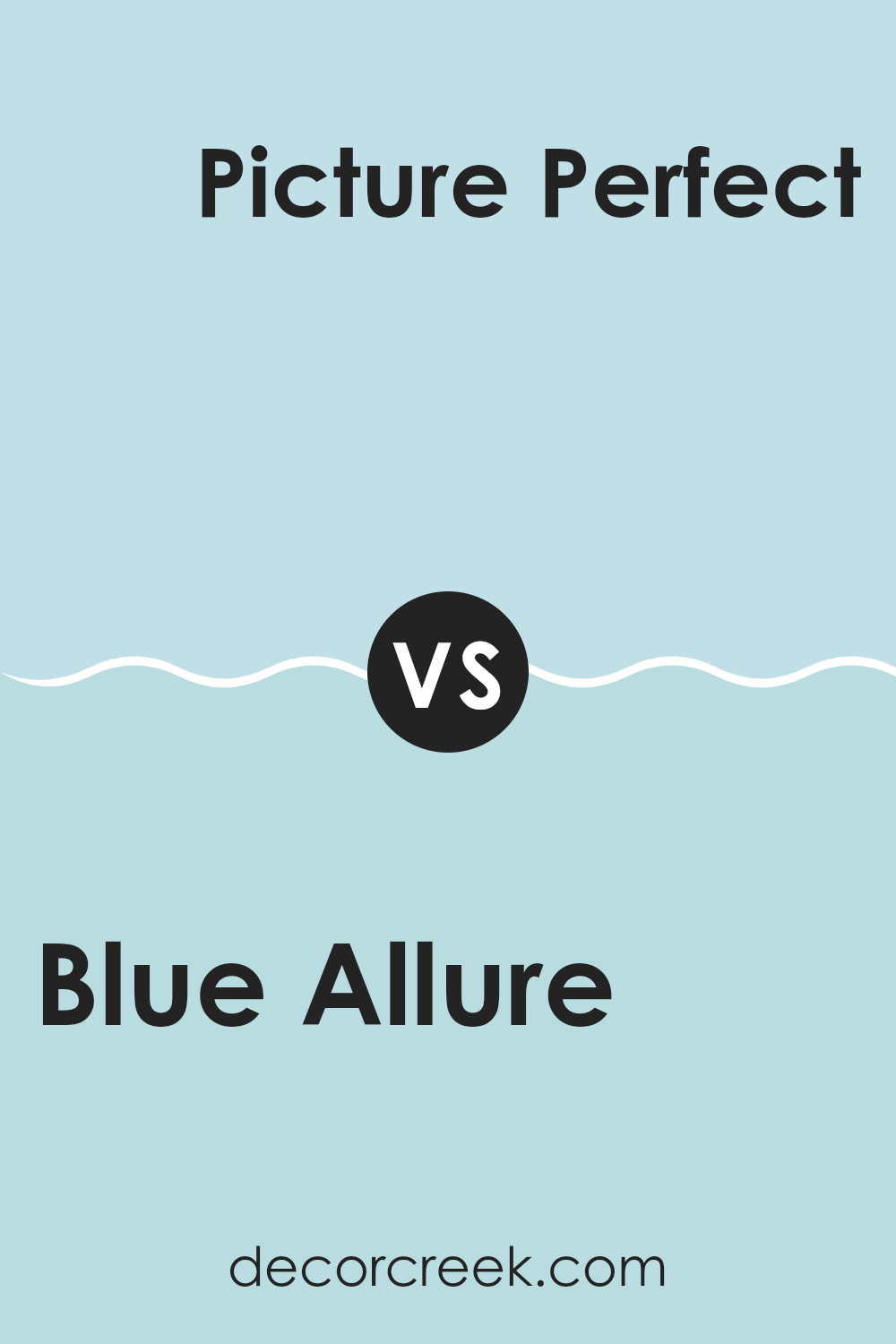
Blue Allure 771 by Benjamin Moore vs Picture Perfect 743 by Benjamin Moore
Blue Allure and Picture Perfect, both by Benjamin Moore, are unique choices for different rooms. Blue Allure is a deeper, more насыщенный shade that can give a room a sense of stability and depth. It works well in areas like bedrooms or offices where a calming yet stronger color is appreciated.
On the other hand, Picture Perfect is a lighter, softer blue with a fresh feeling, great for rooms that benefit from a bright and airy look, such as kitchens and bathrooms. This color can also make small rooms appear larger.
While both colors share a blue base, Blue Allure provides a bolder presence, and Picture Perfect offers a gentle brightness to a room’s atmosphere. Whether you’re going for impact or softness, each has its own charm depending on the mood you want to create.
You can see recommended paint color below:
- 743 Picture Perfect
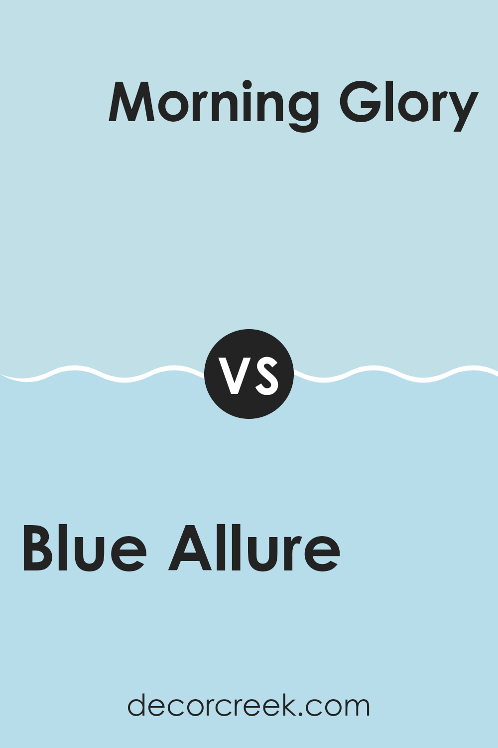
Blue Allure 771 by Benjamin Moore vs Morning Glory 785 by Benjamin Moore
Blue Allure is a rich, deep blue that has a lively intensity. It’s the kind of color that grabs attention and can make any room feel energetic yet cozy. It pairs well with bright whites and grays, which help balance its boldness.
On the other hand, Morning Glory is a lighter shade of blue with hints of softness, making it more airy and gentle in comparison. This color is great for creating a relaxed, fresh atmosphere. It works particularly well in rooms that aim for a calm and casual feeling, like a bedroom or bathroom.
While both colors come from the blue family, Blue Allure is definitely the more striking of the two, filled with depth and character. Morning Glory, meanwhile, offers a softer approach with its calming tones. Together, they can complement each other beautifully in a room that combines relaxation with energy.
You can see recommended paint color below:
- 785 Morning Glory
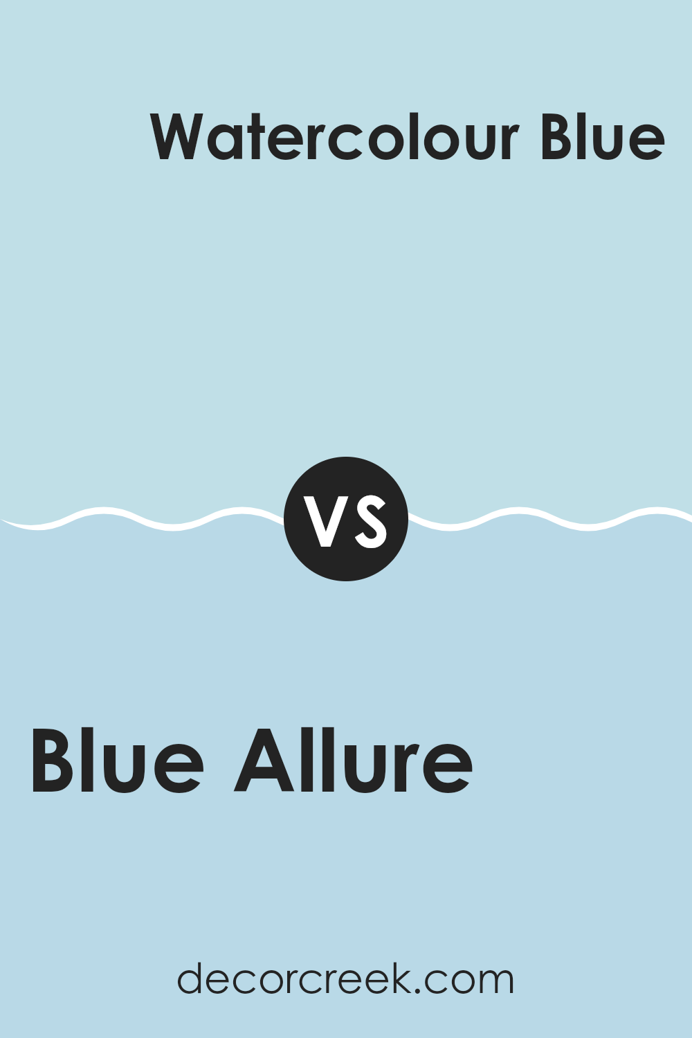
Blue Allure 771 by Benjamin Moore vs Watercolour Blue 793 by Benjamin Moore
Blue Allure and Watercolour Blue, both by Benjamin Moore, are distinct yet balanced shades. Blue Allure presents a richer, deeper navy blue that gives a sense of calm confidence to rooms like living rooms or bedrooms. It’s bold enough to make a statement while still maintaining a classic look.
On the other hand, Watercolour Blue is lighter and has a softer tone. This color brings to mind a gentle sky on a clear day and is perfect for creating a relaxed, airy feeling in a room. It works beautifully in bathrooms or kitchens where you want to keep the atmosphere light and open.
Both colors have their own charm and can be used effectively depending on the mood you want to create and the natural lighting available in your room. Watercolour Blue may be a better fit for smaller, brighter rooms, while Blue Allure can work especially well in larger or dimly lit areas.
You can see recommended paint color below:
- 793 Watercolour Blue
In wrapping up my thoughts about 771 Blue Allure by Benjamin Moore, I have to say that this paint color really caught my eye. It’s not just any blue; it has a bright and lively feeling that can make any room look cheerful and welcoming. I think it’s perfect for a kid’s room or a play area because it reminds me of the sky on a very sunny day.
Also, I found that this shade of blue works well with many other colors. You can pair it with whites to keep things light and airy, or you can combine it with darker colors for a slightly bolder look. I tested it in different rooms under different lighting conditions, and it stayed very true to its color, which is wonderful because you won’t get unexpected results after painting your walls.
After using 771 Blue Allure, I’ve realized it’s a great choice for anyone wanting to add a splash of joy to their home. It’s easy to apply, covers the wall smoothly, and the final result looks just as beautiful as it does in the can. Whether you’re brightening up a small room or updating a larger area, this color will not disappoint.
It’s easy to see why Benjamin Moore included it in their collection, as it definitely has a way of making rooms feel more energetic and fun.
decorcreek.com
Ever wished paint sampling was as easy as sticking a sticker? Guess what? Now it is! Discover Samplize's unique Peel & Stick samples.
Get paint samples