If you’re considering updating your home with a fresh coat of paint and you’ve set your sights on OC-152 Super White by Benjamin Moore, here are some essential points you should consider. Known for its crisp, clean appearance, Super White is a popular choice among homeowners looking to brighten up their interiors. It’s ideal for creating a sense of openness and clarity in small rooms or bringing a vibrant, airy feel to larger areas.
However, before you grab a paintbrush and start, you should be aware of how different light conditions affect the appearance of this shade. Under natural daylight, Super White radiates brilliantly, but in rooms with less light, it can appear slightly cooler.
Additionally, pairing it with complementary colors and decor can enhance its beauty and adjust it smoothly to your desired aesthetic.
So, if a fresh, pure white is what you’re aiming to achieve, Benjamin Moore’s OC-152 Super White might just be the perfect pick for your next home makeover project.

Is Super White OC-152 Right for My Home?
As a lover of clean and refreshing interiors, I find the paint color Super White by Benjamin Moore a true delight. This color is a crisp, pure white that brings clarity and brightness to any room. Its brilliance makes it an excellent choice for creating a sense of openness and airiness.
I’ve noticed how well it works in various interior styles, particularly in modern, minimalistic, and coastal designs, where its understated purity complements sleek lines and casual layouts beautifully.
When it comes to pairing materials and textures, Super White is incredibly adaptable. In my experience, it looks stunning against natural wood, whether it’s a light oak or a darker walnut, highlighting the rich textures of the wood.
It also pairs wonderfully with metals like brushed nickel or stainless steel, adding a clean, sharp edge to the interior. For those who enjoy a bit of contrast, combining this color with matte black or charcoal elements can create a striking visual impact.
I enjoy using Super White in interiors that get plenty of natural light. The way this color reflects light is truly amazing—it almost seems to glow, making the entire room feel more expansive. Whether it’s the backdrop for a busy kitchen or a quiet reading nook, Super White is a reliable choice that supports a range of materials and enhances every texture it accompanies.
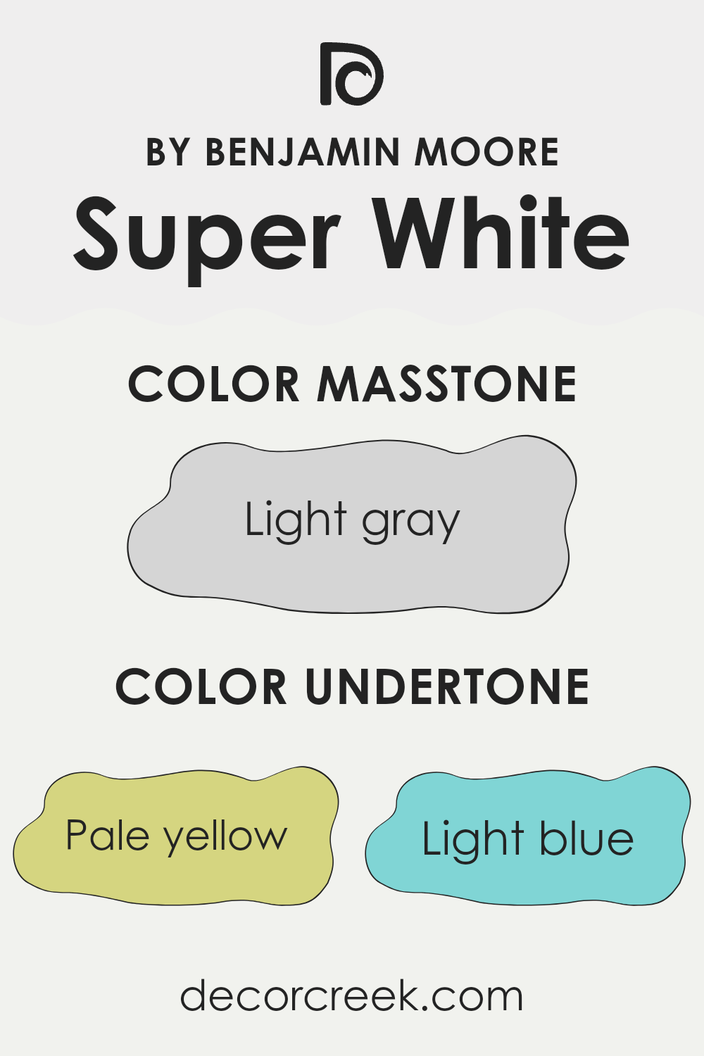
What are the right undertones of Super White OC-152 ?
Super White is a popular shade by Benjamin Moore that’s often chosen for its clean, crisp feel. However, what many people don’t realize is that its appearance can vary greatly depending on the lighting and surroundings. This variation is mainly due to the paint’s undertones. Undertones are subtle colors that rest beneath the primary color of the paint. In the case of Super White, these undertones include pale yellow, light blue, light purple, mint, pale pink, lilac, and grey.
Understanding these undertones is crucial because they can change how the paint looks on your walls. For example, in a room with a lot of natural light, the pale yellow or light blue undertones might make the walls look slightly warmer or cooler, respectively. In artificial light, lilac or pale pink might become more noticeable, giving the room a soft hue.
Different undertones will appear based on the direction of the light and other colors in the room. This is why Super White can look incredibly different from one interior to another. When choosing this paint for interior walls, it’s important to test it in the specific room where it will be used, observing how its appearance changes at different times of the day and in different lighting conditions. This will help you see which undertones become prominent and whether they complement your room’s overall look.
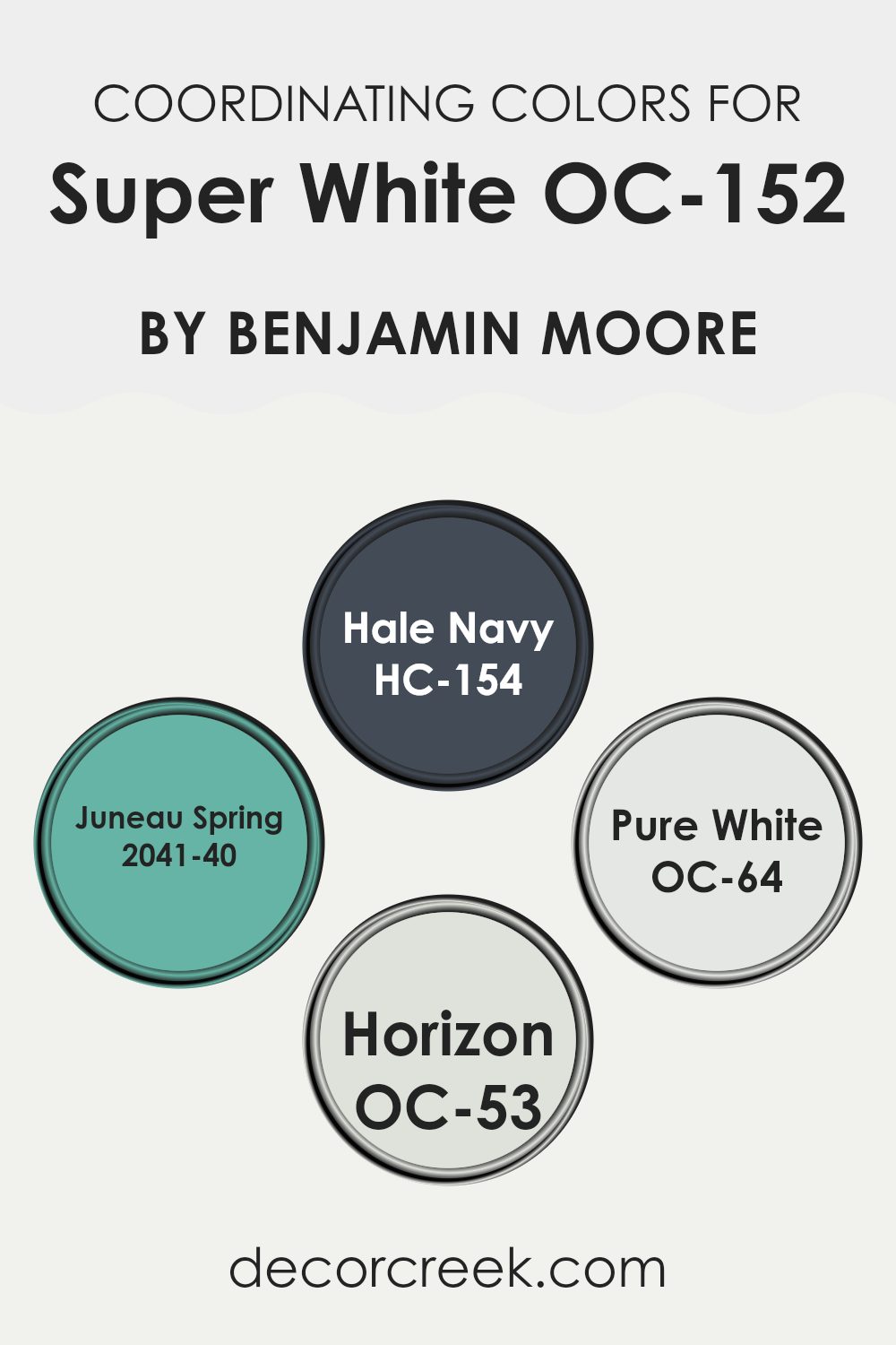
Best Coordinating Colors to use with Super White OC-152 by Benjamin Moore this year.
Coordinating colors are carefully selected shades that complement a primary color, enhancing the overall look of a room. They can create harmony when paired together, as each contributes to a balanced, visually pleasing palette. Coordinating colors can contrast with or complement the main hue, and they work by balancing warm and cool tones or by sharing similar intensity or saturation levels. For instance, when decorating with a base color like a crisp white from Benjamin Moore, choosing the right coordinating colors can create an inviting and cohesive look in any interior.
Hale Navy (HC-154) is a deep navy blue that offers a striking contrast to lighter shades, creating a bold yet balanced look. It pairs well with neutral tones for a classic appearance. Juneau Spring (2041-40) is a vibrant green that brings lively energy into interiors, making it ideal for areas that benefit from a splash of color.
Pure White (OC-64) is a clean and bright white that provides a subtle variation in shade compared to base whites, ensuring that the interior feels layered without feeling excessive. Lastly, Horizon (OC-53) is a soft, light gray that works beautifully to soften the contrast between stronger colors, ensuring a smooth visual transition that is pleasing to the eye.
You can see recommended paint colors below:
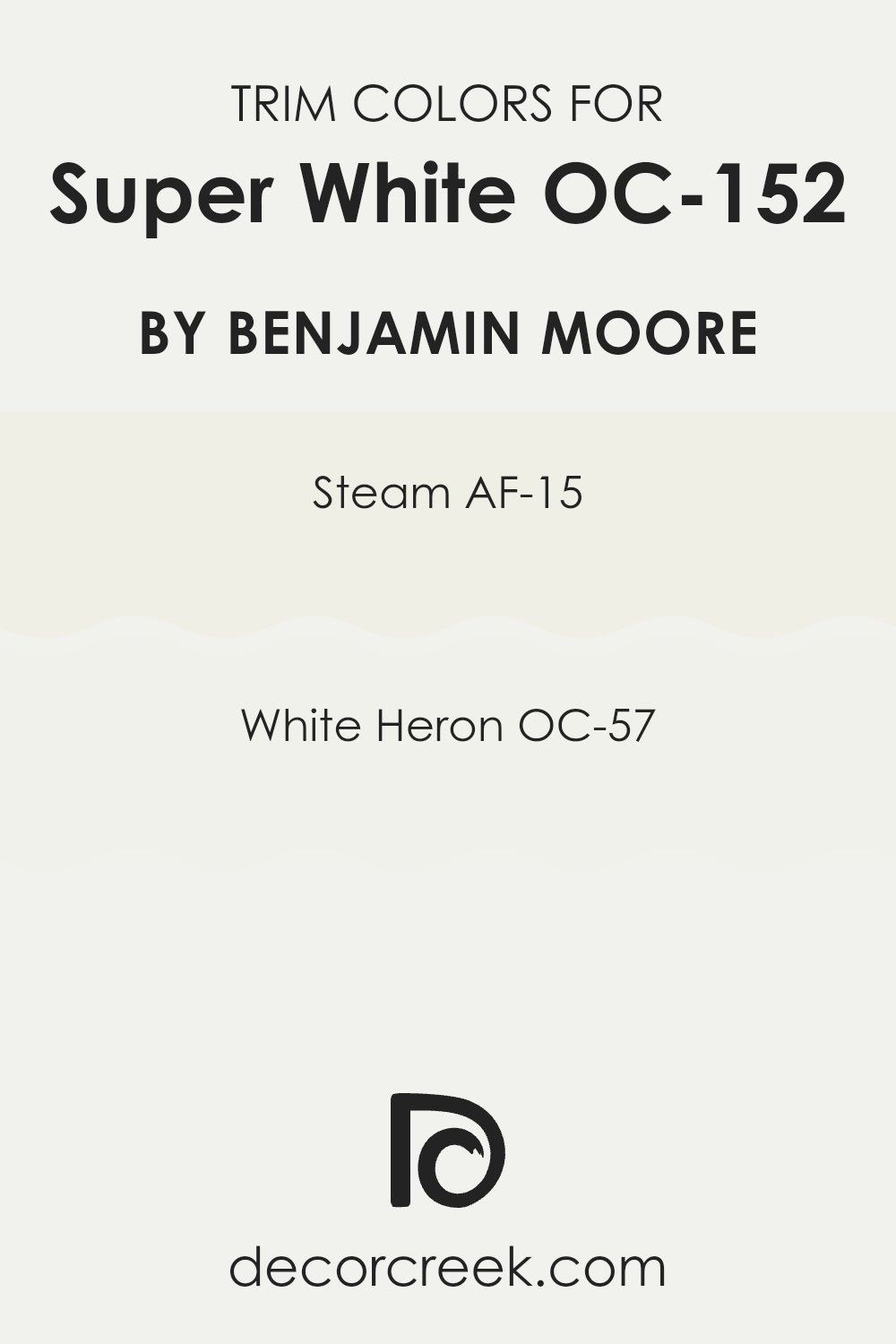
Trendy Trim Colors of Super White OC-152 by Benjamin Moore to use this year.
Trim colors are specific shades used to highlight or define the edges and contours of a room, such as door frames, window frames, and moldings, enhancing the overall design and feel of an interior. Choosing the right trim color can significantly influence the look and atmosphere of a room, providing contrast or harmony with the main wall colors.
For example, when considering a bright and clean shade like a popular vivid white by Benjamin Moore, pairings with appropriate trim colors such as AF-15 Steam or OC-57 White Heron can create a sharp, clean look, emphasizing the crispness of the main color.
AF-15 Steam by Benjamin Moore is a subtle off-white that does not lean into cream or stark white territories, making it an excellent choice for trim when you want to offer a slight contrast without feeling excessive against the primary white. It helps in softening the transition between the walls and trim, giving a cohesive look without using bold contrasts. On the other hand, OC-57 White Heron is a clean, bright white with just a hint of warmth, ensuring that interiors appear lively and fresh. This color is beneficial for creating a seamless look with minimal contrast, perfect for enhancing natural light in an interior and making the room feel open and airy.
You can see recommended paint colors below:
In concluding my review on OC-152 Super White by Benjamin Moore, I have found that this paint stands out for its clean, brilliant white finish. It’s perfect for anyone looking to brighten up their room without the fuss of choosing between complicated shades. This color made walls look fresh and pure, helping small rooms appear bigger and making dark areas seem brighter.
Super White is easy to apply, and coverage is great, which means you don’t need many coats to get a good finish. It’s also a tough paint that handles daily wear and tear well, something that’s really practical for busy homes. What’s more, its simplicity allows it to fit in with any room style, whether you have lots of color or stick to mostly neutral shades.
For families looking to refresh their home with a dependable and clear white, OC-152 Super White by Benjamin Moore is definitely worth considering. It brings a sense of newness to any area it is used in, making it ideal for both living interiors and more practical areas like kitchens and bathrooms. In a simple way, using this paint is like hitting the refresh button on your room, making everything look clean and new again.
Ever wished paint sampling was as easy as sticking a sticker? Guess what? Now it is! Discover Samplize's unique Peel & Stick samples.
Get paint samples

