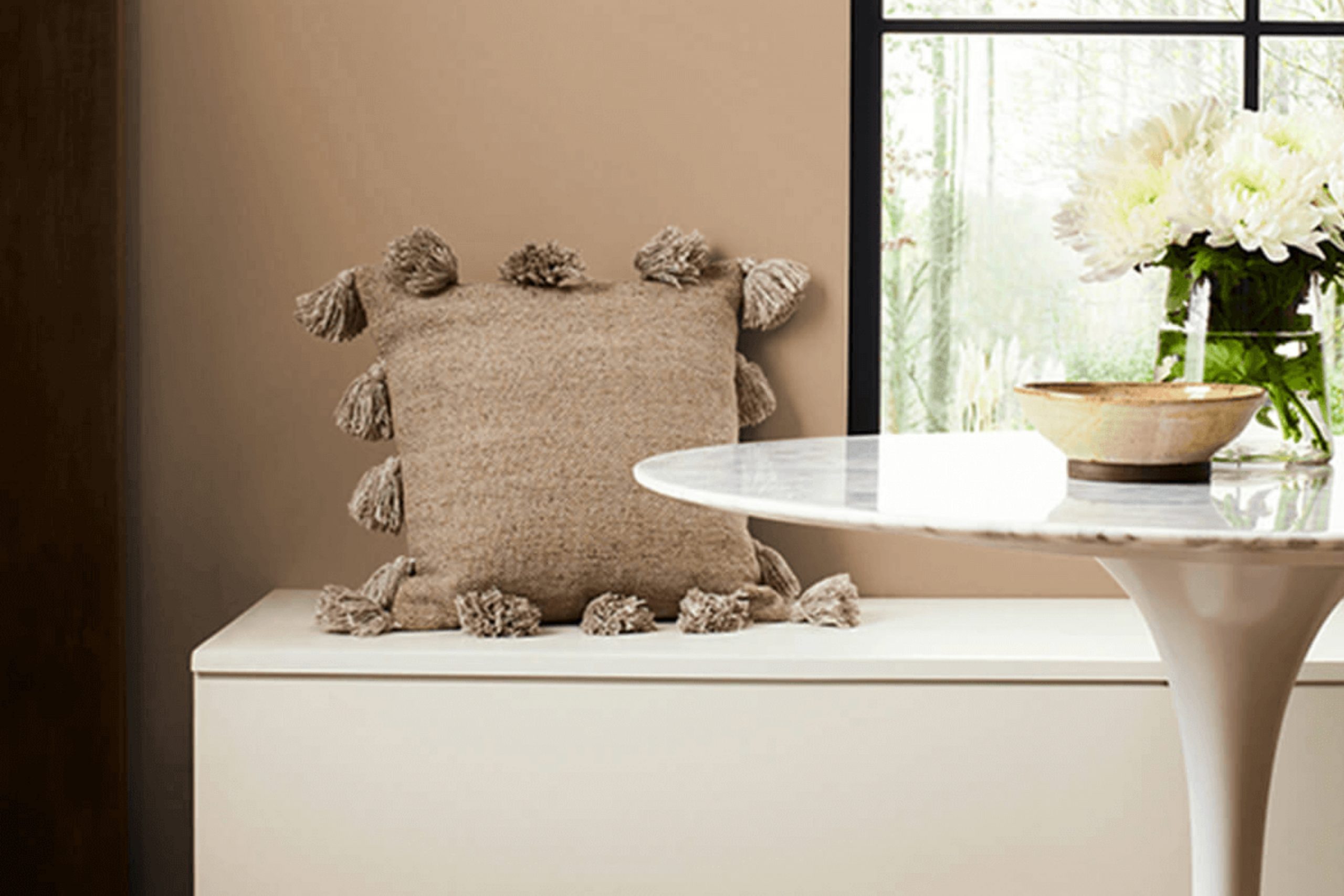
If you’re thinking about giving your space a fresh look, you might want to consider SW 7724 Canoe by Sherwin Williams. I recently stumbled upon this particular shade while searching for the perfect paint for my study.
At first glance, SW 7724 Canoe radiates a serene and warm vibe, distinctly reminding me of the natural earthiness of untouched woodlands. It has a richness that’s subtle yet profoundly impactful in transforming a room into a cozy nook. Choosing paint can often feel overwhelming due to the plethora of options available, but there’s something undeniably reassuring about Canoe.
Its depth creates a soothing ambiance, ideal for spaces where you spend a lot of time thinking or relaxing. I found that this color pairs beautifully with soft whites and rich browns, allowing for a range of decorative styles, from rustic to modern minimalist.
Whether you’re looking to paint an entire room or just an accent wall, SW 7724 Canoe offers versatility and a timeless charm that’s hard to overlook.
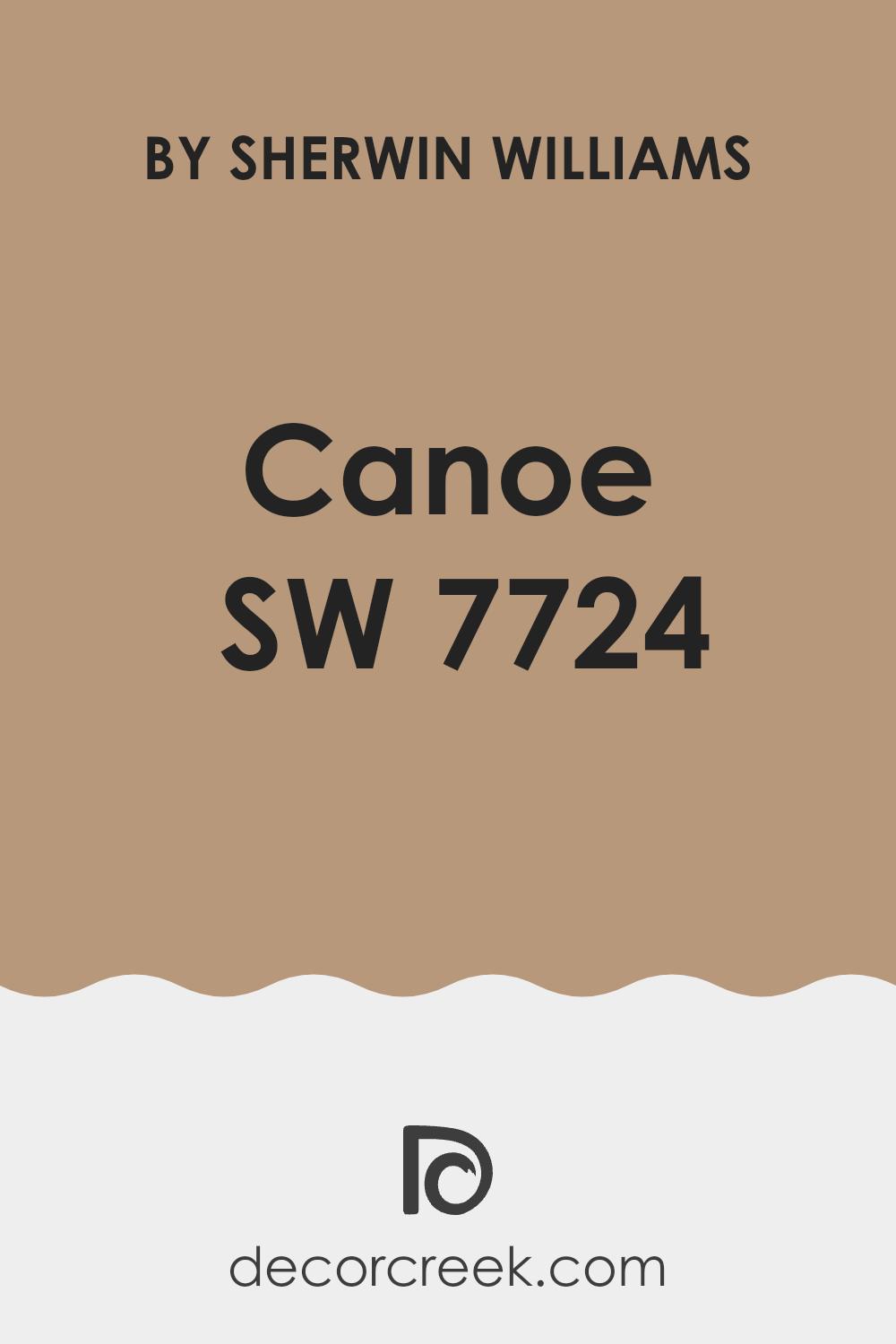
What Color Is Canoe SW 7724 by Sherwin Williams?
The color in discussion is a warm, deep brown with hints of earthy red, making it a perfect base for creating an inviting and cozy space. This shade can help to add a sense of quiet warmth to any room, making it an ideal choice for living areas, dining rooms, or a reading nook. Its richness pairs beautifully with natural materials such as wood, leather, and linen which enhance its organic roots.
When it comes to interior styles, this color works wonders in rustic settings due to its natural, earthy tones. It also complements modern farmhouse and traditional decors, offering depth and warmth that balances well with these aesthetics. For a touch of drama, it can also look stunning in a bohemian-style room, paired with vibrant textiles and eclectic decorations.
Textures that go well with this color include soft, nubby throw blankets, velvet cushions, or jute rugs which add layers of texture and comfort to the inviting warmth of the color. When used on walls, it pairs well with furniture in natural wood tones or metallic finishes like gold or copper, which add a slight contrast and bring out the warmth of the brown.
Its muted yet rich tone creates a homey, welcoming atmosphere that makes any space feel more like a retreat.
Is Canoe SW 7724 by Sherwin Williams Warm or Cool color?
CanoeSW 7724 is a paint color offered by Sherwin Williams that can noticeably alter the atmosphere in any home. This shade is a deep, muted green that has the unique ability to create a cozy and warm feel in spaces.
The rich, earthy tone works well in both small and large areas and can make a room feel more inviting and snug. It’s especially suitable for living rooms and bedrooms where a calm and restful environment is desired, as it pairs well with natural materials like wood and leather.
Furthermore, it’s versatile enough to be utilized as an accent wall, bringing just enough color to a room without overwhelming it. When combined with light colors like soft whites or creams, it can prevent smaller spaces from feeling too closed in. This balance helps to make CanoeSW 7724 a great choice for many looking to improve their home’s aesthetic appeal.
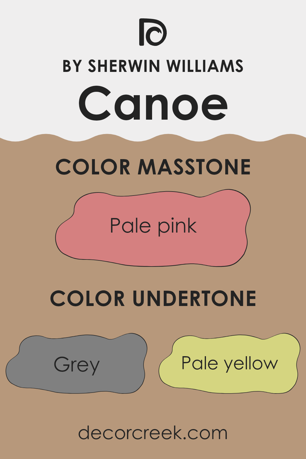
Undertones of Canoe SW 7724 by Sherwin Williams
CanoeSW 7724 by Sherwin Williams is a dynamic color that carries a mix of subtle undertones, including grey, pale yellow, mint, orange, and several others. These undertones can significantly impact how the color appears in different settings and lighting conditions.
Undertones are the hidden hues that influence a color’s overall look. They might not be immediately noticeable, but they play a critical role in how the color interacts with its environment. For example, a color with grey undertones might appear cooler and more muted, which can make a room feel more calm.
On the other hand, undertones like orange or pale yellow can add a sense of warmth, making the space more inviting.
In interior walls, the effect of the undertones in CanoeSW 7724 becomes especially important.
This color can subtly shift under different lighting conditions due to its complex undertone structure. Natural light can bring out its warmer undertones, like pale yellow or mint, giving the room a fresh and airy feel.
Artificial light, depending on the type, might highlight its cooler tones like grey or light purple, lending a gentle, understated elegance to the space.
Thus, when choosing this paint for an interior wall, it’s crucial to consider both the main color and its undertones. They determine the mood and atmosphere the paint will contribute to the room, affecting everything from the perceived size of the space to the emotions it evokes in people.
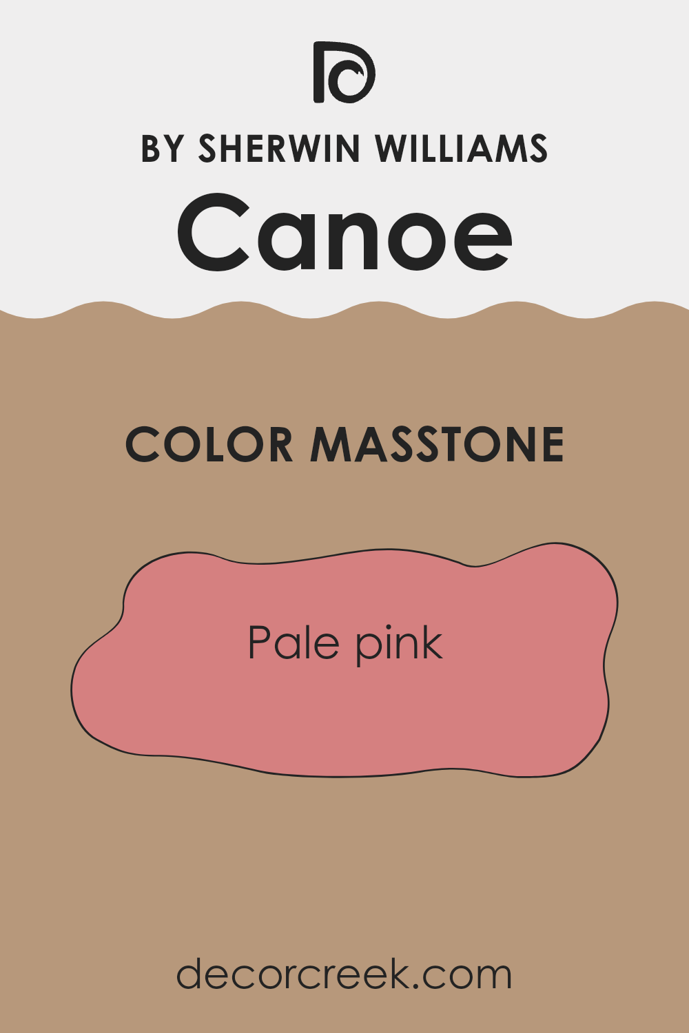
What is the Masstone of the Canoe SW 7724 by Sherwin Williams?
CanoeSW 7724 by Sherwin Williams has a masstone of pale pink, identified by the color code #D58080. This gentle shade has a soft and inviting appeal, making it a popular choice for rooms that aim to provide a calm and friendly atmosphere.
The pale pink works well in spaces like bedrooms and bathrooms where a soothing touch is often appreciated. It pairs easily with neutrals like whites, grays, and beiges, allowing for versatile decorating schemes.
Moreover, since pale pink reflects light subtly, it can help make smaller rooms appear a bit larger and more open. For adding a hint of color without overwhelming a space, this shade is effective. It also provides a warm backdrop for furniture and decor, enhancing materials such as wood and metal. Overall, its gentle charm makes it a flexible option for various home styles.
How Does Lighting Affect Canoe SW 7724 by Sherwin Williams?
Lighting plays a crucial role in how we perceive colors in our environments. Colors can look different depending on the type of light under which they are viewed. This includes natural light from the sun, which changes throughout the day, and artificial light from lamps and other sources, which can vary in intensity and hues based on the bulbs used.
Let’s consider the color Canoe by Sherwin Williams, a warm, deep orange tone. Under artificial light, such as incandescent bulbs which emit a warmer, yellowish glow, this color will appear richer and more vibrant, enhancing its warm undertones. Fluorescent lighting, being cooler, might make the color look slightly subdued and less intense, as it does not complement the warm undertones of the color.
In natural light, the appearance of Canoe can change dramatically. In a room facing north, which receives less direct sunlight and tends to have cooler light, this color may appear slightly muted and darker. The lack of strong, direct light can prevent the color from showing its full vibrancy.
In a south-facing room, abundant in bright, direct sunlight for most of the day, Canoe will show its brightest and most vivid tones. The natural brightness helps to emphasize the depth and warmth of the color, making the room feel inviting.
East and west-facing rooms affect how Canoe looks in different ways depending on the time of day. Morning light in an east-facing room is softer and will show Canoe in a very true, bright form. As the day progresses and the light dims, the color may become softer and less intense. Conversely, in a west-facing room, the color will appear softer in the morning and become dramatically vibrant and warm in the evening as the sun sets.
Understanding these lighting impacts can help in choosing the right paint color for a room based on its orientation and the quality of light it receives.
What is the LRV of Canoe SW 7724 by Sherwin Williams?
LRV, or Light Reflectance Value, is a measure that shows how much light a color reflects or absorbs. Think of it as a scale where the higher the number, the more light it reflects. This is important when choosing paint colors because it impacts how bright or dark a room can feel.
A high LRV means the color is lighter and can make a space feel more open and airy. On the other hand, a low LRV indicates that the color is darker and might make a space feel cozier but smaller. The LRV of CanoeSW 7724 is 33.82, which places it in the darker range of colors.
This means it doesn’t reflect much light. When used on walls, it can create a feeling of warmth and intimacy due to its ability to absorb more light rather than reflect it. However, in a room with limited natural light, using a color with such an LRV might make the space appear even smaller and darker. It’s a great choice for large, well-lit areas or when trying to achieve a more enclosed, cozy atmosphere.

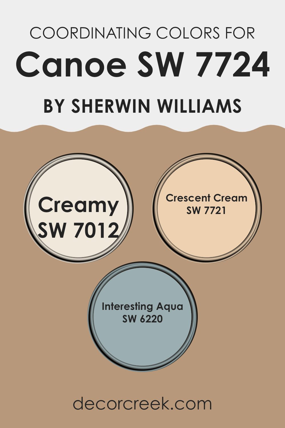
Coordinating Colors of Canoe SW 7724 by Sherwin Williams
Coordinating colors are chosen to complement a main color, enhancing the overall aesthetic of a space without overshadowing the primary hue. When used thoughtfully, these colors can create a harmonious look that feels intentionally designed. For instance, coordinating colors for Canoe SW 7724 by Sherwin Williams include shades like Creamy SW 7012, Crescent Cream SW 7721, and Interesting Aqua SW 6220.
Each of these colors brings its own unique contribution while ensuring that the overall palette remains balanced and pleasing to the eye. Creamy SW 7012 is a soft, warm white that offers a subtle contrast to the richer tones of Canoe. It provides a gentle backdrop that makes the darker colors pop without clashing.
Crescent Cream SW 7721 is another warm hue, but with a slightly more pronounced yellow undertone, giving it a cozy feel that pairs well with the earthiness of Canoe. Interesting Aqua SW 6220 adds a dash of coolness, introducing a refreshing splash of color that can liven up spaces predominantly featuring warmer tones. Each of these colors supports and complements Canoe, allowing for a variety of decorating styles and personal tastes.
You can see recommended paint colors below:
- SW 7012 Creamy
- SW 7721 Crescent Cream
- SW 6220 Interesting Aqua
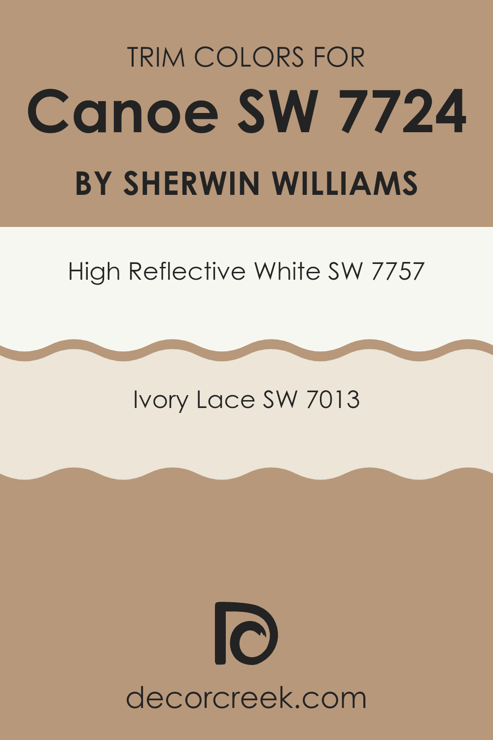
What are the Trim colors of Canoe SW 7724 by Sherwin Williams?
Trim colors are used to highlight or accentuate the architectural details of a room or exterior, such as door frames, window casings, and baseboards. They play a crucial role in defining and complementing the main color scheme. For example, when using a rich hue like CanoeSW 7724 by Sherwin Williams, choosing the right trim color is vital to create a pleasing contrast and enhance the overall aesthetic.
SW 7757 – High Reflective White, with its bright, crisp appearance, can effectively offset the deep, earthy tone of Canoe. Similarly, SW 7013 – Ivory Lace offers a softer contrast, providing a gentle transition that blends beautifully while still maintaining the integrity of both colors.
SW 7757 – High Reflective White is a vivid, pure white that reflects light, making it an excellent choice for trims to make other colors stand out and spaces feel more open and airy. Whereas SW 7013 – Ivory Lace is a warm, slightly off-white shade that offers a subtle, nuanced contrast, ideal for creating a softer edge against stronger main wall colors.
Both options provide distinct benefits that can enhance the appearance of a space, depending on the visual effect one wishes to achieve. Choosing the right trim color such as these not only highlights the key features of a room but also helps in creating a cohesive look that complements the primary color choice.
You can see recommended paint colors below:
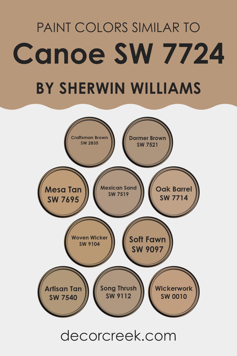
Colors Similar to Canoe SW 7724 by Sherwin Williams
In home décor, using similar colors can create a cohesive and calming atmosphere, making spaces feel more connected and harmonious. Colors similar to Canoe by Sherwin Williams, such as Craftsman Brown and Dormer Brown, offer earthy richness that brings warmth to any room. These colors work well together because they share a similar intensity and depth, providing a subtle contrast without overwhelming the senses.
On the other hand, Mesa Tan, Mexican Sand, and Oak Barrel lie in the same color family, and integrate seamlessly for a smooth visual transition, ideal for open floor plans where colors flow from one room to another.
Additionally, colors like Woven Wicker and Soft Fawn lean towards lighter, neutral tones that help in reflecting light, making spaces appear larger and more inviting. Artisan Tan adds a touch of softness and is versatile for decor, as it complements both modern and traditional interiors.
Song Thrush and Wickerwork are excellent for accentuating features without clashing with dominant hues. Overall, these similar colors support a unified look while allowing for flexibility in design and decoration, making them practical and appealing choices for creating aesthetically pleasing environments.
You can see recommended paint colors below:
- SW 2835 Craftsman Brown
- SW 7521 Dormer Brown
- SW 7695 Mesa Tan
- SW 7519 Mexican Sand
- SW 7714 Oak Barrel
- SW 9104 Woven Wicker
- SW 9097 Soft Fawn
- SW 7540 Artisan Tan
- SW 9112 Song Thrush
- SW 0010 Wickerwork
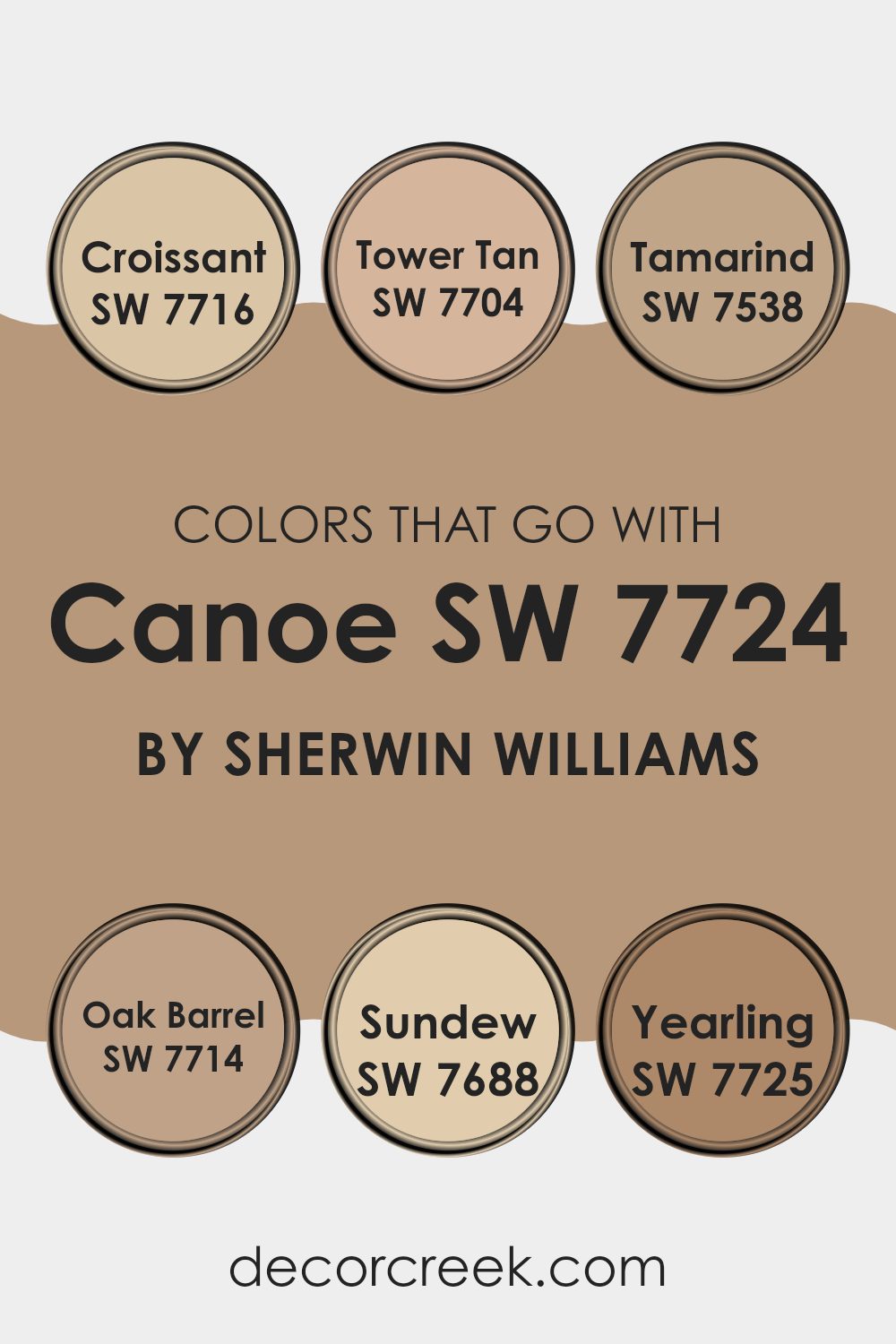
Colors that Go With Canoe SW 7724 by Sherwin Williams
Selecting the right colors to accompany CanoeSW 7724 by Sherwin Williams is essential for creating a harmonious and visually appealing space. Colors like SW 7716 – Croissant, SW 7704 – Tower Tan, and others in this palette work wonderfully together because they share warm, earthy undertones that complement the deep, rich hue of Canoe.
When these colors combine, they create a cozy, welcoming atmosphere, suitable for any room. Whether you are painting a living room, bedroom, or kitchen, choosing coordinating colors ensures a smooth visual flow, which enhances the overall aesthetic of your interiors.
For instance, Croissant is a gentle, creamy beige that offers a light contrast to the deeper tones of Canoe, perfect for creating a balanced look. Tower Tan is a bit darker, with a muted, golden tan shade that resonates warmth and comfort.
Tamarind, a deeper, chocolate brown, adds depth and anchors the palette with its strong presence. Oak Barrel has a robust, earthy appeal with a hint of sophisticated reddish undertone, enriching any space with its robust charm. Sundew, a soft, muted yellow, provides a subtle brightness that can open up a room.
Lastly, Yearling is a gentle brown that works as a fantastic neutral, versatile enough to blend seamlessly with both vibrant and subdued colors. Using these shades in combination with Canoe helps in achieving a cohesive yet diverse color scheme, ideal for crafting inviting and stylish spaces.
You can see recommended paint colors below:
- SW 7716 Croissant
- SW 7704 Tower Tan
- SW 7538 Tamarind
- SW 7714 Oak Barrel
- SW 7688 Sundew
- SW 7725 Yearling
How to Use Canoe SW 7724 by Sherwin Williams In Your Home?
Canoe SW 7724 by Sherwin Williams is a deep, earthy brown paint color that brings warmth and comfort to any room. This color is perfect for creating a cozy and inviting atmosphere, making it an excellent choice for living rooms and bedrooms.
You can also use it in a home office where a calm and focused environment is needed. Because of its rich tone, Canoe pairs well with lighter colors like beige or soft whites for a balanced look. If you want to add a little drama, consider using it on an accent wall or for painting furniture pieces.
This color also works well in a variety of lighting conditions, maintaining its depth and richness whether in natural daylight or under artificial lights. Overall, Canoe SW 7724 is a versatile paint choice that can help make your home feel warm and inviting.
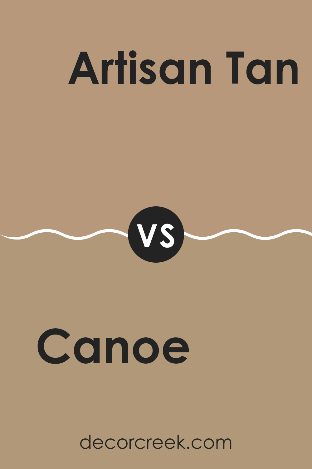
Canoe SW 7724 by Sherwin Williams vs Artisan Tan SW 7540 by Sherwin Williams
Canoe and Artisan Tan, both by Sherwin Williams, are two appealing shades of brown, each creating a distinct atmosphere. Canoe is a rich, deep brown with a slight green undertone, giving it a hearty, nature-inspired feel. It can add warmth to a space while maintaining a connection to the outdoors.
In contrast, Artisan Tan is a lighter, softer brown that leans towards a beige or tan hue. This color is ideal for those who prefer a neutral palette that still brings warmth but in a subtler, more understated way.
Artisan Tan is versatile and pairs well with a wide range of other colors, making it perfect for spaces where a lighter, airier feeling is desired. Both colors can significantly enhance a room, but Canoe makes a statement with its depth and darkness, while Artisan Tan offers a gentler, calming presence.
You can see recommended paint color below:
- SW 7540 Artisan Tan
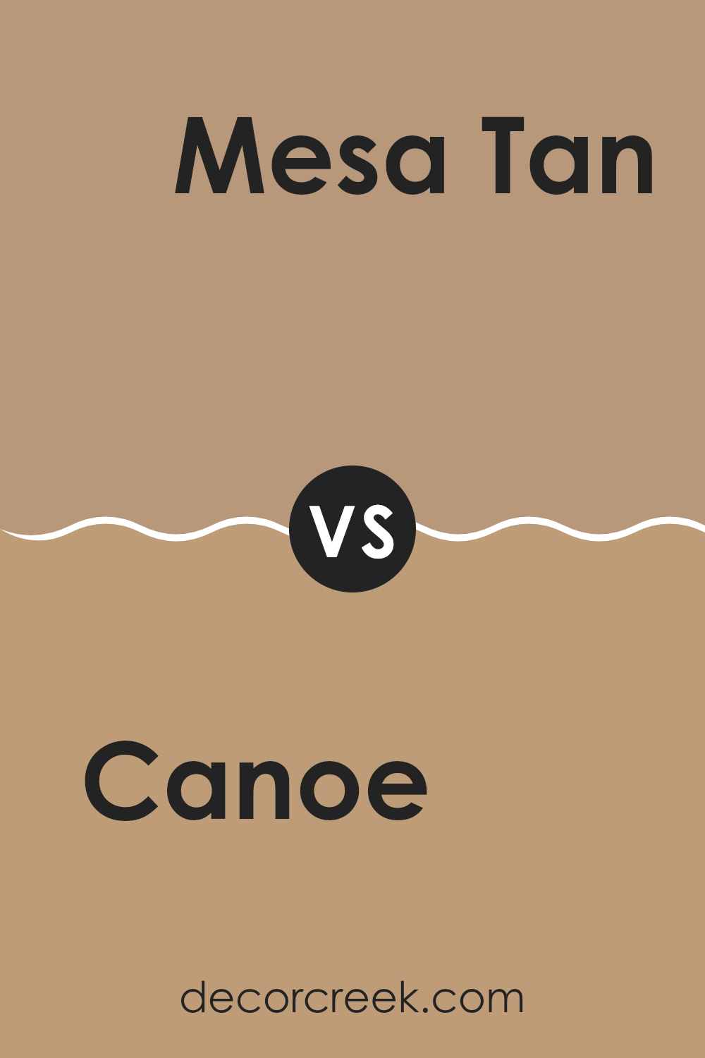
Canoe SW 7724 by Sherwin Williams vs Mesa Tan SW 7695 by Sherwin Williams
Canoe and Mesa Tan, both colors by Sherwin Williams, have their unique charms. Canoe is a deeper, green-based hue, providing a rich and cozy vibe, perfect for spaces where a touch of nature is desired. It’s a color that can make larger rooms feel more intimate and welcoming due to its deep tone.
On the other hand, Mesa Tan is a lighter, warmer beige that gives rooms a fresh and airy feel. It’s versatile, fitting well in various settings without overwhelming the space. This color works excellently in areas where natural light is abundant, as it enhances the brightness of the rooms.
While Canoe leans towards a more enveloping, forest-like atmosphere, Mesa Tan opts for a sunnier, desert-inspired warmth. Whether one chooses the earthy depth of Canoe or the gentle brightness of Mesa Tan depends on the mood they want to set in their space. Both colors offer distinct yet harmonious options for interior design.
You can see recommended paint color below:
- SW 7695 Mesa Tan
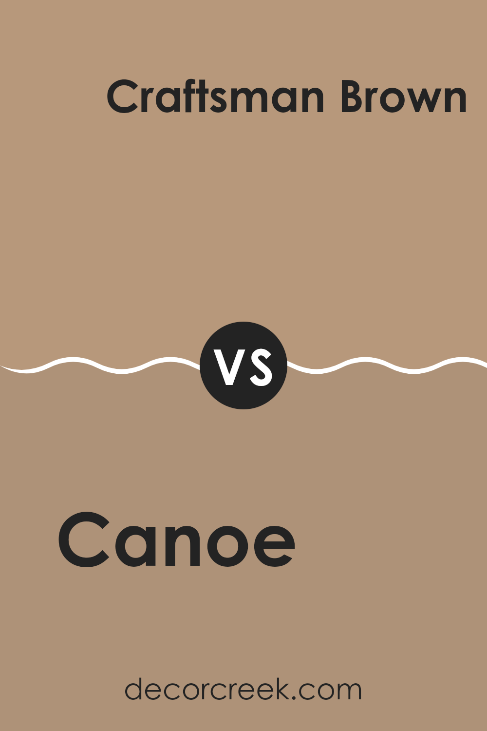
Canoe SW 7724 by Sherwin Williams vs Craftsman Brown SW 2835 by Sherwin Williams
Canoe SW 7724 and Craftsman Brown SW 2835, both by Sherwin-Williams, present unique tones suited for different tastes and styles. Canoe leans towards a deep, greenish-blue, much like a forest at dusk. This color is versatile, fitting for spaces where a sense of calm and grounding is desired. It pairs well with both bright and neutral accents, giving designers flexibility.
On the other hand, Craftsman Brown exudes a rich, warm brown, reminiscent of traditional woodwork and autumn leaves. This color is ideal for areas where a cozy, inviting feel is the goal. It works exceptionally well in spaces with natural light or wooden accents, enhancing the earthy qualities of a room.
While both colors offer distinct vibes — Canoe providing a cooler tone and Craftsman Brown a warmer ambiance — they also share the ability to create a welcoming environment when applied thoughtfully. Pairing them in the right context can offer a balanced, natural aesthetic.
You can see recommended paint color below:
Canoe SW 7724 by Sherwin Williams vs Oak Barrel SW 7714 by Sherwin Williams
The main color, Canoe, and the second color, Oak Barrel, both from Sherwin Williams, present a warm and inviting tone, yet they differ in their depth and mood. Canoe is a darker green, reminiscent of deep forest shades that add a cozy and somewhat mysterious feel to spaces. It tends to give rooms a more enclosed, snug vibe, making it perfect for creating a retreat-like atmosphere.
On the other hand, Oak Barrel is lighter, leaning towards a beige or soft brown. This color brings a warm, welcoming feel to interiors, promoting a friendly and open ambiance. It is versatile and can easily blend with various decor styles, offering a neutral backdrop that complements a wide range of furnishings and accessories.
When used together, these two colors can balance each other nicely, with Oak Barrel lightening the mood and Canoe adding depth and interest.
You can see recommended paint color below:
- SW 7714 Oak Barrel
Canoe SW 7724 by Sherwin Williams vs Wickerwork SW 0010 by Sherwin Williams
Canoe and Wickerwork by Sherwin Williams are two unique shades that offer distinct vibes for room decor. Canoe is a solid, deep green that gives a sense of calmness and a touch of nature to any space. This color is great for those looking to add a grounded, natural feel to their rooms.
On the other hand, Wickerwork offers a lighter, beige tone that is very versatile and warm. It works well in spaces where you want to introduce brightness while maintaining a cozy atmosphere. Wickerwork is easier to match with different decor elements due to its neutral character.
Both colors have their strengths, with Canoe providing depth and a close-to-nature experience, while Wickerwork brightens and opens up a room, making it appear more spacious. When choosing between the two, consider the mood and functional use of your space to achieve the desired effect.
You can see recommended paint color below:
- SW 0010 Wickerwork
Canoe SW 7724 by Sherwin Williams vs Soft Fawn SW 9097 by Sherwin Williams
Canoe and Soft Fawn by Sherwin Williams are both warm, inviting shades, but they offer distinct vibes due to their different color depths and undertones. Canoe is a deeper, rich green that leans towards an earthy, natural feel.
This color is great for spaces where you want a sense of warmth and coziness, making it ideal for living rooms or dens. On the other hand, Soft Fawn is a much lighter beige with a subtle hint of warmth.
This color works beautifully in areas where you might want to create a light, airy feeling, such as bedrooms or home offices. While Canoe adds depth and a touch of nature, Soft Fawn provides a gentle backdrop that complements various decor styles without overwhelming the space. Both colors are versatile and work well in different settings, depending on the mood you’re aiming to achieve.
You can see recommended paint color below:
- SW 9097 Soft Fawn
Canoe SW 7724 by Sherwin Williams vs Mexican Sand SW 7519 by Sherwin Williams
Canoe SW 7724 is a rich, deep green color with noticeable blue undertones, giving it a calming and subtle appearance. This color is quite versatile, suitable for spaces where you want to introduce a sense of nature and calmness without the room feeling dark or closed in.
On the other hand, Mexican Sand SW 7519 is a warm, neutral beige. This shade is soft and earthy, perfect for creating a cozy and welcoming environment. It exudes a gentle, unobtrusive vibe, making it excellent for areas where you want to promote relaxation and comfort.
When comparing the two, Canoe is decidedly more vibrant, bringing a cooler, natural feel, while Mexican Sand provides a lighter, warmer touch, functioning well as a background color that allows other design elements to stand out. Both colors can work beautifully in various settings, depending on what mood or style you’re aiming to achieve in your space.
You can see recommended paint color below:
- SW 7519 Mexican Sand
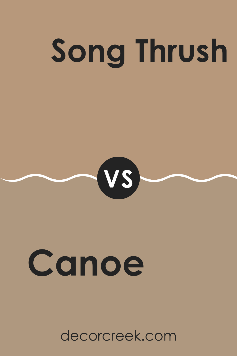
Canoe SW 7724 by Sherwin Williams vs Song Thrush SW 9112 by Sherwin Williams
Canoe SW 7724 is a deep, lush green hue that mimics the dense color of forest foliage. It’s a vibrant choice that brings a natural and refreshing vibe to any space, making it feel lively and full of energy. This color works well in areas where you want to add a touch of nature’s vibrancy, such as living rooms or bedrooms.
On the other hand, Song Thrush SW 9112 presents a much lighter tone. This color is a warm beige that gives a feeling of softness and lightness to rooms. It’s an excellent backdrop for various decorating styles, providing a neutral palette that allows other colors in furniture and decor to stand out without clashing.
In comparison, Canoe is more bold and attention-grabbing, while Song Thrush offers a subtle and calming background. Both colors create different moods and can effectively define space depending on what atmosphere you wish to achieve.
You can see recommended paint color below:
- SW 9112 Song Thrush
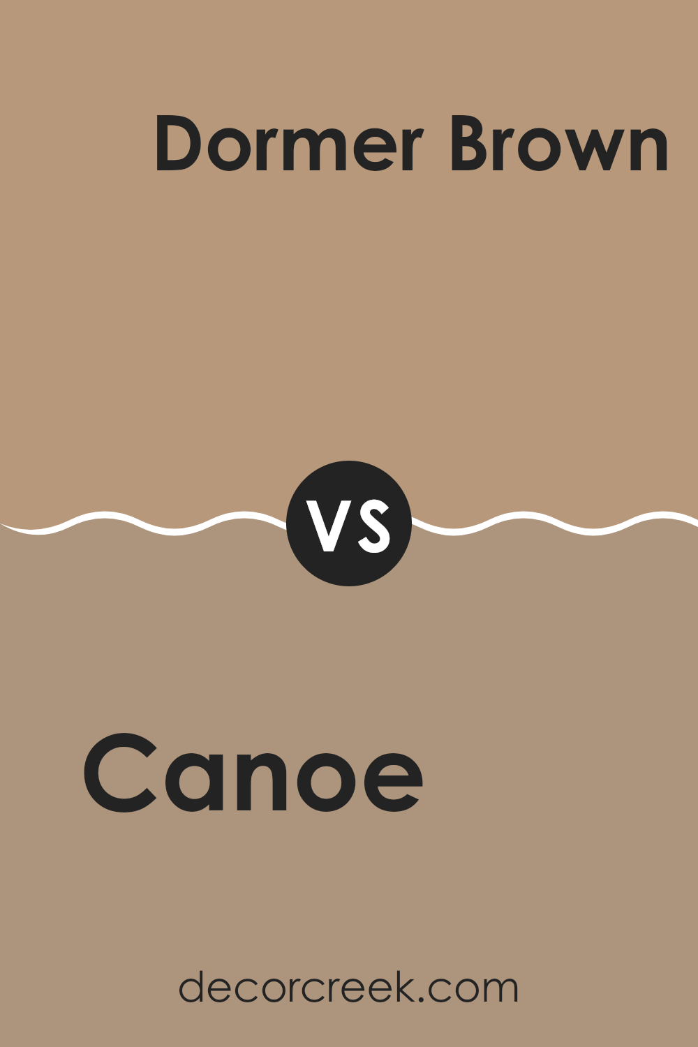
Canoe SW 7724 by Sherwin Williams vs Dormer Brown SW 7521 by Sherwin Williams
Canoe and Dormer Brown are two distinct colors from Sherwin Williams. Canoe is a deep, rich green with undertones that might remind you of a dense forest. This color is vivid and bold, perfect for making a statement in a room or on an accent wall. It works well in spaces where you want to introduce vitality and a touch of nature.
On the other hand, Dormer Brown is a solid, earthy brown shade. It offers a warm and welcoming vibe, suitable for areas where you want to feel relaxed and cozy. Unlike the lively personality of Canoe, Dormer Brown creates a more subdued and comforting atmosphere, making it great for living rooms, bedrooms, or studies.
Both colors hold their own charm and can be used to create different moods in your space depending on what you are aiming for: vibrant and lively with Canoe or calm and cozy with Dormer Brown.
You can see recommended paint color below:
- SW 7521 Dormer Brown
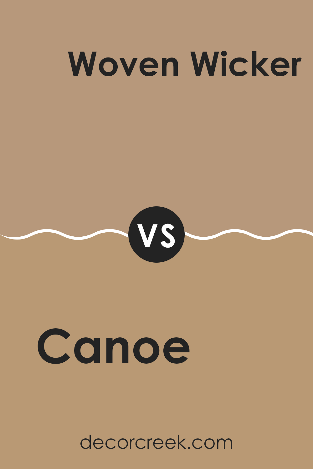
Canoe SW 7724 by Sherwin Williams vs Woven Wicker SW 9104 by Sherwin Williams
The main color, Canoe, is a deep, rich green with hints of blue that gives it a fresh, natural feel. It evokes the lushness of dense forests and is ideal for creating a cozy, inviting atmosphere in a room. On the other hand, Woven Wicker is a lighter, neutral beige with a subtle warmth to it, reminiscent of sandy beaches or dry grass. This color is great for spaces where you want to establish a calm, laid-back vibe without making the room feel too enclosed.
When comparing the two, Canoe brings more depth and boldness to a space, making it a strong choice for accent walls or furniture pieces. Woven Wicker, however, is much more versatile and understated, working well as a background shade that allows other colors in the decor to stand out.
Its natural ease complements Canoe’s intensity, allowing them to be paired together effectively for a balanced look. This combination could work well in a room that aims for a balance between vibrant energy and soothing simplicity.
You can see recommended paint color below:
Conclusion
After reading about SW 7724 Canoe by Sherwin Williams, I really think it’s a great paint color if you want a cozy and warm feeling in a room. The color is like a deep green that reminds me of a forest, which feels calm and comforting. It’s perfect for using in places of your house where you relax, like your bedroom or living room.
This color, SW 7724 Canoe, works well with many other colors too. If your room has furniture in colors like brown, beige, or even some lighter greens and blues, Canoe will make it all look nice together. It’s especially good for homes where you want to create a natural feel, maybe because you like the outdoors or want to feel connected to nature even when you’re inside.
Overall, Canoe by Sherwin Williams is a color that makes rooms look richer and more welcoming. It’s easy to like because it makes you feel like you’re in a safe and cozy place, like being wrapped in a warm blanket. So, if someone asked me what paint color to choose for making their home feel warmer and cozier, I would definitely recommend trying out SW 7724 Canoe.
Ever wished paint sampling was as easy as sticking a sticker? Guess what? Now it is! Discover Samplize's unique Peel & Stick samples.
Get paint samples

