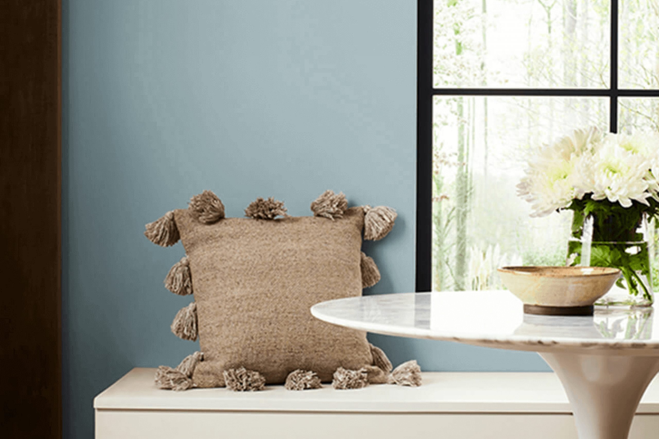
The first time I saw SW 6220 Interesting Aqua by Sherwin Williams, I was drawn to its soft mix of blue and green. It has this fresh, calming feel that works beautifully in any space where you want to relax. A perfect choice for a peaceful, airy vibe!
Imagine walking into a room painted with Interesting Aqua; it feels like a soft breeze on a warm day. The color seems to have a calming effect, helping melt away stress and tension.
It’s versatile, too—I found it works great in a bedroom for its tranquil qualities, but it also brings a touch of elegance and freshness to a living room or kitchen.
This color isn’t overpowering, but rather it complements other colors and furnishings. It can highlight the beauty of natural wood or pair perfectly with whites and grays.
As I experienced, changing the wall color to Interesting Aqua can produce a refreshing transformation, adding a crisp, clean look that feels both modern and timeless.
Choosing the right shade can sometimes feel overwhelming, but with Interesting Aqua, I felt confident that I had a winner. It’s subtle yet engaging, making it a wonderful choice if you want to create a serene space in your home.
What Color Is Interesting Aqua SW 6220 by Sherwin Williams?
Interesting Aqua (SW 6220) by Sherwin-Williams is a refreshing and bright color. It combines the calming effects of blue with the cheerful energy of green, giving it a coastal feel. It’s a modern color that can bring a sense of freshness and light to a room, making spaces feel larger and more open.
This hue works beautifully in beach-inspired interiors or in contemporary spaces that benefit from a touch of color.
In terms of interior styles, Interesting Aqua is a great choice for beach cottages, modern minimalistic designs, and even eclectic rooms that mix different styles. It’s perfect for rooms where you want to feel energized yet relaxed, like kitchens, bathrooms, or living rooms.
This shade pairs well with crisp whites and soft grays, offering high contrast while maintaining a clean look. It also looks excellent with natural materials like light wood, linen, and woven textures, which emphasize its airy quality
. Metals like brushed nickel or stainless steel can further enhance its modern vibe. Soft, plush fabrics such as cotton or wool add warmth and balance against the cool tone of the aqua.
Overall, Interesting Aqua is a versatile and cheerful color that brings positive energy to any space.
Is Interesting Aqua SW 6220 by Sherwin Williams Warm or Cool color?
Sherwin-Williams’ Interesting Aqua (SW 6220) is a popular paint color choice that adds a refreshing touch to home interiors. This shade is a soft blue-green that feels breezy and light, making it ideal for various rooms like bathrooms, kitchens, and bedrooms. Its calming hue brings a sense of openness and clarity, helping smaller rooms feel larger and more inviting.
Interesting Aqua works well with both modern and traditional styles. In a modern home, it pairs beautifully with crisp whites and steel grays, adding a splash of color without being overwhelming. In more traditional settings, it complements wood tones and warm neutrals, providing a subtle contrast that brightens the space.
The color is versatile enough to suit different lighting conditions. In natural light, it appears fresh and vibrant, while in dimmer settings, it takes on a cozier feel. Overall, Interesting Aqua is a flexible choice that can suit many tastes and design needs.
Undertones of Interesting Aqua SW 6220 by Sherwin Williams
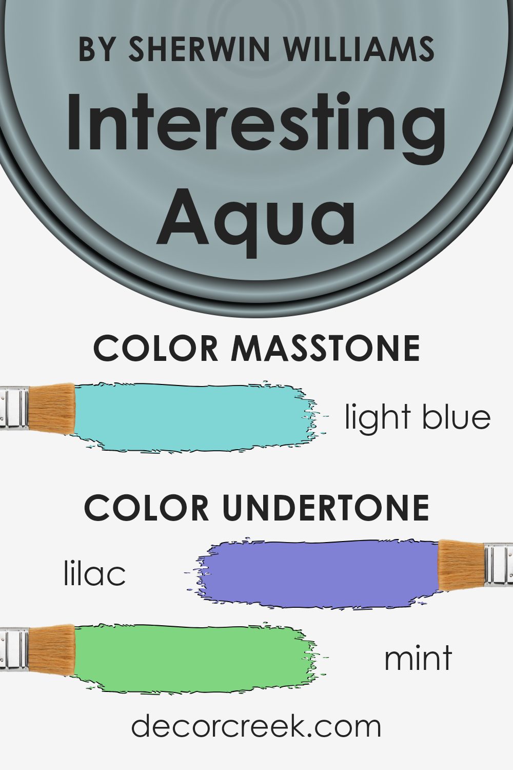
Interesting Aqua by Sherwin Williams is a complex paint color that combines various undertones, creating a unique and versatile shade. The mix of lilac, mint, grey, light gray, light purple, pale yellow, pale pink, turquoise, blue, light turquoise, and dark turquoise undertones influences how the color is perceived in a room.
Undertones are the subtle hues beneath the main color, and they can significantly alter the appearance of a paint color depending on lighting and surrounding decor.
On interior walls, this color can shift in mood and tone. The grey and light gray give it a neutral base, making it adaptable to different settings. The mint and pale yellow add a freshness, while the pale pink and light purple provide a subtle warmth.
Turquoise and blue undertones introduce a calming, airy quality, making spaces feel more open. Depending on the lighting and room placement, this paint might appear more cool or warm.
Natural light tends to highlight the blue and turquoise elements, creating a peaceful ambiance, whereas artificial light can bring out the pastel hints, adding depth and coziness.
Overall, the combination of these undertones makes it a versatile choice for a range of living spaces, offering various moods throughout the day.
What is the Masstone of the Interesting Aqua SW 6220 by Sherwin Williams?
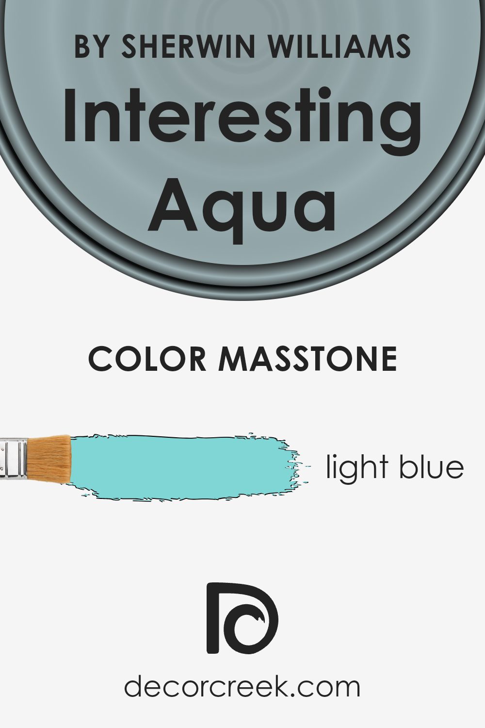
The masstone of Interesting Aqua (SW 6220) by Sherwin Williams is a light blue represented by the color code #80D5D5. This shade brings a fresh and airy feel to any home. With its subtle hints of aqua, it introduces a soothing and calm vibe to spaces. Light blue works wonderfully in home settings because it evokes a sense of openness and can make rooms feel larger and more inviting.
Using this light blue in living rooms or bedrooms helps create an atmosphere of relaxation. It pairs well with neutral colors like whites and grays, allowing for a balanced look. When used in kitchens or bathrooms, it adds a breath of fresh air, making these spaces feel clean and bright.
Interesting Aqua is versatile enough to be used in various rooms and easily complements both modern and traditional styles. This color’s lightness helps reflect natural light, making any room feel more vibrant and lively.
How Does Lighting Affect Interesting Aqua SW 6220 by Sherwin Williams?
Lighting plays a crucial role in how colors appear in a room. The same color can look noticeably different depending on whether it’s seen under natural light or artificial light and depending on which direction a room faces.
Interesting Aqua (SW 6220) by Sherwin Williams is a soft, muted blue-green that can change its appearance dramatically based on lighting conditions. In natural light, the color tends to show its true balance of blue and green tones. The shades of natural light vary throughout the day and influence how the color is perceived.
In north-facing rooms, the light is often cooler and more constant throughout the day. As a result, “Interesting Aqua” can take on a cooler, slightly more muted appearance. This means the room might have a soft, calming feel, with the blue tones becoming more prominent.
South-facing rooms get warm, bright light throughout most of the day. In these rooms, “Interesting Aqua” can appear brighter and more vibrant. The warm natural light highlights the green hues, adding a touch of warmth and freshness to the space.
East-facing rooms receive warm, yellow light in the morning and cool light in the afternoon. In the morning, “Interesting Aqua” might appear warm and inviting, with its green undertones emphasized. In the afternoon, the color can shift to a cooler tone as the light fades.
West-facing rooms, on the other hand, get cool light in the morning and warm, rich light in the late afternoon and evening.
This means “Interesting Aqua” might look a bit flat in the morning, but as the sun moves to the west, the warm light can enhance the color, making it look richer and more vibrant as evening approaches.
Under artificial lighting, the appearance of “Interesting Aqua” will depend on the bulbs used. Cool white light can make it look crisper and more blue, while warm white light brings out the green hues, creating a cozy feel. It’s important to consider the type of lighting to achieve the desired atmosphere in a room.
What is the LRV of Interesting Aqua SW 6220 by Sherwin Williams?
LRV, which stands for Light Reflectance Value, is a measure of how much light a color reflects or absorbs. On a scale from 0 to 100, where 0 is absolute black (completely absorbing all light) and 100 is pure white (reflecting all light), LRV helps determine how bright or dark a color will appear in a room.
Colors with higher LRV numbers reflect more light and can make spaces feel brighter and more open, while those with lower LRV numbers absorb more light, making rooms feel cozier and sometimes smaller.
LRV is vital in picking paint colors because it influences how a color will look once applied to walls in various lighting conditions.
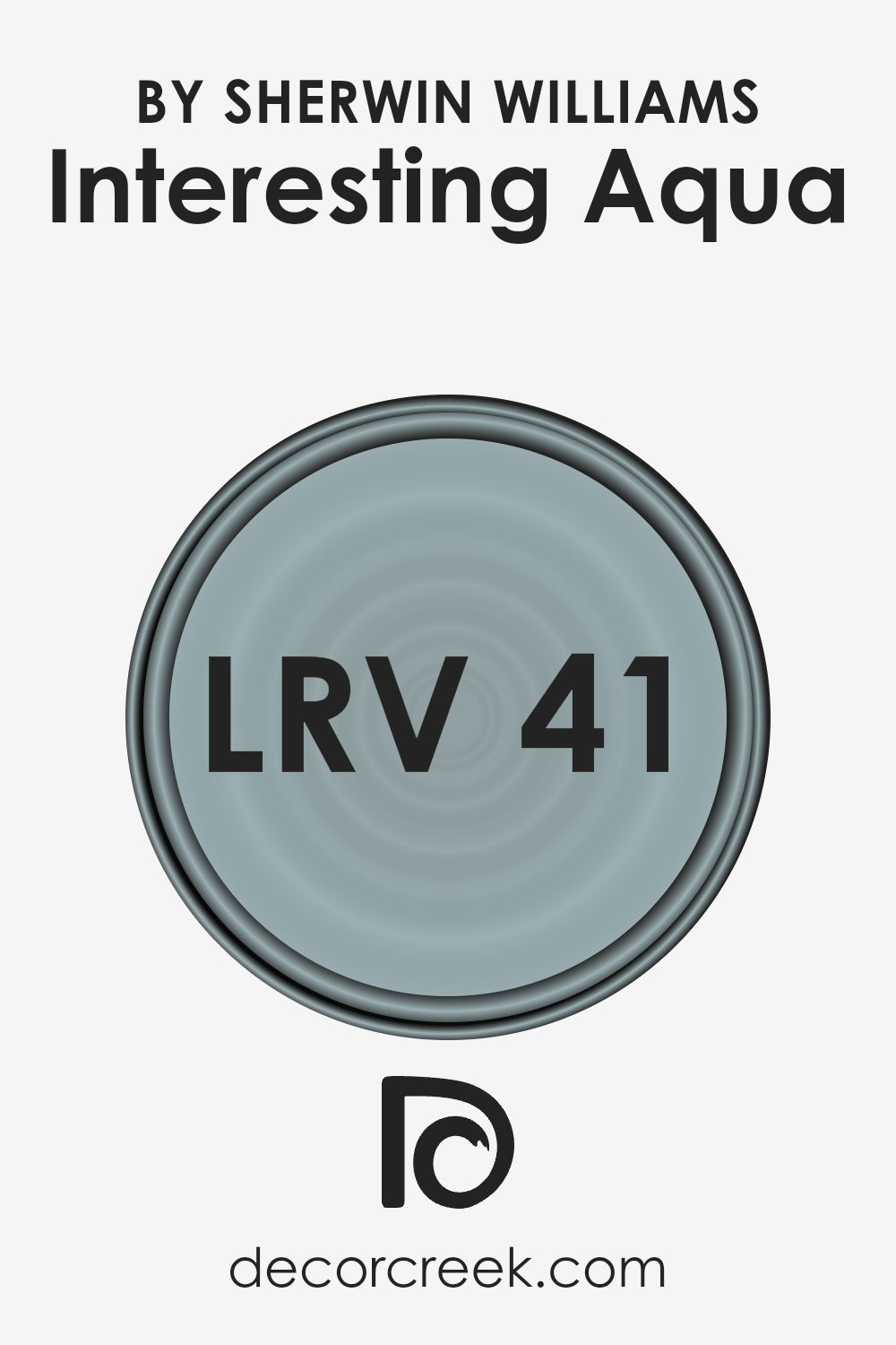
For “Interesting Aqua” with an LRV of 40.888, this value places it in the mid-range of lightness. This means that it reflects a moderate amount of light, which allows it to feel balanced between being light and dark.
In a room with good natural lighting, “Interesting Aqua” will appear bright and can create an energetic vibe without being too overwhelming.
In dimmer spaces, this color will absorb more light, giving it a slightly deeper appearance, which can add to the room’s warmth. Its moderate LRV makes it a versatile choice for different lighting situations, feeling neither too bright nor too dark.
Coordinating Colors of Interesting Aqua SW 6220 by Sherwin Williams
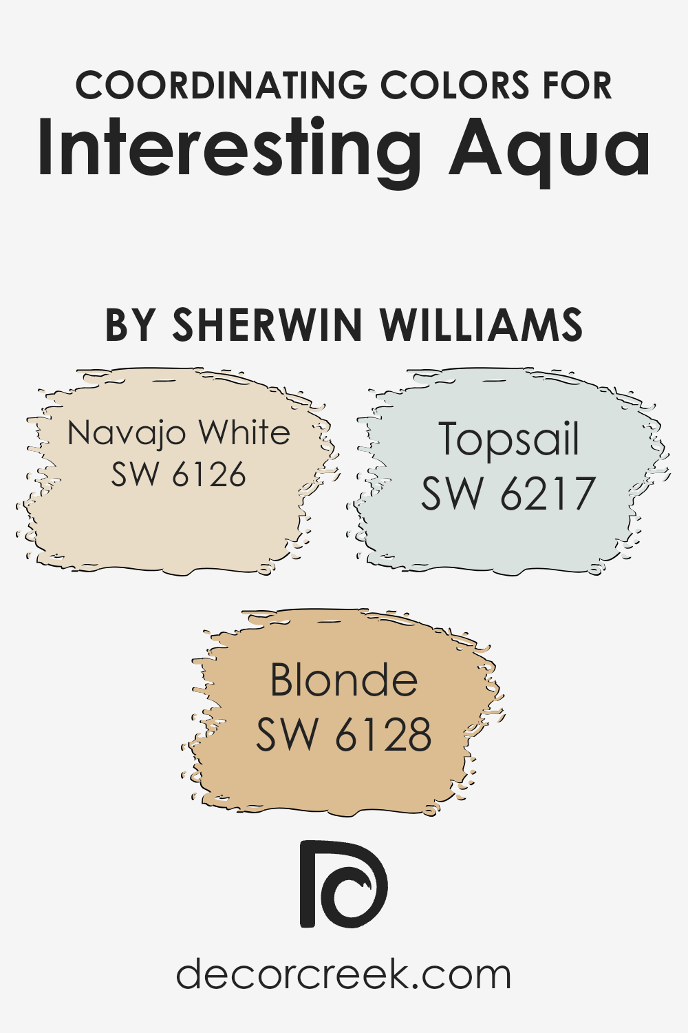
Coordinating colors are shades that work well together to create a balanced and harmonious look in a room. They are chosen based on how they complement each other or the main color in a design scheme. When you select coordinating colors like Navajo White, Blonde, and Topsail alongside Interesting Aqua, they are meant to enhance the space without clashing.
Interesting Aqua, a serene and fresh aqua, serves as the primary color, and the coordinating shades add depth and warmth, maintaining a cohesive atmosphere.
Navajo White is a warm and inviting shade with creamy undertones that adds a cozy and welcoming feel. It’s perfect for tying everything together with its soft, neutral vibe. Blonde is a cheerful and sunny yellow that brings a hint of warmth, providing a lively contrast to the cooler tones of Aqua.
Meanwhile, Topsail is a gentle, breezy blue with a hint of gray, injecting a subtle, calming effect. These shades together create a balanced palette that can be both refreshing and relaxing.
By carefully choosing and combining these colors, you can create a visually pleasing environment that feels both comfortable and stylish.
You can see recommended paint colors below:
- SW 6126 Navajo White
- SW 6128 Blonde
- SW 6217 Topsail
What are the Trim colors of Interesting Aqua SW 6220 by Sherwin Williams?
Trim colors are an essential aspect of interior design, as they help frame and accentuate the primary wall color, adding depth and definition to a room. When using Interesting Aqua SW 6220, a lively and fresh color, it’s important to select trim colors that complement and enhance its vibrant characteristics.
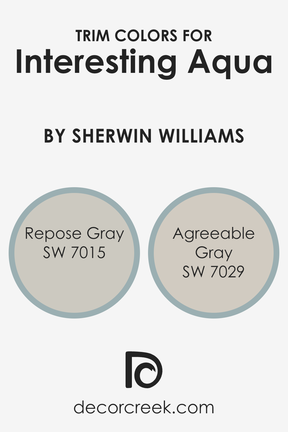
Repose Gray SW 7015 is an excellent choice as a trim color because its soft gray tone provides a neutral and calming contrast, allowing Interesting Aqua to stand out.
Agreeable Gray SW 7029, another suitable trim option, offers a warm, light beige with greige undertones that blend harmoniously with Interesting Aqua while adding a touch of coziness.
Both of these gray hues provide subtle elegance, making them ideal companions for a bright and energetic palette like Interesting Aqua.
Repose Gray SW 7015 is a versatile and timeless gray with a hint of warmth, making it a popular choice for trim as it pairs well with many colors. Its understated warmth works beautifully to subtly outline the walls painted in the refreshing Interesting Aqua, bringing a modern edge to the space.
Agreeable Gray SW 7029, on the other hand, is renowned for its soft and inviting nature, as it balances between gray and beige, providing an easygoing atmosphere. When used as a trim color, Agreeable Gray softens the boldness of Interesting Aqua, creating a welcoming and relaxed environment.
Both Repose Gray and Agreeable Gray offer their unique advantages, ensuring that Interesting Aqua takes the spotlight while being complemented perfectly by these graceful neutrals.
You can see recommended paint colors below:
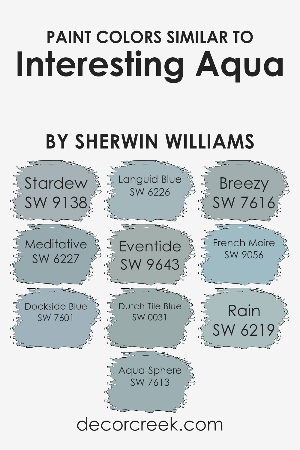
Colors Similar to Interesting Aqua SW 6220 by Sherwin Williams
Colors similar to Sherwin Williams’ Interesting Aqua, such as Stardew, Meditative, Dockside Blue, Aqua-Sphere, Languid Blue, Eventide, Dutch Tile Blue, Breezy, French Moire, and Rain, are important for creating a harmonious and calming atmosphere in any space.
These colors work well together because they share similar undertones, which makes them compatible and easy to mix and match. Using similar colors helps to achieve a cohesive look and feel, allowing for versatility in design without the risk of clashing hues.
These colors can be used for walls, furniture accents, or decor to create a soothing environment, perfect for relaxation or focus.
For instance, Stardew offers a touch of grey within its blue, giving it a soft, muted feel, perfect for a cozy living room.
Meditative and Dockside Blue have slightly deeper tones, adding depth and richness to the overall palette.
Aqua-Sphere and Languid Blue bring in lighter, breezier vibes, ideal for a fresh, airy look. Eventide, meanwhile, has a hint of twilight, providing a peaceful evening feel. Dutch Tile Blue has a more classic blue touch with just a hint of green, while Breezy is soft with a slight whisper of turquoise.
French Moire feels like a gentle wave, and Rain evokes the calmness after a storm with its light, refreshing tone. Together, these hues create a balanced and pleasing aesthetic.
You can see recommended paint colors below:
- SW 9138 Stardew
- SW 6227 Meditative
- SW 7601 Dockside Blue
- SW 7613 Aqua-Sphere
- SW 6226 Languid Blue
- SW 9643 Eventide
- SW 0031 Dutch Tile Blue
- SW 7616 Breezy
- SW 9056 French Moire
- SW 6219 Rain
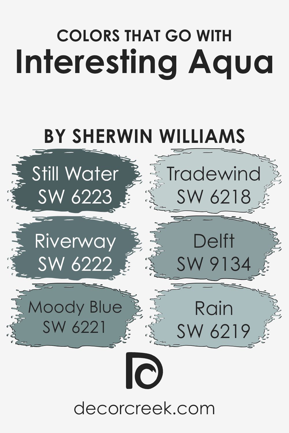
Colors that Go With Interesting Aqua SW 6220 by Sherwin Williams
Colors that complement Interesting Aqua SW 6220 from Sherwin Williams are important because they help create a balanced and harmonious environment. These colors can be used together to create different moods and effects in a room.
For example, SW 6223 – Still Water is a deep, calming shade that brings a sense of peace to any space, making it perfect for a quiet corner or a restful bedroom. Similarly, SW 6222 – Riverway provides a deeper tone that adds a rich, grounding effect to the lightness of Interesting Aqua, making a room feel more intimate and cozy.
SW 6221 – Moody Blue brings a touch of drama with its strong, muted blue tone, creating a striking contrast when paired with lighter shades. Meanwhile, SW 6218 – Tradewind is a gentle, airy color that complements the fresh vibe of Interesting Aqua, perfect for a light and breezy beach house vibe.
SW 9134 – Delft offers a classic, elegant touch with its deep, sophisticated hue, ideal for adding depth to your palette. Finally, SW 6219 – Rain is soft and soothing, lending a gentle backdrop that enhances the lighter, fresh feel of Interesting Aqua.
Together, these colors can create a stunning, balanced environment that feels cohesive and inviting.
You can see recommended paint colors below:
- SW 6223 Still Water
- SW 6222 Riverway
- SW 6221 Moody Blue
- SW 6218 Tradewind
- SW 9134 Delft
- SW 6219 Rain
How to Use Interesting Aqua SW 6220 by Sherwin Williams In Your Home?
Interesting Aqua by Sherwin Williams is a soft, pleasing color that’s perfect for adding a touch of calm to your home. It’s a light blue hue with a hint of green, making it versatile for various spaces. In the living room, it can create a refreshing and airy atmosphere, especially when paired with white or light gray furniture.
In the bedroom, it fosters a peaceful environment, promoting relaxation and restful sleep. It also works well in bathrooms, evoking a spa-like feel when matched with natural elements like wood or stone.
For children’s rooms, Interesting Aqua offers a gentle backdrop that pairs nicely with brighter colors and playful decor.
Additionally, this color can beautifully enhance kitchen spaces, working well with both modern and classic styles. Overall, Interesting Aqua is a wonderful choice for anyone looking to add a soothing yet stylish touch to different areas of their home.
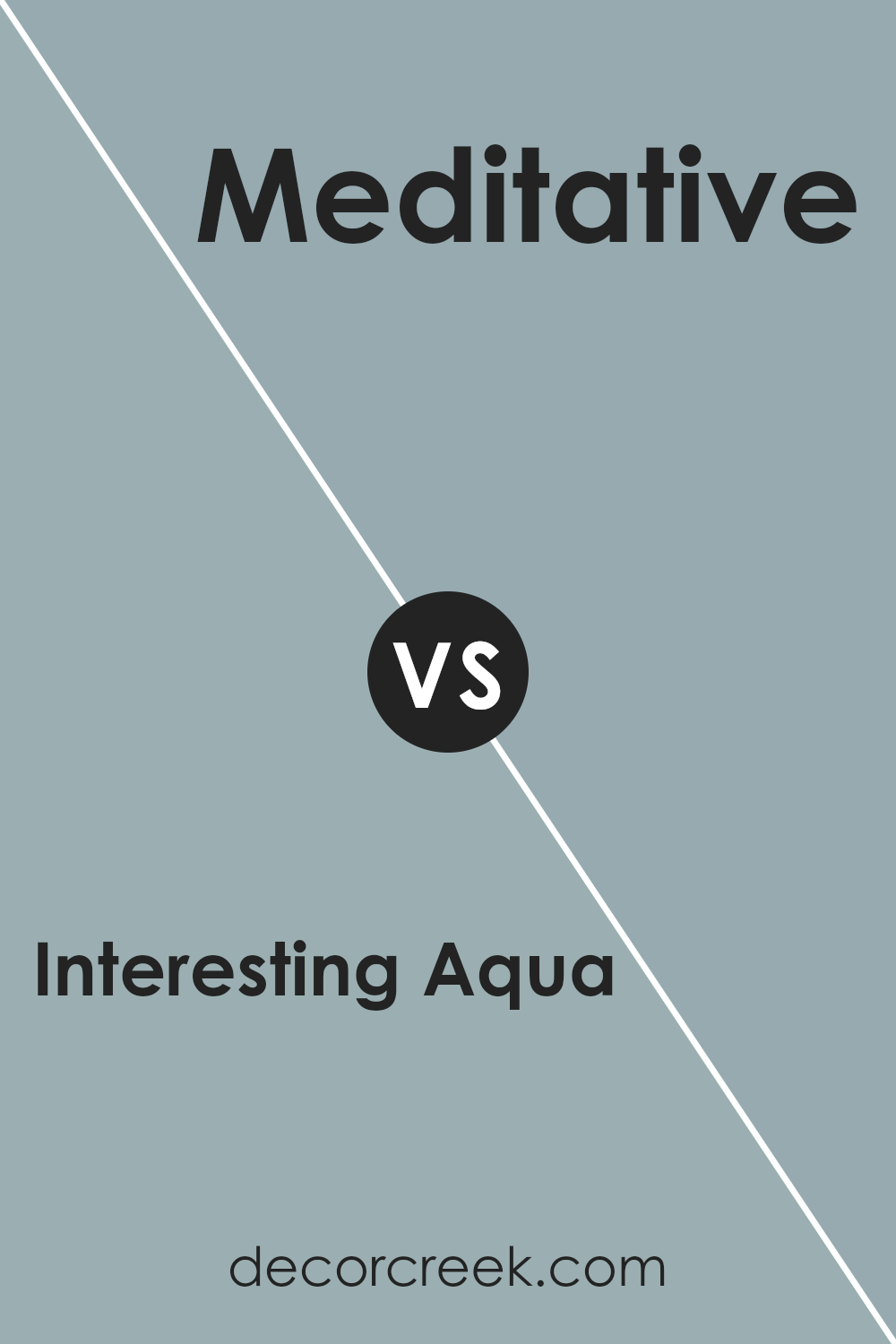
Interesting Aqua SW 6220 by Sherwin Williams vs Meditative SW 6227 by Sherwin Williams
Interesting Aqua SW 6220 and Meditative SW 6227, both by Sherwin Williams, are beautiful colors that bring different moods to a space. Interesting Aqua is a soft, light aqua color with refreshing vibes. It can make a room feel open and airy, perfect for spaces that need a pop of cool color without being too bold.
In contrast, Meditative is a deeper, more muted blue with a touch of gray, giving it a calm and restful feel. This color is excellent for creating a cozy atmosphere and works well in bedrooms or living areas where relaxation is key.
While Interesting Aqua brings a sense of freshness and lightness, Meditative offers a peaceful and grounded presence. Both colors can complement each other when used in different areas of a home, or one can be chosen based on the mood you want to create in your space.
You can see recommended paint color below:
- SW 6227 Meditative
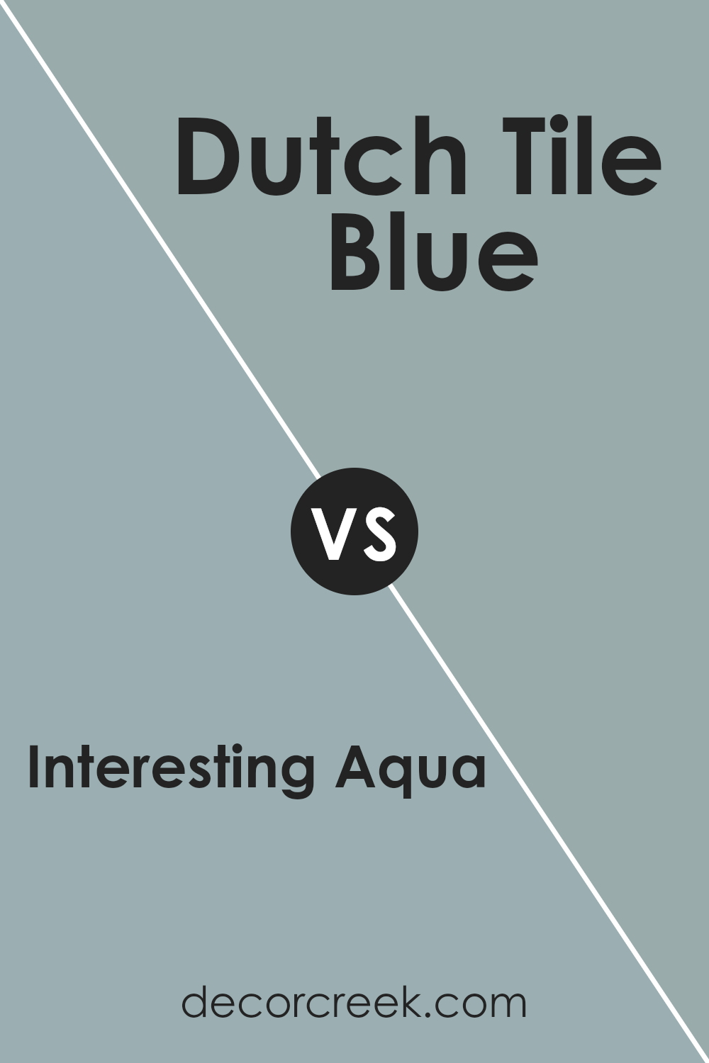
Interesting Aqua SW 6220 by Sherwin Williams vs Dutch Tile Blue SW 0031 by Sherwin Williams
Interesting Aqua (SW 6220) is a soft, calming shade of aqua green with a gentle mix of blue and green tones. It has a light and airy feel, making it perfect for spaces where you want a fresh and open look. The color brings a sense of cool relaxation and pairs well with whites and other muted tones for a peaceful ambiance.
On the other hand, Dutch Tile Blue (SW 0031) is a more intense and traditional blue shade. It carries a classic and bold vibe, reminiscent of historic Dutch ceramics. This color is more saturated and vibrant compared to the soothing aqua.
It works well as an accent color or in rooms where you want to create a cozy and inviting atmosphere. Dutch Tile Blue pairs beautifully with rich wood tones and neutral grays, adding depth and character to any space. Both colors have unique qualities and can be used to create different moods in a home.
You can see recommended paint color below:
- SW 0031 Dutch Tile Blue
Interesting Aqua SW 6220 by Sherwin Williams vs Stardew SW 9138 by Sherwin Williams
Interesting Aqua SW 6220 and Stardew SW 9138 are both colors from Sherwin Williams, but they offer different vibes. Interesting Aqua is a soft blue-green that brings a fresh, lively feeling to a space. It’s bright and cheerful, perfect for areas where you want an energetic yet soothing atmosphere, like bathrooms or kitchens.
On the other hand, Stardew SW 9138 is a calm blue-gray. This color has a more muted tone, which gives it a comforting and calming effect. It’s ideal for bedrooms or living rooms, where you might want a cozy, relaxed environment.
When comparing the two, Interesting Aqua is more vibrant and energetic, while Stardew leans towards a more subdued and soothing feel. Depending on the mood you want to set in a room, you might opt for the liveliness of Interesting Aqua or the calming presence of Stardew. Each brings its own unique charm to a space.
You can see recommended paint color below:
Interesting Aqua SW 6220 by Sherwin Williams vs Rain SW 6219 by Sherwin Williams
Interesting Aqua SW 6220 and Rain SW 6219 by Sherwin Williams are both calming shades, but they bring different vibes to a space. Interesting Aqua is a fresh and vibrant color with a lively greenish-blue hue. It can add energy to a room while still maintaining a peaceful atmosphere.
On the other hand, Rain is a softer, more subdued blue-gray that feels more muted and calming. It’s perfect for creating a relaxing environment without overwhelming the senses.
While Interesting Aqua can be paired with whites and light woods for a bright, airy look, Rain works well with deeper grays and earthy tones for a cozy feel. Both colors work beautifully in various settings, from bathrooms to bedrooms. Whether you want a pop of color or a soft, neutral undertone, these shades offer unique qualities that can enhance your home’s aesthetic.
You can see recommended paint color below:
Interesting Aqua SW 6220 by Sherwin Williams vs Dockside Blue SW 7601 by Sherwin Williams
Interesting Aqua SW 6220 and Dockside Blue SW 7601 are both colors from Sherwin Williams, but they offer different vibes. Interesting Aqua is a medium blue-green that brings a sense of freshness and liveliness to a space. It’s bright without being overwhelming and pairs well with whites and neutral tones, making it versatile for various settings.
On the other hand, Dockside Blue is a muted blue with gray undertones. It’s more subdued and calming compared to Interesting Aqua. This makes it a good choice for spaces where a peaceful atmosphere is desired. It works well with other muted colors and natural materials.
Overall, while Interesting Aqua introduces a bit more energy and vibrancy, Dockside Blue offers a relaxed and easy-going feel. Both can complement a range of styles and preferences, but your choice will depend on whether you lean toward a more energetic or calm environment.
You can see recommended paint color below:
Interesting Aqua SW 6220 by Sherwin Williams vs French Moire SW 9056 by Sherwin Williams
Interesting Aqua SW 6220 by Sherwin Williams is a calm and refreshing greenish-blue color that feels bright and airy. It’s perfect for creating a light, cheerful atmosphere in any room, especially in spaces where you want to feel relaxed and peaceful.
On the other hand, French Moire SW 9056 by Sherwin Williams is a deeper, more intense shade, with a richer green undertone. This color adds a sense of depth and coziness to interiors, making it suitable for more intimate or formal areas like dining rooms or studies.
When these two colors are placed together, Interesting Aqua can lighten up a space and contrast well against darker, more saturated French Moire. Together, they can make a balanced color scheme.
Interesting Aqua works well in spaces where you want openness, while French Moire provides a comfortable and enveloping effect in areas that benefit from a stronger, more grounded presence.
You can see recommended paint color below:
- SW 9056 French Moire
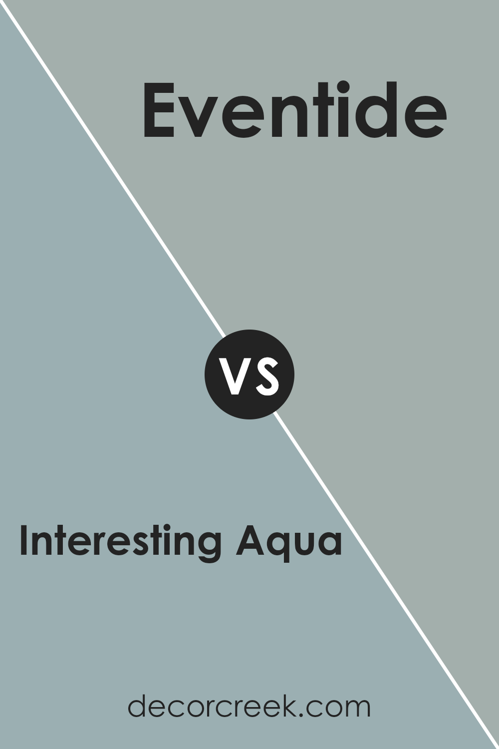
Interesting Aqua SW 6220 by Sherwin Williams vs Eventide SW 9643 by Sherwin Williams
Interesting Aqua SW 6220 and Eventide SW 9643 by Sherwin Williams are two distinct colors, each with its own charm. Interesting Aqua is a bright and refreshing teal shade that evokes the feeling of clear tropical waters. It’s vibrant and full of energy, making any space feel lively and invigorating. This color works well in areas where you want a pop of brightness, such as bathrooms or accent walls.
On the other hand, Eventide SW 9643 is a much more subdued and calming color. It’s a soft gray with a hint of blue, giving it a cool and restful vibe. Eventide is ideal for creating a calm and cozy atmosphere, perfect for bedrooms or living rooms where relaxation is key.
While Interesting Aqua brings a lively and bright touch, Eventide offers a soothing, muted backdrop. Together, they could create an interesting balance of energy and calmness in a space.
You can see recommended paint color below:
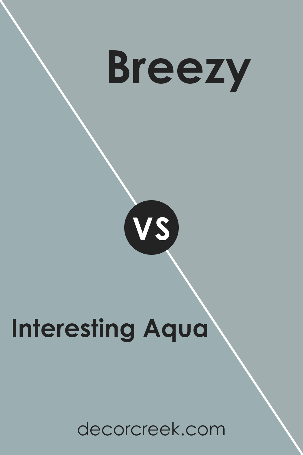
Interesting Aqua SW 6220 by Sherwin Williams vs Breezy SW 7616 by Sherwin Williams
Interesting Aqua SW 6220 and Breezy SW 7616, both from Sherwin Williams, offer different vibes for your space. Interesting Aqua is a vibrant and lively shade of aqua that brings a refreshing and energetic feel to any room. It’s perfect for those who love bold colors and want a lively atmosphere.
Breezy SW 7616, on the other hand, is a softer, more muted blue with gray undertones. It’s great for creating a calm and relaxing environment, making it ideal for bedrooms or living rooms where you want a peaceful ambiance.
While Interesting Aqua can make a room feel sunny and bright, Breezy provides a more laid-back and soothing backdrop. Both colors have their charm, but your choice depends on the mood you want to set. If you’re looking for excitement and brightness, go with Interesting Aqua. If you prefer calm and quiet, Breezy is your color.
You can see recommended paint color below:
- SW 7616 Breezy
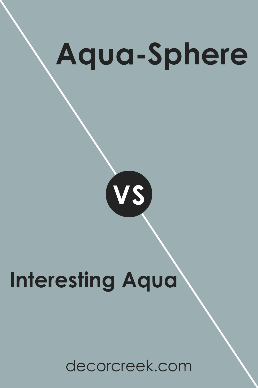
Interesting Aqua SW 6220 by Sherwin Williams vs Aqua-Sphere SW 7613 by Sherwin Williams
Interesting Aqua SW 6220 and Aqua-Sphere SW 7613 by Sherwin Williams are both shades of aqua, but they have subtle differences that set them apart. Interesting Aqua SW 6220 is a vibrant, lively shade of aqua that can brighten up a space with its bold presence. It’s energetic and can add a pop of color to any room, making it feel fresh and inviting.
On the other hand, Aqua-Sphere SW 7613 is a softer, more subdued shade of aqua. It has a calming quality, making it ideal for spaces where you want a more relaxed atmosphere. This color tends to have a slightly cooler tone compared to Interesting Aqua, which can lend a peaceful feel to the room.
In comparison, Interesting Aqua is more striking, while Aqua-Sphere offers a gentle background color that doesn’t overwhelm. Both colors work well in coastal themes, but your choice will depend on whether you want a vibrant or a mellower look.
You can see recommended paint color below:
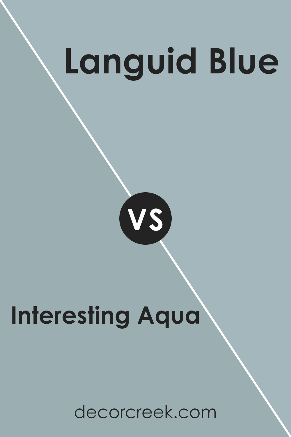
Interesting Aqua SW 6220 by Sherwin Williams vs Languid Blue SW 6226 by Sherwin Williams
Interesting Aqua SW 6220 and Languid Blue SW 6226 by Sherwin Williams are both soothing colors, each offering a unique feel. Interesting Aqua is a vibrant, fresh shade with green and blue undertones that make it lively. It can brighten up a space and add a cheerful touch, making it great for areas where you want energy and positivity.
On the other hand, Languid Blue is a softer, muted shade of blue. It brings a calming and relaxed feel, making it ideal for bedrooms or spaces where relaxation is a priority. While Interesting Aqua stands out and catches the eye, Languid Blue is more subtle and comforting.
Both colors work well in different environments, with Interesting Aqua adding a pop of color and Languid Blue providing a gentle background. Depending on the mood you want to create, you can choose either for a vibrant atmosphere or a peaceful retreat.
You can see recommended paint color below:
- SW 6226 Languid Blue
Conclusion
After thinking about SW 6220 Interesting Aqua by Sherwin Williams, I’ve come to a simple conclusion. This color is like a breath of fresh air. It’s calm but not boring, and it really knows how to cheer up a room. When I see it on a wall, it reminds me of gentle waves on a sunny day. It’s not too loud or too quiet; it’s just right.
Interesting Aqua is great because it can fit in lots of different places in a house. Whether it’s in the living room, the bedroom, or even the bathroom, it always seems to work well.
It pairs nicely with many other colors, so if someone wants to add a splash of brightness or keep things soft and cool, this color can do it.
When you think about colors to paint with, it’s important to find ones that make you feel good. Interesting Aqua does that because it’s both refreshing and comforting.
For anyone wanting to give a room a lift without doing too much, SW 6220 is a wonderful choice. It makes an area feel happy and inviting, like when you’re sitting by a peaceful lake on a summer day.
In short, Interesting Aqua by Sherwin Williams is a winning color because it brings calm and joy all at once.
Ever wished paint sampling was as easy as sticking a sticker? Guess what? Now it is! Discover Samplize's unique Peel & Stick samples.
Get paint samples

