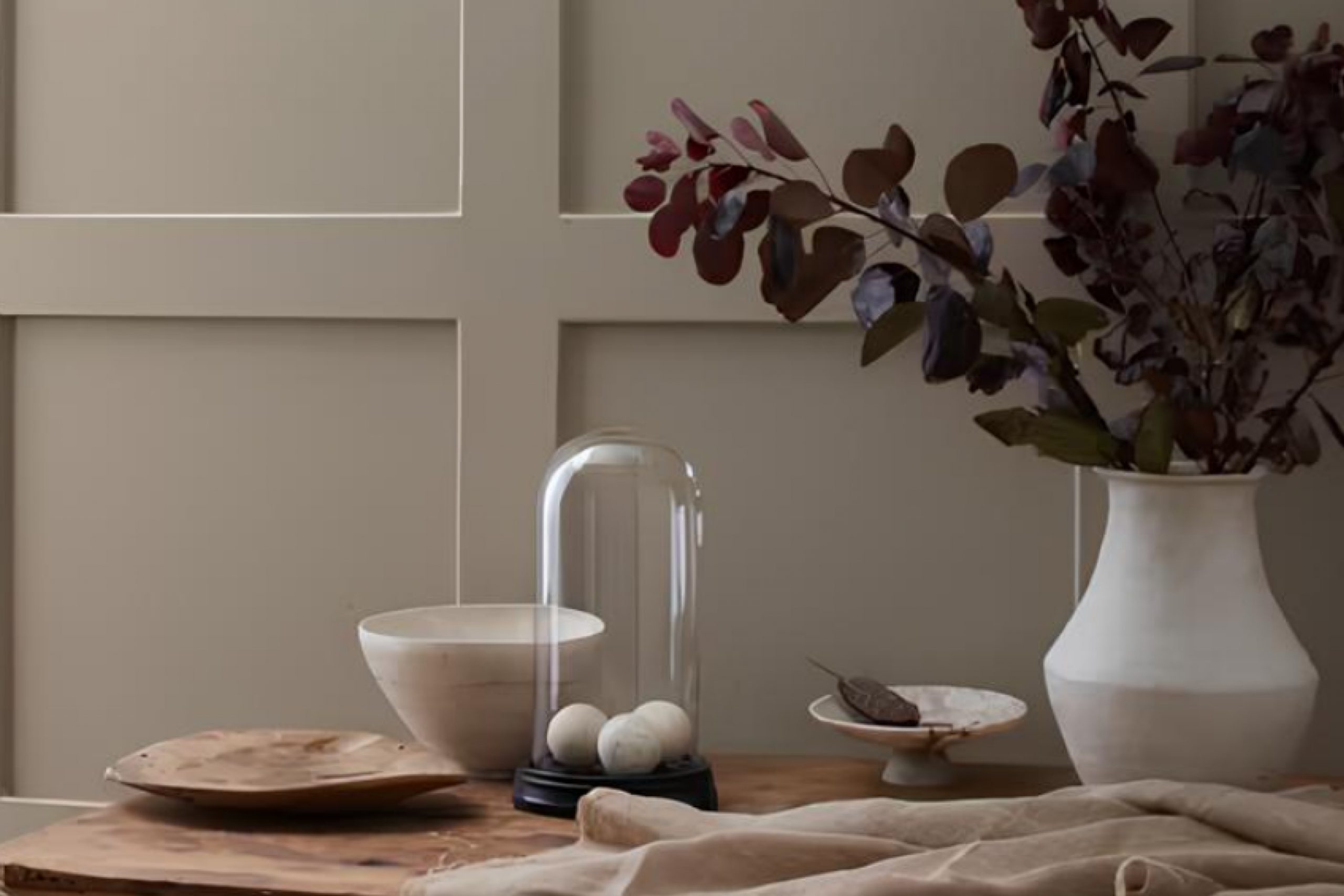
When you decide to experiment with different shades to refresh your walls, consider how the subtle elegance of Carter Gray could enhance your living space. This particular shade straddles the line between a sophisticated gray and a warm, inviting beige, making it incredibly versatile for any room.
Whether you’re updating your kitchen, bedroom, or living room, Carter Gray provides a serene backdrop that complements both modern and traditional styles. It has a unique ability to support a variety of decor, from bold and colorful artwork to more understated, minimalist furnishings.
If you’re like me, always looking for a color that can maintain its charm throughout different lighting conditions and times of day, you’ll appreciate how Carter Gray shifts gracefully with natural light.
It’s a choice that feels effortlessly cohesive with just about any design aesthetic you might already have in your home.
What Color Is Carter Gray CW-80 by Benjamin Moore?
The Carter Gray CW-80 by Benjamin Moore is a unique shade that blends the coolness of classic gray with slight warm undertones. This versatile color has a timeless feel, making it suitable for a variety of living spaces. Its balanced hue is perfect for those looking to achieve a calm and welcoming atmosphere without the harshness some grays can exhibit.
This gray works beautifully in modern and traditional interiors, effortlessly complementing both the sleek lines of contemporary furniture and the ornate details of classic pieces. It’s particularly effective in living rooms, bedrooms, and kitchens where its neutral base encourages a range of decor choices.
When it comes to pairing materials, Carter Gray goes well with natural wood, bringing out its rich tones, whether in flooring, furniture, or decorative accents. It also pairs nicely with metals like brushed nickel or stainless steel, adding a touch of modernity. Textures such as linen, wool, and cotton in soft furnishings look fabulous against this color, providing a comforting and cohesive feel.
Overall, Carter Gray is an excellent choice for creating a stylish and harmonious space. Its adaptability and subtle charm allow it to work well in various settings, supporting a wide array of design preferences.
Is Carter Gray CW-80 by Benjamin Moore Warm or Cool color?
Carter Gray CW-80 by Benjamin Moore is a versatile shade of gray that can work wonders in various rooms of a home. Its neutral tone makes it easy to match with different colors and furniture styles, making decorating simpler.
Whether used in a living room, bedroom, or even a kitchen, Carter Gray creates a calm and welcoming atmosphere without being too dark or overwhelming. Its balanced hue ensures that it can adapt to both modern and traditional décor, enhancing other elements in the room like artwork, textiles, or wood finishes.
Additionally, this color is great for small spaces as it helps them appear more open and airy. Carter Gray is perfect for homeowners looking for a reliable and adaptable paint color that can fit into numerous design schemes while offering a fresh, clean look.
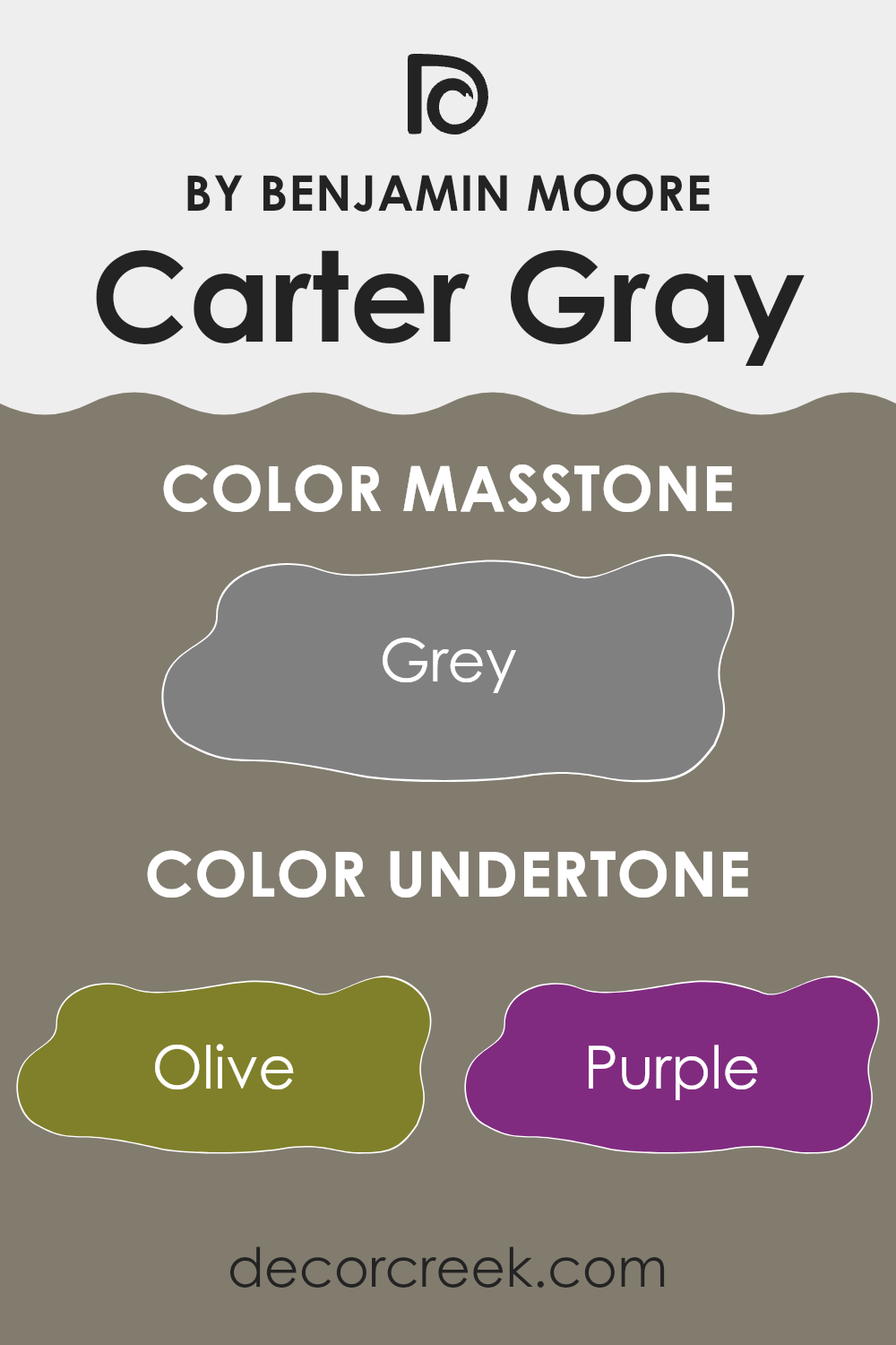
Undertones of Carter Gray CW-80 by Benjamin Moore
Carter GrayCW-80 by Benjamin Moore is quite an interesting shade that incorporates a complex blend of undertones. These include colors like olive, purple, pale pink, and various shades of blue and green, among others. Undertones are the subtle colors that lie beneath the surface of the main color, influencing how it appears in different lighting conditions and environments. In the case of Carter GrayCW-80, these undertones can make the color appear differently depending on the amount and type of light in a room.
For example, under bright daylight, the pale yellow and light turquoise undertones might make the gray look lighter and slightly more vibrant. Under artificial lighting, however, the darker undertones like dark grey and brown might be more noticeable, giving the paint a richer and deeper appearance.
When used on interior walls, the versatility of Carter GrayCW-80 thanks to its multiple undertones allows it to adapt to various types of decor and settings. In a room with a lot of natural light, this paint can help create a fresh and airy feel, accentuating its lighter undertones. In spaces with less light, it can create a cozy, more enclosed atmosphere, allowing the darker undertones to stand out.
Thus, this makes Carter GrayCW-80 a flexible choice for different rooms and styles, always bringing a dynamic character to the space due to its complex undertone structure.
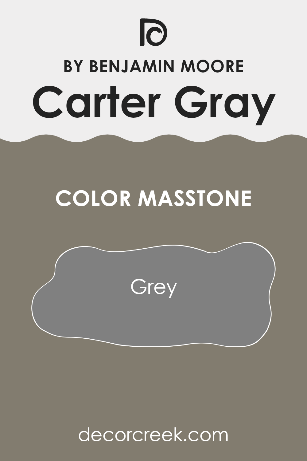
What is the Masstone of the Carter Gray CW-80 by Benjamin Moore?
Carter Gray CW-80 by Benjamin Moore is a balanced medium gray color, similar to the gray shade coded as #808080. This neutral masstone offers homeowners a versatile option for painting their walls.
Its neutral gray shade works well in almost any room, providing a calm, understated backdrop that allows other colors in the decor to stand out. For example, in a living room, this color can help make colorful furniture or vibrant artwork pop, yet in a bedroom, it can make the space feel cozy and inviting without being too dark or moody.
The neutrality of Carter Gray also means it pairs easily with both warm tones like creams and beiges and cooler tones like blues and greens. This adaptability makes it ideal for open-plan spaces where it can help create a sense of continuity across different functional areas. It does its job without demanding attention, which can be perfect for creating a pleasant, laid-back home environment.
How Does Lighting Affect Carter Gray CW-80 by Benjamin Moore?
Lighting plays a crucial role in determining how colors appear in any space. Since light influences color perception, the ambiance and mood of a room can vary significantly depending on the type of light it receives. This effect is clearly seen with color shades such as Carter Gray CW-80 by Benjamin Moore, which will look different under various lighting conditions.
In natural light, the appearance of Carter Gray CW-80 can change throughout the day. Natural light tends to bring out the truest form of the color. In north-facing rooms, which don’t receive direct sunlight and are often lit with cooler, indirect light, Carter Gray CW-80 might appear slightly more muted and cooler, giving a calm and gentle feel to the room.
This subdued light enhances the gray tones, making the color look more uniform and subdued.
On the contrary, in south-facing rooms that are filled with abundant direct sunlight for most of the day, Carter Gray CW-80 can look lighter and warmer. The brightness can draw out the subtler, warmer undertones in the paint, making the room feel more welcoming and airy.
East-facing rooms receive the most light in the morning when the sun rises, so Carter Gray CW-80 can look particularly vibrant and fresh in the morning light but become cooler as the day progresses. This shifting light can make the color seem more dynamic and adaptable to different times of the day.
West-facing rooms, however, get the most intense light during late afternoon. Here, Carter Gray CW-80 can appear richer and deeper as the sun sets, creating a cozy and slightly more dramatic look as evening approaches.
Artificial light also impacts how Carter Gray CW-80 is perceived. Under warm artificial lighting, the paint can appear softer and more welcoming, whereas cooler artificial lights can highlight its gray and blue undertones, making it appear more steadfast and neutral.
Overall, Carter Gray CW-80’s versatility under different lighting conditions makes it a popular choice for many rooms, adapting subtly with the changing light conditions to always provide a pleasant backdrop.
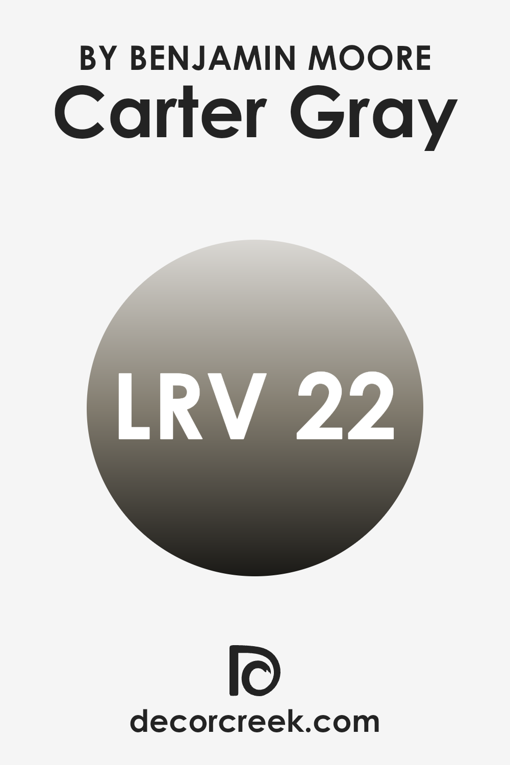
What is the LRV of Carter Gray CW-80 by Benjamin Moore?
LRV stands for Light Reflectance Value, which is a measure of the amount of visible and usable light that reflects from a surface when illuminated by a light source. The scale ranges from 1 to 99, where lower values indicate darker colors that absorb more light, and higher values represent lighter colors that reflect more light.
Understanding LRV helps in selecting paint colors that will either brighten up a space by reflecting more light or create a cozier feel by absorbing more light. In the case of the color with an LRV of 21.86, we’re dealing with a darker shade that absorbs a good deal of light rather than reflecting it.
This implies that walls painted in this color will look rich and will not brighten the space significantly. This means that using this particular color in a small, dimly lit room might make the room feel smaller and darker. However, in a well-lit or large room, it could add a sense of depth and warmth, enhancing the overall aesthetic without making the space feel cramped.
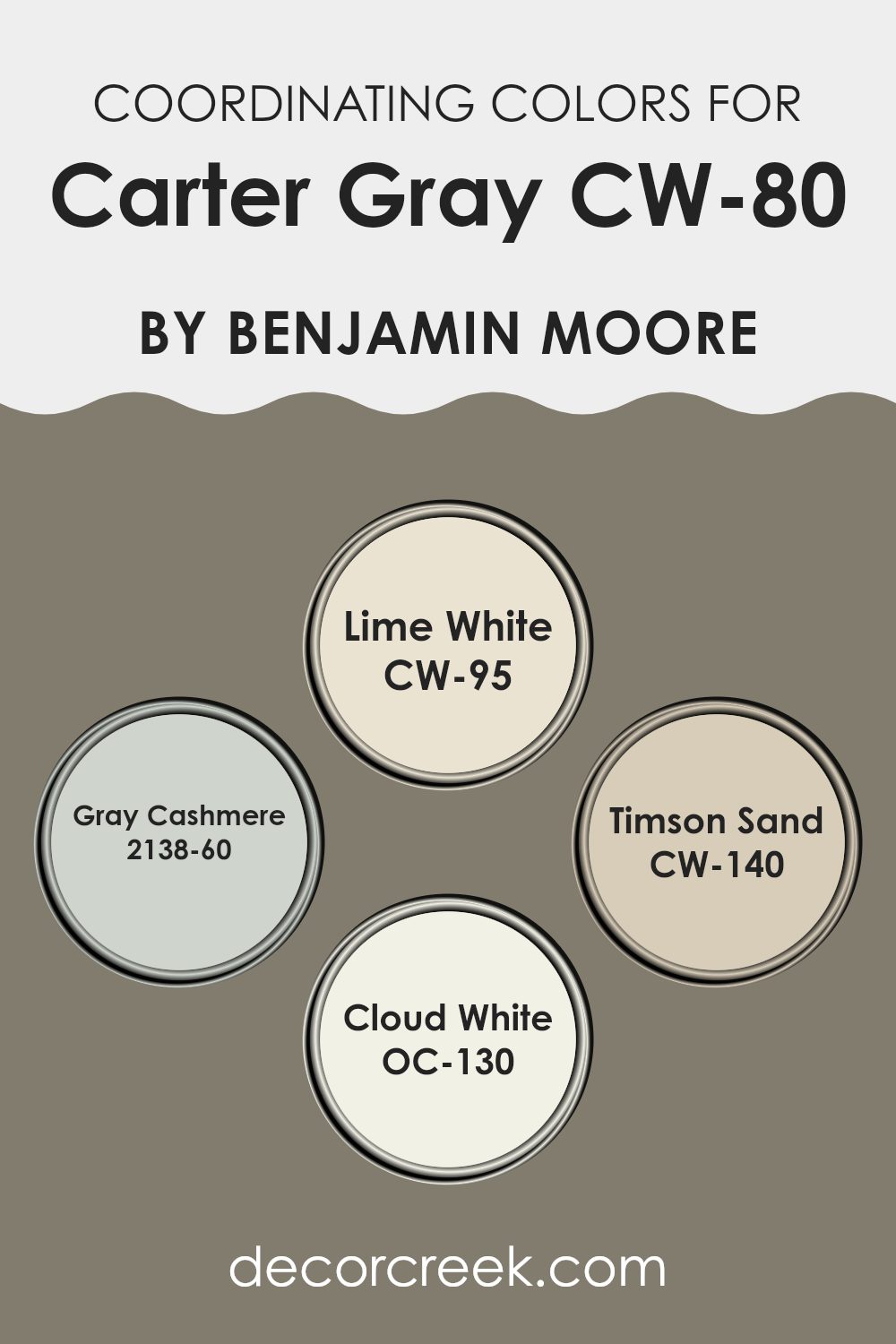
Coordinating Colors of Carter Gray CW-80 by Benjamin Moore
Coordinating colors are selected shades that harmonize with a main color to enhance the overall aesthetic of a space. When using a neutral base color like gray, choosing the right coordinating colors can add depth and warmth, making the room feel more inviting. These harmonizing shades can be used for walls, trims, accents, or decor, providing balance and visual interest by complementing or offering gentle contrast to the main color.
For instance, CW-95 – Lime White by Benjamin Moore is a soft, creamy white that adds a subtle warmth, working well in spaces that need a gentle lift without overwhelming brightness. Then, 2138-60 – Gray Cashmere is a soft blue-green that gives a fresh look, perfect for creating a calm and welcoming atmosphere.
Another great coordinating color is CW-140 – Timson Sand, a warm sandy beige that brings a cozy and natural feel to any room. Finally, OC-130 – Cloud White offers a clean and fresh look, ideal for trims and ceilings to provide a crisp finish that complements darker or richer wall colors. Together, these coordinating colors ensure a cohesive and stylish palette when paired with a gray-toned main color.
You can see recommended paint colors below:
- CW-95 Lime White
- 2138-60 Gray Cashmere
- CW-140 Timson Sand
- OC-130 Cloud White
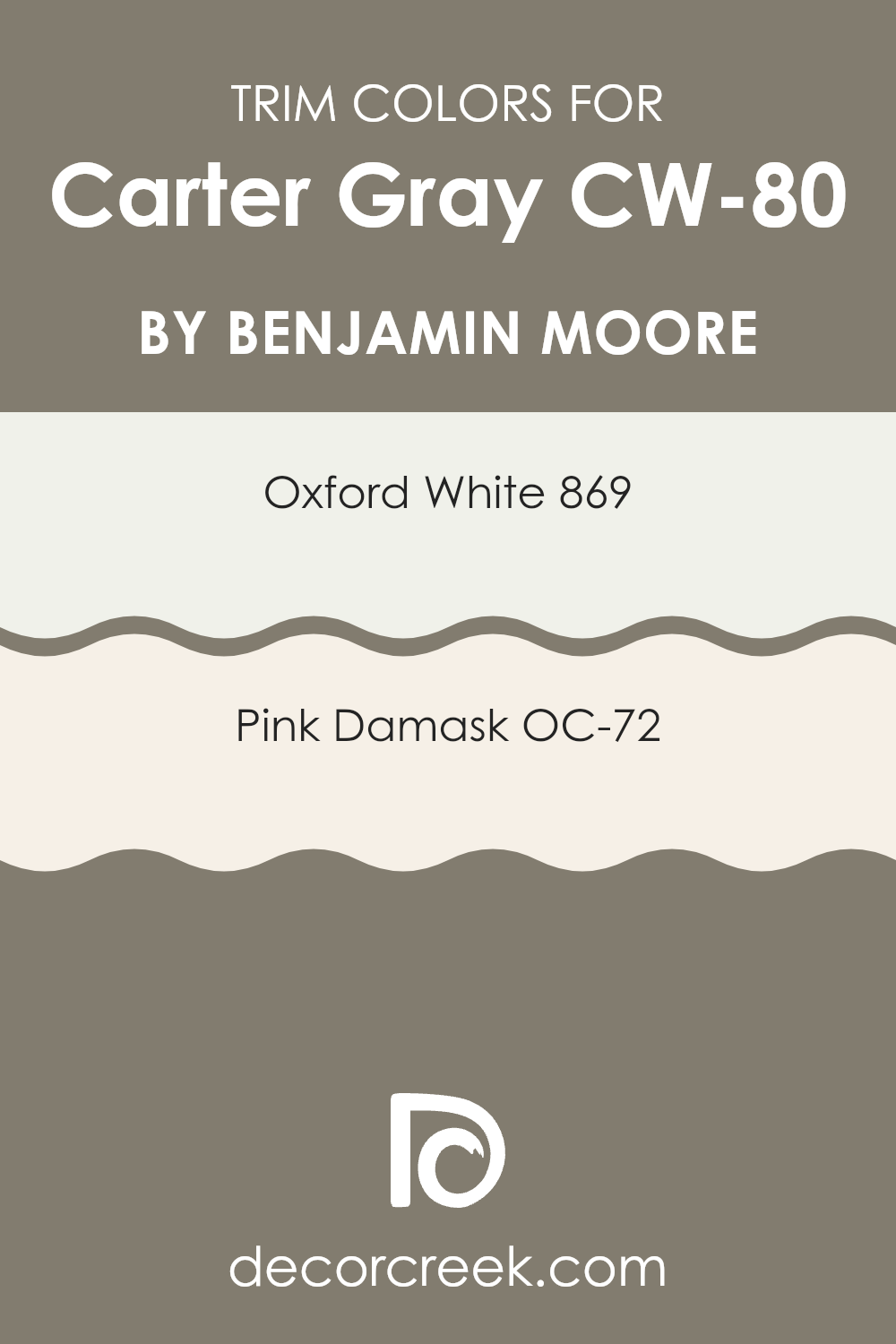
What are the Trim colors of Carter Gray CW-80 by Benjamin Moore?
Trim colors are specific paint hues used to accentuate trim and architectural features in a room, such as baseboards, crown moldings, and window frames. By carefully selecting trim colors, you can enhance the overall appearance of a space and create a visually appealing contrast or complement to the wall colors.
For instance, using colors like Oxford White or Pink Damask from Benjamin Moore as trim colors can define and highlight these details, giving a room a finished look. The choice of trim color can greatly affect the ambiance of a space, making your color decisions crucial for achieving the desired effect.
Oxford White 869 is a crisp and clean white that works brilliantly as a trim color, offering a fresh and clear boundary that can make any wall color pop, such as Carter GrayCW-80. Its bright nature allows it to act as a versatile backdrop that suits a variety of color schemes. On the other hand, Pink Damask OC-72 offers a subtle hint of color with its warm undertones, providing a gentle and inviting contrast when used as a trim. This color is particularly effective if you’re looking to add a touch of warmth to a room without overwhelming it with bold colors.
You can see recommended paint colors below:
- 869 Oxford White
- OC-72 Pink Damask
How to Use Carter Gray CW-80 by Benjamin Moore In Your Home?
Carter Gray CW-80 by Benjamin Moore is a soft, light gray paint that creates a cozy, welcoming atmosphere in any room. This shade is versatile and can easily fit into various styles, from modern to traditional.
If you’re thinking of freshening up your living room or bedroom, Carter Gray is a great choice because it pairs well with both vibrant colors and neutral tones. It can serve as a gentle backdrop for bold furniture or art pieces, letting them stand out. In smaller spaces like bathrooms or hallways, using Carter Gray can make the area feel more open and airy.
It reflects light well, which helps to brighten up these typically darker, smaller spaces. For a cohesive look, you can use this color throughout your home or just in one room for a subtle touch of style. Whether you are painting walls, ceilings or trim, Carter Gray provides a clean, fresh look that can revitalize your living space.
Conclusion
This paint could be a great choice for almost any room in a house. Whether it’s the living room where you hang out and watch movies, or your bedroom where you read books before bed, Carter Gray makes the room feel like a safe, cozy nook. It’s not too dark, not too light, just right for making a place feel like home.
Plus, Benjamin Moore paints are known for being high quality. They last a long time and keep their color well. This means you won’t have to repaint often, which is great because painting can be a lot of work!
So, if anyone asks me for a paint recommendation, I would definitely suggest thinking about CW-80 Carter Gray. It’s easy to match with different decorations, making it simple for you to make your room look nice without too much trouble. All in all, Carter Gray is a lovely choice for anyone looking to make their home a bit cozier.
Ever wished paint sampling was as easy as sticking a sticker? Guess what? Now it is! Discover Samplize's unique Peel & Stick samples.
Get paint samples

