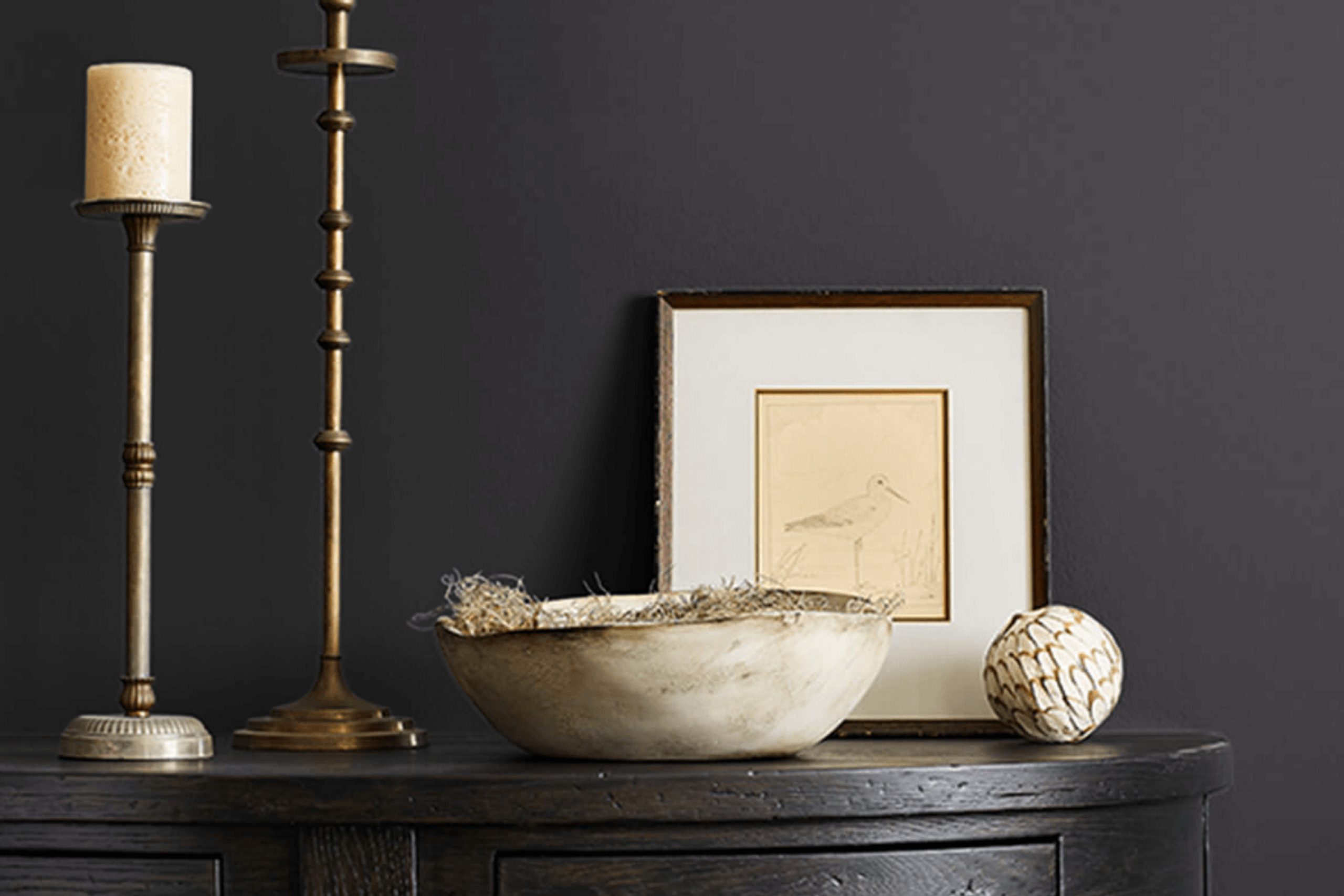
This color is a rich, deep black that adds a sophisticated touch to any space. When you use SW 6990 Caviar, you will notice it has a strong presence that can make your furniture and decor really stand out.
It’s perfect when you want to make a bold statement in your room’s design. I find that it works beautifully for accent walls or even for painting cabinetry and doors for a touch of elegance.
The versatility of Caviar is impressive. It pairs well with a wide range of colors, from bright and vibrant hues to subtle pastels, enhancing them without overpowering.
Applying this color in your home can change the vibe of your space, making it feel more grounded and chic. Whether you are updating a small piece of furniture or transforming an entire room, SW 6990 Caviar could be the perfect choice for you.
What Color Is Caviar SW 6990 by Sherwin Williams?
Caviar by Sherwin Williams is a deep, almost black shade with subtle hints of navy. This rich color gives a feeling of depth and luxury to any space. Due to its dark and sultry nature, it works exceptionally well in modern and minimalist interior designs, as it provides a striking contrast to lighter elements and can be used to create a dramatic backdrop. It’s also a popular choice in industrial style décor, where its bold character complements exposed metal features and raw materials.
When it comes to pairing materials with Caviar, natural wood stands out because the warmth of wood offers a beautiful contrast to the cool darkness of this color. Leather is another excellent choice; a leather sofa or chair in this dark tone adds a touch of luxury and comfort to a room. For textures, think about combining it with smooth satin or velvet finishes to introduce a touch of light reflection and tactile variation.
In rooms like the bedroom, dining room, or a stylish office, using Caviar on a statement wall or for trim can anchor the space and make lighter colors pop. For those looking to add a striking but elegant element to their home, this color is a strong contender.
Is Caviar SW 6990 by Sherwin Williams Warm or Cool color?
CaviarSW 6990 by Sherwin Williams is a deep, rich black that can have a stunning impact in a home. When used on walls, it creates a bold backdrop that makes artwork, furniture, and accents stand out. This shade is perfect for a dramatic statement in a dining room or living area. Because of its depth, it pairs well with bright or metallic decor elements which can help in breaking up the intensity of the color.
In small spaces, like a powder room, using this color can actually make the space feel more intimate and cozy. It can also give a sleek look to cabinets or doors when used in a kitchen or hallway.
When combined with good lighting and a thoughtful color balance with other lighter shades in textiles or furniture, CaviarSW 6990 helps create a stunning, modern look without making the room feel too dark or heavy.
It’s a beautiful choice for anyone looking to add some drama to their space without using bright colors.
What is the Masstone of the Caviar SW 6990 by Sherwin Williams?
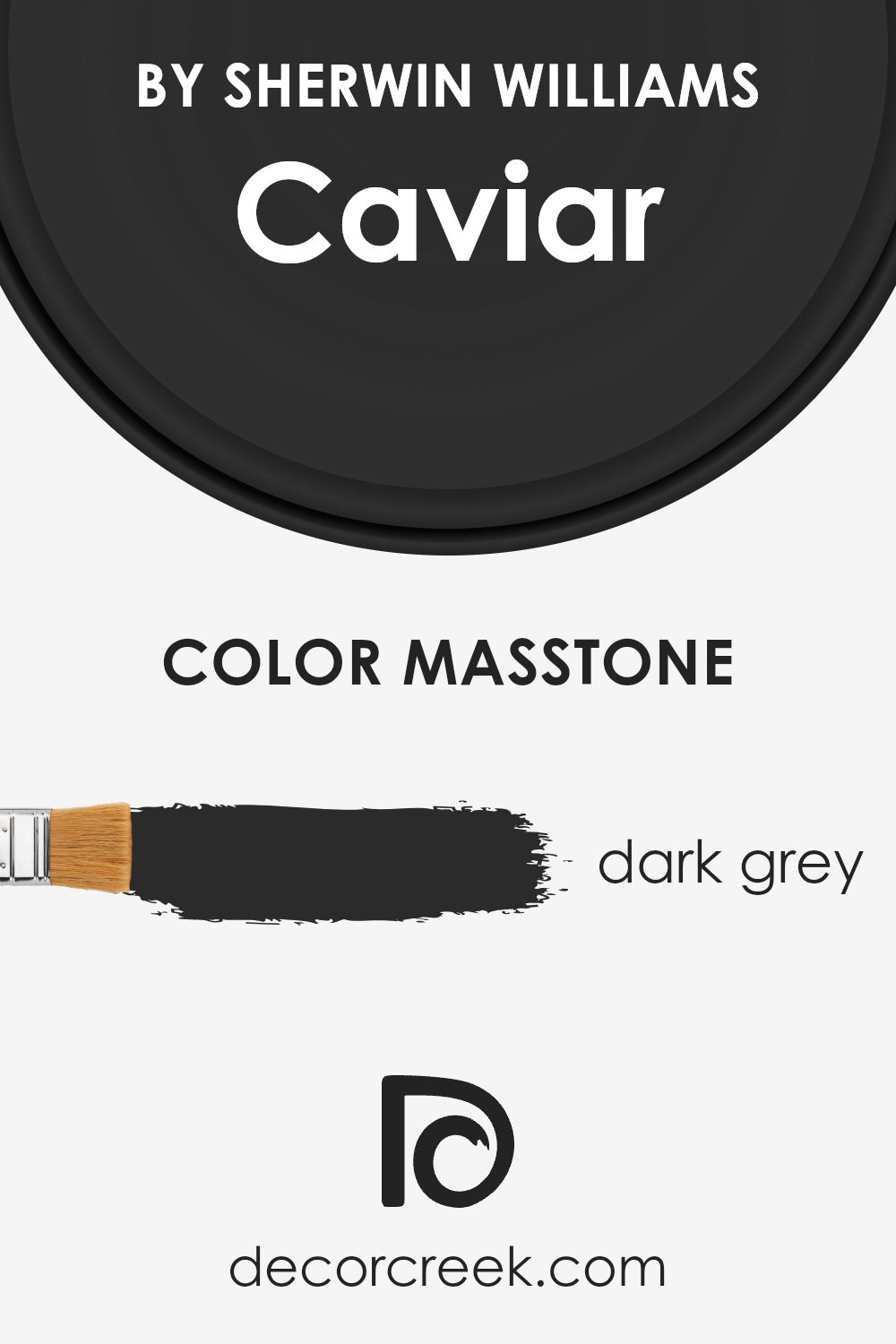
CaviarSW 6990 by Sherwin Williams has a masstone of dark grey, coded as #2B2B2B. This deep grey shade gives a strong, solid feel to any room. It’s ideal for creating a bold statement in living areas or bedrooms. As being such a dark color, it absorbs more light than it reflects, which means it can make small spaces appear smaller.
However, in larger rooms with good natural lighting, the color adds depth and grounds the decor. Homeowners often use it as an accent wall or for highlighting architectural details. It pairs exceptionally well with bright whites or metallics for a sleek, modern look.
Additionally, since dark grey is a neutral color, it works well with most other colors, providing flexibility in decorating without clashing. Overall, this color can give a room a strong presence and a contemporary flair, making it a popular choice for those looking to make a stylish impact in their space.
How Does Lighting Affect Caviar SW 6990 by Sherwin Williams?
Lighting plays a crucial role in how we perceive colors, influencing everything from mood to spatial perception. Different light sources can significantly alter the appearance of a paint color on your walls.
For instance, Caviar, a deep, almost black color with a hint of warm undertones, can show varied characteristics under different lighting conditions. In artificial light, such as that from incandescent bulbs, Caviar tends to appear warmer and more inviting due to the yellowish glow of the bulbs. LED or fluorescent lighting, which can emit a cooler, bluish tone, might make Caviar look sharper and slightly blue-toned.
In natural light, the color’s perception changes throughout the day. Morning light is often soft and warm, making Caviar appear more dynamic and slightly lighter. As the day progresses and the light becomes brighter and more direct, particularly in a south-facing room, the color can look strikingly rich and vivid. As the evening approaches and the light softens, Caviar may return to a softer, more muted black that blends well with the growing shadows.
Room orientation also significantly affects how Caviar is viewed. North-facing rooms can make the color appear cooler and more profound, as the light from the north is often cooler and less direct. This can make the room feel cozier and smaller, a perfect setting for creating a snug reading nook or a dramatic accent wall.
Conversely, in south-facing rooms, where sunlight is abundant for most of the day, Caviar has the potential to look vibrant and powerful, reflecting a bit of the sun’s warmth. This makes it ideal for lively living spaces and kitchens. In east-facing rooms, the morning light can make the color glow warmly, turning cooler as the day progresses. In west-facing rooms, the color will stay relatively neutral during the morning and become intensely warmer in the late afternoon as the sun sets.
Understanding the interplay between light and color, such as with Caviar, helps in choosing the right setting to use it, ensuring the color performs beautifully throughout the day in any room.

What is the LRV of Caviar SW 6990 by Sherwin Williams?
LRV stands for Light Reflectance Value, which measures the percentage of light a paint color reflects. It’s a helpful number to know when choosing paint colors because it indicates how light or dark a color will look once it’s on your walls. A higher LRV means the color reflects more light, making it appear brighter and making a room feel larger. A lower LRV means the color absorbs more light, which can make a space feel cozier but also smaller.
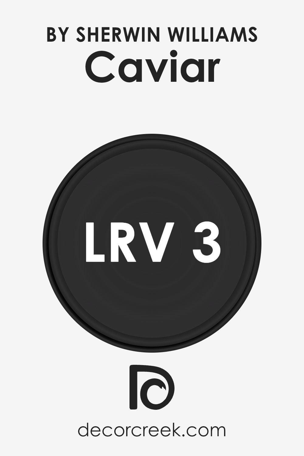
With an LRV of roughly 3, the color in question is quite dark, as it absorbs 97% of light. This makes it a bold choice for interiors, likely to set a dramatic tone wherever it is used. In spaces with limited natural light, using a paint color with such a low LRV can make the room feel enclosed and smaller.
However, in a well-lit or large room, this deep shade can add a layer of warmth and depth, enhancing the room’s aesthetic without making it feel too cramped.
Coordinating Colors of Caviar SW 6990 by Sherwin Williams
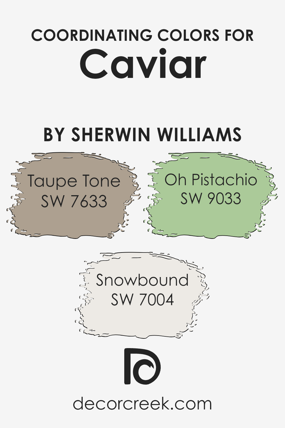
Coordinating colors are shades that complement a main or primary hue, providing balance and harmony in interior design. When combined properly, these colors enhance the aesthetic appeal and bring out the best features of each other. For instance, when dealing with a bold color like Caviar by Sherwin Williams, it’s essential to select coordinating colors that soften or enrich the space without competing for attention.
Taupe Tone is a soft, warm gray that offers a soothing backdrop against more intense colors like Caviar. It has the ability to make rooms feel more inviting and cozy while maintaining a neutral palette. Snowbound, on the other hand, is a crisp, clean white that provides a striking contrast, helping to break up darker elements and introduce brightness into the space, making it feel more open.
Oh Pistachio is a gentle green with a hint of freshness that can introduce a lively yet subtle touch of nature’s calm to any room, creating a pleasant and relaxing atmosphere. Together, these colors work synergistically to create a cohesive look that highlights the richness of Caviar while ensuring the space remains balanced and pleasing to the eye.
You can see recommended paint colors below:
- SW 7633 Taupe Tone (CHECK A SAMPLE)
- SW 7004 Snowbound (CHECK A SAMPLE)
- SW 9033 Oh Pistachio (CHECK A SAMPLE)
What are the Trim colors of Caviar SW 6990 by Sherwin Williams?
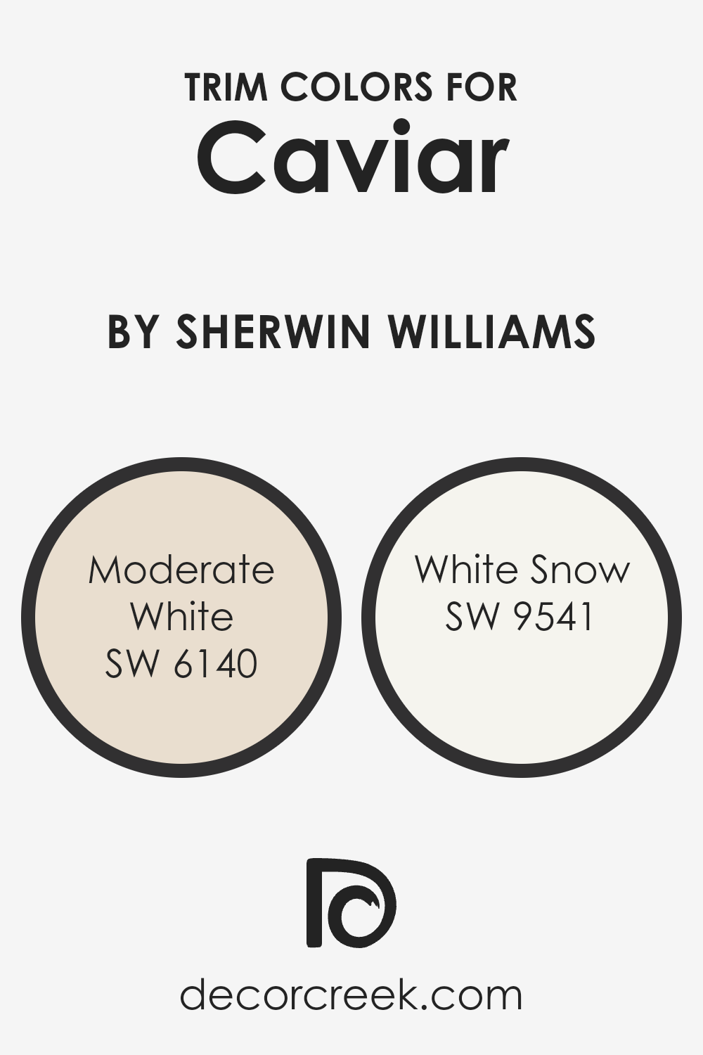
Trim colors are chosen to highlight and accentuate the architectural elements and features of a room, such as door frames, window sills, and baseboards. When used effectively, these colors can define a space and give a polished, finished look to an interior. For a deep, rich hue like Caviar SW 6990 by Sherwin Williams, selecting the right trim colors is crucial to either contrast or complement the main color, affecting the mood and perceived size of the area.
Moderate White SW 6140 is a soft, creamy white that provides a gentle contrast when used as a trim with darker shades like Caviar SW 6990. Its warm undertones can help soften the overall appearance while adding a light, airy feel to the space. On the other hand, White Snow SW 9541 offers a crisper and brighter alternative, creating a striking delineation against deeper and darker wall colors.
This cooler white brings a fresh and clean edge to the room, lending a more distinct separation between the trim and the wall, which can be particularly striking in modern design schemes.
You can see recommended paint colors below:
- SW 6140 Moderate White (CHECK A SAMPLE)
- SW 9541 White Snow (CHECK A SAMPLE)
Colors Similar to Caviar SW 6990 by Sherwin Williams
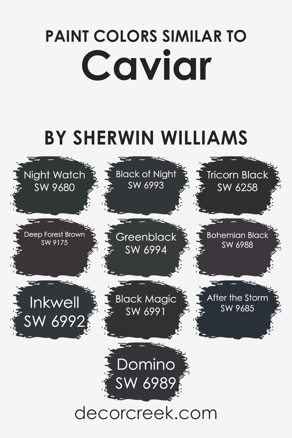
Similar colors play a crucial role in design by creating a harmonious and cohesive look. When colors like Caviar SW 6990 by Sherwin Williams are paired with similar shades, they can enhance the atmosphere of a space without creating a stark contrast.
This smooth transition between colors helps in maintaining a unified aesthetic, making it easier to blend decor and architectural elements seamlessly. For instance, shades such as SW 9680 – Night Watch and SW 9175 – Deep Forest Brown complement Caviar by adding depth with their rich, dark tones.
Using colors like SW 6992 – Inkwell or SW 6989 – Domino alongside Caviar creates a sleek, modern feel, perfect for creating a statement. Similarly, SW 6993 – Black of Night and SW 6994 – Greenblack keep the palette grounded with their deep hues, offering a solid base for any design. SW 6991 – Black Magic and SW 6258 – Tricorn Black provide a classic touch, enhancing the timeless elegance of the space. Shades like SW 6988 – Bohemian Black and SW 9685 – After the Storm offer a subtle variation in the darkness, which can prevent the design from looking flat and add visual interest. Together, these similar colors help in achieving a polished and well-rounded look.
You can see recommended paint colors below:
- SW 9680 Night Watch (CHECK A SAMPLE)
- SW 9175 Deep Forest Brown (CHECK A SAMPLE)
- SW 6992 Inkwell (CHECK A SAMPLE)
- SW 6989 Domino (CHECK A SAMPLE)
- SW 6993 Black of Night (CHECK A SAMPLE)
- SW 6994 Greenblack (CHECK A SAMPLE)
- SW 6991 Black Magic (CHECK A SAMPLE)
- SW 6258 Tricorn Black (CHECK A SAMPLE)
- SW 6988 Bohemian Black (CHECK A SAMPLE)
- SW 9685 After the Storm (CHECK A SAMPLE)
Colors that Go With Caviar SW 6990 by Sherwin Williams
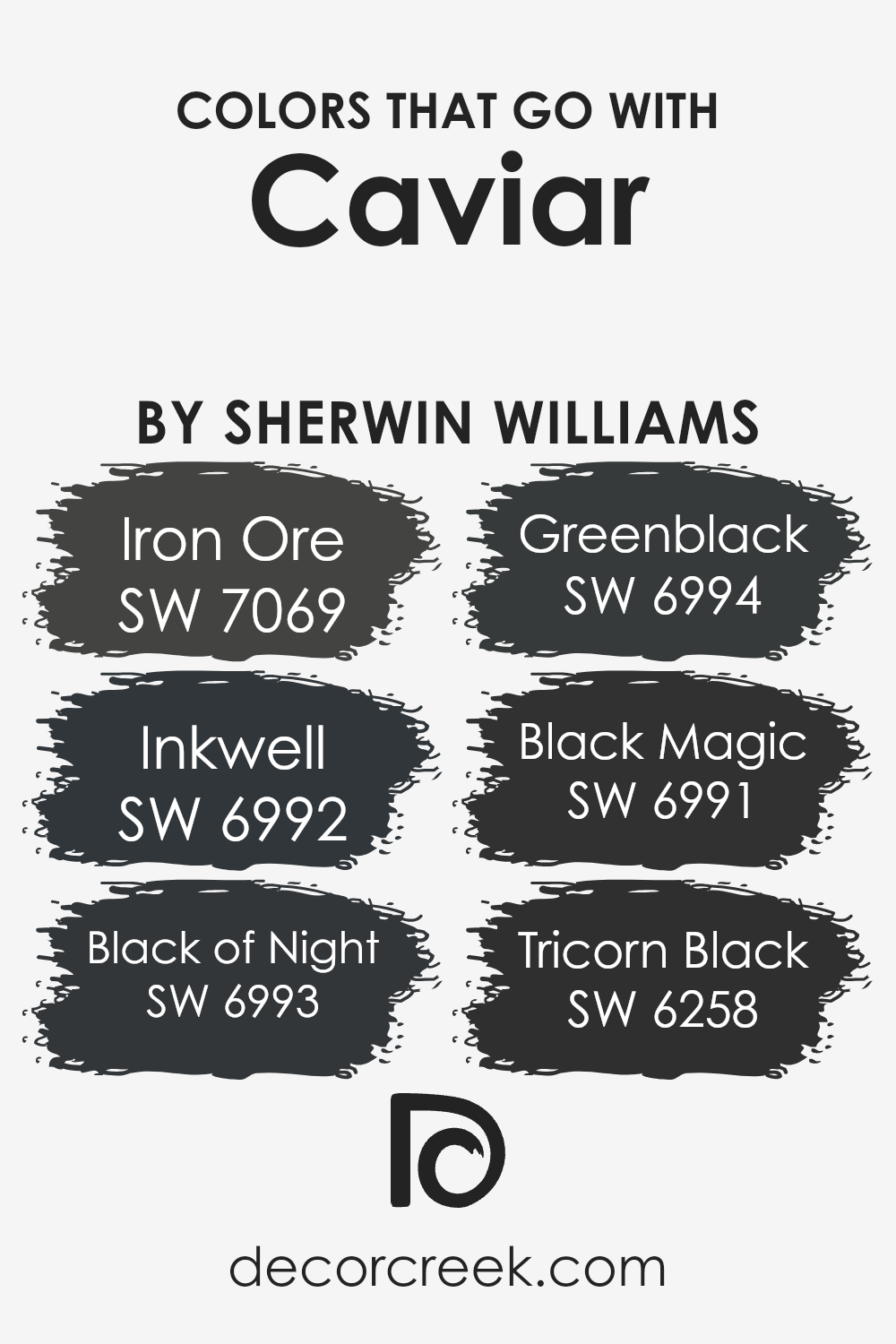
Choosing the right colors to pair with Caviar SW 6990 by Sherwin Williams is crucial for achieving a balanced and harmonious look in your space. Caviar SW 6990 is a deep, nearly black shade that can create a strong statement when used wisely. Complementary colors like Iron Ore, Inkwell, Black of Night, Greenblack, Black Magic, and Tricorn Black each offer unique undertones and depths, allowing for a dynamic yet cohesive color scheme.
These tones work well with Caviar SW 6990, providing subtle variations that can enhance the overall aesthetic without overwhelming the senses.
Iron Ore SW 7069 presents a softer black with grayish undertones, making it a perfect backdrop that doesn’t compete with the starkness of Caviar. Inkwell SW 6992 has a deep blue undertone, giving a nautical feel that pairs nicely with the straightforwardness of Caviar. Black of Night SW 6993 is a true dark shade that complements Caviar without adding contrast.
Greenblack SW 6994 introduces a hint of green, offering a natural element that softens the environment subtly. Black Magic SW 6991 is another robust black but with a mysterious depth that enriches the surroundings. Lastly, Tricorn Black SW 6258 is a classic, solid black that supports the primary color, allowing for a fluid design flow.
These colors, when used together, ensure a visually appealing palette that enhances the space while maintaining a cohesive look.
You can see recommended paint colors below:
- SW 7069 Iron Ore (CHECK A SAMPLE)
- SW 6992 Inkwell (CHECK A SAMPLE)
- SW 6993 Black of Night (CHECK A SAMPLE)
- SW 6994 Greenblack (CHECK A SAMPLE)
- SW 6991 Black Magic (CHECK A SAMPLE)
- SW 6258 Tricorn Black (CHECK A SAMPLE)
How to Use Caviar SW 6990 by Sherwin Williams In Your Home?
If you’re looking to bring some boldness into your home, Caviar SW 6990 by Sherwin Williams is an excellent choice. This deep, rich black can add dramatic flair and make other colors pop beautifully when used as an accent wall. It’s perfect for creating a striking feature in your living room or dining area. You can pair it with bright whites or soft pastels for a stunning contrast that really stands out.
Caviar is also great for furniture rejuvenation. Imagine an old coffee table or bookshelf painted in this intense black—it instantly becomes a statement piece. This color isn’t just for big items; you can use it for smaller accents like picture frames or decorative vases to add depth to your room’s decor.
If you have a small space, like a powder room or an entryway, painting it in Caviar can make the area look more refined and put-together. It’s a color that holds its own, meaning you don’t need too many other elements to create a memorable space. Add some complementary artwork or a mirror with a light-colored frame, and your stylish spot is all set!
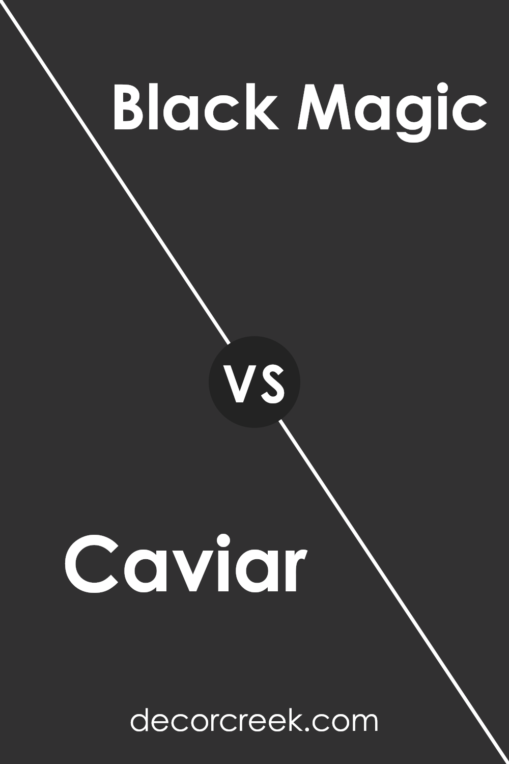
Caviar SW 6990 by Sherwin Williams vs Black Magic SW 6991 by Sherwin Williams
The two paint colors, Caviar and Black Magic, both by Sherwin Williams, are quite similar at first glance, both being variations of black. Caviar has a soft, slightly warmer undertone which makes it versatile and favorable for creating a cozy atmosphere. It’s perfect for a space where you want depth without the starkness of a true black.
On the other hand, Black Magic presents itself with a purer, more straightforward black shade. This color suitable for making bold statements in a space, lending a clean and concise backdrop that highlights other colors or décor elements. While both colors are great for adding drama and elegance, the choice between them depends on the desired effect: warmer and subtler with Caviar or bold and direct with Black Magic.
You can see recommended paint color below:
- SW 6991 Black Magic (CHECK A SAMPLE)
Caviar SW 6990 by Sherwin Williams vs After the Storm SW 9685 by Sherwin Williams
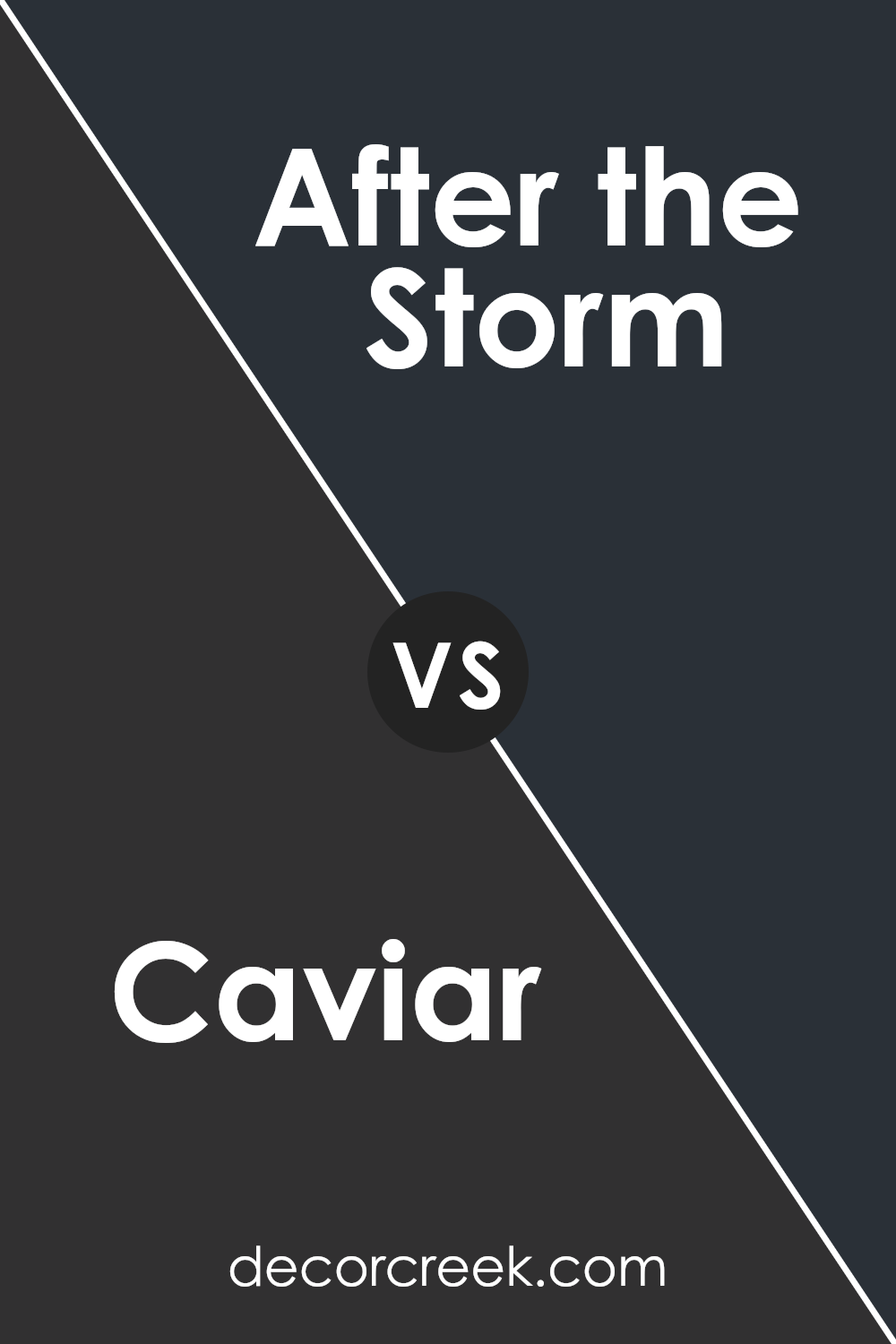
Caviar and After the Storm, both by Sherwin Williams, offer distinctly different vibes for any space. Caviar is a deep, almost black shade that brings a strong and bold feel to a room. It’s perfect for creating a dramatic statement or accentuating a modern look in your home.
On the other hand, After the Storm is a softer, mid-tone gray that gives off a calm and gentle atmosphere. It is ideal for relaxing spaces like bedrooms or living areas where a soothing effect is desired.
While Caviar leans towards a striking and powerful ambiance, After the Storm is more about creating a peaceful and gentle setting. Both colors are versatile but serve very different purposes depending on the mood you want to achieve.
You can see recommended paint color below:
- SW 9685 After the Storm (CHECK A SAMPLE)
Caviar SW 6990 by Sherwin Williams vs Deep Forest Brown SW 9175 by Sherwin Williams
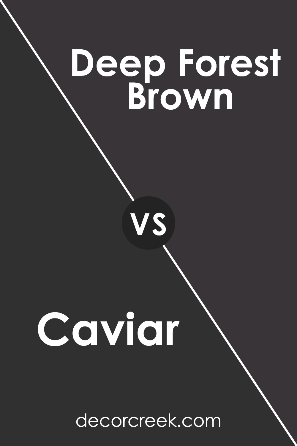
Caviar SW 6990 and Deep Forest Brown SW 9175 are two rich, dark colors by Sherwin Williams, each bringing its own unique vibe to interior spaces. Caviar is a deep, almost black shade that gives a bold and strong presence. It works great for creating dramatic accents in a room or when used on cabinets or doors for a striking contrast against lighter walls.
On the other hand, Deep Forest Brown is a dark brown that resembles the natural hues found in a dense forest. This color is warmer than Caviar, offering a cozy and inviting feel. It’s perfect for spaces where you want to add depth and warmth, making rooms feel more grounded and secure.
While both colors are dark, Caviar leans towards a cooler tone, and Deep Forest Brown moves towards a warmer palette. Depending on the atmosphere you want to create, Caviar might be better for modern and sleek looks, while Deep Forest Brown suits rustic and earthy environments.
You can see recommended paint color below:
- SW 9175 Deep Forest Brown (CHECK A SAMPLE)
Caviar SW 6990 by Sherwin Williams vs Tricorn Black SW 6258 by Sherwin Williams
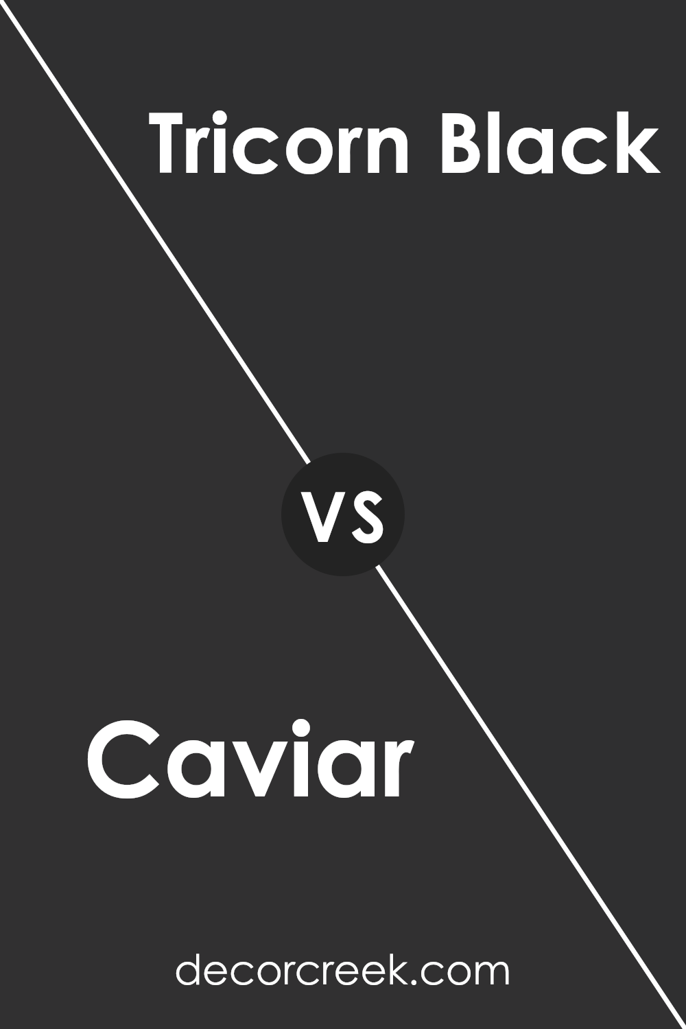
Caviar SW 6990 and Tricorn Black SW 6258 are both dark shades by Sherwin Williams, but they offer subtle differences in tone and depth. Caviar is a deep, rich black with hints of charcoal, adding a touch of warmth to its appearance. This makes it a great choice for spaces where you want depth without the starkness of pure black.
On the other hand, Tricorn Black is a true, strong black. It has no visible undertones, making it cleaner and more classic. This color is perfect for creating a bold statement and works well in a modern setting or when a sharp contrast is desired.
While both colors are suitable for accent walls, doors, or exterior trim, Caviar’s slightly softer edges might be preferable in a home setting for a more welcoming feel. In contrast, Tricorn Black is ideal for achieving a crisp, timeless look in various spaces.
You can see recommended paint color below:
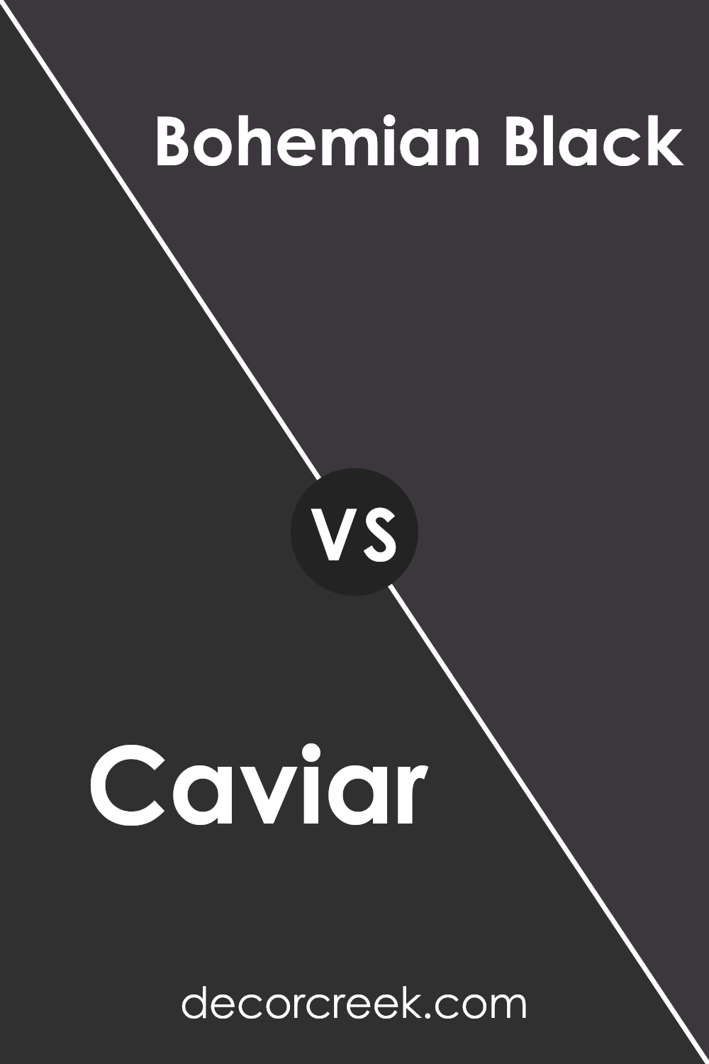
Caviar SW 6990 by Sherwin Williams vs Bohemian Black SW 6988 by Sherwin Williams
Caviar SW 6990 and Bohemian Black SW 6988, both by Sherwin Williams, are unique shades of black that offer subtle differences in their appearance. Caviar is a true black that provides a strong, deep presence on walls, making it perfect for creating a bold statement in any room. It pairs well with various colors, adding a solid and grounding effect to spaces it’s used in.
On the other hand, Bohemian Black has a slightly softer edge, often appearing as a very dark charcoal under certain lighting conditions. This color is ideal for those who prefer a less intense version of black that still adds depth and character to a room.
Both colors are versatile and can be used effectively in various design styles, from modern to traditional, depending on how they’re applied and what other design elements they are paired with. However, Caviar leans towards a more classic black appeal, while Bohemian Black offers a gentler alternative for black, adding warmth without overwhelming spaces with too much darkness.
You can see recommended paint color below:
- SW 6988 Bohemian Black (CHECK A SAMPLE)
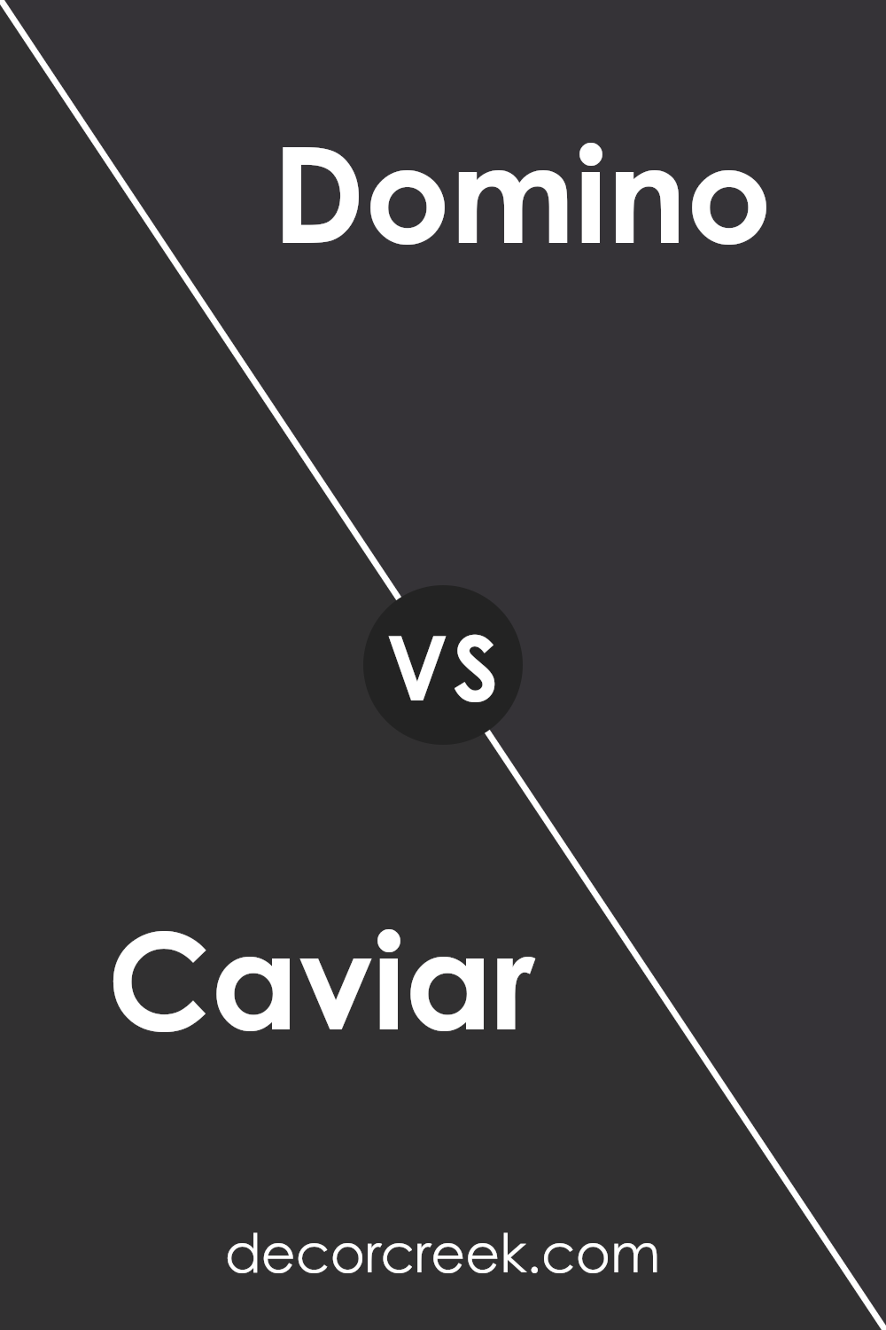
Caviar SW 6990 by Sherwin Williams vs Domino SW 6989 by Sherwin Williams
The main color, Caviar, and the second color, Domino, both by Sherwin Williams, offer distinct tones perfect for various décor styles. Caviar is a deep, nearly black shade that brings a rich and bold essence to any space. It’s ideal for creating strong, dramatic accents in rooms or on exteriors.
In contrast, Domino is a slightly lighter black that provides a subtler, softer approach compared to Caviar. It too delivers a strong presence but without the intensity of Caviar. While Caviar suits spaces where a pronounced, striking contrast is desired, Domino works well where you might want a gentler but still powerful backdrop.
Both colors can help create a modern, cozy feel, and they pair beautifully with bright or muted tones, depending on the desired impact. They are perfect for anyone wanting to add a touch of elegance without using truly black hues.
You can see recommended paint color below:
- SW 6989 Domino (CHECK A SAMPLE)
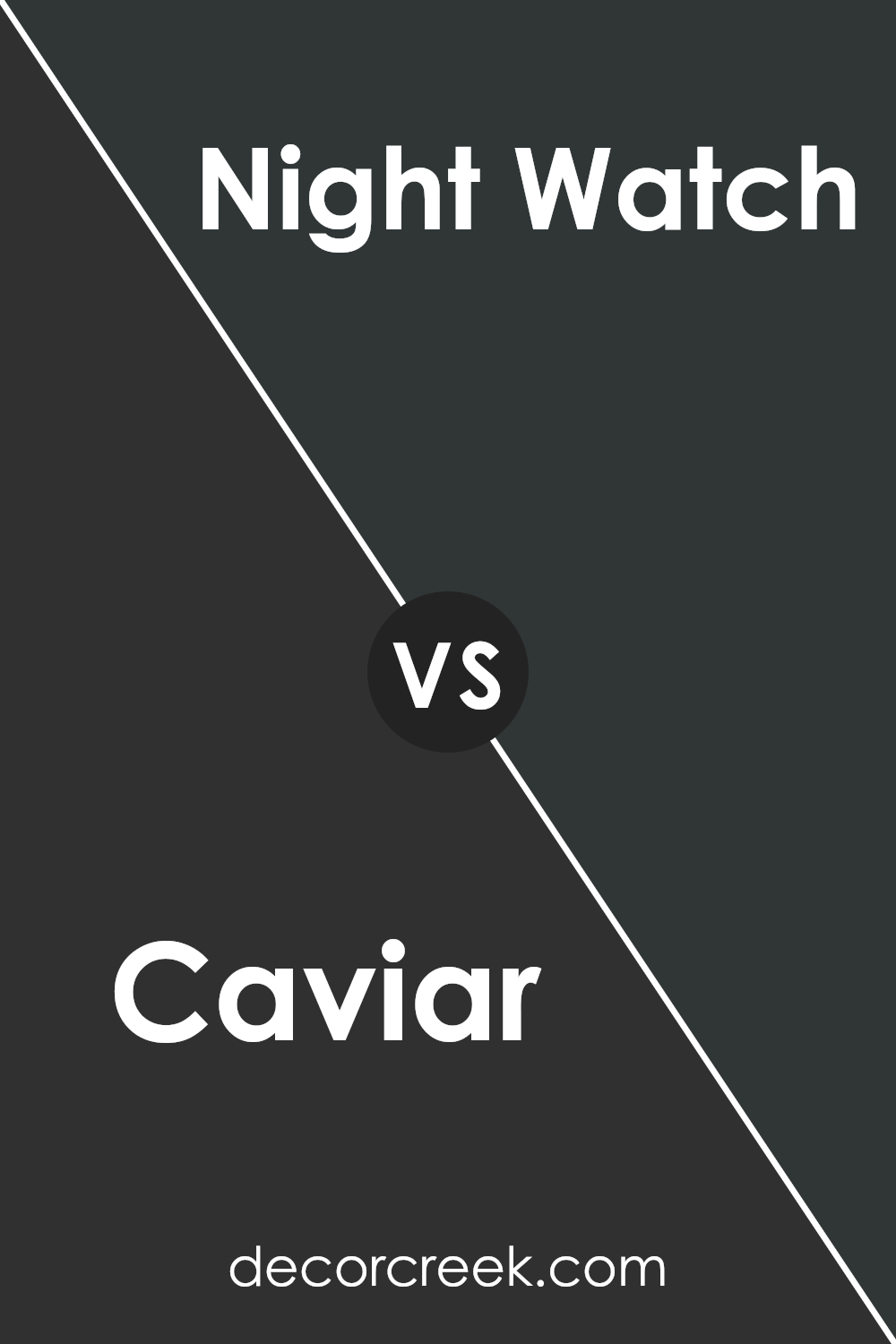
Caviar SW 6990 by Sherwin Williams vs Night Watch SW 9680 by Sherwin Williams
Caviar SW 6990 and Night Watch SW 9680 are both dark, rich colors from Sherwin Williams, but they offer distinct vibes due to their different undertones. Caviar is a deep, true black that provides a strong and bold feel, perfect for making a dramatic statement in a space. It can make other colors pop when used as a background or create a cozy, enveloping feel in a room.
On the other hand, Night Watch is not just deep but also has a hint of green, giving it a slightly natural and refreshing feel compared to the starkness of Caviar. This color can be a great choice for spaces where you want to add depth while keeping a touch of natural elements, making it ideal for offices or dens that benefit from a more grounded, calming look.
Both colors are excellent choices for adding drama and depth to a room, but the choice between a pure deep black and a nuanced green-black depends on the desired mood and style.
You can see recommended paint color below:
- SW 9680 Night Watch (CHECK A SAMPLE)
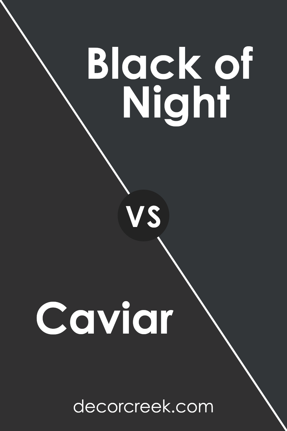
Caviar SW 6990 by Sherwin Williams vs Black of Night SW 6993 by Sherwin Williams
Caviar SW 6990 and Black of Night SW 6993, both by Sherwin Williams, are deep, dark colors that are almost black. Caviar has a warm undertone, making it feel cozy and welcoming, despite its darkness. It’s perfect for creating a snug, inviting space. On the other hand, Black of Night has a cooler undertone, giving it a sharper, more modern edge.
This makes it a great choice for a sleek, contemporary look.
When deciding between the two, consider the mood and style you want for your room. Caviar is better for a traditional or comfortable setting, while Black of Night suits a more modern or minimalistic design. Both colors provide a strong background that makes other colors pop, so accessories in bright colors would stand out against either backdrop.
You can see recommended paint color below:
- SW 6993 Black of Night (CHECK A SAMPLE)
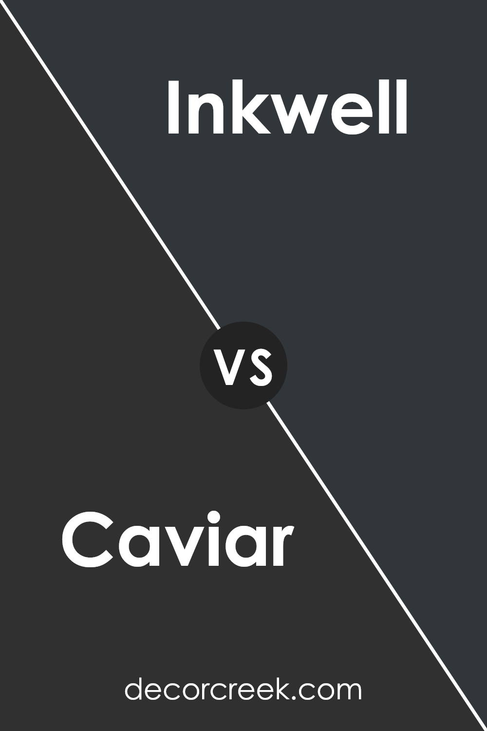
Caviar SW 6990 by Sherwin Williams vs Inkwell SW 6992 by Sherwin Williams
Caviar SW 6990 and Inkwell SW 6992 are two dark shades from Sherwin Williams, each with its distinct vibe. Caviar is a deep, rich black with a warm undertone, making it a cozy choice for spaces where you want some depth and comfort. It’s an ideal color for creating a strong, solid feel in a room without making it feel too tight or overwhelming.
On the other hand, Inkwell is a deep blue-black shade that leans more towards a navy tone. It’s a great alternative to true black, offering a hint of color while still retaining the drama and intensity of a dark hue. Inkwell can add a touch of mystery and charm to a space, perfect for an accent wall or cabinets.
Between the two, Caviar is warmer and more neutral, making it highly versatile for various décor styles. Inkwell, with its bluish tinge, provides a unique twist on traditional black and works well in settings that benefit from a bit of color without straying too far from classic choices.
You can see recommended paint color below:
Caviar SW 6990 by Sherwin Williams vs Greenblack SW 6994 by Sherwin Williams
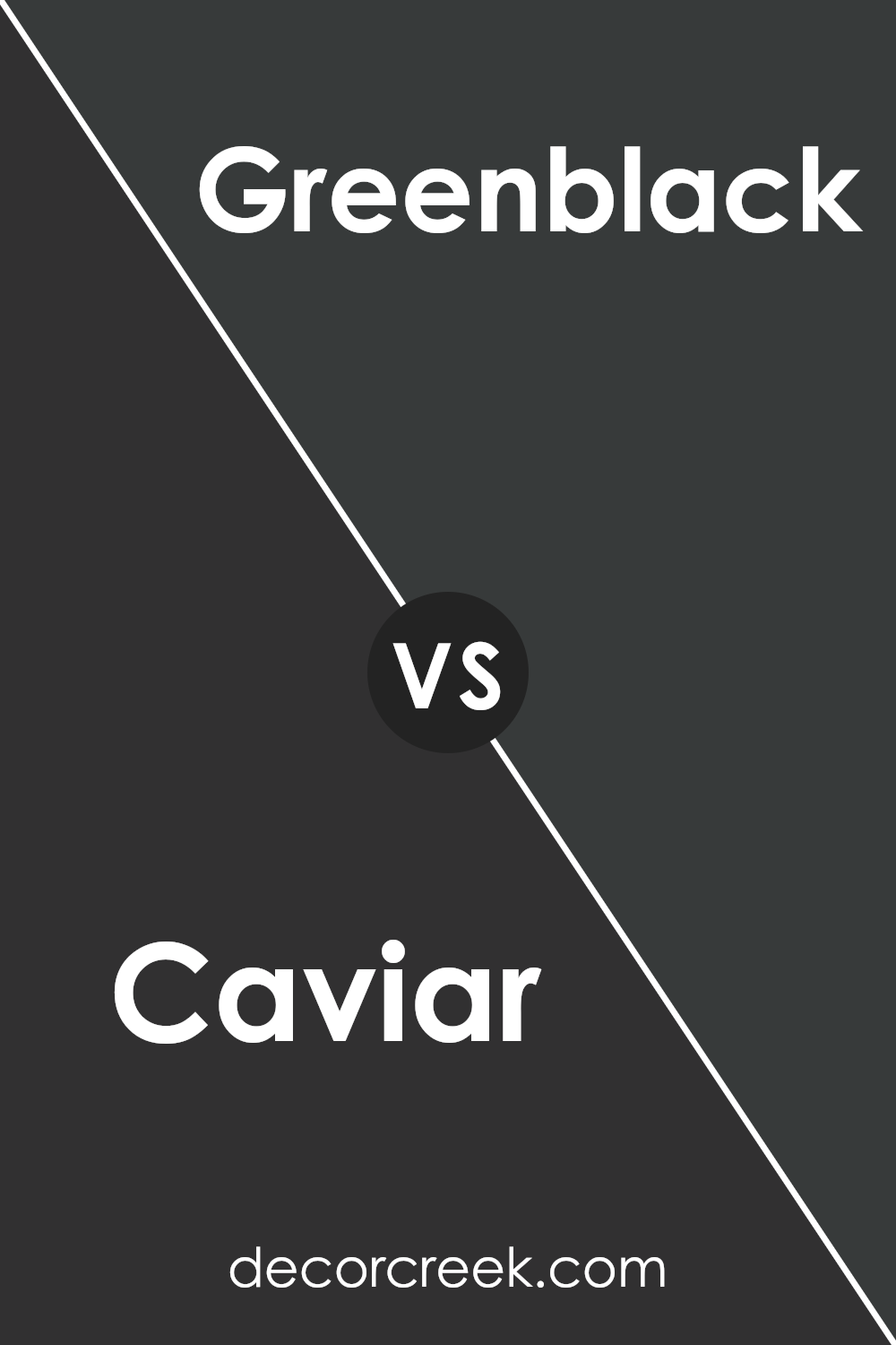
Caviar SW 6990 and Greenblack SW 6994 by Sherwin Williams are both deep, dark colors that provide a strong visual impact. Caviar is a very dark shade of gray, almost black, that brings a bold and classic feel to spaces. It’s perfect for creating dramatic and elegant environments, often used on accent walls or for cabinetry.
On the other hand, Greenblack, as the name suggests, is a dark color that blends black with subtle hints of green. This unique combination adds a slight natural feel to its primarily dark hue, making it ideal for spaces where you want to add depth along with a touch of nature-inspired subtlety.
Both colors are well-suited for modern interiors and can work beautifully in both residential and commercial settings. They pair well with bright whites or lighter tones for a striking contrast.
You can see recommended paint color below:
Conclusion
In wrapping up my thoughts about SW 6990 Caviar by Sherwin Williams, I think it’s clear this color is a solid choice if you want your room to have a cozy and sophisticated look. Caviar is a very dark shade, almost black, which can make any space feel more intimate and warm.
It works perfectly for making big rooms seem less empty or giving small areas a touch of elegance.
Caviar can be mixed with lighter colors like whites or grays to create a nice balance. Also, when you use shiny furniture or decorations, Caviar makes them pop out even more, giving your room a unique style. But remember, it’s a dark color, so it is better to use it in spaces where there’s enough light, so the room doesn’t feel too cramped or gloomy.
Overall, using SW 6990 Caviar is like adding a black-tie jacket to your room—it makes everything look more polished and put together. If you’re thinking of repainting, and you like things to look classy, then you should definitely consider this color. It adds a lot of character and warmth to any space, making it feel like a cozy retreat.
Ever wished paint sampling was as easy as sticking a sticker? Guess what? Now it is! Discover Samplize's unique Peel & Stick samples.
Get paint samples


