In the ever-evolving world of interior and exterior design, color selection stands as a pivotal decision in defining the ambiance and personality of a space. Sherwin Williams, a titan in the paint industry, offers a palette that caters to a wide variety of tastes and design philosophies.
Among its esteemed collection, SW 7069 Iron Ore emerges as a standout shade, embodying depth, sophistication, and versatility. This dark, charcoal gray paint color exudes a strong presence, making it an ideal choice for those seeking to make a bold statement in their design endeavors.
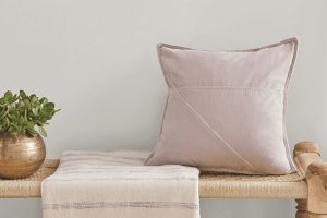
Iron Ore is not just about the strong statement it makes; it’s also celebrated for its flexibility in complementing various styles and themes. Whether applied to the exterior to enhance the architectural details of a home or used indoors to create a cozy, enveloping feel, Iron Ore adjusts beautifully to its surroundings.
Its popularity among designers and homeowners alike speaks volumes about its adaptability and the unique charm it brings to spaces.
In this article, we will delve deeper into the allure of SW 7069 Iron Ore by Sherwin Williams, exploring its usage in different settings, tips for pairing it with other colors, and its effect on the mood of a space.
Join us as we uncover the reasons behind Iron Ore’s growing acclaim in the world of design, making it a go-to shade for those looking to impart a touch of elegance and drama to their environment.

What Color Is Iron Ore SW 7069 by Sherwin Williams
Iron Ore by Sherwin Williams is a rich, deep gray hue with subtle charcoal undertones that exude sophistication and timeless appeal. This color embodies the essence of strength and elegance, making it a perfect choice for those aspiring to incorporate a bold yet refined aesthetic into their interiors.
Its versatility allows it to blend seamlessly with various design palettes, from minimalistic and modern to rustic and industrial styles. Iron Ore works exceptionally well in living spaces, bedrooms, and home offices, providing a striking backdrop that accentuates the architecture of the space and the beauty of the furnishings within it.
When considering interior styles, Iron Ore is particularly adept at enhancing contemporary and industrial motifs, given its profound depth that parallels the raw materials commonly found in these designs, such as metal, concrete, and reclaimed wood.
It also harmonizes beautifully with Scandinavian decor when paired with light woods and soft textiles, creating a cozy yet chic atmosphere.
In terms of materials and textures, this color forms an exquisite partnership with natural elements like exposed brick, leather, and linen, enriching the sensory experience of a room. When juxtaposed with metallic accents in copper or gold, Iron Ore elevates the overall aesthetic, imparting a luxurious feel.
For a cohesive look, smooth matte finishes or soft, plush textures in furnishings provide a delightful contrast with its deep, matte nature, making your space feel both inviting and visually dynamic.
Ever wished paint sampling was as easy as sticking a sticker? Guess what? Now it is! Discover Samplize's unique Peel & Stick samples.
Get paint samples

Is Iron Ore SW 7069 by Sherwin Williams Warm or Cool color?
Iron Ore by Sherwin Williams is a captivating and deeply saturated color that brings a sense of sophistication and dramatic flair to any space. This impactful shade, though nearly black, carries an underlying complexity that prevents it from feeling too stark or overwhelming.
Its nuanced composition allows it to adapt seamlessly to a variety of lighting conditions, displaying subtle shifts in hue that can range from a soft charcoal to a rich, deep slate depending on the surrounding natural and artificial light sources.
Incorporating Iron Ore into home interiors offers a bold statement, whether applied as an accent wall, on cabinetry, or throughout an entire room. This versatility enables designers and homeowners alike to use it in a myriad of ways, from creating a cozy, enveloping atmosphere in a bedroom to presenting a striking contrast against white trim or light furniture in living spaces.
The color’s inherent richness adds depth and elegance, making rooms feel more grounded and thoughtfully curated.
Furthermore, Iron Ore’s adaptability extends to various design styles, from modern minimalism to rustic chic, demonstrating its ability to elevate a space without overpowering it. Its powerful presence works harmoniously with natural materials, such as wood and stone, enhancing their textures and colors.
This dynamic quality ensures that Iron Ore continues to be a popular choice for adding both warmth and drama to home interiors.
Undertones of Iron Ore SW 7069 by Sherwin Williams
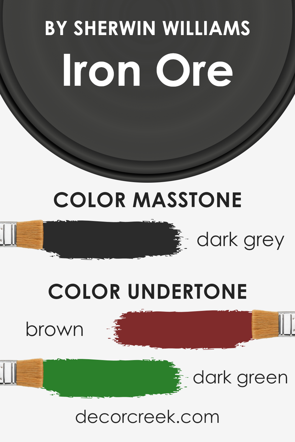
The color Iron Ore, a subtle and sophisticated shade, carries nuanced undertones that influence its perception and application in interior spaces. Specifically, it embraces brown (#802B2B) and dark green (#2B802B) undertones. These undertones play a pivotal role in the color’s versatility and depth, contributing to its unique character.
Undertones affect the way we see colors, adding complexity and dimension. They can alter the color’s appearance under different lighting conditions, making it appear cooler or warmer. For Iron Ore, the brown undertones inject a grounding warmth, creating a cozy and inviting atmosphere.
This warmth allows the color to resonate well in spaces that aim for a snug, comfortable vibe. On the other hand, the dark green undertones introduce a hint of nature-inspired tranquility, offering a subtle connection to the natural world. This can make spaces feel more peaceful and balanced.
When applied to interior walls, the undertones of Iron Ore offer a rich backdrop that complements a wide range of decor styles and palettes. In natural light, the green undertones might become more pronounced, giving the room a serene, earthy feel.
Conversely, in artificial light, the brown undertones may emerge, enhancing the space with a sense of warmth and depth. This duality allows Iron Ore to be extremely adaptable, capable of creating different moods and styles within the same space as the day transitions into night.
What is the Masstone of the Iron Ore SW 7069 by Sherwin Williams?
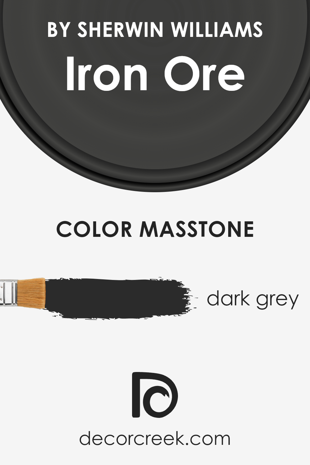
Iron Ore by Sherwin Williams presents a masstone of dark grey, symbolized by the hexadecimal color code #2B2B2B. This deeply saturated shade offers an almost charcoal-like appearance, infusing spaces with a robust character and a touch of sophistication. The inherent darkness of this hue makes it exceptionally versatile in home decor, allowing it to serve as a grounding element in various settings.
It can transform an ordinary room into a dramatic, moody space when applied to walls or create a bold statement when used on cabinetry or doors. Its ability to absorb light lends a cozy feel to larger areas, making spaces seem warmer and more inviting despite its cool undertone.
This unique characteristic of dark grey enables it to blend seamlessly with a wide range of color palettes, from bright and vibrant tones to more muted and natural shades, offering endless possibilities for creating cohesive and appealing interior spaces.
How Does Lighting Affect Iron Ore SW 7069 by Sherwin Williams
Lighting plays a pivotal role in how we perceive color in our surroundings, significantly impacting both its intensity and hue. The phenomenon where lighting conditions affect our perception of color is especially noticeable when discussing paint colors, such as the refined shade known as Iron Ore.
This deep, rich gray possesses unique undertones that can subtly shift under different lighting conditions, showcasing the complexity of its character in various environments.
In artificial light, Iron Ore tends to appear bolder and more pronounced. Depending on the color temperature of the artificial lighting (warmer or cooler), this shade may lean slightly towards a warmer charcoal or a cooler slate, highlighting different facets of its personality.
Artificial lighting can sharpen and define its depth, making it an excellent choice for spaces aiming for a statement with elegance and sophistication.
Under natural light, Iron Ore transforms in a manner that truly showcases its versatility. Natural sunlight allows for the full spectrum of its undertones to be visible. In rooms with ample sunlight, such as those facing south, the color can appear slightly lighter and may even reveal subtle hints of its complex undertones.
In contrast, in north-facing rooms, which receive cooler, indirect light, Iron Ore can appear as a more consistent, stately gray, emphasizing its solidity and depth.
East and west-facing rooms introduce a dynamic aspect to Iron Ore due to the changing quality of light throughout the day. In east-facing rooms, morning light can illuminate the color, softening it slightly and allowing it to playfully reveal its warmth as the sun rises.
Conversely, in west-facing rooms, the evening light can cast a golden hue, enriching the color and giving it a distinctive, almost burnished quality towards sunset.
In summary, Iron Ore’s ability to adapt and morph under various lighting conditions is a testament to its depth and versatility as a color choice.
Whether under the crisp clarity of artificial light or the ever-changing ambiance of natural light, this shade navigates the spectrum of its identities, from bold and striking to subtly nuanced, making it a perennial favorite for those seeking sophistication in their spaces.
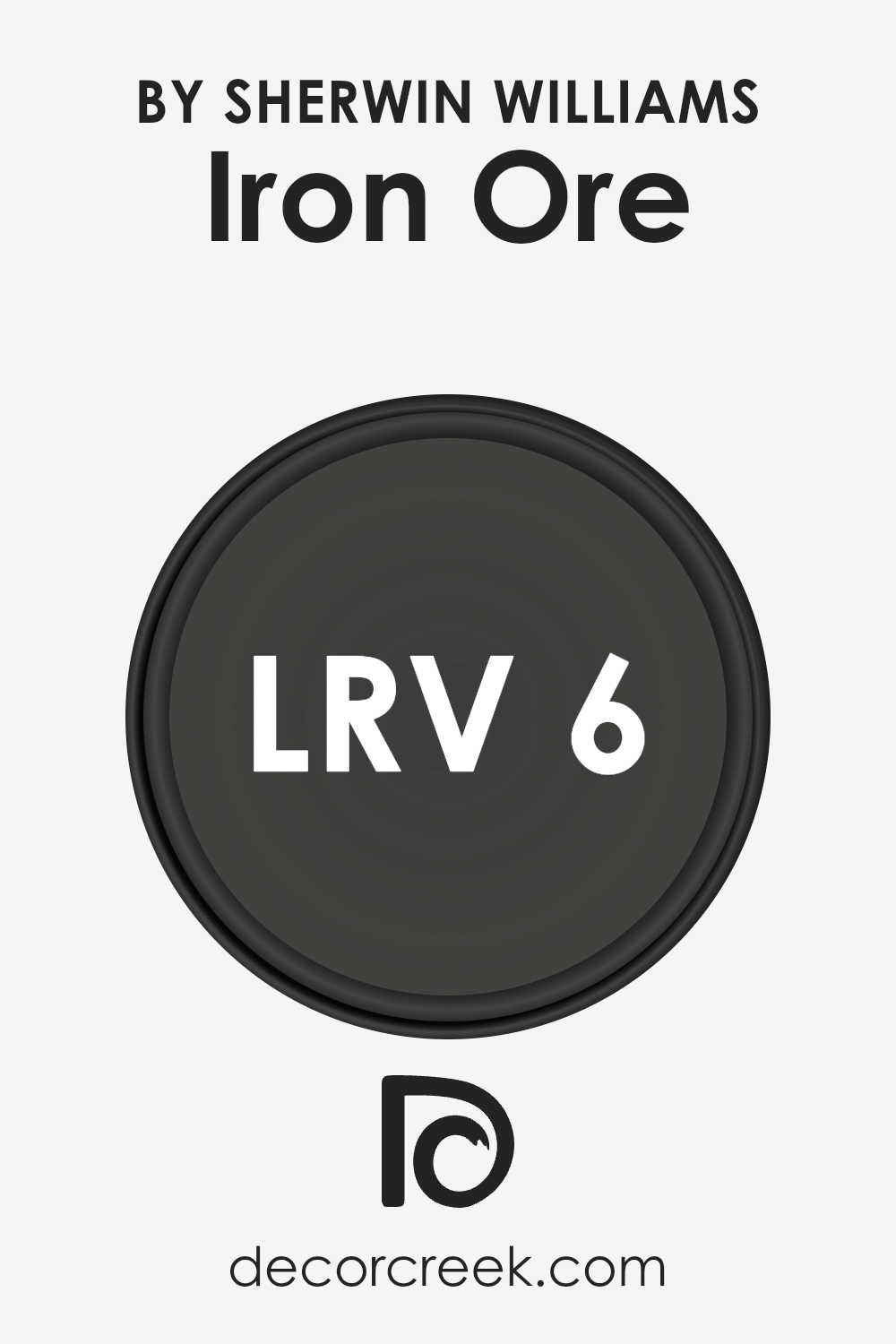
What is the LRV of Iron Ore SW 7069 by Sherwin Williams
Light Reflectance Value, or LRV, is a metric used to measure the percentage of visible and usable light reflected from a surface when illuminated by a light source. This value ranges from 0% to 100%, with 0% being perfectly black (absorbing all light) and 100% being perfectly white (reflecting all light).
The LRV of a color significantly influences both its appearance and functionality in a space.
For instance, colors with higher LRVs make spaces appear larger and more open by reflecting more light, making them ideal for small rooms or spaces with limited natural light. Conversely, colors with lower LRVs absorb more light, creating a cozy or more intimate atmosphere but can make a space feel smaller or darker.
Specifically, with an LRV of 5.55, this deep, rich color absorbs a significant amount of light, lending it an intensity and depth that can dramatically transform a space. This low LRV means it doesn’t reflect much light, making it a bold choice that adds character and sophistication.
However, when using this color on walls, it’s important to consider the room’s natural lighting and size.
In well-lit or larger spaces, it can create a strong, grounding effect without overwhelming the space. In smaller or poorly lit rooms, it should be used judiciously, as it can make the space appear even smaller or darker. Accent walls or lighter-colored trim can help balance the depth of this color, preventing it from overpowering the room while still delivering its unique aesthetic impact.
LRV – what does it mean? Read This Before Finding Your Perfect Paint Color
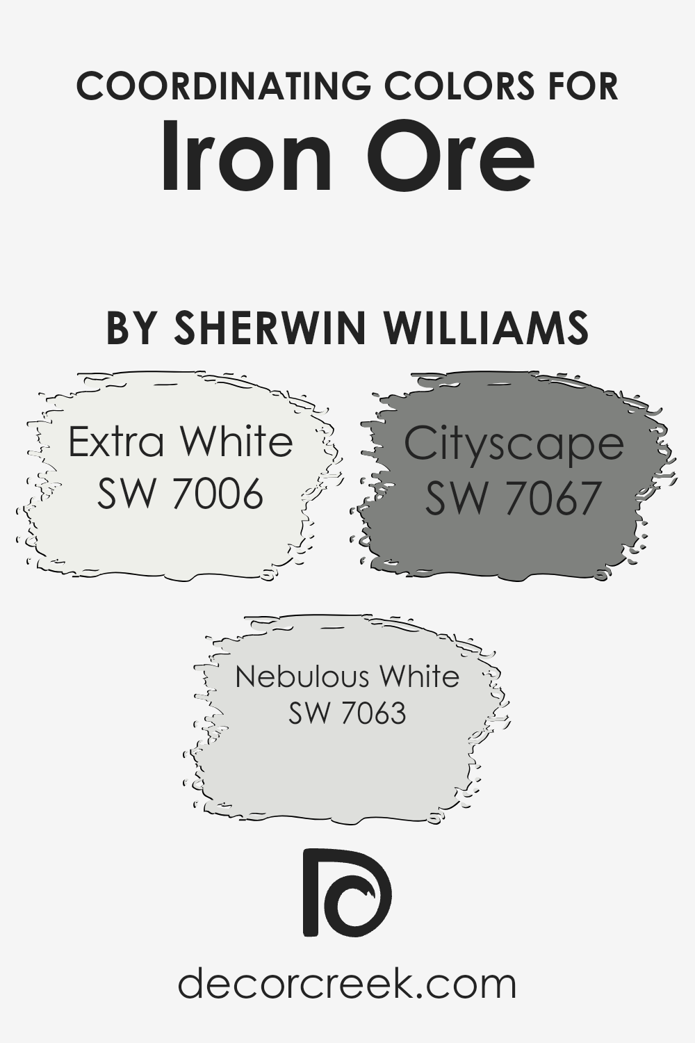
Coordinating Colors of Iron Ore SW 7069 by Sherwin Williams
Coordinating colors are hues that complement each other and work together to enhance the overall aesthetic of a space, ensuring that no color clashes with another. These colors are selected based on their ability to support and balance the primary color in question, in this case, Iron Ore SW 7069 by Sherwin-Williams, a deep, dark gray with a rich tone.
They bring out the best in the primary color, adding depth and layers to the design. When used thoughtfully, coordinating colors can create a cohesive look that is visually appealing and harmonious.
Extra White SW 7006, Nebulous White SW 7063, and Cityscape SW 7067 serve as excellent coordinating colors for Iron Ore. Extra White, with its crisp and clean look, offers a striking contrast that makes the deep tones of Iron Ore stand out, perfect for trim or ceilings to offer a fresh, contemporary look.
Nebulous White, a soft, airy gray, bridges the gap between the starkness of Extra White and the depth of Iron Ore, providing a gentle transition that helps create a serene and inviting atmosphere. Lastly, Cityscape, a mid-tone gray, shares a subtle connection with Iron Ore, ensuring a sophisticated and balanced backdrop that allows for versatility in decorating.
These coordinating colors, when used together, craft a space that feels thoughtfully designed and beautifully executed.
You can see recommended paint colors below:
- SW 7006 Extra White
- SW 7063 Nebulous White
- SW 7067 Cityscape
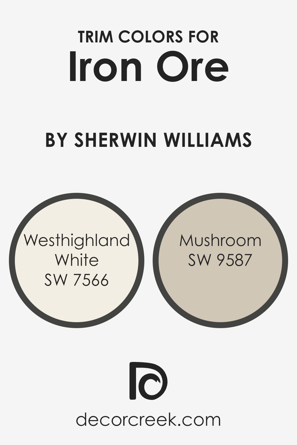
What are the Trim colors of Iron Ore SW 7069 by Sherwin Williams
Trim colors play a vital role in accentuating the architectural features and overall aesthetic of a home, especially when paired with a distinctive base color like Iron Ore by Sherwin Williams. This deep, rich gray possesses an almost magnetic allure, providing a dramatic backdrop that highlights trim work.
When selecting trim colors, it’s crucial to choose shades that complement the base color while adding the desired level of contrast. This ensures that features such as door frames, window casings, and molding are both accentuated and harmonious with the home’s primary color scheme, creating a visually appealing exterior or interior space.
Westhighland White (SW 7566) and Mushroom (SW 9587) serve as exemplary trim colors for Iron Ore due to their harmonious balance with the base color. Westhighland White offers a crisp, clean look that can brighten the edges around Iron Ore, drawing the eye to the home’s architectural details without overwhelming the senses.
Its pure and airy quality can inject lightness around doors and windows, offering a fresh contrast. Mushroom, on the other hand, provides a warmer, earthy contrast to Iron Ore’s cool undertones. This nuanced shade adds a soft, organic touch to the trim, ensuring that the transitions between the deep gray of Iron Ore and the trim are smooth and visually appealing.
By selecting either of these trim colors, homeowners can amplify the aesthetic appeal and character of their space, highlighting the beauty of Iron Ore while ensuring the home’s details pop with refined elegance.
You can see recommended paint colors below:
- SW 7566 Westhighland White
- SW 9587 Mushroom
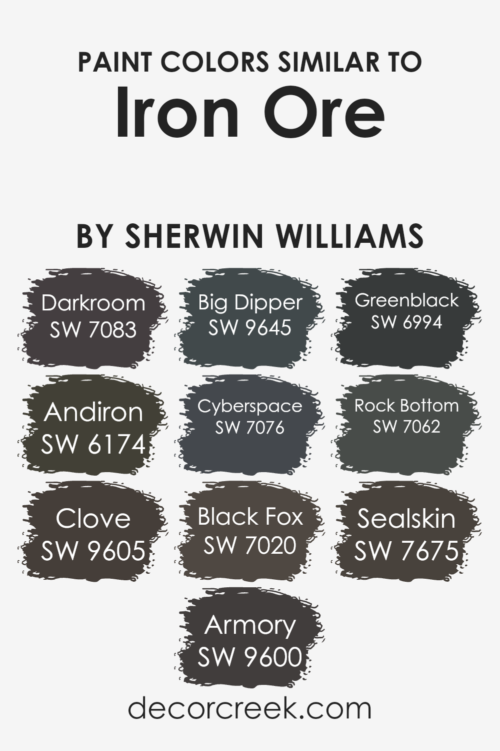
Colors Similar to Iron Ore SW 7069 by Sherwin Williams
Similar colors play a crucial role in design, creating a sense of harmony and balance while allowing for depth and dimension. For example, variations akin to Iron Ore by Sherwin Williams provide a palette that is both versatile and profoundly rich, enabling designers to craft spaces that feel cohesive yet dynamic.
These shades, ranging from deep charcoals to muted blacks with hints of colors, work together by offering subtle contrasts that can elevate a space’s sophistication without overwhelming it with too stark differences.
Darkroom adds a moody, contemplative quality with its deep gray hues, evoking a sense of tranquility and depth. Andiron, slightly lighter, bridges the gap between gray and black, offering a soft, yet impactful alternative. Clove introduces a hint of warmth, bringing in an earthy, inviting feel.
Armory, with its deep gray presence, hints at a metallic inspiration, adding a touch of industrial charm. Big Dipper, slightly brighter, injects a lively yet refined energy into spaces.
Cyberspace dives into the depths of near-black, enriched with subtle nuances of blue. Black Fox, on the other hand, exudes elegance with its rich, dark brown undertones. Greenblack stands out with its unique blend of black and green, offering an organic, grounding effect.
Rock Bottom brings a foundational strength with its solid, dark gray character. Lastly, Sealskin enriches the palette with its luxurious, deep chocolate brown, adding layers of warmth and sophistication.
Together, these colors create a symphony of shades that can transform spaces into nuanced, captivating environments.
You can see recommended paint colors below:
- SW 7083 Darkroom
- SW 6174 Andiron
- SW 9605 Clove
- SW 9600 Armory
- SW 9645 Big Dipper
- SW 7076 Cyberspace
- SW 7020 Black Fox
- SW 6994 Greenblack
- SW 7062 Rock Bottom
- SW 7675 Sealskin
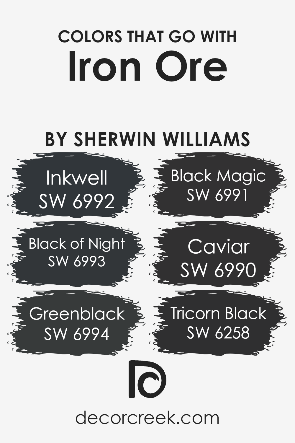
Colors that Go With Iron Ore SW 7069 by Sherwin Williams
Choosing the right colors to complement Iron Ore SW 7069 by Sherwin Williams is crucial for creating a sophisticated and cohesive look. Iron Ore is a deep, rich gray that serves as a versatile backdrop, offering a dramatic yet elegant appearance.
When paired with colors like SW 6992 – Inkwell, a deep blue with a hint of charcoal, it adds a layer of depth and complexity to the space. Similarly, SW 6993 – Black of Night, which is a true, deep black, provides a bold contrast, making Iron Ore appear more dynamic while maintaining a refined atmosphere.
Additionally, SW 6994 – Greenblack, a unique blend of deep green and black, introduces an earthy element when paired with Iron Ore, creating a natural and serene vibe.
SW 6991 – Black Magic offers a slightly softer black with a smooth finish, adding a subtle variation to the palette that enhances the overall aesthetic without overwhelming it. For those seeking an even darker hue, SW 6990 – Caviar, the darkest of these options, brings an unmatched intensity and sophistication, further accentuating Iron Ore’s inherent elegance.
Lastly, SW 6258 – Tricorn Black serves as a classic, pure black that can ground the scheme and tie the other colors together, ensuring a harmonious and stylish result.
Together, these colors work alongside Iron Ore to craft spaces that are both inviting and striking, proving the importance of selecting the right complementary shades.
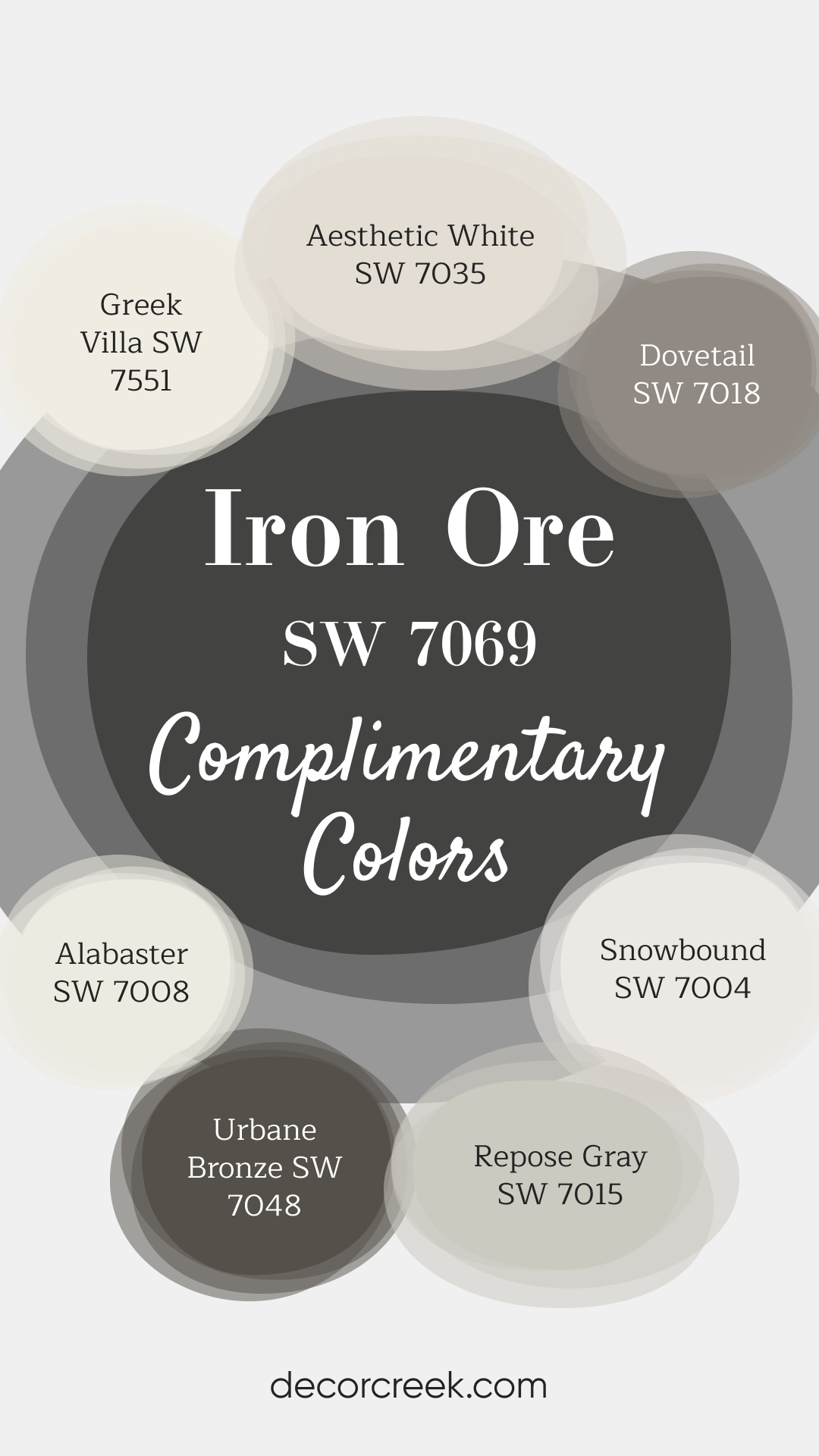
Complimentary Colors for Iron Ore SW 7069 Paint Color by Sherwin Williams
Iron Ore is perfect for adding a bold, rich touch to your home. Pair it with lighter tones like Alabaster or Snowbound to brighten up the room and create a fresh, crisp feel. Dovetail and Repose Gray bring in a neutral element that complements both dark and light accents, adding balance and sophistication to your space. For a warmer look, Aesthetic White and Greek Villa provide a welcoming, light feel. Urbane Bronze can be used as an accent color to bring in even more depth, making your home feel modern yet timeless. These colors offer flexibility, whether you’re looking for contrast or harmony.
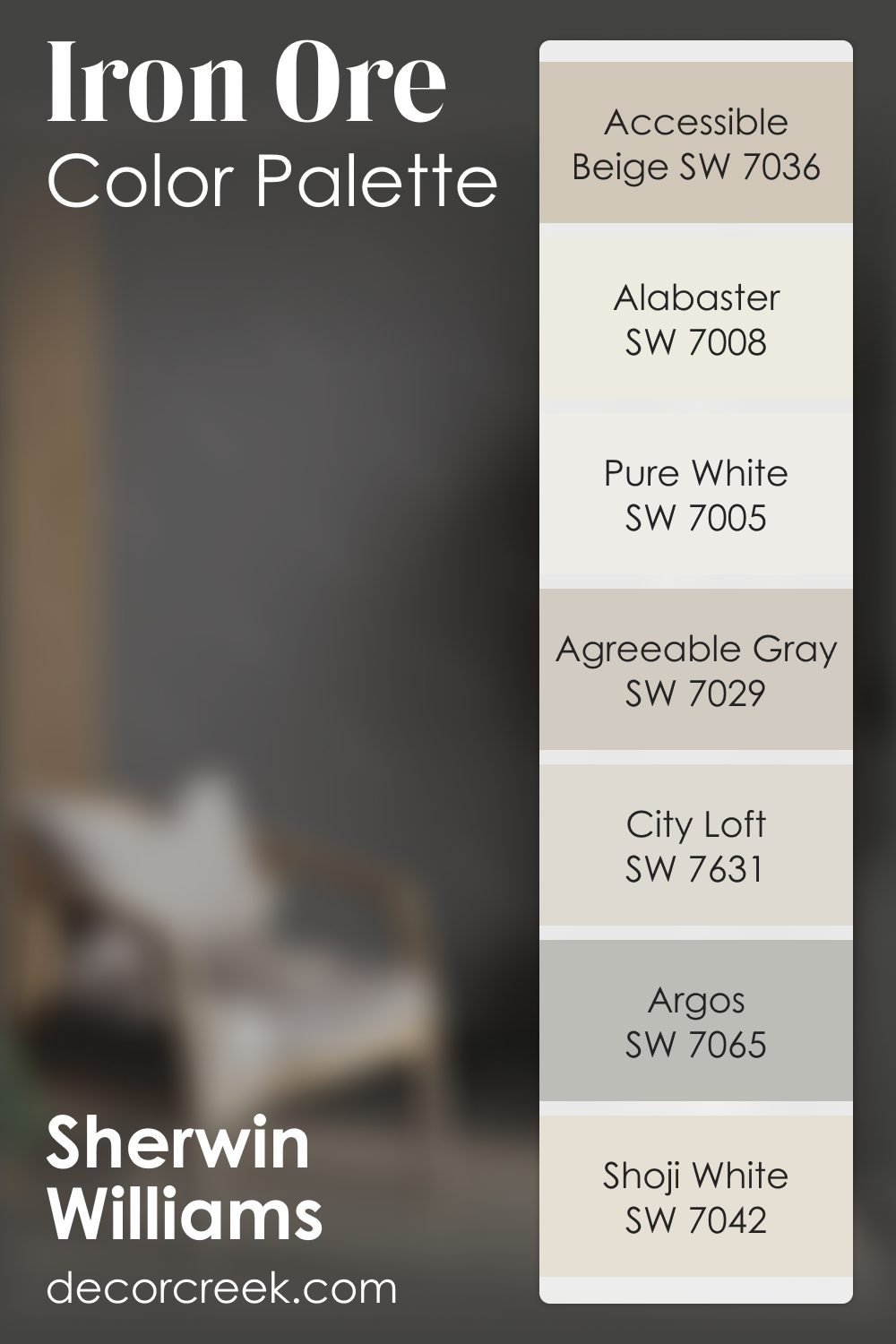
Iron Ore SW 7069 by Sherwin Williams Color Palette
Iron Ore adds bold depth and a strong, steady presence to any space, instantly grounding the room with its rich tone. It brings a quiet confidence that sets the stage for the rest of the palette.
Alabaster and Pure White brighten the palette and soften the contrast, adding clean light that balances Iron Ore’s intensity.
City Loft and Shoji White add gentle transitions, helping the palette move smoothly from dark to light.
Accessible Beige warms the palette with a natural softness, while Agreeable Gray adds balance that ties everything together.
Argos introduces a cool, subtle undertone that finishes the palette with a refined touch. Together, these shades create a strong yet welcoming combination that feels grounded, warm, and thoughtfully layered.
How to Use Iron Ore SW 7069 by Sherwin Williams In Your Home?
Iron Ore is a versatile and sophisticated color from Sherwin Williams that offers an unmatched depth and richness to any space. This deep charcoal with hints of gray strikes a perfect balance between boldness and understated elegance, making it an excellent choice for those looking to infuse their home with a sense of drama and allure.
When it comes to its application, Iron Ore can transform a variety of spaces.
It’s particularly stunning when used on exterior trim, bringing a modern edge to traditional and contemporary homes alike. Inside, it can serve as a striking accent wall in living rooms or bedrooms, providing a perfect backdrop for art or contrasting brightly colored decor.
For a cohesive look, consider using it on interior doors and cabinetry, where it adds a layer of sophistication and depth. Its versatility also extends to smaller projects, such as furniture makeovers, where it can give pieces a chic, updated appearance.
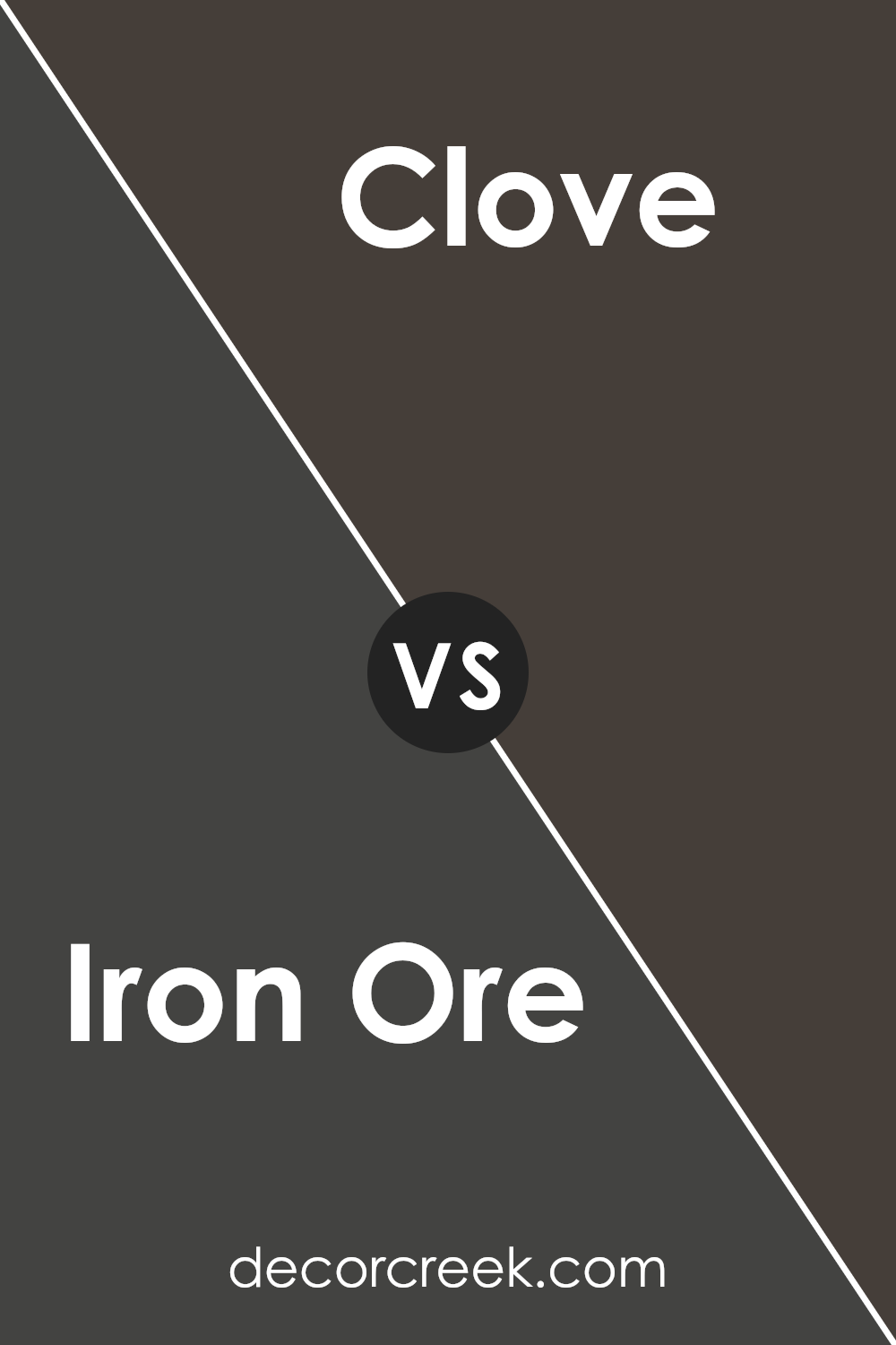
Iron Ore SW 7069 by Sherwin Williams vs Clove SW 9605 by Sherwin Williams
Iron Ore and Clove, both by Sherwin Williams, present intriguing yet contrasting color choices for various design themes. Iron Ore exudes a strong, deep, and almost velvety charcoal gray tone that resonates with boldness and sophistication. It’s a versatile color that can bring a sense of drama and elegance to spaces, perfect for accent walls or as a striking base for exteriors.
On the other hand, Clove offers a warm, inviting, and earthy hue that leans towards a rich brown with subtle reddish undertones.
This color encapsulates warmth and coziness, making it ideal for creating a welcoming and comfortable atmosphere in living areas, bedrooms, or dining spaces. While Iron Ore acts as an anchor, offering depth and definition, Clove envelops a room in warmth, suggesting an embrace.
Together, they could complement each other in a space, with Clove softening the starkness of Iron Ore, or they can stand alone, each asserting its unique ambiance and mood.
You can see recommended paint color below:
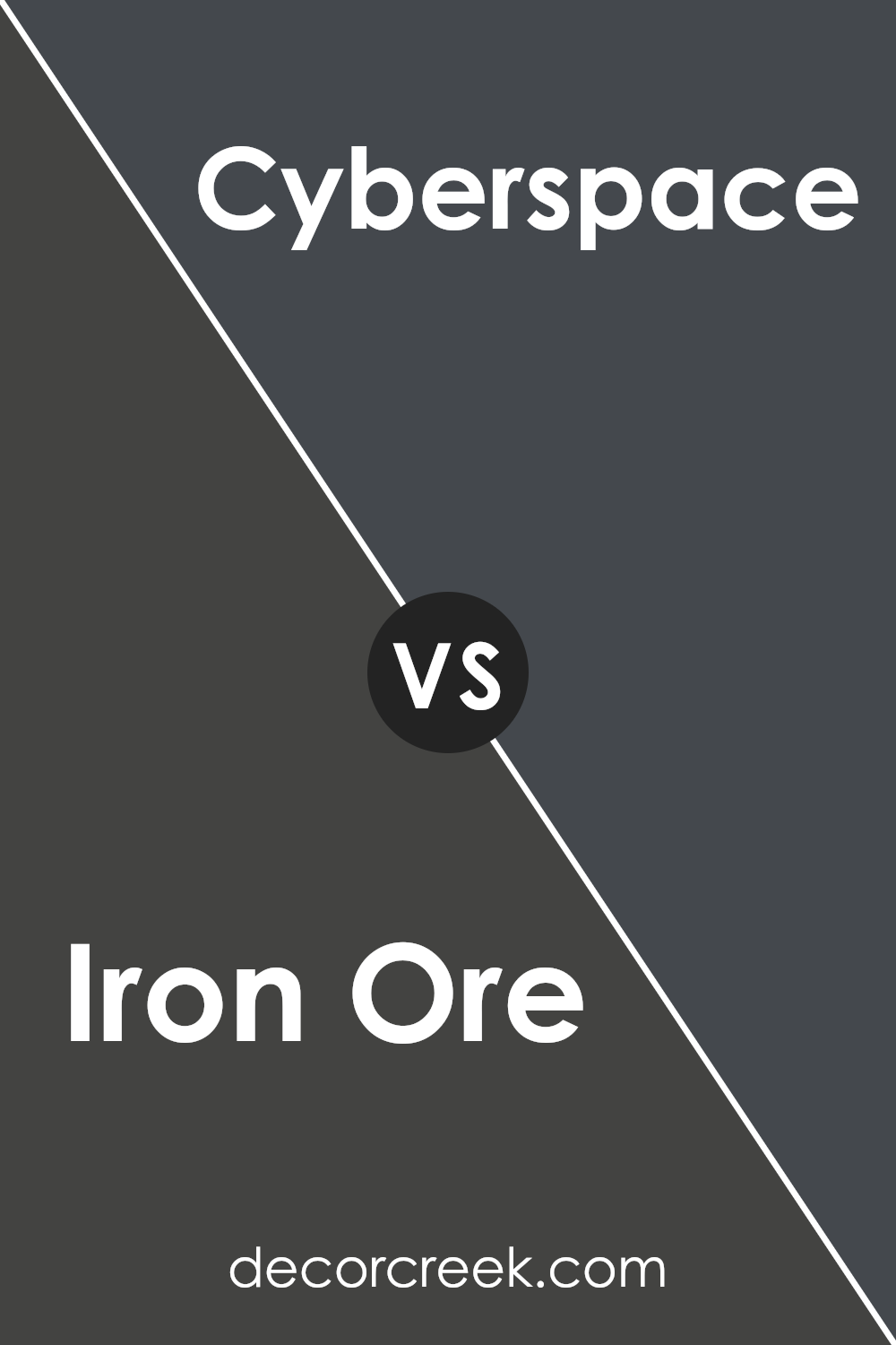
Iron Ore SW 7069 by Sherwin Williams vs Cyberspace SW 7076 by Sherwin Williams
Iron Ore and Cyberspace, both from Sherwin Williams, offer deeply rich hues that can add sophistication and depth to any space. Iron Ore is a dark gray, almost charcoal color, that carries an earthy, organic feel. It’s remarkably versatile, able to serve as a bold statement wall or as an accent, providing a grounding effect in a room.
This color can work well in a variety of design styles, from modern minimalist to rustic farmhouse.
Meanwhile, Cyberspace presents a shade closer to navy, with a subtle, sophisticated undercurrent of slate. This color leans a bit cooler than Iron Ore, offering a serene, calming presence that pairs beautifully with warm woods and metallic finishes.
It’s ideal for creating a striking backdrop in a study or living room, inviting reflection and stillness.
Both colors exemplify elegance and are capable of transforming spaces with their deep, absorbing qualities. The choice between them hinges on the desired ambiance: Iron Ore instills a solid, earthen warmth, while Cyberspace brings a tranquil, contemplative coolness.
You can see recommended paint color below:
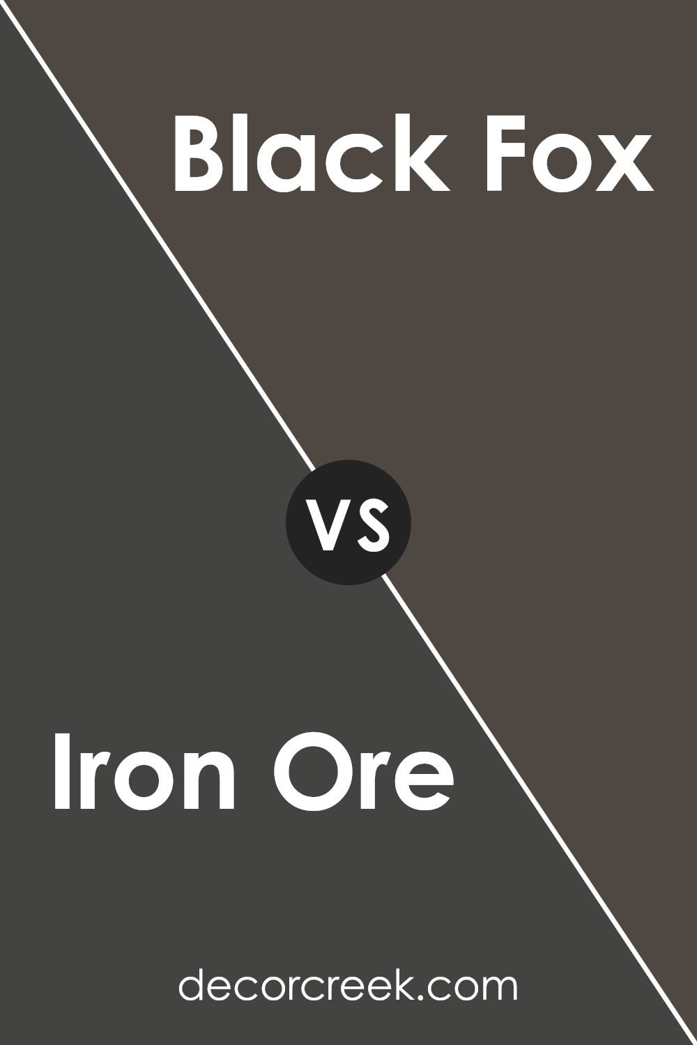
Iron Ore SW 7069 by Sherwin Williams vs Black Fox SW 7020 by Sherwin Williams
Iron Ore and Black Fox, both by Sherwin Williams, present unique nuances in the realm of dark, sophisticated colors. Iron Ore tends toward a softer, charcoal undertone, making it a versatile option for spaces seeking depth without the starkness of pure black.
Its slight warmth allows it to blend harmoniously with a variety of palettes, adding a refined touch to interiors or exteriors.
On the other hand, Black Fox carries a deeper, almost velvety richness, veering closer to a true black while still retaining an accessible warmth. This shade is particularly effective in creating dramatic, cozy environments, ideal for accent walls or cabinetry that command attention.
The subtle difference in their underlying tones—Iron Ore leaning slightly cooler compared to the warmer, fuller body of Black Fox—can significantly affect the ambiance of a room, making the choice between them dependent on the desired aesthetic effect and lighting conditions.
You can see recommended paint color below:
- SW 7020 Black Fox
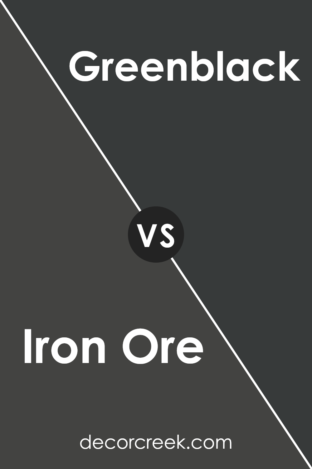
Iron Ore SW 7069 by Sherwin Williams vs Greenblack SW 6994 by Sherwin Williams
Iron Ore and Greenblack, both from Sherwin Williams, present a sophisticated palette, yet tell distinctly different color stories. Iron Ore exudes strength and depth, a rich, dark gray with slight undertones of brown, giving it a warm and inviting depth despite its boldness. Its versatility makes it an excellent choice for both interior and exterior applications, perfect for crafting spaces that speak of elegance and timeless charm.
In contrast, Greenblack dives into a deeper, more mysterious territory. This color, while equally bold, leans towards a dark, almost black hue with subtle green undertones that emerge in certain lighting conditions.
This unique blend makes it an intriguing choice for those looking to inject a sense of nature-inspired sophistication into their spaces.
Together, these colors could complement each other in a design, using Iron Ore as a grounding element while Greenblack provides a lush, enigmatic contrast that recalls the depth of a dense forest at night. Each brings its own character to a palette, offering a harmony between the familiar warm embrace of dark gray and the intriguing, deep allure of green-inflected black.
You can see recommended paint color below:
- SW 6994 Greenblack
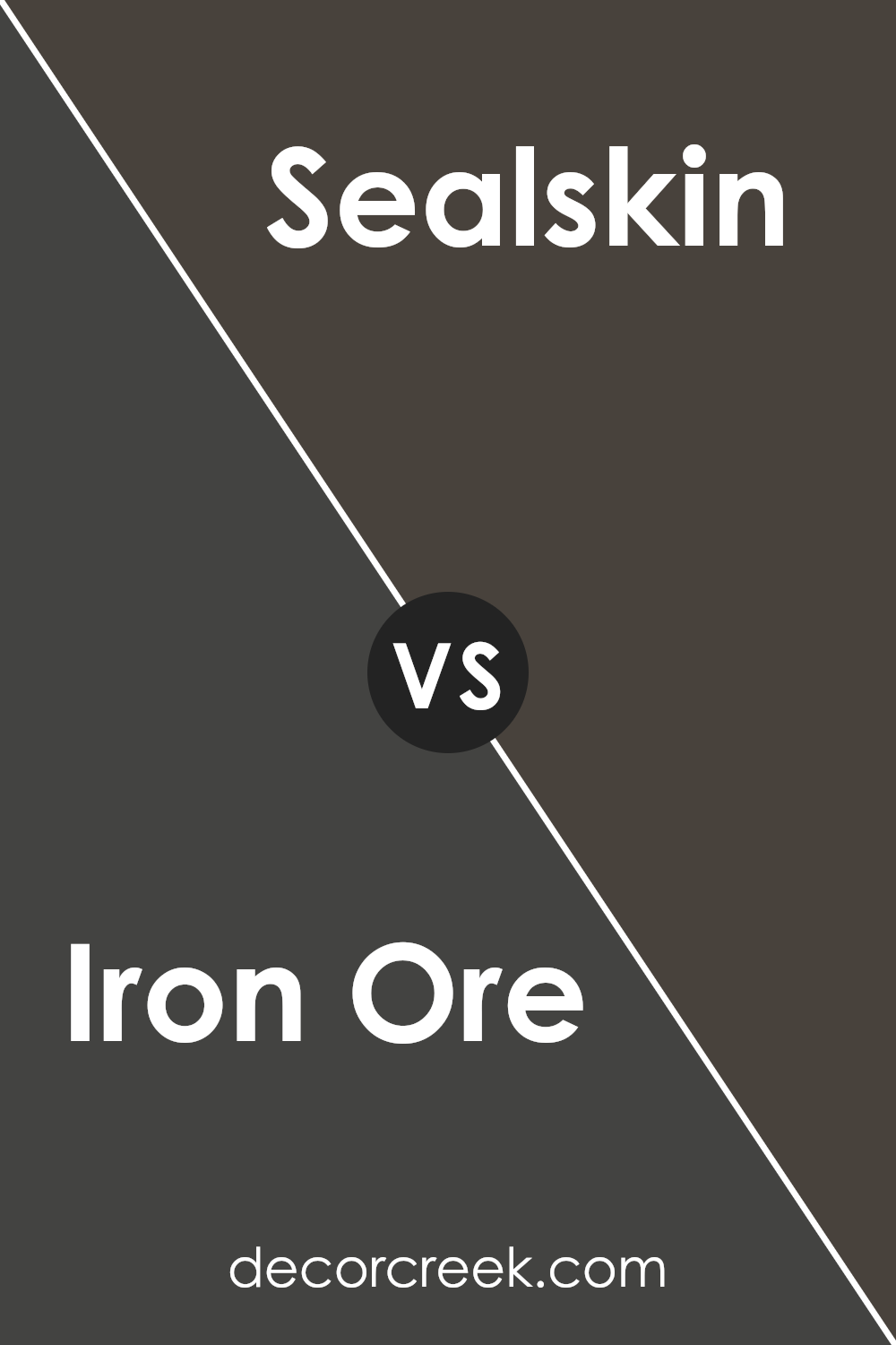
Iron Ore SW 7069 by Sherwin Williams vs Sealskin SW 7675 by Sherwin Williams
Iron Ore and Sealskin, both Sherwin-Williams paints, present shades of deep, dark elegance that bring a sense of sophistication to any space. Iron Ore is a softer black with undertones that can lean slightly towards the grey side under specific lighting conditions, offering an adaptable backdrop that pairs well with a range of decor styles.
It harmonizes beautifully with softer, lighter colors, providing a stunning contrast that makes spaces feel more expansive and chic.
On the other hand, Sealskin showcases a warmer, richer hue, subtly infused with chocolate brown undertones, manifesting a cozy and inviting ambiance. This color tends to envelop rooms in a comforting embrace, making it perfect for creating intimate spaces.
Sealskin works exceptionally well when aiming for an earthy, organic aesthetic, as it seamlessly connects indoor spaces with the natural world outside.
While both colors are deeply saturated and exude an air of luxury, Iron Ore offers a cooler, more neutral base suitable for modern and minimalist designs. In contrast, Sealskin’s warmth is ideal for traditional and rustic decor, adding depth and character to the space.
The choice between them depends on the desired atmosphere and design style, with each color presenting a unique blend of sophistication and versatility.
You can see recommended paint color below:
- SW 7675 Sealskin
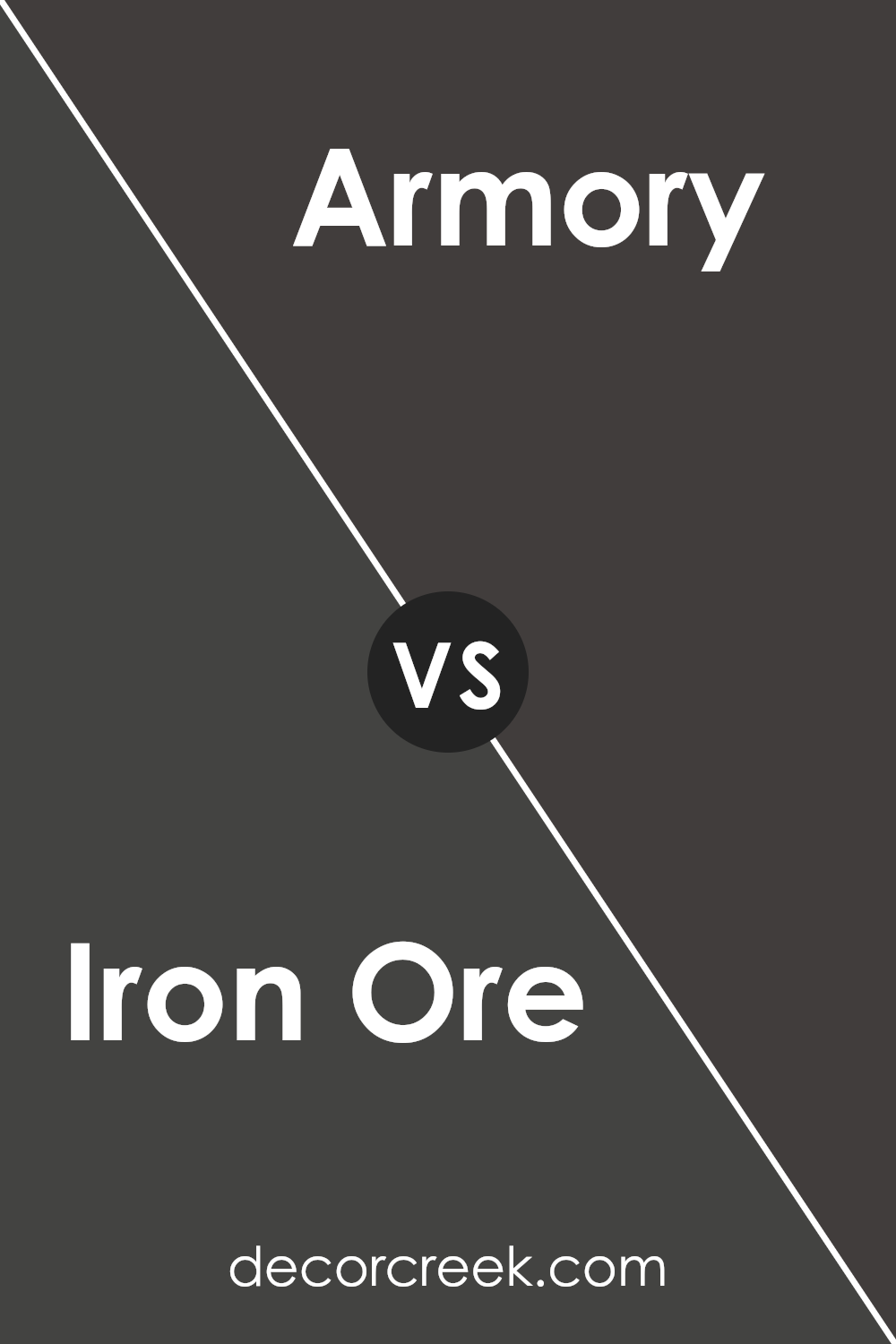
Iron Ore SW 7069 by Sherwin Williams vs Armory SW 9600 by Sherwin Williams
Iron Ore and Armory, both by Sherwin Williams, reside in the realm of dark, moody colors but paint distinctly different narratives. Iron Ore emanates a deep, charred gray with a slight warmth that evokes a sophisticated yet grounding atmosphere.
Its richness in depth allows it to serve as a robust backdrop or an accent, offering versatility in both traditional and contemporary spaces. On the other hand, Armory steps into a cooler spectrum, presenting a profound navy with a hint of slate gray.
This hue captures the essence of a stormy sea at dusk, blending the serenity of blue with the mystery of twilight gray. While Iron Ore leans towards a more earthy, mineral-inspired tone, providing a solid foundation, Armory offers a cooler, maritime-inspired vibe, creating a tranquil yet dramatic aura.
Together, they represent the dynamic interplay between earth and water, warmth and coolness, making them complementary choices for those looking to introduce depth and sophistication into their spaces.
You can see recommended paint color below:
- SW 9600 Armory
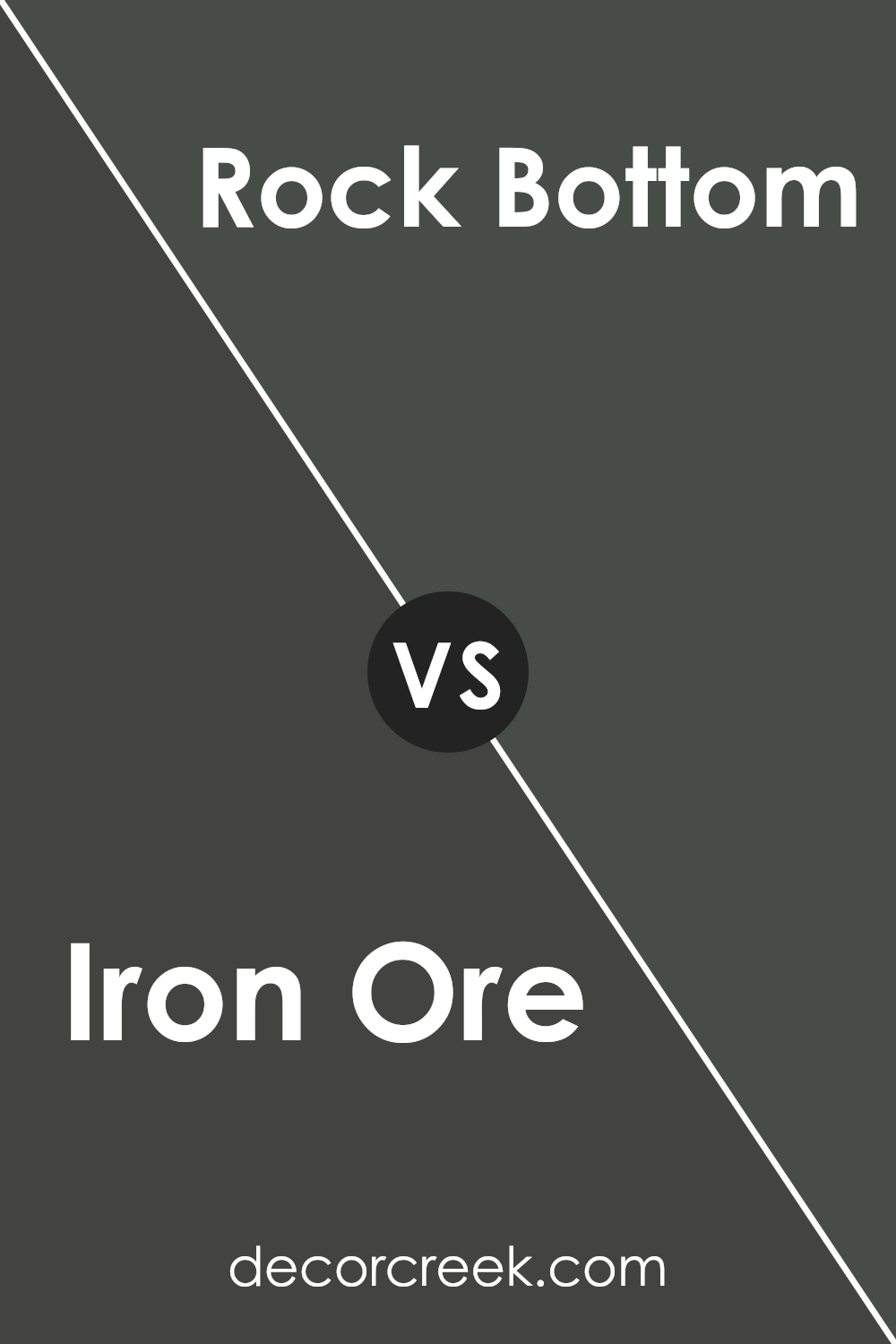
Iron Ore SW 7069 by Sherwin Williams vs Rock Bottom SW 7062 by Sherwin Williams
Iron Ore and Rock Bottom, both from Sherwin Williams, are sophisticated hues that cater to spaces desiring depth and character. Iron Ore stands out as a darker, charcoal-like color with a deep, rich base that leans toward a soft, black finish. It brings an essence of strength and elegance to spaces, making it perfect for accent walls or cabinets when aiming to make a bold statement.
On the other hand, Rock Bottom, while still retaining a sense of depth, is lighter compared to Iron Ore. It showcases a warmer, softer gray that beautifully complements spaces seeking a contemporary yet cozy ambiance. This color works well in spaces that aim for a grounded, understated elegance, offering a perfect backdrop for a wide range of decor styles.
Although both colors share a similar gray base, their intensity and undertones set them apart. Iron Ore provides a more striking, dramatic effect, while Rock Bottom serves as a versatile, soothing gray. Choosing between them depends on the desired impact and mood of the space, as each brings its unique character to interiors.
You can see recommended paint color below:
- SW 7062 Rock Bottom
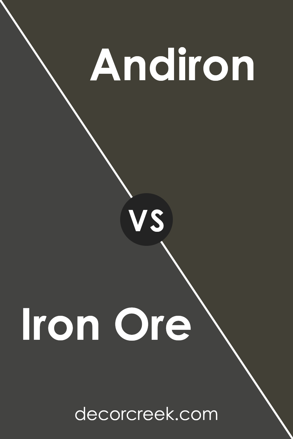
Iron Ore SW 7069 by Sherwin Williams vs Andiron SW 6174 by Sherwin Williams
Iron Ore and Andiron, while both originating from Sherwin Williams’ extensive palette, present unique aesthetics suited to varying design preferences. Iron Ore embodies a deep, rich gray with an almost charcoal essence, lending a powerful and sophisticated ambiance to spaces. Its depth makes it a favorite for accent walls or exterior finishes, offering an elegant contrast against lighter tones or materials.
Andiron, on the other hand, steps into the realm of lighter grays, carrying a softer and more neutral base. It has an inherent versatility, easily adaptable to different settings without overwhelming the senses. Its lighter shade makes it an excellent choice for creating a serene, unassuming background, conducive to both modern and traditional interiors.
The distinction between Iron Ore and Andiron lies primarily in their depth and impact. Iron Ore, with its bolder presence, anchors spaces with a statement, while Andiron offers a more subdued backdrop, allowing for flexibility in decorative elements. Together, they exemplify the dynamic range of grays offered by Sherwin Williams, catering to varied design narratives.
You can see recommended paint color below:
- SW 6174 Andiron
Iron Ore SW 7069 by Sherwin Williams vs Darkroom SW 7083 by Sherwin Williams
Iron Ore and Darkroom, both by Sherwin Williams, are deep, moody hues that bring a sense of sophistication and drama to any space. Iron Ore presents as a darker gray with a hint of warm undertones, making it a versatile choice that pairs well with a broad spectrum of colors, from vibrant hues to more muted tones.
It strikes a balance between being overpoweringly dark and invitingly cozy, offering a modern twist on classic charcoal.
In contrast, Darkroom skews towards a softer, yet equally impactful, ambiance with its deep, almost velvety, maroon-infused black. This nuanced color can envelop a room in a sense of mystery and opulence, leaning more towards a profoundly saturated burgundy at its core. It’s perfect for spaces intended to make a statement or evoke a strong emotional response, radiating warmth despite its depth.
Together, Iron Ore and Darkroom cater to those desiring depth and character in their color choices—Iron Ore with its classic, stately gray, and Darkroom with a lush, dark embrace, each offering distinct but harmonious opportunities for creating engaging, dynamic interiors.
You can see recommended paint color below:
- SW 7083 Darkroom
Iron Ore SW 7069 by Sherwin Williams vs Big Dipper SW 9645 by Sherwin Williams
Iron Ore and Big Dipper, both from Sherwin Williams, present unique characteristics for diverse applications in interior and exterior design. Iron Ore is a deep, rich gray with a slight hint of brown, making it a versatile choice for sophisticated spaces seeking a strong, grounding effect. It’s ideal for accent walls, exterior trim, or cabinets, offering a timeless elegance that pairs beautifully with a wide range of colors and finishes.
On the other hand, Big Dipper is a lighter, more playful shade that leans towards a softer, grayish-blue. It evokes a sense of calm and serenity, making it perfect for bedrooms, bathrooms, or any space aiming to create a tranquil atmosphere. Big Dipper offers a fresh and airy feel, contrasting Iron Ore’s more dramatic impact.
Together, these colors can complement each other wonderfully, with Iron Ore providing depth and solidity, while Big Dipper brings in a lighter, uplifting element. Whether used in combination or separately, they cater to different stylistic needs, allowing for creative and harmonious designs.
You can see recommended paint color below:
- SW 9645 Big Dipper
Conclusion
Iron Ore by Sherwin Williams emerges as a striking yet versatile color, offering a deep, charred grey that exudes sophistication and depth. The shade manages to balance richness with subtlety, making it a perfect choice for those looking to introduce an element of refined elegance into their space.
Its undeniable charm lies in its ability to fit seamlessly into a plethora of design schemes, ranging from modern minimalism to rustic charm, demonstrating its impressive versatility.
In applications, Iron Ore proves to be exceptionally adaptable, serving well as both an accent and a primary color. When used in interior spaces, it brings a grounded, calming presence, whereas in exterior applications, it stands out for its bold yet timeless appeal.
Its compatibility with a wide range of complementary colors further underscores its utility in design, allowing for creative and dynamic color palettes. Ultimately, Iron Ore by Sherwin Williams stands out as a deeply engaging hue, capable of transforming spaces with its sophisticated and adaptable nature.

Ever wished paint sampling was as easy as sticking a sticker? Guess what? Now it is! Discover Samplize's unique Peel & Stick samples.
Get paint samples