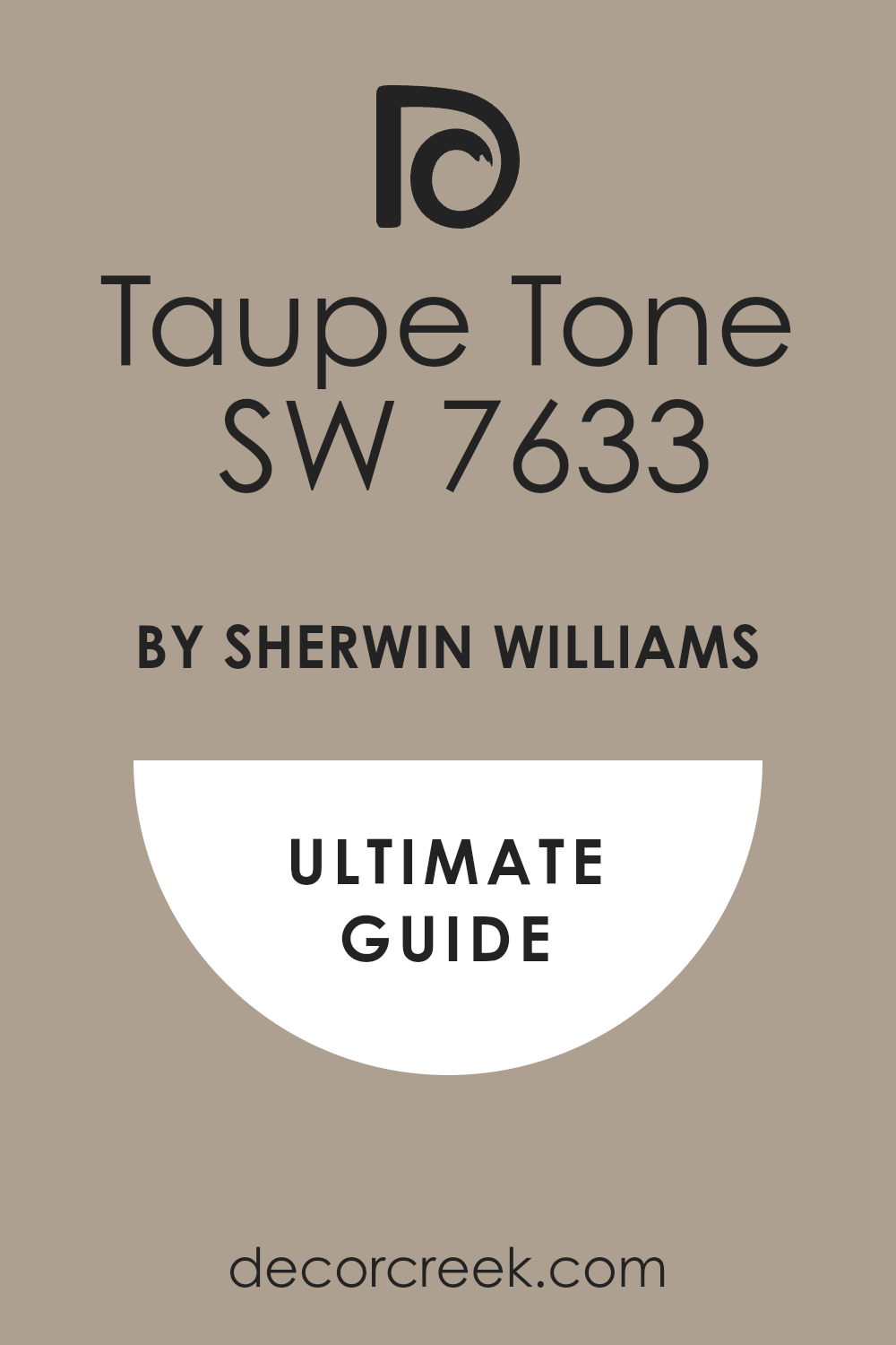
If you’re searching for a color that adds a warm and inviting feel to any room, SW 7633 Taupe Tone by Sherwin Williams might be the perfect choice. This shade of taupe offers a balanced blend of brown and gray, providing a neutral backdrop that works well with a wide range of decor styles.
Whether you’re looking to paint a cozy living area, a sleek modern kitchen, or a peaceful bedroom, Taupe Tone brings a subtle elegance without overpowering the space.
Its versatility also makes it a great option for exterior applications, giving homes a timeless look. Read on to learn how SW 7633 Taupe Tone can enhance different spaces and complement various design elements.
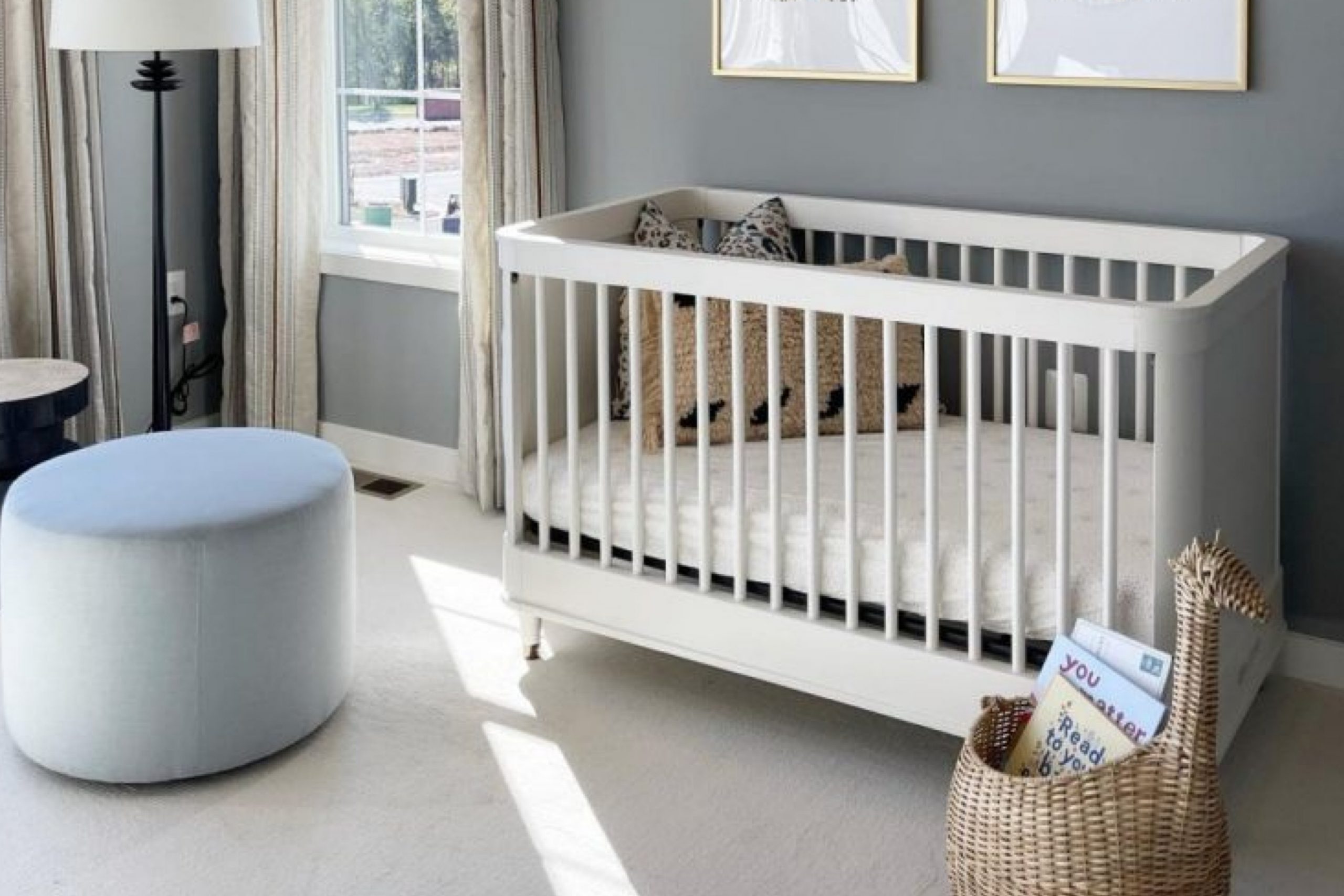
What Color Is Taupe Tone SW 7633 by Sherwin Williams?
Taupe Tone by Sherwin Williams is a warm, versatile neutral shade that exudes a subtle elegance, making it ideal for creating a cozy and inviting atmosphere in any room. With its balanced blend of brown and gray, this color provides a solid foundation that complements a wide range of decorating styles, from modern minimalism to rustic farmhouse.
This paint color pairs exceptionally well with natural materials such as wood, enhancing its grain and texture, and also complements textures like linen and wool, adding a touch of comfort to any space. It works wonderfully with stone elements like a granite kitchen countertop or a marble bathroom vanity, bringing out the natural veins and patterns of the stone.
Taupe Tone fits seamlessly into various interior styles. In a contemporary setting, it can work beautifully to create a soft backdrop for bolder colors or metallic finishes like brass or copper. In a traditional room, it harmonizes with rich textures and deep wood finishes, offering a timeless look that feels both warm and inviting.
When decorating with Taupe Tone, consider using it in living rooms, bedrooms, or dining spaces where its calming influence and adaptability can really shine, providing a neutral canvas that allows your furnishings and decor to take center stage.
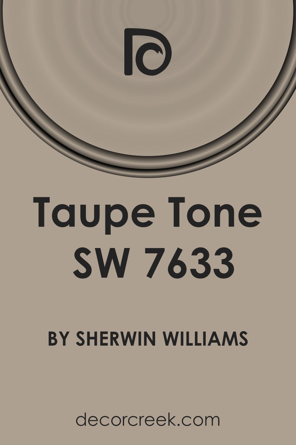
Is Taupe Tone SW 7633 by Sherwin Williams Warm or Cool color?
Taupe Tone by Sherwin Williams is a versatile paint color that many homeowners appreciate for its ability to blend well with different styles and decor. This shade is a balanced mix of brown and gray, providing a neutral backdrop that works in almost any room. Since it’s not too dark or too light, it can help make a space feel warmer and more inviting without overpowering the room or making it feel closed in.
The great thing about Taupe Tone is that it pairs beautifully with a wide range of other colors—from soft whites to bold blacks. It can also handle various textures and materials, whether it’s wood, metal, or fabric. This adaptability makes it an ideal choice for living rooms, bedrooms, and even kitchens, as it complements furniture, floors, and accessories.
Furthermore, using Taupe Tone can help hide imperfections on walls better than lighter colors, which is a useful trait for busy households. Overall, it’s a practical and stylish choice that can create a cozy, harmonious environment in any home.
Undertones of Taupe Tone SW 7633 by Sherwin Williams
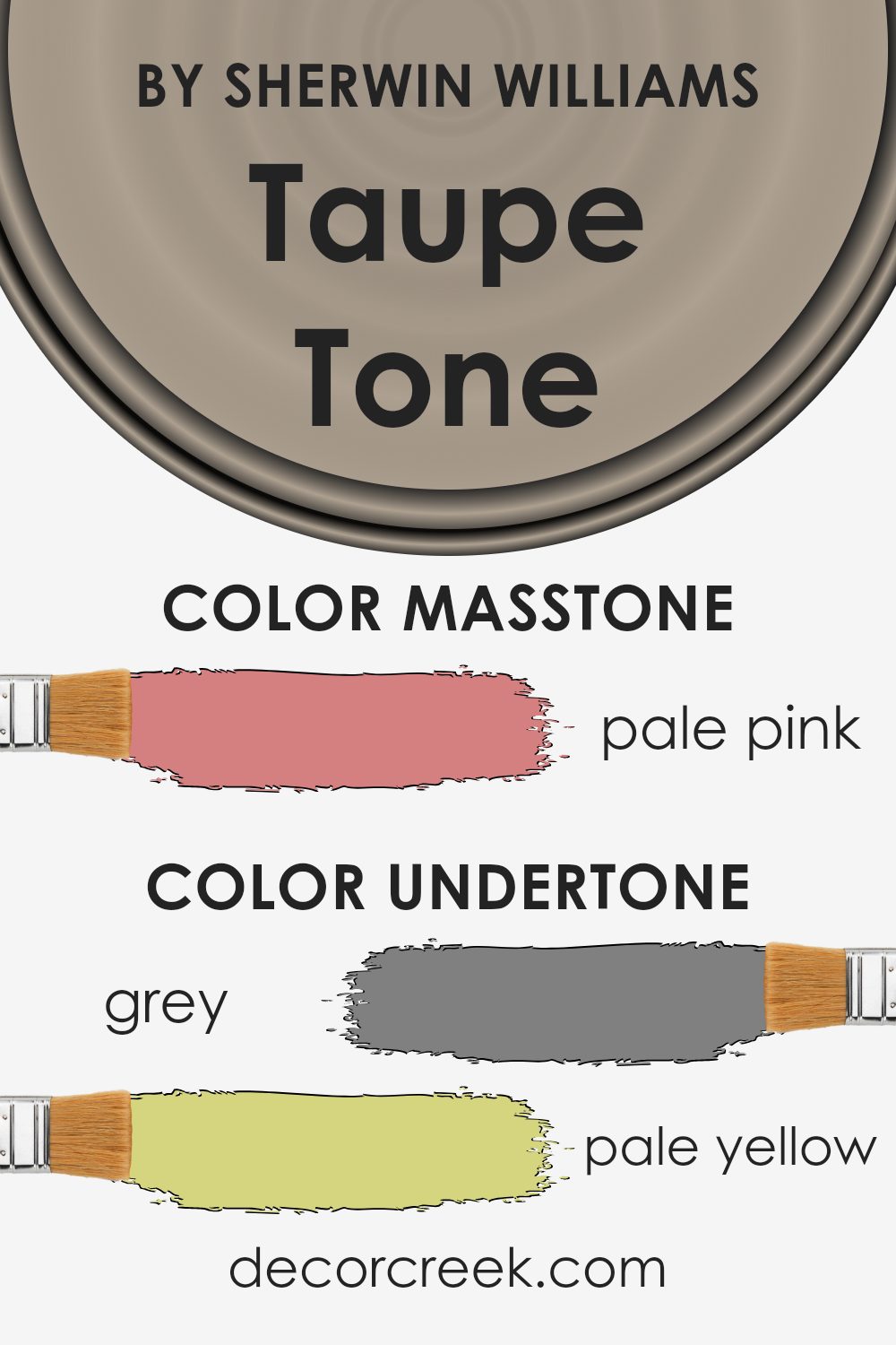
Taupe Tone is a versatile color that appears primarily as a blend of beige and gray. This neutral palette makes it a popular choice for decorators seeking a balanced and adaptive backdrop for any room. Undertones are subtle hues that underpin the main color, influencing its overall appearance and the way it interacts with different lighting and surrounding colors.
The undertones in Taupe Tone include shades of grey, pale yellow, and even hints of mint and lilac. These undertones can bring out various effects depending on the lighting and the colors nearby. For instance, in a room with ample sunlight, pale yellow undertones can make the walls seem warmer, inviting a cozy, soft ambiance.
On the other hand, grey undertones might be more noticeable in artificial light, lending the room a more stable and grounded feel.
On interior walls, Taupe Tone creates a neutral canvas that allows for flexibility in decorating. Whether you pair it with bright colors like orange or fuchsia, or stick to a more muted palette using light gray or olive, Taupe Tone supports a wide range of design aesthetics without overwhelming the senses. Its ability to adapt to various undertones subtly alters its appearance, enhancing the overall mood and style of the space.
Overall, the flexibility of Taupe Tone, stemming from its rich spectrum of undertones, makes it a reliable choice for any interior, adapting beautifully to both modern and traditional designs.
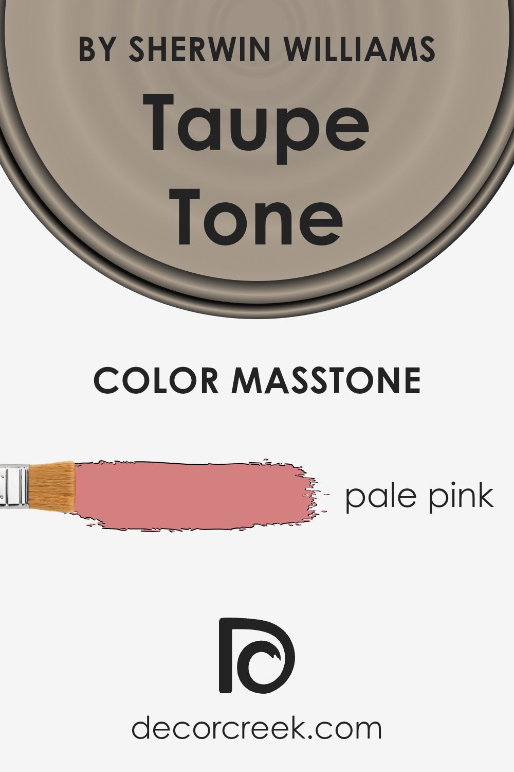
What is the Masstone of the Taupe Tone SW 7633 by Sherwin Williams?
Taupe Tone, designated by the code, is a unique color that resembles a soft, pale pink. This subtle hue is versatile and easily complements various decor styles, making it a popular choice for homeowners looking to add a gentle warmth to their spaces. Its light pink shade brings a fresh and airy feel to rooms, creating a welcoming atmosphere. This is particularly effective in smaller areas, where its ability to reflect light can make the space appear brighter and more open.
When paired with darker colors, Taupe Tone provides a lovely contrast, while with lighter, neutral shades, it offers a smooth and coherent look. It’s great for living rooms, bedrooms, and even bathrooms, where its calming nature supports a relaxed environment. This gentle color is perfect for those wanting to add a touch of color to their home without overwhelming their existing interior design.
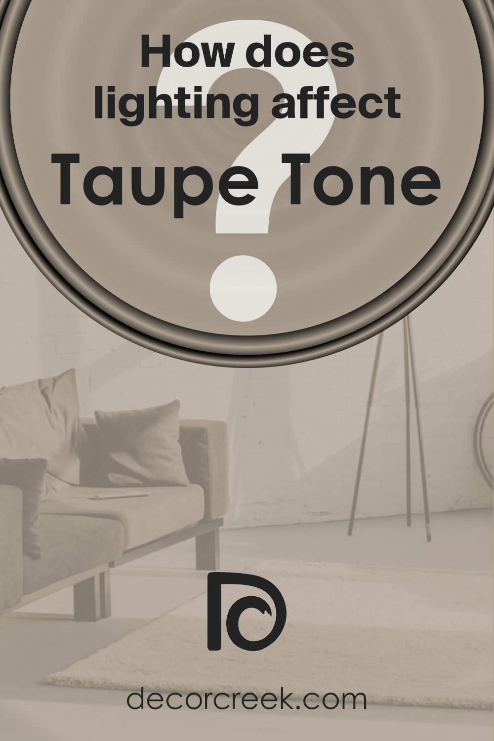
How Does Lighting Affect Taupe Tone SW 7633 by Sherwin Williams?
Lighting plays a crucial role in how we perceive colors. The type of light, whether artificial or natural, can significantly affect how a color looks in a room. Take, for example, the color Taupe Tone. This versatile shade can appear differently depending on the light source.
In artificial light, Taupe Tone tends to display more warmth, bringing out its subtle brown and beige undertones. This makes the color feel cozy and welcoming, ideal for living spaces and bedrooms that aim for a comfortable ambiance. Fluorescent lighting can bring out the cooler aspects of this hue, while incandescent lighting highlights its warmth.
Under natural light, Taupe Tone’s true color is more likely to show. The quality and angle of natural light influence its appearance. For rooms with north-facing windows, the light is usually softer and cooler, which might make Taupe Tone appear slightly more gray. This can add a calm, neutral backdrop to any room.
In south-facing rooms, where the light is warmer and more direct, Taupe Tone will look warmer and richer, enhancing the feeling of warmth in the room. This makes it a great choice for spaces where you want to create a cozy, inviting environment.
Rooms with east-facing windows receive light in the morning that is bright and warm, making Taupe Tone look more vibrant and lively. This can energize a room and make it feel cheerful, especially during the morning hours.
West-facing rooms get the evening light, which is warmer and softer. Here, Taupe Tone will have a calming effect, soothing and mellow, perfect for spaces used mainly in the evenings.
Overall, Taupe Tone is a flexible color that can adapt to different lighting conditions, making it a popular choice for various rooms and settings.
What is the LRV of Taupe Tone SW 7633 by Sherwin Williams?
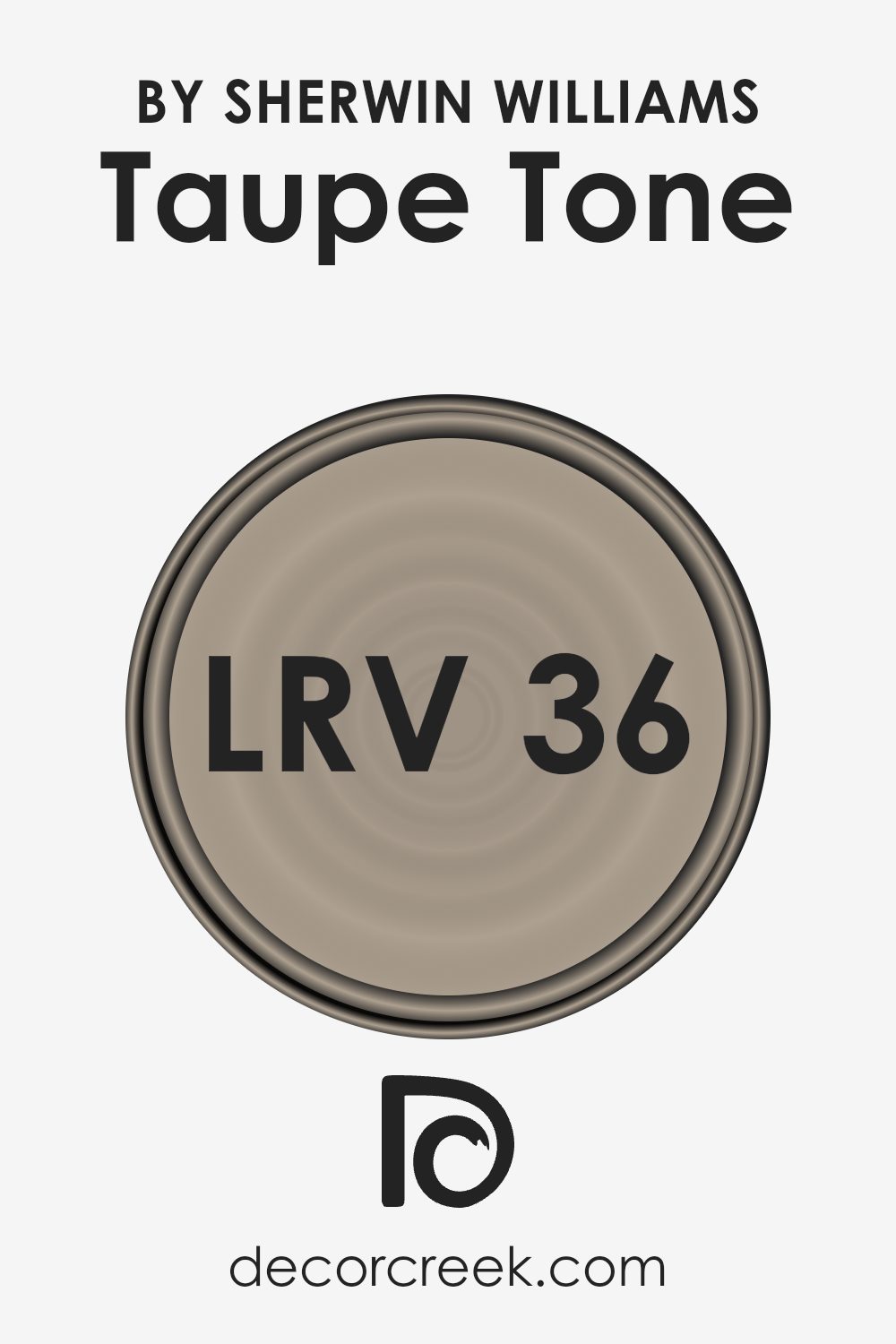
LRV stands for Light Reflectance Value, which is a measurement used to indicate how much light a paint color reflects when it’s applied to a wall. This value can range from a very low number, which means it absorbs more light, to a high number, indicating it reflects more light.
How bright or dark a color appears can greatly impact the feel of a room. Lighter colors can make a room feel more open and airy, while darker colors can make it feel more cozy and smaller.
Taupe Tone, with its LRV of around 36, is somewhat in the middle of the scale but leans towards the darker side. This means it won’t reflect a lot of light but will absorb more, giving walls a heavier feel, which can be used to create a warm and inviting space. This moderate reflectance also means that it doesn’t lighten a room significantly, but it can provide a warm backdrop that enhances decor without overwhelming the space with brightness.
When choosing lighting or decorating a room with this color, it might be good to use brighter lights or lighter colored furnishing to balance out the absorption of light.
Coordinating Colors of Taupe Tone SW 7633 by Sherwin Williams
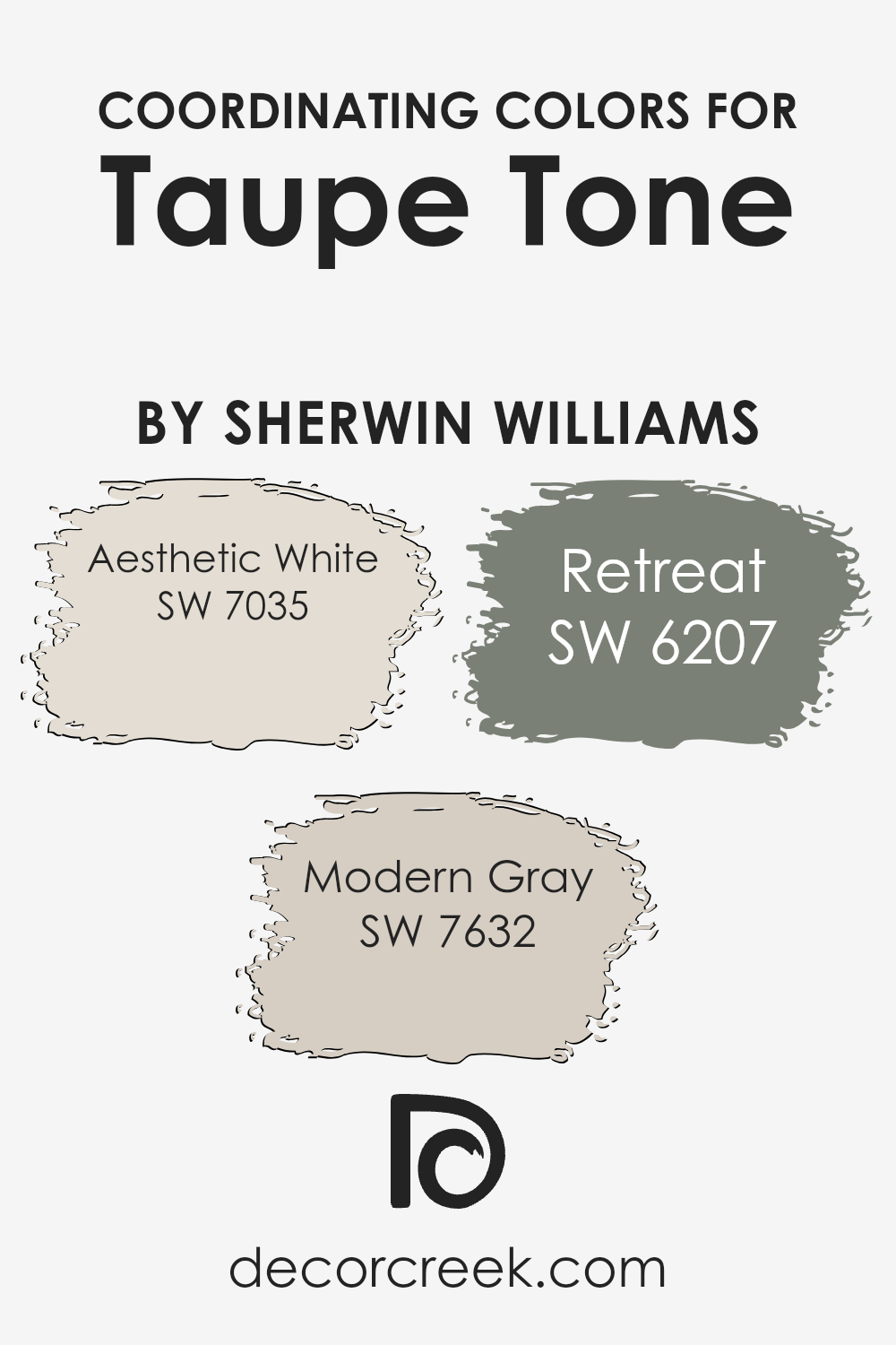
Coordinating colors are hues that complement each other pleasingly when used together in interior design. They help create a balanced and harmonious look, ensuring that no single color overwhelms the space. Specifically, taupe tones, such as the versatile shade from Sherwin Williams, pair beautifully with certain colors that support and enhance its natural richness.
Coordinating colors like Aesthetic White, Modern Gray, and Retreat are ideal choices that contribute to a cohesive and appealing palette.
Aesthetic White is a soft, warm white with just a hint of beige, making it not too stark or clinical. It’s an excellent choice for trim, ceilings, or as an all-over color to provide a gentle backdrop for Taupe Tone. Modern Gray is a neutral gray that offers a contemporary feel without being too cold, acting as a fantastic complementary color for spaces seeking a modern twist. Lastly, Retreat is a deeper, more saturated color resembling a shade of green with gray undertones, perfect for adding a dash of depth and interest to a room themed around Taupe Tone.
Each of these colors supports the main hue without competing for attention, allowing for a well-rounded and inviting decorative scheme.
You can see recommended paint colors below:
What are the Trim colors of Taupe Tone SW 7633 by Sherwin Williams?
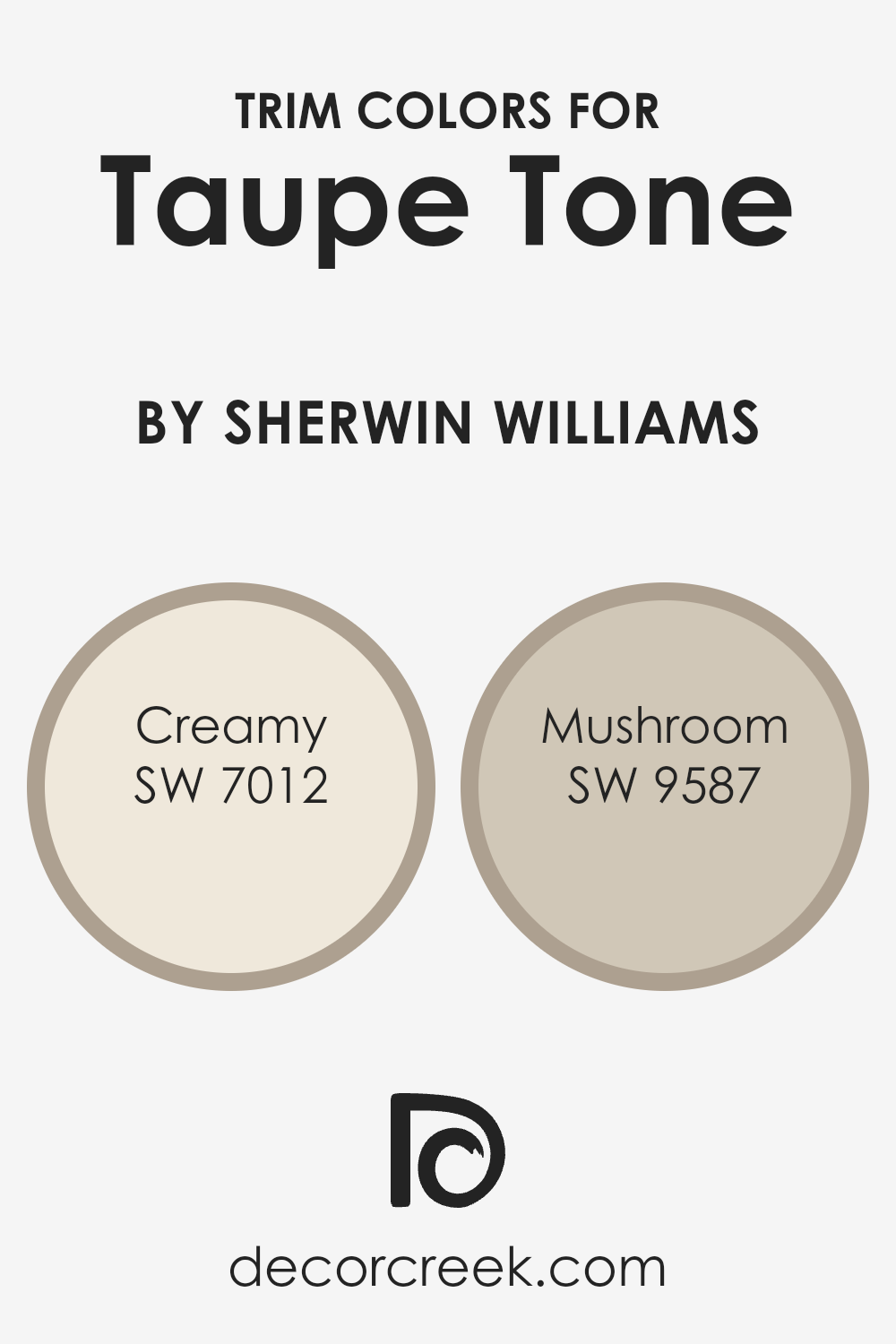
Trim colors are selected accents, often used on doors, windows, and baseboards, that enhance and complement the main wall color in a room. When Taupe Tone, a warm and versatile hue, is used on the walls, choosing the right trim colors can significantly enhance the aesthetic flow and feel of the space.
Creamy (SW 7012) and Mushroom (SW 9587) are excellent choices for trim, as they both provide subtle contrasts that enrich the overall look without overwhelming the primary color.
Creamy is a soft, whitish color that brings a light and airy feel to trim, offering a gentle contrast that highlights Taupe Tone’s rich depth. It works well in spaces that aim for a fresh and inviting atmosphere. On the other hand, Mushroom is a muted, earthy beige with hints of gray, adding a warm and grounding effect to the trim. This color is perfect for adding a bit of weight to the lighter tones of Taupe Tone, ensuring a balanced and cohesive room design. Together, these trim colors can subtly define architectural details and enhance the room’s character.
You can see recommended paint colors below:
- SW 7012 Creamy (CHECK A SAMPLE)
- SW 9587 Mushroom (CHECK A SAMPLE)
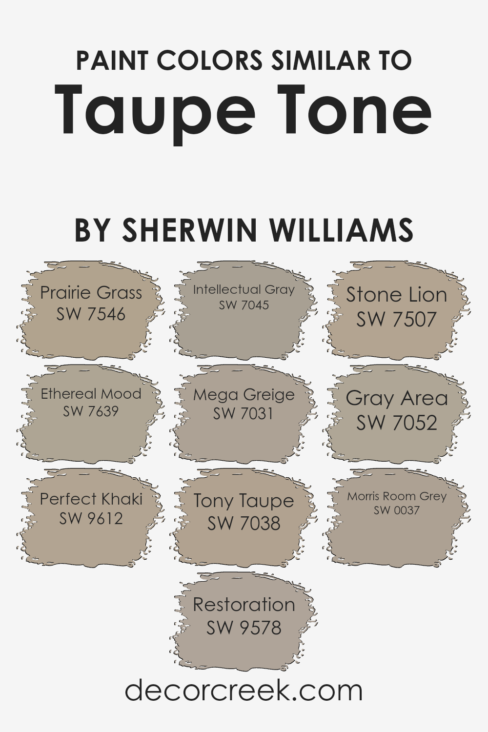
Colors Similar to Taupe Tone SW 7633 by Sherwin Williams
When choosing paint colors, opting for shades similar to a base color like Taupe Tone can create a harmonious and cohesive look in any space. These similar shades, all having subtle differences, work by complementing each other, ensuring that the décor elements blend seamlessly. Such selections are perfect for achieving a balanced aesthetic, without the contrasts being too stark.
Starting with Prairie Grass, it introduces a dustier hue with green undertones, perfect for bringing a natural and earthy feel into rooms. Ethereal Mood adds a hint of mystique with its slightly grayer influence, ideal for calming environments. Perfect Khaki follows, providing a warmer touch that’s both inviting and neutral.
Restoration offers a deeper, richer version of the base tone, adding depth and warmth to larger spaces. Intellectual Gray moves toward a more distinct gray shade, giving a modern twist to any décor. Mega Greige merges gray and beige beautifully for a flawless neutral backdrop.
Tony Taupe intensifies the original color slightly for a more pronounced effect in well-lit areas. Stone Lion lightens things up a bit, providing versatility and freshness.
Gray Area is cooler, which can superbly offset warmer furniture or wood finishes. Lastly, Morris Room Grey shifts to a traditional gray that works well in spaces seeking a classic or formal look. Each color, while maintaining similarity, offers a unique vibe, making it easy to find the right fit for your decorating project.
You can see recommended paint colors below:
- SW 7546 Prairie Grass (CHECK A SAMPLE)
- SW 7639 Ethereal Mood (CHECK A SAMPLE)
- SW 9612 Perfect Khaki (CHECK A SAMPLE)
- SW 9578 Restoration (CHECK A SAMPLE)
- SW 7045 Intellectual Gray (CHECK A SAMPLE)
- SW 7031 Mega Greige (CHECK A SAMPLE)
- SW 7038 Tony Taupe (CHECK A SAMPLE)
- SW 7507 Stone Lion (CHECK A SAMPLE)
- SW 7052 Gray Area (CHECK A SAMPLE)
- SW 0037 Morris Room Grey (CHECK A SAMPLE)
Colors that Go With Taupe Tone SW 7633 by Sherwin Williams
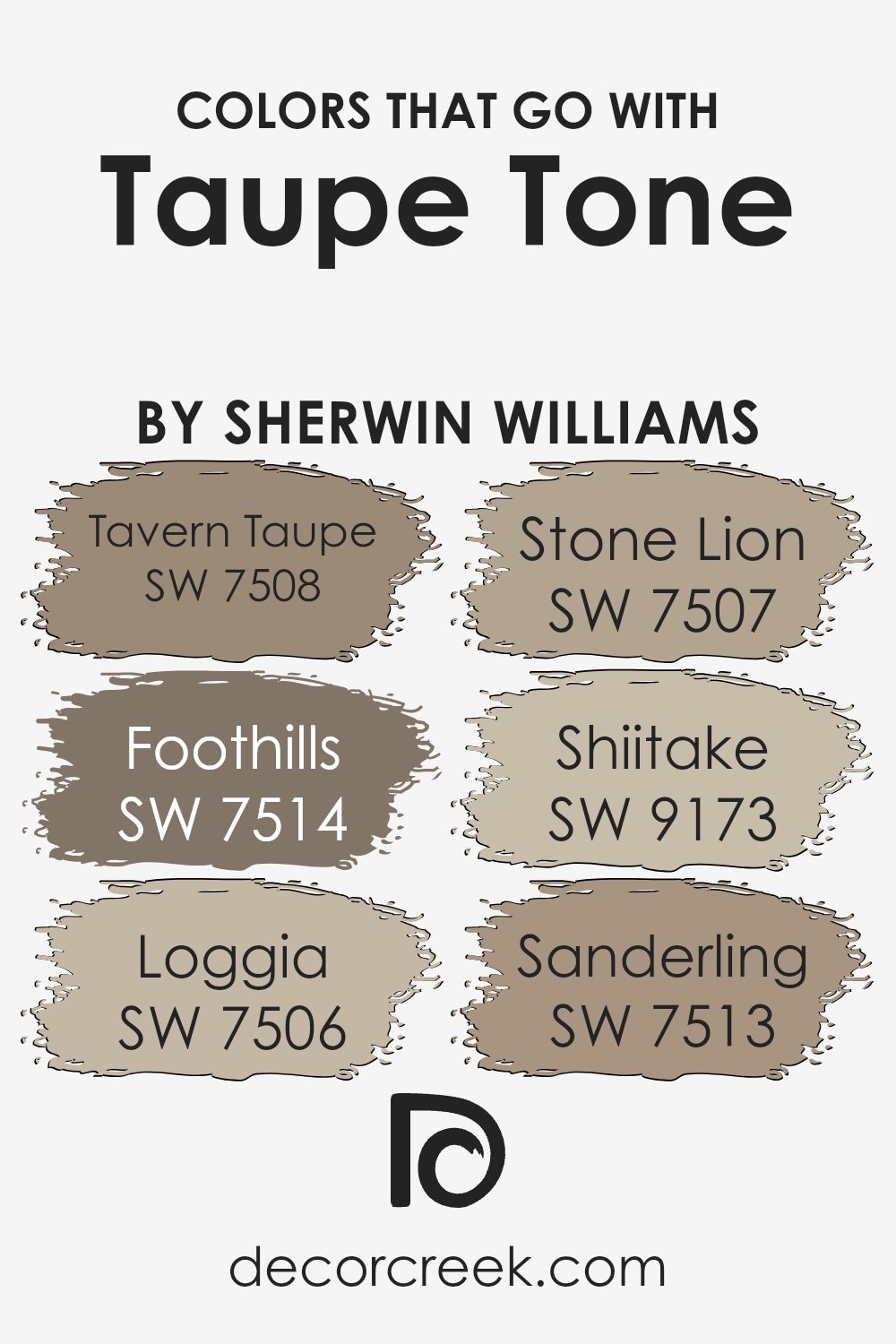
Choosing the right colors to complement Taupe Tone SW 7633 by Sherwin Williams is crucial in achieving a harmonious and aesthetically pleasing space. Colors that pair well with Taupe Tone, such as Tavern Taupe SW 7508, Foothills SW 7514, Loggia SW 7506, Stone Lion SW 7507, Shiitake SW 9173, and Sanderling SW 7513, each contribute uniquely to creating a cozy and inviting environment.
These colors ensure a balanced palette that enhances the warm undertones of Taupe Tone, making it versatile in various design settings.
Tavern Taupe SW 7508 is a deeper brown that provides a strong foundation, perfect for grounding a room. Foothills SW 7514 offers a darker, more intense color, which adds depth and dimension when paired with Taupe Tone. Loggia SW 7506 is a lighter brown that brings a soft contrast to the spaces, making them feel more open. Stone Lion SW 7507 is similar but adds a hint of gray, offering a subtle shift that enriches the texture of the decor. Shiitake SW 9173, with its muted mushroom shade, blends effortlessly with Taupe Tone, supporting a natural and understated look. Lastly, Sanderling SW 7513 is a softer, sandy color that injects a touch of lightness and freshness into the mix, ensuring that the overall scheme remains balanced and not too heavy. By integrating these complementary colors, a room can achieve a layered and pulled-together look that feels welcoming and stylish.
You can see recommended paint colors below:
- SW 7508 Tavern Taupe (CHECK A SAMPLE)
- SW 7514 Foothills (CHECK A SAMPLE)
- SW 7506 Loggia (CHECK A SAMPLE)
- SW 7507 Stone Lion (CHECK A SAMPLE)
- SW 9173 Shiitake (CHECK A SAMPLE)
- SW 7513 Sanderling (CHECK A SAMPLE)
How to Use Taupe Tone SW 7633 by Sherwin Williams In Your Home?
Taupe Tone by Sherwin Williams is a versatile neutral paint color that fits well in many spaces in the home. It has a warm, inviting quality without being too overpowering, making it a great choice for creating a cozy atmosphere. You can use this color in living rooms or bedrooms to set a relaxed, welcoming tone.
Its subtlety also works well in a dining area, complementing various wood finishes and decor styles. For those who like a uniform look, it can be carried into the bathroom or kitchen, binding the house with a consistent theme. Taupe Tone pairs nicely with bright whites or soft creams for trims and ceilings, providing a gentle contrast.
Additionally, it’s an excellent backdrop for hanging art or displaying colorful furniture, as it doesn’t clash with other colors. This paint is perfect for anyone looking to refresh their space with a neutral but warm palette.
Taupe Tone SW 7633 by Sherwin Williams vs Intellectual Gray SW 7045 by Sherwin Williams
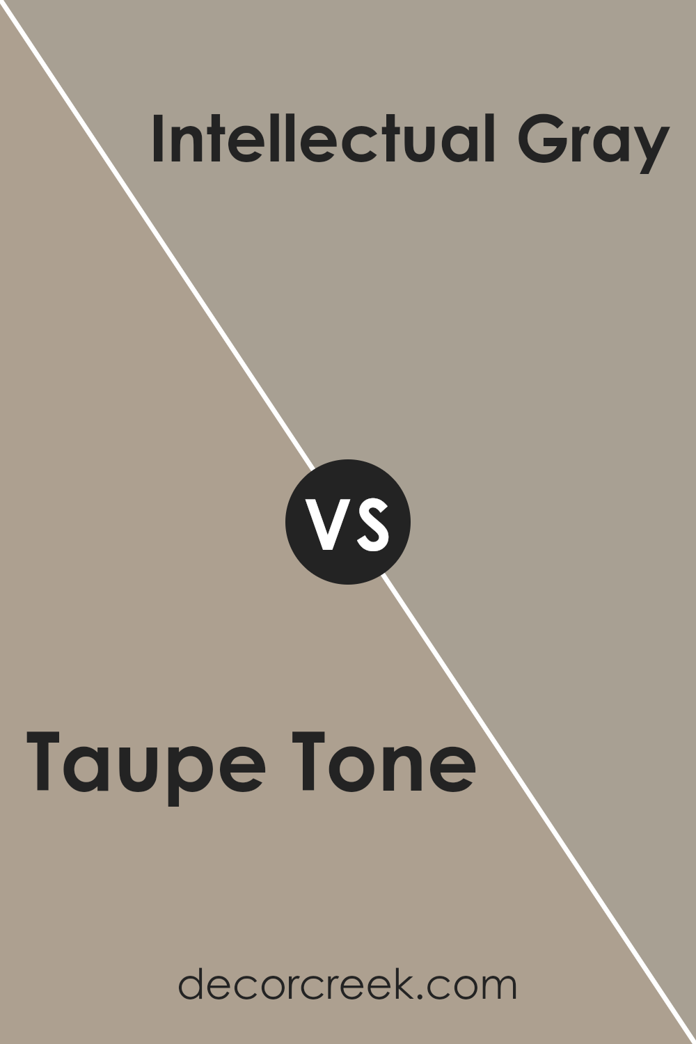
Taupe Tone and Intellectual Gray by Sherwin Williams are two neutral colors that offer subtle but distinct vibes to any space. Taupe Tone is a soft, warm beige with a touch of gray, making it incredibly versatile for any room. It adds a gentle, cozy feel and pairs well with a variety of décor styles and colors.
On the other hand, Intellectual Gray is a deeper, cooler gray that leans slightly toward green and provides a timeless, classic look. This color is excellent for creating a more grounded, calming atmosphere. Both colors are excellent choices for those looking to achieve a modern and clean but inviting environment.
However, Taupe Tone’s warmth makes it ideal for living areas and bedrooms where comfort is key, whereas Intellectual Gray works well in places where a solid, subdued backdrop is preferred, like offices or dens.
You can see recommended paint color below:
Taupe Tone SW 7633 by Sherwin Williams vs Prairie Grass SW 7546 by Sherwin Williams
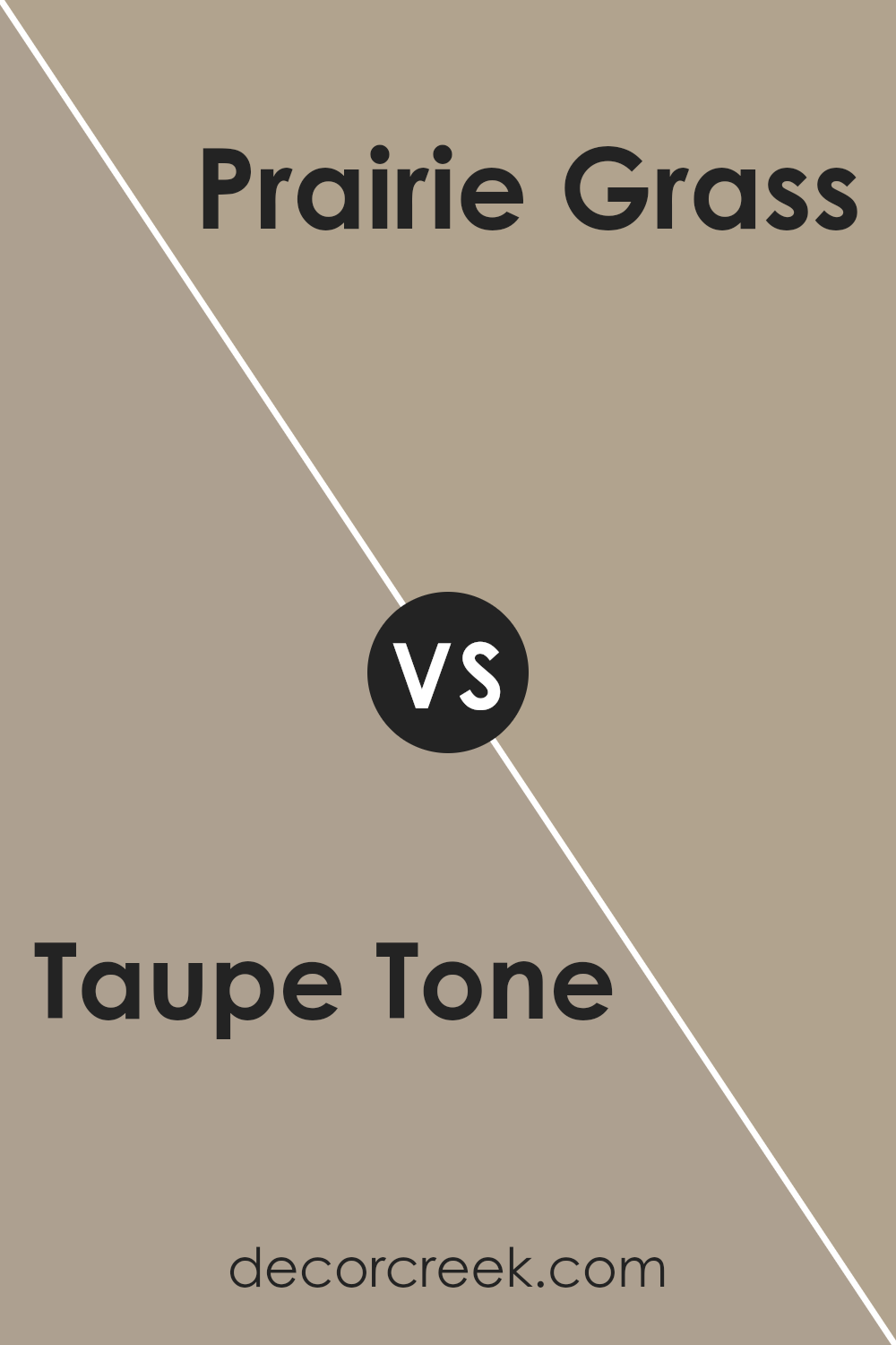
Taupe Tone and Prairie Grass are two distinct colors from Sherwin Williams. Taupe Tone is a soft, neutral shade that leans towards beige with grey undertones. It provides a warm and inviting feel to any space, making it a versatile option for various rooms in a home. On the other hand, Prairie Grass is a muted green with earthy tones that can bring a sense of nature and calmness to an environment. It works well in spaces where a touch of subtle color is desired without overwhelming the senses.
While Taupe Tone is more universal and can easily pair with a wide range of colors and decor styles, Prairie Grass offers a unique hint of color that pairs well with natural elements and materials. Choosing between these colors would depend on the atmosphere you want to achieve in your space; Taupe Tone is excellent for a cozy, neutral backdrop, while Prairie Grass adds a gentle splash of color reminiscent of the outdoors.
You can see recommended paint color below:
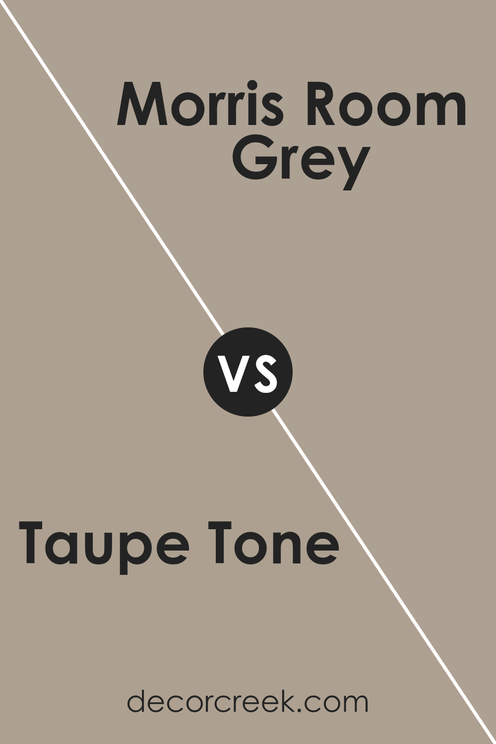
Taupe Tone SW 7633 by Sherwin Williams vs Morris Room Grey SW 0037 by Sherwin Williams
Taupe Tone and Morris Room Grey are both neutral colors by Sherwin Williams, but they offer different vibes for your space. Taupe Tone is a warm shade that leans towards a beige-gray, giving a cozy and inviting atmosphere. It’s quite versatile and works well in areas where you want a soft, neutral backdrop.
On the other hand, Morris Room Grey is a cooler tone, falling more into a true medium gray category. This color provides a crisp, clean look and is perfect for modern settings that aim for a more straightforward, minimalist aesthetic.
While Taupe Tone pairs well with earthy colors and materials, Morris Room Grey functions beautifully with bolder colors or as a contrast to white trim. Depending on your decor, both colors can create a stylish and comfortable environment, but their warmth and coolness will influence the mood and aesthetic appeal of your rooms.
You can see recommended paint color below:
- SW 0037 Morris Room Grey (CHECK A SAMPLE)
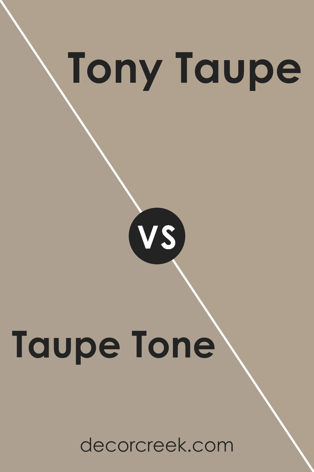
Taupe Tone SW 7633 by Sherwin Williams vs Tony Taupe SW 7038 by Sherwin Williams
Taupe Tone and Tony Taupe are both neutral colors by Sherwin Williams, but they have subtle differences. Taupe Tone is a lighter, more beige color with a warm undertone, making it soft and cozy. It suits spaces where you want a gentle, soothing backdrop. On the other hand, Tony Taupe is darker and leans more towards a grayish-brown, offering a bolder look while still maintaining warmth. This darker hue works well in areas that benefit from a stronger color presence but still keeps the environment welcoming. Both colors provide a versatile base, pairing well with a variety of decor styles and other colors.
Depending on the light and the size of the room, each color can feel different; Taupe Tone might make a small room feel airier, whereas Tony Taupe might give a larger space a more defined feel.
You can see recommended paint color below:
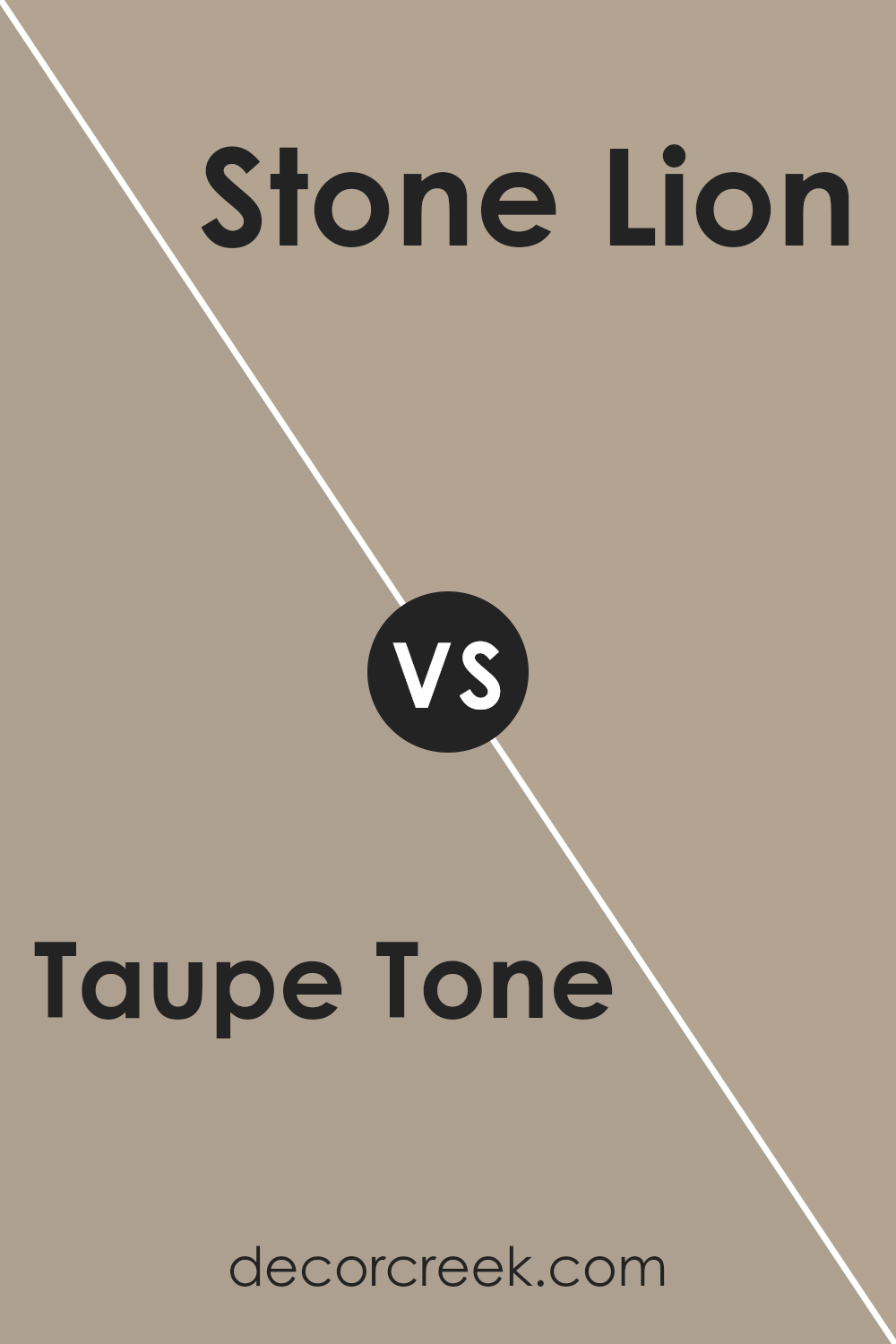
Taupe Tone SW 7633 by Sherwin Williams vs Stone Lion SW 7507 by Sherwin Williams
Taupe Tone and Stone Lion, both by Sherwin Williams, are neutral colors, but they have different undertones and vibes. Taupe Tone is a soft, warm gray with a hint of brown, making it cozy and inviting. It’s a versatile color that works well in most interior spaces, adding a gentle, welcoming feel.
On the other hand, Stone Lion has a stronger presence of brown, giving it a richer and slightly darker appearance. This color provides a sturdy, earthy feel to a room, making it ideal for spaces where you want a more grounded, secure ambiance.
Both colors pair nicely with a variety of other shades, but Taupe Tone might be better for someone looking for a lighter, airier feel, while Stone Lion suits those who prefer something more anchored and robust.
You can see recommended paint color below:
- SW 7507 Stone Lion (CHECK A SAMPLE)
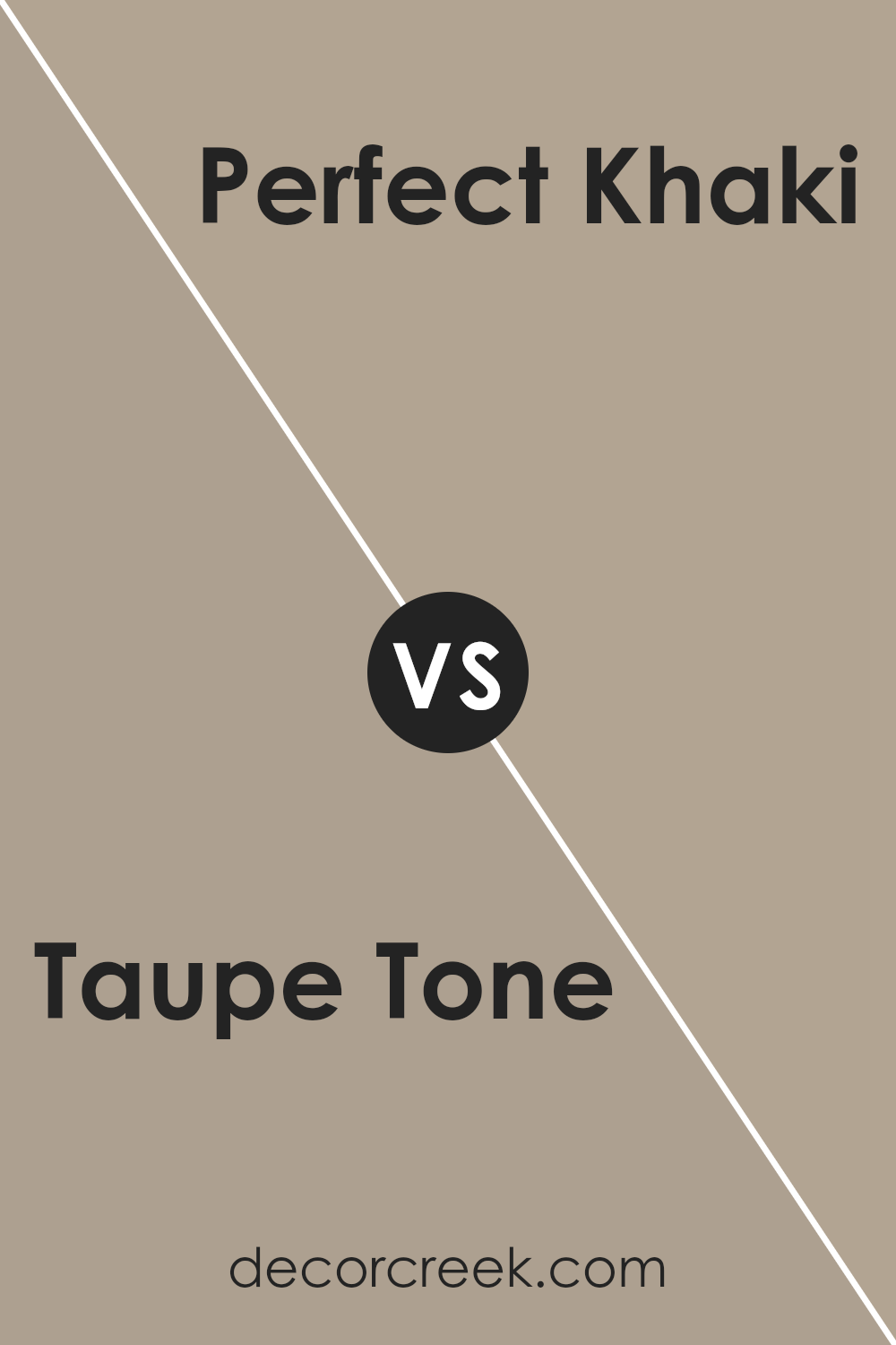
Taupe Tone SW 7633 by Sherwin Williams vs Perfect Khaki SW 9612 by Sherwin Williams
The main color, Taupe Tone, is a gentle neutral with a balanced blend of brown and gray, offering a warm base that’s highly versatile for various decorating styles. This color can make spaces feel cozy yet clean and is easy to match with a range of furniture and accent colors.
On the other hand, Perfect Khaki leans more towards a deeper, slightly richer tone that combines elements of brown with a subtle hint of green. This color adds a bit of depth to rooms and can work well in spaces that aim to have a more grounded, natural feel.
Both colors share a neutral palette, but Taupe Tone is lighter and softer, making it a better fit for smaller or less naturally lit spaces to keep them feeling open and airy. Perfect Khaki, having a bit more weight, suits larger rooms or areas where you want to create a stronger sense of warmth. Together, these colors could complement each other nicely in a space that seeks to balance light and grounding elements.
You can see recommended paint color below:
- SW 9612 Perfect Khaki (CHECK A SAMPLE)
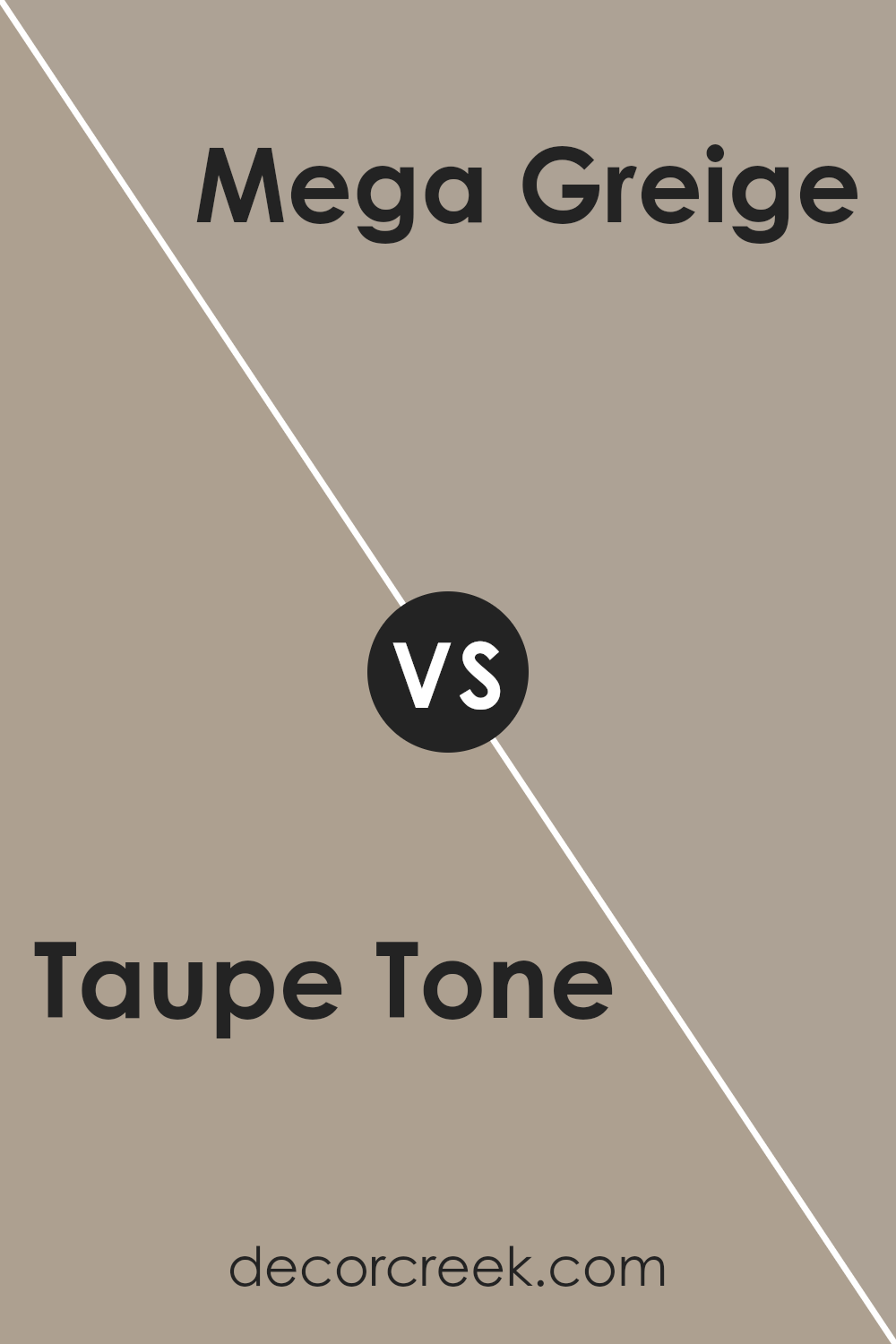
Taupe Tone SW 7633 by Sherwin Williams vs Restoration SW 9578 by Sherwin Williams
Taupe Tone and Restoration are two unique colors from Sherwin Williams, each offering a distinct vibe. Taupe Tone is a warm, welcoming neutral with brown undertones, making it a versatile choice for any space looking for a cozy, inviting feel. It blends well with a variety of decor styles and works beautifully in living areas or bedrooms.
On the other hand, Restoration is a shade darker than Taupe Tone and leans more towards gray, giving it a cooler presence. This makes it great for a modern, clean look, especially in spaces like kitchens and bathrooms. It pairs nicely with crisp whites or vibrant colors to create a balanced, modern aesthetic.
Both colors are subtle and not too overpowering, making them easy to work with. Whether you’re aiming for warmth with Taupe Tone or a sleek, contemporary feel with Restoration, each provides a solid foundation for decorating a room.
You can see recommended paint color below:
- SW 9578 Restoration (CHECK A SAMPLE)
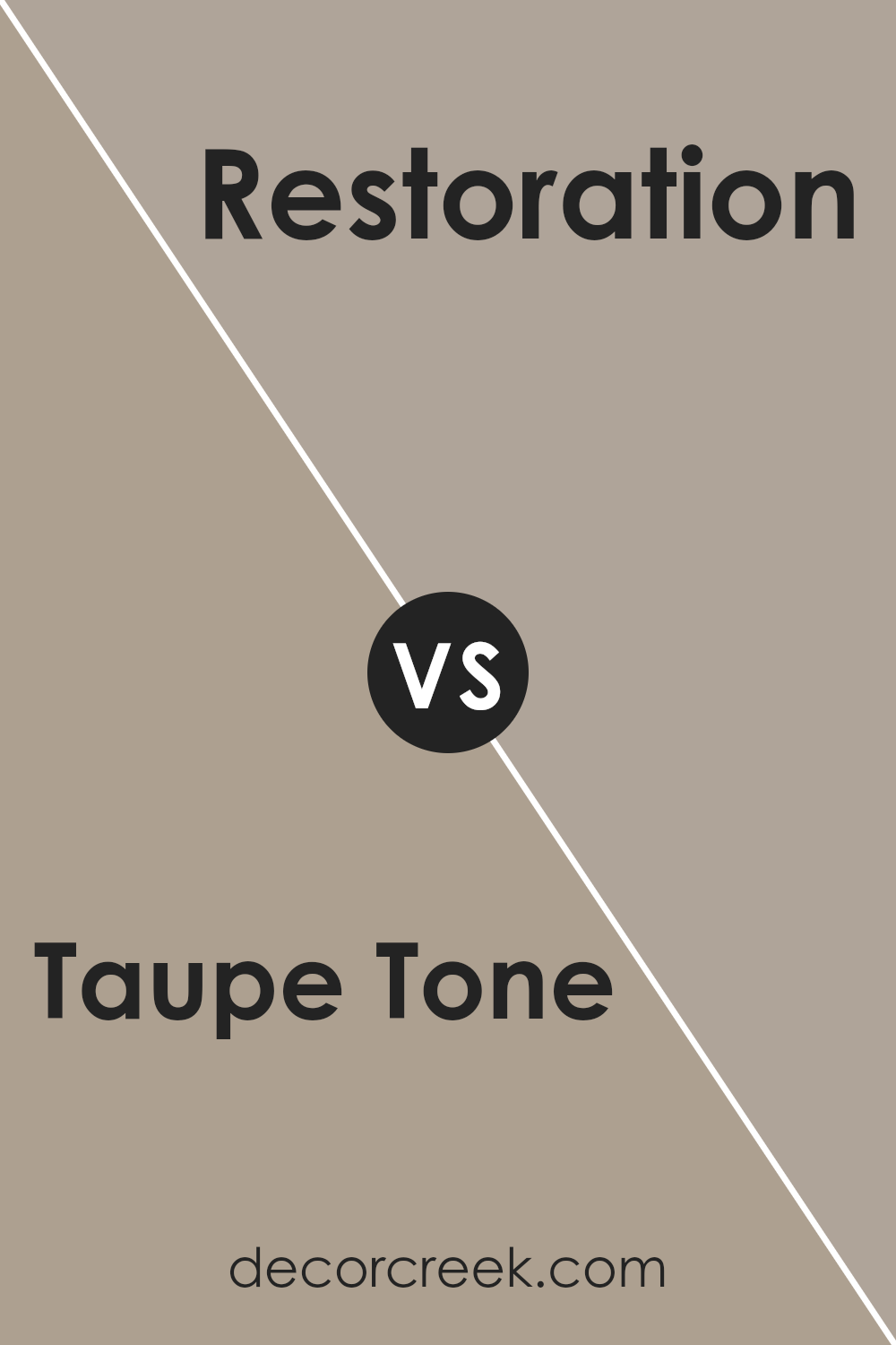
Taupe Tone SW 7633 by Sherwin Williams vs Ethereal Mood SW 7639 by Sherwin Williams
Taupe Tone and Ethereal Mood by Sherwin Williams are two neutral colors that subtly differ in their tones and the mood they set in a space.
Taupe Tone is a warm, beige color with a hint of gray. It feels cozy and grounding, making it a great choice for spaces where you want a comforting and inviting atmosphere, like living rooms or bedrooms. Its warmth works well with a variety of decor styles, from rustic to modern.
On the other hand, Ethereal Mood is a bit cooler, blending gray with a touch of blue. This color presents a more reserved and quiet feel, suitable for creating a calm and collected ambiance. It’s an excellent option for offices or bathrooms where a more relaxed environment is desired.
Both colors are versatile, but the choice between them depends on the desired warmth and mood for the room. Taupe Tone offers warmth and coziness, while Ethereal Mood provides a cooler, more reserved backdrop.
You can see recommended paint color below:
- SW 7639 Ethereal Mood (CHECK A SAMPLE)
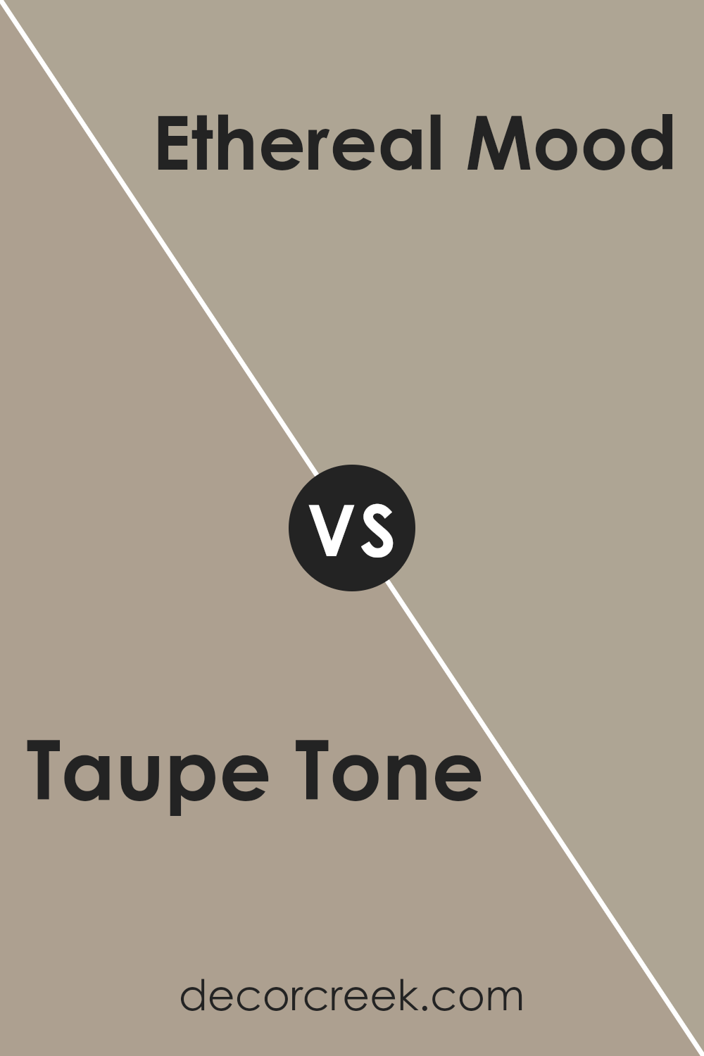
Taupe Tone SW 7633 by Sherwin Williams vs Gray Area SW 7052 by Sherwin Williams
Taupe Tone and Gray Area are both popular shades from Sherwin Williams, but they have distinct differences in color tones. Taupe Tone is a warm gray with a hint of brown, making it a cozy and welcoming color that pairs well with a variety of decor styles. It’s a versatile shade that can easily enhance a room, providing a subtle, softer appearance.
On the other hand, Gray Area is a true, balanced gray that leans towards a cooler tone. This color is perfect for achieving a more modern and crisp look in spaces. It works well in areas that benefit from a clean, straightforward backdrop that doesn’t lean too warm or too cool.
Both colors offer a neutral palette, but Taupe Tone brings a touch of warmth, making a space feel more homely, whereas Gray Area gives off a sleeker, more contemporary vibe. Depending on the mood you want to set and the existing elements in your space, either color could be a fitting choice.
You can see recommended paint color below:
- SW 7052 Gray Area (CHECK A SAMPLE)
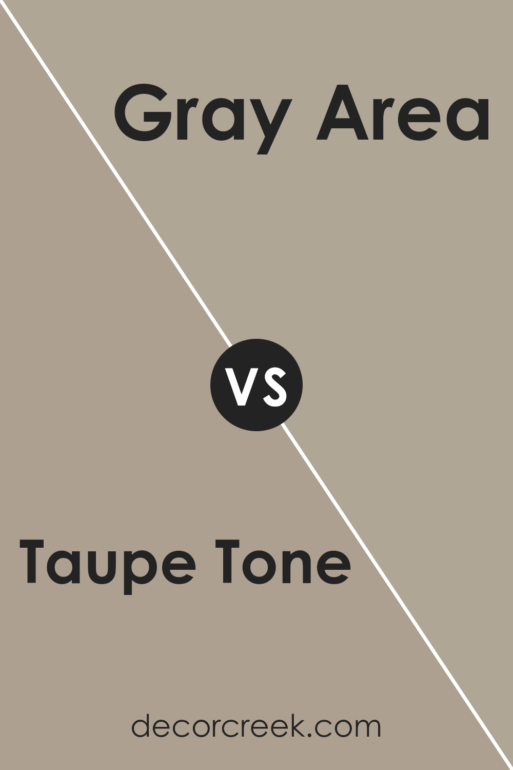
Taupe Tone SW 7633 by Sherwin Williams vs Mega Greige SW 7031 by Sherwin Williams
Taupe Tone and Mega Greige are two popular colors from Sherwin Williams that are often used to create warm and inviting spaces in homes. Taupe Tone is a soft, warm beige with a slight hint of gray. It’s a versatile color that can work well in almost any room, providing a neutral backdrop that complements a wide range of furniture and decor styles.
On the other hand, Mega Greige is a darker shade that blends beige and gray more noticeably. It’s a strong color that makes more of a statement, offering depth and warmth to larger spaces or rooms with ample natural light.
Comparing the two, Taupe Tone is lighter and tends to bring a more airy and open feel to spaces, making it ideal for smaller rooms or areas with limited light. Mega Greige, being a richer and deeper color, is better suited for spacious rooms or as an accent wall, where it can add character without overwhelming the space. Both colors work well with various decor elements and can create a cozy atmosphere in a home.
You can see recommended paint color below:
Conclusion
Taupe Tone by Sherwin Williams is a versatile shade that brings a warm and cozy feel to any room. It wonderfully balances between gray and brown, making it a perfect neutral that pairs well with many color schemes and design styles. Whether you’re looking to refresh your living space or add a touch of warmth to your bedroom, Taupe Tone offers a subtle yet impactful way to enhance your home’s aesthetic.
This color works equally well in traditional and modern spaces, lending a touch of elegance without overwhelming the senses. Its understated beauty makes it an excellent choice for those who prefer decor that speaks of calm and comfort. Whether used as a main color or an accent, Taupe Tone adapts seamlessly, providing a solid foundation for various decorating themes.
Ever wished paint sampling was as easy as sticking a sticker? Guess what? Now it is! Discover Samplize's unique Peel & Stick samples.
Get paint samples


