Surrounded by the beauty of the Cayman Islands, I found a color that completely fascinated me—952 Cayman Islands by Benjamin Moore. This shade is like a gentle whisper from the sea, soothing and calming in its presence. It’s more than a color; it’s a feeling of peacefulness and relaxation. There’s something about it that just feels right, like a cool breeze on a warm day. It instantly brought to mind images of quiet beaches and clear skies, giving my room a sense of openness and calm.
The more I looked at it, the more I appreciated its subtlety and complexity. It isn’t loud or too strong, but rather has a quiet elegance. It’s perfect for creating a peaceful environment, easy on the eyes and comforting to the soul.
I appreciated how it could change the atmosphere of a room, making it a perfect backdrop for both relaxation and creativity. The flexibility of 952 Cayman Islands makes it suitable for various rooms, adding a touch of nature’s calm to everyday life.
Choosing this color felt like inviting a piece of paradise into my home, allowing me to relax and unwind whenever I needed.
What Color Is Cayman Islands 952 by Benjamin Moore?
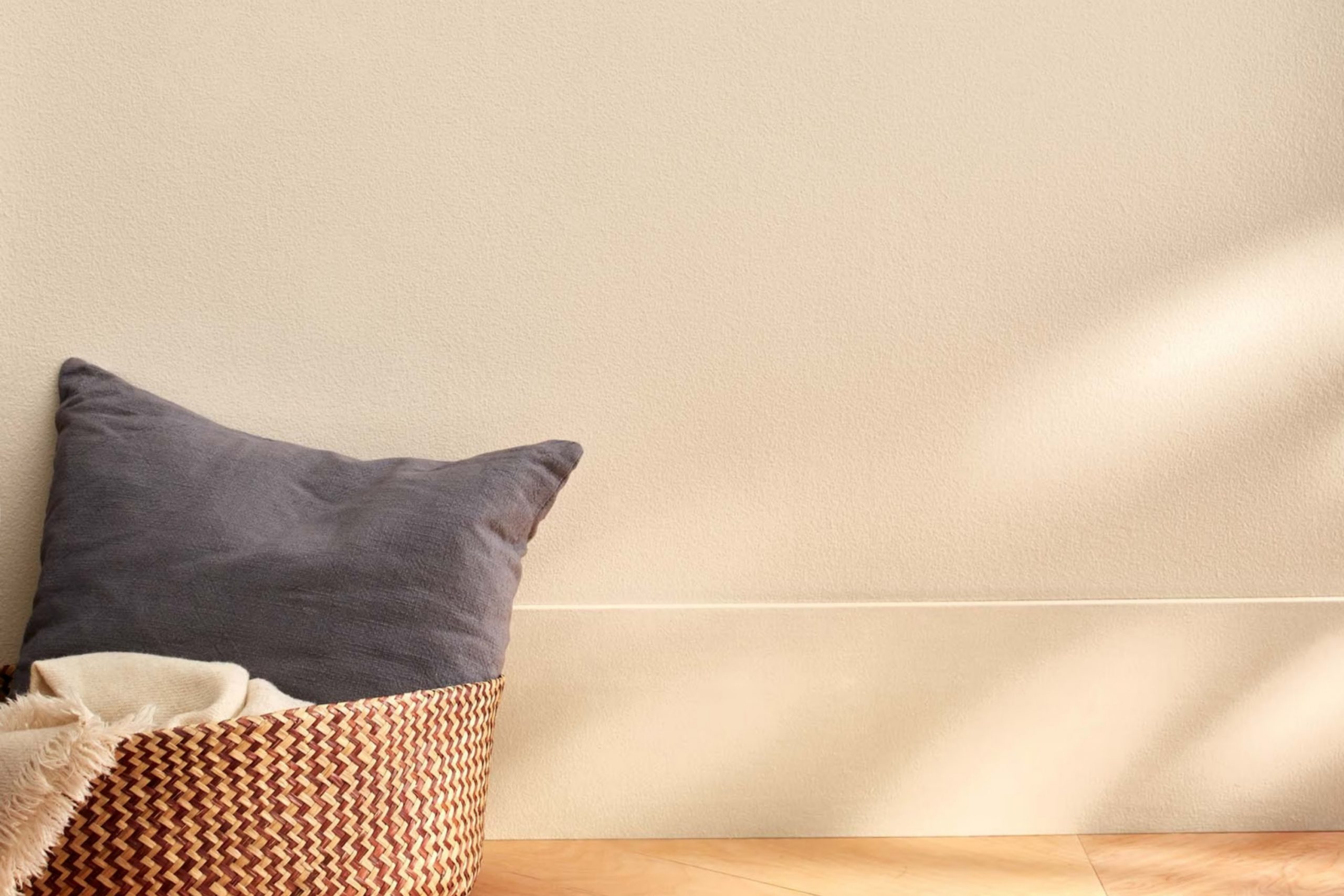
Cayman Islands by Benjamin Moore is a soothing and easy-to-use paint color reminiscent of a gentle aqua. It has a calm, tropical quality, evoking the quiet waters of the Caribbean. This color is perfect for creating a peaceful and refreshing atmosphere in any room.
Cayman Islands works best in coastal or beach-inspired interiors, where its light and breezy feel complements natural elements. It is also well-suited for contemporary or minimalist styles, adding a subtle pop of color without taking away from the simplicity of the design.
This color pairs beautifully with natural materials such as light woods, rattan, and wicker, enhancing its connection to nature. Textures like linen and cotton work well with it, emphasizing a relaxed and comfortable vibe. In a nautical setting, you can combine it with navy blues and crisp whites for a classic look. It also harmonizes with soft grays and taupes for a more understated palette.
Cayman Islands is perfect for bathrooms, bedrooms, or living areas where a calm and refreshing backdrop is desired. Its adaptable nature makes it a great choice for accent walls or even entire rooms, providing a gentle and inviting ambiance.
Is Cayman Islands 952 by Benjamin Moore Warm or Cool color?
Cayman Islands 952 by Benjamin Moore is a soft, inviting color that can create a relaxing atmosphere in a home. This shade is reminiscent of the calming blues found in nature, such as the clear waters of the Caribbean.
Its gentle hue makes it easy to use in various rooms, from living areas to bedrooms. It pairs well with both neutral tones and vibrant accents, allowing for flexibility in design choices. When used on walls, it can make a room feel open and airy, especially if the room is small or lacks natural light.
The color works well with different styles of decor, whether you prefer a modern look or something more traditional. Additionally, it can add a touch of warmth without feeling too strong, making it ideal for areas where comfort and relaxation are key. Overall, Cayman Islands 952 is a great choice for those seeking a calming and inviting feel in their home.
Undertones of Cayman Islands 952 by Benjamin Moore
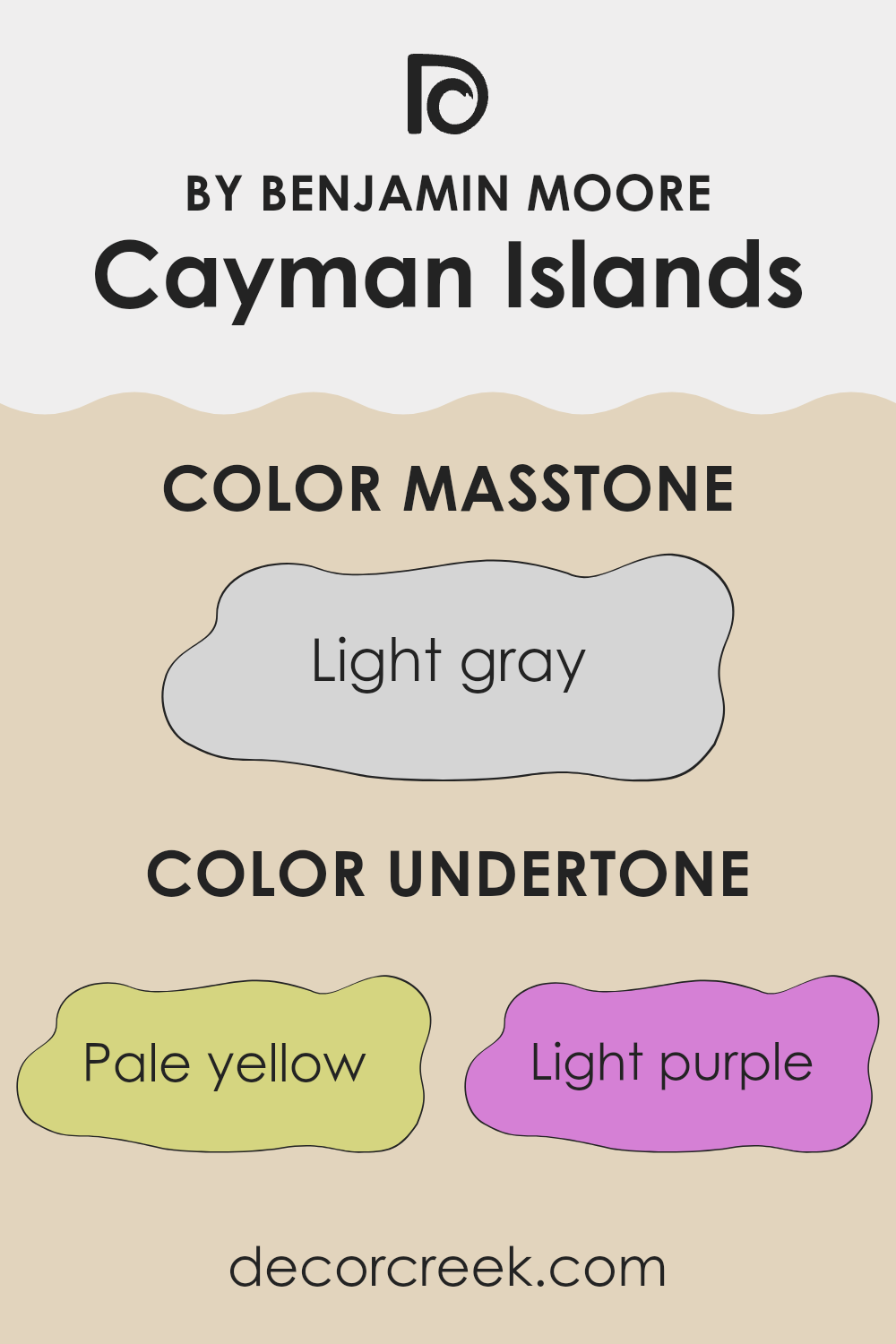
Cayman Islands 952 by Benjamin Moore is a complex and beautiful color with a variety of undertones. This paint color has hints of pale yellow, light purple, light blue, pale pink, mint, lilac, and grey. These undertones can change how we perceive the color, depending on lighting and surrounding decor.
Undertones are the subtle colors that lie beneath the main color and can change the appearance of the paint. For instance, when Cayman Islands 952 is placed in a room with warm lighting, the pale yellow undertone may become more noticeable, giving the room a warmer and cozier feel. In contrast, cool lighting might highlight its grey or light blue undertones, creating a cooler and more calming atmosphere.
When used on interior walls, the Cayman Islands 952 can adapt to different rooms. The mint and light blue notes may bring freshness and a sense of openness to a room, making it feel airy. Meanwhile, the lilac and pale pink undertones can add a subtle, gentle warmth, softening the environment. The grey undertone offers versatility, allowing this color to pair well with a variety of other colors and furnishings. Overall, the color’s varied undertones allow it to create distinct moods and adapt to different design elements within a room.
What is the Masstone of the Cayman Islands 952 by Benjamin Moore?
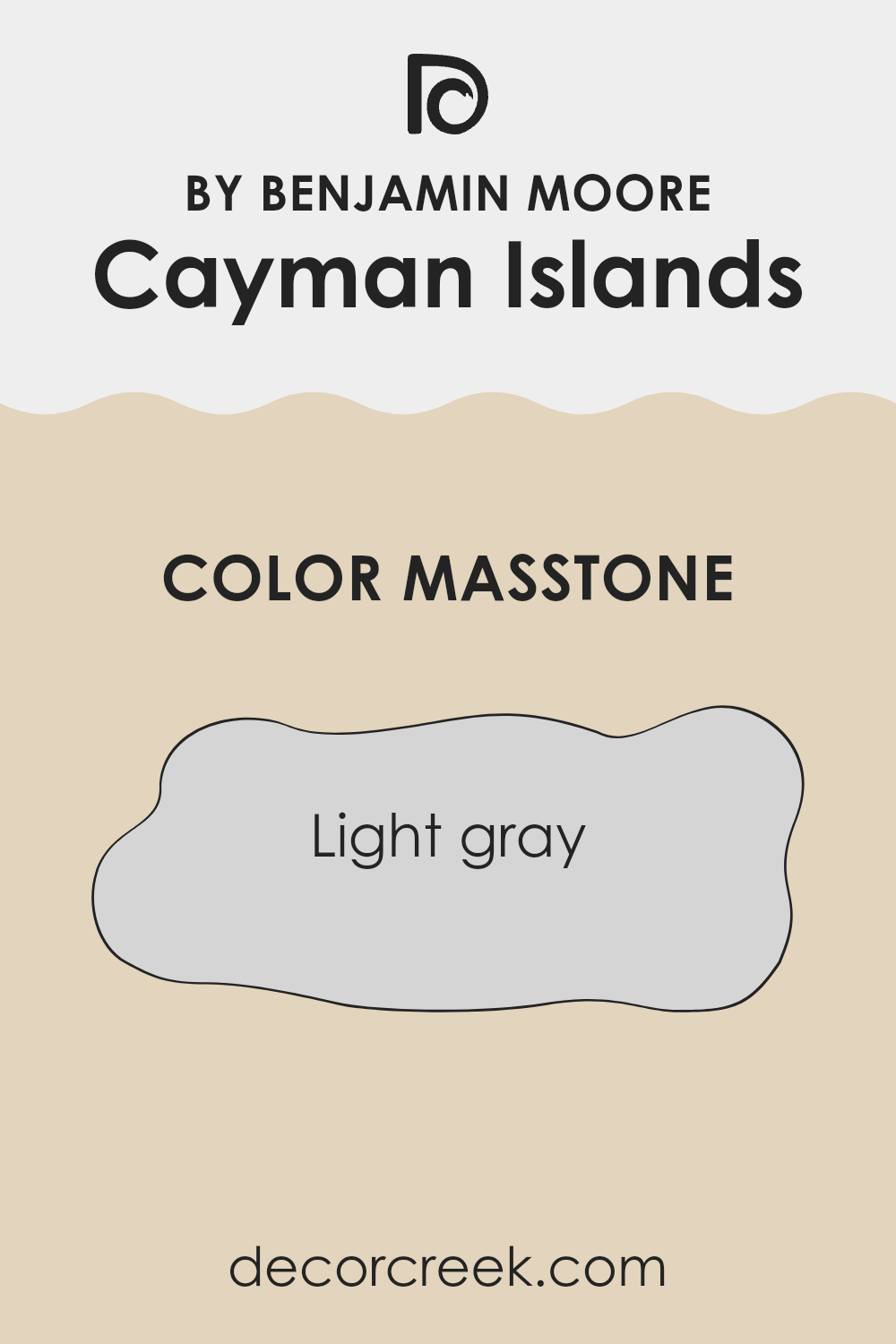
Cayman Islands 952 by Benjamin Moore is a light gray shade represented by the hex value #D5D5D5. This soft and neutral color is easy to work with, making it a popular choice for home interiors. Its lightness allows it to reflect natural light effectively, helping areas feel open and airy. Particularly in smaller rooms, it can create an illusion of more room by enhancing brightness.
This shade works well as a backdrop, allowing more vibrant colors in furniture or decor to stand out. It pairs nicely with both warm and cool colors, giving homeowners flexibility in design. Additionally, because it’s subtle, it doesn’t overwhelm a room, making it ideal for areas where you want to unwind and relax, like bedrooms and living rooms.
When applied to walls, trim, or even kitchen cabinets, Cayman Islands 952 adds a gentle touch that keeps the environment calm and inviting, appealing to various personal styles.
How Does Lighting Affect Cayman Islands 952 by Benjamin Moore?
Lighting can greatly influence the way colors appear to our eyes. Different lighting conditions can change the perception of a color’s hue, saturation, and brightness. Natural light, which varies throughout the day, often reveals the most accurate representation of colors. In contrast, artificial light, depending on its type, can cast various hues that alter how colors are seen.
The color Cayman Islands 952 by Benjamin Moore is a vibrant, teal-leaning blue. In natural light, particularly around midday, this color appears bright and lively. However, as the sun sets, the hues can deepen, giving it a richer appearance.
Under artificial lighting, the color might change further, depending on whether the light is warm or cool. Incandescent lights, which are warm, could give Cayman Islands a slightly warmer, more muted tint. Cool LED lights might enhance its blue tones, making it appear sharper and more saturated.
In north-facing rooms, which usually get consistent but cooler and softer natural light, Cayman Islands 952 may appear a bit more muted and subdued. Its undertones might come out, giving it a calming effect.
In south-facing rooms, where natural light is abundant and usually warmer, this color will appear more vibrant and lighter. It will be energized and full of life, showing its true bright blue-green shades.East-facing rooms get morning light, which is crisp and clear. In these areas, Cayman Islands 952 would look fresh and bright in the early hours, possibly softening as the day progresses and the light changes.
West-facing rooms receive warmer light in the afternoon and evening. Here, Cayman Islands 952 would appear more intense and rich later in the day. The color might feel warmer due to the red and orange tones of the evening sun, making the room feel cozy.
What is the LRV of Cayman Islands 952 by Benjamin Moore?
Light Reflectance Value, or LRV, is a measure that tells us how much light a color reflects or absorbs. It’s a scale that ranges from 0 to 100, with 0 being absolute black (absorbing all light) and 100 being pure white (reflecting all light). When it comes to paint colors, LRV helps us understand how bright or dark a color will appear once it’s on the wall. Colors with high LRV values reflect more light and can make a room feel brighter and more spacious. On the other hand, colors with low LRV values absorb more light, making rooms seem cozier or even smaller.
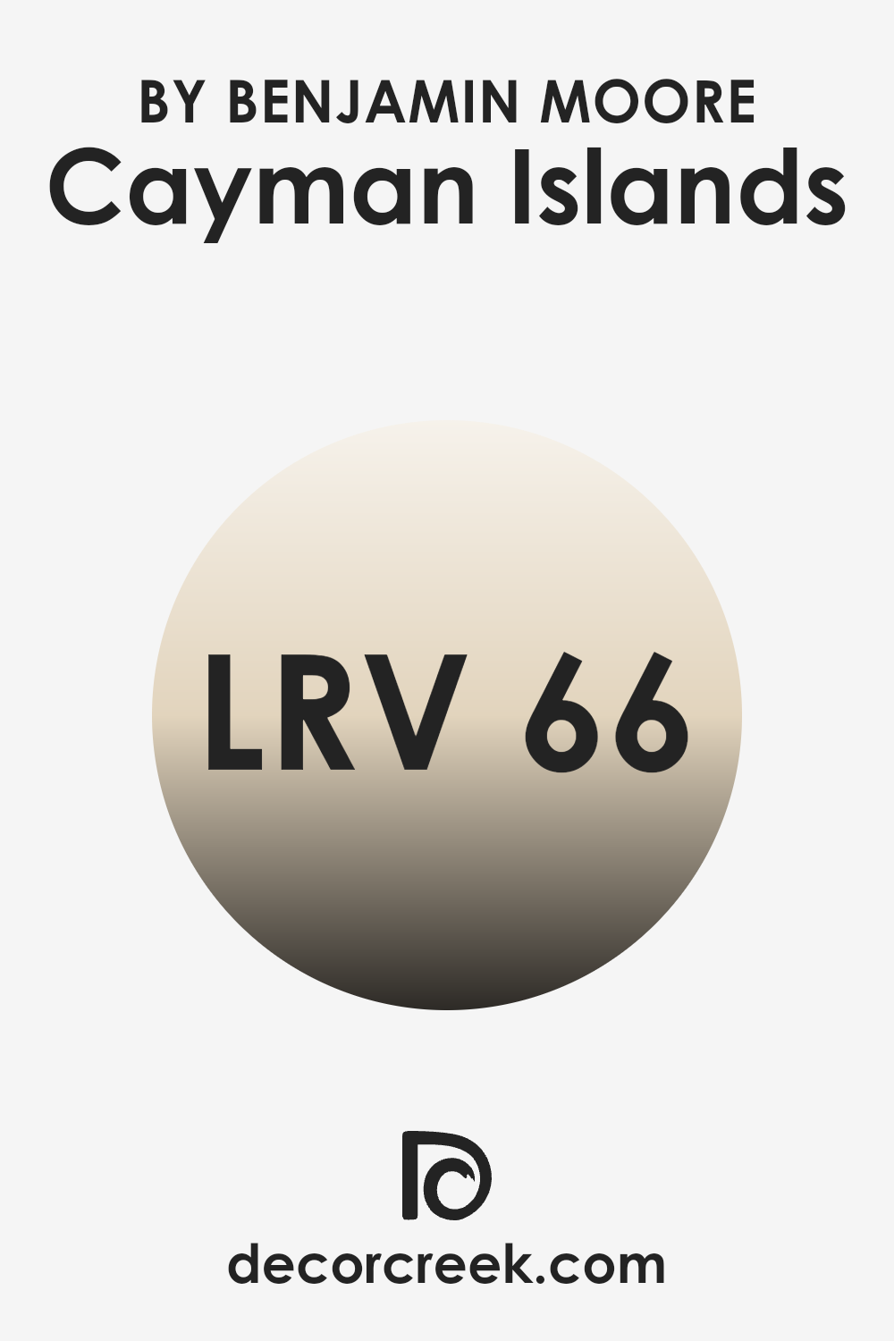
For the Cayman Islands color by Benjamin Moore, which has an LRV of 65.85, this means it reflects a good amount of light, making it suitable for areas where you want to maintain a light and airy atmosphere.
With its LRV, this color is likely to brighten up a room without being too sharp or harsh like a pure white might be. In rooms with less natural light, Cayman Islands can help make the room feel more open and inviting. In brightly lit areas, the color will maintain its presence without blending away. Overall, its moderate LRV allows it to be easy to use in different settings while creating a pleasant and uplifting environment.
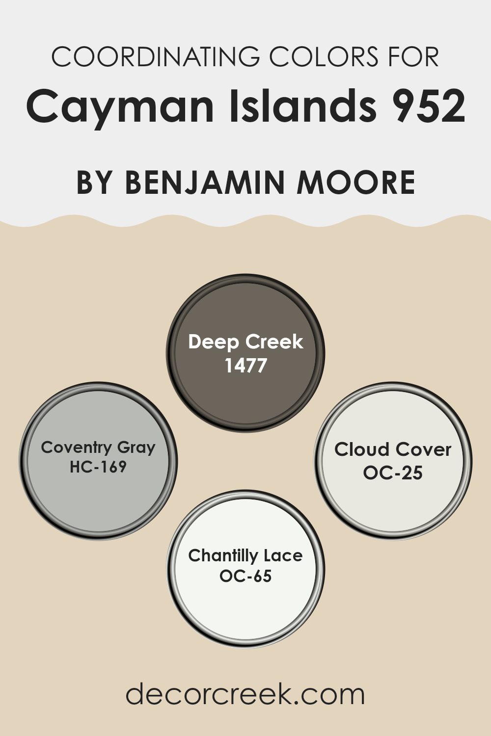
Coordinating Colors of Cayman Islands 952 by Benjamin Moore
Coordinating colors are hues that work well together, creating a balanced and pleasing palette in any room. They complement each other, either by contrast or harmony, and help to achieve a cohesive look in design. By carefully selecting colors that coordinate, you can enhance the beauty of a primary color, such as Cayman Islands by Benjamin Moore, by surrounding it with shades that either offset it or gently blend with it. This approach helps rooms feel connected, and each color can shine without overshadowing the others. The key is to find a blend that feels unified rather than out of sync.
In this palette, Deep Creek is a rich, earthy taupe that adds warmth and depth. Coventry Gray, a soft, neutral gray, grounds rooms with its subtle elegance. Cloud Cover, with its light and airy appearance, creates a gentle backdrop that opens up a room.
Finally, Chantilly Lace is a crisp, clean white that brightens any room and accentuates the surrounding colors. Together, these hues harmonize beautifully, each enhancing the others’ qualities to produce a well-rounded interior atmosphere. Whether used together or individually, they can help produce a cohesive and inviting room.
You can see recommended paint colors below:
- 1477 Deep Creek
- HC-169 Coventry Gray
- OC-25 Cloud Cover
- OC-65 Chantilly Lace
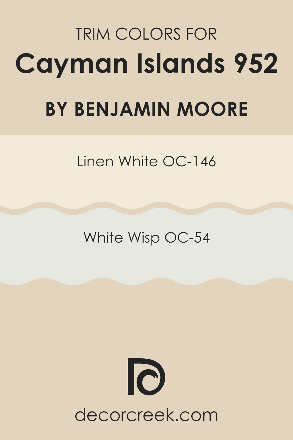
What are the Trim colors of Cayman Islands 952 by Benjamin Moore?
Trim colors are the shades used on the edges, borders, or frames around walls, ceilings, and other architectural details in a room. These colors may be different from the main wall colors to create a contrast or a subtle highlight. In the Cayman Islands, using appropriate trim colors is especially important due to the region’s bright and vibrant natural light.
The right trim color can enhance this natural light, making rooms feel brighter and more inviting. It can also help define and accentuate unique architectural features of homes and buildings, providing a crisp, clean finish that sets them apart.
OC-146 – Linen White is a soft, warm white with a hint of cream, which can offer a cozy and welcoming feel when used as a trim color. This shade complements the brighter light in the Cayman Islands by adding a touch of warmth without feeling too strong. On the other hand, OC-54 – White Wisp is an elegant, gentle gray-white that exudes a light and airy quality, perfect for creating a clean, subtle contrast with a touch of polish.
It works well as a trim to balance more vibrant wall colors, maintaining a fresh and open atmosphere. Both colors serve to enhance the aesthetic quality of any structure, adding personality and character in a subtle yet effective way.
You can see recommended paint colors below:
Colors Similar to Cayman Islands 952 by Benjamin Moore
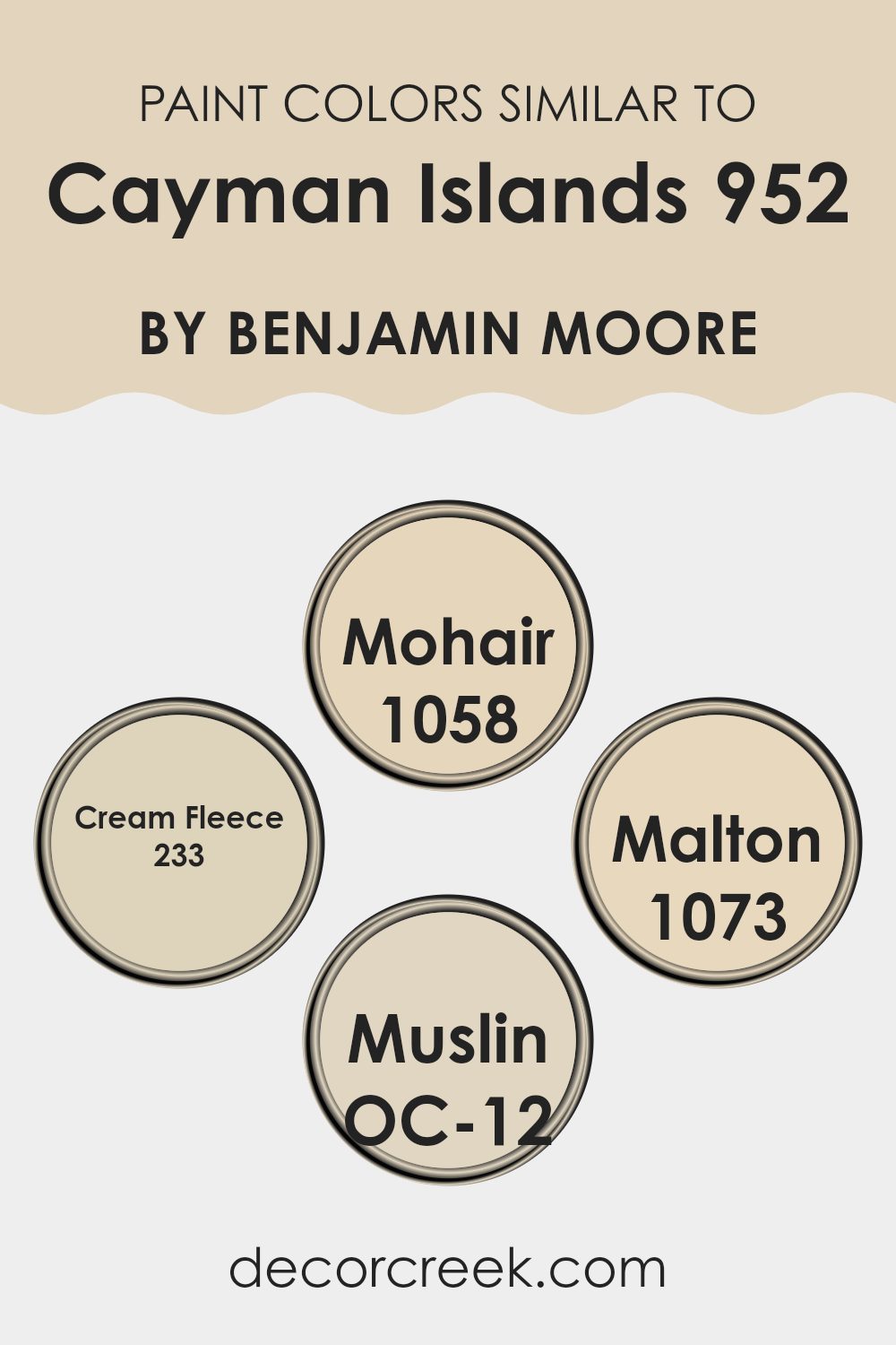
Similar colors play a key role in creating balanced and harmonious areas. They provide a sense of unity and flow in a room, making the environment feel cohesive and inviting. When selecting similar colors to Cayman Islands 952 by Benjamin Moore, shades like 1058 Mohair, 233 Cream Fleece, 1073 Malton, and OC-12 Muslin come to mind.
These colors complement each other beautifully, offering subtle variations that can add depth without feeling too intense. While each color has its own character, together they create a pleasing and consistent palette. This can be particularly important in interior design, where the aim is often to create a restful and harmonious atmosphere.
Mohair 1058 is a soft, muted gray with a hint of warmth, ideal for creating a cozy, understated backdrop. Cream Fleece 233 is a gentle, creamy tone that adds warmth with its buttery undertone. Malton 1073 provides a touch of elegance with its light beige hue, adding a polished touch to any room. Meanwhile, OC-12 Muslin is a flexible neutral that works well in almost any setting, offering a slightly earthy undertone that grounds the color scheme. Together, these colors create a palette that feels refined, yet still warm and welcoming.
You can see recommended paint colors below:
- 1058 Mohair
- 233 Cream Fleece
- 1073 Malton
- OC-12 Muslin
Colors that Go With Cayman Islands 952 by Benjamin Moore
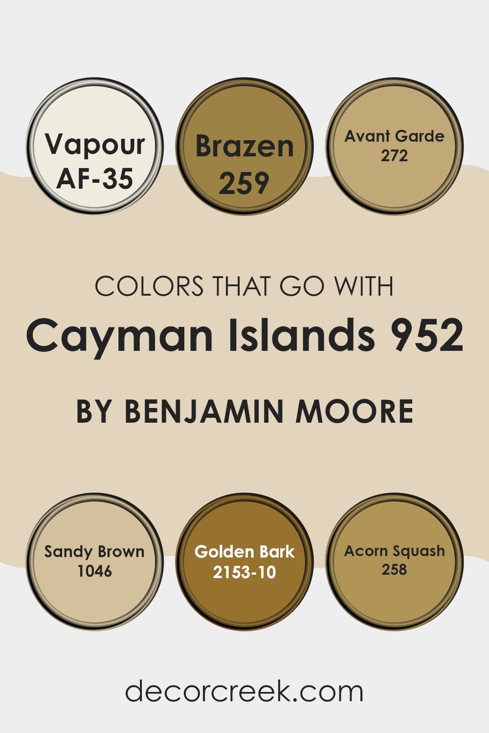
Choosing the right colors to go along with Cayman Islands 952 by Benjamin Moore can enhance the overall look and feel of a room. These complementary colors work together to create a harmonious and balanced environment. AF-35 Vapour is a soft and airy white, adding a light and refreshing touch that balances the deeper tones. Meanwhile, 259 Brazen offers a punchy, bold reddish-orange that can highlight the blues and greens found in Cayman Islands 952, adding warmth and depth without feeling too strong.
Color 272 Avant Garde introduces a modern edge with its muted gray tone, perfect for grounding the brighter colors and providing a neutral backdrop for other design elements. Sandy Brown 1046 brings in a cozy and inviting hue that complements the coolness of Cayman Islands 952 with its earthy warmth.
For a rich contrast, Golden Bark 2153-10 delivers a deep, lush brown, reminiscent of autumn leaves, which pairs beautifully with more vibrant and muted shades alike. Lastly, 258 Acorn Squash provides a softer, buttery yellow tone that brightens anreas and can highlight the lively Caribbean feel associated with Cayman Islands 952. Together, these colors give a balanced and inviting look.
You can see recommended paint colors below:
- AF-35 Vapour
- 259 Brazen
- 272 Avant Garde
- 1046 Sandy Brown
- 2153-10 Golden Bark
- 258 Acorn Squash
How to Use Cayman Islands 952 by Benjamin Moore In Your Home?
Cayman Islands 952 by Benjamin Moore is a beautiful color that brings a vibrant touch to any room in your home. This shade is a soft, tranquil blue that resembles the clear waters of the Caribbean. It’s perfect for creating a calm and inviting atmosphere.
You can use Cayman Islands 952 in a bedroom to promote relaxation and restful sleep. Pair it with white or cream-colored furniture for a clean, fresh look. In a living room, this color can serve as a stunning backdrop for colorful artwork or decorative pieces.
It also works well in bathrooms and kitchens, providing a refreshing feel. To enhance the look, consider using natural materials like wood or wicker to add warmth and texture. Accessorize with plants and light-colored fabrics to complete the room. Cayman Islands 952 can make your home look brighter and more cheerful, making it an easy-to-use choice for any style.
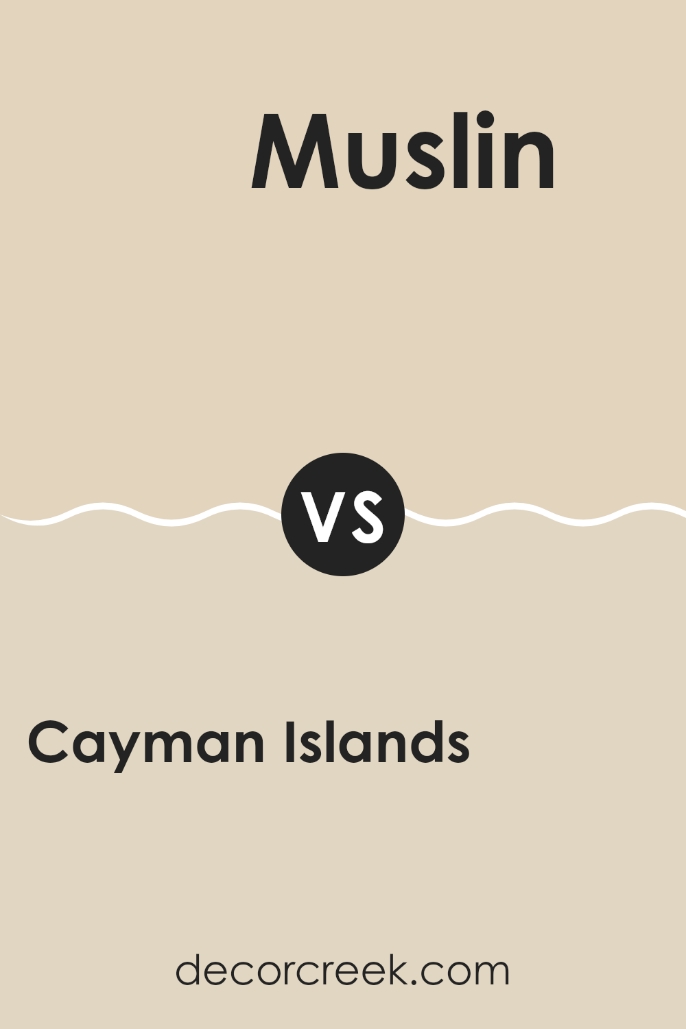
Cayman Islands 952 by Benjamin Moore vs Muslin OC-12 by Benjamin Moore
Cayman Islands 952 by Benjamin Moore is a rich, deep blue-green that brings a bold and vibrant feel to a room. It evokes images of tropical waters and lush landscapes, making it an excellent choice for creating a lively and invigorating atmosphere. This color is perfect for bringing a splash of the outdoors inside, adding energy and depth to any room.
In contrast, Muslin OC-12 by Benjamin Moore is a soft, warm beige with an inviting and understated presence. Its neutral tone makes it incredibly flexible, allowing it to complement a wide range of design styles and colors. This color is great for those who prefer a more subtle and calming environment, providing a gentle backdrop that doesn’t take over a room.
Together, these colors can create a balanced look, with Cayman Islands adding vibrancy and interest, and Muslin offering a warm, grounding touch.
You can see recommended paint color below:
- OC-12 Muslin
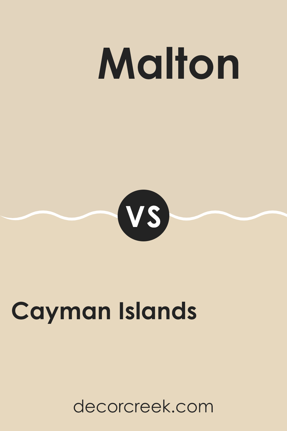
Cayman Islands 952 by Benjamin Moore vs Malton 1073 by Benjamin Moore
Cayman Islands 952 by Benjamin Moore is a refreshing and vibrant shade of teal. It evokes the feeling of a tropical getaway, with its vibrant mix of blue and green. This color is lively and energetic, perfect for adding a splash of excitement to any room. It works well as an accent color or even as a main wall color for those who love bold choices.
Malton 1073, on the other hand, is a warm and welcoming peachy beige. It offers a calming and cozy atmosphere, creating a sense of comfort and warmth. Unlike the bright and bold nature of Cayman Islands 952, Malton 1073 is subdued and easy to use, fitting well in rooms where a soft and inviting look is desired.
While both colors bring their unique vibes to a room, they differ in mood. Cayman Islands 952 is for those looking to make a strong, beach-inspired statement, whereas Malton 1073 is more subtle, adding warmth and coziness.
You can see recommended paint color below:
- 1073 Malton
Cayman Islands 952 by Benjamin Moore vs Mohair 1058 by Benjamin Moore
Cayman Islands 952 and Mohair 1058 by Benjamin Moore are two distinct colors that bring different vibes to a room. Cayman Islands 952 is a mid-tone teal that feels fresh and vibrant. It can add a lively pop of color to a room without being too overpowering. This color is great for adding a touch of energy and personality.
On the other hand, Mohair 1058 is a warm beige with hints of gray. It is a neutral shade that creates a comforting and inviting atmosphere. Mohair works well as a background color, allowing other elements in the room to stand out while maintaining a cozy feel.
When used together, these colors can create a nice balance, with Cayman Islands serving as an accent against the more subdued Mohair. This combination can make a room feel both lively and grounded, offering a mix of energy and warmth.
You can see recommended paint color below:
- 1058 Mohair
Cayman Islands 952 by Benjamin Moore vs Cream Fleece 233 by Benjamin Moore
Cayman Islands 952 and Cream Fleece 233 by Benjamin Moore offer two distinct color choices for your room. Cayman Islands 952 is a muted teal with a hint of gray, providing a calming and cool atmosphere. It’s ideal for creating a relaxed vibe in living rooms or bedrooms. The color feels fresh and pairs well with whites and other light neutrals.
On the other hand, Cream Fleece 233 is a warm, soft beige with yellow undertones. It delivers a cozy and inviting feel, making it perfect for family rooms and kitchens. This color works well in areas where warmth and comfort are the main goals.
While Cayman Islands 952 adds a touch of subtle coolness, Cream Fleece 233 surrounds you with light and warmth. Choosing between them depends on whether you want the soothing feel of teal or the coziness of cream. Both colors can beautifully enhance your home depending on your preferences.
You can see recommended paint color below:
- 233 Cream Fleece
After learning about Benjamin Moore’s 952 Cayman Islands, I feel like I’ve been taken on a colorful journey to a beautiful place. This color reminds me of the ocean and sunny days. It makes me think of a perfect vacation spot where everything feels calm and happy.
Using this color in rooms can make them feel bright and welcoming. It’s like bringing a piece of the seaside into a house. I can imagine painting a room with this color, and it would feel like sitting by the beach, listening to the waves.
What’s amazing about 952 Cayman Islands is how it can change the mood of a room. It can make a room feel bigger and more open. It’s perfect for people who love nature and want a constant reminder of sunny islands and fun adventures.
I also think this color can fit in with many styles. Whether it’s a kid’s playroom, a family living area, or even a quiet reading corner, it brings a sense of peace and joy. Benjamin Moore’s Cayman Islands color is truly special, and it shows how powerful color can be in making areas feel wonderful.
Ever wished paint sampling was as easy as sticking a sticker? Guess what? Now it is! Discover Samplize's unique Peel & Stick samples.
Get paint samples

