If you’re thinking about giving your space a fresh, lively look, you might want to consider the color SW 0073 Chartreuse by Sherwin Williams. As someone who loves adding a splash of vibrancy to rooms, I find this shade absolutely refreshing. It’s a unique blend of yellow and green that brings a lot of energy and brightness wherever it’s used.
Whether you’re looking to liven up a living room or add an invigorating touch to your kitchen, Chartreuse could be the perfect choice.
What I really appreciate about this color is how it balances being bold without overwhelming a space. It pairs beautifully with neutral tones and can also hold its own with darker colors, providing a lovely contrast. It’s not just about looks; the cheerful vibe of this color can also affect your mood, making an area feel more inviting and lively.
So, if you’re thinking about repainting a room or just want to add a bit of zest to your current decor, consider Chartreuse. It might just be the pop of color you are looking for to make your space feel new and exciting.
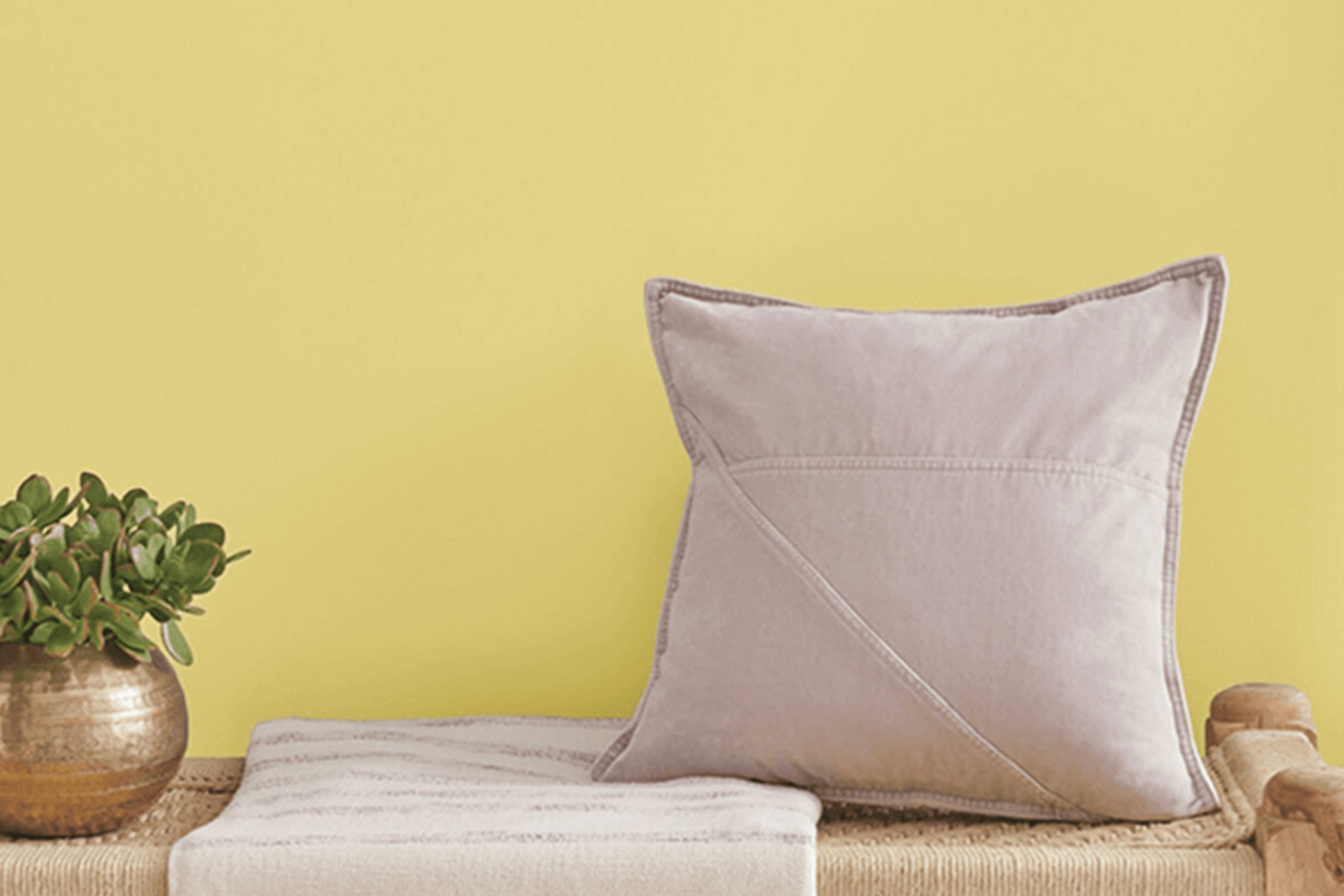
What Color Is Chartreuse SW 0073 by Sherwin Williams?
The color Chartreuse by Sherwin Williams is a vibrant green with a hint of yellow, bringing a lively burst of energy to any space. This hue is particularly striking and works well when you want to add a cheerful, dynamic vibe to your surroundings.
Chartreuse is versatile and can enhance various interior styles. It performs exceptionally well in modern and contemporary settings due to its bold and fresh appeal. In eclectic interiors, it acts as a perfect accent color that can be used to liven up the room. Additionally, it’s an excellent choice for retro-inspired spaces where it pairs brilliantly with mid-century modern elements.
When it comes to combining materials and textures with this color, Chartreuse harmonizes beautifully with natural wood, adding warmth and a grounding effect to the vivid green. Metals like brass or copper can also complement this color, introducing an element of luxury and contrast. Soft textures like velvet or wool in neutral shades such as beige, grey, or cream help balance the intensity of Chartreuse, making the interior look cozy yet lively.
For a more daring and energetic space, pairing it with bold patterns such as stripes or geometric prints can enhance its dynamic nature.
The adaptability of Chartreuse makes it a striking choice for those looking to inject personality and vibrancy into their décor.
Is Chartreuse SW 0073 by Sherwin Williams Warm or Cool color?
ChartreuseSW 0073 by Sherwin Williams is a vibrant and lively color that brings a unique energy into any room. This shade of green with a hint of yellow is bright and bold, making it a perfect choice for spaces that need a touch of cheerfulness. When used in a home, it can make a striking accent wall or can be incorporated through smaller elements like cushions or decorative items to add a pop of color without overwhelming the space.
This color works well in creative spaces like art studios or playrooms where its energizing effect can stimulate creativity and liveliness. In areas meant for relaxation such as living rooms, using it in moderation can add a lively contrast to neutral tones, enhancing the overall aesthetic without being too intense.
Due to its strong hue, it’s important to balance it with softer or neutral colors to create a harmonious environment. It pairs wonderfully with whites, greys, and even navy blues. Overall, incorporating ChartreuseSW 0073 into a home design can make spaces more dynamic and enjoyable.
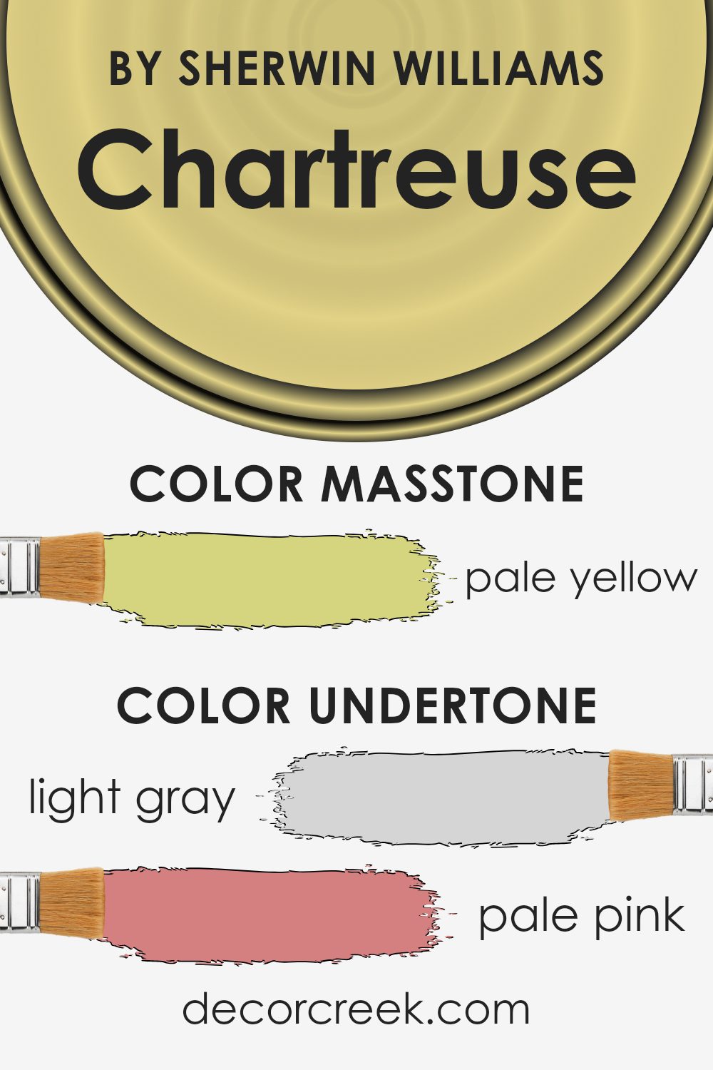
Undertones of Chartreuse SW 0073 by Sherwin Williams
ChartreuseSW 0073 by Sherwin Williams is a vibrant color that can significantly influence the mood and appearance of a room depending on its undertones. Undertones are subtle hues mixed with the original paint color, affecting how we perceive the main color in different lighting conditions and settings.
The undertones in ChartreuseSW 0073 include light gray, pale pink, yellow, mint, light purple, orange, light blue, gray, light green, lilac, and olive. These undertones can make the chartreuse appear softer, warmer, or cooler, shaping how the color interacts with furniture, decor, and other wall colors.
For instance, the light gray and mint undertones can cool down the intensity of the chartreuse, making it more refreshing and calm, which is excellent for a space needing a touch of brightness without overwhelming the senses. The pale pink and light purple can add a subtle softness, making the room feel more inviting.
On interior walls, these undertones enable ChartreuseSW 0073 to adapt to various themes and accessories. In natural light, the yellow and light green undertones might become more dominant, giving a room a sunny vibe. Whereas, in artificial lighting, the warmer undertones like orange and olive might stand out, offering a cozy, welcoming feel.
Choosing accessories and complementary colors that align with these undertones can enhance the overall aesthetics of your room. For instance, using curtains or cushions in shades of mint or light blue can highlight the cooler undertones, while wooden furniture and earthy elements might accentuate the warmer tones like olive and orange. This understanding of undertones helps in achieving a cohesive interior design that resonates with the desired atmosphere of your space.
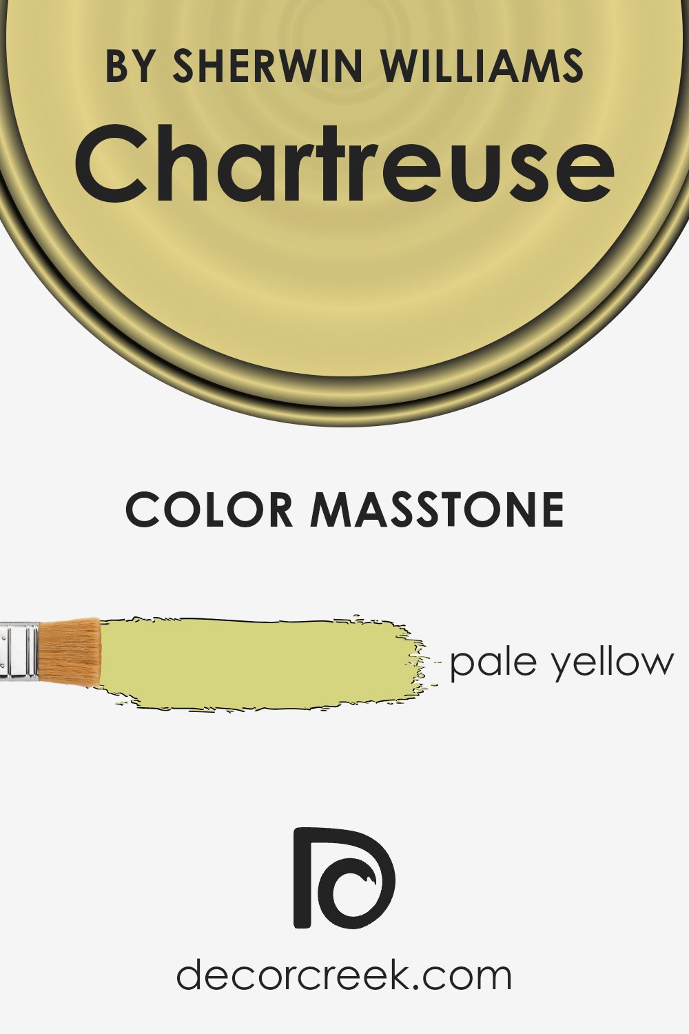
What is the Masstone of the Chartreuse SW 0073 by Sherwin Williams?
The color ChartreuseSW 0073 by Sherwin Williams primarily shows up as a pale yellow. This pale yellow hue, which can brighten any room, offers a calm and cheerful backdrop in homes. Its light tone makes it perfect for smaller spaces, as it tends to make rooms look bigger and more open.
Since it’s such a soft color, it easily matches with many other colors, allowing for versatile decoration options. People can pair it with darker greens, grays, and blues for a natural feel or match it with bright colors for a more playful space.
This color is especially useful in areas that don’t get much sunlight, as its brightness can mimic natural light and make the space feel more inviting. Overall, the pale yellow of ChartreuseSW 0073 offers a light, cheerful environment that can make any home feel welcoming and fresh.
How Does Lighting Affect Chartreuse SW 0073 by Sherwin Williams?
Lighting plays a crucial role in how colors appear in different environments, impacting the overall mood and feel of a space. When considering the paint color Chartreuse by Sherwin Williams, understanding how it interacts with light can help in deciding where to use it effectively.
Artificial vs. Natural Light:
– Artificial Light: Under artificial lighting, the color Chartreuse tends to take on a bolder and more vibrant tone. In spaces with warm-toned bulbs, it might appear slightly more yellowish, giving a cheerful and lively ambiance to the room.
– Natural Light: In the presence of natural light, this color can look more dynamic. Depending on the intensity and angle of the sunlight, it might shift throughout the day, from a bright, zesty lime in direct light to a softer, muted green in weaker light.
Room Orientation and Light Effects:
- North-Faced Rooms: North-facing rooms usually receive less direct sunlight, which can make colors appear cooler. Chartreuse in such a room might seem more subdued and slightly greener than yellow, maintaining a fresh and light feel.
- South-Faced Rooms: In south-facing rooms, abundant in bright, warm light for most of the day, Chartreuse can really pop, appearing lively and vibrant. This setting enhances the paint’s energetic qualities, making the room feel invigorated.
- East-Faced Rooms: Rooms facing east benefit from the morning sunlight, which can make Chartreuse look very bright and intense in the morning, gradually softening as the day progresses. This makes it an excellent choice for waking up to a bright and cheerful space.
- West-Faced Rooms: In west-facing rooms, the color will experience the soft morning light, shifting towards a more intense and warm appearance in the evening. This dynamic change can make Chartreuse a versatile backdrop that changes mood from calm mornings to energetic evenings.
By understanding how lighting affects this particular shade, you can use it to enhance the space visually and alter its perception at different times of the day.
What is the LRV of Chartreuse SW 0073 by Sherwin Williams?
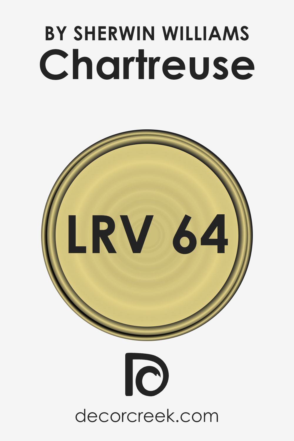
LRV, or Light Reflectance Value, is a measure that indicates how much light a paint color reflects or absorbs. Paint colors with a higher LRV reflect more light, while those with lower values absorb more light. This has a significant impact on how we perceive color in different environments.
A room with a higher LRV color will generally appear lighter and brighter, because more light is being reflected back into the room. Conversely, colors with lower LRV can make a room look darker since they absorb more light.
In the case of the color Chartreuse SW 0073 by Sherwin Williams, which has an LRV of approximately 64.1, it falls on the brighter side of the scale. This means it is capable of reflecting a good amount of light, making it a great option for spaces that you want to appear lively and bright. In rooms that get a lot of sunlight, using a color with this LRV can enhance the brightness, creating a vibrant space. However, in dimly lit areas, even with its relatively high LRV, it might not appear as bright and could look slightly muted.
Coordinating Colors of Chartreuse SW 0073 by Sherwin Williams
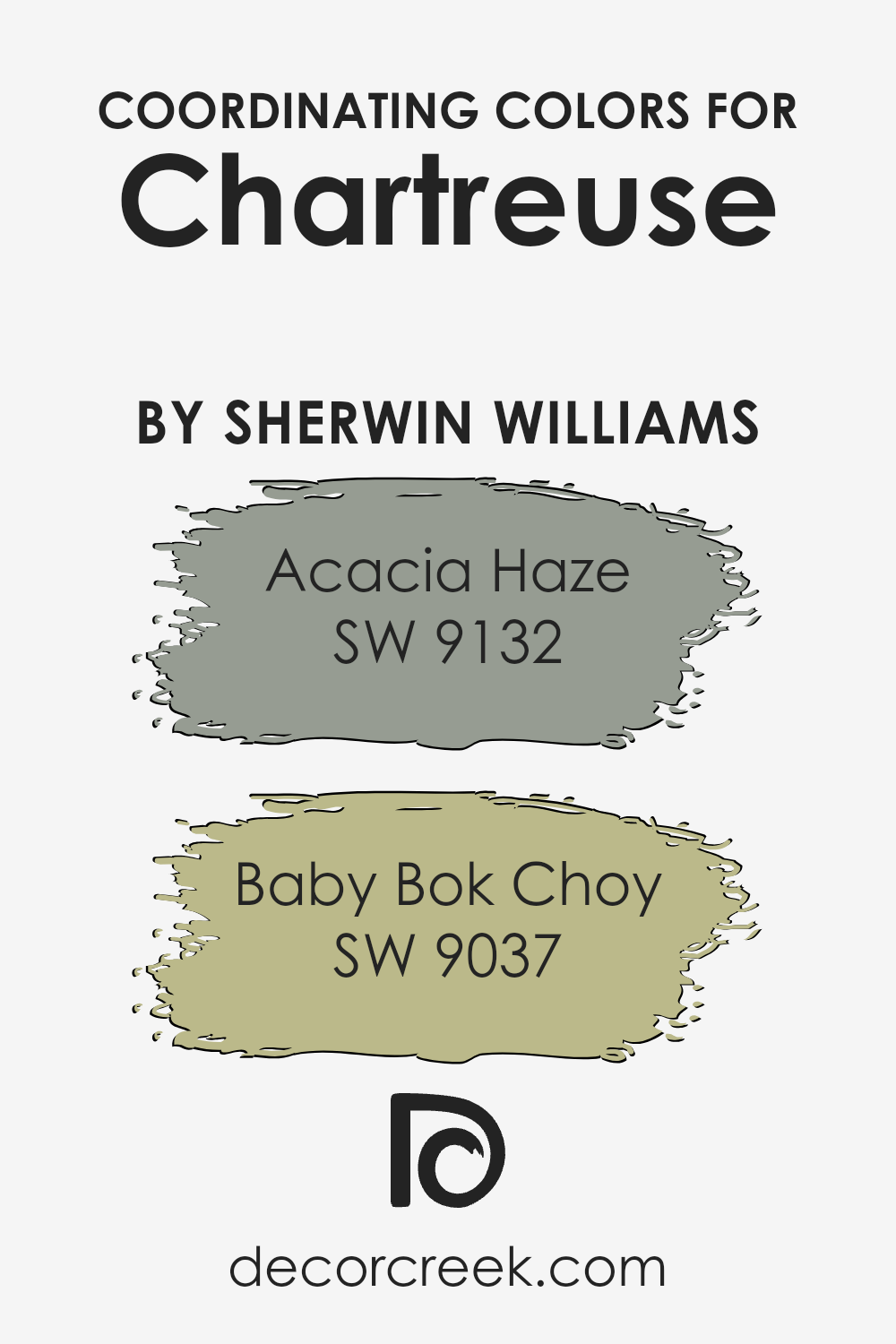
Coordinating colors are hues that complement each other when used together in design and decor. They help create a harmonious and balanced visual experience. A good example of this is how certain colors can be paired with Chartreuse by Sherwin Williams to enhance its boldness without overpowering it. Coordinating colors like SW 9132 – Acacia Haze and SW 9037 – Baby Bok Choy play this role beautifully.
Acacia Haze is a subtle green with a grayish tint, providing a calm backdrop that allows brighter colors like Chartreuse to stand out without clashing. It’s perfect for larger surface areas like walls since it’s not too dominating. On the other hand, Baby Bok Choy has a lighter, almost pastel green shade that offers a softer contrast.
It’s especially useful for accents and smaller elements within a room, giving a fresh uplift while maintaining a gentle visual flow with its surroundings. Both these shades support and complement the vividness of Chartreuse, ensuring the space feels well-coordinated and visually appealing.
You can see recommended paint colors below:
- SW 9132 Acacia Haze (CHECK A SAMPLE)
- SW 9037 Baby Bok Choy (CHECK A SAMPLE)
What are the Trim colors of Chartreuse SW 0073 by Sherwin Williams?
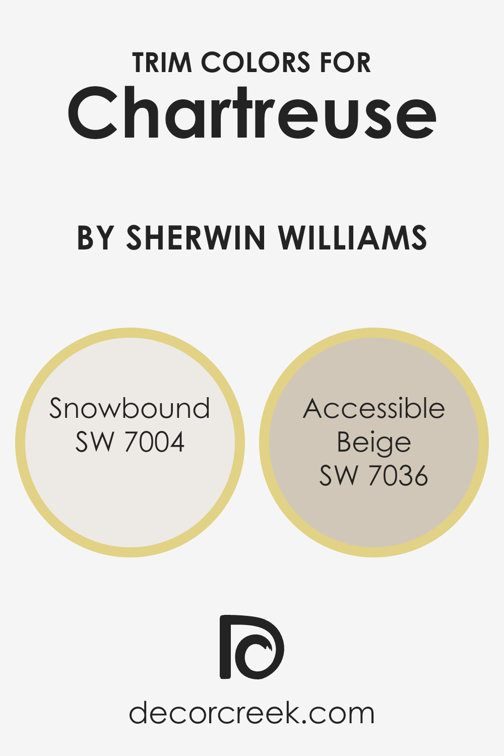
Trim colors are used to enhance architectural details and frame the main colors of a room, providing a visual contrast that helps to define spaces. For Chartreuse, a vibrant and lively color, choosing the right trim colors is crucial to ensure that the bold hue stands out without overwhelming the space. Snowbound and Accessible Beige are excellent choices for trim as they both offer a soft backdrop that complements the intensity of Chartreuse.
Snowbound is a soft, warm white with subtle undertones that can make a room feel bright and airy. It creates a gentle contrast with Chartreuse, ensuring that the lively green pops without clashing. On the other hand, Accessible Beige is a warm beige with a welcoming and earthy feel that grounds the vibrant Chartreuse, providing balance and a sense of harmony to the room.
Together, these trim colors work seamlessly to highlight the beauty of Chartreuse while maintaining a harmonious atmosphere.
You can see recommended paint colors below:
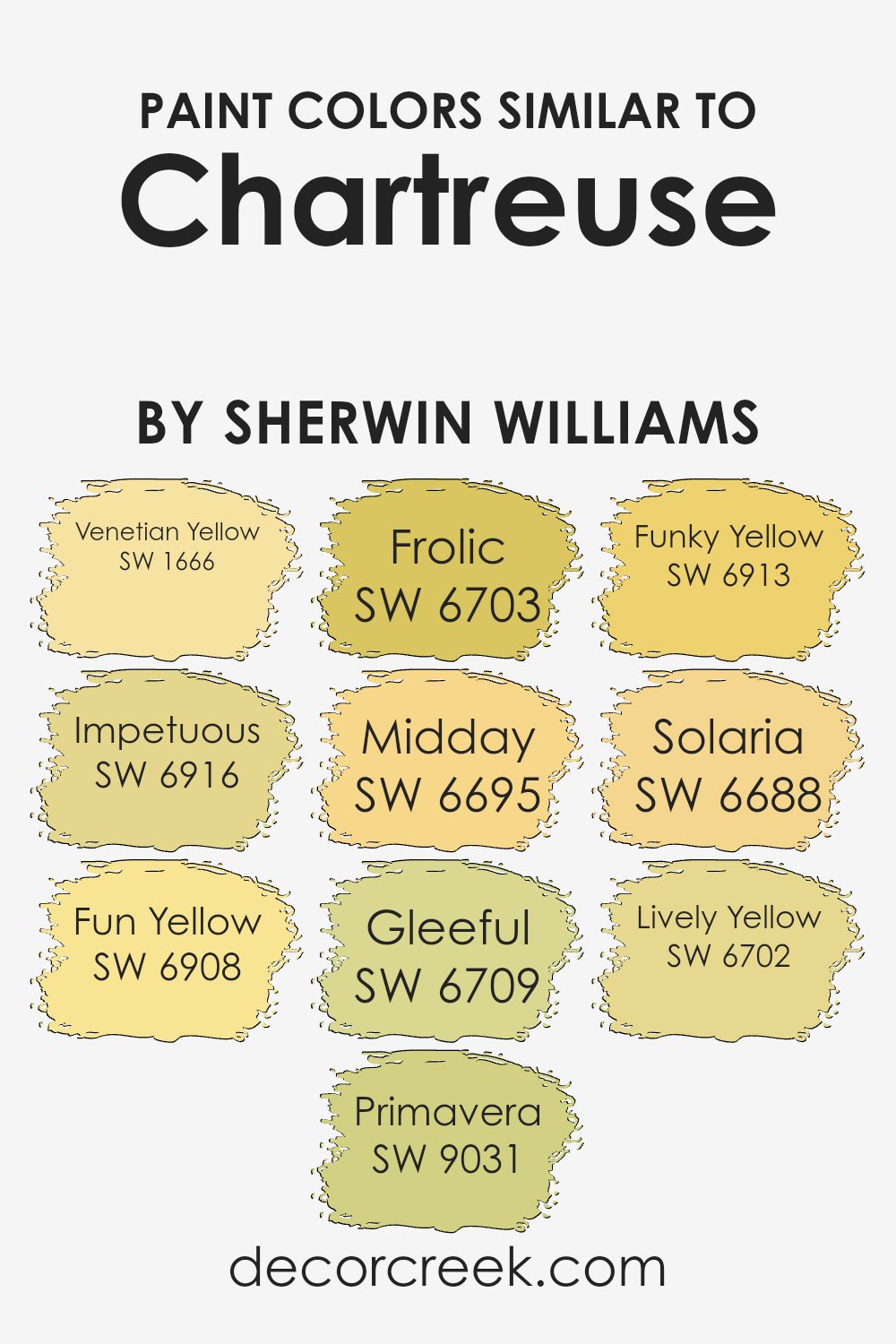
Colors Similar to Chartreuse SW 0073 by Sherwin Williams
Similar colors play a crucial role in interior design by creating a cohesive and harmonious environment. By utilizing shades that closely relate to each other, such as those similar to Chartreuse SW 0073 by Sherwin Williams, you can achieve a visually pleasant space that has a consistent theme.
Colors like Venetian Yellow, Fun Yellow, and Funky Yellow bring a sunny vibrancy, perfect for spaces intended to be lively and energizing. Meanwhile, colors such as Impetuous and Solaria provide a dynamic punch, ideal for accent pieces or a feature wall that needs to stand out yet remain in harmony with the surrounding elements.
Primavera, Frolic, and Midday are fantastic when you’re aiming for a fresh, youthful look, adding a light-hearted touch to the room. On the other hand, Gleeful and Lively Yellow are great for injecting a sense of joy and playfulness into the décor. By strategically using these similar colors, one can effectively set the mood and tone of the space while ensuring that different elements in the room are unified, creating a cohesive and inviting atmosphere.
Whether it’s through painting walls, choosing furniture, or selecting accents, these similar shades can work together to enhance the aesthetic appeal of a space effectively.
You can see recommended paint colors below:
- SW 1666 Venetian Yellow (CHECK A SAMPLE)
- SW 6916 Impetuous
- SW 6908 Fun Yellow (CHECK A SAMPLE)
- SW 9031 Primavera (CHECK A SAMPLE)
- SW 6703 Frolic (CHECK A SAMPLE)
- SW 6695 Midday (CHECK A SAMPLE)
- SW 6709 Gleeful (CHECK A SAMPLE)
- SW 6913 Funky Yellow (CHECK A SAMPLE)
- SW 6688 Solaria (CHECK A SAMPLE)
- SW 6702 Lively Yellow (CHECK A SAMPLE)
How to Use Chartreuse SW 0073 by Sherwin Williams In Your Home?
Chartreuse SW 0073 is a vibrant color from Sherwin Williams that adds a cheerful splash to any room. This shade of green-yellow is perfect for bringing energy and brightness into a space. You can use Chartreuse in a variety of ways around your home. For instance, it makes for a great accent wall in a living room or kitchen, giving a lively contrast to more neutral tones.
If painting a whole wall seems too much, consider using it on smaller elements, such as a backsplash, a door, or furniture pieces to liven up the room without overwhelming it.
Additionally, Chartreuse works well in home offices or study areas, as it’s thought to stimulate creativity and mental energy. Pair it with white or gray for a balanced look, or go bold by combining it with blues or purples for a more dramatic effect. Whether you choose to use it in big doses or small touches, Chartreuse can easily make your home more welcoming and cheery.
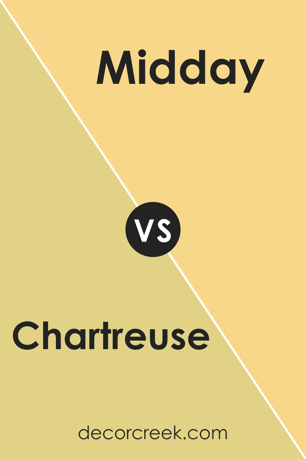
Chartreuse SW 0073 by Sherwin Williams vs Midday SW 6695 by Sherwin Williams
Chartreuse SW 0073 is a vibrant shade that leans towards a bright green with a hint of yellow. It’s a lively color that catches the eye and brings a lot of energy to a space. It’s perfect for adding a punch of color to a room or in decorative accents to spark visual interest.
On the other hand, Midday SW 6695 is quite different. It’s a cheerful, bright yellow that shines with a sunny disposition. This color creates a warm, inviting atmosphere and is especially good for spaces where you want to create a happy and cozy vibe.
While both Chartreuse and Midday bring brightness and life to any space, Chartreuse offers a cooler tone due to its greenish influence, making it a bit more refreshing. Midday, with its dominant yellow tones, feels warmer and more mellow. Both colors stand out strongly on their own but could create a striking contrast if used together in the right context.
You can see recommended paint color below:
- SW 6695 Midday (CHECK A SAMPLE)
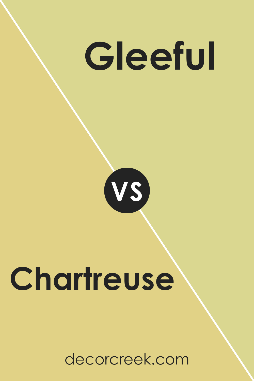
Chartreuse SW 0073 by Sherwin Williams vs Gleeful SW 6709 by Sherwin Williams
Chartreuse SW 0073 and Gleeful SW 6709 are two vibrant shades offered by Sherwin Williams, each bringing its unique personality to a space. Chartreuse is a lively yellow-green hue that pops with energy and freshness. It’s an upbeat color that works well in spaces that need a touch of dynamism without overwhelming the senses. This color can lighten up any room, giving it a lively and refreshing vibe.
On the other hand, Gleeful is a bright and cheerful green that leans more towards a true green than Chartreuse. It is reminiscent of spring and early summer, bringing thoughts of fresh leaves and grass. This shade is perfect for creating an inviting and happy atmosphere in any room.
While both colors are bright and happy, Chartreuse has a noticeable yellow tint, making it warmer, whereas Gleeful is cooler with its closer ties to pure green. Depending on the mood you wish to create, Gleeful might be more calming, while Chartreuse adds more vibrancy and energy. Combining them could offer a refreshing palette that is both lively and harmonious.
You can see recommended paint color below:
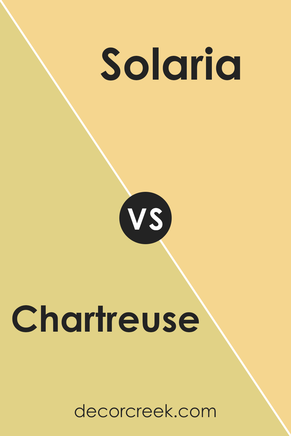
Chartreuse SW 0073 by Sherwin Williams vs Solaria SW 6688 by Sherwin Williams
Chartreuse and Solaria by Sherwin Williams are two vibrant shades that really stand out, but in their own unique ways. Chartreuse is a lively green with a noticeable brightness that can make any space feel alive and energetic. It’s perfect for adding a pop of color where you want to inject some vitality and freshness.
On the other hand, Solaria is a bold, sunny yellow that radiates warmth and cheer. This color has a sunny disposition that can brighten up a room and bring a sense of happiness and optimism.
Using Chartreuse in a room can be a great way to bring in a natural, fresh feel, similar to the way green leaves can liven up a space. Solaria, with its warm yellow tone, works well in spaces where you want to create an inviting, cheerful atmosphere, like kitchens and living rooms.
Both colors are strong enough to be focal points, yet each brings its own distinct vibe to a space. Whether you’re aiming for the fresh vibrancy of green or the sunny sparkle of yellow, both colors are excellent choices for making a statement.
You can see recommended paint color below:
- SW 6688 Solaria (CHECK A SAMPLE)
Chartreuse SW 0073 by Sherwin Williams vs Impetuous SW 6916 by Sherwin Williams
Chartreuse and Impetuous by Sherwin Williams are two very distinct colors. Chartreuse is a vibrant mix of green and yellow, reminiscent of fresh spring leaves or a zesty lime. It’s the kind of color that adds a lively splash to any space, making it feel more energetic and inviting. This makes it great for areas like kitchens or creative spaces where you want to stimulate activity and creativity.
On the other hand, Impetuous is a bold and deep pink color, much richer and with a sense of drama. It seems closer to the color of bright magenta flowers or a stunning sunset. This color can create a strong impression in a room, perfect for adding a sense of excitement or passion. It works well in spaces like dining rooms or bedrooms where a touch of intensity can enhance the overall mood.
Both colors are striking in their own ways and can significantly affect the feel of a room based on their intensity and hue.
You can see recommended paint color below:
- SW 6916 Impetuous
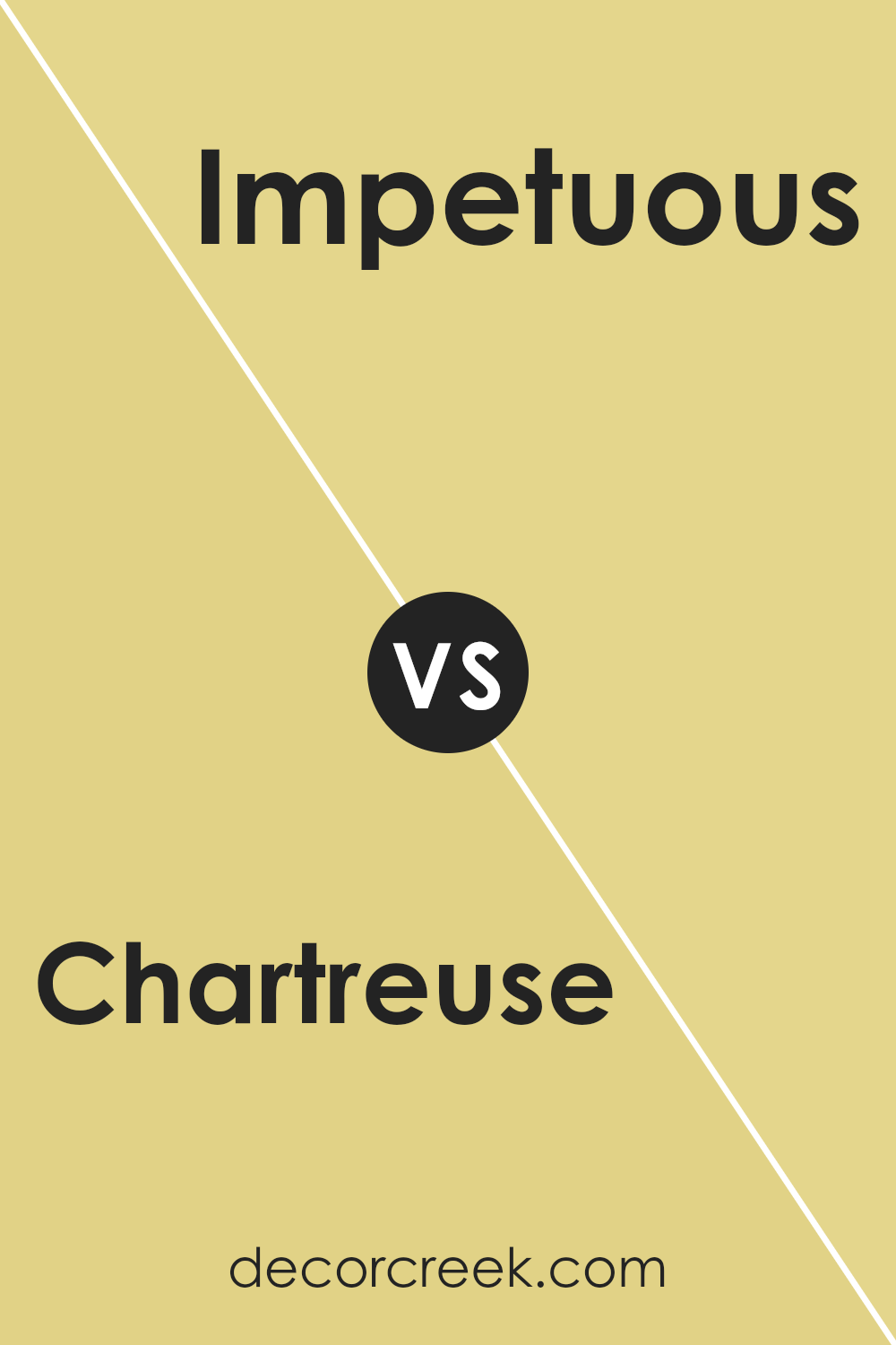
Chartreuse SW 0073 by Sherwin Williams vs Venetian Yellow SW 1666 by Sherwin Williams
The main color, Chartreuse, is a vibrant mix of green and yellow that pops with energy and brightness. It’s a bright color that can really make a space feel lively and fun. On the other hand, Venetian Yellow is also a cheerful color but leans more towards a classic yellow. It has a warmth to it, like sunshine, making it feel cozy and inviting.
When comparing these two, Chartreuse is definitely the more eye-catching due to its bold, almost neon, quality. It’s great for accent pieces or areas where you really want something to stand out. Venetian Yellow, though, is easier to use in larger amounts like on walls, as it creates a more mellow, sunny backdrop that’s not overwhelming.
Both colors bring brightness to a room, but your choice might depend on how bold vs. how subtle you want the color impact to be. Chartreuse shakes things up with its vividness, while Venetian Yellow offers a gentle nudge of brightness.
You can see recommended paint color below:
- SW 1666 Venetian Yellow (CHECK A SAMPLE)
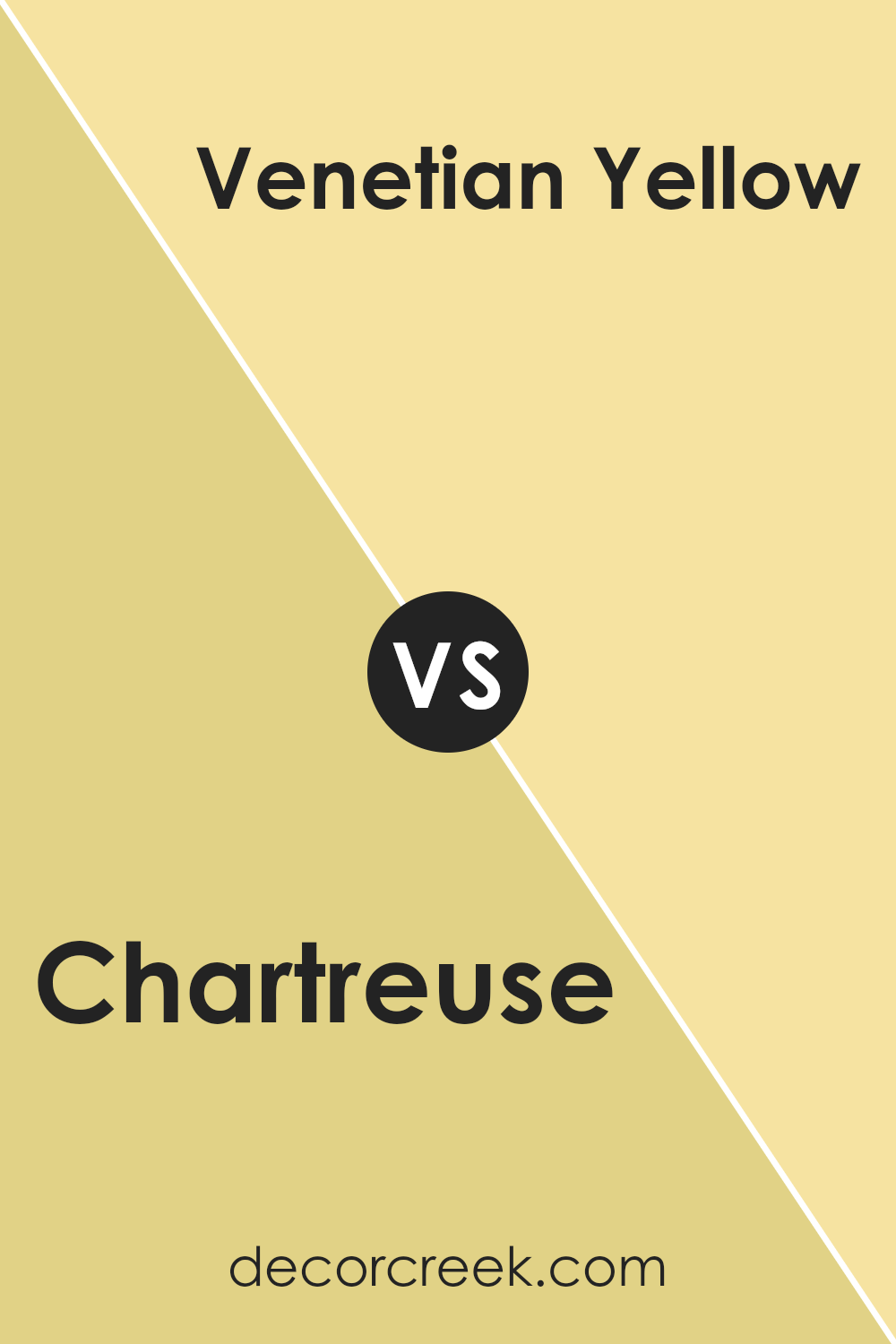
Chartreuse SW 0073 by Sherwin Williams vs Frolic SW 6703 by Sherwin Williams
Chartreuse and Frolic, both by Sherwin Williams, present a vivid and lively palette for any space. Chartreuse is a bright, vibrant shade of yellow-green, similar to the color of spring foliage or a lime peel. It’s bold and can create a strong, energetic feel in a room.
On the other hand, Frolic is a cheerful, bright green, evoking the freshness of new grass or the playfulness of a sunny day in the park. While still lively, it’s a bit calmer than Chartreuse and offers a more consistently green hue, with less yellow undertone. Both colors are excellent for adding a pop of color to a space but cater to slightly different tastes and moods.
Where Chartreuse grabs attention with its intensity, Frolic might be preferred for its softer, yet still lively charm.
You can see recommended paint color below:
- SW 6703 Frolic (CHECK A SAMPLE)
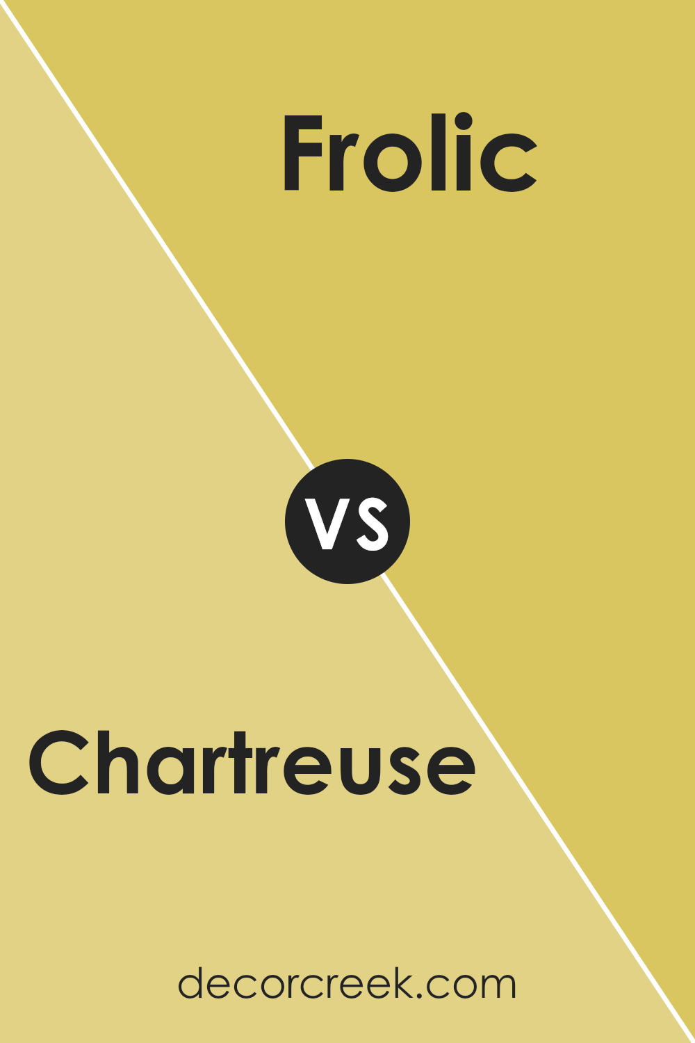
Chartreuse SW 0073 by Sherwin Williams vs Primavera SW 9031 by Sherwin Williams
Main Color: Chartreuse
Chartreuse is a vibrant green color with a lively yellow undertone. It’s the kind of color that really pops and can add a playful touch to any space. It works really well in areas that get lots of natural light, bringing a sunny, energetic feel to the room.
Second Color: Primavera
In contrast, Primavera is a soft, muted beige with a subtle hint of peach-pink. It’s a gentle, warm color that creates a cozy and inviting environment. This shade is great for spaces where you want to relax and feel comfortable, like living rooms and bedrooms.
When comparing Chartreuse to Primavera, the key difference is in their visual impact and mood-setting qualities. Chartreuse is bold and bright, perfect for making a statement or cheering up a space. On the other hand, Primavera offers a calm and soothing backdrop, ideal for more laid-back or restful areas.
Combining them can balance lively splashes of color with soft, warm tones, making a room feel both energetic and cozy.
You can see recommended paint color below:
- SW 9031 Primavera (CHECK A SAMPLE)
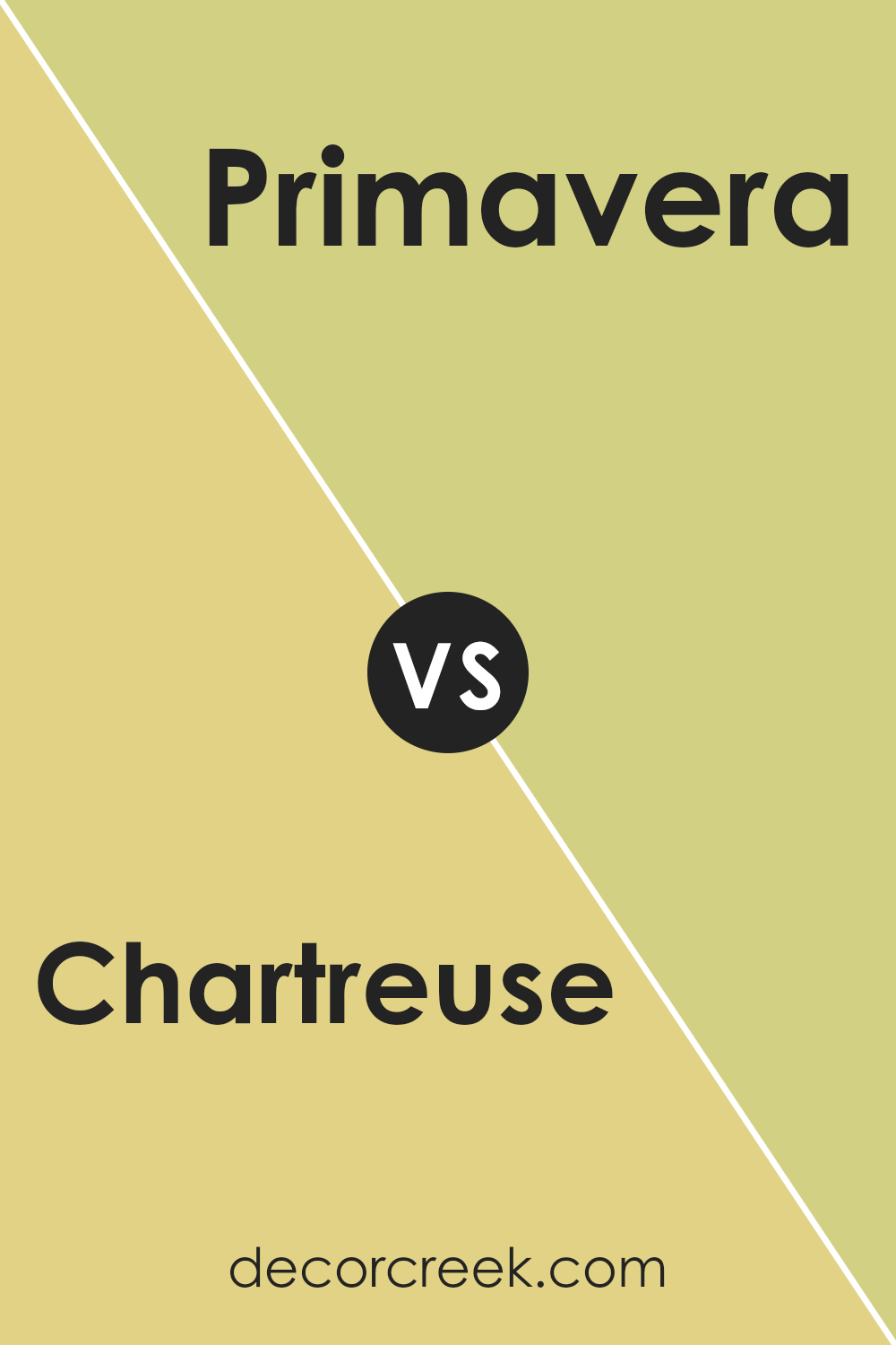
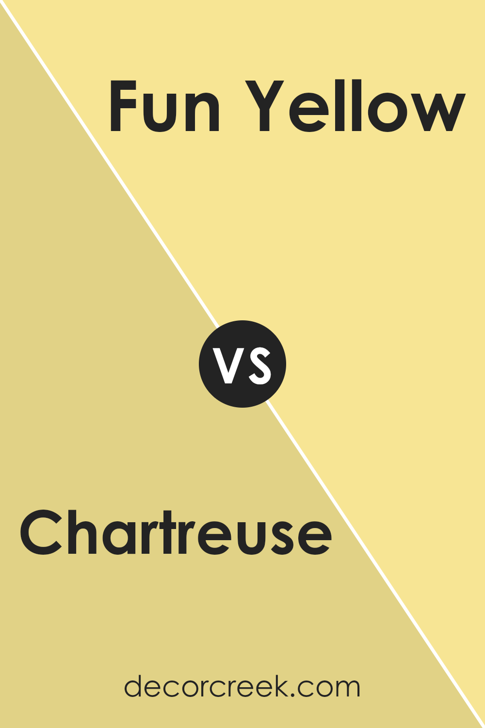
Chartreuse SW 0073 by Sherwin Williams vs Fun Yellow SW 6908 by Sherwin Williams
The color Chartreuse by Sherwin Williams is a vibrant mixture of green and yellow, offering a lively and zesty feel to any space. This shade stands out because of its brightness and can energize a room or bring a lively touch to decor. On the other hand, Fun Yellow by Sherwin Williams leans towards a classic, sunny yellow.
It is cheerful and bright, making rooms feel open and welcoming. While both colors are vibrant and cheerful, Chartreuse has a noticeable green tint, giving it a fresh, spring-like vibe.
In contrast, Fun Yellow sticks to a purer yellow, reminiscent of sunshine and warmth. Both colors would be great for adding a punch of color to a space, but the choice between the two would depend on whether you prefer a greener or a purely yellow hue.
You can see recommended paint color below:
- SW 6908 Fun Yellow (CHECK A SAMPLE)
Chartreuse SW 0073 by Sherwin Williams vs Funky Yellow SW 6913 by Sherwin Williams
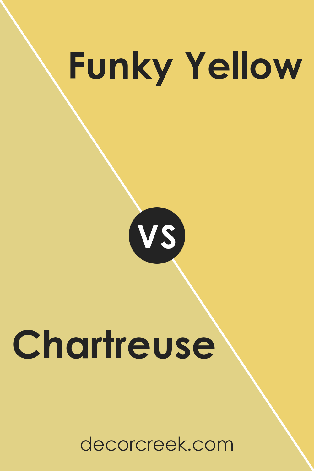
Chartreuse SW 0073 is a vibrant mix of green and yellow, creating a lively hue that can instantly brighten up any space. This color is perfect for adding a cheerful splash to rooms that need a bit more energy or a focal point due to its boldness. It also works well in spaces that get plenty of natural light, as the sunlight enhances its vibrancy.
On the other hand, Funky Yellow SW 6913 is a bright, pure yellow. It’s an eye-catching color that brings a sense of joy and playfulness to any room. Unlike the greenish tones in Chartreuse, Funky Yellow is more straightforward and pure in its yellowness, providing a crisp and clean look.
Both colors are great for adding a refreshing burst of color to a home, but Chartreuse offers a cool, striking visual with its hint of green, while Funky Yellow is warm and sunny, making it a cheerful choice. Depending on your room’s needs and lighting, either color can greatly enhance the space with its distinctive character.
You can see recommended paint color below:
- SW 6913 Funky Yellow (CHECK A SAMPLE)
Chartreuse SW 0073 by Sherwin Williams vs Lively Yellow SW 6702 by Sherwin Williams
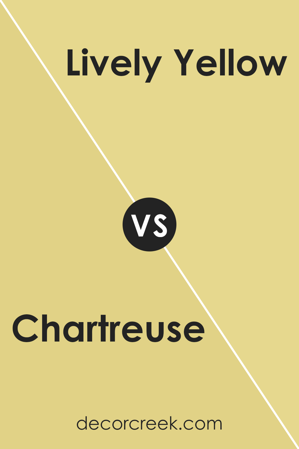
The main color Chartreuse by Sherwin Williams is a vibrant, medium green with a lively yellow undertone. It brings a burst of energy into any space, making it perfect for areas where you want a striking yet inviting atmosphere.
Comparatively, Lively Yellow is much brighter and straightforward in its appearance. As a cheerful, bold yellow, it creates a sunny and warm ambiance that can liven up any room. It’s especially effective in spaces that need a touch of brightness or where you want to inspire positivity and activity.
While both colors are intense and eye-catching, Chartreuse leans more towards green, offering a more natural, earthy vibe. This makes it suitable for those who like a connection to the outdoors but also seek a hint of uniqueness. On the other hand, Lively Yellow sticks to the traditional joyful and energizing effects of pure yellows, perfect for stimulating lively social interactions in kitchens and living rooms.
Choosing between them depends on your desired mood and room function. Chartreuse offers a bold yet not overwhelming background, while Lively Yellow shines in uplifting spirits and energizing a space.
You can see recommended paint color below:
- SW 6702 Lively Yellow (CHECK A SAMPLE)
Conclusion
In wrapping up my thoughts about SW 0073 Chartreuse by Sherwin Williams, I must say that I’ve taken quite a liking to this unique color. Chartreuse is a mix of green and yellow that’s really lively and can brighten up any space. It’s a color that always catches the eye, whether you paint a whole room with it or just add a few splashes here and there for a fun twist.
I find that this color works great in spaces where you want creativity to flow, like art studios or kids’ playrooms. It’s also a good match for areas that get a lot of natural light, making the room feel even more open and cheerful.
Using Chartreuse in your home is like adding a bit of sunshine indoors. It’s warm, welcoming, and has a freshness that can make any space feel more alive. It also mixes well with many other colors — from soft blues and grays to even more vibrant shades.
So, if you’re thinking about adding some new life to your room, give SW 0073 Chartreuse a try. It’s a color that’s both fun and versatile, and I think it might just surprise you with how much it can change the feel of your space.

Ever wished paint sampling was as easy as sticking a sticker? Guess what? Now it is! Discover Samplize's unique Peel & Stick samples.
Get paint samples


