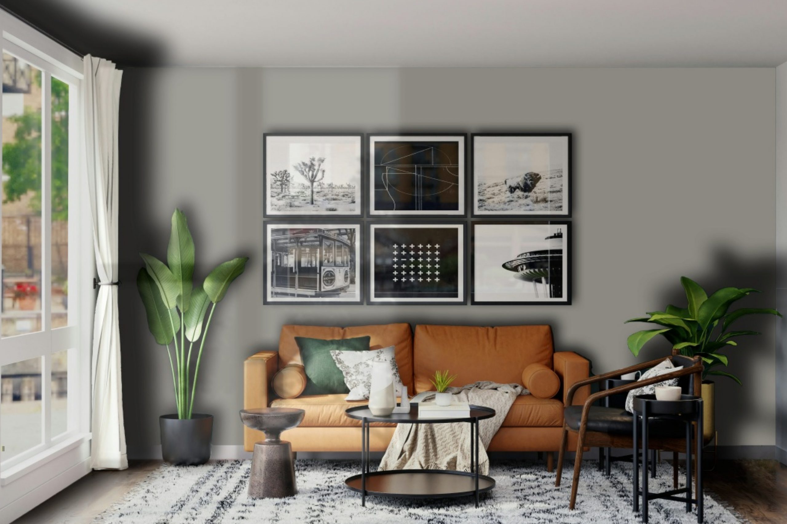
Are you looking for a fresh and stylish way to update your space? Chelsea Gray HC-168 by Benjamin Moore might be just what you need. This versatile shade of gray offers a perfect balance between warmth and sophistication, making it a great choice for anyone looking to give their home or office a modern yet cozy touch.
Whether you’re thinking of painting an accent wall, refreshing your kitchen cabinets, or giving your exterior a chic facelift, Chelsea Gray can work wonders in transforming the ambiance of any room. With its ability to complement a wide range of decor styles and color schemes, this paint color has become a favorite among homeowners and design professionals alike.
In the following article, we will explore the unique characteristics of Chelsea Gray HC-168, offer insights on how best to use it in your decorating projects, and share tips from experienced interior designers. Get ready to discover how this beautiful shade can elevate your space with elegance and ease.
What Color Is Chelsea Gray HC-168 by Benjamin Moore?
Chelsea Gray is a sophisticated, rich shade of gray by Benjamin Moore that brings a classic and timeless elegance to any space. This versatile color is perfect for those looking to add a touch of refined style to their interiors. Its depth adds warmth and character, making it an ideal choice for a wide range of decorating themes.
In terms of interior styles, Chelsea Gray shines in modern and contemporary settings due to its bold yet neutral nature. It also works beautifully in traditional and transitional spaces, where it can serve as a backdrop for both vibrant and subdued color schemes. This shade of gray has the unique ability to blend seamlessly with a variety of materials and textures, enhancing the overall aesthetic of a room.
When pairing with materials, Chelsea Gray complements natural wood tones, from light oak to dark walnut, adding richness and depth. It also pairs well with metallic accents like brass or nickel, bringing out a luxe feel. For textures, this color works great with soft, plush fabrics like velvet or wool, as well as smoother, sleek finishes like leather or glass, creating a dynamic and layered look.
Overall, Chelsea Gray is a versatile color that can transform any room into a polished and inviting space. Its ability to harmonize with different materials and textures makes it a go-to choice for those looking to create a cohesive and stylish interior.
Is Chelsea Gray HC-168 by Benjamin Moore Warm or Cool color?
Chelsea Gray by Benjamin Moore is a sophisticated shade that can transform any home. This color, known for its richness and versatility, works well in various settings. Whether it’s the living room, bedroom, or kitchen, Chelsea Gray adds a touch of elegance without overpowering the space. It’s a color that pairs well with both modern and traditional decor, making it a fantastic choice for those who enjoy a timeless look.
One of the best things about this shade is its ability to make other colors pop. Whether it’s bright whites or bold colors, Chelsea Gray serves as a stunning backdrop that enhances the overall look of a room. It’s also great for creating a cozy and inviting atmosphere, making spaces feel more comfortable and stylish.
Furthermore, its adaptability means it looks amazing in different lighting conditions, from natural daylight to artificial lighting. This flexibility ensures that homes look beautiful at all hours. Overall, Chelsea Gray is a fantastic choice for anyone looking to add a touch of sophistication to their home.
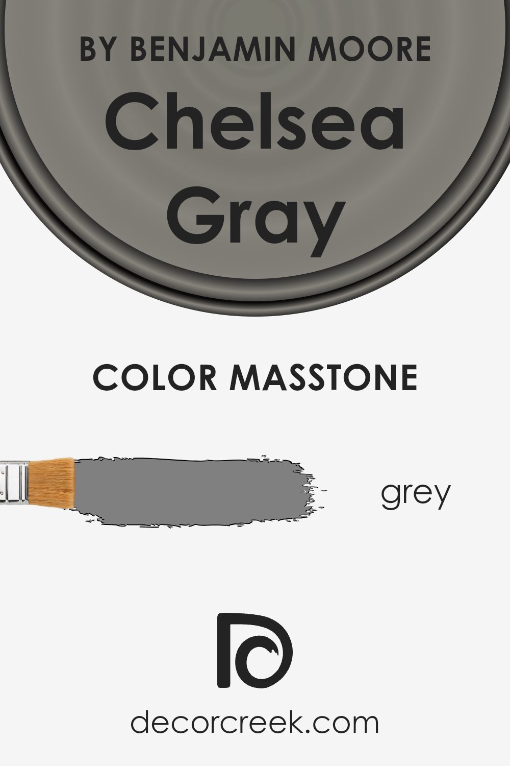
What is the Masstone of the Chelsea Gray HC-168 by Benjamin Moore?
Chelsea Gray HC-168 by Benjamin Moore has a masstone or main color, which is grey (#808080). This specific shade is versatile, making it a great choice for homes. The grey color works well in various spaces because it’s neutral. This means it can match with many other colors, from brights to pastels, making decorating a room much easier.
You can pair it with whites for a clean, modern look or with bolder colors for a dynamic contrast. Grey, like this, also does an excellent job at hiding everyday wear and tear, making it practical for busy areas in the house. It brings a sense of calmness and sophistication, making spaces feel more inviting and cozy.
People often choose this color for bedrooms, living rooms, or even kitchens because it creates a peaceful, yet stylish backdrop. Overall, its grey tone offers a balance of warmth and coolness, ideal for creating a welcoming home environment.
How Does Lighting Affect Chelsea Gray HC-168 by Benjamin Moore?
Lighting plays a crucial role in how we perceive colors. It can change the appearance of a color significantly, making it look brighter, darker, or altering its hue. The color in focus, a popular shade by Benjamin Moore, is no exception to this rule. Let’s explore how this particular shade of gray interacts with different lighting conditions and room orientations.
In artificial light, the outcome can vary depending on the type of bulbs used. Warm-toned bulbs can make this gray look softer and slightly more inviting, enhancing cozy vibes in a room. On the other hand, cool-toned bulbs could highlight its modern and sleek characteristics by bringing out a crispness in the color. This versatility makes it a favorite for spaces that rely on artificial lighting after the sun sets.
Natural light brings its own set of changes to this shade. In rooms that face north, which typically receive cooler, indirect light throughout the day, the color may appear somewhat starker and more shadowy. This doesn’t mean it’s less beautiful; rather, it brings out a certain depth and complexity, making spaces feel sophisticated.
South-facing rooms bask in warm, direct sunlight for most of the day, which can make this gray look lighter and more lively. The warmth of the sunlight can expose the color’s hidden warmth, making spaces feel welcoming and bright.
East-facing rooms catch the morning sun, which is warm and golden. This early light can make the color appear softer and slightly more cheerful in the mornings, transitioning into a true, balanced gray as the light moves across the sky.
Finally, in west-facing rooms, the color undergoes a dramatic transformation during sunset. The intense, warm light in the evenings can add a glowing quality to the gray, making it feel warmer and more dynamic.
Understanding these nuances can help homeowners and designers make informed choices about using this versatile gray in their spaces, ensuring that it complements the room’s function and ambiance under various lighting conditions.
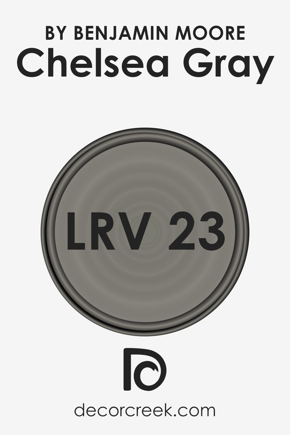
What is the LRV of Chelsea Gray HC-168 by Benjamin Moore?
LRV stands for Light Reflectance Value, and it’s a measure that helps us understand how light or dark a color will look on a wall. In simple terms, LRV is a percentage that ranges from 0 to 100, with 0 being completely black, absorbing all light, and 100 being pure white, reflecting all light back.
This value is super important because it affects how a space feels. For example, a room painted in a color with a high LRV will appear brighter and more open, because it reflects more light around the space. On the other hand, colors with lower LRVs absorb more light, making rooms feel cozier but possibly darker.
The LRV of Chelsea Gray, which is 23.33, places it on the darker side of the scale. This means it won’t reflect back much light. When you use this color on your walls, it can create a rich, sophisticated look, but it’s also something to carefully consider if your room is already lacking in natural light.
In such cases, it can make the space feel even smaller or dimmer. The beauty of a color with an LRV like this, though, is its ability to add depth and character to a space, making it a popular choice for adding a statement or accent in a room. It’s always wise to test a color like this in your specific room conditions to see how it truly affects the feel and atmosphere.
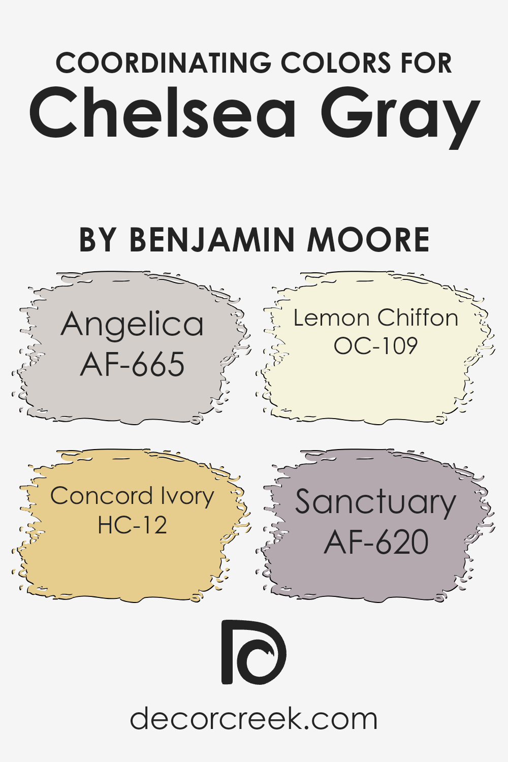
Coordinating Colors of Chelsea Gray HC-168 by Benjamin Moore
Coordinating colors are hues that work well together in a space, creating a harmonious and appealing look. They can be chosen to complement, contrast, or enhance a primary color, in this case, Chelsea Gray HC-168 by Benjamin Moore. These selected colors can add depth, highlight architectural features, or bring a cohesive aesthetic to an interior or exterior design. The key to successful color coordination lies in selecting tones that share similar undertones or are positioned conveniently on the color wheel relative to the main color.
For Chelsea Gray, a sophisticated yet versatile shade, the chosen coordinating colors include AF-665 Angelica, HC-12 Concord Ivory, OC-109 Lemon Chiffon, and AF-620 Sanctuary. AF-665 Angelica is a soft, muted lavender that brings a gentle, soothing quality to the neutral strength of Chelsea Gray, perfect for bedrooms or quiet spaces.
HC-12 Concord Ivory offers a sunny, warm yellow that injects radiance and light, creating an inviting contrast against the cool undertones of Chelsea Gray, ideal for living rooms or kitchens.
OC-109 Lemon Chiffon provides a delicate, airy yellow with a hint of brightness, offering a subtle lift to spaces that aim to be cozy yet light. Lastly, AF-620 Sanctuary leans into the earthy, serene vibe, offering a muted, soft green that echoes natural elements, making it suitable for spaces that seek a balance between the outdoors and the cozy feel of home.
Each color, with its unique tone, plays a crucial role in enhancing Chelsea Gray’s versatility and appeal across various design applications.
You can see recommended paint colors below:
- AF-665 Angelica
- HC-12 Concord Ivory
- OC-109 Lemon Chiffon
- AF-620 Sanctuary
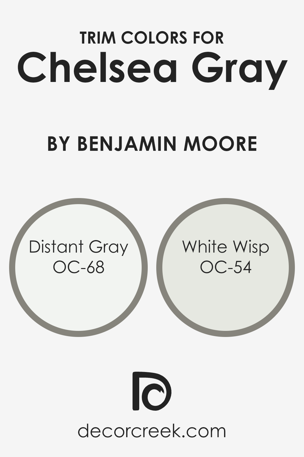
What are the Trim colors of Chelsea Gray HC-168 by Benjamin Moore?
Trim colors are the colors used for painting the trimmings of a room or house, which include door frames, window frames, skirting boards, and moldings. These colors are pivotal because they accentuate the main color used on the walls, in this case, Chelsea Gray, by defining the edges and lines, making architectural details stand out, and giving a finished look to the space.
Selecting the right trim color can enhance the overall appearance and feel of a room, underlining the aesthetic the Chelsea Gray brings by adding depth and contrast, or by softly blending the transitions between walls and trim for a more seamless look.
Distant Gray OC-68 is a soft, almost ethereal color that provides a subtle contrast when used as a trim color with Chelsea Gray. It possesses a light, airy quality that can brighten the edges of a room without overwhelming the senses, giving a crisp and clean boundary that finely balances with the mid-tone gray.
White Wisp OC-54, on the other hand, is a versatile off-white with a hint of gray, offering a slightly warmer alternative for trim that still maintains a sophisticated edge. It complements Chelsea Gray by softly highlighting architectural features, thus contributing to a cohesive yet distinctly refined ambiance in any space it adorns.
You can see recommended paint colors below:
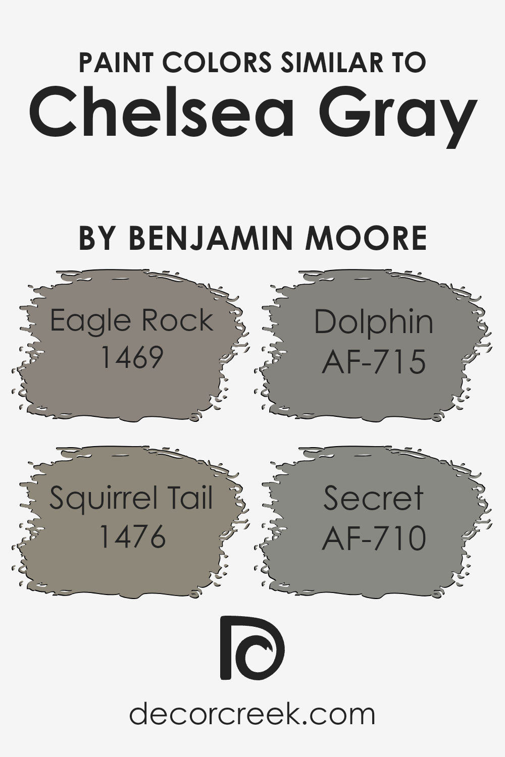
Colors Similar to Chelsea Gray HC-168 by Benjamin Moore
Choosing colors that are similar to Chelsea Gray by Benjamin Moore is important for creating a harmonious look in your space. These colors work well together because they share a certain depth and subtlety that enhances the overall aesthetic without overwhelming it. When used wisely, similar shades can add dimension and interest, making the room feel thoughtfully designed. These colors create a serene and cohesive atmosphere, effortlessly tying together different elements of your decor.
Eagle Rock has a robust and earthy presence, making it an excellent choice for those who wish to introduce a warm, grounding element to their spaces.
It carries a sense of stability and comfort, perfect for creating a cozy retreat. Squirrel Tail, on the other hand, offers a lighter, more versatile gray with hints of taupe, lending itself beautifully to spaces that aim for a soft, elegant look. Dolphin is a mid-tone gray that strikes a balance between warm and cool, making it incredibly adaptable and a great choice for various lighting conditions.
Lastly, Secret is a deeper, more mysterious gray that adds a touch of sophistication and depth, ideal for creating focal points or accentuating architectural features. Together, these colors support the goal of achieving a balanced, synchronized interior palette.
You can see recommended paint colors below:
- 1469 Eagle Rock
- 1476 Squirrel Tail
- AF-715 Dolphin
- AF-710 Secret
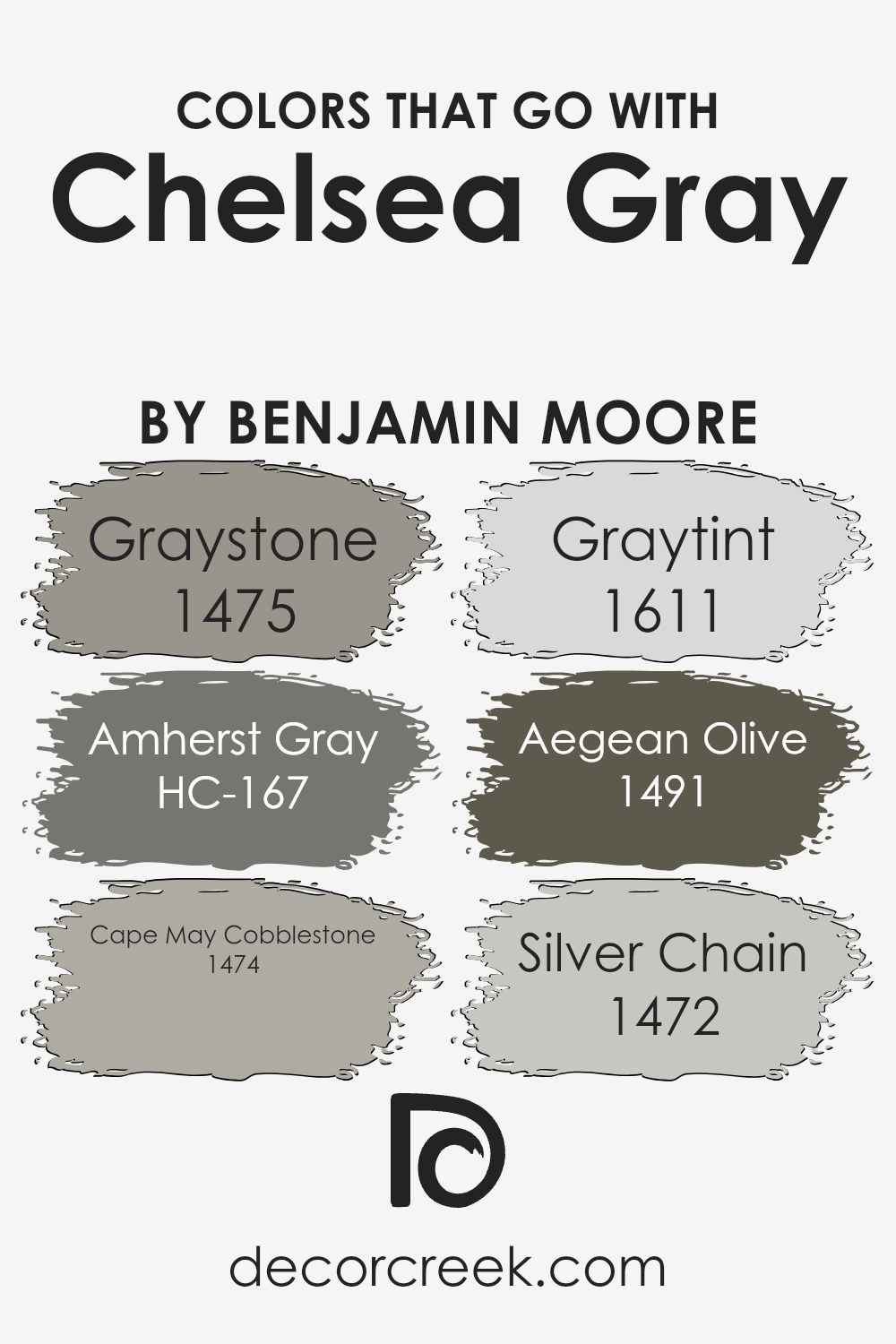
Colors that Go With Chelsea Gray HC-168 by Benjamin Moore
Choosing colors that complement Chelsea Gray HC-168 by Benjamin Moore is essential for creating a beautifully coordinated space. This particular shade of gray offers a sophisticated and versatile backdrop, allowing for a range of colors to enhance its depth and character. Colors like 1475 – Graystone, HC-167 – Amherst Gray, 1474 – Cape May Cobblestone, 1611 – Graytint, 1491 – Aegean Olive, and 1472 – Silver Chain, work in harmony with Chelsea Gray, offering a palette that can transform a room from simple to stylish.
Graystone provides a slightly warmer tone, adding to the coziness of a room, while Amherst Gray brings a deeper, almost charcoal-like depth, perfect for accentuating features or furniture. Cape May Cobblestone is a lighter, softer gray that injects a fresh and airy feel, blending seamlessly with the muted elegance of Chelsea Gray.
On the other hand, Graytint offers a gentle contrast, with its lighter, almost off-white hue, creating a subtle and soothing aesthetic. Aegean Olive introduces a touch of nature, with its earthy, green undertones, it enriches the environment without overwhelming it. Lastly, Silver Chain stands out with its silver-infused gray, delivering a sleek and modern edge to the palette. Together, these colors create a cohesive and inviting space, highlighting the beauty and flexibility of Chelsea Gray.
You can see recommended paint colors below:
- 1475 Graystone
- HC-167 Amherst Gray
- 1474 Cape May Cobblestone
- 1611 Graytint
- 1491 Aegean Olive
- 1472 Silver Chain
How to Use Chelsea Gray HC-168 by Benjamin Moore In Your Home?
Chelsea Gray HC-168 by Benjamin Moore is a rich, elegant gray paint that brings a classic and sophisticated look to any room in your home. This beautiful shade can serve as a stunning backdrop for your living space, creating a cozy and inviting atmosphere. It’s perfect for those looking to add a touch of elegance to their home without overwhelming it with dark colors.
You can use Chelsea Gray in various ways. For example, it’s ideal for painting walls in bedrooms or living areas, adding depth and interest to the space. It also works well for kitchen cabinets, providing a modern and stylish update to your cooking area. If you’re not ready to commit to painting an entire room, consider using Chelsea Gray for an accent wall or for trim, doors, and moldings. This will introduce a subtle contrast and character to your rooms without the need for major redecorating.
Overall, Chelsea Gray HC-168 offers a versatile and refined option for those looking to refresh their home’s appearance. Its ability to blend with multiple color palettes and decor styles makes it a popular choice for anyone looking to enhance the beauty of their living space.
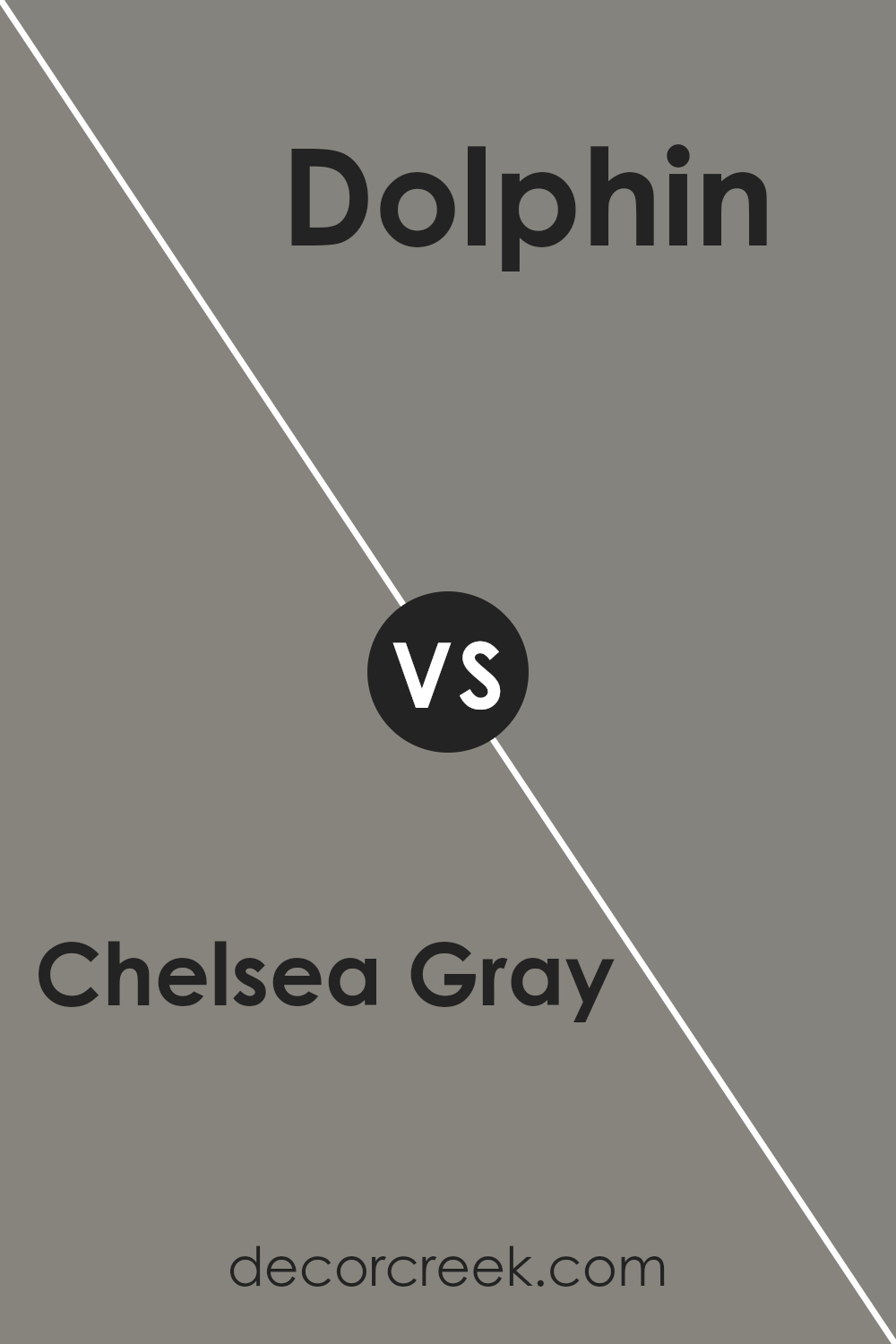
Chelsea Gray HC-168 by Benjamin Moore vs Dolphin AF-715 by Benjamin Moore
Alright, let’s talk about Chelsea Gray and Dolphin, both from Benjamin Moore. Chelsea Gray is a deeper, warmer gray with a slightly earthy undercurrent, making it a great pick for a cozy and inviting space. Its richness adds depth to rooms, making them feel more put together.
On the other hand, Dolphin is a bit lighter and leans towards a cooler, more neutral gray. It’s like the misty morning sky, giving a calm and soothing vibe to any space. Because it’s cooler and lighter, Dolphin can make small rooms feel bigger and brighter. If you’re deciding between the two, think about the mood you want to create.
For a snug, warm feel, Chelsea Gray is your go-to. If you prefer a serene, airy atmosphere, Dolphin is the clear winner. Both colors are versatile, but their unique tones set them apart in creating different ambiances in your home.
You can see recommended paint color below:
- AF-715 Dolphin
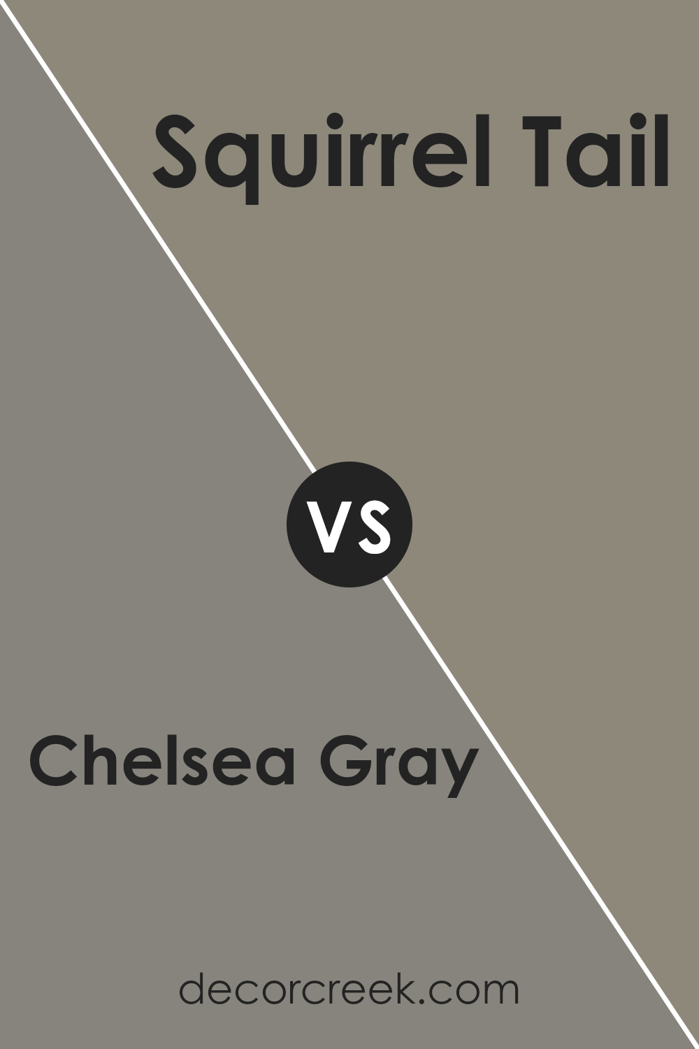
Chelsea Gray HC-168 by Benjamin Moore vs Squirrel Tail 1476 by Benjamin Moore
Chelsea Gray and Squirrel Tail, both from Benjamin Moore, are unique colors that offer distinct vibes for any space. Chelsea Gray lands in the realm of classic, sophisticated grays. It carries a certain elegance and a modern touch that can make furniture or walls pop with an understated, yet stylish flair. It’s perfect for those who want a sleek and contemporary look in their room.
On the other side, Squirrel Tail offers a warmer, more inviting hue. This color has a beautiful earthiness to it, balancing between gray and brown. Its rich tone is superb for creating a cozy atmosphere, making it ideal for living spaces or bedrooms where warmth and comfort are key.
While both colors have their own charm, the main difference lies in their undertones and the moods they set. Chelsea Gray leans towards a cooler, more refined palette, great for a minimalist or industrial design. Squirrel Tail, with its warmer, softer appearance, brings a more comforting and homey feel, suitable for a range of decorating styles. Each color, with its distinct personality, can transform spaces in very different ways.
You can see recommended paint color below:
- 1476 Squirrel Tail
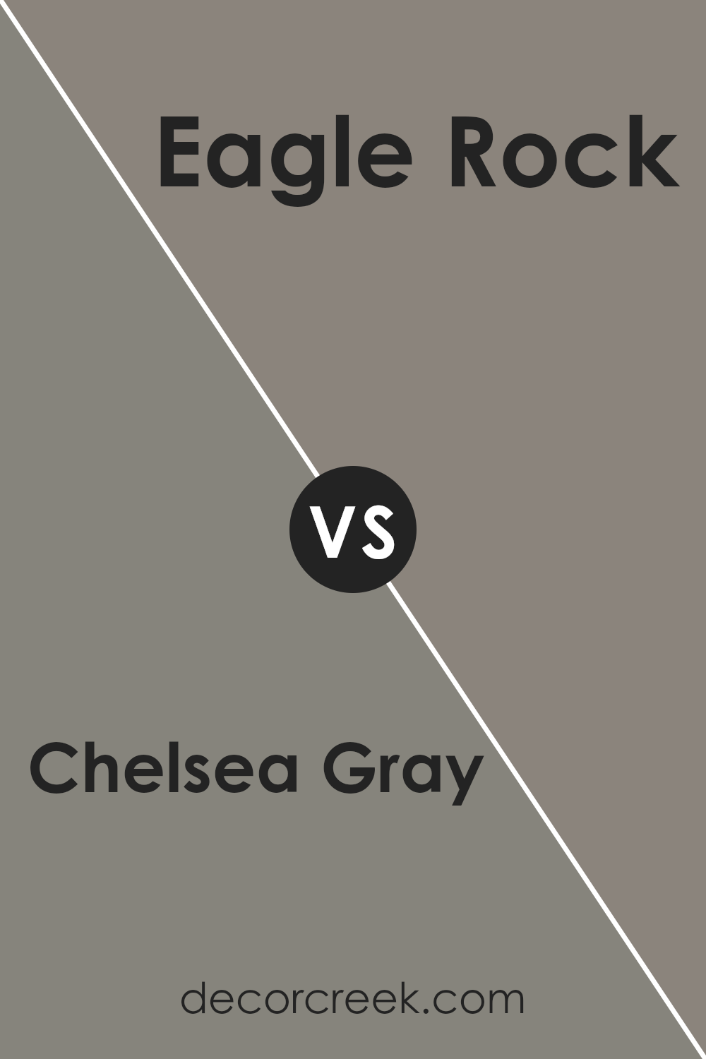
Chelsea Gray HC-168 by Benjamin Moore vs Eagle Rock 1469 by Benjamin Moore
Chelsea Gray and Eagle Rock are two distinct colors by Benjamin Moore, each offering a unique vibe for any space. Chelsea Gray is a versatile, soothing gray that carries a hint of warmth. This makes it incredibly adaptable and perfect for rooms where a calm yet sophisticated atmosphere is desired. It’s like a cozy blanket on a rainy day – comforting and inviting.
On the other hand, Eagle Rock steps into the room with a bit more depth. It’s a darker shade that walks the line between gray and brown. This color brings a stronger statement but still remains neutral, allowing it to pair well with a variety of other colors and decorations. It’s akin to the sturdy trunk of a tree – solid, dependable, and full of character.
While both colors share a base of neutral tones, Chelsea Gray leans towards a lighter, airier feel, ideal for creating a bright and open space. Eagle Rock, with its deeper hue, offers a feeling of groundedness and sophistication. Whether you’re looking to refresh a living area with a gentle, inviting atmosphere or add a touch of elegance to a study or bedroom, these colors offer lovely options.
You can see recommended paint color below:
- 1469 Eagle Rock
Chelsea Gray HC-168 by Benjamin Moore vs Secret AF-710 by Benjamin Moore
Chelsea Gray and Secret are two elegant paint colors from Benjamin Moore’s collection, each bringing its unique feel to interior spaces. Chelsea Gray is a versatile, medium-dark gray that exudes strength and sophistication, with just enough depth to make a statement without overwhelming a room. It’s perfect for those looking to add a touch of elegance to their space, without going too dark.
On the other hand, Secret is a softer, lighter gray with a warm undertone. This color offers a more subtle approach to decorating, creating a serene and welcoming atmosphere. It’s an ideal choice for anyone wanting to keep their space light and airy, yet still achieve a refined look.
While both colors share the common ground of being grays, Chelsea Gray stands out for its boldness and depth, making it suitable for accent walls or statement pieces. Secret, meanwhile, excels in creating a calm and cohesive space, working beautifully as a backdrop for various decor styles. Whether choosing between the two for a single room or considering using them together, they offer a delightful palette for any home.
You can see recommended paint color below:
- AF-710 Secret
Conclusion
Chelsea Gray by Benjamin Moore has become a popular choice for those looking to add a touch of sophistication and elegance to their space. Its unique blend provides a balanced, rich gray that adapts well in various lighting conditions, making it a versatile option for any room. Homeowners and designers alike appreciate how this color can create a cozy atmosphere while maintaining a sleek and modern look.
The use of Chelsea Gray is particularly effective in enhancing architectural details and complementing a wide range of décor styles, from traditional to contemporary. Its popularity lies in its ability to offer depth and warmth to spaces, making them feel inviting and stylish. This color continues to be a top choice for anyone looking to update their interior or exterior spaces with a timeless, chic shade of gray.
Ever wished paint sampling was as easy as sticking a sticker? Guess what? Now it is! Discover Samplize's unique Peel & Stick samples.
Get paint samples

