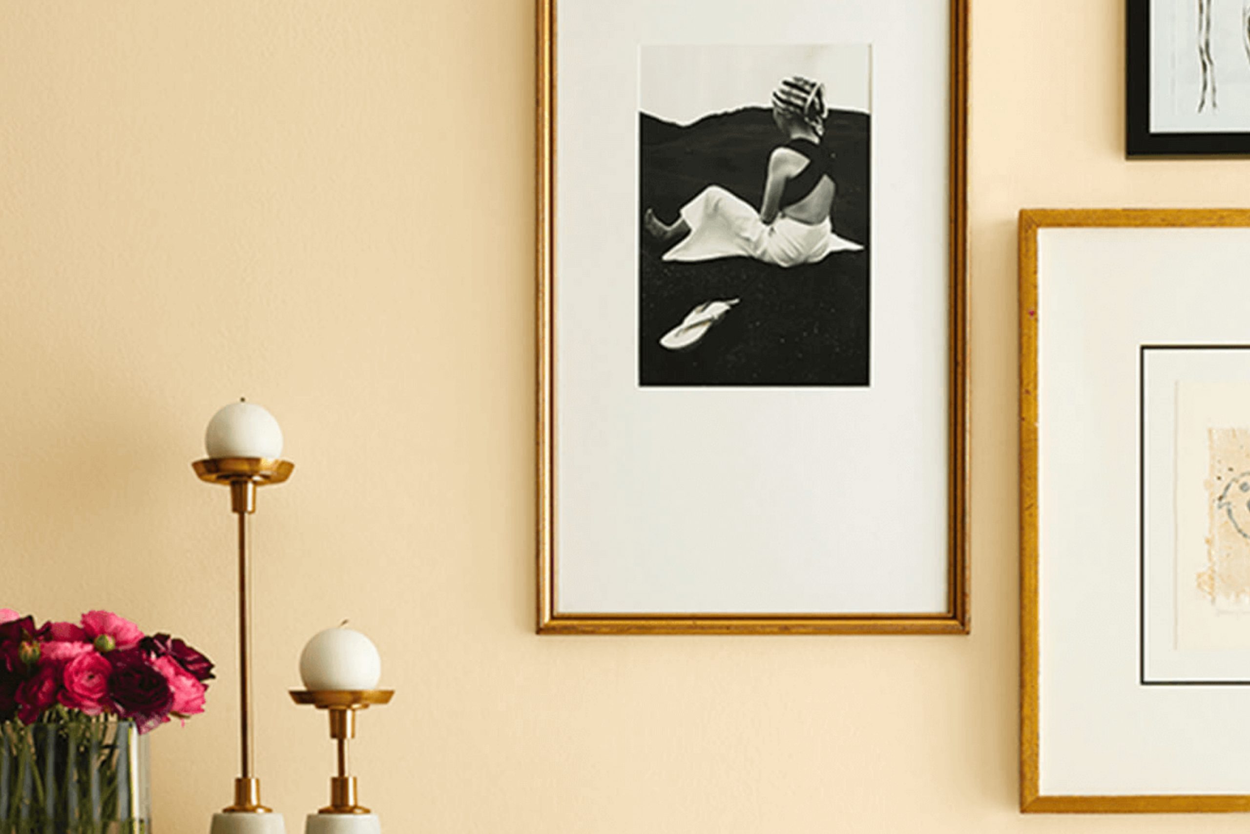
If you’re looking for a paint color that adds a warm, inviting feel to any room, let me share something about SW 7684 Concord Buff by Sherwin Williams. It’s a rich shade that draws its inspiration from the soft, golden tones found in a peaceful sunset.
This hue is versatile enough to work in various spaces, whether it’s brightening up a cozy corner or giving a living room a friendly and welcoming atmosphere. I found that Concord Buff pairs beautifully with natural materials like wood and leather, enhancing their natural beauty without overpowering them.
This color also works well with a wide range of decor styles from rustic to more contemporary looks, offering a subtle warmth that transforms the space into a comforting haven.
If you are thinking about giving your home a fresh look, consider how this serene color can make your space feel more harmonious and inviting.
What Color Is Concord Buff SW 7684 by Sherwin Williams?
Concord Buff is a warm, sandy hue that evokes a sense of coziness and simplicity—a versatile color from Sherwin Williams. Its earthy tone brings a welcoming and relaxed atmosphere to any room. This color works exceptionally well in interior styles that aim for a natural and understated elegance, such as rustic, traditional, or country décor. It provides a perfect canvas for incorporating lived-in comforts and rural charm.
Concord Buff pairs beautifully with a variety of materials and textures. In rooms with hardwood floors or wooden furniture, it enhances the natural grains of the wood, making the space feel more grounded. When combined with soft textiles like linen curtains or wool throws, it creates a soft, inviting look. Textured elements like wicker or rattan furniture also complement its earthy qualities quite well.
Metal accents in bronze or copper can add a touch of warmth that aligns nicely with Concord Buff’s sandy undertones. For those who like a bit more contrast, incorporating matte black or deep navy blue elements can create a striking visual balance that still feels homey.
Overall, Concord Buff is an excellent choice for creating a comforting and relaxed home environment, working well in spaces where you want to promote a calming and welcoming atmosphere.
Is Concord Buff SW 7684 by Sherwin Williams Warm or Cool color?
Concord Buff by Sherwin Williams is a warm, creamy yellow paint color that adds a cozy and inviting feel to any room. This versatile shade works well in spaces that lack natural light, giving them a brighter and more airy appearance.
It’s particularly effective in living rooms and kitchens where a welcoming atmosphere is key. The color pairs beautifully with both dark and light-colored furniture, making it easy to integrate with existing décor. It also works nicely with natural materials like wood, enhancing their rich tones.
If you’re looking to refresh your space, painting your walls in Concord Buff can create a comfortable backdrop for everyday living. It helps highlight artwork or unique furniture pieces without overwhelming them. Overall, Concord Buff is perfect for anyone wanting to create a warm, peaceful setting in their home. Its universal appeal makes it a safe choice for adding warmth to various decorating styles.
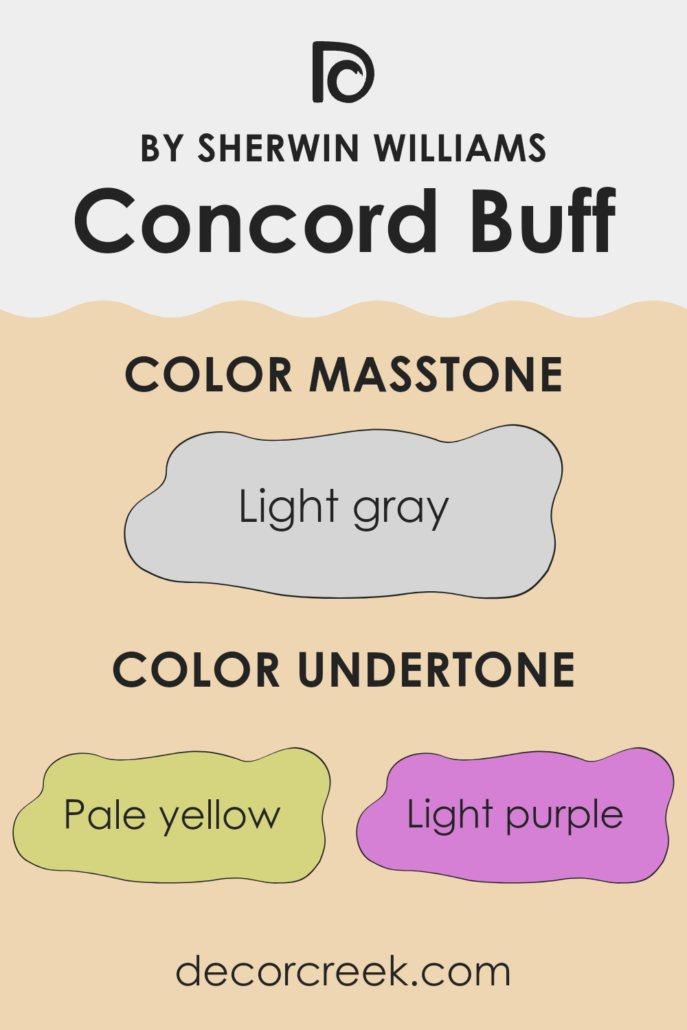
Undertones of Concord Buff SW 7684 by Sherwin Williams
Concord Buff is a versatile paint color that subtly incorporates a range of undertones to create a warm and inviting atmosphere. These undertones include pale yellow, light purple, pale pink, light blue, mint, lilac, and gray. Each undertone can alter the perception of the main color, depending on the lighting and surrounding decor.
The presence of pale yellow undertones helps add a touch of warmth, making the space feel cozy and welcoming. Light purple and lilac contribute a hint of softness, which can make the room feel more relaxed. On the other hand, pale pink offers a gentle, soothing touch, enhancing the overall gentle feel of the color.
Light blue and mint undertones bring a fresh, airy feel to the room, preventing the color from feeling too warm or overpowering. These cooler tones help balance the warmth of yellow and pink, ensuring the color remains balanced and pleasant. Gray undertones help to ground the color, adding a sense of stability and preventing it from becoming overly bright.
When used on interior walls, the combination of these undertones in Concord Buff creates a dynamic yet harmonious look. This color adapts well to different lighting conditions, changing subtly throughout the day from a brighter, more vibrant shade to a softer, more muted hue. This adaptability makes it a great choice for living spaces, bedrooms, and even kitchens, as it complements a wide range of furnishings and styles.
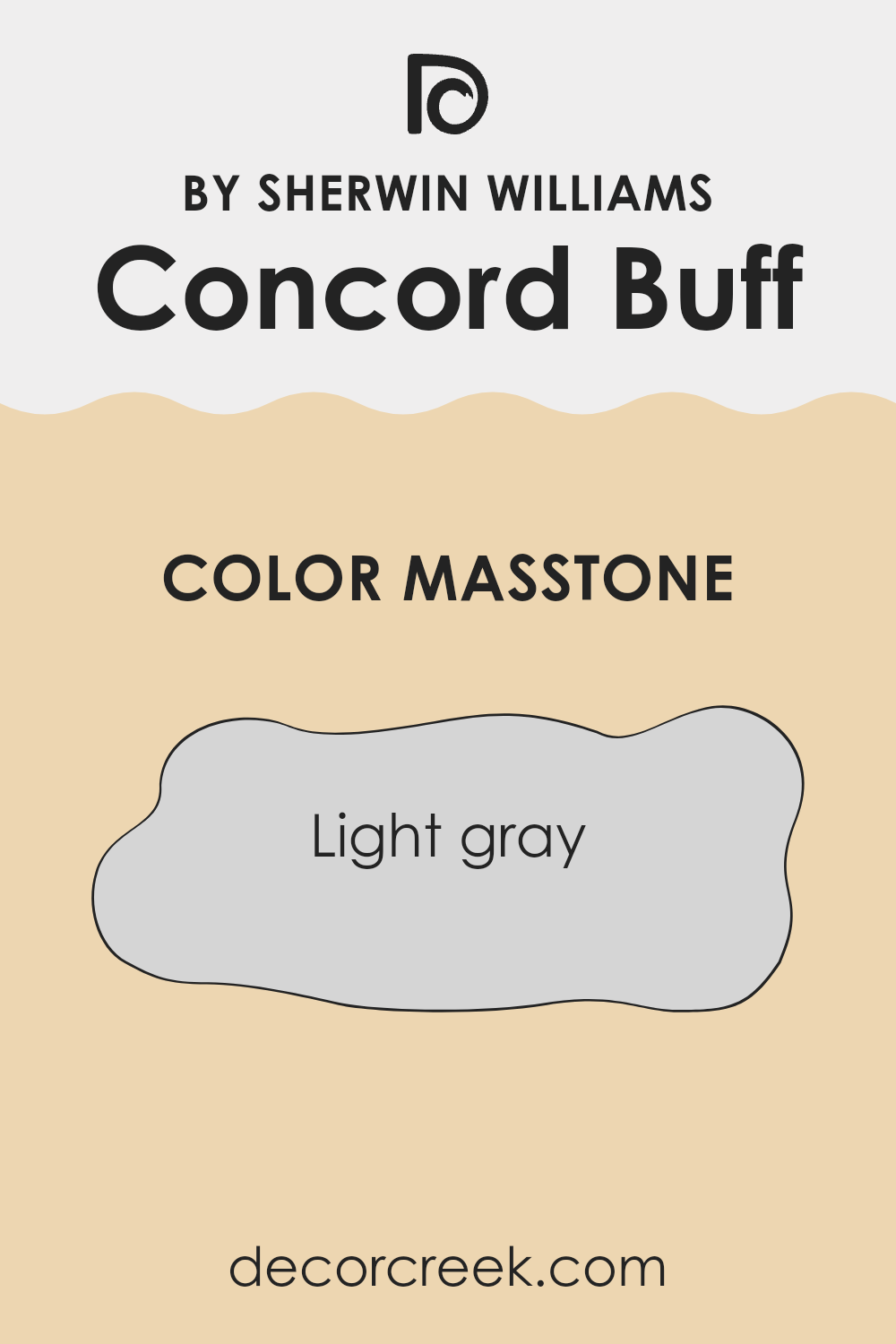
What is the Masstone of the Concord Buff SW 7684 by Sherwin Williams?
Concord Buff SW 7684 is a light gray color that brings a fresh and clean look to any room in a home. When you use this color on your walls, it makes the space feel larger and more open. It’s soft enough not to overpower the room but has enough presence to give a finished look.
This light gray works really well if you combine it with brighter colors for furniture or decorations, as it helps those colors stand out more. In spaces that don’t get a lot of natural light, this color can help reflect what light there is, making the room brighter and more inviting.
It’s an excellent choice for living rooms or bedrooms where you want a peaceful and calm atmosphere without making it too dark or busy. Overall, Concord Buff is versatile and can pair easily with other colors to create a stylish and comfortable space.
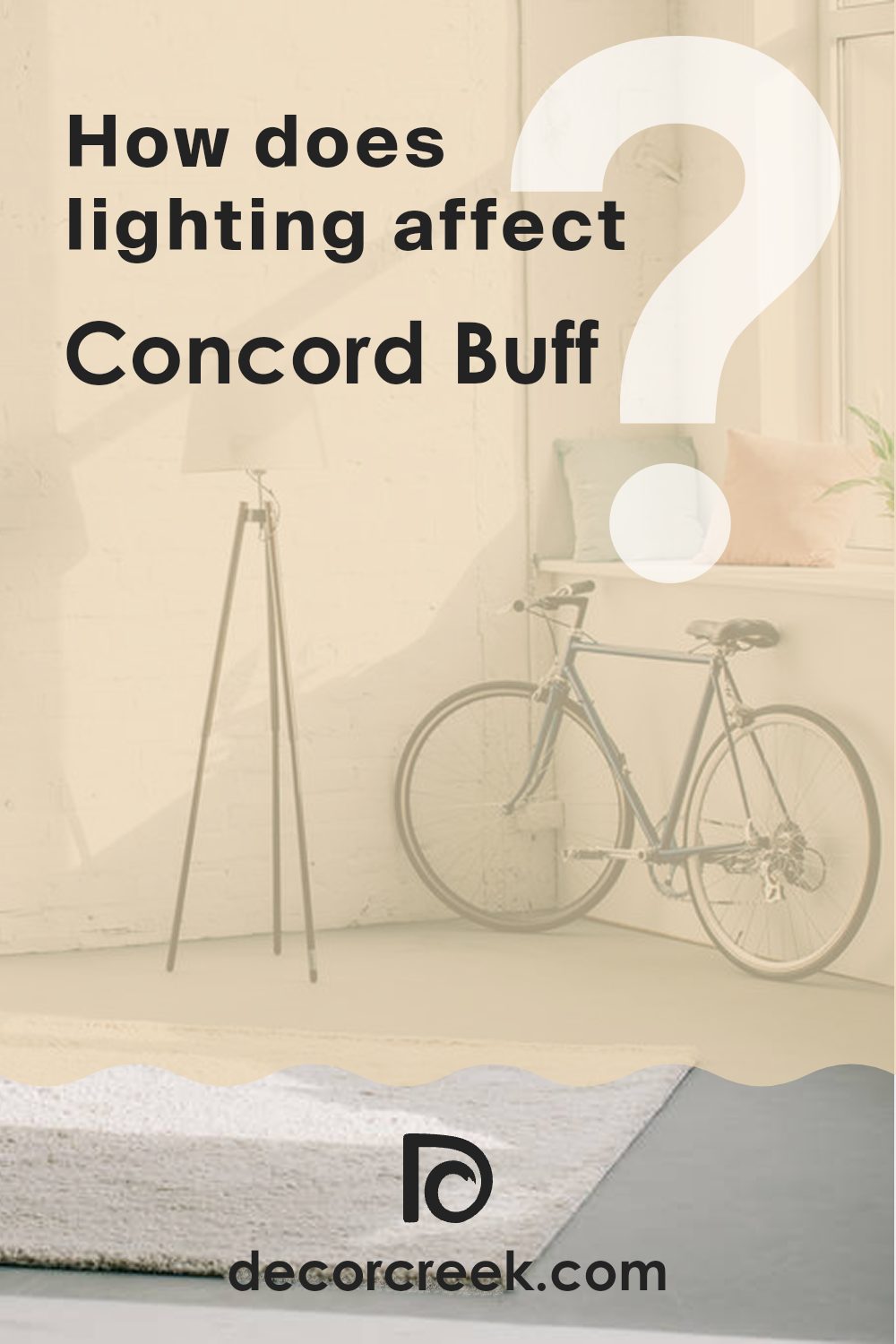
How Does Lighting Affect Concord Buff SW 7684 by Sherwin Williams?
Lighting plays a crucial role in how we perceive colors. The same paint can appear vastly different under varying light sources due to the light’s color temperature and intensity. Understanding this can help you choose paint colors more effectively for your home or any space.
Consider a warm, creamy hue like Concord Buff, a popular paint choice for many rooms. In artificial light, the type of bulb you use will impact how this color looks on your walls. Incandescent bulbs, which give off a warm light, tend to enhance warm tones, making Concord Buff appear cozier and richer. Fluorescent lighting, however, typically casts a cooler glow, which might make this warm tone look slightly muted or less vibrant.
Natural light has perhaps the most significant impact on paint colors. The orientation of a room — whether it faces north, south, east, or west — drastically changes how natural light interacts with Concord Buff. North-facing rooms get less direct sunlight and can make warm colors like Concord Buff appear slightly darker and less vibrant, giving the space a calm feel. South-facing rooms, however, are bathed in plenty of sunlight, making this warm shade bright and lively, truly bringing out its creamy qualities.
East-facing rooms receive strong light in the morning, which is warm and bright. Here, Concord Buff will glow warmly in the morning but might appear softer and more subdued as the day progresses and the natural light diminishes. West-facing rooms have the opposite effect, with the color potentially looking duller in the morning light but gaining warmth and depth from the intense evening sun.
Understanding these nuances of lighting can help you pick the right paint color for any room, ensuring that you achieve the desired atmosphere regardless of the light conditions throughout the day.
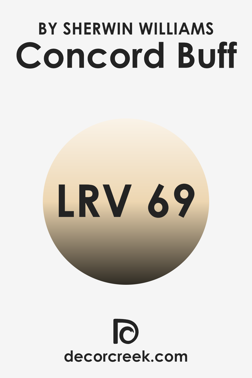
What is the LRV of Concord Buff SW 7684 by Sherwin Williams?
LRV stands for Light Reflectance Value, and it measures the percentage of light a paint color reflects back into a room compared to the amount of light the paint receives. Essentially, it’s an indicator of how light or dark a color will appear once it’s on your walls. Higher LRV values indicate that the color reflects more light, making spaces appear brighter and larger.
Conversely, colors with lower values tend to absorb more light, giving a room a cozier and more enclosed feel. LRV is particularly important when choosing paint colors for a room based on how much natural or artificial light the room receives throughout the day.
For the color Concord Buff with an LRV of around 69, this means the color is on the lighter side, capable of making rooms feel airy and open. Since it reflects a good amount of light, this color works well in spaces that may not receive a lot of sunlight, helping to brighten them up. Additionally, its light-reflective properties can make smaller rooms seem more spacious. Depending on the room’s exposure and lighting, this level of LRV ensures that the color remains true under different lighting conditions, maintaining its intended appearance without becoming too washed out or too dark.
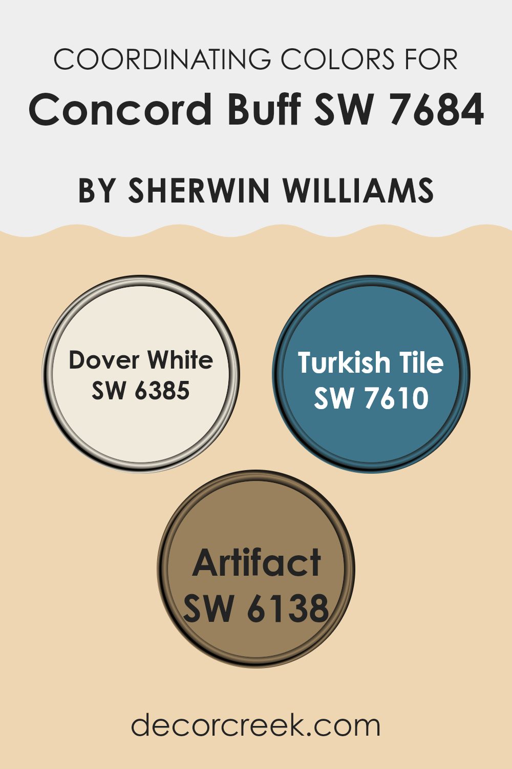
Coordinating Colors of Concord Buff SW 7684 by Sherwin Williams
Coordinating colors are those that complement each other and create a balanced, aesthetically pleasing palette when used together in decorating or design. They work by enhancing the main color without overpowering it, ultimately bringing out the best features in a space through harmony and contrast. Coordinating colors can be similar in tone or can offer a striking contrast to create visual interest and a dynamic interior.
For example, Dover White SW 6385 is a soft, creamy white that brings a light and airy feel to the surroundings, making it an excellent choice for trim or accents that gently complement richer hues like Concord Buff. On the other hand, Turkish Tile SW 7610 offers a vibrant contrast with its deep, aquatic blue shade, adding a splash of colorful intensity that stands out beautifully against more subdued tones.
This makes it a fantastic option for accent walls or decorative elements that need to draw the eye. Finally, Artifact SW 6138 is a warm, earthy tone similar to terracotta, which works wonderfully to add depth and warmth to spaces, pairing nicely with Concord Buff for a cozy, inviting atmosphere. Together, these coordinating colors can create a cohesive look that enhances the visual appeal of any room.
You can see recommended paint colors below:
- SW 6385 Dover White
- SW 7610 Turkish Tile
- SW 6138 Artifact
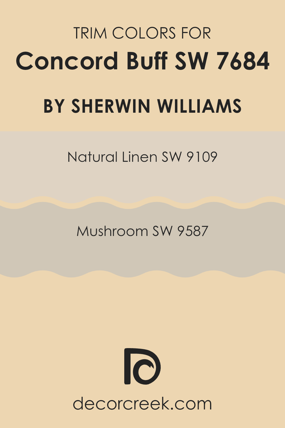
What are the Trim colors of Concord Buff SW 7684 by Sherwin Williams?
Trim colors play a crucial role in enhancing the overall appearance of a room by defining and accentuating the architectural features such as doors, windows, and baseboards. When painted in complementary shades, trims help frame the wall color, adding contrast and depth to the space.
For a warm, inviting color like Concord Buff by Sherwin Williams, trim colors like SW 9109 – Natural Linen and SW 9587 – Mushroom are excellent choices. These colors harmonize well, highlighting Concord Buff’s rich tone without overwhelming it.
Natural Linen is a soft, subtle beige that imparts a clean and fresh look when used as a trim color. Its understated elegance allows it to blend smoothly with the warmer hues of Concord Buff, providing a gentle contrast that is neither too stark nor too muted. On the other hand, Mushroom is a deeper, taupe-like color that offers a stronger delineation against Concord Buff. This color adds a touch of warmth and depth to the trim, enriching the overall palette of the room while creating a cohesive and inviting atmosphere.
You can see recommended paint colors below:
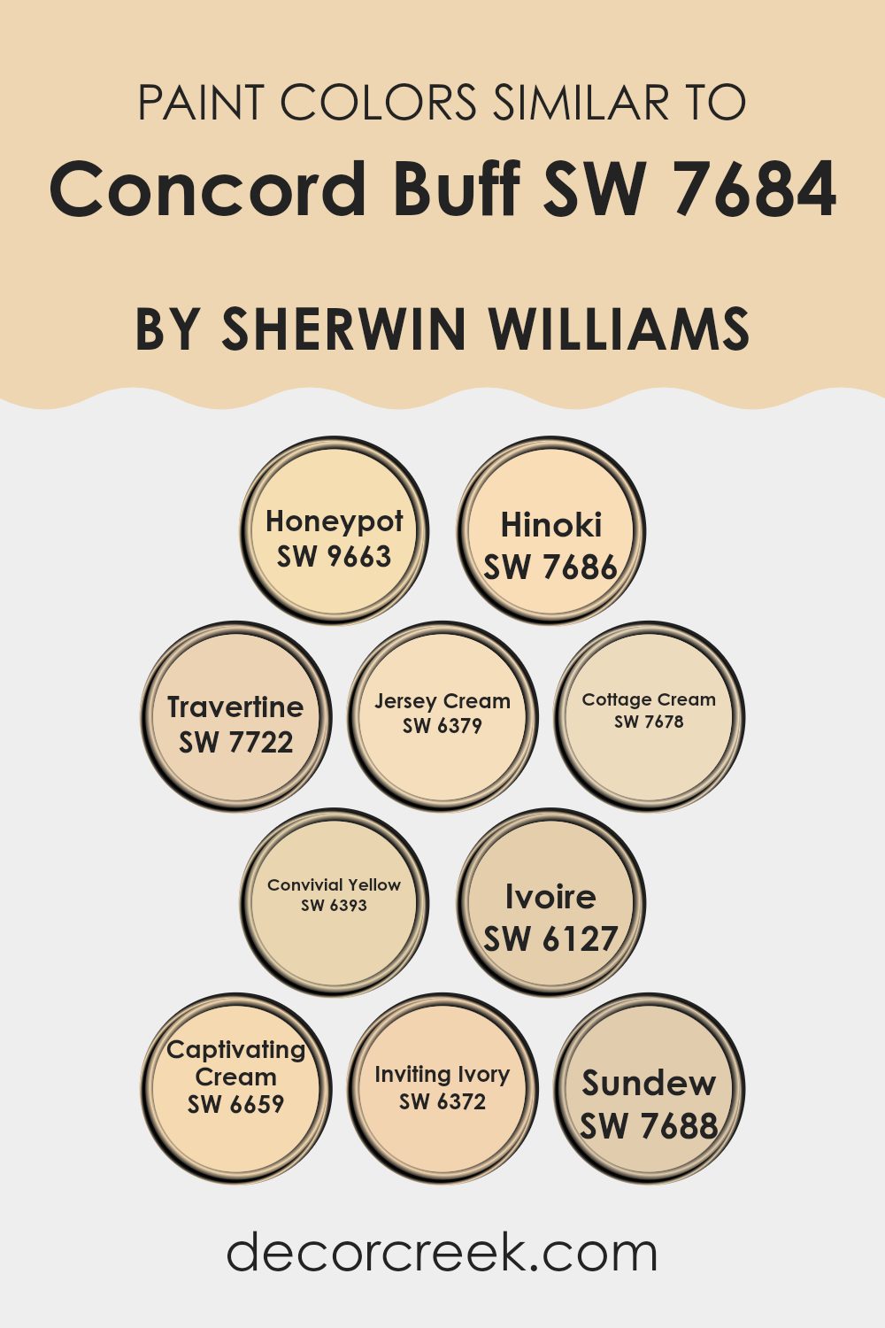
Colors Similar to Concord Buff SW 7684 by Sherwin Williams
Similar colors play a crucial role in design by creating a cohesive and harmonious look. When colors, such as those similar to Concord Buff by Sherwin Williams, are used together, they create a seamless flow from one area to another, enhancing the overall aesthetic without overwhelming the senses. These colors usually share a common hue, varying in brightness or saturation, allowing for a subtle yet impactful visual experience. The use of similar colors can also make a space appear larger and more open, as there are no abrupt color changes to visually break up the area.
Among the colors similar to Concord Buff, Honeypot offers a gentle, honey-like warmth, making it ideal for cozy and inviting spaces. Hinoki, with its muted earthy tone, provides a neutral backdrop that complements wooden features superbly.
Travertine has a soft, sandy look that works well in spaces that aim for a light and airy feel. Jersey Cream brightens spaces with its creamy, light-reflective qualities, while Cottage Cream adds a touch of subtle warmth, perfect for creating a relaxed environment. Convivial Yellow brings a cheerful brightness, enhancing spaces with a lively yet soft glow.
Ivoire offers a muted, creamy texture, great for softening the overall look of a room. Captivating Cream, although full of warmth, helps to maintain a light, inviting space. Inviting Ivory’s gentle hue pairs beautifully with a variety of décor styles, leading to versatile design options. Lastly, Sundew provides a touch of understated sunshine, ideal for spaces that need a gentle burst of brightness.
You can see recommended paint colors below:
- SW 9663 Honeypot
- SW 7686 Hinoki
- SW 7722 Travertine
- SW 6379 Jersey Cream
- SW 7678 Cottage Cream
- SW 6393 Convivial Yellow
- SW 6127 Ivoire
- SW 6659 Captivating Cream
- SW 6372 Inviting Ivory
- SW 7688 Sundew
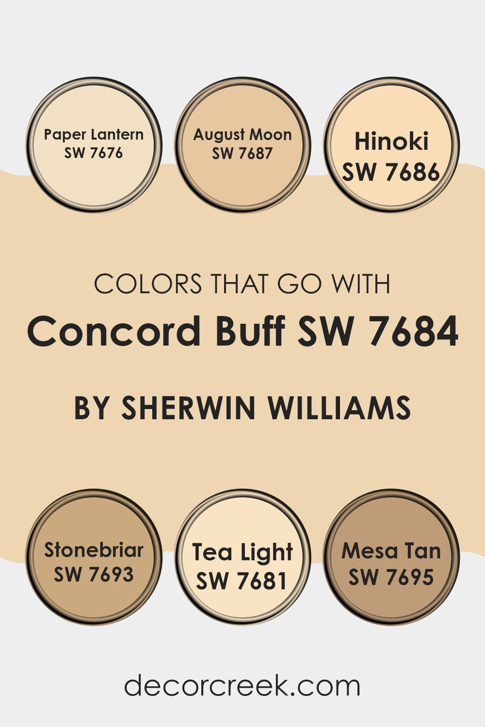
Colors that Go With Concord Buff SW 7684 by Sherwin Williams
Choosing the right colors to pair with Concord Buff SW 7684 by Sherwin Williams is crucial because it ensures that the overall look of your space remains harmonious and appealing. Concord Buff, a warm beige, sets a cozy and welcoming tone on its own, but when paired with complementary colors, it creates a balanced and inviting aesthetic.
For example, pairing it with Paper Lantern SW 7676, a soft, golden yellow, adds a subtle brightness that keeps rooms feeling light and airy. August Moon SW 7687, another excellent choice, brings in a richer golden tone, giving spaces a gentle warmth that is inviting.
On the other hand, Hinoki SW 7686 offers a deeper, more muted beige that provides a natural contrast to Concord Buff, grounding lighter spaces without overpowering them. Stonebriar SW 7693, a grayish-green, adds a touch of earthy elegance, making it ideal for those wanting to introduce a nature-inspired vibe into their environment. Tea Light SW 7681 is a pale creamy hue that acts as a soft backdrop, perfect for smaller spaces or as an accent color for detailed work.
Lastly, Mesa Tan SW 7695, with its warmer, more robust tan shade, pairs wonderfully with Concord Buff to create a nurturing and cozy atmosphere, perfect for family rooms or dens where comfort is key. Selecting and combining these colors thoughtfully can enhance the aesthetics of any setting.
You can see recommended paint colors below:
- SW 7676 Paper Lantern
- SW 7687 August Moon
- SW 7686 Hinoki
- SW 7693 Stonebriar
- SW 7681 Tea Light
- SW 7695 Mesa Tan
How to Use Concord Buff SW 7684 by Sherwin Williams In Your Home?
Concord Buff SW 7684 is a warm, creamy beige paint color by Sherwin Williams. It’s perfect for creating a cozy and welcoming atmosphere in any room. This color works well in living rooms or bedrooms where you want to promote a sense of comfort and relaxation. Its neutral tone makes it incredibly versatile, allowing it to pair well with a variety of decor styles and colors.
If you’re considering updating your kitchen or bathroom, Concord Buff adds a soft, clean look without making the space feel cold. It’s particularly effective in smaller rooms, as the light hue helps to make areas appear larger and more open. Additionally, this paint is a great choice for hallways and entryways, providing a bright yet warm welcome into the home.
When it comes to accents, Concord Buff goes well with rich wood furniture, colorful art, or bright textiles. This creates a balance that is visually appealing and makes your space feel personalized and put-together.
Concord Buff SW 7684 by Sherwin Williams vs Jersey Cream SW 6379 by Sherwin Williams
**Concord Buff and Jersey Cream by Sherwin Williams are two warm, inviting colors that work well in many spaces. Concord Buff is a soft, sandy beige with a subtle gray undertone, making it a versatile choice for creating a cozy and comfortable atmosphere. It pairs well with both bright and dark colors, forming a balanced backdrop in a room.
On the other hand, Jersey Cream has a creamy, yellowish tint that brings a brighter, more cheerful vibe to interiors. This color is excellent for spaces where you want to add a sense of light and warmth, such as kitchens or living rooms.
While both colors promote a warm ambiance, Jersey Cream offers a more lively and vibrant feel compared to the muted, neutral presence of Concord Buff. Whether used separately or together, each color has its unique way of making a home feel welcoming and stylish.
You can see recommended paint color below:
- SW 6379 Jersey Cream
Concord Buff SW 7684 by Sherwin Williams vs Ivoire SW 6127 by Sherwin Williams
The main color, Concord Buff, is a warm, muted yellow with a touch of brown, giving it an earthy, cozy feel. It’s a versatile shade that works well in many spaces, adding a subtle richness without being too bold. It pairs well with natural materials like wood and stone, enhancing a welcoming atmosphere in any room.
On the other hand, Ivoire is a lighter, creamier color. It’s softer than Concord Buff, providing a gentle backdrop that allows other design elements to stand out. This color can make small spaces appear bigger and brighter, as its pale tone reflects more light.
Both colors offer warmth, but Concord Buff adds depth with its richer hue, while Ivoire offers a cleaner, airier look. Each can create a pleasant environment, but your choice might depend on how much warmth and depth you want in your space.
You can see recommended paint color below:
- SW 6127 Ivoire
Concord Buff SW 7684 by Sherwin Williams vs Hinoki SW 7686 by Sherwin Williams
Concord Buff is a warm, inviting beige with a soft and subtle feel to it. Its creaminess gives a cozy vibe, making it perfect for living rooms or bedrooms where you want a comforting and peaceful atmosphere. The color pairs well with a wide range of decor styles, from rustic to modern.
On the other hand, Hinoki is slightly deeper and leans towards a taupe shade. Its richer color provides a sturdier feel, making it ideal for areas where you want more depth and warmth, such as dining rooms or entryways. Despite its stronger presence, Hinoki still maintains an air of understated warmth.
Comparatively, Concord Buff reflects more light and can make a room feel a bit larger, whereas Hinoki, with its deeper tones, tends to add a bit more character and dimension. Both colors work beautifully together, providing a harmonious balance when used in the same space.
You can see recommended paint color below:
Concord Buff SW 7684 by Sherwin Williams vs Cottage Cream SW 7678 by Sherwin Williams
The main color, Concord Buff, is a soothing shade of brown with a muted, earthy vibe that gives any space a cozy feel. It works well in rooms where you want a sense of warmth and comfort, such as living rooms or bedrooms. It pairs nicely with wood furniture and natural textures, bringing out an inviting atmosphere.
On the other hand, Cottage Cream offers a lighter and creamier yellow tone. This color is perfect if you’re looking to brighten up a space while keeping it soft and not too overpowering. It’s great for kitchens, bathrooms, or any area where you want a cheerful, airy feel.
When placed side by side, Concord Buff tends to draw in the eye with its deeper, richer hue, while Cottage Cream gives a lift and lightens up a space. Both offer unique vibes and can complement each other well depending on the room’s purpose and the mood you want to set.
You can see recommended paint color below:
- SW 7678 Cottage Cream
Concord Buff SW 7684 by Sherwin Williams vs Convivial Yellow SW 6393 by Sherwin Williams
Concord Buff and Convivial Yellow are both warm, inviting colors by Sherwin Williams, but they have distinct tones and atmospheres. Concord Buff is a subdued, muted yellow with a hint of brown, making it feel cozy and understated. This color is great for those who prefer a subtle, soft background that complements various decor styles without overwhelming the space.
On the other hand, Convivial Yellow is a brighter, more vibrant shade. It’s a cheerful yellow that can instantly brighten up a room and add a sense of liveliness and energy. This color works well in spaces where you want to create a sunny, friendly atmosphere, like kitchens or playrooms.
In summary, while both colors share a base in yellow, Concord Buff offers a more gentle and low-key vibe, whereas Convivial Yellow stands out with its freshness and vitality. Choosing between them would depend on the mood and energy you want to bring into your space.
You can see recommended paint color below:
- SW 6393 Convivial Yellow
Concord Buff SW 7684 by Sherwin Williams vs Inviting Ivory SW 6372 by Sherwin Williams
Concord Buff and Inviting Ivory are two distinct paint colors from Sherwin Williams. Concord Buff is a deep, warm beige with a slightly dusty tone that gives it a cozy feel. This color works well in spaces where you want a touch of warmth without overwhelming the room with a dark shade. It pairs nicely with natural materials like wood and leather, adding a subtle richness to the environment.
On the other hand, Inviting Ivory is a much lighter color with a creamy base. It’s soft and subtle, making it perfect for creating a bright and airy space. This color is excellent for smaller rooms or areas with limited natural light, as it reflects light well and helps make the space appear larger and more open.
Together, Concord Buff and Inviting Ivory can create a balanced and harmonious look. Using Inviting Ivory on walls with Concord Buff for trim or accent areas can provide a pleasing contrast that’s neither too stark nor too bland.
You can see recommended paint color below:
- SW 6372 Inviting Ivory
Concord Buff SW 7684 by Sherwin Williams vs Sundew SW 7688 by Sherwin Williams
Concord Buff and Sundew by Sherwin Williams are two warm and welcoming colors that can really make a space feel cozy. Concord Buff is a deeper, dusty yellow with a hint of brown, giving it an earthy, natural feel that works well in rooms that aim for a comfortable, inviting atmosphere.
On the other hand, Sundew has a lighter, creamier appearance. It’s closer to a soft beige with a gentle yellow undertone, making it perfect for areas where you want to add a touch of warmth without overwhelming the space.
While Concord Buff is richer and can create a more dominant backdrop in a room, Sundew offers a subtler approach, making it ideal for smaller spaces or as a complement to bolder colors. These two colors can beautifully complement each other within a home, with Sundew acting as a soothing counterbalance to the more pronounced Concord Buff. Each brings its own unique vibe, yet they maintain harmony when used together in decor.
You can see recommended paint color below:
- SW 7688 Sundew
Concord Buff SW 7684 by Sherwin Williams vs Travertine SW 7722 by Sherwin Williams
Concord Buff and Travertine are two distinct paint colors by Sherwin Williams, each offering its unique appeal. Concord Buff is a warm, sandy hue that brings a cozy and welcoming feel to any space. It has a yellow undertone which makes it bright and inviting, perfect for living rooms or bedrooms looking to foster a comforting atmosphere.
On the other hand, Travertine is a cooler, greenish-gray color that lends a more reserved and grounded vibe. This color is ideal for spaces where you want a subtle touch of nature while keeping the overall feel muted and understated, such as bathrooms or offices.
Both colors work well in various settings, depending on the mood you wish to create. While Concord Buff warms a room, Travertine gives it a calm, fresh look. This makes them valuable for different design needs, either as main themes or accent colors.
You can see recommended paint color below:
Concord Buff SW 7684 by Sherwin Williams vs Captivating Cream SW 6659 by Sherwin Williams
Concord Buff is a warm, muted yellow with a subtle earthy tone that gives a cozy, welcoming feel to any space. It’s soft enough to be versatile, so it works well in living rooms, bedrooms, or kitchens, bringing a gentle cheerfulness without overpowering the room.
Captivating Cream, on the other hand, is a much brighter yellow. It’s a lively color that adds a splash of sunshine to any area, making it feel more open and airy. This shade is perfect for spaces that need a boost of light, particularly smaller or darker rooms.
Both colors reflect light well, but Captivating Cream does so more intensely due to its lighter and more vibrant nature. Concord Buff, being more subdued, offers warmth without the brightness, creating a more relaxed environment. When choosing between the two, consider the mood you want to set: lively and bright or calm and cozy.
You can see recommended paint color below:
- SW 6659 Captivating Cream
Concord Buff SW 7684 by Sherwin Williams vs Honeypot SW 9663 by Sherwin Williams
Concord Buff and Honeypot are both warm, inviting colors from Sherwin Williams, but they offer different vibes due to their hues and saturation levels. Concord Buff is a soft, muted yellow with a sandy feel, giving it a natural and comforting presence that works well in spaces that aim for a cozy and understated look. It pairs nicely with earth tones and wood finishes, enhancing a space without overwhelming it.
On the other hand, Honeypot is a richer, more golden yellow. It’s brighter and has more depth, which makes it a great choice for adding a cheerful touch to a room. This color shines best in spaces that benefit from a splash of brightness, such as kitchens or dining areas.
While Concord Buff leans towards a neutral, subtle palette, Honeypot steps up as the bolder choice. Depending on your room’s purpose and lighting, both colors offer unique qualities, with Concord Buff providing a gentle backdrop and Honeypot bringing a dash of sunshine.
You can see recommended paint color below:
- SW 9663 Honeypot
In wrapping up my thoughts on SW 7684 Concord Buff by Sherwin Williams, I’ve really grown to appreciate this paint color. Concord Buff is like a warm hug for any room, radiating a cozy and welcoming vibe with its soothing yellow tone. It’s a fantastic pick if you’re looking to make a place feel more cheerful and bright without it being too bold or flashy.
This paint works nicely in lots of different rooms. Whether it’s your living room, kitchen, or even a bedroom, Concord Buff adds just the right amount of warmth and coziness, making the room feel just right. It pairs well with many colors, from soft whites to rich blues and greens, which means it’s easy to match with furniture and decorations you might already have.
So, if you’re thinking about giving your room a new look, consider SW 7684 Concord Buff. It’s a friendly color that makes everyone feel at home, and it keeps the room looking fresh and inviting. I think it’s a great choice that you won’t regret.
Ever wished paint sampling was as easy as sticking a sticker? Guess what? Now it is! Discover Samplize's unique Peel & Stick samples.
Get paint samples

