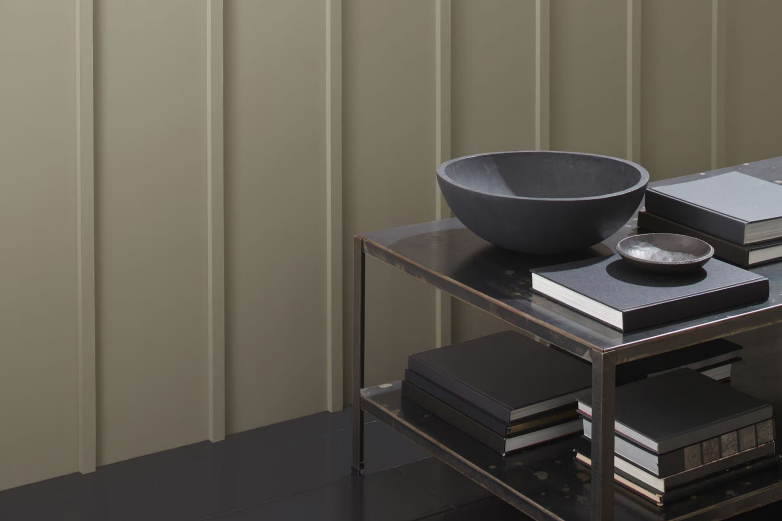
As you consider a fresh coat of paint for your room, you might want to look at HC-104 Copley Gray by Benjamin Moore. This elegant shade offers a subtle blend of green and gray, making it a flexible option that complements a wide range of decor styles.
Whether you’re giving your living room a new look or refreshing your bedroom, Copley Gray provides a soothing backdrop that enhances natural light and adds a touch of elegance without overpowering your senses. I’ve used this color in various rooms and found it particularly effective for creating a cozy, inviting atmosphere.
It pairs beautifully with both modern and traditional furnishings, bridging the gap between different tastes and design elements. Whether you have bold, vibrant accents or prefer a more understated palette, Copley Gray adapts seamlessly, proving itself as a truly adaptable choice for your decorating projects.
Let’s see how this charming color can renew your rooms into stylish, comforting areas.
What Color Is Copley Gray HC-104 by Benjamin Moore?
Copley Gray is a warm, subtle gray that adds a soft touch of elegance to any room. It’s a flexible shade that can be foundational or act as an accent, depending on your interior design needs. This color strikes a nice balance between warm and cool tones, making it an excellent choice for living rooms, bedrooms, or even kitchens. Its understated nature allows it to blend seamlessly with various décor styles.
In terms of interior styles, Copley Gray works particularly well in modern farmhouse, traditional, and transitional décor. Its subtlety complements the clean lines and simple aesthetics of modern design, while also fitting comfortably within the more classic elements of traditional styles. In a farmhouse setting, it pairs beautifully with natural materials like wood and stone, enhancing their organic feel.
Copley Gray goes well with a wide range of materials and textures. It looks stunning with polished wood, adding warmth to the room, and also complements metal finishes such as brushed nickel or aged brass, providing a subtle contrast. When paired with soft textiles like linen or cotton in light colors, it creates a cozy and welcoming atmosphere.
Its flexibility in pairing makes it a reliable choice for those looking to create a cohesive yet stylish interior.
Is Copley Gray HC-104 by Benjamin Moore Warm or Cool color?
Copley Gray by Benjamin Moore is a flexible paint color that brings a warm, subtle elegance to any room in a home. This shade is a soft gray with hints of green, making it a perfect choice for those looking to add a touch of nature-inspired neutrality to their living areas. Its earthy tones help create a cozy and inviting atmosphere, making it ideal for common areas like living rooms and kitchens.
One of the benefits of using this color is its ability to pair well with a wide variety of decor styles and colors. Whether your home features modern furniture or more traditional pieces, Copley Gray works harmoniously to complement your existing aesthetics without overpowering them.
It’s also great for rooms that get a lot of natural light, as it reflects the light beautifully, enhancing the overall brightness of the area. Moreover, this color can help small rooms appear larger and more open due to its light and airy feel. Overall, Copley Gray offers an enduring appeal that can help make your home feel more welcoming and put-together.
Undertones of Copley Gray HC-104 by Benjamin Moore
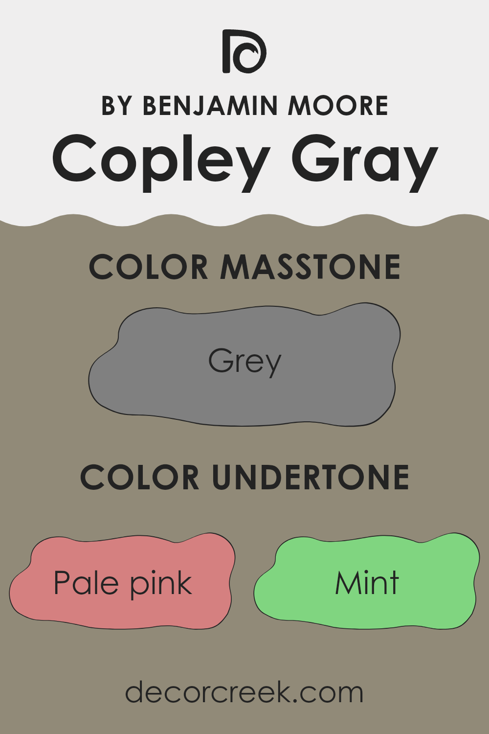
Copley Gray by Benjamin Moore features a complex balance of undertones that can subtly influence the perception and atmosphere of any room. Undertones are secondary colors that are mixed into the primary paint color, affecting how it appears under different lighting conditions or when placed next to other colors. For example, having undertones like pale pink or lilac might make a gray appear slightly warmer or cooler depending on the surrounding elements and the light.
When used on interior walls, the various undertones of Copley Gray can either enhance or soften the room’s overall aesthetic. In natural light, lighter undertones like lilac and pale yellow might make the walls seem brighter and more open, offering a gentle uplifting effect. In contrast, darker undertones like navy and dark green could provide a grounding feel, giving the room a more anchored and calm look.
Choosing this particular shade of gray can be quite practical too. Its blend of undertones, such as light blue and mint, could work well in rooms that aim for a fresh, airy vibe. Alternatively, its deeper tones like brown and dark grey add a touch of warmth, making large rooms feel more cozy and inviting.
In summary, the undertones in Copley Gray play a crucial role in how the paint color performs in an interior setting. They can impact mood, perceived area, and compatibility with other decor elements, allowing for more flexibility in designing a room that feels both welcoming and stylish.
What is the Masstone of the Copley Gray HC-104 by Benjamin Moore?
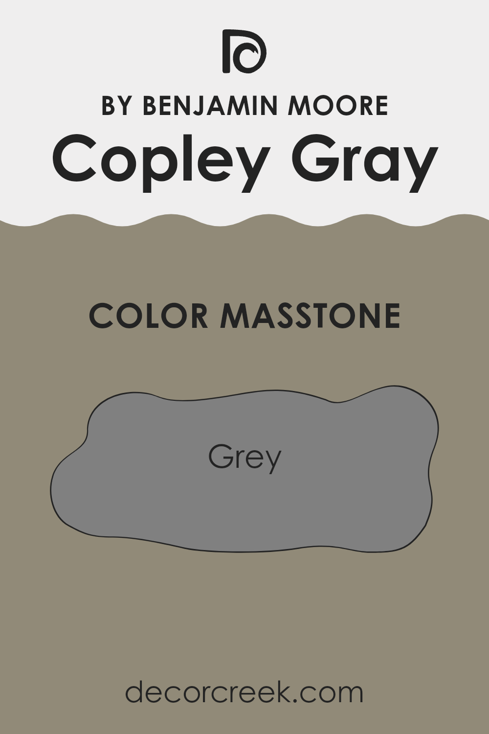
Copley Gray HC-104 by Benjamin Moore is a mid-tone gray that strikes a perfect balance for home interiors. With its masstone at Grey (#808080), it presents a neutral and adaptable backdrop suitable for various room styles and sizes. This shade is especially effective in rooms where you want to achieve a subtle, grounded feel without the starkness sometimes associated with deeper grays or the bright intensity of lighter grays.
When used in homes, Copley Gray offers consistency in appearance under different lighting conditions. The steady gray tone helps in blending with other colors, making it easy to accessorize with a wide range of furniture and decor items, from bold and bright to soft and pale hues.
It can work wonderfully in living rooms, bedrooms, and even kitchens, providing a calm, stable visual anchor that complements wood furniture, metallic finishes, and natural textiles. Whether aiming for a modern look or a more classic style, Copley Gray serves as a dependable choice that enhances the aesthetic of a room without overpowering it.
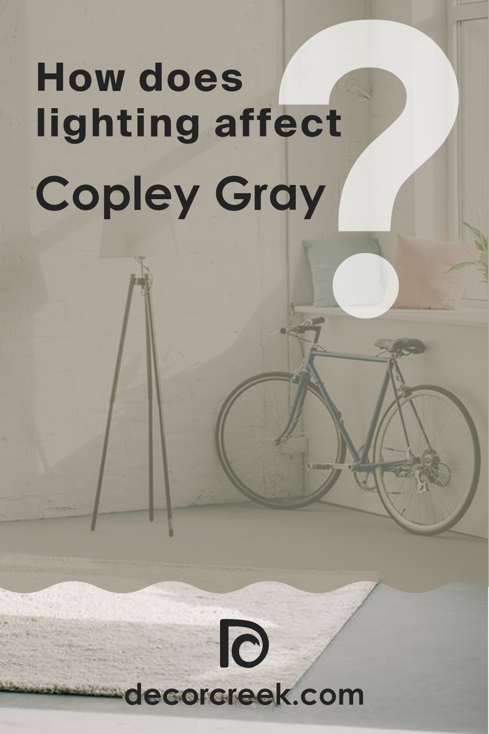
How Does Lighting Affect Copley Gray HC-104 by Benjamin Moore?
Lighting plays a significant role in determining how we see colors in our surroundings. The interaction between the type of light and paint colors can noticeably change how a color appears. Take the color Copley Gray HC-104 by Benjamin Moore, for example.
This shade is a balanced gray with warm undertones. Under artificial light, such as incandescent bulbs, these warm undertones are enhanced, giving the color a cozier and slightly more intense feel. This makes the room feel welcoming, particularly during evening hours when artificial lighting is predominant.
Under natural sunlight, the color can appear differently depending on the time of day and the room’s orientation. In north-facing rooms, which receive less direct sunlight and hence cooler light, Copley Gray may appear as a truer gray, somewhat muted and cooler. This creates a calm and reserved look that is quite appealing for rooms meant to be relaxing.
In south-facing rooms, where sunlight is warmer and more abundant throughout the day, the paint will reflect more of its warm undertones, making the room look brighter and more vibrant. Copley Gray in such rooms can appear lighter and more airy, giving an inviting feel throughout the day.
When used in east-facing rooms, the color will capture the warm, golden tones of the morning light, making the room feel lively and cheerful in the morning but turning back to a true moderate gray as the day progresses and the natural light diminishes.
For west-facing rooms, during sunset when the light is warmer and softer, the paint will have a warm, welcoming glow. As the sunlight fades, the color leans back into its balanced gray look, maintaining a neutral feeling into the evening.
In summary, Copley Gray’s appearance can shift from warm and inviting to reserved and true gray based on the light source and the room’s orientation, making it a flexible color choice for various rooms and settings.
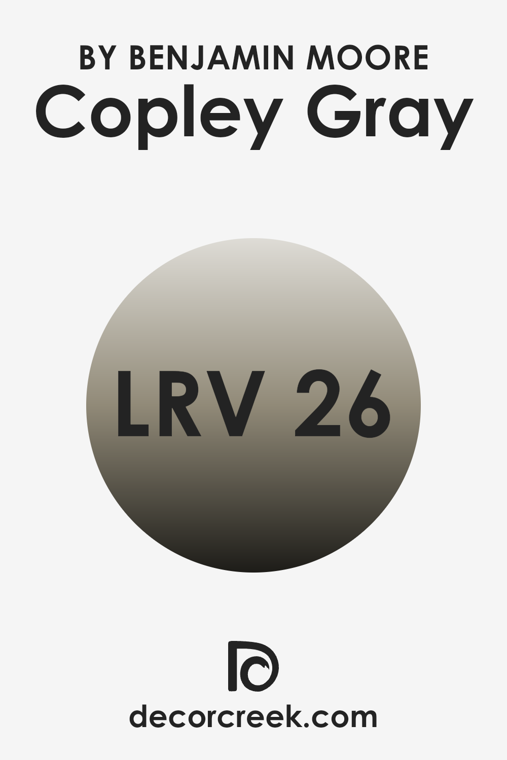
What is the LRV of Copley Gray HC-104 by Benjamin Moore?
LRV stands for Light Reflectance Value, which measures the percentage of light a paint color reflects back into the room compared to the amount of light it absorbs. This value ranges from 1 to 99, with lower values indicating darker colors that absorb more light and higher values representing lighter colors that reflect more light.
Understanding LRV is crucial when choosing paint colors because it helps predict how light or dark a color will look on your walls under different lighting conditions. For instance, a room painted with a high LRV color will typically appear brighter and need less artificial lighting compared to a room painted with a low LRV color.
Considering the LRV of 25.65 for Copley Gray HC-104 by Benjamin Moore, this shade is on the darker side, meaning it will absorb more light than it reflects. This characteristic can make a room feel cozier and more enclosed, particularly in areas with limited natural light. If you’re thinking of using this color in a smaller or poorly lit room, it might make the area feel smaller or dimmer than it actually is. To counteract this effect, good lighting arrangements and lighter-colored furnishings can help balance the darkness of the walls and enhance the overall ambiance of the room.
Coordinating Colors of Copley Gray HC-104 by Benjamin Moore
Coordinating colors are complementary shades that work together to enhance the overall aesthetic of a room. When selecting coordinating colors, it is essential to consider how they will interact with each other to create a harmonious look. For instance, a balanced color palette around a base color can bring out the best features of a room, highlighting architectural details or unifying different elements. Using coordinating colors effectively ensures that none of the colors overpower the others, but rather complement each other to enhance the overall ambiance.
One of the coordinating colors for Copley Gray by Benjamin Moore is Million Dollar Red (2003-10), a bold and lively red that injects energy and warmth into a room, making it an excellent choice for accents like doors or furniture. Another coordinating shade, White Dove (OC-17), is a soft and clean white, perfect for trim and ceilings to provide a crisp contrast.
Bennington Gray (HC-82) offers a deeper, warmer tone that pairs well with Copley Gray for a subtle yet rich layering of neutrals. Lastly, Sea Haze (2137-50) brings in a hint of green and gray, ideal for creating a calm, cohesive look that complements natural elements in a room. Together, these colors create a flexible and appealing palette that can enhance any living area.
You can see recommended paint colors below:

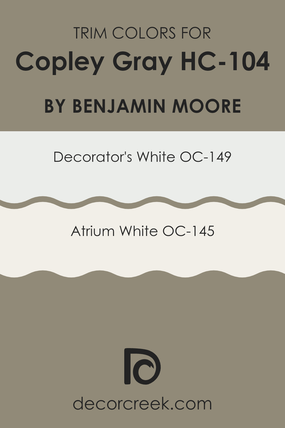
What are the Trim colors of Copley Gray HC-104 by Benjamin Moore?
Trim colors are specifically chosen paints applied to detailing elements such as door frames, baseboards, moldings, and window casings in a room, enhancing the primary wall color and contributing to the overall aesthetics of the area. For a color like Copley Gray by Benjamin Moore, selecting the right trim color is crucial as it contrasts and highlights the main shade, making the architectural details stand out.
Opting for lighter trim colors expands the boundaries of the room, making it appear larger and more open. It also provides a crisp clean line that delineates the different architectural features, making them more prominent and pleasing to the eye. Decorator’s White (OC-149) and Atrium White (OC-145) are excellent choices for trim colors when paired with Copley Gray.
Decorator’s White is an enduring and flexible white with a slight hint of gray, blending seamlessly with cooler tones. It’s a perfect choice for creating a subtle contrast without overpowering the senses. On the other hand, Atrium White is softer and warmer, giving off a gentle, welcoming vibe that can soften the more austere gray of Copley Gray, providing a gentle transition between colors and making the room feel harmonious and inviting.
You can see recommended paint colors below:
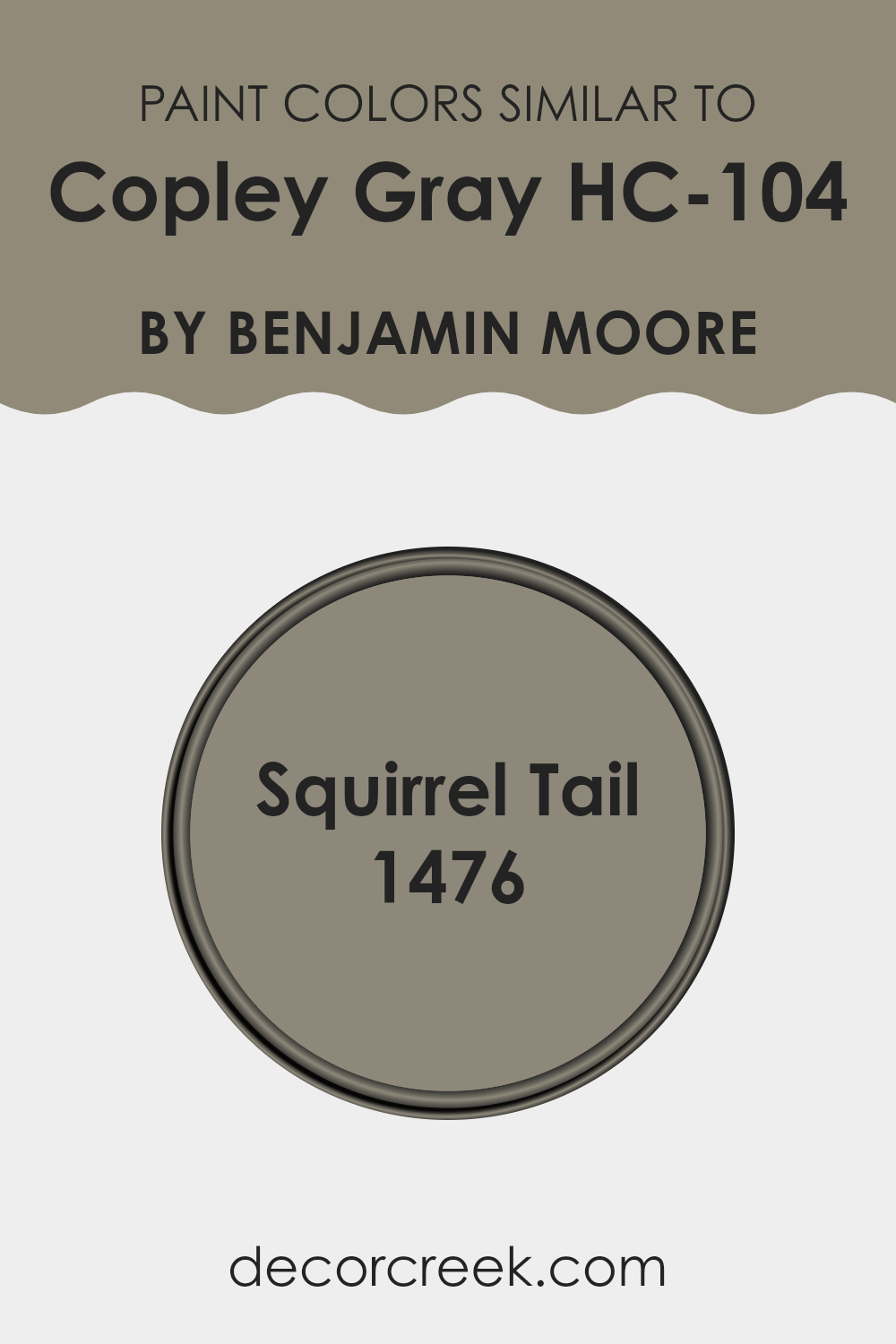
Colors Similar to Copley Gray HC-104 by Benjamin Moore
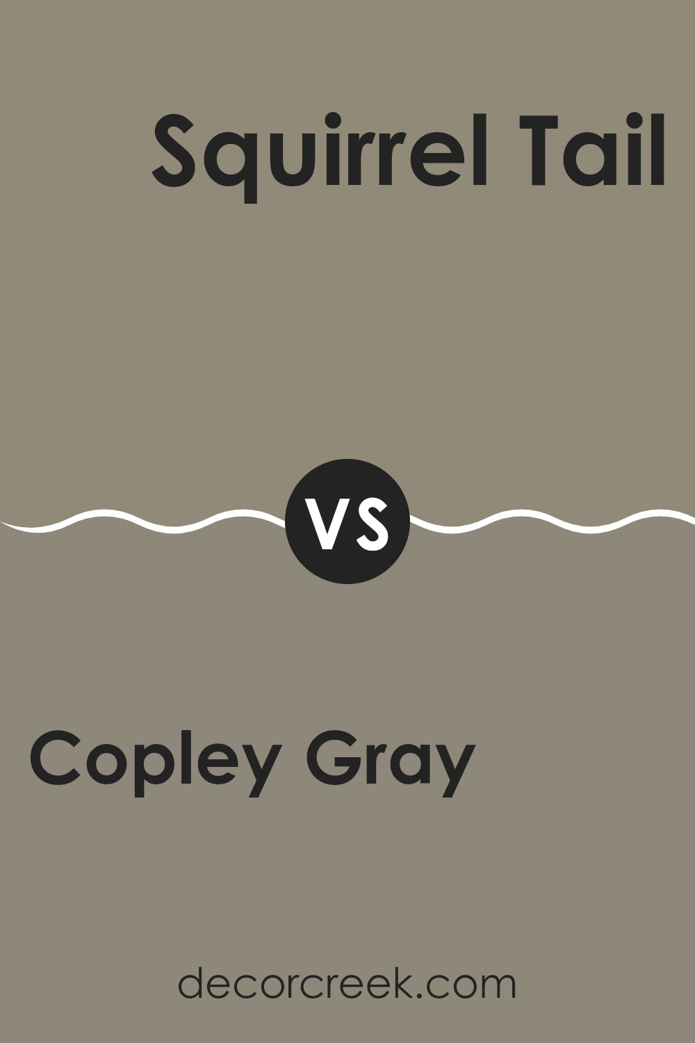
Similar colors play a crucial role in interior design by creating a harmonious and seamless look within a room. Choosing colors that closely resemble each other, such as Copley Gray and Squirrel Tail, is a great way to achieve a cohesive appearance without the abrupt transitions that sometimes occur with contrasting colors.
When hues are closely related, they help maintain a calm and consistent visual experience, proving especially useful in open-concept layouts where various elements need to blend smoothly. Copley Gray is a mid-tone gray that carries subtle hints of green, offering a muted yet warm presence in any room. It is flexible and works well in areas that aim for an understated yet inviting atmosphere.
On the other hand, Squirrel Tail steps slightly darker, presenting a rich blend of gray and brown. This color adds a bit more depth to interiors, making it an excellent choice for accent walls or for furniture pieces that need a touch more prominence. Both colors support each other, enhancing the overall aesthetic while allowing for design flexibility. By using these similar shades, one can ensure that the interior feels balanced and well-coordinated.
You can see recommended paint color below:
- 1476 Squirrel Tail
How to Use Copley Gray HC-104 by Benjamin Moore In Your Home?
Copley Gray HC-104 by Benjamin Moore is a flexible neutral shade that can be used in various ways across the home. This color presents as a subtle gray with warm undertones that make it ideal for creating a cozy atmosphere. You can use it in living rooms or bedrooms to provide a soothing background that complements both modern and traditional decor.
Its understated elegance allows it to pair well with bright colors for a pop of contrast or with other neutrals for a more monochromatic scheme. In addition to walls, Copley Gray can be applied to cabinets or furniture, giving old pieces a fresh, updated look. Its adaptability makes it suitable for various surfaces, including wood and metal.
For those who enjoy DIY projects, painting accent items like picture frames or shelving in this color can add a subtle cohesive element throughout their living areas. In sum, whether you’re repainting a room or updating furniture, Copley Gray offers a balanced backdrop that can enhance your home’s aesthetic while providing a warm and inviting feel.
Copley Gray HC-104 by Benjamin Moore vs Squirrel Tail 1476 by Benjamin Moore
Copley Gray and Squirrel Tail by Benjamin Moore are two distinct shades to consider for a cozy and inviting atmosphere. Copley Gray is a warm, medium gray with a hint of green, making it a flexible choice that can blend effortlessly with natural elements in a room, such as wooden furniture or plants. It can soften rooms without making them feel too dark and works well for both large living areas and smaller rooms.
On the other hand, Squirrel Tail is a deeper, taupe-like gray with noticeable brown undertones. This color adds a bit of richness and warmth, perfect for creating a cozy corner or accenting smaller areas where you want to add depth and comfort.
When choosing between these two, consider the light in your room and the mood you’re aiming to create. Copley Gray works well in rooms with plenty of natural light, keeping areas bright yet cozy. Squirrel Tail is ideal for adding character or warmth, fitting well in lower-lit areas or where a more enveloping feel is desired. Both colors offer a modern yet homely touch that can refresh any room.
You can see recommended paint color below:
- 1476 Squirrel Tail
After reading all about HC-104 Copley Gray by Benjamin Moore, I’ve learned a lot about this distinctive color. It stands out because it’s a mix between gray and green, which can look really nice in different rooms.
Whether you’re painting your living room, bedroom, or even a piece of furniture, Copley Gray has a gentle and calming feel that’s not too loud or soft, making it just right for creating a cozy environment. What’s great about this paint is that it works well with many other colors. You can pair it with bright tones like yellows or blues to make them stand out, or with deeper shades to keep things calm and balanced.
Copley Gray is also known for its quality, as Benjamin Moore paints are praised for their strong coverage and lasting finish — so you won’t have to worry about redoing it anytime soon. For anyone wanting to refresh their home with a new look that feels warm and inviting, HC-104 Copley Gray is a smart pick.
It’s perfect for anyone who wants to make their home feel more welcoming without making it too bold. So, it’s definitely a thumbs up from me!
Ever wished paint sampling was as easy as sticking a sticker? Guess what? Now it is! Discover Samplize's unique Peel & Stick samples.
Get paint samples

