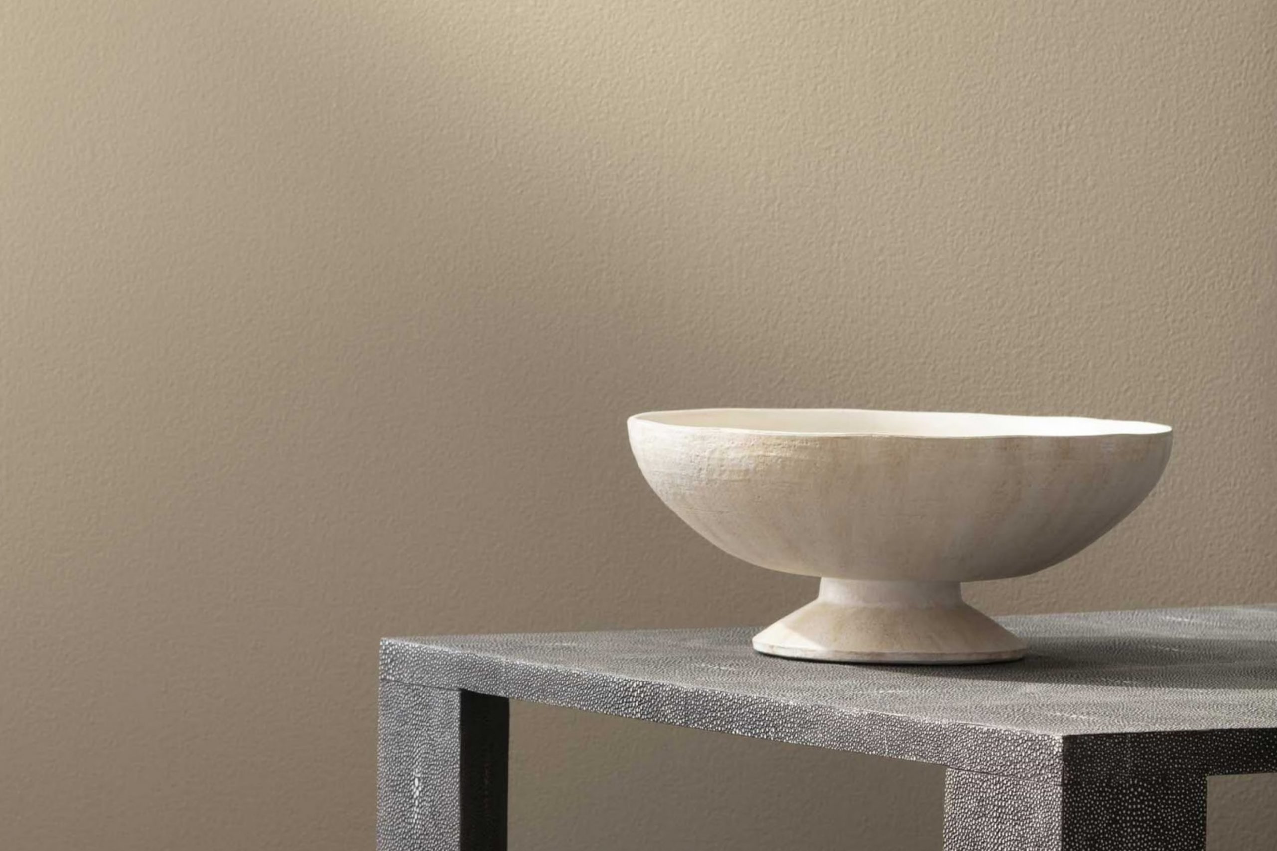
When I think about creating a warm and welcoming room, HC-82 Bennington Gray by Benjamin Moore often comes to mind. This shade is more than just a color; it’s a feeling you can bring into your home. Bennington Gray strikes a perfect balance, offering a gentle and inviting hue that works beautifully in any room. It has a subtle warmth with a hint of gray that adds a refined touch to the walls, making rooms feel cozy yet elegant.
I’ve found that this color harmonizes effortlessly with various decor styles. Whether you’ve got modern furniture or cherish vintage pieces, it seems to effortlessly tie everything together. Its versatility is a real asset, and it pairs well with both neutral tones and bolder accents.
One of the things I appreciate most about Bennington Gray is its ability to change with the light. In the morning, it might appear soft and soothing, and by evening, it deepens slightly, offering a comforting atmosphere. For anyone looking to create a room that feels both classic and modern, this color is a delightful choice.
It’s perfect for living rooms, bedrooms, or even a charming home office. Give it a try, and see how it can add character and warmth to your room.
What Color Is Bennington Gray HC-82 by Benjamin Moore?
Bennington Gray (HC-82) by Benjamin Moore is a flexible and earthy neutral that sits comfortably between gray and beige, often referred to as “greige.” This color is warm and inviting, making it a great choice for creating a cozy atmosphere in any room. Its subtle undertones can vary slightly depending on the lighting, sometimes appearing more gray or more beige, providing a soft and adaptable backdrop.
This color works well in a variety of interior styles. In traditional homes, it complements classic furnishings and rich woods. It adds a sense of warmth without overpowering the room. In more modern or minimalist areas, Bennington Gray can ground the room, adding a hint of color without detracting from the clean lines and simplicity.
Pair Bennington Gray with materials like natural wood, leather, and stone to enhance its warm undertones. Textured fabrics such as linen, wool, or cotton in soft, neutral shades can complement this color beautifully. For a striking contrast, metallic accents in gold or bronze can add a touch of elegance. Additionally, incorporating greenery or botanical elements can enhance the natural vibe of Bennington Gray, creating a balanced and harmonious area.
Is Bennington Gray HC-82 by Benjamin Moore Warm or Cool color?
Bennington Gray HC-82 by Benjamin Moore is a warm, earthy shade that can add a cozy feel to any home. It’s a flexible color that works well in various areas, from living rooms to bedrooms. Its soft, muted tones make it an ideal choice for creating a welcoming atmosphere. The gray has subtle brown undertones, which give it a comforting, natural vibe.
This color can be a great backdrop for other colors, as it complements different shades beautifully. It pairs nicely with whites and creams for a classic look. When combined with darker colors, it creates a rich contrast that adds depth to a room.
It’s not too dark, making it suitable for small areas, as it won’t overpower them. Additionally, it works well with wood and natural materials, enhancing a room’s warmth and inviting feel. Overall, Bennington Gray HC-82 is a reliable choice for those looking to add a touch of warmth to their home.
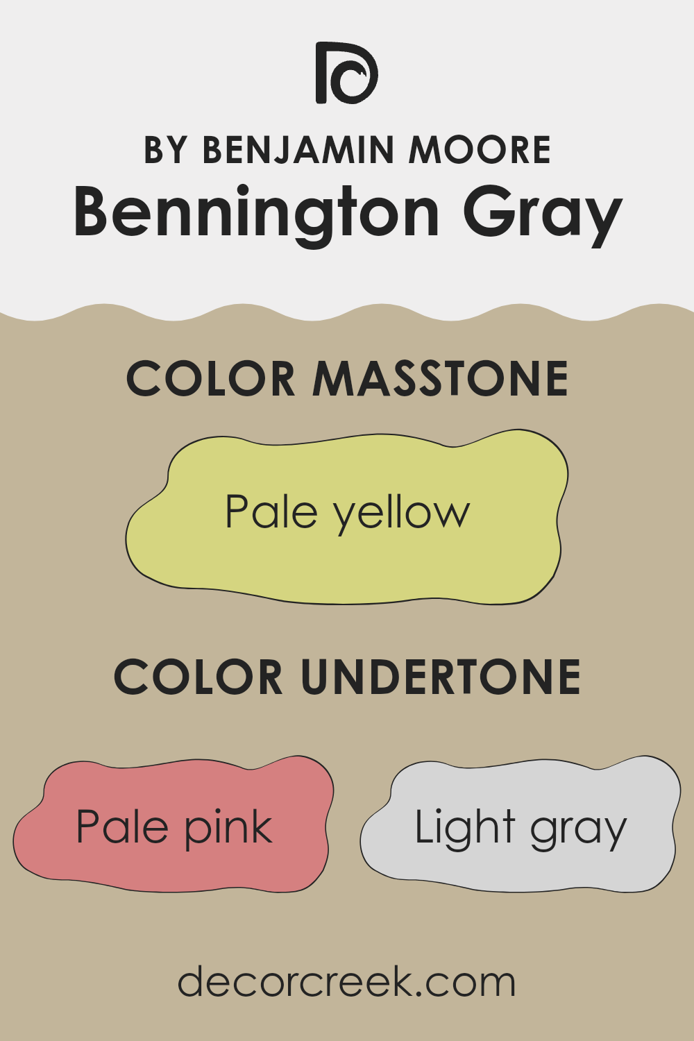
Undertones of Bennington Gray HC-82 by Benjamin Moore
Bennington Gray by Benjamin Moore is a complex color with layers of undertones that can change how it looks in different settings. Its primary look is a warm taupe, but the mix of subtle undertones adds depth and flexibility. When you consider the undertones such as pale pink, mint, and light purple, they can lend a soft, welcoming feel to a room. These undertones gently warm up the area, making it feel cozy yet neutral.
The addition of light gray and standard gray tones provides balance, grounding the color and ensuring it remains adaptable for various styles and décors. Light blue, lilac, and light green add a coolness that can be refreshing, particularly in areas with lots of natural light, where cooler undertones are brought more to the forefront.
Warmer hues like yellow, orange, and olive contribute a hint of richness and warmth, which can be particularly comforting in rooms with little natural light. This can create a softer, more inviting atmosphere.
Overall, Bennington Gray’s collection of undertones provides a balance that makes it both flexible and engaging to the eye, subtly shifting in tone with lighting changes and varying environments, making it a popular choice for interior walls.
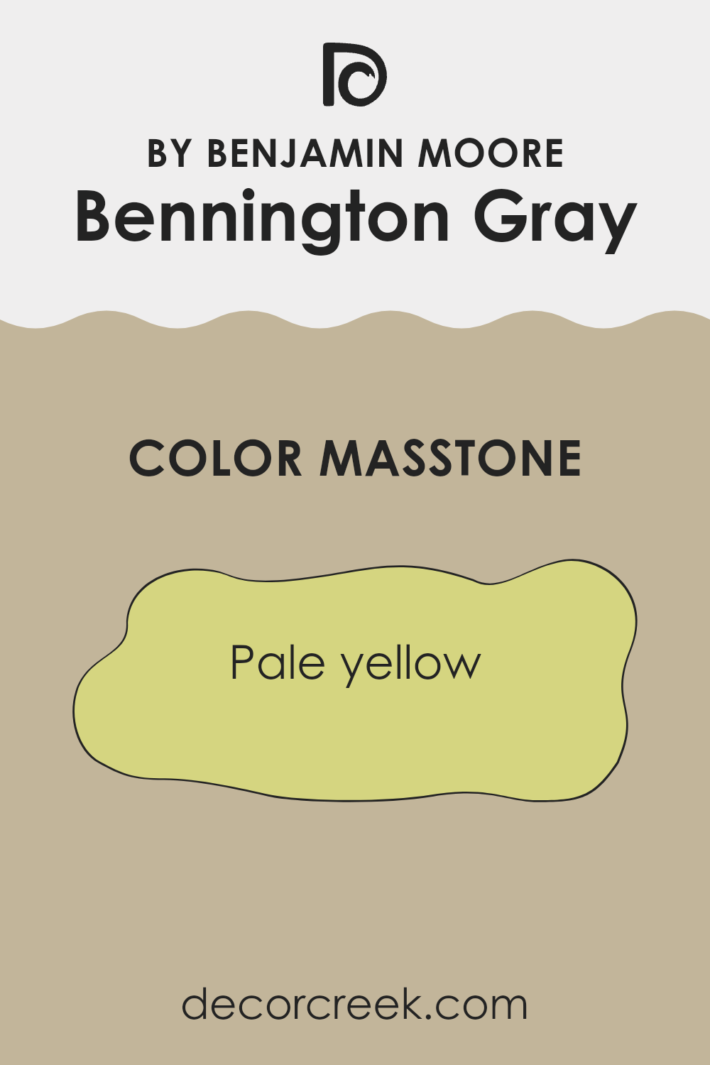
What is the Masstone of the Bennington Gray HC-82 by Benjamin Moore?
Bennington Gray (HC-82) by Benjamin Moore, with its pale yellow masstone, is a soft and comforting color choice for homes. This subtle yellow hue brings warmth and light to a room, making it feel inviting and cheerful.
Its gentle undertone ensures it doesn’t overwhelm a room, but rather adds a cozy and pleasant ambiance. In living rooms, it can create a relaxed environment where family and guests feel welcome. In kitchens, this pale yellow can make the room feel fresh and bright, enhancing the overall cooking and dining experience.
When used in bedrooms or bathrooms, it provides a calming backdrop that promotes relaxation. This hue pairs well with a range of other colors such as earthy browns, soft whites, and gentle grays, allowing for versatility in decorating.
Its ability to reflect natural sunlight can make rooms appear larger and more open while maintaining a comfortable and grounded feel.
How Does Lighting Affect Bennington Gray HC-82 by Benjamin Moore?
Lighting plays a crucial role in how we perceive colors. Different light sources can make the same color look vastly different. Bennington Gray (HC-82) by Benjamin Moore is a medium-toned, warm gray that contains subtle green and beige undertones. Its appearance changes depending on the type and direction of light it is exposed to.
In natural light, Bennington Gray’s undertones are more visible, making it appear warmer or cooler based on the time of day. In artificial lighting, especially under warm bulbs, the color can look more beige or taupe, emphasizing its earthy undertones.
Rooms with north-facing windows receive less intense and cooler light. In these areas, Bennington Gray might take on a cooler tone, perhaps even hinting at a slight green hue. This can make the room feel a bit darker or moodier, which can be comforting for some settings.
Conversely, south-facing rooms are flooded with bright, warm light for most of the day. Here, Bennington Gray will appear warmer and may show more of its beige tones. The color can feel more accommodating and inviting in such settings, making the room feel cozier.
East-facing rooms have strong morning light, which is crisp and cool. In the morning, Bennington Gray might seem cooler and lighter, which can be refreshing. As the day progresses and the natural light fades, artificial light will bring out its warmer tones.
West-facing rooms enjoy warm afternoon light. Bennington Gray will generally appear warmer and may seem richer and more beige, creating an inviting atmosphere as the day winds down.
Overall, the shifting light throughout the day greatly impacts how Bennington Gray appears. It’s important to test paint samples in your home to observe these changes and see how the color feels in your specific environment.
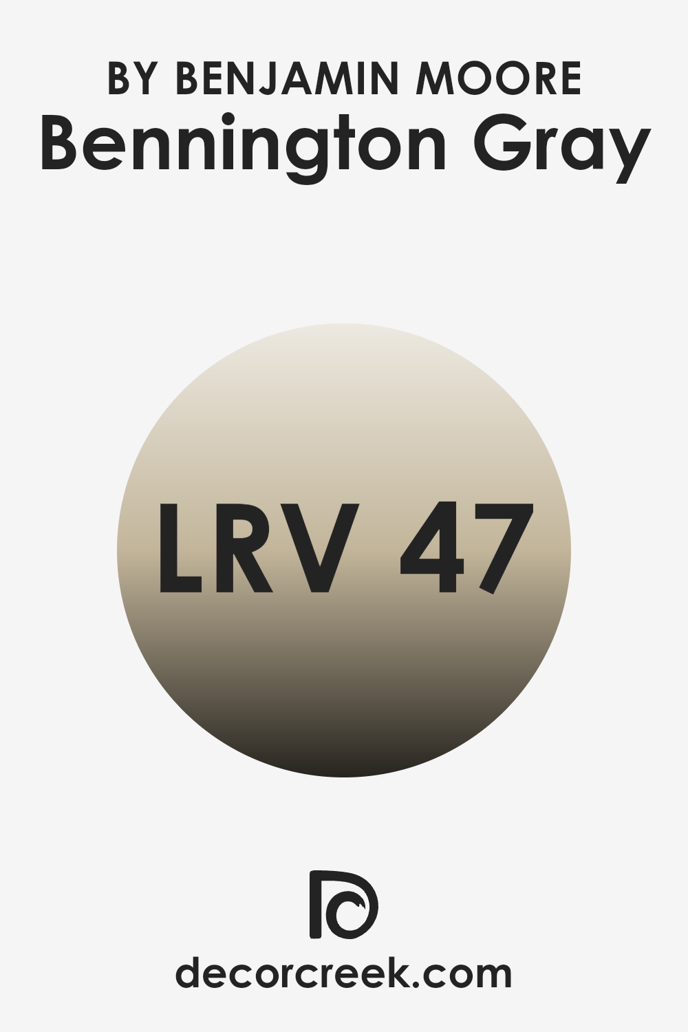
What is the LRV of Bennington Gray HC-82 by Benjamin Moore?
Light Reflectance Value (LRV) is a measurement that tells us how much light a color reflects or absorbs. It’s a scale from 0 to 100, where 0 is completely black, reflecting no light, and 100 is pure white, reflecting the most light. When choosing a paint color, the LRV can help predict how light or dark a color will appear in a room and how it will interact with natural and artificial lighting.
A higher LRV means more light is reflected, making a room feel brighter and more open. Conversely, a lower LRV absorbs more light, which can make a room feel cozier and more intimate. For Bennington Gray with an LRV of 46.68, this value suggests it’s a mid-tone color. It doesn’t absorb too much light nor reflect excessive amounts, striking a balance between light and dark.
As a result, Bennington Gray can contribute to a warm and welcoming environment without overpowering a room. It will hold its own against natural light during the day and may appear slightly darker in dimly lit areas, offering a flexible and adaptable choice for various settings. Its neutral gray tones can serve as a backdrop, allowing other design elements in a room to stand out while maintaining a sense of balance and harmony.
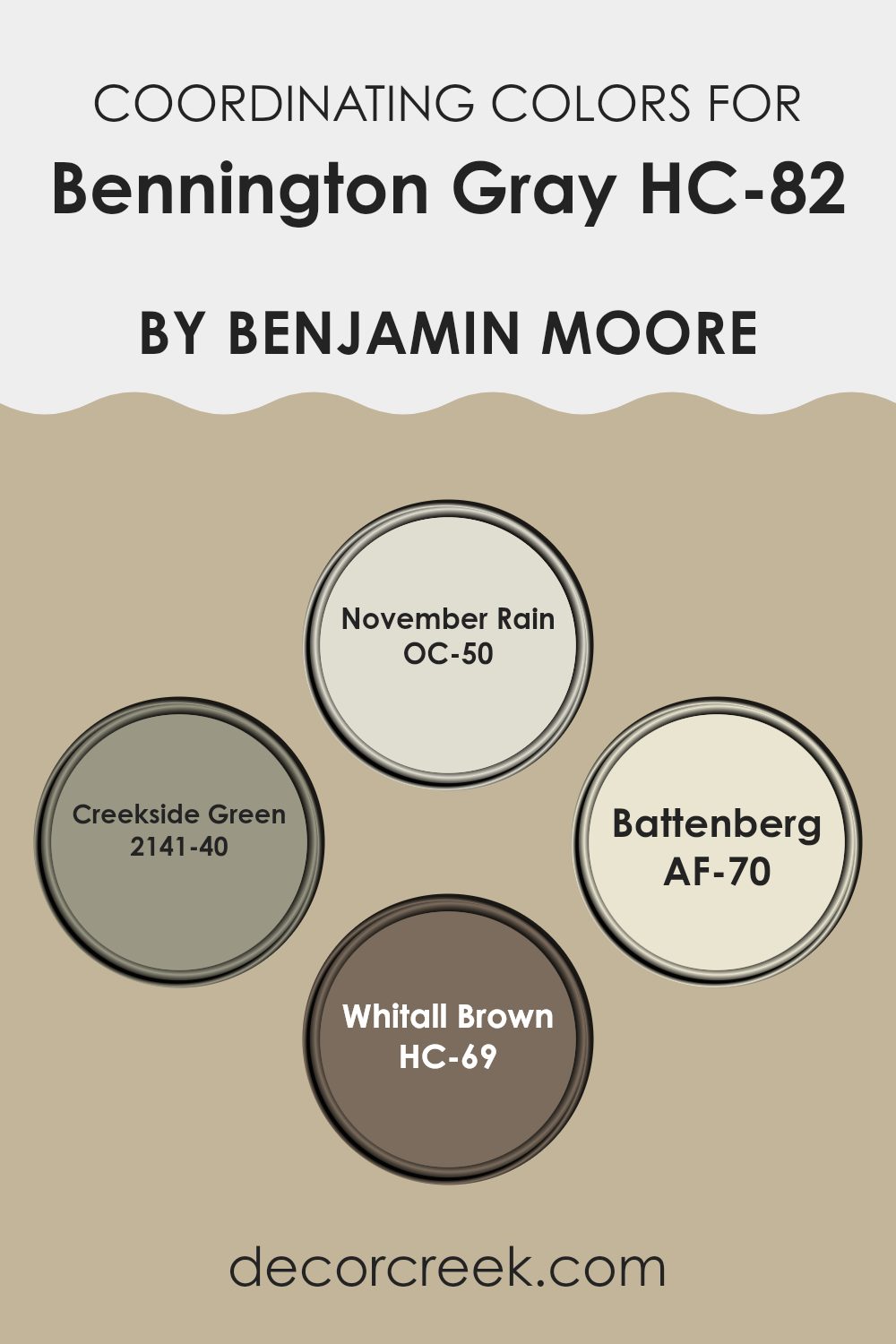
Coordinating Colors of Bennington Gray HC-82 by Benjamin Moore
Coordinating colors are shades that work well together to create a harmonious look in a room. They complement each other by sharing a similar undertone or level of brightness, which helps in tying a room’s design elements together. When working with Bennington Gray, a warm and inviting neutral, you can turn to related hues to create a cohesive atmosphere.
One such color is November Rain, a delicate off-white with a hint of gray, which brightens a room while maintaining a soft, peaceful environment. Creekside Green is another coordinating shade that beautifully enhances Bennington Gray. This misty green adds a subtle touch of nature and freshness, making it ideal for a calming backdrop.
Battenberg, with its gentle butter-yellow tone, infuses warmth and light into a room, making it feel cozy and inviting. Finally, Whitall Brown brings depth with its rich, earthy brown, grounding the palette and introducing a refined touch. These colors, when used alongside Bennington Gray, create a balanced and harmonious setting, allowing each shade to shine while contributing to the overall feel of the room.
You can see recommended paint colors below:
- OC-50 November Rain
- 2141-40 Creekside Green
- AF-70 Battenberg
- HC-69 Whitall Brown
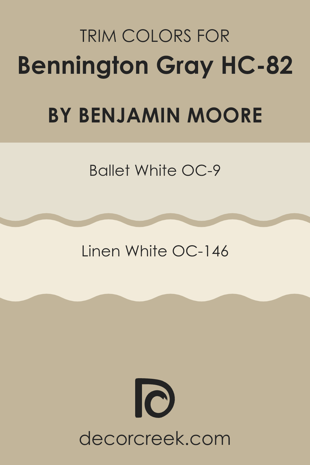
What are the Trim colors of Bennington Gray HC-82 by Benjamin Moore?
Trim colors are the shades used for the edges or borders of walls, doors, and windows to create contrast to the main wall color. They can add depth and make certain areas pop, enhancing the room’s overall appearance. For Bennington Gray HC-82 by Benjamin Moore, choosing the right trim color is essential.
This particular color is a warm, neutral gray with a hint of beige, giving rooms a cozy and inviting feel. Pairing it with the right trim color not only highlights its warmth but also defines the architectural details of the room. Ballet White OC-9 and Linen White OC-146 can both work beautifully as trim colors with Bennington Gray.
Ballet White is a soft, creamy off-white with a hint of warmth, which makes it a gentle complement to the gray. It brightens the edges and gives a subtle contrast without being too stark. On the other hand, Linen White is a creamy white with a bit more beige, offering a warmer alternative. Its slightly deeper tone complements Bennington Gray while still providing a distinct separation between the walls and trim, creating a harmonious and cozy atmosphere.
You can see recommended paint colors below:
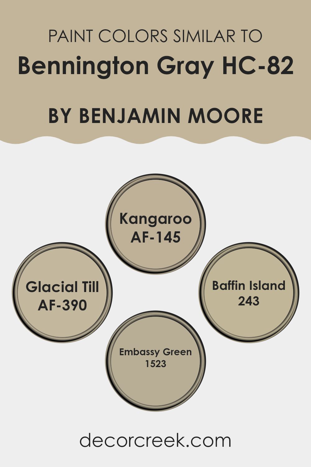
Colors Similar to Bennington Gray HC-82 by Benjamin Moore
Similar colors play an important role in design and aesthetics because they provide a cohesive and harmonious look. They can make a room feel balanced and inviting, rather than chaotic or overpowering. When colors are similar, they share certain undertones or hues that create a subtle connection, making it easy for them to blend together smoothly in a room.
Similar colors to Bennington Gray by Benjamin Moore, like Kangaroo, Glacial Till, Baffin Island, and Embassy Green, work well together because they share a neutral, earthy vibe that complements a variety of styles and settings. Kangaroo (AF-145) is a warm, taupe-like color that evokes a comforting and cozy atmosphere, perfect for areas where relaxation is key.
Glacial Till (AF-390) has a cool, light gray tone that adds a refreshing and open feel, making it ideal for rooms that require a touch of brightness. Baffin Island (243) is a soft gray that carries a hint of blue, offering a soothing presence that’s great for bringing calmness into a room. Embassy Green (1523) introduces a muted, greenish-gray color that can add a natural, grounded touch, particularly in rooms that benefit from a soft connection to the outdoors. These colors, when used together, create a restful and inviting environment.
You can see recommended paint colors below:
- AF-145 Kangaroo
- AF-390 Glacial Till
- 243 Baffin Island
- 1523 Embassy Green
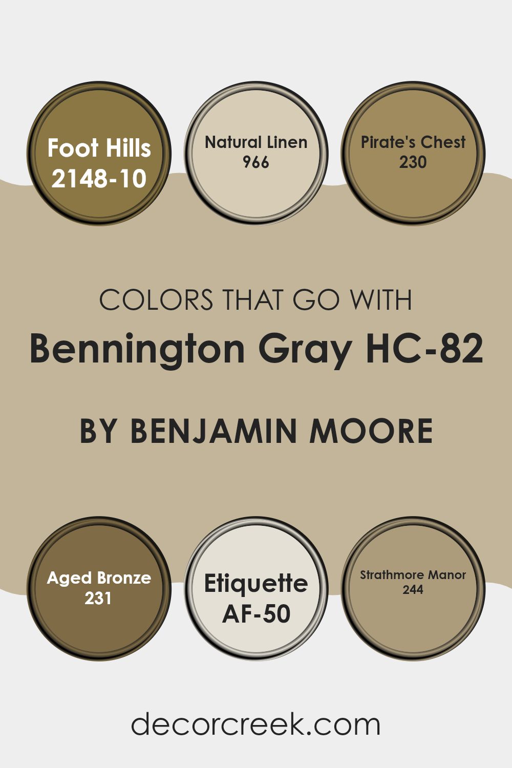
Colors that Go With Bennington Gray HC-82 by Benjamin Moore
Adding colors that complement Bennington Gray HC-82 by Benjamin Moore is essential for creating a well-rounded and balanced room. Bennington Gray is a soft, warm gray with a hint of beige, making it a flexible backdrop. Pairing it with colors like Foot Hills 2148-10, a deep earthy green, creates a sense of groundedness and connection to nature.
Natural Linen 966 brings a warm, creamy tone that highlights the subtle warmth in Bennington Gray, making rooms feel cozy and inviting. Pirate’s Chest 230, with its rich brown hue, introduces an element of strength and stability, adding depth to the overall palette.
Aged Bronze 231 offers a dark, muted tone that contrasts beautifully with Bennington Gray, providing a sense of elegance and richness. Etiquette AF-50 is a gentle, muted pink that enhances the soft undertones of Bennington Gray, adding a touch of warmth and comfort. Strathmore Manor 244 offers a muted lavender hue that infuses a hint of color without being overpowering, tying the palette together with a bit of playfulness. By combining these colors, rooms become harmonious and inviting, with each shade playing off the others to create a seamless and pleasing environment.
You can see recommended paint colors below:
- 2148-10 Foot Hills
- 966 Natural Linen
- 230 Pirate’s Chest
- 231 Aged Bronze
- AF-50 Etiquette
- 244 Strathmore Manor
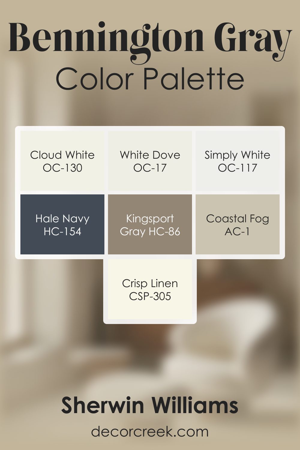
Bennington Gray HC-82 by Benjamin Moore Color Palette
Bennington Gray carries a warm, grounded presence that feels welcoming and naturally balanced. This palette expands its earthy charm with a mix of warm whites, soft neutrals, and rich accents that bring shape and comfort to the overall look.
White Dove and Cloud White add gentle brightness that highlights Bennington Gray’s warmth without washing it out.
Simply White introduces a crisp, clean layer that lifts the palette and keeps it feeling fresh. Kingsport Gray and Coastal Fog deepen the palette with warm taupe and gray-brown tones, creating a smooth transition that feels calm and cohesive.
Crisp Linen adds a warm, gentle glow that blends beautifully with the palette’s natural warmth.
Hale Navy brings strong contrast and structure, grounding the softer tones with depth and character. The combination creates a palette that feels warm, inviting, and easy to use in a variety of interiors.
Its grounded nature makes it ideal for living rooms, kitchens, dining spaces, and bedrooms where comfort and quiet depth create a welcoming atmosphere.
How to Use Bennington Gray HC-82 by Benjamin Moore In Your Home?
Bennington Gray HC-82 by Benjamin Moore is a warm and inviting paint color that’s perfect for creating a cozy atmosphere in your home. This neutral shade has a balance of beige and gray, making it flexible for various areas.
You can use Bennington Gray in your living room to create a comfortable room where family and friends can relax. Pair it with white or cream furniture for a clean and fresh look, or add darker accents like navy or charcoal for more contrast.
In the bedroom, Bennington Gray offers a calm backdrop that helps promote restful sleep. Add soft bedding and natural textures like wood or linen to enhance the cozy feel. In the kitchen, this color can blend nicely with wood cabinets, providing a warm feel without overpowering the room. Whether in a small hallway or a large open area, Bennington Gray adapts well, offering a welcoming and classic look.
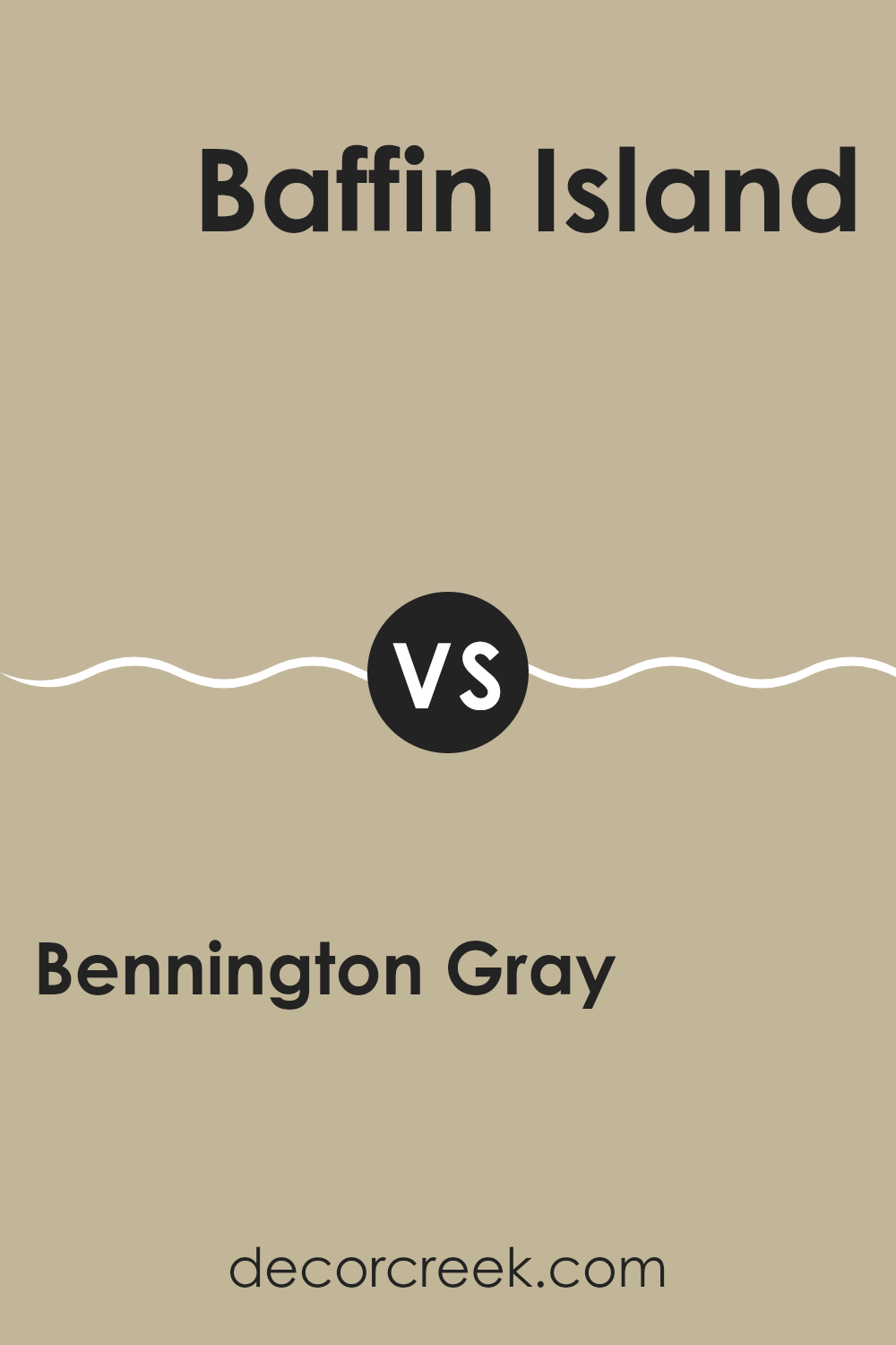
Bennington Gray HC-82 by Benjamin Moore vs Baffin Island 243 by Benjamin Moore
Bennington Gray HC-82 by Benjamin Moore is a warm and inviting shade of gray with undertones of beige, making it a flexible choice for various areas. It feels cozy and creates a welcoming environment, making it suitable for living rooms, bedrooms, or any setting where you want a touch of warmth.
On the other hand, Baffin Island 243 by Benjamin Moore is a cooler gray with subtle blue undertones. This color tends to bring a fresh and crisp feel to a room. Perfect for bathrooms, kitchens, or areas where a brighter and more airy atmosphere is desired, it adds a sense of lightness and openness.
While both are shades of gray, Bennington Gray adds warmth and coziness, while Baffin Island brings a cooler and more refreshing vibe. Choosing between them often depends on whether you prefer the snug and earthy feel of Bennington Gray or the crisp, modern ambiance of Baffin Island.
You can see recommended paint color below:
- 243 Baffin Island
Bennington Gray HC-82 by Benjamin Moore vs Glacial Till AF-390 by Benjamin Moore
Bennington Gray HC-82 by Benjamin Moore is a warm, earthy shade that leans toward beige with a hint of gray. It creates a cozy, inviting atmosphere in a room, making it a flexible option for living rooms and bedrooms. Its warm undertones pair well with natural materials and earthy accents, adding a touch of comfort and homeliness.
On the other hand, Glacial Till AF-390 by Benjamin Moore is a cooler, softer gray. It has a more modern and understated vibe compared to Bennington Gray. This color can give a room a clean and fresh feel, ideal for areas that benefit from a light, airy ambiance. It works well with bold accents and modern furnishings, providing a neutral backdrop that doesn’t overwhelm.
While both colors are grays, Bennington Gray offers warmth and coziness, making areas feel snug, whereas Glacial Till brings a cooler, more crisp sensation, perfect for contemporary styles.
You can see recommended paint color below:
- AF-390 Glacial Till
Bennington Gray HC-82 by Benjamin Moore vs Embassy Green 1523 by Benjamin Moore
Bennington Gray HC-82 by Benjamin Moore is a warm, neutral shade with a hint of beige, creating a welcoming and cozy atmosphere. It pairs well with a variety of accent colors, making it a flexible choice for different rooms. This color can suit traditional and modern areas alike, providing a subtle and elegant background without overpowering the senses.
On the other hand, Embassy Green 1523 by Benjamin Moore is a deeper, richer green that adds a touch of nature to any room. It can bring a sense of freshness and vibrancy, especially when used as an accent wall or in smaller areas. This green works well in rooms where you want a bit more energy and boldness.
When comparing the two, Bennington Gray is more subdued and easygoing, perfect for areas where calmness is desired. Embassy Green offers a more striking impact, ideal for creating focal points in a room.
You can see recommended paint color below:
- 1523 Embassy Green
Bennington Gray HC-82 by Benjamin Moore vs Kangaroo AF-145 by Benjamin Moore
Bennington Gray HC-82 and Kangaroo AF-145 are two popular paint colors by Benjamin Moore. Bennington Gray is a warm, earthy shade that has a comforting presence. It’s a muted gray with undertones of beige, making it a flexible backdrop for various areas. This color works well in living rooms or bedrooms where you want a cozy feel.
On the other hand, Kangaroo AF-145 is a warm taupe. It’s slightly darker compared to Bennington Gray and has more brown undertones. This color can add richness to a room and pairs well with both classic and modern decor.
Both colors are neutral and adaptable, but Bennington Gray feels a bit softer and lighter, making it suitable for areas you want to feel open and airy. Kangaroo tends to bring a bit more depth, ideal for areas that benefit from an intimate or grounded touch. When choosing between them, consider the overall mood and lighting of your room.
You can see recommended paint color below:
- AF-145 Kangaroo
After reading about HC-82 Bennington Gray by Benjamin Moore, I’ve learned a lot about this special shade of paint. This kind of paint is a lovely mix of gray and beige, creating a warm and cozy color. It’s like having a hug in a paint can, perfect for rooms where you want to feel comfortable.
What makes Bennington Gray so great is how it can fit into many different styles. Whether you like modern things or old-fashioned ones, this color will look nice. It looks great on walls and helps make a room feel welcoming. It’s also fantastic because you can pair it with many other colors. Imagine putting it near white, blue, green, or even brighter colors—Bennington Gray works well with all of them!
By using this color at home, I can bring a cozy feeling into any room. It helps create a place where everyone feels happy and relaxed. From bedrooms to living rooms or even in the hallway, this color is a winner. If you are looking for a color that helps make rooms feel inviting and pleasant, HC-82 Bennington Gray is a wonderful choice.
I’m excited about the countless possibilities with this beautiful paint!
Ever wished paint sampling was as easy as sticking a sticker? Guess what? Now it is! Discover Samplize's unique Peel & Stick samples.
Get paint samples

