If you’re on the lookout for a fresh and clean color to brighten up your space, look no further than SW 7636 Origami White by Sherwin Williams. This particular shade of white is like a breath of fresh air, bringing with it a sense of calm and simplicity that can easily transform any room.
Not too stark or cold, Origami White hits the sweet spot, offering a warm and inviting atmosphere that feels just right.
This color is incredibly versatile and can be used in a variety of settings. Whether you’re aiming to create a serene bedroom retreat, a bright and airy living room, or even a sleek and modern kitchen, Origami White can help you achieve the look you desire.
It pairs beautifully with a wide range of decor styles, from contemporary to traditional, making it a go-to choice for homeowners and professional decorators alike.
Beyond its aesthetic appeal, Origami White is also practical. It reflects light beautifully, helping to make small spaces appear larger and more open. Plus, it serves as an excellent backdrop for artwork and other statement pieces, allowing them to truly stand out. If you’re considering giving your home a makeover or simply want to update a single room, SW 7636 Origami White by Sherwin Williams is a color worth considering.
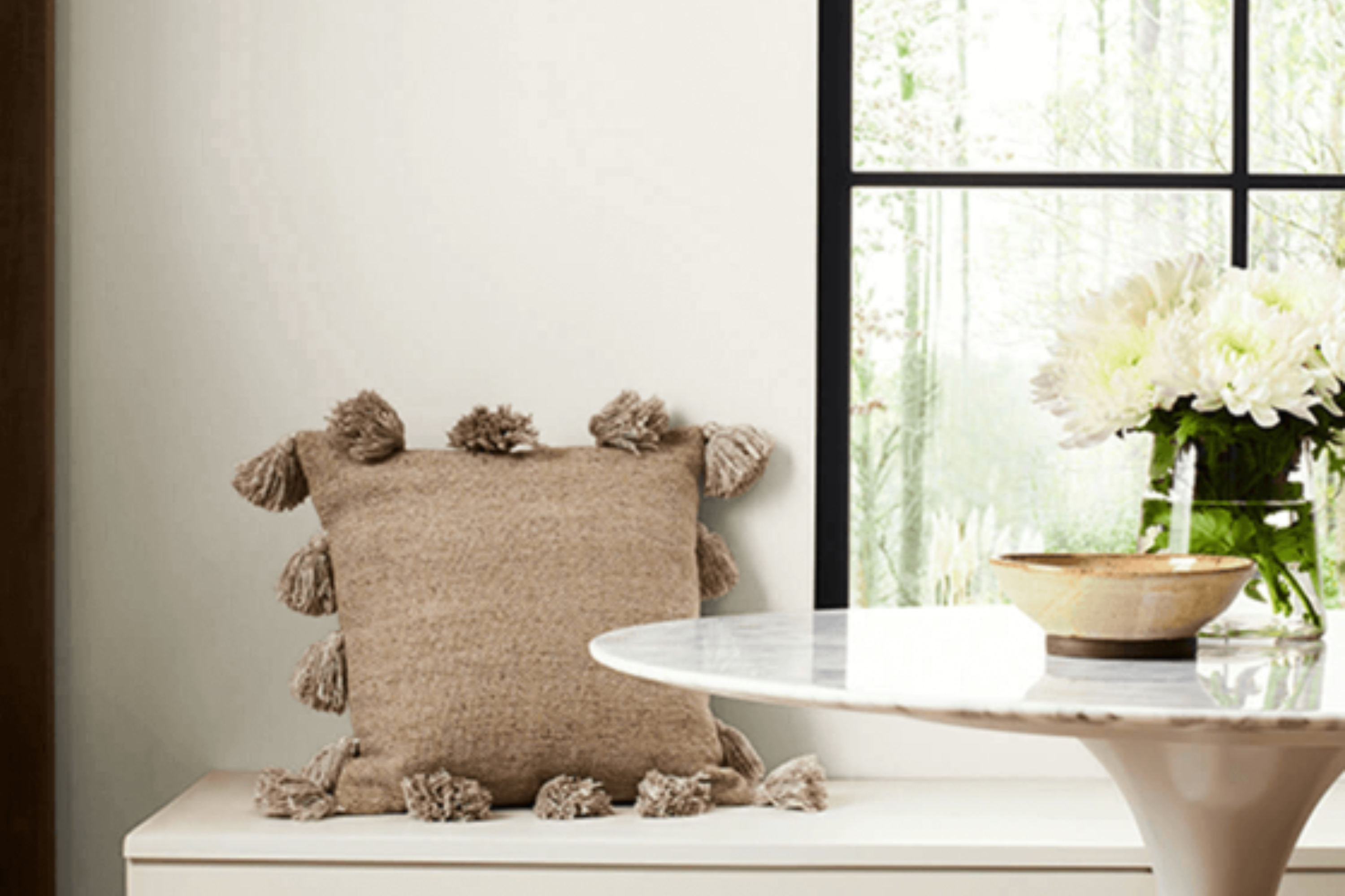
What Color Is Origami White SW 7636 by Sherwin Williams?
Origami White by Sherwin Williams is a nuanced hue that brings a subtle warmth to spaces, making it an excellent choice for those looking to create a serene and inviting environment. This color finds its strength in its versatility – it’s not a stark white, but rather has soft, creamy undertones that can complement a wide range of decor styles and color schemes.
This shade works wonders in inspiring a light and airy atmosphere, making it an ideal backdrop for minimalist and Scandinavian-inspired interiors, where the focus is on simplicity and natural materials like wood, linen, and leather.
Its understated elegance also fits perfectly in modern farmhouse and coastal settings, providing a clean, fresh look that pairs beautifully with natural elements and textured accents such as woven baskets, jute rugs, and rustic wood finishes.
Origami White has the magic of making small spaces appear larger and brighter, while still adding warmth to larger, open-plan areas. It’s a go-to color for walls, trim, and ceiling alike, offering a cohesive look that can tie together different materials and textures throughout the home.
When paired with soft pastels, it brings a gentle contrast; against bold colors, it offers a muted balance, allowing for design flexibility in incorporating decorative elements, artwork, and furniture.
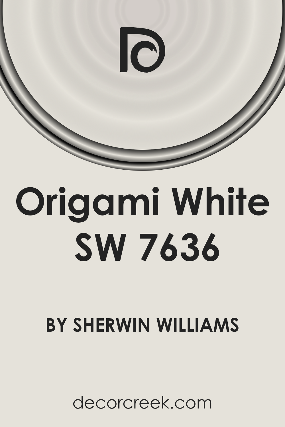
Is Origami White SW 7636 by Sherwin Williams Warm or Cool color?
Origami White by Sherwin Williams is a versatile paint color that brings a gentle, subtle warmth to any room. Its unique shade can be best described as a soft, off-white with hints of gray, making it a perfect choice for those looking to create a cozy yet bright space.
This color has a way of making homes feel more open and airy, without the starkness often associated with pure white paints. It pairs beautifully with a wide range of colors, from soft pastels to bold hues, allowing for flexibility in design and decor.
In homes, Origami White serves as an excellent backdrop for both contemporary and traditional styles. It enhances natural light, making spaces appear larger and more inviting.
For rooms with limited natural light, it can help in lightening up the area, providing a sense of serenity and calm. Its adaptability means it can be used in any room, from kitchens to bedrooms, adding a touch of elegance without overwhelming the senses. With Origami White, homeowners can create a harmonious and welcoming environment that feels both modern and timeless.
Undertones of Origami White SW 7636 by Sherwin Williams
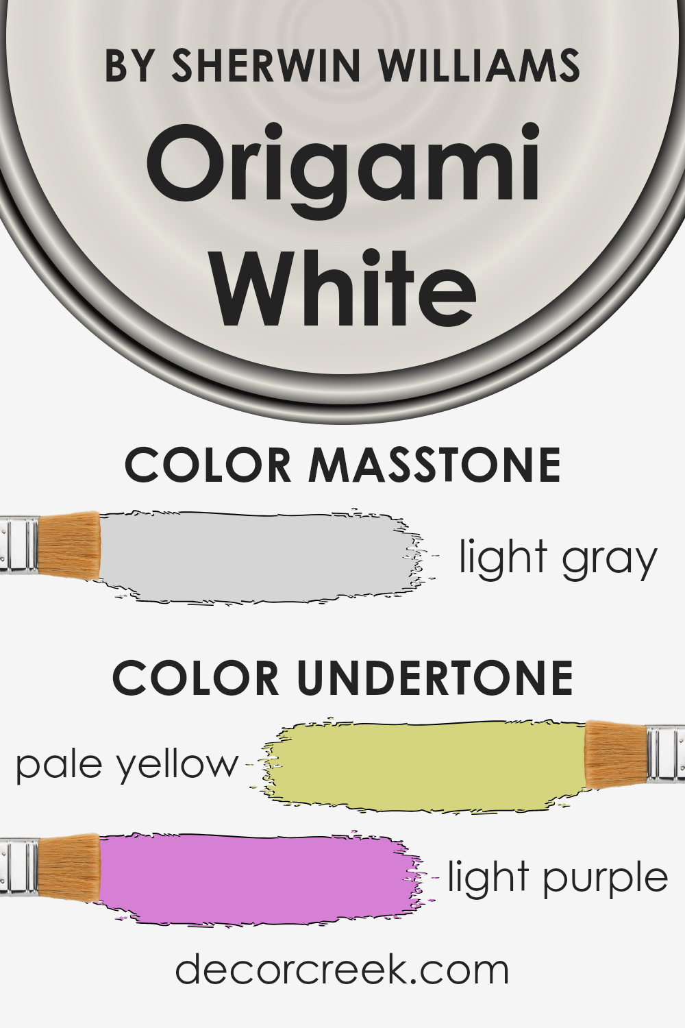
Origami White by Sherwin Williams is a unique color that might seem simple at first glance, but it has subtle undertones that add a special depth to any room. The undertones of this color include pale yellow and light purple, which are not always noticeable but have a significant impact on how the color feels and looks in various lighting conditions.
Undertones in paint colors are like the secret ingredients in a recipe; they can change the overall flavor of the dish without being directly identifiable. In the case of paint, undertones affect the warmth or coolness of a color, its brightness, and how it pairs with other colors and materials. For instance, a color might appear more welcoming or feel cooler depending on its undertones.
For Origami White, the pale yellow undertone adds a subtle warmth, making spaces feel cozy and inviting. This warmth can make a room feel more intimate and comfortable, especially in natural light.
On the other hand, the light purple undertone introduces a hint of coolness and sophistication, giving the color a balanced versatility. This unique combination allows Origami White to adapt to different styles and lighting, making it a go-to choice for various interior walls.
When applied to interior walls, the blend of these undertones in Origami White offers a backdrop that is both dynamic and understated. It can complement a wide range of decor styles, from modern to traditional, by bringing a quiet complexity to the space.
Whether you’re looking to create a warm, inviting atmosphere or a refined, elegant vibe, the nuanced undertones of this color can achieve those effects subtly but effectively.
What is the Masstone of the Origami White SW 7636 by Sherwin Williams?
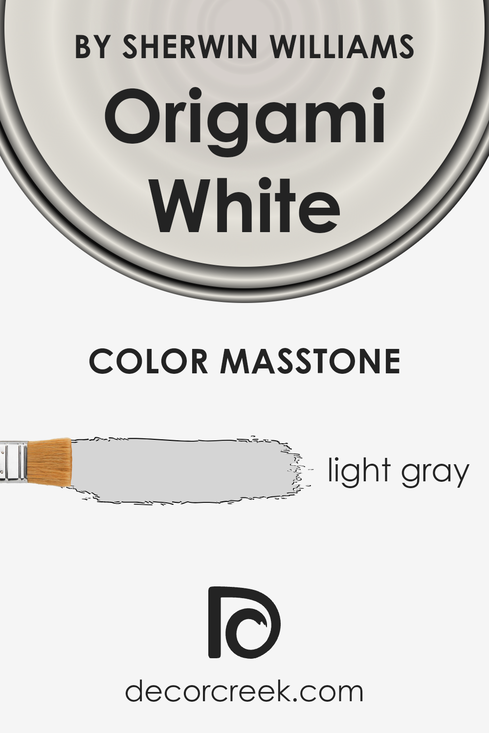
Origami White, a paint color by Sherwin Williams, has a masstone that closely resembles light gray (#D5D5D5). This subtle, neutral shade is versatile, making it a perfect background color for any room in a home.
Its light gray tone offers a fresh, clean look, ideal for creating a serene and inviting atmosphere. This color works well in spaces with limited natural light, as it can help brighten rooms without overwhelming them with stark brightness.
Additionally, Origami White pairs beautifully with a wide range of decor styles and colors. Whether you’re looking to complement bold accent pieces or aiming for a more monochromatic scheme, it provides a solid foundation without dominating the space.
It’s particularly effective in small areas, making them appear larger and more open. The calming quality of this light gray color also promotes a sense of relaxation, making it ideal for bedrooms and living areas.
How Does Lighting Affect Origami White SW 7636 by Sherwin Williams?
Lighting plays a major role in how we perceive colors. It can change the way a color looks depending on the type of light it’s under, making it appear different from one moment to the next. When it comes to interior paint, such as the Origami White color, understanding this concept can help you decide where to use it in your home for the best effect.
- Under artificial light, the shade of Origami White can vary significantly. In warm, yellow-toned artificial lighting, it might appear softer and more creamy. This can add a cozy feel to a room, making it perfect for living spaces or bedrooms where you want a comforting atmosphere. In cooler, white artificial light, Origami White tends to look brighter and more true to its base color, creating a crisp and clean look. This makes it ideal for kitchens, bathrooms, or any area where clarity and freshness are desired.
- Natural light brings out the best in Origami White, showcasing its true color during different times of the day. This is where room orientation comes into play. In north-facing rooms, light tends to be cooler and softer, which can make Origami White look slightly more grayish and subdued. It’s perfect for creating a serene and calm space. South-facing rooms bathe walls in warm, bright light throughout the day, making Origami White look warmer and more vibrant. This can help make a room feel more welcoming and lively.
- East-facing rooms get bright morning light, making Origami White appear very bright and fresh early in the day, then turning cooler as the day progresses. This natural shift in brightness can bring a dynamic mood to the space. West-facing rooms, on the other hand, might have a subdued look in the morning but become dramatically lit with warm, golden tones by the afternoon and evening, adding a cozy glow to the Origami White walls.
In summary, the effect of lighting on Origani White can transform the mood and feel of a room. By considering the type of light your room receives, you can use this paint color to its full potential, creating the desired ambiance in any space.
What is the LRV of Origami White SW 7636 by Sherwin Williams?
LRV stands for Light Reflectance Value, which is a measure of the percentage of light a paint color reflects back into a room, compared to the total amount of light the room is exposed to. This value can range from 0 (absolute black, absorbing all light) to 100 (pure white, reflecting all light). LRV is super useful to know because it helps you understand how light or dark a color will look once it’s on your walls.
Think of it this way: paint colors with a higher LRV will make a room feel brighter and more open because they reflect more light, while colors with a lower LRV can make a room feel cozier but smaller because they absorb more light.
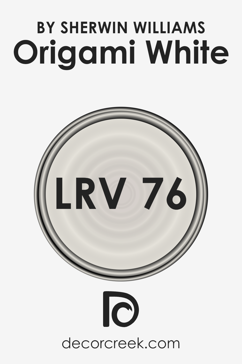
Given that the LRV of Origami White is nearly 76, it falls into the category of colors that are quite light and will reflect a good amount of light back into the room.
This means that if you use this color in a space, you can expect the walls to look bright and airy, enhancing the natural light in the room. If your room gets a lot of sunlight, the color might appear even lighter at times, making the space feel open and welcoming.
The high LRV also makes it a versatile background, easily supporting a wide range of decor styles and colors by not overpowering them with its own hue. This high reflectance makes it an excellent choice for spaces you want to feel larger and more open.
Coordinating Colors of Origami White SW 7636 by Sherwin Williams
Coordinating colors are those that complement each other well and create a balanced, visually pleasing aesthetic when used together in design and decor. Essentially, they are hues that, due to their properties, can enhance the appeal of the main color – in this case, Origami White by Sherwin Williams.
This idea works by picking colors that either contrast with or smoothly blend with the main color, ensuring that neither overwhelms the other, but rather they work in harmony to enhance the overall look of a space.
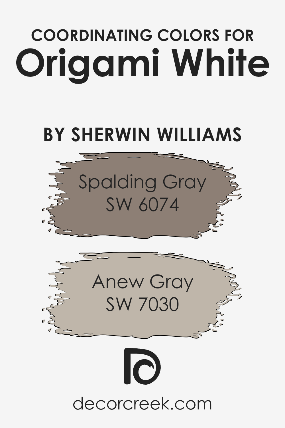
A perfect coordinating color for Origami White is Spalding Gray (SW 6074). It’s a deeper, warm hue that offers a grounding contrast to the light and airy feel of Origami White. The richness of Spalding Gray adds depth and sophistication, making it an excellent choice for features or accent walls that aim to add a bit of weight and definition to a room without overpowering the light neutrality of Origami White.
On the other hand, Anew Gray (SW 7030) is a lighter, more subdued grey that carries warm undertones, making it a natural progression from the crispness of Origami White.
This color combo works well for a gentle, seamless transition between spaces, maintaining a light feel while introducing a subtle distinction in color that adds interest and complexity to the design palette.
You can see recommended paint colors below:
- SW 6074 Spalding Gray (CHECK A SAMPLE)
- SW 7030 Anew Gray (CHECK A SAMPLE)
What are the Trim colors of Origami White SW 7636 by Sherwin Williams?
Trim colors serve a significant role in painting and decorating; they are used to accent and frame the primary color of your walls, helping to define and outline spaces beautifully. For a color like Origami White by Sherwin Williams, selecting the right trim color is crucial because it can either complement the wall color subtly or provide a striking contrast.
The right trim color can enhance the room’s overall aesthetic, making the wall color stand out more prominently or tying all the room’s elements together in harmony.
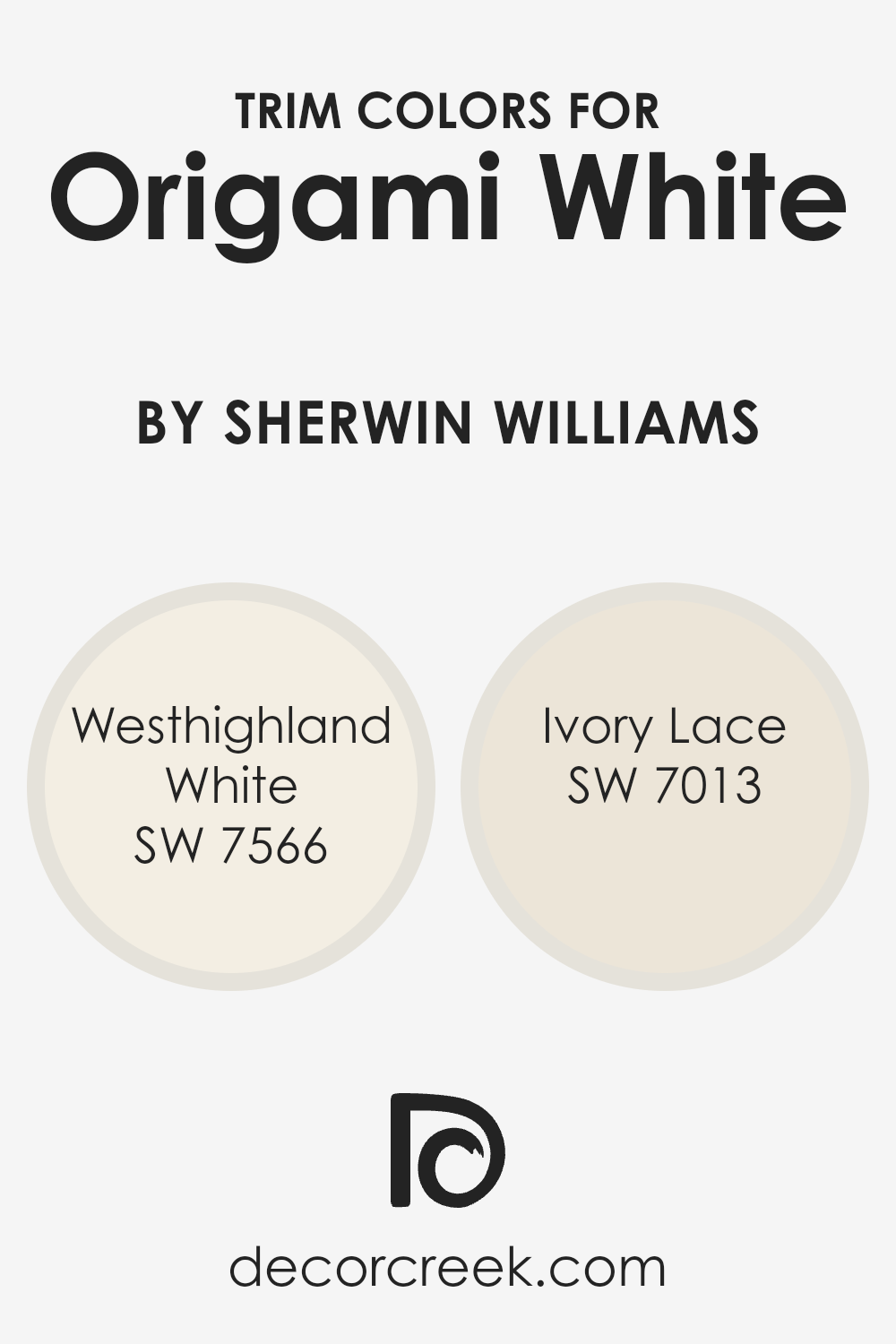
One great trim color option is Westhighland White (SW 7566), a soft and slightly creamy white that can add a touch of warmth to the crispness of Origami White, creating a gentle transition from the wall to the trim that feels seamless and inviting.
Another choice is Ivory Lace (SW 7013), which brings its own charm with a hint of beige, offering a subtle contrast that enriches the room’s color palette without overwhelming it.
This color is perfect for those looking to introduce a slightly deeper hue against the Origami White walls, ensuring the space feels cozy yet sophisticated. Both options contribute to refining the look of a room, enhancing both its feel and appeal.
You can see recommended paint colors below:
Colors Similar to Origami White SW 7636 by Sherwin Williams
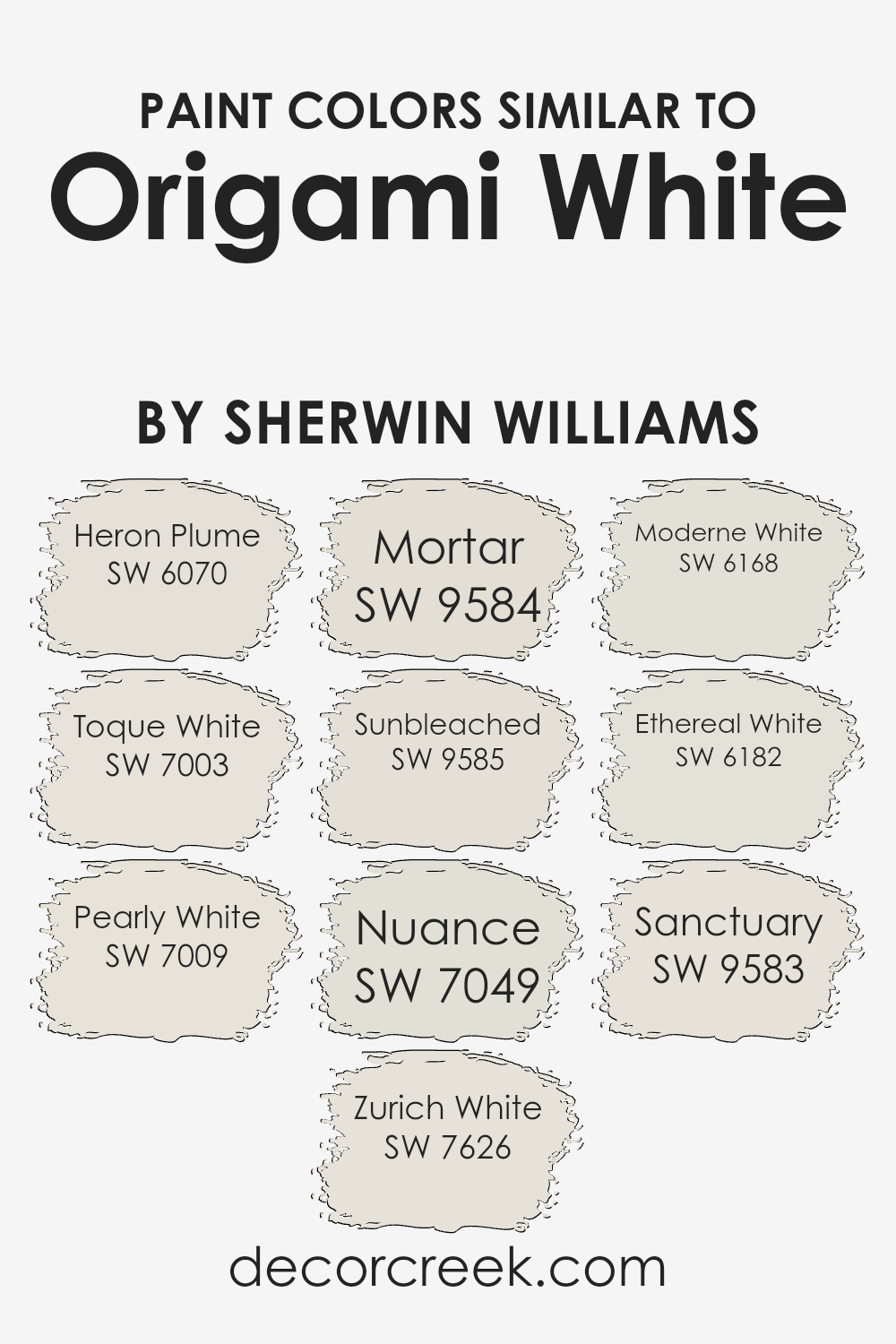
In the realm of interior design, similar colors play a key role in creating harmonious and soothing spaces. Colors like Origami White by Sherwin Williams and its similar shades are particularly sought after for their versatility and ability to create a tranquil atmosphere.
These shades, including Heron Plume and Toque White, offer subtle variations in warmth and coolness, allowing for nuanced differences in design applications.
Pearly White and Zurich White, for example, provide a soft backdrop that can make spaces feel more open and inviting. These colors work well together because they share a common hue but differ in brightness and saturation, making it easy to layer them for depth and complexity in a design scheme.
On the other hand, colors like Mortar and Sunbleached introduce a more grounded, earthy feel to spaces, complementing wooden materials and natural textures.
Nuance, Moderne White, and Ethereal White add a sophisticated touch, perfect for creating a refined look with a minimalist vibe. Sanctuary, a color that leans towards serenity, offers a peaceful retreat feeling, ideal for bedrooms and bathrooms where relaxation is paramount.
Each of these colors, though distinct, harmonizes beautifully with Origami White, enabling designers and homeowners to craft spaces that feel cohesive and thoughtfully curated. Utilizing similar colors such as these enables a seamless transition from room to room, enhancing the overall aesthetic appeal and creating a comforting sense of unity throughout the home.
You can see recommended paint colors below:
- SW 6070 Heron Plume (CHECK A SAMPLE)
- SW 7003 Toque White (CHECK A SAMPLE)
- SW 7009 Pearly White (CHECK A SAMPLE)
- SW 7626 Zurich White (CHECK A SAMPLE)
- SW 9584 Mortar (CHECK A SAMPLE)
- SW 9585 Sunbleached (CHECK A SAMPLE)
- SW 7049 Nuance (CHECK A SAMPLE)
- SW 6168 Moderne White (CHECK A SAMPLE)
- SW 6182 Ethereal White (CHECK A SAMPLE)
- SW 9583 Sanctuary (CHECK A SAMPLE)
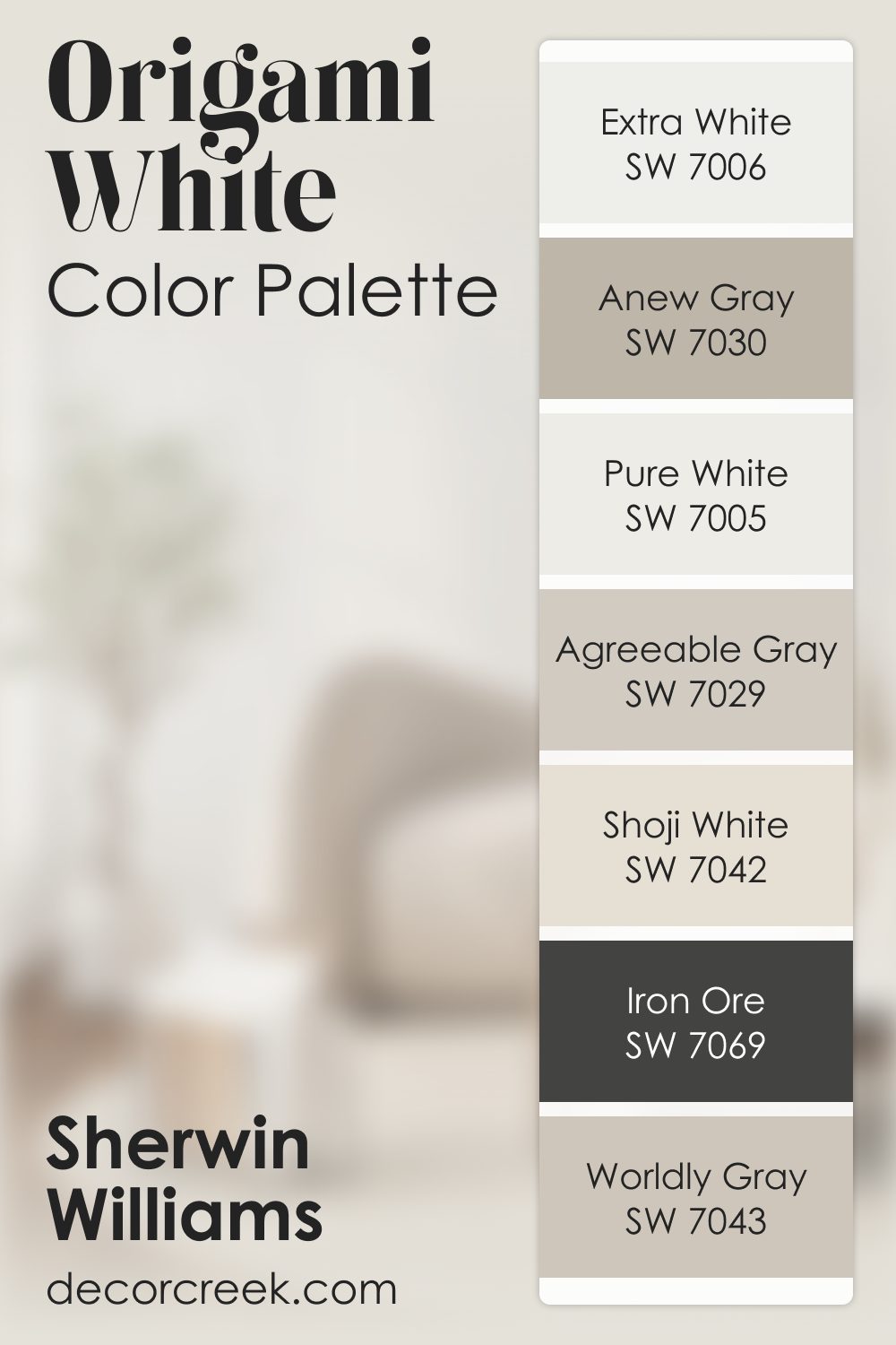
Origami White SW 7636 by Sherwin Williams Color Palette
The Origami White palette is soft, airy, and full of gentle movement. Extra White brings a crisp brightness that pairs beautifully with the warm softness of Shoji White and Agreeable Gray. Worldly Gray and Anew Gray add a grounded feel, giving your home a sense of gentle balance.
The repeat of Pure White offers clarity, while Iron Ore brings that confident depth that makes colors stand out in a calm and pleasing way.
This palette feels light and modern, perfect for anyone who enjoys a clean look that still feels personal and warm.
Each shade supports the next, creating a comforting harmony that works beautifully for open layouts, cozy corners, and everything in between.
How to Use Origami White SW 7636 by Sherwin Williams In Your Home?
Origami White by Sherwin Williams is a soft, warm white paint color that can breathe new life into any room in your home. Think of it as a cozy blanket for your walls, providing a calm backdrop that complements a wide range of decor styles. From modern to traditional, this color has the versatility to fit any mood or setting.
Using Origami White in your home is an easy way to refresh your space. It’s perfect for making small rooms feel larger and more inviting, as the light color helps to reflect natural light, brightening up the area.
It’s also great for creating a neutral canvas, allowing your furniture and decor to stand out. Whether you paint an entire room, an accent wall, or even cabinets and trim, Origoral White brings a sense of peace and simplicity to your home.
It’s an ideal choice for those wanting to achieve a clean, airy feel without the starkness that some whites carry. Pair it with soft colors for a gentle, layered look or bold hues for a striking contrast.
Origami White SW 7636 by Sherwin Williams vs Zurich White SW 7626 by Sherwin Williams
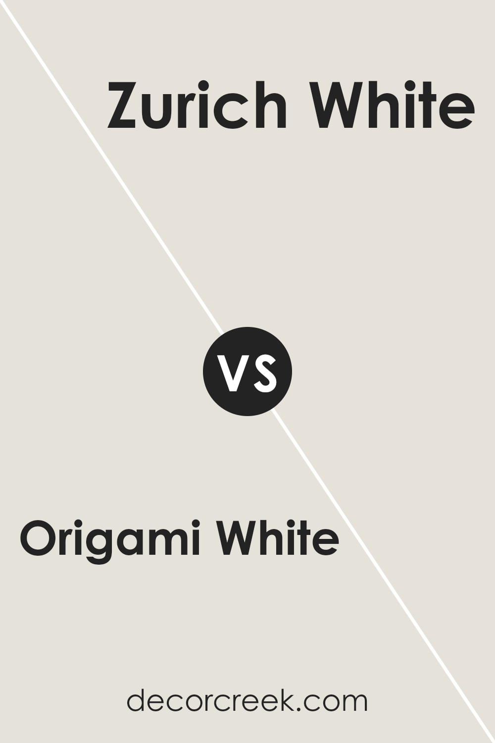
Origami White and Zurich White, both from Sherwin Williams, are two popular shades that homeowners often consider for a neutral yet inviting look. Origami White leans towards a soft, warm hue that brings a cozy and light feel to any room.
It has a gentle touch of creaminess, making it an excellent choice for spaces where you want a hint of warmth without overpowering the room’s ambiance. On the other hand, Zurich White offers a slightly cooler tone, presenting a clean and crisp background. It’s a bit more neutral compared to Origami White, making it versatile for combining with various decor styles and colors.
While both colors offer a sense of calmness and simplicity, Origami White is your go-to for a warmer, comforting feel, whereas Zurich White is perfect if you’re aiming for a sharper, more defined look. Choosing between them depends on the mood you want to create and the specific design aesthetic of your space.
You can see recommended paint color below:
Origami White SW 7636 by Sherwin Williams vs Heron Plume SW 6070 by Sherwin Williams
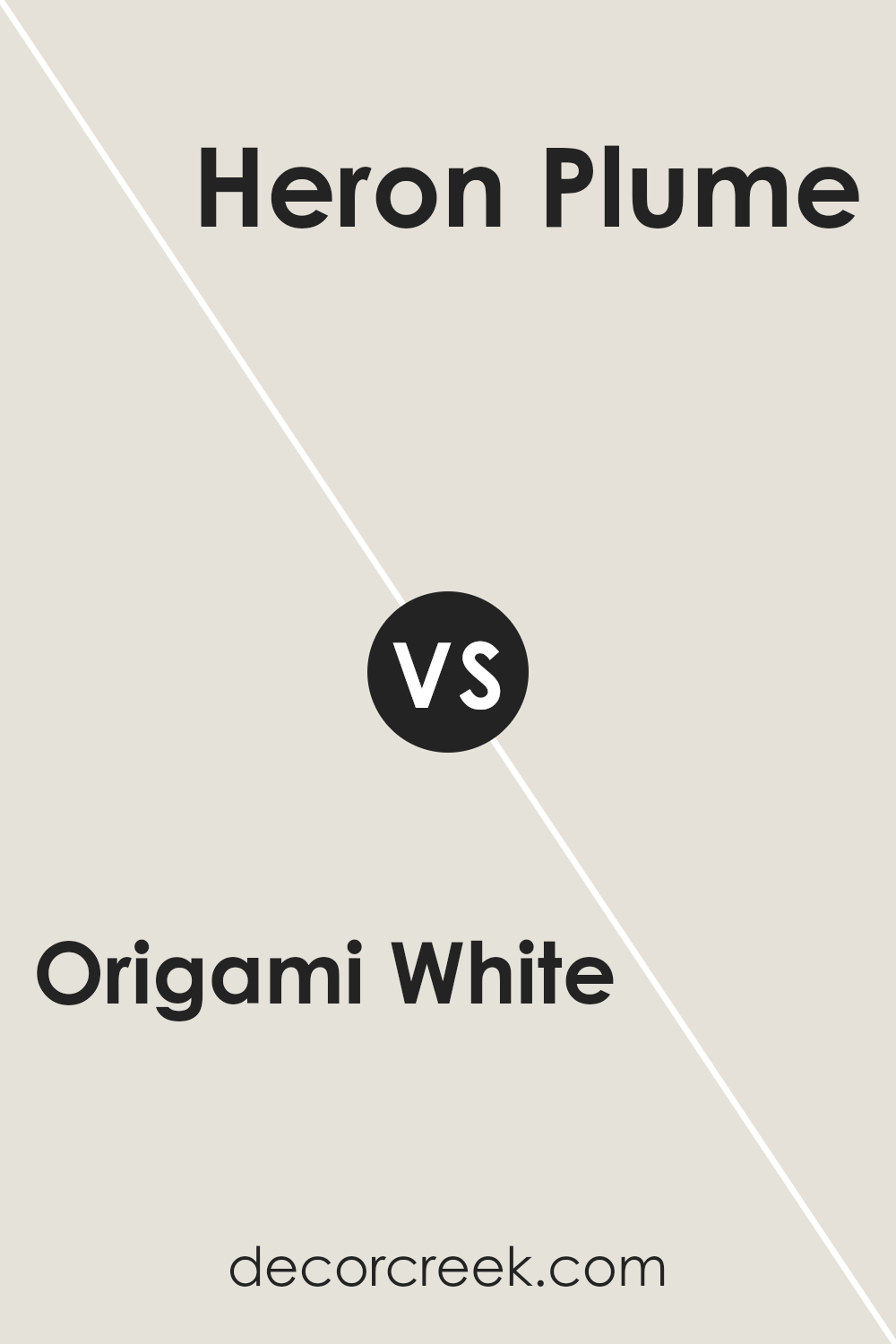
Origami White and Heron Plume are two shades by Sherwin Williams with subtle differences that set them apart. Origami White leans towards a soft, warm white with a slight hint of beige, making it cozy and inviting.
It’s perfect for creating a bright, airy feel in a room without feeling cold. On the other hand, Heron Plume has a touch more gray, giving it a slightly cooler tone compared to Origami White.
Despite this, Heron Plume still carries warmth in its undertone, making it versatile for spaces that aim to be soothing and calm. Heron Plume can act as a neutral backdrop that’s a bit more defined, offering soft contrast without overwhelming a space.
Both colors work beautifully in well-lit areas, where their subtle differences become more apparent, enhancing the atmosphere of any room with their understated elegance. Choosing between them depends on the desired balance between warmth and a neutral, soft backdrop.
You can see recommended paint color below:
- SW 6070 Heron Plume (CHECK A SAMPLE)
Origami White SW 7636 by Sherwin Williams vs Moderne White SW 6168 by Sherwin Williams
Origami White and Moderne White by Sherwin Williams are two subtle shades that each bring their own unique feel to a space. Origami White has a soft, warm undertone that makes it perfect for creating a cozy and inviting atmosphere.
It’s like wrapping yourself in a blanket on a cool morning. On the flip side, Moderne White leans slightly cooler, offering a crisp, clean look that can make a room feel more spacious and open. This shade is like a fresh breeze through an open window. While both colors are excellent choices for those seeking a modern and understated look, the choice between them depends on the mood you want to set.
Origami White is ideal for those wanting a hint of warmth, making spaces feel more homely. Meanwhile, Moderne White is your go-to if you prefer a sleeker, more refreshing vibe. Both colors play well with light, but the effect they create is distinctively different due to their underlying tones.
You can see recommended paint color below:
- SW 6168 Moderne White (CHECK A SAMPLE)
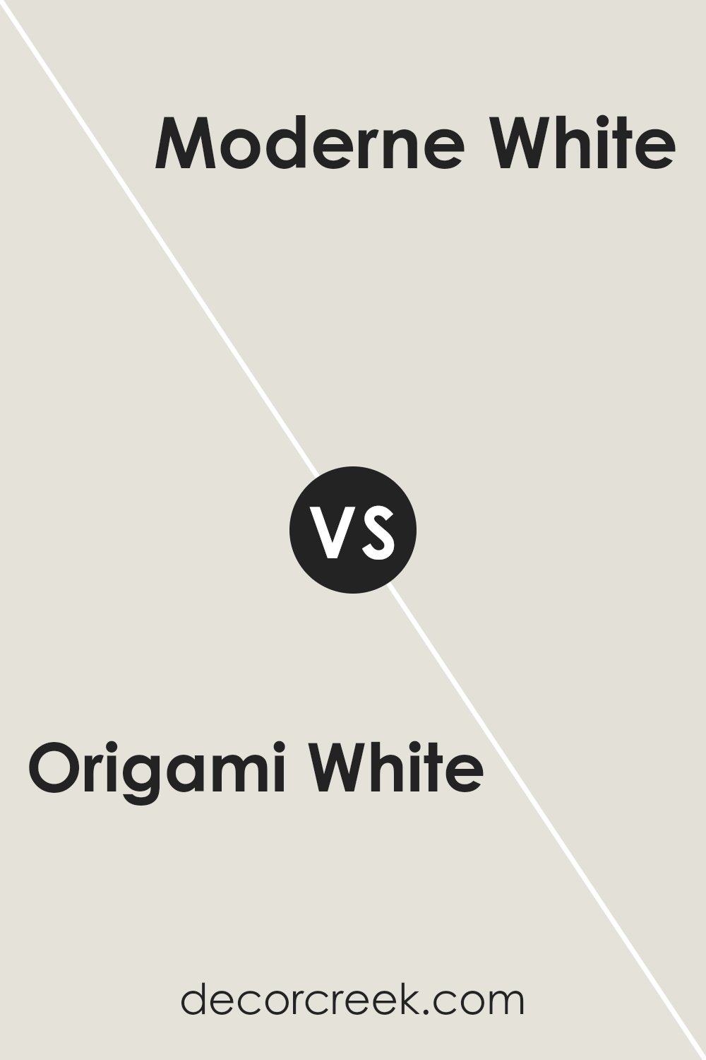
Origami White SW 7636 by Sherwin Williams vs Nuance SW 7049 by Sherwin Williams
Origami White and Nuance are two colors by Sherwin Williams that each have their unique appeal. Origami White is a soft, warm white with a hint of creaminess, making it a great choice for creating a cozy and welcoming atmosphere.
It’s not stark or cold but has a gentle warmth to it, perfect for almost any room in your home. On the other hand, Nuance is a light grey that leans towards a neutral, earthy tone. This color is versatile, offering a modern and sophisticated vibe.
Nuance can also help make spaces feel more open and airy. While both colors are relatively light, Origani White brings a subtle warmth, whereas Nuance offers a cooler, more grounded look. Depending on the mood you want to set, either color could be a great choice.
Origami White is ideal for those seeking a delicate, warm touch, and Nuance is better for creating a sleek, contemporary feel.
You can see recommended paint color below:
- SW 7049 Nuance (CHECK A SAMPLE)
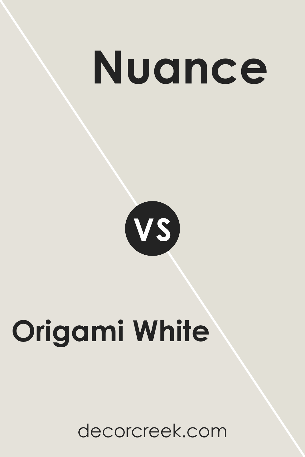
Origami White SW 7636 by Sherwin Williams vs Mortar SW 9584 by Sherwin Williams
Origami White and Mortar, both from Sherwin Williams, offer distinct vibes for any space. Origami White is a soft, warm white with a hint of beige, making it perfect for creating a cozy and inviting atmosphere.
It reflects light beautifully, brightening up rooms in a subtle, natural way. On the other hand, Mortar stands out with its deeper, warmer gray tone. This color provides a solid, earthy foundation that can make a space feel grounded and serene. It’s excellent for adding a touch of sophistication and depth. When comparing the two, Origami White brings a light, airy feel, ideal for smaller spaces or ceilings to make them appear larger.
Mortar, with its richer hue, works well in larger rooms or as an accent wall, adding character and moodiness. Together, they could complement each part of a home, from creating a restful bedroom in Origami White to a statement dining room in Mortar.
You can see recommended paint color below:
- SW 9584 Mortar (CHECK A SAMPLE)
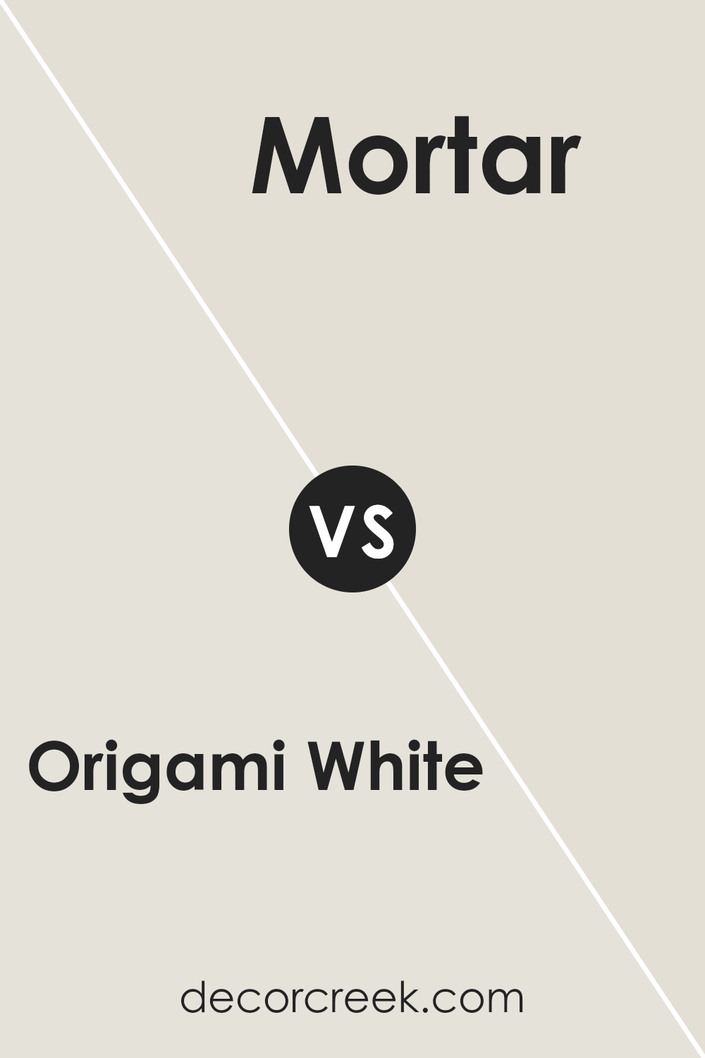
Origami White SW 7636 by Sherwin Williams vs Ethereal White SW 6182 by Sherwin Williams
Origami White and Ethereal White from Sherwin Williams are two shades that might seem similar but have their subtle differences. Origami White leans a bit towards a soft, warm beige, giving it a cozy and inviting feel perfect for spaces where you want a hint of warmth without overwhelming the room. It’s like the light, creamy color you’d see on a well-lit day, making your room feel bright yet comfy.
On the other side, Ethereal White is cooler and closer to a true white. It has a cleaner, more refreshing look that can make a room feel more spacious and airy. It’s the kind of white that pairs well with modern decor, providing a crisp backdrop for bolder colors or serving as a serene base for a minimalist design.
If you’re deciding between the two, think about the mood you’re aiming for. Origami White brings warmth and coziness, perfect for a living room or bedroom, while Ethereal White offers a fresh, clean look, ideal for kitchens, bathrooms, or spaces with lots of natural light.
You can see recommended paint color below:
- SW 6182 Ethereal White (CHECK A SAMPLE)
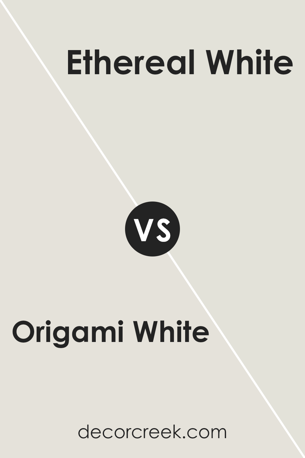
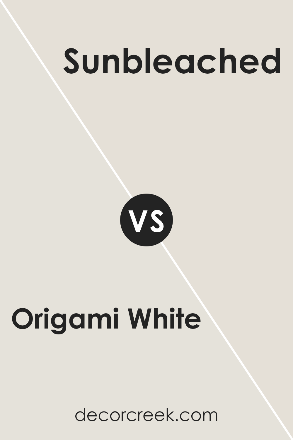
Origami White SW 7636 by Sherwin Williams vs Sanctuary SW 9583 by Sherwin Williams
Origami White and Sanctuary by Sherwin Williams are two unique shades, each with its own vibe. Origami White is a soft, warm white that feels cozy and welcoming in any space. It’s like the gentle hug of a well-loved blanket, making rooms feel bright and airy without being too stark. This color works great as a backdrop for artwork or as the main color in a minimalist design, where the goal is to achieve a clean and calm environment.
On the other hand, Sanctuary taps into nature’s palette, offering a deeper, muted green with earthy undertones. This color brings a sense of tranquility and peace, reminiscent of a quiet walk in a lush forest. It’s perfect for creating a retreat-like atmosphere in bedrooms or reading nooks.
While Origami White expands a space with its light-reflecting qualities, Sanctuary draws you in, creating a cozy, intimate setting. Both colors offer unique possibilities for transforming a room, depending on whether you’re aiming for brightness and openness with Origami White or seeking the comforting embrace of nature with Sanctuary.
You can see recommended paint color below:
- SW 9583 Sanctuary (CHECK A SAMPLE)
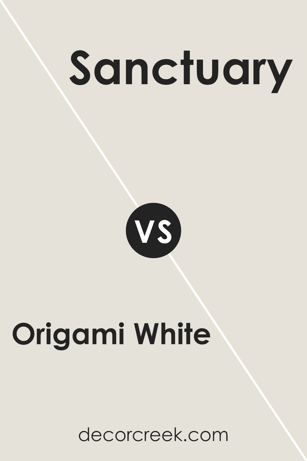
Origami White SW 7636 by Sherwin Williams vs Pearly White SW 7009 by Sherwin Williams
Origami White and Pearly White are two popular but distinct shades offered by Sherin Williams. Origami White leans more towards a soft, warm beige with a cozy feel, making it a versatile choice for any space looking for a hint of warmth without overpowering.
It’s like a creamy latte that blends seamlessly into a variety of decor styles, providing a gentle background. On the other hand, Pearly White is a step towards the cooler side, offering a more refined, subtle elegance with its light, almost ethereal vibe.
It has a slight hint of gray, making it an excellent choice for those wanting a hint of color while maintaining a neutral, airy feel. It’s perfect for spaces that aim for a crisp, clean look with a touch of sophistication.
Despite both being whites, Originary White brings warmth and coziness, whereas Pearly White offers a bright, refreshing coolness, making them suitable for different tastes and spaces.
You can see recommended paint color below:
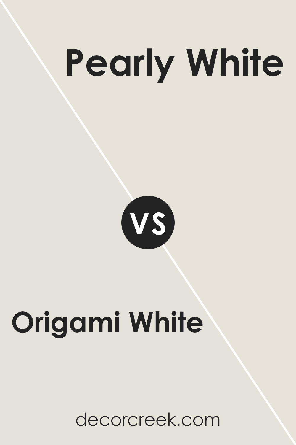
Origami White SW 7636 by Sherwin Williams vs Toque White SW 7003 by Sherwin Williams
Origami White and Toque White, both from Sherwin Williams, are two off-white shades, but they have distinct undertones and vibes. Origami White leans slightly towards a warm, creamy direction, making spaces feel cozy and inviting. Its subtle hint of beige adds a touch of warmth to rooms, perfect for creating a comforting ambiance.
On the other hand, Toque White veers more towards a neutral to slightly cool palette, offering a cleaner, more straightforward backdrop. This color can help brighten spaces while maintaining a soft, understated elegance. Its neutral base makes it incredibly versatile, fitting in seamlessly with a variety of decor styles and color schemes.
While both colors offer a sense of calm and simplicity, the choice between them depends on the desired atmosphere. Origami White brings a cozy warmth, ideal for living areas and bedrooms where a soft, welcoming feel is desired.
Toque White, being cooler and more neutral, is perfect for spaces that aim for a crisp, fresh look, such as kitchens and bathrooms. Ultimately, both colors provide a beautiful, subtle backdrop that can enhance any space with their own unique qualities.
You can see recommended paint color below:
- SW 7003 Toque White (CHECK A SAMPLE)
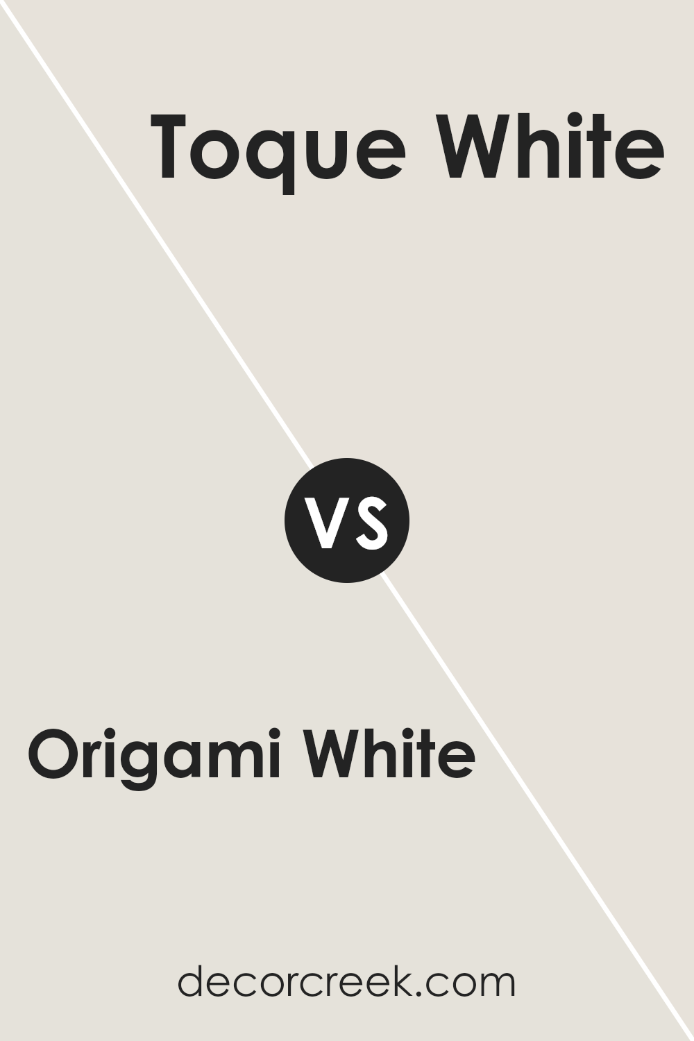
Origami White SW 7636 by Sherwin Williams vs Sunbleached SW 9585 by Sherwin Williams
Origami White and Sunbleached are two beautiful colors from Sherwin Williams that offer subtle yet distinct vibes to any space. Origami White is a soft, warm white with a calm and welcoming feel. It’s like the gentle light of early morning, bright but soothing, making it perfect for creating a serene and inviting atmosphere in any room. This color has a hint of creaminess, ensuring that spaces feel cozy and lived-in, rather than stark or clinical.
On the other hand, Sunbleached is a much lighter, almost airy hue with a hint of beige, giving it a sun-kissed look as if it has been faded by the gentle touch of the sun over time. This color leans towards a neutral palette but with a warmth that evokes the feeling of a peaceful, sunny day.
It’s ideal for those looking to add a light, breezy feel to their spaces, without the coldness that sometimes comes with pure white or grey.
While both colors share a subtle warmth, Origami White offers depth and a sense of embrace, whereas Sunbleached brings an open, airy feel, making it feel like a soft whisper of daylight in your home.
You can see recommended paint color below:
- SW 9585 Sunbleached (CHECK A SAMPLE)
Conclusion
Origami White by Sherwin Williams stands out as an exceptional paint option for those seeking a subtle yet sophisticated backdrop for their space. Its understated elegance makes it a versatile choice, easily complementing a wide range of decor styles and color palettes.
This color emanates a sense of calm and serenity, making it perfect for rooms where a peaceful and inviting atmosphere is desired. Its ability to blend seamlessly with other colors allows for creative freedom in design, ensuring that any room it adorns will feel both refined and welcoming.
The popularity of Origami White can be attributed to its perfect balance of warmth and cool tones, which ensures it works wonderfully in both well-lit and dimly lit spaces. Whether it’s used as a primary color scheme or as a contrasting accent, it consistently brings a light, airy feel to interiors.
For homeowners and designers alike looking for a paint color that offers flexibility, timelessness, and a hint of modernity, Origami White is a go-to choice. It’s a color that not only enhances the aesthetic appeal of a space but also contributes to creating a comfortable and inviting ambiance.

Ever wished paint sampling was as easy as sticking a sticker? Guess what? Now it is! Discover Samplize's unique Peel & Stick samples.
Get paint samples


