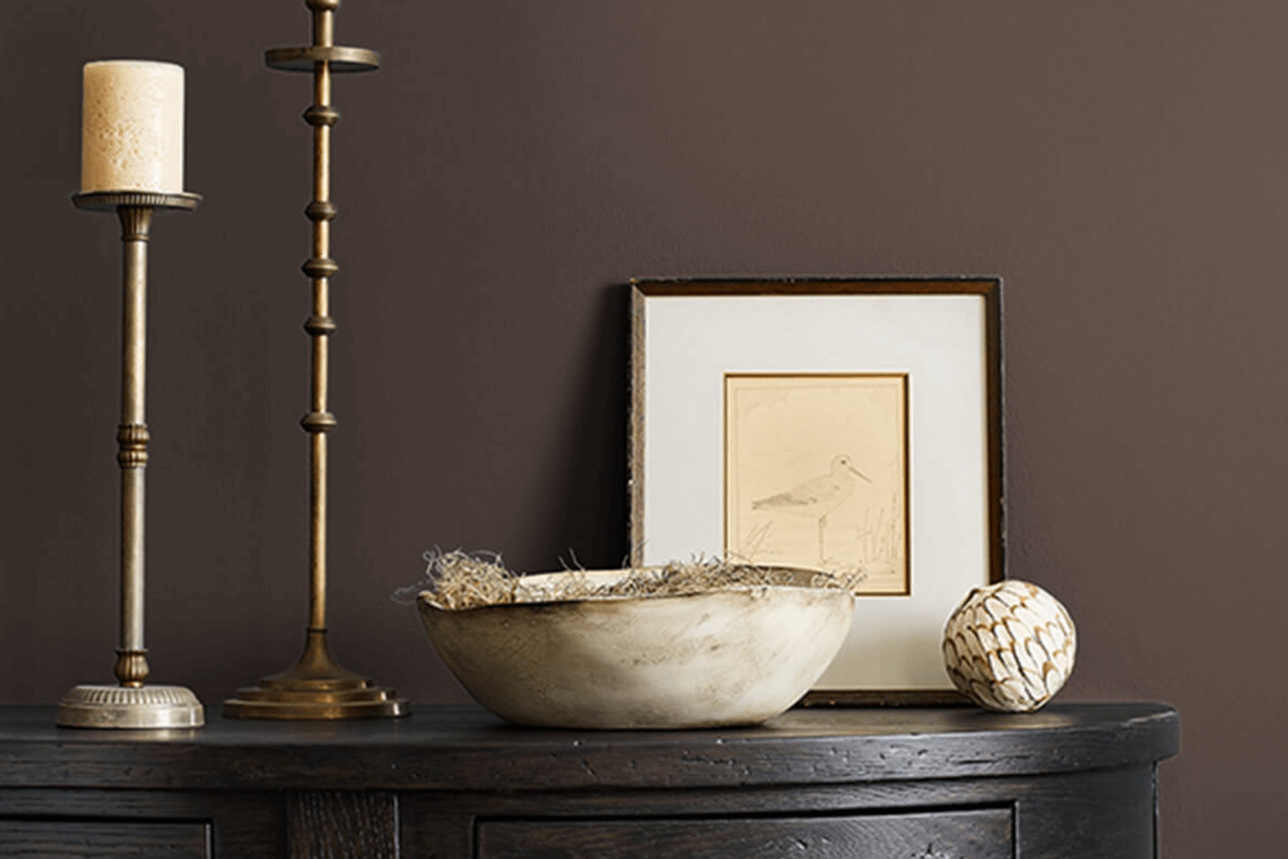
I worked with a client recently who wanted a bold update for her entryway — something dramatic but not too loud. We looked at a few dark colors, but once I showed her Cracked Pepper (SW 9580 by Sherwin Williams), she was hooked!
It’s this deep, moody gray that leans into charcoal territory — super rich, but not harsh at all. It gave her hallway that “wow” moment without taking over everything else around it. It paired beautifully with her wood trim and brass light fixture — seriously, such a cool combo.
If you’re looking for a color that’s bold but still feels classy and grounded, Cracked Pepper is worth checking out. Works great in smaller spots where you want a bit of drama!
Choosing the right paint color can often feel overwhelming with so many options out there, but Cracked Pepper strikes a nice balance. It’s dark enough to make a statement yet versatile enough to pair with both bright accents and more subdued hues. Whether you’re aiming to create a focal point wall or looking to redo the entire area, this shade can provide a fresh update to any space.
In this selection, I’ll share my personal experience with applying Cracked Pepper to my walls, detailing the paint’s consistency, coverage, and the overall impact it made on my living space.
If you’re considering a change or just curious about this particular shade, my insights might help you make an informed decision.
What Color Is Cracked Pepper SW 9580 by Sherwin Williams?
Cracked Pepper by Sherwin Williams is a deep, charcoal gray that brings a strong, almost black tone to the palette. This color is a solid choice for creating a grounding atmosphere in a room, adding depth and maturity without overwhelming the space.
This shade works exceptionally well in modern and minimalist interior styles due to its bold and clean appearance. It can act as a striking contrast in a predominantly light room, or it can help create a cozy, enclosed feel in a space with ample natural light. Additionally, the color is versatile enough to fit seamlessly into industrial settings, complementing metal fixtures and exposed brick elements.
The materials that pair well with this rich gray include natural wood, which adds warmth against the cool tone of Cracked Pepper. Leather furniture also works beautifully with this color, enhancing a luxurious feel. In terms of textures, soft, plush fabrics like velvet or wool create an inviting space, while shiny metals in silver or chrome add a crisp, modern vibe. Combining Cracked Pepper with glass elements or mirrors can help lighten spaces, making this intense color feel more balanced and integrated.
Is Cracked Pepper SW 9580 by Sherwin Williams Warm or Cool color?
Cracked Pepper by Sherwin Williams is a rich and deep gray that brings a strong sense of modern style to any room. This color is versatile enough to work in various spaces, whether you want a bold living room or a cozy, inviting kitchen.
Due to its dark tone, Cracked Pepper can make a striking contrast when paired with lighter colors like whites or creams, enhancing the visual appeal of the space. It’s especially effective in creating a focal point in a room, whether on a feature wall or through cabinetry in a kitchen.
However, when using such a dark shade, lighting plays a crucial role. In well-lit or naturally bright rooms, Cracked Pepper looks elegant and grounded. But in spaces without much natural light, it might make the area feel smaller or more closed in. To offset this, combining it with lighter furniture or decor elements can help balance the darkness and prevent the room from feeling too heavy. This color is a strong choice for those looking to add a touch of modern drama to their home.
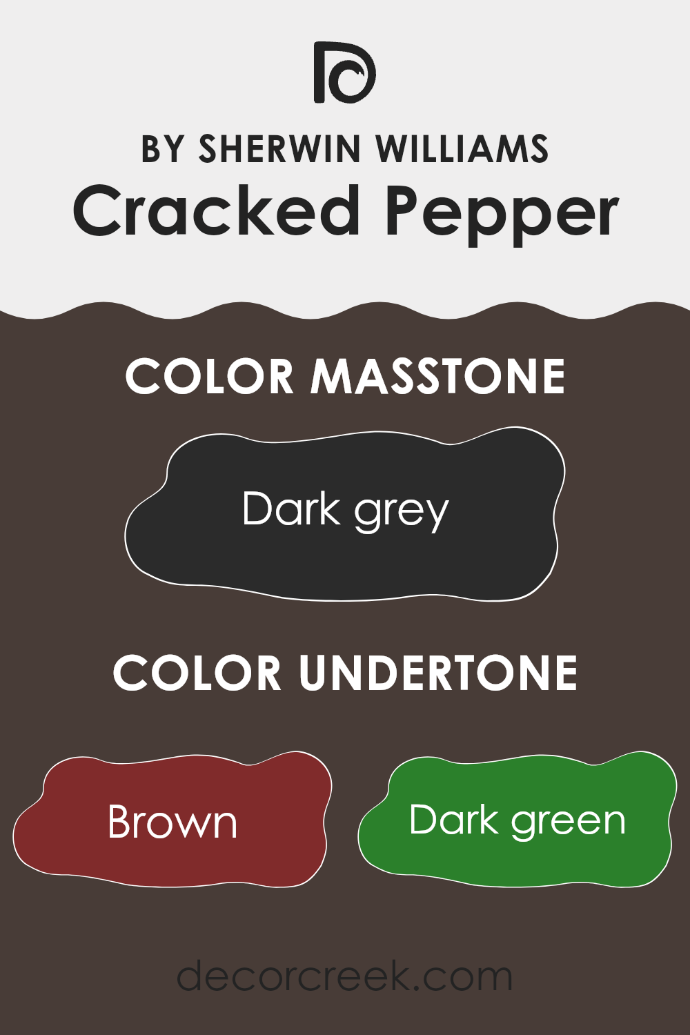
Undertones of Cracked Pepper SW 9580 by Sherwin Williams
Cracked Pepper by Sherwin Williams is a deep, bold color that might look simply black at first glance, but it carries complex undertones that influence its appearance under different lighting conditions and when paired with various interior elements. These undertones include brown, dark green, navy, olive, purple, dark turquoise, and grey.
Understanding undertones in paint is crucial because they greatly affect how colors appear once applied to walls. For example, dark green and navy undertones could make a room feel cooler, while brown or olive might warm up the space slightly, even if the main hue appears neutral or colorless.
In an interior setting, the variety of undertones in Cracked Pepper adds depth and dimension to the walls. Natural light and different types of artificial lighting will pull out these undertones at varying intensities, changing the color’s appearance throughout the day. On a sunny day, for instance, the brown or olive undertones might become more visible, giving the room a warmer feel. In contrast, during the evening under artificial light, the navy or purple undertones could be more noticeable, lending a slightly cooler vibe to the space.
These subtle color shifts can make Cracked Pepper a versatile choice for rooms, enabling it to adapt dynamically with both the style of furnishings and the changing light, providing a rich backdrop that enhances the overall aesthetic of any room.
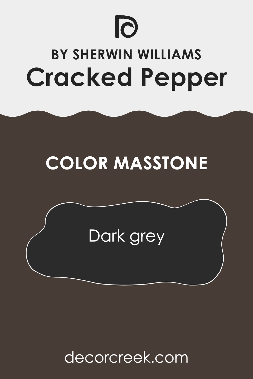
What is the Masstone of the Cracked Pepper SW 9580 by Sherwin Williams?
Cracked Pepper (SW 9580) by Sherwin Williams is a deep, dark grey color, much like the shade you’d see on a charcoal piece. Its masstone, or the color you see when the paint is applied thickly, is a strong, solid dark grey.
This hue is perfect for creating a bold statement in a home. It provides a stylish backdrop that makes other colors, like whites or bright hues, really pop. Dark grey walls can give a room a more grounded, cozy feel. Because it’s so dark, it can make large, open spaces feel a bit more intimate and personal.
It also hides marks and smudges well, which makes it practical for high-traffic areas such as hallways or kids’ rooms. However, in small rooms, using too much of this color might make the space feel smaller or more closed in. Lighting plays a big role, too; bright lighting can prevent the room from feeling too dark.
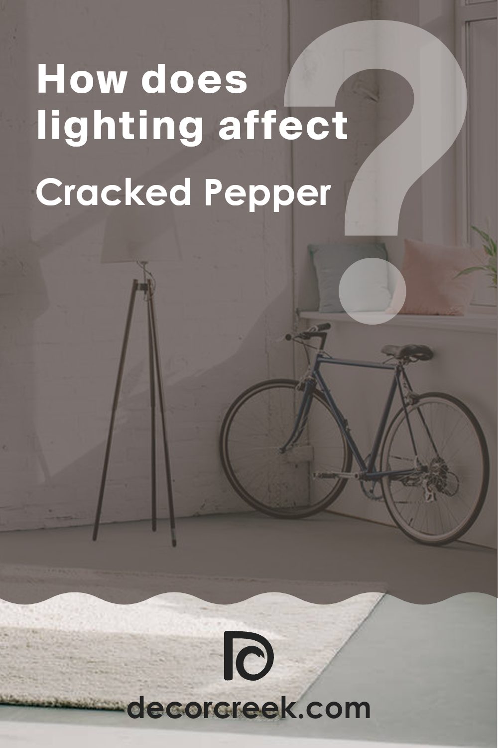
How Does Lighting Affect Cracked Pepper SW 9580 by Sherwin Williams?
Lighting plays a crucial role in how we perceive colors. The type and intensity of light can significantly affect the appearance of a color. For instance, natural daylight often reveals the truest color, while artificial lighting can alter how a color looks.Considering a deep color like Sherwin Williams’ Cracked Pepper (SW 9580), a dark gray with subtle blue undertones, the impact of different lighting conditions becomes quite visible.
Under artificial light, such as LED or incandescent bulbs, Cracked Pepper tends to appear slightly warmer due to the yellowish tint that artificial lights can emit.
This makes the color seem less harsh and more welcoming, especially in living spaces.
In natural light, the color will look truer to its original shade. During the day, as the intensity and angle of the sunlight change, Cracked Pepper will also shift in appearance.
It might look softer and more nuanced during bright midday and darker or more profound as the sun sets.
The orientation of rooms also impacts how this color is displayed:
- North-Faced Rooms: These rooms get less direct sunlight, which can make Cracked Pepper appear more consistent throughout the day but generally darker and more intense. It’s a good choice if you want a bold look without much variation.
- South-Faced Rooms: With more exposure to direct sunlight, Cracked Pepper can lighten up significantly, showing more of its blue undertones. This makes the color lively and dynamic, changing subtly with the sun’s position.
- East-Faced Rooms: Morning light is cooler, so Cracked Pepper will have a softer appearance in the morning, becoming shadowier and deeper as the day progresses and the natural light diminishes.
- West-Faced Rooms: Evening light is warmer, so here, Cracked Pepper will start off darker in the morning and gradually warm up. By sunset, it can look vibrant and rich, enhanced by the warm tones of the setting sun.
Ultimately, the effect of lighting on colors like Cracked Pepper highlights the importance of considering both your light sources and room orientation when choosing a paint color for your space. This ensures the color looks its best at all times.
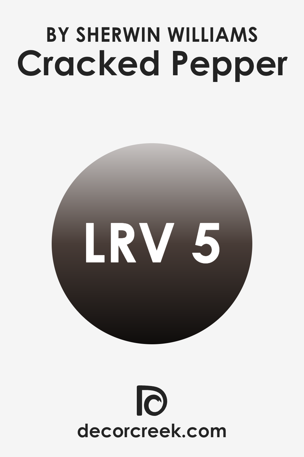
What is the LRV of Cracked Pepper SW 9580 by Sherwin Williams?
LRV stands for Light Reflectance Value, which is a measurement used to determine how much light a paint color will reflect back into a room. It’s a scale commonly used in the paint industry, ranging from low to high reflection, where lower numbers mean less light is reflected and higher numbers indicate more reflectance.
This number helps you understand how light or dark a color will look once it’s applied to your walls. A higher LRV can make a room feel brighter and more open, as more light is bouncing around the space. On the other hand, a lower LRV can make a room feel cozier and more enclosed because it absorbs more light.
Cracked Pepper, with an LRV of 4.842, is a very dark shade. This means it absorbs much of the light that hits it, instead of reflecting it back into the room. When applied to walls, this color can make a space feel smaller and more intimate because of its low light reflection. In rooms with limited natural light, using a color with such a low LRV can make the space appear even darker. Therefore, it’s important to consider the amount of lighting available in your room before choosing this deep color, as it has a significant impact on the overall ambiance due to its low LRV.
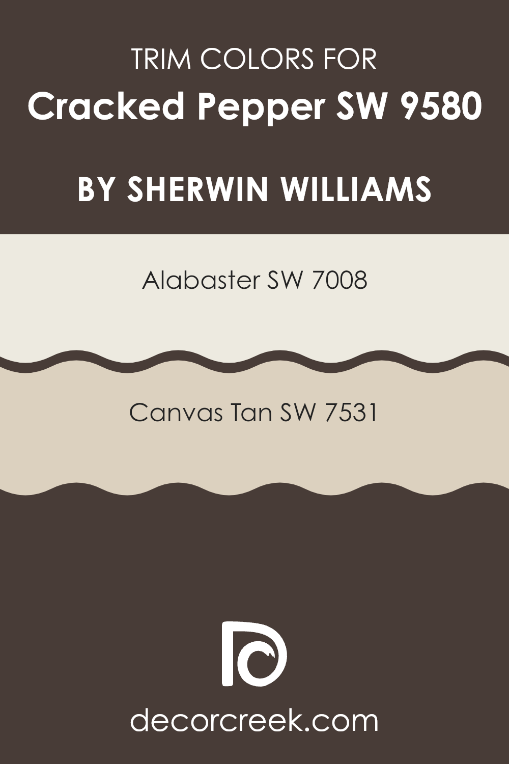
What are the Trim colors of Cracked Pepper SW 9580 by Sherwin Williams?
Trim colors are essential accents in painting that help define and accentuate architectural details of rooms, such as moldings, door frames, window frames, and baseboards. By selecting specific colors for these trims, you can create a refined contrast or smooth transition that enhances both the overall aesthetic and the individual components of the space.
For example, when using a deep hue like Cracked Pepper from Sherwin Williams, choosing lighter or softer trim colors can help balance the boldness of the wall color and bring a cohesive look to the decorating scheme.
Alabaster (SW 7008) is a very light, almost white color that offers a clean and clear look when used as a trim color; it contrasts sharply with darker shades, making it ideal for giving a room a fresh, vibrant appearance against a strong color like Cracked Pepper.
Canvas Tan (SW 7531), on the other hand, is a soft, neutral beige that provides a subtle, understated contrast, perfect for creating a gentle transition that still highlights the architectural features without overwhelming the main wall color. Each color serves to frame and define the spaces in a way that complements the primary color choice, ensuring the room feels well-designed and harmoniously decorated.
You can see recommended paint colors below:
Colors Similar to Cracked Pepper SW 9580 by Sherwin Williams
Similar colors work harmoniously together because they share a common hue, saturation, or brightness, creating a cohesive and pleasing look. Colors like SW 9605 Clove and SW 9600 Armory are both deep and warm, which can create an inviting and cozy atmosphere in any space.
These tones are particularly effective in areas where a sense of warmth is desired, such as living rooms or bedrooms. Along the same lines, SW 9183 Dark Clove and SW 2735 Rockweed add a touch of earthiness, grounding the environment with their nature-inspired hues. Such colors are excellent for spaces that intend to foster a connection with the natural world outside.
Additionally, SW 6041 Otter and SW 6013 Bitter Chocolate offer rich, dark brown tones that work well in creating depth and contrast when used with lighter colors. SW 6006 Black Bean and SW 7675 Sealskin, which are nearly black, can help in defining spaces and accentuating key areas of a room.
Meanwhile, SW 6076 Turkish Coffee and SW 2926 Iron Gate demonstrate how darker shades can be utilized to bring about a feeling of coziness and comfort, making them perfect for creating a focal point or for use in intimate settings. Overall, these similar colors can enhance each other, allowing for a space that feels both coordinated and stylish.
You can see recommended paint colors below:
- SW 9605 Clove
- SW 9600 Armory
- SW 9183 Dark Clove
- SW 2735 Rockweed
- SW 6041 Otter
- SW 6013 Bitter Chocolate
- SW 6006 Black Bean
- SW 7675 Sealskin
- SW 6076 Turkish Coffee
- SW 2926 Iron Gate

How to Use Cracked Pepper SW 9580 by Sherwin Williams In Your Home?
Cracked Pepper SW 9580 by Sherwin Williams is a bold and deep gray paint color, ideal for creating a strong statement in your home. It’s a dark shade that works well in a variety of settings. You can use it in your living room or dining area to make the space feel cozy and inviting. Applying this color to one wall can create a stylish accent wall, adding depth and contrast to lighter surrounding walls.
In bedrooms, Cracked Pepper can help to create a restful, yet powerful ambiance. It pairs beautifully with lighter furniture and bedding, allowing them to pop against the dark backdrop. Additionally, this color can be used in bathrooms for a sleek and clean look.
In the kitchen, consider using it on cabinets or an island as it pairs well with stainless steel appliances and white countertops for a modern vibe. Cracked Pepper can also enhance small spaces like a hallway or nook, giving them more character and a distinct style.
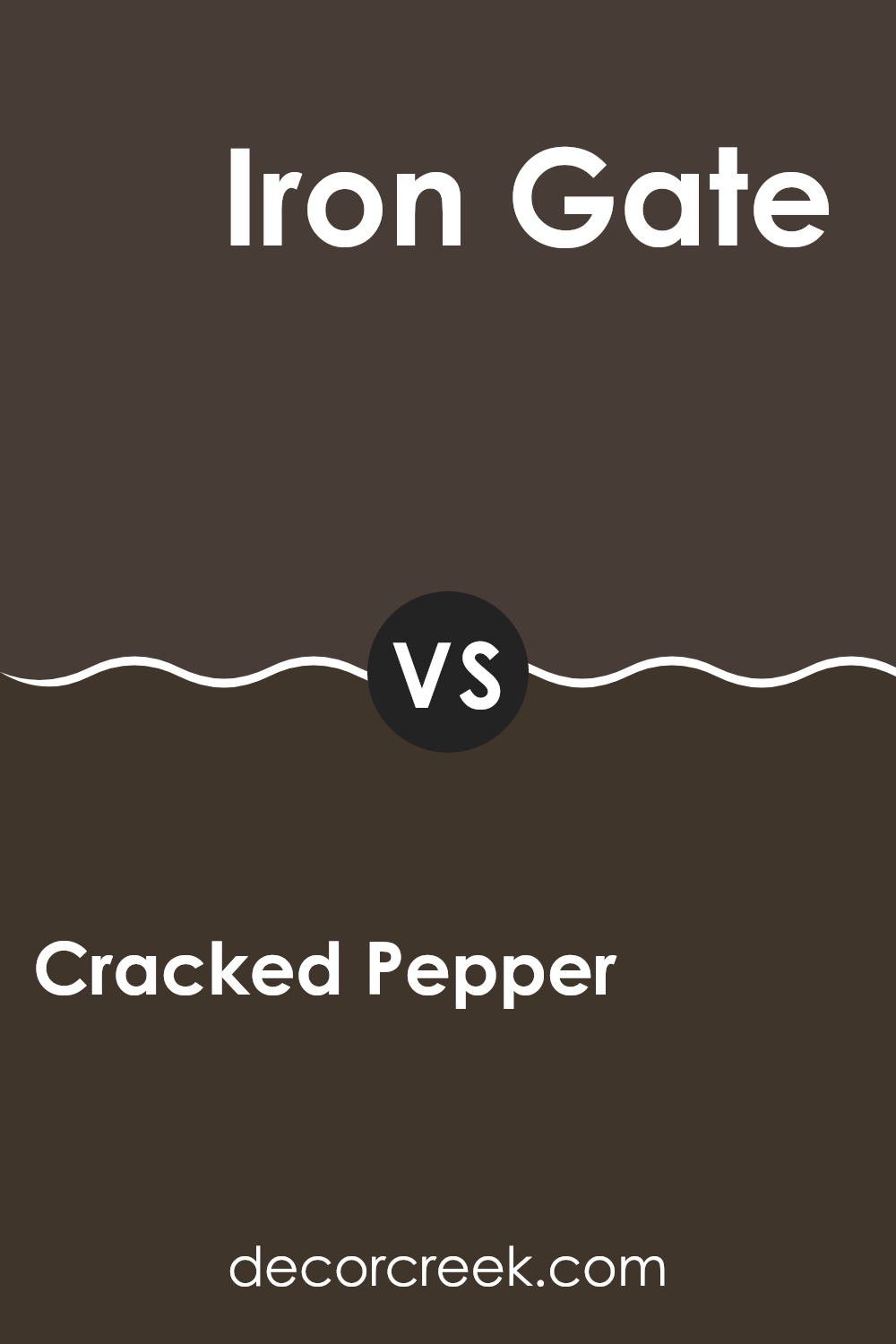
Cracked Pepper SW 9580 by Sherwin Williams vs Iron Gate SW 2926 by Sherwin Williams
Cracked Pepper and Iron Gate, both from Sherwin Williams, are rich, dark tones, but each offers a distinctive mood. Cracked Pepper is a deep charcoal with a hint of warmth, making it highly versatile for spaces needing a strong but not overpowering backdrop. It works well in areas where you want to add depth without the harshness of a true black.
On the other hand, Iron Gate is a dark grey that leans slightly towards a slate color. It’s less warm than Cracked Pepper, giving it a cooler presence. This makes Iron Gate ideal for modern spaces where a sleek, clean look is desired. It pairs beautifully with lighter grays or vibrant colors for a striking contrast.
Both colors provide a strong foundation for decor, but the choice between warmth and coolness will depend on the atmosphere you’re aiming to create in your space.
You can see recommended paint color below:
- SW 2926 Iron Gate
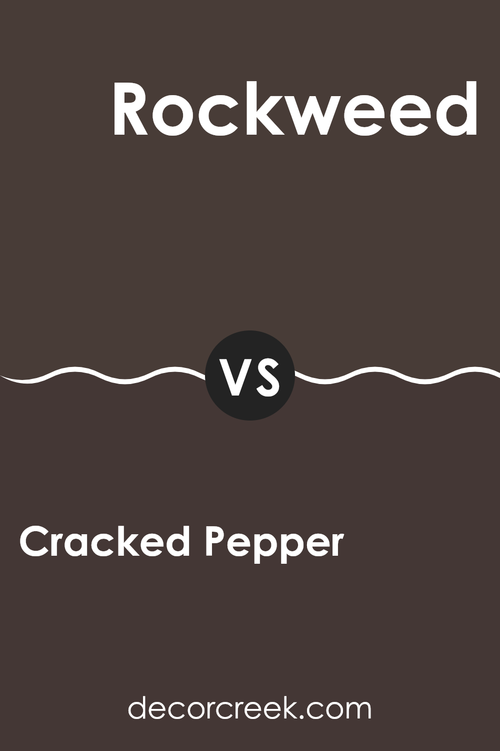
Cracked Pepper SW 9580 by Sherwin Williams vs Rockweed SW 2735 by Sherwin Williams
Cracked Pepper and Rockweed, both from Sherwin Williams, showcase distinct tones that cater to different tastes and design needs. Cracked Pepper is a deep, dark gray, almost black, which provides a bold and strong presence in a room. It’s ideal for creating dramatic accents or for use in a modern setting where a sharp contrast is desired.
On the other hand, Rockweed is a muted green with gray undertones. This color is softer and more natural, offering a calming effect that works well in spaces intended for relaxation and quiet reflection. Its earthy hue blends effortlessly with other natural colors, making it perfect for a cohesive and harmonious palette.
Using Cracked Pepper can give your space a more defined and striking look, while Rockweed allows for a gentle and soothing atmosphere. Each color serves a unique purpose, depending on the ambiance you wish to achieve in your interior design.
You can see recommended paint color below:
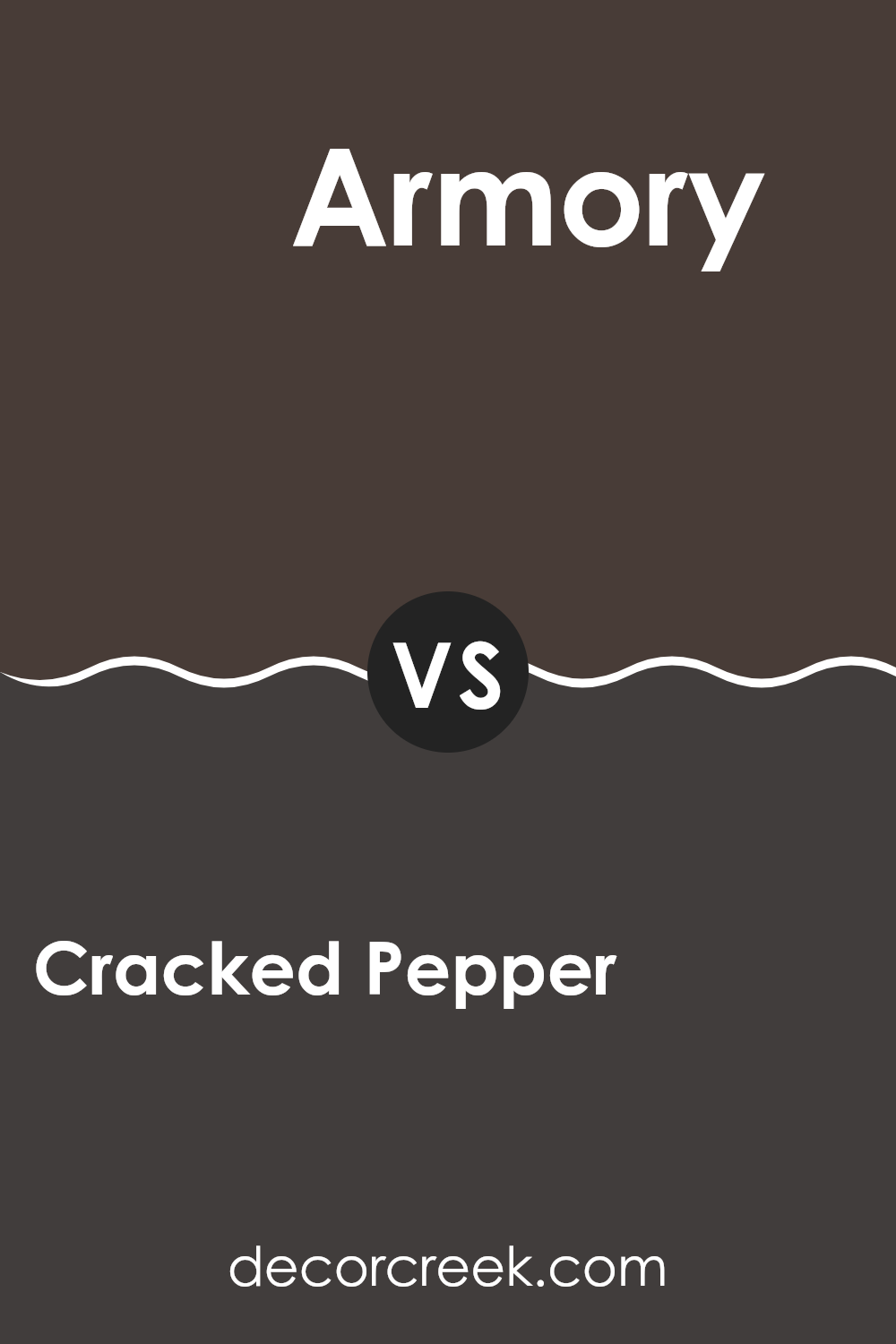
Cracked Pepper SW 9580 by Sherwin Williams vs Armory SW 9600 by Sherwin Williams
Cracked Pepper and Armory are two distinct paint colors by Sherwin Williams, and each brings its unique vibe to a space. Cracked Pepper is a deep, dark gray that almost resembles a soft black. It’s a classic choice, offering a bold and strong feel to any room, while still keeping things simple and clean. This color works well when you want a dramatic effect without going for a pure black.
On the other hand, Armory is also a gray, but it has distinct blue undertones, making it cooler compared to the neutral base of Cracked Pepper. It’s lighter than Cracked Pepper, providing a more airy and open feel. This shade is perfect for those looking to add a touch of modern flair without overwhelming a space with too dark a hue.
Overall, Cracked Pepper is excellent for striking, deep accents, while Armory offers a cooler, lighter option for a contemporary touch. Both colors are versatile and can complement a wide range of decorating styles.
You can see recommended paint color below:
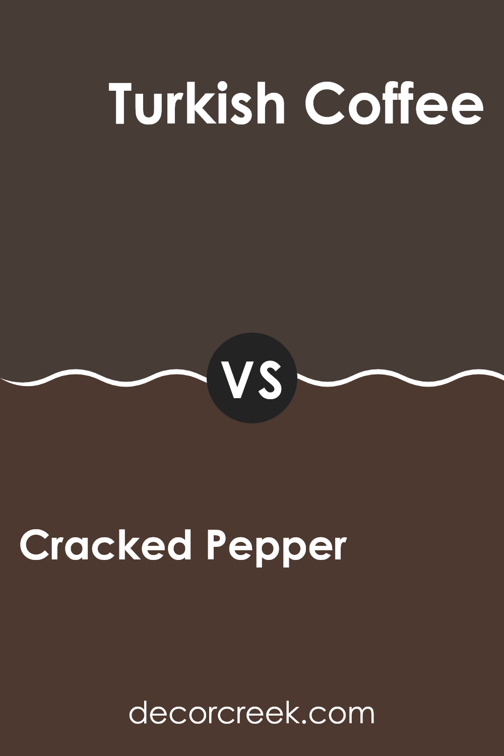
Cracked Pepper SW 9580 by Sherwin Williams vs Turkish Coffee SW 6076 by Sherwin Williams
Cracked Pepper and Turkish Coffee, both by Sherwin Williams, are rich, deep colors, perfect for creating a bold statement in any space. Cracked Pepper is a very dark gray, almost black, that offers a strong, solid feel to walls and accents.
It contrasts sharply with lighter colors, making them pop beautifully. On the other hand, Turkish Coffee is a dark brown with warm, chocolatey undertones, providing a cozy and welcoming atmosphere. It pairs well with warm neutrals and can add depth to a room without the harshness of a black.
While Cracked Pepper leans more towards a modern, minimalistic look, Turkish Coffee brings a sense of warmth and tradition, making it ideal for spaces where you want to foster relaxation and comfort. Both colors are versatile, but the choice between them depends on the mood and style you want to achieve.
You can see recommended paint color below:
- SW 6076 Turkish Coffee
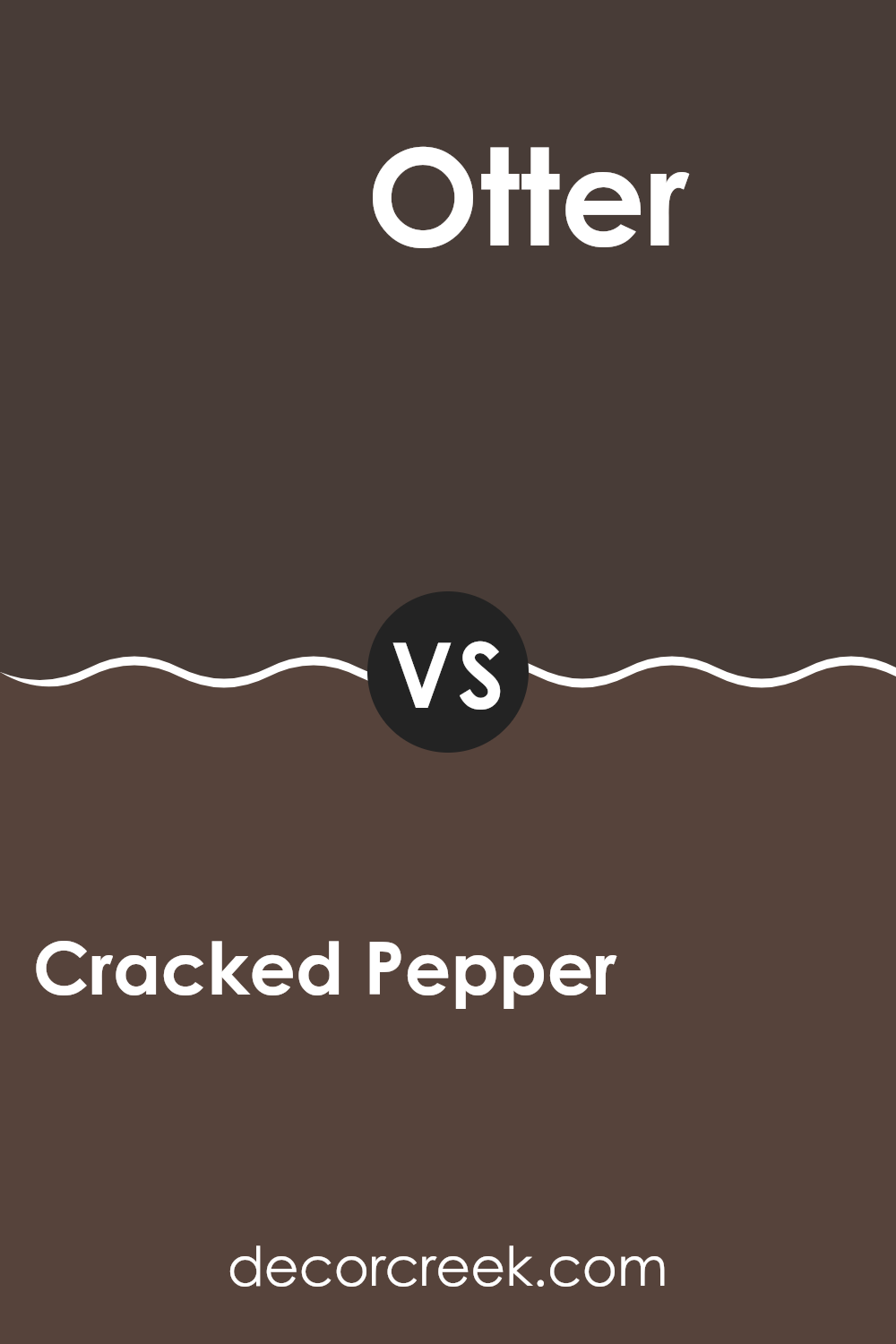
Cracked Pepper SW 9580 by Sherwin Williams vs Otter SW 6041 by Sherwin Williams
Cracked Pepper and Otter by Sherwin Williams are two distinct shades that cater to different design needs. Cracked Pepper is a deep, dark gray that closely resembles the color of black pepper, providing a strong and bold look suitable for making a statement in a space. It’s perfect for accent walls or furniture, giving a grounding effect to any room.
On the other hand, Otter is a much softer color, a light, warm gray with a touch of brown. This makes it a great choice for creating a cozy and inviting atmosphere. It’s versatile and works well in various settings, from living rooms to bedrooms, adding a gentle touch without overpowering the space.
Together, these colors can complement each other well in a design scheme, with Otter lightening the intense depth of Cracked Pepper, offering a balanced visual appeal. Whether used separately or together, they provide options for distinctive yet harmonious interior designs.
You can see recommended paint color below:
- SW 6041 Otter
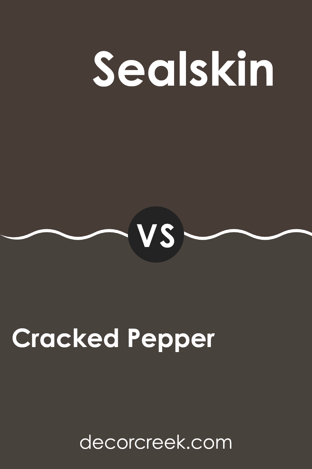
Cracked Pepper SW 9580 by Sherwin Williams vs Sealskin SW 7675 by Sherwin Williams
Cracked Pepper and Sealskin, both by Sherwin Williams, are two dark shades that lend any space a strong presence. Cracked Pepper is a deep gray with a subtle hint of charcoal that makes it a cooler tone. This color is ideal if you’re aiming for a modern and sleek look. It works well in places that benefit from a bold, solid color like living rooms or bedrooms.
On the other hand, Sealskin swirls in a bit more warmth with its rich, dark chocolate brown undertones. This color provides a cozy and inviting atmosphere, making it perfect for areas where a sense of warmth is desired, like dens or dining rooms.
Both colors have a striking depth that pairs well with a variety of decor styles and can be used to make a statement whether as a feature wall or throughout a room. While Cracked Pepper leans towards a more neutral, versatile backdrop, Sealskin offers a hearty, welcoming feel with its earthier base.
You can see recommended paint color below:
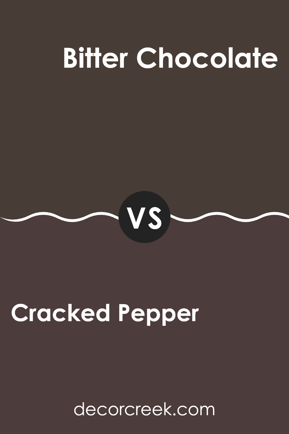
Cracked Pepper SW 9580 by Sherwin Williams vs Bitter Chocolate SW 6013 by Sherwin Williams
Cracked Pepper and Bitter Chocolate by Sherwin Williams are two rich, deep colors that hold their own unique appeal. Cracked Pepper is a dark gray that almost touches black, providing a bold and robust backbone for any room.
It’s perfect for creating a strong, grounded atmosphere without being too overpowering. On the other hand, Bitter Chocolate brings a warmer tone to the table, leaning towards a deep brown with a hint of softness that makes spaces feel cozy and inviting.
This color is ideal for those looking to add a touch of warmth to their decor. Both colors work well in spaces that aim for a modern feel with a classic twist, but while Cracked Pepper gives off a more stark and dramatic vibe, Bitter Chocolate offers a gentler and more enveloping ambiance. Depending on the mood you want to set, either color can dramatically improve a room’s aesthetic.
You can see recommended paint color below:
- SW 6013 Bitter Chocolate
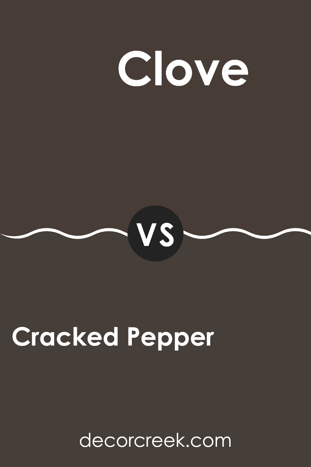
Cracked Pepper SW 9580 by Sherwin Williams vs Clove SW 9605 by Sherwin Williams
Cracked Pepper and Clove by Sherwin Williams are two distinct shades you might consider for a cozy and welcoming space. Cracked Pepper is a deep, almost black gray that can make any area feel more grounded and calm. It’s great for creating a bold statement without being too intense.
On the other hand, Clove is a rich, deep brown with a warm undertone, making it perfect for adding a touch of warmth to your rooms. It exudes a natural, earthy vibe that pairs well with materials like wood and leather.
When comparing the two, Cracked Pepper offers a more neutral look that works like a dark canvas, allowing other colors to stand out, while Clove provides a hearty, warm base that’s ideal for a cozy, inviting environment. Both colors work well in spaces where you want to add depth and interest without overwhelming the senses.
You can see recommended paint color below:
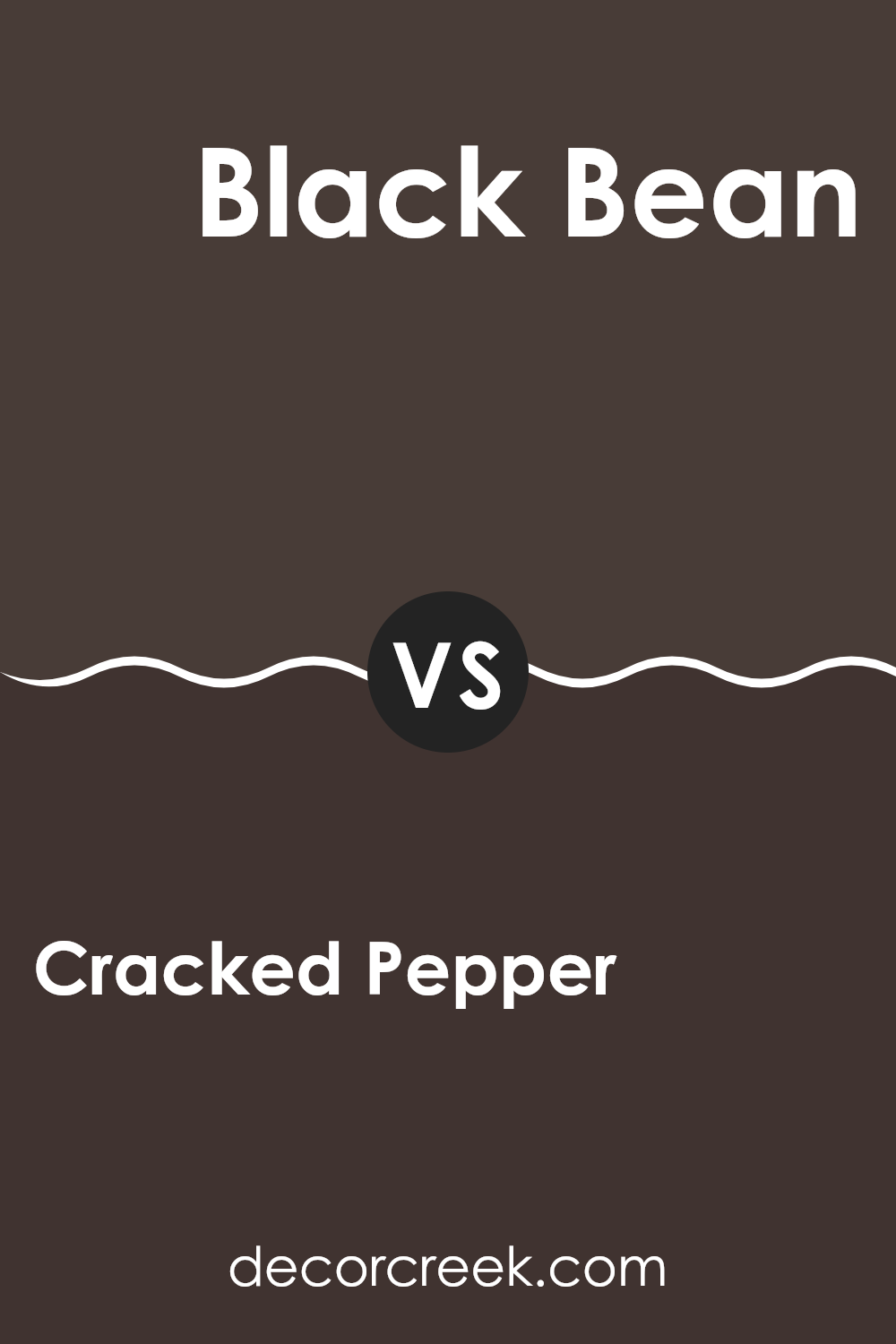
Cracked Pepper SW 9580 by Sherwin Williams vs Black Bean SW 6006 by Sherwin Williams
Cracked Pepper by Sherwin-Williams is a deep, charcoal gray that brings a strong, yet not overpowering, presence to a space. It has a slightly softer touch compared to a pure black, making it versatile for both modern and traditional settings. This color works well in rooms that aim for a chic yet understated look.
On the other hand, Black Bean by Sherwin-Williams leans more towards a true black but with intriguing brown undertones. This adds a warm richness that prevents it from feeling too harsh or cold, which can be a common issue with darker blacks. Black Bean is ideal for areas where you want to create a cozy, enveloping feel, as it tends to make spaces feel more intimate.
Both colors are excellent choices for adding drama and depth to your decor but serve slightly different moods and aesthetics with Cracked Pepper offering a bit more flexibility and lightness, while Black Bean brings warmth and intimacy.
You can see recommended paint color below:
Cracked Pepper SW 9580 by Sherwin Williams vs Dark Clove SW 9183 by Sherwin Williams
Cracked Pepper and Dark Clove are both deep, rich colors from Sherwin Williams, but they have different tones that set them apart. Cracked Pepper is a very dark shade, almost like charcoal, which gives it a strong and bold feel.
It’s perfect for making a statement in a room, whether on an accent wall or for cabinetry. On the other hand, Dark Clove has a warmer, browner base. It feels cozy and welcoming due to its earthier hue. This color works well in spaces where you want a sense of warmth, like living rooms or bedrooms.
Both colors are versatile and can help define a space, but the choice between them depends on the mood you want to create. Cracked Pepper tends towards a more modern, dramatic look, while Dark Clove leans into a rustic, homey vibe.
You can see recommended paint color below:
Conclusion
After reading about SW 9580 Cracked Pepper by Sherwin Williams, I’ve learned quite a bit about this paint color. This shade of black is so cool because it’s not just a plain black; it has hints of gray which makes it look softer and more interesting. It’s a great pick if someone wants a room to feel cozy and stylish at the same time.
What I really like about Cracked Pepper is that it works well in a lot of places in a house. You can use it for a bedroom to make it feel like a snug hideout, or in the living room to give it a chic look. Even painting a front door with this color could make the house stand out.
Also, this color matches nicely with many other colors. This means it’s easy to find things like curtains, carpets, and furniture that go together with it, which is pretty handy. I think it would be a fun paint color to use because it makes things look new and nice without trying too hard.
For anyone thinking about picking a new paint color, SW 9580 Cracked Pepper is definitely worth considering. It’s stylish, has a cool twist with its gray tones, and can make any room look great in a simple and elegant way.
Ever wished paint sampling was as easy as sticking a sticker? Guess what? Now it is! Discover Samplize's unique Peel & Stick samples.
Get paint samples

