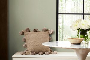
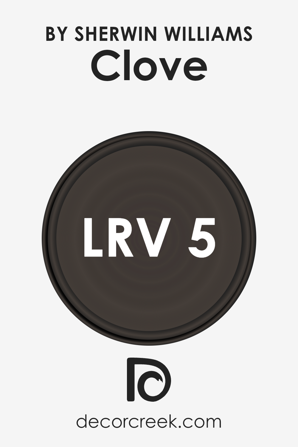
Introducing SW 9605 Clove by Sherwin-Williams, a paint color that captures the essence of warmth, comfort, and timelessness. In the vast spectrum of colors offered by Sherwin-Williams, Clove stands out as a uniquely inviting hue. It embodies the deep, rich tones of the spice after which it’s named, bringing a sense of sophistication and earthiness into any space.
This color is versatile, making it an excellent choice for those looking to create a cozy atmosphere in their living spaces, enhance the elegance of a dining area, or add a touch of warmth to a bedroom.
The depth of SW 9605 Clove offers a perfect backdrop for both traditional and modern decor, allowing furniture and artwork to pop, while also providing a comforting embrace with its enveloping warmth.
Whether one is aiming to achieve a statement wall that captivates attention or to envelop a room in a soothing ambiance, SW 9605 Clove by Sherwin-Williams offers a distinctive palette that enriches environments and transforms them into inviting sanctuaries.
In this article, we will explore the unique characteristics of SW 9605 Clove, providing insights into how it can be integrated into various design schemes to achieve desired aesthetics and moods.

What Color Is Clove SW 9605 by Sherwin Williams
Clove by Sherwin Williams is a sophisticated, deep hue that encapsulates a sense of warmth and robust elegance. This color, rich and inviting, carries undertones that oscillate between a dusky brown and a subtle hint of burgundy.
The depth of Clove offers a versatile backdrop that can transform a space into a cozy retreat or an opulent setting, depending on its application and accompanying décor.
This color thrives in a variety of interior styles, particularly in spaces that embody traditional elegance or a rustic charm. It can anchor a room with a classic, timeless appeal, especially when paired with furnishings and accessories that highlight natural beauty and craftsmanship.
In a more rustic setting, Clove serves as a perfect complement to distressed woods, bringing out their natural grains and textures, thus enhancing the room’s overall warmth and inviting nature.
When it comes to materials and textures, Clove interacts gracefully with a wide spectrum. It pairs beautifully with rich leathers, adding depth and sophistication to any space. The color also complements natural stone, such as marble or slate, creating a luxurious and dynamic contrast.
Soft textures like velvet or wool in lighter shades can offer a delightful contrast, lightening the overall mood without detracting from the color’s inherent opulence. The adaptability of Clove makes it an exemplary choice for those looking to imbue their space with a sense of warmth, richness, and timeless elegance.
Ever wished paint sampling was as easy as sticking a sticker? Guess what? Now it is! Discover Samplize's unique Peel & Stick samples.
Get paint samples

Is Clove SW 9605 by Sherwin Williams Warm or Cool color?
CloveSW 9605, a sophisticated shade by Sherwin Williams, offers a remarkable depth and warmth that can transform any space into a cozy nook. This particular hue, a blend between earthy tones and a hint of spice, introduces an element of serene comfort, making it ideal for rooms where relaxation and tranquility are sought.
Its unique ability to create an inviting and snug atmosphere is precisely why it’s a popular choice for living rooms and bedrooms.
The versatility of CloveSW 9605 ensures that it pairs beautifully with both light, neutral furnishings, which can create a striking contrast, and with dark woods or textiles, enhancing the room’s coziness. Additionally, its richness in color adds an elegant backdrop, making artworks and decorative elements stand out.
In spaces that lack natural light, this color imbues a subtle warmth that compensates for the absence, ensuring that the room feels welcoming at all hours. Overall, CloveSW 9605 by Sherwin Williams is more than just a paint color; it’s a design tool that deeply affects the ambiance and mood of a home, enriching the lives of its inhabitants.
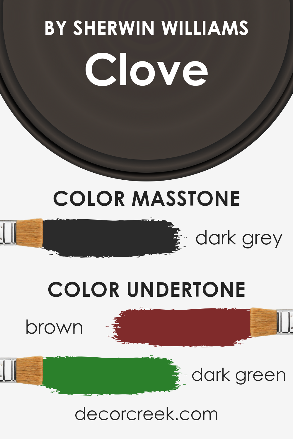
Undertones of Clove SW 9605 by Sherwin Williams
Clove, a sophisticated hue, carries a complexity often sought after in design spaces. The perception of color is not solely a matter of its primary tone; instead, it’s deeply influenced by its undertones, those secondary colors that lie beneath the surface of the initial impression.
In the case of Clove, the understated presence of brown and dark green undertones adds a richness and depth that elevates its appearance beyond a simple primary color. These undertones play a crucial role in the way we perceive color, influencing mood, size perception, and even temperature of spaces.
When applied to interior walls, the impact of Clove’s undertones becomes distinctly pronounced. The brown undertone introduces an element of warmth and naturalness, making spaces feel more inviting and cozy. It’s akin to the warm embrace of a well-loved leather chair, offering comfort and stability.
On the other hand, the dark green undertone injects a sense of vitality and grounding, reminiscent of the serene and rejuvenating qualities of nature.
This creates a unique balance, allowing the color to adapt under different lighting conditions – under sunlit conditions, the green undertones might become more pronounced, lending the room a fresh, lively vibe, whereas in dimmer, artificial light, the brown undertones might dominate, wrapping the space in a warm, comforting aura.
The interplay of these undertones in Clove ensures that it remains a versatile color choice, capable of adding depth, warmth, or freshness to a space depending on the accompanying decor and natural light available.
The result is a dynamic and responsive color that offers much more complexity and versatility than meets the eye, making it an intriguing choice for interior design.
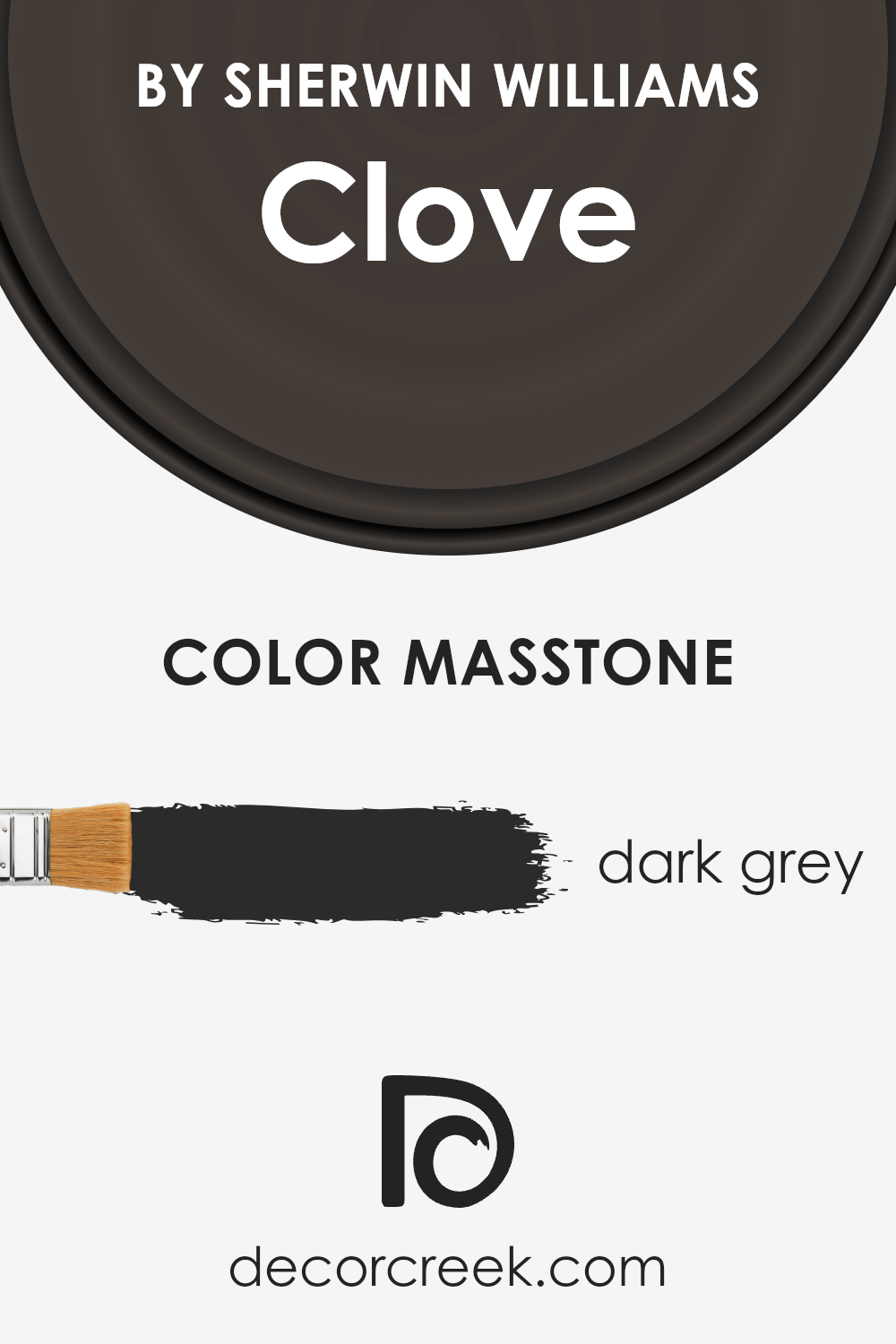
What is the Masstone of the Clove SW 9605 by Sherwin Williams?
The masstone of Clove SW 9605 by Sherwin Williams, characterized as Dark Grey (#2B2B2B), possesses a profound depth that brings about an unmatched sophistication in home interiors. This specific shade of grey bears a neutrality that allows it to act as a versatile backdrop, easily complementing a wide range of decor styles and color schemes.
When applied to walls, it creates a grounding effect, making spaces feel more anchored and serene. Its richness adds a layer of elegance, especially in well-lit areas where natural light can subtly reveal its complex undertones.
In spaces aiming for a modern or minimalist aesthetic, this dark grey serves as a strong, yet understated base, highlighting and enhancing the visual appeal of other elements within the room, such as furniture, artwork, and accessories.
It also works exceptionally well in creating an intimate ambiance in bedrooms or living rooms, offering a cozy retreat that feels both comforting and stylish.
Importantly, this color has the remarkable ability to add perceived value and depth to a space, making it not just a color choice, but a design strategy for those looking to achieve a refined and cohesive interior.
How Does Lighting Affect Clove SW 9605 by Sherwin Williams
The influence of lighting on colors is a fascinating topic within the realm of interior design and aesthetics. How a color appears can dramatically change under different lighting conditions due to the color temperature and intensity of light. This phenomenon is vital to consider when choosing paint colors for any space.
Take, for example, a deep, rich color like Clove by Sherwin Williams. In artificial light, which often has a warmer cast, especially with incandescent or warm LED bulbs, this color can appear more vibrant and cozy.
The warm light enhances the red and orange undertones of Clove, making it ideal for spaces meant to evoke warmth and comfort.
Conversely, in the bright, white light of fluorescent or cool LED bulbs, this color might lose some of its warmth, appearing slightly muted and more neutral.
In natural daylight, the appearance of this hue shifts again. Natural light, particularly in the morning and midday, tends to be cooler, so it can highlight the depth and complexity of the color.
Clove, under these conditions, might exhibit a more nuanced palette, revealing subtle undertones you wouldn’t notice under artificial light.
The orientation of a room also plays a crucial role in how a color is perceived. North-faced rooms receive indirect, cooler light, which can make the color appear more muted and subdued.
In contrast, south-faced rooms are bathed in warm, direct sunlight for most of the day, which can intensify the color’s warmth, making it appear more vibrant and rich.
East-faced rooms enjoy the warm, golden light of the morning sun, which can make this color glow warmly, enhancing its cozy feel. As the day progresses, the light in these rooms becomes cooler, which might make the color appear a bit more neutral.
West-faced rooms, on the other hand, get the evening light, which is warm and golden, again accentuating the warmth and depth of the color, making it perfect for living spaces where a welcoming, comforting feel is desired.
Understanding how lighting affects colors is essential for creating spaces that feel right at any time of the day.
The example of Clove demonstrates how varied the same color can look under different lighting conditions, emphasizing the importance of considering both natural and artificial light when decorating.

What is the LRV of Clove SW 9605 by Sherwin Williams
Light Reflectance Value (LRV) is a crucial measure used in the world of paint and design to assess how light or dark a color will appear once applied to walls or other surfaces. It ranges from 0 to 100, with 0 being absolute black, reflecting no light, and 100 being pure white, reflecting all light.
This value helps in determining how much light a paint color will absorb or reflect in a given space, playing a significant role in the ambiance and visual temperature of a room.
Different lighting conditions can dramatically change the perception of the color, making the LRV a valuable tool for designers and homeowners to predict how a color will behave in various environments before committing to it.
With an LRV of approximately 5.055, a deeply rich shade like Clove offers a daring and sophisticated choice that absorbs most light rather than reflecting it. This low LRV indicates that it will appear quite dark, making it an ideal choice for creating an intimate and cozy atmosphere in a space.
However, this also means it’s critical to consider the room’s lighting, as such a deep color could make a small or poorly lit room feel even smaller or darker.
To counteract this, strategic lighting and complementing it with lighter shades in decor or furnishings can balance the visual weight. The LRV of this specific hue aids in understanding how it can transform a space, offering depth and drama to an interior when used thoughtfully.
LRV – what does it mean? Read This Before Finding Your Perfect Paint Color
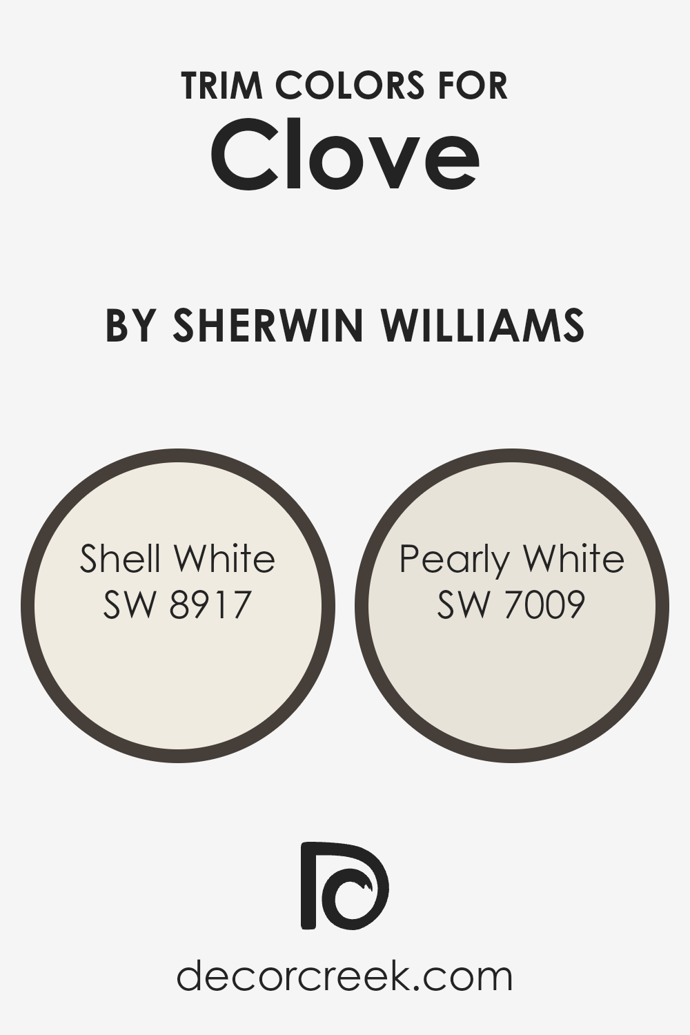
What are the Trim colors of Clove SW 9605 by Sherwin Williams
Trim colors play a crucial role in defining and accentuating the architectural elements of a space, providing a finishing touch that complements the primary color palette. In the case of CloveSW 9605 by Sherwin Williams, selecting the right trim colors is essential to enhance its warm, earthy tones without overwhelming its subtle sophistication.
Trim colors act as a visual guide, drawing the eye toward architectural details, creating clean lines, and framing sections of a room to make its colors pop.
They balance the primary wall color and add depth and contrast, ensuring that every element in a room is cohesively tied together. The careful selection of trim colors can transform an ordinary space into one that exudes personality and refined style, making it a critical step in the design process.
Shell White, with its SW code 8917 , serves as an ideal trim color, offering a soft, serene backdrop that beautifully complements the rich depth of Clove. It’s a versatile, warm off-white with a gentle creamy undertone, making it an excellent choice for creating a smooth transition between the boldness of Clove and the trim.
Then there’s Pearly White, coded SW 7009 , a subtly lustrous shade that injects a slight vibrancy without competing with the main color theme.
Pearly White stands out for its ability to add a whisper of radiance and light-reflection to the trim, enhancing the overall warmth and inviting ambiance of the room. Both Shell White and Pearly White thus serve not only to define spatial boundaries with elegance but also to illuminate and uplift the intrinsic beauty of Clove, making each architectural detail a testament to timeless design.
You can see recommended paint colors below:
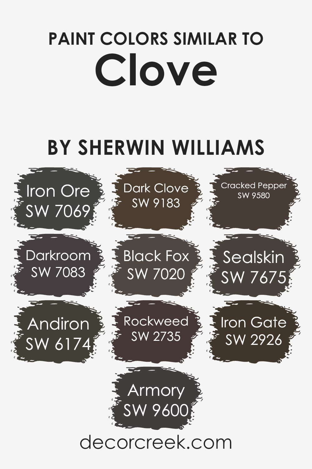
Colors Similar to Clove SW 9605 by Sherwin Williams
Understanding the importance of similar colors in design can significantly impact the visual flow and harmony of a space. Similar colors, such as those related to Clove SW 9605 by Sherwin Williams, share common undertones or intensity, making them ideal for creating a cohesive and nuanced palette.
These colors work together by subtly varying in shade or depth, allowing for a sophisticated layering effect that adds dimension and interest without overwhelming the senses.
For example, colors like Iron Ore and Darkroom offer deep, rich hues that act as strong anchors in a palette, providing depth and focus. Andiron and Armory introduce a slightly lighter, yet equally complex, spectrum of color, bridging the gap between the darkest and mid-tone hues.
Dark Clove and Black Fox carry a warmth that complements the cooler shades, ensuring the color scheme remains balanced and inviting. Rockweed and Cracked Pepper, with their unique undertones, add a natural, earthy quality that grounds the palette, while Sealskin and Iron Gate round out the selection with their versatile, slightly softer but no less impactful shades.
By utilizing a range of similar colors, designers can craft spaces that feel harmonious and connected, with each color enhancing the others’ beauty without competing for attention. This carefully considered approach to color selection creates an environment that is visually coherent, deeply rich, and compelling, demonstrating the power of similar colors in design.
You can see recommended paint colors below:
- SW 7069 Iron Ore
- SW 7083 Darkroom
- SW 6174 Andiron
- SW 9600 Armory
- SW 9183 Dark Clove
- SW 7020 Black Fox
- SW 2735 Rockweed
- SW 9580 Cracked Pepper
- SW 7675 Sealskin
- SW 2926 Iron Gate
How to Use Clove SW 9605 by Sherwin Williams In Your Home?
Clove SW 9605 by Sherwin Williams is a unique and captivating paint color that offers a spectrum of possibilities for enhancing your home’s aesthetic. This warm, rich hue balances between a deep brown and a subtle hint of burgundy, reminiscent of the spice after which it’s named.
Its sophisticated and cozy vibe can transform any room into a welcoming space, making it perfect for living rooms, dining areas, or bedrooms where comfort and elegance are desired.
Incorporating Clove into your home can be both exciting and versatile. For a bold statement, consider using it on your walls as a primary color. It pairs beautifully with soft creams, warm whites, or even lighter shades of gray, creating a balanced and inviting palette.
For those hesitant to commit to painting an entire room, Clove can also serve as an accent, whether on a single wall, through decorative trims, or by painting furniture pieces. This not only injects warmth into the space but also elevates the overall design with a touch of sophistication.
Ultimately, Clove SW 9605 is not just a paint color, it’s a means to infuse personality and warmth into your home, offering a backdrop that complements both modern and traditional decor with ease.
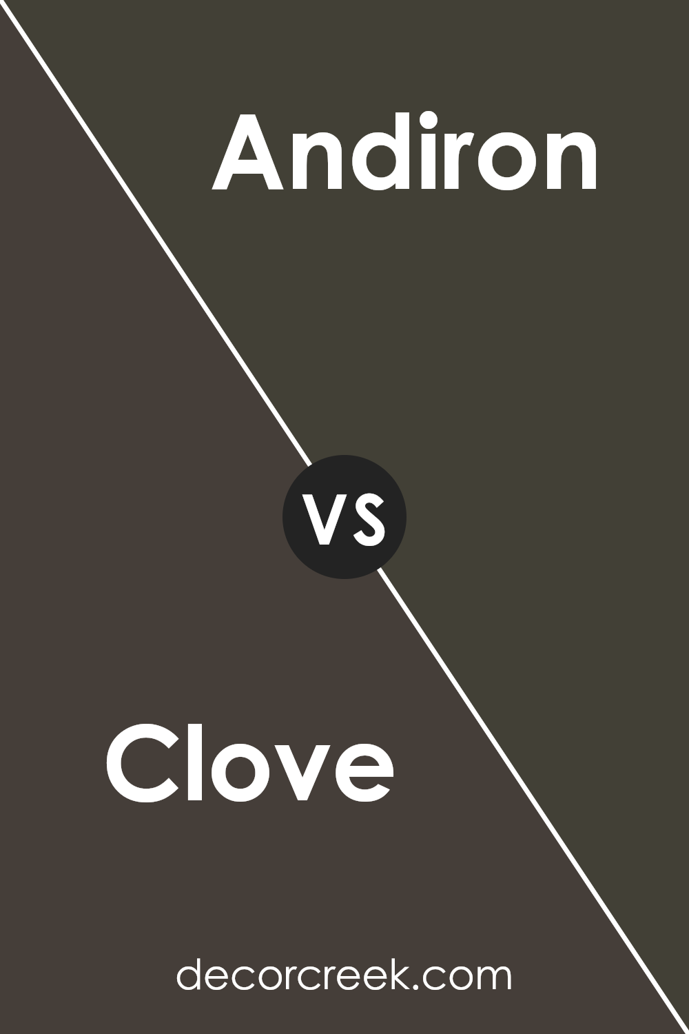
Clove SW 9605 by Sherwin Williams vs Andiron SW 6174 by Sherwin Williams
Clove and Andiron , both by Sherwin Williams, offer distinct hues that cater to differing aesthetic preferences. Clove presents itself as a deep, warm hue grounded in earthy brown tones with a subtle hint of softness, reminiscent of the spice it’s named after.
This color imbues spaces with a sense of comfort and cozy sophistication, making it an excellent choice for living areas or bedrooms where warmth and tranquility are desired.
Andiron, on the other hand, shifts towards a darker, more grounded palette. This color encapsulates the essence of smoldering coals and has a muted, almost smoky quality. It’s a color that speaks of strength and stability, perfect for creating dramatic accents or anchoring a room with its rich depth.
Its versatility allows it to blend seamlessly with a wide range of decor styles, from modern minimalist to rustic charm.
While both colors share an affinity for creating inviting spaces, Clove leans towards a lighter, warmer ambiance, whereas Andiron offers boldness and depth, making each uniquely suited to different design goals and personal tastes.
You can see recommended paint color below:
- SW 6174 Andiron
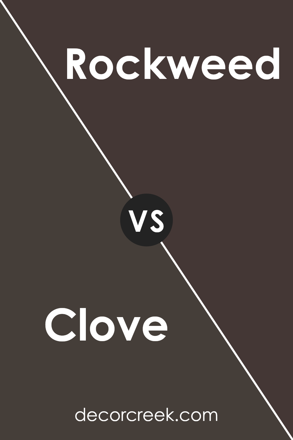
Clove SW 9605 by Sherwin Williams vs Rockweed SW 2735 by Sherwin Williams
Clove and Rockweed by Sherwin Williams offer distinct visual experiences, each embodying unique characteristics. Clove is a deep, warm hue, reminiscent of the spice after which it’s named. This color exudes earthiness and comfort, making it an excellent choice for creating cozy, inviting spaces.
Its rich undertone provides a robust backdrop, ideal for rooms that aim to foster relaxation and warmth.
On the other hand, Rockweed stands out with its cooler, more neutral tone. This color channels the natural elegance of seaside foliage, bringing a serene and balanced energy into any space.
Rockweed excellently complements modern and minimalist designs, thanks to its subtle sophistication and versatility.
It works well in environments where the goal is to achieve calmness and a grounded feel.
Comparatively, while both colors share an inspiration from nature, Clove leans towards warmth and richness, enveloping rooms in a snug aura. Rockweed, however, opts for tranquility and a refreshing openness, making spaces feel airy and harmonious.
The choice between them depends on the atmosphere one wishes to curate: warmth and intimacy with Clove or calmness and balance with Rockweed.
You can see recommended paint color below:
- SW 2735 Rockweed
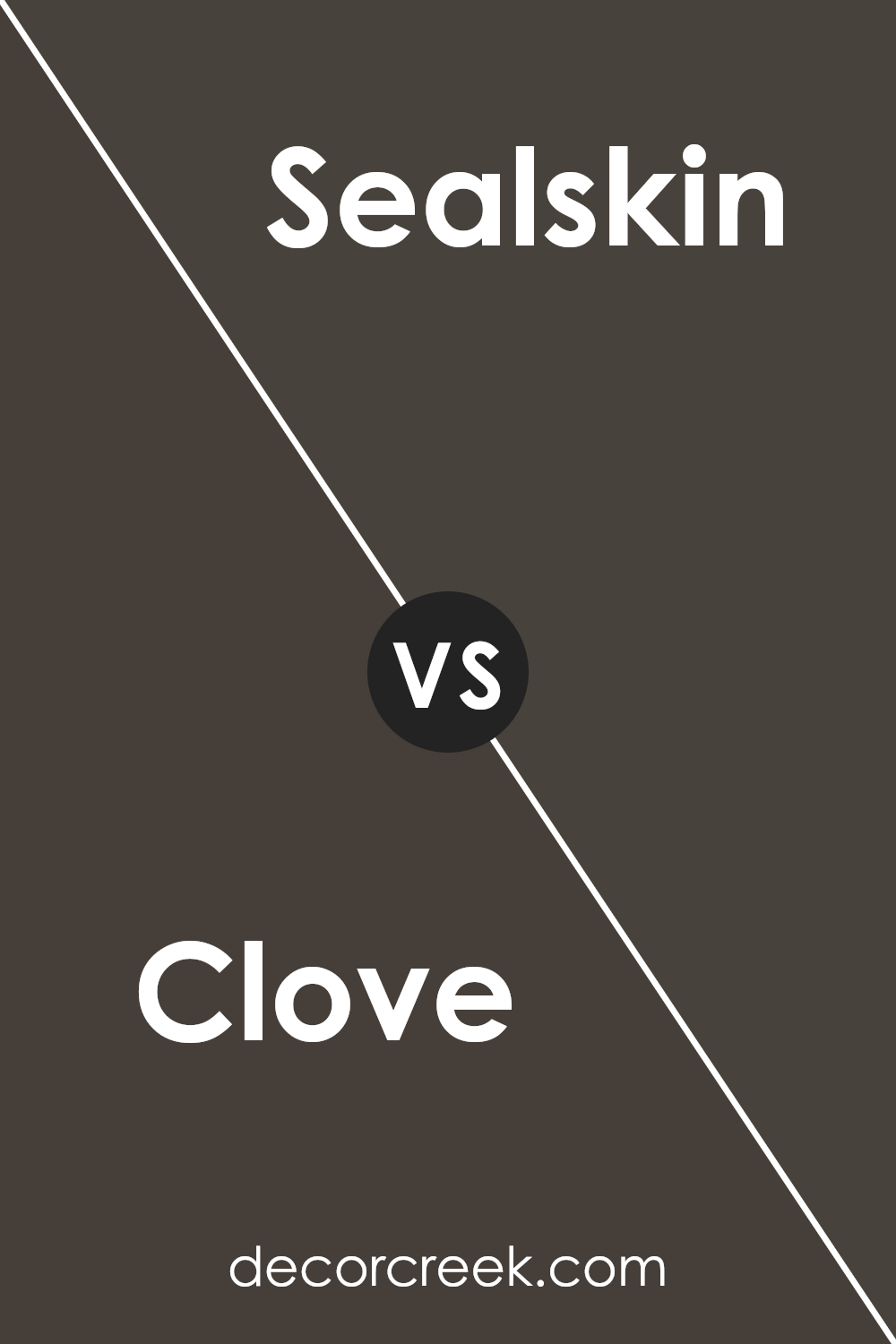
Clove SW 9605 by Sherwin Williams vs Sealskin SW 7675 by Sherwin Williams
Clove SW 9605 by Sherwin Williams is a sophisticated and warm shade that brings a sense of comfort and earthiness to spaces. Its rich brown tone is deep yet inviting, making it a perfect choice for creating cozy and embracing environments.
This color is particularly suitable for living areas, bedrooms, or any space where a sense of warmth and stability is desired.
On the other hand, Sealskin SW 7675 , also by Sherwin Williams, presents a darker and more intense experience. This color leans towards a more robust and dramatic side, with its deep, almost charcoal gray undertones.
Despite its intensity, it offers an elegant and grounded atmosphere, making it an excellent choice for accent walls, exterior trims, or spaces designed to make a statement.
While both colors exude sophistication and depth, Clove’s earthy warmth contrasts beautifully with Sealskin’s bold and strong character. The use of Clove can create a nurturing and welcoming environment, whereas Sealskin is ideal for adding weight and definition to a space.
You can see recommended paint color below:
- SW 7675 Sealskin
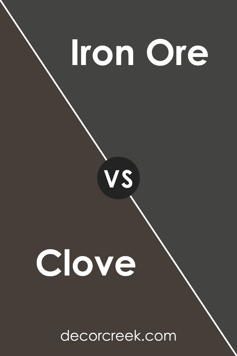
Clove SW 9605 by Sherwin Williams vs Iron Ore SW 7069 by Sherwin Williams
Clove SW 9605 and Iron Ore SW 7069 , both from Sherwin Williams, present distinct nuances that differentiate them within the interior design palette. Clove situates itself as a warm, deep hue, reminiscent of the spice it’s named after. This color emanates a sense of comfort and earthiness, making it ideal for spaces that aim to be inviting and cozy.
Its rich, brown undertones provide a grounded atmosphere, perfect for living rooms or bedrooms looking to achieve a calming ambience.
In contrast, Iron Ore is a robust, darker shade that leans towards a soft, almost charcoal black with subtle, cool undertones. This color exudes sophistication and strength, lending itself to creating striking accents or dramatic statements within a space.
Iron Ore is versatile in its application, functioning well on exteriors for a bold impression, or in interiors, complementing modern and minimalist designs.
Though both colors offer a sense of depth and dimension, Clove’s warmth contrasts with Iron Ore’s cooler, bolder presence, providing varied options for those looking to imbue their space with character and individuality.
You can see recommended paint color below:
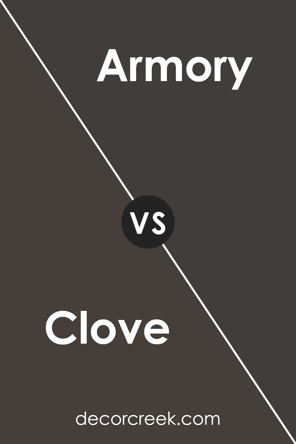
Clove SW 9605 by Sherwin Williams vs Armory SW 9600 by Sherwin Williams
Clove SW 9605 and Armory SW 9600 , both from Sherwin Williams, present distinctive hues, fostering unique atmospheres in spaces where they are applied. Clove SW 9605 leans towards a warm, rich, and earthy brown tone, reminiscent of autumnal themes, exuding coziness and a welcoming ambiance.
It’s a versatile color that harmonizes well with natural materials and textures, making it suitable for living areas, bedrooms, and even kitchens, where it brings a sense of groundedness.
On the other hand, Armory SW 9600 is a deeper, more saturated tone, verging on the spectrum of grays with a subtle blue undertone. This color conveys a sense of sophistication and modernity, making it ideal for spaces that aim for a more contemporary edge.
Armory’s strength lies in its ability to act as a bold backdrop, accentuating decor and architectural details without overwhelming the space.
When comparing these two, the key difference lies in their temperature and depth. Clove’s warmth contrasts with Armory’s cooler and more assertive presence, offering diverse options for interior moods and styles.
You can see recommended paint color below:
- SW 9600 Armory
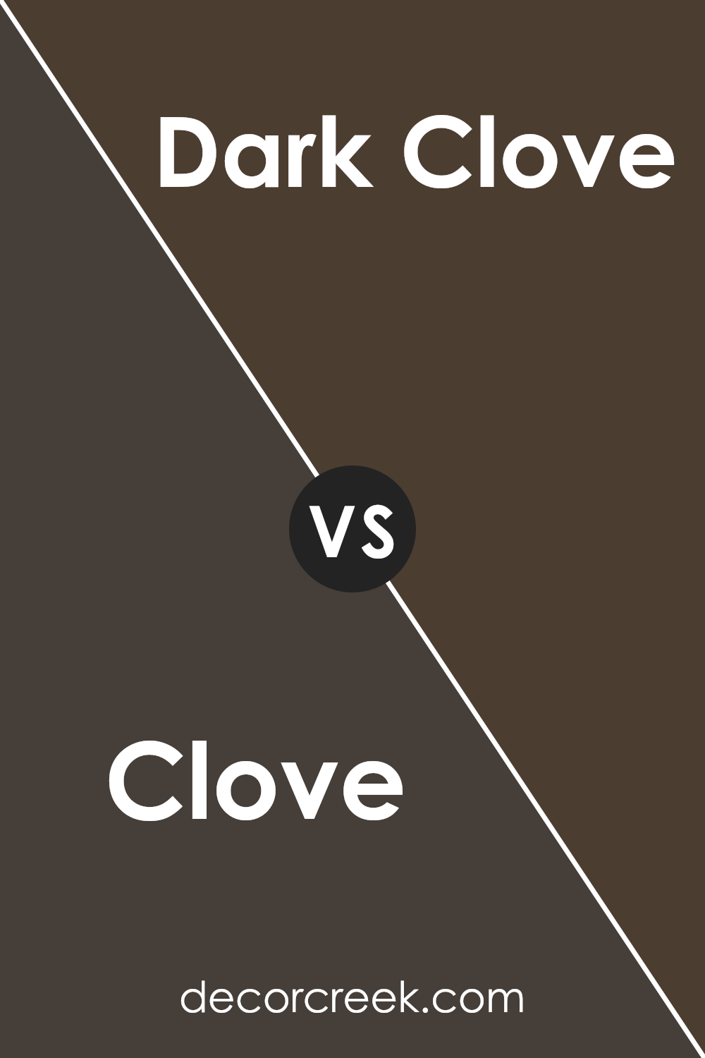
Clove SW 9605 by Sherwin Williams vs Dark Clove SW 9183 by Sherwin Williams
Clove SW 9605 and Dark Clove SW 9183 by Sherwin Williams are two unique hues that, while sharing a common base, exhibit notable differences in depth and ambiance. Clove SW 9605 presents itself as a warm, inviting shade that balances between the earthiness of brown and the subtle richness of a muted terracotta.
Its versatile tone makes it a perfect candidate for creating a cozy and welcoming atmosphere in any space.
On the other hand, Dark Clove SW 9183 takes the essence of its counterpart and deepens it, imbuing spaces with a more pronounced, intense character. This darker iteration offers a robust and sophisticated edge, appropriate for creating dramatic highlights or an elegant, enveloping environment.
Its strength lies in its ability to add depth and a sense of luxury, making it a go-to for accent walls or spaces where a bold statement is desired.
Together, these two colors offer a range that can cater to various aesthetic preferences, from the soft and subtle to the bold and dramatic, providing designers and homeowners alike with a versatile palette to express their style.
You can see recommended paint color below:
- SW 9183 Dark Clove
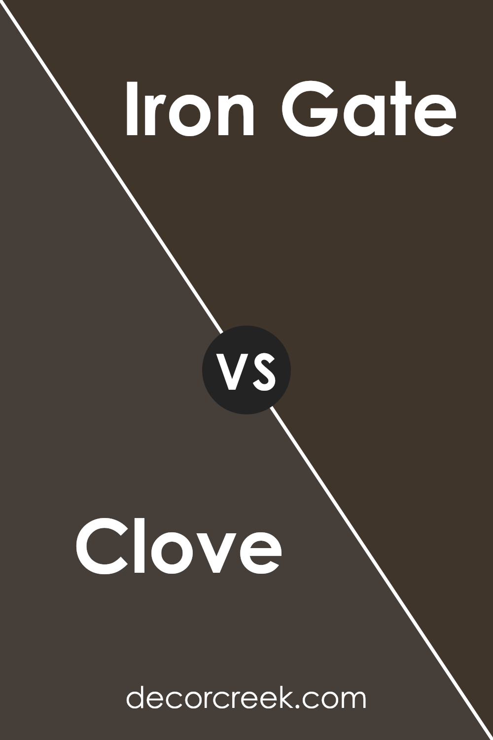
Clove SW 9605 by Sherwin Williams vs Iron Gate SW 2926 by Sherwin Williams
“Clove” and “Iron Gate” by Sherwin Williams are two distinct shades that cater to different aesthetic preferences and design needs. Clove stands out as a warm, deep hue that effortlessly brings a cozy, inviting feel and lends an air of sophistication to spaces.
It’s a color that resonates with warmth and earthiness, often used to create a comforting and enveloping atmosphere. Its rich depth makes it an ideal choice for accent walls, living rooms, or dining areas where warmth is desired.
On the other hand, “Iron Gate” presents a cooler, more neutral tone. This color is versatile, embodying a sense of strength and tranquility. It’s a grey that carries with it a metallic sharpness, reminiscent of wrought iron, hence its name.
Suitable for modern and minimalist designs, Iron Gate provides a solid foundation that complements a wide range of colors, making it perfect for bedrooms, home offices, or spaces where a calm, composed atmosphere is sought.
While Clove adds warmth and depth with its earthy undertones, Iron Gate offers a neutral canvas, offering peace and quiet elegance. Both colors showcase Sherwin Williams’ range in providing diverse options for personal and interior design expressions.
You can see recommended paint color below:
- SW 2926 Iron Gate
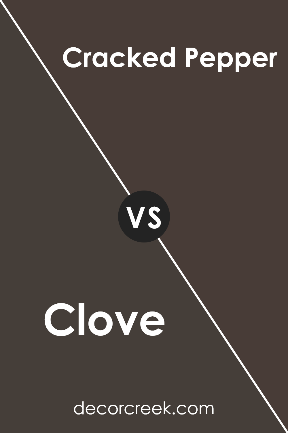
Clove SW 9605 by Sherwin Williams vs Cracked Pepper SW 9580 by Sherwin Williams
Clove and Cracked Pepper , both from Sherwin Williams, present an intriguing contrast within the neutral color palette. Clove embodies a deep, warm, earthy hue, reminiscent of the spice it’s named after. This color exudes a comforting, enveloping sensation, making spaces feel cozy and grounded.
It’s an ideal choice for creating an inviting and serene ambiance, perfect for living rooms or bedrooms where a soothing effect is desired.
On the other hand, Cracked Pepper steps into the realm with a bold, almost stark character. This color leans towards a sophisticated, deep gray with a strong presence, offering a contemporary edge. It’s markedly cooler compared to the warmth of Clove, providing a chic and modern feel.
Cracked Pepper is versatile, fitting well in spaces that aim for a statement, from sleek kitchens to elegant office spaces.
Together, Clove and Cracked Pepper showcase the versatility of neutral colors, offering warmth and modernity, respectively. Their distinct qualities allow them to be either complementary in a space that seeks balance or individually as focal points that cater to specific moods and styles.
You can see recommended paint color below:
- SW 9580 Cracked Pepper
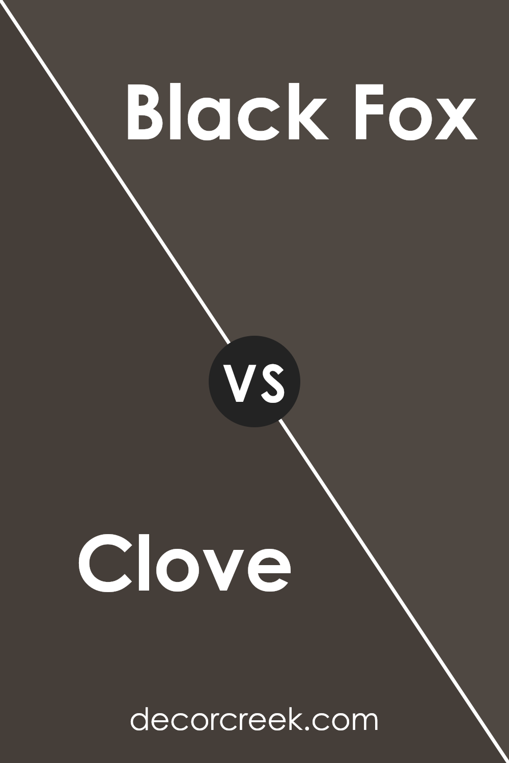
Clove SW 9605 by Sherwin Williams vs Black Fox SW 7020 by Sherwin Williams
Clove and Black Fox , by Sherwin Williams, are two distinct shades that cater to different aesthetic preferences. Clove presents itself as a warm, deep hue leaning towards a brown with a subtle hint of mauve, offering a cozy and inviting ambiance.
Its richness ensures a sophisticated backdrop that pairs well with both vibrant and earthy color palettes, making it versatile for various design styles from modern to rustic.
On the other hand, Black Fox ventures into the territory of boldness with its dark charcoal base, infused with an understated brown to soften its impact. This shade exudes elegance and strength, making it an ideal choice for accent walls or furniture to create a statement.
While both colors embody a sense of depth and complexity, Clove adds warmth and a touch of femininity to a space, whereas Black Fox provides a stark, dramatic flair, showcasing a more masculine energy. Together, they can harmonize within a design, offering balance between warmth and dramatic intensity.
You can see recommended paint color below:
Clove SW 9605 by Sherwin Williams vs Darkroom SW 7083 by Sherwin Williams
Clove and Darkroom , both by Sherwin Williams, present intriguing options for those looking to imbue their space with character and depth. Clove is a warm, earthy hue that radiates a sense of coziness and comfort, akin to the spice after which it is named.
This color lends itself well to creating inviting, serene spaces, making it an excellent choice for living areas or bedrooms where a calming effect is desired.
In contrast, Darkroom offers a more dramatic flair. As a deeper, more intense shade, it evokes a sense of mystery and sophistication. This color is particularly adept at adding a bold statement to spaces, suitable for accent walls or rooms where a strong, captivating presence is desired.
It can also be used effectively to contrast with lighter, more neutral tones, providing a dynamic visual interest.
When comparing the two, it’s evident that Clove provides a soft, warm embrace, ideal for those seeking comfort and warmth in their décor. On the other hand, Darkroom is the go-to for an edgier, more striking ambiance.
Despite their differences, both colors share the capability to enrich a space with their distinct personalities, making the choice between them dependent on the desired atmosphere and aesthetic appeal.
You can see recommended paint color below:
- SW 7083 Darkroom
Conclusion
Clove SW 9605 by Sherwin Williams embodies a depth and warmth that brings a unique coziness to any space it graces. As a color, it strikes a beautiful balance between sophistication and earthy, creating an inviting atmosphere that’s both calming and rich in character.
Its versatility allows it to blend seamlessly with a variety of decor styles, from rustic to modern, making it a favored choice for designers looking to add a touch of elegance without overwhelming a room’s aesthetic.
The allure of Clove SW 9605 lies in its ability to infuse spaces with a sense of serenity and warmth, making it perfect for creating focal points in living areas or adding depth to bedrooms.
Its understated beauty complements a wide range of complementary colors, from soft neutrals to more vibrant hues, allowing for creative and personalized interior designs.
This color not only enhances the visual appeal of a space but also contributes to creating a welcoming and comforting ambiance, establishing it as a go-to choice for those looking to transform their living or working environments.
Ever wished paint sampling was as easy as sticking a sticker? Guess what? Now it is! Discover Samplize's unique Peel & Stick samples.
Get paint samples