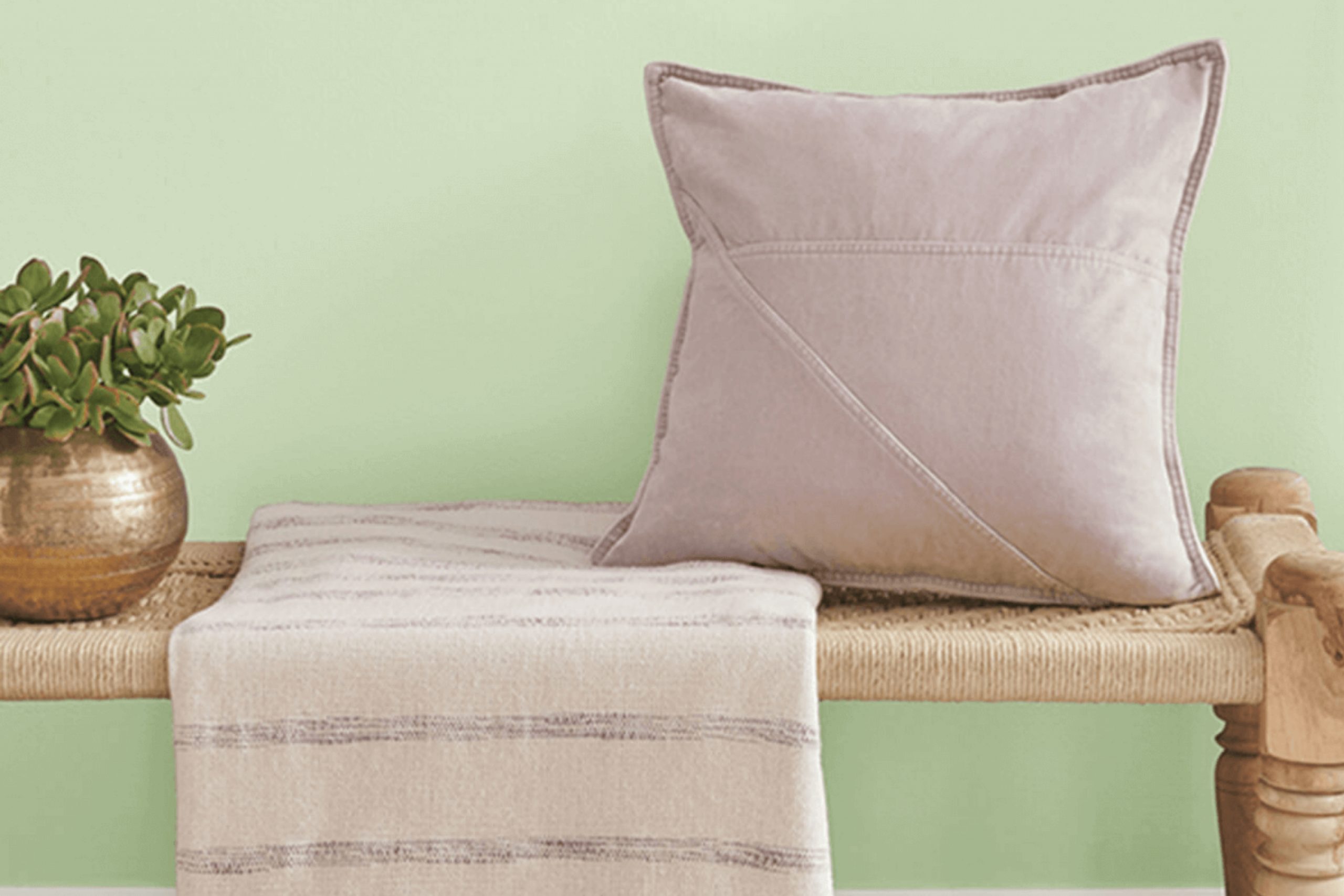
When I started painting with the color SW 6722 Cucumber by Sherwin Williams, it immediately changed my room. The vibrant, lively hue brings a fresh energy to any area, making it feel more open and inviting. This soft yet vibrant green strikes a perfect balance, offering both a sense of calm and a splash of creativity. It reminds me of new beginnings and the fresh growth of spring, a perfect way to breathe life into my home.
On walls or even as an accent, SW 6722 Cucumber manages to capture that sweet spot between relaxation and invigoration. The gentle green carries an organic charm while also providing versatility, pairing seamlessly with a variety of colors and materials. It sits beautifully alongside neutrals, adding a touch of nature and warmth without too intense the senses.
Whether used for an entire room or as an unexpected pop of color, this shade never fails to bring a sense of freshness. It’s like a breath of fresh air, ushering comfort and positivity into the area. It’s truly interesting how a simple color choice can shape the mood and atmosphere.
As I apply each stroke, I realize how much this shade reflects the simplicity and beauty of nature itself.
What Color Is Cucumber SW 6722 by Sherwin Williams?
Cucumber SW 6722 by Sherwin Williams is a refreshing, light green color that adds a natural touch to any room. It is reminiscent of a cool, crisp cucumber, bringing a sense of freshness and vitality. This shade works beautifully in contemporary and modern interior styles, adding a touch of nature without being too intense in the room. It is a great choice for kitchens, living rooms, or bathrooms where you want a hint of color and energy.
In terms of pairing, Cucumber SW 6722 works well with materials like light woods, which complement its fresh hue. Consider using it alongside oak or maple furniture to create a breezy, inviting atmosphere.
White or light gray accents can help balance the color, keeping the room feeling bright and open. Textiles like linen and cotton in neutral shades can soften the green, providing a cozy contrast. Metal fixtures in brushed nickel or matte black can further complement the color, adding a modern touch without clashing.
This green color also pairs nicely with houseplants, boosting the natural feel of the room. Incorporating soft texture elements, such as wool rugs or woven baskets, can enhance the homey feel, making Cucumber SW 6722 an ideal choice for relaxed and welcoming interiors.
Is Cucumber SW 6722 by Sherwin Williams Warm or Cool color?
Cucumber SW 6722 by Sherwin Williams is a fresh, lively green that can instantly brighten up any area. This color is ideal for rooms where you want to create a cheerful and inviting atmosphere. Its crisp shade resembles that of a freshly sliced cucumber, making it perfect for kitchens, bathrooms, or even a sunroom.
This color works well with natural light, enhancing the room’s brightness. It pairs nicely with white or light wood tones, offering a clean and natural look. In living rooms or bedrooms, Cucumber SW 6722 can be used as an accent wall, bringing a bit of nature indoors.
It also complements well with soft blues, yellows, and neutrals, offering flexibility in design. Keep in mind, though, that it’s important to balance this vibrant shade with other colors in your decor to avoid being too intense in the room. Overall, this fresh green adds energy and freshness to home interiors.
Undertones of Cucumber SW 6722 by Sherwin Williams
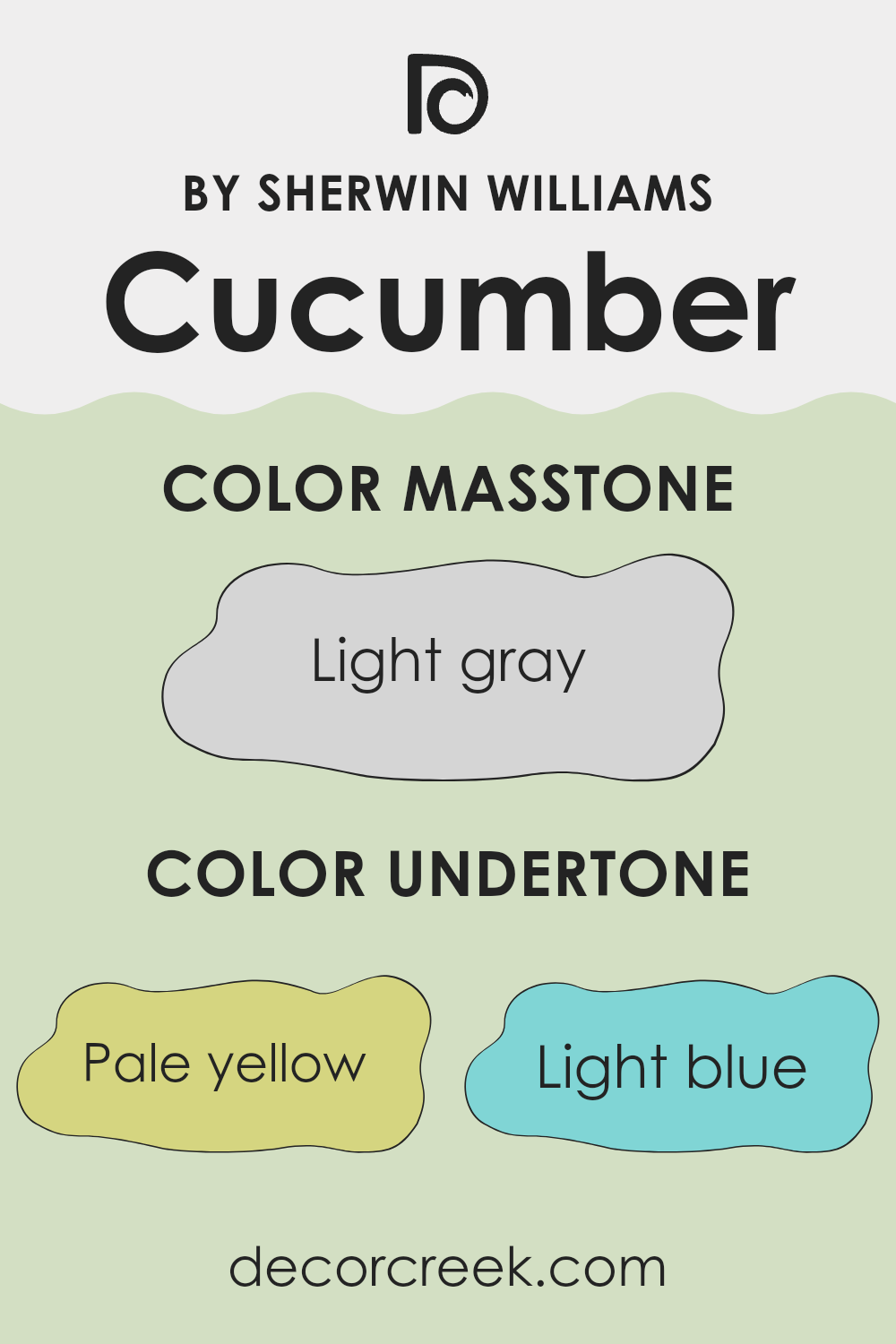
Cucumber SW 6722 by Sherwin Williams is a fresh, lively shade of green with several interesting undertones that affect how it appears on interior walls. When a color has undertones, it means these subtle shades can influence how the main color is perceived. For Cucumber, the pale yellow and mint undertones can make the green feel brighter and more cheerful, giving a room a sunny and uplifting vibe.
The light blue and light purple undertones add a coolness to the color, helping the room feel more restful and balanced. These undertones can be more noticeable in natural light, making the room feel airy and refreshing. On the other hand, the pale pink and lilac undertones bring a hint of warmth and depth, which can add coziness, especially under artificial lighting.
The grey undertone helps to tone down the brightness of the green, giving it a more subdued and refined look that can work well in both traditional and modern areas. Overall, the mix of these undertones makes Cucumber an adaptable choice for adding a touch of nature and energy to interiors, while still maintaining a soothing environment.
The color shifts gently depending on lighting and furnishings, making it adaptable to various design styles.
What is the Masstone of the Cucumber SW 6722 by Sherwin Williams?
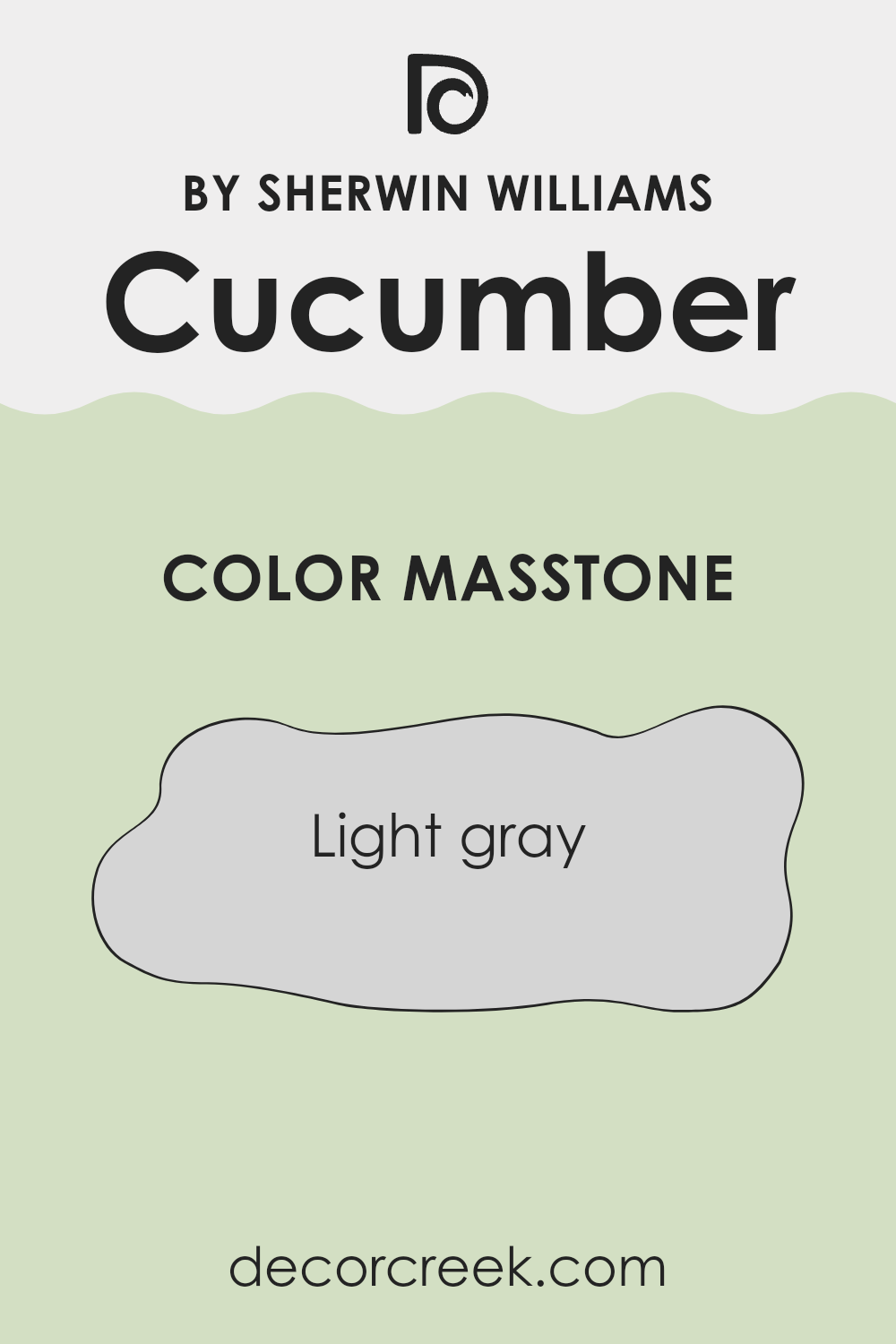
Cucumber SW 6722 by Sherwin Williams has a masstone of light gray (#D5D5D5), which plays a significant role in how the color appears in homes. The light gray masstone provides a neutral and soft backdrop, making Cucumber SW 6722 adaptable for various interiors.
It helps diffuse natural and artificial light evenly across a room, creating a bright and airy atmosphere. This subtle color allows other elements in the home, such as furniture, artwork, and decorative pieces, to stand out without clashing.
The light gray undertones are comforting and can help make a room feel more open and expansive, which is particularly useful in smaller rooms or in areas with limited natural light. This makes it suitable for living rooms, bedrooms, and even kitchens. The neutrality of the light gray also pairs well with both warm and cool color palettes, giving homeowners flexibility in decorating and changing themes over time.
How Does Lighting Affect Cucumber SW 6722 by Sherwin Williams?
Lighting plays a big role in how colors appear in a room. Different types of light can change how we see colors, making them look brighter, duller, warmer, or cooler. The color Cucumber SW 6722 by Sherwin Williams, for example, can look different depending on the kind of light it receives.
In natural light, Cucumber SW 6722 generally appears fresh and crisp. The green tones are more visible and true to their shade. However, the direction the room faces changes how this color looks. In north-facing rooms, which tend to have cooler and softer natural light, Cucumber SW 6722 can look a bit more muted and subdued. The green might seem a little grayish or cooler because of the cool light coming in.
In south-facing rooms, the light is warmer and usually more intense, which can make Cucumber SW 6722 appear warmer and more vibrant. The natural warmth enhances the green, making it feel sunny and lively.
East-facing rooms get bright, clear light in the morning, and Cucumber SW 6722 will look fresh and energetic during these hours. However, as the sun moves, the color might start to look a bit more neutral or dim by the afternoon.
West-facing rooms experience softer, more orange-tinted light in the evening. During this time, Cucumber SW 6722 can appear warmer and slightly golden, changing how it feels in the room.
Under artificial lighting, the type of bulb influences this color. Incandescent lights, which are warm, may make Cucumber SW 6722 look cozy and slightly yellowish. On the other hand, fluorescent lights, which are cooler, can make it appear brighter but may dull the warmth.
LED lights, depending on whether they are warm or cool, can shift the appearance of this green either way. Understanding lighting can help determine how this hue will fit into a specific room’s ambiance.
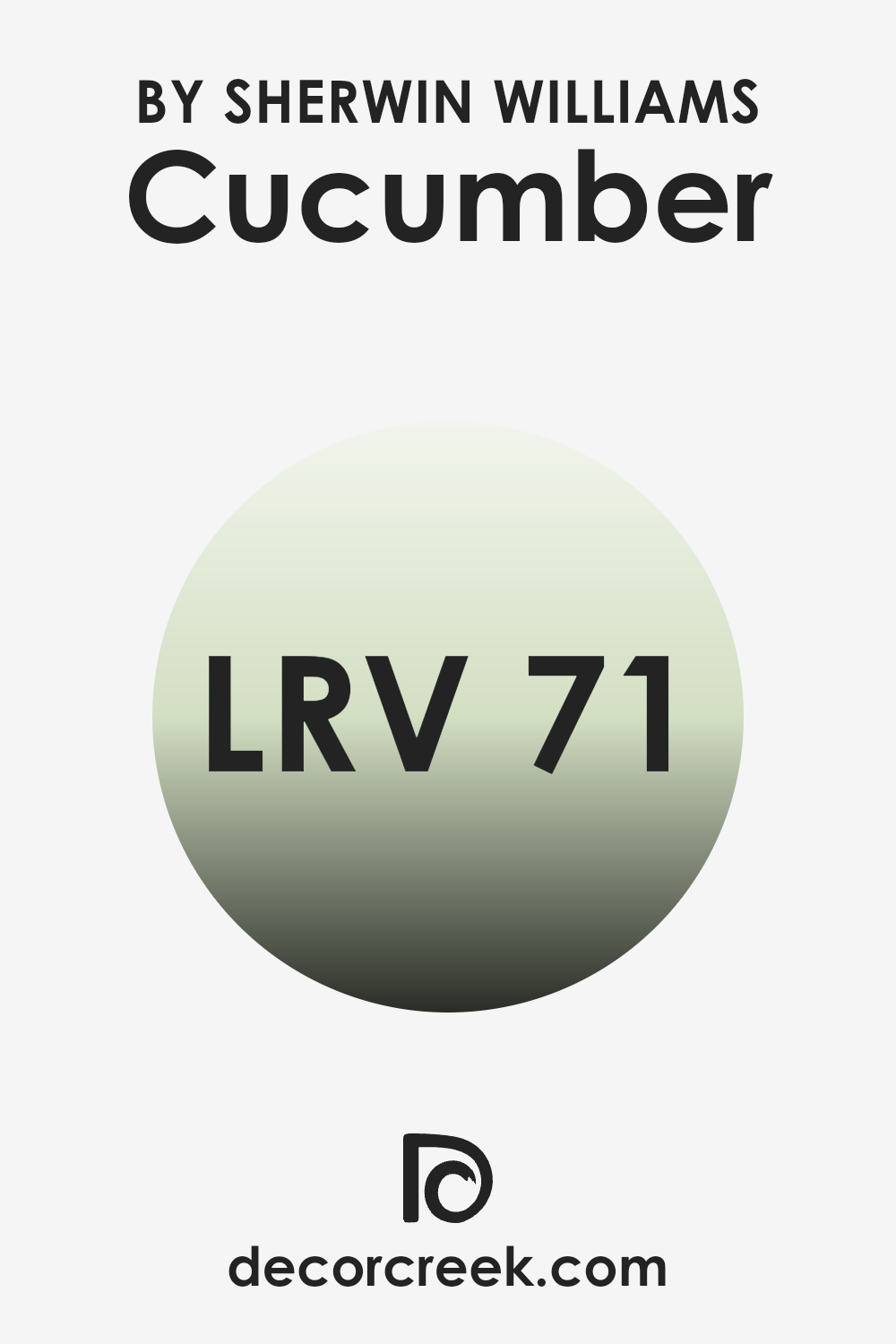
What is the LRV of Cucumber SW 6722 by Sherwin Williams?
Light Reflectance Value, or LRV, is a measurement used in the paint industry to express the amount of light a color reflects. It ranges from 0, which is absolute black and absorbs all light, to 100, which is pure white and reflects all light. Understanding the LRV of a color helps people predict how light or dark a color will appear once applied to a surface.
A higher LRV means that the color reflects more light and will likely make a room feel brighter and more open. Conversely, a lower LRV means the color absorbs more light, which can make a room feel more intimate or cozy.
For Cucumber, with an LRV of 70.71, this indicates that it is on the lighter side of the scale. This means it will reflect a significant amount of light and will generally make an area feel more spacious and airy. In a room with ample natural light, this color can enhance the brightness and create a fresh, open atmosphere.
In smaller or darker areas, the high light reflectance can help to keep the room from feeling cramped or dim. It’s a great choice for those looking to maintain a light and bright feel in their home, making rooms seem more welcoming and cheerful.
Coordinating Colors of Cucumber SW 6722 by Sherwin Williams
Coordinating colors are carefully chosen hues that complement each other when used together, creating a harmonious and visually pleasing look in a room. When considering colors that go well with Sherwin Williams’ Cucumber SW 6722, it’s important to think about how these shades interact.
Cucumber is a fresh, green hue that brings a touch of nature indoors, and it pairs beautifully with colors like Pineapple Cream, Sprout, and Frosted Emerald. Each of these colors has its unique charm and, when combined, they can enhance the overall ambiance.
Pineapple Cream, with its warm, soft yellow tone, adds a cozy and inviting feel to any room. It’s like a touch of sunshine, brightening areas and harmonizing well with the coolness of Cucumber. Sprout, another coordinating color, is a gentle, earthy green that blends naturally with Cucumber, adding depth without being too intense.
Frosted Emerald, a more vibrant green shade, brings energy and life, creating a perfect contrast while still maintaining a cohesive look. Together, these colors work in tandem to create a balanced and seamless design palette, making your room feel both lively and comfortable.
You can see recommended paint colors below:
- SW 1668 Pineapple Cream
- SW 6427 Sprout
- SW 9035 Frosted Emerald

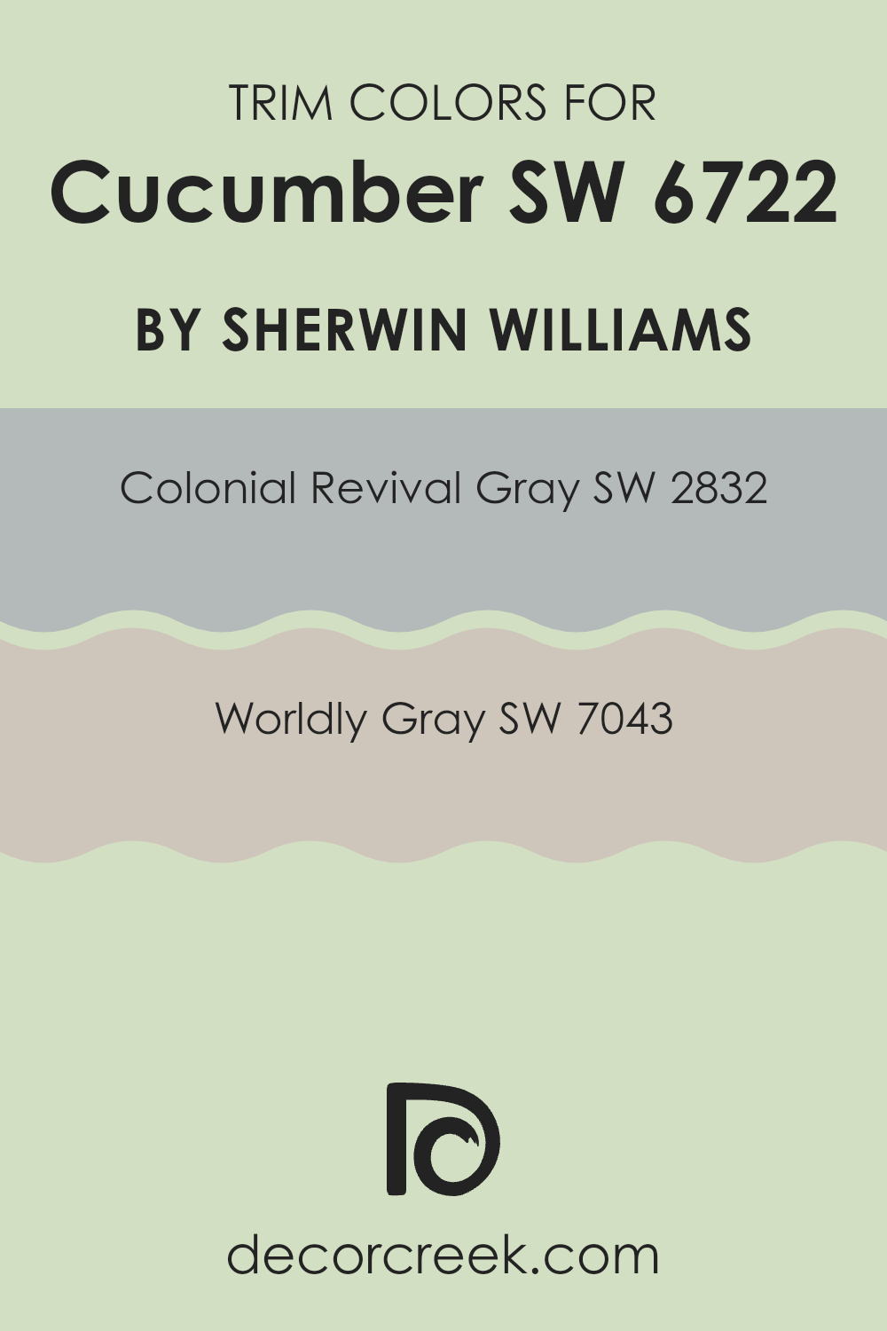
What are the Trim colors of Cucumber SW 6722 by Sherwin Williams?
Trim colors are the hues used to paint the edges and frames around doors, windows, ceilings, and baseboards, helping to define the room’s architectural details. They are crucial in enhancing the overall look and feel of a room because they provide a contrast or complement to the main wall color, like Cucumber SW 6722 by Sherwin Williams.
This soft, subtle green makes for a gentle and calming wall color, perfect for living room a and bedrooms. Choosing the right trim colors can help highlight the Cucumber shade and provide a beautifully balanced and cohesive interior atmosphere.
SW 2832 – Colonial Revival Gray and SW 7043 – Worldly Gray are excellent options for trim with Cucumber SW 6722. Colonial Revival Gray is a softly muted gray with a hint of blue, offering a cool contrast that can subtly highlight architectural features. On the other hand, Worldly Gray is a warm, earthy gray that brings a touch of elegance and complements the natural green of Cucumber. Both trims add depth and interest without being too intense against the main Cucumber color, allowing for a beautifully finished room with a professional look.
You can see recommended paint colors below:
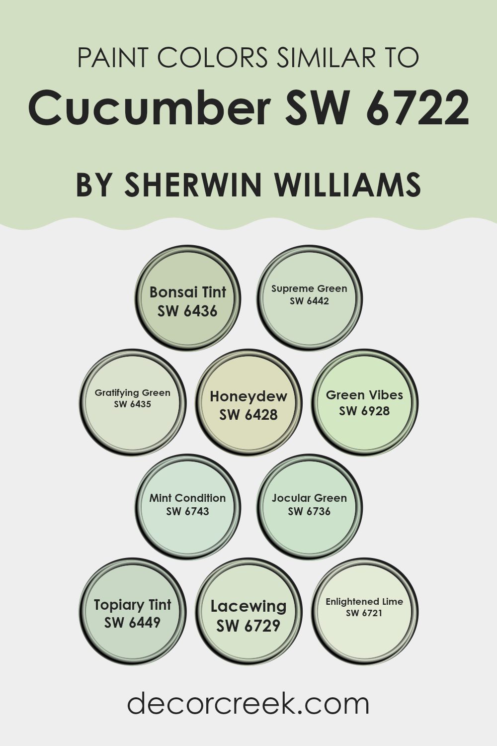
Colors Similar to Cucumber SW 6722 by Sherwin Williams
Similar colors are important in design because they create a harmonious and cohesive look. They help tie together different elements in a room, making it feel balanced and unified. For instance, the color Cucumber by Sherwin Williams is a refreshing shade that can be complemented beautifully by its similar colors, which offer subtle variations without clashing.
SW 6436 – Bonsai Tint is a gentle, muted green, like a whisper of nature in your room. SW 6442 – Supreme Green features a more vibrant and lively hue, bringing energy into any setting.
SW 6435 – Gratifying Green has an earthy tone, grounding your environment with its natural feel. SW 6428 – Honeydew is a lighter, sweet green that feels fresh and clean, perfect for brightening up corners. If you’re looking for something bold, SW 6928 – Green Vibes offers a playful touch.
SW 6743 – Mint Condition presents a soft, minty freshness that’s cool and inviting. SW 6736 – Jocular Green adds a cheerful note with its fun and whimsical green.
Meanwhile, SW 6449 – Topiary Tint provides a refined touch with its deep, rich shade. SW 6729 – Lacewing is breezy and light, while SW 6721 – Enlightened Lime offers a zestful and refreshing splash.
Together, these colors create an inviting palette that can enhance any room.
You can see recommended paint colors below:
- SW 6436 Bonsai Tint
- SW 6442 Supreme Green
- SW 6435 Gratifying Green
- SW 6428 Honeydew
- SW 6928 Green Vibes
- SW 6743 Mint Condition
- SW 6736 Jocular Green
- SW 6449 Topiary Tint
- SW 6729 Lacewing
- SW 6721 Enlightened Lime
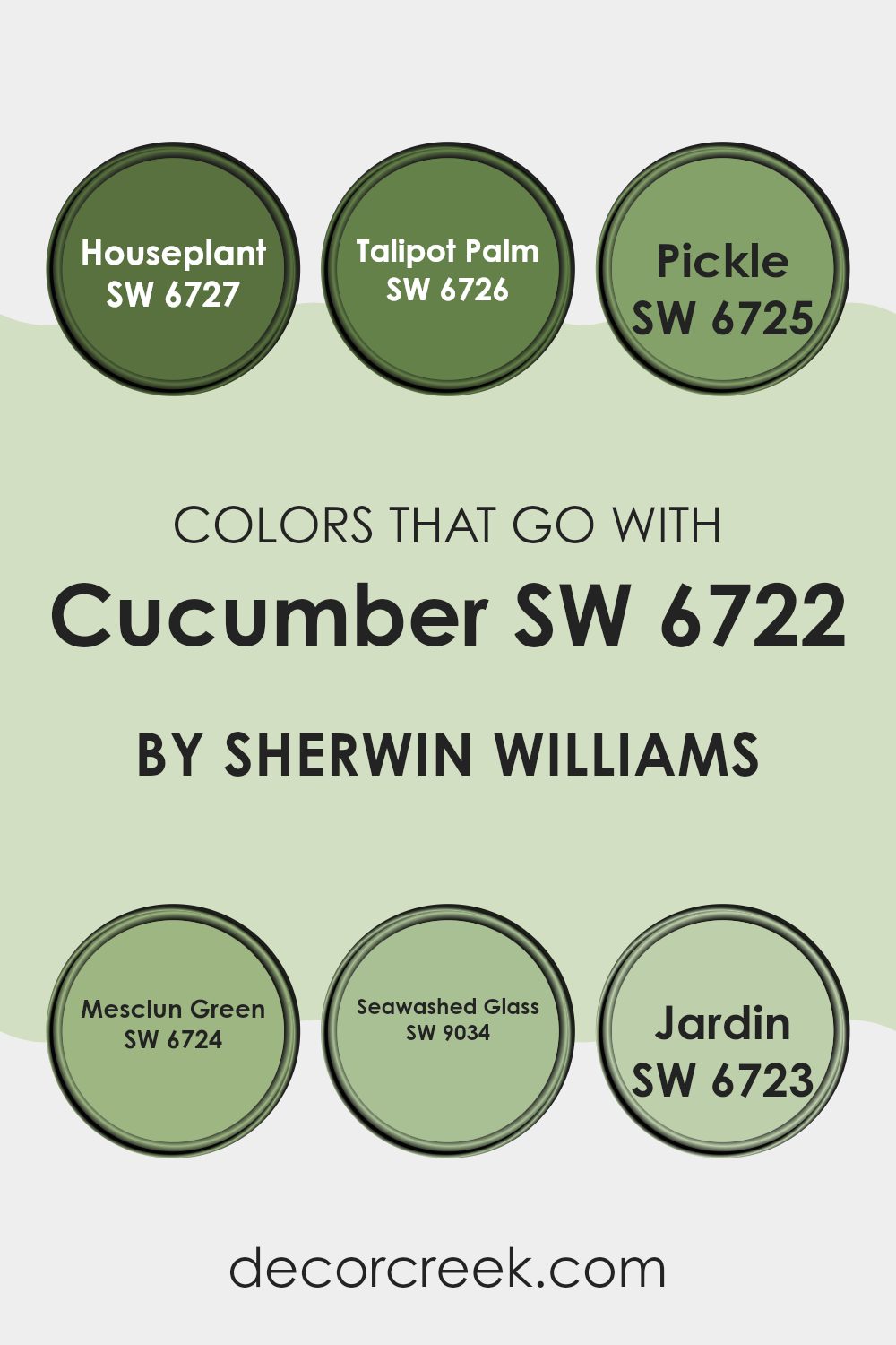
Colors that Go With Cucumber SW 6722 by Sherwin Williams
Cucumber SW 6722 by Sherwin Williams is a refreshing, light green color that brings a sense of nature into any room. Choosing colors that work well with it is important for creating a cohesive, visually pleasing environment.
Complementary colors can enhance the main shade and make a room feel balanced. SW 6727 – Houseplant is a deeper shade of green, bringing to mind rich foliage, and pairs beautifully as an accent or trim. Its boldness makes it excellent for adding depth. SW 6726 – Talipot Palm also enriches the room with its lush, jungle-inspired tone, perfect for a tropical vibe.
SW 6725 – Pickle is a playful, earthy green that adds warmth and can make for a charming contrast when used with Cucumber. SW 6724 – Mesclun Green is a mid-tone green that creates balance with its soft vibrancy. This shade works well on walls or furniture to keep things lively yet soothing.
SW 9034 – Seawashed Glass has a touch of blue, lending a breezy freshness to any room and harmonizing beautifully with Cucumber’s natural feel. Lastly, SW 6723 – Jardin is vibrant and invigorating, perfect for adding a burst of life to rooms needing energy, enhancing the fresh, clean character that Cucumber brings.
You can see recommended paint colors below:
- SW 6727 Houseplant
- SW 6726 Talipot Palm
- SW 6725 Pickle
- SW 6724 Mesclun Green
- SW 9034 Seawashed Glass
- SW 6723 Jardin
How to Use Cucumber SW 6722 by Sherwin Williams In Your Home?
Cucumber SW 6722 by Sherwin Williams is a refreshing and lively shade of green. It can bring a sense of life and freshness into your home. This color works great in kitchens and dining rooms, as it evokes the natural feel of fresh produce.
In a kitchen, it can pair well with white cabinets and light-colored countertops, giving the room a bright and airy feel. If you’re considering it for a living room, combine it with neutral colors for furniture and décor to create a balanced look.
Cucumber green is also a lovely choice for a child’s room, adding a playful and cheerful vibe. For exterior areas, it can be an excellent choice for accent doors or shutters, providing a pop of color that is inviting and cheerful. Overall, Cucumber SW 6722 is an adaptable color that can add a lively touch to various rooms in your home.
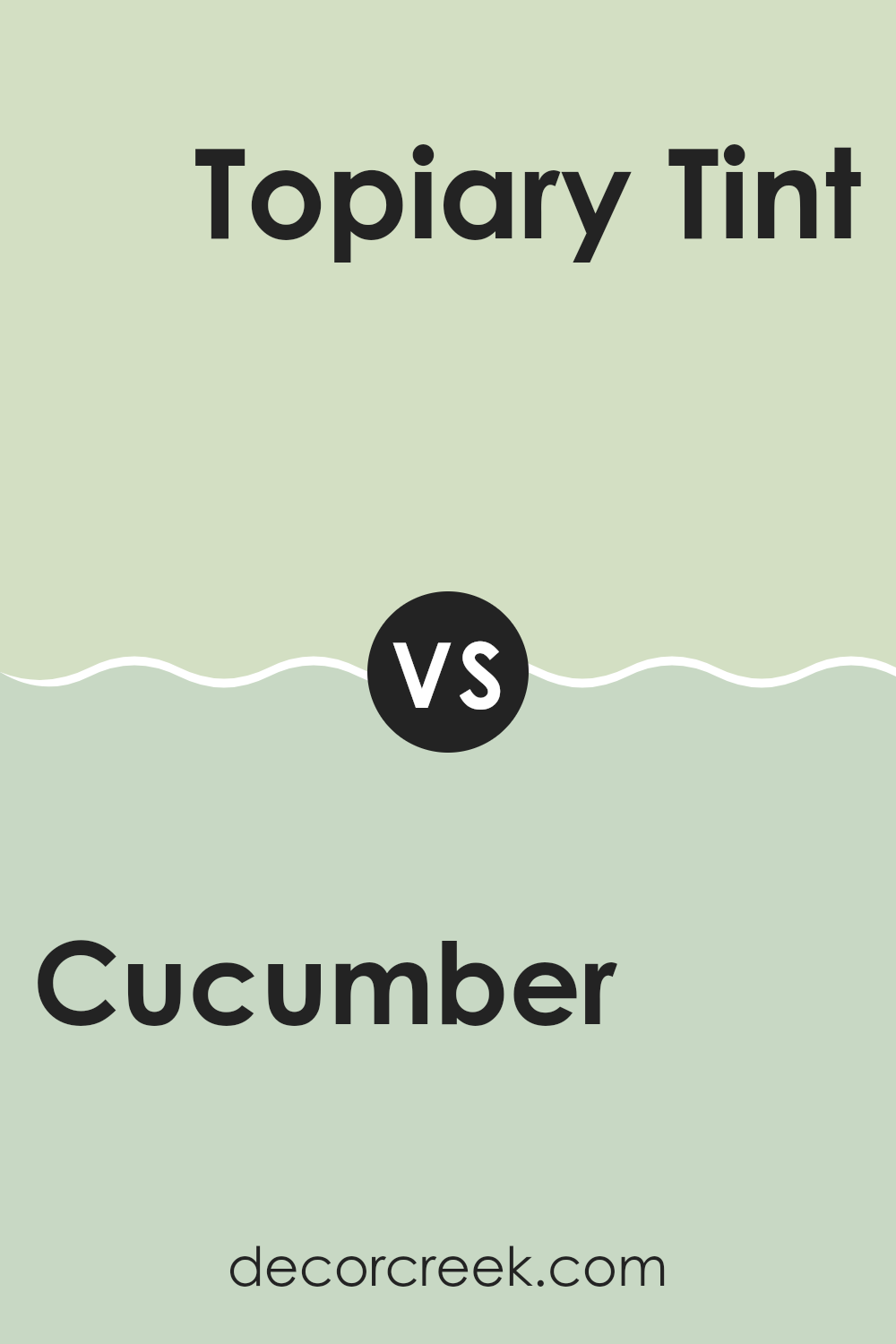
Cucumber SW 6722 by Sherwin Williams vs Topiary Tint SW 6449 by Sherwin Williams
Cucumber SW 6722 and Topiary Tint SW 6449 are two refreshing colors by Sherwin Williams. Cucumber is a light, soft green that feels fresh and lively. It’s similar to the color of the inside of a cucumber, offering a bright and natural touch. This shade can bring a sense of calm to an area and works well in rooms that aim for a clean and airy vibe.
On the other hand, Topiary Tint is a slightly deeper green. It has a bit more intensity and warmth compared to Cucumber. Topiary Tint might remind you of a well-manicured garden or the leaves of a lush shrub. This color adds coziness and can create a more intimate feeling in a room.
Both colors are adaptable and can be used in various settings, but Cucumber is better for modern, light rooms, while Topiary Tint suits areas needing a bit more warmth and depth.
You can see recommended paint color below:
- SW 6449 Topiary Tint
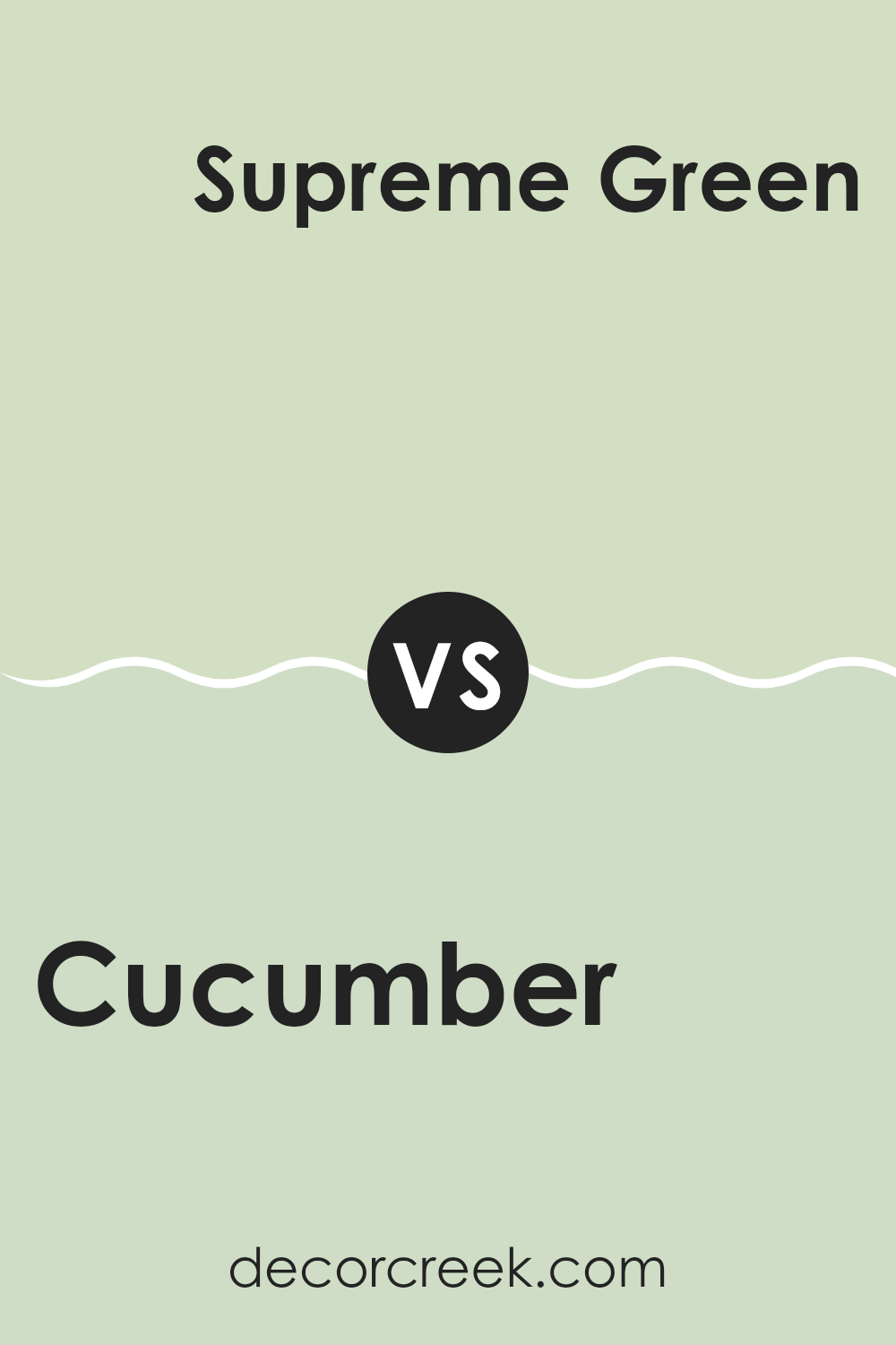
Cucumber SW 6722 by Sherwin Williams vs Supreme Green SW 6442 by Sherwin Williams
Cucumber SW 6722 and Supreme Green SW 6442 are two distinct shades of green offered by Sherwin Williams. Cucumber is a softer, more muted green with a fresh and light feel. It brings to mind the crispness of cucumbers, offering a gentle and calming effect to an area. This color works well in rooms where you want a light, airy atmosphere.
On the other hand, Supreme Green is a deeper and more intense shade. It is a bolder, richer green that can add a strong pop of color to a room. This color is vibrant and makes a statement, perfect for creating a lively and energetic room.
Both colors bring a natural feel, but Cucumber is more subdued, while Supreme Green is more vivid and prominent. Your choice between these greens would depend on whether you prefer a calm and refreshing look or a dynamic and lively interior.
You can see recommended paint color below:
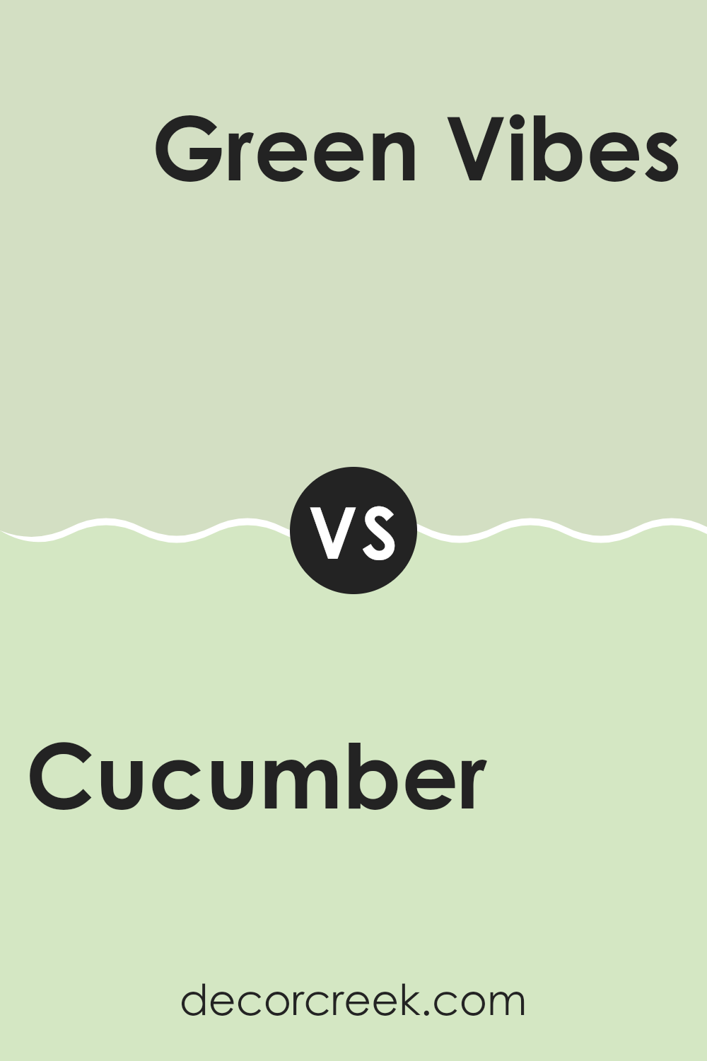
Cucumber SW 6722 by Sherwin Williams vs Green Vibes SW 6928 by Sherwin Williams
Cucumber (SW 6722) and Green Vibes (SW 6928) are both refreshing shades of green by Sherwin Williams, but they have distinct characteristics. Cucumber is a subtle, soft green that feels light and airy. It’s an adaptable color, bringing a fresh and calming feel to a room.
It’s great for creating a soothing environment in bedrooms or living rooms. On the other hand, Green Vibes is a more bold and lively green, offering a strong, vibrant look. This color can energize a room and is perfect for areas where you want to make a statement or inject some energy, like a kitchen or an accent wall.
While Cucumber is more muted and calming, Green Vibes stands out with its intensity. Both colors can be used effectively, depending on whether you want a more relaxed or dynamic atmosphere.
You can see recommended paint color below:
- SW 6928 Green Vibes
Cucumber SW 6722 by Sherwin Williams vs Jocular Green SW 6736 by Sherwin Williams
Cucumber SW 6722 and Jocular Green SW 6736 by Sherwin Williams are both green shades, but they offer different vibes. Cucumber is a lighter, softer green that feels fresh and subtle. It’s perfect if you want a color that adds just a hint of nature to a room without being too intense. Its pale tone makes it adaptable and easy to pair with other colors.
On the other hand, Jocular Green is much bolder and more vibrant. It’s a rich green that grabs attention and adds energy to a room. This color works well for those seeking a lively and cheerful atmosphere. It can become the focal point of a room due to its striking hue, making it a great choice for accent walls or main areas where you want to make a statement.
Together, Cucumber offers calm simplicity, while Jocular Green brings bold joyfulness.
You can see recommended paint color below:
- SW 6736 Jocular Green
Cucumber SW 6722 by Sherwin Williams vs Honeydew SW 6428 by Sherwin Williams
Cucumber (SW 6722) by Sherwin Williams is a fresh, vibrant green that can make any room feel lively and invigorating. It’s like the bright green of a garden after a rain, bringing a lively and refreshing vibe into an area. On the other hand, Honeydew (SW 6428) by Sherwin Williams is a much softer, pale green with a touch of warmth. It’s more subtle than Cucumber and feels light and airy, almost like a gentle breeze on a warm day.
Cucumber tends to be more of a statement color, ideal for accent walls or rooms where you want energy and a sense of cheerfulness. Honeydew, being softer, works well in creating a calm and welcoming atmosphere, perfect for bedrooms or living rooms where relaxation is key.
Both colors are green but serve different purposes; Cucumber energizes while Honeydew soothes, allowing for various design choices depending on the desired mood.
You can see recommended paint color below:
- SW 6428 Honeydew
Cucumber SW 6722 by Sherwin Williams vs Bonsai Tint SW 6436 by Sherwin Williams
Cucumber (SW 6722) by Sherwin Williams is a soft, refreshing shade of green that brings a lively and natural feel to a room. It’s like a breath of fresh air, reminiscent of spring leaves and youthful vibrance. Cucumber is an excellent choice if you want to add a touch of nature inside your home without being too intense.
Bonsai Tint (SW 6436) by Sherwin Williams, on the other hand, is a more subdued green. It’s gentle and muted, carrying a sense of peacefulness. This color leans towards a grayish-green, which makes it adaptable for pairing with neutrals and soft pastels.
While Cucumber is more vibrant and fresh, Bonsai Tint offers a quieter, more refined feel. Both colors bring nature indoors, but their differing tones can change the mood of a room significantly, with Cucumber being more lively and energizing, and Bonsai Tint providing a soft, calm ambiance.
You can see recommended paint color below:
Cucumber SW 6722 by Sherwin Williams vs Lacewing SW 6729 by Sherwin Williams
Cucumber and Lacewing are two refreshing shades of green by Sherwin Williams that can brighten up any room. Cucumber is a soft, muted green that brings a fresh, natural feel to an area. It has a subtle, calming quality that makes it an adaptable choice for various settings, whether it’s a living room or a kitchen. Lacewing, on the other hand, is a bit brighter and more lively. It has more of a yellow undertone, which gives it a cheerful and vibrant look.
When you use Cucumber, you create a peaceful and relaxed atmosphere. It pairs well with neutral colors, making it an excellent backdrop for other decor elements. Lacewing, with its more dynamic vibe, adds energy to a room. It works great as an accent color or in smaller areas like bathrooms to bring some zest.
Both colors bring a touch of nature indoors, but your choice will depend on the mood you want to set.
You can see recommended paint color below:
- SW 6729 Lacewing
Cucumber SW 6722 by Sherwin Williams vs Enlightened Lime SW 6721 by Sherwin Williams
Cucumber SW 6722 and Enlightened Lime SW 6721 by Sherwin Williams are both fresh, vibrant shades of green, but they offer distinct vibes. Cucumber is a soft, soothing green that can bring a sense of peacefulness and freshness to a room. It’s great for areas where you want a gentle, natural feel, like kitchens or bathrooms.
On the other hand, Enlightened Lime is brighter and more energetic. It’s a bold, invigorating shade that can add a lively touch to any area. This color works well in rooms where you want a pop of energy, such as playrooms or feature walls.
While both colors are green, Cucumber leans towards a milder undertone, making it more subtle, whereas Enlightened Lime is more daring and vivid. When choosing between them, consider the mood you want to create: calming and understated with Cucumber or lively and dynamic with Enlightened Lime.
You can see recommended paint color below:
- SW 6721 Enlightened Lime
Cucumber SW 6722 by Sherwin Williams vs Gratifying Green SW 6435 by Sherwin Williams
Cucumber, labeled as SW 6722 by Sherwin Williams, is a fresh and vibrant green. It feels lively, bringing a sense of nature into a room due to its light and bright tone. This color is reminiscent of fresh-cut cucumbers, offering an invigorating and uplifting atmosphere.
Gratifying Green, on the other hand, marked as SW 6435, is a more subdued and calming green. It’s a bit deeper and more muted compared to Cucumber. This makes Gratifying Green excellent for creating a relaxed and cozy environment, as it doesn’t grab attention immediately but rather settles gently into a room.
When comparing the two, Cucumber is like a breath of fresh air, ideal for energizing a room, whereas Gratifying Green lends a comforting, more peaceful vibe. Together, they can complement each other by balancing brightness with subtlety, depending on the desired ambiance of an area.
You can see recommended paint color below:
Cucumber SW 6722 by Sherwin Williams vs Mint Condition SW 6743 by Sherwin Williams
Cucumber SW 6722 and Mint Condition SW 6743 by Sherwin Williams are two lovely greens with distinct personalities. Cucumber is a fresh, crisp green reminiscent of the peel of a cucumber, offering a nice, clean brightness. It brings a natural and lively feel to a room, perfect for energizing areas like kitchens or bathrooms.
Mint Condition, on the other hand, is slightly lighter and softer, with a touch more blue in its undertone. It feels cooler and more calming, making it a great choice for bedrooms or living rooms where you want a more relaxed atmosphere.
While both colors are refreshing, Cucumber stands out with its slightly sharper tone. In contrast, Mint Condition has a soothing presence. Depending on the vibe you want in a room, Cucumber adds a bit more energy, while Mint Condition provides a peaceful and gentle environment.
You can see recommended paint color below:
- SW 6743 Mint Condition
After learning about SW 6722 Cucumber by Sherwin-Williams, I feel like I truly understand why this color is special. Imagine a shade of green that isn’t too bright but not dull either. It’s like a fresh cucumber, making it feel lively and clean. This color can make any room in the house look neat and welcoming.
When I think about using Cucumber in a bedroom, it feels like waking up in a garden. It’s calming, so you can start your day refreshed. In the living room, it can make the area look bright and happy, perfect for spending time with family and friends.
In kitchens, Cucumber can add a splash of life. It’s like having a bit of nature around, which can make cooking and eating more fun. It even works in offices, helping us feel alert and focused when we have work to do.
What I like most is how Cucumber matches with so many different colors. You can pair it with whites for a crisp look or mix it with dark colors to make it stand out. It’s flexible and can fit into any style, whether your home is modern or classic.
In short, SW 6722 Cucumber is not just a color; it’s a feeling that makes every room in the house feel fresh, inviting, and balanced. It reminds me that the right paint can change how we feel about a place.
Ever wished paint sampling was as easy as sticking a sticker? Guess what? Now it is! Discover Samplize's unique Peel & Stick samples.
Get paint samples

