The world of colors is both an art and a science. Whether you are a professional designer or a homeowner seeking to refresh your living space, choosing the right color can make a world of difference.
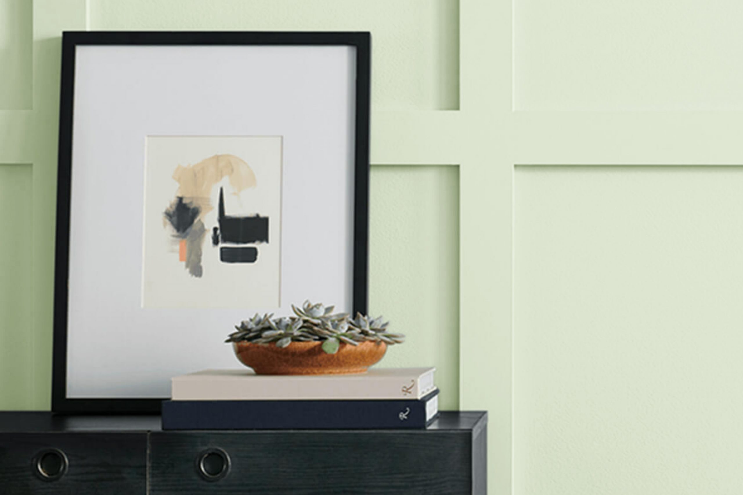
One such vibrant shade that has gained popularity in recent years is Sherwin-Williams’ SW 6435 Gratifying Green. Known for its refreshing and uplifting energy, Gratifying Green is a color that can bring any space to life.
What Color Is SW 6435 Gratifying Green? Is It a Warm Or Cool Color?
SW Gratifying Green is a medium-light shade of green in the yellow-green spectrum. As Hextoral says, it creates a serene and soothing atmosphere while also invigorating the space with its vibrant energy.
In the realm of color psychology, SW Gratifying Green is cool in nature. Cool colors are known for their calming and relaxing effect, and Gratifying Green is no exception, making it an excellent choice for creating a tranquil retreat.

Ever wished paint sampling was as easy as sticking a sticker? Guess what? Now it is! Discover Samplize's unique Peel & Stick samples.
Get paint samples

Undertones of SW 6435 Gratifying Green Paint Color
SW Gratifying Green is a complex hue with several undertones that add to its uniqueness.
- Yellow: This is the most prominent undertone that contributes to the vibrant energy of SW Gratifying Green.
- Blue: A subtle hint of blue adds a bit of coolness, balancing out the warmth of the yellow undertone.
- Gray: This slight undertone grounds the color, preventing it from being overly vibrant and keeping it versatile.
Now that you know its undertones, using this color will be easier for you.

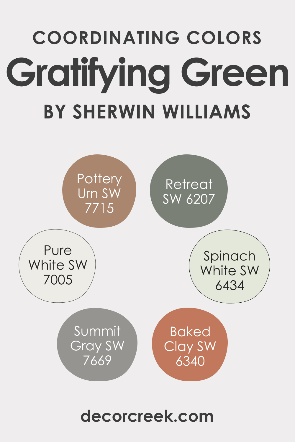
Coordinating Colors of SW 6435 Gratifying Green
For such a complex color as SW Gratifying Green, picking the correct coordinating colors can be challenging! This is why we have prepared several color recommendations you may find helpful:
- SW 6434 Spinach White : A delicate shade, Spinach White is a soft white with a hint of green, making it a perfect backdrop for Gratifying Green.
- SW 6207 Retreat : This deep, muted green-blue brings out the vibrancy of SW Gratifying Green and creates a natural harmony.
- SW 7715 Pottery Urn : An earthy, brown shade that grounds the vibrancy of SW Gratifying Green, Pottery Urn creates a balanced look.
Further expanding on this palette, here are three additional colors that pair beautifully with SW Gratifying Green:
- SW 7005 Pure White : Pure and crisp, this shade provides a fresh contrast to the vividness of SW Gratifying Green.
- SW 7669 Summit Gray : A warm, sophisticated gray accentuating the cool undertones of SW Gratifying Green.
- SW 6340 Baked Clay : A warm, terracotta color that adds a rustic charm and complements the lively energy of SW Gratifying Green.
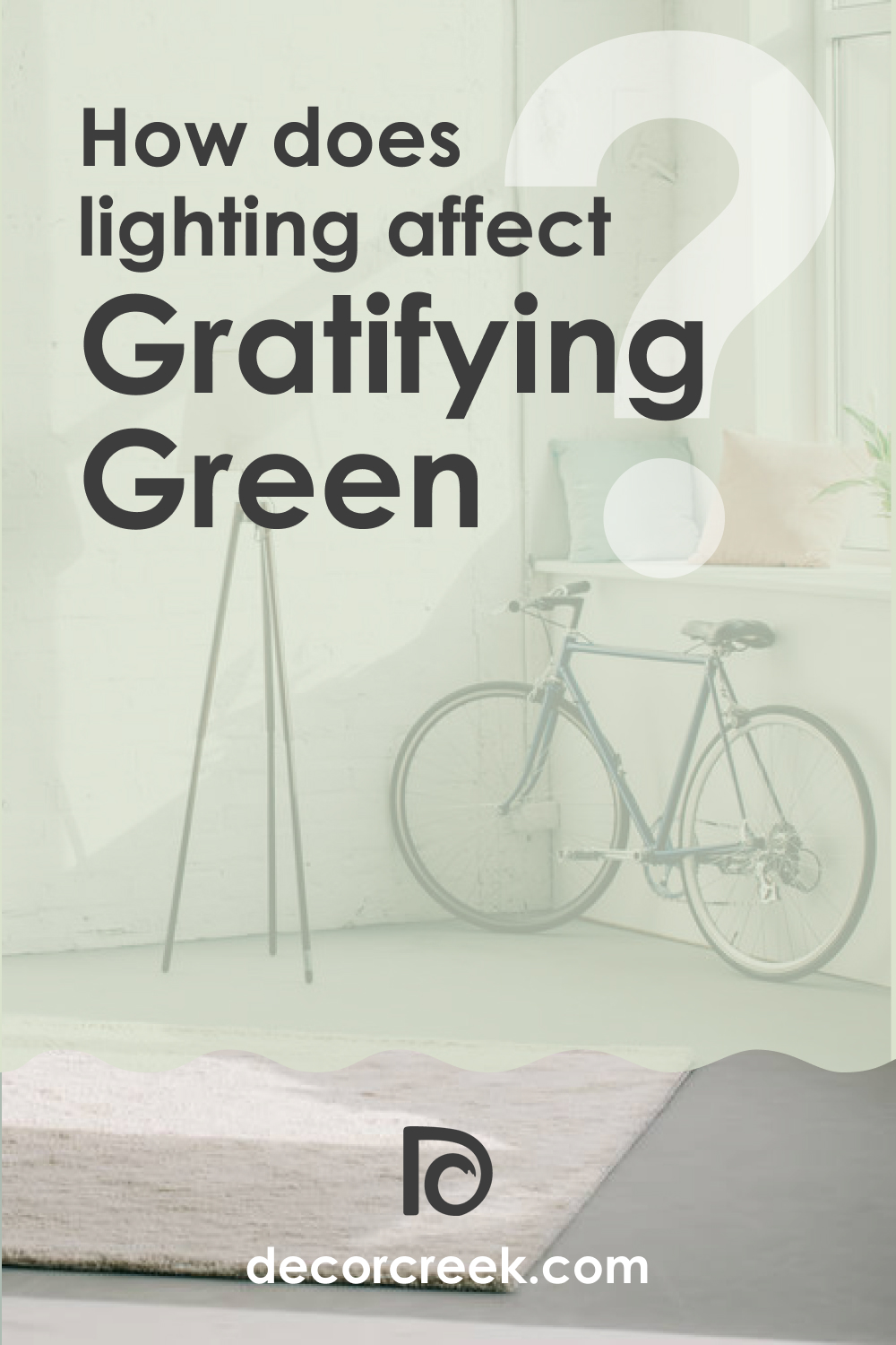
How Does Lighting Affect SW 6435 Gratifying Green Paint Color?
Lighting plays a crucial role in how we perceive colors. In natural light, SW Gratifying Green appears bright and full of life, exhibiting its vibrant yellow undertone. In contrast, artificial light enhances its blue and gray undertones, creating a softer and more tranquil ambience.
This shift in mood makes SW Gratifying Green a versatile color, suitable for spaces with varying lighting conditions.
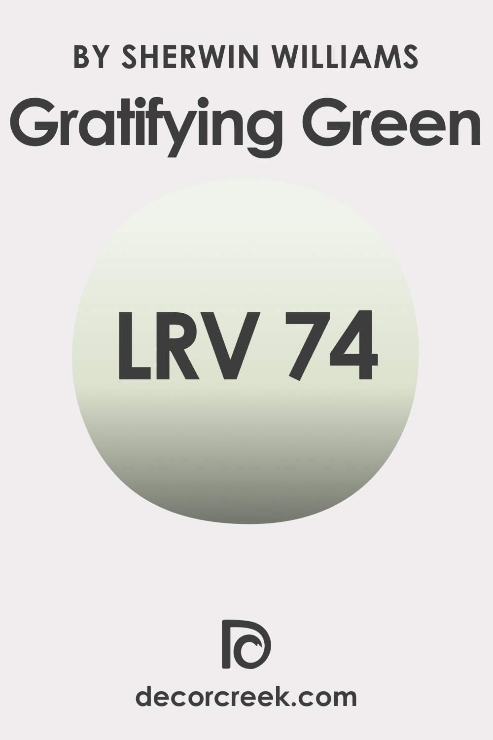
LRV of SW 6435 Gratifying Green Paint Color
LRV, or Light Reflectance Value, is a measurement of how much light a color reflects. The closer the LRV value to 100, the lighter and more reflective the color. Respectively, the lower the LRV value, approaching zero, the darker the hue.
With an LRV of 74, Gratifying Green is a fairly light color that can brighten up spaces while adding a splash of vibrant color. High-LRV colors like Gratifying Green can make a room feel larger and more open, making it an excellent choice for smaller spaces that need a sense of expansion.
Despite its vibrant hue, its high LRV ensures that Gratifying Green does not overwhelm a space but rather enhances it with a fresh and lively vibe.
LRV – what does it mean? Read This Before Finding Your Perfect Paint Color
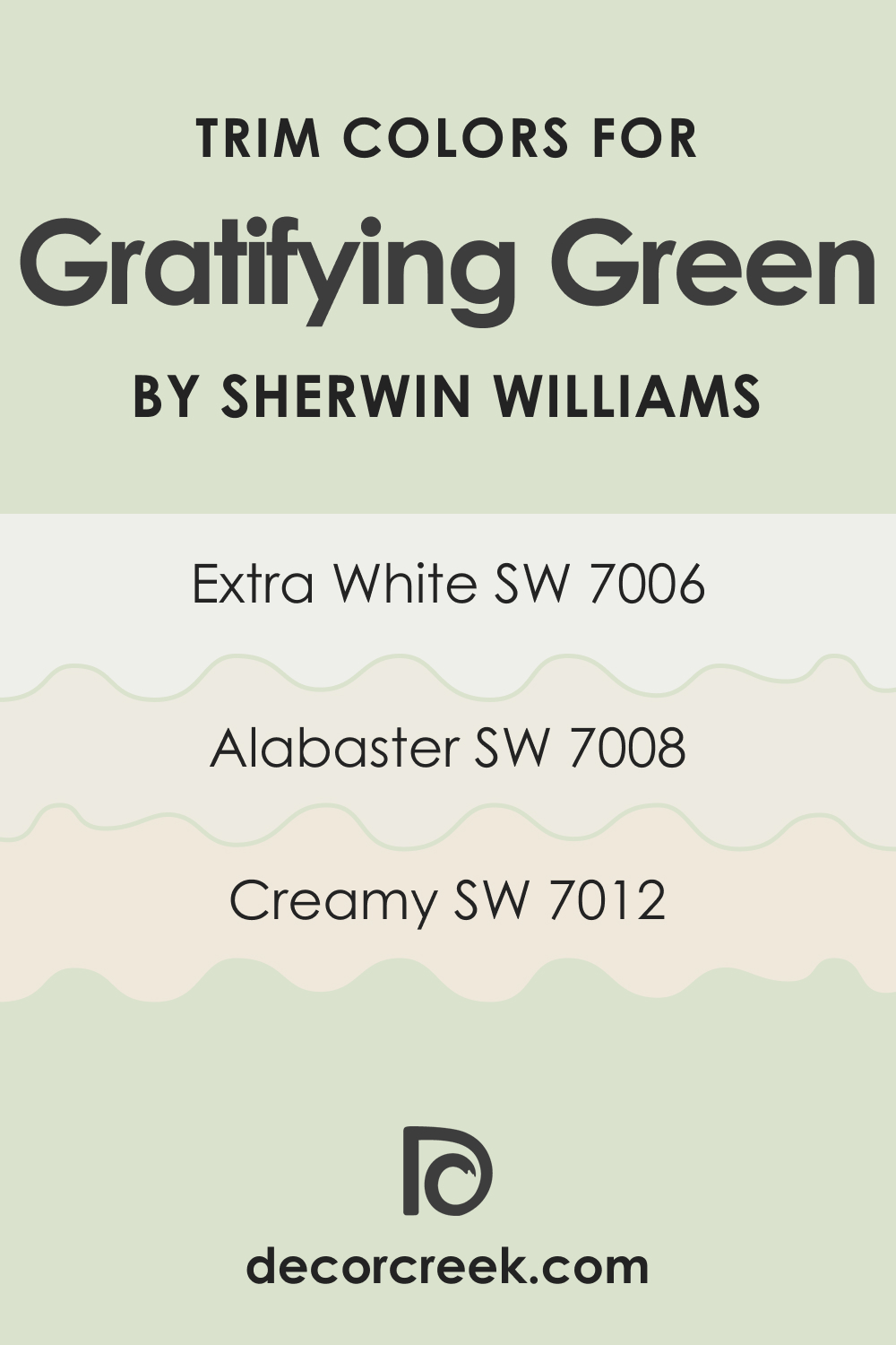
Trim Colors of SW 6435 Gratifying Green
Complementing Gratifying Green with the right trim color can create a striking contrast and enhance its vibrancy. Here are three Sherwin-Williams shades of white that pair well with Gratifying Green:
- SW 7006 Extra White : Pure and crisp, Extra White is a true white that provides a stark contrast, making Gratifying Green pop.
- SW 7008 Alabaster : A softer, warmer white that creates a more subtle and harmonious contrast.
- SW 7012 Creamy : A creamy, slightly yellow-toned white that echoes the yellow undertone of Gratifying Green, creating a harmonious look.
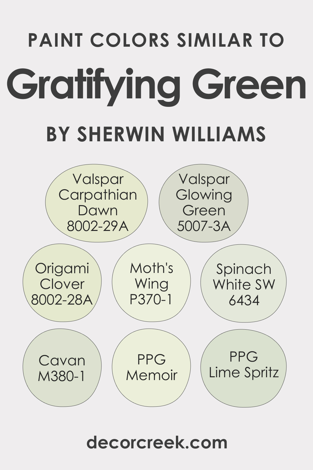
Colors Similar to SW 6435 Gratifying Green
If you realize you need a slightly different green hue than SW Gratifying Green, having a couple of alternative colors is always a good idea. When it comes to shades similar to Gratifying Green, Sherwin-Williams offers a plethora of choices:
- Valspar Origami Clover (8002-28A)
- Valspar Carpathian Dawn (8002-29A)
- Valspar Glowing Green (5007-3A)
- SW 6434 Spinach White
- Behr Cavan (M380-1)
- Behr Moth’s Wing (P370-1)
- PPG Lime Spritz
- PPG Memoir (PPG1220-1)
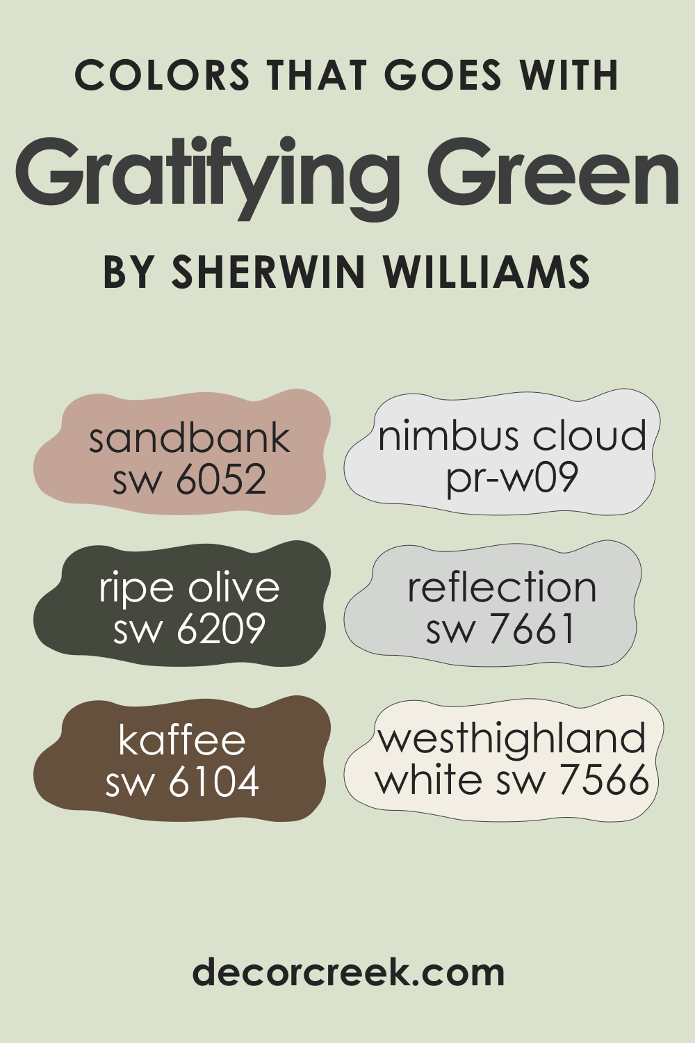
Colors That Go With SW 6435 Gratifying Green
The key to a harmonious and balanced interior palette is the correct combination of colors. To pick the colors that work best with SW Gratifying Green, we have selected a few options you might find interesting. They will complement SW Gratifying Green beautifully:
- SW 6052 Sandbank : A soft, sandy color that provides a neutral backdrop for Gratifying Green.
- SW 7606 Ripe Olive : A deep, earthy green that creates a natural harmony.
- SW 7661 Reflection : A cool, soft gray that enhances the cool undertones of Gratifying Green.
- SW 7566 Westhighland White : A soft, creamy white that creates a fresh contrast.
- SW 6104 Kaffee : A rich, warm brown that grounds the vibrant energy of Gratifying Green.
How to Use SW Gratifying Green Paint Color In Different Spaces of Your Home?
Despite its complexity, SW Gratifying Green is pretty versatile and can work well in many rooms and spaces. Below, we describe how exactly this fresh-looking and calm hue may read in common areas of your house or apartment, as well as in more private spaces.
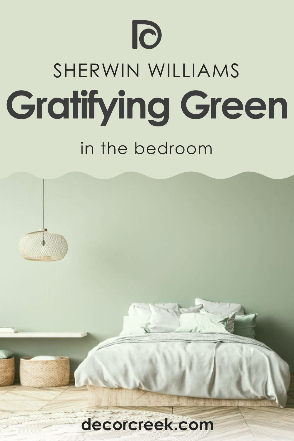
SW 6435 Gratifying Green in the Bedroom
SW Gratifying Green can create a tranquil yet refreshing atmosphere in the bedroom. Apply it on a feature wall behind the bed to create an invigorating backdrop, or paint all walls to immerse the room in its refreshing energy. Complement it with soft, neutral furnishings and gold accents for a luxurious look.
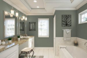
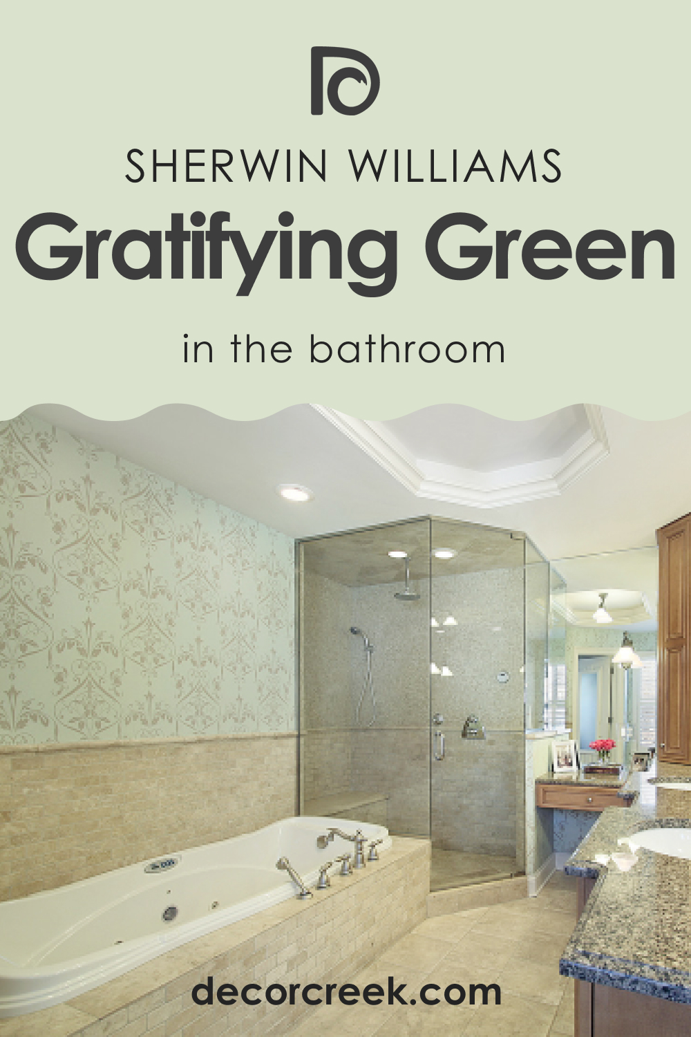
SW 6435 Gratifying Green In the Bathroom
With its soothing yet vibrant vibe, SW Gratifying Green can turn your bathroom into a spa-like retreat. Pair it with white fixtures for a clean and fresh look or warm, natural elements like wood for a more organic and earthy atmosphere.
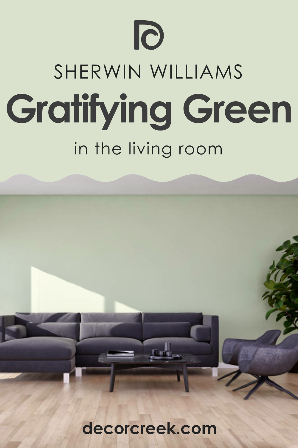
SW 6435 Gratifying Green in the Living Room
SW Gratifying Green can bring a sense of vibrancy and energy to the living room. Apply it on all walls to create an immersive space, or use it on an accent wall to add a pop of color. Pair it with neutral furnishings and natural textures to create a balance.
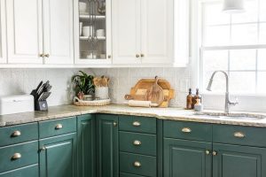
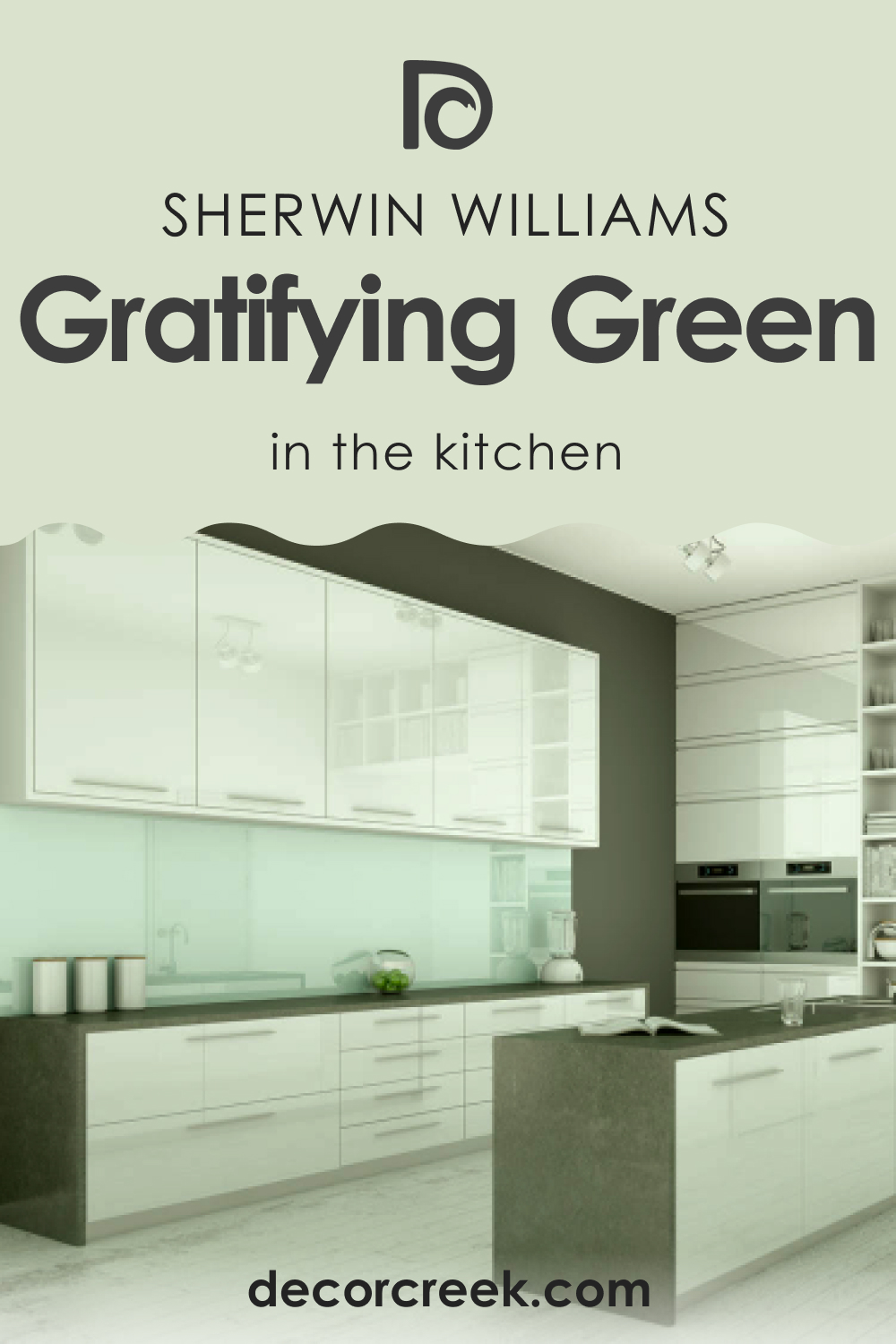
SW 6435 Gratifying Green in the Kitchen
SW Gratifying Green is perfect for bringing refreshing energy to the kitchen. Paint the cabinets in SW Gratifying Green and pair them with white or wooden countertops for a lively yet grounded look. Or, use it on the walls to brighten up the space.
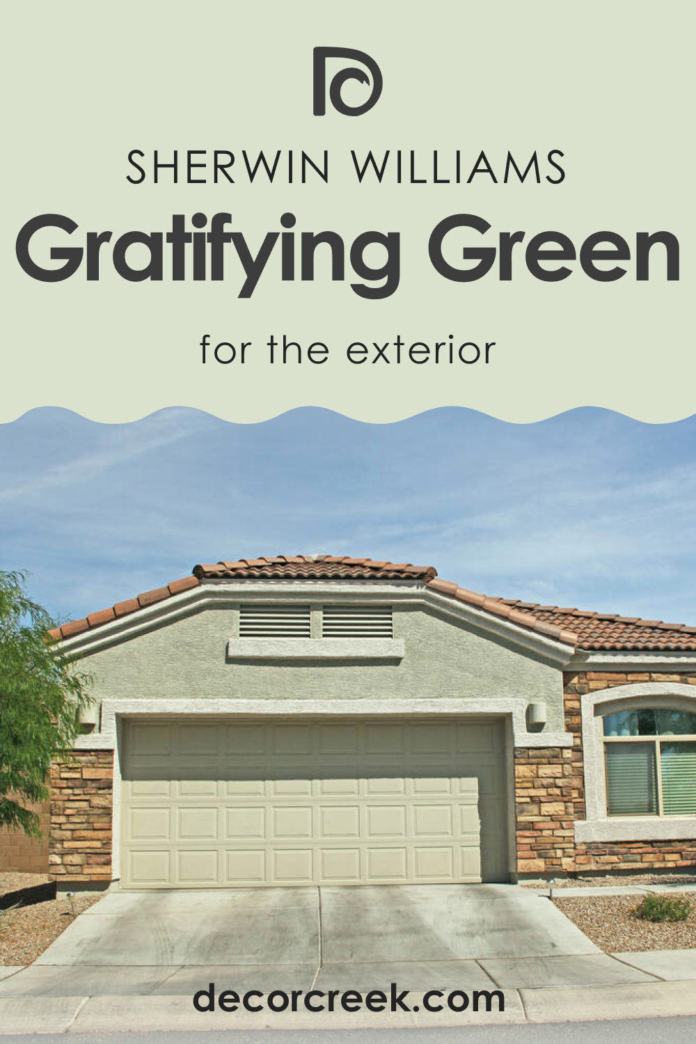
SW 6435 Gratifying Green in For an Exterior
SW Gratifying Green can create a welcoming and lively exterior. Apply it on the front door for a vibrant welcome, or use it on the trim for a refreshing contrast against a neutral facade.
Comparing SW 6435 Gratifying Green With Other Colors
To help you better see the difference between SW Gratifying Green and several alternative colors, we compare this green hue with a few greens that look nearly the same.
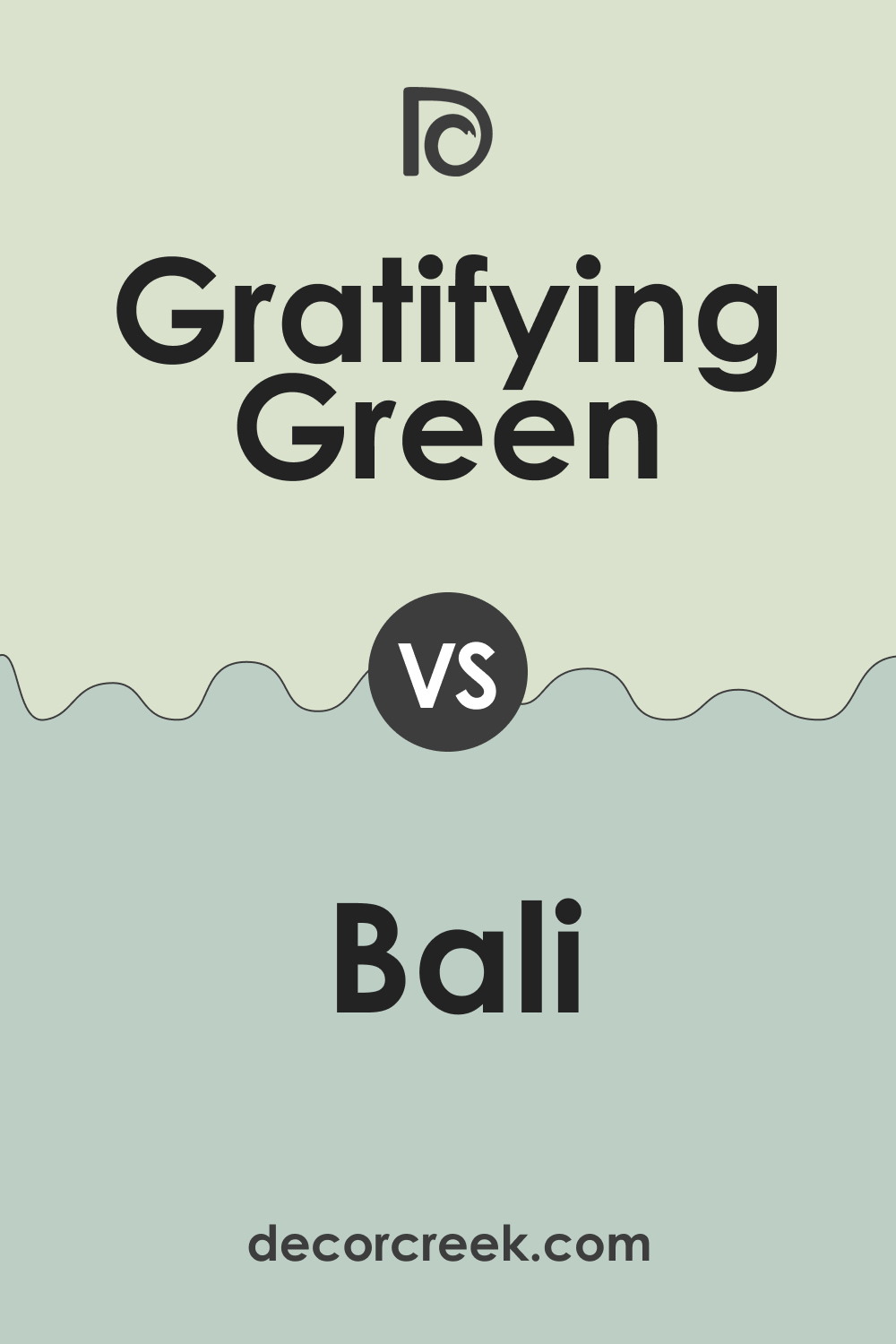
SW 6435 Gratifying Green vs Benjamin Moore 2035-40 Bali Green
BM Bali Green is darker and more saturated than Gratifying Green, with a stronger blue undertone. While both are refreshing, Gratifying Green offers a softer and more versatile look.
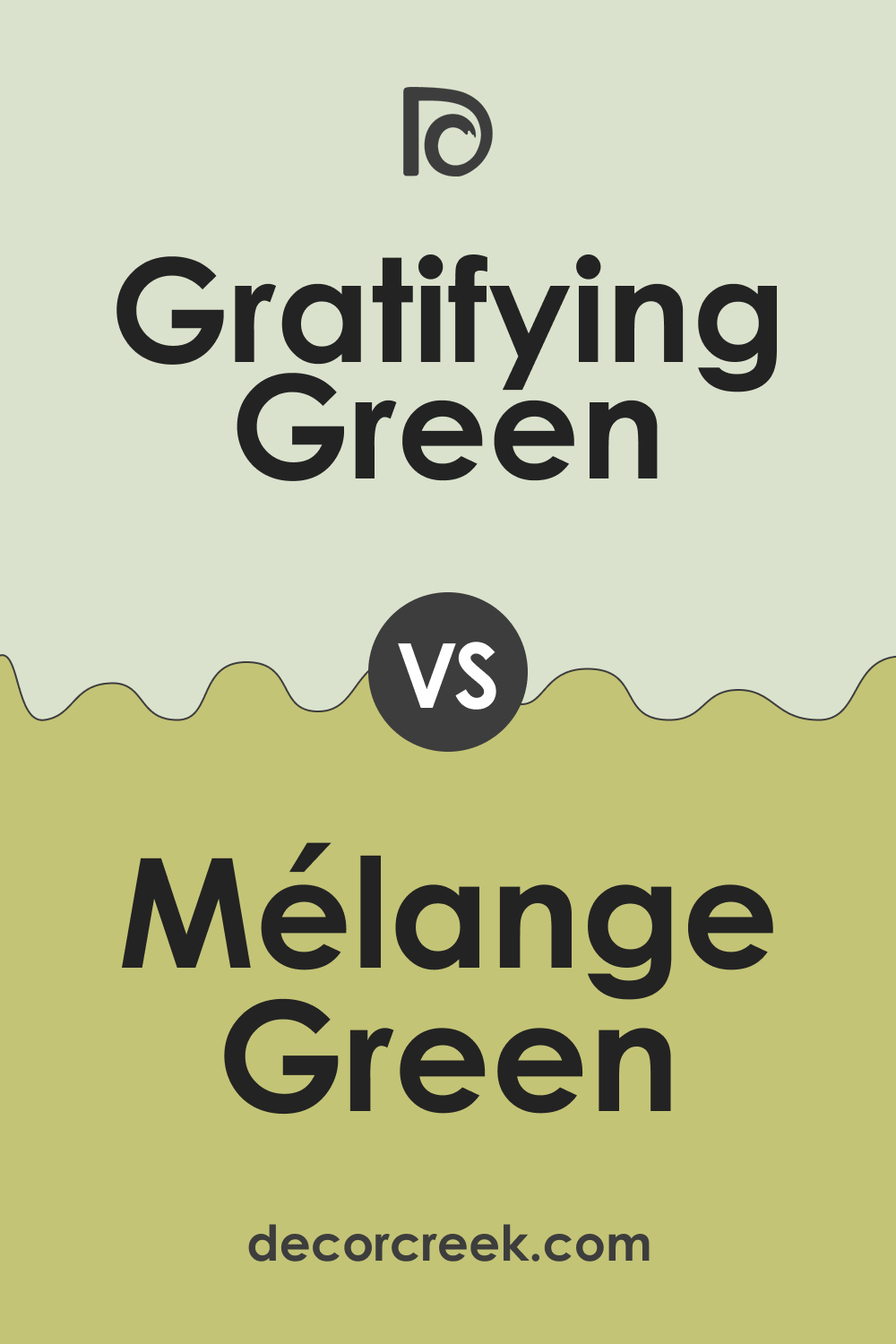
SW 6435 Gratifying Green vs SW 6710 Melange Green
SW Melange Green is a deeper, cooler green with strong blue undertones. In contrast, Gratifying Green is lighter and warmer, with a more uplifting energy.
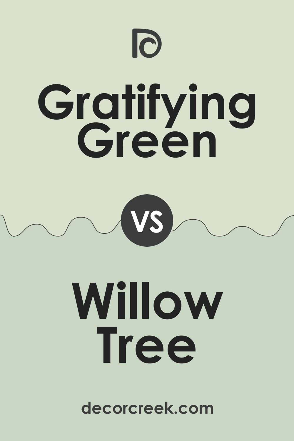
SW 6435 Gratifying Green vs Dulux Willow Tree
The Willow Tree color is a lighter, more neutral green with a strong gray undertone. While both are calming, Gratifying Green offers a more vibrant and energizing atmosphere.
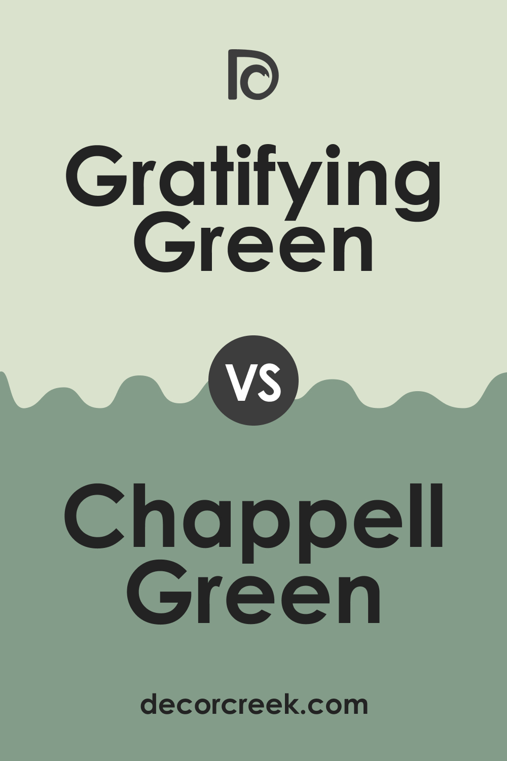
SW 6435 Gratifying Green vs Farrow & Ball 100 Chappell Green
The Chappell Green color is a deep, earthy green with a more subdued vibe. In comparison, Gratifying Green is more vibrant and lively, adding a fresh burst of color to any space.
Conclusion
With its refreshing energy and versatile undertones, SW 6435 Gratifying Green is a color that can transform any space. Whether you are designing a soothing bedroom, a lively kitchen, or a welcoming exterior, SW Gratifying Green offers the perfect balance of calmness and energy.
Its compatibility with a range of colors makes it a great choice for various design styles. So, whether you prefer a modern minimalist look or a rustic, earthy vibe, SW Gratifying Green can be your perfect canvas.
Ever wished paint sampling was as easy as sticking a sticker? Guess what? Now it is! Discover Samplize's unique Peel & Stick samples.
Get paint samples
Frequently Asked Questions
⭐What kind of rooms or spaces work best with SW 6435 Gratifying Green?
SW Gratifying Green is a versatile color that works well in various spaces, including bedrooms, bathrooms, living rooms, and kitchens. It can also be used for exterior applications, such as doors or trim, for a vibrant welcome.
⭐What are the best colors to pair with SW 6435 Gratifying Green?
SW Gratifying Green pairs beautifully with various colors, including whites like SW 7006 Extra White or SW 7008 Alabaster for contrast, neutrals like SW 6052 Sandbank for a balanced look, or deeper tones like SW 7606 Ripe Olive for natural harmony.
⭐What undertones does SW 6435 Gratifying Green have?
SW Gratifying Green is a complex hue with several undertones, including yellow, blue, and gray. The yellow undertone contributes to its vibrant energy, while the blue and gray undertones balance it out and keep it versatile.
⭐How does lighting affect the appearance of SW 6435 Gratifying Green?
Lighting can significantly affect how we perceive SW Gratifying Green. In natural light, it appears bright and full of life, exhibiting its vibrant yellow undertone. In contrast, artificial light enhances its blue and gray undertones, creating a softer and more tranquil ambience.
⭐What are some colors similar to SW 6435 Gratifying Green?
Several Sherwin-Williams colors are similar to Gratifying Green, such as SW 6732 Organic Green, SW 6716 Dancing Green, and SW 6721 Celery. These shades offer slight variations in depth, vibrancy, and undertones, allowing you to select a color that perfectly suits your space and design preferences.