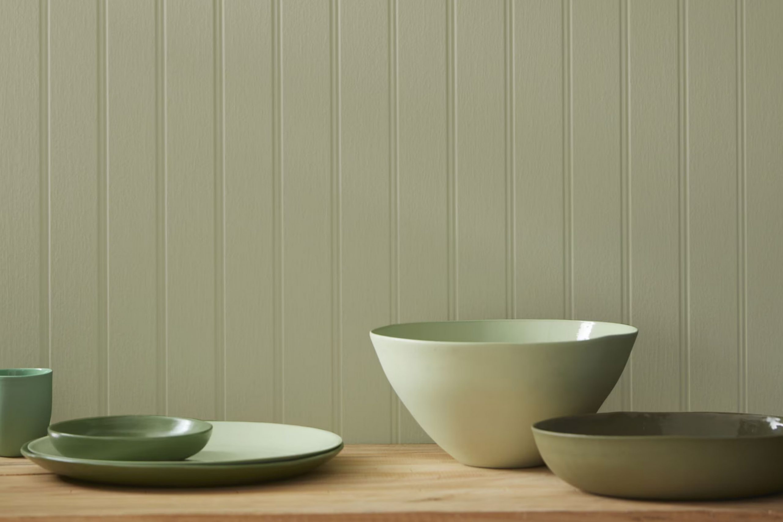
When I first chose the shade 509 Cypress Green by Benjamin Moore for my living room, I was looking for something both soothing and refreshing. This particular color is a rich, verdant green that beautifully mimics the calm hues of a forest. It’s not just any green; it has a depth that adds refinement and a touch of nature to any room without making it too strong.
Using it on the walls, I noticed how it brought a calming, cohesive look to my eclectic mix of furniture and decor. Whether in natural daylight or under soft lighting at night, Cypress Green offered a consistent charm that made my living room feel both inviting and comfortably stylish.
What sets it apart is how it pairs easily with both modern and rustic elements, providing flexibility in decorating styles. Applying this color is an easy way to refresh your home environment, making it feel like a new room with just a few coats of paint.
If you’re considering a change and want a color that ties elegance with the calming essence of nature, 509 Cypress Green is a choice that could meet your needs beautifully.
What Color Is Cypress Green 509 by Benjamin Moore?
Cypress Green by Benjamin Moore is a rich, deep green with hints of gray. This color has a natural and earthy vibe, making it perfect for creating a cozy and grounding atmosphere in any room. It’s a soothing color that can work well in many parts of the home, including living rooms, bedrooms, and even kitchens.
This shade of green is quite flexible when it comes to interior design styles. It fits beautifully in rustic settings, complementing natural wood textures and other organic materials. Cypress Green also works well in modern and contemporary rooms, especially when paired with sleek, minimalist furniture and metallic accents like brass or copper.
In terms of materials, Cypress Green pairs wonderfully with natural wood, leather, and linen. These materials help to enhance the earthy quality of the color. Textures like knitted throws or woolen rugs can also complement this shade, adding layers of warmth to the interior.
Using this color can help add depth to a room, especially when used on accent walls or for cabinetry. It’s an excellent backdrop for hanging artwork or displaying collections, as it enhances the objects without making them too bold.
Overall, Cypress Green by Benjamin Moore offers a grounding palette that is flexible enough to fit many interior designs while bringing a sense of calm and comfort to rooms.
Is Cypress Green 509 by Benjamin Moore Warm or Cool color?
Cypress Green 509 by Benjamin Moore is a unique green shade that brings a refreshing and earthy feel to any room. This particular green has a muted quality, making it easy to pair with different decor styles and colors. Its flexibility allows it to work well in many parts of the home, from living rooms to bedrooms, providing a calm and welcoming atmosphere.
In a living room, Cypress Green can act as an excellent backdrop for both modern and traditional furniture, allowing other accent colors to stand out. In bedrooms, it pairs beautifully with light woods and soft linens, creating a comfortable and relaxing room. This color’s natural tones also pair nicely with plants, enhancing the sense of nature indoors.
Cypress Green is especially effective in homes that receive plenty of natural light, as it shifts subtly with the light throughout the day, giving a dynamic feel to the room. Overall, this color is a great choice for anyone wanting to add a natural and refreshing touch to their home.
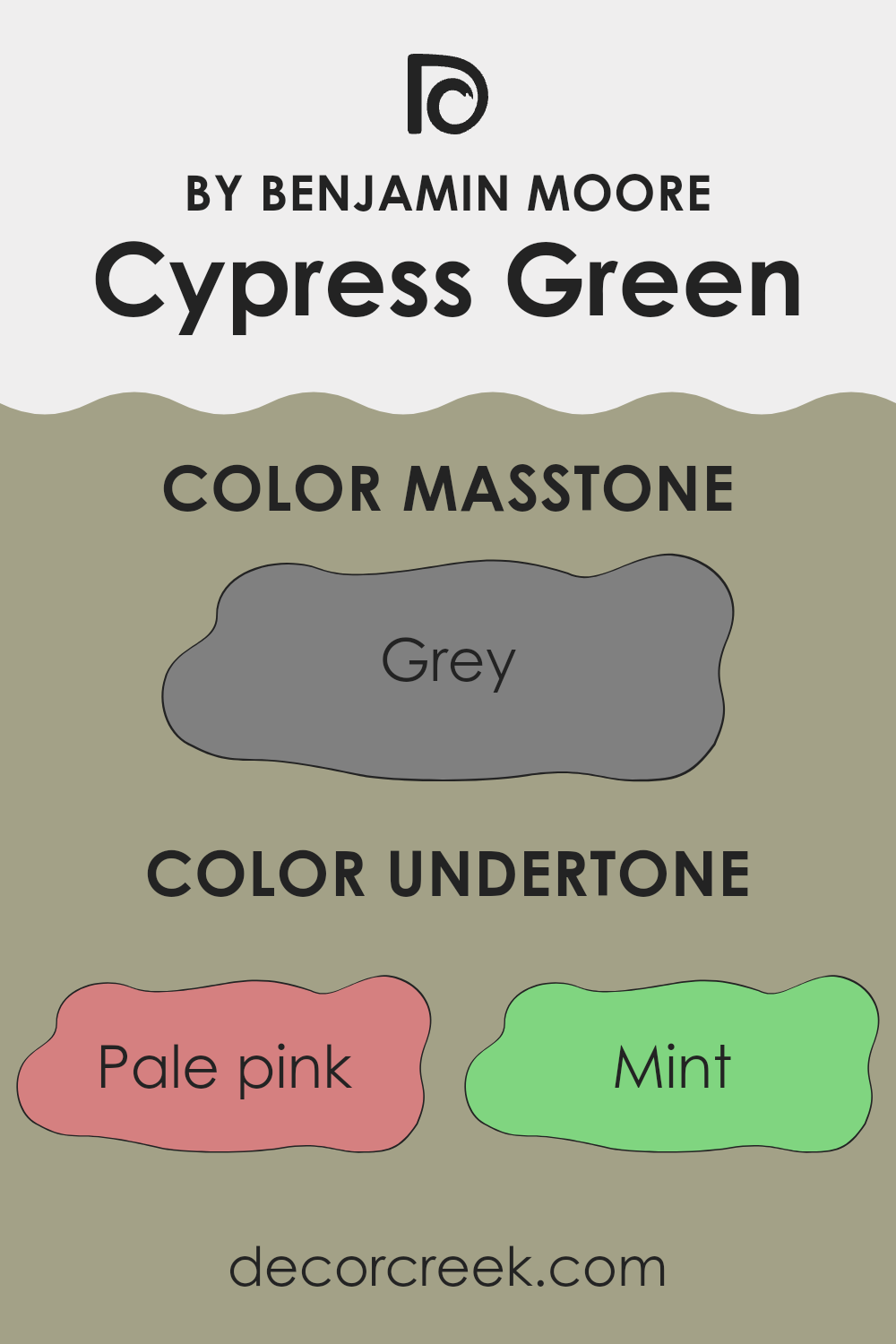
Undertones of Cypress Green 509 by Benjamin Moore
Cypress Green by Benjamin Moore is a unique color that can bring a lot of character to a room. When we talk about undertones, we’re referring to the subtle colors blended into the main shade, which affect how it appears under different lighting and when placed alongside other hues.
Cypress Green has several undertones that make it quite flexible for home decor. These include shades like pale pink, mint, pale yellow, lilac, and light blue. Each undertone reveals a different side of Cypress Green.
For instance, the pale pink and lilac tones can add a bit of warmth, softening the overall look. Meanwhile, undertones like mint and light blue highlight the freshness of the color, giving the room a livelier, more open feel.
When used on interior walls, Cypress Green can shape the mood and perception of the room. Depending on the lighting, it may appear more muted and soft, or it might show a brighter personality with undertones like light turquoise or mint coming forward. This makes it a great choice for those who want a natural, calming feel in their home but still enjoy a hint of depth that keeps the color from feeling too flat or heavy.
In short, the range of undertones in Cypress Green allows it to adjust beautifully to different design styles and moods, making it more than just a standard green. It blends easily with many decor elements, helping to create a comfortable and adaptable room.
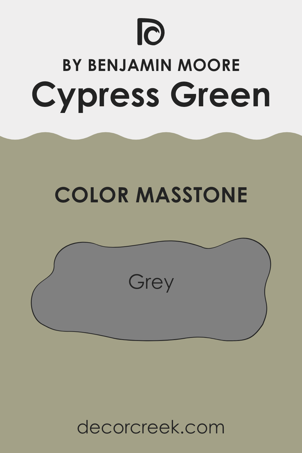
What is the Masstone of the Cypress Green 509 by Benjamin Moore?
Cypress Green 509 by Benjamin Moore has a masstone of grey, a neutral color often chosen because it pairs easily with many other shades. This grey tone gives rooms a calm and balanced feel, making it an excellent option for home interiors.
It’s especially fitting for rooms where you want a soothing atmosphere without the coolness that some greys can bring. The gentle green tint in Cypress Green adds a soft touch of nature and freshness, making it more welcoming than a standard grey.
This color performs beautifully in both low and bright natural light, showing more green tones in well-lit areas and appearing more true-grey in dimmer rooms. It’s flexible enough for living rooms, bedrooms, and kitchens, pairing nicely with white trim for a crisp contrast or with warm wood furniture for a cozy look. Overall, its ability to serve as a neutral yet subtly unique backdrop makes it a practical and appealing choice for many homes.
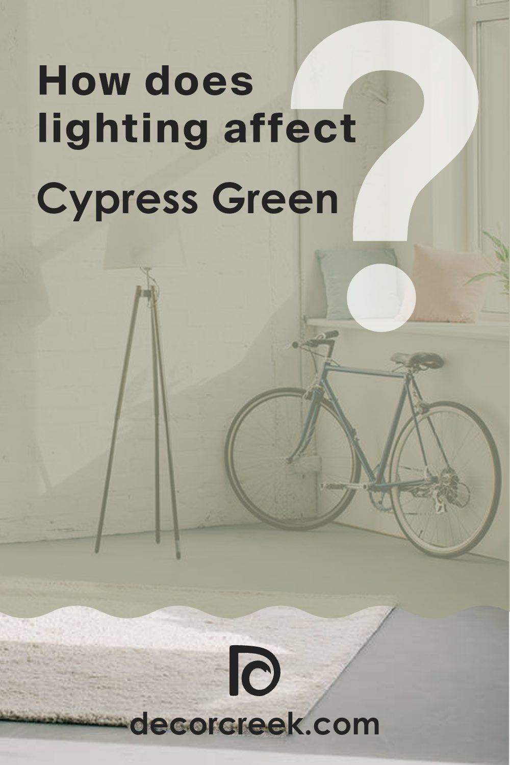
How Does Lighting Affect Cypress Green 509 by Benjamin Moore?
Lighting plays an important role in how we perceive colors, as it can greatly influence the appearance and mood created by a paint color. Cypress Green by Benjamin Moore is a perfect example of how lighting conditions can change the way a shade looks in a room.
In artificial light, Cypress Green tends to appear warmer and slightly darker. Incandescent or warm LED lights bring out the yellow tones in the color, giving it a cozy and inviting feel. This makes it an excellent choice for living rooms or bedrooms where a grounded and comfortable atmosphere is desired.
In natural light, the true depth and richness of Cypress Green become more noticeable. Sunlight highlights its layers, making it appear more vivid and lively—ideal for areas like kitchens or home offices that are used during the day.
The direction a room faces also affects how Cypress Green looks:
- North-facing rooms: These receive cooler, indirect light, which can make Cypress Green seem softer and more subdued. Adding warm artificial lighting can help balance the tone.
- South-facing rooms: These are filled with bright, direct sunlight, making the color appear lighter and more vibrant. Cypress Green will feel bright and refreshing here, perfect for creating an inviting atmosphere.
- East-facing rooms: Morning sunlight makes Cypress Green look cheerful and light early in the day, gradually becoming softer and calmer as the light fades.
- West-facing rooms: These get gentle light in the morning and a warm glow in the evening, causing Cypress Green to look richer and more dramatic toward sunset.
Overall, Cypress Green’s flexibility under different lighting conditions makes it a favorite choice. Whether under artificial or natural light, it adapts beautifully—shifting in tone and mood throughout the day to suit the setting.
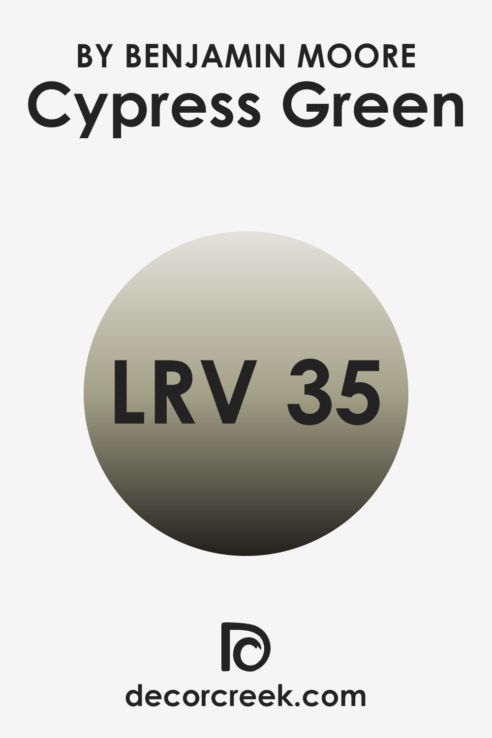
What is the LRV of Cypress Green 509 by Benjamin Moore?
Light Reflectance Value (LRV) measures how much light a paint color reflects back into a room compared to how much it absorbs. This value is shown on a scale from one to a hundred, where one represents nearly black—absorbing most light—and a hundred represents pure white, reflecting nearly all of it.
Understanding LRV is important when choosing paint colors because it directly affects how bright a room feels. A higher LRV makes a room appear lighter and more open since more light bounces around the area. A lower LRV, on the other hand, can make a room feel cozier and more enclosed, as it reflects less light.
Cypress Green, with an LRV of 35.09, is a deeper color that absorbs more light than it reflects. When used on walls, it creates a rich, intimate look. This level of LRV works especially well in larger rooms or rooms with plenty of natural or artificial light to balance out the depth of the shade.
It’s important to think about the room’s size, lighting, and desired atmosphere when choosing this color. Cypress Green can bring warmth and comfort to a room, though it might feel a bit dark in smaller or dimly lit rooms unless paired with added light sources.
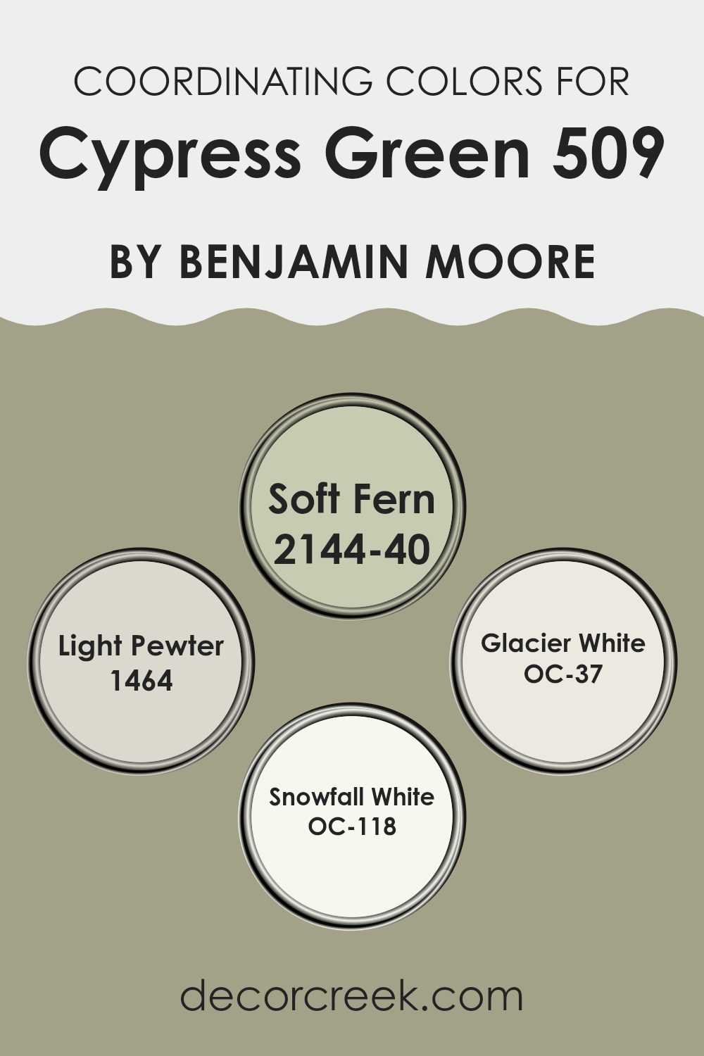
Coordinating Colors of Cypress Green 509 by Benjamin Moore
Coordinating colors are those that complement each other well when used together in decorating schemes, creating a balanced and appealing look. These shades are chosen to highlight the main color—in this case, Cypress Green by Benjamin Moore.
Coordinating colors can emphasize different tones in the primary shade, balance the visual flow of a room, and add subtle layers of depth and interest. By using colors that naturally harmonize—such as greens, grays, or whites—designers and homeowners can create rooms that feel unified and visually comfortable.
For example, Soft Fern is a gentle green that enhances the deeper tones of Cypress Green, making it ideal for a connected yet softly varied palette. Light Pewter introduces a neutral gray that provides a quiet contrast, offering a relaxed background that helps the richer shades stand out.
Glacier White is a clean, bright white that adds light and freshness, making it an excellent choice for trim or ceilings to complement the main color. Snowfall White, with its slight warmth, helps create a cozy and inviting feeling, maintaining a cohesive but distinctive style when paired with Cypress Green.
You can see recommended paint colors below:
- 2144-40 Soft Fern
- 1464 Light Pewter
- OC-37 Glacier White
- OC-118 Snowfall White
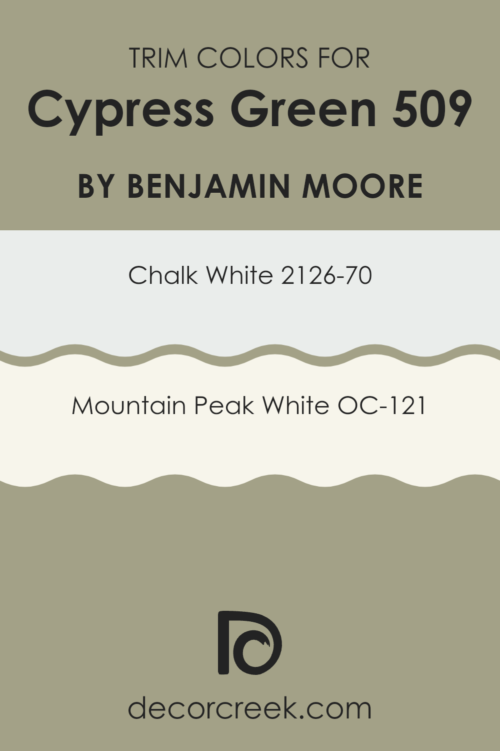
What are the Trim colors of Cypress Green 509 by Benjamin Moore?
Trim colors are the shades used on borders, moldings, and door frames to create contrast and emphasize the main wall color. When paired with Cypress Green by Benjamin Moore—a rich, deep green—the right trim color can enhance the overall design by framing the walls with complementary tones that highlight the green beautifully.
Chalk White and Mountain Peak White are excellent trim choices for Cypress Green, as they offer a clean, bright contrast that helps the green stand out while keeping the room balanced and cohesive.
Chalk White (2126-70) is a soft, light white with a touch of warmth, perfect for achieving a gentle distinction without making the contrast too sharp. Mountain Peak White (OC-121), on the other hand, has a slightly warmer undertone that creates a smooth transition, bringing out the natural depth of Cypress Green and adding harmony to the room. Both shades deliver a refined, well-balanced finish that supports the primary color while maintaining an elegant, polished look.
You can see recommended paint colors below:
- 2126-70 Chalk White
- OC-121 Mountain Peak White
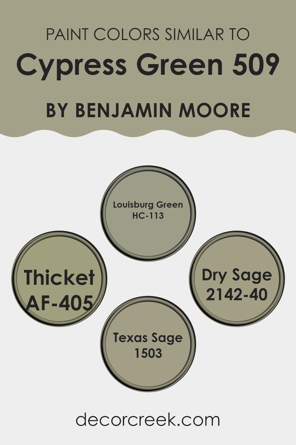
Colors Similar to Cypress Green 509 by Benjamin Moore
Similar colors play an important role in design by creating a sense of unity and balance. When shades such as HC-113 Louisburg Green, AF-405 Thicket, 2142-40 Dry Sage, and 1503 Texas Sage, which are close to Cypress Green by Benjamin Moore, are used together, they help create a cohesive and thoughtfully coordinated look.
These gentle variations in tone bring depth and character to a room while maintaining harmony without making the palette feel too strong. By staying within a consistent color family, designers can ensure that every element contributes to a smooth, well-connected aesthetic.
Louisburg Green is a deep, muted green that adds an earthy, grounded feel, making interiors feel warm and welcoming. Thicket is a slightly darker shade, offering a rich, elegant backdrop that highlights decor elements while keeping a refined atmosphere.
Dry Sage is a lighter, softer green that gives a fresh, clean appearance and fits beautifully in many types of interiors. Texas Sage blends gray and green for a balanced, neutral effect that complements both modern and classic styles. Together, these shades create a continuous visual flow, enhancing the overall mood and design of any room.
You can see recommended paint colors below:
- HC-113 Louisburg Green
- AF-405 Thicket
- 2142-40 Dry Sage
- 1503 Texas Sage
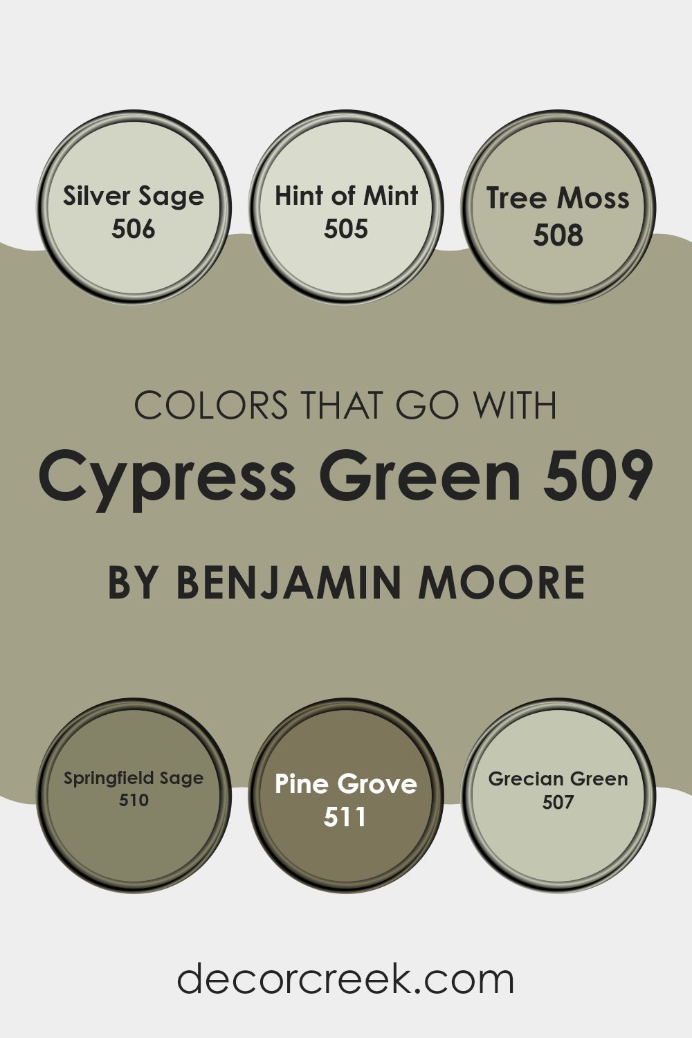
Colors that Go With Cypress Green 509 by Benjamin Moore
Choosing the right colors to pair with Cypress Green 509 by Benjamin Moore is important for creating a harmonious and visually pleasing room. Complementary shades such as Silver Sage, Hint of Mint, Tree Moss, Springfield Sage, Pine Grove, and Grecian Green work beautifully with Cypress Green to form a balanced and cohesive palette.
Silver Sage (506) is a gentle gray-green that offers soft contrast, ideal for a subtle, muted look beside the richer tone of Cypress Green. Hint of Mint (505) adds a light, airy freshness that brightens a room while maintaining harmony with other greens.
For a deeper, more natural feel, Tree Moss (508) brings an earthy richness that complements the grounded undertones of Cypress Green. Springfield Sage (510) leans toward a more herbal tone, creating a lively yet elegant feel when used together with Cypress Green.
Pine Grove (511) is the darkest shade in this group—a deep, forest green that adds depth and character, perfect for cozy, intimate room. Meanwhile, Grecian Green (507) introduces a Mediterranean touch, with its vibrant yet soothing quality bringing warmth and energy to the palette.
Together, these colors enhance the beauty of Cypress Green, blending light, mid, and dark tones to create a welcoming and well-balanced atmosphere in any interior.
You can see recommended paint colors below:
- 506 Silver Sage
- 505 Hint of Mint
- 508 Tree Moss
- 510 Springfield Sage
- 511 Pine Grove
- 507 Grecian Green
How to Use Cypress Green 509 by Benjamin Moore In Your Home?
Cypress Green 509 by Benjamin Moore is a beautiful shade that brings a touch of nature into your home. This color has a fresh and clean feel, making it perfect for any room that could use a bit of brightness. For those looking to refresh their living area, Cypress Green is an excellent choice.
You can use it in your living room or kitchen to create a lively and welcoming atmosphere. It also works wonderfully in bedrooms, offering a calm backdrop that pairs nicely with white or light wood furniture for a balanced look.
Additionally, Cypress Green is flexible enough to be used on cabinets or doors for a gentle pop of color. If you want to add some personality to your home without making it too bold, this shade is a great option. Whether you paint an accent wall, a whole room, or just some trim, Cypress Green gives a fresh and inviting touch to your room.
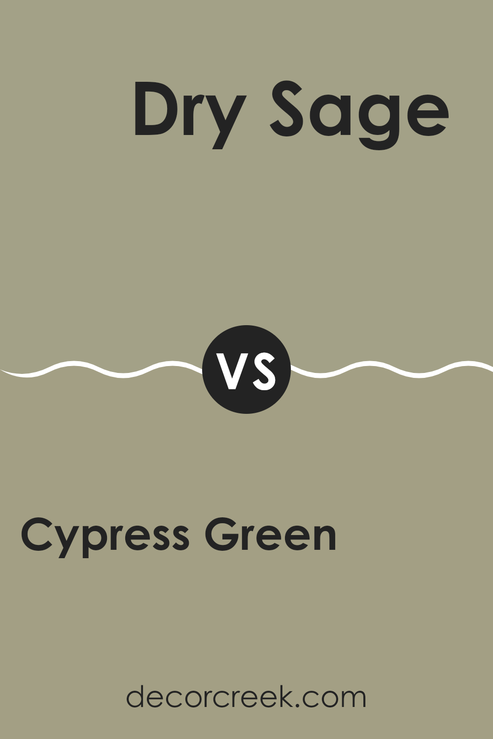
Cypress Green 509 by Benjamin Moore vs Dry Sage 2142-40 by Benjamin Moore
Cypress Green and Dry Sage are two colors from Benjamin Moore that share an earthy, natural character but differ in tone and depth. Cypress Green has a deeper, richer quality, similar to the dark green of cypress trees. It’s a strong choice for creating a warm, inviting feel in rooms like living areas or studies.
Dry Sage, on the other hand, is lighter and leans toward a soft, muted green that recalls the look of dried sage leaves. It gives a room a brighter, more open feel, making it perfect for kitchens or bathrooms where a light, fresh atmosphere is desired.
Both shades work beautifully in interiors that draw inspiration from nature, but their effects are distinct. Cypress Green adds warmth and depth, while Dry Sage brings lightness and clarity. The best choice depends on the mood you want to achieve—grounded and cozy with Cypress Green or airy and refreshing with Dry Sage.
You can see recommended paint color below:
- 2142-40 Dry Sage
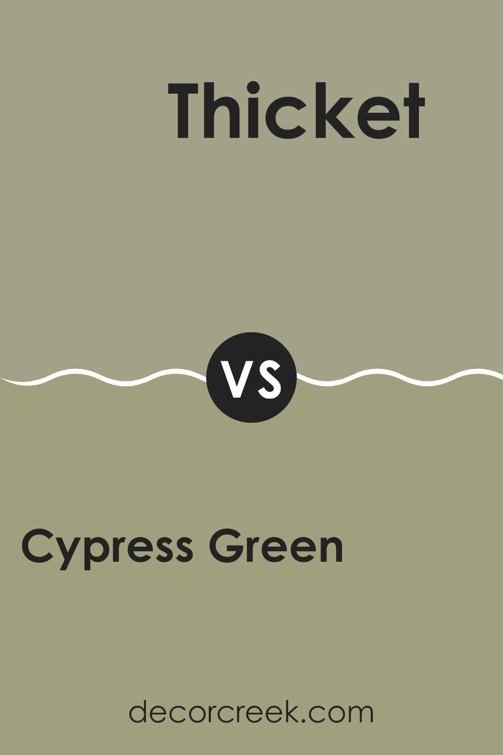
Cypress Green 509 by Benjamin Moore vs Thicket AF-405 by Benjamin Moore
Cypress Green by Benjamin Moore is a rich, earthy green that brings a sense of calm and balance to any room. It carries a hint of gray, making it pleasantly neutral and easy to pair with many decor styles and color palettes. This shade works beautifully for creating warm, welcoming environments, especially in living rooms and bedrooms.
Thicket by Benjamin Moore, on the other hand, is a deeper, more intense green with subtle vibrancy. It stands out more as a statement color compared to the gentler Cypress Green, making it an excellent choice for accent walls or for adding a lively yet natural touch to a room.
Both colors belong to the green family but evoke different moods. Cypress Green feels soft and grounded, while Thicket brings boldness and energy. The choice between them depends on the atmosphere you want to create—tranquil and understated with Cypress Green or dynamic and striking with Thicket.
You can see recommended paint color below:
- AF-405 Thicket
Cypress Green 509 by Benjamin Moore vs Texas Sage 1503 by Benjamin Moore
Cypress Green and Texas Sage by Benjamin Moore are both natural, muted shades of green, yet they differ in undertone and depth. Cypress Green leans darker, with a rich, forest-like tone that brings an earthy, grounded feel—perfect for rooms where you want to introduce warmth and a connection to nature.
Texas Sage, by contrast, is lighter and carries subtle gray undertones, giving it a softer, more airy quality. This makes it ideal for creating an open, relaxed atmosphere while still offering a gentle touch of color. Cypress Green works beautifully in areas that benefit from a cozy, wrapped-in feel, such as living rooms or bedrooms, while Texas Sage fits well in modern or minimalist areas that favor calm and simplicity.
Texas Sage also pairs easily with brighter accents or can stand alone for a balanced, quiet ambiance. Each shade offers its own charm—Cypress Green brings depth and warmth, while Texas Sage provides freshness and lightness—allowing you to shape the perfect mood for every room.
You can see recommended paint color below:
Cypress Green 509 by Benjamin Moore vs Louisburg Green HC-113 by Benjamin Moore
Cypress Green by Benjamin Moore is a deep, muted green with a rich, earthy character. It feels grounded and calm, making it an excellent choice for rooms where you want to create a warm and welcoming atmosphere. Its depth brings to mind the cool, shaded tones of a dense forest.
Louisburg Green, also by Benjamin Moore, is a bit lighter and carries a more traditional charm. It resembles the soft greens of early spring or the gentle patina of aged copper. This shade brings freshness and brightness to a room while maintaining the warmth and balance that greens naturally provide.
While both belong to the green family, they set different moods. Cypress Green delivers a deeper, nature-inspired richness that makes a room feel cozy and vibrant, whereas Louisburg Green offers a softer, lighter approach—perfect for brightening rooms while keeping a natural, inviting feel.
You can see recommended paint color below:
After reading about 509 Cypress Green by Benjamin Moore, I felt inspired to share my thoughts. This color feels like a soft forest green that captures the peaceful essence of nature and quiet afternoons. It’s not too bright or too dark—just the right balance for painting walls in a cozy home. Many people love this shade because it brings warmth and comfort, wrapping a room in a welcoming, homey feel.
In rooms filled with sunlight, Cypress Green appears lively and uplifting, adding a cheerful glow to the room. In dimmer light, it deepens into a richer green, creating a sense of calm that’s perfect for relaxing moments.
From what I’ve seen, this color works beautifully in living rooms, bedrooms, and even bathrooms. It makes large rooms feel inviting and intimate, while smaller rooms gain depth and charm.
In the end, Cypress Green 509 isn’t just another green paint—it’s a color that highlights a room’s natural beauty in a gentle yet meaningful way. It complements many different styles and color palettes, helping any home feel warm, balanced, and full of life.
decorcreek.com
Ever wished paint sampling was as easy as sticking a sticker? Guess what? Now it is! Discover Samplize's unique Peel & Stick samples.
Get paint samples

