This particular hue instantly caught my attention with its subtle blend of gray and beige tones. I found it to be an incredibly versatile color, perfect for creating a calm and inviting space.
It fits well with both modern and classic home styles and complements various materials and textures.
What I loved most about Light Pewter was how it harmonized with natural light. Throughout the day, I noticed how its tone shifted gently—a bit warmer with the morning sun and cooler in the afternoon. This characteristic gave my room a dynamic, yet consistent feel that I appreciated.
It settled into the background beautifully, allowing my furniture and decor pieces to stand out.
Choosing paint can often feel overwhelming, but I didn’t feel that way with Light Pewter. It suited my vision perfectly, creating a backdrop that was both soothing and sophisticated. Whether you aim for a minimalist look or something more eclectic, this shade adapts easily.
From my personal experience, if you’re searching for a timeless and adaptable color for your home, 1464 Light Pewter could be just the right choice.
What Color Is Light Pewter 1464 by Benjamin Moore?
Light Pewter by Benjamin Moore is a soft, warm light gray with subtle beige undertones. This neutral shade is versatile and works in various interior styles. It offers a calming and elegant backdrop that complements many color schemes.
In traditional or transitional interiors, Light Pewter adds a touch of sophistication while maintaining a cozy atmosphere. In modern or minimalist spaces, it serves as a clean and neutral canvas, enhancing the simplicity of the design.
This color is excellent for Scandinavian styles, where it can connect seamlessly with white and natural wood elements.
Pairing Light Pewter with natural materials like wood, stone, and metal brings out the warmth in the hue, creating a welcoming environment. It harmonizes beautifully with wooden floors or furniture, adding depth without overwhelming the space. Metals like brushed nickel or antique brass look striking against this color, providing subtle contrast.
Add texture with soft fabrics such as wool or linen. Light Pewter’s gentle tone complements these materials, creating a cozy yet sophisticated look. Accents in soft blues, greens, or warm whites make for a balanced and stylish setting.
Accessories in darker shades or bold colors can be used to create focal points in rooms painted with Light Pewter.
Is Light Pewter 1464 by Benjamin Moore Warm or Cool color?
Light Pewter by Benjamin Moore is a versatile paint color that’s often chosen for its neutral and calming qualities. It’s a soft gray shade that has subtle undertones, making it neither too warm nor too cool. This balance makes Light Pewter a great choice for almost any room in the house.
It works well in living rooms, bedrooms, and even kitchens, providing a clean and fresh backdrop that complements various decor styles.
In homes, Light Pewter is popular because it can make spaces feel open and airy. It reflects natural light beautifully, which can help brighten rooms that might otherwise feel dark or cramped. This color pairs well with both light and dark furnishings, adding to its adaptability.
Whether used on all four walls or as an accent, Light Pewter allows homeowners to play with other decorative elements like colorful artwork or bold furniture, while still maintaining a cohesive and pleasant environment.
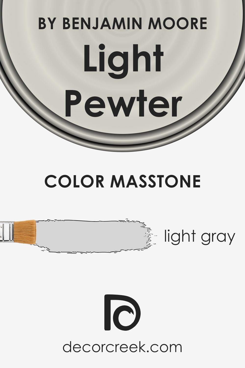
What is the Masstone of the Light Pewter 1464 by Benjamin Moore?
Light Pewter, recognized by its code 1464 from Benjamin Moore, is a popular light gray paint choice for many homes. With its masstone being a soft, gentle gray (#D5D5D5), Light Pewter brings a sense of balance and neutrality to various spaces. This color has a way of adapting to its surroundings, making it a versatile option for any room.
In homes, this shade works well because it neither overwhelms nor fades into the background. It provides a subtle backdrop that can make other colors and decor stand out. Light Pewter works beautifully in living rooms, kitchens, or bedrooms, providing a calm and clean look.
Its neutral tone allows it to match with many different accent colors, whether you prefer vibrant hues or more muted shades.
It also complements natural light, making rooms feel airy and spacious during the day while maintaining a cozy atmosphere in the evening.
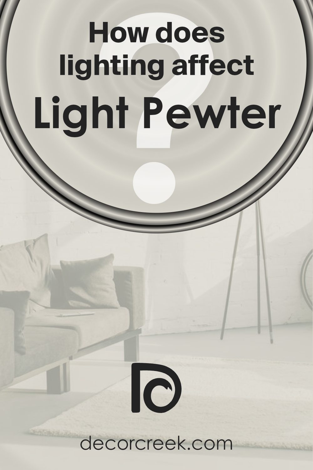
How Does Lighting Affect Light Pewter 1464 by Benjamin Moore?
Lighting significantly impacts how we perceive colors. Different light sources can change how a color appears in a room. For example, natural sunlight differs throughout the day and varies depending on the room’s orientation. Artificial lighting can also change the way we see colors, as the type of bulb used—be it LED, incandescent, or fluorescent—will interact differently with wall paint.
Light Pewter by Benjamin Moore is a versatile, neutral-toned color. In natural light, it tends to show its true character. However, the appearance of Light Pewter can change based on the room’s orientation, which affects the amount and quality of sunlight a room receives.
In north-facing rooms, the light is generally cooler and dimmer, which can make colors appear more muted. In these rooms, Light Pewter might appear a bit more gray and understated. The cooler light will enhance any subtle blue or gray undertones present in the paint.
South-facing rooms are filled with warm, bright, direct sunlight for most of the day. This can bring out the warmer undertones in Light Pewter, making it look almost like a warm beige.
The abundance of natural light helps surfaces appear lighter and brighter, so the paint could look warmer and more inviting.
In east-facing rooms, the light is strongest and warmest in the morning, often with cooler tones taking over in the afternoon. Light Pewter can appear warm and inviting in the morning light but may shift to a cooler tone as the day progresses.
West-facing rooms receive the most light in the afternoon and evening, which is warm and rich. Light Pewter in these spaces will appear warmer and more cozy as the afternoon light highlights its neutral aspects.
Artificial lighting, such as soft white or daylight bulbs, can also affect this paint color. Warmer bulbs might enhance its beige undertones, while cooler lighting might bring out its gray.
Therefore, the choice of lighting can dramatically alter how Light Pewter is perceived in a space.
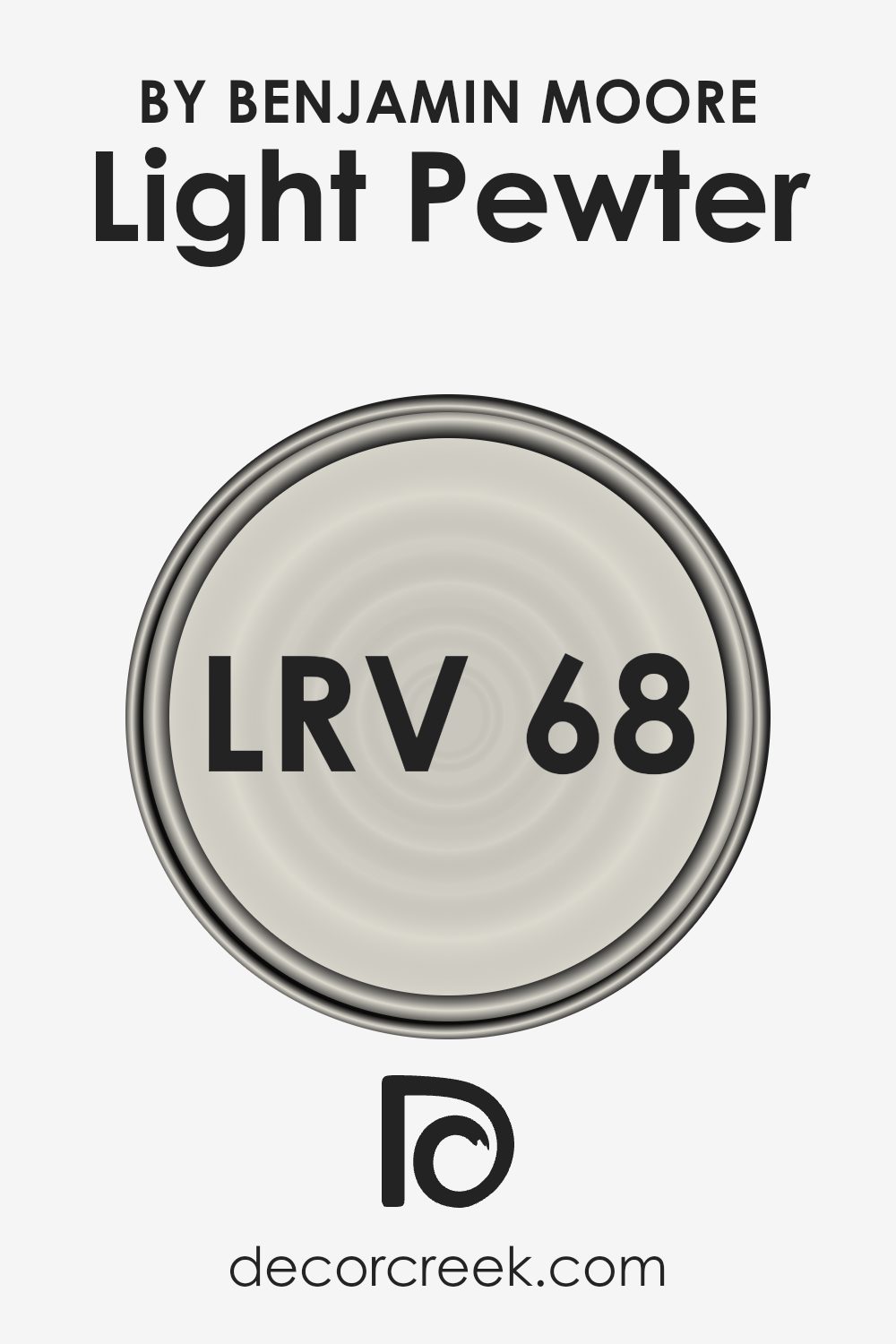
What is the LRV of Light Pewter 1464 by Benjamin Moore?
The Light Reflectance Value, or LRV, is a measure that indicates how much light a color reflects. It is a scale from 0 to 100, where 0 means the color absorbs all light (black) and 100 means the color reflects all light (white). The LRV helps in understanding how bright or dark a color will appear once it is painted on walls.
Colors with higher LRV values will reflect more light and can make a room feel brighter and more open. On the other hand, colors with lower LRVs absorb more light, making a room feel cozier and sometimes smaller.
LRV is a helpful tool for designers and homeowners to decide on colors based on the natural and artificial lighting conditions of a room.
With an LRV of 67.52, Light Pewter by Benjamin Moore is considered to be on the lighter side of the spectrum. This means it reflects a good amount of light, which can help make a space feel larger and more open.
It’s a versatile choice that tends to brighten up a room, making it a good option for spaces without a lot of natural light.
In brighter rooms with plenty of sunlight, Light Pewter will maintain its shade without appearing washed out.
Its ability to reflect light while maintaining its warmth makes it an excellent color for both modern and traditional settings, offering a light and airy feel without losing depth.
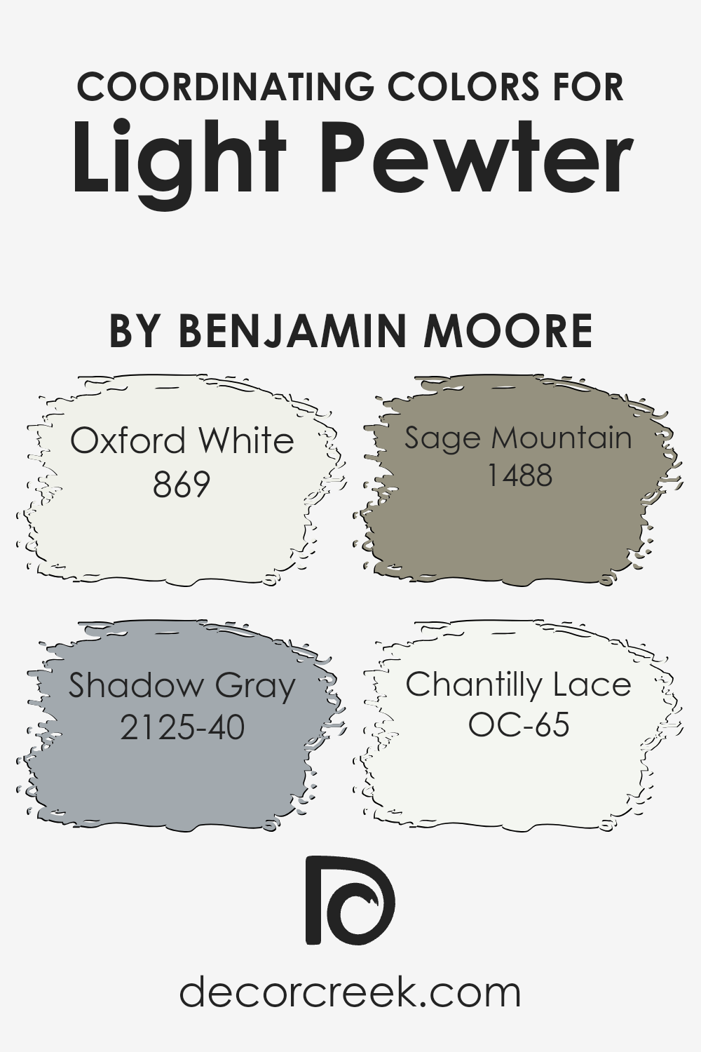
Coordinating Colors of Light Pewter 1464 by Benjamin Moore
Coordinating colors are hues that complement each other harmoniously when used together, ensuring a balanced and pleasing look in a space. When choosing colors that coordinate well, it’s essential to ensure they share similar undertones or completely contrast to create a dynamic balance.
For Light Pewter by Benjamin Moore, a light and neutral shade of gray with warm undertones, certain colors work well to enhance its beauty. These include Oxford White, Shadow Gray, Sage Mountain, and Chantilly Lace. Each of these colors adds a unique touch that complements Light Pewter.
Oxford White is a crisp, clean white that brings a bright and fresh feel to a room. Its simplicity and purity work well with Light Pewter, offering a refreshing yet understated contrast. Shadow Gray, on the other hand, adds a deeper, more dramatic hue with its cooler, bluish tone, perfect for creating depth.
Sage Mountain offers a soft, muted green that evokes a sense of nature and calmness, beautifully blending with the warm undertones of Light Pewter.
Lastly, Chantilly Lace is a bright white with a slight hint of warmth, ensuring a cozy, inviting atmosphere when paired alongside Light Pewter. Together, these colors can make any space feel cohesive and inviting.
You can see recommended paint colors below:
- 869 Oxford White
- 2125-40 Shadow Gray
- 1488 Sage Mountain
- OC-65 Chantilly Lace
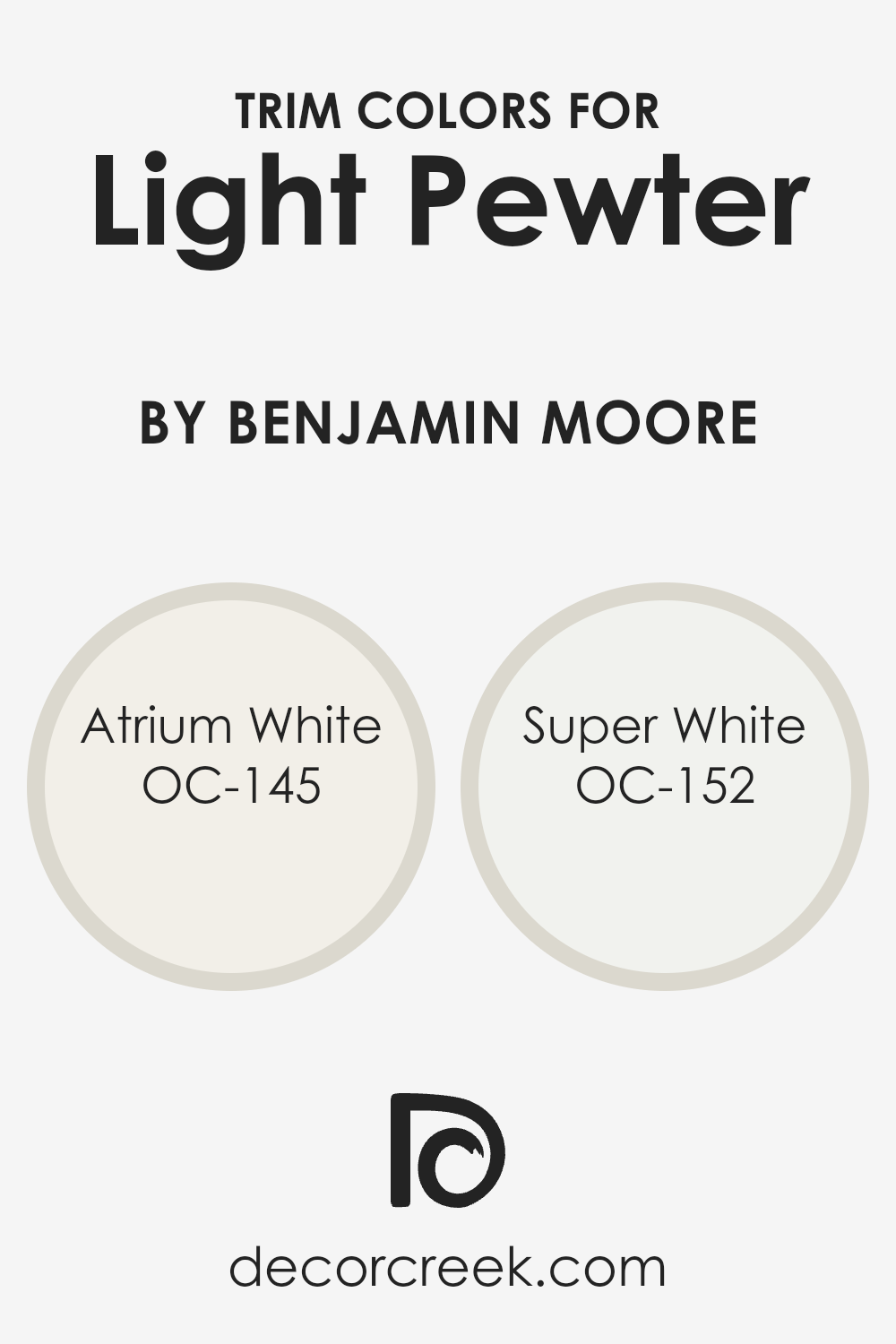
What are the Trim colors of Light Pewter 1464 by Benjamin Moore?
Trim colors are the paints used on the edges and details of walls, doors, and windows to highlight or complement the primary wall color. When pairing them with a main wall color like Light Pewter by Benjamin Moore, trim colors are crucial because they can enhance the overall look and feel of a space, providing contrast or harmony depending on the desired effect.
Light Pewter is a versatile and soft neutral tone that works well with many different colors. Using specific trim colors can either create a distinct border or blend smoothly with the main wall color, making spaces look more balanced and defined.
Atrium White and Super White are two great options for trim colors to pair with Light Pewter. Atrium White is a warm, inviting shade of white with a hint of pink undertones that can give a cozy and inviting feel, adding warmth and a touch of subtle color differentiation against neutral backgrounds like Light Pewter.
Super White, on the other hand, is a clean and crisp white that adds sharpness and brightness, making it ideal for creating a strong contrast without overwhelming the main color.
These colors work well to either softly highlight or sharply define the architectural details in your space, depending on the vibe you’re aiming for.
You can see recommended paint colors below:
- OC-145 Atrium White
- OC-152 Super White
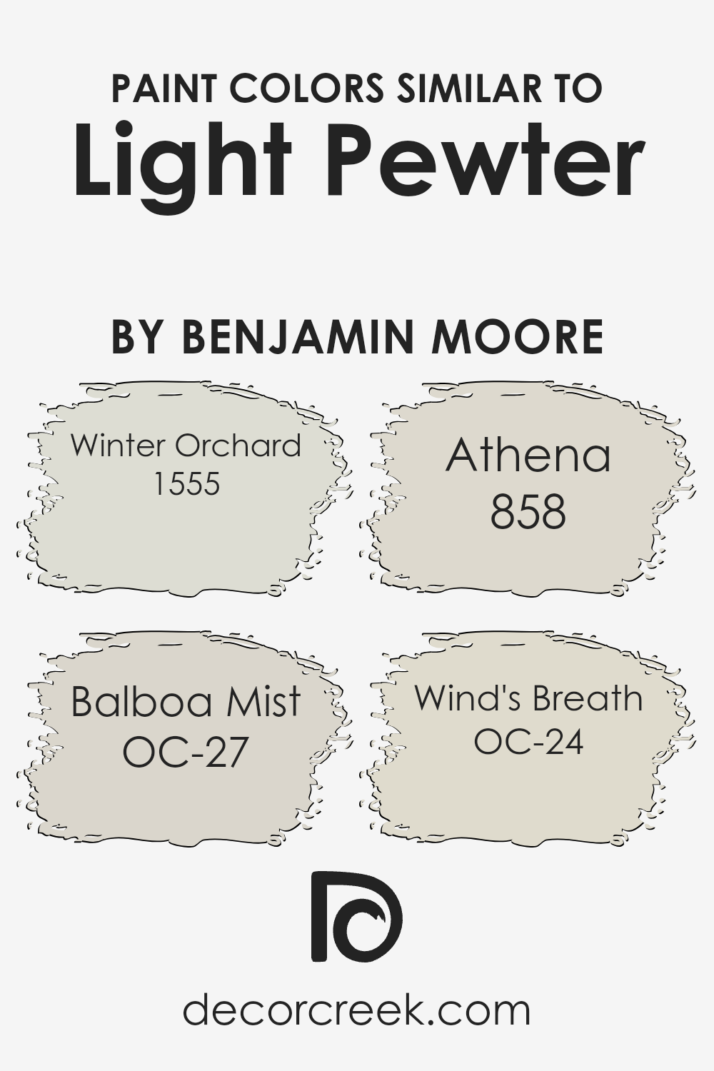
Colors Similar to Light Pewter 1464 by Benjamin Moore
Similar colors play a significant role in creating harmony and balance in a space. The subtlety in their differences can help guide the atmosphere and mood of a room without clashing or feeling overwhelming. Colors like Winter Orchard, Balboa Mist, Athena, and Wind’s Breath share a kinship with Light Pewter.
Their muted tones offer versatility, allowing for easy pairing with other design elements. They naturally complement and enhance the hues of Light Pewter, maintaining a cohesive and relaxing environment.
Winter Orchard is a soft, cool gray with a hint of warmth, making it a versatile backdrop for various settings.
Balboa Mist presents itself as a gentle warm gray with a touch of beige, offering a soothing and flexible choice. Athena is a light beige with a subtle gray undertone, providing a cozy and inviting atmosphere.
Lastly, Wind’s Breath is an airy off-white with a whisper of warmth, perfect for creating a fresh and open feel. These similar colors work well together by offering slight variations, each contributing its touch while keeping the overall look unified and calm.
You can see recommended paint colors below:
- 1555 Winter Orchard
- OC-27 Balboa Mist
- 858 Athena
- OC-24 Wind’s Breath
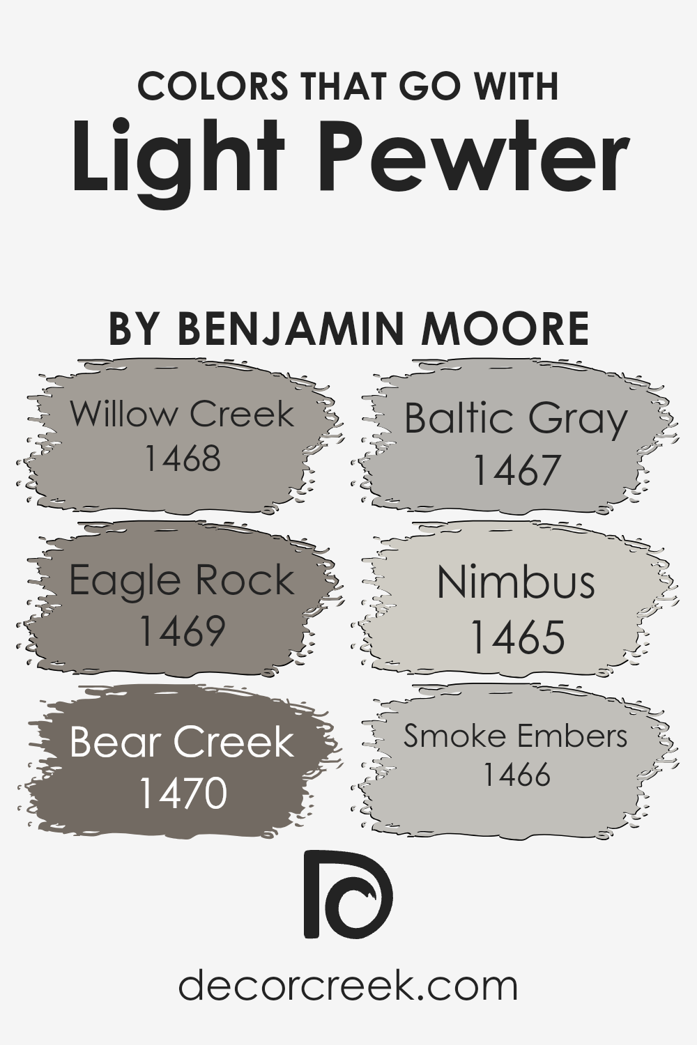
Colors that Go With Light Pewter 1464 by Benjamin Moore
Colors that complement Light Pewter 1464 by Benjamin Moore are essential because they enhance its neutral beauty and add depth to a space. Light Pewter is a soft, versatile gray with warm undertones, making it an excellent backdrop for various color schemes.
When paired with colors like Willow Creek (1468), Eagle Rock (1469), Bear Creek (1470), Baltic Gray (1467), Nimbus (1465), and Smoke Embers (1466), Light Pewter truly shines by providing a balanced contrast or harmonious blend.
Willow Creek is a gentle taupe-gray that pairs nicely with Light Pewter, adding a cozy touch that makes spaces feel welcoming. The warm and earthy tone of Eagle Rock brings a sense of stability and works well when you want a grounded atmosphere.
Bear Creek offers a darker, moodier shade that creates a striking contrast with Light Pewter, perfect for adding some drama to a room. On the other hand, Baltic Gray is a soothing soft gray that effortlessly blends with Light Pewter for a unified look.
Nimbus is a slightly cool gray with a hint of blue, which adds a crisp freshness alongside the warmer Light Pewter.
Smoke Embers carries a slightly softer tone, enriching the ambiance with its understated elegance, thus rounding off a palette that collectively enhances Light Pewter’s versatile charm.
These colors work well together, creating a variety of moods and aesthetics that enhance both modern and traditional designs.
You can see recommended paint colors below:
- 1468 Willow Creek
- 1469 Eagle Rock
- 1470 Bear Creek
- 1467 Baltic Gray
- 1465 Nimbus
- 1466 Smoke Embers
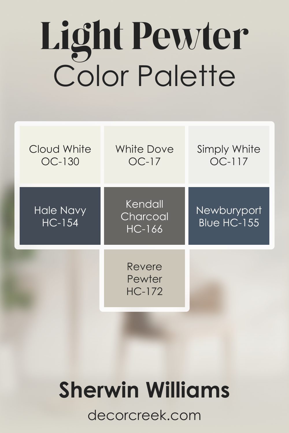
Light Pewter 1464 by Benjamin Moore Color Palette
Light Pewter has a gentle gray warmth that feels soft, balanced, and easy to live with. This palette strengthens that feeling with warm whites, soft neutrals, and rich grounding tones.
White Dove, Cloud White, and Simply White brighten the palette with clean, soft light that highlights Light Pewter’s subtle warmth.
Revere Pewter adds a warm supporting note, creating a smooth transition and natural flow within the palette.
Kendall Charcoal brings strong grounding that adds clarity and structure, while Hale Navy introduces cool depth that pairs beautifully with the warm grays. Newburyport Blue adds a steady, calming accent, deepening the overall mood.
Together, these shades create a palette that feels relaxed, welcoming, and full of gentle character. The blend works well in bedrooms, living rooms, and kitchens where a quiet, warm presence is desired, offering softness with thoughtful depth.
How to Use Light Pewter 1464 by Benjamin Moore In Your Home?
Light Pewter by Benjamin Moore is a versatile, soft gray paint that works well in many home environments. Its warm undertones make it suitable for both modern and traditional spaces. You can use this color in the living room to create a welcoming and cozy atmosphere.
Pair it with white trim for a clean and fresh look. In the kitchen, Light Pewter provides a neutral backdrop, allowing colorful decor or cabinets to stand out.
It’s also an excellent choice for bedrooms, where its calm tones help create a restful and relaxing space, making it easier to unwind.
Bathrooms can benefit from this shade because it adds a touch of elegance without feeling too cold or stark.
Light Pewter works beautifully as a whole-house color, providing consistency and flow, or as an accent wall combined with bolder colors to add depth and interest to your home decor.
Light Pewter 1464 by Benjamin Moore vs Balboa Mist OC-27 by Benjamin Moore
Light Pewter 1464 by Benjamin Moore is a soft, neutral gray with a hint of warmth that makes it versatile for various spaces. It’s a calming color that works well as a backdrop for both modern and traditional decor. Light Pewter tends to complement a wide range of colors, making it an ideal choice for open-concept living areas.
Balboa Mist OC-27, also by Benjamin Moore, is another neutral, yet it leans slightly more toward the beige spectrum, giving it a warm, inviting feel. It’s a popular choice for those who want a light, airy atmosphere without committing to a pure white.
Balboa Mist reflects a bit more warmth compared to Light Pewter, making it a great option for cozy and comfortable spaces.
Both colors are excellent choices for creating a calm, neutral environment but differ subtly in their undertones—Light Pewter with its gray notes and Balboa Mist with its warmer beige tint.
You can see recommended paint color below:
Light Pewter 1464 by Benjamin Moore vs Winter Orchard 1555 by Benjamin Moore
Light Pewter 1464 by Benjamin Moore is a soft, neutral gray with warm undertones. It has a versatile and understated appeal, making it suitable for a range of spaces. The color can appear almost off-white in bright light, while in dimmer areas, it reveals its gentle gray characteristics. This makes it an excellent backdrop for modern and traditional interiors alike.
Winter Orchard 1555, also by Benjamin Moore, is a deeper gray with cool undertones. It provides a more dramatic contrast compared to the light and airy feel of Light Pewter.
This shade brings a touch of bold sophistication to a room, making it ideal for spaces where a more pronounced color statement is desired.
When comparing the two, Light Pewter is the more neutral and adaptable option, while Winter Orchard offers depth and a slightly more intense presence. Both colors work well in different settings, complementing various design styles.
You can see recommended paint color below:
- 1555 Winter Orchard
Light Pewter 1464 by Benjamin Moore vs Wind’s Breath OC-24 by Benjamin Moore
Light Pewter 1464 and Wind’s Breath OC-24 by Benjamin Moore are both neutral paint colors that bring a calm feeling to a space but have distinct differences. Light Pewter is a soft, warm gray with subtle beige undertones, making it adaptable and popular for various rooms and decor styles. It’s a versatile color that works well as a backdrop without being too overwhelming.
On the other hand, Wind’s Breath is slightly warmer and creamier, with a hint of greige. This gives it a touch more warmth compared to Light Pewter, making it feel even cozier and inviting. It’s an excellent choice for spaces aiming for a gentle, warm atmosphere.
Both colors are excellent choices for those who appreciate subtle, neutral tones, but the choice between them may come down to whether you prefer a bit more gray or slightly more warmth.
You can see recommended paint color below:
Light Pewter 1464 by Benjamin Moore vs Athena 858 by Benjamin Moore
Light Pewter 1464 by Benjamin Moore and Athena 858 by Benjamin Moore are both soft and versatile colors, but they have distinct characteristics. Light Pewter is a gentle gray with warm undertones, making it a fantastic neutral that can adapt to various settings.
It provides a cozy and inviting atmosphere without overpowering a room. On the other hand, Athena 858 has a slightly warmer tone with beige undertones, offering a hint of warmth that can create a cozy and approachable space.
Both colors are well-suited for different rooms and purposes.
Light Pewter is excellent for creating a calm and neutral backdrop, while Athena’s warmth can add a touch of comfort to living rooms or bedrooms. When choosing between the two, consider the lighting and existing color scheme.
Light Pewter works well in spaces with cooler lighting, while Athena complements warm light and traditional decor better. Both colors offer versatility and timelessness for any home.
You can see recommended paint color below:
- 858 Athena
It’s like a soft, gentle shade of gray that isn’t too dark or too light. People often like it because it can make a room feel cozy and inviting. It works well in different kinds of rooms, like living rooms, bedrooms, or even kitchens.
One cool thing about Light Pewter is that it goes well with lots of other colors. This means if you have colorful furniture or decorations, it won’t clash. Instead, it will help everything look good together. Some say it can even make small rooms feel a bit bigger.
If you want to paint a room where there’s a lot of sunlight, Light Pewter can be a great choice because it looks warm and soft. Even if the room doesn’t get much sunlight, this color still works well because it’s not too bright or too dull.
In the end, what makes Light Pewter special is how it fits in with just about any style you like. Whether your room is full of vibrant colors or more mellow, Light Pewter can be a perfect backdrop.
It’s a color that many people find pleasant and calming, making it a great choice for your home.
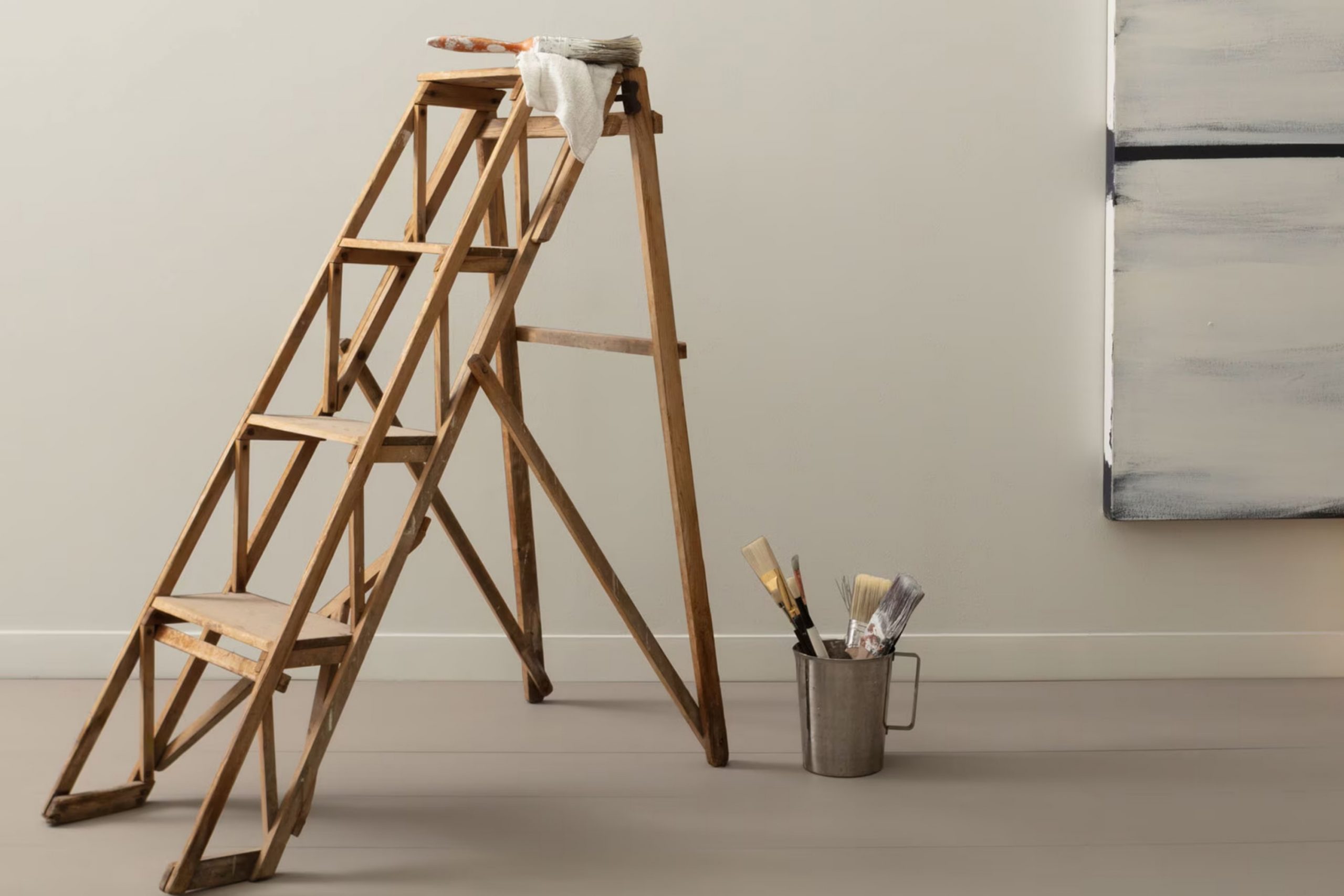
Ever wished paint sampling was as easy as sticking a sticker? Guess what? Now it is! Discover Samplize's unique Peel & Stick samples.
Get paint samples

