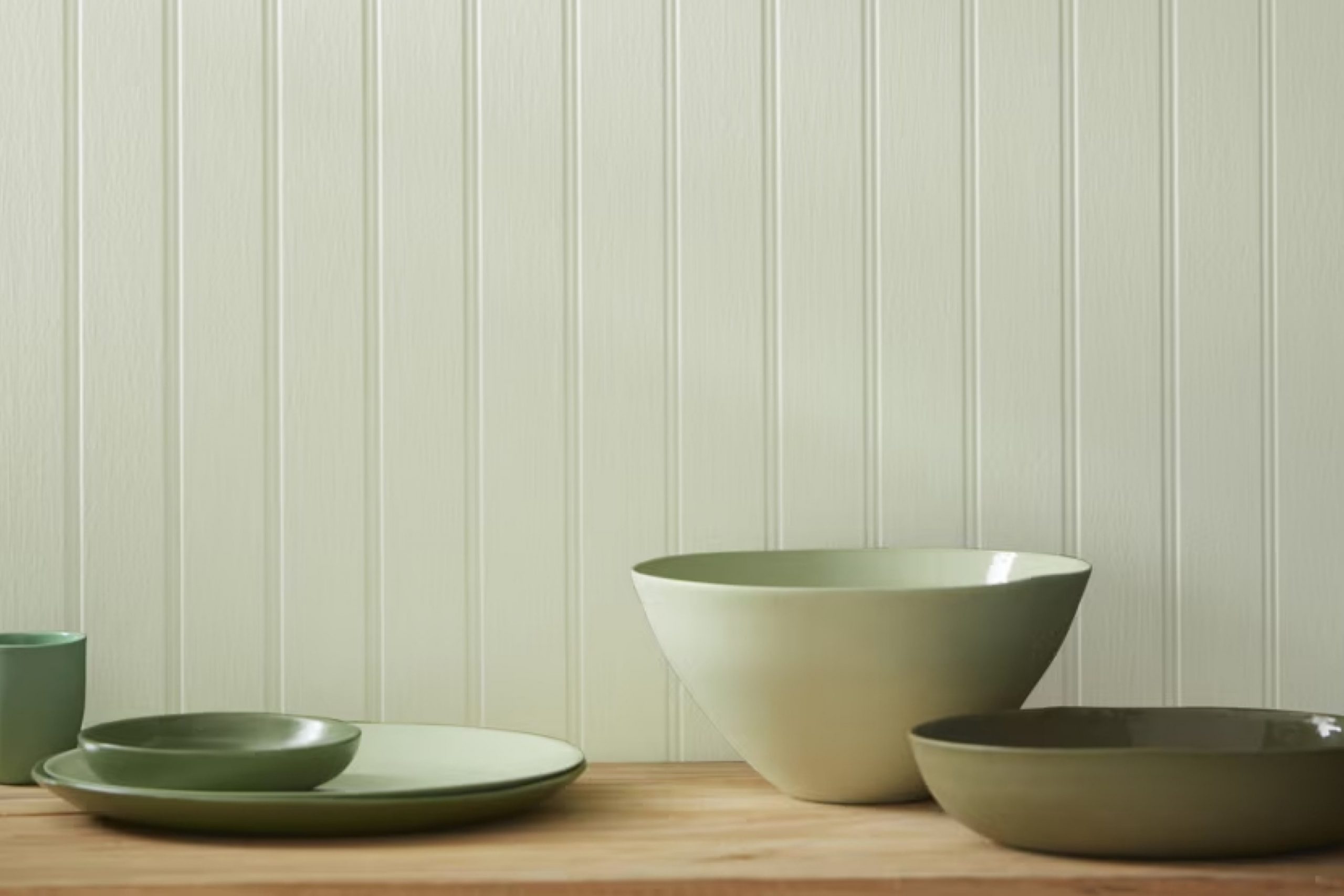
This color is a beautiful blend of gray and green, offering a soft and soothing hue that feels like a breath of fresh air. It’s not just a paint color; it’s a way to bring serenity into your space.
I find Silver Sage to be incredibly versatile. It works well in practically any room. In the living room, it creates a cozy and inviting atmosphere, perfect for unwinding after a long day. In the bedroom, it provides a calming effect, helping me relax and enjoy a restful sleep.
I love how Silver Sage adapts to different styles. Whether you prefer a modern aesthetic or a more traditional ambiance, this color complements various decors. Paired with white trim, it looks crisp and clean. Combined with natural wood tones, it adds warmth and depth.
Using Silver Sage is a straightforward way to refresh your home. Whether you’re painting an entire room or just an accent wall, it brings a peaceful and stylish vibe.
This shade is more than just a color on the wall; it’s a gentle reminder of the tranquility and beauty that simple choices can bring to our lives.
What Color Is Silver Sage 506 by Benjamin Moore?
Silver Sage by Benjamin Moore is a soothing blend of soft green and subtle gray. This gentle, muted tone brings a sense of calm and balance to any room. It’s neither too bold nor too dull, making it a versatile choice for many interior styles.
Silver Sage works well in traditional, coastal, and modern farmhouse designs. It provides a perfect backdrop for spaces that need a hint of color while maintaining a neutral, grounded feel.
In traditional settings, this color brings a classic, understated elegance, while in a coastal home, it mimics the gentle colors of the sea and sky.
Pairing Silver Sage with natural materials enhances its charm. Think warm woods, wicker, and stone to bring out its gentle warmth. Textures such as linen, cotton, and wool complement its understated vibe.
Soft, creamy whites and taupes highlight Silver Sage’s cool tone, while darker grays or navy can add depth and contrast.
Accessories in bronze or brushed nickel can add a touch of character without overpowering its calm essence. In the kitchen or bathroom, try pairing it with white subway tiles or marble countertops for a clean and fresh look.
Overall, Silver Sage is a versatile color that effortlessly lends an inviting and cozy atmosphere.
Is Silver Sage 506 by Benjamin Moore Warm or Cool color?
Silver Sage 506 by Benjamin Moore is a soft, muted green with a hint of gray. It’s a versatile color that can create a calming atmosphere in any room. In living rooms, Silver Sage can help make the space feel warm and inviting, encouraging relaxation and comfort.
When used in bedrooms, this shade promotes a peaceful setting that’s perfect for winding down. Kitchens and dining areas can also benefit from Silver Sage, as it adds a touch of understated elegance while still feeling fresh.
This color works well with natural light, making rooms feel bright and airy. Paired with white or cream, it creates a clean and timeless look.
Silver Sage complements various materials, such as wood or stone, enhancing the natural elements in a home. It also pairs beautifully with accents in darker shades, adding depth to a room without overwhelming it. Overall, Silver Sage 506 is a gentle color that’s easy to live with.
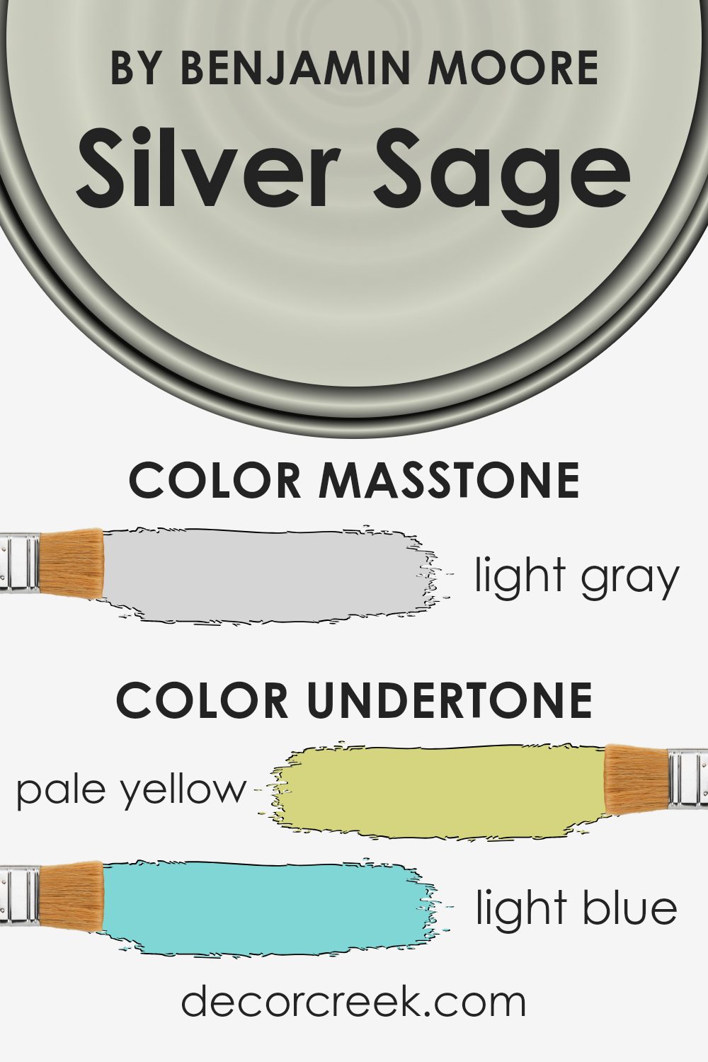
Undertones of Silver Sage 506 by Benjamin Moore
The color Silver Sage by Benjamin Moore is unique because it has a mix of different undertones. These include pale yellow, light blue, light purple, mint, pale pink, lilac, and grey. When you look at a color, these undertones can change how you feel about it and how it looks in different lights or settings. For Silver Sage, these undertones can make it seem different depending on the lighting in a room.
For example, in a room with lots of natural light, the pale yellow and mint undertones might become more noticeable, giving the room a warm and fresh feel. In a dimly lit room, the grey and light purple undertones may stand out, making the color appear cooler and more calming.
Because of these varied undertones, Silver Sage can be a versatile choice for interior walls. It can adapt to different lighting conditions and moods, making it a good option for many spaces.
Overall, the undertones in Silver Sage can create a dynamic and playful atmosphere in a room, offering subtle changes in color perception throughout the day.
This makes it an interesting choice for spaces where you want a soft yet lively background.
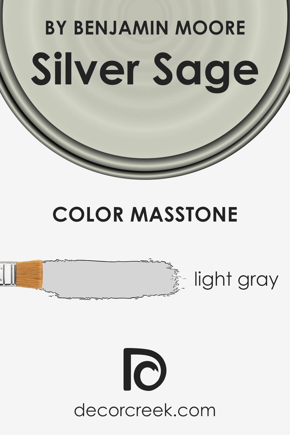
What is the Masstone of the Silver Sage 506 by Benjamin Moore?
Silver Sage by Benjamin Moore is a light gray color that lends a calming and versatile feel to any home. Its masstone, or the primary color as seen in natural light, is #D5D5D5, a gentle gray that is both neutral and sophisticated. This versatile shade works well in various spaces, helping to create a clean and airy atmosphere that complements many styles of decor.
In living rooms, Silver Sage can make the space feel more open and inviting. Its light tone helps reflect natural light, making a room brighter and more spacious. In bedrooms, the soft gray hue promotes relaxation, providing a perfect backdrop for peaceful rest.
Silver Sage pairs beautifully with other neutral shades like white, beige, or soft pastels, allowing you to mix and match furniture and accessories easily. Whether used on walls or as an accent, this light gray color can harmonize with both modern and traditional design elements in any home.
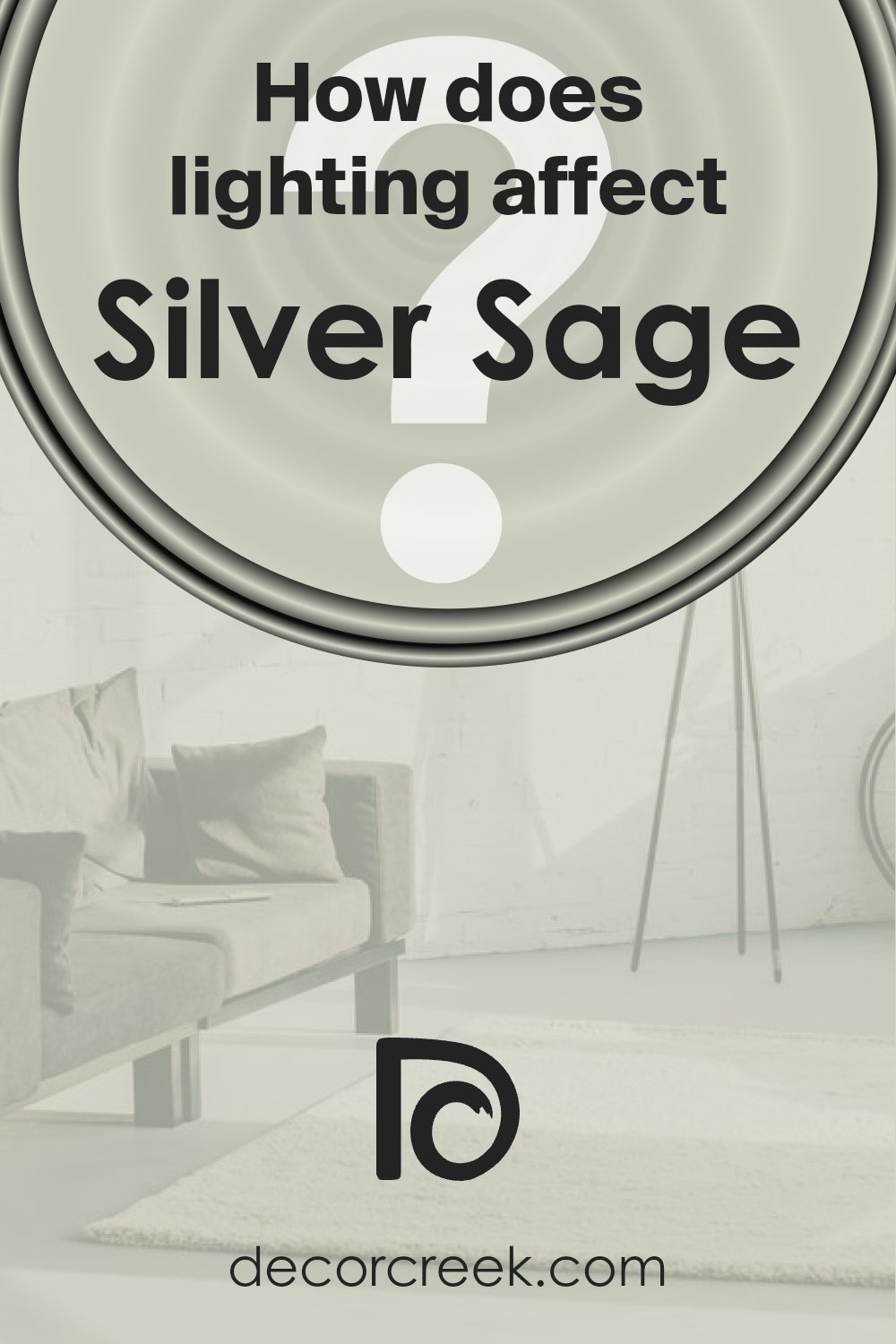
How Does Lighting Affect Silver Sage 506 by Benjamin Moore?
Lighting has a significant impact on how we perceive colors. The source and quality of light can change the appearance of a paint color, making it look different depending on the time of day and type of light. This is important when considering a paint color like Silver Sage by Benjamin Moore, which can appear differently in various lighting conditions.
In natural light, Silver Sage tends to show its true color. It is a gentle gray-green that can look sophisticated and soothing. In rooms that receive a lot of natural light, this color can feel airy and soft.
However, in north-facing rooms, which receive cooler and indirect sunlight, Silver Sage may appear cooler and more gray, making the space feel calm but potentially a bit stark.
Adding warm-toned lighting or accents can help balance this effect.
In contrast, in south-facing rooms with warm, direct sunlight, Silver Sage can reveal its warmer undertones, appearing more green and vibrant. This can make the room feel inviting and lively throughout the day. The color’s versatility allows it to adapt well, adding both warmth and serenity to these spaces.
East-facing rooms catch warm, yellow light in the morning, which can enhance the green hues of Silver Sage. This results in a fresh and lively feel in the early hours, while during the afternoon, the color may become more muted as the natural light diminishes.
West-facing rooms experience the reverse, with cooler, softer light in the morning and warm, golden tones in the late afternoon. Silver Sage in a west-facing room may look subdued earlier in the day and become warmer as the sun sets, creating a cozy atmosphere.
In artificial light, the perception of Silver Sage depends on the bulb used. Warm, incandescent bulbs can bring out its green notes, while cooler, LED lighting might emphasize the gray aspects, altering the mood of the room. Therefore, choosing the right lighting is crucial for achieving the desired effect with Silver Sage.
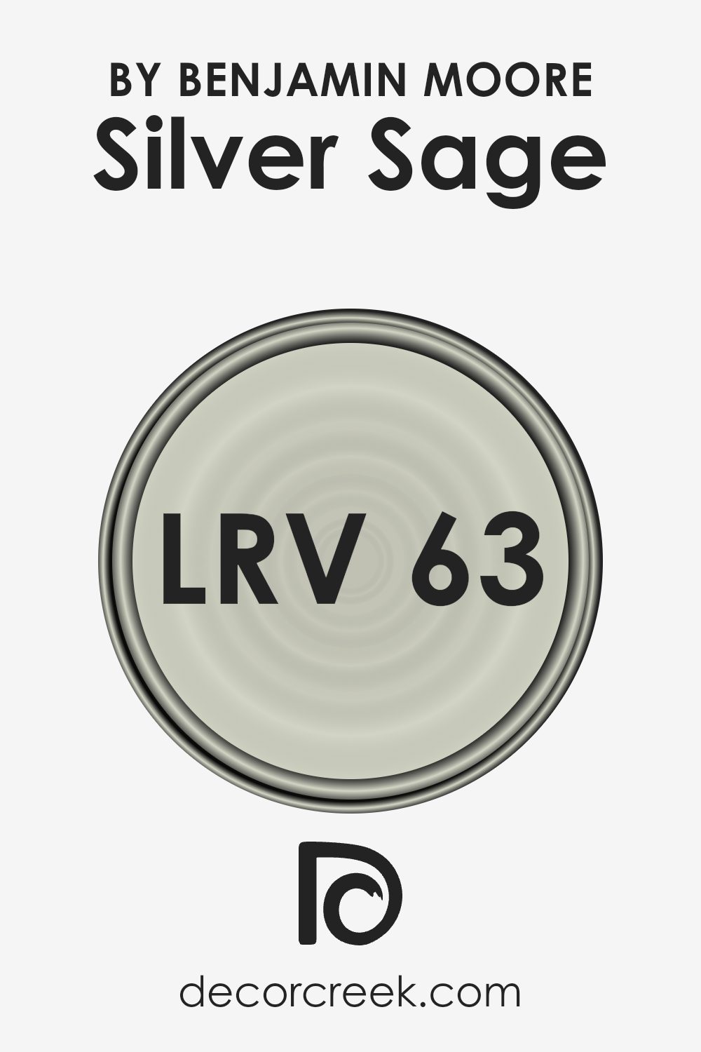
What is the LRV of Silver Sage 506 by Benjamin Moore?
Light Reflectance Value, or LRV, is a measure that indicates how much light a color reflects. It is a scale that ranges from 0% to 100%, where 0% is absolute black, absorbing all light, and 100% is pure white, reflecting all light.
Colors with high LRV reflect more light, making spaces appear brighter and more open, while colors with low LRV reflect less light, which can make spaces feel cozier and more intimate.
LRV is an important factor to consider when selecting paint colors, as it can greatly influence the ambiance and perception of a room by affecting how light interacts with the painted surface.
The LRV of Silver Sage by Benjamin Moore is 63.26, which means it reflects a fairly high amount of light. This value suggests that Silver Sage will contribute to a light and airy feel in a room, without being too stark or overwhelming. It’s a balanced color that will help illuminate spaces, making rooms appear larger and more open.
Since it is not an extremely high LRV, it also has enough depth to add character and warmth to a space. Its reflective properties make it a versatile choice for various lighting conditions, ensuring that the color maintains a consistent appearance throughout the day as natural light levels change.
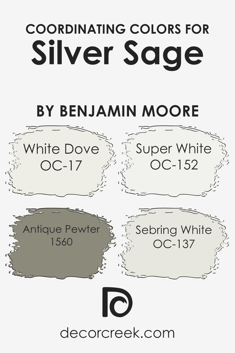
Coordinating Colors of Silver Sage 506 by Benjamin Moore
Coordinating colors are shades that work well together to create a harmonious look in a space. These colors complement the main color, Silver Sage, from Benjamin Moore, which is a soft, muted green with a hint of gray.
To bring out the best in this shade, a carefully chosen palette of coordinating colors can enhance its natural charm and balance. For instance, White Dove (OC-17) is a warm white that adds a sense of calm and light when paired with Silver Sage.
Its creamy undertone blends beautifully, adding a subtle contrast without overpowering the primary color.
Another great match is Antique Pewter (1560), a medium gray with earthy undertones, providing depth and grounding to the space. Then there’s Super White (OC-152), a crisp and clean white that offers a modern and fresh touch. Its bright quality helps create a striking contrast that highlights the soft green of Silver Sage.
Sebring White (OC-137) is a soft and neutral shade with a hint of warmth, offering a cozy and inviting feel that complements the main color’s gentle presence.
Together, this lineup of coordinating colors creates a balanced and inviting atmosphere, enhancing Silver Sage’s natural beauty.
You can see recommended paint colors below:
- OC-17 White Dove
- 1560 Antique Pewter
- OC-152 Super White
- OC-137 Sebring White
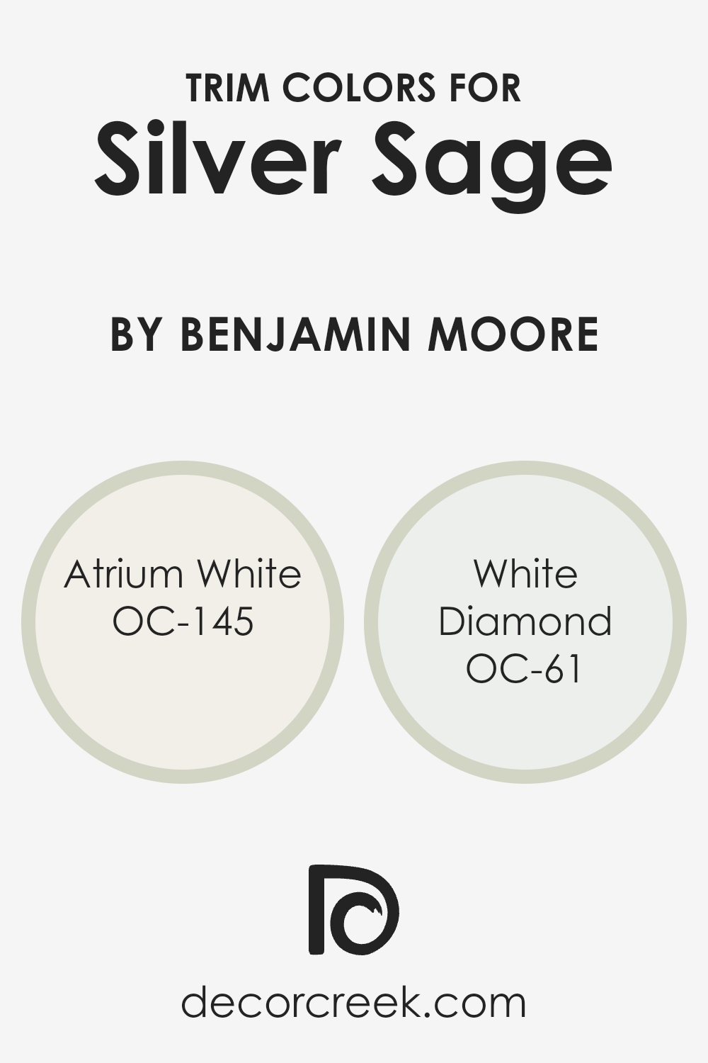
What are the Trim colors of Silver Sage 506 by Benjamin Moore?
Trim colors are the paints used for the finishing touches on a room, typically applied to baseboards, moldings, window frames, and doors. They help highlight architectural details and create a finished look that enhances the main wall color. Choosing the right trim color is essential because it complements and frames the main color, impacting the overall look and feel of a space.
For the Silver Sage color by Benjamin Moore, using the right trim colors can balance its soft, muted tone. Atrium White (OC-145) is a warm white that adds a subtle softness to your space, bringing out the gentle undertones of Silver Sage without being too stark.
On the other hand, White Diamond (OC-61) is a cooler, crisp white that can offer a fresh contrast, highlighting Silver Sage’s unique warmth while maintaining a clean and modern aesthetic.
Atrium White is a warm and inviting white that offers a slightly creamy appearance, making it perfect for adding warmth but not overwhelming the main color. It brings a comforting feel that connects well with Silver Sage’s soothing nature.
White Diamond is a cooler, brighter white that provides sharp definition against Silver Sage, allowing the sage hue to stand out while delivering a polished and clean look.
Together, these trim colors enhance the overall decor by either blending subtly with Silver Sage or offering a striking contrast that highlights architectural features, both ensuring that the space feels cohesive and stylish.
You can see recommended paint colors below:
- OC-145 Atrium White
- OC-61 White Diamond
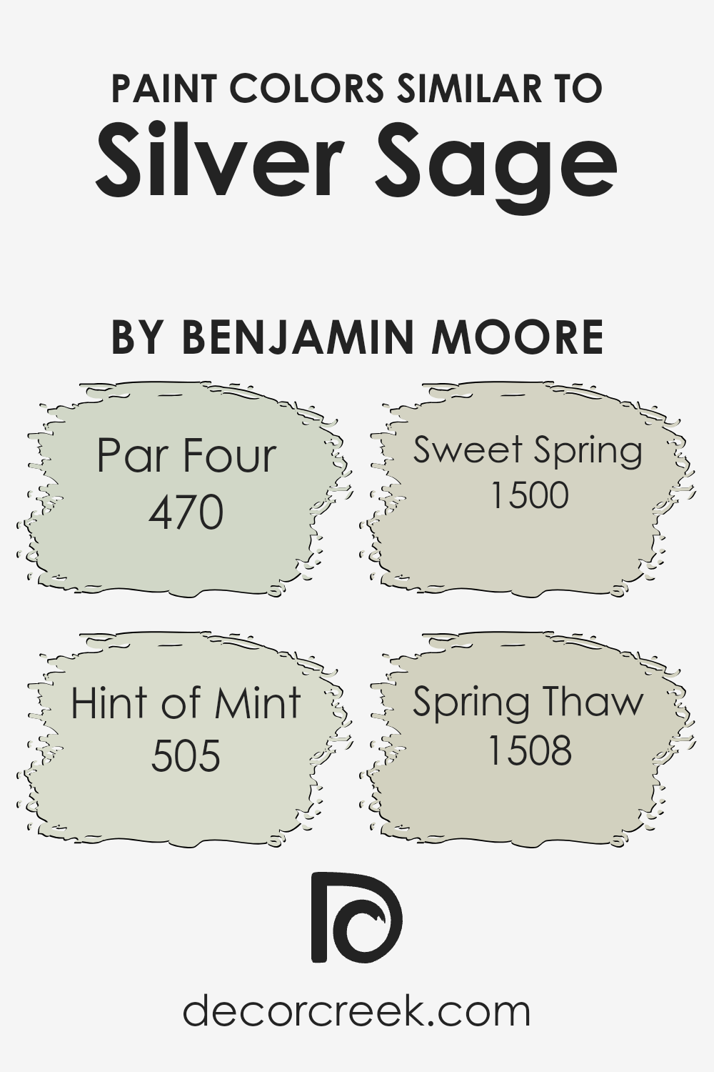
Colors Similar to Silver Sage 506 by Benjamin Moore
Similar colors are essential in design because they create harmony and balance in a space. When you use colors that are close to each other on the palette, like Par Four, Hint of Mint, Sweet Spring, and Spring Thaw, you create a soothing environment that is visually pleasing.
Par Four is a soft, muted green that offers a calming effect, much like a gentle stroll through a lush garden. Hint of Mint is a light, fresh shade with a touch of minty coolness, refreshing yet understated, perfect for adding a breath of fresh air to any room.
Sweet Spring is a delicate, pale green that brings a bit of the outside indoors, reminiscent of the first budding leaves of springtime. Meanwhile, Spring Thaw is a slightly deeper, warmer green, invoking the feeling of nature waking up after a long winter.
Together, these colors complement Silver Sage’s gentle green, creating a cohesive palette that provides a sense of unity.
Each of these colors works in concert to produce a natural, easy-on-the-eyes setting, ideal for areas where relaxation and rejuvenation are priorities, such as living rooms, bedrooms, or reading nooks.
You can see recommended paint colors below:
- 470 Par Four
- 505 Hint of Mint
- 1500 Sweet Spring
- 1508 Spring Thaw
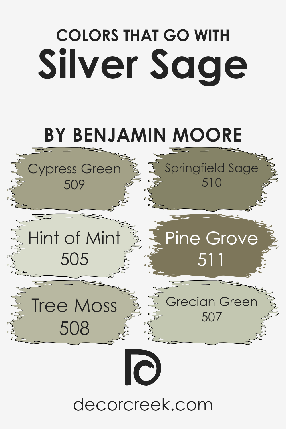
Colors that Go With Silver Sage 506 by Benjamin Moore
Choosing colors that complement Silver Sage 506 by Benjamin Moore can create a harmonious and balanced look in any space. When paired with 509 – Cypress Green, a muted forest green, the result is a natural and calming atmosphere.
Cypress Green’s earthy tone works perfectly with Silver Sage, as both share an understated elegance that can fit in both modern and traditional settings. The delicate touch of 505 – Hint of Mint adds a refreshing and airy quality. I
t’s light and gentle, offering a soft contrast while enhancing the calming nature of Silver Sage. A color like 508 – Tree Moss, with its deep, rich texture, provides depth and grounds the lighter tones in the palette, making the overall look more dynamic.
On the other hand, 510 – Springfield Sage is a bit darker than Silver Sage, offering a slightly bolder choice while remaining in the same color family. It adds a subtle hint of drama without overpowering. 511 – Pine Grove, a darker and more intense green, can create focal points or accent areas that stand out against Silver Sage’s softer hue.
Lastly, 507 – Grecian Green has a classic and timeless quality, offering a neutral backdrop that can beautifully balance Silver Sage. Together, these colors create an inviting and cohesive environment that feels effortlessly put together.
You can see recommended paint colors below:
- 509 Cypress Green
- 505 Hint of Mint
- 508 Tree Moss
- 510 Springfield Sage
- 511 Pine Grove
- 507 Grecian Green
How to Use Silver Sage 506 by Benjamin Moore In Your Home?
Silver Sage 506 by Benjamin Moore is a versatile paint color that adds a gentle touch to any home. It’s a soft, muted green with subtle gray undertones, making it an excellent choice for creating a calm and inviting atmosphere. This color works well in various rooms, from living areas to bedrooms, and is perfect for those who want a natural and soothing backdrop.
In living spaces, Silver Sage can bring a sense of comfort and relaxation. Pair it with neutral furniture and natural materials like wood for a harmonious look. In bedrooms, this color can help create a restful environment, promoting a peaceful night’s sleep. Adding white or cream accents can brighten the room, while deeper greens or blues can add depth and interest.
Silver Sage also suits kitchens and bathrooms, providing a fresh, clean feel. It pairs well with stainless steel or white fixtures, adding a touch of elegance without overwhelming the space.
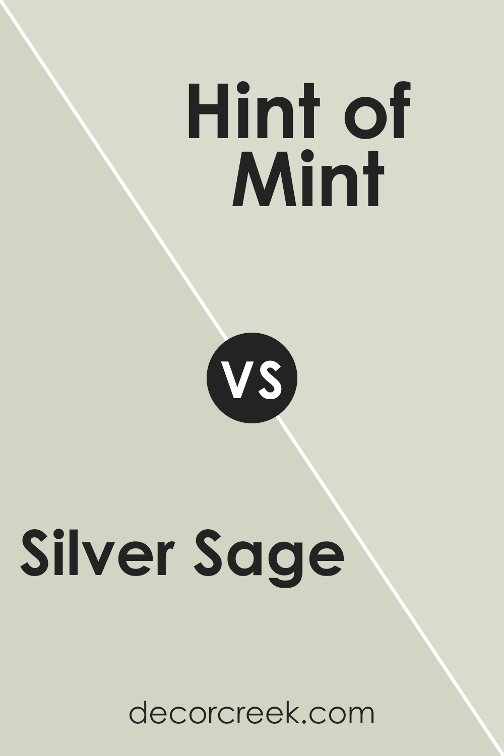
Silver Sage 506 by Benjamin Moore vs Hint of Mint 505 by Benjamin Moore
Silver Sage 506 by Benjamin Moore is a soft, muted green-gray that brings a calming and neutral feel to a space. It’s a versatile color that works well in a variety of settings, from living rooms to bedrooms, offering a subtle backdrop that blends nicely with other colors.
On the other hand, Hint of Mint 505 by Benjamin Moore is a brighter, more vibrant shade of green. It offers a fresh, lively touch, with a hint of blue that gives it an energetic and refreshing vibe.
While Silver Sage leans toward a more understated and earthy tone, Hint of Mint is playful and works well in spaces needing a pop of color.
Together, they offer contrasting but complementary options: one more subdued and relaxing, and the other fresh and invigorating.
Both shades can complement each other beautifully when used wisely in different parts of a home.
You can see recommended paint color below:
- 505 Hint of Mint
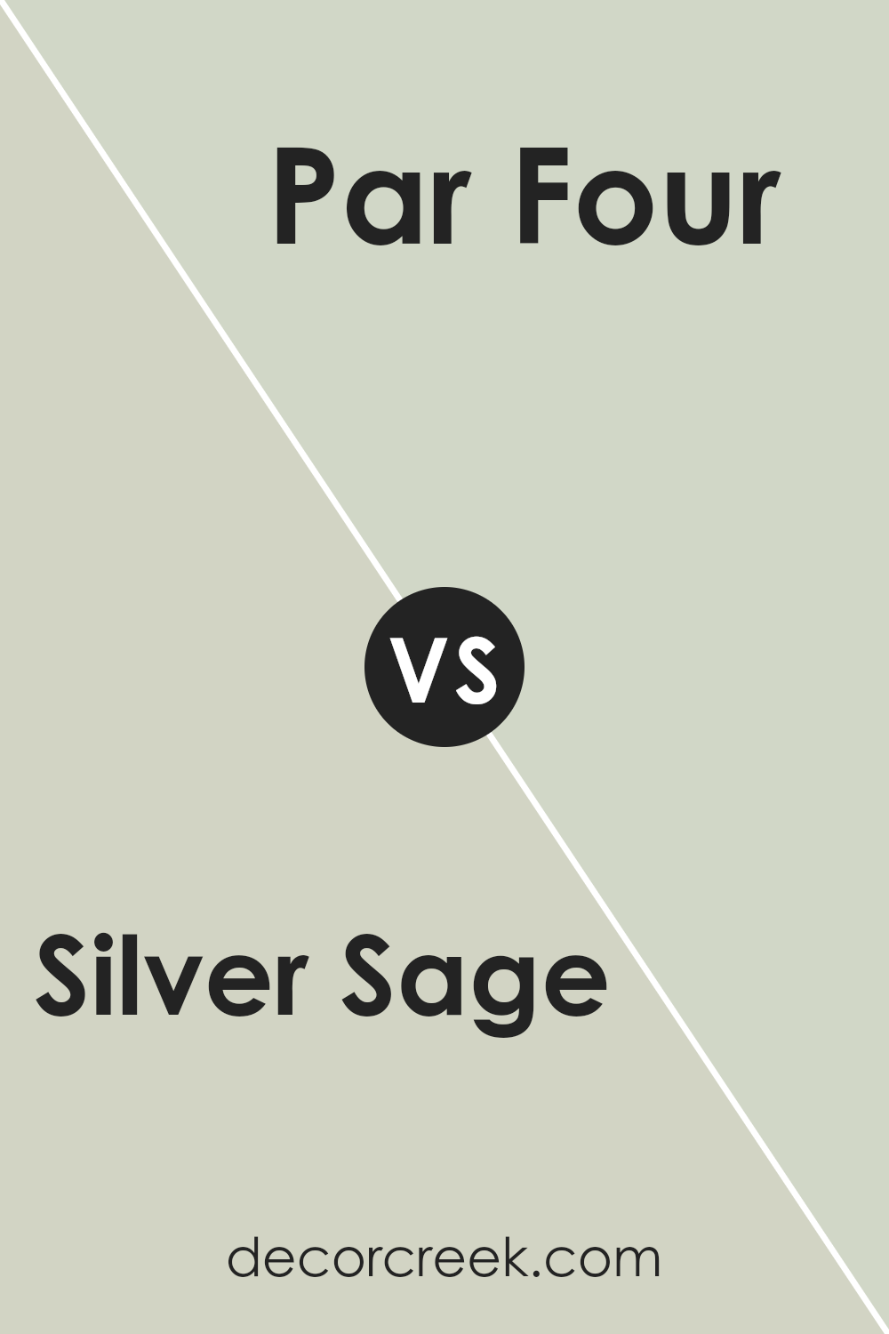
Silver Sage 506 by Benjamin Moore vs Par Four 470 by Benjamin Moore
Silver Sage and Par Four are both attractive colors by Benjamin Moore, but they offer different vibes. Silver Sage is a soft, muted green with gray undertones. It feels calm and gentle, making it ideal for spaces where you want a peaceful atmosphere.
It’s versatile and can fit well in bedrooms or living rooms, pairing nicely with natural materials and soft neutrals.
On the other hand, Par Four is a bolder and more vibrant green. It’s energetic and fresh, evoking the feel of a lush golf course or bright spring day. This color can make a strong statement and works well in spaces where you want to add some life and energy, such as a playroom or an accent wall.
In summary, Silver Sage is subtle and calming, while Par Four is lively and invigorating. Your choice between them would depend on whether you prefer a soothing or energizing ambience.
You can see recommended paint color below:
- 470 Par Four
Silver Sage 506 by Benjamin Moore vs Spring Thaw 1508 by Benjamin Moore
Silver Sage 506 and Spring Thaw 1508 by Benjamin Moore are both soothing colors with different characters. Silver Sage 506 is a soft, muted green with gray undertones. It gives a calm and neutral feel, making it versatile for various settings. It’s great for those who want a subtle, earthy vibe in their space.
Spring Thaw 1508, on the other hand, is a light and warm color with beige undertones. It offers a gentle brightness and feels welcoming. This color is perfect if you want to create a cozy and inviting atmosphere without overwhelming the senses.
While Silver Sage leans more towards a cool tone, Spring Thaw adds warmth. They can both be used throughout a home, but Silver Sage is more restful, while Spring Thaw brings a bit more light and warmth. Together, they can complement each other if used thoughtfully, balancing coolness and warmth in a room.
You can see recommended paint color below:
- 1508 Spring Thaw
Silver Sage 506 by Benjamin Moore vs Sweet Spring 1500 by Benjamin Moore
Silver Sage 506 by Benjamin Moore is a calming color that blends green and gray tones, creating a muted, earthy look. It’s a versatile shade that can bring a sense of peace to a room without being overpowering. This color works well in spaces where you want a touch of nature and relaxation.
Sweet Spring 1500, also by Benjamin Moore, is a much lighter and softer color, with hints of green that feel fresh and gentle. It leans more toward a pastel shade compared to the deeper presence of Silver Sage.
Sweet Spring is ideal for spaces where you want a light and airy feeling, perhaps in a bedroom or a nursery.
While both colors incorporate green, Silver Sage is darker and more muted, while Sweet Spring is lighter and softer. Silver Sage might suit a modern living area, whereas Sweet Spring could brighten up a smaller space.
You can see recommended paint color below:
- 1500 Sweet Spring
Conclusion
I really enjoyed learning about 506 Silver Sage by Benjamin Moore. This paint color is like a magical mix of green and gray that looks really nice and soft. It’s such a friendly color because it can look good in almost any room. When you use it, it feels like you bring a little bit of the calmness of nature inside, which is really cool.
You can use 506 Silver Sage in your bedroom to feel more relaxed before going to sleep, or in the living room to make it cozy for your family and friends. Even in a place like the kitchen, it can make everything seem fresh and clean.
It’s not too bright and not too dull—just right to make the room look great without being too fancy.
One of the best things about it is that it works well with lots of other colors. You can match it with whites, browns, or even some blues to make a room look just the way you want. Also, it can make the whole room feel warmer or cooler depending on the other colors you choose.
In simple words, 506 Silver Sage is a really nice color that can help make any room in a house feel more welcoming and comfortable. I think it is a fantastic choice if you want something that looks nice and peaceful.
Ever wished paint sampling was as easy as sticking a sticker? Guess what? Now it is! Discover Samplize's unique Peel & Stick samples.
Get paint samples

