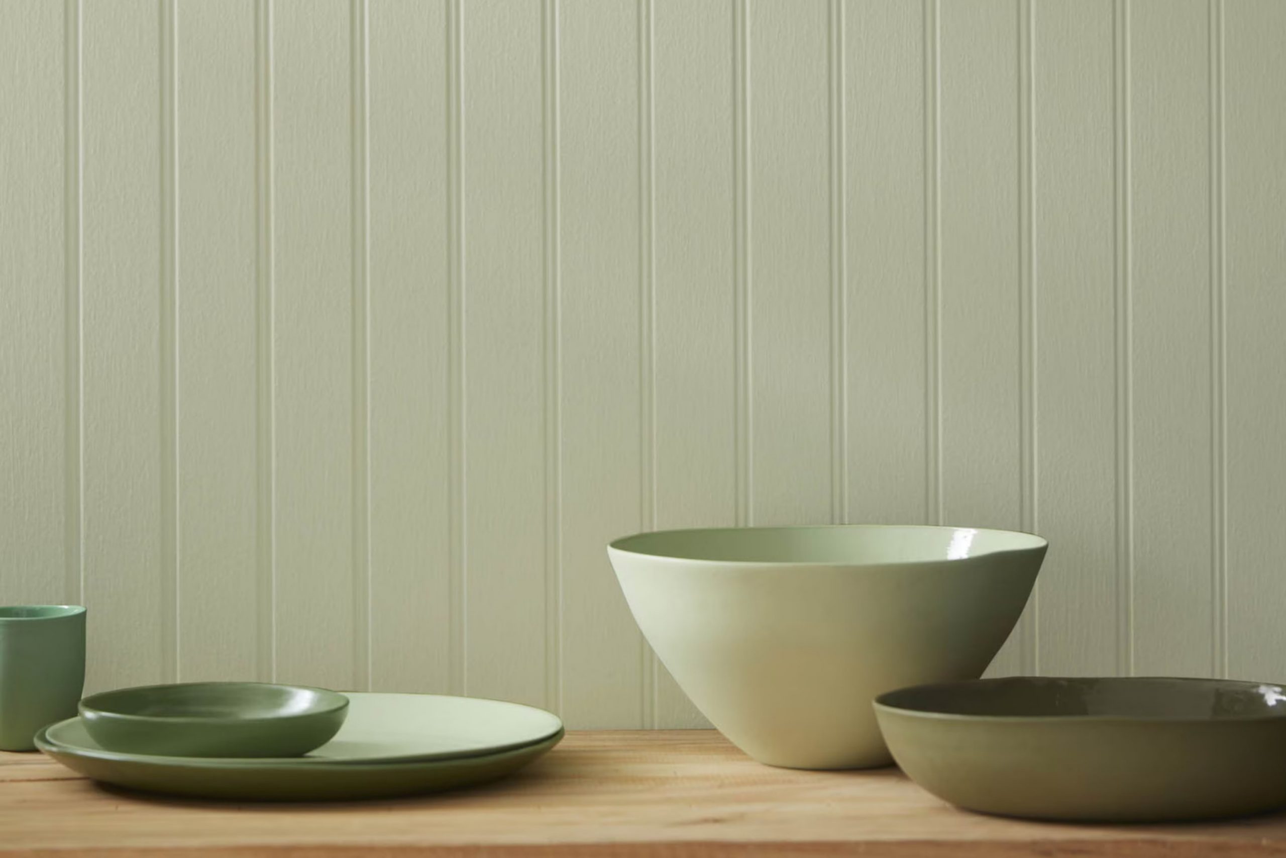
When I started painting my study room, I was looking for a color that would reflect a sense of calm and nature-inspired peace. That’s when I came across 508 Tree Moss by Benjamin Moore.
This unique paint color draws inspiration from the soft, earthy hues found in a forest, particularly the gentle colors of tree moss. The subtle green with gray undertones creates a soothing backdrop that is adaptable enough to match a wide range of decor.
It has an organic feel that brings the calmness of nature indoors, making it ideal for rooms where you want to promote relaxation and focus.
As I applied it, I noticed how it changed the room into a calm retreat, proving to be a perfect choice for creating a peaceful and inviting atmosphere.
What Color Is Tree Moss 508 by Benjamin Moore?
Tree Moss 508 by Benjamin Moore is a soft, muted green with hints of gray, providing a subtle and soothing feel to any room it’s used in. This color resembles the natural tones of a mossy forest floor, ideal for creating a calm and inviting atmosphere. Its gentle presence works well in rooms aiming for a relaxed vibe but still looking for just a hint of color.
This adaptable shade is particularly well-suited to rustic and vintage interior styles, where its earthy quality complements natural wood, distressed furniture, and antique decor. Tree Moss is also a fantastic choice for coastal styles, blending beautifully with sandy hues, blues, and crisp whites, reminiscent of the seaside.
In terms of materials, Tree Moss pairs wonderfully with organic textures such as linen, cotton, and wool, enhancing the coziness of the environment. For furniture, think unfinished wood, wicker, or bamboo which contribute to a more relaxed, down-to-earth feel. Combine it with metals like copper or bronze for a gentle contrast that enriches its natural aesthetic.
Overall, Tree Moss is ideal for those looking to introduce a natural, grounding element to their room that feels both fresh and relaxed without being overly bold or too much.
decorcreek.com
Is Tree Moss 508 by Benjamin Moore Warm or Cool color?
Tree Moss 508 by Benjamin Moore is a unique and subtle paint color, ideal for creating a cozy, welcoming vibe in any home. This shade is a soft, earthy green that easily blends with a variety of decor styles, from rustic to modern. Its muted tone ensures that it isn’t too much, making it perfect for larger areas like living rooms or smaller rooms such as bathrooms.
What’s great about Tree Moss is its adaptability. It pairs beautifully with natural materials like wood and stone, enhancing their natural colors and adding a touch of warmth. Additionally, this color works well in rooms that have either little or plenty of light, maintaining its depth and richness regardless of the lighting condition.
When used in homes, Tree Moss 508 can help to create a cozy atmosphere. It’s especially effective in bedrooms where it adds a soft, calming backdrop, conducive to relaxation and good sleep. Whether you’re painting an accent wall or the entire room, this color is a practical choice that remains stylish and appealing.
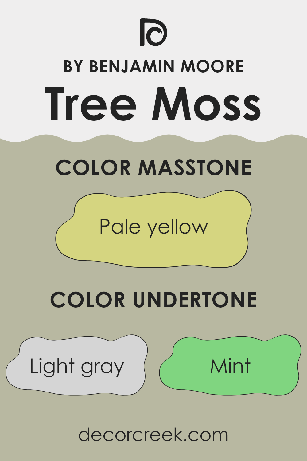
Undertones of Tree Moss 508 by Benjamin Moore
Tree Moss 508 by Benjamin Moore exhibits a unique assortment of undertones that contribute to its overall appearance and how it is perceived in various lighting conditions. Undertones are the colors that linger beneath the surface of the paint, influencing its depth and character. For Tree Moss, these undertones include shades such as light gray, mint, pale pink, light blue, light purple, grey, lilac, yellow, light green, orange, and olive.
Understanding how undertones impact the color helps in making informed decisions especially when painting interior walls. For example, in rooms with lots of natural light, mint and light blue undertones might make Tree Moss appear fresher and more vibrant. Conversely, in rooms with less natural light, gray or olive undertones could make the color look deeper and more muted.
When applied to interior walls, the variety of undertones in Tree Moss can affect the mood and feel of a room. Lighter undertones like pale pink and light purple can soften the overall look, making the room feel more comfortable and welcoming. Meanwhile, colors like orange and yellow might add a subtle warmth to the room, perfect for rooms intended to feel cozy and inviting.
Choosing the right paint color, like Tree Moss, means considering how its undertones will play with the room’s lighting, furniture, and overall ambience. This awareness ensures that the color complements the room effectively, enhancing the environment rather than clashing with it.
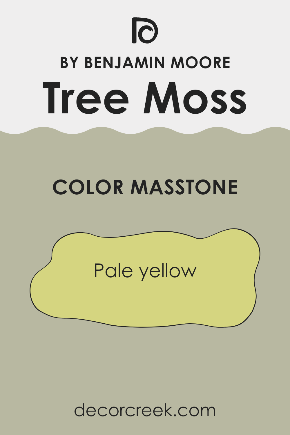
What is the Masstone of the Tree Moss 508 by Benjamin Moore?
Tree Moss 508 by Benjamin Moore, primarily recognized by its masstone, pale yellow (#D5D580), provides a soft and soothing feel to any room. This color is gentle and muted, making it a great choice for those looking to create a cozy and cheerful environment. Because it’s not too much, it works well in smaller rooms without making them feel cramped. The pale yellow shade brings a sense of light and openness, which is perfect for areas of the home that don’t receive a lot of natural sunlight.
When applied, it offers a fresh look, making it ideal for kitchens or living rooms where a welcoming feeling is desired. Additionally, this color pairs well with various decor styles and other colors, allowing for flexible design options.
Its lightness can also make rooms feel larger and more airy, which is beneficial in homes where room is at a premium. Whether you’re looking to freshen up a single room or repaint the entire house, this pale yellow can provide a gentle touch of warmth, enhancing the overall ambience of the home.
How Does Lighting Affect Tree Moss 508 by Benjamin Moore?
Lighting plays a crucial role in how we perceive colors. The same paint can look different under various lighting conditions. For instance, consider the shade Tree Moss 508 by Benjamin Moore. It’s a unique color that can change its appearance dramatically depending on the light.
In artificial light, such as LED or fluorescent bulbs, Tree Moss 508 can appear slightly more intense and vivid. This is because most artificial lighting tends to be either cool, giving off a bluish tone, or warm, radiating a yellowish glow. If the artificial light is warm, it can enhance the yellow undertones of Tree Moss 508, making it look warmer than it actually is.
In natural light, the appearance of Tree Moss 508 can change throughout the day. Morning light is generally cooler, which might make the paint look more subdued and closer to a true gray. As the day progresses and the natural light becomes warmer, especially in the late afternoon, the color could appear softer and slightly more greenish.
The orientation of a room affects how Tree Moss 508 looks due to the differing qualities of light throughout the day:
- North-Faced Rooms: These rooms receive less direct sunlight, often resulting in cooler, softer light. Tree Moss 508 might look more muted and closer to a shadowy green in such rooms.
- South-Faced Rooms: These get more sunlight, which means the color can look brighter and more vibrant. Tree Moss 508 will likely show its green undertones more prominently in a south-facing room.
- East-Faced Rooms: With morning light, this color will start the day looking quite fresh and lively due to the cooler morning light. As the light fades, the color might become more subdued.
- West-Faced Rooms: Here, Tree Moss 508 might appear less vibrant in the morning but gain intensity during sunset when the warmer light accentuates its depth.
In summary, Tree Moss 508’s perception can shift based on lighting conditions, whether natural or artificial, and the room’s orientation, which impacts the quality and amount of light entering the room. This makes the color adaptable yet unpredictable, a characteristic that could be used to great advantage when decorating.
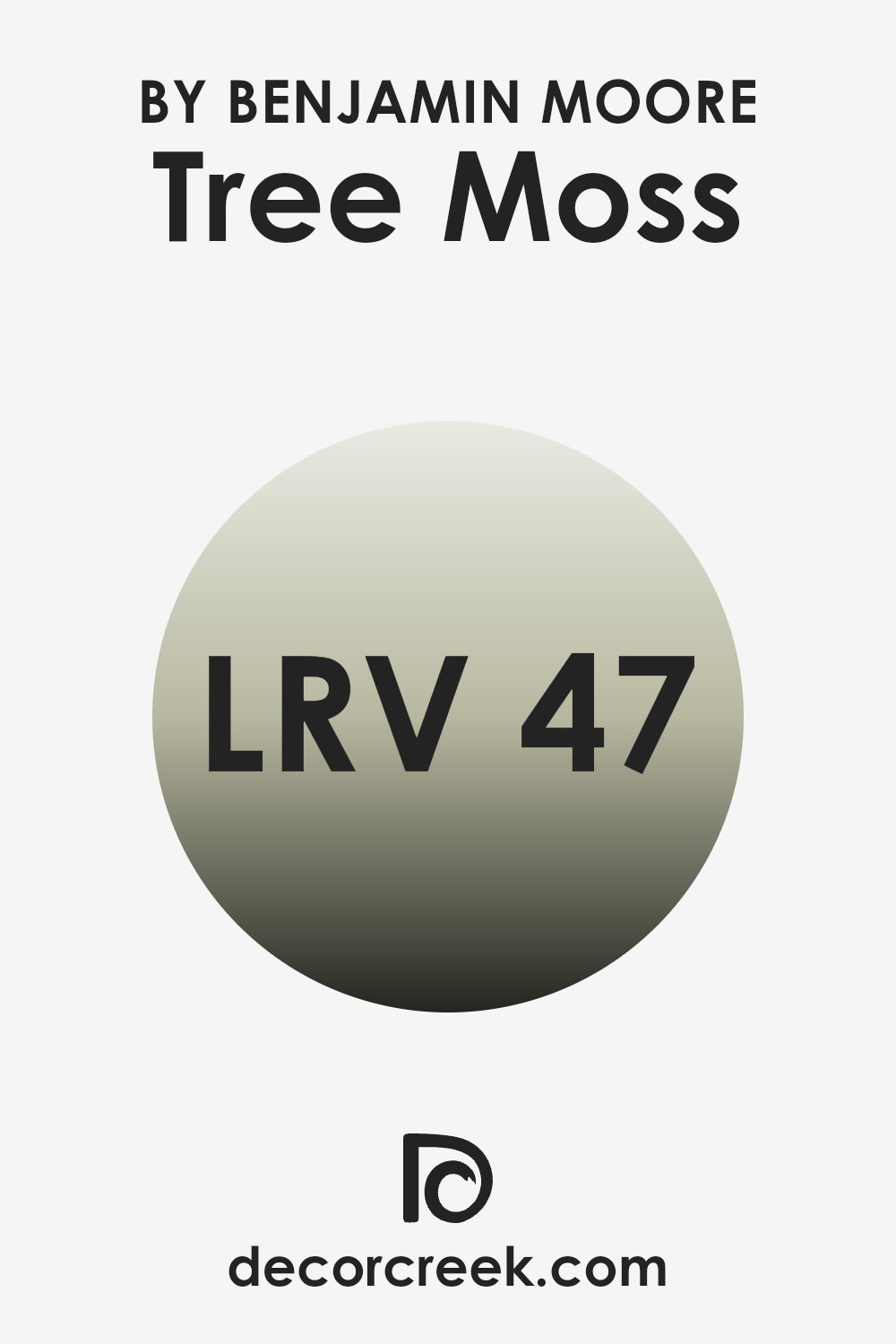
What is the LRV of Tree Moss 508 by Benjamin Moore?
LRV stands for Light Reflectance Value, which is a measure of the amount of light a paint color reflects or absorbs from its environment. This value ranges between 1 and 99, where higher numbers indicate that more light is reflected back. LRV is an important factor when choosing paint colors because it can significantly influence how a color appears in different lighting conditions.
For instance, colors with a higher LRV make a room feel brighter and more open since they reflect more light around the room. Conversely, colors with a lower LRV absorb more light, which can make a room feel cozy but smaller and darker.
Considering the LRV of 46.81 for the color of the paint mentioned, it reflects almost half the light that hits it. This means it stands somewhere in the middle range of the LRV scale, not too dark or too bright.
In practical terms, this value suggests that the color will bring a balanced amount of brightness to a room. It will not make a room feel as bright as colors with much higher LRVs, nor will it make it feel overly dark like those with much lower values. This makes it an adaptable choice that can work well in a variety of rooms and lighting conditions, avoiding the extremes of feeling too stark or too dim.
decorcreek.com
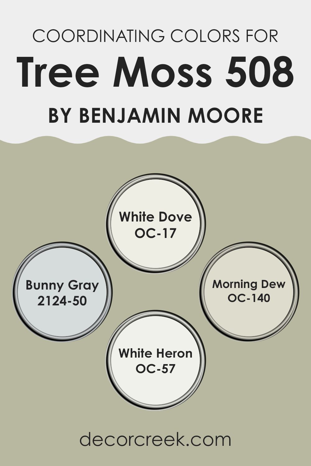
Coordinating Colors of Tree Moss 508 by Benjamin Moore
Coordinating colors are selected to complement or enhance each other when used together in decor or design. For instance, when paired with a specific color, such as a deep green, coordinating colors can balance the intensity by presenting lighter shades, subtle contrasts, or harmonious tones.
Finding the right coordinating colors is essential in creating a polished and well-thought-out look in any room. Typically, these colors share a similar saturation level or temperature, even though they might differ in hue, enabling them to coexist harmoniously without being too much for each other.
For example, White Dove OC-17 is a soft, warm white that offers a calm backdrop, making it an adaptable partner for stronger colors by providing a gentle contrast that highlights their richness without competition.
Bunny Gray 2124-50, as its name suggests, carries a gentle gray tone that pairs beautifully with cooler shades by softening their appearance with its understated elegance. Morning Dew OC-140 offers a breath of freshness as a pale, muted green, ideal for soothing the senses and complementing naturalistic themes.
Lastly, White Heron OC-57 is a crisp and clean white, slightly cooler than White Dove, which provides a fresh clarity, proving especially useful in lifting darker or more saturated colors by giving a clean slate feeling. These coordinating colors work together to create a balanced and aesthetically pleasing room.
You can see recommended paint colors below:
- OC-17 White Dove
- 2124-50 Bunny Gray
- OC-140 Morning Dew
- OC-57 White Heron
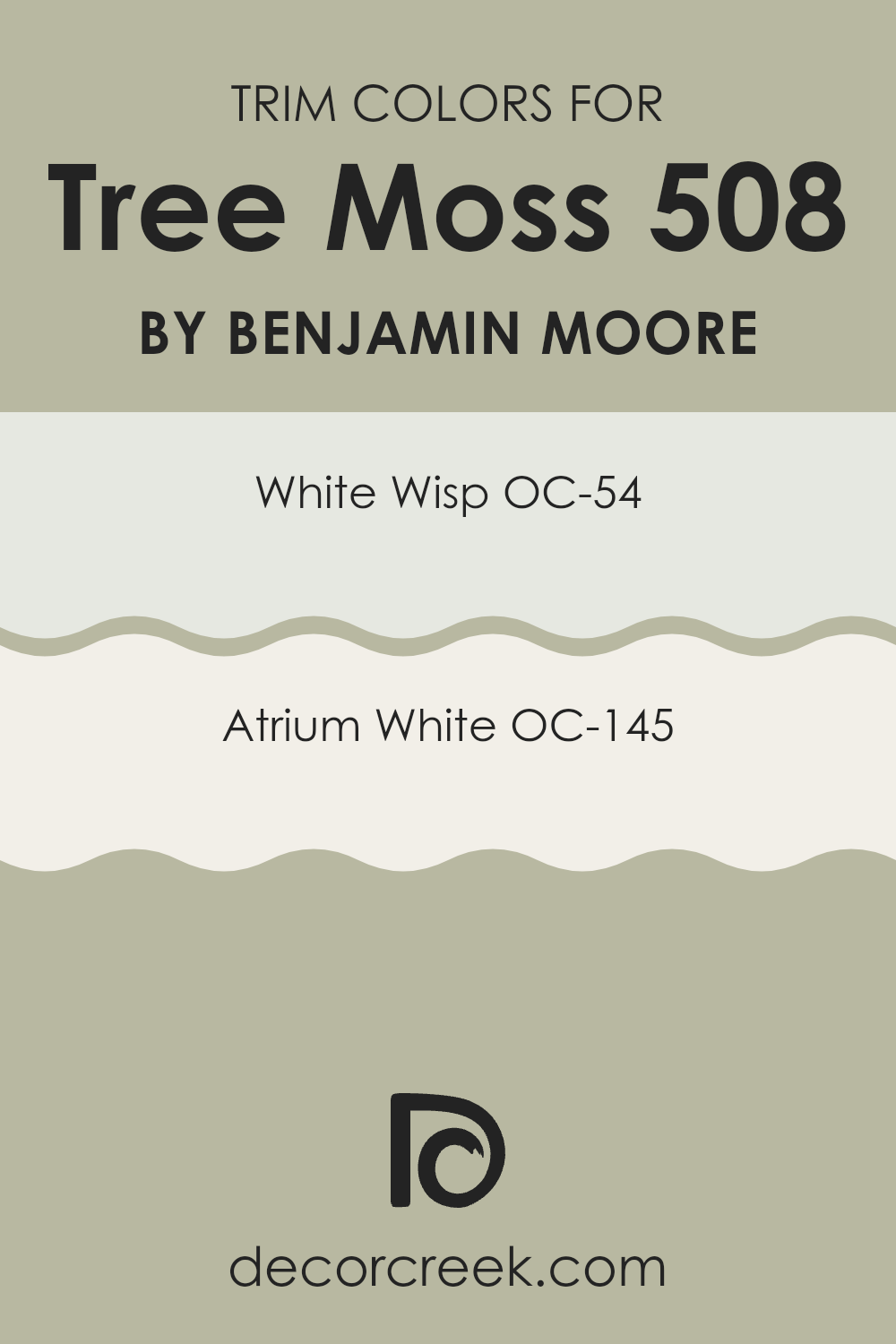
What are the Trim colors of Tree Moss 508 by Benjamin Moore?
Trim colors refer to the shades used on the architectural features of a room, such as baseboards, moldings, window frames, and door frames, contrasting with the wall color to frame and define the rooms dynamically.
When paired with a distinctive color like Tree Moss by Benjamin Moore, selecting the right trim color is crucial as it can either subtly complement the primary hue or make a pronounced statement that distinguishes the trim visually, enhancing the overall aesthetic appeal of the room. White Wisp OC-54 by Benjamin Moore is a gentle off-white with a hint of gray, providing a soft, subtle boundary that can help unify the colors in a room without stark contrasts.
Atrium White OC-145, another option for trim, is a pure, clean white that offers a crisp edge to more pronounced hues, giving a fresh and clean look that can help in making the room appear brighter and more inviting. Both colors can create a refined look when used as trim with Tree Moss, setting off its lush depth without being too much.
You can see recommended paint colors below:
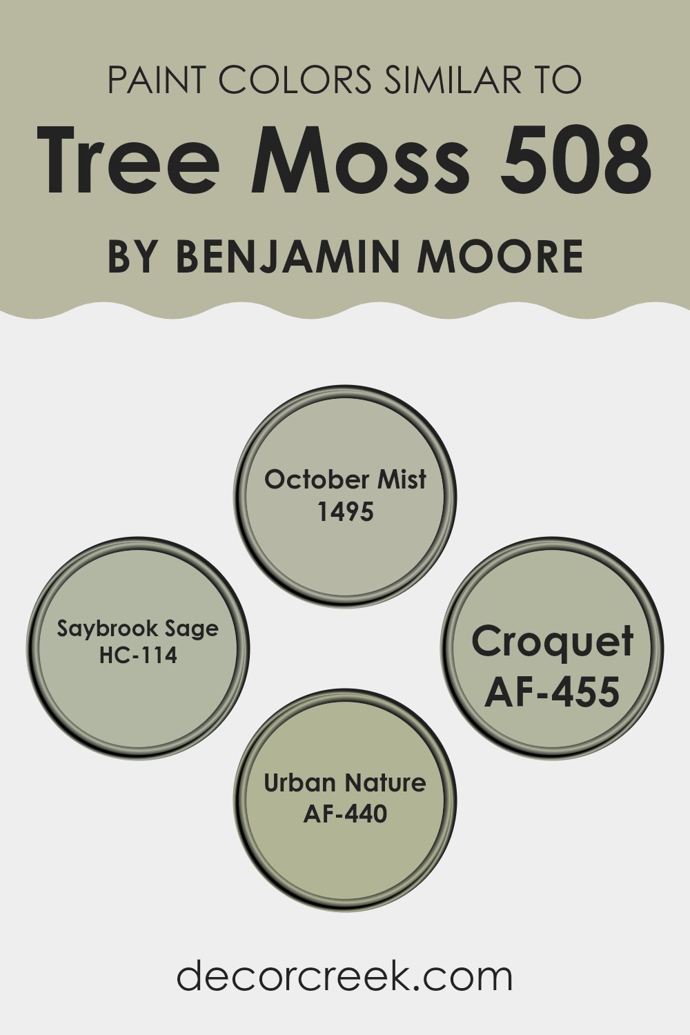
Colors Similar to Tree Moss 508 by Benjamin Moore
When designing a room, using similar colors can make a significant impact, yielding a harmonious and well-put-together look that feels intentional and cozy. Similar colors, like those akin to Tree Moss by Benjamin Moore, provide a subtle variability that keeps the visual experience interesting without causing a jarring contrast.
This approach creates a smooth visual flow from one area to another, making the room feel larger and more connected. Colors such as October Mist, Saybrook Sage, Croquet, and Urban Nature are great examples that work well with Tree Moss to achieve this effect.
October Mist presents a soft, muted green that gently complements environments seeking a touch of understated color, making it adaptable for various rooms. Likewise, Saybrook Sage offers a slightly deeper hue, reminiscent of lush foliage, which provides a refreshing natural feel to the room.
Croquet steps in as a lighter option, toggling the balance between subtle color and neutral tones, perfect for those who prefer a hint rather than a splash of color. Lastly, Urban Nature stands out with a slightly earthier tone, enriching the palette with its grounding presence, thus, these colors collectively contribute to a cohesive look while still allowing for individual elements to stand out.
You can see recommended paint colors below:
- 1495 October Mist
- HC-114 Saybrook Sage
- AF-455 Croquet
- AF-440 Urban Nature
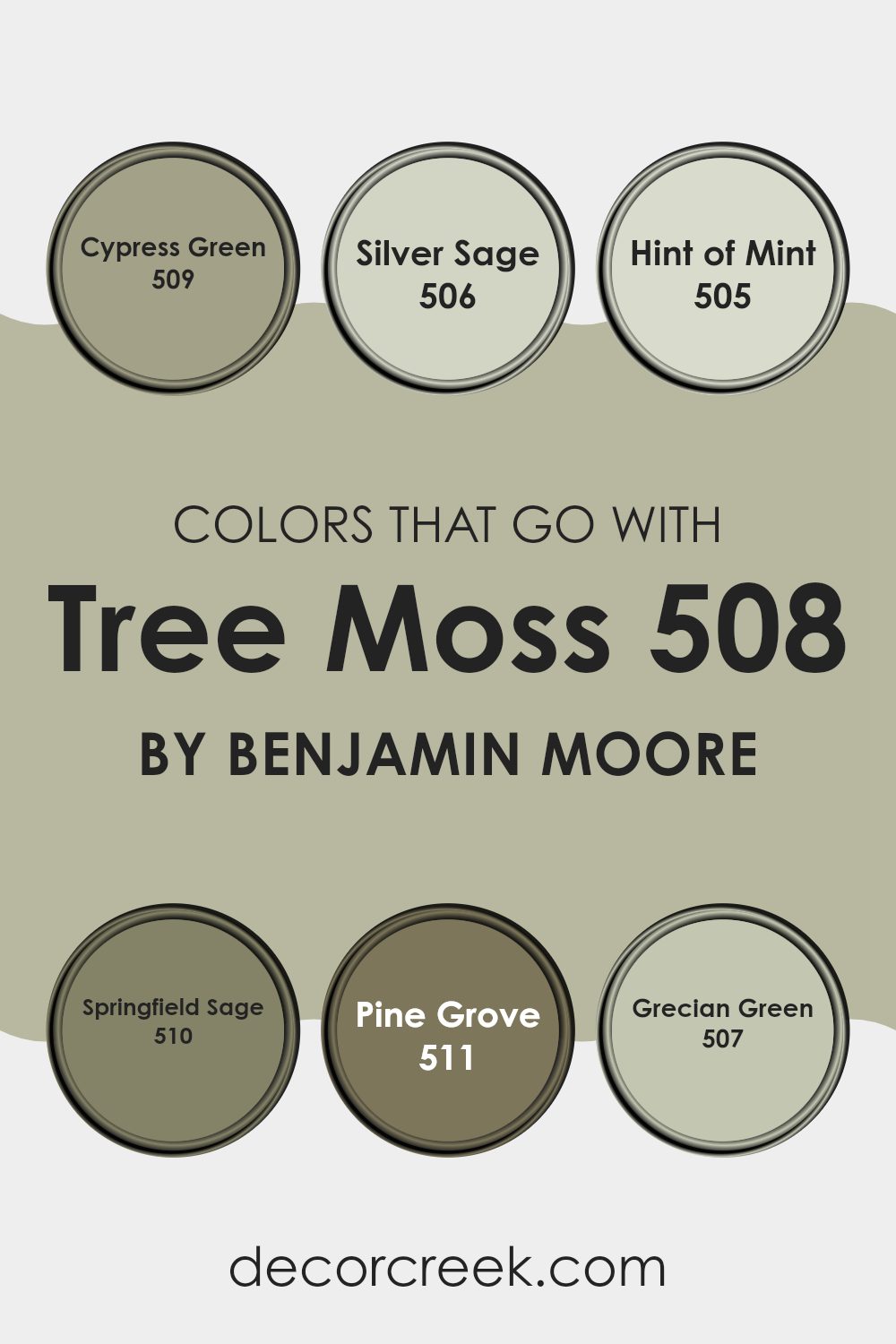
Colors that Go With Tree Moss 508 by Benjamin Moore
Choosing colors that harmonize with Tree Moss 508 by Benjamin Moore is crucial for creating a cohesive and appealing room. These colors are thoughtfully selected to blend well with the earthy, mossy tone of Tree Moss, ensuring that any decorating scheme feels balanced and harmonious.
For example, Cypress Green 509 offers a slightly deeper, woodsy hue, enriching the theme with a touch of forest elegance. This pairs wonderfully with the softer tone of Silver Sage 506, which lends a subtle, airy feel to a room, reminiscent of early morning mist in a sage field.
Further complementing this palette, Hint of Mint 505 introduces a fresh, light touch that brightens rooms and adds a hint of youthful energy. In contrast, Springfield Sage 510 provides a dusty, herbal note that grounds the environment with its earthiness. For deeper accents, Pine Grove 511 pulls in a rich, dark green that mimics the dense shadows under thick pine branches, providing depth and contrast.
Lastly, Grecian Green 507 bridges these elements with a vibrant but natural tone that seems to stitch other colors together seamlessly. These colors work in harmony to create a visually appealing room, enhancing the natural qualities of each other and the main hue, Tree Moss.
You can see recommended paint colors below:
- 509 Cypress Green
- 506 Silver Sage
- 505 Hint of Mint
- 510 Springfield Sage
- 511 Pine Grove
- 507 Grecian Green
How to Use Tree Moss 508 by Benjamin Moore In Your Home?
Tree Moss 508 by Benjamin Moore is a rich, earthy green paint color that can create a warm and cozy ambiance in your home. If you are thinking about giving your living room or bedroom a fresh look, this shade is a great choice because it pairs well with natural materials like wood and stone. Using Tree Moss 508 on the walls can make a room feel more connected to nature, which is calming and welcoming.
This color also works well in a bathroom or kitchen when combined with white tiles or cabinetry, as it adds a splash of color without being too much for the room. It’s an adaptable color that can suit different styles, whether you’re going for a rustic feel or a more modern look.
Consider using Tree Moss 508 for accent walls, too. It can highlight specific areas like a reading nook or dining area, setting them apart from the rest of the room. Accessories in lighter tones or vibrant contrasts can also enhance the overall aesthetic.
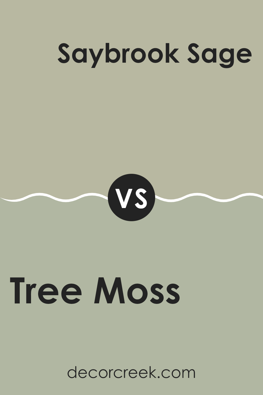
Tree Moss 508 by Benjamin Moore vs Saybrook Sage HC-114 by Benjamin Moore
The colors Tree Moss and Saybrook Sage, both by Benjamin Moore, present subtle yet distinct tones that can really influence the mood of a room. Tree Moss is a darker shade that resembles the dense green you might see in a damp, shaded forest.
It’s a bit more enclosed and cozy, making it ideal for rooms where you want a sense of calm and groundedness. On the other hand, Saybrook Sage has a lighter, airier feel. This color mimics the gentle green of sage leaves and inherently feels fresher and more open. It could make a room feel more spacious and relaxed.
When choosing between the two, consider the amount of natural light in your room and the size of the room. Tree Moss works well in larger or well-lit rooms where its depth won’t be too much, while Saybrook Sage is perfect for smaller rooms or areas that could benefit from a brighter touch. Each brings its unique green to the table, with different impacts on style and room perception.
You can see recommended paint color below:
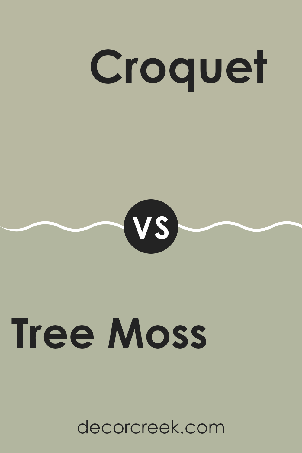
Tree Moss 508 by Benjamin Moore vs Croquet AF-455 by Benjamin Moore
Tree Moss 508 is a deep, rich green that resembles the color of dense forest foliage. It has a strong, earthy quality that makes it ideal for creating a cozy and grounded feeling in a room. This color works well in areas that need an injection of nature’s calmness and can pair beautifully with natural materials like wood or stone.
On the other hand, Croquet AF-455 is a much lighter and softer green. It has a subtle, almost neutral tone that offers a fresh and airy feel to any room. This color is perfect for rooms that you want to keep light and bright. It doesn’t overpower the senses, making it ideal for bedrooms or living areas where you want a hint of color without being too much for other design elements.
Both colors provide a touch of nature, but while Tree Moss gives depth and intimacy through its darker, richer tone, Croquet lends a gentle, refreshing touch with its paler hue.
You can see recommended paint color below:
- AF-455 Croquet
Tree Moss 508 by Benjamin Moore vs Urban Nature AF-440 by Benjamin Moore
Tree Moss and Urban Nature from Benjamin Moore are both greens, but they offer different vibes. Tree Moss has a darker, earthy tone, resembling the dense green of a deep forest. It gives a room a cozy and grounding feel, which is great for rooms where you want to relax and feel sheltered, like living rooms or bedrooms.
Urban Nature, on the other hand, is lighter and leans towards a fresher, more neutral green. It’s the kind of color that feels clean and calm, suitable for rooms that aim for a light, airy feel, such as kitchens or bathrooms. This color could also work well in an office or a study room, where the gentle hint of nature helps in keeping a fresh and alert mind.
Both colors reflect nature but in different forms: Tree Moss mimics the shadowed green of dense foliage, while Urban Nature brings the softness of light filtering through leaves. Depending on the mood and function of your room, one of these might be more appropriate than the other.
You can see recommended paint color below:
- AF-440 Urban Nature
Tree Moss 508 by Benjamin Moore vs October Mist 1495 by Benjamin Moore
Tree Moss by Benjamin Moore is a deep, rich green that brings to mind the natural shade of dense forest foliage. It has a strong presence due to its depth and can make a statement in any room. In contrast, October Mist is a much softer color, resembling the subtle green of sage.
This color has a muted tone, making it easier to blend with a variety of decor styles and other colors. When you compare them, Tree Moss comes across as more bold and impactful, great for creating a focal point in a room.
On the other hand, October Mist is more adaptable and gentle, ideal for a soothing background or for rooms that aim for a calm and inviting atmosphere. Both colors work well in home environments but serve different purposes based on the mood you want to achieve.
You can see recommended paint color below:
After reading about 508 Tree Moss by Benjamin Moore, I’ve learned quite a bit about this unique paint color. 508 Tree Moss is not just a simple green; it has a touch of gray that makes it really special. It can work well in many different parts of a house, like living rooms or bedrooms, because it’s subtle and pretty.
This color has a way of making a room feel cozy and welcoming without being too bright or bold. It’s perfect for anyone who wants to make their room look nice in a soft and gentle way. It’s also really good because it doesn’t get dirty easily, which is great for homes with kids or pets.
Using 508 Tree Moss can help make old furniture look new again because it goes well with many colors. It’s a good choice if you want to refresh your home without making everything look very different.
Overall, 508 Tree Moss by Benjamin Moore is a good paint color that can make your home look and feel warm and cozy. It’s a color that makes you feel good when you look at it, and it can help make your home a nicer place to be
I think it’s a great pick for anyone looking to repaint their room.
Ever wished paint sampling was as easy as sticking a sticker? Guess what? Now it is! Discover Samplize's unique Peel & Stick samples.
Get paint samples

