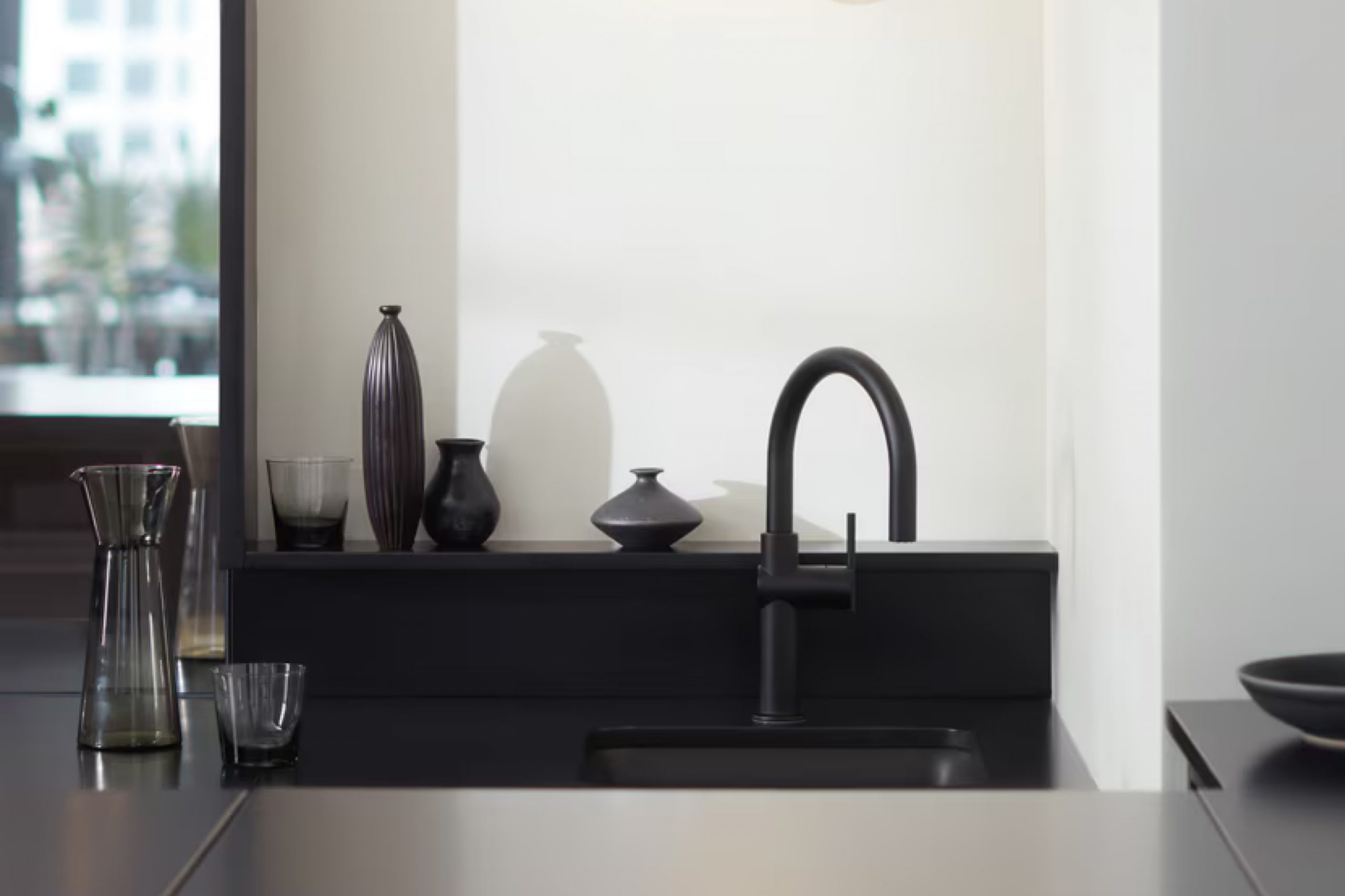
Looking for the perfect shade of white for your decorating project? Benjamin Moore’s OC-149, also known as Decorator’s White, could be just what you need. This particular white has gained a lot of love for its versatility and ability to fit into numerous design styles and spaces.
Unlike stark, pure whites, Decorator’s White offers a slight hint of gray, creating a soft, sophisticated look that feels both modern and welcoming. This nuanced balance makes it an ideal choice for walls, trim, or ceiling, providing a seamless backdrop that enhances natural light and complements various color schemes and decor elements.
Whether you’re updating a cozy bedroom, giving a fresh look to your kitchen cabinets, or looking for the right white to brighten up a dark hallway, OC-149 Decorator’s White is a great starting point. It’s known for its ability to blend with other colors, giving you the freedom to add your personal touch to any room. Its light-reflective qualities can make small spaces appear larger and more inviting, while also adding a crisp, clean feel to the area.
Picking the right white paint might seem challenging with so many options available, but Decorator’s White by Benjamin Moore stands out for its adaptability and timeless appeal. It’s a reliable choice that decorators and homeowners alike return to again and again for its beautiful finish and uncomplicated elegance.
What Color Is Decorator’s White OC-149 by Benjamin Moore?
Decorator’s White by Benjamin Moore is a versatile shade that brings a fresh and clean look to any room. Its neutral tone makes it a perfect backdrop for almost any color scheme, giving you the freedom to play with different hues in your decor. This crisp white has a slight cool undertone, making spaces feel open and airy, yet it’s warm enough to add a cozy touch to your interior.
This color works exceptionally well in modern and minimalist interiors, where its simplicity can be the foundation of the design. However, its adaptability means it also fits beautifully in more traditional or eclectic settings, where it can help to unify diverse elements and textures.
Decorator’s White pairs wonderfully with materials such as natural wood, adding warmth to the space, and with metals like brushed nickel or chrome, introducing a sleek, contemporary vibe. It’s equally at home with soft textiles and rough textures, allowing for a play of contrasts that can make your decor interesting. Whether it’s a smooth leather sofa, a fluffy area rug, or linen curtains, this color supports a wide range of materials and textures, making your design choices almost limitless.
In summary, Decorator’s White is a go-to color for those looking to create a space that feels both inviting and stylish, adapting gracefully to any interior style.
Is Decorator’s White OC-149 by Benjamin Moore Warm or Cool color?
Decorator’s White (OC-149) by Benjamin Moore is a standout choice for anyone looking to freshen up their home. This shade of white has a subtle hint of gray, which gives it a cool, crisp look. Its versatility is one of its strongest points. Whether you’re aiming for a modern, sleek appearance or a comfy, cozy vibe, this color can do it all.
One of the best things about Decorator’s White is how it plays with light. In rooms with plenty of natural light, it looks bright and vibrant, making spaces appear larger. In areas with less light, it still maintains a clean, inviting feel without turning dull or dingy.
This color also works wonders when it comes to matching with other colors. Whether you’re pairing it with bold, dark colors for a dramatic look or soft, light tones for a more airy feel, it supports a wide variety of styles and preferences. In essence, Decorator’s White provides a perfect backdrop for any type of decor, making it a smart choice for walls, trim, and even ceilings. It’s a go-to for giving your home a harmonious and pulled-together look.
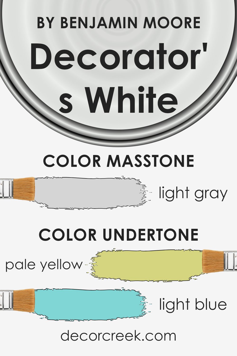
Undertones of Decorator’s White OC-149 by Benjamin Moore
Decorator’s White by Benjamin Moore is a popular paint choice for its clean, crisp look. However, the secret to its appeal lies in its complex undertones. These undertones include pale yellow, light blue, light purple, mint, pale pink, lilac, and grey. Each of these subtle colors plays a role in how we perceive Decorator’s White, making it more than just a simple white paint.
Undertones are like the background music in a movie—they set the mood without you even realizing it. In paint, they can make a color feel warm or cool, and they can either complement or clash with the other colors in a room. Decorator’s White, with its mix of undertones, is like a chameleon. It can look slightly different depending on the lighting and the surrounding colors.
For example, in a room with lots of natural light, the pale yellow undertone might make the walls feel warm and welcoming. Meanwhile, the light blue undertone could give a cooler, calmer feel under artificial lighting.
When painted on interior walls, Decorator’s White brings a subtle liveliness that pure white paint lacks. Its pale yellow and pink undertones add a soft glow, making spaces feel more inviting. The mint and light blue can introduce a refreshing note, perfect for creating a serene environment.
Meanwhile, the light purple and lilac undertones add a hint of sophistication and depth, and the grey undertone ensures the color remains grounded, avoiding any starkness often associated with pure white. This blend of undertones allows Decorator’s White to adapt beautifully to different rooms and styles, making it a versatile choice for any interior space.
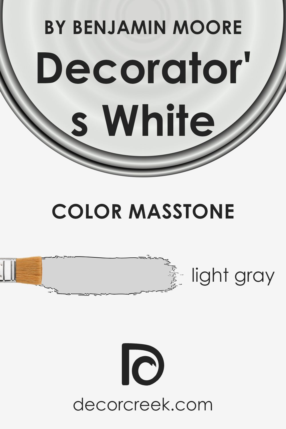
What is the Masstone of the Decorator’s White OC-149 by Benjamin Moore?
Decorator’s White OC-149 by Benjamin Moore has a masstone of light gray, showing up as a soft, gentle color that looks almost white with just a hint of gray (#D5D5D5). This subtle color tone makes it incredibly versatile and a popular choice for homes. Its light gray masstone allows it to work beautifully in various spaces, acting as a neutral backdrop that can easily pair with other colors, from bright and bold to soft and subtle.
Whether in a sunny kitchen, a cozy living room, or a serene bedroom, this color brings in a clean, fresh feel without making the room feel cold or stark.
Its quiet elegance means that it doesn’t overpower a space but complements it by adding a touch of sophistication. Because it reflects light well, it can help make small rooms appear larger and more open, while also enhancing the natural light in well-lit spaces. It’s perfect for those wanting to create a peaceful, airy atmosphere in their home without going for a pure white.
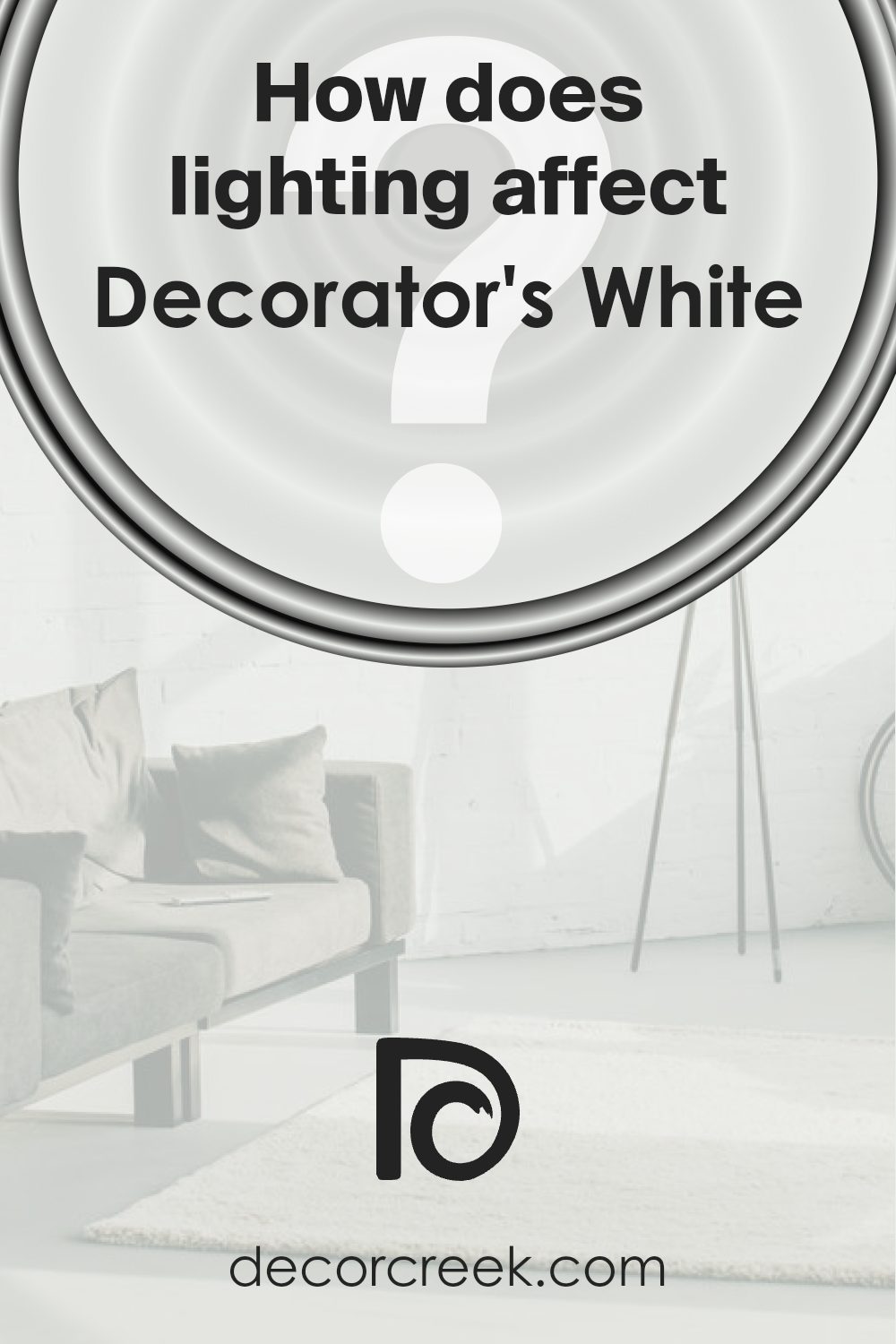
How Does Lighting Affect Decorator’s White OC-149 by Benjamin Moore?
Lighting plays a crucial role in how we perceive colors, and understanding this can significantly impact the feel and look of a room. Different types of light, whether artificial or natural, can change how a color looks. For instance, Decorator’s White is a popular choice for those looking to achieve a crisp, clean backdrop. However, the appearance of this shade can vary dramatically depending on the light it’s exposed to.
In artificial light, this white can lean towards either a warmer or cooler tone based on the type of bulb used. LED or fluorescent lights that mimic daylight will keep the color looking true to its swatch, providing a bright and clear hue. On the other hand, incandescent bulbs can make it appear softer and slightly warmer, adding a cozy feel to the space.
Natural light brings its own set of variables. The direction your room faces plays a significant role in how Decorator’s White will manifest throughout the day. North-facing rooms receive less direct sunlight, which can make this shade appear slightly cooler and more subdued, emphasizing its crisp qualities without becoming stark.
South-facing rooms bask in ample sunlight, bathing walls painted in this color in warm, bright light for most of the day. Here, it will look its brightest, lending a luminous and airy feel to the space.
East-facing rooms enjoy the morning light, which means this paint color will appear warmer and brighter in the morning, shifting towards a cooler tone as the day progresses. This dynamic change can bring a lively feel to the space, making it ideal for bedrooms or breakfast nooks.
Conversely, west-facing rooms get the evening light, which means the color will start cooler in the morning and gradually warm up. The late afternoon and evening light can make the walls glow, providing a soft, warm backdrop perfect for relaxing.
Understanding how light affects colors, especially versatile ones like Decorator’s White, allows you to choose the right shade for the desired mood and effect in any room, taking full advantage of the light available to you.
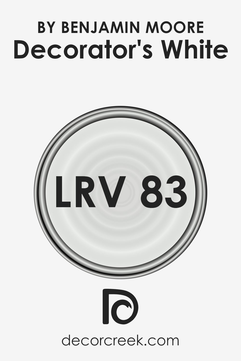
What is the LRV of Decorator’s White OC-149 by Benjamin Moore?
For the color Decorator’s White (with an LRV of 82.68), this means it’s quite a light shade that will reflect a lot of light back into the room. This high LRV makes it an excellent choice for walls in almost any space, as it can make the area feel more airy and spacious. Since it’s closer to the higher end of the LRV scale, Decorator’s White can help brighten dark rooms or enhance the light in already well-lit spaces.
However, the exact effect will also depend on the room’s orientation, the amount of natural light it receives, and what types of artificial lights are used. Overall, this particular shade offers flexibility and can help achieve a fresh and open feel in a variety of settings.
Coordinating Colors of Decorator’s White OC-149 by Benjamin Moore
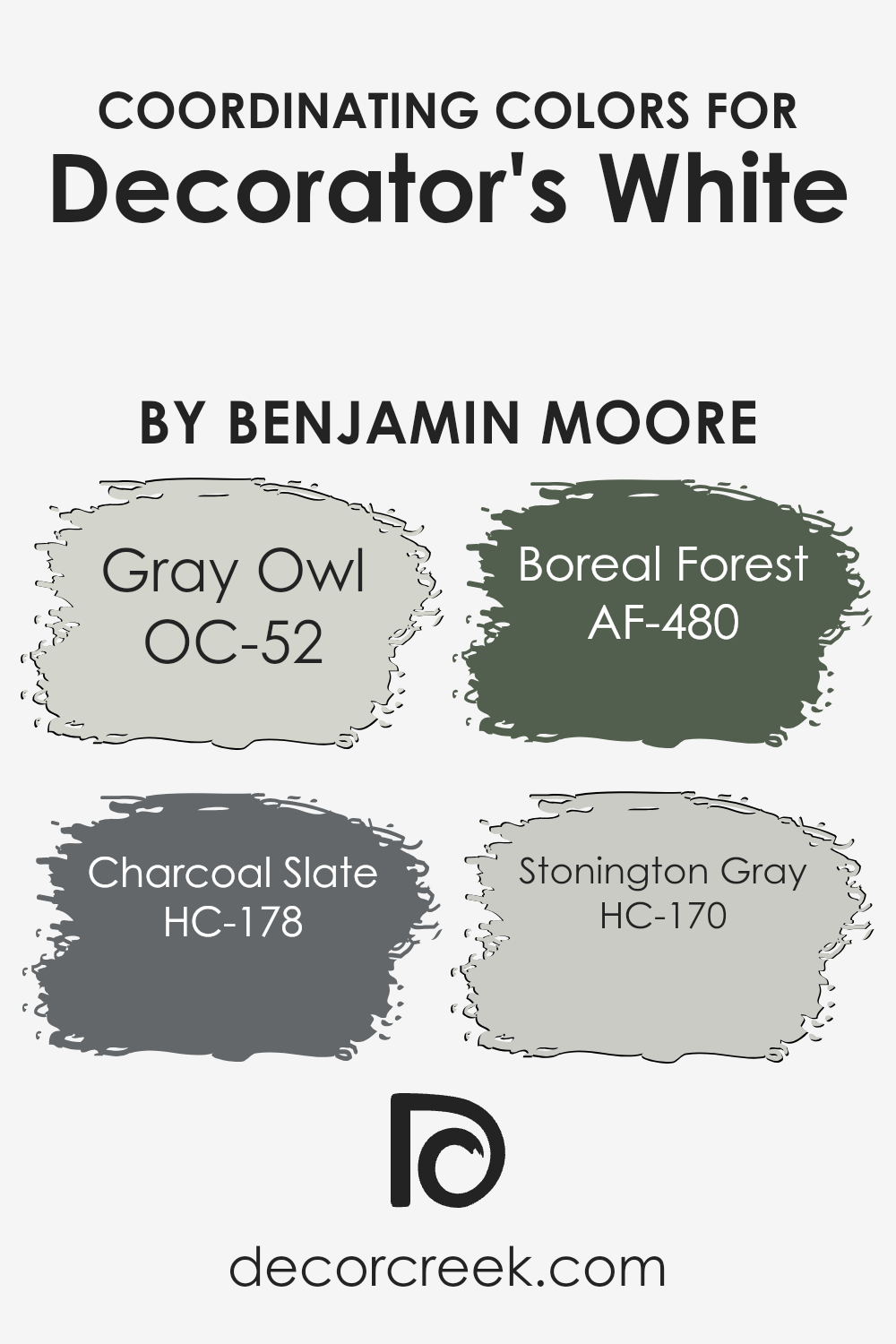
Coordinating colors are hues that harmonize well with a primary color, making your space feel balanced and put together. When it comes to selecting coordinating colors for Decorator’s White by Benjamin Moore, a crisp and clean shade, options like OC-52 Gray Owl, HC-178 Charcoal Slate, AF-480 Boreal Forest, and HC-170 Stonington Gray come into play.
These colors work together by either complementing or offering a pleasing contrast to Decorator’s White, thereby enhancing the overall aesthetic of a room.
OC-52 Gray Owl is a soft, light gray that brings a serene and airy feel to spaces, making it a perfect complement to the brightness of Decorator’s White. It’s like a breath of fresh air in a room, offering a subtle depth without overwhelming. HC-178 Charcoal Slate, on the other hand, adds a bold and dramatic flair with its deep, rich gray tone. It’s ideal for adding a touch of sophistication and creating an impressive contrast against lighter walls. AF-480 Boreal Forest introduces a natural, earthy green that can transform a space into a calming oasis, blending beautifully with Decorator’s White to create a harmonious and grounded environment.
Finally, HC-170 Stonington Gray is a versatile, medium-light gray that strikes a perfect balance between warmth and coolness, making any room look effortlessly chic and well-coordinated when used alongside Decorator’s White. Together, these colors provide a range of options for creating a cohesive look that suits your taste and enhances the beauty of your home.
You can see recommended paint colors below:
- OC-52 Gray Owl
- HC-178 Charcoal Slate
- AF-480 Boreal Forest
- HC-170 Stonington Gray
What are the Trim colors of Decorator’s White OC-149 by Benjamin Moore?
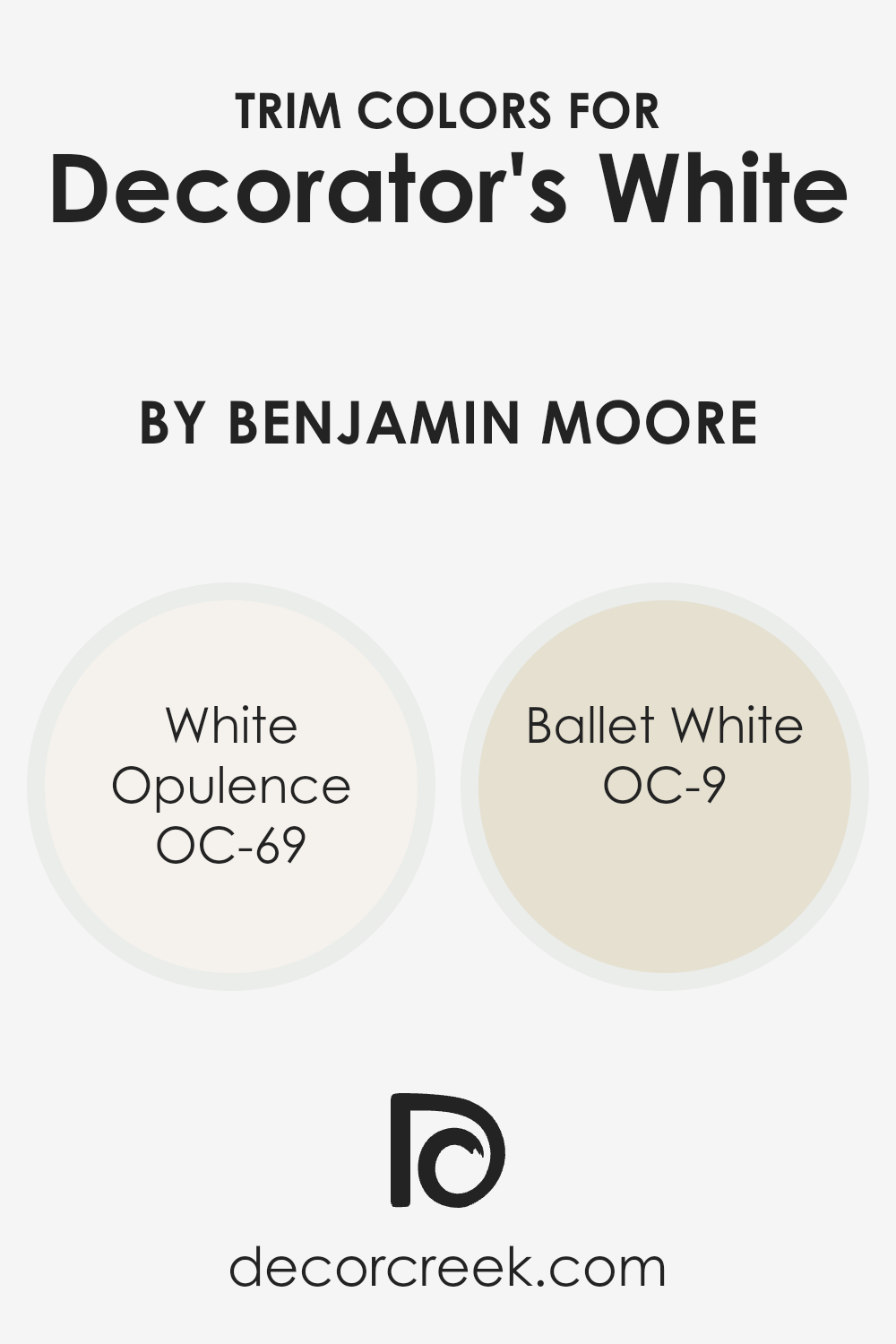
Trim colors are essentially the hues chosen to paint the trims of walls, doors, windows, and other architectural features, acting as accents that contrast or complement the main wall color. For a clean, fresh look like when using Benjamin Moore’s Decorator’s White, selecting the right trim color is crucial as it defines and highlights the architectural detailing and shapes of a space.
Trim colors can either blend seamlessly with the main color to create a subtle, unified look or stand out to add depth and character to the decor. The choice heavily influences the overall ambiance and aesthetic appeal of a room, making it vital to pick a complementary trim color that enhances the primary shade used.
White Opulence (OC-69) is a soft, airy white with a hint of warmth, offering a gentle contrast that brightens spaces without overwhelming the senses, perfect for creating a serene and inviting atmosphere when combined with Decorator’s White. Ballet White (OC-9), on the other hand, provides a slightly richer, warmer tone that adds a cozy, sophisticated touch to any room, making it an excellent choice for those looking to introduce subtle depth while maintaining a harmonious look with Decorator’s White.
Both colors support the main hue in enhancing the overall visual appeal of a room, subtly defining spaces without diverting attention from the primary color theme.
You can see recommended paint colors below:
- OC-69 White Opulence
- OC-9 Ballet White
How to Use Decorator’s White OC-149 by Benjamin Moore In Your Home?
Decorator’s White OC-149 by Benjamin Moore is a go-to paint choice for anyone wanting to freshen up their home. This shade of white is incredibly versatile, making it a perfect pick for nearly any room. It has a clean, crisp vibe that brings a sense of calm and clarity, ideal for creating a space that feels both welcoming and stylish.
You can use it in your living areas to make them appear brighter and more spacious. It’s also great for kitchens and bathrooms, where it can help reflect light, making these spaces look clean and inviting. Bedrooms benefit as well, with Decorator’s White providing a serene backdrop for relaxation and sleep.
Its neutral tone means it goes well with all kinds of décor, from modern to classic. Whether you’re painting walls, trim, or even cabinets, this color can unify disparate elements and highlight your home’s features. It’s a simple way to update your space without overwhelming it, giving you a timeless look that you can complement with accent colors through furniture or decorative items.
Conclusion
Decorator’s White by Benjamin Moore is a popular choice for those looking to brighten up their space without overwhelming it with pure white. This particular shade offers a subtle hint of gray, providing a soft, sophisticated backdrop that works well in a variety of settings. It’s especially favored in modern and contemporary interiors for its ability to enhance natural light while maintaining a neutral, yet inviting atmosphere.
The color’s versatility is a key attraction, as it pairs nicely with both bold and muted accents, making it a go-to option for decorators aiming for a clean and cohesive look.
Overall, Decorator’s White stands out as a go-to white that isn’t stark or sterile. Its underlying gray tones help in creating a warm, refined ambiance that feels welcoming. This makes it an excellent choice for walls, trims, and ceilings alike, offering consistency and flexibility in design.
Whether used in a living room, kitchen, or bedroom, Decorator’s White provides a seamless canvas that elevates the overall aesthetic of any home, adapting effortlessly to changing styles and decor preferences. Thus, for anyone looking to refresh their space with a timeless yet modern touch, Decorator’s White by Benjamin Moore is a highly recommended option.
Ever wished paint sampling was as easy as sticking a sticker? Guess what? Now it is! Discover Samplize's unique Peel & Stick samples.
Get paint samples

