In the world of home decoration, choosing the right paint color is crucial. HC-170 Stonington Gray by Benjamin Moore is a shade that has gained a lot of attention for its versatility and elegant appearance. This article aims to introduce you to Stonington Gray, a color that can effortlessly transform your space, providing a serene and stylish backdrop for any room in your home.
Stonington Gray is not just any gray; it’s a balanced, medium-tone gray that strikes a perfect harmony between warm and cool undertones. This makes it an ideal choice for those looking to achieve a contemporary, yet timeless look. Whether it’s applied in living rooms, bedrooms, or kitchens, Stonington Gray adds a touch of sophistication without overpowering the room’s other design elements.
Choosing paint colors can be overwhelming, but HC-170 seeks to simplify this decision. Its neutral hue ensures it pairs beautifully with a wide array of color schemes, furniture styles, and home decors. Whether you’re updating a single room or undertaking a complete home makeover, Stonington Gray offers a solid foundation upon which to build your aesthetic visions.
As we explore further, we’ll discuss the unique qualities that make Stonington Gray stand out, including its adaptability, visual appeal, and how it can enhance your home’s overall ambiance.
If you’re looking for a paint color that combines elegance with versatility, HC-170 Stonington Gray by Benjamin Moore might be the perfect choice for your next project.
What Color Is Stonington Gray HC-170 by Benjamin Moore?
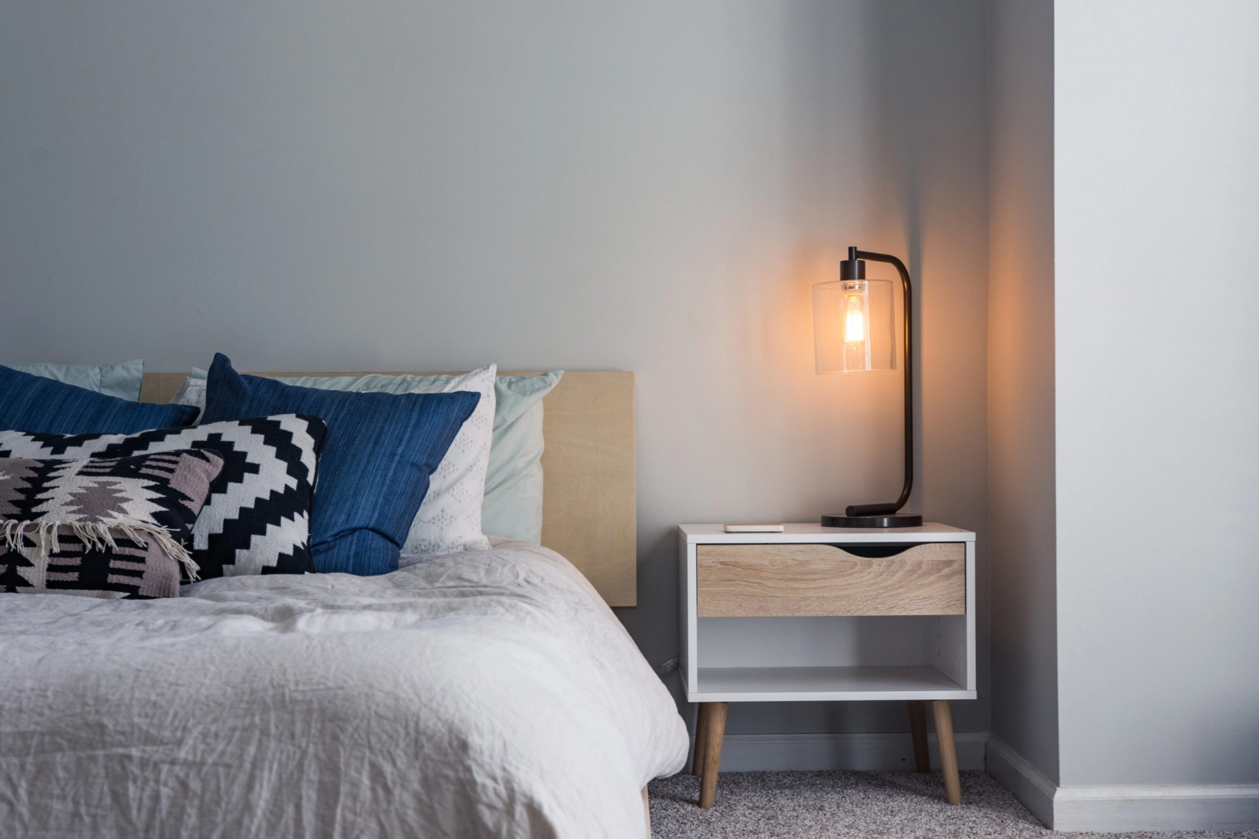
Stonington Gray by Benjamin Moore is a versatile and gentle gray that brings a clean, airy feel to any space. Striking a balance between cool and warm tones, it effortlessly adapts to different lighting conditions, making it a reliable choice for many rooms. Its light-reflective quality can make small spaces appear larger and brighter, yet it retains enough depth to add sophistication to more expansive rooms. This color is particularly effective in creating a serene and calming environment, perfect for bedrooms, living rooms, and home offices alike.
When it comes to interior styles, Stonington Gray shines in modern, minimalist, and transitional decors. Its understated elegance supports a sleek, contemporary look without overwhelming the senses, serving as a backdrop that allows your furniture and artwork to take center stage.
For those who lean towards a coastal or Scandinavian aesthetic, this gray harmonizes beautifully with soft blues, greens, and neutral palettes, enhancing the light and breezy feel characteristic of these designs.
Pairing Stonington Gray with various materials and textures can further enhance its appeal. It works wonderfully with natural wood, from light oak to richer walnuts, adding warmth and grounding the space. Metals like brushed nickel and chrome accentuate its modern vibe, while soft textiles in velvet or wool create a cozy, inviting atmosphere.
Stonington Gray’s flexibility makes it an excellent choice for those looking to create a space that feels both sophisticated and welcoming.
Is Stonington Gray HC-170 by Benjamin Moore Warm or Cool color?
Stonington Gray is a unique color by Benjamin Moore that has won the hearts of many homeowners looking for a fresh, yet timeless look for their spaces. This particular shade of gray carries a balance of cool tones that can make a room feel more spacious and airy, without making it feel cold or unwelcoming. Its adaptability is one of its standout features; it effortlessly complements a wide range of decor styles, from modern to traditional, and pairs beautifully with both bright colors and softer hues.
In homes, Stonington Gray works wonders by providing a serene backdrop that allows furniture and artwork to shine. It’s particularly effective in rooms that receive a lot of natural light, as the changing light subtly alters the color’s appearance, keeping the space lively and engaging.
This versatility means that whether it’s applied in a busy kitchen, a cozy living room, or a tranquil bedroom, Stonington Gray brings a sense of calm and sophistication. It’s a color that supports a variety of living spaces, making them feel both elegant and inviting.
Undertones of Stonington Gray HC-170 by Benjamin Moore
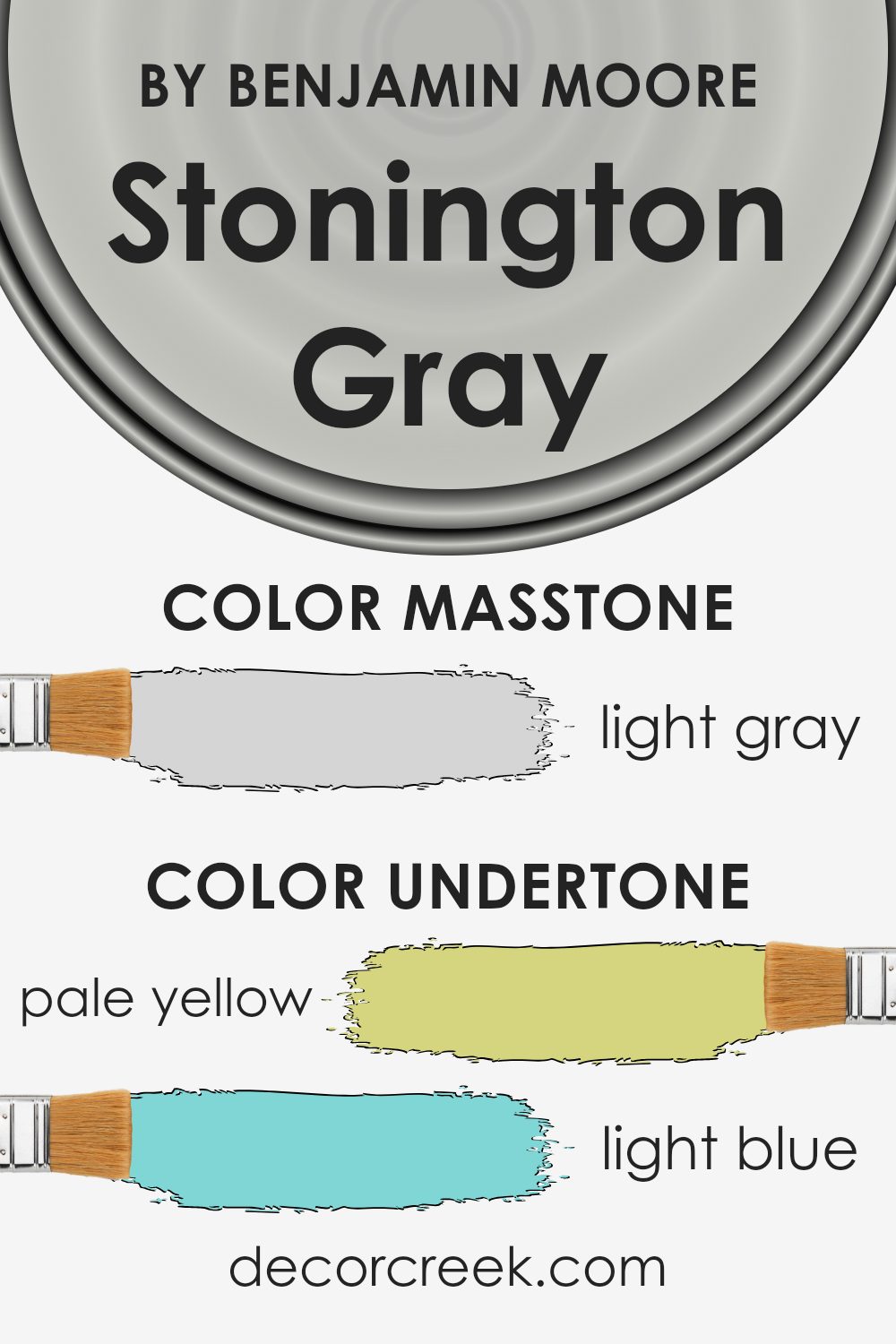
Stonington Gray by Benjamin Moore is a versatile color that can appear quite complex due to its mix of undertones. Think of an undertone as a hint of another color that sits beneath the surface of the primary paint color you’re looking at. These undertones can significantly influence how a color looks in different lighting conditions, making it change throughout the day.
This shade has a variety of undertones like pale yellow, light blue, light purple, mint, pale pink, lilac, and grey. These added nuances are what give the color its depth and complexity, allowing it to blend seamlessly with a wide range of decor styles and other colors.
In interior walls, these undertones play a crucial role. For instance, in a room with a lot of natural sunlight, the pale yellow and light blue undertones of Stonington Gray might become more pronounced, giving the room a cooler, more refreshing feel. Alternatively, in a room with less natural light, the pink or purple undertones could come forward, creating a warmer, more intimate atmosphere.
The beauty of this gray lies in its adaptability. Depending on the room’s lighting and surrounding colors, it can shift from a cool, calming neutral to a warmer, more embracing hue. This chameleon-like quality makes it an excellent choice for any room, adapting to different styles and evolving tastes without overwhelming the space. The understated elegance of the color, combined with its complex undertones, ensures that it provides a sophisticated backdrop to any interior.
What is the Masstone of the Stonington Gray HC-170 by Benjamin Moore?
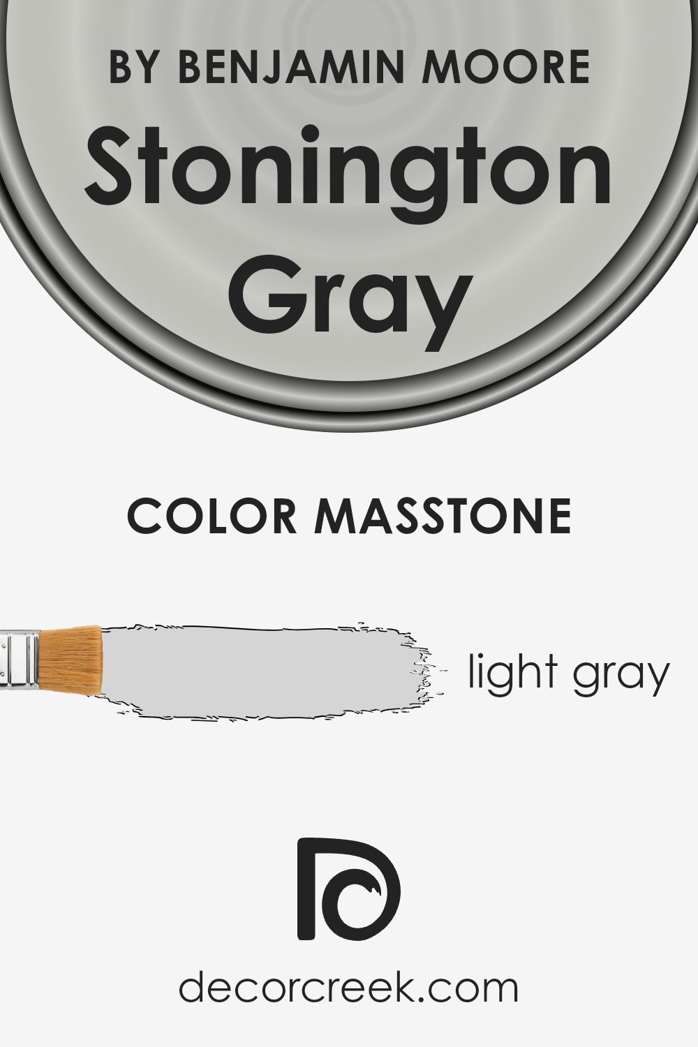
Stonington Gray, with its masstone of light gray, carries a subtle elegance that works wonders in homes. Its light gray tone, closely mirrored by the hex color #D5D5D5, offers a neutral backdrop that is both soothing and versatile. This shade excels in its ability to blend seamlessly with various decor styles and color schemes.
Whether you’re aiming for a modern, minimalist look or a cozy, traditional feel, Stonington Gray sets the stage without overwhelming the space. Its lightness helps in making rooms appear more spacious and airy, inviting natural light to play across the walls and enhancing the overall ambiance. Furthermore, this particular shade of gray is effective in hiding imperfections, thanks to its neutral masstone, making it a practical choice for busy households.
Its understated character allows for creative freedom, enabling individuals to introduce bold colors or keep the palette soft and understated, depending on personal taste and home design goals.
How Does Lighting Affect Stonington Gray HC-170 by Benjamin Moore?
Lighting plays a crucial role in how we perceive colors in our environment. It has the power to transform a color’s appearance, making it look different under various light sources. The influence of lighting on color can be easily observed with a specific hue, like a cool, versatile gray.
When considering how gray reacts to artificial light, it’s worth noting that the type of bulb used can significantly affect how the color is perceived. In artificial lighting, this gray might appear warmer and more inviting if illuminated by incandescent lights, which tend to cast a yellowish glow. On the other hand, LED or fluorescent lights, which often emit a cooler, bluer light, can make the gray look sharper and more crisp.
Natural light brings its own dynamics into play. Under the broad spectrum of sunlight, colors can look remarkably different depending on the time of the day and the direction the light is coming from. In rooms with north-facing windows, light tends to be cooler and more consistent throughout the day. Here, the gray might appear truer to its original hue but slightly cooler, enhancing its calming qualities.
South-facing rooms benefit from warm, abundant sunlight, making colors look brighter and warmer. In such rooms, the gray can take on a softer, more luminous quality, making the space feel more cozy and welcoming.
East-facing rooms enjoy bright morning light, which is generally warmer. Here, the gray can look particularly lively in the morning, gradually transitioning to a cooler tone as the day progresses. This natural shift highlights the color’s versatility in adapting to different lighting conditions.
West-facing rooms experience the opposite effect, with cooler morning light gradually shifting to warmer, more intense hues in the afternoon and evening. In these rooms, the gray will maintain a neutral, balanced appearance in the morning but may become warmer and more dynamic towards the end of the day.
Understanding how lighting affects colors, especially versatile ones like gray, can significantly impact decorating choices, making it easier to achieve the desired mood and effect in any space.
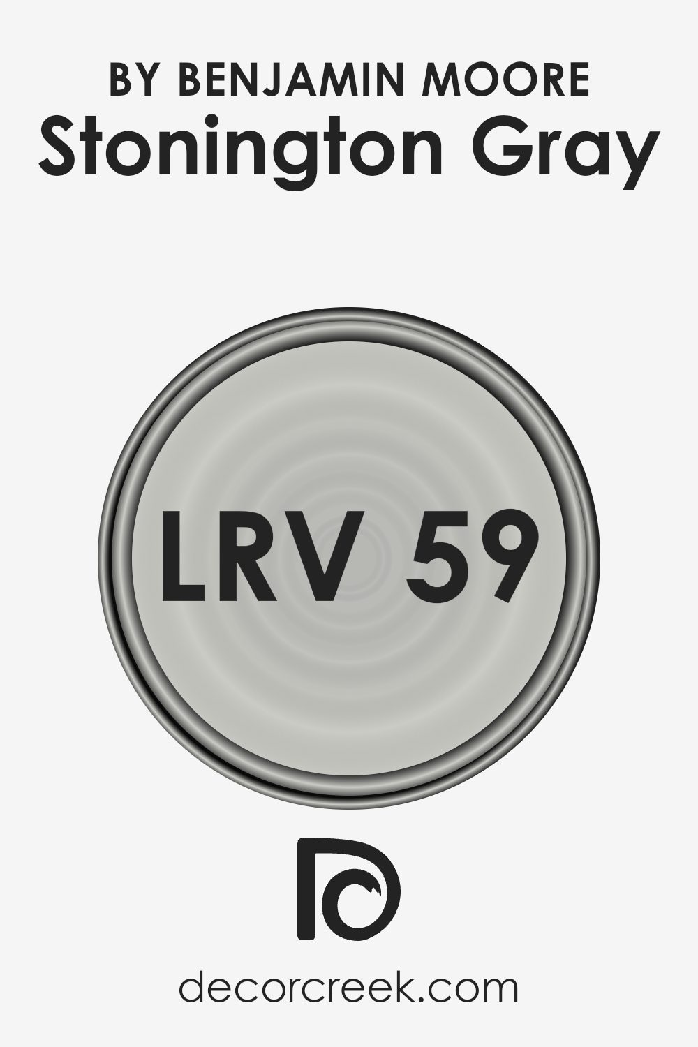
What is the LRV of Stonington Gray HC-170 by Benjamin Moore?
LRV is crucial in choosing paint colors because it can greatly affect the appearance and mood of a room. A higher LRV means the color will reflect more light, making a space feel more open and brighter, while a lower LRV means the color will absorb more light, making a space feel cozier or potentially darker.
For Stonington Gray (HC-170) by Benjamin Moore, with an LRV of 59.36, it sits in the mid-range of the LRV scale. This means it strikes a balance between reflecting and absorbing light. In practical terms, in a well-lit space, Stonington Gray will appear lighter and more airy, capitalizing on its ability to reflect a substantial amount of light. In contrast, in a room with less natural light, it might look slightly darker but will still hold onto its true gray essence without veering too much into the shadowy spectrum. This particular LRV makes Stonington Gray a versatile color, capable of adapting to different lighting conditions while maintaining its sophisticated gray hue, thus affecting its perception and ambiance in a space.
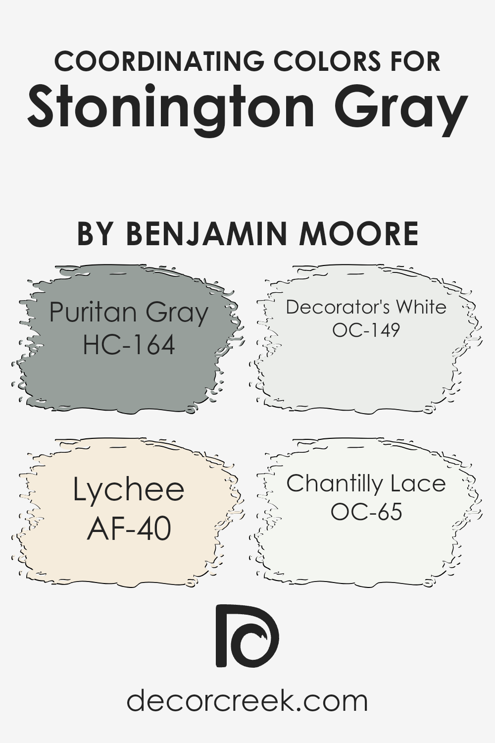
Coordinating Colors of Stonington Gray HC-170 by Benjamin Moore
Coordinating colors are hues that harmonize well with a primary color, creating a balanced and visually compelling look in any space. When selecting coordinating colors, the aim is to choose shades that complement the main color, enhancing its beauty without overwhelming it. This principle works perfectly with Stonington Gray by Benjamin Moore, a versatile and understated gray that serves as an excellent neutral base. By pairing it with carefully selected coordinating colors, you can achieve a cohesive and sophisticated design.
Puritan Gray presents a deeper, more intense alternative that can add depth and contrast to spaces dominated by Stonington Gray, offering an elegant and refined ambiance. Lychee, on the other hand, introduces a subtle, warm touch that softens the overall appearance, making the environment feel welcoming and serene.
Decorator’s White is a crisp, clean white that brings freshness and a sense of openness, working seamlessly with Stonington Gray to create a light and airy feel. Lastly, Chantilly Lace is another white tone, but with a slightly warmer undercurrent, adding a smooth and harmonious blend to the Stonington Gray backdrop, perfect for crafting spaces that feel cohesive and meticulously put together.
Together, these colors offer a palette that can enhance the natural appeal of Stonington Gray, allowing for a range of design possibilities that are both stylish and functional.
You can see recommended paint colors below:
- HC-164 Puritan Gray
- AF-40 Lychee
- OC-149 Decorator’s White
- OC-65 Chantilly Lace
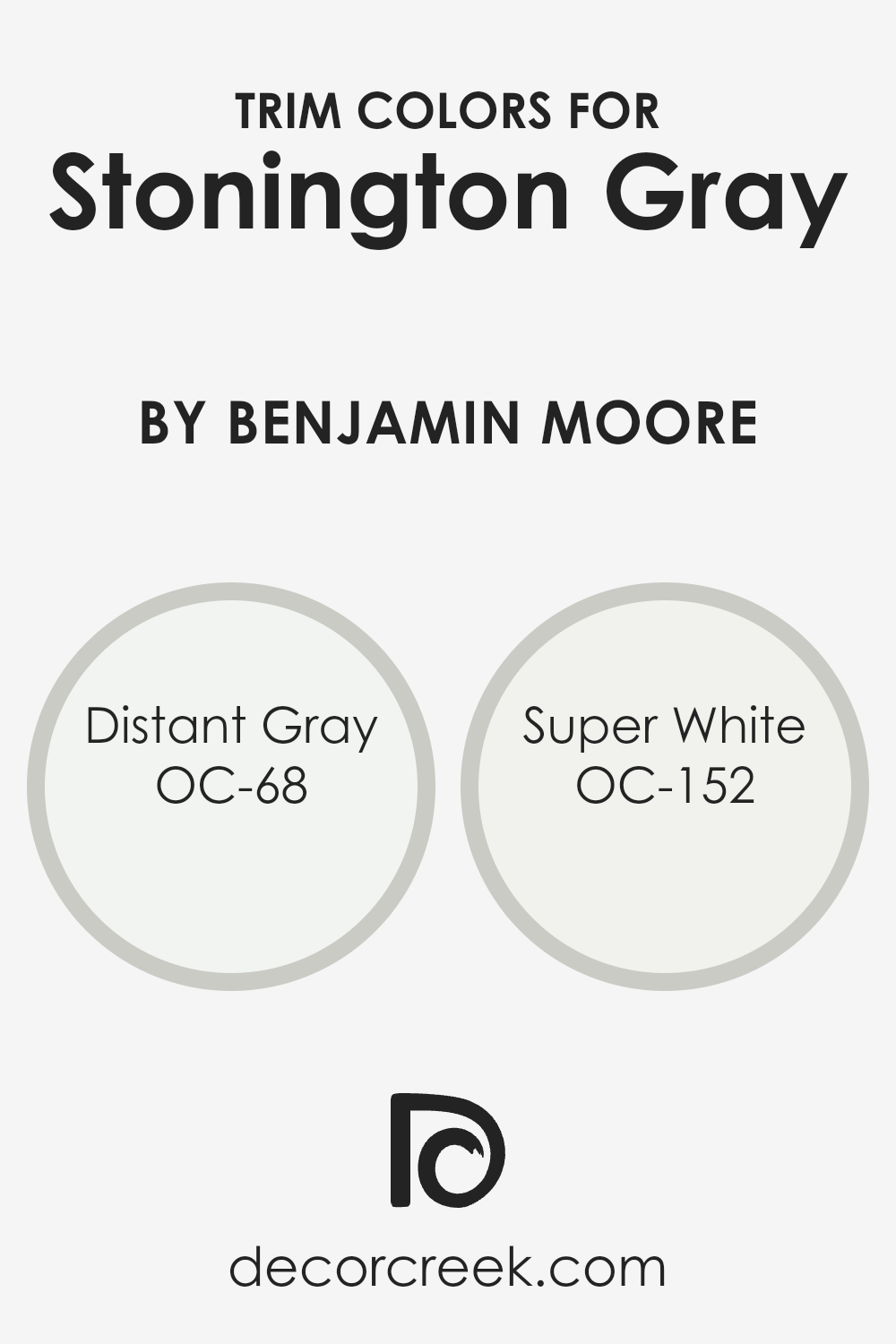
What are the Trim colors of Stonington Gray HC-170 by Benjamin Moore?
Trim colors are those chosen specifically to complement or contrast a primary color used on the larger surfaces of a room, such as walls or exteriors, offering a way to create clean lines, highlight architectural features, or frame sections of a space. In the context of using Stonington Gray by Benjamin Moore, selecting the right trim color is crucial because it can enhance the sophisticated, balanced nature of this neutral shade, making it appear more defined and striking without overwhelming the senses.
Distant Gray OC-68 is a very light, almost ethereal color that brings a subtle contrast to Stonington Gray, giving spaces a fresh, airy feel while still maintaining a seamless blend with the cooler undertones of the gray. Super White OC-152, on the other hand, is a crisp, stark white that offers a more pronounced, sharp contrast, thus accentuating the edges and details of the room with a clear, bright delineation against the softer backdrop of Stonington Gray.
Both choices can significantly contribute to the overall ambiance of a space by highlighting its architectural elements and enhancing its dimensionality.
You can see recommended paint colors below:
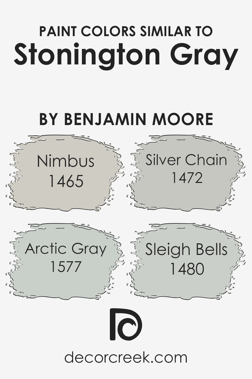
Colors Similar to Stonington Gray HC-170 by Benjamin Moore
Similar colors are crucial when it comes to creating a cohesive look in any space. Colors that share a close relationship on the color spectrum can transform a room into a harmonious sanctuary. For instance, when we consider shades akin to Stonington Gray by Benjamin Moore, we unlock a palette that can seamlessly blend together, providing both variety and unity. Such colors can help in achieving a subtle gradation without causing a stark contrast, making transitions smooth and pleasing to the eye. They work by anchoring a space in a particular mood or tone, allowing decor elements to come together in a cohesive aesthetic.
For example, Nimbus offers a soft, airy quality that can open up a space, making it feel light and expansive. It’s like a gentle whisper against a canvas, providing a subtle backdrop that’s both calming and inviting. Arctic Gray, on the other hand, adds a slightly cooler touch, reminiscent of a serene, frosty morning. Its tranquil presence evokes a sense of peacefulness.
Moving towards Silver Chain, we find a hue that strikes a harmonious balance between light and shadow, offering depth without overwhelming a room. It’s like the perfect middle ground, versatile and understated. Lastly, Sleigh Bells brings a touch of warmth, suggesting the quiet coziness of a winter’s day spent indoors.
Together, these colors create a spectrum of options that can make any space feel connected, yet distinct, unified yet diverse, proving the power and importance of similar colors in design.
You can see recommended paint colors below:
- 1465 Nimbus
- 1577 Arctic Gray
- 1472 Silver Chain
- 1480 Sleigh Bells
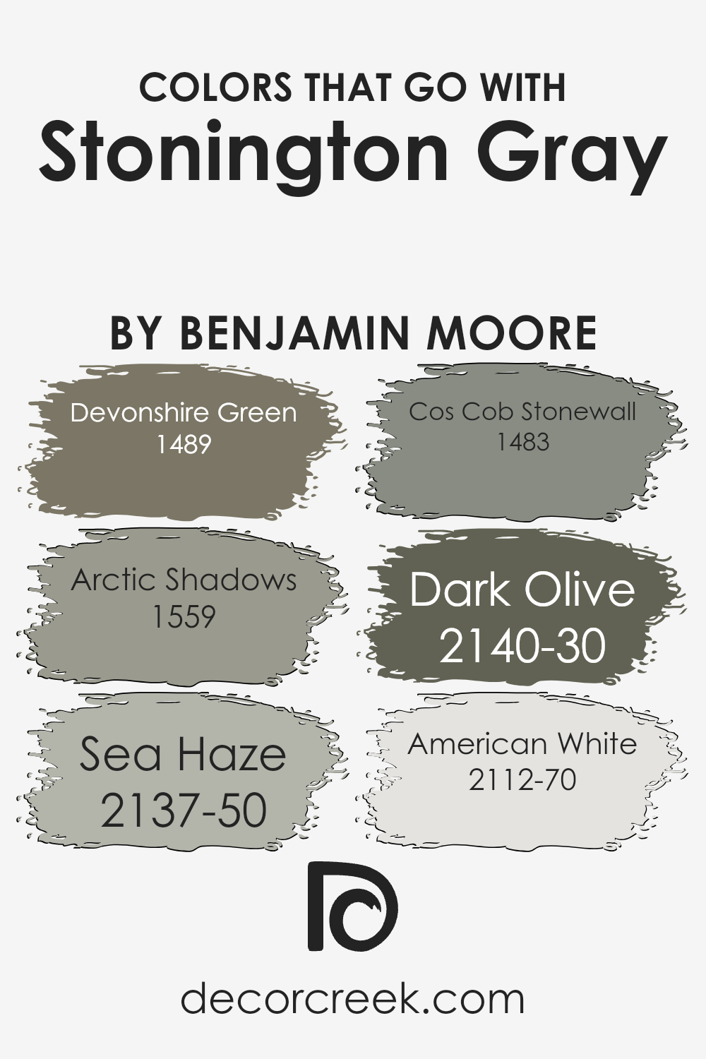
Colors that Go With Stonington Gray HC-170 by Benjamin Moore
Choosing colors that pair well with Stonington Gray HC-170 by Benjamin Moore is essential because it can enhance the beauty and balance of any space. Stonington Gray is a versatile, light gray hue that acts as a fantastic neutral backdrop, allowingother colors to shine in harmony alongside it.
By selecting the right companion colors, you can create a cohesive look that feels intentional and polished. These colors help in setting the desired mood, whether it’s calm and serene or bold and dynamic, without overwhelming the core aesthetic the Stonington Gray provides.
Devonshire Green brings a soft, earthy touch, reminiscent of a serene meadow, to complement Stonington Gray’s coolness, offering a natural, refreshing contrast. Arctic Shadows, on the other hand, introduces a deeper, mysterious dimension to spaces, adding depth and sophistication when paired with the lighter gray.
Sea Haze is like a whisper of color, soft and elusive, perfect for creating a serene, airy feel that enhances Stonington Gray’s calmness. Cos Cob Stonewall, inspired by natural stone, adds a rustic charm, grounding spaces with its earthy tones.
Dark Olive injects a bold, dramatic flair, its rich, deep green enlivening Stonington Gray’s neutrality without overpowering it. Finally, American White offers a subtle, creamy brightness, a gentle lift to the cool gray, ensuring spaces feel open and light-filled.
Together, these colors work in harmony to elevate the aesthetic appeal of any room, providing versatility and style that adapts to various decor preferences and functions.
You can see recommended paint colors below:
- 1489 Devonshire Green
- 1559 Arctic Shadows
- 2137-50 Sea Haze
- 1483 Cos Cob Stonewall
- 2140-30 Dark Olive
- 2112-70 American White
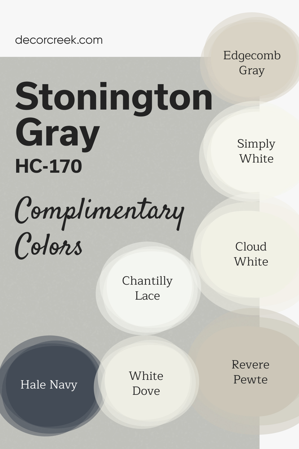
Complimentary Colors for Stonington Gray HC-170 Paint Color by Benjamin Moore
Stonington Gray by Benjamin Moore is a cool, neutral gray that brings a sleek and elegant feel to any space. It pairs well with bright whites like White Dove and Chantilly Lace, offering crisp, clean accents that brighten a room.
For a softer, more balanced look, Revere Pewter provide subtle warmth and depth. For bolder contrast, Hale Navy adds richness and depth, making it a great choice for accent walls or cabinetry.
Simply White and Cloud White complement the palette by bringing a fresh and clean touch. Together, these colors create a sophisticated, timeless look that works well in both modern and traditional spaces.
How to Use Stonington Gray HC-170 by Benjamin Moore In Your Home?
Stonington Gray HC-170 by Benjamin Moore is a versatile paint color that many homeowners love. It’s a beautiful gray shade that has a cool undertone, making it perfect for creating a calm and soothing environment in any room. This color works great in spaces like living rooms and bedrooms, where you want a peaceful atmosphere. Because it’s a neutral color, it matches well with a wide range of other colors and decor styles. Whether you have modern, minimalist, or even traditional furnishings, Stonington Gray can complement your home beautifully.
You can use it as a main wall color or as an accent to highlight specific areas in your home. It’s especially useful in rooms that get a lot of natural light, as the color can change subtly throughout the day, adding depth and interest to your space.
If you’re looking for a reliable and stylish gray to refresh your walls, Stonington Gray is a great choice. It’s easy to apply, and its durability means it can handle the wear and tear of everyday life, keeping your home looking great for years.
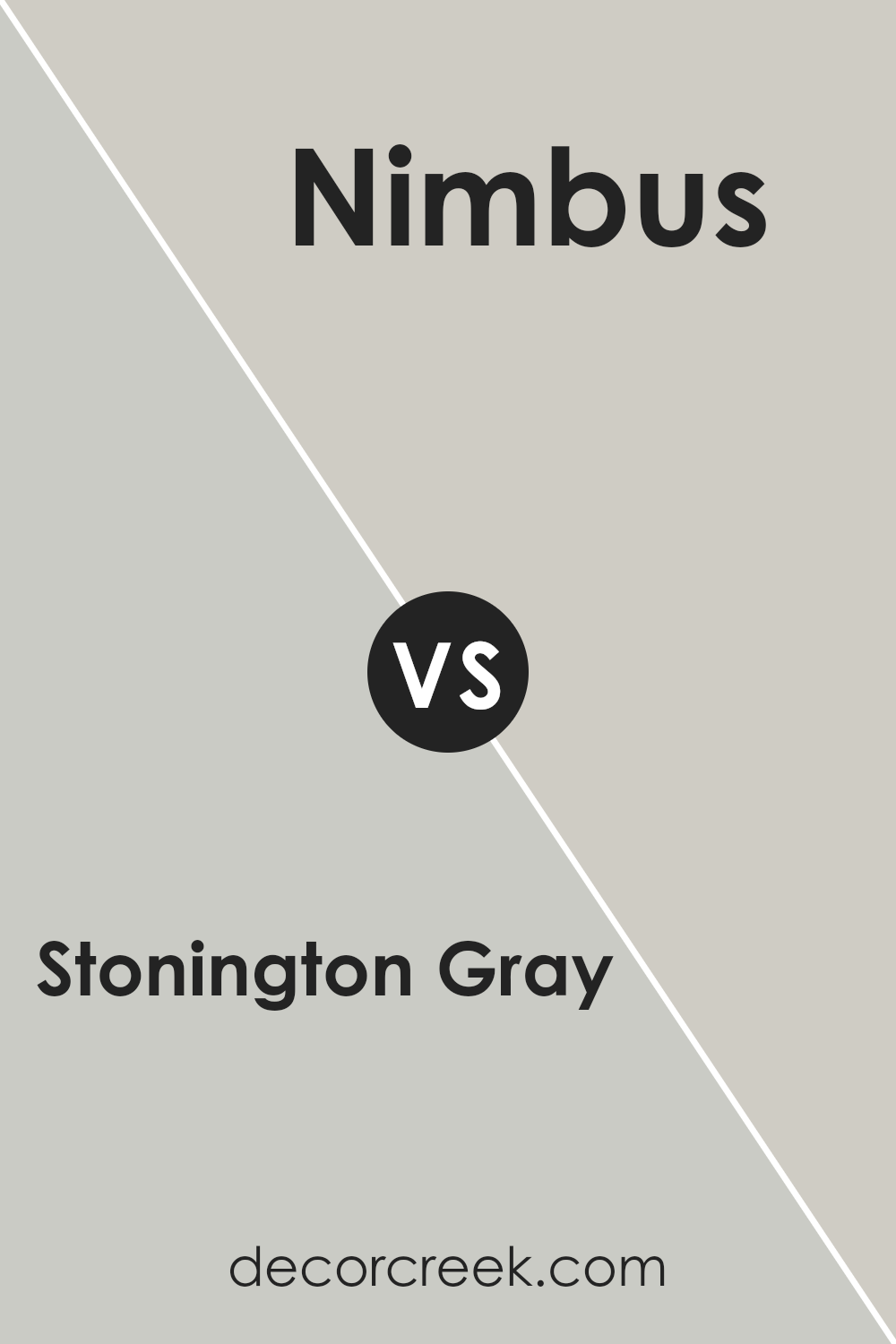
Stonington Gray HC-170 by Benjamin Moore vs Nimbus 1465 by Benjamin Moore
Stonington Gray and Nimbus, both by Benjamin Moore, share a cool, tranquil vibe but each has its unique charm. Stonington Gray is like a serene, cloudy day. It’s a true gray that balances between warm and cool tones, making it incredibly versatile. This color can light up any room with its soft, subtle presence, offering a calm and collected ambiance.
On the other hand, Nimbus has a bit more complexity. It leans toward a slightly warmer, more nuanced gray with undertones that can shift based on lighting. Think of it like the gentle hue of an early morning mist. It’s soft but with a depth that adds character and warmth to spaces.
While both colors are understated and elegant, Stonington Gray offers a cleaner, more straightforward gray experience. Nimbus, meanwhile, provides a touch of warmth, making it cozy and inviting. Choosing between them depends on the mood you’re aiming for: Stonington Gray for a crisp, modern look, or Nimbus for a richer, cozier feel.
You can see recommended paint color below:
- 1465 Nimbus
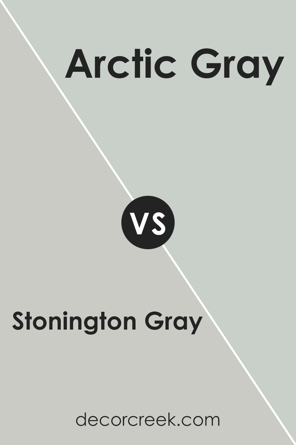
Stonington Gray HC-170 by Benjamin Moore vs Arctic Gray 1577 by Benjamin Moore
Stonington Gray and Arctic Gray by Benjamin Moore are both popular paint colors, but they offer different vibes for your space. Stonington Gray is a cool, light gray that has a hint of blue undertone. This makes it quite versatile, fitting well in many rooms, adding a serene and subtle backdrop. It’s perfect if you’re going for a modern, fresh look that’s not too stark.
On the other hand, Arctic Gray is a warmer, softer gray with noticeable lavender undertones, giving it a more cozy and inviting feel. It suits spaces where you want a touch of warmth without moving away from a gray palette. This color tends to feel more personal and can make large spaces feel more intimate.
Both colors are great choices depending on what atmosphere you’re aiming for. Stonington Gray works well for a crisp, clean look, while Arctic Gray is ideal for a softer, more enveloping space.
You can see recommended paint color below:
- 1577 Arctic Gray
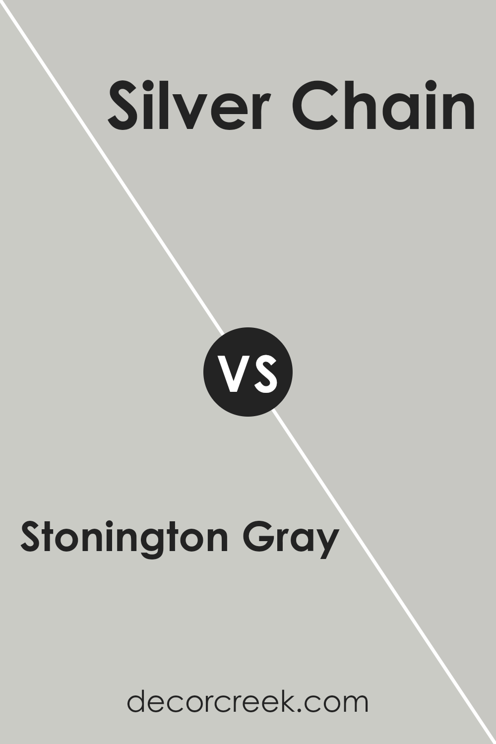
Stonington Gray HC-170 by Benjamin Moore vs Silver Chain 1472 by Benjamin Moore
Stonington Gray and Silver Chain by Benjamin Moore are two popular colors that offer subtle differences for decorating spaces. Stonington Gray has a balanced, light gray shade that gives a calm and serene feel to any room. It’s versatile, fitting well with a range of décor styles, from modern to traditional.
On the other hand, Silver Chain is slightly darker with a hint of warmth, providing a cozy ambiance. This color works best in spaces where you want a bit of depth without overwhelming the room with darkness. While both colors are in the gray family, Stonington Gray leans towards a cooler spectrum, making spaces feel more open and airy.
Silver Chain, with its warmer undertones, adds a more intimate and inviting touch. Choosing between them depends on the mood you want to set: Stonington Gray for a crisp, clean look, or Silver Chain for a more grounded, subtle elegance.
You can see recommended paint color below:
- 1472 Silver Chain
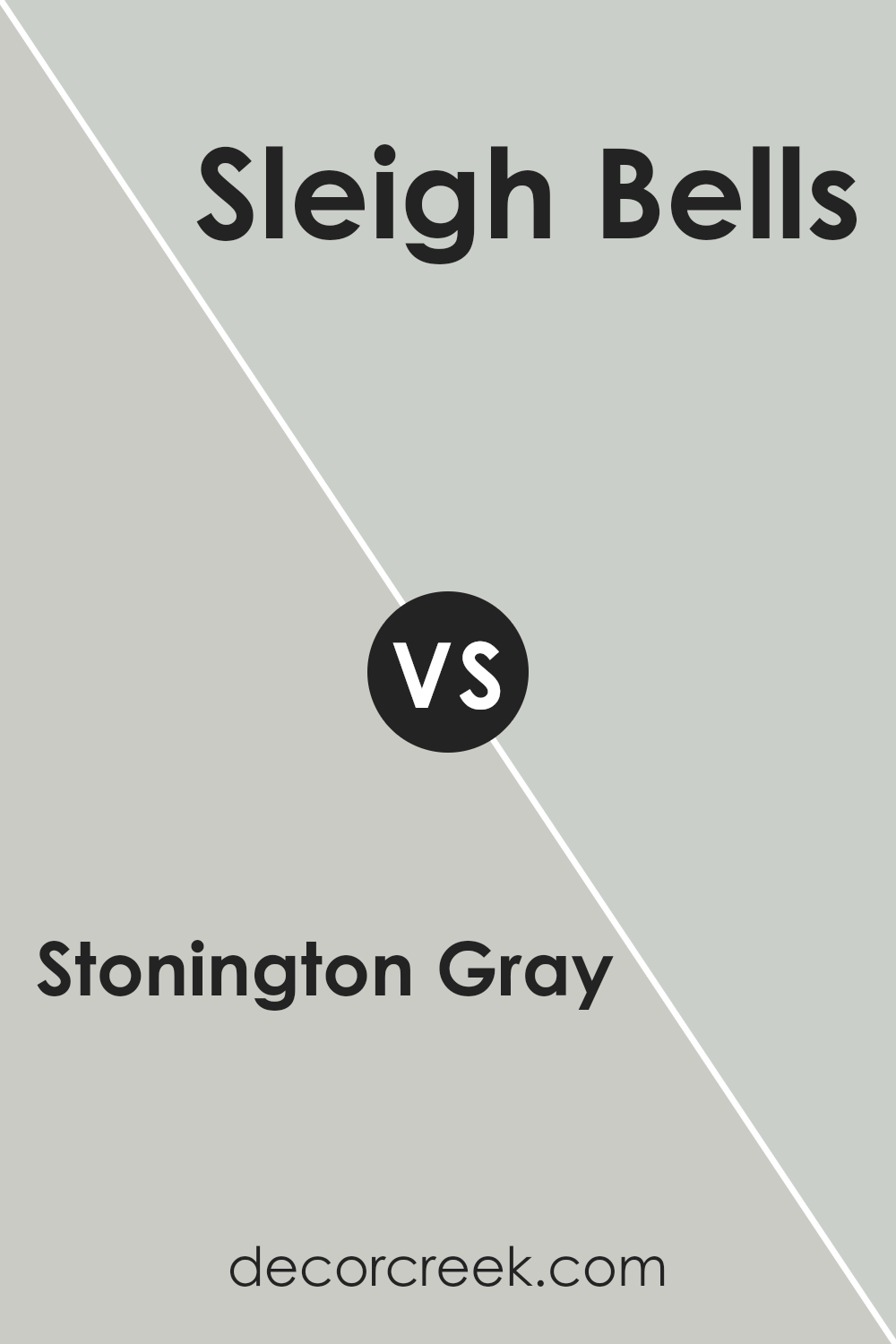
Stonington Gray HC-170 by Benjamin Moore vs Sleigh Bells 1480 by Benjamin Moore
Stonington Gray and Sleigh Bells are both popular choices from Benjamin Moore, but they bring different vibes to a room. Stonington Gray is a balanced, cool gray that feels modern and fresh. It’s like a cloudy day, offering a neutral backdrop that works well in almost any space. It’s light enough to make rooms feel airy but has enough depth to add character.
On the other hand, Sleigh Bells is a softer option, leaning towards a beige-gray with a hint of warmth. This color gives a cozy and inviting feel, perfect for creating a relaxed and comfortable atmosphere. It’s like wrapping yourself in a soft blanket on a chilly evening. While it can also serve as a neutral, its warmth adds a welcoming touch that’s less stark than Stonington Gray.
In comparing these two, Stonington Gray offers a cooler, more modern feel, while Sleigh Bells brings warmth and coziness. Both are versatile, but your choice might depend on the mood you’re aiming for in your space.
You can see recommended paint color below:
- 1480 Sleigh Bells
Conclusion
Stonington Gray by Benjamin Moore is a versatile and attractive color that offers a subtle and elegant look for any room. Its balanced shade makes it a popular choice for those seeking a neutral backdrop that can complement various decors, from modern to traditional.
The color is appreciated for its ability to bring a calming and serene atmosphere to spaces, making it ideal for bedrooms, living rooms, and even home offices. Its understated elegance allows for easy pairing with bolder hues or serving as a standalone color that adds depth and sophistication without overwhelming the senses.
Choosing Stonington Gray is a smart decision for anyone looking to refresh their home with a timeless and adaptable color. Its ability to adapt to different lighting conditions and harmonize with a wide range of furnishings and accessories makes it a go-to option for both designers and homeowners. Whether you’re updating a single room or transforming your entire home, Stonington Gray offers a blend of style and functionality that is hard to beat.
Its popularity is a testament to its beauty and the tranquil ambiance it can create, making any space more inviting and comfortable.

Ever wished paint sampling was as easy as sticking a sticker? Guess what? Now it is! Discover Samplize's unique Peel & Stick samples.
Get paint samples

