This particular shade has a unique way of balancing intensity with tranquility. It’s deep enough to add depth to any space while maintaining a soothing feel that is welcoming and warm.
I noticed how this color plays with light throughout the day, creating variations that always keep things interesting. In the morning, it reflects a soft, gentle light that feels gentle and refreshing. As the day progresses, it becomes richer and more enveloping, adding a comforting layer to my surroundings.
Choosing 1582 Deep River means setting a mood that is deep and thought-provoking yet wholly approachable. Whether it’s in a living room, bedroom, or study, this color invites a sense of peace and sophistication. I find it perfect for mixing with lighter or more earthy tones, allowing the space to feel grounded and harmonious.
Whether I’m relaxing or working, the room seems to carry a timeless elegance, offering a perfect backdrop for moments of reflection and rest.
In using Deep River, I feel like I’ve found a color that speaks to both style and substance, bringing a harmonious balance to my home.

What Color Is Deep River 1582 by Benjamin Moore?
Deep River by Benjamin Moore is a rich, deep blue-green shade with a classic, timeless appeal. This color can add depth and drama to any room, making it an excellent choice for various interior styles. Its dark, moody tone works well in modern and traditional spaces, providing a versatile backdrop.
In a modern setting, Deep River can create a striking contrast when paired with sleek, white furniture or metallic accents. It complements clean lines and minimalistic designs while adding a touch of color.
In traditional interiors, this color can enhance warm wood tones and rich textures, fitting perfectly with antique furnishings or classic decor elements.
Deep River pairs beautifully with natural materials such as wood, leather, and wool. The color’s depth can highlight the grain and texture of wood, making it a popular choice for accent walls in living rooms or bedrooms.
Soft wool throws or leather cushions can complement this shade, adding warmth and coziness to the space.
In a coastal or nautical-themed room, Deep River can enhance sea-themed decor, blending seamlessly with natural fibers like jute or sisal. Its harmonious tone also works well with whitewashed or weathered finishes. Overall, Deep River brings depth, character, and a touch of boldness to interiors.
Is Deep River 1582 by Benjamin Moore Warm or Cool color?
Deep River by Benjamin Moore is a rich, dark color often used in home design to create a cozy and inviting atmosphere. This shade of deep green adds a sense of warmth and depth to any room. It’s a perfect choice for living rooms or bedrooms where a bit of drama and comfort are desired.
When used on walls, Deep River can make a space feel intimate and enclosed, ideal for creating a snug environment. It pairs well with neutral tones, like beige or soft whites, which help balance its intensity.
Wood accents, like oak or walnut furniture, also complement this color nicely, enhancing its natural feel.
In homes, Deep River can be used to make a statement in a dining room or home office, offering a strong backdrop that is both bold and sophisticated. Whether on an accent wall or throughout a space, this color brings a grounded and harmonious feel.
Undertones of Deep River 1582 by Benjamin Moore
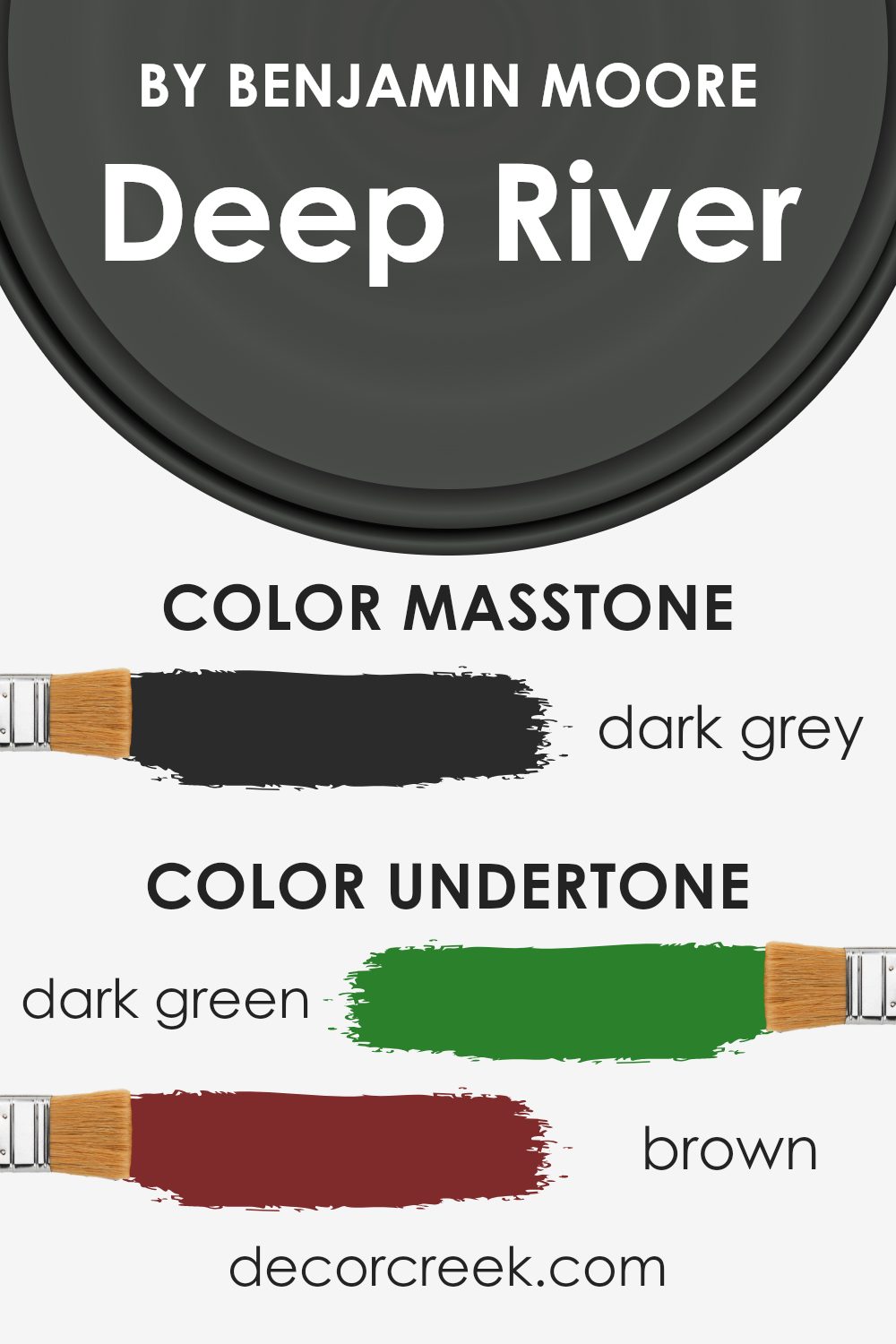
Deep River by Benjamin Moore is a dark, rich color that can create a cozy and dramatic atmosphere in a room. The undertones of this paint include dark green, brown, navy, olive, dark turquoise, purple, and grey. These undertones influence how we perceive Deep River in different lighting and settings.
The dark green and olive undertones can make the color appear more natural and earthy, adding a sense of calmness and comfort. Brown hues give it a warm and inviting feel, which can bring warmth to a space.
Navy and grey undertones add depth and can make the color look more sophisticated and grounded, while also creating a neutral backdrop.
When you paint walls with Deep River, the presence of these undertones means the color can change slightly depending on the surrounding light and decor. For instance, in natural light, the paint may appear a bit greener or bluer, highlighting its cooler tones. In dim lighting, the brown and grey tones may dominate, giving the space a more intimate and enveloping feel.
The mixture of these undertones also helps Deep River blend well with a variety of other colors and materials, making it a versatile choice for interiors. This complex blend results in a deep color that adds richness and character to any room.
What is the Masstone of the Deep River 1582 by Benjamin Moore?
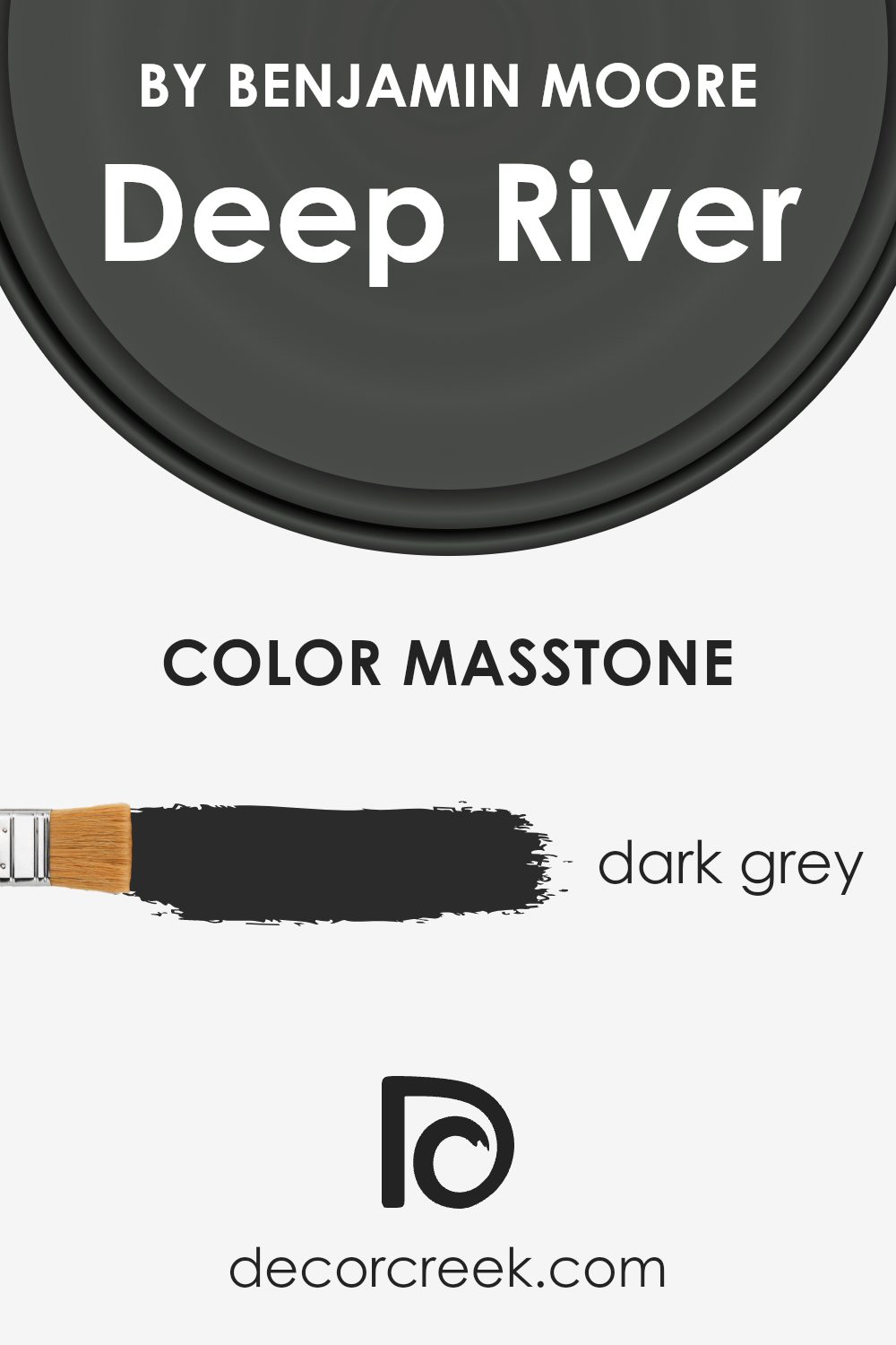
Deep River by Benjamin Moore is a dark grey color with a masstone of #2B2B2B. This shade can create a cozy and intimate atmosphere in a home. Dark grey colors like Deep River provide a sense of depth and can make a room feel more grounded.
This color works well in spaces where you want to create a calmer environment, such as a bedroom or a living room.
Dark grey as a wall color can serve as a neutral backdrop, allowing other colors in the room to stand out more vividly. It pairs well with lighter colors, like whites or soft pastels, offering a nice contrast. Additionally, this shade can complement natural materials like wood or stone, highlighting their textures.
When using this color, ensure the room has enough natural or artificial light, as dark colors can make spaces seem smaller and more enclosed.
With the right balance, Deep River can bring a sleek and timeless touch to any room.
How Does Lighting Affect Deep River 1582 by Benjamin Moore?
Lighting plays a huge role in how we perceive colors in a room. Natural and artificial light can change the appearance of paint colors, sometimes in surprising ways. The color Deep River by Benjamin Moore, a deep and rich green, is no exception.
In natural light, colors appear more true to their actual shade. However, the type of natural light can vary based on the direction a room faces. In north-facing rooms, the light is cooler and more muted, often giving colors a blue or gray tint.
Deep River might appear darker and richer in these settings.
In south-facing rooms, the lighting tends to be warmer and more intense, which can add warmth to the color, making it look slightly lighter and more vivid. East-facing rooms get warm, bright light in the morning and cooler light in the afternoon.
In the early part of the day, Deep River might look more vibrant, but as the sun moves, it could become dimmer and cooler.
West-facing rooms have the opposite effect, with cooler morning light and warmer, golden light in the afternoon, which might make Deep River appear more dynamic, changing from cooler tones to warmer hues as the day progresses.
Artificial light also affects how we see colors. Incandescent bulbs emit warm, yellow light, which can enhance warmer tones in Deep River, making it cozier. LED lights might vary depending on their color temperature.
Warm LED lights will have a similar effect to incandescent lights, while cool LED lights could bring out cooler, greener tones in Deep River, similar to the effect of north-facing natural light.
Overall, the way Deep River looks in a room is greatly influenced by the source and direction of light. Testing paint samples in different lighting conditions is crucial to see how this color adapts throughout the day.

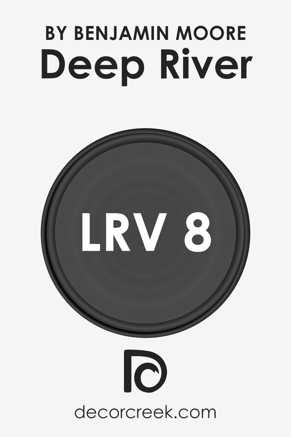
What is the LRV of Deep River 1582 by Benjamin Moore?
Light Reflectance Value (LRV) is a measurement of how much light a color reflects or absorbs. The scale ranges from 0 to 100, where 0 is absolute black, absorbing all light, and 100 is pure white, reflecting all light. A lower LRV means the color will absorb more light and appear darker, whereas a higher LRV means it will reflect more light and seem lighter.
LRV is essential in choosing paint colors because it can influence the mood and brightness of a room. When a color has a low LRV, it can make a space feel cozy and intimate but may also make it seem smaller or more enclosed. Conversely, a color with a high LRV can open up a room, making it feel larger and more airy.
Deep River, with its LRV of 7.82, is on the lower end of the scale, indicating it is a deep, dark color that absorbs a lot of light. This can give a room a more intimate and dramatic feel. The color can make a strong visual impact, creating depth and sophistication in a space.
Because it reflects so little light, Deep River may make a room feel darker, especially if there isn’t much natural light available. It’s well-suited for accent walls or areas where you want to bring out a sense of warmth and comfort.
However, when using a color with such a low LRV, it’s vital to consider the lighting and size of the room to avoid making the space feel overly small or gloomy.
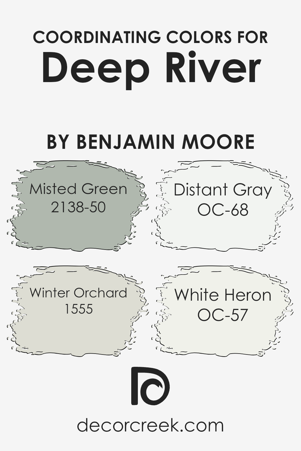
Coordinating Colors of Deep River 1582 by Benjamin Moore
Coordinating colors are hues that complement each other and work well together, creating a harmonious look. When you pair them with a strong shade like Deep River, they enhance its beauty without overpowering it.
Deep River by Benjamin Moore is a deep, rich green that can be a focal point in any room. To balance this bold choice, you can use lighter or softer colors. Misted Green is a light, misty hue that brings out the undertones of Deep River, offering a gentle contrast.
It feels fresh and calming, perfect for areas where you want to relax.
Winter Orchard is a subtle, muted shade with a hint of warmth. This soft shade works well in spaces that need a cozy and inviting atmosphere. Distant Gray is a light, clean gray that adds brightness and airiness, preventing the space from feeling too dark. It acts like a neutral canvas, allowing Deep River to stand out.
Lastly, White Heron is a crisp, off-white color that provides a classic backdrop. It’s elegant and timeless, making rooms feel bigger and more open. Together, these colors create a balanced palette that enhances any space, making it feel cohesive and inviting.
You can see recommended paint colors below:
- 2138-50 Misted Green
- 1555 Winter Orchard
- OC-68 Distant Gray
- OC-57 White Heron
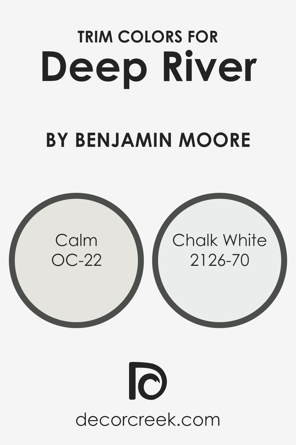
What are the Trim colors of Deep River 1582 by Benjamin Moore?
Trim colors are the shades used to paint the edges and borders of walls, windows, doors, and other architectural features in a room. They help define and highlight these areas, offering a crisp and clean transition between the walls and other elements.
Using contrasting trim colors with a bold wall color like Deep River by Benjamin Moore can make a room look more polished and harmonious. Trim colors such as OC-22 Calm and 2126-70 Chalk White can play a significant role in achieving a balanced look with Deep River.
A good trim choice can tie together the overall color scheme, making the space feel cohesive and well-thought-out.
OC-22 Calm is a gentle, light gray with subtle warmth that complements the richness of Deep River. Its soft, muted tone provides a subtle contrast without overwhelming the boldness of the main color, adding a delicate touch to the room’s design.
Meanwhile, 2126-70 Chalk White is a clean, crisp white that provides a striking yet classic contrast against Deep River’s deep hue. It can brighten up the space, highlighting the architectural details for a more dynamic and visually interesting effect.
Both Calm and Chalk White work well as trim colors because they offer a subtle but effective contrast, emphasizing the beauty of the Deep River shade.
You can see recommended paint colors below:
- OC-22 Calm
- 2126-70 Chalk White
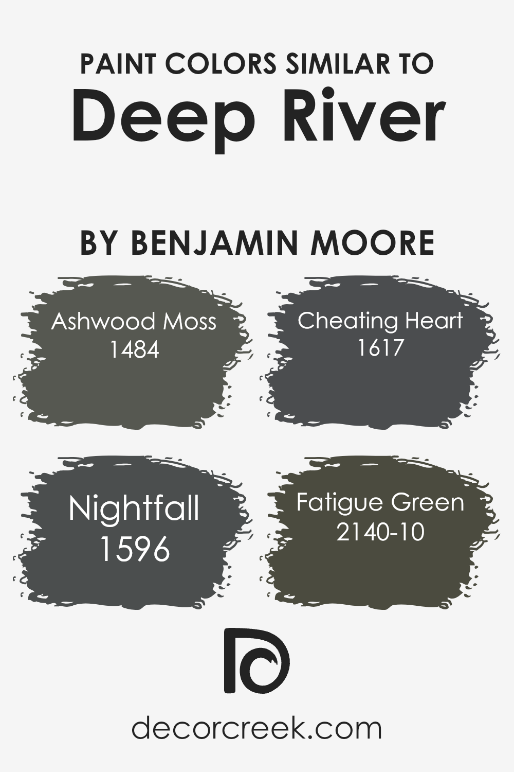
Colors Similar to Deep River 1582 by Benjamin Moore
When choosing colors for a room, using shades similar to Deep River can create a balanced and cohesive look. These similar shades, like Ashwood Moss, Nightfall, Cheating Heart, and Fatigue Green, harmonize beautifully with Deep River’s deep, muted tones.
They maintain a sense of unity while introducing subtle variations that keep a space interesting without overwhelming it. The interplay between these colors can make a room feel more inviting and comfortable, enhancing its overall atmosphere.
Ashwood Moss offers a rich, earthy tone with a hint of warmth, which pairs nicely with Deep River’s calming depth. Nightfall, on the other hand, brings a dark, moody presence, which can add a touch of drama and sophistication. Cheating Heart is a bold, dark gray that balances strength and style, creating a perfect backdrop for more vibrant accent pieces.
Lastly, Fatigue Green provides an understated, natural vibe that complements the other colors’ grounded qualities. Together, these colors work seamlessly to create a harmonious and visually appealing design, making any space feel cohesive and well-thought-out.
By incorporating these similar shades, you can achieve a sophisticated look that remains inviting and warm.
You can see recommended paint colors below:
- 1484 Ashwood Moss
- 1596 Nightfall
- 1617 Cheating Heart
- 2140-10 Fatigue Green
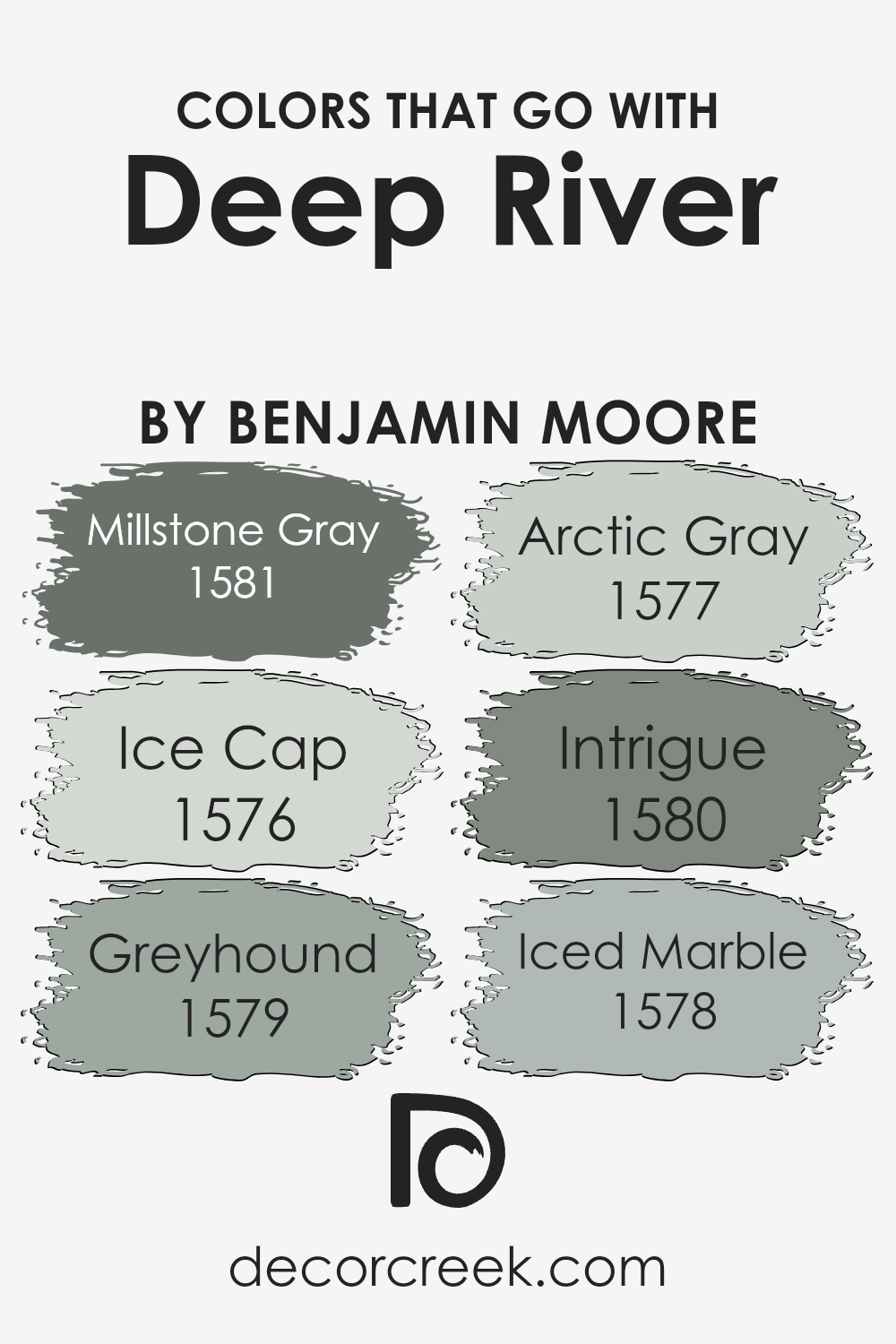
Colors that Go With Deep River 1582 by Benjamin Moore
Choosing colors that complement Deep River 1582 by Benjamin Moore helps create a balanced and appealing space. Deep River is a rich, dark shade, so pairing it with the right colors is crucial for an inviting atmosphere. Millstone Gray 1581 fits beautifully with Deep River.
It’s a soft, warm gray that brings out the depth of Deep River without overwhelming it. Ice Cap 1576, a light and cool blue, adds a refreshing contrast, making spaces feel brighter and more open. Greyhound 1579 is a medium gray with a hint of warmth; it balances Deep River’s intensity and adds a touch of comfort.
Arctic Gray 1577 is a soft gray with a cool undertone, lending a gentle touch that lightens the mood around the darker hue of Deep River. Intrigue 1580 is a mysterious bluish green that offers an interesting interplay between boldness and calmness, deepening the overall color scheme.
Finally, Iced Marble 1578, a light and airy gray, offers a crisp and clean look. It pairs well with Deep River for a feeling of freshness.
Each of these colors helps to highlight the richness of Deep River 1582 while adding distinct layers of depth and light, creating rooms that are pleasing and well-composed.
You can see recommended paint colors below:
- 1581 Millstone Gray
- 1576 Ice Cap
- 1579 Greyhound
- 1577 Arctic Gray
- 1580 Intrigue
- 1578 Iced Marble
How to Use Deep River 1582 by Benjamin Moore In Your Home?
Deep River 1582 by Benjamin Moore is a rich and versatile paint color that can add warmth to any space. It is a deep, muted blue with hints of green and gray, giving it a cozy yet elegant feel. This color works well in different areas of a home. In a living room, it can make the space feel inviting and comfortable.
Pair it with light or neutral furniture to create a pleasant contrast. In a bedroom, Deep River 1582 can create a restful atmosphere, perfect for relaxation. It also works well in kitchens or dining areas, where it can add a touch of sophistication without being overpowering.
This shade complements a variety of styles, from traditional to modern. To complete the look, consider using light-colored accents and furnishings, which will stand out beautifully against the deep tones of Deep River 1582, creating a balanced and harmonious space.
Deep River 1582 by Benjamin Moore vs Ashwood Moss 1484 by Benjamin Moore
Deep River 1582 by Benjamin Moore is a dark, muted blue-green. It’s rich and intense, providing a strong, calming presence. This color works well in spaces where you want to create a cozy and relaxing atmosphere. It pairs nicely with neutral tones and can be used as a bold backdrop for artwork or furniture.
On the other hand, Ashwood Moss 1484 by Benjamin Moore is a deep green with earthy undertones. It’s less blue than Deep River and brings a touch of nature indoors.
Ashwood Moss has a grounding effect, making it suitable for spaces where you want to feel connected to the outdoors. It works well with natural wood accents and other warm colors.
While both colors are dark and soothing, Deep River leans more toward blue, giving it a cool vibe, while Ashwood Moss has a warmer, more natural feel due to its greenish-brown hue. Both can create an inviting, elegant space.
You can see recommended paint color below:
Deep River 1582 by Benjamin Moore vs Fatigue Green 2140-10 by Benjamin Moore
Deep River 1582 by Benjamin Moore is a rich, dark blue with gray undertones. It brings a sense of calmness and depth to a space, making it feel cozy and intimate. The color is versatile and can work well in both modern and traditional settings, adding a touch of elegance without being overpowering.
On the other hand, Fatigue Green 2140-10 by Benjamin Moore is a muted, earthy green. This color has a natural, grounding feel to it, reminiscent of olive drab used in military contexts. It’s perfect for creating a warm and relaxed atmosphere, especially in areas where you want a comforting and welcoming vibe.
While Deep River gives a room a cool, sophisticated look, Fatigue Green offers warmth and an inviting feel. Both colors can serve as excellent backdrops in a home, but they cater to different moods: Deep River is calming and deep, whereas Fatigue Green is soothing and natural.
You can see recommended paint color below:
- 2140-10 Fatigue Green
Deep River 1582 by Benjamin Moore vs Nightfall 1596 by Benjamin Moore
Deep River 1582 and Nightfall 1596, both by Benjamin Moore, are rich, dark colors that can add depth to any space.
Deep River is a deep teal with undertones of blue and green. It’s a versatile color that works well in various settings, from a cozy living room to an elegant dining area. Its soothing mixture of cool tones provides a calm and inviting atmosphere.
Nightfall 1596, on the other hand, leans more towards a dark, charcoal gray with subtle blue undertones. This color is often used to create a dramatic effect, making it suitable for modern and chic spaces. It pairs well with lighter colors, offering a striking contrast that enhances a room’s overall look.
Both colors are excellent for creating a sense of depth and warmth but offer different moods due to their distinct undertones. While Deep River leans towards a teal vibe, Nightfall brings out a moody, sophisticated gray.
You can see recommended paint color below:
- 1596 Nightfall
Deep River 1582 by Benjamin Moore vs Cheating Heart 1617 by Benjamin Moore
Deep River 1582 and Cheating Heart 1617 are two popular colors by Benjamin Moore. Deep River is a rich, dark blue-green that brings a sense of calm and nature into a space. It’s versatile and works well in a variety of settings, from living rooms to bedrooms, creating a cozy and grounded atmosphere.
On the other hand, Cheating Heart is a deep charcoal gray with hints of blue. It’s darker and more dramatic, lending a modern and sleek feel to interiors.
Cheating Heart is ideal for those looking to add depth to their home with a bold but sophisticated touch, and it pairs well with lighter colors and natural elements.
While both colors are deep and moody, Deep River leans more towards a blue-green hue, perfect for adding a touch of nature, whereas Cheating Heart’s almost black tone adds a modern and elegant edge to a room.
Both can set the mood but offer different vibes depending on the desired aesthetic.
You can see recommended paint color below:
Conclusion
It’s a rich blue, kind of like the deep ocean or a nighttime sky. This color isn’t too bright or too dark—it strikes a nice balance that can make a room feel cozy and inviting.
Whether it’s a bedroom where you sleep or a living room where you gather with family, this color can set the mood just right.
It’s like wearing your favorite, comfy sweater that makes everything feel just a bit more snug.
What I find cool is how this shade of blue can be paired with other colors. You can match it with white for a crisp look or with warm colors for something a bit more exciting. This makes it a great choice for anyone who wants a color that’s both bold and calming.
In the end, 1582 Deep River isn’t just a paint—it’s a way to give your room a nice, cozy feeling. It’s a color that draws you in and makes you feel at home. I’ve come away with a real appreciation for how something as simple as a coat of paint can change how we feel about a space.
Ever wished paint sampling was as easy as sticking a sticker? Guess what? Now it is! Discover Samplize's unique Peel & Stick samples.
Get paint samples

