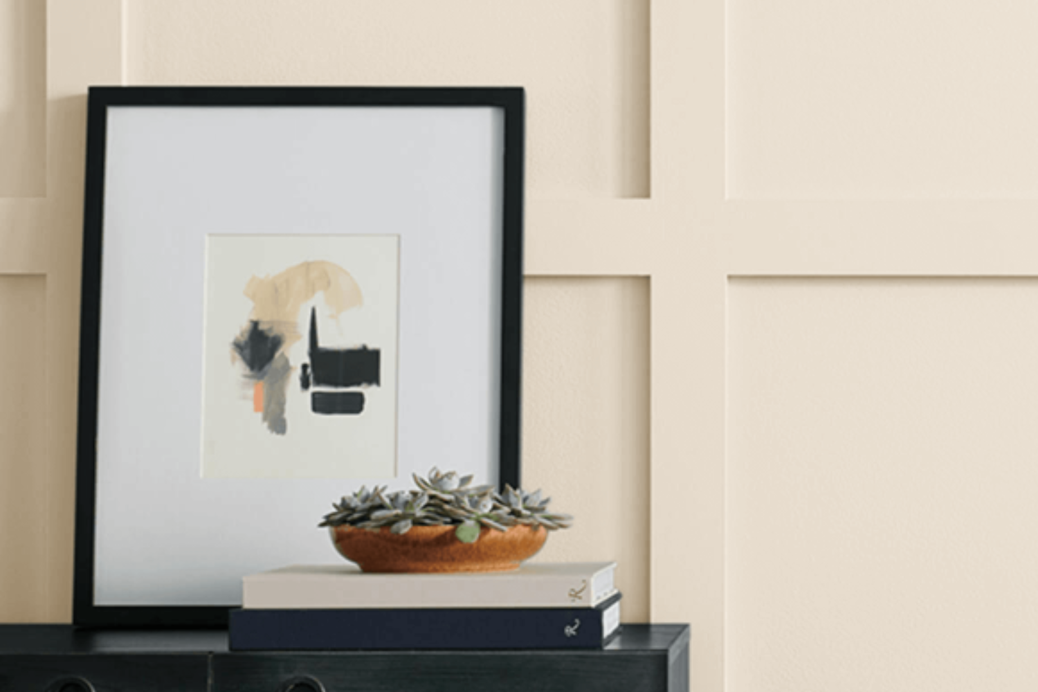
SW 6105 Divine White by Sherwin Williams is a paint color that has been gaining popularity for its beautiful, warm, and inviting tone. This shade of white stands out because it perfectly balances a soft, creamy appearance with just the right touch of warmth, making it a great choice for anyone looking to add a cozy yet sophisticated vibe to their home.
Its adaptability is one of its best features; Divine White fits in seamlessly with a variety of decor styles, from modern minimalist to more traditional settings.
What sets Divine White apart from other white paints is its subtle undertones, which can change depending on the lighting in a room. Under natural daylight, it exudes a soft, welcoming glow, while artificial light brings out its creamy side, adding a touch of elegance to any space.
This versatility makes it a favorite among homeowners and interior designers alike, as it can be used in a multitude of spaces including living rooms, bedrooms, kitchens, and more.
Whether you’re looking to brighten up a small room or add a touch of warmth to a large open space, SW 6105 Divine White is a great choice that will complement your home’s aesthetic beautifully.
What Color Is Divine White SW 6105 by Sherwin Williams?
Divine White by Sherwin Williams is a soft, warm white that carries a slight nuance of beige, making it an incredibly versatile color for interior spaces. Unlike stark whites, Divine White offers a cozy warmth, making it perfect for creating a welcoming atmosphere in any home. Its understated elegance allows it to seamlessly blend with various decor styles, from traditional to modern minimalist, without overwhelming a space.
This color works exceptionally well in styles where a sense of calm and serenity is desired. It is particularly suited for farmhouse, shabby chic, Scandinavian, and transitional interiors, where its subtle warmth enhances the inviting nature of these styles.
Divine White can also serve as a beautiful backdrop in a more eclectic setting, providing a neutral canvas against which more vibrant elements can stand out.
When it comes to pairing with materials and textures, Divine White shines with a wide range. It complements natural wood finishes, from light pine to rich walnut, highlighting their natural beauty without competing for attention. In rooms with plenty of natural light, this color pairs well with linen, cotton, and other lightweight fabrics to create an airy, breathable feel. Metal accents in brass, gold, or brushed nickel add a touch of sophistication and contrast nicely with Divine White’s soft warmth.
Overall, Divine White is a remarkably adaptable color that can enhance the aesthetic appeal of a wide range of interior styles and pair beautifully with a variety of materials and textures.
Ever wished paint sampling was as easy as sticking a sticker? Guess what? Now it is! Discover Samplize's unique Peel & Stick samples.
Get paint samples

Is Divine White SW 6105 by Sherwin Williams Warm or Cool color?
Divine White by Sherwin Williams is a warm, inviting shade that seamlessly blends into the backdrop of any home, adding a touch of elegance and softness to spaces. Its subtle cream undertones ensure it’s not a stark white, making it versatile enough to work in various environments – from a cozy, sunlit reading nook to a spacious, open-plan kitchen. This color shines particularly well in rooms that get a lot of natural light, as it can enhance the space with a gentle, welcoming glow.
When used in smaller spaces, Divine White can make the area feel more open and airy, giving the illusion of a bigger room without feeling too cold or impersonal.
In larger rooms, it can help create a cohesive look, tying together different elements of the décor for a polished and sophisticated finish. Its neutrality means it pairs beautifully with both vibrant colors and softer, earthy tones, offering flexibility in design choices.
Applying Divine White on walls can also serve as a canvas, allowing furniture and art to stand out. It’s particularly effective in highlighting textured materials or colorful patterns, providing a calm backdrop that complements rather than competes.
Whether you’re aiming for a modern, minimalist look or a more traditional, cozy atmosphere, Divine White brings a sense of tranquility and warmth to homes, proving itself as a timeless and adaptable choice.
Undertones of Divine White SW 6105 by Sherwin Williams
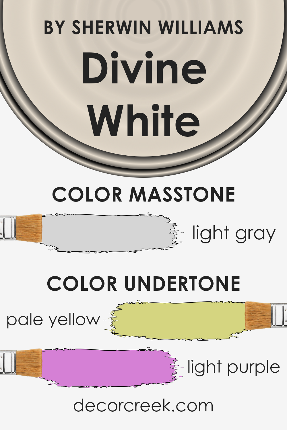
When we talk about the color Divine White, it’s important to consider its undertones because they can significantly alter our perception of the main color. This paint, in particular, has subtle hints of pale yellow and light purple. These aren’t colors you’d see straight away, but they have a big impact on how Divine White looks in different settings.
Undertones work kind of like a background tune. You might not notice them immediately, but they shape your overall experience. For Divine White, the pale yellow undertone adds a warm, soft glow. It’s like the color is bathed in a bit of sunshine, making spaces feel inviting and cozy. On the other hand, the light purple undertone adds a hint of coolness and sophistication. This balance between warmth and coolness makes Divine White incredibly versatile.
On interior walls, these undertones play with the light in interesting ways. In rooms with lots of natural light, the pale yellow might become more pronounced, making the room feel sunnier. In artificial light or during the evening, the light purple could step forward, giving the room a calmer, more collected vibe.
So, while you might think you’re just looking at a simple shade of white, the undertones are secretly shaping your perception, making Divine White a unique and dynamic choice for any room.
What is the Masstone of the Divine White SW 6105 by Sherwin Williams?
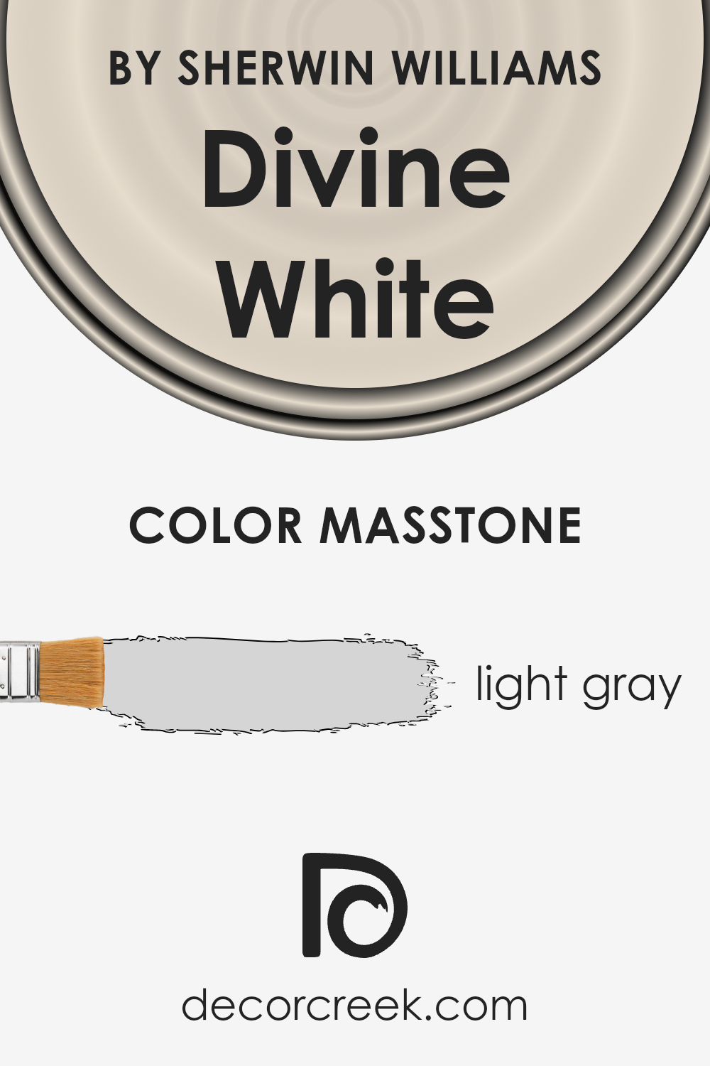
Divine White by Sherwin Williams has a masstone that can be best described as a light gray, closely resembling the shade #D5D5D5. This subtle, gentle gray has a warm undertone, making it incredibly versatile and a popular choice for home interiors. Its lightness ensures that spaces feel open and airy, maximizing the sense of space in any room.
This color works wonders in homes because it acts as a soft backdrop that can complement both bold and muted decor styles. Whether you have a house filled with modern, minimalist pieces or a more traditional setup, Divine White effortlessly ties different elements together. It has the magic of making other colors pop while maintaining a calm and cohesive atmosphere, perfect for creating a welcoming environment.
Plus, its light gray hue reflects natural light beautifully, making rooms look brighter and more inviting without overwhelming the senses. Its understated elegance allows for creative freedom in decorating without the fear of clashing styles or colors.
How Does Lighting Affect Divine White SW 6105 by Sherwin Williams?
Lighting plays a crucial role in how we perceive colors, and understanding this can greatly influence the atmosphere and mood in any space. One color that showcases this well is Divine White by Sherwin Williams. This shade can appear differently depending on the type of light it’s exposed to, whether it’s artificial or natural light, and even the direction the room faces.
- In artificial light, Divine White tends to warm up, giving off a cozy and inviting feel. This is because most artificial lights, like incandescent bulbs, have a warm tone that enhances the creamy aspects of this color, making spaces feel snug and comfortable.
- Natural light, on the other hand, brings out the truest form of this shade. However, the amount and intensity of natural light can change the color’s appearance throughout the day. In north-faced rooms, which receive cooler, indirect light, Divine White can appear more muted and slightly cooler, maintaining its brightness but without the same warmth as in artificially lit areas.
- South-faced rooms benefit from generous amounts of natural sunlight, making Divine White glow with warmth and brightness. It radiates a soft, welcoming vibe throughout the day, making spaces feel open and airy.
- In east-faced rooms, the morning light can make this color look very bright and vibrant. As the natural light is warmer in the morning, it enhances the creamy qualities of the color, creating a gentle, uplifting atmosphere. However, as the day progresses and the natural light diminishes, the color may become more subdued.
- West-faced rooms experience the opposite effect, with the afternoon and evening light bringing out the warm, golden tones of Divine White. This can add a cozy, serene ambiance to the room, making it a perfect space to relax in the evening as the color transitions with the shifting light.
In summary, Divine White’s appearance is notably affected by the lighting conditions, changing its character and feel, from the warmth of south and west-facing rooms to the subtler hues in north and east-facing environments. Whether in natural or artificial light, this color offers versatility and adaptability, complementing any setting beautifully.
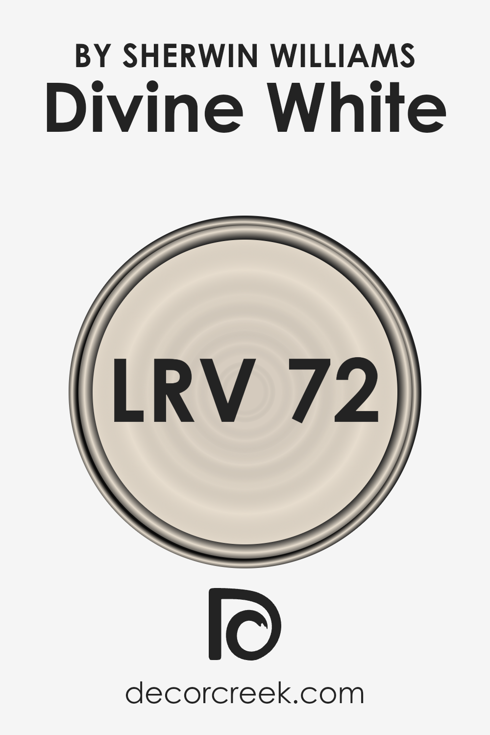
What is the LRV of Divine White SW 6105 by Sherwin Williams?
LRV stands for Light Reflectance Value, which measures the percentage of light a paint color reflects back into a room. Think of LRV as a scale from 0 to 100, with 0 being completely black, absorbing all light, and 100 being pure white, reflecting all light.
This number helps in deciding how light or dark a color will look on your walls and how it changes under different lighting conditions. A higher LRV means the color reflects more light, making spaces feel more open and airy. Conversely, a lower LRV color absorbs more light, which can make a room feel cozier or smaller.
With an LRV of 72.261, the color in question is on the lighter side of the scale. It means that this color is great at reflecting light, contributing to a brighter and more spacious feeling in any room it’s applied.
This particular shade of white will not only make walls seem illuminated but will also add a soft, warm glow to the space. In rooms with plenty of natural light, this color will look especially vibrant, enhancing the overall ambiance. Even in spaces with less natural light, the high LRV ensures that the color will help maximize the available light, making the room feel welcoming and larger.
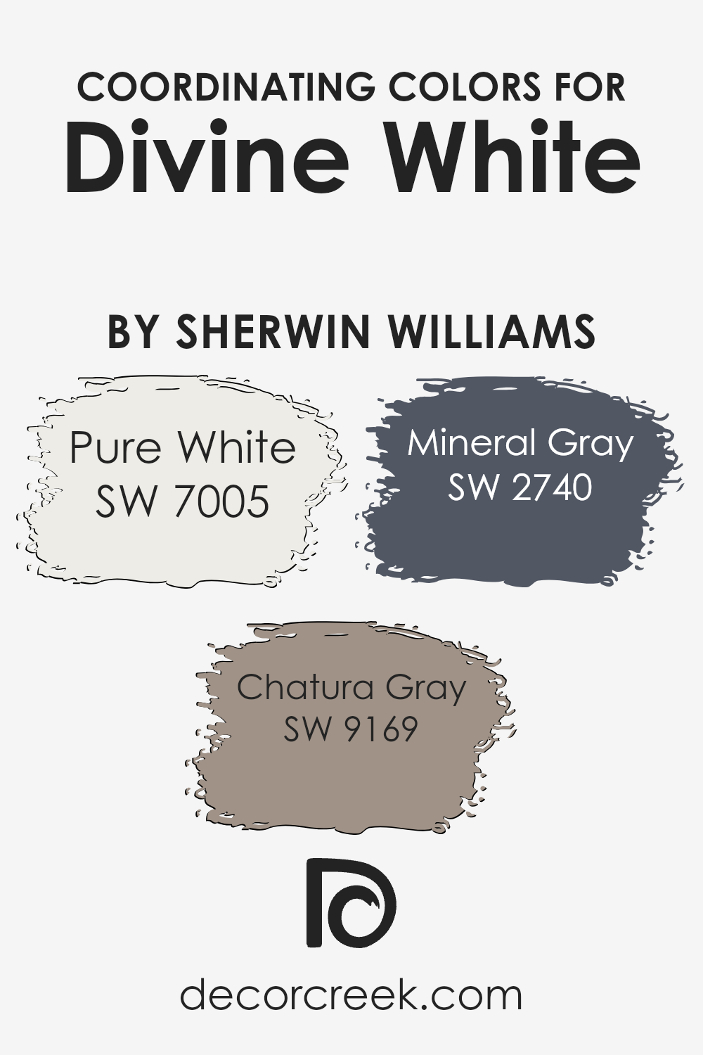
Coordinating Colors of Divine White SW 6105 by Sherwin Williams
Coordinating colors are hues that work harmoniously together to enhance the visual appeal of a space. When choosing coordinating colors for Divine White by Sherwin Williams, it’s essential to select shades that complement rather than clash with its soft, warm undertones. The goal is to create a balanced and cohesive look that is pleasing to the eye. Coordinating colors can be used for walls, trim, ceilings, and accents to tie the rooms together seamlessly.
Pure White (SW 7005) is a clean and crisp white that acts as a perfect backdrop, making it a great choice for trim or ceilings to contrast gently with Divine White walls. Its simplicity offers a fresh and open feel to any space.
Chatura Gray (SW 9169) is a muted, sophisticated shade that adds depth and elegance. This color works well in spaces that aim for a subtle contrast without overwhelming the room’s balance. Lastly, Mineral Gray (SW 2740) brings a richer, earthier tone into the palette, lending a grounding effect that pairs nicely with the soft warmth of Divine White.
It is ideal for creating an accent wall or for furniture pieces that complement the overall serene and welcoming ambiance of a room. Together, these colors form a harmonious palette that enhances the beauty and cohesiveness of a space.
You can see recommended paint colors below:
- SW 7005 Pure White
- SW 9169 Chatura Gray
- SW 2740 Mineral Gray
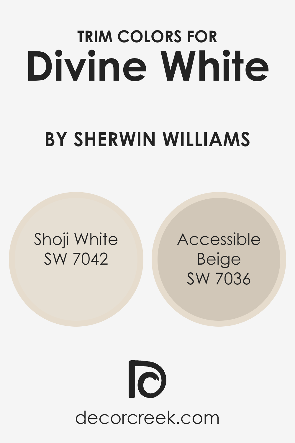
What are the Trim colors of Divine White SW 6105 by Sherwin Williams?
Trim colors are basically hues selected for painting the architectural trim elements, such as door frames, window frames, skirting boards, and moldings, in a space. These colors play a significant role in defining the overall look of a room, enhancing the main wall color, and highlighting the architectural features of a home.
When paired with Divine White by Sherwin Williams, a warm and inviting neutral, choosing the right trim color can accentuate its beauty and add depth to the room’s aesthetic. Trim colors, like Shoji White and Accessible Beige, are crucial in bringing a cohesive look and refining the visual appeal of the spaces where Divine White is applied.
Shoji White SW 7042 is a soft, muted white with a hint of warm gray, making it an ideal trim color to subtly contrast with the creamy undertones of Divine White without overwhelming it. This combination can create a seamless and sophisticated palette, elevating the elegance of a space.
Accessible Beige SW 7036, on the other hand, offers a richer contrast as a trim color, with its light yet warm beige adding a touch of earthy coziness. This pairing emphasizes the architectural details of a room, making them pop against the soft backdrop of Divine White, thereby fostering an inviting and harmonious atmosphere.
You can see recommended paint colors below:
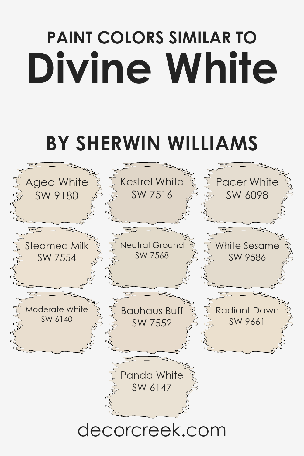
Colors Similar to Divine White SW 6105 by Sherwin Williams
Understanding the importance of similar colors is essential for creating harmonious and visually appealing spaces. Colors like Aged White bring a sense of warmth and nostalgia, offering a creamy backdrop that’s subtle yet inviting. Steamed Milk, on the other hand, has a softer presence, providing a serene and calming effect perfect for creating a restful environment.
- Then we have Moderate White, which stands out for its balance between warm and cool tones, making it incredibly versatile for any space.
- Panda White adds a unique touch with its hint of gray, providing a sophisticated neutrality that pairs well with modern and traditional decor alike.
- Meanwhile, Kestrel White gives off a slightly more robust hue, introducing a hint of earthiness that grounds the space.
- Neutral Ground, as its name suggests, serves as a fantastic foundation, offering a stable and unobtrusive base that allows other design elements to shine. Bauhaus Buff draws inspiration from the Bauhaus movement, providing a muted but artistic undertone that stimulates creativity.
- Pacer White offers a gentle whisper of color, a nearly pure backdrop that refreshes a space without overwhelming it. White Sesame is another intriguing option, weaving in slight variances in tone to create depth and interest.
- Lastly, Radiant Dawn breathes life into rooms with its subtle vibrancy, reminiscent of the early morning sky, offering a fresh and uplifting start to any day.
Each of these colors, while similar, holds its unique charm, demonstrating the versatility and power of utilizing a cohesive palette to achieve a desired aesthetic and ambiance.
You can see recommended paint colors below:
- SW 9180 Aged White
- SW 7554 Steamed Milk
- SW 6140 Moderate White
- SW 6147 Panda White
- SW 7516 Kestrel White
- SW 7568 Neutral Ground
- SW 7552 Bauhaus Buff
- SW 6098 Pacer White
- SW 9586 White Sesame
- SW 9661 Radiant Dawn
How to Use Divine White SW 6105 by Sherwin Williams In Your Home?
Divine White SW 6105 by Sherwin Williams is a warm, inviting neutral paint color that can bring a cozy, soothing atmosphere to any room in your home. Its versatility makes it a fantastic choice for various spaces, from living rooms and kitchens to bedrooms and bathrooms.
With its soft, slightly creamy hue, Divine White can help make your rooms feel more spacious and bright, especially when paired with good natural lighting. It’s excellent for those who want to create a calm, welcoming environment without the starkness sometimes associated with pure white.
This color works well with a wide range of decor styles, whether you’re aiming for a modern, minimalist look or a more traditional, homey vibe. It can serve as a neutral backdrop for your furniture and art, allowing your personal style to shine through. Additionally, Divine White is great for adding a sense of continuity when used throughout the home, helping to tie different spaces together seamlessly. For a cohesive look, you can also pair it with contrasting colors or textures in your decor items, such as dark wood furniture or colorful accents, to make the space more dynamic and interesting.
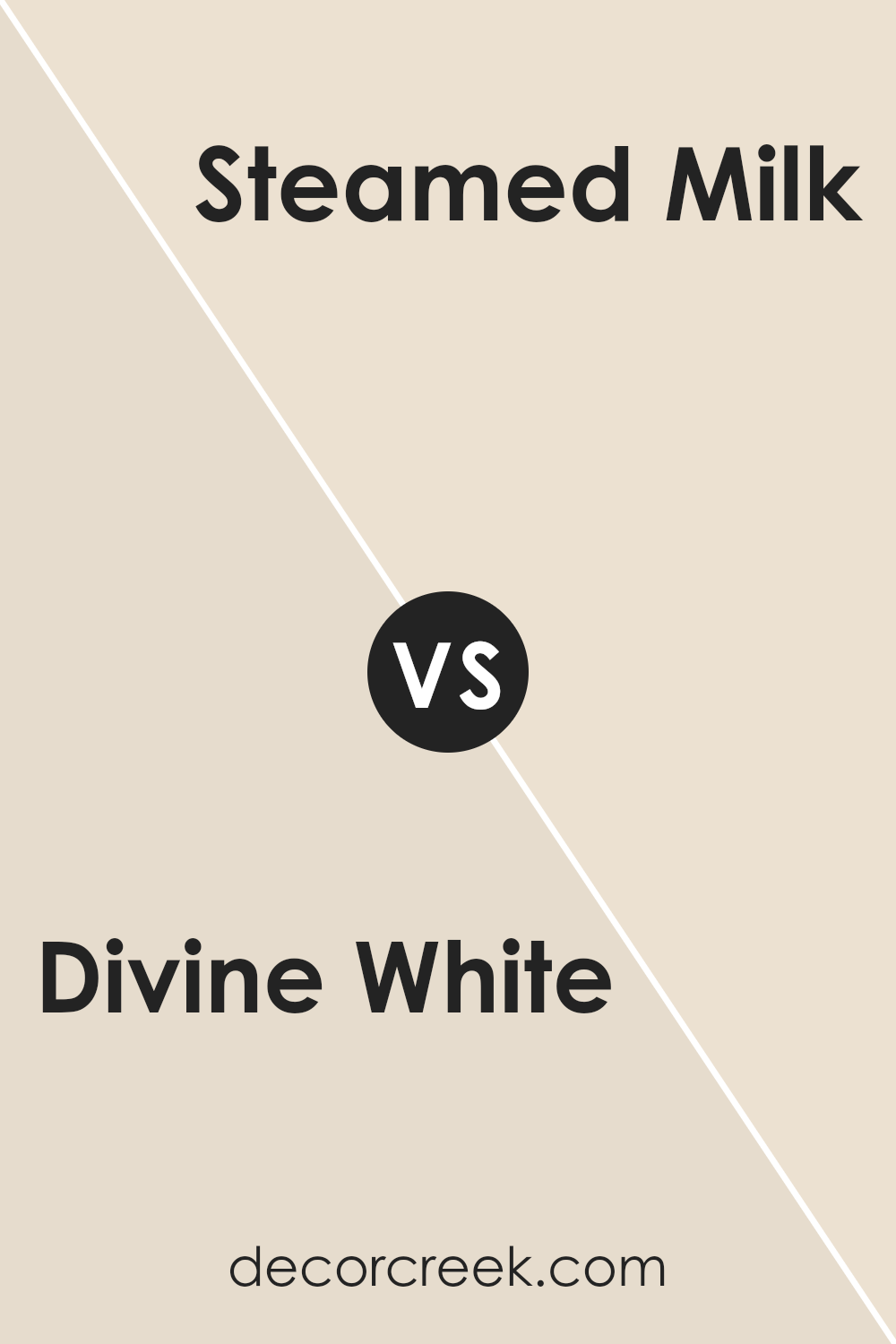
Divine White SW 6105 by Sherwin Williams vs Steamed Milk SW 7554 by Sherwin Williams
Divine White and Steamed Milk are two colors by Sherwin Williams, each offering a distinct vibe for your space. Divine White is a soft, warm white with a hint of beige, making it versatile for any room. It’s like a cozy blanket, giving off a calm and inviting atmosphere. On the other hand, Steamed Milk has a slightly richer, creamier tone. Despite its name, it’s not stark white but carries a welcoming, subtle beige that leans towards a light, creamy latte.
Choosing between the two depends on the mood you’re aiming for. If you want a hint of warmth with a clean, almost ethereal quality, Divine White is your go-to. It’s light enough to make spaces feel airy yet warm enough to keep them feeling cozy.
Steamed Milk is perfect for those who prefer a bit more depth and coziness in their color, creating a snug, enveloping feel without darkening the room. Both are excellent choices for a neutral palette, but your final choice might hinge on whether you prefer the lighter touch of Divine White or the slightly richer embrace of Steamed Milk.
You can see recommended paint color below:
- SW 7554 Steamed Milk
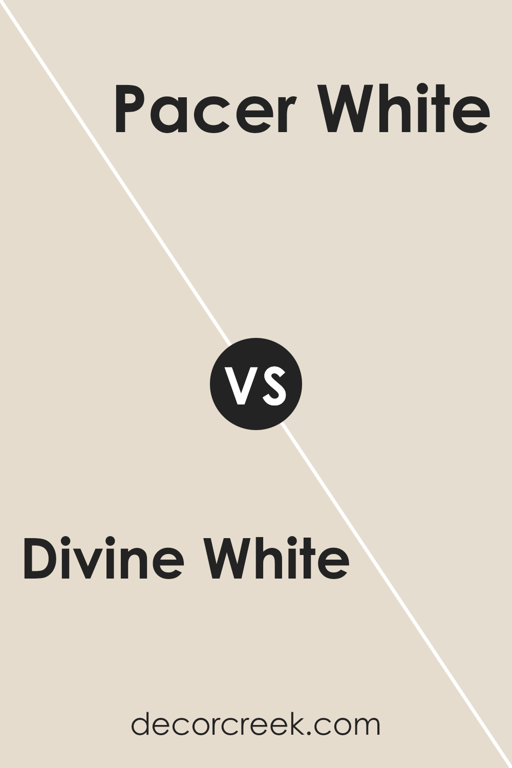
Divine White SW 6105 by Sherwin Williams vs Pacer White SW 6098 by Sherwin Williams
Divine White and Pacer White are two light shades that offer subtle yet distinct differences. Divine White leans towards a soft, creamy warmth, making spaces feel cozy and welcoming without overpowering them with color. It has a gentle touch of beige, adding to its versatility in matching various decor styles, from traditional to modern.
On the other hand, Pacer White stands out for its slightly cooler, almost neutral tone. It’s like a crisp white with just a hint of gray, offering a fresh and clean backdrop that can brighten rooms while also providing a subtle contrast against both bright and muted colors.
This makes Pacer White a great choice for those looking to create a serene, calming vibe in their spaces. While both shades are excellent for creating a light and airy atmosphere, your choice between Divine White and Pacer White would depend on the warmth and mood you want to bring into your room.
You can see recommended paint color below:
- SW 6098 Pacer White
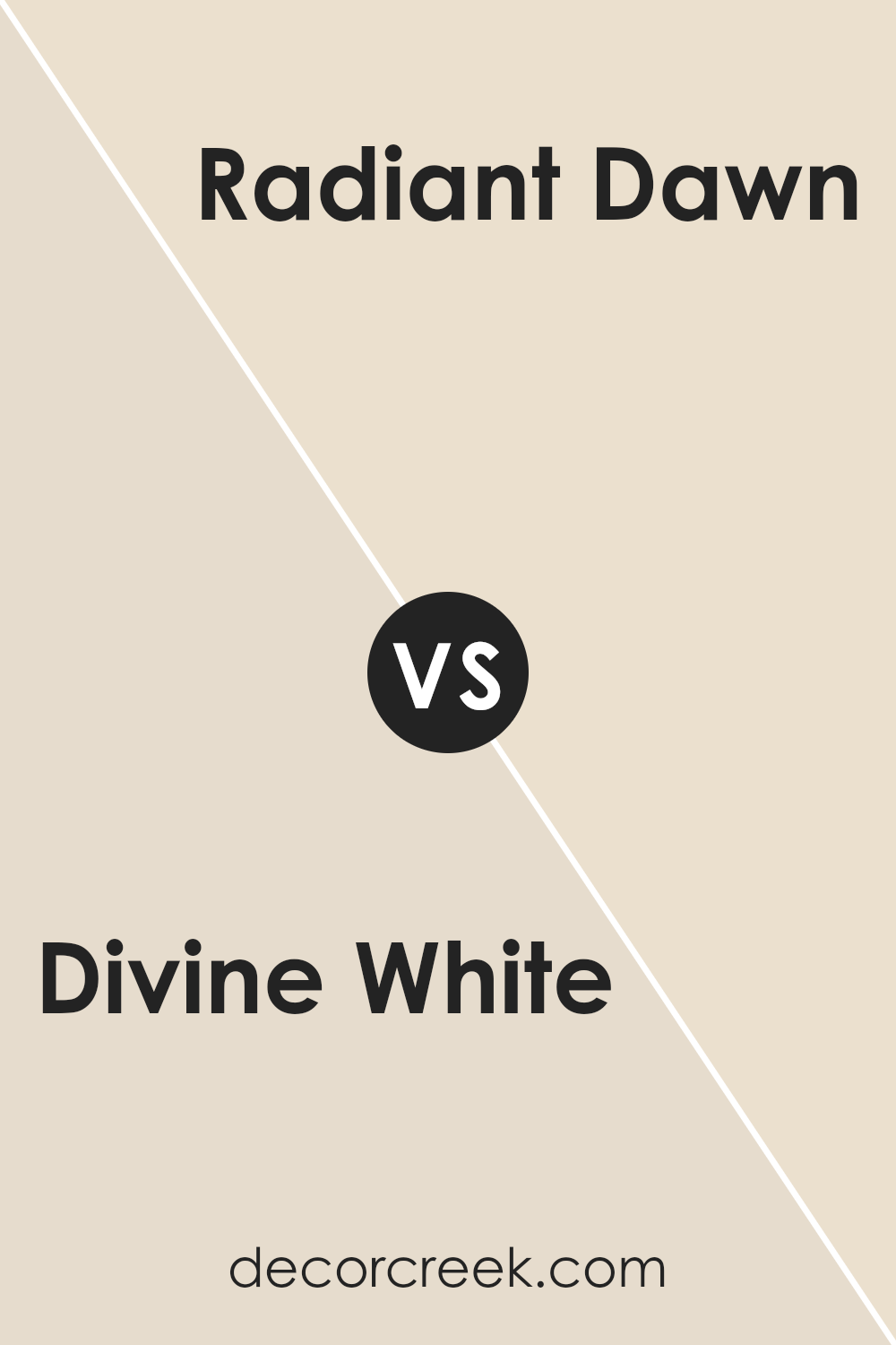
Divine White SW 6105 by Sherwin Williams vs Radiant Dawn SW 9661 by Sherwin Williams
Divine White and Radiant Dawn are two beautiful colors by Sherwin Williams that have their own unique appeal. Divine White is a soft, creamy color that brings a subtle warmth to any space. It’s perfect for creating a cozy and inviting atmosphere without overwhelming the room with too much color. On the other hand, Radiant Dawn is a light and airy color, offering a hint of freshness and rejuvenation.
This color can help brighten up a space, making it feel more open and vibrant. While Divine White leans towards a neutral, soothing palette that blends seamlessly with various decor styles, Radiant Dawn adds a gentle splash of energy, perfect for awakening a dull room.
Despite their differences, both colors share the ability to enhance a room’s aesthetic gently and are versatile enough to complement a wide range of furnishings and accessories. Choosing between them depends on the mood you want to set: warm and serene with Divine White or lively and refreshing with Radiant Dawn.
You can see recommended paint color below:
- SW 9661 Radiant Dawn
Divine White SW 6105 by Sherwin Williams vs Neutral Ground SW 7568 by Sherwin Williams
Divine White and Neutral Ground, both by Sherwin Williams, offer subtle yet distinct moods for any space. Divine White has a soft, welcoming allure, almost like the gentle morning light that streams into a cozy room. It’s not pure white but carries a hint of warmth that makes any space feel inviting without being overly stark or bright.
On the other side, Neutral Ground stands as a slightly bolder choice, with its grounding presence that brings a sense of calm and stability. It’s like the color of ancient parchment or soft clay, providing a neutral backdrop that’s easy on the eyes and works well with almost any decor style.
While both colors share a muted, understated elegance, Divine White leans towards a touch of warmth, making spaces feel homely and soft. Neutral Ground, conversely, offers a hint more earthiness and depth, setting the stage for a range of decorative styles, from modern to rustic. Choosing between them depends on the warmth and ambiance you want to achieve in your space.
You can see recommended paint color below:
- SW 7568 Neutral Ground
Divine White SW 6105 by Sherwin Williams vs Kestrel White SW 7516 by Sherwin Williams
Divine White and Kestrel White, both by Sherwin Williams, offer subtle yet distinct differences perfect for a variety of spaces. Divine White is a soft, warm hue that brings a cozy, inviting feeling to rooms. It has a gentle touch of creaminess, making it stand out as a rich and welcoming shade. Think of it as a color that adds a little hug to your walls, making spaces feel more like home.
On the other hand, Kestrel White steps in with a slightly cooler tone. This color leans more towards a neutral, understated elegance. It’s not as warm as Divine White, offering instead a fresher look.
Kestrel White can brighten spaces while maintaining a sophisticated vibe. It’s great for those who prefer a hint of coolness in their whites without venturing into stark or cold territory.
Together, these two shades offer versatility. Whether you’re looking for warmth and coziness or a more refined, airy feel, Divine White and Kestrel White cater to different preferences while maintaining their timeless appeal.
You can see recommended paint color below:
- SW 7516 Kestrel White
Divine White SW 6105 by Sherwin Williams vs Aged White SW 9180 by Sherwin Williams
Divine White and Aged White, both Sherwin Williams paints, have their unique vibes. Divine White has a soft, warm feel, adding a cozy touch to any room. It’s not just “white”; it carries a hint of creaminess that avoids it looking too stark or cold. This makes it great for spaces where you want comfort, like living rooms or bedrooms.
On the other hand, Aged White steps it up in terms of warmth. It has a richer, deeper tone, almost drifting into beige territory. This color is perfect for creating a welcoming atmosphere, offering more character and depth than its Divine counterpart. It works well in areas where you wish for an inviting, yet sophisticated backdrop.
Both are versatile, but while Divine White leans towards a light, airy feel, Aged White brings in an element of earthiness and tradition. Choosing between them depends on whether you’re after a brighter, cleaner look or something more grounded and warm.
You can see recommended paint color below:
- SW 9180 Aged White
Divine White SW 6105 by Sherwin Williams vs Panda White SW 6147 by Sherwin Williams
Divine White and Panda White from Sherwin Williams are two neutral shades, but they have their unique characteristics. Divine White leans more towards a warm, welcoming off-white with a soft, creamy finish. It’s perfect for creating a cozy ambiance in a space without feeling stark or cold.
On the other hand, Panda White has a touch more gray in its composition. This slight difference makes Panda White a cooler, more muted option compared to Divine White. While both colors are versatile and can blend beautifully with various decor styles, Divine White offers a hint more warmth, making spaces feel more inviting.
Panda It is ideal for those preferring a subtle, sophisticated backdrop that bridges the gap between pure white and light gray. Whether you’re looking to brighten up a room or add a hint of elegance, choosing between Divine White and Panda White comes down to the desired warmth and mood of your space.
You can see recommended paint color below:
- SW 6147 Panda White
Divine White SW 6105 by Sherwin Williams vs Bauhaus Buff SW 7552 by Sherwin Williams
Divine White and Bauhaus Buff by Sherwin Williams are two neutral shades that offer subtle warmth to any space. Divine White is a gentle, creamy off-white that brings a soft and airy feel to rooms. It’s like a calm, peaceful morning, offering a backdrop that combines well with various colors, making it extremely versatile for decorating.
On the other hand, Bauhaus Buff has a slightly deeper, more beige tone. It stands out by adding a bit more warmth and coziness compared to Divine White. Think of Bauhaus Buff as the warm glow of the afternoon sun, enriching the space with a sense of comfort and welcomeness.
Both colors work well in spaces aiming for a classic, serene vibe, but Bauhaus Buff offers a tad more depth, making it ideal for creating inviting, snug environments. Choosing between them depends on the mood you’re aiming for – brighter and lighter (Divine White) or warmer and cozier (Bauhaus Buff).
You can see recommended paint color below:
- SW 7552 Bauhaus Buff
Divine White SW 6105 by Sherwin Williams vs White Sesame SW 9586 by Sherwin Williams
Divine White and White Sesame by Sherwin Williams are two distinctive shades of white that can change the look and feel of a room depending on which one you choose. Divine White is a soft, warm white that gives off a cozy and inviting vibe. It’s a bit creamy but not too yellow, making it perfect for spaces where you want a snug and relaxing atmosphere without the starkness of pure white.
On the other hand, White Sesame is a cooler, more neutral white. It carries a slight hint of gray, giving it a modern and fresh appearance. This color is great for spaces that you want to feel open, airy, and minimalistic.
It’s especially good in rooms with plenty of natural light, as the light plays well with its subtle undertones, enhancing the space’s overall feel.
In summary, if you’re after a warm, inviting feel, Divine White is the way to go. But, if you prefer a cleaner, more contemporary vibe, White Sesame is your best bet.
You can see recommended paint color below:
- SW 9586 White Sesame
Divine White SW 6105 by Sherwin Williams vs Moderate White SW 6140 by Sherwin Williams
Divine White and Moderate White are two elegant shades by Sherwin Williams that are perfect for creating a cozy and welcoming atmosphere in your home. While both colors belong to the white family, they have distinct differences that make each unique. Divine White has a warm, creamy undertone that brings a soft and gentle feel to any room.
It’s like wrapping yourself in a blanket of tranquility. On the other hand, Moderate White steps in with a slightly grayer undertone, offering a more neutral look. This color is great for those who appreciate a hint of warmth in their whites but prefer a cleaner, more subdued appearance.
When comparing the two, Divine White has a stronger presence of warmth, making it ideal for spaces where you want to create a cozy, inviting atmosphere. Moderate White, however, is your go-to for a more contemporary, minimalist vibe that still retains a touch of warmth without being overly yellow or creamy.
You can see recommended paint color below:
- SW 6140 Moderate White
Conclusion
In summary, Divine White from Sherwin Williams is a versatile and warm shade of white that has become a preferred choice for those looking to create cozy and inviting spaces. Its subtle undertones ensure it pairs well with a wide range of colors and decor styles, making it suitable for various applications throughout the home.
From walls to cabinets, and even exterior finishes, this color offers flexibility and a timeless aesthetic, ensuring it can seamlessly blend with both modern and traditional design elements.
The popularity of Divine White can be attributed to its ability to enhance the natural light in a room, making spaces appear more open and airy.
Its soft, neutral palette serves as an excellent backdrop for artwork and bold color choices, allowing individuals to personalize their environment while maintaining a cohesive look. Whether implemented in small doses or as a primary color scheme, Divine White proves to be a reliable and sophisticated choice for those seeking to refresh their surroundings with a touch of elegance and warmth.
Ever wished paint sampling was as easy as sticking a sticker? Guess what? Now it is! Discover Samplize's unique Peel & Stick samples.
Get paint samples
