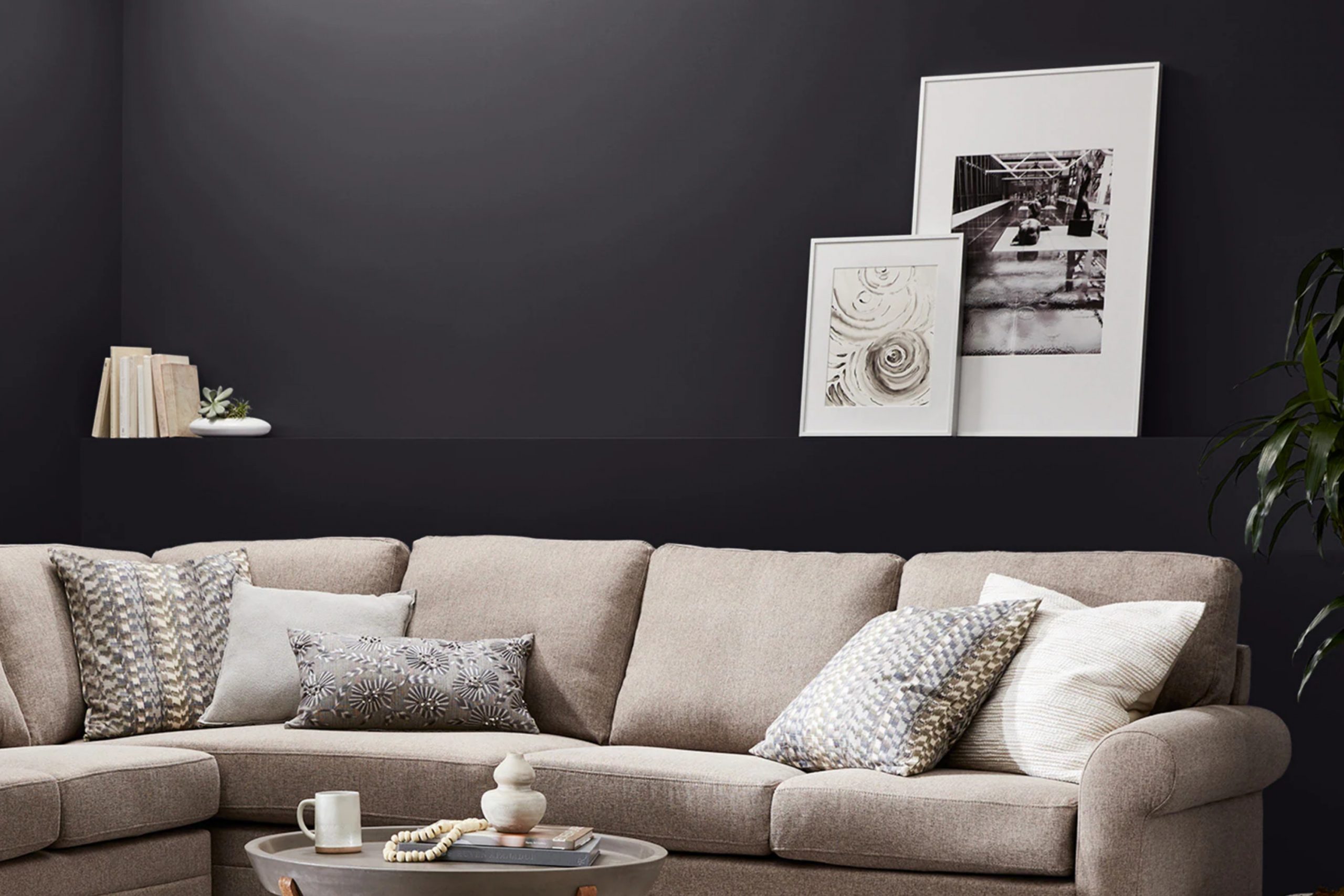
If you are curious about the bold and sophisticated shade known as SW 6989 Domino by Sherwin Williams, let me share my insights. Its intense, almost jet black hue makes it a standout choice for anyone looking to make a statement in their space. This color can add remarkable depth and drama to any room, making it ideal for accent walls or trim that you really want to highlight.
The versatility of Domino is something I appreciate. It pairs beautifully with a wide range of colors, from bright whites to soft pastels, making it suitable for various design styles, whether you lean towards modern minimalism or prefer a more traditional look. What’s more, this color can be used in different types of settings – from a cozy living room nook to a sleek office environment, it adapts wonderfully.
However, if you plan to use SW 6989 Domino, consider lighting carefully. The color’s perception can shift dramatically depending on natural and artificial light sources, changing from a solid black to a charcoal gray.
Overall, choosing SW 6989 Domino is a bold move that promises to bring a unique character to your decor, highlighting daring choices and creating a space that truly reflects your style.
What Color Is Domino SW 6989 by Sherwin Williams?
Domino by Sherwin Williams is a bold and deep charcoal black that provides a strong sense of drama and personality to any space. This rich hue can serve as a powerful accent color or a commanding base color, depending on how it is used within a room. It’s a versatile shade that fits well with a variety of interior design styles, particularly modern, industrial, and contemporary styles.
When using Domino, you can pair it with a range of materials to enhance its impact. For a sleek and modern look, metal accents in silver or chrome are ideal. The coolness of the metal contrasts beautifully with the deep warmth of the black, creating a balanced aesthetic. Textures like smooth leather and clear glass also work well with this color, adding a touch of luxury and refinement without overwhelming the senses.
For an industrial vibe, consider pairing Domino with raw materials such as exposed brick, reclaimed wood, or concrete. These elements can soften the intensity of the black while maintaining a rugged feel. Soft furnishings and fabrics in lighter colors, like creams or light grays, can add a welcome brightness to spaces dominated by this dark shade, ensuring that the room remains warm and inviting.
Is Domino SW 6989 by Sherwin Williams Warm or Cool color?
Domino SW 6989 by Sherwin Williams is a rich, deep black paint that makes a bold statement in any room. The color is extremely versatile, fitting well in various home styles, from modern to traditional. Using Domino in small spaces can create a cozy, intimate feeling, making it perfect for accent walls, reading nooks, or even on a bathroom ceiling for a chic, dramatic effect.
In larger spaces, such as living rooms or open floor plans, painting all the walls in this color will result in a striking, cohesive look that easily ties together with different textures and brighter color accents in furniture and decor.
Applying Domino in a room with ample natural light helps prevent the space from feeling too dark, and when paired with crisp white trim or molding, it provides a clean, sharp contrast. Because of its depth, it is well-suited for highlighting artwork or furniture pieces, really allowing them to stand out. This color is a great option for those looking to create a powerful, yet inviting home environment.
Undertones of Domino SW 6989 by Sherwin Williams
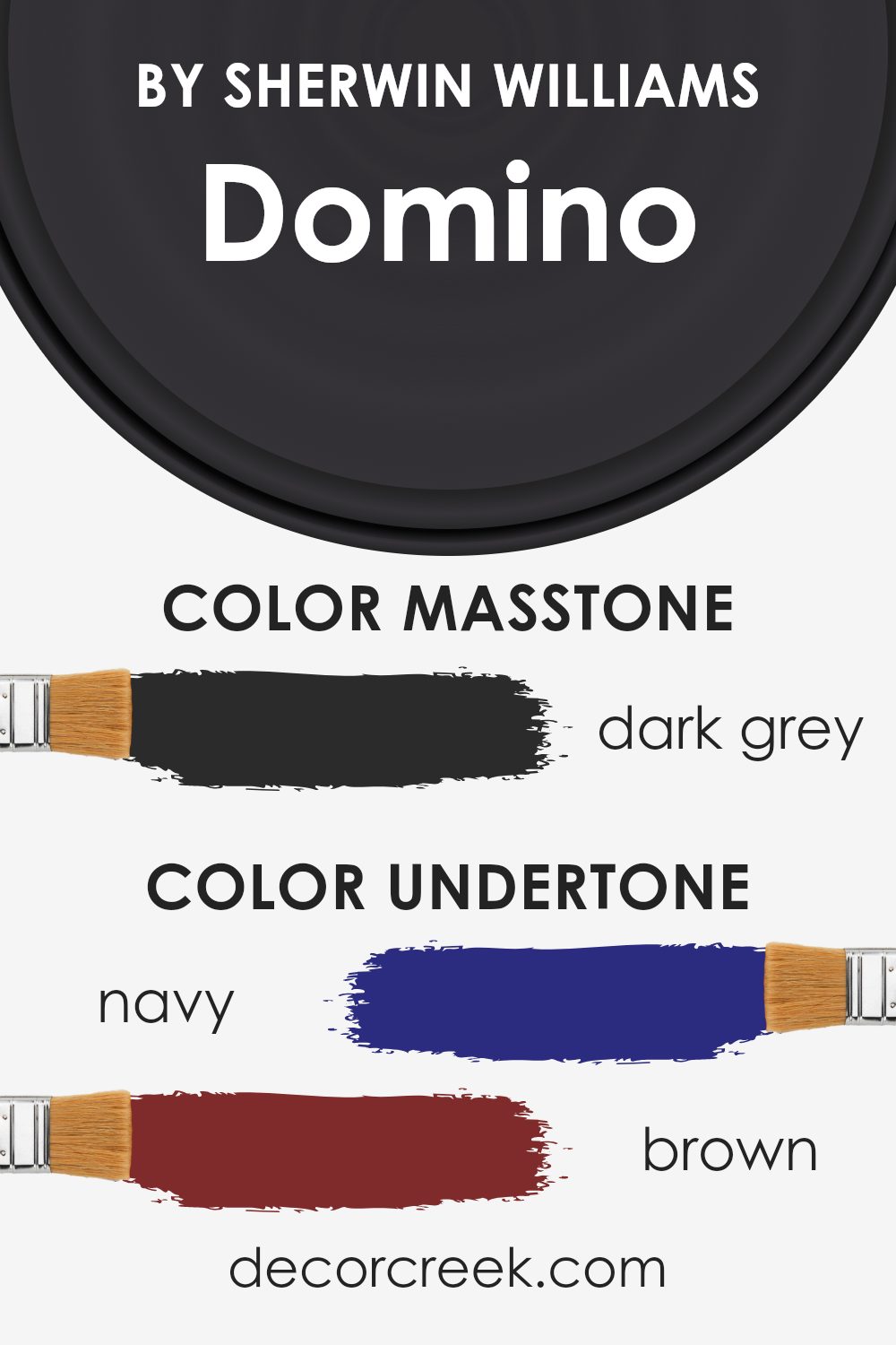
Domino is a rich, dark paint color with complex undertones that can subtly change its appearance under different lighting conditions. Understanding these undertones is key to predicting how it will look in your space. Undertones are secondary colors that influence the main hue. For Domino, these include shades of navy, brown, dark green, purple, dark turquoise, olive, and grey.
Each undertone plays a role in how we perceive the color. Navy and dark turquoise bring coolness, which can make a room feel more balanced, especially if it’s south-facing and gets a lot of warm light. The brown and olive undertones add warmth, making the color more welcoming in spaces with less natural light. Purple and dark green add depth, making Domino an ideal choice for creating a focal point in a room.
In interior settings, these undertones can affect the overall ambiance. On walls, Domino acts as a dynamic backdrop. In natural light, the cooler undertones might become more prominent, giving the space a fresh look. In artificial light, the warmer tones such as brown and olive might stand out, providing a cozy, inviting feel. The color’s adaptability makes it suitable for various rooms, whether you’re aiming for a bold statement in a living room or a subdued atmosphere in a bedroom.
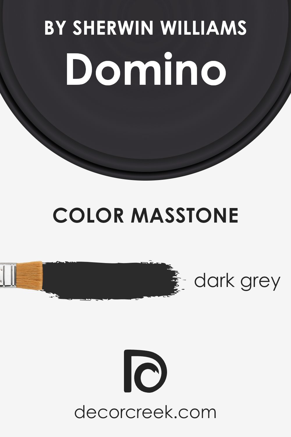
What is the Masstone of the Domino SW 6989 by Sherwin Williams?
Domino SW 6989 by Sherwin Williams has a masstone of dark grey, specifically color code #2B2B2B. This deep, versatile shade is perfect for adding a strong, anchored feel to any room. Because it’s a neutral color, it pairs well with a wide range of other colors, from bright hues to other neutrals.
Applying Domino in a space can give the area a grounded, calm atmosphere, which is great for rooms meant for relaxation or focus, like bedrooms or home offices.
In homes, using such a dark grey can also help hide marks or dirt, which makes it a practical choice for high-traffic areas like hallways or living rooms. It’s important to balance this dark shade with lighter colors or materials to prevent spaces from feeling too closed in. Light-colored furnishings, floors, or decorative accents can create a pleasing contrast, making the space feel more open and welcoming.
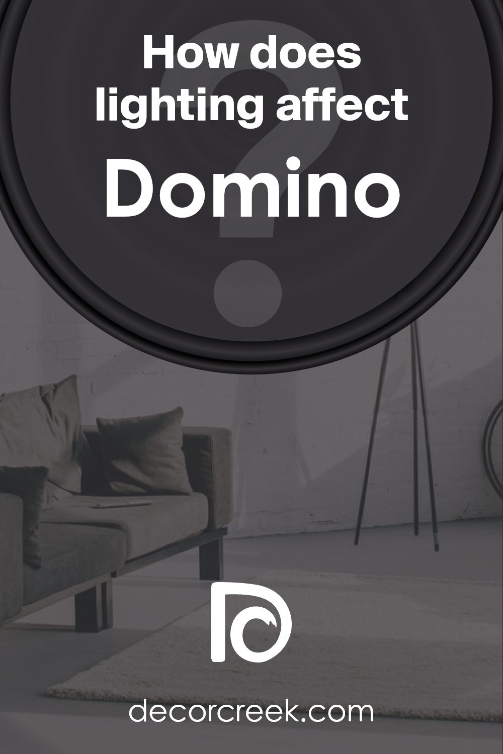
How Does Lighting Affect Domino SW 6989 by Sherwin Williams?
Lighting has a significant impact on how we perceive colors. For example, the color Domino, a deep, dark charcoal gray by Sherwin Williams, can appear very different in various lighting conditions.
In artificial light, Domino tends to look softer and slightly warmer. This is because most indoor lighting has yellow undertones, which can make the color seem less harsh and more inviting. It’s an excellent choice for living areas and bedrooms where you want a cozy and welcoming atmosphere.
In natural light, however, Domino will show its true color depending on the intensity and angle of the light. It can appear almost black in low light or a rich, pure gray in brighter light. This variability makes it a versatile color for use in various settings, adapting to the changing light throughout the day.
The direction a room faces also affects how Domino looks. In north-facing rooms, which receive less direct sunlight and can often seem cooler, Domino will appear more solid and bold, enhancing the room’s character without overwhelming it. This makes it a good choice for creating a striking feature wall or cozy nook.
In south-facing rooms, where light is brighter and warmer, Domino can lighten up slightly, showing more of its gray nuances. The warmth of the sun softens the color, making it feel less stark and blending beautifully with natural elements in the room.
East-faced rooms get morning light, which is generally cooler and bluer. Here, Domino may appear sharper and clearer, making it ideal for starting the day energetically. Conversely, in west-faced rooms, the color can appear richer and deeper in the evening due to the warm, golden tones of the sunset.
In general, Domino is a very adaptable color that works well in many different environments and lighting conditions, making it a popular choice for those looking to add depth and elegance to their space.
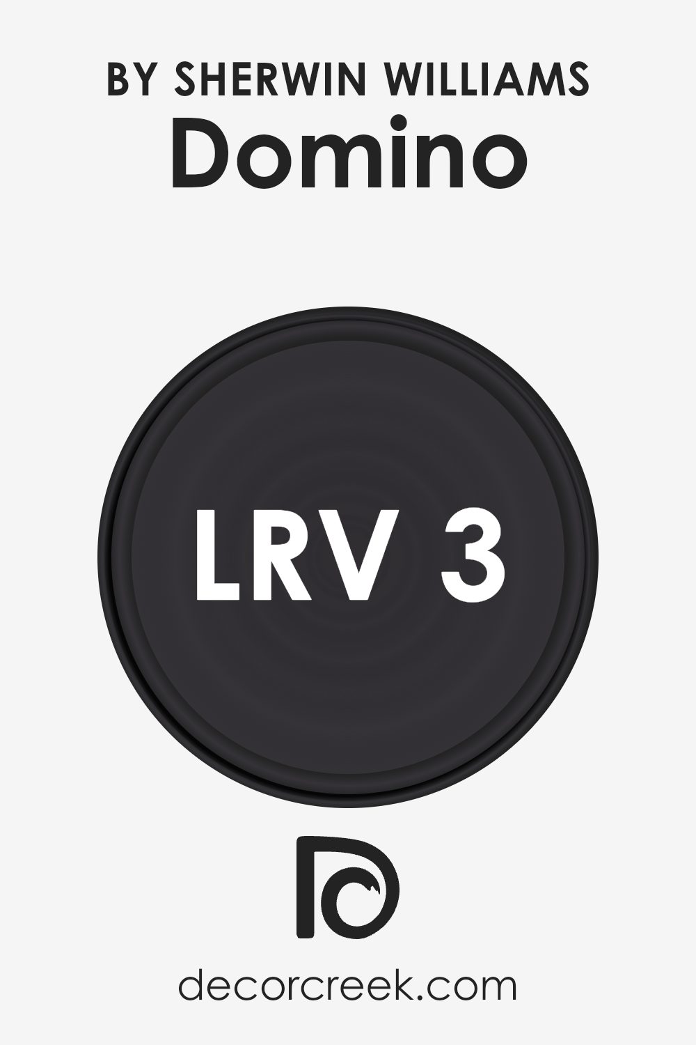
What is the LRV of Domino SW 6989 by Sherwin Williams?
LRV stands for Light Reflectance Value, which is a measure of the amount of visible and usable light that a paint color reflects or absorbs when it’s applied to a wall. Basically, it tells you how light or dark the color will appear once it’s on your wall. A higher LRV means the color reflects more light, making it appear lighter, whereas a lower LRV means it reflects less light, appearing darker.
This is important because it can greatly affect the mood and feel of a room. Light colors can make small rooms feel larger and more open, while dark colors can make a space feel cozier and more intimate.
The LRV for the color Domino is 3.37, which is quite low. This means it’s a very dark color that absorbs much of the light that hits it, rather than reflecting it. When you use a color with such a low LRV on your walls, it can significantly darken the room, affecting the overall atmosphere and how spacious it feels. Since it reflects so little light, using this color in a small or poorly lit room might make the space feel even smaller and darker. In contrast, in a larger, well-lit space, this color can add a dramatic flair, bringing a strong and bold character to the environment.
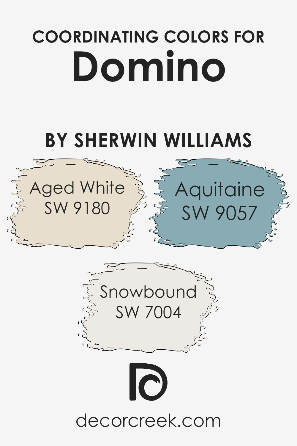
Coordinating Colors of Domino SW 6989 by Sherwin Williams
Coordinating colors, like the ones paired with Domino by Sherwin Williams, are selected to complement the main color, enhancing the overall aesthetic appeal. These coordinated shades harmoniously blend while providing contrast that can accentuate architectural features or simply add visual interest to a room. For instance, when using dynamic and bold primary colors, choosing softer tones or neutrals as coordinating colors can balance the intensity, ensuring the space feels welcoming and comfortable without overwhelming the senses.
Among the coordinating colors, Aged White offers a subtle and creamy backdrop that can soften the stronger presence of a bold color like Domino, making it ideal for creating a gentle contrast. This shade is particularly useful in spaces that aim for a relaxed atmosphere but need a touch of warmth to counterbalance any colder tones.
Snowbound, another coordinating color, is a clean and slightly cool white that provides a crisp contrast, brightening spaces and giving a fresh, airy feel. It can make smaller rooms appear larger and more open. Aquitaine, a unique hue with a mix of blue and grey, adds a touch of muted color, which works beautifully to enhance spaces with its calm and collected feel without competing with the main color.
You can see recommended paint colors below:
- SW 9180 Aged White
- SW 7004 Snowbound
- SW 9057 Aquitaine
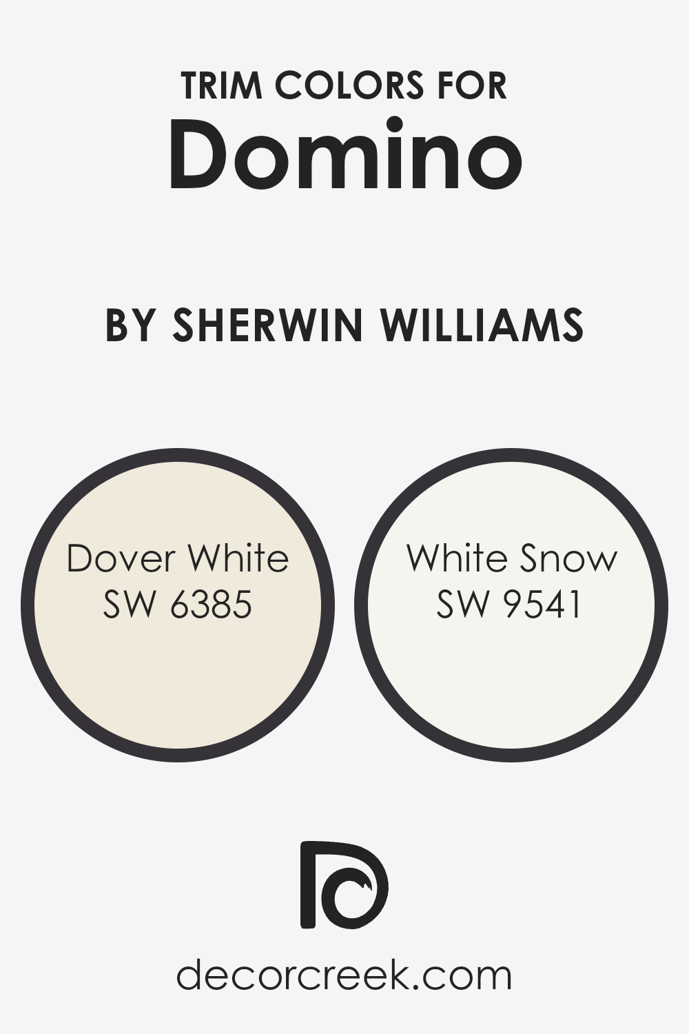
What are the Trim colors of Domino SW 6989 by Sherwin Williams?
Trim colors play an essential role in interior and exterior design, serving to accentuate and define the architectural features of a space. By using trim colors strategically, one can highlight the lines and shapes of a building, contributing to the overall aesthetic and balance of design elements. For instance, when paired with a dark hue like Domino from Sherwin Williams, lighter trim colors such as Dover White and White Snow can create a striking contrast that draws attention to details such as moldings, door frames, and window sills.
Dover White SW 6385 offers a warm and creamy hue, which brings a soft and inviting touch to any space. It pairs well with darker shades, helping to create a gentle yet appealing contrast that can make the darker colors stand out more prominently.
On the other hand, White Snow SW 9541 provides a crisp, clean look with its bright and refreshing tone. This color is ideal for use in spaces that aim to achieve a fresh and airy atmosphere, complementing darker colors by adding a vivid burst of brightness to balance the strength of deeper tones.
You can see recommended paint colors below:
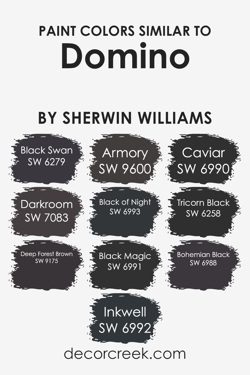
Colors Similar to Domino SW 6989 by Sherwin Williams
When designing a space, maintaining a consistent color palette is crucial as it ensures a harmonious and cohesive look. Similar colors, such as shades of deep, dark tones, can create a subtle yet impactful visual interest and depth in a space.
These colors often share a common base tone but differ slightly in saturation or brightness, making them ideal for creating a layered, monochromatic effect. For instance, using shades that are close on the color spectrum can define different zones without the harsh contrast that opposites might bring, lending a seamless transition across a room.
Among the favored choices for adding dignified and elegant dark tones to a space are varieties like Black Swan, which boasts a deep, rich charcoal hue, adding a touch of mystery and drama. Darkroom is another sophisticated option, offering a softer, almost shadowy charcoal feel that is perfect for accent walls or furniture pieces. Deep Forest Brown has an earthy, nearly black brown tone that grounds spaces beautifully.
Inkwell is a darker and more intense shade, capturing a true black with a hint of blue undertone, making it perfect for a modern aesthetic. Armory is a cooler, slate-like shade that pairs well with metal accents in a room. Black of Night offers a true, deep black that is both stark and bold, ideal for creating striking contrasts. Black Magic presents a crisp black that can sharpen any space. Caviar has a hint of grey, lightening its black to offer a softer option suitable for various applications.
Tricorn Black is an industry standard for a pure, balanced black used extensively for its flexibility and depth. Finally, Bohemian Black is slightly warmer, with hues that suggest a hidden depth under its initial appearance, great for cozy, inviting spaces. Using similar colors wisely in design can turn an ordinary environment into a finely tuned aesthetic experience.
You can see recommended paint colors below:
- SW 6279 Black Swan
- SW 7083 Darkroom
- SW 9175 Deep Forest Brown
- SW 6992 Inkwell
- SW 9600 Armory
- SW 6993 Black of Night
- SW 6991 Black Magic
- SW 6990 Caviar
- SW 6258 Tricorn Black
- SW 6988 Bohemian Black
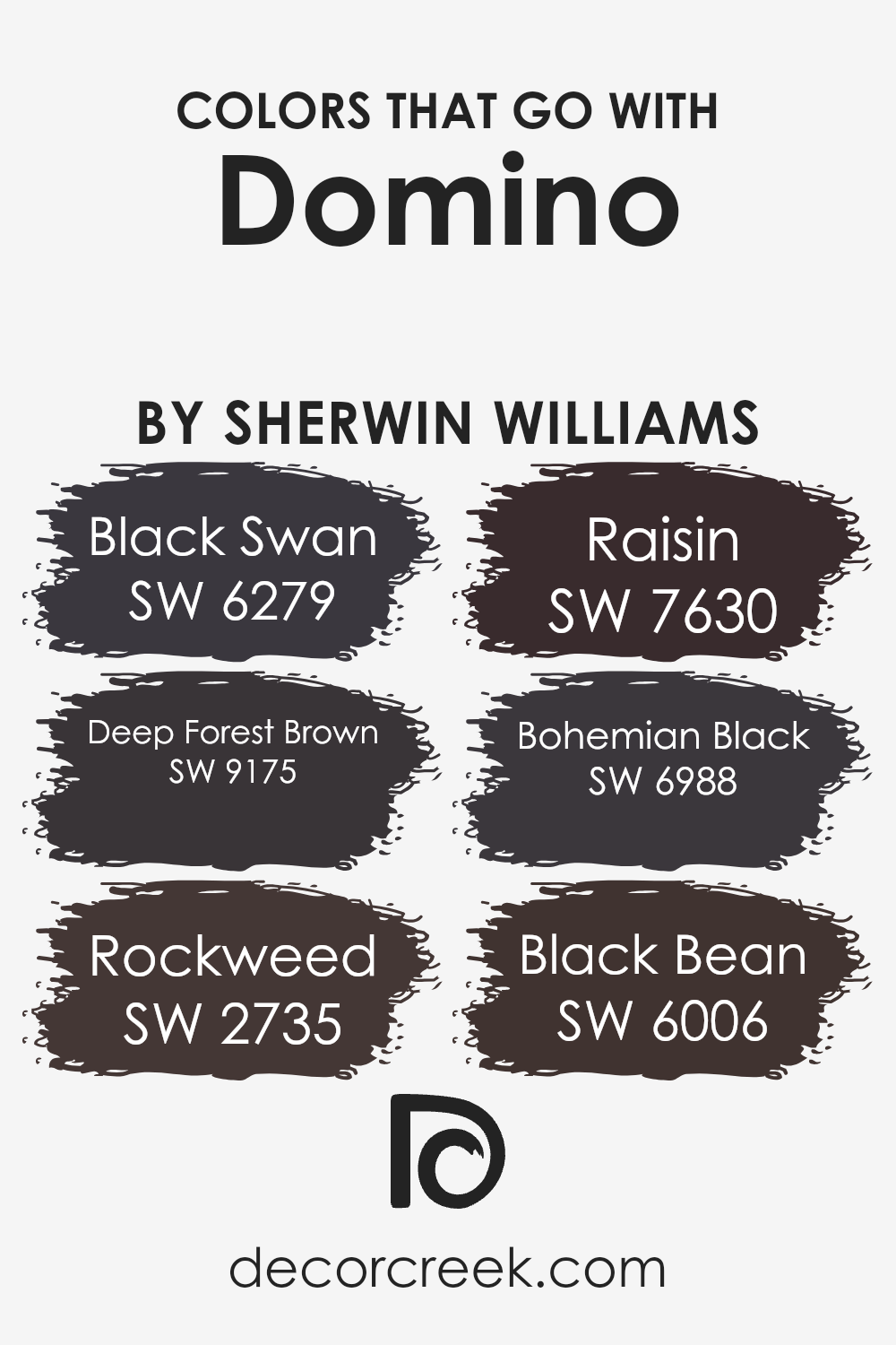
Colors that Go With Domino SW 6989 by Sherwin Williams
Choosing the right colors to complement Domino SW 6989 by Sherwin Williams is crucial for creating cohesive and appealing design schemes. These colors work together to bring balance and harmony to spaces, ensuring that the surroundings are pleasing to the eye. Complementary colors like SW 6279 – Black Swan, a deep, moody gray with subtle violet undertones, and SW 9175 – Deep Forest Brown, a rich dark brown, offer a striking contrast to Domino’s near-black hue, setting a bold tone in any room. Moreover, these colors add depth and can make the spaces feel warm and inviting.
Other coordinating colors, such as SW 2735 – Rockweed, an earthy, dark green, serves as a perfect backdrop for natural themes and adds a touch of nature’s calmness to the environment. SW 7630 – Raisin, which carries a muted plum tone, infuses a touch of subdued color that enriches the space without overpowering it.
Additionally, SW 6988 – Bohemian Black provides a nearly true black that can be used to create a dramatic look or as an accent to draw attention to specific design elements. Lastly, SW 6006 – Black Bean has a very dark coffee brown shade, contributing to creating cozy and comfortable interiors. All these colors create a palette that complements DominoSW 6989 effectively, enhancing the overall aesthetic and atmosphere of a room.
You can see recommended paint colors below:
- SW 6279 Black Swan
- SW 9175 Deep Forest Brown
- SW 2735 Rockweed
- SW 7630 Raisin
- SW 6988 Bohemian Black
- SW 6006 Black Bean
How to Use Domino SW 6989 by Sherwin Williams In Your Home?
Domino SW 6989 by Sherwin Williams is a deep, rich black paint that can add a striking touch to any area of your home. If you’re looking to make a bold statement, consider using it on an accent wall in your living room or dining area.
This can create a stunning backdrop for artwork or bright-colored furniture, helping them stand out even more. Domino is also great for exterior use, such as on your front door or shutters, giving your home a classic, timeless look that really catches the eye.
For a more subtle effect, you could use Domino on smaller elements like trim or cabinets. In a kitchen, painting cabinets with this deep black can create a lovely contrast against lighter walls or countertops, making the space feel more grounded and inviting. Similarly, using it on trim can frame rooms in your home beautifully, adding depth and definition to your walls without overwhelming the space.
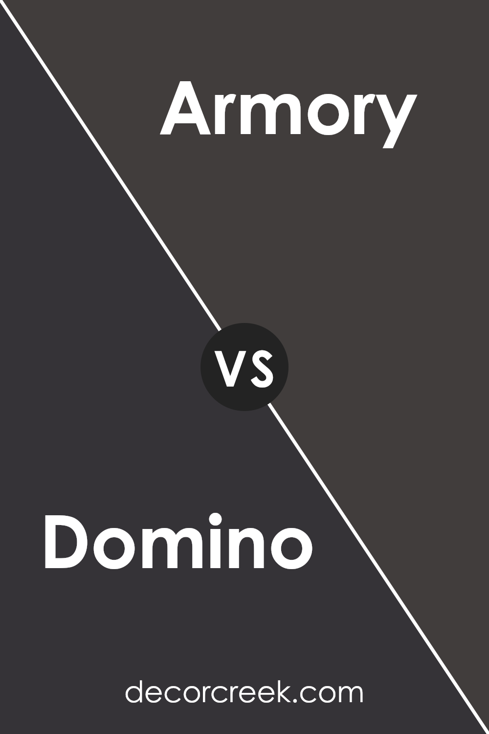
Domino SW 6989 by Sherwin Williams vs Armory SW 9600 by Sherwin Williams
Domino SW 6989 by Sherwin Williams is a deep, charcoal gray with slight blue undertones, giving it a strong, bold feel. In contrast, Armory SW 9600, also by Sherwin Williams, is a darker shade that leans more towards a true navy blue. This color has a classic and timeless appeal, often associated with nautical or classic Americana themes.
When comparing the two, Domino is versatile due to its gray undertones, working well in modern or industrial style spaces as it pairs nicely with a variety of decor. On the other hand, Armory’s deeper blue hue provides a more focused color impact, excellent for creating a focal point in a room or as part of a more traditional setting.
Both colors have their unique strengths: Domino for its ability to blend seamlessly with other shades, and Armory for its striking depth and classic vibe. The choice between the two would depend on the desired mood and theme of the space.
You can see recommended paint color below:
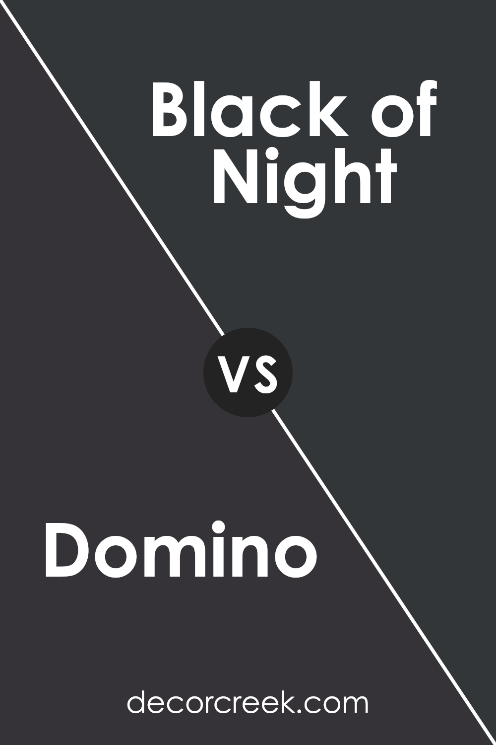
Domino SW 6989 by Sherwin Williams vs Black of Night SW 6993 by Sherwin Williams
Domino SW 6989 and Black of Night SW 6993, both by Sherwin Williams, are dark shades that create distinct atmospheres. Domino is a deep charcoal with hints of brown, giving it a warm, cozy feel. It’s versatile for many spaces, adding a soft yet strong character. Meanwhile, Black of Night is a darker, true black that provides a sharper contrast.
It’s ideal for making other elements in a room stand out, or for creating a bold statement wall. Both colors are excellent for adding drama and depth to a space, though Domino’s slightly lighter tone may make a room feel less enclosed compared to the intense depth of Black of Night.
Whether choosing for an accent or a base wall color, both options offer a dramatic flair to interior designs.
You can see recommended paint color below:
- SW 6993 Black of Night
Domino SW 6989 by Sherwin Williams vs Black Magic SW 6991 by Sherwin Williams
Domino SW 6989 and Black Magic SW 6991, both by Sherwin Williams, present two different takes on darker hues. Domino is more of a deep charcoal gray that carries a bit of warmth. This makes it a great choice for adding some drama to a space without making it feel too tight or overwhelming. It’s dark but still has a noticeable softness compared to pure black, lending a cozy atmosphere wherever it’s used.
On the other hand, Black Magic is a true black. It’s the darker of the two, offering a bold and striking look. Black Magic is ideal for creating strong contrasts, especially in spaces where you want to highlight other colors or design elements. It’s perfect for accent walls or furniture pieces to make them stand out.
Both colors are versatile, but your choice depends on how intense and stark you want your color effect to be. Domino softens the effect with its gray undertones, while Black Magic delivers a sharper, clearer statement.
You can see recommended paint color below:
- SW 6991 Black Magic
Domino SW 6989 by Sherwin Williams vs Inkwell SW 6992 by Sherwin Williams
Domino and Inkwell by Sherwin Williams are both dark, striking colors, but they have distinct differences in hue and impact. Domino has a deep, chocolatey brown tone, giving it a warm, cozy feel. It’s perfect for spaces where you want to create a homey, welcoming atmosphere. This makes it a great choice for living rooms or bedrooms where warmth is key.
On the other hand, Inkwell leans towards a very dark navy or charcoal color, offering a cooler tone. This color is closer to black than blue, giving it a more neutral and versatile appearance. Inkwell is ideal for achieving a bold, modern look in a space. It pairs beautifully with contrasting light colors or as a statement backdrop for artwork.
While both colors are dark and can be used to make a room feel more intimate, Inkwell offers a cooler presence compared to the warmer tones of Domino. Inkwell’s versatility across color schemes also makes it slightly more adaptable for different decor styles.
You can see recommended paint color below:
Domino SW 6989 by Sherwin Williams vs Deep Forest Brown SW 9175 by Sherwin Williams
Domino by Sherwin Williams is a deep, dark gray with hints of blue, creating a moody and strong presence in any space. It’s almost like a charcoal shade, versatile enough to work in various settings, from modern living rooms to cozy bedrooms. It’s quite neutral, so it pairs well with bright colors as well as other muted tones.
Deep Forest Brown, on the other hand, is a rich, dark chocolate brown. This color is warmer than Domino and evokes a sense of snugness and comfort, perfect for spaces where you want to feel secure and relaxed, like studies or dens. It’s a very earthy tone that naturally pairs well with greens, tans, and creams.
Both colors are quite dark, but while Domino leans toward a cooler, more neutral palette, Deep Forest Brown brings warmth and a natural feel. Depending on the atmosphere you want in a room, either could be a great choice. Domino offers a more crisp, clean backdrop, whereas Deep Forest Brown adds a touch of warmth and grounding.
You can see recommended paint color below:
- SW 9175 Deep Forest Brown
Domino SW 6989 by Sherwin Williams vs Black Swan SW 6279 by Sherwin Williams
Domino and Black Swan are two distinct colors offered by Sherwin Williams. Domino is a deep, dark charcoal that almost looks like a soft black. This color can make a strong statement and works well for creating a striking contrast in spaces needing some boldness.
On the other hand, Black Swan is a rich, dark navy, almost black, but with a hint of blue under certain lighting. This color can add depth and an element of subtlety to spaces, offering a less intense alternative to pure black. When comparing the two, Domino leans towards a neutral, classic black while Black Swan brings in a cooler tone due to its blue base.
Both colors are great for accent walls or to create a cozy, intimate setting in any room. Whether chosen for a modern vibe or a more traditional space, each color has its unique presence.
You can see recommended paint color below:
Domino SW 6989 by Sherwin Williams vs Tricorn Black SW 6258 by Sherwin Williams
Domino SW 6989 and Tricorn Black SW 6258 from Sherwin Williams are both dark, bold colors, but they have distinct tones that set them apart. Domino is a deep charcoal with hints of chocolate. It provides a warm and inviting feel, despite its darkness, making it a great choice for cozy spaces. It has the flexibility to work well in both modern and traditional settings, adding depth and warmth while remaining neutral.
On the other hand, Tricorn Black is a true, classic black. It’s sharper and more straightforward in its presentation, offering a crisp darkness that creates dramatic flair in any space. Tricorn Black is ideal for making strong statements, whether on an accent wall, cabinets, or even exterior trims. It pairs beautifully with bright colors for contrast or with other neutrals for a more subdued palette.
While both colors are deep and rich, Domino offers warmth and complexity, whereas Tricorn Black gives a cleaner, sharper edge.
You can see recommended paint color below:
Domino SW 6989 by Sherwin Williams vs Darkroom SW 7083 by Sherwin Williams
Domino and Darkroom are both darker shades offered by Sherwin Williams but have distinct tones that set them apart. Domino is a deep charcoal with a soft black quality, creating a strong presence in any room without overpowering it. It’s a versatile color that can easily fit into various design styles and pairs well with lighter or vibrant colors for a balanced look.
Darkroom, on the other hand, leans towards a sophisticated navy-black hue, providing a unique alternative to traditional black or navy. It has a hint of warmth which makes it welcoming and ideal for spaces where you want a bit of depth and intrigue without opting for a pure black.
Both colors are excellent choices for creating a statement in a space, whether through an accent wall or as a primary color scheme. They function well with muted tones and can also support a pop of color, like mustard or teal, for a more dynamic environment. Their dark bases mean they can hide wear and tear better than lighter shades, making them practical for high-traffic areas.
You can see recommended paint color below:
- SW 7083 Darkroom
Domino SW 6989 by Sherwin Williams vs Caviar SW 6990 by Sherwin Williams
Domino SW 6989 and Caviar SW 6990, both by Sherwin Williams, are darker shades but they differ subtly in their undertones and depth. Domino is a deep charcoal gray with a hint of brown, giving it a warm, welcoming feel even though it’s quite dark. This color is versatile and can work well in various spaces, making rooms feel cozy and grounded.
On the other hand, Caviar is an even darker shade, leaning towards a true black. This makes it a bold choice that can create dramatic and striking effects in a space. Caviar is perfect for accent walls or for use in areas where you want to make a strong visual statement without introducing bright colors.
Both colors are great for creating contrast with lighter hues and can add depth to a room’s color scheme. However, the choice between them depends on how bold you want to go—Domino offers depth with a bit more subtlety, while Caviar goes full, deep black for maximum impact.
You can see recommended paint color below:
Domino SW 6989 by Sherwin Williams vs Bohemian Black SW 6988 by Sherwin Williams
Domino and Bohemian Black by Sherwin Williams are two distinct shades of dark hues with subtle differences. Domino is a deep gray, offering a mix between black and a softer, lighter gray, providing a modern yet not overly intense feel to walls or furniture. It suits well in spaces where you want depth without the starkness of pure black.
On the other hand, Bohemian Black leans more towards a true black, delivering a strong and clear statement wherever it’s used. This color is perfect for creating striking contrasts, especially in areas that benefit from a bold aesthetic, such as accent walls or decorative trim.
Choosing between these depends on your desired impact and the light in your space. While Domino brings a softer, more muted atmosphere, Bohemian Black provides a clearer, more defined presence, making it more suitable for spaces aiming for a dramatic flair.
You can see recommended paint color below:
- SW 6988 Bohemian Black
Conclusion
After carefully studying SW 6989 Domino by Sherwin Williams, I think it’s a fantastic paint color if you need something bold and striking. This deep, jet black shade can make any room feel more daring and noticeable. It’s perfect for making a big impression in a space without using bright colors.
I’ve learned that using Domino in small areas can add a lot of style without making the room look too dark. It works very well on accent walls, on kitchen cabinets, or even for furniture if you want to add some drama and focal points in your room. When paired with lighter colors or different textures, Domino really stands out and brings a stylish look to any home.
To sum it up, I believe Domino by Sherwin Williams is an excellent choice for anyone looking to make a bold statement in their home. It’s a strong, dark color that can help other elements in the room shine, perfect for creating stylish, memorable spaces. If you’re thinking about a new look for a room in your home, Domino might just be the paint color you need to create something striking and stunning.
Ever wished paint sampling was as easy as sticking a sticker? Guess what? Now it is! Discover Samplize's unique Peel & Stick samples.
Get paint samples

