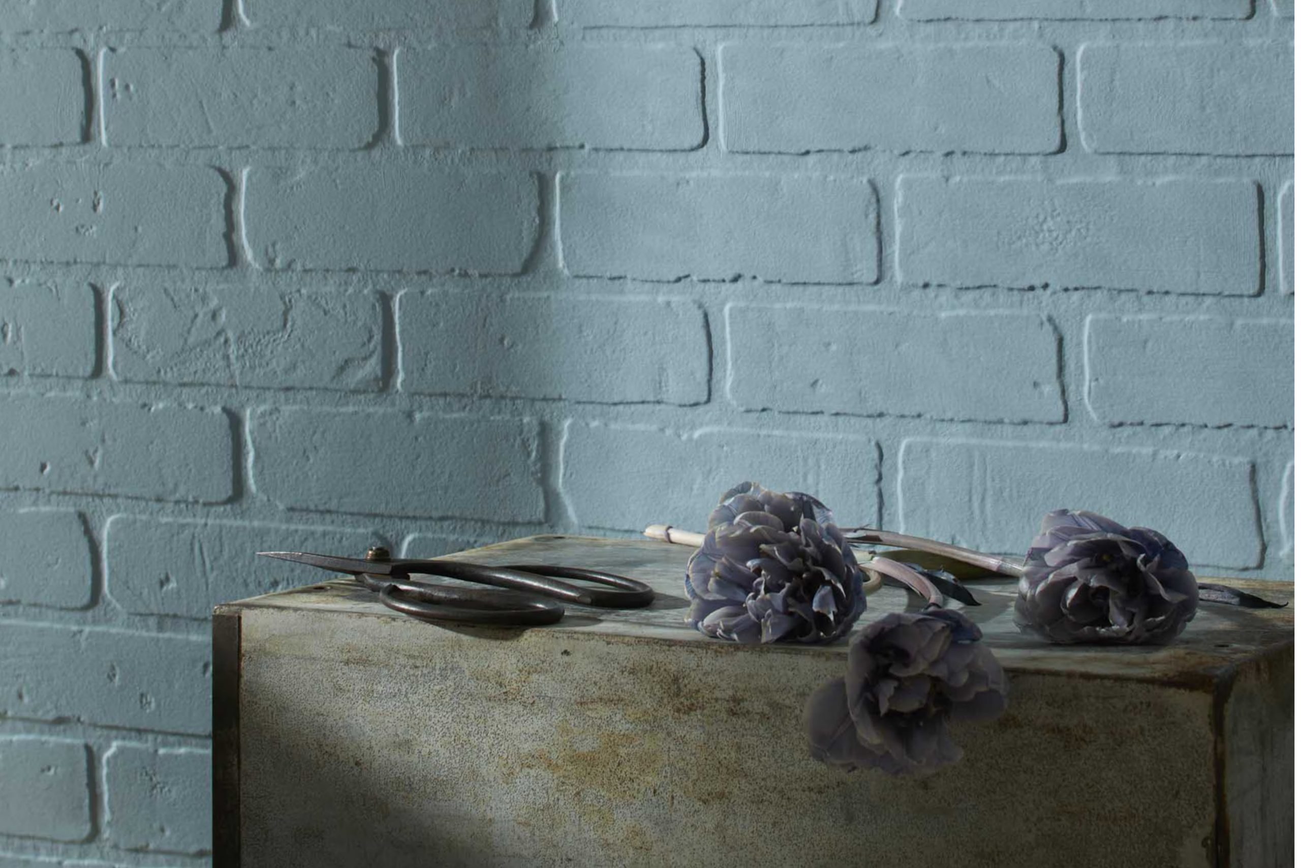
CSP-605 Dusty Cornflower by Benjamin Moore is a shade that’s as intriguing as its name suggests. This color walks the fine line between the calming presence of blue and the earthy tones of lighter grays, offering a unique addition to any space it graces. Perfect for those wishing to add a subtle pop of color that doesn’t overwhelm, Dusty Cornflower brings a serene and sophisticated vibe to interiors.
Whether you’re aiming to freshen up a room or add a touch of elegance to your home office, this color adapts beautifully to various settings and decor styles. Its versatility makes it a favorite among homeowners and interior designers alike, providing a backdrop that complements both modern and traditional furnishings.
Benjamin Moore’s commitment to quality ensures that Dusty Cornflower not only looks stunning but also provides the durability and finish you expect from a premium paint.
So, if you’re searching for a color that combines beauty with practicality, CSP-605 Dusty Cornflower is worth considering. Its unique charm will surely enhance your home, creating spaces that invite relaxation and inspiration.
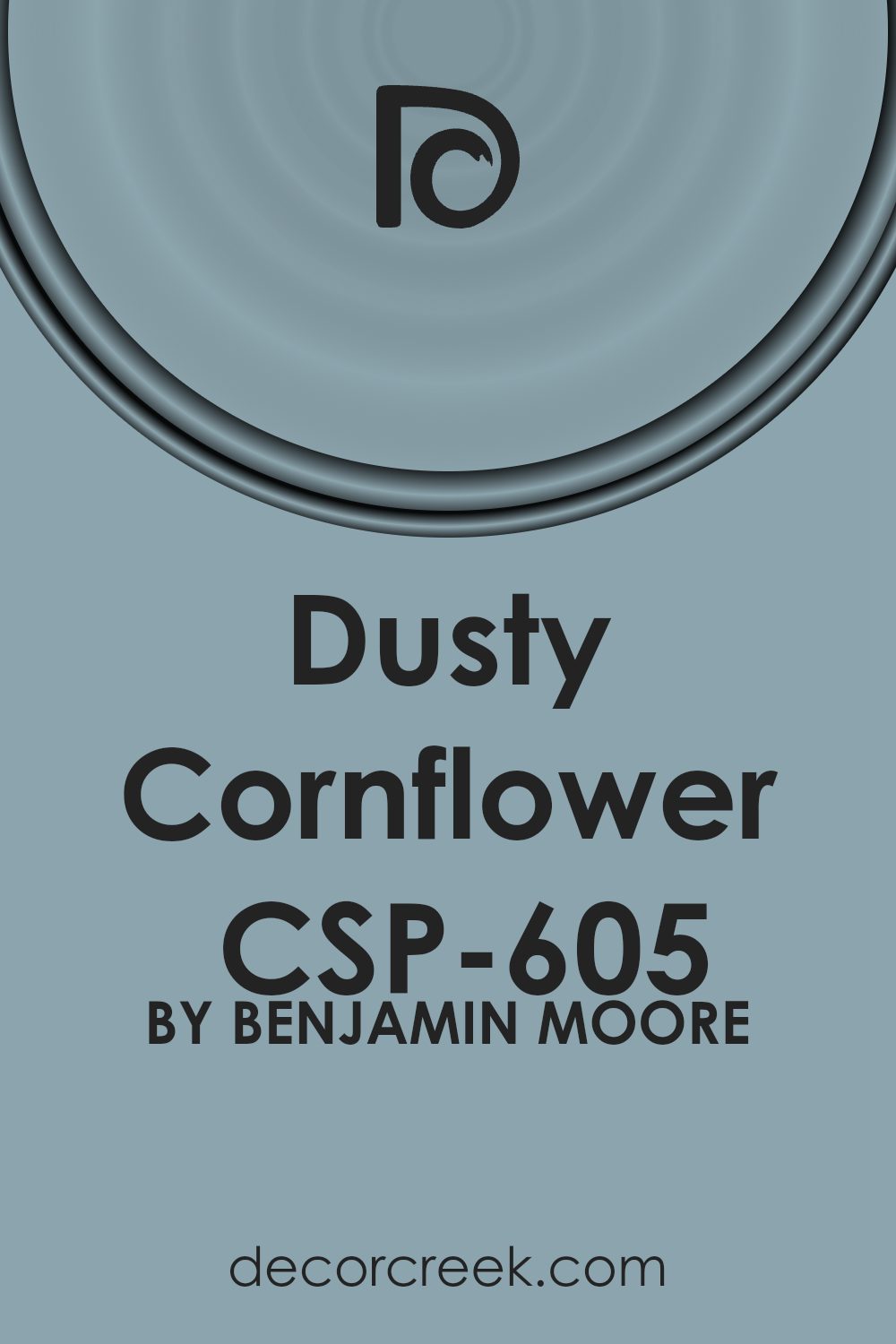
What Color Is Dusty Cornflower CSP-605 by Benjamin Moore?
Dusty Cornflower is a unique color from Benjamin Moore that brings a soft, subtle touch to any space. Picture the gentle sway of cornflower petals under a clear sky, and you capture the essence of this color. It’s a blend that balances between blue and gray, making it versatile for various interior designs. This shade has a soothing quality, perfect for creating a peaceful and welcoming atmosphere in your home.
In terms of interior styles, Dusty Cornflower shines in settings that favor a modern minimalist approach, Scandinavian simplicity, or even a coastal vibe that seeks to reflect the calmness of the sea and sky. Its understated elegance makes it a great choice for living rooms, bedrooms, and bathrooms where you want to foster a serene environment.
When considering what materials and textures pair well with Dusty Cornflower, think natural wood with its rich grains, linen textiles that offer a light, airy feel, and metallic accents in silver or brushed nickel that add a touch of sophistication without overpowering the room’s tranquil feel. Leather pieces in lighter shades can also complement the space, adding a bit of warmth to the coolness of the color.
Overall, Dusty Cornflower is a versatile color that works beautifully in contemporary homes, providing a backdrop that is both stylish and soothing.
Is Dusty Cornflower CSP-605 by Benjamin Moore Warm or Cool color?
Dusty Cornflower CSP-605 by Benjamin Moore is a beautiful paint color that brings a unique charm to any room. This shade has a soft, serene vibe, similar to the gentle hue of a cornflower at dusk. It strikes a perfect balance between being peaceful and subtle without being too dull or overwhelming, making it an excellent choice for creating a relaxing environment in homes.
In home settings, Dusty Cornflower can work wonders by adding a touch of understated elegance. It’s versatile enough to fit various rooms, from bedrooms to living areas or even kitchens, providing a fresh, airy feel that can make spaces seem larger and more inviting. This color pairs nicely with both light and dark furnishings, allowing for a wide range of decorative styles, from modern minimalist to more traditional looks.
Dusty Cornflower also does a great job in enhancing natural light, making it a fantastic option for rooms that could use a bit of a brightening boost. Its calming effect makes it ideal for places where you want to unwind, helping to create a peaceful retreat within your home.
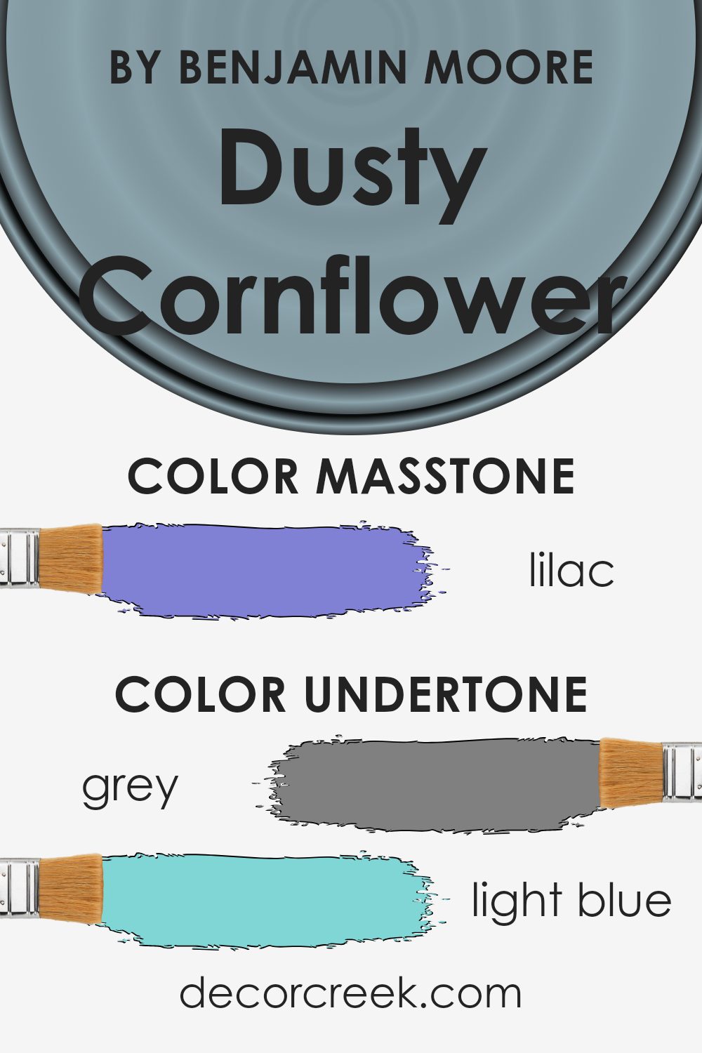
Undertones of Dusty Cornflower CSP-605 by Benjamin Moore
Dusty Cornflower by Benjamin Moore is a beautiful color that might seem simple at first glance but actually has a complex set of undertones. These undertones, including grey, light blue, mint, light purple, pale pink, light gray, pale yellow, blue, dark turquoise, turquoise, light turquoise, violet, purple, fuchsia, pink, dark blue, and navy, play a huge role in how we perceive the color.
When you look at Dusty Cornflower, you’re not just seeing a single shade. The mix of undertones adds depth and richness, making the color more versatile. For example, the grey undertone can help it blend with modern and industrial styles, while the light blue and mint bring a fresh, airy feel. The hints of light purple and pale pink add a soft, almost whimsical touch.
On interior walls, these undertones influence the mood and feel of a room. In natural light, Dusty Cornflower might lean more towards its cooler undertones, like light blue or mint, creating a calm and soothing atmosphere. In artificial lighting, the warmer undertones, like pale pink or pale yellow, might become more noticeable, adding warmth to the space.
Furthermore, the surrounding colors and decor can highlight different undertones in Dusty Cornflower. Darker furniture can bring out its deeper blues and purples, while light wood or metal might highlight its grey and light blue undertones.
This interaction between the paint and the room’s elements means Dusty Cornflower can fit a variety of styles and preferences, making it a surprisingly adaptable choice for any space.
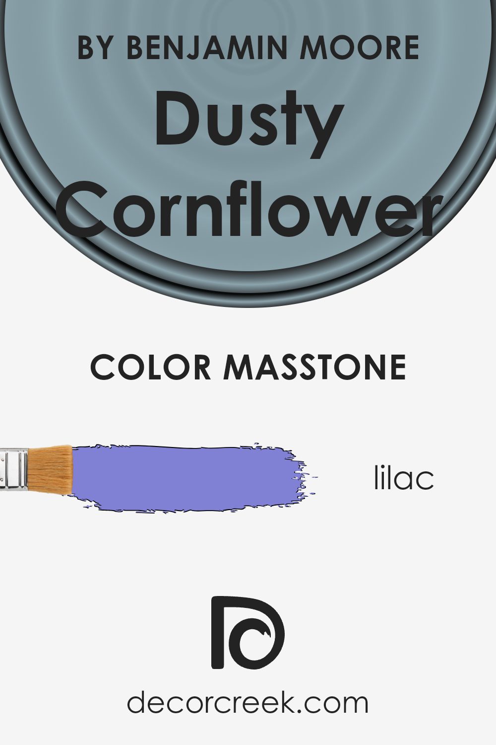
What is the Masstone of the Dusty Cornflower CSP-605 by Benjamin Moore?
Dusty Cornflower, a unique shade offered by Benjamin Moore, presents a delightful lilac hue. This color, resembling the soft masstone of Lilac (#8080D5), brings a fresh and serene ambiance into any home. Its gentle character makes it versatile, fitting well in various rooms, from bedrooms to living spaces. The light purple tone has a calming effect, making it perfect for both modern and traditional interiors.
It effortlessly pairs with neutral colors, adding a touch of elegance without overwhelming the space. Its subtle warmth brightens rooms, reflecting natural light beautifully and creating an inviting atmosphere.
Dusty Cornflower works wonderfully as a main wall color or as an accent, providing a backdrop for decor in contrasting or complementary shades. This color is ideal for anyone looking to introduce a sense of tranquility and refined style into their home.
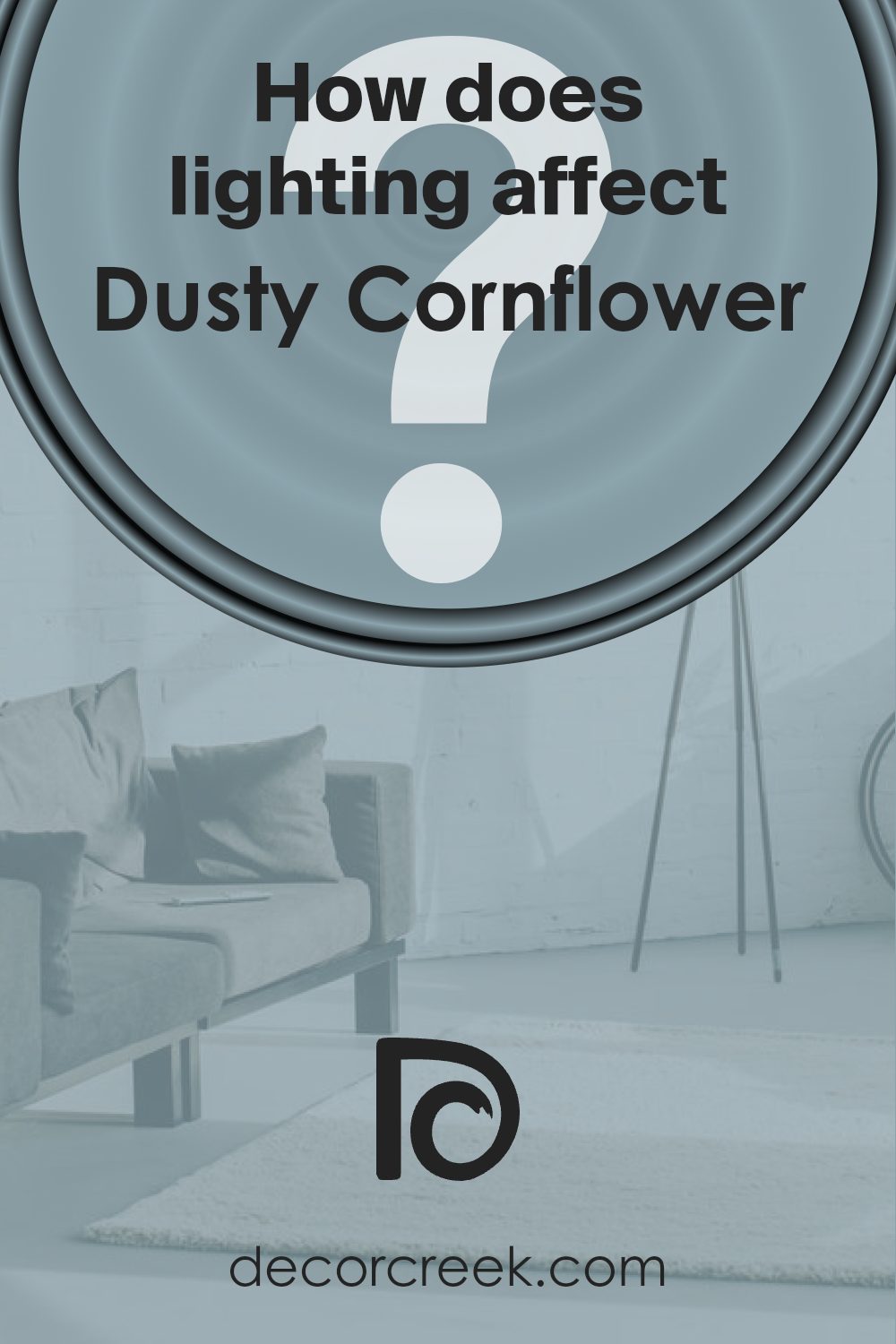
How Does Lighting Affect Dusty Cornflower CSP-605 by Benjamin Moore?
Lighting plays a crucial role in how colors appear to our eyes. The same color can look vastly different under various light sources. This is especially true for paint colors, like the serene shade Dusty Cornflower by Benjamin Moore. Its appearance can shift significantly depending on whether the light is natural or artificial, and even the direction of the room can influence its perception.
In artificial light, Dusty Cornflower may take on a warmer or cooler tone, depending on the type of bulb used. Warm, yellow-toned lights can make it seem more muted and cozier, while cool, white lights might highlight its blue undertones, giving it a crisper look. This versatility allows the color to adapt smoothly to various settings and moods.
Natural light, on the other hand, has a profound impact on how this color is perceived throughout the day. In rooms facing north, which receive cooler, softer light, Dusty Cornflower might appear more subtle and soothing. It maintains its vibrancy without becoming overwhelming, perfect for creating a calming retreat.
South-facing rooms bathe in warm, bright light for most of the day, enhancing the liveliness of Dusty Cornflower. Here, the color can truly shine, displaying its full richness and depth, making the room feel inviting and energetic.
East-facing rooms enjoy the morning light, which is warm and bright. In these rooms, Dusty Cornflower will appear vibrant in the morning, becoming softer as the day progresses. This dynamic change can give the room a refreshing ambiance in the morning, perfect for starting the day on a bright note.
Lastly, in west-facing rooms, the evening light can cast a golden glow, making Dusty Cornflower appear warmer and more nuanced in the afternoon and evening. This can create a cozy atmosphere, perfect for relaxing at the end of the day.
Overall, the beauty of Dusty Cornflower lies in its versatility under different lighting conditions, making it a splendid choice for any room, regardless of its orientation or light source.
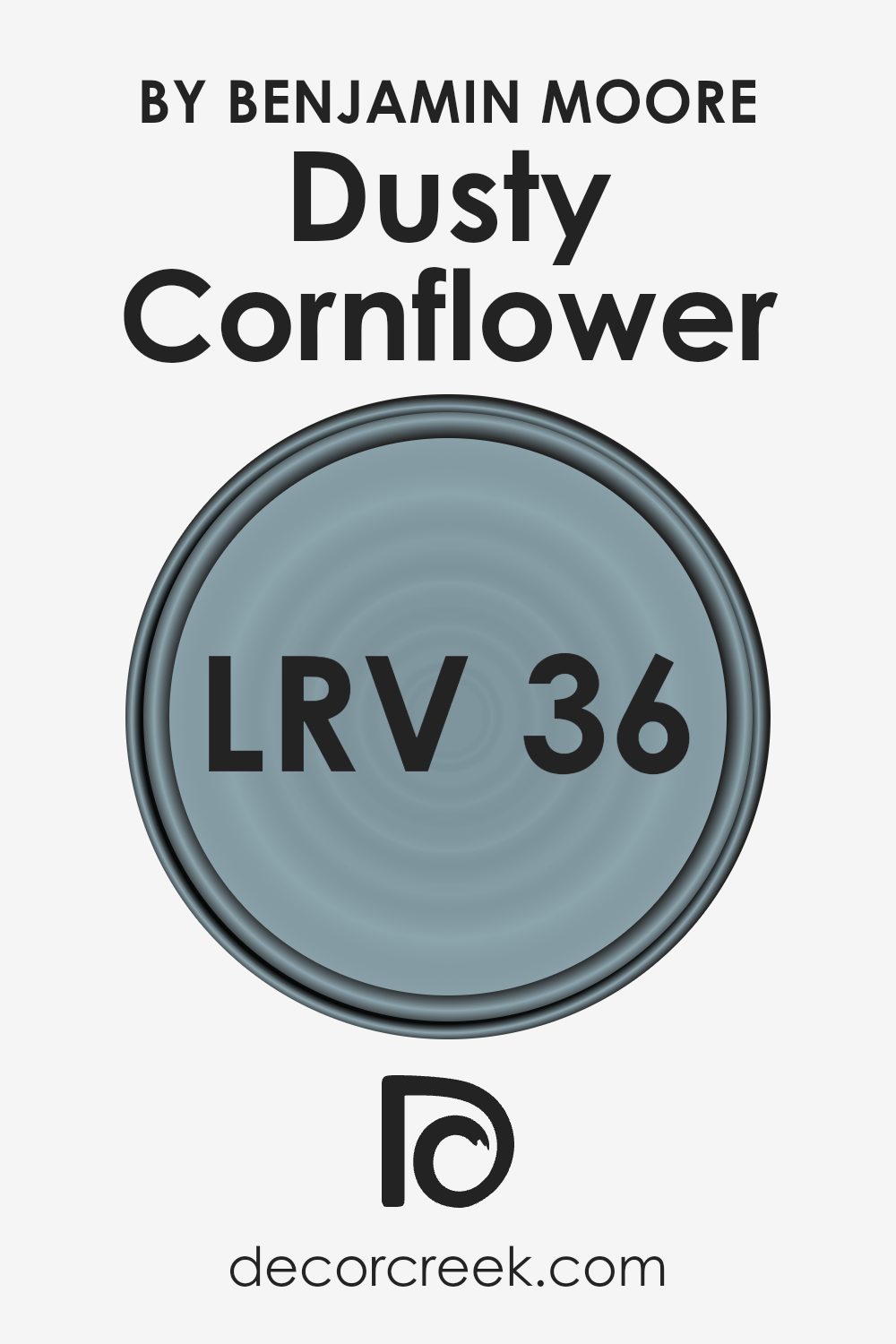
What is the LRV of Dusty Cornflower CSP-605 by Benjamin Moore?
With an LRV of 36.19, Dusty Cornflower falls into the medium range. It’s neither too dark nor too light, offering a balanced option for those who want a color with substance without overwhelming a space. In a room with ample natural light, this LRV means that Dusty Cornflower will look lively and engaging, reflecting a moderate amount of light and maintaining its true color.
In dimmer spaces, it might appear a bit darker, but it won’t turn into a deep shadow on your walls, keeping the room’s feel cozy and inviting.
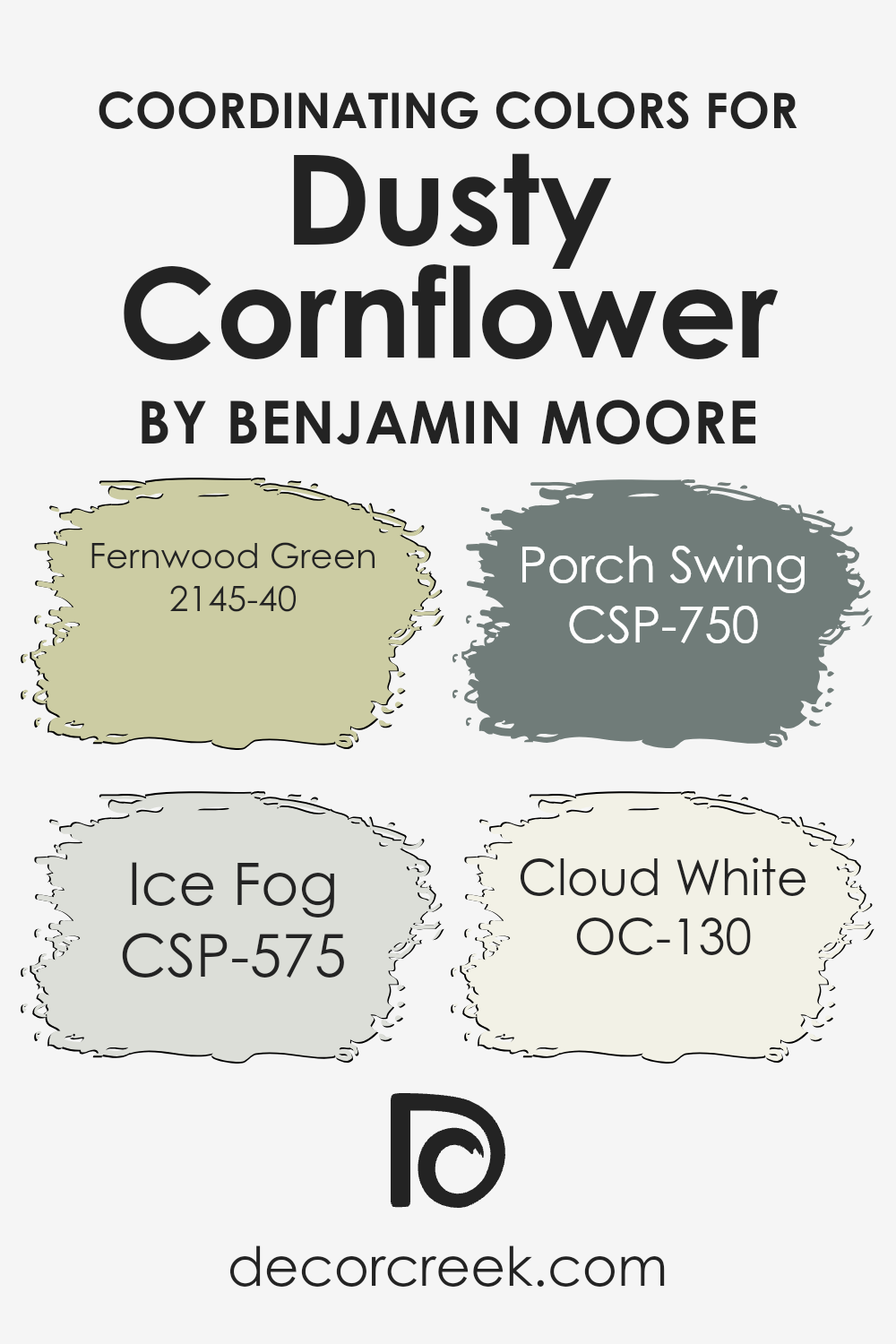
Coordinating Colors of Dusty Cornflower CSP-605 by Benjamin Moore
Coordinating colors are shades that complement each other beautifully when used together, creating a harmonious and appealing look in any space. They work by balancing visual appeal, either by contrasting or enhancing the main hue, ensuring the overall ambiance is both inviting and cohesive. By selecting coordinating colors, such as those designed to pair with Benjamin Moore’s Dusty Cornflower, you ensure your decor has depth and character.
For instance, 2145-40 Fernwood Green is a soft, earthy green that brings a refreshing touch to a room, perfectly complementing the cooler tones of Dusty Cornflower. CSP-575 Ice Fog offers a subtle, light grayish hue, providing a delicate and serene backdrop that allows Dusty Cornflower to stand out without overwhelming the space.
CSP-750 Porch Swing is a gentle, muted blue with a hint of nostalgia, adding depth and sophistication when paired with Dusty Cornflower. Finally, OC-130 Cloud White is a crisp, clean white that acts as the perfect neutral, ensuring that Dusty Cornflower remains the focal point while contributing to the airiness and brightness of the room. These coordinating colors work together to create a beautifully balanced and harmonious look that can enhance any living space.
You can see recommended paint colors below:
- 2145-40 Fernwood Green
- CSP-575 Ice Fog
- CSP-750 Porch Swing
- OC-130 Cloud White
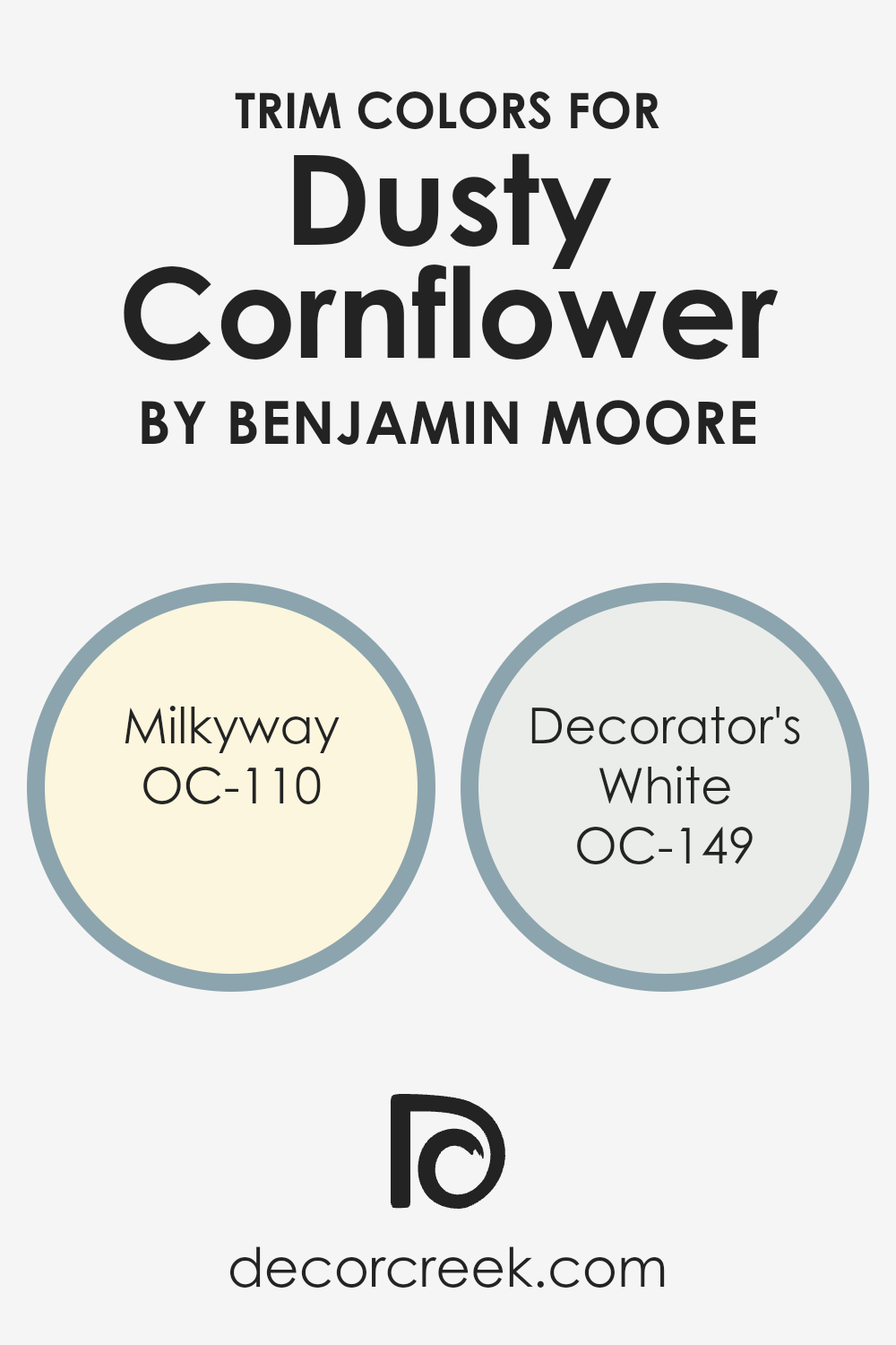
What are the Trim colors of Dusty Cornflower CSP-605 by Benjamin Moore?
Trim colors are those chosen specifically for painting the edges or borders of a room, such as baseboards, moldings, door frames, and window sills. These colors play a crucial role in defining the aesthetic appeal and overall vibe of a room, highlighting architectural details or adding a crisp, finishing touch to the spaces.
For a soft and serene hue like Dusty Cornflower by Benjamin Moore, selecting the right trim colors is essential to complement its gentle yet impactful nature. Opting for hues like OC-110 – Milkyway and OC-149 – Decorator’s White as trim options can enhance the beauty and elevate the sophistication of the space, making it feel more cohesive and well-thought-out.
OC-110 – Milkyway is a warm, off-white with a subtle creamy undertone that pairs beautifully with Dusty Cornflower, offering a soft transition between the wall color and trim, fostering a harmonious atmosphere. Meanwhile, OC-149 – Decorator’s White is a crisp, clean white with a slight hint of coolness, making it a fantastic choice for adding a sharp contrast that pops against the calming tone of Dusty Cornflower.
Using either of these colors for trim not only defines the space with elegance but also ensures the serene blue becomes the focal point, enriching the room’s overall aesthetic and mood.
You can see recommended paint colors below:
- OC-110 Milkyway
- OC-149 Decorator’s White
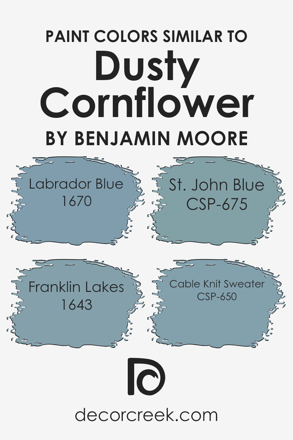
Colors Similar to Dusty Cornflower CSP-605 by Benjamin Moore
Choosing similar colors plays a vital role in interior design, creating a harmonious and balanced look in any space. When colors like the serene Dusty Cornflower by Benjamin Moore are selected as the base, homeowners often lean towards shades that complement without overwhelming, achieving a subtle yet impactful aesthetic.
Similar colors, such as Labrador Blue, Franklin Lakes, St. John Blue, and Cable Knit Sweater, work wonders by either offering a slight variation in hue or by introducing a depth that can accentuate the primary color’s calmness and charm. These similar shades help in crafting spaces that feel coordinated and thoughtfully designed.
Labrador Blue is a shade that brings to mind the reflective quality of a serene lake under a clear sky, providing a fresh and open ambiance. Franklin Lakes, on the other hand, introduces a slightly more pronounced depth, reminiscent of a peaceful water body nestled within a quiet town, inviting a sense of tranquility. St. John Blue elevates the aesthetic with an air of sophistication, hinting at the elegance of historic architecture under a midday sky.
Cable Knit Sweater wraps up the selection with a cozy touch, mirroring the comfortable and soft embrace of your favorite winter wear, making spaces feel warm and welcoming. Each of these colors, while similar, holds its unique charm and function, enabling designers and homeowners to marry consistency with personality effortlessly.
You can see recommended paint colors below:
- 1670 Labrador Blue
- 1643 Franklin Lakes
- CSP-675 St. John Blue
- CSP-650 Cable Knit Sweater
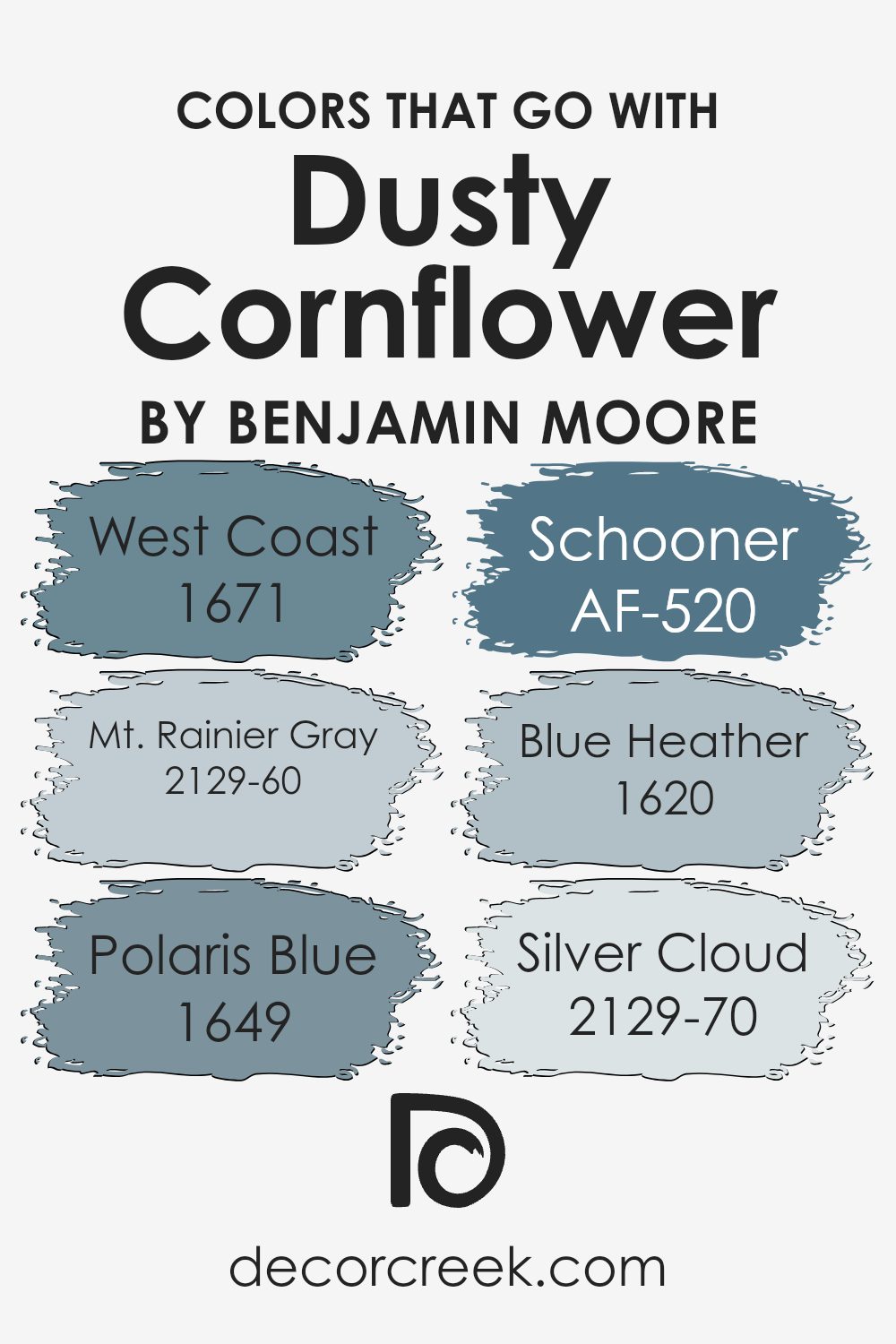
Colors that Go With Dusty Cornflower CSP-605 by Benjamin Moore
Choosing the right colors to complement Dusty Cornflower CSP-605 by Benjamin Moore is crucial in creating a harmonious and appealing space. These colors, including West Coast 1671, Mt. Rainier Gray 2129-60, Polaris Blue 1649, Schooner AF-520, Blue Heather 1620, and Silver Cloud 2129-70, play vital roles in designing interiors that are both inviting and stylish.
These specific shades were selected for their ability to blend well with Dusty Cornflower, a unique and gentle hue, to balance its cool tones with their own distinct qualities, ensuring a cohesive and attractive look.
West Coast 1671 lightens the mood with its soft, warm undertone, providing a beautiful contrast to Dusty Cornflower’s serene vibe, while Mt. Rainier Gray 2129-60 introduces a subtle, calming grey that pairs nicely for a sophisticated feel. Polaris Blue 1649, on the other hand, is a slightly brighter shade that brings a refreshing energy to the space. Schooner AF-520 offers a deeper, nautical-inspired tone that grounds the palette, adding depth and interest.
Blue Heather 1620 echoes the core qualities of Dusty Cornflower but in a lighter, more ethereal shade, enhancing the space with a touch of airy elegance. Lastly, Silver Cloud 2129-70 is the perfect neutral, offering a light, almost ethereal quality that ties the whole palette together, ensuring a softly coordinated appearance that’s both soothing and contemporary. Together, these colors support and enhance the beauty of Dusty Cornflower, allowing for a versatile and visually appealing space.
You can see recommended paint colors below:
- 1671 West Coast
- 2129-60 Mt. Rainier Gray
- 1649 Polaris Blue
- AF-520 Schooner
- 1620 Blue Heather
- 2129-70 Silver Cloud
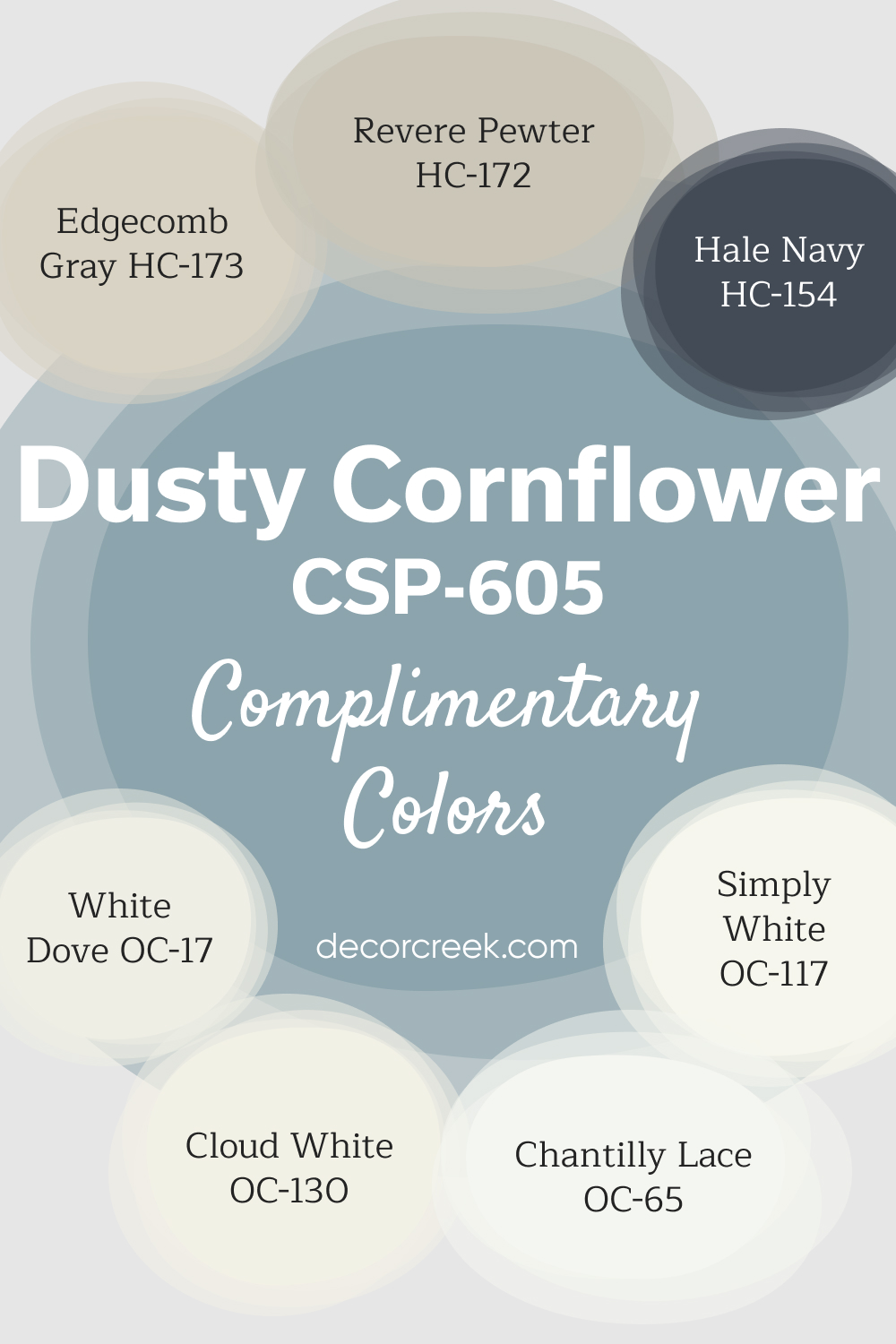
Complimentary Colors for Dusty Cornflower CSP-605 Paint Color by Benjamin Moore
Dusty Cornflower by Benjamin Moore is a gentle blue that brings a soothing atmosphere to any space. It works well with a variety of neutral tones, making it easy to pair with other colors. Whites like White Dove, Chantilly Lace, and Simply White create a clean and crisp contrast, highlighting the softness of Dusty Cornflower.
For a more subtle, layered look, Edgecomb Gray and Revere Pewter offer neutral warmth without overpowering the space.
Cloud White adds a touch of brightness, while Hale Navy introduces depth and boldness to the palette. This combination of colors creates a harmonious and inviting environment suitable for any room in your home.
How to Use Dusty Cornflower CSP-605 by Benjamin Moore In Your Home?
Dusty Cornflower CSP-605 by Benjamin Moore is a versatile paint color that offers a unique blend of calmness and vibrancy to any room in your home. Its soft, muted blue tone works well in spaces where you want to create a serene and relaxing atmosphere, like bedrooms and bathrooms. At the same time, its lively undertones can add a hint of energy and freshness to living areas and kitchens.
This color pairs beautifully with white trim and natural wood accents, enhancing a room’s light and making it feel more spacious. For those looking to add a subtle pop of color without overwhelming a space, Dusty Cornflower is an excellent choice. It can be used on walls, as an accent color, or for furniture pieces to create a cohesive and inviting environment.
Moreover, this shade is suitable for various decorating styles, from modern to rustic, making it a flexible option for your home. Whether you’re updating a single room or giving your whole house a makeover, Dusty Cornflower CSP-605 can help you achieve the look you’re aiming for with ease.
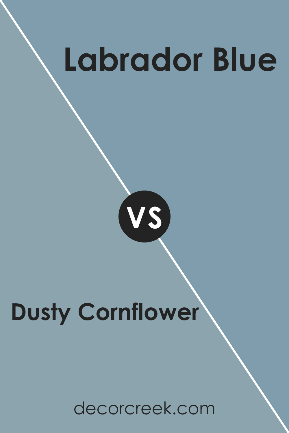
Dusty Cornflower CSP-605 by Benjamin Moore vs Labrador Blue 1670 by Benjamin Moore
Comparing Dusty Cornflower by Benjamin Moore and Labrador Blue, also by Benjamin Moore, we can see that both colors bring unique shades to the table. Dusty Cornflower is a soft, muted blue with a hint of gray which gives it a very soothing and gentle appearance. It’s like looking at the sky on a calm, early morning when the sun is just peeking through.
On the other hand, Labrador Blue offers a brighter and more pronounced blue that stands out more vividly. It resembles the vibrant color of a clear sky on a sunny day or the deep blue of ocean waters under the afternoon sun. While Dusty Cornflower might be chosen for creating a peaceful and serene ambiance, Labrador Blue would be the go-to for adding a splash of energy and liveliness to a space.
Both colors are beautiful, but they serve different moods and settings depending on what feeling you want to achieve in a room.
You can see recommended paint color below:
- 1670 Labrador Blue
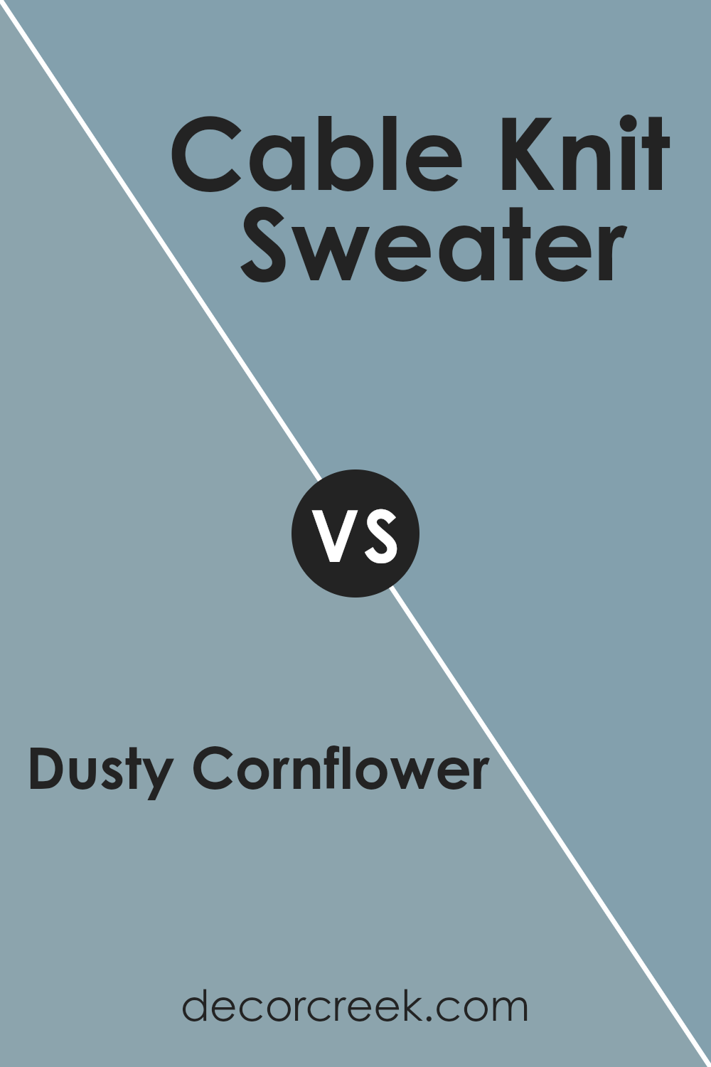
Dusty Cornflower CSP-605 by Benjamin Moore vs Cable Knit Sweater CSP-650 by Benjamin Moore
Alright, let’s look at two colors from Benjamin Moore: Dusty Cornflower and Cable Knit Sweater. Dusty Cornflower is a soft, serene blue. It’s got this light, airy feel, kind of like looking at a clear sky just after dawn. It brings a calm, refreshing vibe to any space. On the other hand, Cable Knit Sweater moves in a different direction. It’s a warm, creamy white. Picture the color of a cozy wool sweater you’d wear on a chilly day. It creates a snug, inviting atmosphere, making any room feel more homely.
Both colors are subtle and have their unique charm. Dusty Cornflower is for those who want a touch of calm blue sophistication, while Cable Knit Sweater suits someone looking for warmth and coziness. Depending on what mood you’re going for in your space, either of these could be the perfect fit. They’re versatile, but in their own special ways, one brings a cool calmness and the other, a gentle warmth.
You can see recommended paint color below:
- CSP-650 Cable Knit Sweater
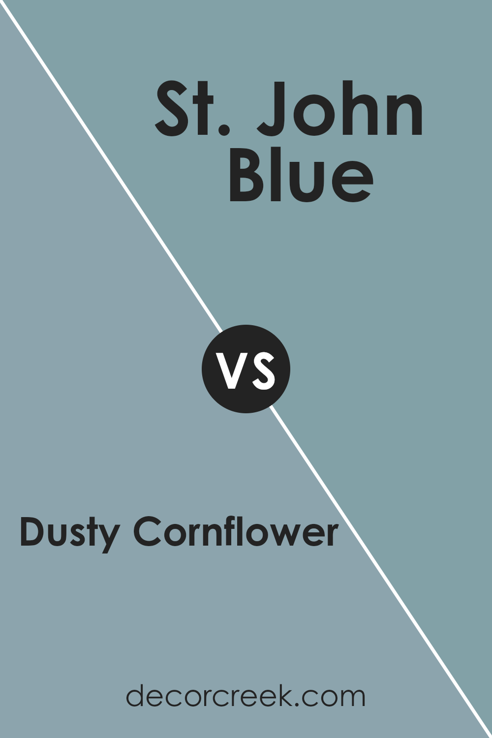
Dusty Cornflower CSP-605 by Benjamin Moore vs St. John Blue CSP-675 by Benjamin Moore
Dusty Cornflower and St. John Blue are both beautiful colors made by Benjamin Moore, but they have their unique vibes. Dusty Cornflower is a soft, muted blue with a touch of gray. It’s like looking at the sky on a hazy morning. This color is soothing and gentle, making rooms feel calm and cozy. On the other hand, St. John Blue is a bit brighter and has a hint of teal. It’s like the color of the ocean in a tropical paradise. This one adds a fresh and lively feel to spaces, making them feel more energetic.
If you want a room that feels peaceful and serene, Dusty Cornflower is a great pick. It’s perfect for bedrooms or quiet reading corners. For spaces where you might want a bit more vitality, like kitchens or bathrooms, St. John Blue can really shine. It brings in a burst of energy without being too overwhelming. Both colors are versatile and can mix well with others, but they set totally different moods in a room.
You can see recommended paint color below:
- CSP-675 St. John Blue
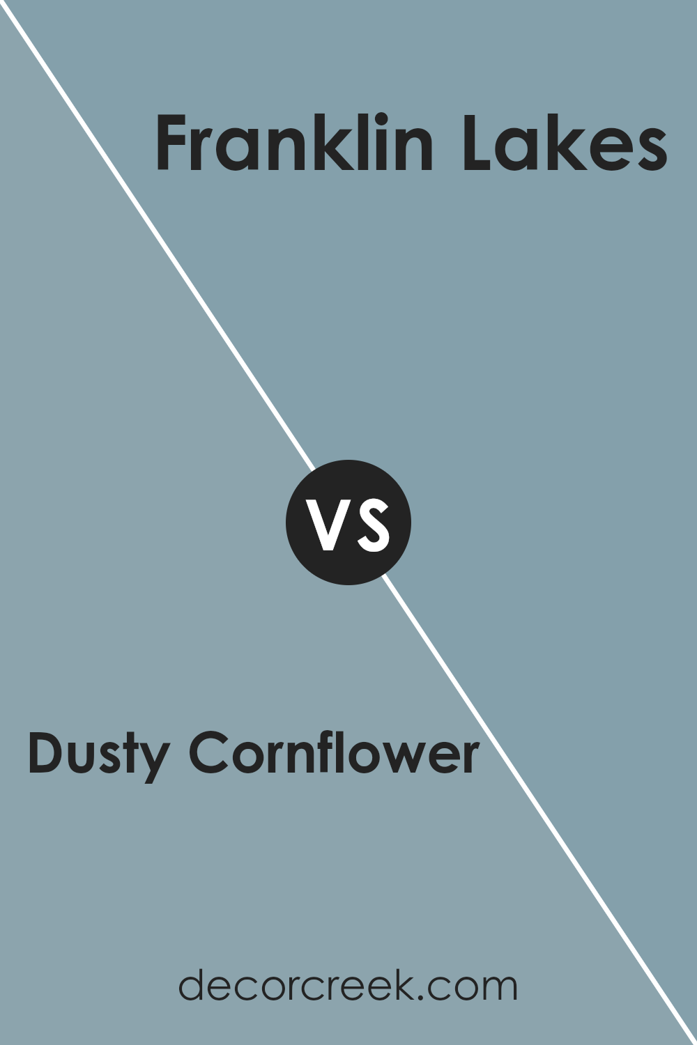
Dusty Cornflower CSP-605 by Benjamin Moore vs Franklin Lakes 1643 by Benjamin Moore
Dusty Cornflower and Franklin Lakes, both from Benjamin Moore, offer unique shades for any room. Dusty Cornflower is a serene, muted blue with a hint of gray that brings a calm and soothing atmosphere. It’s like looking at a peaceful sky just before dusk, offering a soft backdrop that is easy on the eyes. This color can make a small space feel more open and airy, or give a large room a cozy, welcoming vibe.
On the other hand, Franklin Lakes is more of a sophisticated, deep gray with blue undertones. It’s a versatile color that adds a touch of elegance and depth to spaces. It works well in areas where you want a bit more drama or a strong visual impact without overwhelming the senses. Franklin Lakes can pair nicely with brighter colors for a stunning contrast, or with other neutrals for a refined look.
Both colors are beautifully distinct, with Dusty Cornflower leaning towards a lighter, more ethereal feel, and Franklin Lakes offering a bold, grounded presence. They cater to different moods and settings, yet both could harmoniously blend within the same color scheme for a nuanced and layered interior design.
You can see recommended paint color below:
- 1643 Franklin Lakes
Conclusion
Dusty Cornflower CSP-605 by Benjamin Moore is a unique and subtle color that offers a versatile option for those looking to refresh their space. This shade has the ability to bring a serene and calming atmosphere to any room, making it ideal for creating a relaxing environment.
Its understated elegance allows it to pair well with a variety of decor styles and other colors, providing a seamless integration into existing designs or serving as a calm foundation for new aesthetic adventures.
Despite its gentle appearance, Dusty Cornflower CSP-605 possesses a depth that can enhance the visual interest of a space without overwhelming it. It works exceptionally well in areas that receive a lot of natural light, showcasing different facets of its character at various times of the day.
This color proves to be a practical choice for those wanting to inject a bit of personality into their surroundings while maintaining a sense of tranquility. Its adaptability and the soothing vibe make it a go-to paint color for anyone looking to update their home with a touch of sophistication and calm.
Ever wished paint sampling was as easy as sticking a sticker? Guess what? Now it is! Discover Samplize's unique Peel & Stick samples.
Get paint samples

