When you first see 1038 Everlasting by Benjamin Moore, it might just look like a simple shade of beige. But give it a moment, and you’ll notice there’s something special about this color. Designed to offer a timeless appeal, it has the ability to make any space feel warm and inviting without overwhelming the senses with bold intensity.
This shade isn’t merely a backdrop. Instead, it plays an integral role in bringing a cohesive look to a room, enhancing the furniture and decor with its subtle yet profound presence.
Whether you’re giving a room a makeover or just adding a fresh coat of paint, 1038 Everlasting offers a versatility that works beautifully in a variety of settings, from modern to traditional.
Its ability to blend seamlessly with other colors and elements makes it a go-to choice for those looking to create a soothing and welcoming atmosphere in their home.
What Color Is Everlasting 1038 by Benjamin Moore?
Everlasting (1038) by Benjamin Moore is a soft and subtle beige hue that brings a warm, inviting atmosphere to any room. This color is a versatile choice, as it serves as a neutral backdrop that can blend seamlessly with a variety of decor styles and color palettes. Everlasting works exceptionally well in casual and cozy interior styles such as rustic, farmhouse, and traditional, due to its earthy tones that echo natural elements.
The beauty of Everlasting lies in its ability to pair well with both light and dark shades. When matched with darker colors, it prevents them from feeling too heavy, while pairing it with lighter tones can create a soothing, cohesive look. This color is especially effective in spaces that aim for a relaxed feel, like living rooms, bedrooms, and kitchens.
In terms of materials, Everlasting looks outstanding with natural wood, from pine to mahogany, enhancing the wood’s richness. Textures such as linen, wool, and cotton in furnishings or window treatments add to the cozy feel. Metal accents in brass or copper can also complement this beige color, adding a touch of warmth and luster to the overall aesthetic of the room.
Overall, Everlasting is a go-to choice for creating a welcoming and comfortable home environment.
Is Everlasting 1038 by Benjamin Moore Warm or Cool color?
The color Everlasting (1038) by Benjamin Moore is a versatile neutral shade that can really open up a space. This light gray with a hint of beige provides a calm, soft backdrop that pairs well with various decor styles, from modern to classic. It’s particularly effective in smaller rooms or areas with limited natural light, as it can make the space appear larger and brighter.
In homes, Everlasting1038’s flexibility allows homeowners to match it easily with different color combinations for furniture and accessories. It works well with both vibrant colors and more subdued tones, making it ideal for living rooms, bedrooms, and kitchens.
This color also has the advantage of staying relatively consistent in different lighting conditions, which means it maintains its charm whether illuminated by sunlight during the day or by artificial lighting at night. By using this neutral shade, homeowners can create a welcoming, cozy environment that feels inviting and comfortable.
Undertones of Everlasting 1038 by Benjamin Moore
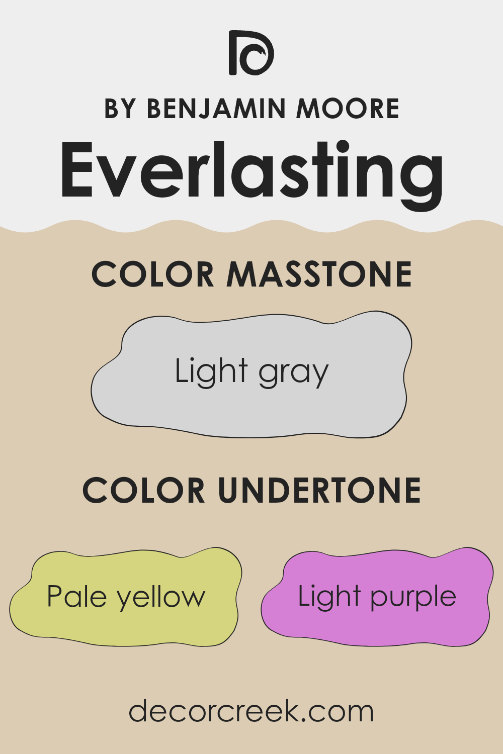
Everlasting, a paint color by Benjamin Moore, has a unique look that changes depending on the light and surroundings because of its multiple undertones. The undertones in a paint color are softer colors that you can see beneath the main color. For Everlasting, these undertones include pale yellow, light purple, pale pink, light blue, mint, lilac, and gray. Undertones affect how we perceive color. They can make a color appear cooler or warmer and influence how it matches with other colors in a room.
For example, in a room with lots of natural light, Everlasting might show more of its pale yellow or light blue undertones, making the room feel brighter and more airy. In a room with less natural light or at different times of the day, the gray or lilac undertones might become more noticeable, giving the walls a softer, muted look.
When using Everlasting on interior walls, the range of its undertones offers flexibility in decor. Because it includes both warm (pale yellow, pale pink) and cool (light blue, lilac) undertones, it can harmonize with various furniture colors and styles, making it a versatile choice for any room. This adaptability also means that the color’s appearance can shift subtly with changes in room lighting and decor, providing a dynamic backdrop to any interior space.
What is the Masstone of the Everlasting 1038 by Benjamin Moore?
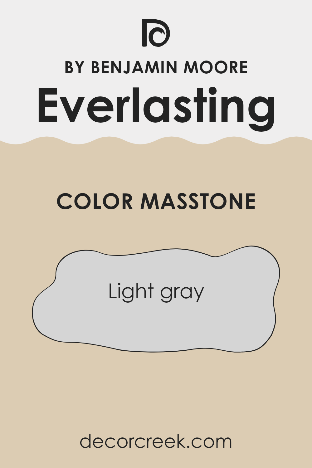
Everlasting1038 by Benjamin Moore is a light gray (#D5D5D5) color that offers a versatile backdrop for any room in a home. This light gray tone, known as masstone, provides a clean and subtle look that works well in various lighting conditions.
It’s perfectly suited for small spaces, as it helps make rooms look bigger and brighter. In larger rooms, it brings a sense of calm and simplicity, allowing other design elements like furniture and artwork to stand out.
This color is easy to match with other colors, making it a great choice for people who like to switch up their decor often. Whether you’re pairing it with bright colors for a lively look or with other neutrals for a more understated style, Everlasting1038 maintains its balance without overpowering other elements. Overall, its neutral shade is practical for any home, providing a fresh and airy feel that’s never too stark or cold.
How Does Lighting Affect Everlasting 1038 by Benjamin Moore?
Lighting plays a crucial role in how colors appear, as it can either enhance or alter our perception of a shade. The color Everlasting1038 by Benjamin Moore is an interesting example to discuss. This particular color can look very different depending on whether it is viewed under artificial light or natural sunlight.
Under artificial lighting, Everlasting1038 tends to appear slightly warmer. This is due to most indoor lights casting a yellowish hue, which can make the color seem cozier and richer. On the other hand, in natural light, Everlasting1038 often looks truer to its original shade. This is because daylight is generally cooler and reveals more of the color’s real tone.
The orientation of a room also affects how Everlasting1038 is perceived. In north-facing rooms, which receive less direct sunlight, this color can look somewhat more muted and cooler. This might make the room feel calmer but can at times feel a bit dim. In south-facing rooms, where sunlight is abundant throughout the day, Everlasting1038 will be vibrant and lively, playing up the warm tones in the paint.
In east-facing rooms, this color gets bright morning light, which can make the color appear soft and warm early in the day. However, it could feel cooler as the day progresses because eastern light diminishes. Conversely, in west-facing rooms, the color will experience the opposite effect; starting out cooler in the morning, then becoming warmly illuminated by the intense late afternoon and evening sunlight.
Overall, Everlasting1038’s appearance is significantly influenced by the light conditions present, which can either warm up or cool down its presentation in a space. Understanding how light affects color can help in making informed choices about using this color in different room orientations and lighting conditions.
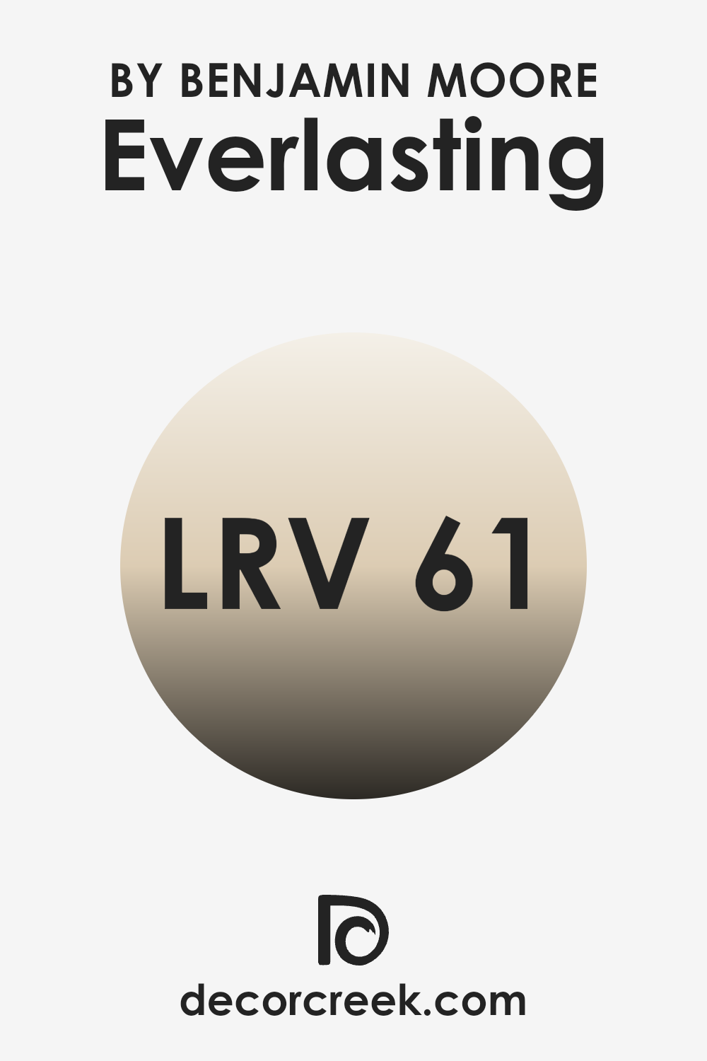
What is the LRV of Everlasting 1038 by Benjamin Moore?
LRV stands for Light Reflectance Value, which is a measure of the percentage of light a paint color reflects when it’s on the walls. This value is particularly useful when choosing paint shades because it tells you how light or dark a color might appear once it’s up on your walls.
A higher LRV means that the color will reflect more light, making the room feel brighter and more open. On the other hand, a lower LRV indicates that the color absorbs more light, which can make a space feel cozier but smaller.
The LRV for Everlasting, which is around sixty point sixty-six, suggests that it is a relatively light color that will reflect a good amount of light back into the room. This makes it a versatile choice for spaces where you want to enhance natural light without going too bright. The light-reflective nature of this shade can help make a room feel airy and lifted, making it a solid choice for areas like living rooms or small spaces that could benefit from a sense of increased openness.
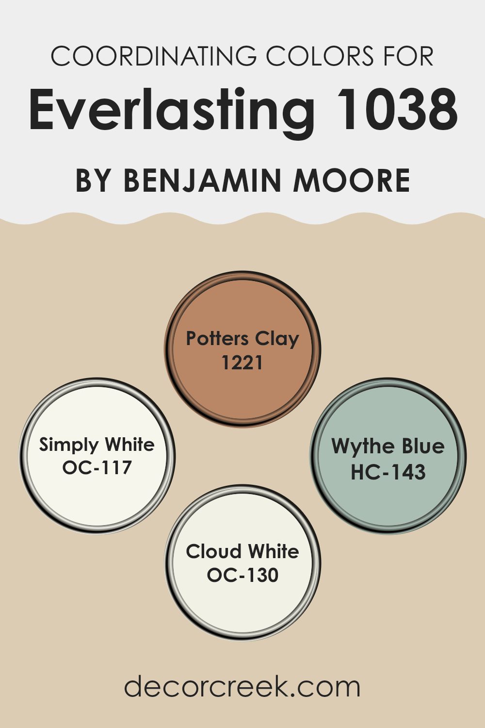
Coordinating Colors of Everlasting 1038 by Benjamin Moore
Coordinating colors work by complementing each other to create a visually appealing palette in your space. These colors are chosen based on their ability to harmonize with a main color while enhancing the overall aesthetic appeal.
For instance, Benjamin Moore’s Everlasting 1038 pairs beautifully with its designated coordinating colors like 1221 – Potter’s Clay, OC-117 – Simply White, HC-143 – Wythe Blue, and OC-130 – Cloud White. Each of these colors supports the main hue, either by offering a striking contrast or by softly blending to maintain a balanced visual flow throughout the space.
To give an idea of how these colors play together, Potter’s Clay provides a deep, earthy tone that adds warmth and depth, contrasting beautifully with lighter shades and making them pop. Simply White is a clean and refreshing white that brightens and opens up any space, making it feel airy and light.
Wythe Blue is a gentle blue with a hint of green, perfect for lending a calm and cozy feel to interiors. Finally, Cloud White offers a slightly creamy white tone that works wonderfully as a soft background or to highlight other elements in the room. These colors all come together to create a coherent and inviting environment.
You can see recommended paint colors below:
- 1221 Potters Clay
- OC-117 Simply White
- HC-143 Wythe Blue
- OC-130 Cloud White
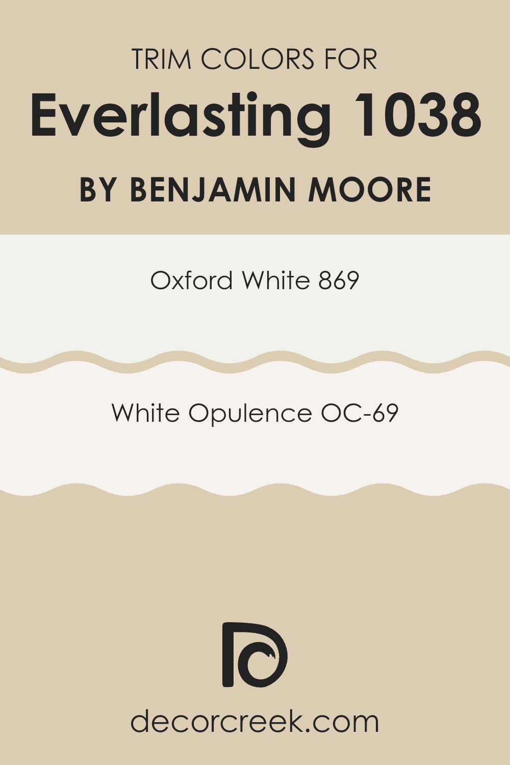
What are the Trim colors of Everlasting 1038 by Benjamin Moore?
Trim colors are specific shades used for painting the molding, door frames, window frames, and other architectural elements distinct from the main wall color. These colors help in creating contrast and enhancing the architectural features of a space. For a color like Everlasting by Benjamin Moore, choosing the right trim color is crucial because it complements the main hue and brings a neat finish to the overall look of a room.
Oxford White 869 is a clean and bright white that brings a fresh and crisp look when used as a trim color. It’s great for creating a clear boundary against deeper or muted wall colors, making it ideal for framing areas or highlighting details.
White Opulence OC-69, on the other hand, offers a slightly warmer tone, providing a gentle and inviting feel. This color works well in softening the transition between the wall color and the trim, adding a subtle, harmonious touch to the interiors. Using either of these colors as trim can effectively enhance the aesthetic appeal and finish of a room painted in Everlasting.
You can see recommended paint colors below:
- 869 Oxford White
- OC-69 White Opulence
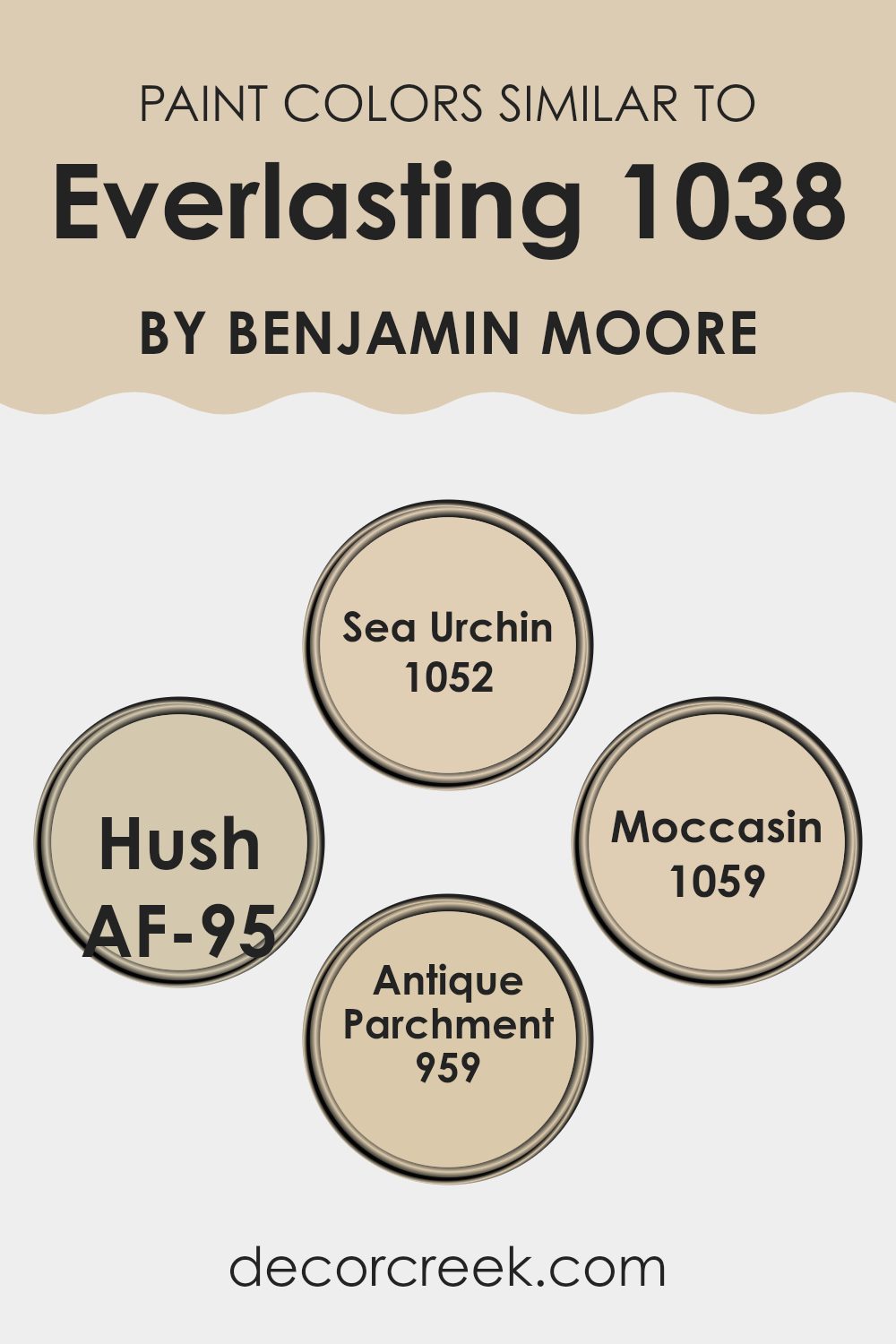
Colors Similar to Everlasting 1038 by Benjamin Moore
Choosing similar colors can create a harmonious and aesthetically pleasing environment in any space. Similar colors, like the shades related to Everlasting by Benjamin Moore, work together by providing a subtle variance that adds depth and interest without overwhelming the senses.
These colors usually share a common base tone but differ slightly in hue or brightness, allowing them to complement each other beautifully. This approach is particularly effective in achieving a cohesive look, making the space feel well put together and thoughtfully planned.
For instance, the color Sea Urchin can really warm up a room with its soft, sandy tone, giving a cozy and inviting vibe. It’s a versatile color that works well with earthy textures and materials. Hush, on the other hand, acts as a light neutral with a hint of warmth, excellent for creating a calm and inviting backdrop that allows other design elements to stand out.
Moccasin offers a richer, deeper hue akin to lightly tanned leather, adding a touch of elegance without overpowering. Lastly, Antique Parchment provides a classic, slightly aged look, great for adding a timeless quality to spaces and works especially well with vintage or traditional decors. Together, these colors present a palette that is fluid and cohesive, perfect for creating a comfortable and stylish space.
You can see recommended paint colors below:
- 1052 Sea Urchin
- AF-95 Hush
- 1059 Moccasin
- 959 Antique Parchment
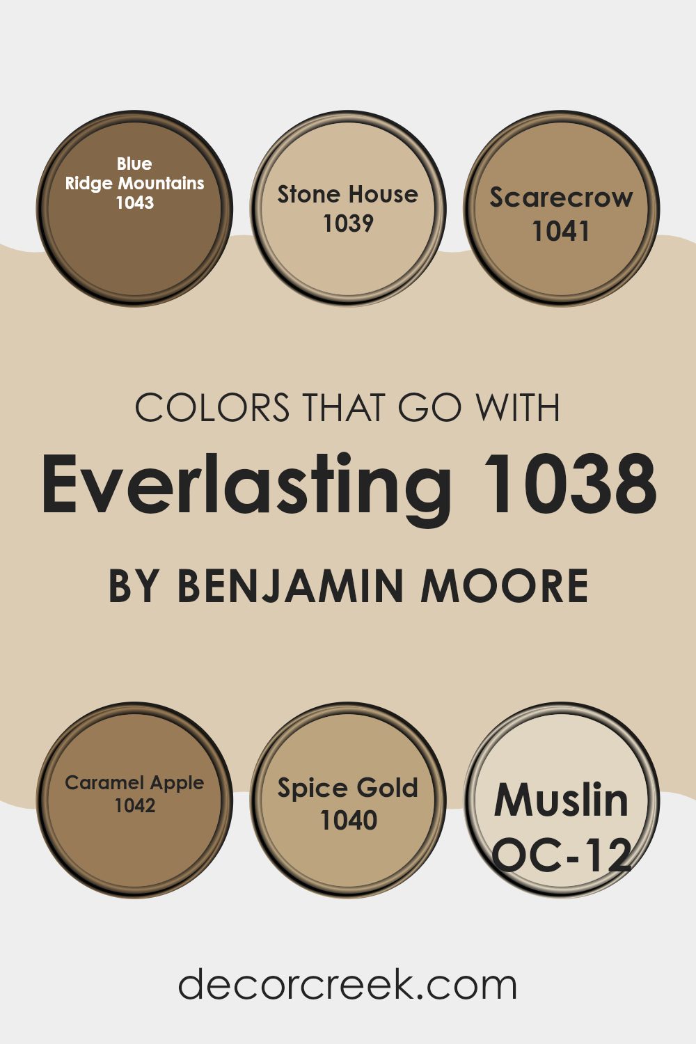
Colors that Go With Everlasting 1038 by Benjamin Moore
Choosing colors that harmonize with Everlasting 1038 by Benjamin Moore is crucial for creating a cohesive and appealing look in any space. When paired with compatible hues, Everlasting—a subdued, light beige—provides a neutral backdrop that allows other colors to stand out beautifully.
For instance, pairing it with a deeper tone like Blue Ridge Mountains, a soft and dusty blue, provides a refreshing contrast that enlivens the environment without overwhelming it. Similarly, Stone House, which is a warm, rich beige, blends seamlessly with Everlasting, enhancing the warmth of a room while maintaining a gentle, inviting atmosphere.
Other colors like Scarecrow, a soft terracotta, add a touch of earthy charm when combined with Everlasting, perfect for creating a cozy and inviting space. Caramel Apple, a deeper, muted cider color, offers a subtly vibrant kick that pairs well with the softness of Everlasting, making spaces feel more lively and welcoming. For a hint of zest, Spice Gold, a medium mustard-yellow, introduces a cheerful brightness that interacts harmoniously with the neutral qualities of Everlasting.
Lastly, Muslin, a light and airy cream, echoes the gentle traits of Everlasting, ensuring a smooth and seamless color flow throughout the space. By selecting the right colors to accompany Everlasting 1038, you ensure a balanced and pleasant aesthetic that suits a variety of design desires.
You can see recommended paint colors below:
- 1043 Blue Ridge Mountains
- 1039 Stone House
- 1041 Scarecrow
- 1042 Caramel Apple
- 1040 Spice Gold
- OC-12 Muslin
How to Use Everlasting 1038 by Benjamin Moore In Your Home?
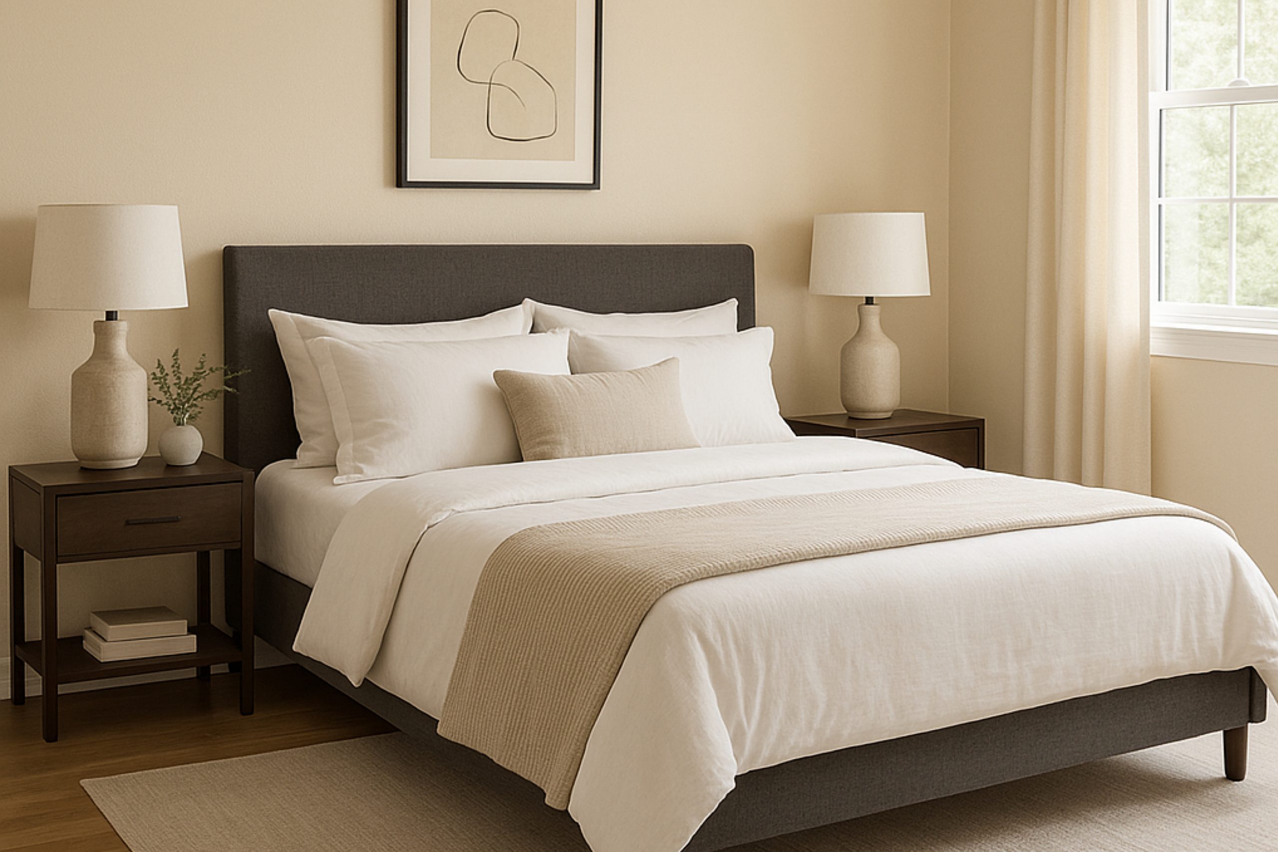
Everlasting 1038 by Benjamin Moore is a versatile paint color that’s perfect for anyone looking to freshen up their living space. This shade is a soft, neutral beige that works wonderfully in almost any room, lending a subtle and clean look to interiors. It’s ideal for creating a cozy atmosphere in living areas or bedrooms, where comfort is key.
Using Everlasting 1038 in your home is simple. It pairs well with a wide range of colors, from bright and bold hues to more downplayed tones, making it a good base color for living rooms. You could paint all the walls this shade for a uniform look or use it on just one wall to establish a focal point.
This color is also excellent for smaller spaces like bathrooms or hallways, as it can help make them appear bigger and more open. Furthermore, it’s a practical choice for families, as its neutral tone can hide minor wear and tear better than darker colors. Whether updating your kitchen cabinets or refreshing your walls, Everlasting 1038 brings a fresh and clean feel to any DIY project.
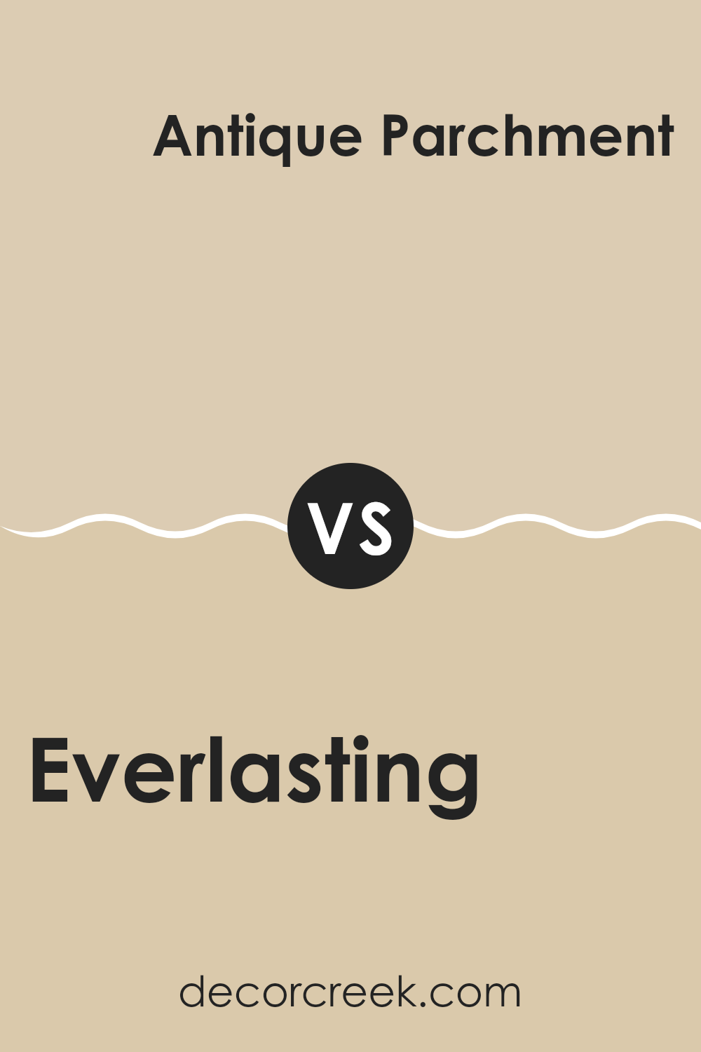
Everlasting 1038 by Benjamin Moore vs Antique Parchment 959 by Benjamin Moore
The main color, Everlasting, is a neutral shade with a light, airy feel, almost like a pale taupe. It provides a subtle warmth to any space, making it versatile enough to be used in various rooms, whether it’s a bedroom or a living area.
On the other hand, Antique Parchment is a warmer tone, resembling a soft beige with yellow undertones. This color gives off a cozy vibe, ideal for creating a welcoming atmosphere in spaces like kitchens or family rooms. When comparing both, Everlasting is cooler and more understated, making it a great backdrop for both bright accents and muted decors.
Antique Parchment, however, adds a bit more warmth to the environment, which might be preferable in settings where you want a soothing yet inviting feel. Each color has its unique charm and can significantly influence the mood and aesthetic of a room depending on how it’s used.
You can see recommended paint color below:
- 959 Antique Parchment
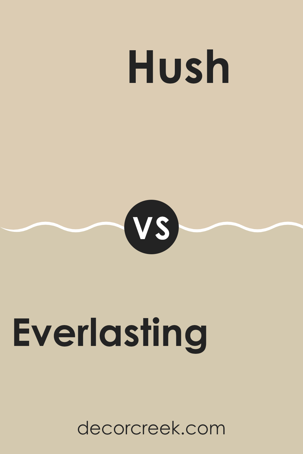
Everlasting 1038 by Benjamin Moore vs Hush AF-95 by Benjamin Moore
Everlasting 1038 by Benjamin Moore is a soft beige that gives a warm and inviting vibe to any room. It’s a versatile color that pairs well with brighter accents or darker furniture, creating a cozy, homey feel. On the other hand, Hush AF-95, also by Benjamin Moore, is a bit lighter, leaning towards a gentle, off-white hue.
This color is excellent for making a small room appear more spacious and airy, and it reflects natural light beautifully, enhancing a feeling of openness. While Everlasting 1038 offers a hint of warmth making spaces feel close and personal, Hush AF-95 provides a clean, minimalistic backdrop that complements modern interiors.
Depending on the lighting, Hush can feel almost pure white, making it perfect for those who prefer a more neutral palette that’s easy to match with any decor style. Both colors are quite neutral, yet Everlasting with its slightly deeper tone, lends itself well to creating a cozy atmosphere, whereas Hush maintains a crisp, fresh look.
You can see recommended paint color below:
- AF-95 Hush
Everlasting 1038 by Benjamin Moore vs Moccasin 1059 by Benjamin Moore
The main color, Everlasting, has a subtly warm and neutral tone, resembling a very soft beige. This makes it an excellent choice for creating a calm and inviting atmosphere in any room. It’s light enough to help spaces feel larger, but still adds a touch of warmth to make rooms feel cozy.
On the other hand, Moccasin is a deeper beige that leans towards a sandy color, providing a wholesome, earthy quality. This color is particularly good for adding a bit of richness and depth to spaces without overwhelming with too dark a shade. It can work well in areas where you want a bit more warmth and personality without stepping away too far from neutral tones.
Both Everlasting and Moccasin share a base of beige, but the intensity and depth of their colors differ. Everlasting is lighter and can be used almost like an off-white, while Moccasin offers a cozier feel that can ground a room more firmly. Their difference in tone makes them versatile for various decorating styles.
You can see recommended paint color below:
- 1059 Moccasin
Everlasting 1038 by Benjamin Moore vs Sea Urchin 1052 by Benjamin Moore
The main color, Everlasting, is a light neutral tone that brings a soft and airy feel to any space. It’s subtle and blends easily with various decor styles, making it a versatile choice for any room. Its gentle presence creates a welcoming and peaceful atmosphere.
On the other hand, Sea Urchin is a slightly darker shade. This color has a deeper, more pronounced presence compared to Everlasting. It offers a hint of warmth and richness, making it ideal for areas where you want a bit more character without overwhelming the space with too much darkness.
Although both colors are neutral, Everlasting leans towards a lighter, more understated palette, while Sea Urchin provides a bit more depth and warmth. Both are excellent choices for creating a cozy and inviting environment, but your choice might depend on how light or rich you want the room to feel.
You can see recommended paint color below:
- 1052 Sea Urchin
Conclusion
Think about using this paint in a bedroom or a place where you like to relax. It could make the room feel like a cozy, nice corner of the world just for you. It’s not a loud color, but it has a way of making everything look nicer. It’s simple but really pretty.
For anyone looking to freshen up their room without making things look too different, I would recommend giving this color a try. It could make your room look new and clean without needing to change too much. Benjamin Moore’s 1038 Everlasting might just be the change you are looking for.
Ever wished paint sampling was as easy as sticking a sticker? Guess what? Now it is! Discover Samplize's unique Peel & Stick samples.
Get paint samples

