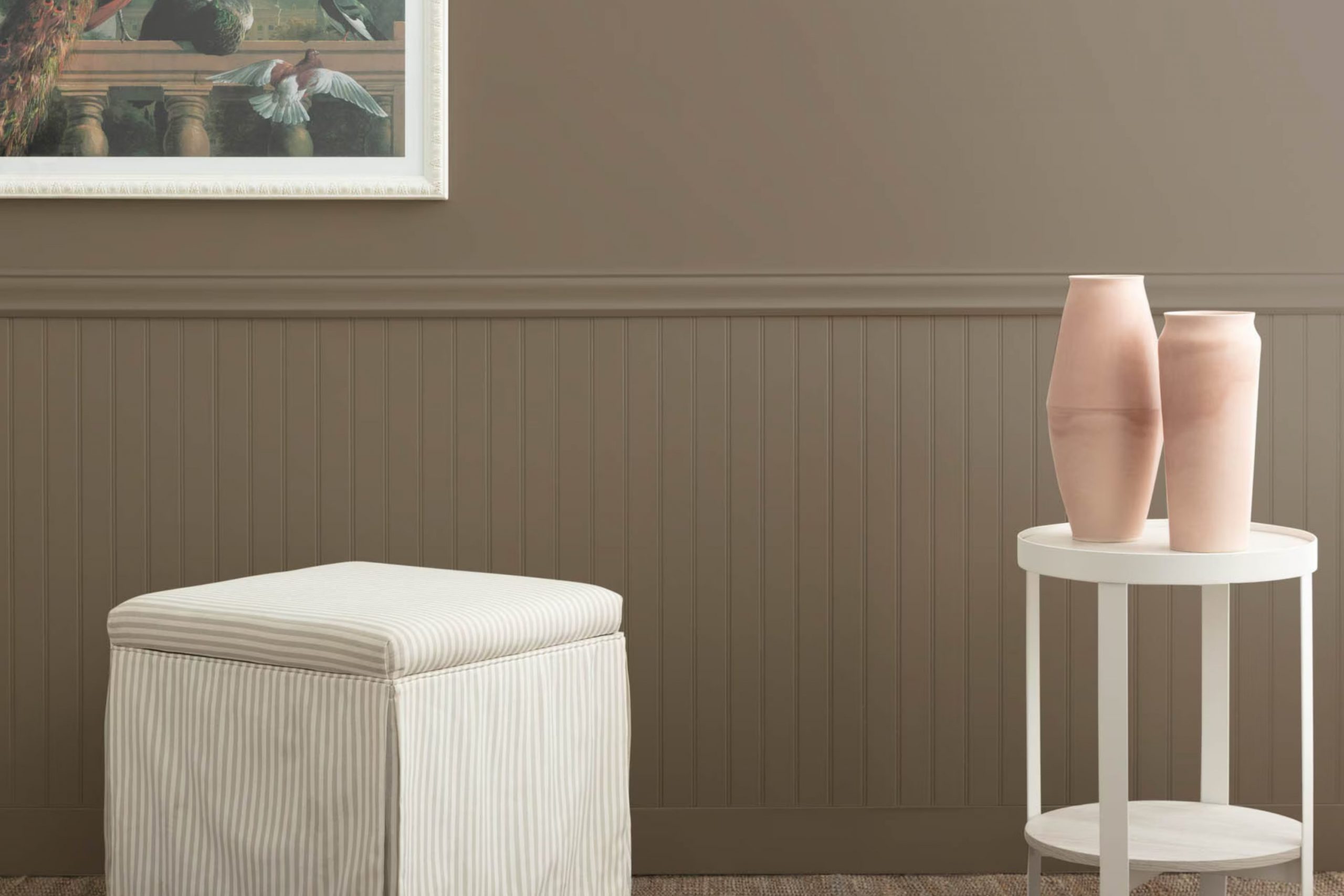
If you’re like me and searching for the perfect neutral shade for your room, you might want to consider HC-85 Fairview Taupe by Benjamin Moore. I came across this color during my quest to find a flexible background that wouldn’t dominate my decor. Fairview Taupe offers a balanced mix of warmth and refined character, easily blending with different styles and furnishings.
Personally, I have tried various hues before, but the subtle elegance of this particular taupe caught my attention. It’s neither too dark nor too light, striking an ideal balance that enhances the room’s look without taking over. What stands out about Fairview Taupe is how it shifts with the lighting, showing a range of shades from a soft mushroom in bright daylight to a richer, deeper taupe as the evening sets in.
Great for anyone looking to refresh their living area, HC-85 works wonders in creating a cozy, inviting atmosphere.
Whether you’re painting a living room, bedroom, or just an accent wall, this color has the potential to change your home with its understated charm.
What Color Is Fairview Taupe HC-85 by Benjamin Moore?
Fairview Taupe by Benjamin Moore is a warm, adaptable neutral shade that can add a cozy feel to any room. This color features hints of brown and gray, making it a perfect backdrop for various decorating styles. It stands out for its ability to create a welcoming, relaxed atmosphere in a room, whether on walls, cabinetry, or accent features.
Fairview Taupe works exceptionally well in traditional and rustic interior styles. Its earthy tones complement natural materials like wood, enhancing grain patterns and adding depth to wooden furniture or floors. This color also pairs beautifully with textured fabrics such as wool or linen, contributing to a cozy, layered look in living rooms or bedrooms.
For those looking to achieve a more modern aesthetic, this color can also be effective. It acts as a subtle base that allows brighter colors or bold patterns to stand out without feeling too strong. When matched with metals like brass or copper, Fairview Taupe brings warmth and a sense of refined style to contemporary interiors.
In summary, Fairview Taupe is a highly flexible color that works in many design contexts, enhancing natural materials and providing a solid foundation for both bold and subtle interior themes.
Is Fairview Taupe HC-85 by Benjamin Moore Warm or Cool color?
Fairview Taupe HC-85 by Benjamin Moore is a flexible paint color that brings warmth to any room in a home. This shade of taupe has a unique blend that can complement various decor styles, making it a popular choice among homeowners and designers. Its neutral tone serves as a perfect backdrop, allowing furniture and other decorative elements to stand out.
In living rooms, Fairview Taupe can create a cozy atmosphere, making the room feel more inviting. For bedrooms, it adds a subtle warmth, ideal for areas meant for relaxation. This color also works well in kitchens and dining rooms, where it pairs beautifully with both wood and metal finishes.
The adaptability of Fairview Taupe means it fits well with both modern and traditional homes. It can gently brighten a dark room, or it can add depth to a brighter room without feeling too heavy. Whether you want to refresh a single room or repaint your entire house, Fairview Taupe is a solid, dependable choice that blends easily with most color schemes.
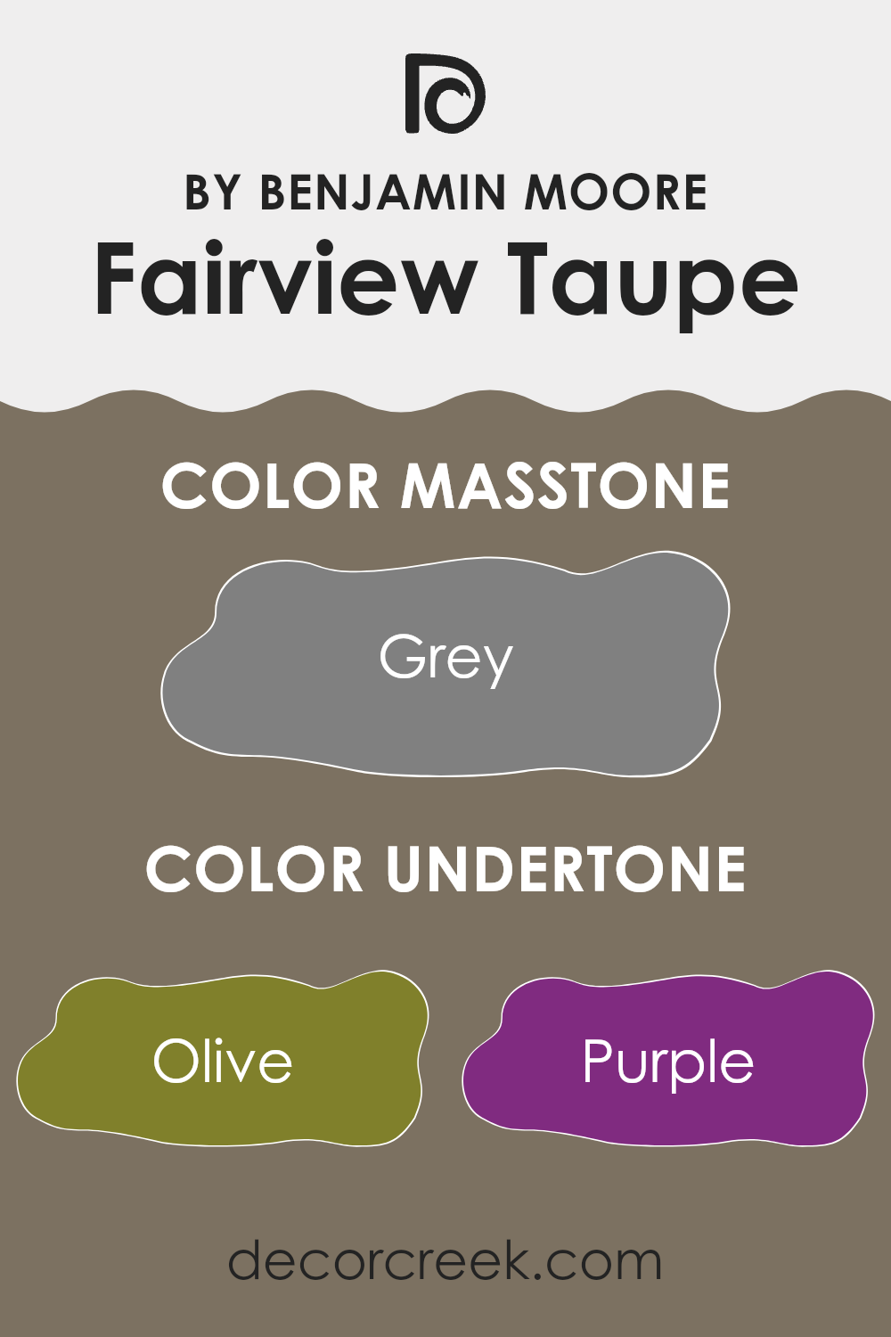
Undertones of Fairview Taupe HC-85 by Benjamin Moore
Fairview Taupe is a flexible paint color with a rich composition of undertones that can subtly influence the perception of the room painted with it. This color primarily gives off warmth and coziness that can make any room feel welcoming.
One of the significant undertones of Fairview Taupe is olive. This gives it an earthy feel, making it suitable for rooms where a connection to nature and calmness is desired. Another interesting undertone is purple, which can add a subtle hint of creativity to the atmosphere while staying mostly neutral.
When used on interior walls, Fairview Taupe provides a neutral backdrop that is far from plain. Its complexity comes from the range of subtle colors it contains. For instance, the dark turquoise and dark green undertones add a touch of richness, increasing the depth of the wall color under different lighting conditions.
Lighting plays a crucial role in how these undertones show themselves. Natural light brings out the brightness and warmer tones like pale pink and mint, making the room feel airy and light. In artificial lighting, darker undertones like brown and dark gray may become more noticeable, giving the room a more grounded feel.
Overall, the variety of undertones in Fairview Taupe ensures that it can adjust to many decor styles and preferences, making it a practical choice for many homes. It stands out by offering much more interest and interaction than a simple tan or beige, shifting subtly with the furnishings and lighting conditions.
decorcreek.com
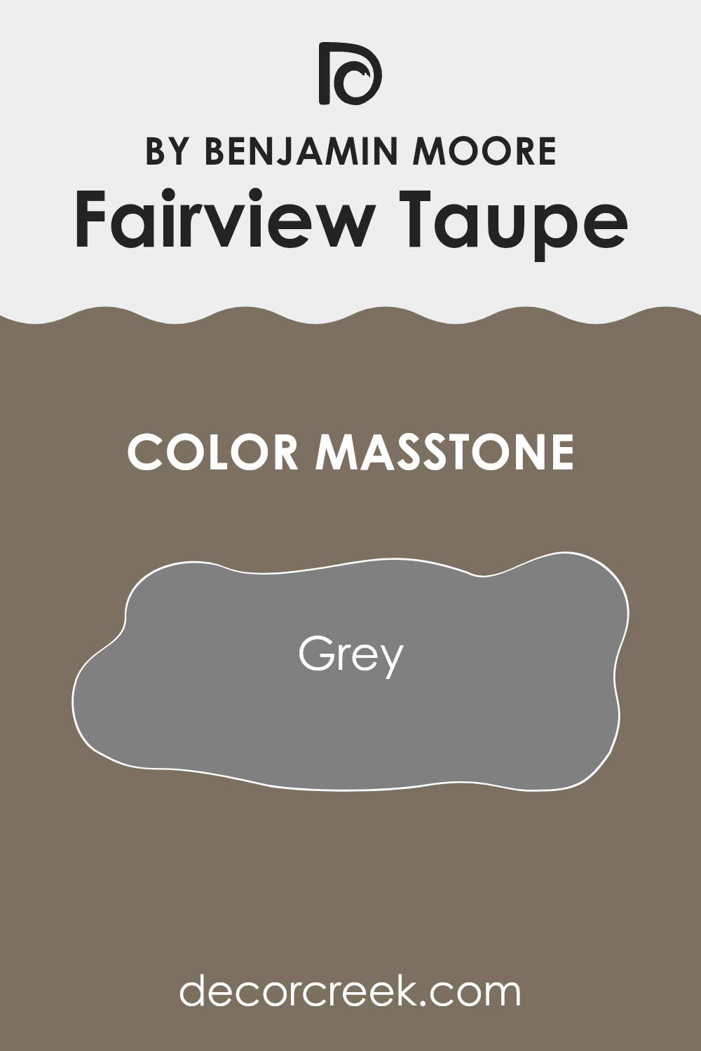
What is the Masstone of the Fairview Taupe HC-85 by Benjamin Moore?
Fairview Taupe HC-85 by Benjamin Moore has a masstone of grey, specifically color code #808080. This neutral grey hue is flexible and practical for home decor, offering a stable backdrop that can support various design styles. In a living room, this color works well because it’s subtle and does not dominate the room.
It can pull together different colors and patterns found in furniture and decor, resulting in a cohesive look. In a bright room, Fairview Taupe stays true to its grey tone, reflecting and working with light rather than absorbing it. This makes the room feel larger and more open.
In darker rooms, this color can add depth while keeping a neutral, calming atmosphere. It’s also ideal for high-traffic areas like hallways or family rooms, as it hides dirt and marks fairly well compared to lighter shades. Overall, Fairview Taupe is a practical choice for creating a tidy and pulled-together look in any home.
How Does Lighting Affect Fairview Taupe HC-85 by Benjamin Moore?
Lighting plays a significant role in how colors appear in a room. Different light sources and the direction of light can make a color look different at various times of the day or in different settings.
Talking specifically about the color Fairview Taupe by Benjamin Moore, it’s a balanced and warm hue that can change appearance under different lighting conditions. This flexibility makes it a popular choice for interior walls, as it can work well with many room features and lighting situations.
In natural light, Fairview Taupe’s warm undertones are highlighted, making the room feel cozy and inviting. The intensity and angle of the natural light, however, influence its appearance significantly:
North-facing rooms tend to have cooler, more consistent light throughout the day. In these rooms, Fairview Taupe may appear slightly more muted and cooler, emphasizing the gray components of the taupe and giving a calm, subtle look.
South-facing rooms receive a lot of bright, warm light for most of the day. Here, Fairview Taupe shows its warmer side, helping the room feel more welcoming and bright.
East-facing rooms enjoy strong light in the morning that fades as the day goes on. In morning light, Fairview Taupe looks warm and lively, but later it can shift to a softer, more gray-leaning tone.
West-facing rooms experience softer light in the morning and stronger light later in the day. Fairview Taupe appears gentler early on and becomes warmer and richer toward the evening.
In artificial light, the type of bulbs used also affects how the color looks. Incandescent bulbs, which give off warmer light, enhance the brown and warm tones of Fairview Taupe, making it feel cozier. Fluorescent lighting, which is cooler, can bring out more gray tones, giving the color a more neutral look. LED lights, which range from warm to cool, offer more control over how Fairview Taupe appears depending on the mood you want to create.
Choosing the right lighting and considering room orientation are important when working with rich, adaptable colors like Fairview Taupe to help them show their best qualities.
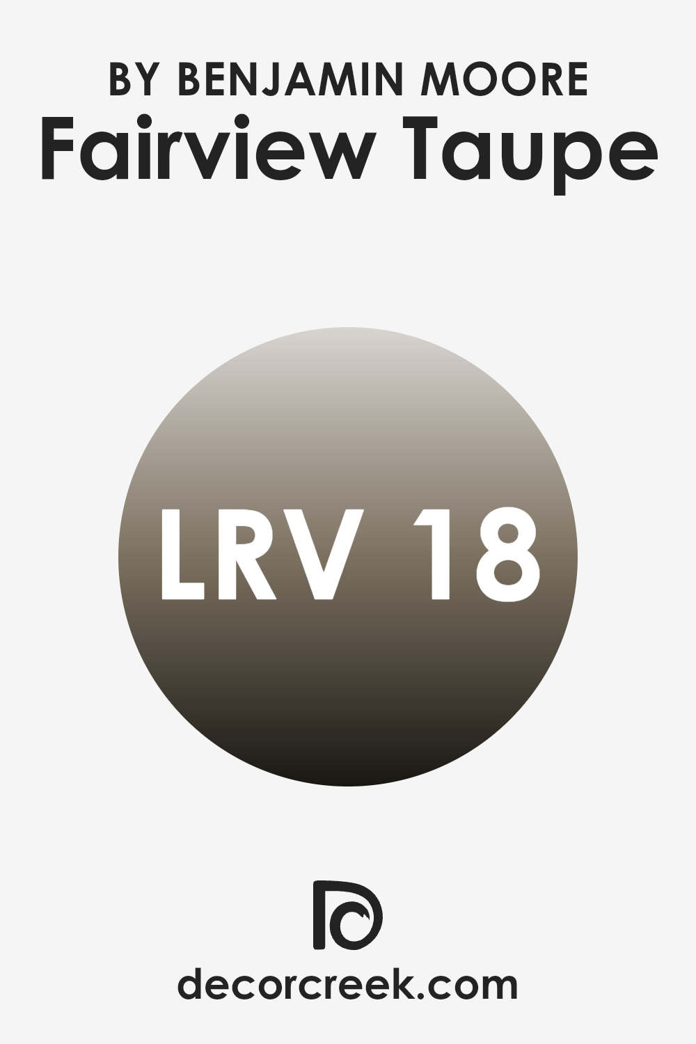
What is the LRV of Fairview Taupe HC-85 by Benjamin Moore?
LRV, or Light Reflectance Value, is a measurement that tells us how much light a paint color reflects back into a room compared to how much it absorbs. It’s a scale commonly used in the design industry to choose colors for rooms, because it greatly affects how light or dark a room feels.
In simple terms, colors with a higher LRV make a room look brighter because they reflect more light. On the other hand, colors with a lower LRV can make a room appear darker, as they absorb more light. This makes LRV an important factor to consider when picking out paint colors, especially in rooms that have limited natural light.
The LRV of Fairview Taupe, which is 17.98, indicates that it is a darker shade, absorbing more light than it reflects. This characteristic means it might make a room feel cozier and somewhat enclosed. When used on walls, this color is ideal for creating a warm, intimate atmosphere in a room. However, it’s essential to balance this darker shade with proper lighting and lighter-colored furnishings or accents to prevent the room from feeling too dark or small. This balance will ensure that the room keeps a welcoming feel without sacrificing style.
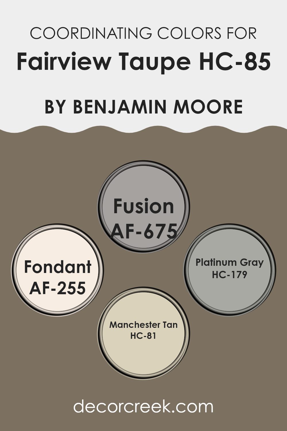
Coordinating Colors of Fairview Taupe HC-85 by Benjamin Moore
Coordinating colors are a set of hues that complement and enhance each other, creating a visually pleasing ambiance in any room. When selecting coordinating colors, the goal is to find shades that maintain balance and harmony within a design scheme. For Fairview Taupe, colors like Fusion AF-675, Fondant AF-255, Platinum Gray HC-179, and Manchester Tan HC-81 by Benjamin Moore work well together by offering a balanced palette that can create both contrast and unity in a room.
Fusion AF-675 is a deep, rich shade that brings a sense of warmth and can be used to add depth to a room. It pairs well with the neutral undertones of Fairview Taupe, providing a grounding effect in a thoughtfully decorated room. Fondant AF-255 is a softer, creamy color, excellent for creating a light, airy feel. It works seamlessly with Fairview Taupe to establish a calm and welcoming environment.
Platinum Gray HC-179 is a medium gray that offers a contemporary look when paired with the warmer tones of Fairview Taupe, perfect for modern settings. Finally, Manchester Tan HC-81 is a light, sandy beige that complements Fairview Taupe by adding a natural, subtle contrast, ideal for achieving a relaxed aesthetic in home interiors. Together, these colors support each other, enhancing the overall decor while maintaining individual characteristics that provide distinct visual interest.
You can see recommended paint colors below:
- AF-675 Fusion
- AF-255 Fondant
- HC-179 Platinum Gray
- HC-81 Manchester Tan
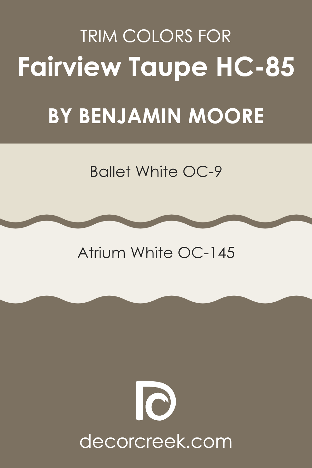
What are the Trim colors of Fairview Taupe HC-85 by Benjamin Moore?
Trim colors, such as OC-9 Ballet White and OC-145 Atrium White by Benjamin Moore, are used to highlight or accentuate the architectural details of a room, like moldings, door frames, and windowsills. These colors provide visual contrast to the main wall color, helping to define the room and add visual interest.
In the case of Fairview Taupe, a warm and flexible taupe hue, choosing the right trim color is essential because it complements the main color and improves the overall look. A well-chosen trim color can make the walls appear more crisp and make architectural features stand out.
OC-9 Ballet White is a soft, creamy white with a warm undertone that adds a gentle contrast against Fairview Taupe, giving a room a cozy and inviting feel. It works well in rooms seeking a subtle distinction without overpowering the primary color. On the other hand, OC-145 Atrium White is a cleaner, brighter white with a slightly stronger contrast to Fairview Taupe, which can help make a room feel more open and airy. Both trim colors work harmoniously with Fairview Taupe to improve the room’s appeal by providing a clean, finished look to the room.
You can see recommended paint colors below:
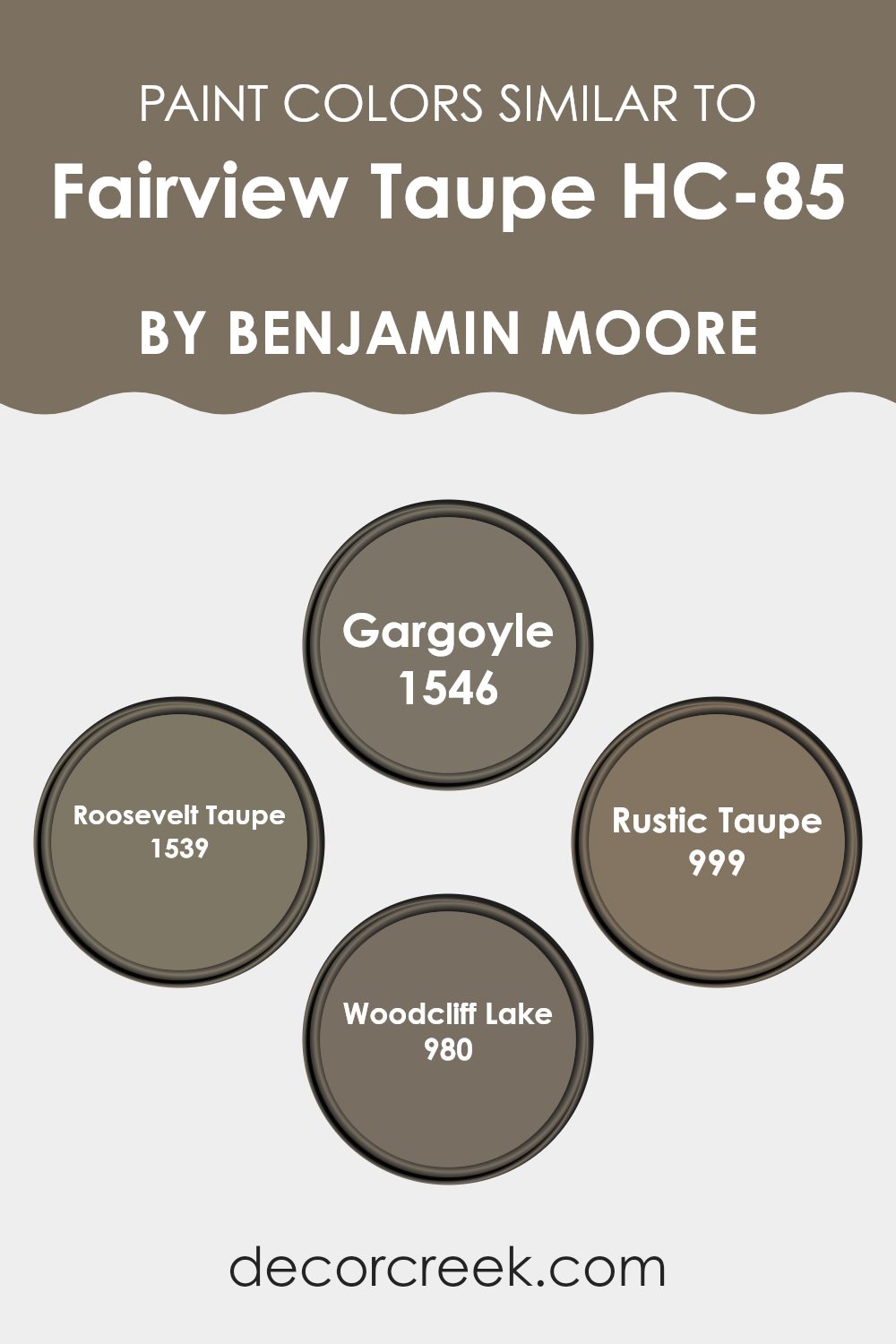
Colors Similar to Fairview Taupe HC-85 by Benjamin Moore
Choosing similar colors when decorating a room is important because it helps create a harmonious and cohesive look. Colors that are similar sit next to each other on the color wheel and share a primary color, making them blend well together without creating stark contrasts. This type of palette helps set a continuous visual tone, allowing for a smooth transition between connected rooms, such as open floor plans, or between the interior and exterior of a home.
For instance, Fairview Taupe, a warm and welcoming shade, pairs elegantly with other colors like Gargoyle, which is a slightly darker, muted gray-brown that lends a grounded feel to interiors. Roosevelt Taupe also shares this blend of earth tones, though it is lighter and warmer, offering an inviting backdrop that feels easy and pleasant to the eye.
Moving to Rustic Taupe, we see a richer, deeper brown that works well as an accent, highlighting furniture and architectural details without feeling too strong against the overall theme. Lastly, Woodcliff Lake is a refined grayish-brown that helps balance brighter tones and features within a room, making sure the interior keeps a unified look while adding depth and visual interest. Together, these colors reflect an understated elegance, working together to create a cohesive and appealing environment.
You can see recommended paint colors below:
- 1546 Gargoyle
- 1539 Roosevelt Taupe
- 999 Rustic Taupe
- 980 Woodcliff Lake
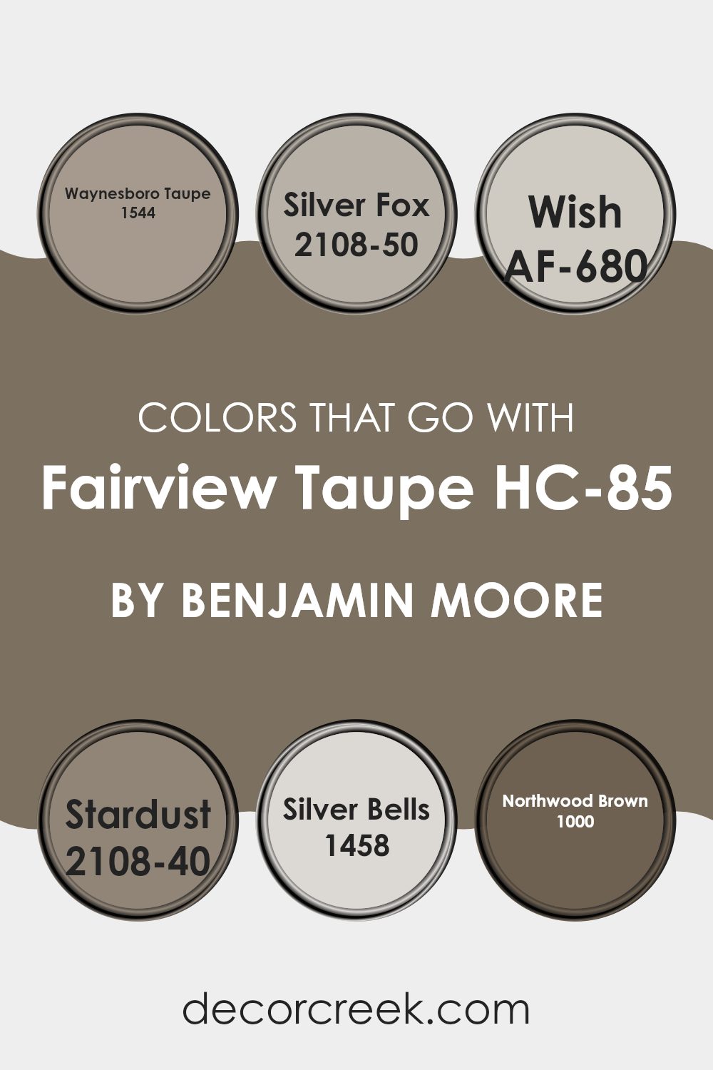
Colors that Go With Fairview Taupe HC-85 by Benjamin Moore
Choosing the right colors to complement Fairview Taupe HC-85 by Benjamin Moore is essential because these colors help create a harmonious and pleasant environment. When paired correctly, such as with 1544 – Waynesboro Taupe, the result is a cohesive look that smoothly ties together different elements of a room.
Waynesboro Taupe is a slightly darker shade that enriches the base tone of Fairview Taupe, offering a gentle contrast without dominating the room. Another great match is 2108-50 – Silver Fox, a soft gray that reflects light well, helping a room feel more open and airy while still keeping a warm undertone that aligns with Fairview Taupe.
Further enhancing this palette, AF-680 Wish brings a lighter, almost misty gray that adds a fresh and airy feel, making it ideal for smaller rooms or as an accent wall to add dimension. For a touch of refined style, 2108-40 Stardust can be used; it’s a unique gray with hints of purple that adds personality and flair.
1458 – Silver Bells, another light gray, works in a similar way to Wish but with a subtle silvery glow that catches the eye under light. Lastly, 1000 – Northwood Brown has a deeper, rich tone that grounds the scheme and works well for furniture or floors, providing a strong foundation that balances the lighter wall colors. By choosing these supporting colors, you ensure the room feels balanced and cohesive, enhancing the overall look.
You can see recommended paint colors below:
- 1544 Waynesboro Taupe
- 2108-50 Silver Fox
- AF-680 Wish
- 2108-40 Stardust
- 1458 Silver Bells
- 1000 Northwood Brown
How to Use Fairview Taupe HC-85 by Benjamin Moore In Your Home?
Fairview Taupe HC-85 by Benjamin Moore is a warm, flexible paint color that’s perfect for creating a cozy atmosphere in your home. Its rich taupe hue makes it ideal for living rooms and bedrooms where you want to establish a relaxing, welcoming vibe. This color pairs beautifully with lighter colors like creams and soft whites, which can help brighten up a room while keeping the feeling grounded and calm.
For those looking to refresh their kitchen or dining area, Fairview Taupe can also complement wood finishes and metallic accents, adding a subtle touch of elegance without taking over the room. In the bathroom, pairing this color with pastel towels or a bright shower curtain can make the room feel more personal and warm.
Overall, Fairview Taupe is easy to work with. Whether you’re painting an entire room, creating an accent wall, or updating old furniture, it provides a solid foundation that can support various decor styles and preferences.
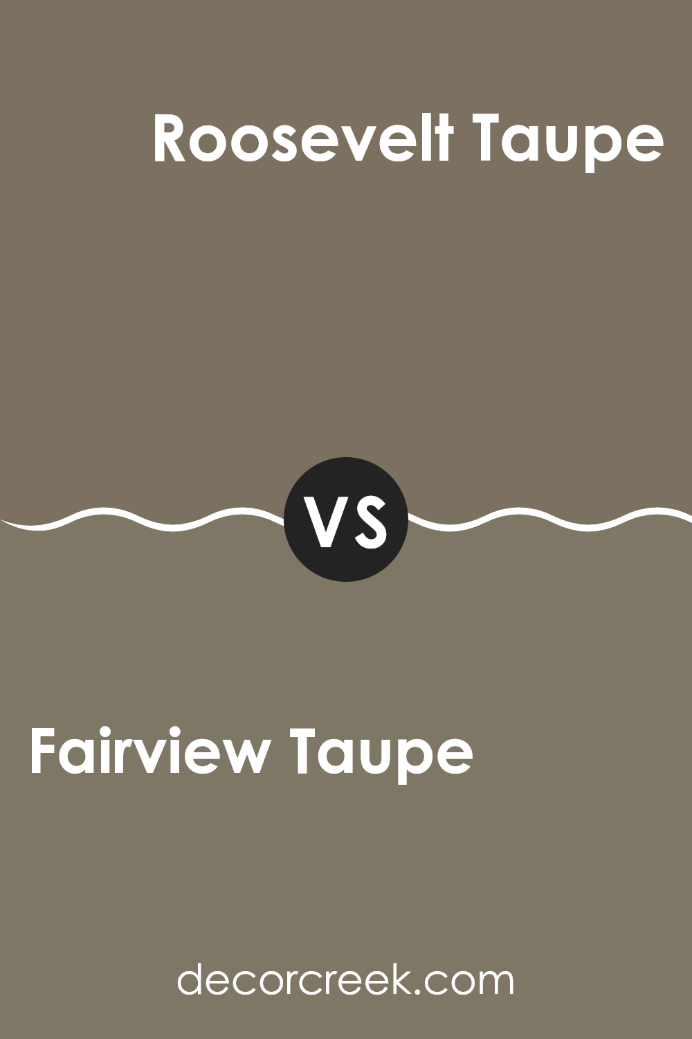
Fairview Taupe HC-85 by Benjamin Moore vs Roosevelt Taupe 1539 by Benjamin Moore
Fairview Taupe and Roosevelt Taupe by Benjamin Moore are two different yet similar colors in their own ways. Fairview Taupe has a warm, welcoming feel, perfect for making rooms cozy and inviting.
It’s a bit lighter, which can help small rooms appear bigger and more open. On the other hand, Roosevelt Taupe is slightly deeper and richer, giving it the ability to add a strong, grounded presence to any area. This color works well in larger rooms or places where you want to create a statement without being too bold.
Both colors are great choices for someone looking to add a touch of understated elegance, with Fairview Taupe being better for a softer look and Roosevelt Taupe for a more pronounced, yet still subtle effect.
You can see recommended paint color below:
- 1539 Roosevelt Taupe
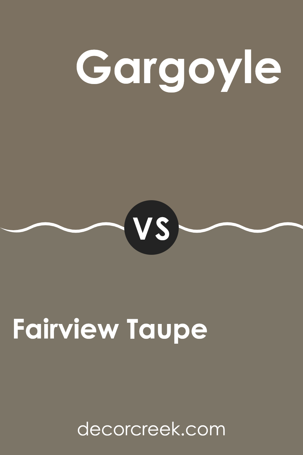
Fairview Taupe HC-85 by Benjamin Moore vs Gargoyle 1546 by Benjamin Moore
Fairview Taupe and Gargoyle, both by Benjamin Moore, offer distinct tones that cater to different decorating preferences. Fairview Taupe is a warm, welcoming beige with subtle gray undertones. It’s flexible and commonly used in living rooms and bedrooms for a cozy atmosphere.
In contrast, Gargoyle is a deeper, more intense gray that gives a bold and dramatic look. This color works well in modern interiors or as an accent wall, providing depth and focus.
While Fairview Taupe brings a softness and lightness to rooms, enhancing the feeling of openness, Gargoyle offers a strong statement, perfect for those who want to add a bit of drama to their decor. Both colors coordinate well with a wide range of other hues, making them practical choices for stylish interiors.
You can see recommended paint color below:
- 1546 Gargoyle
Fairview Taupe HC-85 by Benjamin Moore vs Woodcliff Lake 980 by Benjamin Moore
Fairview Taupe and Woodcliff Lake, both by Benjamin Moore, present unique shades for home decor. Fairview Taupe is a warm, welcoming beige with deep undertones that give it a cozy feel, making it ideal for living rooms and bedrooms where comfort is key. It pairs well with a range of colors, adding a subtle richness to rooms.
On the other hand, Woodcliff Lake has a stronger, more defined presence due to its richer, darker brown tone. This color works well in areas that benefit from a grounded, earthy feel, like studies or dining rooms. It’s perfect for creating a strong base when using brighter or lighter decorative accents.
Together, these colors can complement each other well in a room, with Fairview Taupe lightening areas and Woodcliff Lake adding depth and focus. Each brings its own character to interiors, suiting different tastes and styles.
You can see recommended paint color below:
Fairview Taupe HC-85 by Benjamin Moore vs Rustic Taupe 999 by Benjamin Moore
Fairview Taupe and Rustic Taupe, both by Benjamin Moore, offer unique shades for home decorating. Fairview Taupe has a balanced, warm beige hue that is flexible for any room. It provides a cozy and welcoming atmosphere, making it ideal for living rooms or bedrooms. It pairs well with both bright and muted furnishings, allowing for flexibility in interior design choices.
On the other hand, Rustic Taupe presents a deeper, grayer tone. While it still lies in the taupe family, its darker shade offers a bolder look. This color is great for creating a strong presence in a room, suitable for accent walls or furniture pieces. It works well in areas that benefit from a more pronounced color statement, like dining rooms or entryways.
Ultimately, the choice between these colors depends on the desired impact and the specific room’s function. Fairview Taupe is softer and lighter, providing a neutral backdrop, while Rustic Taupe offers a deeper, more striking option.
You can see recommended paint color below:
- 999 Rustic Taupe
After taking a good look at HC-85 Fairview Taupe by Benjamin Moore, I’ve learned quite a bit about this paint color. It’s clear that Fairview Taupe is more than just a basic brown. It has a special warmth that makes any room feel cozy and inviting.
If you’re looking for a color that goes with a lot of different things and isn’t too loud, this could be the one for you. Whether you’re painting a bedroom, living room, or even the outside of your house, Fairview Taupe keeps things looking neat and put-together.
Plus, it’s easy to find other colors and furniture that look great with it, so you won’t have a hard time decorating. To sum it up, HC-85 Fairview Taupe by Benjamin Moore is a wonderful choice if you want a paint color that creates a friendly and comfortable vibe in your home.
Ever wished paint sampling was as easy as sticking a sticker? Guess what? Now it is! Discover Samplize's unique Peel & Stick samples.
Get paint samples

